SVG Marching Ants
Maxim Leyzerovich created the marching ants effect with some delectably simple SVG.
See the Pen SVG Marching Ants by Maxim Leyzerovich (@round) on CodePen.
Let’s break it apart bit by bit and see all the little parts come together.
Step 1: Draw a dang rectangle
We can set up our SVG like a square, but have the aspect ratio ignored and have it flex into whatever rectangle we’d like.
<svg viewbox='0 0 40 40' preserveAspectRatio='none'>
  <rect width='40' height='40' />
</svg>
Right away, we’re reminded that the coordinate system inside an SVG is unit-less. Here we’re saying, “This SVG is a 40x40 grid. Now draw a rectangle covering the entire grid.” We can still size the whole SVG in CSS though. Let’s force it to be exactly half of the viewport:
svg {
  position: absolute;
  width: 50vw;
  height: 50vh;
  top: 0;
  right: 0;
  bottom: 0;
  left: 0;
  margin: auto;
}
Step 2: Fight the squish
Because we made the box and grid so flexible, we’ll get some squishing that we probably could have predicted. Say we have a stroke that is 2 wide in our coordinate system. When the SVG is narrow, it still needs to split that narrow space into 40 units. That means the stroke will be quite narrow.
We can stop that by telling the stroke to be non-scaling.
rect {
  fill: none;
  stroke: #000;
  stroke-width: 10px;
  vector-effect: non-scaling-stroke;
}
Now the stroke will behave more like a border on an HTML element.
Step 3: Draw the cross lines
In Maxim’s demo, he draws the lines in the middle with four path elements. Remember, we have a 40x40 coordinate system, so the math is great:
<path d='M 20,20 L 40,40' />
<path d='M 20,20 L 00,40 '/>
<path d='M 20,20 L 40,0' />
<path d='M 20,20 L 0,0' />
These are four lines that start in the exact center (20,20) and go to each corner. Why four lines instead of two that go corner to corner? I suspect it’s because the marching ants animation later looks kinda cooler if all the ants are emanating from the center rather than crisscrossing.
I love the nice syntax of path, but let’s only use two lines to be different:
<line x1="0" y1="0" x2="40" y2="40"></line>
<line x1="0" y1="40" x2="40" y2="0"></line>
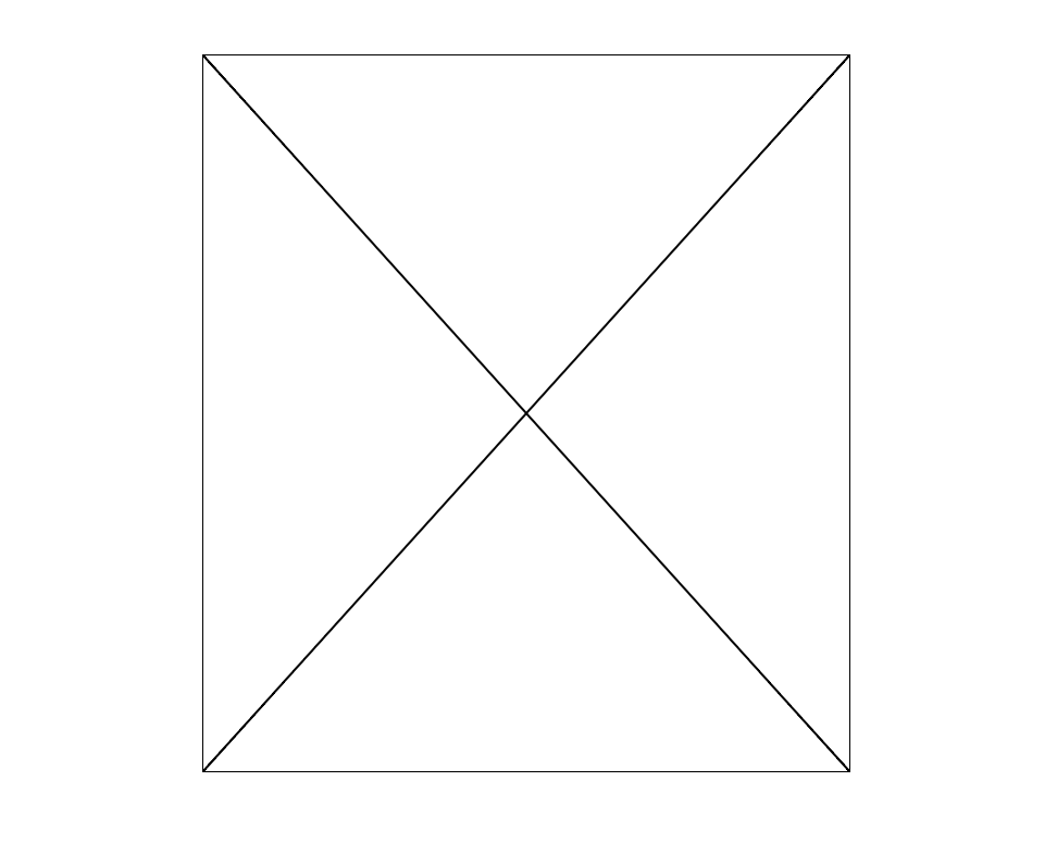
If we apply our stroke to both our rect and line, it works! But we see a slightly weird issue:
rect, line {
  fill: none;
  stroke: #000;
  stroke-width: 1px;
  vector-effect: non-scaling-stroke;
}
The outside line appears thinner than the inside lines, and the reason is that the outer rectangle is hugging the exact outside of the SVG. As a result, anything outside of it is cut off. It’s pretty frustrating, but strokes in SVG always straddle the paths that they sit on, so exactly half of the outer stroke (0.5px) is hidden. We can double the rectangle alone to “fix” it:
rect, line {
  fill: none;
  stroke: #000;
  stroke-width: 1px;
  vector-effect: non-scaling-stroke;
}

rect {
  stroke-width: 2px;
}
Maxim also tosses a shape-rendering: geometricPrecision; on there because, apparently, it cleans things up a bit on non-retina displays.
Step 3: Ants are dashes
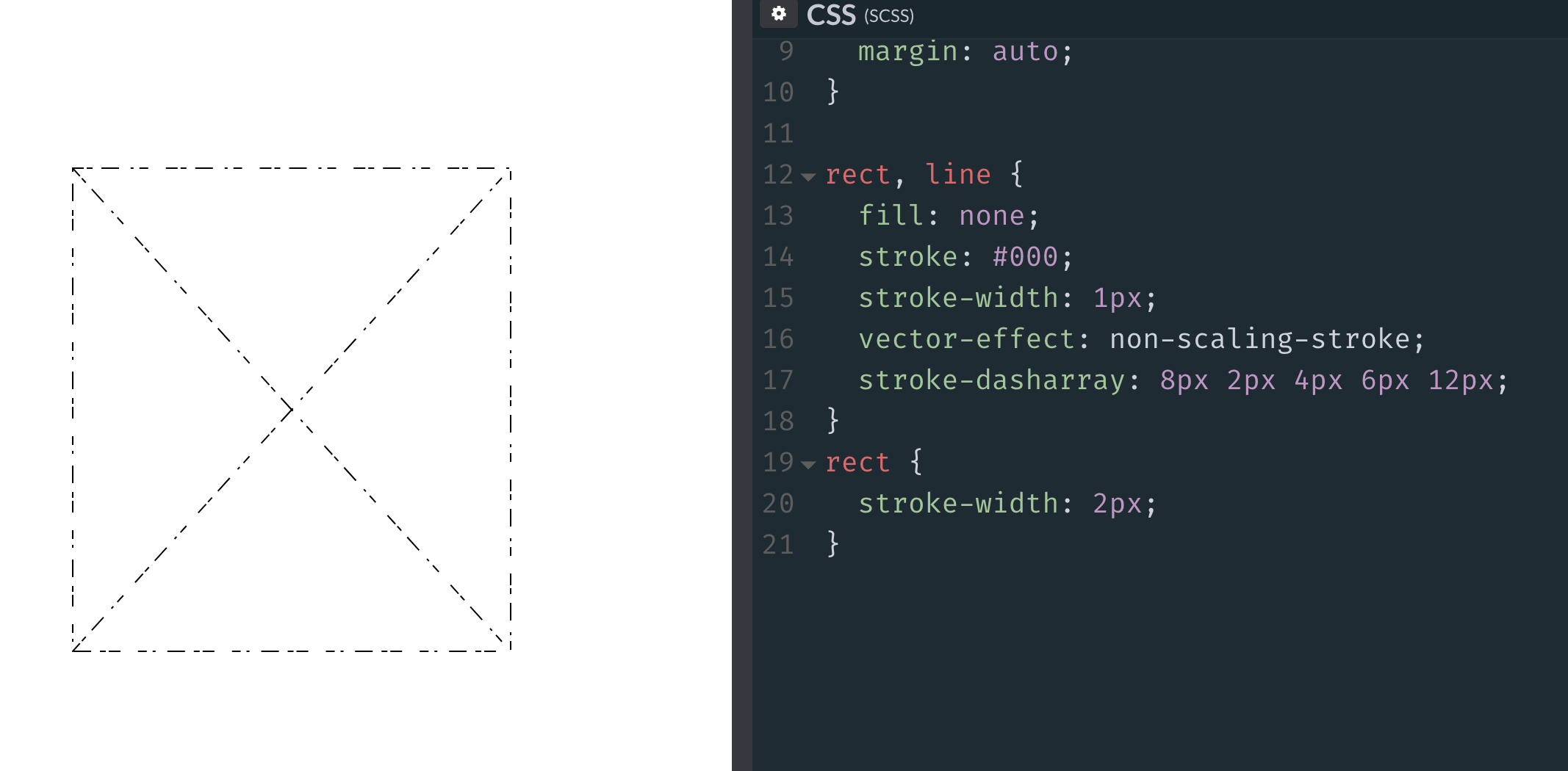
Other than the weird straddling-the-line thing, SVG strokes offer way more control than CSS borders. For example, CSS has dashed and dotted border styles, but offers no control over them. In SVG, we have control over the length of the dashes and the amount of space between them, thanks to stroke-dasharray:
rect, line {
  ...

  /* 8px dashes with 2px spaces */
  stroke-dasharray: 8px 2px;
}
We can even get real weird with it:

But the ants look good with 4px dashes and 4px spaces between, so we can use a shorthand of stroke-dasharray: 4px;.
Step 5: Animate the ants!
The “marching” part of “marching ants” comes from the animation. SVG strokes also have the ability to be offset by a particular distance. If we pick a distance that is exactly as long as the dash and the gap together, then animate the offset of that distance, we can get a smooth movement of the stroke design. We’ve even covered this before to create an effect of an SVG that draws itself.
rect, line {
  ...

  stroke-dasharray: 4px;
  stroke-dashoffset: 8px;
  animation: stroke 0.2s linear infinite;
}

@keyframes stroke {
  to {
    stroke-dashoffset: 0;
  }
}
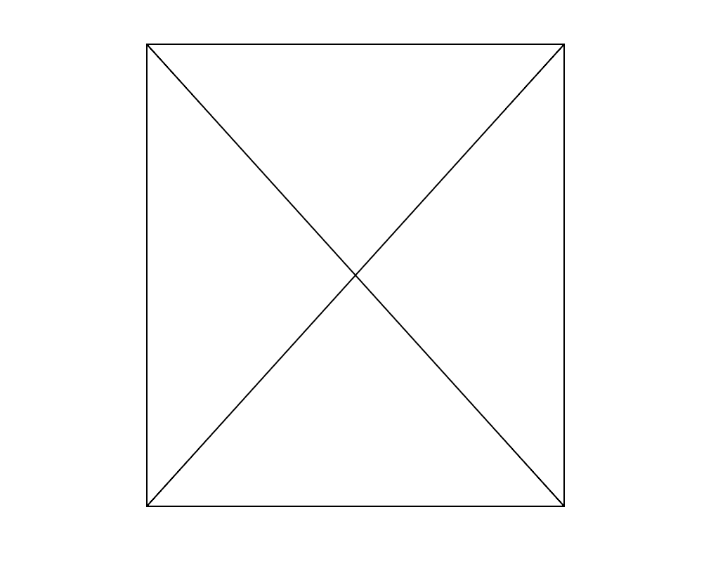
Here’s our replica and the original:
See the Pen SVG Marching Ants by Maxim Leyzerovich (@round) on CodePen.
Again, perhaps my favorite part here is the crisp 1px lines that aren’t limited by size or aspect ratio at all and how little code it takes to put it all together.
The post SVG Marching Ants appeared first on CSS-Tricks.