Hand roll charts with D3 like you actually know what you’re doing
Charts! My least favorite subject besides Social Studies. But you just won’t get very far in this industry before someone wants you to make a chart. I don’t know what it is with people and charts, but apparently we can’t have a civilization without a bar chart showing Maggie’s sales for last month so by ALL MEANS — let’s make a chart.
To prepare you for that impending “OMG I’m going to have to make a chart” existential crisis that, much like death, we like to pretend is never going to happen, I’m going to show you how to hand-roll your own scatter plot graph with D3.js. This article is heavy on the code side and your first glance at the finished code is going to trigger your “fight or flight” response. But if you can get through this article, I think you will be surprised at how well you understand D3 and how confident you are that you can go make some other chart that you would rather not make.
Before we do that, though, it’s important to talk about WHY you would ever want to roll your own chart.
Building vs. Buying
When you do have to chart, you will likely reach for something that comes “out of the box.” You would never ever hand-roll a chart. The same way you would never sit around and smash your thumb with a hammer; it’s rather painful and there are more productive ways to use your hammer. Charts are rather complex user interface items. It’s not like you’re center-aligning some text in a div here. Libraries like Chart.js or Kendo UI have pre-made charts that you can just point at your data. Developers have spent thousands of hours perfecting these charts You would never ever build one of these yourself.
Or would you?
Charting libraries are fantastic, but they do impose a certain amount of restrictions on you…and sometimes they actually make it harder to do even the simple things. As Peter Parker’s grandfather said before he over-acted his dying scene in Spiderman, “With great charting libraries, comes great trade-off in flexibility.”

This is exactly the scenario I found myself in when my colleague, Jasmine Greenaway, and I decided that we could use charts to figure out who @horse_js is. In case you aren’t already a big @horse_js fan, it’s a Twitter parody account that quotes people out of context. It’s extremely awesome.
We pulled every tweet from @horse_js for the past two years. We stuck that in a Cosmos DB database and then created an Azure Function endpoint to expose the data.
And then, with a sinking feeling in our stomachs, we realized that we needed a chart. We wanted to be able to see what the data looked like as it occurred over time. We thought being able to see the data visually in a Time Series Analysis might help us identify some pattern or gain some insight about the twitter account. And indeed, it did.
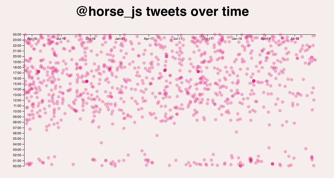
We charted every tweet that @horse_js has posted in the last two years. When we look at that data on a scatter plot, it looks like this:
See the Pen wYxYNd by Burke Holland (@burkeholland) on CodePen.
Coincidentally, this is the thing we are going to build in this article.
Each tweet is displayed with the date on the x-axis, and the time of day on the y. I thought this would be easy to do with a charting library, but all the ones I tried weren’t really equipped to handle the scenario of a date across the x and a time on the y. I also couldn’t find any examples of people doing it online. Am I breaking new ground here? Am I a data visualization pioneer?
Probably. Definitely.
So, let’s take a look at how we can build this breathtaking scatter plot using D3.
Getting started with D3
Here’s the thing about D3: it looks pretty awful. I just want to get that out there so we can stop pretending like D3 code is fun to look at. It’s not. There’s no shame in saying that. Now that we’ve invited that elephant in the room to the tea party, allow me to insinuate that even though D3 code looks pretty bad, it’s actually not. There’s just a lot of it.
To get started, we need D3. I am using the CDN include for D3 5 for these examples. I’m also using Moment to work with the dates, which we’ll get to later.
https://cdnjs.cloudflare.com/ajax/libs/d3/5.7.0/d3.min.js
https://cdnjs.cloudflare.com/ajax/libs/moment.js/2.22.2/moment.min.js
D3 works with SVG. That’s what it does. It basically marries SVG with data and provides some handy pre-built mechanisms for visualization it — things such as axis. Or Axees? Axises? Whatever the plural of “axis” is. But for now, just know that it’s like jQuery for SVG.
So, the first thing we need is an SVG element to work with.
<svg id="chart"></svg>OK. Now we’re ready to start D3’ing our way to data visualization infamy. The first thing we’re going to do is make our scatter plot a class. We want to make this thing as generic as possible so that we can re-use it with other sets of data. We’ll start with a constructor that takes two parameters. The first will be the class or id of the element we are about to work with (in our case that’s, #chart) and the second is an object that will allow us to pass in any parameters that might vary from chart-to-chart (e.g. data, width, etc.).
class ScatterPlot {
  constructor(el, options) {
  }
}
The chart code itself will go in a render function, which will also require the data set we’re working with to be passed.
class ScatterPlot {
  constructor(el, options) {
    this.render(options.data);
  }

  render(data) {
  }
}
The first thing we’ll do in our render method is set some size values and margins for our chart.
class ScatterPlot {
  constructor(el, options) {
    this.data = options.data || [];
    this.width = options.width || 500;
    this.height = options.height || 400;

    this.render();
  }

  render() {
    let margin = { top: 20, right: 20, bottom: 50, left: 60 };
    let height = this.height || 400;
    let width = (this.height || 400) - margin.top - margin.bottom;
    let data = this.data;
  }
}
I mentioned that D3 is like jQuery for SVG, and I think that analogy sticks. So you can see what I mean, let’s make a simple SVG drawing with D3.
For starters, you need to select the DOM element that SVG is going to work with. Once you do that, you can start appending things and setting their attributes. D3, just like jQuery, is built on the concept of chaining, so each function that you call returns an instance of the element on which you called it. In this manner, you can keep on adding elements and attributes until the cows come home.
For instance, let’s say we wanted to draw a square. With D3, we can draw a rectangle (in SVG that’s a rect), adding the necessary attributes along the way.
See the Pen zmdpJZ by Burke Holland (@burkeholland) on CodePen.
NOW. At this point you will say, “But I don’t know SVG.” Well, I don’t either. But I do know how to Google and there is no shortage of articles on how to do pretty much anything in SVG.
So, how do we get from a rectangle to a chart? This is where D3 becomes way more than just “jQuery for drawing.”
??First, let’s create a chart. We start with an empty SVG element in our markup. We use D3 to select that empty svg element (called #chart?) and define its width and height as well as margins.
// create the chart
this.chart = d3.select(this.el)
  .attr('width', width + margin.right + margin.left)
  .attr('height', height + margin.top + margin.bottom);
And here’s what it looks like:
See the Pen EdpOqy by Burke Holland (@burkeholland) on CodePen.
AMAZING! Nothing there. If you open the dev tools, you’ll see that there is something there. It’s just an empty something. Kind of like my soul.
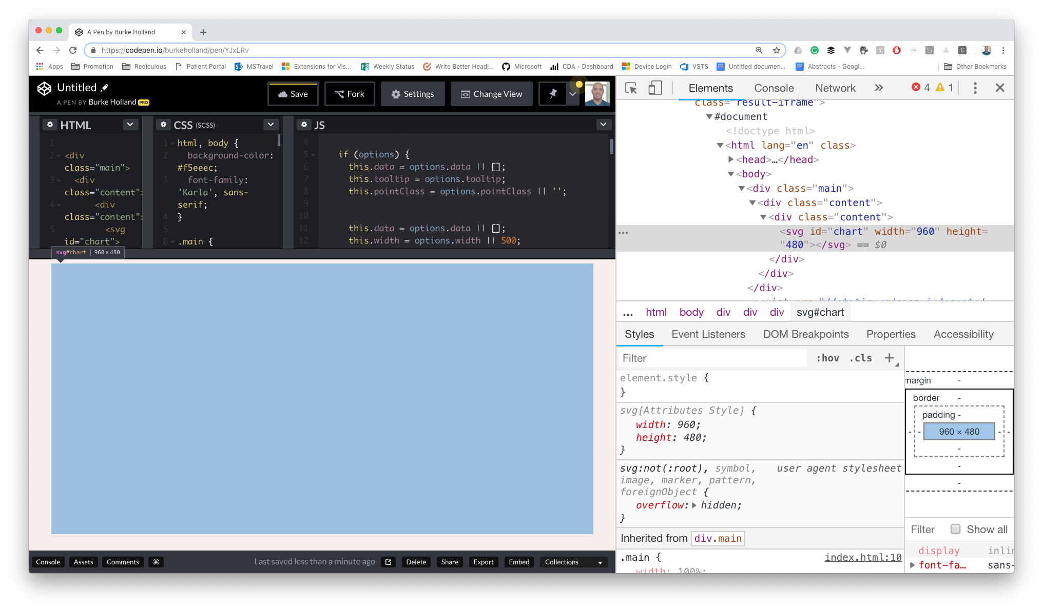
That’s your chart! Let’s go about putting some data in it. For that, we are going to need to define our x and y-axis.
That’s pretty easy in D3. You call the axisBottom method. Here, I am also formatting the tick marks with the right date format to display.
let xAxis = d3.axisBottom(x).tickFormat(d3.timeFormat('%b-%y'));I am also passing an “x” parameter to the axisBottom method. What is that? That is called a scale.
D3 scales
D3 has something called scales. Scales are just a way of telling D3 where to put your data and D3 has a lot of different types of scales. The most common kind would be linear — like a scale of data from 1 to 10. It also contains a scale just for time series data — which is what we need for this chart. We can use the scaleTime method to define a “scale” for our x-axis.
// define the x-axis
let minDateValue = d3.min(data, d => {
  return new Date(moment(d.created_at).format('MM-DD-YYYY'));
});

let maxDateValue = d3.max(data, d => {
  return new Date(moment(d.created_at).format('MM-DD-YYYY'));
});

let x = d3.scaleTime()
  .domain([minDateValue, maxDateValue])
  .range([0, width]);

let xAxis = d3.axisBottom(x).tickFormat(d3.timeFormat('%b-%y'));
D3 scales use some terminology that is slightly intimidating. There are two main concepts to understand here: domains and ranges.
- Domain: The range of possible values in your data set. In my case, I’m getting the minimum date from the array, and the maximum date from the array. Every other value in the data set falls between these two endpoints — so those “endpoints” define my domain.
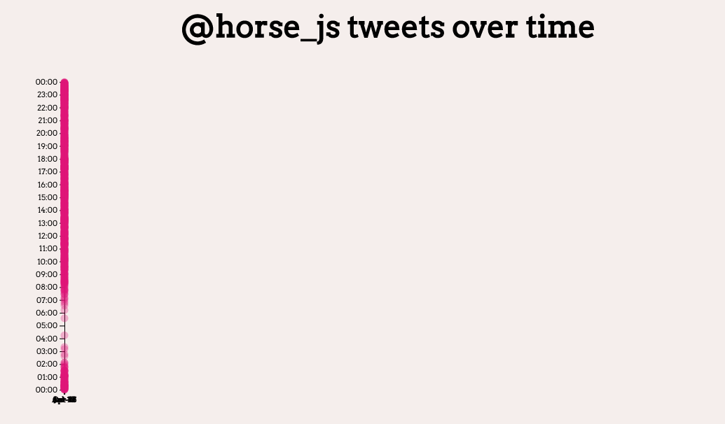
- Range: The range over which to display your data set. In other words, how spread out do you want your data to be? In our case, we want it constrained to the width of the chart, so we just pass
widthas the second parameter. If we passed a value like, say,10000, our data out over 10,000 pixels wide. If we passed no value at all, it would draw all of the data on top of itself all on the left-hand side of the chart… like the following image.
The y-axis is built in the same way. Only, for it, we are going to be formatting our data for time, not date.
// define y axis
let minTimeValue = new Date().setHours(0, 0, 0, 0);
let maxTimeValue = new Date().setHours(23, 59, 59, 999);

let y = d3.scaleTime()
  .domain([minTimeValue, maxTimeValue])
  .nice(d3.timeDay)
  .range([height, 0]);

let yAxis = d3.axisLeft(y).ticks(24).tickFormat(d3.timeFormat('%H:%M'));
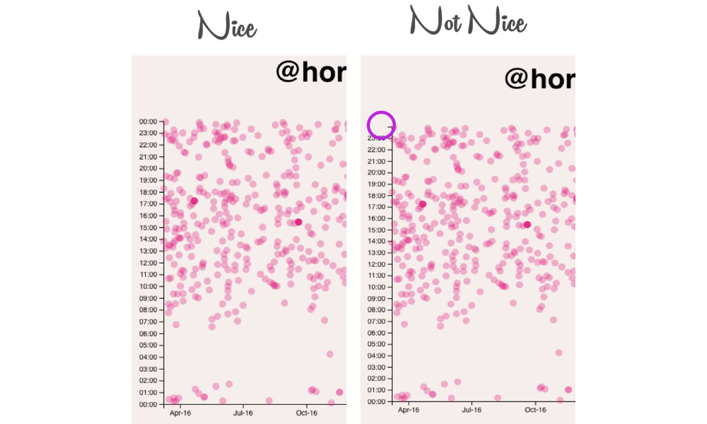
The extra nice method call on the y scale tells the y-axis to format this time scale nicely. If we don’t include that, it won’t have a label for the top-most tick on the left-hand side because it only goes to 11:59:59 PM, rather than all the way to midnight. It’s a quirk, but we’re not making crap here. We need labels on all our ticks.
Now we’re ready to draw our axis to the chart. Remember that our chart has some margins on it. In order to properly position the items inside of our chart, we are going to create a grouping (g) element and set its width and height. Then, we can draw all of our elements in that container.
let main = this.chart.append('g')
  .attr('transform', `translate(${margin.left}, ${margin.top})`)
  .attr('width', width)
  .attr('height', height)
  .attr('class', 'main');
We’re drawing our container, accounting for margin and setting its width and height. Yes. I know. It’s tedious. But such is the state of laying things out in a browser. When was the last time you tried to horizontally and vertically center content in a div? Yeah, not so awesome prior to Flexbox and CSS Grid.
Now, we can draw our x-axis:
main.chart.append('g')
  .attr('transform', `translate(0, ${height})`)
  .attr('class', 'main axis date')
  .call(xAxis);
We make a container element, and then “call” the xAxis that we defined earlier. D3 draws things starting at the top-left, so we use the transform attribute to offset the x-axis from the top so it appears at the bottom. If we didn’t do that, our chart would look like this…
By specifying the transform, we push it to the bottom. Now for the y-axis:
main.append('g')
  .attr('class', 'main axis date')
  .call(yAxis);
Let’s look at all the code we have so far, and then we’ll see what this outputs to the screen.
class ScatterPlot {
  constructor(el, options) {
    this.el = el;

    if (options) {
      this.data = options.data || [];
      this.tooltip = options.tooltip;
      this.pointClass = options.pointClass || '';


      this.data = options.data || [];
      this.width = options.width || 500;
      this.height = options.height || 400;

      this.render();
    }
  }

  render() {
    let margin = { top: 20, right: 15, bottom: 60, left: 60 };
    let height = this.height || 400;
    let width = (this.width || 500) - margin.right - margin.left;
    let data = this.data;

    // create the chart
    let chart = d3.select(this.el)
      .attr('width', width + margin.right + margin.left)
      .attr('height', height + margin.top + margin.bottom);

    // define the x-axis
    let minDateValue = d3.min(data, d => {
      return new Date(moment(d.created_at).format('MM-DD-YYYY'));
    });

    let maxDateValue = d3.max(data, d => {
      return new Date(moment(d.created_at).format('MM-DD-YYYY'));
    });

    let x = d3.scaleTime()
      .domain([minDateValue, maxDateValue])
      .range([0, width]);

    let xAxis = d3.axisBottom(x).tickFormat(d3.timeFormat('%b-%y'));

    // define y axis
    let minTimeValue = new Date().setHours(0, 0, 0, 0);
    let maxTimeValue = new Date().setHours(23, 59, 59, 999);

    let y = d3.scaleTime()
      .domain([minTimeValue, maxTimeValue])
      .nice(d3.timeDay)
      .range([height, 0]);

    let yAxis = d3.axisLeft(y).ticks(24).tickFormat(d3.timeFormat('%H:%M'));

    // define our content area
    let main = chart.append('g')
      .attr('transform', `translate(${margin.left}, ${margin.top})`)
      .attr('width', width)
      .attr('height', height)
      .attr('class', 'main');

    // draw x axis
    main.append('g')
      .attr('transform', `translate(0, ${height})`)
      .attr('class', 'main axis date')
      .call(xAxis);

    // draw y axis
    main.append('g')
      .attr('class', 'main axis date')
      .call(yAxis);
  }
}
See the Pen oaeybM by Burke Holland (@burkeholland) on CodePen.
We’ve got a chart! Call your friends! Call your parents! IMPOSSIBLE IS NOTHING!
??Axis labels
Now let’s add some chart labels. By now you may have figured out that when it comes to D3, you are doing pretty much everything by hand. Adding axis labels is no different. All we are going to do is add an svg text? element, set it’s value and position it. That’s all.
??
??For the x?-axis, we can add the text label and position it using translate?. We set it’s x? position to the middle (width / 2) of the chart. Then we subtract the left-hand margin to make sure we are centered under just the chart. I’m also using a CSS class for axis-label? that has a text-anchor: middle? to make sure our text is originating from the center of the text element.
??
// text label for the x axis
chart.append("text")
.attr("transform",
"translate(" + ((width/2) + margin.left) + " ," +
(height + margin.top + margin.bottom) + ")")
.attr('class', 'axis-label')
.text("Date Of Tweet");??
??The y?-axis is the same concept — a text? element that we manually position. This one is positioned with absolute x? and y? attributes. This is because our transform? is used to rotate the label, so we use the x? and y? properties to position it.
??
??Remember: Once you rotate an element, x and y rotate with it. That means that when the text? element is on its side like it is here, y? now pushes it left and right and x? pushes it up and down. Confused yet? It’s OK, you’re in great company.
??
// text label for the y-axis
chart.append("text")
.attr("transform", "rotate(-90)")
.attr("y", 10)
.attr("x",0 - ((height / 2) + (margin.top + margin.bottom))
.attr('class', 'axis-label')
.text("Time of Tweet - CST (-6)");??
??
See the Pen oaeybM by Burke Holland (@burkeholland) on CodePen.
??Now, like I said — it’s a LOT of code. That’s undeniable. But it’s not super complex code. It’s like LEGO: LEGO blocks are simple, but you can build pretty complex things with them. What I’m trying to say is it’s a highly sophisticated interlocking brick system.

??Now that we have a chart, it’s time to draw our data.
??
Drawing the data points
This is fairly straightforward. As usual, we create a grouping to put all our circles in. Then we loop over each item in our data set and draw an SVG circle. We have to set the position of each circle (cx and cy) based on the current data item’s date and time value. Lastly, we set its radius (r), which controls how big the circle is.
let circles = main.append('g');

data.forEach(item => {
  circles.append('svg:circle')
  .attr('class', this.pointClass)
  .attr('cx', d => {
    return x(new Date(item.created_at));
  })
  .attr('cy', d => {
    let today = new Date();
    let time = new Date(item.created_at);
    return y(today.setHours(time.getHours(), time.getMinutes(), time.getSeconds(), time.getMilliseconds()));
  })
  .attr('r', 5);
});
When we set the cx and cy values, we use the scale (x or y) that we defined earlier. We pass that scale the date or time value of the current data item and the scale will give us back the correct position on the chart for this item.
And, my good friend, we have a real chart with some real data in it.
See the Pen VEzdrR by Burke Holland (@burkeholland) on CodePen.
Lastly, let’s add some animation to this chart. D3 has some nice easing functions that we can use here. What we do is define a transition on each one of our circles. Basically, anything that comes after the transition method gets animated. Since D3 draws everything from the top-left, we can set the x position first and then animate the y. The result is the dots look like they are falling into place. We can use D3’s nifty easeBounce easing function to make those dots bounce when they fall.
data.forEach(item => {
  circles.append('svg:circle')
  .attr('class', this.pointClass)
  .attr('cx', d => {
    return x(new Date(item.created_at));
  })
  .transition()
  .duration(Math.floor(Math.random() * (3000-2000) + 1000))
  .ease(d3.easeBounce)
  .attr('cy', d => {
      let today = new Date();
      let time = new Date(item.created_at);
      return y(today.setHours(time.getHours(), time.getMinutes(), time.getSeconds(), time.getMilliseconds()));
  })
  .attr('r', 5);
OK, so one more time, all together now…
class ScatterPlot {
constructor(el, options) {
this.el = el;
this.data = options.data || [];
this.width = options.width || 960;
this.height = options.height || 500;
this.render();
}
render() {
let margin = { top: 20, right: 20, bottom: 50, left: 60 };
let height = this.height - margin.bottom - margin.top;
let width = this.width - margin.right - margin.left;
let data = this.data;
// create the chart
let chart = d3.select(this.el)
.attr('width', width + margin.right + margin.left)
.attr('height', height + margin.top + margin.bottom);
// define the x-axis
let minDateValue = d3.min(data, d => {
return new Date(moment(d.created_at).format('MM-DD-YYYY'));
});
let maxDateValue = d3.max(data, d => {
return new Date(moment(d.created_at).format('MM-DD-YYYY'));
});
let x = d3.scaleTime()
.domain([minDateValue, maxDateValue])
.range([0, width]);
let xAxis = d3.axisBottom(x).tickFormat(d3.timeFormat('%b-%y'));
// define y axis
let minTimeValue = new Date().setHours(0, 0, 0, 0);
let maxTimeValue = new Date().setHours(23, 59, 59, 999);
let y = d3.scaleTime()
.domain([minTimeValue, maxTimeValue])
.nice(d3.timeDay)
.range([height, 0]);
let yAxis = d3.axisLeft(y).ticks(24).tickFormat(d3.timeFormat('%H:%M'));
// define our content area
let main = chart.append('g')
.attr('transform', `translate(${margin.left}, ${margin.top})`)
.attr('width', width)
.attr('height', height)
.attr('class', 'main');
// draw x axis
main.append('g')
.attr('transform', `translate(0, ${height})`)
.attr('class', 'main axis date')
.call(xAxis);
// draw y axis
main.append('g')
.attr('class', 'main axis date')
.call(yAxis);
// text label for the y axis
chart.append("text")
.attr("transform", "rotate(-90)")
.attr("y", 10)
.attr("x",0 - ((height / 2) + margin.top + margin.bottom)
.attr('class', 'axis-label')
.text("Time of Tweet - CST (-6)");
// draw the data points
let circles = main.append('g');
data.forEach(item => {
circles.append('svg:circle')
.attr('class', this.pointClass)
.attr('cx', d => {
return x(new Date(item.created_at));
})
.transition()
.duration(Math.floor(Math.random() * (3000-2000) + 1000))
.ease(d3.easeBounce)
.attr('cy', d => {
let today = new Date();
let time = new Date(item.created_at);
return y(today.setHours(time.getHours(), time.getMinutes(), time.getSeconds(), time.getMilliseconds()));
})
.attr('r', 5);
});
}
}We can now make a call for some data and render this chart…
// get the data
let data = fetch('https://s3-us-west-2.amazonaws.com/s.cdpn.io/4548/time-series.json').then(d => d.json()).then(data => {

  // massage the data a bit to get it in the right format
  let horseData = data.map(item => {
    return item.horse;
  })

  // create the chart
  let chart = new ScatterPlot('#chart', {
    data: horseData,
    width: 960
  });
});
And here is the whole thing, complete with a call to our Azure Function returning the data from Cosmos DB. It’s a TON of data, so be patient while we chew up all your bandwidth.
See the Pen GYvGep by Burke Holland (@burkeholland) on CodePen.
If you made it this far, I…well, I’m impressed. D3 is not an easy thing to get into. It simply doesn’t look like it’s going to be any fun. BUT, no thumbs were smashed here, and we now have complete control of this chart. We can do anything we like with it.
Check out some of these additional resources for D3, and good luck with your chart. You can do it! Or you can’t. Either way, someone has to make a chart, and it might as well be you.
For your data and API:
More on D3:
The post Hand roll charts with D3 like you actually know what you’re doing appeared first on CSS-Tricks.