Archive

Archive for October, 2018

Splicing HTML’s DNA With CSS Attribute Selectors

October 23rd, 2018 No comments

Splicing HTML’s DNA With CSS Attribute Selectors

Splicing HTML’s DNA With CSS Attribute Selectors

John Rhea

2018-10-23T13:15:11+02:002018-10-23T11:22:43+00:00

For most of my career, attribute selectors have been more magic than science. I’d stare, gobsmacked, at the CSS for outputting a link in a print style sheet, understanding nothing. I’d dutifully copy, and paste it into my print stylesheet then run off to put out whatever project was the largest burning trash heap.

But you don’t have to stare slack-jawed at CSS attribute selectors anymore. By the end of this article, you’ll use them to run diagnostics on your site, fix otherwise unsolvable problems, and generate technologic experiences so advanced they feel like magic. You may think I’m promising too much and you’re right, but once you understand the power of attribute selectors, you might feel like exaggerating yourself.

On the most basic level, you put an HTML attribute in square brackets and call it an attribute selector like so:

[href] {
   color: chartreuse;
}

The text of any element that has an href and doesn’t have a more specific selector will now magically turn chartreuse. Attribute selector specificity is the same as classes.

Note: For more on the cage match that is CSS specificity, you can read “CSS Specificity: Things You Should Know” or if you like Star Wars: “CSS Specificity Wars”.

But you can do far more with attribute selectors. Just like your DNA, they have built-in logic to help you choose all kinds of attribute combinations and values. Instead of only exact matching the way a tag, class, or id selector would, they can match any attribute and even string values within attributes.

Attribute Selection

Attribute selectors can live on their own or be more specific, i.e. if you need to select all div tags that had a title attribute.

div[title]

But you could also select the children of divs that have a title by doing the following:

div [title]

To be clear, no space between them means the attribute is on the same element (just like an element and class without a space), and a space between them means a descendant selector, i.e. selecting the element’s children who have the attribute.

You can get far more granular in how you select attributes including the values of attributes.

div[title="dna"]

The above selects all divs with an exact title of “dna”. A title of “dna is awesome” or “dnamutation” wouldn’t be selected, though there are selector algorithms that handle each of those cases (and more). We’ll get to those soon.

Note: Quotation marks are not required in attribute selectors in most cases, but I will use them because I believe it increases clarity and ensures edge cases work appropriately.

If you wanted to select “dna” out of a space separated list like “my beautiful dna” or “mutating dna is fun!” you can add a tilde or “squiggly,” as I like to call it, in front of the equal sign.

div[title~="dna"]

You can select titles such as “dontblamemeblamemydna” or “his-stupidity-is-from-upbringing-not-dna” then you can use the dollar sign $ to match the end of a title.

[title$="dna"]

To match the front of an attribute value such as titles of “dnamutants” or “dna-splicing-for-all” use a caret.

[title^="dna"]

While having an exact match is helpful it might be too tight of a selection, and the caret front match might be too wide for your needs. For instance, you might not want to select a title of “genealogy”, but still select both “gene” and “gene-data”. The exclamation point or “bang,” as I like to call it, is just that, it does an exact match, but includes when the exact match is followed by a dash.

[title!="gene"]

To be clear, though this construction often means “not equal” in many programming languages, in CSS attribute selectors it is an exact match plus an exact match at the beginning of the value followed by a dash.

Lastly, there’s a full search attribute operator that will match any substring.

[title*="dna"]

But use it wisely as the above will match “I-like-my-dna-like-my-meat-rare” as well as “edna”, “kidnapping”, and “echidnas” (something Edna really shouldn’t do.)

What makes these attribute selectors even more powerful is that they’re stackable — allowing you to select elements with multiple matching factors.

But you need to find the a tag that has a title and has a class ending in “genes”? Here’s how:

a[title][class$="genes"]

Not only can you select the attributes of an HTML element you can also print their mutated genes using pseudo-“science” (meaning pseudo-elements and the content declaration).

<span class="joke" title="Gene Editing!">What's the first thing a biotech journalist does after finishing the first draft of an article?</span>
.joke:hover:after {
   content: "Answer:" attr(title);
   display: block;
}

The code above will show the answer to one of the worst jokes ever written on hover (yes, I wrote it myself, and, yes, calling it a “joke” is being generous).

The last thing to know is that you can add a flag to make the attribute searches case insensitive. You add an i before the closing square bracket.

[title*="DNA" i]

And thus it would match “dna”, “DNA”, “dnA”, and any other variation.

The only downside to this is that the i only works in Firefox, Chrome, Safari, Opera and a smattering of mobile browsers.

Now that we’ve seen how to select with attribute selectors, let’s look at some use cases. I’ve divided them into two categories: General Uses and Diagnostics.

General Uses

Style By Input Type

You can style input types differently, e.g. email vs. phone.

input[type="email"] {
   color: papayawhip;
}
input[type="tel"] {
   color: thistle;
}

Display Telephone Links

You can hide a phone number at certain sizes and display a phone link instead to make calling easier on a phone.

span.phone {
   display: none;
}
a[href^="tel"] {
   display: block;
}

Internal vs. External Links, Secure vs. Insecure

You can treat internal and external links differently and style secure links differently from insecure links.

a[href^="http"]{
   color: bisque;
}
a:not([href^="http"]) {
  color: darksalmon;
}
 
a[href^="http://"]:after {
   content: url(unlock-icon.svg);
}
a[href^="https://"]:after {
   content: url(lock-icon.svg);
}

Download Icons

One attribute HTML5 gave us was “download” which tells the browser to, you guessed it, download that file rather than trying to open it. This is useful for PDFs and DOCs you want people to access but don’t want them to open right now. It also makes the workflow for downloading lots of files in a row easier. The downside to the download attribute is that there’s no default visual that distinguishes it from a more traditional link. Often this is what you want, but when it’s not, you can do something like the below.

a[download]:after { 
   content: url(download-arrow.svg);
}

You could also communicate file types with different icons like PDF vs. DOCX vs. ODF, and so on.

a[href$="pdf"]:after {
   content: url(pdf-icon.svg);
}
a[href$="docx"]:after {
   content: url(docx-icon.svg);
}
a[href$="odf"]:after {
   content: url(open-office-icon.svg);
}

You could also make sure that those icons were only on downloadable links by stacking the attribute selector.

a[download][href$="pdf"]:after {
   content: url(pdf-icon.svg);
}

Override Or Reapply Obsolete/Deprecated Code

We’ve all come across old sites that have outdated code, but sometimes updating the code isn’t worth the time it’d take to do it on six thousand pages. You might need to override or even reapply a style implemented as an attribute before HTML5.

<div bgcolor="#000000" color="#FFFFFF">Old, holey genes</div>
 
div[bgcolor="#000000"] { /*override*/
   background-color: #222222 !important;
}
div[color="#FFFFFF"] { /*reapply*/
   color: #FFFFFF;
}

Override Specific Inline Styles

Sometimes you’ll come across inline styles that are gumming up the works, but they’re coming from code outside your control. It should be said if you can change them that would be ideal, but if you can’t, here’s a workaround.

Note: This works best if you know the exact property and value you want to override, and if you want it overridden wherever it appears.

For this example, the element’s margin is set in pixels, but it needs to be expanded and set in ems so that the element can re-adjust properly if the user changes the default font size.

<div style="color: #222222; margin: 8px; background-color: #EFEFEF;"Teenage Mutant Ninja Myrtle</div>
 
div[style*="margin: 8px"] {
   margin: 1em !important;
}

Note: This approach should be used with extreme caution as if you ever need to override this style you’ll fall into an !important war and kittens will die.

Showing File Types

The list of acceptable files for a file input is invisible by default. Typically, we’d use a pseudo element for exposing them and, though you can’t do pseudo elements on most input tags (or at all in Firefox or Edge), you can use them on file inputs.

<input type="file" accept="pdf,doc,docx">
 
[accept] {
   content: "Acceptable file types: " attr(accept);
}

HTML Accordion Menu

The not-well-publicized details and summary tag duo are a way to do expandable/accordion menus with just HTML. Details wrap both the summary tag and the content you want to display when the accordion is open. Clicking on the summary expands the detail tag and adds an open attribute. The open attribute makes it easy to style an open details tag differently from a closed details tag.

<details>
  <summary>List of Genes</summary>
    Roddenberry
    Hackman
    Wilder
    Kelly
    Luen Yang
    Simmons
</details>
details[open] {
   background-color: hotpink;
}

Printing Links

Showing URLs in print styles led me down this road to understanding attribute selectors. You should know how to construct it yourself now. You simply select all a tags with an href, add a pseudo-element, and print them using attr() and content.

a[href]:after {
   content: " (" attr(href) ") ";
}

Custom Tooltips

Creating custom tooltips is fun and easy with attribute selectors (okay, fun if you’re a nerd like me, but easy either way).

Note: This code should get you in the general vicinity, but may need some tweaks to the spacing, padding, and color scheme depending on your site’s environment and whether you have better taste than me or not.

[title] {
  position: relative;
  display: block;
}
[title]:hover:after {
  content: attr(title);
  color: hotpink;
  background-color: slateblue;
  display: block;
  padding: .225em .35em;
  position: absolute;
  right: -5px;
  bottom: -5px;
}

AccessKeys

One of the great things about the web is that it provides many different options for accessing information. One rarely used attribute is the ability to set an accesskey so that that item can be accessed directly through a key combination and the letter set by accesskey (the exact key combination depends on the browser). But there’s no easy way to know what keys have been set on a website.

The following code will show those keys on :focus. I don’t use on hover because most of the time people who need the accesskey are those who have trouble using a mouse. You can add that as a second option, but be sure it isn’t the only option.

a[accesskey]:focus:after {
   content: " AccessKey: " attr(accesskey);
}

Diagnostics

These options are for helping you identify issues either during the build process or locally while trying to fix issues. Putting these on your production site will make errors stick out to your users.

Audio Without Controls

I don’t use the audio tag too often, but when I do use it, I often forget to include the controls attribute. The result: nothing is shown. If you’re working in Firefox, this code can help you suss out if you’ve got an audio element hiding or if syntax or some other issue is preventing it from appearing (it only works in Firefox).

audio:not([controls]) {
  width: 100px;
  height: 20px;
  background-color: chartreuse;
  display: block;
}

No Alt Text

Images without alt text are a logistics and accessibility nightmare. They’re hard to find by just looking at the page, but if you add this they’ll pop right out.

Note: I use outline instead of border because borders could add to the element’s width and mess up the layout. outline does not add width.

img:not([alt]) { /* no alt attribute */ 
  outline: 2em solid chartreuse; 
}
img[alt=""] { /* alt attribute is blank */ 
  outline: 2em solid cadetblue; 
}

Asynchronous Javascript Files

Web pages can be a conglomerate of content management systems and plugins and frameworks and code that Ted (sitting three cubicles over) wrote on vacation because the site was down and he fears your boss. Figuring out what JavaScript loads asynchronously and what doesn’t can help you focus on where to enhance page performance.

script[src]:not([async]) {
  display: block;
  width: 100%;
  height: 1em;
  background-color: red;
}
script:after {
  content: attr(src);
}

Javascript Event Elements

You can also highlight elements that have a JavaScript event attribute to refactor them into your JavaScript file. I’ve focused on the OnMouseOver attribute here, but it works for any of the JavaScript event attributes.

[OnMouseOver] {
   color: burlywood;
}
[OnMouseOver]:after {
   content: "JS: " attr(OnMouseOver);
}

Hidden Items

If you need to see where your hidden elements or hidden inputs live you can show them with:

[hidden], [type="hidden"] {
  display: block;
}

But with all these amazing capabilities you think there must be a catch. Surely attribute selectors must only work while flagged in Chrome or in the nightly builds of Fiery Foxes on the Edge of a Safari. This is just too good to be true. And, unfortunately, there is a catch.

If you want to work with attribute selectors in that most beloved of browsers — that is, IE6 — you won’t be able to. (It’s okay; let the tears fall. No judgments.) Pretty much everywhere else you’re good to go. Attribute selectors are part of the CSS 2.1 spec and thus have been in browsers for the better part of a decade.

And so these selectors should no longer be magical to you but revealed as a sufficiently advanced technology. They are more science than magic, and now that you know their deepest secrets, it’s up to you. Go forth and work mystifying wonders of science upon the web.

Smashing Editorial(dm, ra, yk, il)
Categories: Others Tags:

The Landing Page at 15: Grown Up and Professional

October 23rd, 2018 No comments

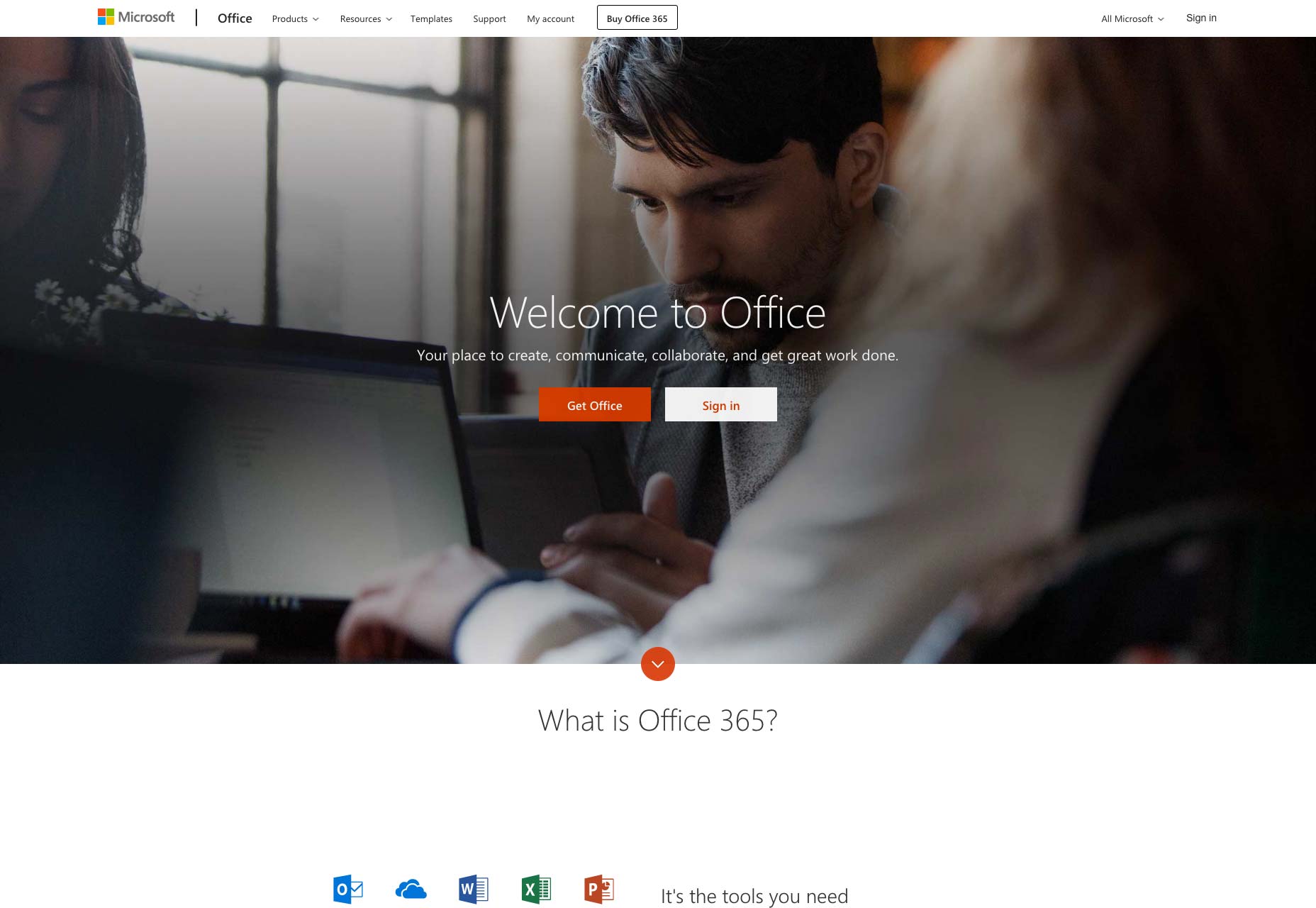
Tech folklore has it that the landing page was born in late 2003, when Microsoft created the concept in response to poor online sales of Office. Realising that the buying process had to be smoother and more direct, the IT giant created a separate mini-site designed specifically for buying its flagship product.

Whilst the campaign undoubtedly worked for Microsoft—we’re still stuck with Office, after all—it’s hard to believe nobody had tried the concept before, so basic is the marketing principle behind it. Surely, people had been using single, direct sales pages before 2003, even if that was their entire web presence?

Either way, catchy, compelling landing pages that convert clicks into contracts are still a must-have for any online business. The problem is that, like any marketing concept, landing pages are in a constant evolutionary race with consumers. Fifteen years after Microsoft’s breakthrough, only the slickest, most original designers are winning. Many landing pages have become formulaic, and for the average business the traditional landing page may no longer be a suitable approach.

The Early Years

In the years following Microsoft’s discovery, landing pages proliferated. And in the true style of the early Internet, they were messy, shouty affairs. Often several different brash sales pitches competed for prominence with the obligatory glowing testimonials, all on a white background.

That started to change in 2009, a year in which the landing page seemingly graduated and became professionalised. Almost overnight, a series of specialist companies sprang up and started to offer recognisably modern design. Messages became shorter, funny even. The background turned from white to hues of blue, and the photos came into focus.

Along with these visual improvements, the marketing concept was refined too. By running sites in parallel—known as A/B testing—designers literally got a scientific answer as to what worked best.

The ‘Rules’ of Writing a Landing Page

There is a lot of advice available online regarding the writing of compelling, high-converting landing pages. It comes from experienced marketeers and it has worked very well in the past. Certain elements of this advice effectively serve to define what we understand as a landing page today: A catchy headline; a punchy intro directly addressing a core customer need or desire; and a concise ‘call to action’.

Lance Jones, of Copy Hackers, recommends writing a landing page from the bottom up. He says:

Start with the goal. The call to action. The thing you want visitors to a landing page to do. Then, work backward from your button, writing only copy that will convince people to click that button. Nothing else makes it on the page. Nothing.

The ‘CTA’ is perhaps the defining characteristic of the pure landing page. While some marketeers still advise including testimonials, and telling customers exactly how you will solve their problem, others have stripped things back to the very basics: the initial page is primarily just a ‘buy’ button or an email field, even if a little bit more info is available by scrolling. Microsoft themselves have evolved towards this approach.

Short and Simple Sells

While popping a ‘buy’ button in front of the customer straight off is visually appealing, that simplicity of approach is only possible when people already know what the product is. Big companies with enough branding behind them are just providing a gateway to the product: Smaller businesses can attempt this by running social media or advertising campaigns that sell on specific points. The landing pages these campaigns point to can, in theory, be highly simplified because the selling points have already been addressed.

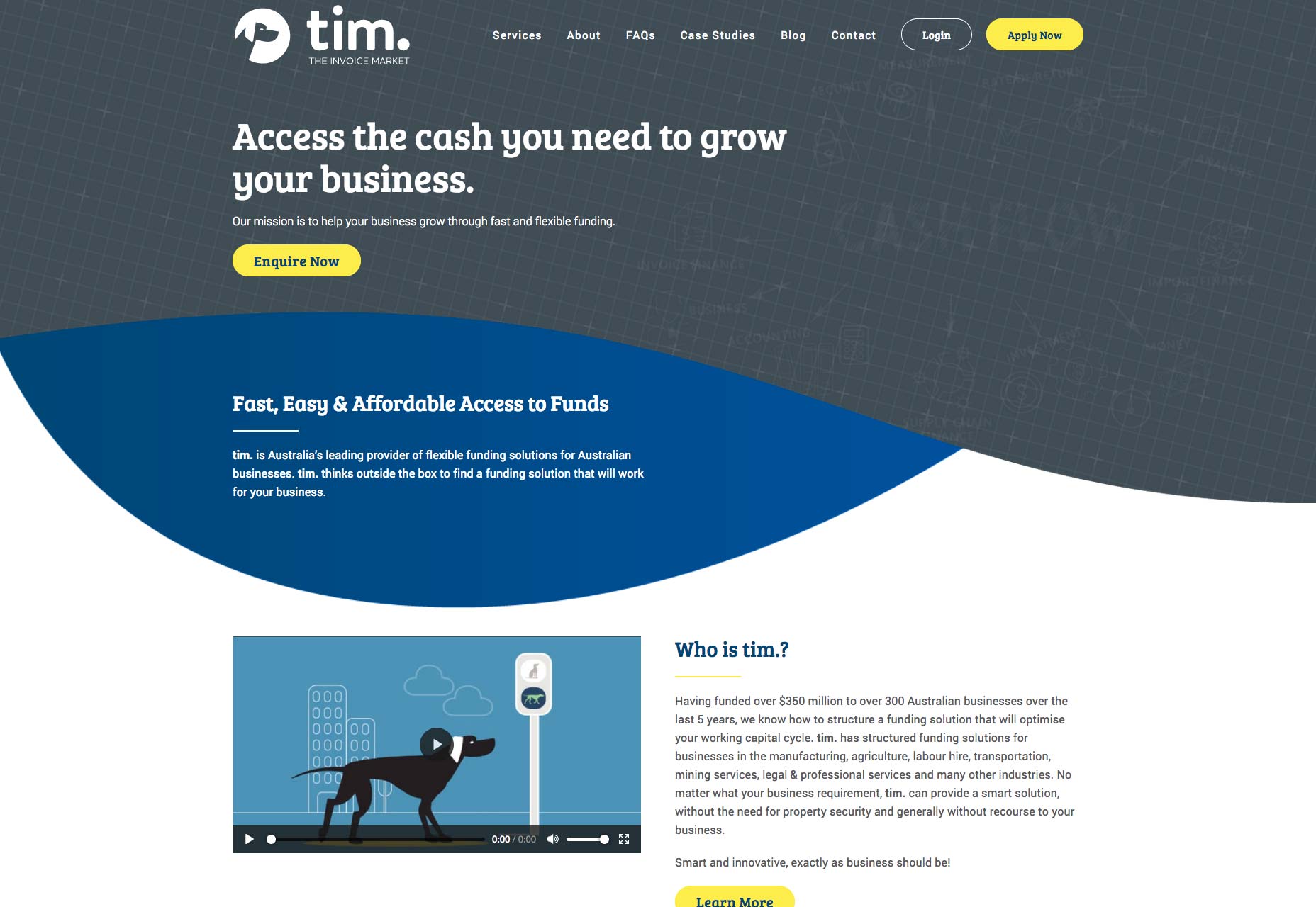
Businesses offering relatively complex and high value services will struggle to sell directly through a conventional, simple landing page., however. Their options, in the modern era, are to go for a simple first screen that then scrolls to further information set out in a visual, reassuring and intuitive way, like this Australian business finance firm; or to target something less than a full sale.

The Squeeze Page

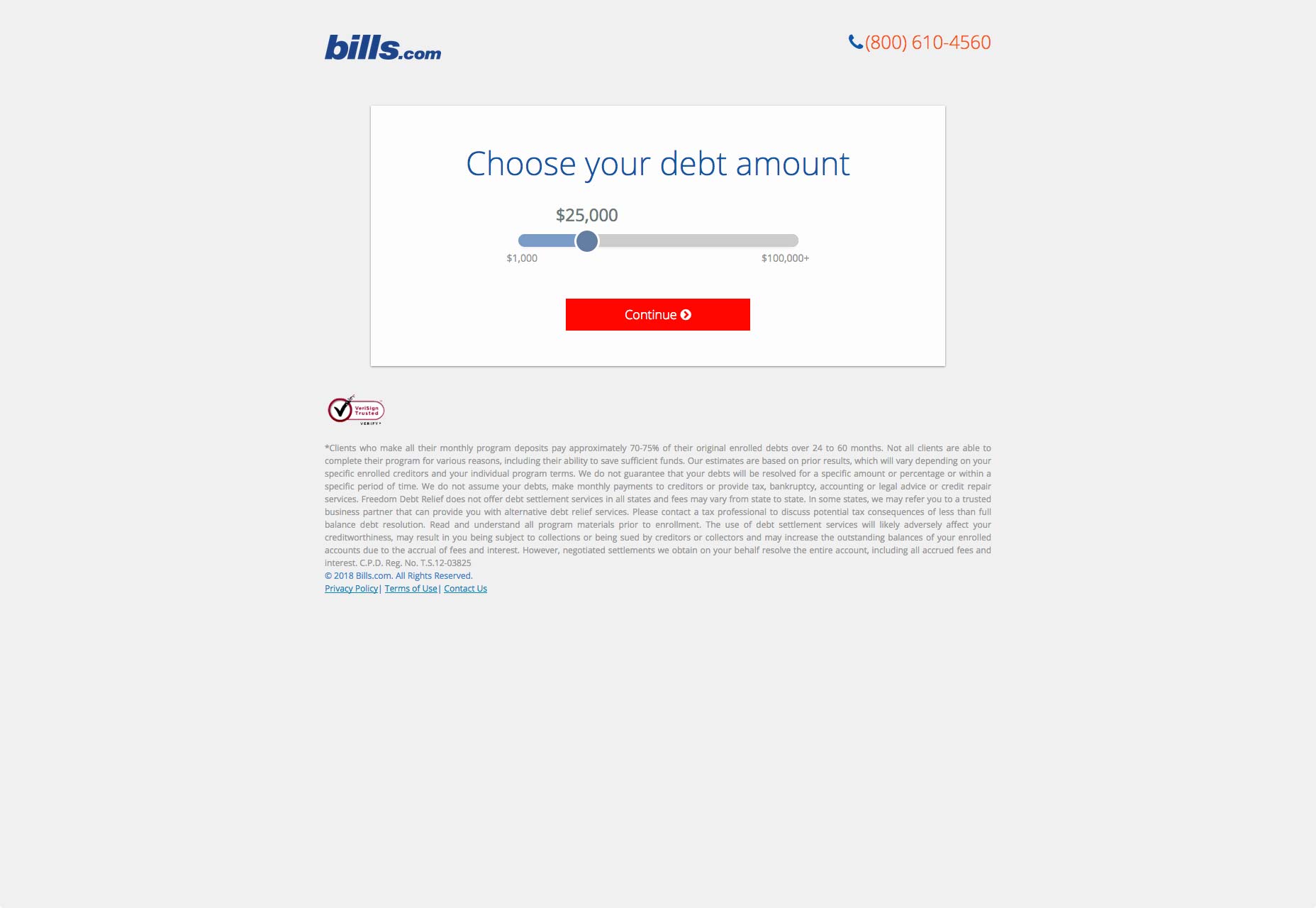
If all you want is an initial contact or an email address from a customer, you don’t need to go for a hard sell. In this example, a no-obligation opportunity to interact leads the customer into a mini-site. What marketeers call a funnel, these simple ‘squeeze pages’ have become a sub-category of the landing page.

The concept of a squeeze page is to keep things very simple, because all you want is an initial contact or, more usually, an email address. In order to do this, businesses offer a free downloadable guide; a trial version; or a no-obligation consultation, for example. For a squeeze page to work, is has to be clear that what is being offered is free.

Linking to a Search

There is one further approach for more complex services, and that is to simply start the customer’s search for them. Airlines and online booking companies do this: imagine how Hotels.com will load on your screen if you search for ”Paris hotels” and then click on the company’s ad.

The Landing Page Links Debate

Most landing pages have links—84% of them, if you believe the latest count, which seems reasonable.

But a series of A/B tests by HubSpot, using their own landing pages, suggested that at best links made no difference and at worst they were an unwelcome distraction: when it came to free trials and demos, the versions without links performed 16% and 28% better in terms of conversions, respectively.

Tests by other companies have shown even bigger jumps in conversion rate when all links are removed. But these tests have no way of accounting for cautious potential customers who want to browse your site a little before they commit to buying—because these potential big spenders would eventually contact you via a different page, or perhaps by a phone call.

Unsurprisingly therefore, the inclusion or otherwise of links—even to your own homepage, remains a hotly contested topic for landing page experts. Online marketer Neil Patel suggests that the only clickable link on a landing page should be your call to action, and possibly a link to more information for those who are undecided:

Forget about links to everything else…all they do is clutter up the page and increase the likelihood that your visitors will abandon your landing page without converting.

Pages Must Fit the Business

What seems clear is that as landing pages have evolved, they have become more varied. Despite ruthless live testing, no secret formula has emerged. Indeed, several different approaches have thrived in response to the many and varied businesses that use them.

Karla Cook, writing for Hubspot this year, said:

Best practices will tell you that both short and long forms perform well—it all depends on whether you want to generate a lot of (potentially) lower-quality form submissions, or a smaller number of higher-quality submissions.
If you’re an online business that can offer something immediate, therefore, landing pages work and you want to keep them simple. It seems brutal, but the statistics suggest that, if you can offer a free trial, a demo version, or if you basic product is basically free, then all you need is a catchy page that looks good, loads quickly and is highly functional and intuitive.

If you’re in a more complex sector and you want this, it’s even worth creating a freebie—usually an e-book or guide—as a way of collecting email addresses with this approach.

On the other hand, if you provide complex products and are essentially hoping that customers will call your expert advisers—or you, if you’re a small business—and discuss their needs in more depth, you’ll want them to be able to check you out in full. Arguably, what you will then build is not a true landing page. But if it is designed to meet specific traffic, then the basic rules are still applicable.

Neil Patel sums it up:

Your copy should be clear and concise. It should be persuasive, too. Landing pages are not the place to show off your creativity, unless that creativity is clear, concise, and persuasive. Leave the creative turns-of-phrase for your blog.

Add Realistic Chalk and Sketch Lettering Effects with Sketch’it – only $5!

Source

Categories: Designing, Others Tags:

Understanding the difference between grid-template and grid-auto

October 22nd, 2018 No comments

Ire Aderinokun:

Within a grid container, there are grid cells. Any cell positioned and sized using the grid-template-* properties forms part of the explicit grid. Any grid cell that is not positioned/sized using this property forms part of the implicit grid instead.

Understanding explicit grids and implicit grids is powerful. This is my quicky take:

  • Explicit: you define a grid and place items exactly where you want them to go.
  • Implicit: you define a grid and let items fall into it as they can.

Grids can be both!

Direct Link to ArticlePermalink

The post Understanding the difference between grid-template and grid-auto appeared first on CSS-Tricks.

Categories: Designing, Others Tags:

Hard Costs of Third-Party Scripts

October 22nd, 2018 No comments

Dave Rupert:

Every client I have averages ~30 third-party scripts but discussions about reducing them with stakeholders end in “What if we load them all async?” This is a good rebuttal because there are right and wrong ways to load third-party scripts, but there is still a cost, a cost that’s passed on to the user. And that’s what I want to investigate.

Yes, performance is a major concern. But it’s not just the loading time and final weight of those scripts, there are all sorts of concerns. Dave lists privacy, render blocking, fighting for CPU time, fighting for network connection threads, data and battery costs, and more.

Dave’s partner Trent Walton is also deep into thinking about third-party scripts, which he talked about a bit on the latest ShopTalk Show.

Check out Paolo Mioni’s investigation of a single script and the nefarious things it can do.

Direct Link to ArticlePermalink

The post Hard Costs of Third-Party Scripts appeared first on CSS-Tricks.

Categories: Designing, Others Tags:

Building Skeleton Components with React

October 22nd, 2018 No comments

One of the advantages of building a Single Page Application (SPA) is the way navigating between pages is extremely fast. Unfortunately, the data of our components is sometimes only available after we have navigated to a specific part of our application. We can level up the user’s perceived performance by breaking the component into two pieces: the container (which displays a skeleton view when it’s empty) and the content. If we delay the rendering of the content component until we have actually received the content required, then we can leverage the skeleton view of the container thus boosting the perceived load time!

Let’s get started in creating our components.

What we’re making

We will be leveraging the skeleton component that was built in the article, “Building Skeleton Screens with CSS Custom Properties.”

This is a great article that outlines how you can create a skeleton component, and the use of the :empty selector allows us to cleverly use {this.props.children} inside of our components so that the skeleton card is rendered whenever the content is unavailable.

See the Pen React 16 — Skeleton Card – Final by Mathias Rechtzigel (@MathiasaurusRex) on CodePen.

Creating our components

We’re going to create a couple of components to help get us started.

  1. The outside container (CardContainer)
  2. The inside content (CardContent)

First, let’s create our CardContainer. This container component will leveraging the :empty pseudo selector so it will render the skeleton view whenever this component doesn’t receive a child.

class CardContainer extends React.Component {
  render() {
    return (
      <div className="card">
        {this.props.children}
      </div>
    );
  }
}

Next, let’s create our CardContent component, which will be nested inside of our CardContainer component.

class CardContent extends React.Component {
  render() {
    return (
      <div className="card--content">
        <div className="card-content--top">
          <div className="card-avatar">
            <img 
              className="card-avatar--image"
              src={this.props.avatarImage}
              alt="" />
            <span>{this.props.avatarName}</span>
          </div>
        </div>
        <div className="card-content--bottom">
          <div className="card-copy">
            <h1 className="card-copy--title">{this.props.cardTitle}</h1>
            <p className="card-copy--description">{this.props.cardDescription}</p>
          </div>
          <div className="card--info">
            <span className="card-icon">
              <span className="sr-only">Total views: </span>
              {this.props.countViews}
            </span>
            <span className="card-icon">
              <span className="sr-only">Total comments: </span>
              {this.props.countComments}
            </span>
          </div>
        </div>
      </div>
    );
  }
}

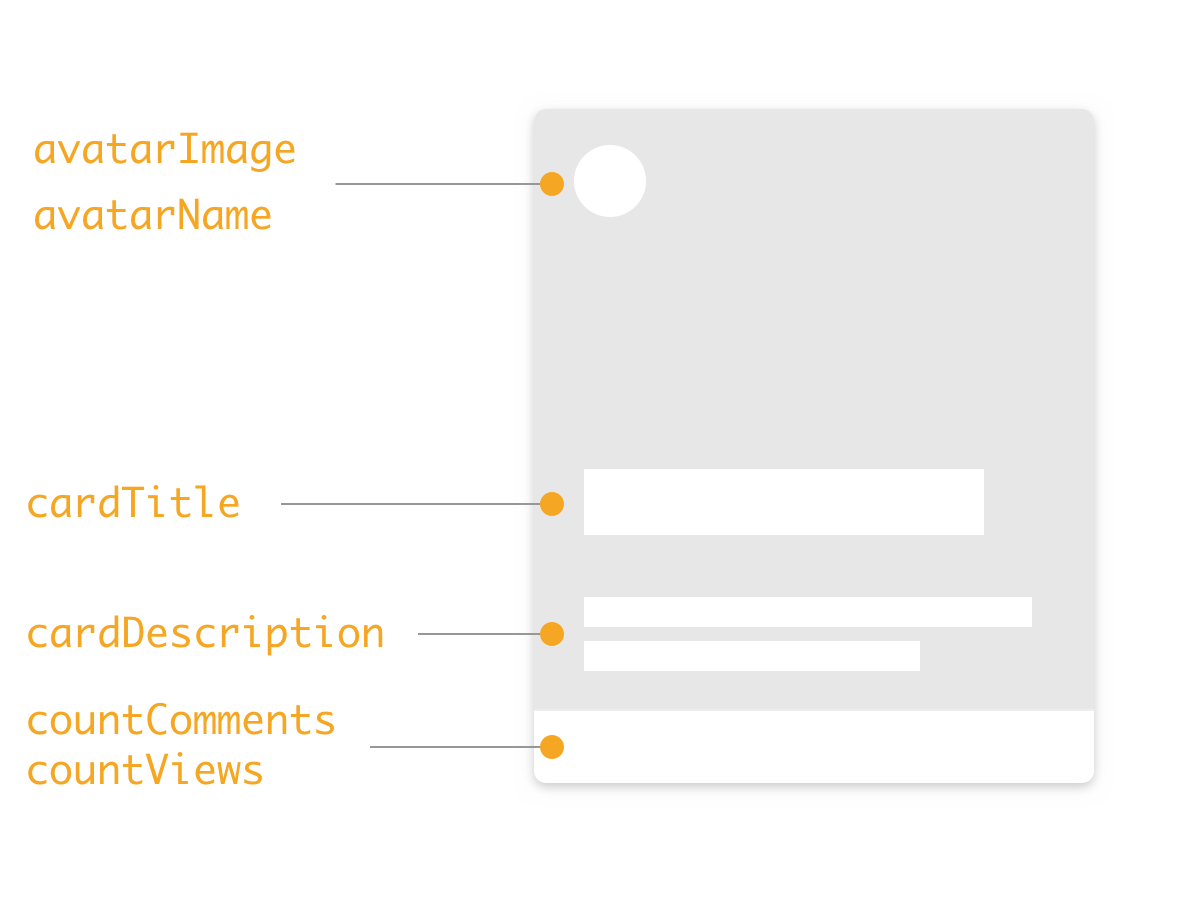
As you can see, there’s a couple of spaces for properties that can be accepted, such as an avatar image and name and the content of the card that is visible.

Putting the components together allows us to create a full card component.

<CardContainer>
  <CardContent
    avatarImage='path/to/avatar.jpg'
    avatarName='FirstName LastName'
    cardTitle='Title of card'
    cardDescription='Description of card'
    countComments='XX'
    countViews='XX'
  />
</CardContainer>

See the Pen React 16 — Skeleton Card – Card Content No State by Mathias Rechtzigel (@MathiasaurusRex) on CodePen.

Using a ternary operator to reveal contents when the state has been loaded

Now that we have both a CardContainer and CardContent component, we have split our card into the necessary pieces to create a skeleton component. But how do we swap between the two when content has been loaded?

This is where a clever use of state and ternary operators comes to the rescue!

We’re going to do three things in this section:

  1. Create a state object that is initially set to false
  2. Update our component to use a ternary operator so that the cardContent component will not be rendered when the state is false
  3. Set the state to be the content of our object once we receive that information

We want to set the default state of our content to be set to false. This hides the card content and allows the CSS :empty selector to do it’s magic.

this.state = {
  cardContent: false
};

Now we’re got to update our CardContainer children to include a ternary operator. In our case, it looks at this.state.cardContent to see whether or not it resolves to true or false. If it’s true, it does everything on the left side of the colon (:). Conversely, if it’s false, it does everything on the right hand of the colon. This is pretty useful because objects will resolve to true and if we set the initial state to false, then our component has all the conditions it needs to implement a skeleton component!

Let’s combine everything together inside of our main application. We wont worry about the state inside CardContent quite yet. We’ll bind that to a button to mimic the process of fetching content from an API.

<CardContainer>
  {this.state.cardContent 
    ? 
      <CardContent 
      avatarImage={this.state.cardContent.card.avatarImage}
      avatarName={this.state.cardContent.card.avatarName}
      cardTitle={this.state.cardContent.card.cardTitle}
      cardDescription={this.state.cardContent.card.cardDescription}
      countComments={this.state.cardContent.card.countComments}
      countViews={this.state.cardContent.card.countViews}/>
    : 
    null
  }          
</CardContainer>

Boom! As you can see, the card is rendering as the skeleton component since the state of cardContent is set to false. Next, we’re going to create a function that sets the state of cardContent to a mock Card Data Object (dummyCardData):

populateCardContent = (event) => {
    const dummyCardData =  {
      card: {
        avatarImage: "https://gravatar.com/avatar/f382340e55fa164f1e3aef2739919078?s=80&d=https://codepen.io/assets/avatars/user-avatar-80x80-bdcd44a3bfb9a5fd01eb8b86f9e033fa1a9897c3a15b33adfc2649a002dab1b6.png",
        avatarName: "Mathias Rechtzigel",
        cardTitle: "Minneapolis",
        cardDescription:"Winter is coming, and it will never leave",
        countComments:"52",
        countViews:"32"
      }
    }
    const cardContent = dummyCardData
    this.setState({
      cardContent
    })
  }

In this example, we’re setting the state inside of a function. We could also leverage React’s lifecycle methods to populate the component’s state. We would have to take a look at the appropriate method to use, depending on our requirements. For example, if I’m loading an individual component and want to get the content from the API, then we would use the ComponentDidMount lifecycle method. As the documentation states, we have to be careful of using this lifecycle method in this way as it could cause an additional render — but setting the initial state to false should prevent that from happening.

See the Pen React 16 — Skeleton Card – Final by Mathias Rechtzigel (@MathiasaurusRex) on CodePen.

The second card in the list is hooked up to the click event that sets the cardContent state. Once the state is set to the content’s object, the skeleton version of the card disappears and the content is shown, ensuring the that the user doesn’t see a flash of UI (FLU season is coming so we don’t want to give the users the F.L.U.!).

Let’s review

We covered quite a bit, so let’s recap what we did.

  1. We created a CardContainer. The container component is leveraging the :empty pseudo selector so that it renders the skeleton view of the component when it is empty.
  2. We created the CardContent component that is nested within CardContainer that we pass our state to.
  3. We set the default state of the cardContent to false
  4. We use a ternary operator to render the inner content component only when we receive the content and put it in our cardContent state object.

And there we have it! A perceived boost in performance by creating an interstitial state between the UI being rendered and it receiving the data to populate content.

The post Building Skeleton Components with React appeared first on CSS-Tricks.

Categories: Designing, Others Tags:

What does Stack Overflow want to be when it grows up?

October 22nd, 2018 No comments
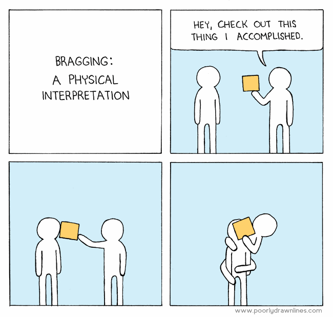
bragging

I sometimes get asked by regular people in the actual real world what it is that I do for a living, and here’s my 15 second answer:

We built a sort of Wikipedia website for programmers to post questions and answers. It’s called Stack Overflow.

As of last month, it’s been 10 years since Joel Spolsky and I started Stack Overflow. I currently do other stuff now, and I have since 2012, but if I will be known for anything when I’m dead, clearly it is going to be good old Stack Overflow.

Here’s where I’d normally segue into a bunch of rah-rah stuff about how great Stack Overflow is, and thus how implicitly great I am by association for being a founder, and all.

I do not care about any of that.

What I do care about, though, is whether Stack Overflow is useful to working programmers. Let’s check in with one of my idols, John Carmack. How useful is Stack Overflow, from the perspective of what I consider to be one of the greatest living programmers?

@StackExchange @codinghorror SO has probably added billions of dollars of value to the world in increased programmer productivity.

— John Carmack (@ID_AA_Carmack) September 17, 2013

I won’t lie, September 17th, 2013 was a pretty good day. I literally got chills when I read that, and not just because I always read the word “billions” in Carl Sagan’s voice. It was also pleasantly the opposite of pretty much every other day I’m on Twitter, scrolling through an oppressive, endless litany of shared human suffering and people screaming at each other. Which reminds me, I should check my Twitter and see who else is wrong on the Internet today.

I am honored and humbled by the public utility that Stack Overflow has unlocked for a whole generation of programmers. But I didn’t do that.

  • You did, when you contributed a well researched question to Stack Overflow.
  • You did, when you contributed a succinct and clear answer to Stack Overflow.
  • You did, when you edited a question or answer on Stack Overflow to make it clearer.

All those “fun size” units of Q&A collectively contributed by working programmers from all around the world ended up building a Creative Commons resource that truly rivals Wikipedia within our field. That’s … incredible, actually.

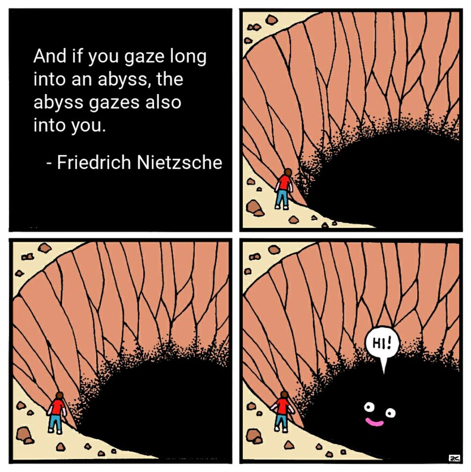
But success stories are boring. The world is filled with people that basically got lucky, and subsequently can’t stop telling people how it was all of their hard work and moxie that made it happen. I find failure much more instructive, and when building a business and planning for the future, I take on the role of Abyss Domain Expert™ and begin a staring contest. It’s just a little something I like to do, you know … for me.

abyss-oc

Thus, what I’d like to do right now is peer into that glorious abyss for a bit and introspect about the challenges I see facing Stack Overflow for the next 10 years. Before I begin, I do want to be absolutely crystal clear about a few things:

  1. I have not worked at Stack Overflow in any capacity whatsoever since February 2012 and I’ve had zero day to day operational input since that date, more or less by choice. Do I have opinions about how things should be done? Uh, have you met me? Do I email people every now and then about said opinions? I might, but I honestly do try to keep it to an absolute minimum, and I think my email archive track record here is reasonable.

  2. The people working at Stack are amazing and most of them (including much of the Stack Overflow community, while I’m at it) could articulate the mission better — and perhaps a tad less crankily — than I could by the time I left. Would I trust them with my life? No. But I’d trust them with Joel’s life!

  3. The whole point of the Stack Overflow exercise is that it’s not beholden to me, or Joel, or any other Great Person. Stack Overflow works because it empowers regular everyday programmers all over the world, just like you, just like me. I guess in my mind it’s akin to being a parent. The goal is for your children to eventually grow up to be sane, practicing adults who don’t need (or, really, want) you to hang around any more.

  4. Understand that you’re reading the weak opinions strongly held the strong opinions weakly held of a co-founder who spent prodigious amounts of time working with the community in the first four years of Stack Overflow’s life to shape the rules and norms of the site to fit their needs. These are merely my opinions. I like to think they are informed opinions, but that doesn’t necessarily mean I can predict the future, or that I am even qualified to try. But it ain’t gonna stop me, either!

Stack Overflow is a wiki first

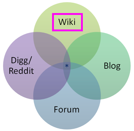
Stack Overflow ultimately has much more in common with Wikipedia than a discussion forum. By this I mean questions and answers on Stack Overflow are not primarily judged by their usefulness to a specific individual, but by how many other programmers that question or answer can potentially help over time. I tried as hard as I could to emphasize this relationship from launch day in 2008. Note who has top billing in this venn diagram.

stack-overflow-venn-diagram

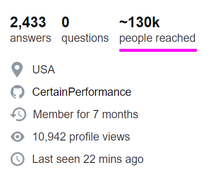
Stack Overflow later added a super neat feature to highlight this core value in user profiles, where it shows how many other people you have potentially helped with your contributed questions and answers so far.

stackoverflow-people-reached-profile-stat-1

The most common complaints I see about Stack Overflow are usually the result of this fundamental misunderstanding about who the questions and answers on the site are ultimately for, and why there’s so much strictness involved in the whole process.

I wish more people understood that the goal of Stack Overflow is not “answer my question” but “let’s collaboratively build an artifact that will benefit future coders”. Perhaps SO could be doing more to educate people about this.

— Jeff Atwood (@codinghorror) April 30, 2018

The responsibility for this misunderstanding is all on Stack Overflow (and by that also mean myself, at least up until 2012). I guess the logic is that “every programmer has surely seen, used, and understands Stack Overflow by now, 10 years in” but … I think that’s a highly risky assumption to make. New programmers are minted every second of every day. Complicating matters further, there are three tiers of usage at Stack Overflow, from biggest to smallest, in inverted pyramid style:

  1. I passively search for programming answers.

    Passively searching and reading highly ranked Stack Overflow answers as they appear in web search results is arguably the primary goal of Stack Overflow. If Stack Overflow is working like it’s supposed to, 98% of programmers should get all the answers they need from reading search result pages and wouldn’t need to ask or answer a single question in their entire careers. This is a good thing! Great, even!

  2. I participate on Stack Overflow when I get stuck on a really hairy problem and searching isn’t helping.

    Participating only at those times when you are extra stuck is completely valid. However, I feel this level is where most people tend to run into difficulty on Stack Overflow, because it involves someone who may not be new to Stack Overflow per se, but is new to asking questions, and also at the precise time of stress and tension for them where they must get an answer due to a problem they’re facing … and they don’t have the time or inclination to deal with Stack Overflow’s strict wiki type requirements for research effort, formatting, showing previous work, and referencing what they found in prior searches.

  3. I participate on Stack Overflow for professional development.

    At this level you’re talking about experienced Stack Overflow users who have contributed many answers and thus have a pretty good idea of what makes a great question, the kind they’d want to answer themselves. As a result, they don’t tend to ask many questions because they self-medicate through exhaustive searching and research, but when they do their questions are exemplary.

(There’s technically a fourth tier here, for people who want to selflessly contribute creative commons questions and answers to move the entire field of software development forward for the next generation of software developers. But who has time for saints ?, y’all make the rest of us look bad, so knock it off already Skeet.)

It wouldn’t shock me at all if people spent years happily at tier 1 and then got a big unpleasant surprise when reaching tier 2. The primary place to deal with this, in my opinion, is a massively revamped and improved ask page. It’s also fair to note that maybe people don’t understand that they’re signing up for a sizable chunk of work by implicitly committing to the wiki standard of “try to make sure it’s useful to more people than just yourself” when asking a question on Stack Overflow, and are then put off by the negative reaction to what others view as an insufficiently researched question.

Stack Overflow absorbs so much tension from its adoption of wiki standards for content. Even if you know about that requirement up front, it is not always clear what “useful” means, in the same way it’s not always clear what topics, people, and places are deserving of a Wikipedia page. Henrietta Lacks, absolutely, but what about your cousin Dave in Omaha with his weirdo PHP 5.6 issue?

Over time, duplicates become vast fields of landmines

Here’s one thing I really, really saw coming and to be honest with you I was kinda glad I left in 2012 before I had to deal with it because of the incredible technical difficulty involved: duplicates. Of all the complaints I hear about Stack Overflow, this is the one I am most sympathetic to by far.

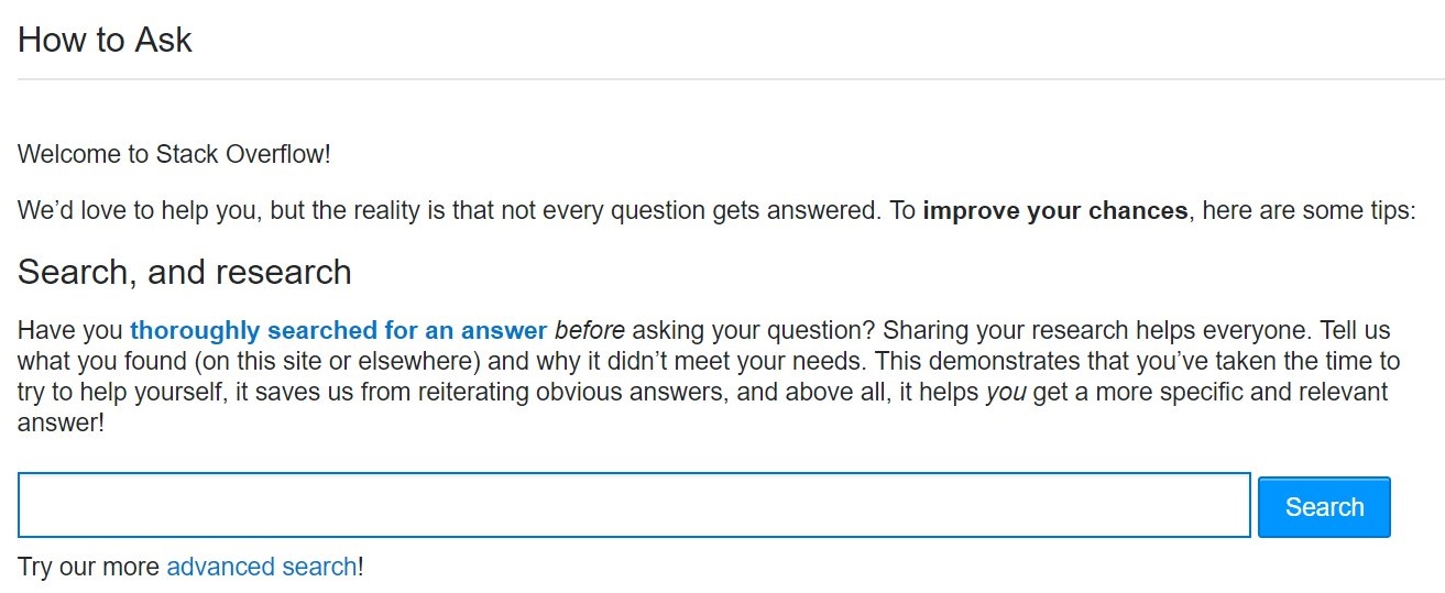
If you accept that Stack Overflow is a wiki type system, then for the same reasons that you obviously can’t have five different articles about Italy on Wikipedia, Stack Overflow can’t accept duplicate questions on the exact same programming problem. While there is a fair amount of code to do pre-emptive searches as people type in questions, plus many exhortations to search before you ask, with an inviting search field and button right there on the mandatory page you see before asking your first question …

stack-overflow-how-to-ask

… locating and identifying duplicate content is an insanely difficult problem even for a company like Google that’s done nothing but specialize in this exact problem for, what, 20 years now, with a veritable army of the world’s most talented engineers.

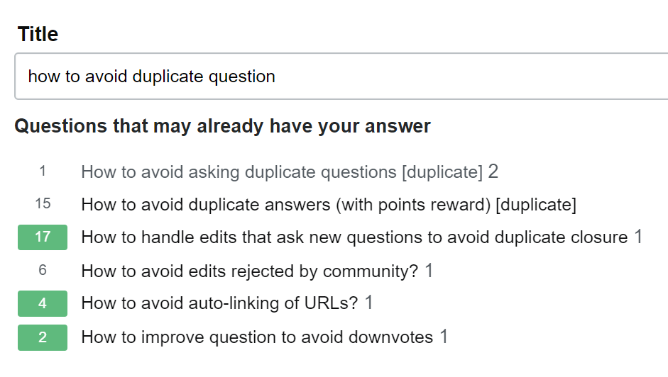
When you’re asking a question on a site that doesn’t allow duplicate questions, the problem space of a site with 1 million existing questions is rather different from a site with 10 million existing questions … or even 100 million. Your mission to ask a single unique question goes from mildly difficult to mission almost impossible, because that question needs to thread a narrow path through this vast, enormous field of prior art questions without stepping on any of the vaguely similar looking landmines in the process.

stackoverflow-asking-duplicate-question

But wait! It gets harder!

  • Some variance in similar-ish questions is OK, because 10 different people will ask a nearly identical question using 10 different sets of completely unrelated words with no overlap. I know, it sounds crazy, but trust me: humans are amazing at this. We want all those duplicates to exist so they can point to the primary question they are a duplicate of, while still being valid search targets for people who ask questions with unusual or rare word choices.

  • It can be legitimately difficult to determine if your question is a true duplicate. How much overlap is enough before one programming question is a duplicate of another? And by whose definition? Opinions vary. This is subject to human interpretation, and humans are.. unreliable. Nobody will ever be completely happy with this system, pretty much by design. That tension is baked in permanently and forever.

I don’t have any real answers on the duplicate problem, which only gets worse over time. But I will point out that there is plenty of precedent on the Stack Exchange network for splitting sites into “expert” and “beginner” areas with slightly different rulesets. We’ve seen this for Math vs. MathOverflow, English vs. English Learners, Unix vs. Ubuntu… perhaps it’s time for a more beginner focused Stack Overflow where duplicates are less frowned upon, and conversational rules are a bit more lenient?

Stack Overflow is a competitive system of peer review

Stack Overflow was indeed built to be a fairly explicitly competitive system, with the caveat that “there’s always more than one way to do it.” This design choice was based on my perennial observation that the best way to motivate any programmer .. is to subtly insinuate that another programmer could have maybe done it better.

geek-hero-motivating-programmers

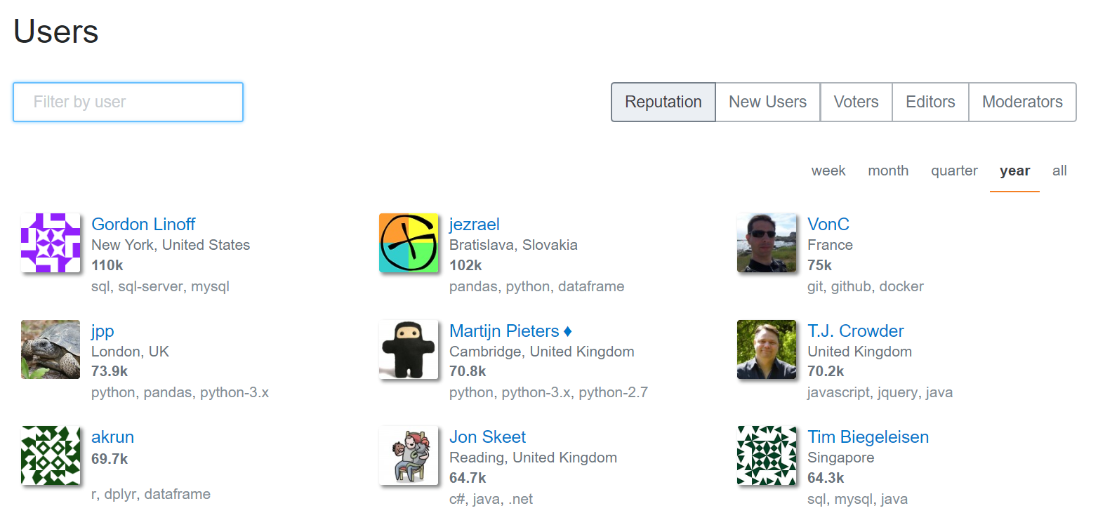
This is manifested in the public reputation system on Stack Overflow, the incredible power of a number printed next to someone’s name, writ large. All reputation in Stack Overflow comes from the recognition of your peers, never the “system”.

stack-overflow-top-rep-by-year

Once your question is asked, or your answer is posted, it can then be poked, prodded, edited, flagged, closed, opened, upvoted, downvoted, folded and spindled by your peers. The intent is for Stack Overflow to be a system of peer review and friendly competition, like a code review from a coworker you’ve never met at a different division of the company. It’s also completely fair for a fellow programmer to question the premise of your question, as long as it’s done in a nice way. For example, do you really want to use that regular expression to match HTML?

I fully acknowledge that competitive peer review systems aren’t for everyone, and thus the overall process of having peers review your question may not always feel great, depending on your circumstances and background in the field — particularly when combined with the additional tensions Stack Overflow already absorbed from its wiki elements. Kind of a double whammy there.

I’ve heard people describe the process of asking a question on Stack Overflow as anxiety inducing. To me, posting on Stack Overflow is supposed to involve a healthy kind of minor “let me be sure to show off my best work” anxiety:

  • the anxiety of giving a presentation to your fellow peers
  • the anxiety of doing your best work on a test
  • the anxiety of showing up to a new job with talented coworkers on your first day
  • the anxiety of showing up on your first day at school with other students at your level

I imagine systems where there is zero anxiety involved and I can only think of jobs where I had long since stopped caring about the work and thus had no anxiety about whether I even showed for work on any given day. How can that work? Let’s just say I’m not a fan of zero-anxiety systems.

Could there be a less competitive Q&A system, a system without downvotes, a system without close votes, where there was never any anxiety about posting anything? Absolutely! I think many alternative sites should exist on the internet so people can choose an experience that matches their personal preferences and goals. Should Stack build that alternative? Has it already been built? It’s an open question; feel free to point out examples in the comments.

Stack Overflow is designed for practicing programmers

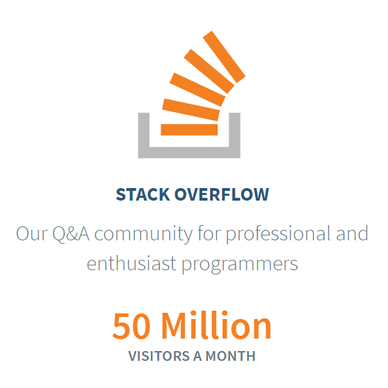
Another point of confusion that comes up a fair bit is who the intended audience for Stack Overflow actually is. That one is straightforward, and it’s been the same from day one:

stackoverflow-for-business-description

Q&A for professional and enthusiast programmers. By that we mean

People who either already have a job as a programmer, or could potentially be hired as a programmer today if they wanted to be.

Yes, in case you’re wondering, part of this was an overt business decision. To make money you must have an audience of people already on a programmer’s salary, or in the job hunt to be a programmer. The entire Stack Overflow network may be Creative Commons licensed, but it was never a non-profit play. It was always imagined as a viable business from the outset, and that’s why we launched Stack Overflow Careers only one year after Stack Overflow launched. To be honest far sooner than we should have, in retrospect. Careers has since been smartly subsumed into Stack Overflow proper at stackoverflow.com/jobs for a more integrated and most assuredly way-better-than-2009 experience.

The choice of audience wasn’t meant to be an exclusionary decision in any way, but Stack Overflow was definitely designed as a fairly strict system of peer review, which is great (IMNSHO, obviously) for already practicing professionals, but pretty much everything you would not want as a student or beginner. This is why I cringe so hard I practically turn myself inside out when people on Twitter mention that they have pointed their students at Stack Overflow. What you’d want for a beginner or a student in the field of programming is almost the exact opposite of what Stack Overflow does at every turn:

  • one on one mentoring
  • real time collaborative screen sharing
  • live chat
  • theory and background courses
  • starter tasks and exercises

These are all very fine and good things, but Stack Overflow does NONE of them, by design.

Can you use Stack Overflow to learn how to program from first principles? Well, technically you can do anything with any software. You could try to have actual conversations on Reddit, if you’re a masochist. But the answer is yes. You could learn how to program on Stack Overflow, in theory, if you are a prodigy who is comfortable with the light competitive aspects (reputation, closing, downvoting) and also perfectly willing to define all your contributions to the site in terms of utility to others, not just yourself as a student attempting to learn things. But I suuuuuuper would not recommend it. There are far better websites and systems out there for learning to be a programmer.

Could Stack Overflow build beginner and student friendly systems like this? I don’t know, and it’s certainly not my call to make. Insert thinking emoji face here!

And that’s it. We can now resume our normal non-abyss gazing. Or whatever it is that passes for normal in these times.

I hope all of this doesn’t come across as negative. Overall I’d say the state of the Stack is strong. But does it even matter what I think? As it was in 2008, so it is in 2018.

Stack Overflow is you.

This is the scary part, the great leap of faith that Stack Overflow is predicated on: trusting your fellow programmers. The programmers who choose to participate in Stack Overflow are the “secret sauce” that makes it work. You are the reason I continue to believe in developer community as the greatest source of learning and growth. You are the reason I continue to get so many positive emails and testimonials about Stack Overflow. I can’t take credit for that. But you can.

I learned the collective power of my fellow programmers long ago writing on Coding Horror. The community is far, far smarter than I will ever be. All I can ask — all any of us can ask — is to help each other along the path.

And if your fellow programmers decide to recognize you for that, then I say you’ve well and truly earned it.

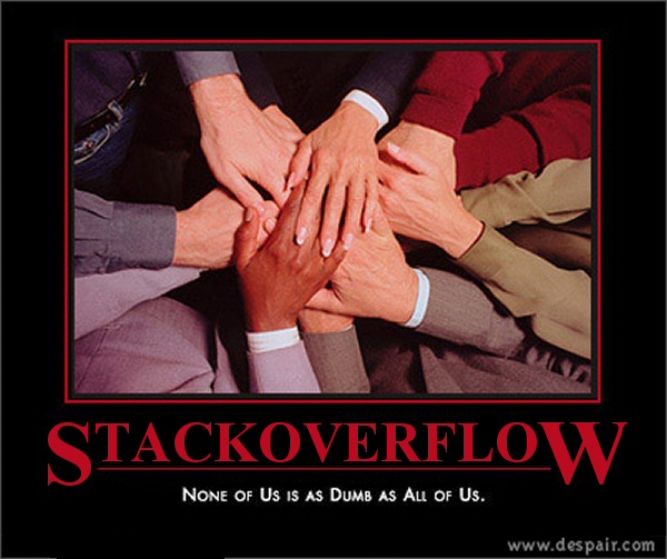
The strength of Stack Overflow begins, and ends, with the community of programmers that power the site. What should Stack Overflow be when it grows up? Whatever we make it, together.

stackoverflow-none-of-us-is-as-dumb-as-all-of-us

p.s. Happy 10th anniversary Stack Overflow!


Also see Joel’s take on 10 years of Stack Overflow with The Stack Overflow Age, A Dusting of Gamification, and Strange and Maddening Rules.

Categories: Others, Programming Tags:

20 Freshest Web Designs, October 2018

October 22nd, 2018 No comments

Fall is truly upon us in the Northern hemisphere, and Spring is in bloom in the Southern hemisphere. Bright colors, uplifting gradients, and bold color blocking have been evident through much of 2018, and October’s ramping it up another notch. This month you’ll find luxury goods, ethical concerns, large scale images and videos, and designers playing with the grid. Enjoy!

Myro

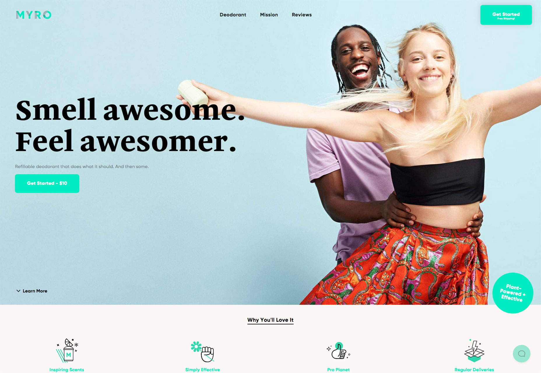
Some products are easy to sell, and some are not. Myro is the latter, a refillable deodorant. This site does an exceptional job of putting an aspirational spin on a product that many of us simply use and forget about.

Satellites

There are hundreds of thousands of objects orbiting the earth, from natural debris to parts of rockets from past space missions. Satellites is an absorbing ambient visualization of them all.

El Salado

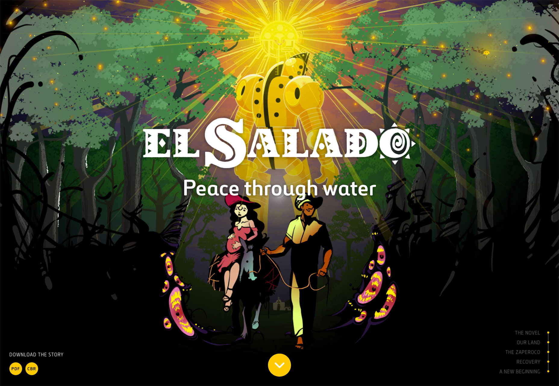
Following in the long tradition of art tackling big issues, El Salado is a graphic novel themed around social problems in provincial Columbia. The site tells the story behind the novel, and you can even download the novel.

Manolo Blahnik

Manolo Blahnik’s minimal site presents its wares on a minimal white background. It may seem like any other minimal fashion site, but the shoes are presented outside of the grid, at angles. This simple approach feels free and emphasizes the luxury on offer.

Green Party of Ireland

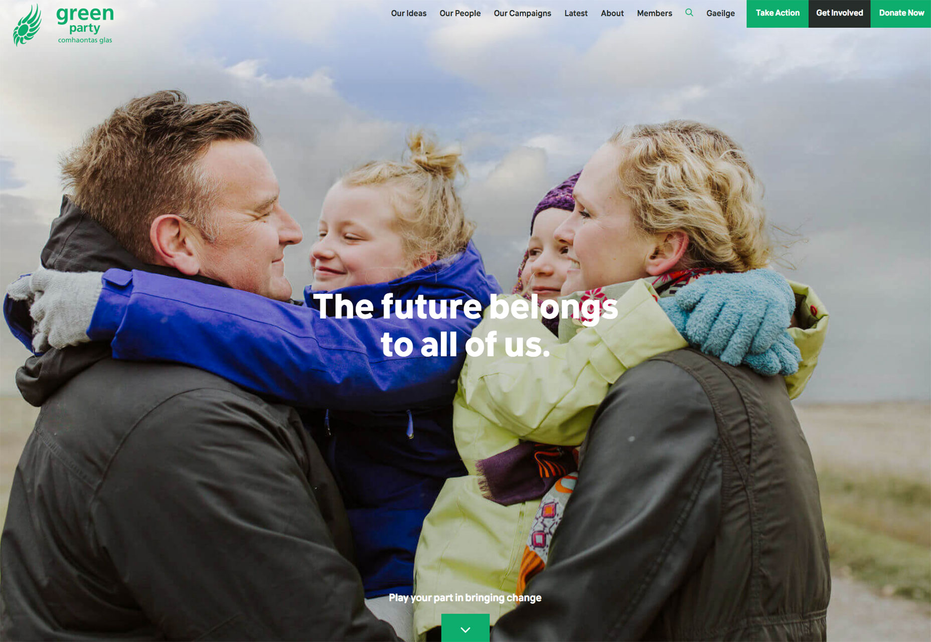
The Green Party of Ireland is the sister party of many Green parties across Europe, seeking to build a sustainable future for everyone. Their site is an exemplary example of how a non-profit can promote itself well online.

Le Grand Courtage

A site selling wine to women, Le Grand Courtage features some tres chic typography, glamorous photography, and subtle pastel tones that reflect the color of the wines on offer.

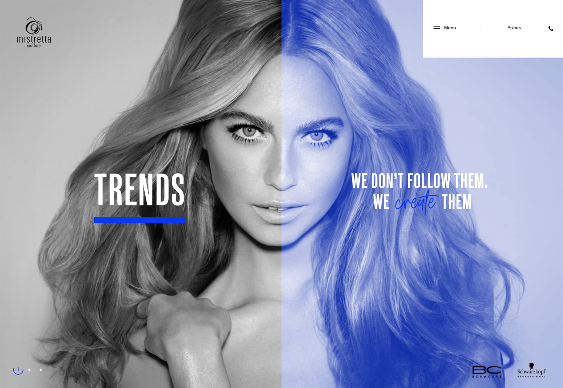
Mistretta Coiffure

Mistretta Coiffure is a fabulous site for a hair dresser. A bold grid matches a bold color palette and the home page features a really attention-grabbing liquid effect.

Monograno

Who knew that the highest quality pasta comes from 1km above sea-level… Monograno’s site features beautiful imagery and typography to sell its vision of the world’s best pasta, direct from the Italian alps.

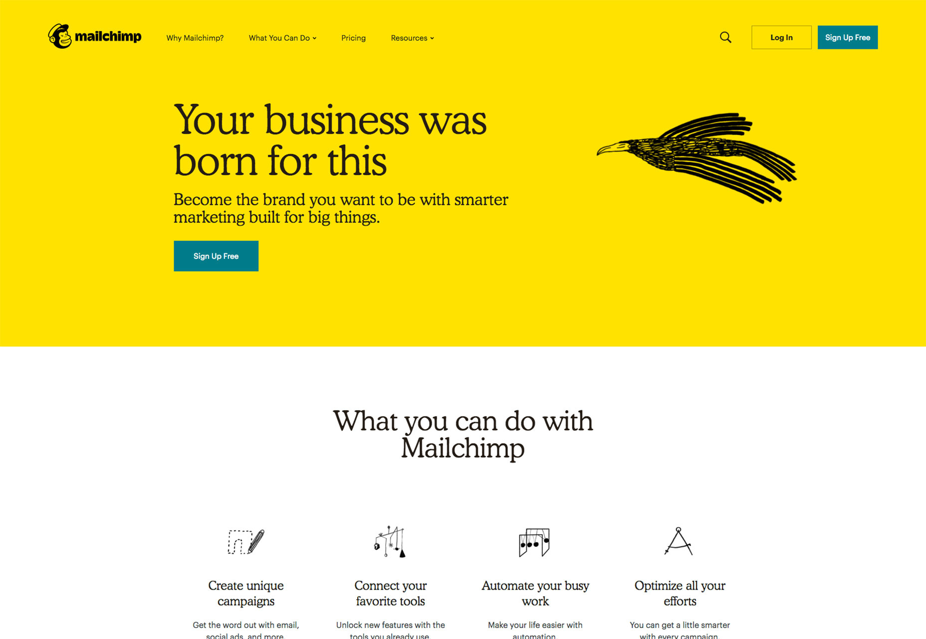
Mailchimp

Mailchimp’s redesign has been everywhere this month. The bold new color, coupled with incredible original illustrations is a brave approach to take and fits the personality of the company perfectly.

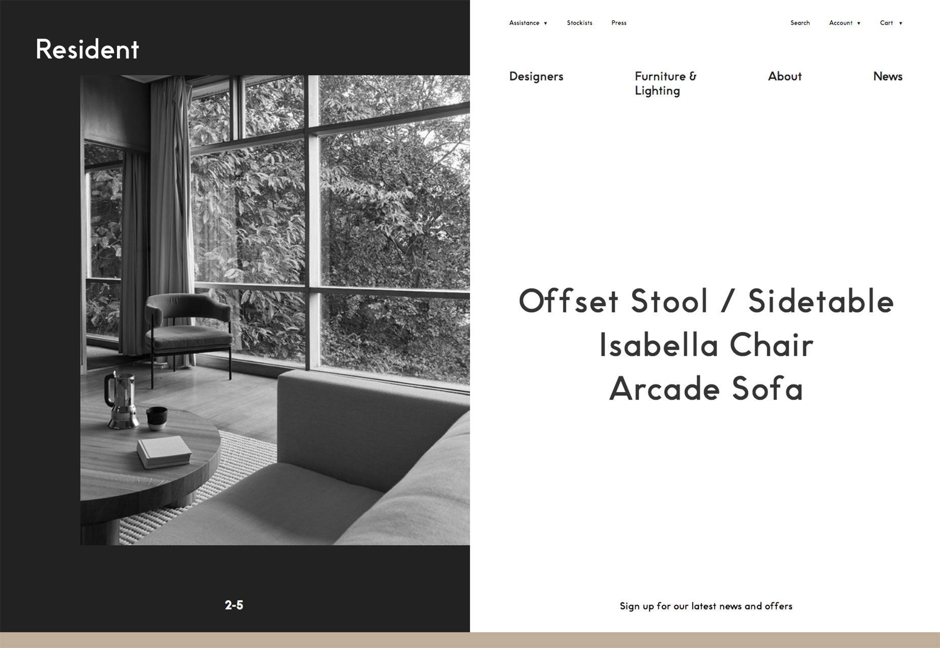
Resident

Resident is a furniture and lighting store from New Zealand. The high-design products are beautifully complemented by the strict geometric grid that underpins the asymmetrical layout.

Curadoria DiVerGente

Greeting you with an acid orange slap in the eyeballs, Curadoria DiVerGente has a nice subtle segue effect from one page to another with its initials sliding sideways on the screen. It’s great to see some bold color use.

Pre Helsinki

Celebrating the unique vision of Finland’s burgeoning fashion scene, Pre Helsinki features huge edge-to-edge videos, a superb range of fashion photography, and large-scale typography.

X

Describing itself as a diverse group of investors and entrepreneurs who are seeking to use technology to solve humanity’s problems, X’s site features inspiring videos and images, and an exceptional logomark.

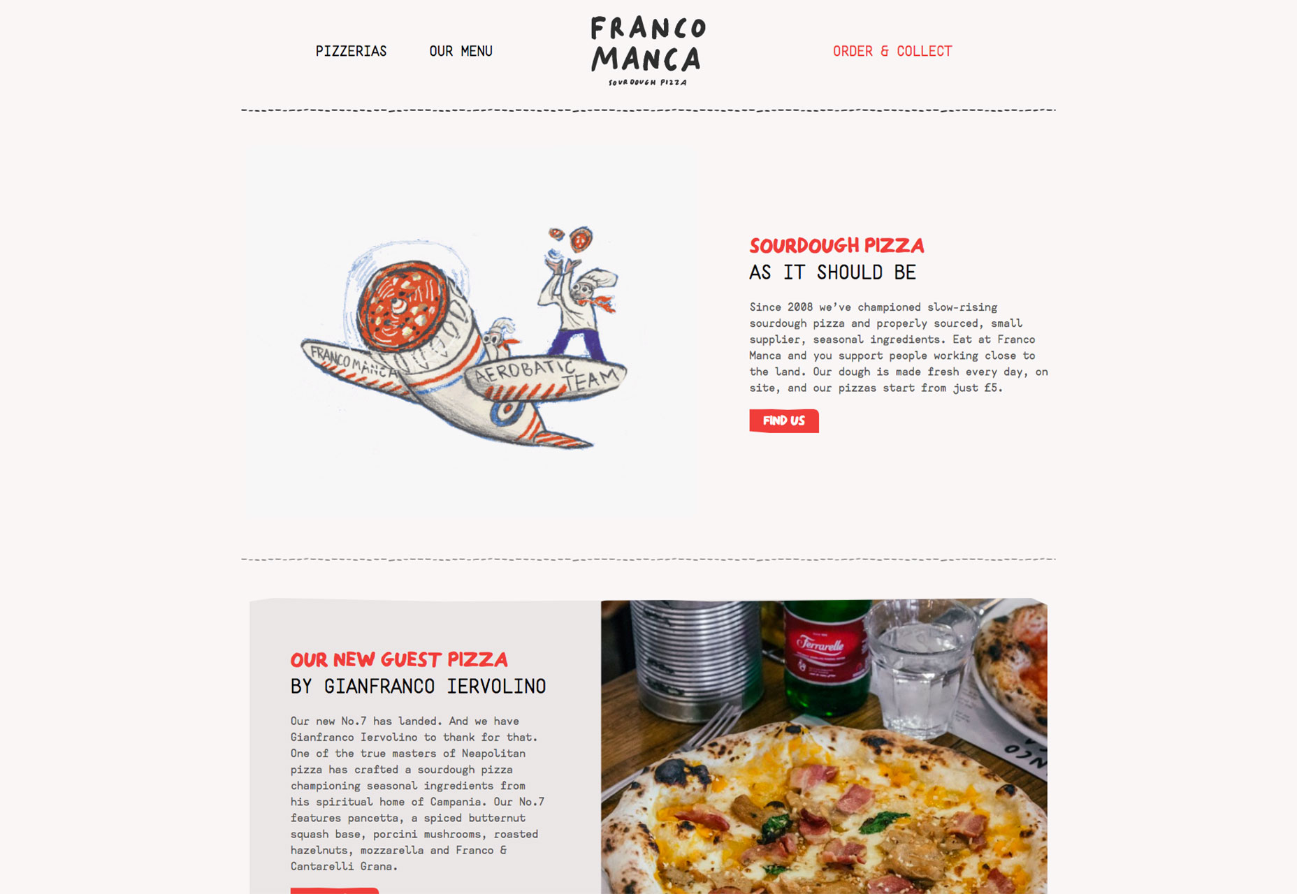
Franco Manca

There’s no pizza as enjoyable as sourdough pizza, and Franco Manca offers some of the best. The quirky site perfectly captures the offbeat approach of this growing eatery brand.

Berlin Grotesk

Berlin Grotesk is a site promoting yet another sans-serif workhorse typeface. The bold black and white design is impactful, and does a great job of selling a font family in a saturated market.

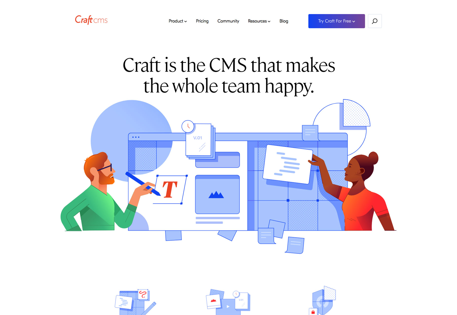
CraftCMS

Craft CMS is one of the best premium content management systems available, and its new site does a great job of walking the line between familiar design patterns, and its own unique brand approach.

FJ 1857

FJ 1857 opens with an intrusive interstitial, but skip it and you’ll be rewarded with a high-class site featuring bold typography and edge-to-edge video, all carefully integrated with a well crafted sales funnel.

AR

Andrea Reni’s site is presented as a terminal, which might be intimidating for a layman, but tells his intended audience (other developers) exactly who he is. It’s refreshing to see an unusual approach.

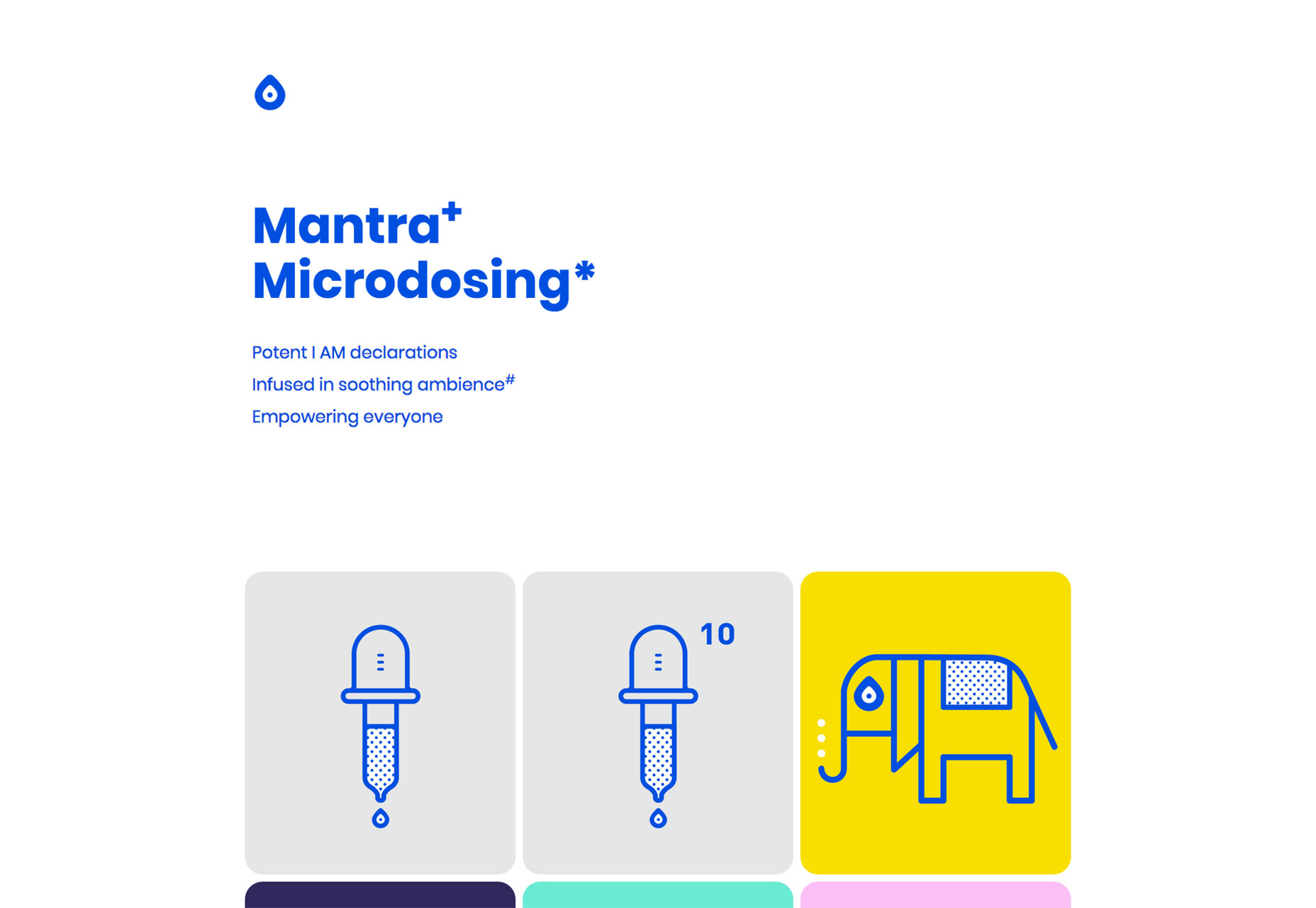
Tonik

Tonik is an app site with a difference. Rejecting the usual, screenshot of an iphone and the stock image of a girl in a coffeeshop, Tonik uses bold type, a bold blue color, and some simple illustrations to sell itself.

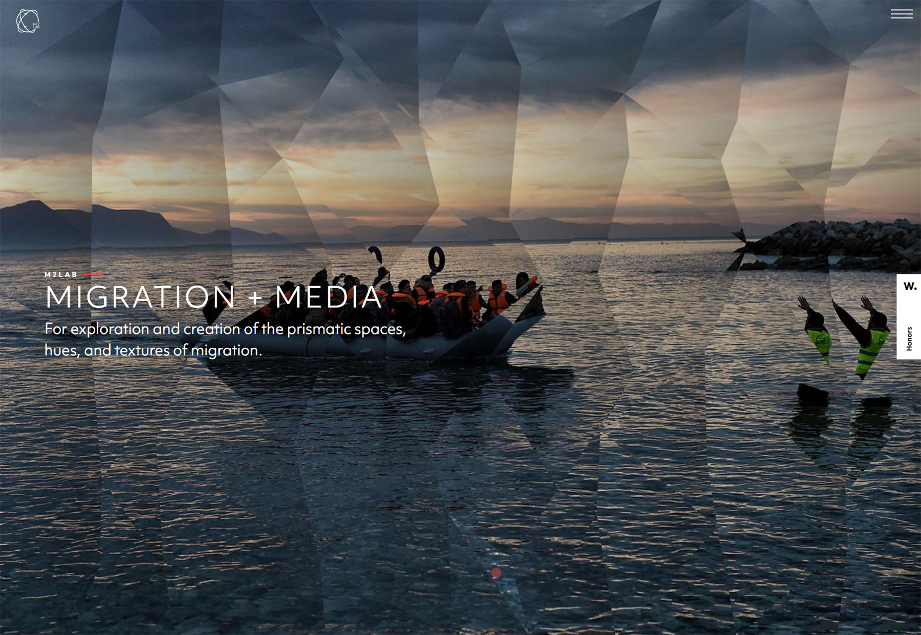
M2Lab

M2Lab is an attempt to engage thinkers, writers, the media, and the community to think differently about immigration and refugees by visualizing the movement of people across cultures in new ways.

Add Realistic Chalk and Sketch Lettering Effects with Sketch’it – only $5!

Source

Categories: Designing, Others Tags:

Popular Design News of the Week: October 15, 2018 – October 21, 2018

October 21st, 2018 No comments

Every week users submit a lot of interesting stuff on our sister site Webdesigner News, highlighting great content from around the web that can be of interest to web designers.

The best way to keep track of all the great stories and news being posted is simply to check out the Webdesigner News site, however, in case you missed some here’s a quick and useful compilation of the most popular designer news that we curated from the past week.

Note that this is only a very small selection of the links that were posted, so don’t miss out and subscribe to our newsletter and follow the site daily for all the news.

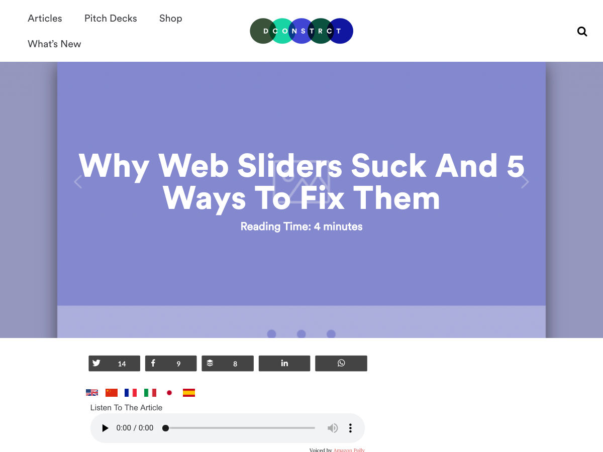
Why Web Sliders Suck and 5 Ways to Fix Them

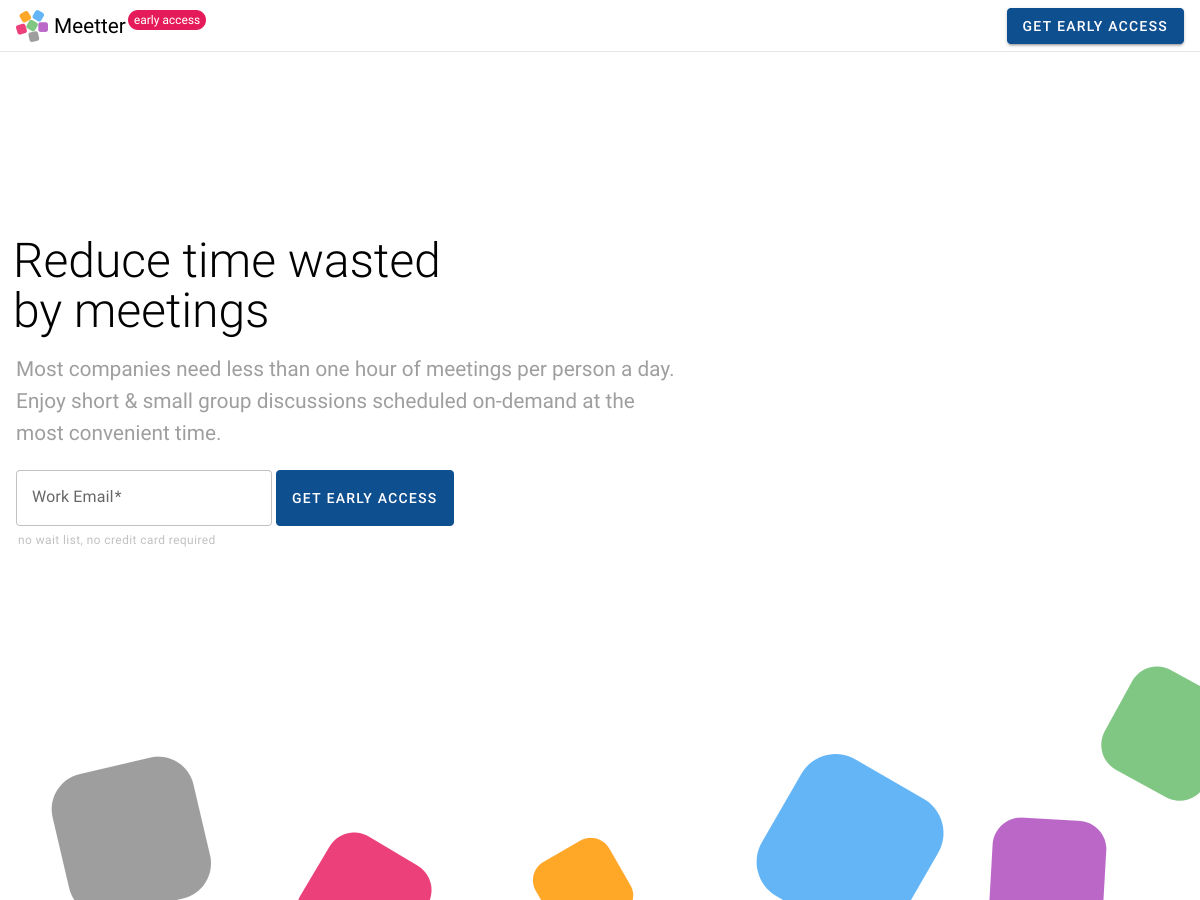
Meetter – Reduce Time Wasted by Meetings

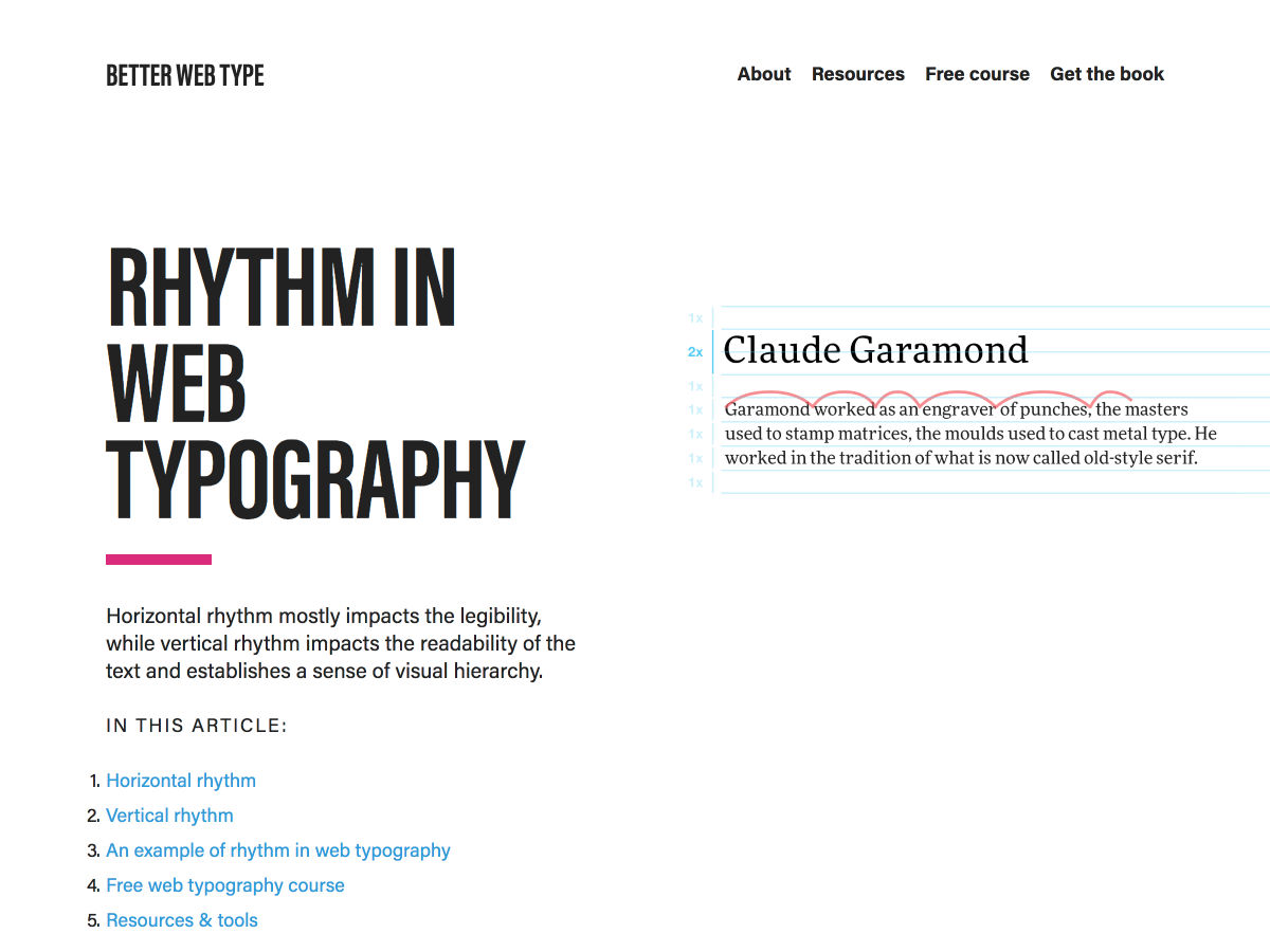
A Guide to Rhythm in Web Typography

Keys to Maintainable CSS: Order

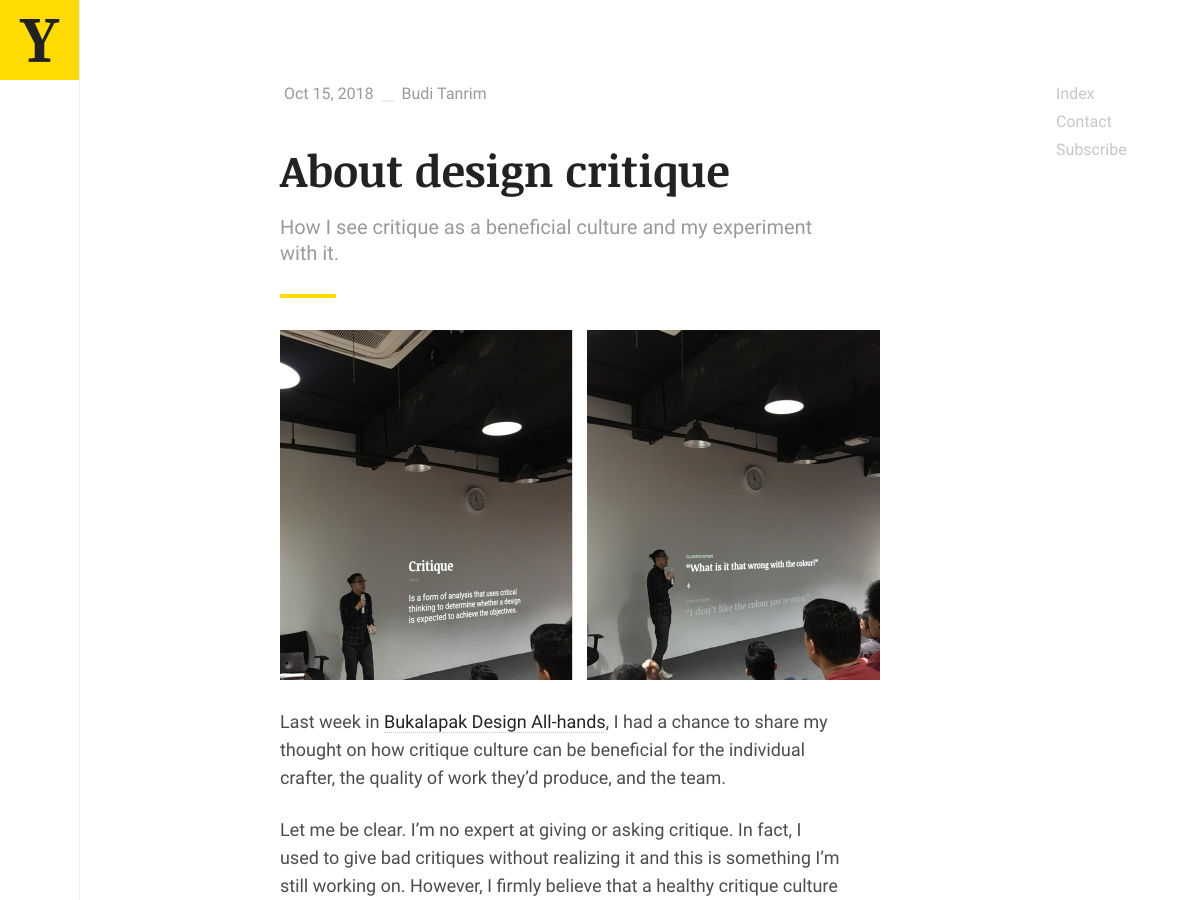
About Design Critique

How not to Design a Product like Everyone Else’s

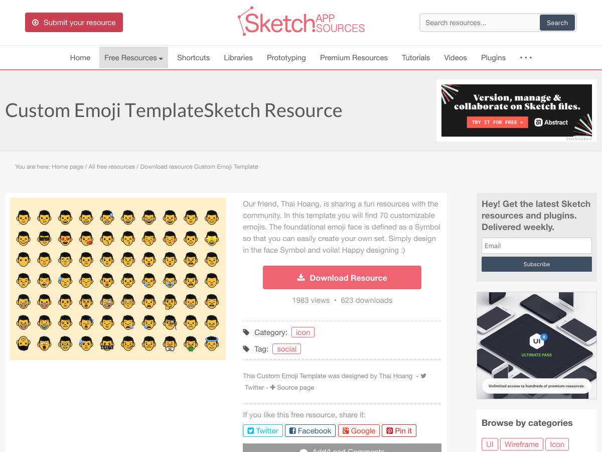
Become an Emoji!

The Best Colors Named After People

Documenting Design Workflows

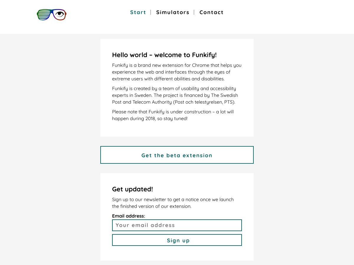
Funkify – Experience the Web Through the Eyes of the Differently Abled

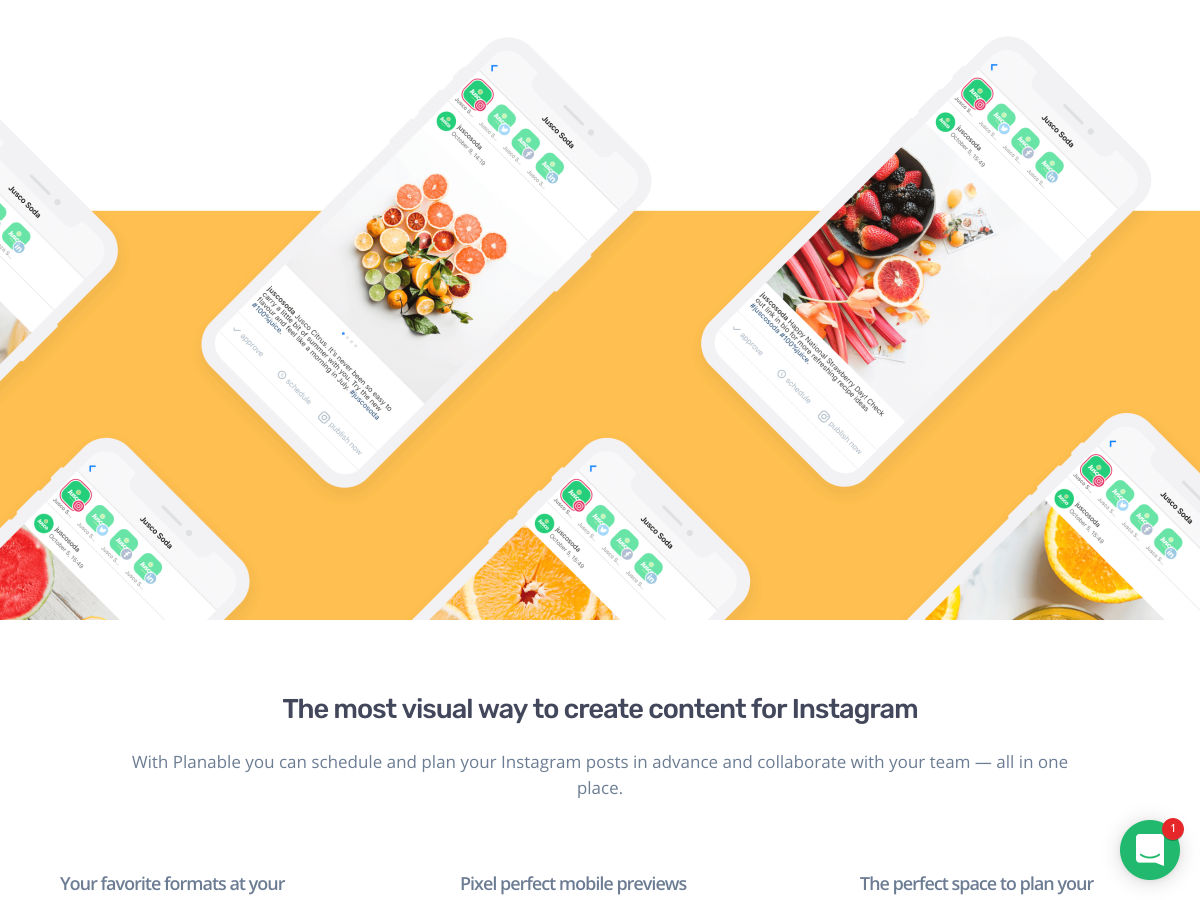
Planable 2.0 – Collaborate on any Social Content, from Anywhere

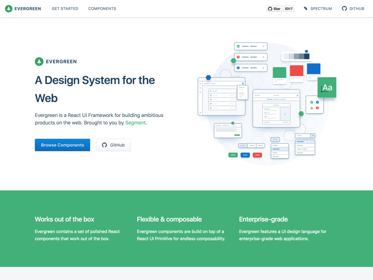
Evergreen: A React UI Framework Built by Segment

If You Want to Design your Life, Start by Designing your Environment

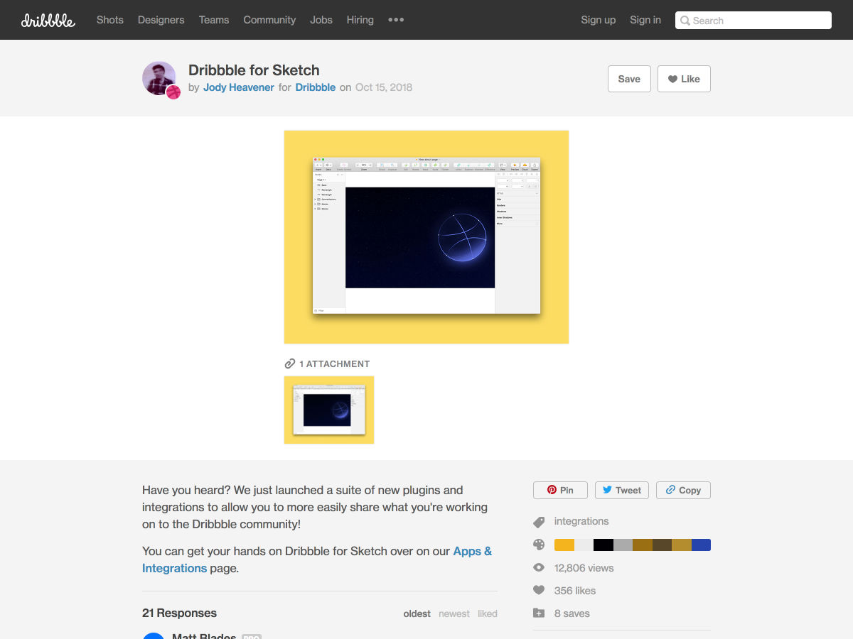
Dribbble Launched an Official Sketch Plugin

Building an Image Generator for the Number 1 Track on Spotify

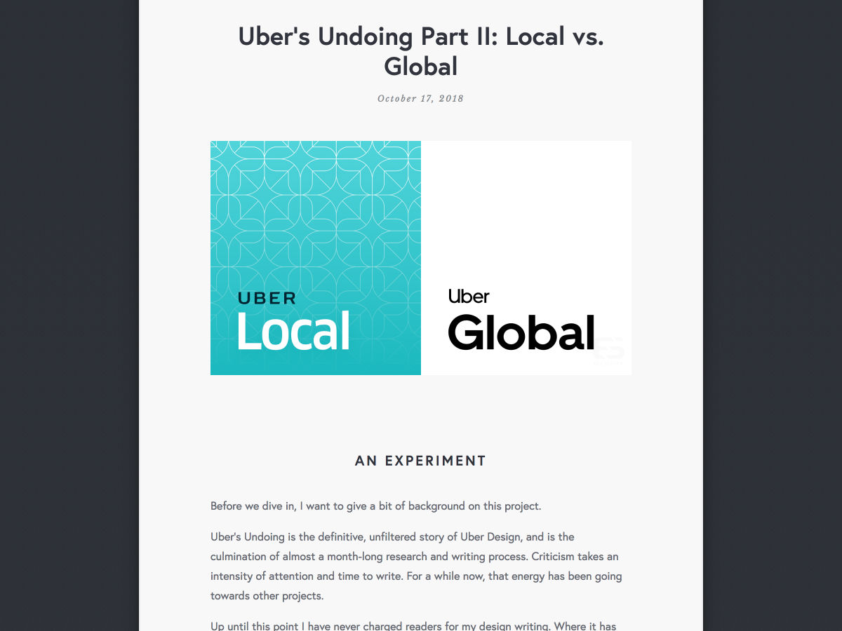
Uber’s Undoing: Local Vs. Global

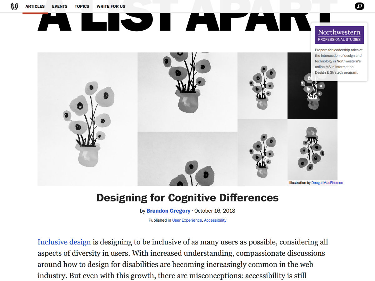
Designing for Cognitive Differences

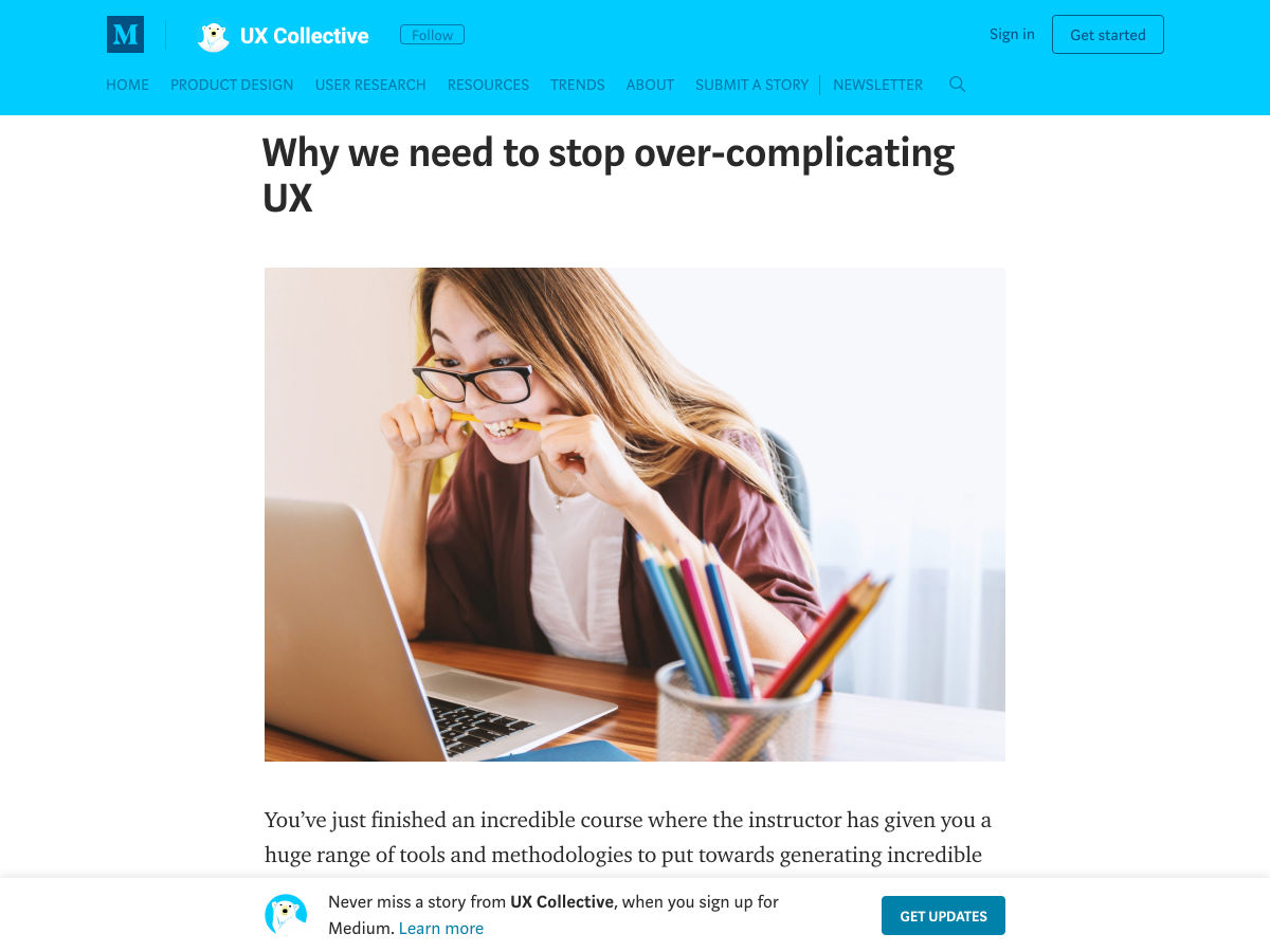
Why We Need to Stop Over-complicating UX

The No. 1 Thing You’re Getting Wrong About Inclusive Design

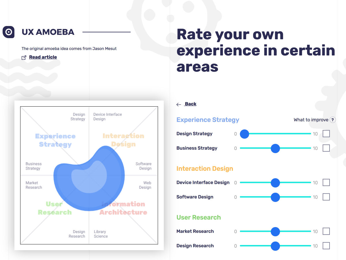
UX Amoeba for your Resume

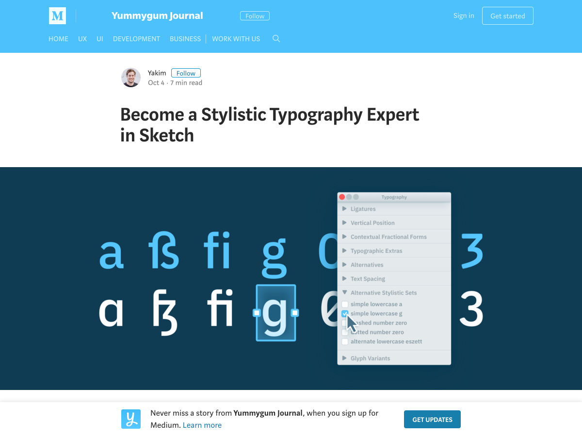
Become a Stylistic Typography Expert in Sketch

Inclusive Design 24

Embracing Design Generalism

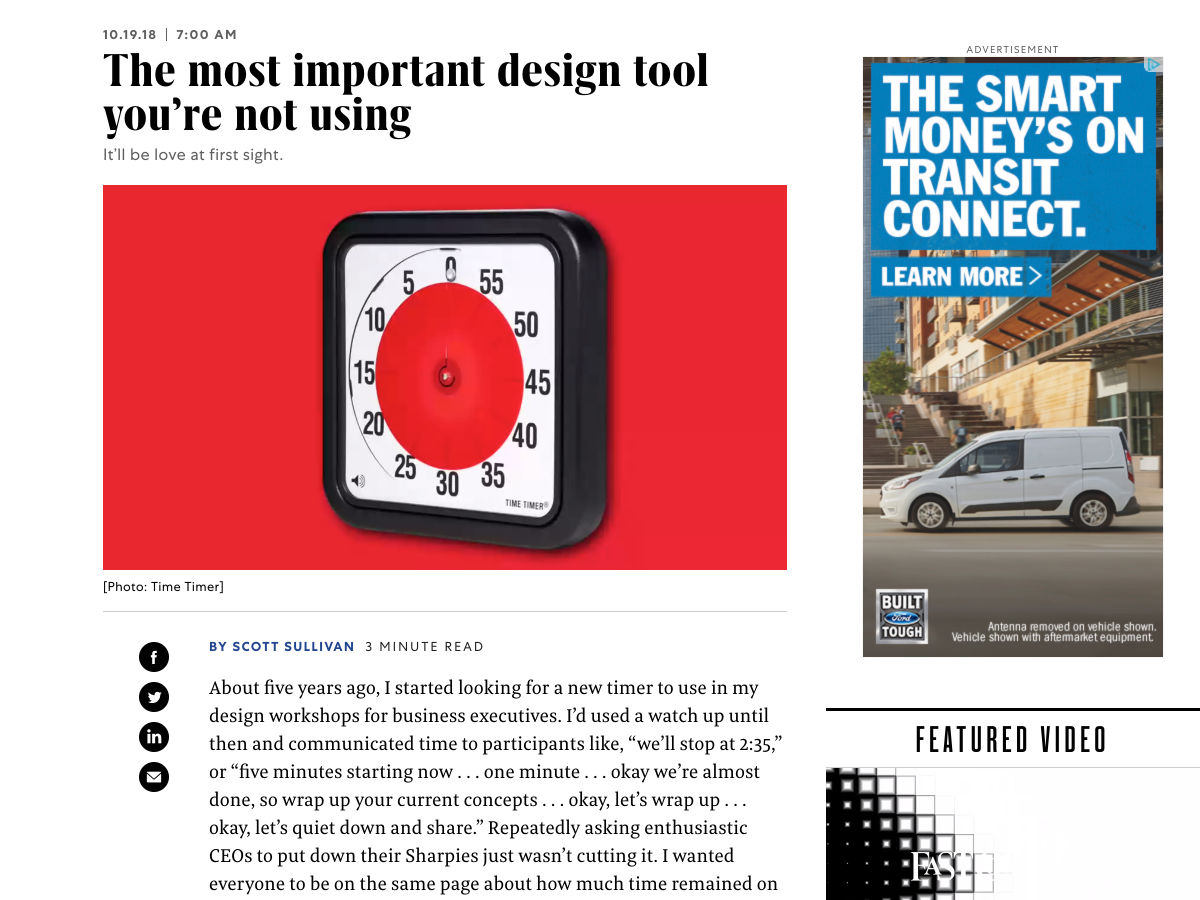
The Most Important Design Tool You’re not Using

Instagram has a Massive Harassment Problem

Want more? No problem! Keep track of top design news from around the web with Webdesigner News.

Add Realistic Chalk and Sketch Lettering Effects with Sketch’it – only $5!

Source

Categories: Designing, Others Tags:

8 Tips for Great Code Reviews

October 19th, 2018 No comments

Kelly Sutton with good advice on code reviews. Hard to pick a favorite. I like all the stuff about minding your tone and getting everyone involved, but I also think the computerization stuff is important:

If a computer can decide and enforce a rule, let the computer do it. Arguing spaces vs. tabs is not a productive use of human time.

Re: Tip #6: it’s pretty cool when the tools you use can help with that, like this new GitHub feature where code suggestions can turn into a commit.

Direct Link to ArticlePermalink

The post 8 Tips for Great Code Reviews appeared first on CSS-Tricks.

Categories: Designing, Others Tags:

Why Do You Use Frameworks?

October 19th, 2018 No comments

Nicole Sullivan asked. People said:

  • ?… for the same reason that I buy ingredients rather than growing/raising all of my own food.
  • ? I write too many bugs without them.
  • ? Avoiding bikeshedding.
  • ? … to solve problems that are adjacent to, but distinct from, the problem I’m trying to solve at hand.
  • ? Because to create the same functionality would require a much larger team
  • ? I want to be able to focus on building the product rather than the tools.
  • ? it’s easier to pick a framework and point to docs than teach and document your own solution.
  • ? faster development
  • ? They have typically solved the problems and in a better way than my first version or even fifth version will be.

There are tons more replies. Jeremy notes “exactly zero mention end users.” I said: Sometimes I just wanna be told what to do.

Nicole stubbed out the responses:

Why do you use frameworks? Almost 100 of you answered. Here are the results. pic.twitter.com/jdcTpA0kf5

— Nicole Sullivan ? (@stubbornella) October 16, 2018

If you can’t get enough of the answers here, Rachel asked the same thing a few days later, this time scoped to CSS frameworks.

The post Why Do You Use Frameworks? appeared first on CSS-Tricks.

Categories: Designing, Others Tags: