Archive

Archive for October, 2018

Using Feature Detection, Conditionals, and Groups with Selectors

October 19th, 2018 No comments

CSS is designed in a way that allows for relatively seamless addition of new features. Since the dawn of the language, specifications have required browsers to gracefully ignore any properties, values, selectors, or at-rules they do not support. Consequently, in most cases, it is possible to successfully use a newer technology without causing any issues in older browsers.

Consider the relatively new caret-color property (it changes the color of the cursor in inputs). Its support is still low but that does not mean that we should not use it today.

.myInput {
  color: blue;
  caret-color: red;
}

Notice how we put it right next to color, a property with practically universal browser support; one that will be applied everywhere. In this case, we have not explicitly discriminated between modern and older browsers. Instead, we just rely on the older ones ignoring features they do not support.

It turns out that this pattern is powerful enough in the vast majority of situations.

When feature detection is necessary

In some cases, however, we would really like to use a modern property or property value whose use differs significantly from its fallback. In those cases, @supports comes to the rescue.

@supports is a special at-rule that allows us to conditionally apply any styles in browsers that support a particular property and its value.

@supports (display: grid) {
  /* Styles for browsers that support grid layout... */
}

It works analogously to @media queries, which also only apply styles conditionally when a certain predicate is met.

To illustrate the use of @supports, consider the following example: we would like to display a user-uploaded avatar in a nice circle but we cannot guarantee that the actual file will be of square dimensions. For that, the object-fit property would be immensely helpful; however, it is not supported by Internet Explorer (IE). What do we do then?

Let us start with markup:

<div class="avatar">
  <img class="avatar-image" src="..." alt="..." />
</div>

As a not-so-pretty fallback, we will squeeze the image width within the avatar at the cost that wider files will not completely cover the avatar area. Instead, our single-color background will appear underneath.

.avatar {
  position: relative;
  width: 5em;
  height: 5em;
  border-radius: 50%;
  overflow: hidden;
  background: #cccccc; /* Fallback color */
}

.avatar-image {
  position: absolute;
  top: 50%;
  right: 0;
  bottom: 0;
  left: 50%;
  transform: translate(-50%, -50%);
  max-width: 100%;
}

You can see this behavior in action here:

See the Pen Demo fallback for object-fit by Jirka Vebr (@JirkaVebr) on CodePen.

Notice there is one square image, a wide one, and a tall one.

Now, if we use object-fit, we can let the browser decide the best way to position the image, namely whether to stretch the width, height, or neither.

@supports (object-fit: cover) {
  .avatar-image {
    /* We no longer need absolute positioning or any transforms */
    position: static;
    transform: none;
    object-fit: cover;
    width: 100%;
    height: 100%;
  }
}

The result, for the same set of image dimensions, works nicely in modern browsers:

See the Pen @supports object-fit demo by Jirka Vebr (@JirkaVebr) on CodePen.

Conditional selector support

Even though the Selectors Level 4 specification is still a Working Draft, some of the selectors it defines — such as :placeholder-shown — are already supported by many browsers. Should this trend continue (and should the draft retain most of its current proposals), this level of the specification will introduce more new selectors than any of its predecessors. In the meantime, and also while IE is still alive, CSS developers will have to target a yet more diverse and volatile spectrum of browsers with nascent support for these selectors.

It will be very useful to perform feature detection on selectors. Unfortunately, @supports is only designed for testing support of properties and their values, and even the newest draft of its specification does not appear to change that. Ever since its inception, it has, however, defined a special production rule in its grammar whose sole purpose is to provide room for potential backwards-compatible extensions, and thus it is perfectly feasible for a future version to add the ability to condition on support for particular selectors. Nevertheless, that eventuality remains entirely hypothetical.

Selector counterpart to @supports

First of all, it is important to emphasize that, analogous to the aforementioned caret-color example where @supports is probably not necessary, many selectors do not need to be explicitly tested for either. For instance, we might simply try to match ::selection and not worry about browsers that do not support it since it will not be the end of the world if the selection appearance remains the browser default.

Nevertheless, there are cases where explicit feature detection for selectors would be highly desirable. In the rest of this article, we will introduce a pattern for addressing such needs and subsequently use it with :placeholder-shown to build a CSS-only alternative to the Material Design text field with a floating label.

Fundamental property groups of selectors

In order to avoid duplication, it is possible to condense several identical declarations into one comma-separated list of selectors, which is referred to as group of selectors.

Thus we can turn:

.foo { color: red }
.bar { color: red }

…into:

.foo, .bar { color: red }

However, as the Selectors Level 3 specification warns, these are only equivalent because all of the selectors involved are valid. As per the specification, if any of the selectors in the group is invalid, the entire group is ignored. Consequently, the selectors:

..foo { color: red } /* Note the extra dot */
.bar { color: red }

…could not be safely grouped, as the former selector is invalid. If we grouped them, we would cause the browser to ignore the declaration for the latter as well.

It is worth pointing out that, as far as a browser is concerned, there is no difference between an invalid selector and a selector that is only valid as per a newer version of the specification, or one that the browser does not know. To the browser, both are simply invalid.

We can take advantage of this property to test for support of a particular selector. All we need is a selector that we can guarantee matches nothing. In our examples, we will use :not(*).

.foo { color: red }

:not(*):placeholder-shown,
.foo {
  color: green
}

Let us break down what is happening here. An older browser will successfully apply the first rule, but when processing the the rest, it will find the first selector in the group invalid since it does not know :placeholder-shown, and thus it will ignore the entire selector group. Consequently, all elements matching .foo will remain red. In contrast, while a newer browser will likely roll its robot eyes upon encountering :not(*) (which never matches anything) it will not discard the entire selector group. Instead, it will override the previous rule, and thus all elements matching .foo will be green.

Notice the similarity to @supports (or any @media query, for that matter) in terms of how it is used. We first specify the fallback and then override it for browsers that satisfy a predicate, which in this case is the support for a particular selector — albeit written in a somewhat convoluted fashion.

See the Pen @supports for selectors by Jirka Vebr (@JirkaVebr) on CodePen.

Real-world example

We can use this technique for our input with a floating label to separate browsers that do from those that do not support :placeholder-shown, a pseudo-class that is absolutely vital to this example. For the sake of relative simplicity, in spite of best UI practices, we will choose our fallback to be only the actual placeholder.

Let us start with markup:

<div class="input">
  <input class="input-control" type="email" name="email" placeholder="Email" id="email" required />
  <label class="input-label" for="email">Email</label>
</div>

As before, the key is to first add styles for older browsers. We hide the label and set the color of the placeholder.

.input {
  height: 3.2em;
  position: relative;
  display: flex;
  align-items: center;
  font-size: 1em;
}

.input-control {
  flex: 1;
  z-index: 2; /* So that it is always "above" the label */
  border: none;
  padding: 0 0 0 1em;
  background: transparent;
  position: relative;
}

.input-label {
  position: absolute;
  top: 50%;
  right: 0;
  bottom: 0;
  left: 1em; /* Align this with the control's padding */
  z-index: 1;
  display: none; /* Hide this for old browsers */
  transform-origin: top left;
  text-align: left;
}

For modern browsers, we can effectively disable the placeholder by setting its color to transparent. We can also align the input and the label relative to one other for when the placeholder is shown. To that end, we can also utilize the sibling selector in order to style the label with respect to the state of the input.

.input-control:placeholder-shown::placeholder {
  color: transparent;
}

.input-control:placeholder-shown ~ .input-label {
  transform: translateY(-50%)
}

.input-control:placeholder-shown {
  transform: translateY(0);
}

Finally, the trick! Exactly like above, we override the styles for the label and the input for modern browsers and the state where the placeholder is not shown. That involves moving the label out of the way and shrinking it a little.

:not(*):placeholder-shown,
.input-label {
  display: block;
  transform: translateY(-70%) scale(.7);

}
:not(*):placeholder-shown,
.input-control {
  transform: translateY(35%);
}

With all the pieces together, as well as more styles and configuration options that are orthogonal to this example, you can see the full demo:

See the Pen CSS-only @supports for selectors demo by Jirka Vebr (@JirkaVebr) on CodePen.

Reliability and limitations of this technique

Fundamentally, this technique requires a selector that matches nothing. To that end, we have been using :not(*); however, its support is also limited. The universal selector * is supported even by IE 7, whereas the :not pseudo-class has only been implemented since IE 9, which is thus the oldest browser in which this approach works. Older browsers would reject our selector groups for the wrong reason — they do not support :not! Alternatively, we could use a class selector such as .foo or a type selector such as foo, thereby supporting even the most ancient browsers. Nevertheless, these make the code less readable as they do not convey that they should never match anything, and thus for most modern sites, :not(*) seems like the best option.

As for whether the property of groups of selectors that we have been taking advantage of also holds in older browsers, the behavior is illustrated in an example as a part of the CSS 1 section on forward-compatible parsing. Furthermore, the CSS 2.1 specification then explicitly mandates this behavior. To put the age of this specification in perspective, this is the one that introduced :hover. In short, while this technique has not been extensively tested in the oldest or most obscure browsers, its support should be extremely wide.

Lastly, there is one small caveat for Sass users (Sass, not SCSS): upon encountering the :not(*):placeholder-shown selector, the compiler gets fooled by the leading colon, attempts to parse it as a property, and when encountering the error, it advises the developer to escape the selector as so: :not(*):placeholder-shown, which does not look very pleasant. A better workaround is perhaps to replace the backslash with yet another universal selector to obtain *:not(*):placeholder-shown since, as per the specification, it is implied anyway in this case.

The post Using Feature Detection, Conditionals, and Groups with Selectors appeared first on CSS-Tricks.
Categories: Designing, Others Tags:

Dealing with Dependencies Inside Design Systems

October 19th, 2018 No comments

Dependencies in JavaScript are pretty straightforward. I can’t write library.doThing() unless library exists. If library changes in some fundamental way, things break and hopefully our tests catch it.

Dependencies in CSS can be a bit more abstract. Robin just wrote in our newsletter how the styling from certain classes (e.g. position: absolute) can depend on the styling from other classes (e.g. position: relative) and how that can be — at best — obtuse sometimes.

Design has dependencies too, especially in design systems. Nathan Curtis:

You release icon first, and then other components that depend on it later. Then, icon adds minor features or suffers a breaking change. If you update icon, you can’t stop there. You must ripple that change through all of icon’s dependent in the library too.

“If we upgrade and break a component, we have to go through and fix all the dependent components.”?—?Jony Cheung, Software Engineering Manager, Atlassian’s Atlaskit

The biggest changes happen with the smallest components.

Direct Link to ArticlePermalink

The post Dealing with Dependencies Inside Design Systems appeared first on CSS-Tricks.

Categories: Designing, Others Tags:

Monthly Web Development Update 10/2018: The Hurricane Web, End-To-End-Integrity, And RAIL

October 19th, 2018 No comments

Monthly Web Development Update 10/2018: The Hurricane Web, End-To-End-Integrity, And RAIL

Monthly Web Development Update 10/2018: The Hurricane Web, End-To-End-Integrity, And RAIL

Anselm Hannemann

2018-10-19T15:19:58+02:002018-10-19T13:34:15+00:00

With the latest studies and official reports out this week, it seems that to avoid an irreversible climate change on Planet Earth, we need to act drastically within the next ten years. This rose a couple of doubts and assumptions that I find worth writing about.

One of the arguments I hear often is that we as individuals cannot make an impact and that climate change is “the big companies’ fault”. However, we as the consumers are the ones who make the decisions what we buy and from whom, whose products we use and which ones we avoid. And by choosing wisely, we can make a change. By talking to other people around you, by convincing your company owner to switch to renewable energy, for example, we can transform our society and economy to a more sustainable one that doesn’t harm the planet as much. It will be a hard task, of course, but we can’t deny our individual responsibility.

Maybe we should take this as an occasion to rethink how much we really need. Maybe going out into nature helps us reconnect with our environment. Maybe building something from hand and with slow methods, trying to understand the materials and their properties, helps us grasp how valuable the resources we currently have are — and what we would lose if we don’t care about our planet now.

News

  • Chrome 70 is here with Desktop Progressive Web Apps on Windows and Linux, public key credentials in the Credential Management API, and named Workers.
  • Postgres 11 is out and brings more robustness and performance for partitioning, enhanced capabilities for query parallelism, Just-in-Time (JIT) compilation for expressions, and a couple of other useful and convenient changes.
  • As the new macOS Mojave and iOS 12 are out now, Safari 12 is as well. What’s new in this version? A built-in password generator, a 3D and AR model viewer, icons in tabs, web pages on the latest watch OS, new form field attribute values, the Fullscreen API for iOS on iPads, font collection support in WOFF2, the font-display loading CSS property, Intelligent Tracking Prevention 2.0, and a couple of security enhancements.
  • Google’s decision to force users to log into their Google account in the browser to be able to access services like Gmail caused a lot of discussions. Due to the negative feedback, Google promptly announced changes for v70. Nevertheless, this clearly shows the interests of the company and in which direction they’re pushing the app. This is unfortunate as Chrome and the people working on that project shaped the web a lot in the past years and brought the ecosystem “web” to an entirely new level.
  • Microsoft Edge 18 is out and brings along the Web Authentication API, new autoplay policies, Service Worker updates, as well as CSS masking, background blend, and overscroll.

General

  • Max Böck wrote about the Hurricane Web and what we can do to keep users up-to-date even when bandwidth and battery are limited. Interestingly, CNN and NPR provided text-only pages during Hurricane Florence to serve low traffic that doesn’t drain batteries. It would be amazing if we could move the default websites towards these goals — saving power and bandwidth — to improve not only performance and load times but also help the environment and make users happier.

UI/UX

Shawn Parks shares the lessons he learned from redesigning his portfolio every year. (Image credit)

Accessibility

Tooling

Privacy

  • Guess what? Our simple privacy-enhancing tools that delete cookies are useless as this article shows. There are smarter ways to track a user via TLS session tracking, and we don’t have much power to do anything against it. So be aware that someone might be able to track you regardless of how many countermeasures you have enabled in your browser.
  • Josh Clark’s comment on university research about Google’s data collection is highlighting the most important parts about how important Android phone data is to Google’s business model and what type of information they collect even when your smartphone is idle and not moving location.

Security

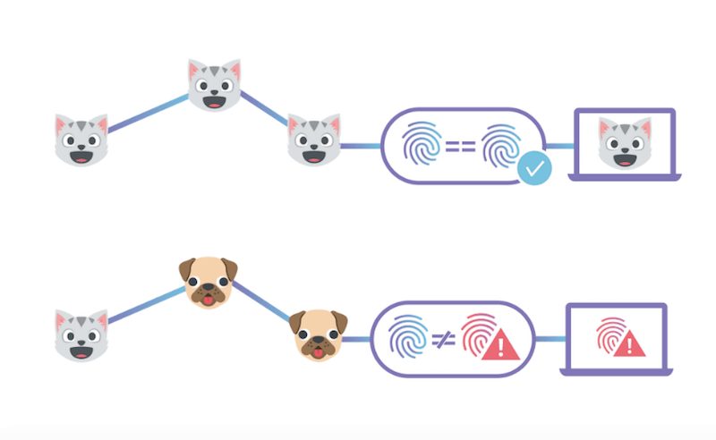
End-to-End Integrity with IPFS illustrated with cats and dogs
Cloudflare’s IPFS gateway allows a website to be end-to-end secure while maintaining the performance and reliability benefits of being served from their edge network. (Image credit)

Web Performance

Illustration of the RAIL model
The four parts of the RAIL performance model: Response, Animation, Idle, Load. (Image credit)

HTML & SVG

JavaScript

  • Willian Martins shares the secrets of JavaScript’s bind() function, a widely unknown operator that is so powerful and allows us to invoke this from somewhere else into named, non-anonymous functions. A different way to write JavaScript.
  • Everyone knows what the “9am rush hour” means. Paul Lewis uses the term to rethink how we build for the web and why we should try to avoid traffic jams on the main thread of the browser and outsource everything that doesn’t belong to the UI into separate traffic lanes instead.

CSS

An item placed inside a grid using negative grid lines
Did you know you can use negative grid line numbers to position Grid items with CSS? (Image credit)

Work & Life

Going Beyond…

  • In the Netherlands, there’s now a legal basis that prescribes CO2 emissions to be cut by 25% by 2020 (that’s just a bit more than one year from now). I love the idea and hope other countries will be inspired by it — Germany, for example, which currently moves its emission cut goals farther and farther into the future.
  • David Wolpert explains why computers use so much energy and how we could make them vastly more efficient. But for that to happen, we need to understand the thermodynamics of computing better.
  • Turning down twenty billion dollars is cool. Of course, it is. But the interesting point in this article about the Whatsapp founder who just told the world how unhappy he is having sold his service to Facebook is that it seems that he believed he could keep the control over his product.

One more thing: I’m very grateful for all of you who helped raise my funding level for the Web Development Reading List to 100% this month. I never got so much feedback from you and so much support. Thank you! Have a great month!

—Anselm

Smashing Editorial(cm)
Categories: Others Tags:

Should You Sell Website Support or Maintenance Services?

October 19th, 2018 No comments

By now, you’ve likely encountered and worked your way out one of the more common problems freelancers face. In moving your business model from one that bills by the hour to value-based pricing, you become a trusted resource for clients instead of one they call on to tackle nitpicky requests. As a result, everyone stops focusing on the number of hours you put into a website and starts looking at the outcomes you deliver.

By setting a rate that is commensurate with the value you deliver, you’re likely to be happier with your work. But what if I told you there’s another way to increase your comfort and satisfaction as a web designer?

With standard web design work, you make a living from one-off jobs. However, you can’t always predict when or how many of them you’ll have at any given time.

This can lead to the dreaded feast or famine.

By selling design support or maintenance services, you can give yourself a steady stream of recurring revenue that spares you from that.

Reasons to Offer Website Support and Maintenance Services

There are entire companies whose business models revolve around WordPress support and maintenance services. It’s great that there are dedicated professionals who can handle this for WordPress users who don’t know how to do it themselves, don’t have the time, or simply don’t want to. But if this is something you’re capable of doing and have an interest in, why not add it to your repertoire and become their one-stop-shop for all things website-related?

Here are some reasons why I believe designers should add this service to their offering:

  • Maintenance and support work is ongoing. This translates to a steady and predictable paycheck.
  • You can automate many of these tasks, or even outsource, and still make a good profit.
  • You can pick-and-choose what kinds of support tasks you offer.
  • This enables you to be more productive and focused on your regular design work as you’re not worried about finding that next client.
  • You’ll have a hand in protecting and maintaining clients’ websites, which ensures they get the most out of it.
  • This is a great way to upsell previous or current website customers on ongoing services.
  • This is a good opportunity to turn maintenance customers into website customers.
  • You can create new website packages that include this add-on service. This’ll bring more variety to what you offer and paint your overall services in a more professional light.

Bottom line: you’ll benefit from having a predictable revenue stream; clients will benefit from having an end-to-end website service partner.

Consider the Choices: Maintenance and Support Services

The maintenance and support of a website is generally focused on upkeep that can have just as much of an impact on the user experience as the design itself.

Wondering what sort of services maintenance and support entail? Really, this boils down to what’s in your wheelhouse and what you’re interested in. The list of tasks below breaks down the most common choices.

Design Updates

By creating a website update package, clients can contact you throughout the month for a set number of tasks or hours’ worth of tasks. This encourages them to keep their site up-to-date with tasks like tweaking promotional offers, uploading blog posts, reskinning the site for a special occasion, and so on.

Website Support

Website support allocates a certain number of hours every month to troubleshooting and repairs. It’s not something smaller clients will need, but medium-sized and enterprise clients would appreciate having a support line to tap into.

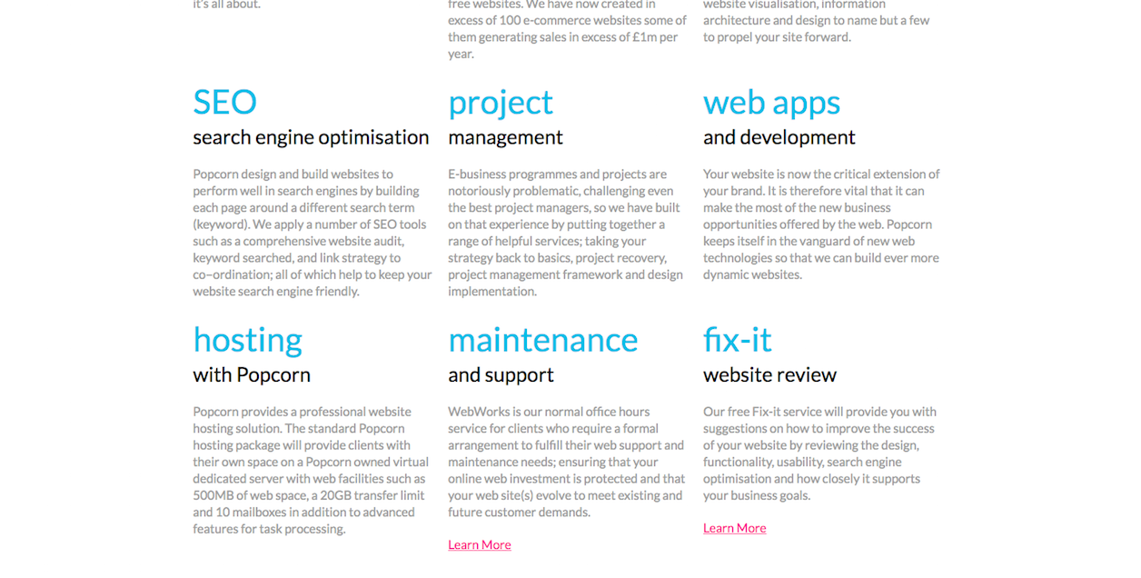
Popcorn Web Design has a lot of niche specialties, but the Fix-It service is an interesting take on website support.

Website Updates

It doesn’t matter which content management system your clients use (WordPress, Joomla, Drupal, etc.), regular updates of the core software and extensions need to be managed frequently. You can automate this for smaller sites and manually test and implement these for larger ones.

Distillery Creative includes bi-monthly updates within its creative and support services packages.

Security Monitoring

A security scanner can handle the monitoring piece of this for you. It’ll then be your job to pay close attention to warning signs, so you can jump in and repair any sort of infection or vulnerability that might spring up.

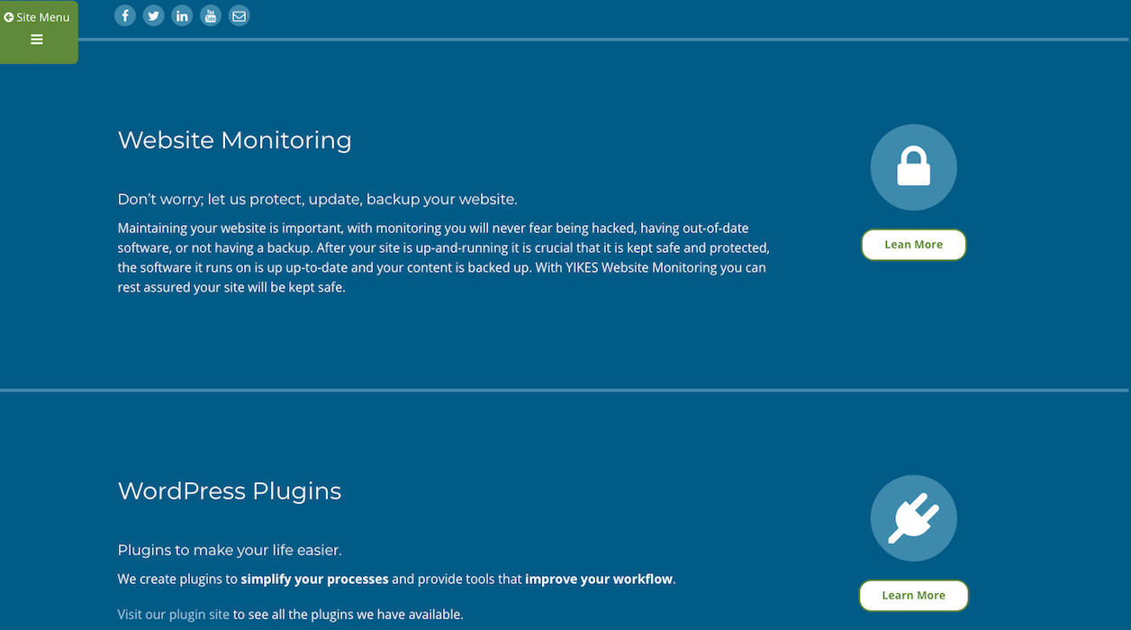
Yikes Web Design & Development bundles security, performance, and backup services into one maintenance package.

Uptime Monitoring

Uptime monitoring is another thing you can automate with an online tool. Just watch for notifications regarding a website going down or slowing to a crawl, so you can hop inside and troubleshoot the source of the problem.

Database Optimization

Websites and their users have a tendency to save everything, even if those files are no longer in use. By offering database optimization and website cleanup services, you can ensure clients’ servers are always running as lean and mean as possible.

Website Backups

Even with the best-laid security plan and performance monitoring system, bad stuff can happen to a website, which is why nightly or weekly backups need to be generated. You can automate this through web hosting or a plugin.

Web Hosting & Domain Management

When signing on new clients, you may find they come to you without a domain or web hosting. By selling web hosting and domain management services, you can position yourself to take that off their hands right from the get-go.

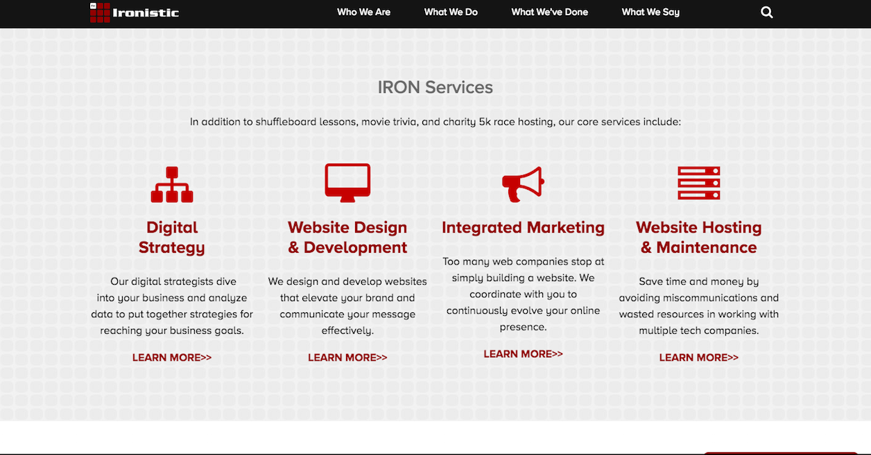
In addition to maintenance services, Ironistic also offers hosting.

SEO

Search engine optimization is typically something that comes with the initial build of a website. However, that doesn’t mean that SEO stops there. This service will keep your clients’ sites in line with the latest and greatest of Google demands.

Content Marketing

Web development agencies are more likely to offer this “maintenance” service, but it is possible for freelance designers to offer it as well. You just have to decide what exactly you’re capable of handling: strategy, planning, writing, optimization, publication?

As you can see, Iceberg Web Design offers a content marketing service that makes a lot of sense for designers—email newsletter design.

Reporting

Once you hand a new website over to a client, they’re probably not going to check on the status of it often. A reporting service will not only provide them with the most pertinent details from Google Analytics, but will also inform them about performance and security.

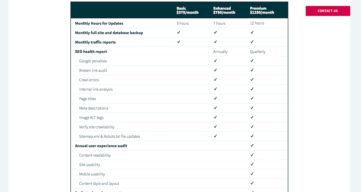
Gravitate Design places a heavy emphasis on reporting and auditing within its maintenance packages.

Wrapping Up

Rather than offer these maintenance and support services as a piecemeal “menu” that clients can choose from, bundle the tasks into related packages—starting with basic support up to a premium offering. It’ll save clients from having to guess which services they need while helping you to refine your internal process for handling them.

Bottom line: if you want your web design business to be sustainable, you need predictable, recurring revenue coming through. By offering maintenance and support services, you can give your business that cushion it needs so you can more comfortably and efficiently handle the work you love.

Featured image via DepositPhotos.

Add Realistic Chalk and Sketch Lettering Effects with Sketch’it – only $5!

Source

Categories: Designing, Others Tags:

4 Reasons Your Creative Team Needs to Sync Files to the Cloud

October 18th, 2018 No comments
Sync Files

Why Cloud Storage is the Future of Digital Design… and an Introduction to Our Favorite Cloud Storage and Sync Tools

Sync Files

In some fields, changes happens slowly over time. Digital design is not one of those fields. Digital tools are constantly changing and evolving, which means if your team is going to remain competitive, you need to be on the cutting edge of digital design tech at all times. At this point in the game, many media, advertising, and other creative teams have already taken their digital work to the cloud. If you haven’t, made the switch to cloud storage, there’s no better time than now.

In this article, we’ll go over the top 5 reasons why your creative team needs to sync files to the cloud, including:

  • You need access to your files from more than one location
  • File sizes are only going to get bigger
  • Constantly running out of space on your device isn’t good for anyone
  • It never hurts to have a backup and recovery plan
  • Improved version control

Sync Files

Digital designers use tools on a variety of devices, which makes the ability to sync files between devices essential.

1. Location(s), Location(s), Location(s).

Digital designers today have a variety of incredible digital tools at their disposal. Whether you prefer working on laptops, desktops, tablets, or even phones, there are a variety of design tools that allow you work on creative projects from any device you choose. Many designers even use different devices throughout the creative process– perhaps starting out with a rough design on a mobile device before switching to a desktop or laptop computer to fine-tune the design.

Cloud syncing is the easiest, fastest, and most convenient way to share your files between different devices. Gone are the days of trying to compress and email files to yourself– syncing to the cloud streamlines your creative workflows and makes it easier than ever to include as many or as few of your favorite tools and devices in your process as you choose.

2. Design files are getting bigger, and they aren’t going to stop growing anytime soon.

Back in the day, we had a very different idea of what it meant for a file to be “big”– anything pushing the 100-200MB mark was getting pretty large and unwieldy. Today, designers are easily creating files that are 30GB or larger, and many projects require dozens if not hundreds of graphic images over their duration.

Cloud syncing and storage tools have virtually infinite storage capacity, which means you don’t have to worry about size limitations due to the underlying disk array on your computer. And even better, many cloud storage platforms allow you to choose how much storage you need to support your creative work, which means you’re paying for the space that you need– and none of the space that you don’t.

Sync Files

Don’t let file storage get you down– transfer your creative team’s files to the cloud today.

3. You don’t want to bog down your device with local file storage.

Nothing’s quite as exciting as starting a new creative project. It has so much potential, and you and your team are ready to dive right into the design process, but wait– do you have enough room on your device to get started? If you’re constantly asking IT to expand your device’s file servers to make room for bulky photo edits and vector files or you’re constantly purging old files from your device to make room for more, it may be time to consider syncing up with the cloud.

When you switch to a cloud storage system, this problem virtually disappears. As we mentioned before, many platforms give you scalable cloud storage, which means if you need more space, you’ve got it. No fuss.

4. Syncing to the cloud gives you a built in backup plan.

Anybody who has ever worked on a digital design project knows that, while the finished product may look streamlined and simple, it takes a whole lot of blood, sweat, and tears to get the project to that point. What would you do if you walked into work one morning only to find that your computer had crashed? Without syncing your files to the cloud, the answer is simple– you’d be starting over on a lot of designs.

Most cloud storage platforms create multiple copies of your data in separate physical server facilities just in case something goes wrong. Whenever you make a change to a file and sync it to the cloud, it is automatically backed up to all of those locations. The result? Total security. Losing files when your device crashes is a thing of the past.

5. Cloud syncing makes it easy to reference older versions.

Every digital designer has that one monster folder lurking somewhere on their hard drive. It’s huge, it’s unorganized, and it’s named, simply, “OLD”. It’s important for your creative team to have access to old designs for future reference– whether it’s later on in the same project or even during a different project down the road. But this takes up a crazy amount of space on your local device or server.

Once again, syncing to the cloud is a better solution. Many platforms save old versions of files automatically, which makes it easy for you to go back through and access them later if necessary.

Sync Files

Using the cloud to sync files across devices is an important strategy for any creative team.

Digital design is a field that’s constantly evolving, and if your creative team is going to keep up, you need to stay up-to-date on the latest and best design tools. Syncing your work to the cloud today sets your digital design team up for success tomorrow.

All opinions are my own. Dropbox is not affiliated with nor endorses any other products or services mentioned.

Read More at 4 Reasons Your Creative Team Needs to Sync Files to the Cloud

Categories: Designing, Others Tags:

How to Create Attractive Visual Style for Your Instagram Business Account

October 18th, 2018 No comments

Being one of the most popular social networks worldwide, Instagram has reached 1 billion active users monthly. Are you surprised by the colossal number? Try to remember the first thing you did this morning when you woke up. It’s quite common for people to stay updated with the virtual world and even their personal business via social media platforms. We wouldn’t exaggerate at all if we said that Instagram is an amazing tool for business promotion. A mobile photo sharing app at first, Instagram now has a few more features that make it more interactive than ever before. Instagram Business Account will do wonders to your company.

Whether you are a novice to Instagram Business Account, or you already have an account that’s turning in profit, the strategies and techniques are continuously evolving. The reasons businesses choose to use this social network vary; it’s a great place to stand out from the crowd of competitors, to look for new partners, to grow world-wide recognition, to attract more traffic to their websites, so on and so forth.

Create Attractive Visual Style for Your Instagram Business Account

Instagram has evolved from being an app for sharing photos exclusively, to now being able to share videos, stories, and to interact with your followers through live chats. But Instagram is not only about images, but also about text. So in order to make the best out of your Instagram Business Account to have to take care of the both types of content.

  • Profile name
  • Bio
  • Email, Directions, Phone Number
  • Theme, Topic, Color
  • Filters
  • Quotes
  • Hashtags
  • Tags
  • Story
  • Live

Instagram Business Account

Profile name

You want your potential clients to find your Instagram Business Account with ease. Don’t overload your name with useless signs and symbols just for the sake of decoration, but keep it simple. Your business’s name is enough. You will notice that Instagram doesn’t allow a two-word name. If your company’s name is formed from more than just one word, the best thing to do is to write them all connected.

Bio

You are given a limited amount of words for your bio, so use it to its maximum potential. In your Bio you can write the name of your company properly, add the location of your headquarters, link to your official website, and the main objectives of your business. In order to structure your information better, make sure you edit your Bio from desktop, instead of the mobile version of the app. It will make it easier for your visitor to find the needed information.

Instagram Business Account

Email, Directions, Phone Number

Right under your Bio, your potential clients have the chance to instantly contact you, find you, or call you. Make sure you add your information correctly and avoid any miscommunications.

Theme, Topic, Color

The looks of your profile can influence whether the visitor will stay or run in horror at their first visual interaction. I already mentioned that a well-structured bio will engage your visitors faster. Also, the first six images they see are just as important. Your featured images need to have the same theme, same topic, and same colors. Of course, you can play with this idea as much as you want. Get creative, get wild, stand out, but stay on point.

Instagram Business Account

Filters

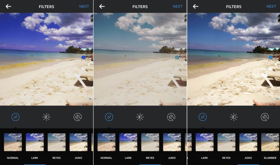
Instagram supplies each user with an arsenal of creative filters to apply to their photos. Not everybody is a professional photographer, but using the right filter can really change the mood of a photo. If you want the flow of your photos to be natural, try to stick to just a few of your favorite filters. Bare in mind that your photos don’t always need a filter.

Instagram Business Account

Quotes

Sometimes photos aren’t enough. If you have a specific quote in mind, a simple description, or even important information, try to add it to the face of your photo in a clean and creative. You also want to keep the message short. People use social media for their convenience, so using a paragraph when a simple sentence will do, is a major turn-off for potential customers.

Hashtags

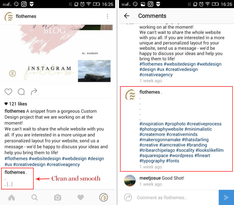
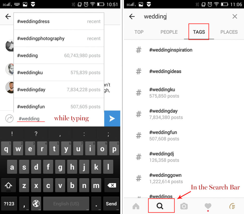
Plain and simple, hashtags are your keywords. You want to be using relevant hashtags that people will actually look for. Every photo you post should include a variety of hashtags. The more tags, the wider the audience. A helpful tip would be to pay attention to the number of posts pertaining to each tag when you write it out. Try to consistently use the more popular ones.

Instagram Business AccountInstagram Business Account

Story

The Instagram Story feature is a more recent one, and people seem to love it. Use it as a tool to share images and videos that only last 24 hours, for content that doesn’t need a special post, such as discounts, promotions, and shout outs. It is also a great channel for communication with your followers, as they can ask you questions that don’t require elaborate answers. Announce your customers regarding any sales, great offers, or freebies, via the story feature. It allows you to add the texts and emojis that will draw attention for sure.

Live

Live on Instagram literally means a live chat with your followers. It’s an amazing feature where you can interact with you potential customers and answer their questions regarding your products. The best way of using the live chat is to not use it daily. People get bored easily, so save it for special events such as the opening of your business, the launch of a new product, or an office tour.

We hope that these tips will make a difference for your Instagram Business Account. Let us know if they were helpful in the comment section below. Also, we are more than happy to answer any of your questions, so drop those below, too.

Read More at How to Create Attractive Visual Style for Your Instagram Business Account

Categories: Designing, Others Tags:

SVG Marching Ants

October 18th, 2018 No comments

Maxim Leyzerovich created the marching ants effect with some delectably simple SVG.

See the Pen SVG Marching Ants by Maxim Leyzerovich (@round) on CodePen.

Let’s break it apart bit by bit and see all the little parts come together.

Step 1: Draw a dang rectangle

We can set up our SVG like a square, but have the aspect ratio ignored and have it flex into whatever rectangle we’d like.

<svg viewbox='0 0 40 40' preserveAspectRatio='none'>
  <rect width='40' height='40' />
</svg>

Right away, we’re reminded that the coordinate system inside an SVG is unit-less. Here we’re saying, “This SVG is a 40x40 grid. Now draw a rectangle covering the entire grid.” We can still size the whole SVG in CSS though. Let’s force it to be exactly half of the viewport:

svg {
  position: absolute;
  width: 50vw;
  height: 50vh;
  top: 0;
  right: 0;
  bottom: 0;
  left: 0;
  margin: auto;
}

Step 2: Fight the squish

Because we made the box and grid so flexible, we’ll get some squishing that we probably could have predicted. Say we have a stroke that is 2 wide in our coordinate system. When the SVG is narrow, it still needs to split that narrow space into 40 units. That means the stroke will be quite narrow.

We can stop that by telling the stroke to be non-scaling.

rect {
  fill: none;
  stroke: #000;
  stroke-width: 10px;
  vector-effect: non-scaling-stroke;
}

Now the stroke will behave more like a border on an HTML element.

Step 3: Draw the cross lines

In Maxim’s demo, he draws the lines in the middle with four path elements. Remember, we have a 40x40 coordinate system, so the math is great:

<path d='M 20,20 L 40,40' />
<path d='M 20,20 L 00,40 '/>
<path d='M 20,20 L 40,0' />
<path d='M 20,20 L 0,0' />

These are four lines that start in the exact center (20,20) and go to each corner. Why four lines instead of two that go corner to corner? I suspect it’s because the marching ants animation later looks kinda cooler if all the ants are emanating from the center rather than crisscrossing.

I love the nice syntax of path, but let’s only use two lines to be different:

<line x1="0" y1="0" x2="40" y2="40"></line>
<line x1="0" y1="40" x2="40" y2="0"></line>

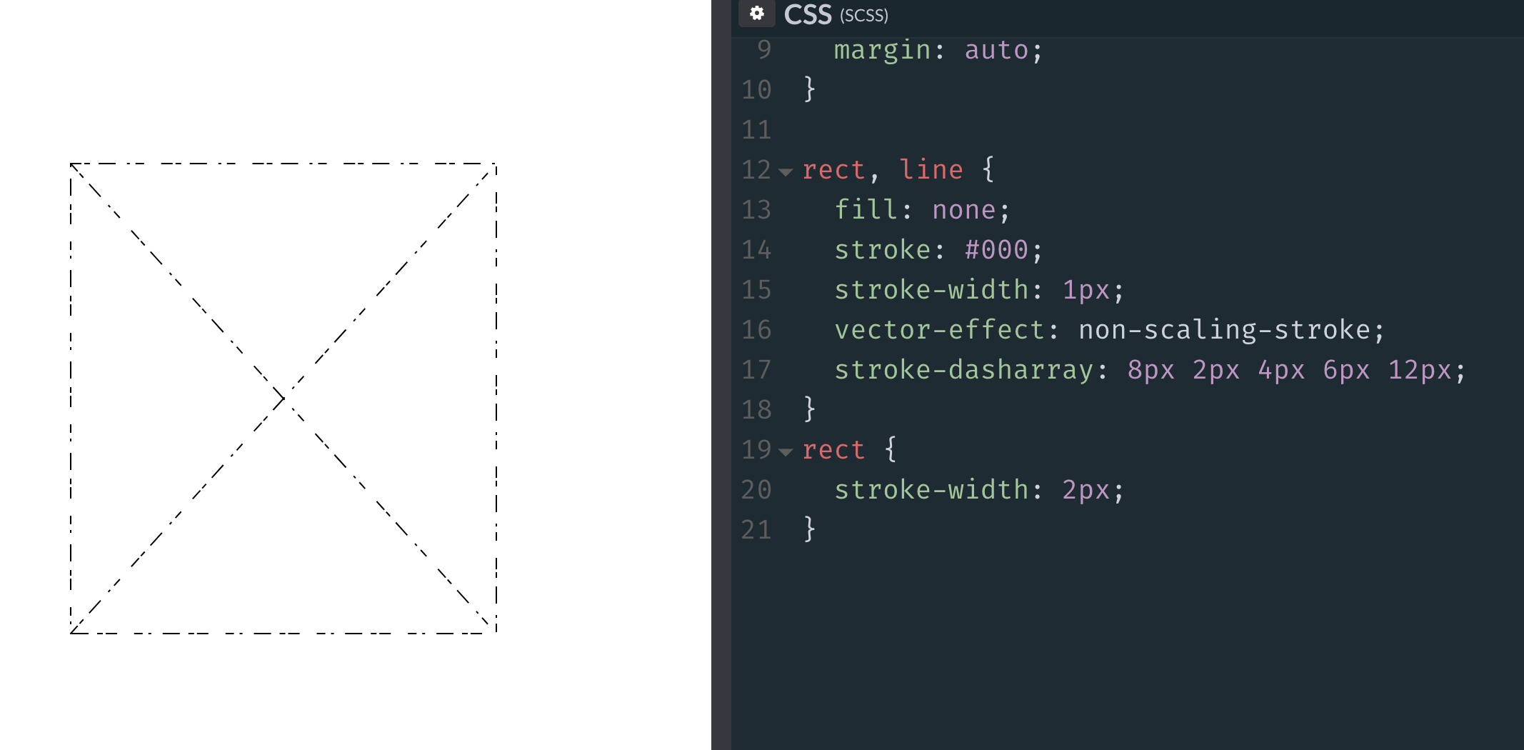
If we apply our stroke to both our rect and line, it works! But we see a slightly weird issue:

rect, line {
  fill: none;
  stroke: #000;
  stroke-width: 1px;
  vector-effect: non-scaling-stroke;
}

The outside line appears thinner than the inside lines, and the reason is that the outer rectangle is hugging the exact outside of the SVG. As a result, anything outside of it is cut off. It’s pretty frustrating, but strokes in SVG always straddle the paths that they sit on, so exactly half of the outer stroke (0.5px) is hidden. We can double the rectangle alone to “fix” it:

rect, line {
  fill: none;
  stroke: #000;
  stroke-width: 1px;
  vector-effect: non-scaling-stroke;
}

rect {
  stroke-width: 2px;
}

Maxim also tosses a shape-rendering: geometricPrecision; on there because, apparently, it cleans things up a bit on non-retina displays.

Step 3: Ants are dashes

Other than the weird straddling-the-line thing, SVG strokes offer way more control than CSS borders. For example, CSS has dashed and dotted border styles, but offers no control over them. In SVG, we have control over the length of the dashes and the amount of space between them, thanks to stroke-dasharray:

rect, line {
  ...

  /* 8px dashes with 2px spaces */
  stroke-dasharray: 8px 2px;
}

We can even get real weird with it:

But the ants look good with 4px dashes and 4px spaces between, so we can use a shorthand of stroke-dasharray: 4px;.

Step 5: Animate the ants!

The “marching” part of “marching ants” comes from the animation. SVG strokes also have the ability to be offset by a particular distance. If we pick a distance that is exactly as long as the dash and the gap together, then animate the offset of that distance, we can get a smooth movement of the stroke design. We’ve even covered this before to create an effect of an SVG that draws itself.

rect, line {
  ...

  stroke-dasharray: 4px;
  stroke-dashoffset: 8px;
  animation: stroke 0.2s linear infinite;
}

@keyframes stroke {
  to {
    stroke-dashoffset: 0;
  }
}

Here’s our replica and the original:

See the Pen SVG Marching Ants by Maxim Leyzerovich (@round) on CodePen.

Again, perhaps my favorite part here is the crisp 1px lines that aren’t limited by size or aspect ratio at all and how little code it takes to put it all together.

The post SVG Marching Ants appeared first on CSS-Tricks.

Categories: Designing, Others Tags:

CSS border-radius can do that?

October 18th, 2018 No comments

Nils Binder has the scoop on how to manipulate elements by using border-radius by passing eight values into the property like so:

.element {
  border-radius: 30% 70% 70% 30% / 30% 30% 70% 70%;
}

This is such a cool technique that he also developed a tiny web app called Fancy-Border-Radius to see how those values work in practice. It lets you manipulate the shape in any which way you want and then copy and paste that code straight into your designs:


Cool, huh? I think this technique is potentially very useful if you don’t want to have an SVG wrapping some content, as I’ve seen a ton of websites lately use “blobs” as graphic elements and this is certainly an interesting new way to do that. But it also has me wondering how many relatively old and familiar CSS properties have something sneaky that’s hidden and waiting for us.

Direct Link to ArticlePermalink

The post CSS border-radius can do that? appeared first on CSS-Tricks.

Categories: Designing, Others Tags:

The fast and visual way to understand your users

October 18th, 2018 No comments

(This is a sponsored post.)

Hotjar is everything your team needs to:

  • Get instant visual user feedback
  • See how people are really using your site
  • Uncover insights to make the right changes
  • All in one central place
  • If you are a web or UX designer or into web marketing, Hotjar will allow you to improve how your site performs. Try it for free.

    Direct Link to ArticlePermalink

    The post The fast and visual way to understand your users appeared first on CSS-Tricks.
    Categories: Designing, Others Tags:

    Reasons Your Mobile App Retention Rate Might Be So Low

    October 18th, 2018 No comments

    Reasons Your Mobile App Retention Rate Might Be So Low

    Reasons Your Mobile App Retention Rate Might Be So Low

    Suzanne Scacca

    2018-10-18T14:00:01+02:002018-10-19T13:34:15+00:00

    In business, there’s a lot of talk about generating customer loyalty and retaining the business of good customers. Mobile apps aren’t all that different when you think about it.

    While the number of installs may signal that an app is popular with users initially, it doesn’t tell the whole story. In order for an app to be successful, it must have loyal subscribers that make use of the app as it was intended. Which is where the retention rate enters the picture.

    In this article, I want to explore what a good retention rate looks like for mobile apps. I’ll dig into the more common reasons why mobile apps have low retention rates and how those issues can be fixed.

    Let’s start with the basics.

    Checking The Facts: What Is A Good Mobile App Retention Rate?

    A retention rate is the percentage of users that remain active on your mobile app after a certain period of time. It doesn’t necessarily pertain to how many people have uninstalled the app either. A sustained lack of activity is generally accepted as a sign that a user has lost interest in an app.

    To calculate a good retention rate for your mobile app, be sure to take into account the frequency of logins you expect users to make. Some apps realistically should see daily logins, especially for gaming, dating, and social networking. Others, though, may only need weekly logins, like for ride-sharing apps, Google Authenticator or local business apps.

    When calculating the retention rate for anticipated daily usage, you should run the calculation for at least a week, if not more. For weekly or monthly usage, adjust your calculation accordingly.

    Recommended reading: Driving App Engagement With Personalization Techniques

    For daily usage, divide the following like so:

    Users Logged into the App on Day 0
    Users Logged into the App on Day 1
    Users Logged into the App on Day 2
    Users Logged into the App on Day 3
    Users Logged into the App on Day 4
    Users Logged into the App on Day 5
    Users Logged into the App on Day 6
    Users Logged into the App on Day 7

    This will give you a curve that demonstrates how well your mobile app is able to sustain users. Here is an example of how you would calculate this:

    Number of New Users Acquired
    Day 0 100
    Day 1 91 (91% )
    Day 2 85 (85%)
    Day 3 70 (70%)
    Day 4 60 (60%)
    Day 5 49 (49%)
    Day 6 32 (32%)
    Day 7 31 (31%)

    If you can, add the data into a line graph format. It’ll be much easier to spot trends in downward momentum or plateauing:


    example retention rate
    An example of how to calculate and chart your app’s retention rate (Image source: Google Docs) (Large preview)

    This is just a basic example of how a retention rate calculation works. Curious to see what the average (Android) mobile app’s retention curve looks like?

    A Quettra study (with Andrew Chen) charted the following:


    average Android app retention rate
    Average retention rates for Android apps (Image source: Andrew Chen) (Large preview)

    According to this data, the average app loses 77% of users within just three days. By the time the first-month wraps, 90% of those original new users are gone.

    Recent data shows that the average cost per installation of a mobile app (globally) breaks down to the following:


    average cost per app install
    Average cost of each mobile app installation (Image source: Statista) (Large preview)

    Basically, this is the average cost to build and market an app — a number you should aim to recuperate per user once the app has been installed. However, if your app loses about 90% of its users within a month’s time, think about what the loss actually translates to for your business.

    Ankit Jain of Gradient Ventures summarized the key lesson to take away from these findings:

    “Users try out a lot of apps but decide which ones they want to ‘stop using’ within the first 3-7 days. For ‘decent’ apps, the majority of users retained for 7 days stick around much longer. The key to success is to get the users hooked during that critical first 3-7 day period.”

    As you can see from the charting of the top Android apps, Jain’s argument holds water:


    average retention rate for top Android apps
    Average retention rates for top Android apps (Image source: Andrew Chen) (Large preview)

    Top Android apps still see a sharp decline in active users after about three days, but then the numbers plateau. They also don’t bleed as many new users upfront, which allows them to sustain a larger percentage of users.

    This is exactly what you should be aiming for.

    A Retention Recovery Guide For Mobile Apps

    So, we know what makes for a good and bad retention rate. We also understand that it’s not about how many people have uninstalled or deleted the app from their devices. Letting an app sit in isolation, untouched on a mobile device, is just as bad.

    As you can imagine, increasing your retention rate will lead to other big wins for your mobile app:

    • More engagement
    • More meaningful engagement
    • Greater loyalty
    • Increased conversions (if your app is monetized, that is)

    Now you need to ask yourself:

    “When are users dropping off? And why?”

    You can draw your own hypotheses about this based on the retention rate alone, though it might be helpful to make use of tools like heat maps to spot problem areas in the mobile app. Once you know what’s going on, you can take action to remove the friction from the user experience.

    To get you started, I’ve included a number of issues that commonly plague mobile apps with low retention rates. If your app is guilty of any of these, get to work on fixing the design or functionality ASAP!

    1. Difficult Onboarding

    Aside from the app store description and screenshots users encounter, onboarding is the first real experience they have with a mobile app. As you can imagine, a frustrating sign-in or onboarding procedure could easily turn off those who take that as a signal the rest of the app will be as difficult to use.

    Let’s use the OkCupid dating app as an example. The initial splash screen looks great and is well-designed. It has a clear value proposition, and an easy-to-find call-to-action:


    Splash screen for OkCupid app
    The first screen new OkCupid users encounter (Image source: OkCupid) (Large preview)

    On the next page, users are given two options for joining the app. It’s free to use, but still requires users to create an account:


    OkCupid account creation
    Account creation for OkCupid gives two options (Image source: OkCupid) (Large preview)

    The first option is a Facebook sign-in. The other is to use a personal email address. Since Facebook logins can streamline not just signup, but the setup of dating mobile apps (since users can automatically import details, photos, and connections), this option is probably one many users’ choose.

    But there’s a problem with it: After seven clicks to connect to Facebook and confirm one’s identity, here is what the user sees (or, at least, this is what I encountered the last couple of times I tried):


    Signup error with OkCupid
    After connecting to Facebook, users still encounter an error signing in. (Image source: OkCupid) (Large preview)

    One of the main reasons why users choose a Facebook sign-in is because of how quick and easy it’s supposed to be. In these attempts of mine, however, my OkCupid app wouldn’t connect to Facebook. So, after 14 total clicks (7 for each time I tried to sign up), I ended up having to provide an email anyway.

    This is obviously not a great first impression OkCupid has left on me (or any of its users). What makes it worse is that we know there’s a lot more work to get onboarded with the app. Unlike competitors like Bumble that have greatly simplified signup, OkCupid forces users into a buggy onboarding experience as well as a more lengthy profile configuration.

    Needless to say, this is probably a bit too much for some users.

    2. Slow or Sloppy Navigation

    Here’s another example of a time-waster for mobile app users.

    Let’s say getting inside the new app is easy. There’s no real onboarding required. Maybe you just ask if it’s okay to use their location for personalization purposes or if you can send push notifications. Otherwise, users are able to start using the app right away.

    That’s great — until they realize how clunky the experience is.

    To start, navigation of a mobile app should be easy and ever-present. It’s not like a browser window where users can hit that “Back” button in order to get out of an unwanted page. On a mobile app, they need a clear and intuitive exit strategy. Also, navigation of an app should never take more than two or three steps to get to a desired outcome.

    One example of this comes from Wendy’s. Specifically, I want to look at the “Offers” user journey:


    Offers from Wendy's app
    The home page of the Wendy’s app promises “Offers” (Image source: Wendy’s) (Large preview)

    As you can see, the navigation at the bottom of the app is as clear as day. Users have three areas of the app they can explore — each of which makes sense for a business like Wendy’s. There are three additional navigation options in the top-right corner of the app, too.

    When “Offers” is clicked, users are taken to a sort of full-screen pop-up containing all current special deals:


    Wendy's Offers pop-up
    The Wendy’s Offers pop-up screen (Image source: Wendy’s) (Large preview)

    As you can see, the navigation is no longer there. The “X” for the Offers pop-up also sits in the top-left corner (instead of the right, which is the more intuitive choice). This is already a problem. It also persists throughout the entire Offers redemption experience.

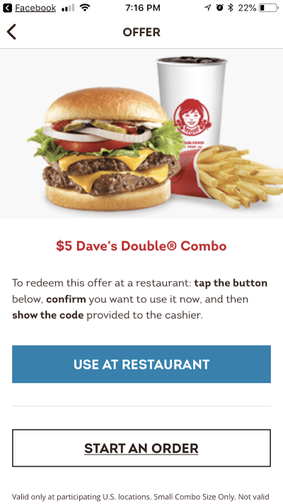
    Let’s say that users aren’t turned off by the poor navigational choices and still want to redeem one of these offers. This is what they encounter next:


    Wendy's in-restaurant offers
    Wendy’s Offers can be used at the restaurant. (Image source: Wendy’s) (Large preview)

    Now, this is pretty cool. Users can redeem the offer at that very moment while they’re in a Wendy’s or they can place the order through the app and pick it up. Either way, this is a great way to integrate the mobile app and in-store experiences.

    Except…


    Wendy's offer code
    The Wendy’s offer code takes a while to populate. (Image source: Wendy’s) (Large preview)

    Imagine standing in line at a Wendy’s or going through a drive-thru that isn’t particularly busy. That image above is not one you’d want to see.

    They call it “fast food” for a reason and if your app isn’t working or it takes just a few seconds too long to load the offer code, imagine what that will do for everyone else’s experience at Wendy’s. The cashiers will be annoyed that they’ve held up the flow of traffic and everyone waiting in line will be frustrated in having to wait longer.

    While mobile apps generally are designed to cater to the single user experience, you do have to consider how something like this could affect the experience of others.

    Recommended reading: How To Improve Your Billing Form’s UX In One Day

    3. Overwhelming Navigation

    A poorly constructed or non-visible navigation is one thing. But a navigation that gives way too many options can be just as problematic. While a mega menu on something like an e-commerce website certainly makes sense, an oversized menu in mobile apps doesn’t.

    It pains me to do this since I love the BBC, but its news app is guilty of this crime:


    BBC News navigation
    The top of the BBC News navigation (Image source: BBC News) (Large preview)

    This looks like a standard news navigation at first glance. Top (popular) stories sit at the top; my News (customized) stories below it. But then it appears there’s more, so users are apt to scroll downwards and see what others options there are:


    More BBC News pages
    More of the BBC News navigation bar (Image source: BBC News) (Large preview)

    The next scroll down gives users a choice of stories by geography, by subject:


    Even more BBC News pages
    Even more BBC News pages to choose from. (Image source: BBC News) (Large preview)

    And then there are even more options for sports as well as specific BBC News channels. It’s a lot to take in.

    If that weren’t bad enough, the personalization choices mirror the depth of the navigation:


    BBC News personalization
    BBC News personalization choices (Image source: BBC News) (Large preview)

    Now, there’s nothing wrong with personalizing the mobile app experience. I think it’s something every app — especially those that deliver global news — should allow for. However, BBC News gives an overwhelming amount of options.

    What’s worse is that many of the stories overlap categories, which means users could realistically see the same headlines over and over again as they scroll through the personalized categories they’ve chosen.

    If BBC News (or any other app that does this) wants to allow for such deep personalization, the app should be programmed to hide stories that have already been seen or scrolled past — much like how Feedly handles its stream of news. That way, all that personalization really is valuable.

    Recommended reading: How BBC Interactive Content Works Across AMP, Apps, And The Web

    4. Outdated or Incomplete Experience

    Anything a mobile app does that makes users unwillingly stop or slow down is bad. And this could be caused by a number of flaws in the experience:

    • Slow-loading pages,
    • Intrusive pop-ups,
    • Dated design choices,
    • Broken links or images,
    • Incomplete information,
    • And so on.

    If you expect users to take time to download and at least give your app a try, make sure it’s worth their while.

    One such example of this is the USHUD mobile app. It’s supposed to provide the same exact experience to users as the website counterpart. However, the app doesn’t work all that well:


    Slow USHD app
    A slow-loading page on the USHUD app (Image source: USHUD) (Large preview)

    In the example above, you can see that search results are slow to load. Now, if they were chock full of images and videos, I could see why that might occur (though it’s still not really acceptable).

    That said, many of the properties listed on the app don’t have corresponding visual content:


    USHUD missing images
    USHUD is missing images in search. (Image source: USHUD) (Large preview)

    Real estate apps or, really, any apps that deal in the transaction of purchasing or renting of property or products should include images with each listing. It’s the whole reason why consumers are able to rent and buy online (or at least use it in the decisionmaking process).

    But this app seems to be missing many images, which can lead to an unhelpful and unpleasant experience for users who hope to get information from the more convenient mobile app option.

    If you’re going to build a mobile app that’s supposed to inform and compel users to engage, make sure it’s running in tip-top shape. All information is available. All tabs are accessible. And pages load in a reasonable timeframe.

    5. Complicated or Impossible Gestures

    We’ve already seen what a poorly made navigation can do to the user experience as well as the problem with pages that just don’t load. But sometimes friction can come from intentionally complicated gestures and engagements.

    This is something I personally encountered with Sinemia recently. Sinemia is a competitor of the revolutionary yet failing MoviePass mobile app. Sinemia seems like a reasonable deal and one that could possibly sustain a lot longer than the unrealistic MoviePass model that promises entry to one movie every single day. However, Sinemia has had many issues with meeting the demand of its users.

    To start, it delayed the sending of cards by a week. When I signed up in May, I was told I would have to wait at least 60 days to receive my card in the mail, even though my subscription had already kicked in. So, there was already a disparity there.

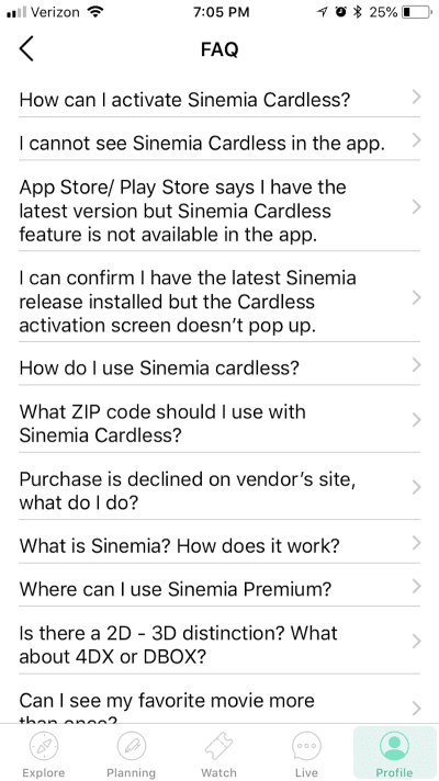
    Sinemia’s response to that was to create a “Cardless” feature. This would enable those users who hadn’t yet received their cards to begin using their accounts. As you can see here, the FAQ included a dedicated section to Sinemia Cardless:


    Sinemia FAQ
    Questions about Sinemia Cardless (Image source: Sinemia) (Large preview)

    See that point that says “I can confirm I have the latest Sinemia release installed…”? The reason why that point is there is because many Sinemia Cardless users (myself included) couldn’t actually activate the Cardless feature. When attempting to do so, the app would display an error.

    The Sinemia FAQ then goes on to provide this answer to the complaint/question:


    Sinemia Cardless issues
    Sinemia Cardless issues with app version (Image source: Sinemia) (Large preview)

    Here’s the problem: there were never any updates available for the mobile app. So, I and many others reached out to Sinemia for support. The answer repeatedly given was that Cardless could not work if your app ran on an old version. Support asked users to delete the app from their devices and reinstall from the app store to ensure they had the correct version — to no avail.

    For me, this was a big problem. I was paying for a service that I had no way of using, and I was spending way too much time uninstalling and installing an app that should work straight out the gate.

    I gave up after 48 hours of futile attempts. I went to my Profile to delete my account and get a refund on the subscription I had yet to use. But the app told me it was impossible to cancel my account through it. I tried to ask support for help, but no one responded. So, after Googling similar issues with account cancellations, I found that the only channel through which Sinemia would handle these requests was Facebook Messenger.

    Needless to say, the whole experience left me quite jaded about apps that can’t do something as simple as activating or deactivating an account. While I recognize an urge to get a better solution on the mobile app market, rushing out an app and functionality that’s not ready to reach the public isn’t the solution.

    Recommended reading: What You Need To Know About OAuth2 And Logging In With Facebook

    6. Gated Content Keeps App from Being Valuable

    For those of you who notice your retention rate remaining high for the first week or so from installation, the problem may more have to do with the mobile app’s limitations.

    Recolor is a coloring book app I discovered in the app store. There’s nothing in the description that would lead me to believe that the app requires payment in order to enjoy the calming benefits of coloring pictures, but that’s indeed what I encountered:


    Free coloring book images
    Free drawings users can color with the Recolor app. (Image source: Recolor) (Large preview)

    Above, you can see there are a number of free drawings available. Some of the more complex drawings will take some time to fill in, but not as much as a physical coloring book would by hand, which means users are apt to get through this quickly.

    Inevitably, mobile app users will go searching for more options and this is what they will encounter:


    Recolor is pay to play
    Recolor’s more popular options are for Premium users. (Image source: Recolor) (Large preview)

    When users look into some of the more popular drawings from Recolor, you’d hope they would encounter at least a few free drawings, right? After all, how many users could possibly be paying for a subscription to this app that’s not outrightly advertised as premium?

    But it’s not just the Popular choices that require a fee to access (that’s what the yellow symbol in the bottom-right means). So, too, do most of the other categories:


    Recolor's premium offerings
    Premium account needed to access more drawings on Recolor. (Image source: Recolor) (Large preview)

    It’s a shame that so much of the content is gated off. Coloring books have proven to be good for managing anxiety and stress, so leaving users with only a few dozen options doesn’t seem right. Plus, the weekly membership to the app is pretty expensive, even if users try to earn coins by watching videos.

    A mobile app such as this one should make its intentions clear from the start: “Consider this a free trial. If you want more, you’ll have to pay.”

    While I’m sure the developer didn’t intend to deceive with this app model, I can see how the retention rate might suffer and prevent this app from becoming a long-term staple on many users’ devices.

    When making a promise to users (even if it’s implied), design and manage your app in a way that lives up to those expectations.

    As I noted earlier, those initial signups might make you hopeful of the app’s long-term potential, but a forced pay-to-play scenario could easily disrupt that after just a few weeks.

    7. Impossible to Convert in-App

    Why do we create mobile apps? For many developers, it’s because the mobile web experience is insufficient. And because many users want a more convenient way to connect with your brand. A mobile app sits on the home screen of devices and requires just a single click to get inside.

    So, why would someone build an app that forces users to leave it in order to convert? It seems pointless to even go through the trouble of creating the app in the first place (which is usually no easy task).

    Here’s the Megabus app:


    Megabus ticket search
    The Megabus mobile app for searching and buying tickets (Image source: Megabus) (Large preview)

    Megabus is a low-cost transportation service that operates in Canada, the United States and the United Kingdom. There are a number of reasons why users would gravitate to the mobile app counterpart for the website; namely, the convenience of logging in and purchasing tickets while they’re traveling.

    The image above shows the search I did for Megabus tickets through the mobile app. I entered all pertinent details, found tickets available for my destination and got ready to “Buy Tickets” right then and there.

    However, you can’t actually buy tickets from the mobile app:


    Megabus tickets
    Megabus tickets are only available online. (Image source: Megabus) (Large preview)

    Upon clicking “Buy Tickets”, the app pushes users out and into their browser. They then are asked to reinput all those details from the mobile app to search for open trips and make a purchase.

    For a service that’s supposed to make travel over long distances convenient, its mobile app has done anything but reinforce that experience.

    For those of you considering building an app (whether on your own accord or because a client asked) solely so you can land a spot in app store search results, don’t waste users’ time. If they can’t have a complete experience within the app, you’re likely to see your retention rate tank fairly quickly.

    Wrapping Up

    Clearly, there are a number of ways in which a mobile app may suffer a misstep in terms of the user experience. And I’m sure that there are times when mobile app developers don’t even realize there’s something off in the experience.

    This is why your mobile app retention rate is such a critical data point to pay attention to. It’s not enough to just know what that rate is. You should watch for when those major dropoffs occur; not just in terms of the timeline, but also in terms of which pages lead to a stoppage in activity or an uninstall altogether.

    With this data in hand, you can refine the in-app experience and make it one that users want to stay inside of for the long run.

    Smashing Editorial(ra, yk, il)
    Categories: Others Tags: