Archive

Archive for October, 2018

Getting Started with Vue Plugins

October 16th, 2018 No comments

In the last months, I’ve learned a lot about Vue. From building SEO-friendly SPAs to crafting killer blogs or playing with transitions and animations, I’ve experimented with the framework thoroughly.

But there’s been a missing piece throughout my learning: plugins.

Most folks working with Vue have either comes to rely on plugins as part of their workflow or will certainly cross paths with plugins somewhere down the road. Whatever the case, they’re a great way to leverage existing code without having to constantly write from scratch.

Many of you have likely used jQuery and are accustomed to using (or making!) plugins to create anything from carousels and modals to responsive videos and type. We’re basically talking about the same thing here with Vue plugins.

So, you want to make one? I’m going to assume you’re nodding your head so we can get our hands dirty together with a step-by-step guide for writing a custom Vue plugin.

First, a little context…

Plugins aren’t something specific to Vue and — just like jQuery — you’ll find that there’s a wide variety of plugins that do many different things. By definition, they indicate that an interface is provided to allow for extensibility.

Brass tax: they’re a way to plug global features into an app and extend them for your use.

The Vue documentation covers plugins in great detail and provides an excellent list of broad categories that plugins generally fall into:

  1. Add some global methods or properties.
  2. Add one or more global assets: directives/filters/transitions etc.
  3. Add some component options by global mixin.
  4. Add some Vue instance methods by attaching them to Vue.prototype.
  5. A library that provides an API of its own, while at the same time injecting some combination of the above.

OK, OK. Enough prelude. Let’s write some code!

What we’re making

At Spektrum, Snipcart’s mother agency, our designs go through an approval process, as I’m sure is typical at most other shops and companies. We allow a client to comment and make suggestions on designs as they review them so that, ultimately, we get the green light to proceed and build the thing.

We generally use InVision for all this. The commenting system is a core component in InVision. It lets people click on any portion of the design and leave a comment for collaborators directly where that feedback makes sense. It’s pretty rad.
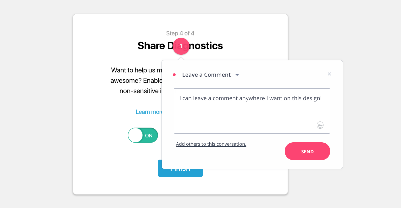
As cool as InVision is, I think we can do the same thing ourselves with a little Vue magic and come out with a plugin that anyone can use as well.

The good news here is they’re not that intimidating. A basic knowledge of Vue is all you need to start fiddling with plugins right away.

Step 1. Prepare the codebase

A Vue plugin should contain an install method that takes two parameters:

  1. The global Vue object
  2. An object incorporating user-defined options

Firing up a Vue project is super simple, thanks to Vue CLI 3. Once you have that installed, run the following in your command line:

$ vue create vue-comments-overlay
# Answer the few questions
$ cd vue-comments-overlay
$ npm run serve

This gives us the classic “Hello World” start we need to crank out a test app that will put our plugin to use.

Step 2. Create the plugin directory

Our plugin has to live somewhere in the project, so let’s create a directory where we can cram all our work, then navigate our command line to the new directory:

$ mkdir src/plugins
$ mkdir src/plugins/CommentsOverlay
$ cd src/plugins/CommentsOverlay

Step 3: Hook up the basic wiring

A Vue plugin is basically an object with an install function that gets executed whenever the application using it includes it with Vue.use().

The install function receives the global Vue object as a parameter and an options object:

// src/plugins/CommentsOverlay/index.js
// 
export default {
  install(vue, opts){   
    console.log('Installing the CommentsOverlay plugin!')
    // Fun will happen here
  }
}

Now, let’s plug this in our “Hello World” test app:

// src/main.js
import Vue from 'vue'
import App from './App.vue'
import CommentsOverlay from './plugins/CommentsOverlay' // import the plugin

Vue.use(CommentsOverlay) // put the plugin to use!

Vue.config.productionTip = false

new Vue({ render: createElement => createElement(App)}).$mount('#app')

Step 4: Provide support for options

We want the plugin to be configurable. This will allow anyone using it in their own app to tweak things up. It also makes our plugin more versatile.

We’ll make options the second argument of the install function. Let’s create the default options that will represent the base behavior of the plugin, i.e. how it operates when no custom option is specified:

// src/plugins/CommentsOverlay/index.js

const optionsDefaults = {
  // Retrieves the current logged in user that is posting a comment
  commenterSelector() {
    return {
      id: null,
      fullName: 'Anonymous',
      initials: '--',
      email: null
    }
  },
  data: {
    // Hash object of all elements that can be commented on
    targets: {},
    onCreate(created) {
      this.targets[created.targetId].comments.push(created)
    },
    onEdit(editted) {
      // This is obviously not necessary
      // It's there to illustrate what could be done in the callback of a remote call
      let comments = this.targets[editted.targetId].comments
      comments.splice(comments.indexOf(editted), 1, editted);
    },
    onRemove(removed) {
      let comments = this.targets[removed.targetId].comments
      comments.splice(comments.indexOf(removed), 1);
    }
  }
}

Then, we can merge the options that get passed into the install function on top of these defaults:

// src/plugins/CommentsOverlay/index.js

export default {
  install(vue, opts){
    // Merge options argument into options defaults
    const options = { ...optionsDefaults, ...opts }
    // ...
  }
}

Step 5: Create an instance for the commenting layer

One thing you want to avoid with this plugin is having its DOM and styles interfere with the app it is installed on. To minimize the chances of this happening, one way to go is making the plugin live in another root Vue instance, outside of the main app’s component tree.

Add the following to the install function:

// src/plugins/CommentsOverlay/index.js

export default {
  install(vue, opts){
    ...
  // Create plugin's root Vue instance
      const root = new Vue({
        data: { targets: options.data.targets },
        render: createElement => createElement(CommentsRootContainer)
      })

      // Mount root Vue instance on new div element added to body
      root.$mount(document.body.appendChild(document.createElement('div')))

      // Register data mutation handlers on root instance
      root.$on('create', options.data.onCreate)
      root.$on('edit', options.data.onEdit)
      root.$on('remove', options.data.onRemove)

      // Make the root instance available in all components
      vue.prototype.$commentsOverlay = root
      ...
  }
}

Essential bits in the snippet above:

  1. The app lives in a new div at the end of the body.
  2. The event handlers defined in the options object are hooked to the matching events on the root instance. This will make sense by the end of the tutorial, promise.
  3. The $commentsOverlay property added to Vue’s prototype exposes the root instance to all Vue components in the application.

Step 6: Make a custom directive

Finally, we need a way for apps using the plugin to tell it which element will have the comments functionality enabled. This is a case for a custom Vue directive. Since plugins have access to the global Vue object, they can define new directives.

Ours will be named comments-enabled, and it goes like this:

// src/plugins/CommentsOverlay/index.js

export default {
  install(vue, opts){

    ...

    // Register custom directive tha enables commenting on any element
    vue.directive('comments-enabled', {
      bind(el, binding) {

        // Add this target entry in root instance's data
        root.$set(
          root.targets,
          binding.value,
          {
            id: binding.value,
            comments: [],
            getRect: () => el.getBoundingClientRect(),
          });

        el.addEventListener('click', (evt) => {
          root.$emit(`commentTargetClicked__${binding.value}`, {
            id: uuid(),
            commenter: options.commenterSelector(),
            clientX: evt.clientX,
            clientY: evt.clientY
          })
        })
      }
    })
  }
}

The directive does two things:

  1. It adds its target to the root instance’s data. The key defined for it is binding.value. It enables consumers to specify their own ID for target elements, like so : .
  2. It registers a click event handler on the target element that, in turn, emits an event on the root instance for this particular target. We’ll get back to how to handle it later on.

The install function is now complete! Now we can move on to the commenting functionality and components to render.

Step 7: Establish a “Comments Root Container” component

We’re going to create a CommentsRootContainer and use it as the root component of the plugin’s UI. Let’s take a look at it:

<!-- 
 src/plugins/CommentsOverlay/CommentsRootContainer.vue -->

<template>
  <div>
    <comments-overlay
        v-for="target in targets"
        :target="target"
        :key="target.id">
    </comments-overlay>
  </div>
</template>

<script>
import CommentsOverlay from "./CommentsOverlay";

export default {
  components: { CommentsOverlay },
  computed: {
    targets() {
      return this.$root.targets;
    }
  }
};
</script>

What’s this doing? We’ve basically created a wrapper that’s holding another component we’ve yet to make: CommentsOverlay. You can see where that component is being imported in the script and the values that are being requested inside the wrapper template (target and target.id). Note how the target computed property is derived from the root component’s data.

Now, the overlay component is where all the magic happens. Let’s get to it!

Step 8: Make magic with a “Comments Overlay” component

OK, I’m about to throw a lot of code at you, but we’ll be sure to walk through it:

<!--  src/plugins/CommentsOverlay/CommentsRootContainer.vue -->

<template>
  <div class="comments-overlay">

    <div class="comments-overlay__container" v-for="comment in target.comments" :key="comment.id" :style="getCommentPostition(comment)">
      <button class="comments-overlay__indicator" v-if="editing != comment" @click="onIndicatorClick(comment)">
        {{ comment.commenter.initials }}
      </button>
      <div v-else class="comments-overlay__form">
        <p>{{ getCommentMetaString(comment) }}</p>
        <textarea ref="text" v-model="text" />        
        <button @click="edit" :disabled="!text">Save</button>
        <button @click="cancel">Cancel</button>
        <button @click="remove">Remove</button>
      </div>
    </div>

    <div class="comments-overlay__form" v-if="this.creating" :style="getCommentPostition(this.creating)">
      <textarea ref="text" v-model="text" />
      <button @click="create" :disabled="!text">Save</button>
      <button @click="cancel">Cancel</button>
    </div>

  </div>
</template>

<script>
export default {
  props: ['target'],

  data() {
    return {
      text: null,
      editing: null,
      creating: null
    };
  },

  methods: {
    onTargetClick(payload) {
      this._resetState();
      const rect = this.target.getRect();

      this.creating = {
        id: payload.id,
        targetId: this.target.id,
        commenter: payload.commenter,
        ratioX: (payload.clientX - rect.left) / rect.width,
        ratioY: (payload.clientY - rect.top) / rect.height
      };
    },
    onIndicatorClick(comment) {
      this._resetState();
      this.text = comment.text;
      this.editing = comment;
    },
    getCommentPostition(comment) {
      const rect = this.target.getRect();
      const x = comment.ratioX  <em> rect.width + rect.left;
      const y = comment.ratioY  <em> rect.height + rect.top;
      return { left: `${x}px`>, top: `${y}px` };
    },
    getCommentMetaString(comment) {
      return `${
        comment.commenter.fullName
      } - ${comment.timestamp.getMonth()}/${comment.timestamp.getDate()}/${comment.timestamp.getFullYear()}`;
    },
    edit() {
      this.editing.text = this.text;
      this.editing.timestamp = new Date();
      this._emit("edit", this.editing);
      this._resetState();
    },
    create() {
      this.creating.text = this.text;
      this.creating.timestamp = new Date();
      this._emit("create", this.creating);
      this._resetState();
    },
    cancel() {
      this._resetState();
    },
    remove() {
      this._emit("remove", this.editing);
      this._resetState();
    },
    _emit(evt, data) {
      this.$root.$emit(evt, data);
    },
    _resetState() {
      this.text = null;
      this.editing = null;
      this.creating = null;
    }
  },

  mounted() {
    this.$root.$on(`commentTargetClicked__${this.target.id}`, this.onTargetClick
    );
  },

  beforeDestroy() {
    this.$root.$off(`commentTargetClicked__${this.target.id}`, this.onTargetClick
    );
  }
};
</script>

I know, I know. A little daunting. But it’s basically only doing a few key things.

First off, the entire first part contained in the tag establishes the markup for a comment popover that will display on the screen with a form to submit a comment. In other words, this is the HTML markup that renders our comments.

Next up, we write the scripts that power the way our comments behave. The component receives the full target object as a prop. This is where the comments array and the positioning info is stored.

Then, the magic. We’ve defined several methods that do important stuff when triggered:

  • Listens for a click
  • Renders a comment box and positions it where the click was executed
  • Captures user-submitted data, including the user’s name and the comment
  • Provides affordances to create, edit, remove, and cancel a comment

Lastly, the handler for the commentTargetClicked events we saw earlier is managed within the mounted and beforeDestroy hooks.

It’s worth noting that the root instance is used as the event bus. Even if this approach is often discouraged, I judged it reasonable in this context since the components aren’t publicly exposed and can be seen as a monolithic unit.

Aaaaaaand, we’re all set! After a bit of styling (I won’t expand on my dubious CSS skills), our plugin is ready to take user comments on target elements!

Demo time!
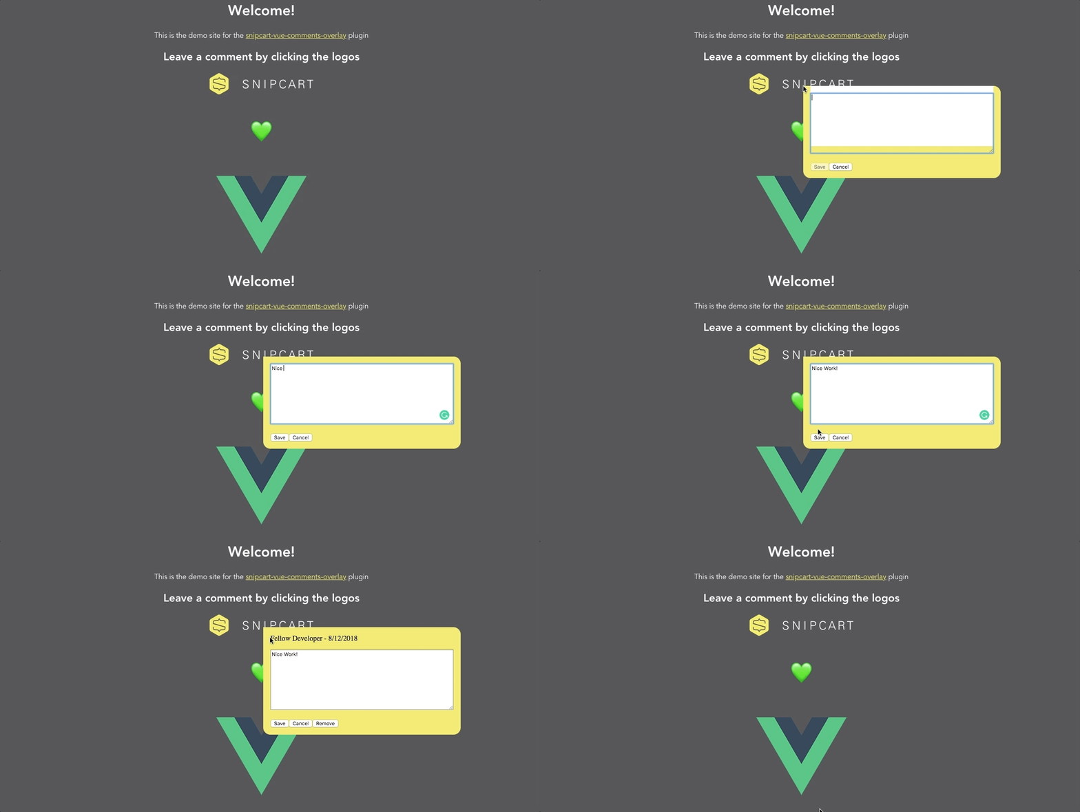
Live Demo

GitHub Repo

Getting acquainted with more Vue plugins

We spent the bulk of this post creating a Vue plugin but I want to bring this full circle to the reason we use plugins at all. I’ve compiled a short list of extremely popular Vue plugins to showcase all the wonderful things you gain access to when putting plugins to use.

  • Vue-router – If you’re building single-page applications, you’ll without a doubt need Vue-router. As the official router for Vue, it integrates deeply with its core to accomplish tasks like mapping components and nesting routes.
  • Vuex – Serving as a centralized store for all the components in an application, Vuex is a no-brainer if you wish to build large apps with high maintenance.
  • Vee-validate – When building typical line of business applications, form validation can quickly become unmanageable if not handled with care. Vee-validate takes care of it all in a graceful manner. It uses directives, and it’s built with localization in mind.

I’ll limit myself to these plugins, but know that there are many others waiting to help Vue developers, like yourself!

And, hey! If you can’t find a plugin that serves your exact needs, you now have some hands-on experience crafting a custom plugin. ?

The post Getting Started with Vue Plugins appeared first on CSS-Tricks.

Categories: Designing, Others Tags:

Photoshop Workflows And Shortcuts For Digital Artists

October 16th, 2018 No comments
Picture of the artist writing the article

Photoshop Workflows And Shortcuts For Digital Artists

Photoshop Workflows And Shortcuts For Digital Artists

Yoanna Victorova

2018-10-16T15:30:51+02:002018-10-16T13:39:09+00:00

Adobe Photoshop plays a role in almost every digital creator’s life. Photoshop is what many digital artists, photographers, graphic designers, and even some web developers have in common. The tool is so flexible that often you can achieve the same results in several different ways. What sets us all apart is our personal workflows and our preferences on how we use it to achieve the desired outcome.

I use Photoshop every day and shortcuts are a vital part of my workflow. They allow me to save time and to focus better on what I am doing: digital illustration. In this article, I am going to share the Photoshop shortcuts I use frequently — some of its features that help me be more productive, and a few key parts of my creative process.

To profit the most from this tutorial, some familiarity with Photoshop would be required but no matter if you are a complete beginner or an advanced user, you should be able to follow along because every technique will be explained in detail.

For this article, I’ve decided to use one of my most famous Photoshop artworks named “Regret”:


Picture of the artist writing the article
Author’s illustration (Large preview)

Table of Contents

  1. Introduction To Shortcuts: The Path To Boosting Your Productivity
  2. The Keyboard Shortcuts Window
  3. How To Increase And Decrease The Brush Size
  4. How To Increase And Decrease The Brush Softness
  5. Quick Color Picker (HUD Color Picker)
  6. Working With Layers
  7. Working With Curves
  8. Actions: Recording Everything You Need For Your Project
  9. Conclusion
  10. Further Reading

1. Introduction To Shortcuts: The Path To Boosting Your Productivity

Every single designer, artist, photographer or web developer has probably once opened Photoshop and has pointed and clicked on an icon to select the Brush tool, the Move tool, and so on. We’ve all been there, but those days are long gone for most of us who use Photoshop every day. Some might still do it today, however, what I would like to talk about before getting into the details, is the importance of shortcuts.

When you think about it, you’re saving perhaps half a second by using a keyboard shortcut instead of moving your mouse (or stylus) over to the Tools bar and selecting the tool you need by clicking on the tool’s little icon. To some that may seem petty, however, do consider that every digital creator does thousands of selections per project and these half-seconds add up to become hours in the end!

Now, before we continue, please note the following:

  1. Shortcuts Notation
    I use Photoshop on Windows but all of the shortcuts should work the same on Mac OS; the only thing worth mentioning is that the Ctrl (Control) key on Windows corresponds to the Cmd (Command) key on the Mac, so I’ll be using Ctrl/Cmd throughout this tutorial.
  2. Photoshop CS6+
    All the features and shortcuts mentioned here should work in Photoshop CS6 and later — including the latest Photoshop CC 2018.

2. The Keyboard Shortcuts Window

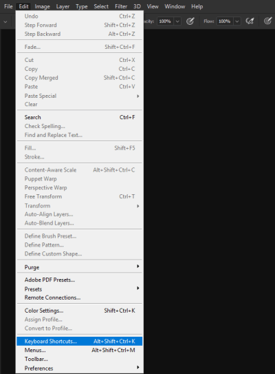
To start off, I would like to show you where you can find the Keyboard Shortcuts window where you could modify the already existing shortcuts, and learn which key is bound to which feature or tool:

Open Photoshop, go to Edit and select Keyboard Shortcuts. Alternatively, you can access the same from here: Window ? Workspace ? Keyboard Shortcuts & Menus.


the Edit tab with Keyboard Shortcuts option highlighted
Photoshop’s edit (Large preview)

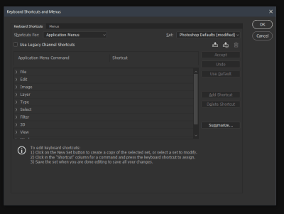
Now you will be greeted by the Keyboard Shortcuts and Menus window (dialog box), where you can pick a category you would like to check out. There are a ton of options in there, so it could get a bit intimidating at first, but that feeling will pass soon. The main three options (accessible through the Shortcuts for:… dropdown list) are:

  • Application Menus
  • Panel Menus
  • Tools

Typically the Application Menus will be the first thing you’ll see. These are the shortcuts for the menu options you see on the top of Photoshop’s window (File, Edit, Image, Layer, Type, and so on).


 Keyboard Shortcuts and Menus option open, displaying the shortcuts for the Applications menu
Applications menu (Large preview)

So for example if you’re using the Brightness/Contrast option often, instead of having to click on Image (in the menu), then Adjustments and finally find and click on Brightness/Contrast item, you can simply assign a key combination and Brightness/Contrast will show right up after you press the keys assigned.

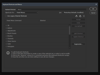
The second section, Panel Menus, is an interesting one as well, especially in its Layers portion. You get to see several options that could be of use to you depending on the type of work you need to do. That’s where the standard New Layer shortcut lies (Ctrl/Cmd + Shift + N) but also you can set up a shortcut for Delete Hidden Layers. Deleting unnecessary layers helps in lowering the size of the Photoshop file and helps improving performance because your computer will not have to cache in on those extra layers that you’re actually not using.


Keyboard Shortcuts and Menus option open, displaying the shortcuts for the Panel Menus
Panel menu (Large preview)

The third section is Tools where you can see the shortcuts assigned to all the tools found in the left panel of Photoshop.

Pro Tip: To cycle between any of the tools that have sub-tools (example: the Eraser tool has a Background Eraser and a Magic Eraser) you just need to hold your Shift key and the appropriate shortcut button. In case of the Eraser example, press Shift + E a few times until you reach the desired sub-tool.

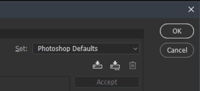
One last thing I would like to mention before wrapping up this section is that the Keyboard Shortcuts and Menus allows you to set up different Profiles (Photoshop calls them “sets” but I think that “profiles” better suits the purpose), so that if you don’t really want to mess with the Photoshop Defaults one, you can simply create a new personalized profile. It’s worth mentioning that when you create a new Profile, you get the Default set of Photoshop Shortcuts in it until you start modifying them.


Keyboard Shortcuts and Menus option showing the Profiles section
Keyboard shortcuts and menus profile section (Large preview)

The Keyboard Shortcuts menu can take a bit of time to get around to, however, if you invest the time in the beginning (best if you do it in your own time rather than during a project), you will benefit later.

Focusing On The Shortcuts On The Left Side Of Your Keyboard

After people acknowledged the usefulness of using shortcuts, eventually they agreed that time is being wasted moving your hand from one side of the keyboard to the opposite one. Sounds a bit petty again, however, remember those half-seconds? They still add up, but this time it can even fatigue your arm if you’re constantly switching tools and have to move your arm around. So this probably led to Adobe adding a few more shortcut features focused on the left side of the keyboard.

Now let me show you the shortcuts that I most often use (and why).

3. How To Increase And Decrease The Brush Size

In order to increase or decrease the size of your brush, you need to:

  1. Click and hold the Alt key. (On the Mac this would be the Ctrl and Alt keys),
  2. Click and hold the right mouse button,
  3. Then drag horizontally from left to right to increase, and from right to left to decrease the size.

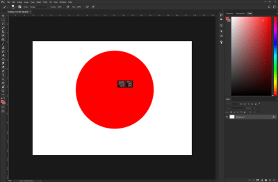
Red circle displaying the brush size increase via mouse drag
Brush size increase preview (Large preview)

The moment I learned about this shortcut, I literally couldn’t stop using it!

If you’re a digital artist, I believe you will particularly love it as well. Sketching, painting, erasing, just about everything you need to do with a brush becomes a whole lot easier and fluent because you wouldn’t need to reach for the all too familiar [ and ] keys which are the default ones for increasing and decreasing the brush size. Going for those keys can disrupt your workflow, especially if you need to take your eyes off your project or put the stylus aside.

4. How To Increase And Decrease The Brush Softness

It’s actually the same key combination but with a slight twist: increasing and decreasing the softness of your Brush will work only for Photoshop’s default Round brushes. Unfortunately, if you have any custom made brushes that have a custom form, this wouldn’t work for those.

  1. Click and hold the Alt key. (On the Mac this would be Ctrl and Alt keys),
  2. Click and hold the right mouse button,
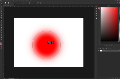
  3. Then drag upwards to harden the edge of your brush and drag downwards to make it softer.

Red circle displaying the brush softness increase via mouse drag
Brush softness increase preview (Large preview)

Again, this shortcut doesn’t work for custom shaped brushes, although it would have been a really nice feature to have. Hopefully, we’ll be able to see that in a future update to Photoshop.

5. Quick Color Picker (HUD Color Picker)

You may or may not be aware that Photoshop offers a quick color picker (HUD Color Picker). And no, this is not the color picker that is located in the Tools section.


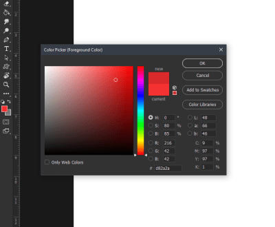
Photoshop's Quick color picker
Quick color picker (Large preview)

I am referring to what Adobe calls “HUD Color Picker” that pops up right where your cursor is located on the canvas.

This so-called HUD Color Picker is a built-in version and I believe it’s been around since at least Photoshop CS6 (which was released back in 2012). If you’re learning about this now, probably you’re as surprised as I was when I first came across it a few months ago. Yes, it took me a while to get used to, too! Well, to be fair, I do also have some reservations about this color picker, but I’ll get to them in a second.


Photoshop's HUD color picker
Photoshop’s HUD color picker (Large preview)

Here’s how to pull up the HUD Color Picker:

On Windows
  1. Click and hold Alt + Shift,
  2. Click and hold the right mouse button.
On Mac
  1. Click and hold Ctrl ? + Alt ? + Cmd ?,
  2. Click and hold the right mouse button.

If you’ve followed the key combinations above, you should see this colorful square. However, you’ve probably noticed that it’s a bit awkward to work with it. For example, you need to continue holding all of the keys, and while you do that, you need to hover over to the right rectangle to pick a color gamut and then hover back to the square to pick the shade. With all of the hovering that’s going on, it’s somewhat easy to miss the color that you’ve actually set your heart to pick, which could get a little annoying.

Nevertheless, I do believe that with a little practice you will be able to master the Quick Color Picker and get your desired results. If you’re not too keen on using that built-in version, there are always third-party extensions that you can strap to your Photoshop, for example, Coolorus 2 Color Wheel or Painters Wheel (works with PS CS4, CS5, CS6).

6. Working With Layers

One of the advantages of working digitally is undisputedly the ability to work with layers. They are quite versatile, and there’s a lot of things that you could do with them. You could say that one could write a book just on Layers alone. However, I’m going to do the next best thing, and that would be to share with you the options I most commonly use when working on my projects.

As you may have guessed, the Layer section is a pretty important one for any type of digital creative. In this section, I’m going to share the simpler but very useful shortcuts that could be some real lifesavers.

Clipping Mask Layer

A Clipping Mask Layer is what I most often use when I’m drawing. For those of you who do not know what that is, it’s basically a layer which you clip on to the layer below. The layer below defines what’s visible on the clipped on layer.

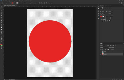
For example, let’s say that you have a circle on the base layer and then you add a Clipping Mask Layer to that circle. When you start drawing on your Clipping Mask Layer, you will be restricted only to the shapes in the Base Layer.


Red circle shape that's going to be used for a clipping mask
Red circle shape on transparent background (Large preview)

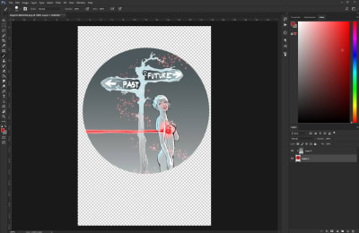
Drawly's artwork inserted into circle shape
Drawing inserted into circle shape (Large preview)

Take notice of the layers on the right side of the screen. Layer 0 is the Clipping Mask Layer of the Base Layer — Layer 1.

This option allows you to really easily create frames and the best part is that they’re non-destructive. The more shapes you add (in this case it’s Layer 1), the more visible parts of the image can be seen.


Drawly's artwork added into various shapes as a clipping mask
Drawly’s artwork added into various shapes as a clipping mask (Large preview)

The most common use for Clipping Mask Layers in digital art/painting is to add shadows and highlights to a base color. For example, let’s say that you’ve completed your character’s line-art and you’ve added their base skin tone. You can use Clipping Mask Layers to add non-destructive shadows and highlights.

Note: I’m using the term “non-destructive” because you cannot erase away something from the base layers — they will be safe and sound.)

So, how do you create those Clipping Mask Layers? Well, each one starts off as a regular “Layer”.

To create a regular Layer, you can use this shortcut:

Action Keyboard Shortcut
Creates a new regular Layer Ctrl/Cmd + Shift + N
Makes the newly created Layer into a Clipping Mask to the Layer below it Ctrl/Cmd + Alt + G

An alternative way to make a regular layer into a Clipping Mask is to press and hold the Alt key, and click between the two Layers. The upper layer will then become the Clipping Mask of the layer below.

Selecting All Layers

Every once in a while, you may want to select all of the layers, and group them together so that you can continue building on top of them or a number of other reasons. Typically, what I used to do is simply hold the Ctrl/Cmd key and then start clicking away at all of the layers. Needless to say, that was a bit time-consuming, especially if I’m working on a big project. So here’s a better way:

What you would need to do is simply press: Ctrl/Cmd + Alt + A.

Now that should’ve selected all of your layers and you will be able to do anything you want with them.

Flattening Visible Layers

Clipping Mask Layers may be totally awesome, however, they don’t always work well if you want to modify something in the general image you’re doing. Sometimes you just need everything (e.g. base color, highlights and shadows) to stop being on different layers and just be combined into one. Sometimes you just need to merge all currently visible layers into one, in a non-destructive way.

Here’s how:

Press and hold Ctrl/Cmd + Alt + Shift + E.

Et voilà! Now you should be seeing an extra layer on the top that has all other visible layers in it. The beauty of this shortcut is that you still have your other layers below — untouched and safe. If you mess up something with the newly created layer, you can still bring things back to the way they were before and start afresh.

Copying Multiple Layers

Every now and then we’re faced with the need to copy stuff from multiple layers. Typically what most people do is duplicate the two given layers they need, merge them and then start erasing away the unnecessary parts of the image.

What you need to do instead is to make a selection and then press:

Ctrl/Cmd + Shift + C

Here’s an example:


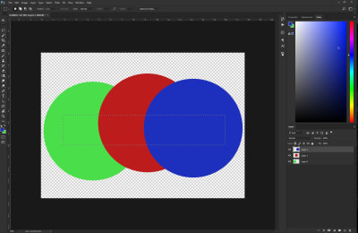
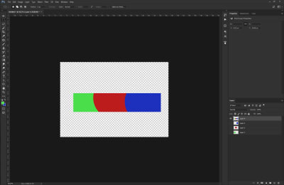
Three different colored circles on a transparent background
Three different colored circles (Large preview)

As you can see, each color dot is on a separate layer. Let’s say that we need to copy a straight rectangle through the center of the dots and copy it on a layer at the top.


Three different colored circles with a selection box inside them
Three different colored circles with a selection box inside them (Large preview)

We’ve made a selection and once you press Ctrl/Cmd + Shift + C, Photoshop will copy everything you have in your selection to the clipboard. Then all you have to do is simply paste (Ctrl/Cmd + V) anywhere, and a new layer will appear on the top of the page.


Selection box with the three different colors from the circles
Selection box with three different colors (Large preview)

This shortcut can come really handy especially when you’re working with multiple layers, and you need just a portion of the image to be together in a single layer.

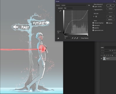
7. Working With Curves

In this section of the article, I would like to cover the importance of values as well as Curves which are generally a big topic to cover.

Starting off with the shortcut: Ctrl/Cmd + M.

Pretty simple, right? The best things in life are (almost) always simple! However, don’t let this talk about simplicity fool you, the Curves setting is one of the most powerful tools you have in Photoshop. Especially when it comes to tweaking brightness, contrast, colors, tones, and so on.

Now some of you may be feeling a bit of intimidated by the previous sentence: colors, tones, contrast,… say what now? Don’t worry, because the Curves tool is pretty simple to understand and it will do marvelous things for you. Let’s dig into the details.


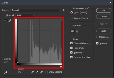
 Curves histogram
Curves histogram highlighted in red square (Large preview)

This is what the Curves tool basically looks like. As you can see, there’s a moderate amount of options available. What we’re interested in, however, is the area I’ve captured inside the red square. It is actually a simple Histogram with a diagonal line across. The Histogram‘s purpose is to show the values of the given image (or painting), left being the darkest points and right being the lightest ones.


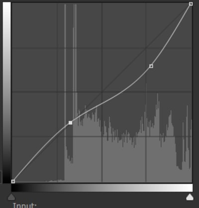
Curves histogram with one anchor point added
Curves histogram with one anchor point added (Large preview)

Curves histogram with two anchor points added
Curves histogram with two anchor points added (Large preview)

Using the mouse, we can put points on the diagonal line and drag it up and down. We typically decide what we want to darken or lighten. If, for example, we want to have the light parts of our image be just a bit darker, we need to click somewhere on the right side and drag down (just like in the first image).

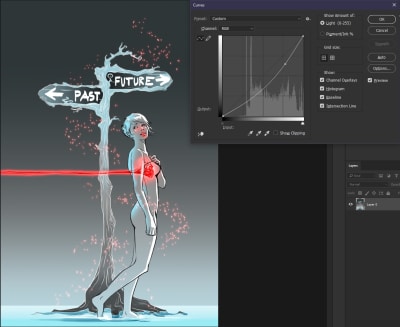
Here’s an example. First, take a look at the normal image:


Drawly's artwork, original colors and values
Drawly’s artwork, original colors and values. (Large preview)

Now, using Curves with the light parts toned down:


Curves histogram with one anchor point
Curves histogram with one anchor point (Large preview)

AIn addition, just for demonstration purposes, here’s what would happen if we have the lighter parts darkened and the darker parts lightened:


Curves histogram with two anchor points making the ‘S' shape
Curves histogram with two anchor points making the ‘S’ shape (Large preview)

You see, basically the linework is the darkest part, which stayed and the other darks have been lightened to a grayish type of value.

Now let me quickly elaborate on values and why they matter: by “values,” especially in the art world, we’re referring to the amount of lightness or darkness in a drawing (painting). With values, we create depth in our painting which on its part helps with creating the illusion which element is closer to the viewer and which one is in the distance (further back).

8. Actions: Recording Everything You Need For Your Project

Every so often we all need to deal with repetitive processes which could range from adding a filter over our image to creating certain types of layers with blending modes. Does this sound familiar? If so, keep reading.

Did you know that Photoshop supports programming languages such as JavaScript, AppleScript, and VBScript to automate certain processes? I didn’t, as programming has never been my cup of tea. The good thing is that instead, I came across the Actions panel, which offers a lot of functionality and options for automating some repetitive tasks and workflows. In my opinion, this is the best automation tool that Photoshop has to offer if you don’t know how to code.

The Actions panel basically can record every process you’re doing (e.g. adding a layer, cropping the image, changing its hue, and so on); then you can assign a function key to this process and easily re-use it later at any time.

By using the Actions panel, you can capture just about anything that you do in Photoshop and then save it as a process.

Let me give you an example. Let’s say that you want to automate the process of Create a new Layer, set it as a Clipping Mask, and then set its blending mode to Multiply (or anything else). You can record this whole process which would then be available to you for re-use by the press of a button.

Here’s how it works:

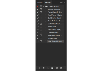
Pressing Alt + F9 will open this panel:


The actions panel displaying all the default options
The actions panel displaying all the default options (Large preview)

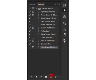
As you can probably see, there are some default (pre-recorded) processes on there. What we’re interested in, however, is creating our own action, which is done by clicking on the “Create new action” icon.


The actions panel with the “New Action” button highlighted in a red square
The actions panel with the “New Action” button highlighted (Large preview)

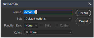
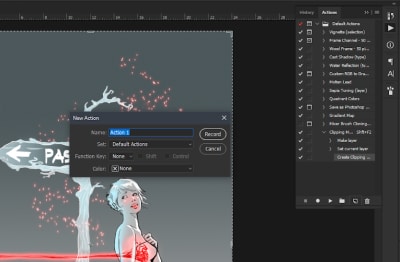
Now just like when you create a new layer in the Layers panel, once you click on the “Create new action” icon, a pop-up window opens with a few options in it.


New Action window displayed with text highlighted
New Action window (Large preview)

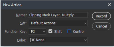
You can choose any given name for the Action you want to create and assign a Function key for it. So, for this demonstration purpose, I’ll create an action that will do the following:

  • Create a new transparent Layer;
  • Add it as a Clipping Mask to the Layer below;
  • Set its blending mode to Multiply.

I’ll set its Function key to Shift + F2.


Custom name added and function key assigned in New Action box
Custom name added and function key assigned in New Action box (Large preview)

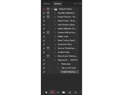
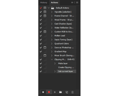
Once you’re ready with these settings, what you need to do is press the Record button. Once you’ve done that, you’ll notice that the Actions panel now has a red button to show you it’s recording.


Recording the new Action, record button toggled
Recording the new Action (Large preview)

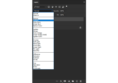
Now you just have to go about the regular process of creating a new layer, set it as a clipping mask and change its blending mode to Multiply.


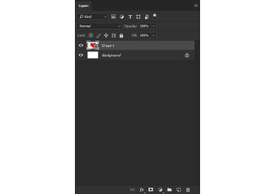
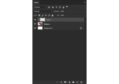
Heart shape layer added in Layers panel
Heart shape layer added (Large preview)

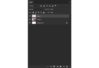
Heart shape layer added in Layers panel
New layer added on top of the heart shape (Large preview)

New layer made in to a clipping mask
New layer made in to a clipping mask to the heart shape (Large preview)

Blending mode drop-down menu open, Multiply highlighted
Blending mode drop-down menu open, Multiply highlighted. (Large preview)

Once you’re done, you have to hit the Stop icon on the Actions panel.


Actions panel open with the red recording button
Actions panel open with the red recording button (Large preview)

Your automation process is now ready to go! When you press Shift + F2, you’ll get a new Layer set as a Clipping Mask to the layer below and its blending mode set to Multiply.

I would also like to mention that the Actions automation process is not limited to just creating layers and setting blending modes. Here are some examples of some pretty handy other uses and options for actions:

  • You can set up to save images as certain types of files to certain folders on your computer;
  • Using File ? Automate ? Batch for processing lots of images;
  • The Allow Tool Recording option in the flyout Actions panel menu allows actions to include painting, and so on;
  • The Insert Conditional option in the flyout Actions panel menu allows actions to change their behavior, based on the state of the document;
  • File ? Scripts ? Script Events Manager lets actions run based on events, like when a document is opened or a new document is created.

Let me give you another example, I’ll create another Action that will change the size of my image and save it as a PNG file in a certain folder on my desktop.

So after we hit the New Action button on the Actions panel, we’ll proceed with picking the shortcut that we want, set a name for it, and I’ll take it a step further and assign a color to the Action (I’ll explain why this is a helpful feature in a bit).


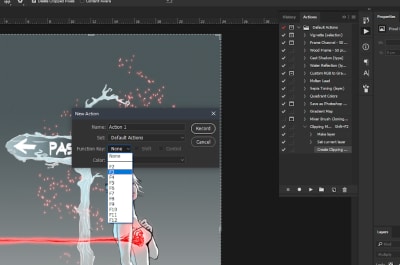
New Action box open
New Action box open (Large preview)

Selecting the Function key
Selecting the Function key (Large preview)

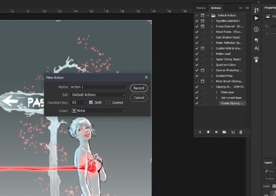
Checking the Shift checkbox
Checking the Shift checkbox (Large preview)

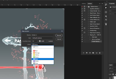
Picking a color for the Action
Picking a color for the Action (Large preview)

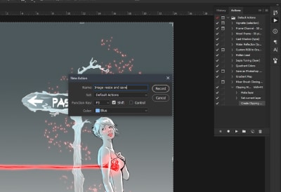
Displaying that a blue color was picked for the new action
Blue color picked for the new Action (Large preview)

Now about that color, you may notice that when you assign a color, it doesn’t really reflect in the Actions Panel. Instead, everything stays monochrome. The reason is because when you typically open that panel, you’re in the Edit view, where you’re able to modify the Actions, record new ones, and so on. In order to see all of the available actions in a simpler interface, do this:

  • On the upper-right hand corner of the panel you will see four horizontal lines. Click on those.
  • You’ll get a drop-down menu, where you have different Actions options. On the top, you’ll notice a Button Mode.

  • Actions' drop-down menu open, highlighted Button Mode
    Actions’ drop-down menu open, highlighted ‘Button Mode’. (Large preview)
  • Clicking on that will change the Actions Panel interface, where you will see your available Actions as colorful buttons.

The Actions' button mode
The Actions’ button mode (Large preview)

If you haven’t guessed it already, coloring your Actions will help you distinguish them more easily at a glance. In Button mode, when you take a glance at the panel, you will be able to navigate quickly to the Action that you want to apply to your image/drawing (if you don’t really remember the shortcut you’ve assigned for it).

Okay, so what we have so far is the following:

  1. We’ve created a new action;
  2. Set the shortcut for it;
  3. Changed its color;
  4. Named it.

Let’s proceed with recording the process that we need.

To open the Image Size menu, you can either go to Image ? Image Size or simply hit Ctrl + Alt + I and you’ll get this window:


 Image size menu open
Image size menu open (Large preview)

What you would want to do is set the desired size for your image and once you’re happy with that hit “OK” to apply the changes.


Image size values changed
Image size values changed (Large preview)

Next, what we want to do is use the Save As option in order to get the option to choose the type of file, destination folder, and so on. You can either go to File ? Save As… or you could simply press Ctrl + Shift + S and you will get the following window:


Saving dialogue box open
Saving dialogue box open (Large preview)

Navigate to the dedicated folder in which you want to save the current project in and actually save it there. An additional Action you can do is to close the image/project you’re working on (don’t worry, the Actions won’t stop recording unless you close down Photoshop).


Saving file as PNG, PNG options displayed
PNG options displayed (Large preview)

Once all of that is done, you can hit the Stop icon on the Actions Panel to stop recording your movement in Photoshop.

If you need to resize a bunch of files and save them in a dedicated folder, you just have to load them up in Photoshop and continue hitting the Action shortcut that you’ve created for Resizing and Saving.

If you take the time to get accustomed to the Actions tool in Photoshop and utilize it, you can say “Goodbye” to the bothersome repetitive work that usually eats up most of your time. You will be able to fly through these tasks with such speed that even the Flash could get jealous of.

9. Conclusion

In this article, I’ve shared some of the shortcuts I mostly use. I sincerely hope that they will help you boost up your productivity and make your workflow better as well.

Special Thanks

I would like to mention that this tutorial was made possible with the help of Angel (a.k.a. ArcanumEX). You can check out his artwork on his Facebook page, on Instagram, and on his YouTube channel.

Further Reading

In addition to everything I’ve talked about so far, I’ll include more resources that I believe you might find helpful. Be sure to check out:

What are your favorite shortcuts? Feel free to share them in the comments below!

Smashing Editorial(mb, ra, yk, il)
Categories: Others Tags:

HTML for Zip Codes

October 15th, 2018 No comments

I just overheard this discussion on Twitter, kicked off by Dave.

Me (coding a form):
Tiny Devil (appears on shoulder): Yaaas! I love the optimism, ship it!
Me: Wait, why are you here? Is this going to blow up on me? What do you know that I don’t?

— Dave SPOOPert (@davatron5000) October 9, 2018

It seems like zip codes are just numbers, right? So…

<input id="zip" name="zip" type="number">

The advantage there being able to take advantage of free validation from the browser, and triggering a more helpful number-based keyboard on mobile devices.

But Zach pointed out that type="number" is problematic for zip codes because zip codes can have leading zeros (e.g. a Boston zip code might be 02119). Filament group also has a little lib for fixing this.

This is the perfect job for inputmode, as Jeremy suggests

But the support is pretty bad at the time of this writing.

A couple of people mentioned trying to hijack type="tel" for it, but that has its own downsides, like rejecting properly formatted 9-digit zip codes.

So, zip codes, while they look like numbers, are probably best treated as strings. Another option here is to leave it as a text input, but force numbers with pattern, as Pamela Fox documents:

<input id="zip" name="zip" type="text" pattern="[0-9]*">

The post HTML for Zip Codes appeared first on CSS-Tricks.
Categories: Designing, Others Tags:

Sass Selector Combining

October 15th, 2018 No comments

Brad Frost was asking about this the other day…

Sass people, which way do you do it and why? pic.twitter.com/dIBA9BIuCO

— Brad Frost (@brad_frost) October 1, 2018

.c-btn {
    &__icon {
        ...
    }
}

I guess that’s technically “nesting” but the selectors come out flat:

.c-button__icon { }

The question was whether you do that or just write out the whole selector instead, as you would with vanilla CSS. Brad’s post gets into all the pro’s and con’s of both ways.

To me, I’m firmly in the camp of not “nesting” because it makes searching for selectors so much harder. I absolutely live by being able to search my project for fully expanded class names and, ironically, just as Brad was posting that poll, I was stumped by a combined class like this and changed it in one of my own code bases.

Robin Rendle also notes the difficulty in searching as an issue with an example that has clearly gone too far!

Direct Link to ArticlePermalink

The post Sass Selector Combining appeared first on CSS-Tricks.
Categories: Designing, Others Tags:

Is Polygraph Crative the Perfect Agency? AOTW #14

October 15th, 2018 No comments
Polygraph Crative

“To tell you the truth… the success of every project comes down to the talent, expertise and service of a few key individuals on both sides of the team. Ours is a conscientious, award-winning group of designers, putting passion, craft and intellect into every design decision we make.” – The team at Polygraph Creative

This week on Agency of the Week, we’re going to take a look at an agency with quite an impressive list of clients, and an even more impressive list of talents. Polygraph Creative is a Washington DC based studio that’s only after one thing: your success.

What do they do?

The talented folks over at Polygraph focus their expertise into anything related to design. Seriously. If you’re looking for web design, they’ve got you covered. Are you looking for a fresh packing logo? No problem! If you’re looking for a new typeface that’ll set your product off in the market, you guessed it, they’re great at that, too. Here’s a quick list of what they’re capable of so that you don’t have to stress about finding an agency for any specific field:

  • Brand Identity Design
  • Art Direction
  • Product Design
  • Packaging
  • Corporate Communications
  • Brand Voice
  • Annual Reports
  • Typeface Design
  • Hand-Lettering
  • Editorial Design
  • Magazine Design
  • Strategy
  • Book Design
  • Web
  • Digital Media Design
  • Illustration
  • Signage
  • Environmental

What have they done?

As I said before, they have quite an impressive list of clients that ranges from the United States Postal Service, all the way to beauty product businesses. When you sign up with them, you can be sure that you’ll come out better than before, and with a one of a kind look. Here are a few examples of work they’ve nailed in the past:

Cut Seven

Polygraph CrativePolygraph Crative

We developed distinct brand letterforms and dynamic verbal, graphic, and photographic languages that deliver the intensity of the Cut Seven Experience.

Cava

Polygraph CrativePolygraph Crative

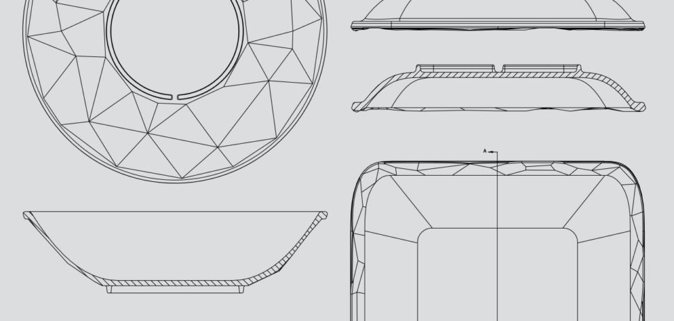
Our goal was to create vessels that celebrate the food, allowing it to take centerstage, with smooth, contoured interiors; yet on the flip side (literally), display Cava’s progressive brand personality with matte black, textured geometry.

The Little Red Fox

Polygraph CrativePolygraph Crative

Taking cues from traditional woodcut printing, we created their iconic mascot that has captured the hearts of market patrons, particularly the littlest customers. The sly mark found his way onto the storefront, coffee cups, onesies, and all of the many housemade products available at the eatery.

If you’re in the market for something creative and perfect for your brand, then polygraph Creative might be the perfect fit for you. They’ve proven time and time again what they’re capable of, and I’m certain that the party won’t stop here.

If your enjoy design related stories like this one, and want to stay up-to-date with everything in the web design world, then be sure to tune in to Webdesignledger daily!

Read More at Is Polygraph Crative the Perfect Agency? AOTW #14

Categories: Designing, Others Tags:

All the News From Adobe MAX

October 15th, 2018 No comments

Adobe’s annual MAX conference is well underway in LA, and as usual there’s a big buzz around changes to the Creative Cloud suite.

Adobe’s product line often seems archaic—parts of Photoshop’s first codebase were originally painted onto the walls of caves by neanderthals—but this iterative approach also provides a solid platform to venture into new ground in ways that would bankrupt a startup.

Not only has Adobe pivoted into prototyping with XD, overtaking the existing market in a brief couple of years, but it’s now applying the same approach to new markets, where the competition is even thinner on the ground.

Adobe XD Updates

Since May, when we reported that Adobe XD is now free, interest in the platform has grown exponentially. Despite interesting additions to Lightroom and Premier Pro CC, it’s XD that’s getting all the attention at MAX.

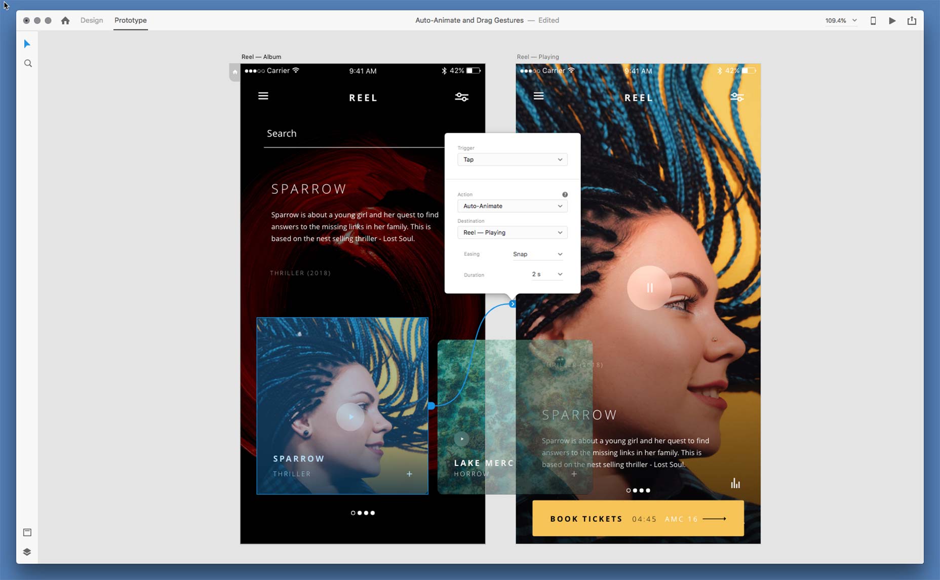
XD has new features, taking it far beyond any of its competition; you can now use XD to design for voice, and there are substantial changes to the animation design process that users have been asking for, for some time. XD’s $0 price tag means its business model is as a lure, to tempt designers into the rest of the CC product range, and as expected, tighter integration with other apps including Illustrator and After Effects has been unveiled.

If you’ve been wavering, now’s a great time to pick up XD.

Project Rocket

Adobe has often talked a good game when it comes to device compatibility, and its mobile apps have always seemed slick, but very few creatives actually use them professionally; they just don’t have enough functionality.

Not since the first wide-eyed discovery of large touch screens has there been a more convincing reason to buy an iPad

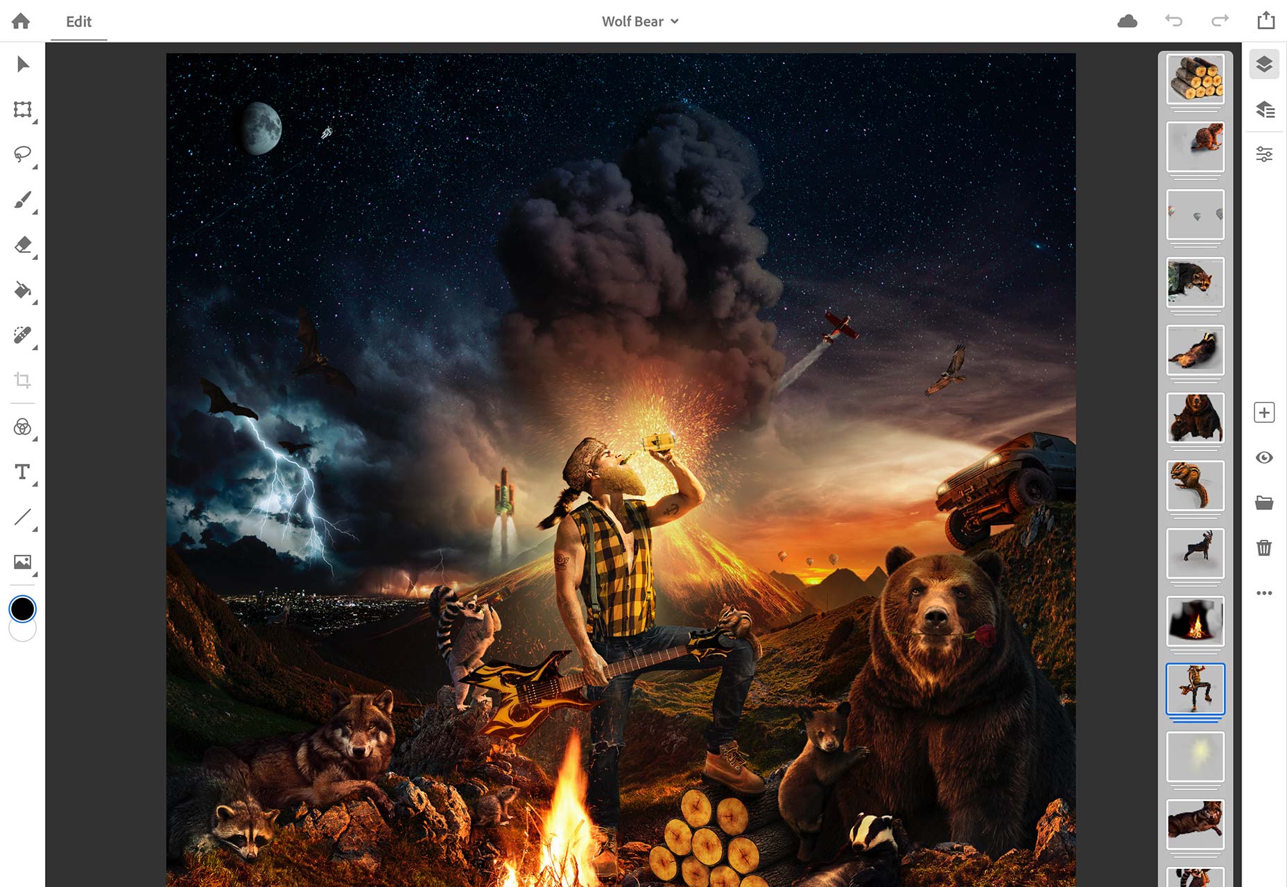
That may now be about to change as Adobe has unveiled the hotly anticipated Project Rocket—that’s Photoshop for the iPad to you and I—due to launch sometime in 2019. The big news is that Rocket isn’t an iPad version of Photoshop, it’s the Photoshop. With a UI repurposed for touch screens, but with the full Photoshop engine behind it, Rocket makes design work on the iPad a realistic possibility for the first time.

Apple must be thrilled. Not since the first wide-eyed discovery of large touch screens has there been a more convincing reason to buy an iPad.

Project Gemini

To further boost Apple sales, Adobe have also unveiled Project Gemini.

Gemini is an as-yet unnamed drawing and painting app that combines bitmap and vector graphic editing. Having sat through a demo of the watercolor brushes, I have to admit, what they’ve achieved is astounding—even if a single painting effect has limited shelf life.

Not since the wide-eyed discovery of Project Rocket has there been a more convincing reason to buy an iPad.

Adobe Sensei

Almost all of the additions to Adobe’s product line come curtesy of Sensei. Sensei is Adobe’s AI project, and it’s backing it big time.

Small intelligent tools are making their way into all Adobe apps. The belief is that over time, Sensei will be intelligent enough to automate tedious tasks, freeing us to be creative. It’s not there yet; personally, I’m not convinced it will ever be entirely there. But you only have to look at additions like the intelligent fill in Photoshop, to see how much Adobe is investing in this technology.

Project Aero

For more evidence of Adobe’s relentless march into the future, and its surprisingly nimble ability to pivot into new markets, look no further than Project Aero.

Aero is still in heavy development, but it’s an AR design tool. Yes, it’s primitive now, but that’s exactly what we said about XD three years ago.

Illustrator CC Updates

Designers who tire of hearing about hot new products, while they earn their bread and butter with “classic” applications, will be thrilled to learn that Illustrator has finally received some long-overdue attention.

There’s an intelligent new tool UI, and the introduction of more natural gradients—again, powered by Sensei. Perfect for anyone joyfully burning their Flat Design rulebook this year.

Adobe Fonts

Arguably the biggest announcement of the day, at least when it comes to everyday design tasks, is the news that Adobe Fonts—yes, the long-expected renaming of Typekit has finally happened—has had its sync limits removed; you’ll no longer have to unsync half your font library just to sync the fonts for your new client’s project.

There are no web page view limits, and no domain limits. No one’s pretending it’s as good value as Google Fonts, but then Google Fonts don’t sync to your design apps, and it’s the small benefits that make the biggest difference to our process.

Wrapping Up

Adobe covets the idea of creative freedom; freedom to work anywhere, freedom to work any how, freedom to work on any thing. What has been unveiled at MAX today, offers a real opportunity for designers to be freer in their process, and in the coming years, freer in the projects they accept.

You can see all the new features of Creative Cloud by watching the MAX Keynotes.

Add Realistic Chalk and Sketch Lettering Effects with Sketch’it – only $5!

Source

Categories: Designing, Others Tags:

Lazy Loading Images with Vue.js Directives and Intersection Observer

October 15th, 2018 No comments

When I think about web performance, the first thing that comes to my mind is how images are generally the last elements that appear on a page. Today, images can be a major issue when it comes to performance, which is unfortunate since the speed a website loads has a direct impact on users successfully doing what they came to the page to do (think conversation rates).

Very recently, Rahul Nanwani wrote up an extensive guide on lazy loading images. I’d like to cover the same topic, but from a different approach: using data attributes, Intersection Observer and custom directives in Vue.js.

What this’ll basically do is allow us to solve two things:

  1. Store the src of the image we want to load without loading it in the first place.
  2. Detect when the image becomes visible to the user and trigger the request to load the image.

Same basic lazy loading concept, but another way to go about it.

I created an example, based on an example described by Benjamin Taylor in his blog post. It contains a list of random articles each one containing a short description, image, and a link to the source of the article. We will go through the process of creating a component that is in charge of displaying that list, rendering an article, and lazy loading the image for a specific article.

Let’s get lazy! Or at least break this component down piece-by-piece.

Step 1: Create the ImageItem component in Vue

Let’s start by creating a component that will show an image (but with no lazy loading involved just yet). We’ll call this file ImageItem.vue. In the component template, we’ll use a figure tag that contains our image — the image tag itself will receive the src attribute that points to the source URL for the image file.

<template>
  <figure class="image__wrapper">
    <img
      class="image__item"
      :src="source"
      alt="random image"
    >
  </figure>
</template>

In the script section of the component, we receive the prop source that we’ll use for the src url of the image we are displaying.

export default {
  name: "ImageItem",
  props: {
    source: {
      type: String,
      required: true
    }
  }
};

All this is perfectly fine and will render the image normally as is. But, if we leave it here, the image will load straight away without waiting for the entire component to be render. That’s not what we want, so let’s go to the next step.

Step 2: Prevent the image from being loaded when the component is created

It might sound a little funny that we want to prevent something from loading when we want to show it, but this is about loading it at the right time rather than blocking it indefinitely. To prevent the image from being loaded, we need to get rid of the src attribute from the img tag. But, we still need to store it somewhere so we can make use of it when we want it. A good place to keep that information is in a data- attribute. These allow us to store information on standard, semantic HTML elements. In fact, you may already be accustomed to using them as JavaScript selectors.

In this case, they’re a perfect fit for our needs!

<!--ImageItem.vue-->
<template>
  <figure class="image__wrapper">
    <img
      class="image__item"
      :data-url="source" // yay for data attributes!
      alt="random image"
    >
  </figure>
</template>

With that, our image will not load because there is no source URL to pull from.

That’s a good start, but still not quite what we want. We want to load our image under specific conditions. We can request the image to load by replacing the src attribute with the image source URL kept in our data-url attribute. That’s the easy part. The real challenge is figuring out when to replace it with the actual source.

Our goal is to pin the load to the user’s screen location. So, when the user scrolls to a point where the image comes into view, that’s where it loads.

How can we detect if the image is in view or not? That’s our next step.

Step 3: Detect when the image is visible to the user

You may have experience using JavaScript to determine when an element is in view. You may also have experience winding up with some gnarly script.

For example, we could use events and event handlers to detect the scroll position, offset value, element height, and viewport height, then calculate whether an image is in the viewport or not. But that already sounds gnarly, doesn’t it?

But it could get worse. This has direct implications on performance. Those calculations would be fired on every scroll event. Even worse, imagine a few dozen images, each having to recalculate whether it is visible or not on each scroll event. Madness!

Intersection Observer to the rescue! This provides a very efficient way of detecting if an element is visible in the viewport. Specifically, it allows you to configure a callback that is triggered when one element — called the target — intersects with either the device viewport or a specified element.

So, what we need to do to use it? A few things:

  • create a new intersection observer
  • watch the element we wish to lazy load for visibility changes
  • load the element when the element is in viewport (by replacing src with our data-url)
  • stop watching for visibility changes (unobserve) after the load completes

Vue.js has custom directives to wrap all this functionality together and use it when we need it, as many times as we need it. Putting that to use is our next step.

Step 4: Create a Vue custom directive

What is a custom directive? Vue’s documentation describes it as a way to get low-level DOM access on elements. For example, changing an attribute of a specific DOM element which, in our case, could be changing the src attribute of an img element. Perfect!

We’ll break this down in a moment, but here’s what we’re looking at as far as the code:

export default {
  inserted: el => {
    function loadImage() {
      const imageElement = Array.from(el.children).find(
      el => el.nodeName === "IMG"
      );
      if (imageElement) {
        imageElement.addEventListener("load", () => {
          setTimeout(() => el.classList.add("loaded"), 100);
        });
        imageElement.addEventListener("error", () => console.log("error"));
        imageElement.src = imageElement.dataset.url;
      }
    }

    function handleIntersect(entries, observer) {
      entries.forEach(entry => {
        if (entry.isIntersecting) {
          loadImage();
          observer.unobserve(el);
        }
      });
    }

    function createObserver() {
      const options = {
        root: null,
        threshold: "0"
      };
      const observer = new IntersectionObserver(handleIntersect, options);
      observer.observe(el);
    }
    if (window["IntersectionObserver"]) {
      createObserver();
    } else {
      loadImage();
    }
  }
};

OK, let’s tackle this step-by-step.

The hook function allows us to fire a custom logic at a specific moment of a bound element lifecycle. We use the inserted hook because it is called when the bound element has been inserted into its parent node (this guarantees the parent node is present). Since we want to observe visibility of an element in relation to its parent (or any ancestor), we need to use that hook.

export default {
  inserted: el => {
    ...
  }
}

The loadImage function is the one responsible for replacing the src value with data-url. In it, we have access to our element (el) which is where we apply the directive. We can extract the img from that element.

Next, we check if the image exists and, if it does, we add a listener that will fire a callback function when the loading is finished. That callback will be responsible for hiding the spinner and adding the animation (fade-in effect) to the image using a CSS class. We also add a second listener that will be called in the event that the URL fails to load.

Finally, we replace the src of our img element with the source URL of the image and show it!

function loadImage() {
  const imageElement = Array.from(el.children).find(
    el => el.nodeName === "IMG"
  );
  if (imageElement) {
    imageElement.addEventListener("load", () => {
      setTimeout(() => el.classList.add("loaded"), 100);
    });
    imageElement.addEventListener("error", () => console.log("error"));
    imageElement.src = imageElement.dataset.url;
  }
}

We use Intersection Observer’s handleIntersect function, which is responsible for firing loadImage when certain conditions are met. Specifically, it is fired when Intersection Observer detects that the element enters the viewport or a parent component element.

The function has access to entries, which is an array of all elements that are watched by the observer and observer itself. We iterate through entries and check if a single entry becomes visible to our user with isIntersecting — and fire the loadImage function if it is. Once the image is requested, we unobserve the element (remove it from the observer’s watch list), which prevents the image from being loaded again. And again. And again. And…

function handleIntersect(entries, observer) {
  entries.forEach(entry => {
    if (entry.isIntersecting) {
      loadImage();
      observer.unobserve(el);
    }
  });
}

The last piece is the createObserver function. This guy is responsible for creating our Intersection Observer and attaching it to our element. The IntersectionObserver constructor accepts a callback (our handleIntersect function) that is fired when the observed element passes the specified threshold and the options object that carries our observer options.

Speaking of the options object, it uses root as our reference object, which we use to base the visibility of our watched element. It might be any ancestor of the object or our browser viewport if we pass null. The object also specifies a threshold value that can vary from 0 to 1 and tells us at what percent of the target’s visibility the observer callback should be executed, with 0 meaning as soon as even one pixel is visible and 1 meaning the whole element must be visible.

And then, after creating the Intersection Observer, we attach it to our element using the observe method.

function createObserver() {
  const options = {
    root: null,
    threshold: "0"
  };
  const observer = new IntersectionObserver(handleIntersect, options);
  observer.observe(el);
}

Step 5: Registering directive

To use our newly created directive, we first need to register it. There are two ways to do it: globally (available everywhere in the app) or locally (on a specified component level).

Global registration

For global registration, we import our directive and use the Vue.directive method to pass the name we want to call our directive and directive itself. That allows us to add a v-lazyload attribute to any element in our code.

// main.js
import Vue from "vue";
import App from "./App";
import LazyLoadDirective from "./directives/LazyLoadDirective";

Vue.config.productionTip = false;

Vue.directive("lazyload", LazyLoadDirective);

new Vue({
  el: "#app",
  components: { App },
  template: "<App/>"
});

Local registration

If we want to use our directive only in a specific component and restrict the access to it, we can register the directive locally. To do that, we need to import the directive inside the component that will use it and register it in the directives object. That will give us the ability to add a v-lazyload attribute to any element in that component.

import LazyLoadDirective from "./directives/LazyLoadDirective";

export default {
  directives: {
    lazyload: LazyLoadDirective
  }
}

Step 6: Use a directive on the ImageItem component

Now that our directive has been registered, we can use it by adding v-lazyload on the parent element that carries our image (the figure tag in our case).

<template>
  <figure v-lazyload class="image__wrapper">
    <ImageSpinner
      class="image__spinner"
    />
    <img
      class="image__item"
      :data-url="source"
      alt="random image"
    >
  </figure>
</template>

Browser Support

We’d be remiss if we didn’t make a note about browser support. Even though the Intersection Observe API it is not supported by all browsers, it does cover 73% of users (as of this writing).

This browser support data is from Caniuse, which has more detail. A number indicates that browser supports the feature at that version and up.

Desktop

Chrome Opera Firefox IE Edge Safari
58 45 55 No 16 No

Mobile / Tablet

iOS Safari Opera Mobile Opera Mini Android Android Chrome Android Firefox
No 46 No 67 69 62

Not bad. Not bad at all.

But! Having in mind that we want to show images to all users (remember that using data-url prevents the image from being loaded at all), we need to add one more piece to our directive. Specifically, we need to check if the browser supports Intersection Observer, and it it doesn’t, fire loadImage instead. This will be our fallback.

if (window["IntersectionObserver"]) {
    createObserver();
} else {
    loadImage();
}

Summary

Lazy loading images can significantly improve page performance because it takes the page weight hogged by images and loads them in only when the user actually needs them.

For those still not convinced if it is worth playing with lazy loading, here’s some raw numbers from the simple example we’ve been using. The list contains 11 articles with one image per article. That’s a total of 11 images (math!). It’s not like that’s a ton of images but we can still work with it.

Here’s what we get rending all 11 images without lazy loading on a 3G connection:

The 11 image requests contribute to an overall page size of 3.2 MB. Oomph.

Here’s the same page putting lazy loading to task:

Say what? Only one request for one image. Our page is now 1.4 MB. We saved 10 requests and reduced the page size by 56%.

Is it a simple and isolated example? Yes, but the numbers still speak for themselves. Hopefully you find lazy loading an effective way to fight the battle against page bloat and that this specific approach using Vue with Intersection Observer comes in handy.

The post Lazy Loading Images with Vue.js Directives and Intersection Observer appeared first on CSS-Tricks.
Categories: Designing, Others Tags:

Smart Bundling: How To Serve Legacy Code Only To Legacy Browsers

October 15th, 2018 No comments
Transpilation to ES5, web platform polyfills, ES6+ polyfills, CSS prefixing

Smart Bundling: How To Serve Legacy Code Only To Legacy Browsers

Smart Bundling: How To Serve Legacy Code Only To Legacy Browsers

Shubham Kanodia

2018-10-15T14:30:13+02:002018-10-15T17:29:14+00:00

A website today receives a large chunk of its traffic from evergreen browsers — most of which have good support for ES6+, new JavaScript standards, new web platform APIs and CSS attributes. However, legacy browsers still need to be supported for the near future — their usage share is large enough not to be ignored, depending on your user base.

A quick look at caniuse.com‘s usage table reveals that evergreen browsers occupy a lion’s share of the browser market — more than 75%. In spite of this, the norm is to prefix CSS, transpile all of our JavaScript to ES5, and include polyfills to support every user we care about.

While this is understandable from a historical context — the web has always been about progressive enhancement — the question remains: Are we slowing down the web for the majority of our users in order to support a diminishing set of legacy browsers?


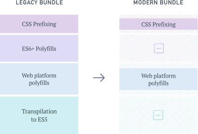
Transpilation to ES5, web platform polyfills, ES6+ polyfills, CSS prefixing
The different compatibility layers of a web app. (View large version)

The Cost Of Supporting Legacy Browsers

Let’s try to understand how different steps in a typical build pipeline can add weight to our front-end resources:

Transpiling To ES5

To estimate how much weight transpiling can add to a JavaScript bundle, I took a few popular JavaScript libraries originally written in ES6+ and compared their bundle sizes before and after transpilation:

Library Size
(minified ES6)
Size
(minified ES5)
Difference
TodoMVC 8.4 KB 11 KB 24.5%
Draggable 77.9 KB 11.5 KB 31.3%
Luxon 75.4 KB 100.3 KB 24.8%
Video.js 237.2 KB 335.8 KB 29.4%
PixiJS 370.8 KB 452 KB 18%

On average, untranspiled bundles are about 25% smaller than those that have been transpiled down to ES5. This isn’t surprising given that ES6+ provides a more compact and expressive way to represent the equivalent logic and that transpilation of some of these features to ES5 can require a lot of code.

ES6+ Polyfills

While Babel does a good job of applying syntactical transforms to our ES6+ code, built-in features introduced in ES6+ — such as Promise, Map and Set, and new array and string methods — still need to be polyfilled. Dropping in babel-polyfill as is can add close to 90 KB to your minified bundle.

Web Platform Polyfills

Modern web application development has been simplified due to the availability of a plethora of new browser APIs. Commonly used ones are fetch, for requesting for resources, IntersectionObserver, for efficiently observing the visibility of elements, and the URL specification, which makes reading and manipulation of URLs on the web easier.

Adding a spec-compliant polyfill for each of these features can have a noticeable impact on bundle size.

CSS Prefixing

Lastly, let’s look at the impact of CSS prefixing. While prefixes aren’t going to add as much dead weight to bundles as other build transforms do — especially because they compress well when Gzip’d — there are still some savings to be achieved here.

Library Size
(minified, prefixed for last 5 browser versions)
Size
(minified, prefixed for last browser version)
Difference
Bootstrap 159 KB 132 KB 17%
Bulma 184 KB 164 KB 10.9%
Foundation 139 KB 118 KB 15.1%
Semantic UI 622 KB 569 KB 8.5%

A Practical Guide To Shipping Efficient Code

It’s probably evident where I’m going with this. If we leverage existing build pipelines to ship these compatibility layers only to browsers that require it, we can deliver a lighter experience to the rest of our users — those who form a rising majority — while maintaining compatibility for older browsers.


The modern bundle is smaller than the legacy bundle because it forgoes some compatibility layers.
Forking our bundles. (View large version)

This idea isn’t entirely new. Services such as Polyfill.io are attempts to dynamically polyfill browser environments at runtime. But approaches such as this suffer from a few shortcomings:

  • The selection of polyfills is limited to those listed by the service — unless you host and maintain the service yourself.
  • Because the polyfilling happens at runtime and is a blocking operation, page-loading time can be significantly higher for users on old browsers.
  • Serving a custom-made polyfill file to every user introduces entropy to the system, which makes troubleshooting harder when things go wrong.

Also, this doesn’t solve the problem of weight added by transpilation of the application code, which at times can be larger than the polyfills themselves.

Let see how we can solve for all of the sources of bloat we’ve identified till now.

Tools We’ll Need

  • Webpack
    This will be our build tool, although the process will remain similar to that of other build tools, like Parcel and Rollup.
  • Browserslist
    With this, we’ll manage and define the browsers we’d like to support.
  • And we’ll use some Browserslist support plugins.

1. Defining Modern And Legacy Browsers

First, we’ll want to make clear what we mean by “modern” and “legacy” browsers. For ease of maintenance and testing, it helps to divide browsers into two discrete groups: adding browsers that require little to no polyfilling or transpilation to our modern list, and putting the rest on our legacy list.


= 53; Edge >= 15; Chrome >= 58; iOS >= 10.1″>
Browsers that support ES6+, new CSS attributes, and browser APIs like Promises and Fetch. (View large version)

A Browserslist configuration at the root of your project can store this information. “Environment” subsections can be used to document the two browser groups, like so:

[modern]
Firefox >= 53
Edge >= 15
Chrome >= 58
iOS >= 10.1

[legacy]
> 1%

The list given here is only an example and can be customized and updated based on your website’s requirements and the time available. This configuration will act as the source of truth for the two sets of front-end bundles that we will create next: one for the modern browsers and one for all other users.

2. ES6+ Transpiling And Polyfilling

To transpile our JavaScript in an environment-aware manner, we’re going to use babel-preset-env.

Let’s initialize a .babelrc file at our project’s root with this:

{
  "presets": [
    ["env", { "useBuiltIns": "entry"}]
  ]
}

Enabling the useBuiltIns flag allows Babel to selectively polyfill built-in features that were introduced as part of ES6+. Because it filters polyfills to include only the ones required by the environment, we mitigate the cost of shipping with babel-polyfill in its entirety.

For this flag to work, we will also need to import babel-polyfill in our entry point.

// In
import "babel-polyfill";

Doing so will replace the large babel-polyfill import with granular imports, filtered by the browser environment that we’re targeting.

// Transformed output
import "core-js/modules/es7.string.pad-start";
import "core-js/modules/es7.string.pad-end";
import "core-js/modules/web.timers";
…

3. Polyfilling Web Platform Features

To ship polyfills for web platform features to our users, we will need to create two entry points for both environments:

require('whatwg-fetch');
require('es6-promise').polyfill();
// … other polyfills

And this:

// polyfills for modern browsers (if any)
require('intersection-observer');

This is the only step in our flow that requires some degree of manual maintenance. We can make this process less error-prone by adding eslint-plugin-compat to the project. This plugin warns us when we use a browser feature that hasn’t been polyfilled yet.

4. CSS Prefixing

Finally, let’s see how we can cut down on CSS prefixes for browsers that don’t require it. Because autoprefixer was one of the first tools in the ecosystem to support reading from a browserslist configuration file, we don’t have much to do here.

Creating a simple PostCSS configuration file at the project’s root should suffice:

module.exports = {
  plugins: [ require('autoprefixer') ],
}

Putting It All Together

Now that we’ve defined all of the required plugin configurations, we can put together a webpack configuration that reads these and outputs two separate builds in dist/modern and dist/legacy folders.

const MiniCssExtractPlugin = require('mini-css-extract-plugin')
const isModern = process.env.BROWSERSLIST_ENV === 'modern'
const buildRoot = path.resolve(__dirname, "dist")

module.exports = {
  entry: [
    isModern ? './polyfills.modern.js' : './polyfills.legacy.js',
    "./main.js"
  ],
  output: {
    path: path.join(buildRoot, isModern ? 'modern' : 'legacy'),
    filename: 'bundle.[hash].js',
  },
  module: {
    rules: [
      { test: /.jsx?$/, use: "babel-loader" },
      {
        test: /.css$/,
        use: [MiniCssExtractPlugin.loader, 'css-loader', 'postcss-loader']
      }
    ]},
    plugins: {
      new MiniCssExtractPlugin(),
      new HtmlWebpackPlugin({
      template: 'index.hbs',
      filename: 'index.html',
    }),
  },
};

To finish up, we’ll create a few build commands in our package.json file:

"scripts": {
  "build": "yarn build:legacy && yarn build:modern",
  "build:legacy": "BROWSERSLIST_ENV=legacy webpack -p --config webpack.config.js",
  "build:modern": "BROWSERSLIST_ENV=modern webpack -p --config webpack.config.js"
}

That’s it. Running yarn build should now give us two builds, which are equivalent in functionality.

Serving The Right Bundle To Users

Creating separate builds helps us achieve only the first half of our goal. We still need to identify and serve the right bundle to users.

Remember the Browserslist configuration we defined earlier? Wouldn’t it be nice if we could use the same configuration to determine which category the user falls into?

Enter browserslist-useragent. As the name suggests, browserslist-useragent can read our browserslist configuration and then match a user agent to the relevant environment. The following example demonstrates this with a Koa server:

const Koa = require('koa')
const app = new Koa()
const send = require('koa-send')
const { matchesUA } = require('browserslist-useragent')
var router = new Router()

app.use(router.routes())

router.get('/', async (ctx, next) => {
  const useragent = ctx.get('User-Agent')  
  const isModernUser = matchesUA(useragent, {
      env: 'modern',
      allowHigherVersions: true,
   })
   const index = isModernUser ? 'dist/modern/index.html', 'dist/legacy/index.html'
   await send(ctx, index);
});

Here, setting the allowHigherVersions flag ensures that if newer versions of a browser are released — ones that are not yet a part of Can I Use’s database — they will still report as truthy for modern browsers.

One of browserslist-useragent‘s functions is to ensure that platform quirks are taken into account while matching user agents. For example, all browsers on iOS (including Chrome) use WebKit as the underlying engine and will be matched to the respective Safari-specific Browserslist query.

It might not be prudent to rely solely on the correctness of user-agent parsing in production. By falling back to the legacy bundle for browsers that aren’t defined in the modern list or that have unknown or unparseable user-agent strings, we ensure that our website still works.
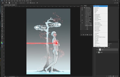
Conclusion: Is It Worth It?

We have managed to cover an end-to-end flow for shipping bloat-free bundles to our clients. But it’s only reasonable to wonder whether the maintenance overhead this adds to a project is worth its benefits. Let’s evaluate the pros and cons of this approach:
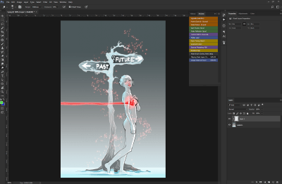
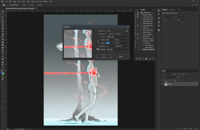
1. Maintenance And Testing

One is required to maintain only a single Browserslist configuration that powers all of the tools in this pipeline. Updating the definitions of modern and legacy browsers can be done anytime in the future without having to refactor supporting configurations or code. I’d argue that this makes the maintenance overhead almost negligible.

There is, however, a small theoretical risk associated with relying on Babel to produce two different code bundles, each of which needs to work fine in its respective environment.

While errors due to differences in bundles might be rare, monitoring these variants for errors should help to identify and effectively mitigate any issues.

2. Build Time vs. Runtime

Unlike other techniques prevalent today, all of these optimizations occur at build time and are invisible to the client.

3. Progressively Enhanced Speed

The experience of users on modern browsers becomes significantly faster, while users on legacy browsers continue to get served the same bundle as before, without any negative consequences.

4. Using Modern Browser Features With Ease

We often avoid using new browser features due to the size of polyfills required to use them. At times, we even choose smaller non-spec-compliant polyfills to save on size. This new approach allows us to use spec-compliant polyfills without worrying much about affecting all users.

Differential Bundle Serving In Production

Given the significant advantages, we adopted this build pipeline when creating a new mobile checkout experience for customers of Urban Ladder, one of India’s largest furniture and decor retailers.

In our already optimized bundle, we were able to squeeze savings of approximately 20% on the Gzip’d CSS and JavaScript resources sent down the wire to modern mobile users. Because more than 80% of our daily visitors were on these evergreen browsers, the effort put in was well worth the impact.

Further Resources

Smashing Editorial(dm, ra, yk, il, al)
Categories: Others Tags:

What’s New for Designers, October 2018

October 15th, 2018 No comments

You might notice a theme this month in our collection of new tools for designers: color. There are lots of color resources sprinkled throughout this collection. But there are plenty of other goodies as well, including a beta tool from Google and some new ways to think about layouts.

If we’ve missed something that you think should have been on the list, let us know in the comments. And if you know of a new app or resource that should be featured next month, tweet it to @carriecousins to be considered!

Logo Lab

Logo Lab is a new tool that helps you figure out if a logo is sound. Simply upload a logo, and you’ll be presented with visual experiments that test key factors like scalability, silhouette and balance. The visual tool shows where a logo succeeds and where it could use some improvement. This can be a great resource for individual testing or client presentations. It includes 10 tests (including a color blindness simulator and scalability test) and all you have to do to use it is upload a PNG or SVG version of your logo.

ColorBox

ColorBox by Lyft Design can help you create cool color sets that you can use and share. With plenty of options that you can adjust and see on screen, it’s easy to create all kinds of palettes and color combinations. Use it to create a base color scheme or pick colors for a gradient pattern.

New Werner’s Nomenclature of Colours

From modern color in the previous item to classic color here, Werner’s Nomenclature of Colours has been recreated for the digital age. The 1821 color guidebook is all new (and equally impressive) thanks to Nicholas Rougeux.

GraphQLEditor

GraphQLEditor allows you to create visual diagrams without writing any code. Just click and experiment. (The code is generated as you draw.) It works using Graphql schema and when you create and join blocks the editor transforms them into code.

Firefox Reality

Firefox Reality is a new browser just for virtual reality. Mozilla says it “was specifically designed to tackle all of the new opportunities (and challenges) that come with browsing in VR.” Get it for your preferred VR device with support for Viveport, Oculus Go or Google Daydream.

Google Dataset Search

Google Dataset Search is a beta tool that allows you to search within datasets to find information. Here’s how Google describes the new project:

Dataset Search enables users to find datasets stored across thousands of repositories on the Web, making these datasets universally accessible and useful…By providing our users with a single interface that allows them to search across multiple repositories, we hope to transform how data is being published and used. We also believe that this project will have the additional benefits of a) creating a data sharing ecosystem that will encourage data publishers to follow best practices for data storage and publication and b) giving scientists a way to show the impact of their work through citation of datasets that they have produced.

Zipsell

Zipsell is an open source, self-hosted platform for selling digital downloads. Just add products so users can browse your digital store and allow them to make purchases online and pay with Stripe. Customize it with your brand and there’s no commission fee.

GraphJS

GraphJS is an open source set of “stickers” that enables social capabilities on any webpage. Use it for authentication, forums, profiles, groups, messaging and ratings or commenting. Plus, it’s all open-source.

Landing Pages

Davide Pacilio has created four different landing page templates for startups that are available as free downloads. Each template design features a fairly flexible layout in a different style. This can be a great resource to get a nice website up fast.

Gitbird

Turn shots into tweets automatically with this fun little tool. It’s a nice resource to help promote your projects without a lot of extra work. The micro plan (5 commits per month) is free.

Accurately Measuring Layout on the Web

Want to understand more about the browser rendering pipeline and how to make websites faster? (Everyone does, right?) This article by developer Nolan Lawson explains it in one of the least complex ways possible so you can more accurately measure what’s happening when things are rendered on the web.

The Font Loading Checklist

The Font Loading Checklist is a four-step guide from Zach Leatherman where he details everything he’s learned about maximizing the potential of font loading. He provides a checklist with implementation strategies that are easy to understand.

Slang

Slang is an audio programming language made in JavaScript that’s all in-browser. Here’s how it works: “Parsing is handled by Ohm.js using a custom grammar, the editor uses CodeMirror with a simple syntax definition, and the runtime itself is written in JS using the Web Audio API.”

Design+Code 3

Design+Code 3 includes more than 60 hours of video training and downloads to help you learn to code React and Swift apps. The paid plan also includes access to design/developer tool discounts.

Scriptgun

Scriptgun is a tool that writes code to save you time. Using common code, you can jumpstart a design. It’s a fully-integrated Angular project that includes 100 percent database configuration.

DBDiagram

DBDiagram is a quick and simple tool to help draw database relationship diagrams and flow using simple DSL language.

Realtime Board Mind Map

Realtime Board Mind Map is a tool for teams that can help you structure ideas and brainstorming sessions. Map tasks and ideas such as building user story maps, roadmaps, or journey maps.

500 Error

500 Error is a crazy animation for unfortunate page landing events. It’s cool, but can be a bit dizzying.

Trendy Palettes

Trendy Palettes is a curated collection of hand-made color palettes that you can use for projects. Pick a swatch, copy the color values and go! (Or download a PNG.)

Baseline Icons

Baseline Icons is a set of 75 free icons with a consistent look. The simple line and filled icons includes clean elements and is free for personal and commercial projects. It includes plenty of common digital icon elements.

Autumn Kawaii Icon Set

Autumn Kawaii Icon Set is a seasonal pack of free icons for fall projects. Every icon is editable and scalable so you can make the selection of flat, line and colored icons your own. (Plus, the design is whimsical and fun.)

Color Leap

Color Leap is a new kind of color palette generator. Move through different points of history to see colors that were popular in that time to help jumpstart your inspiration.

Azonix

Azonix is a modern sans serif featuring a capital character set. The design says it was inspired by “sci-fi and futuristic films such as Exmachina.” The font also includes numerals and punctuation.

Rolleston

Rolleston is an expansive font family with amazing character and serifs. The most spectacular part of this premium font might be the ligature set. It includes 42 styles and a complete character set.

Sometype Mono

Sometype Mono is a font family for coding and tabular layout. The set includes six styles and could be expanded. The open source font is more flowy and visually interesting than some traditional monospaced options.

Add Realistic Chalk and Sketch Lettering Effects with Sketch’it – only $5!

Source

Categories: Designing, Others Tags:

Introducing JotForm PDF Editor: Turn Form Responses into Designed PDFs

October 15th, 2018 No comments
JotForm PDF Editor

Let’s say you receive a form submission and want the information you just collected displayed on a single PDF document. Easy enough. Just copy the information, open a new word processing document, paste the information, and then save the whole thing as a PDF.

But what if you wanted to turn 100 form submissions into their own separate PDFs? That would require some serious legwork, not to mention it’s tedious.

That’s why we’re proud to introduce JotForm PDF Editor, a new way to automate polished, designed documents that you can share, download, or print with the click of a button.

Responses you receive through your online forms are instantly and automatically turned into elegantly-designed PDFs. No copying and pasting required.

How does this help you? Imagine you manage a restaurant and you’re using a JotForm job application form to hire new kitchen staff. You can send out an online application form like you always have. But when the responses come back, they are converted into beautiful PDFs that you can instantly forward along to colleagues, send back to the applicant, or keep for your own files.

It’s the same information you’ve always collected, only now the final document is far superior.

Below are a few standout features of JotForm PDF Editor.

Design

The beauty of PDF Editor is the ability to design your PDF however you’d like, including the ability to add sections, custom colors, and numerous fonts. You can even include images and your company logo. It requires very little effort and even less skill; just click and drag sections and text along a handy grid. You also have full control over how you’d like your response information to appear on the document, which can be displayed in landscape or portrait orientation.

100+ Templates

Designing a PDF with PDF Editor is a cinch, but if you wanted a jump start we have more than 100 snazzy PDF templates you can choose from. There’s one for just about any reason you’d need a professional PDF, including medical consent, supply requests, event registrations, and agreements. Best part? They’re free!

Automate

A single online form can generate thousands of custom different PDFs — a new one created every time someone responds to your form. This level of automation is uncommon in the world of PDFs. Online forms are easier for your clients and colleagues to fill out, so you get more responses. And the work of turning the information into polished PDFs is automatically done for you.

Password Protection

????

Are your PDFs to be read by a chosen few? Then password protection is your best friend. In our layout settings, just select “Enable Password Protection” and then type your new password. Only those people with the password will be able to access your document.

Easy Sharing

JotForm PDF Editor makes distributing your new PDFs incredibly easy, boosting communication between colleagues and clients. When you’re in preview mode, you can toggle between the PDF submissions you receive and then download, print, or share in a single click at the top of the screen. The share option prompts an email draft with the attached PDF that you can immediately send.

Fillable PDFs

JotForm’s hallmark Fillable PDF Creator is now included as a feature in PDF Editor. Quickly build a PDF form with fillable fields that sends response information directly to your JotForm inbox. Now this feature is updated to make your fillable PDFs more customizable and attractive. To use this feature, make sure you and your respondents use Adobe Acrobat Reader when filling it out.

Electronic Signatures

You’ve always been able to collect e-signatures using JotForm. But now you can automatically have collected signatures stamped on new PDFs whenever someone submits your online form. Given how easy it is to fill out a JotForm form — even on mobile devices — your clients can sign agreements from wherever they are without hassle. No printing, scanning, or headaches necessary. Then you can return a signed agreement to them with a single click.

Functional Integrations

JotForm PDF Editor integrates seamlessly with Google Sheets, DropBox, and Box so that the PDFs generated from your form responses automatically send to cloud storage systems your team depends on.

PDF Editor can change the way your organization creates documentation for contracts, agreements, waivers, intake, quality control, incident reporting, evaluations, and a lot more.

Have you already giving JotForm PDF Editor a try? How are you using it? Let us know in the comments below!

Originally published at www.jotform.com.

Categories: Others Tags: