5 Principles of Cuteness in Web Design
Okay, how in the heck do you make something “cute”? Now maybe you’ve grown up in an environment where getting in touch with your feelings was anathema. Maybe you just naturally gravitated to Max Steel over Hello Kitty. Maybe you’ve never had a problem with any of this, and freely make high-pitched noises whenever there’s a puppy in sight (as is appropriate).
Whatever your background, attempting to turn a web design into “something cute” will require you to try and determine exactly what makes a thing cute in the first place, and that’s where it gets complicated. The whole concept is naturally subjective. It’s a vaguely warm and fuzzy emotion that seems directly connected to our impulse to smile, but what brings it on can vary greatly. There are people who call insects cute, whereas I could never bring myself to agree.
They’re just icky, okay?
But whatever you use, cuteness sells—cue the obligatory joke about cat GIFs on the Internet. At some point in our lives, we will be called upon to make something cute, because that’s what the client wants, and we’ll start idly wondering if that means making everything pink.
Don’t do that. Read this instead.
1. Imagery
Using cute imagery is almost cheating. I mean, you’re just taking something cute, throwing it into your design, and calling it a day. But don’t discount the idea; being cheap and easy doesn’t mean that it’s not effective. Some curmudgeons notwithstanding, human beings are biologically wired to get hit right in the pleasure centers of our brains when we see human offspring (particularly our own), and other things that share some baby-like features (ie. puppies, kittens, pandas).
Stock photography can be a great start, but keep in mind that illustration can be a great way to trigger the same responses that wild make people want to squeeze your website. If you need to use original imagery, hiring an illustrator is also way easier than getting babies or animals to hold still.
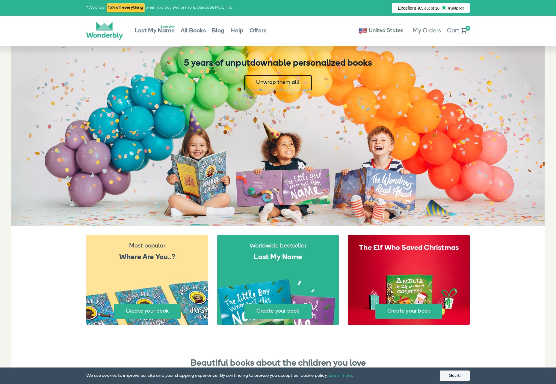
Example: Wonderbly uses both photos and illustration.
2. Colors
Imagery is good, but what if you want to embed that warm and fuzzy feeling into the very DNA of your design, and not just in the content? This is where we turn to color. Now repeat after me: Pink is NOT the only cute color.
In fact, “cute” colors are a concept that will vary according to individual cultures. For one thing, babies vary in color. The general rule to follow, though, boils down to three words: primaries and pastels. Bright primary colors and their softer pastel counterparts dominate the “cute aesthetic” worldwide. If you’re designing something cute for (very young) kids, use bolder tones. If you’re designing something for adults, use the pastels, which are far easier on the eyes, and tired brains.
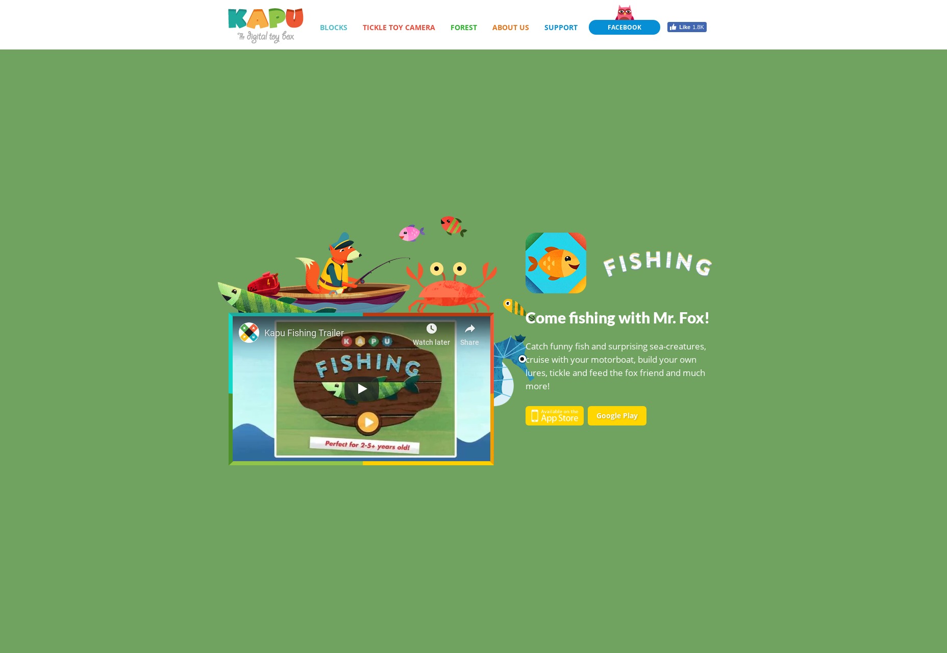
Example: Kapu Toys goes hard on the primary colors.
3. The Other Kinds of Cute
So far, I’ve discussed cuteness in terms of human offspring and related things. Thing is, the word “cute” wasn’t even originally used for babies so much as for keen or sharp-witted people. It evolved over time to be used for attractive young people, and then finally for babies and other baby-like things.
Since then, it has also come to encompass things that, while not baby-related, still produce a warm and fuzzy kind of feeling. Things that produce feelings of comfort, contentment, and “home” can also be represented by the word “cute”.
For example: “What a cute tablecloth!” “That’s an adorable rocking chair.” Cute arrangements of flowers. etc.
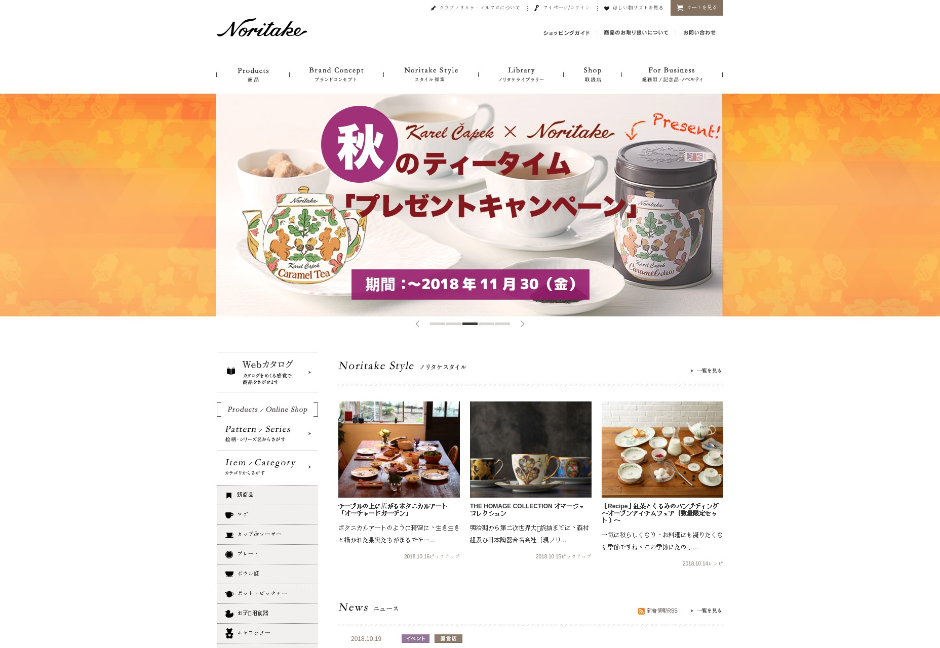
Example: Noritake shows how the domestic-cute concept has reached far beyond Western borders.
The additional forms of cuteness go beyond the domestic and into the world of fashion as well. A certain warmth and contentment can be found in knowing that you’re looking good today, hence the use of phrases like, “That’s a cute dress!” This use of the word also hearkens back to its use in describing generally attractive people.
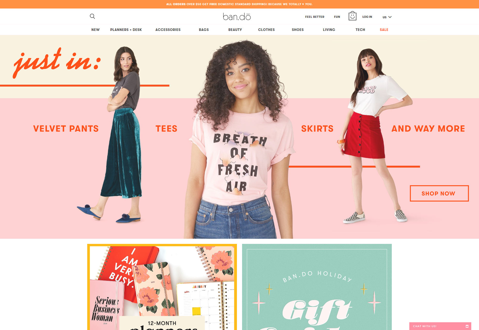
Example: Bando provides a picture-perfect example of fashion-cute.
4. Cuteness in the copy
So we’ve discussed the use of cuteness in imagery, in color, and the overall feel of a design. So how do you write cute things in your website without—for the love of God—going full “baby talk”? Well it all comes down to the emotions you want to evoke. Cuteness is a term that covers a lot of possible subject matter, but one primary emotion: warmth.
You don’t want to write the word “cute” over and over in an effort to convince people to see your page’s subject your way. You want to convey the comfort of a home where you are loved, the depth in the round and trusting eyes of a puppy, the clumsy antics of a cat that’s been surprised by something, or the sheer joy of wearing an outfit that makes you give yourself the old up-and-down glance in the mirror.
Concepts like “elegance” are inherently visual, and so designing them into a website is a purely visual exercise. Concepts like “cuteness” are far more emotional. Though you can tune the visual characteristics of just about anything to make it cute, it’s worth remembering that the emotional side of the concept can actually get pretty complex, and your copy should reflect that.
5. Cuteness in the details
Keep in mind that you don’t always need to saturate your website with cute vibes. As many parents whose children love the Minions might tell you, too much “cuteness” can get on the nerves after a while. For most websites that don’t strictly relate to children or home decorating, you’ll want to splash some cuteness in here and there, without overwhelming the user.
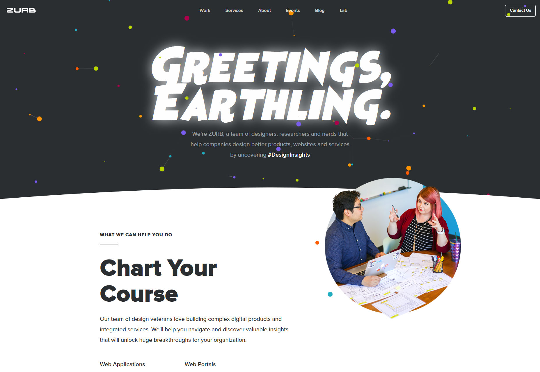
One of my favorite examples will always be sites like Zurb. Most of the site is fairly corporate-standard, but there’s a touch of cuteness in there, with their hidden cows, their project mascots, and entertaining bits of microcopy. It’s a light touch, but it’s enough to make them stand out.
| Add Realistic Chalk and Sketch Lettering Effects with Sketch’it – only $5! |
|
