Exclusions will hopefully be like more powerful grid-friendly floats
Exclusions (which are currently in a “working draft” spec as I write) are kinda like float in that they allow inline content to wrap around an element. But not exactly a float. Chen Hui Jing has an excellent explanation:
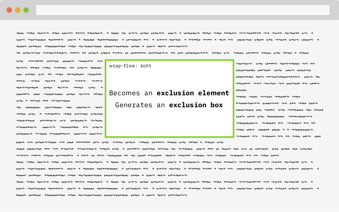
An exclusion element is a block-level element which is not a float, and generates an exclusion box. An exclusion element establishes a new block formatting context.
An element becomes an exclusion when its wrap-flow property is computed to something other than its initial value of auto. When an element becomes an exclusion, inline content will wrap around the exclusion areas, but within their own formatting contexts.

Support is limited to Edge and IE (again, as I write):
This browser support data is from Caniuse, which has more detail. A number indicates that browser supports the feature at that version and up.
Desktop
| Chrome | Opera | Firefox | IE | Edge | Safari |
|---|---|---|---|---|---|
| No | No | No | 10* | 12* | No |
Mobile / Tablet
| iOS Safari | Opera Mobile | Opera Mini | Android | Android Chrome | Android Firefox |
|---|---|---|---|---|---|
| No | No | No | No | No | No |
Chen makes a great case for why they are useful, but another round of discussion has cropped up lately as well. Rob Weychert documents a simple layout situation in which an image is floated left and text is wrapping around it:
As those light red bars indicate, Rob has set up some display: grid; columns to align elements in the article to those axes. A classic “editorial layout” indeed. But there really is no good mechanism to place that image onto the grid and maintain the wrapping. By placing both the content and the image into separate grid items, you don’t get the wrapping. You can use float, but that’s not using the grid.
Rachel Andrew chimed in that the answer is CSS exclusions. While Rob’s example ultimately had to use floats, Rachel re-did it with exclusions. Exclusions make the code much simpler.
/* with floats, replicating exactly what the grid is doing */
img {
  float: left;
  width: calc( 3 * ((100% - 50px - 15em) / 6) + 50px + 2em );
}

/* with exclusions, using the grid */
img {
  grid-row: 2;
  grid-column: 1 / 3;
  -ms-wrap-flow: both;
}
Perhaps we can chime in with thumbs up on Rachel’s call to see what’s up with the status of the spec and with other author use cases.
The post Exclusions will hopefully be like more powerful grid-friendly floats appeared first on CSS-Tricks.