Nesting Components in Figma
For the past couple of weeks, I’ve been building our UI Kit at Gusto, where I work, and this is a Figma document that contains all of our design patterns and components so that designers on our team can hop in, go shopping for a component that they need, and then get back to working on the problem that they’re trying to solve.
There’s a couple things that I’ve learned since I started. First, building a UI Kit is immensely delicate work and takes a really long time (although it happens to be very satisfying all the while). But, most importantly, embedding Figma components within other components is sort of magic.
Here’s why.
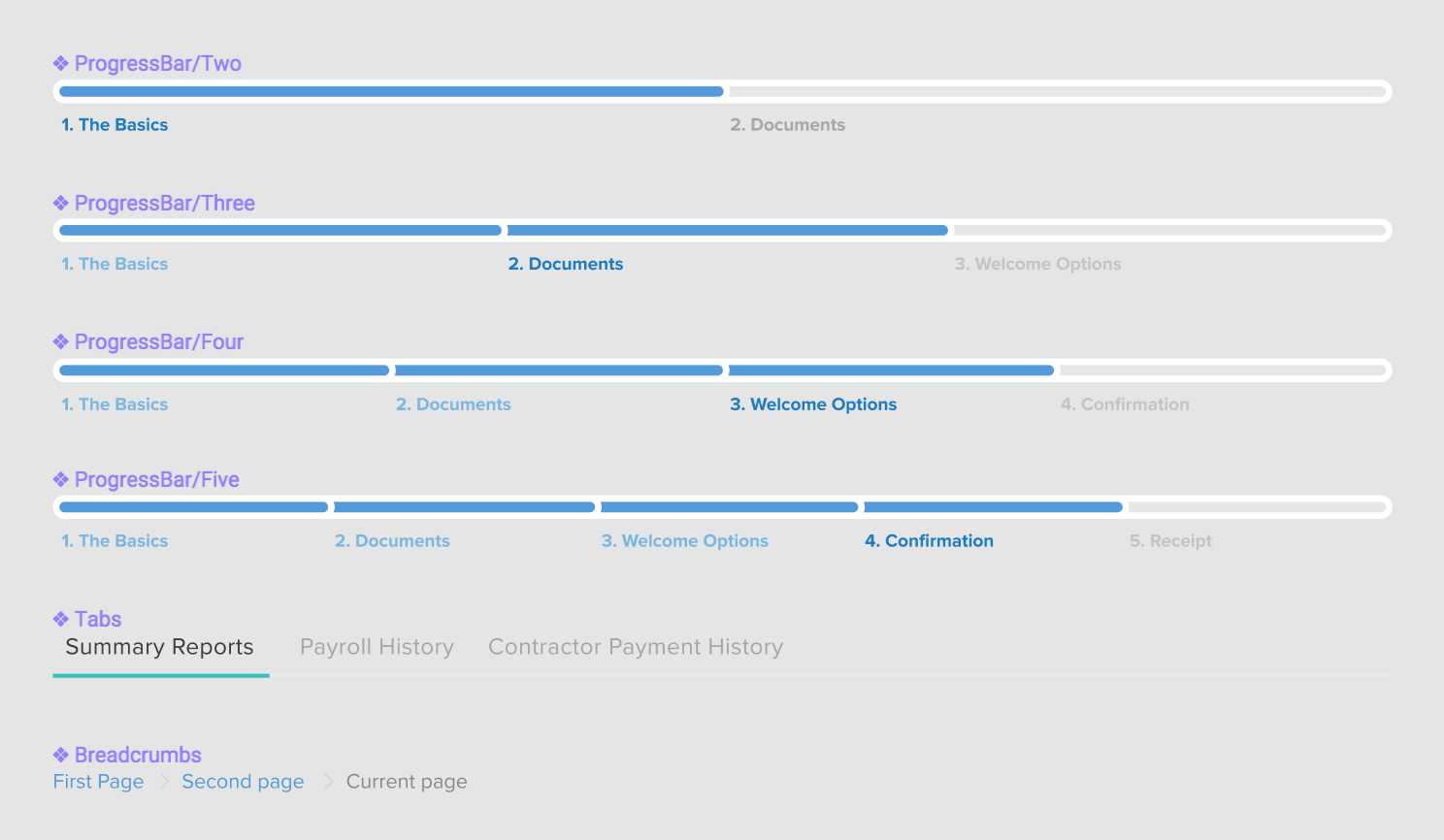
First, it’s important to note that I’ve tried to break down our components into the smallest, littlest chunks. So, for example, our Breadcrumbs, Tabs, and Progress Bar components are all separate from one another and I’ve dumped them all into a Symbols page.
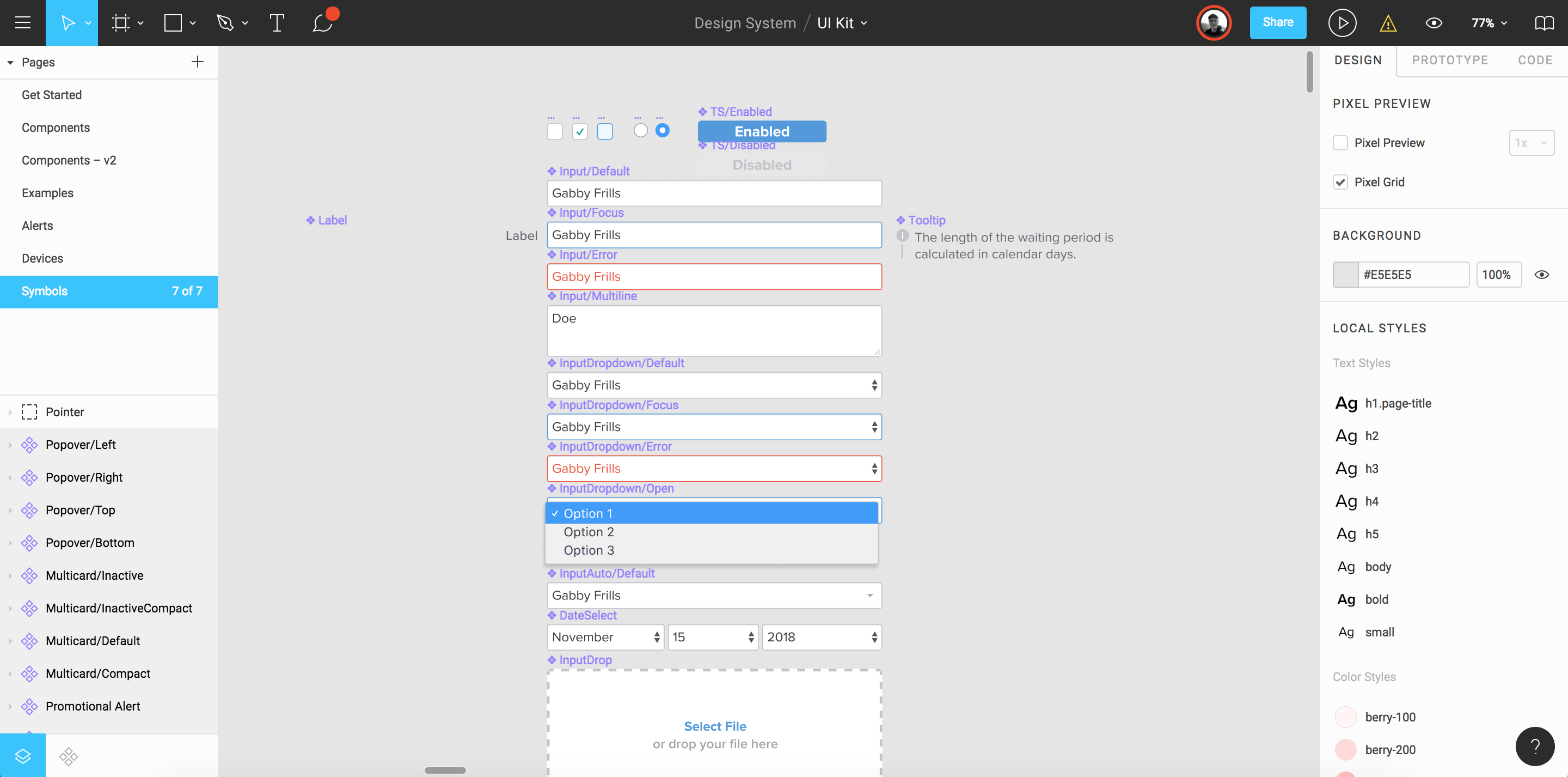
Here’s an example of how I’ve started to build our form elements:

From what I can tell, this is how a lot of UI Kits are designed — there’s a welcome page that introduces what this document is and how to use it; there’s a symbols page that the design systems folks will maintain that has everything from buttons to forms inside it as symbols or components; and then there’s typically another page that has examples of these symbols that represent the final application.
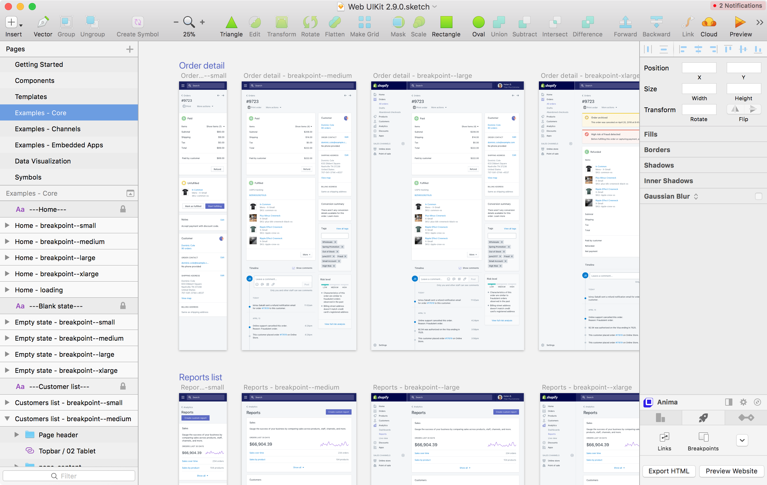
Shopify’s design system, Polaris, does also this with their Sketch file, but so do a lot of examples I’ve seen from other big design teams:

But anyway, going back to my design in Figma — notice below that a forward slash (/) is used in the name of ProgressBar/Two and ProgressBar/Three components.

Well, that’s Figma’s naming convention for identifying Instances. What this means is that when a designer drags in the ProgressBar component from the UI Kit, they can switch between different options, like this:
That’s nifty! But once I broke up our UI into these tiny components, I started to wonder how I might combine these pieces together to make things even easier for our design team. I soon realized that in our app we have navigation items like breadcrumbs or progress bars but they always have a title associated with them. Once I figured that out, I started a series of new components called Header/Default, Header/Breadcrumbs, Header/ProgressBar, etc., which have all these components embedded within them.
So, now when a designer drags in the Header component into their mockups, they can do the following:
We’re switching between the different Header instances there and that doesn’t look like much, yet. But! Since we’re nesting components within our Header component, designers can jump down into the subcomponents, like ProgressBar and update that, too:
How neat is that? And again, this doesn’t look particularly useful just yet but nesting components within larger components means that you can start to use them in clever ways.
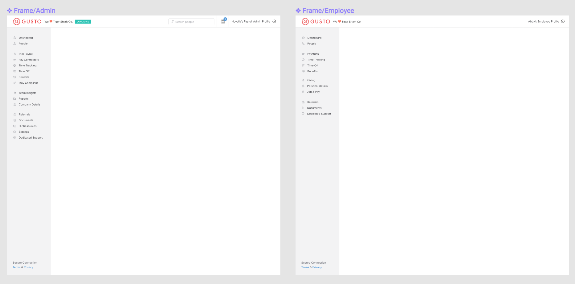
Where this gets interesting is here: at Gusto, we have two different UIs for our types of customers. We have admins that run payroll and then their employees that can access their account to see how much they’ve been paid. There’s different navigation and options for both, so I created two components for them: Frame/Admin and Frame/Employee.

These two components have the sidebar and navigation items but are then placed into a separate component called Layout/Default where we’ve placed our Header component. But since these components are instances and nested together, we can begin to click-clack bits of the UI together to get the precise interface that we want.
Now, whenever designers need to switch between different UIs, they can use these nested components and instances to toggle between them super fast. I’ve only just started experimenting with this but the idea is that by using these nested components you give folks a way to toggle between the different variants inside them whilst also providing a nice API for larger layouts.
If you’re using instances in Figma, Sketch, or another design tool — let me know! I’m constantly on the lookout for improving things here, but I think this is certainly a good start.
The post Nesting Components in Figma appeared first on CSS-Tricks.