Archive

Archive for November, 2018

Sunlight, Fresh Air and Exercise: How to Stay Creative

November 22nd, 2018 No comments

The autumn air is fresh and clear, the light is soft and uplifting and the autumnal forests are at their most beautiful. Combined with some smooth Swiss tarmac under my wheels, cycling conditions are perfect and I’m often out enjoying the hills in the middle of the day. But I’m not skiving, this is an important part of my work routine.

Cycling doesn’t require a lot of engagement of the brain, so it’s a great time for thinking. The rhythmic motion of feet on pedals seems to literally crank up my brain, so that soon it’s racing way ahead of the road in front of me, seeing angles in stories nobody had realised were there, or picking quotes that offer the key to explaining a complex issue.

With creative tasks, inspiration is crucial and most people can’t achieve that…sat in the office

When I return home to my desk, I often hit the keyboard straight away. Showers, food and checking emails can wait: I have words in my mind that I want to get down.

Whether you’re a web designer, writer, marketer or programmer, you need to feel refreshed and positive in order to do your best work. With creative tasks, inspiration is crucial and most people can’t achieve that for 8 hours a day, sat in the office.

The Science of Breaks

Most of us naturally tend to take a break every so often, because we get bored, fatigued or just fancy a coffee or snack. But there is solid science behind allowing yourself such moments, and indeed encouraging yourself and your employees to take them.

Summarising recent research that backs up the benefits of breaking up the work routine in Psychology Today, retired professor and author of ‘Changepower! 37 Secrets to Habit Change Success’ Meg Selig says that for “think-work,” the prefrontal cortex needs to recharge regularly.

Meg found studies showing that short ‘movement breaks’ are essential in sedentary jobs; that leaders easily suffer from ‘decision fatigue’ if they work too solidly; that resting helps learning; and that we are more motivated to focus on long-term goals after a pause. Perhaps most importantly, working for long stretches without breaks leads to stress and exhaustion.

Taking breaks refreshes the mind, replenishes your mental resources, and helps you become more creative…‘Aha moments’ came more often to those who took breaks, according to research.

At the same time, productivity is also an issue for those that work for themselves. Can you you afford to spend an hour out on the road, or sitting watching the ocean? The answer should be a resounding yes: productivity requires breaks as much as creativity.

How Many Breaks Should You Take?

Older programmers will perhaps remember the Pomodoro Technique, which was popular in IT circles of decades gone by. It involved setting a tomato-shaped timer for 25 minutes and focusing 100% on a task for that interval. When the buzzer rang, users were advised to “breathe, meditate, grab a cup of coffee, go for a short walk or do something else relaxing.” After every four cycles, workers were advised to take a longer break.

The Pomodoro Technique is still used today, and you can still buy the little tomato timers: many creative or ‘information economy’ workers appreciate being reminded to take a breather.

Both regular short breaks and occasional longer ones are important. A series of studies recently published in the Harvard Business Review confirmed that we are neither creative not productive if we work on a single task for too long. The authors noted that when attempting problems that require creativity, we often reach a dead end without realizing it:

We find ourselves circling around the same ineffective ideas and don’t recognize when it’s time to move on

A five minute reset is all very well, but for home workers—or IT types who spend long hours working with the same small team—the need to get a change of scene in order to find their professional A-game can be even greater than for those who have a larger and more dynamic workplace. There is plenty of evidence that longer breaks are worthwhile too: the HBR study concludes: “Don’t skip your lunch breaks, and don’t feel guilty about taking breaks, especially when you are feeling stuck. Doing so may actually be the best use of your time.”

Breaks and Routine are Essential

Despite having the freedom to work when and where they want, most successful business people choose to follow a daily routine. This is because otherwise, they would constantly get sidetracked with urgent but minor matters, rather than concentrating on what is strategically important.

This is very different to merely having a to-do list, as it entails the business leader setting out time for all the key business tasks she or he must fulfil. As Stephen Covey wrote in The Seven Habits of Highly Effective People:

The key is not to prioritise what’s on your schedule, but to schedule your priorities.

Scheduling your priorities for the business also ensures that you don’t keep putting off the tasks you don’t like—or might feel guilty about. The logical conclusion, then, is that breaks should actually be incorporated into the daily schedule. They are an important part of your routine, and one you shouldn’t shirk. Scheduling should also help ensure you aren’t using daily jog simply to run away from a difficult job!

Finding Your Natural Schedule

Productivity guru Chris Bailey, author of Hyper Focus, recommends having a routine, and his includes going to the gym, playing the piano, and time for snacks and reading in among his plan to target various areas of his creative job.

Chris says it’s important to learn when we are most productive, and when we will likely be feeling creative. They are not the same, and he recommends figuring out how your natural day runs before creating your daily routine:

A daily routine is powerful for one simple reason: not all hours of your day are created equal. There are certain times when you’ll naturally have more (or less) energy. Once you identify those hours, you can take advantage of them.

According to Chris, it’s easy to figure out when your most productive hours are—they are when you have the most energy. Your most creative hours are when you tend to have the least energy, because your brain is the less inhibited at that time.

The Right Kind of Breaks

Just scheduling and taking breaks is not enough, because they have to be the right kind. There is one kind of break in particular that we all take far too much these days: looking at our phones. Recent research suggest that the more we do it, the more we train ourselves to get distracted. The same goes for looking at social media or even reading a newspaper online. That isn’t really a break if you work in front of a screen all day: it’s a distraction.

It is important that the breaks we schedule and take restore the part of the brain we use to work creatively. And the body deserves a break too, from the eyes down to your back and bum, neither of which evolved to sit on a chair all day.

Instead, experts recommend fresh air and a calming exposure to nature; real social interaction and ideally laughter; and exercise.

So put down your phone, and go enjoy your Thanksgiving!

Featured image via DepositPhotos.

Add Realistic Chalk and Sketch Lettering Effects with Sketch’it – only $5!

Source

Categories: Designing, Others Tags:

What Is a Website Redesign & How To Plan For It Effectively

November 22nd, 2018 No comments

Websites have become essential marketing tools for businesses and it’s mandatory to keep them up to date and fresh always. This can be justified with the help of the statement made by a Danish computer scientist, Jakob Nielsen: “A bad website is like a grumpy salesperson.” This is where the need for website redesigning comes … Continue reading What Is a Website Redesign & How To Plan For It Effectively

The post What Is a Website Redesign & How To Plan For It Effectively appeared first on Design Shard.

Categories: Designing, Others Tags:

What Is a Website Redesign & How To Plan For It Effectively

November 22nd, 2018 No comments

Websites have become essential marketing tools for businesses and it’s mandatory to keep them up to date and fresh always. This can be justified with the help of the statement made by a Danish computer scientist, Jakob Nielsen: “A bad website is like a grumpy salesperson.” This is where the need for website redesigning comes

Categories: Designing, Others Tags:

Gravit Designer Is the FREE Designing Software You Need

November 21st, 2018 No comments
Gravit Designer

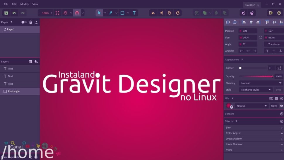
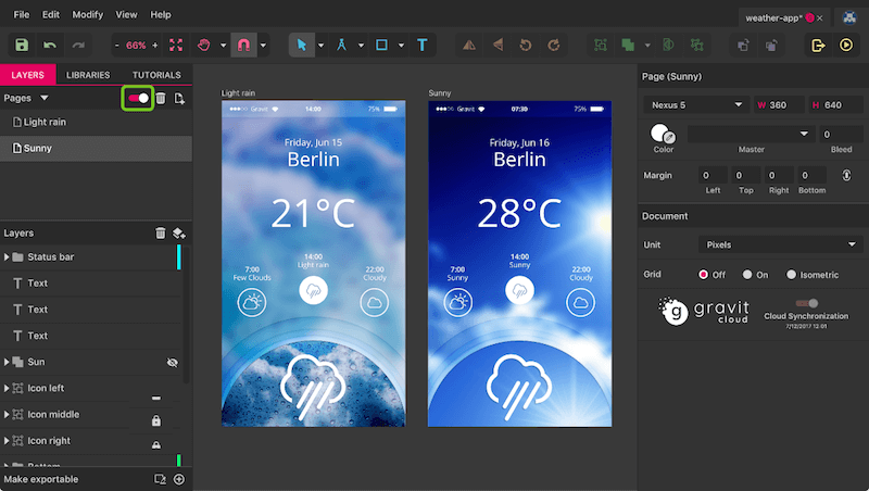
In the world of design, whether it be graphic or web, you’ll always have a need to create vector graphics. Of course, there are lots of tools out there to help you with your need, but are they really the best? Today, we’re going to be taking a lot at one of the most robust apps on the market to see if it really lives up to its hype. We’re going to be reviewing Gravit Designer. Many have described it as an amazing alternative to Illustrator and Sketch, amazed by its multitude of features. But before we get more into the details that set Gravit Designer above many other designing tools, let’s find out more on our subject today.

What is Gravit Designer?

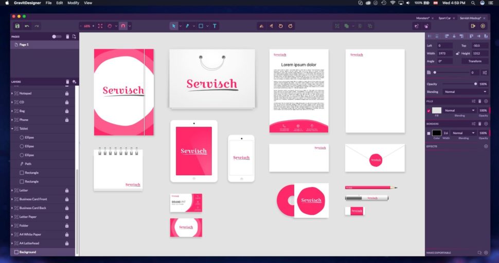
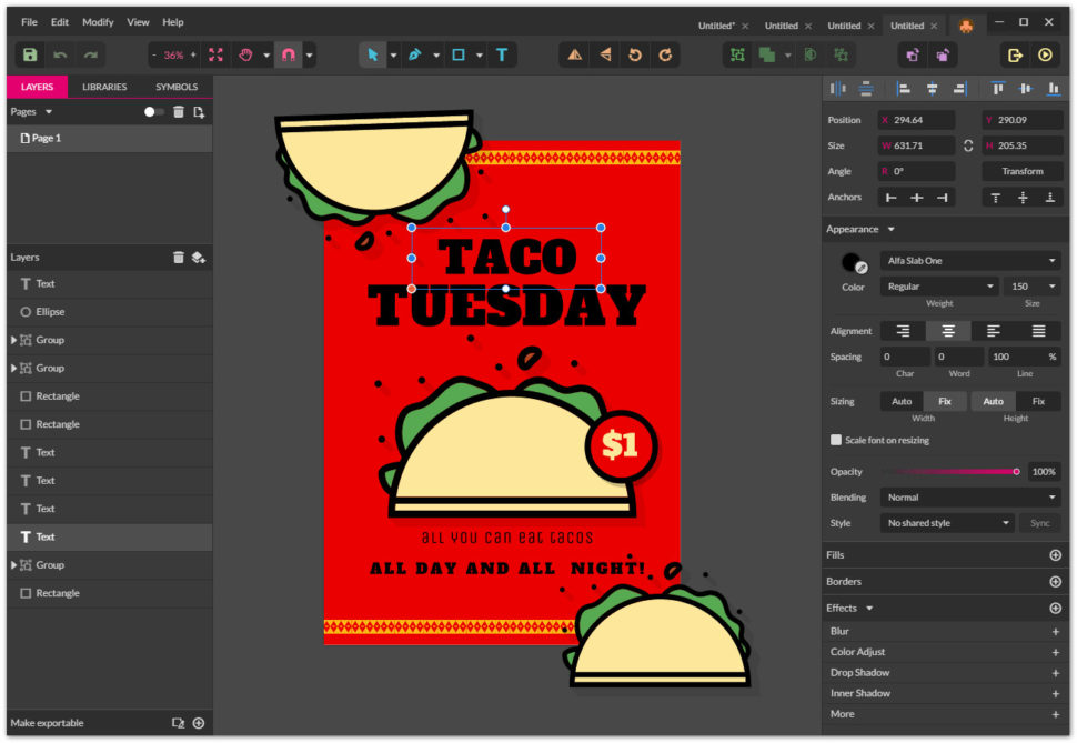
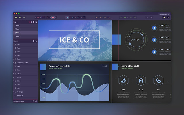
If you haven’t already heard about it, Gravit Designer is a completely free software that gives users the power to create and design icons, presentations, illustrations, prints, apps, and even screen designs. With this program, you’ll have access to a wide range of very powerful tools to help you leap over any obstacle you may come across.

Gravit Designer

With an impressive toolset that includes UI design, icons, marketing tool graphics, concept art design, and animators, it’s a wonder that this thing is free. To top it all off, it can run both as a desktop application and in-browser, and it runs smoothly on most operating systems.

Features

A lot of these apps come with useless tools that they overcharge for, but Gravit Designer seems to be loaded down with surprisingly useful ones. Check them out:

  • Artboards
  • Layers and symbols
  • Booleans
  • A knife tool
  • Path graphs
  • Very high export quality
  • Text engine
  • Grids, anchors, and auto-layers
  • Multiple fills, effects, and blending modes

This list is fairly comprehensive, but there are a few other features on the app that are worth checking out for yourself. Even with just the features listed above, Gravit Designer is nothing to shake a stick at.

Gravit Designer

Price

As I mentioned before, Gravit Designer is completely free and offers no upgrade packages. Everything that the app has to offer is 100% accessible by anyone that uses it. The reason price is included in this review is so that we can compare the prices of similar apps.

Most apps similar to service and features like the ones Gravit Designer has to offer cost between $5 and $20 for the mobile versions and anywhere between $30 and $50 for the desktop application. Now, compare that to Gravit Designer’s price tag of… well, free, and you can’t beat it.

In the words of Alexander Adam, CEO of Gravit:

If it will definitely remain free and it will never be crippled by the stupid freemium or whatever, then we could offer additional things for equipment that could be paid (since we also need to pay those server accounts) but the Designer will remain free since we want everyone can have access to a professional free design tool.

Gravit Designer

User Satisfaction

One of the biggest deciding factors when purchasing a vector design tool is seeing how well it sits with other users. As of right now, there are very few, if any negative reviews on Gravit Designer. This is great news for anyone looking for a helpful tool. Combine that with the fact that it’s completely free, and you have yourself a great app.

Don’t get me wrong, there are a few reviews that list some cons to the app. Here are a few examples:

  • You cannot export to most popular files. This means that you can’t pick up where you left off if you decided to swap to another platform. This can cause massive delays if you need to switch things up.
  • The app changes constantly. With all the attention it’s getting, there are almost constant updates to keep things fresh. This could be viewed as a negative or a positive, however, as it’s always good to get refreshing updates.
  • Since it is free, it does often lack some of the power the other paid programs produce.

Gravit Designer

Again, for a free app, you really can’t be too mad at the features Gravit Designer offers. Ignoring the features, the interface is very straightforward and easy to follow. It makes it difficult to get lost and allows you more time to focus on your designs. Depending on your needs, or if you’re just starting out in the industry, Gravit Designer is definitely worth looking into.

Here are some honest opinions of people who have tried it and shared their experience with the world on g2crowd:

I love Gravit Designer because it is a fantastic multiplatform application for vector design.

It does not matter if we need to work with vector images, icons, if we want to build a website, a mobile application, or simply create presentations with art concepts. Gravit Designer for Windows is the application that we must install on our PC, and the best totally free and very easy to use. JUAN M.

The best thing about it that it’s free. When you struggle to pay for your tools or get overcharged on cards while still need to complete work for yourself or client, gravit has your back. Paulius P.

Gravit has a modern, accessible UI, and it’s far easier to approach. I actually find it superior to Illustrator and similar applications in this regard. Jeff C.

Gravit Designer

The takeaway

Gravit Designer is definitely a contender in its category for the best software you can get your hands on. Yes, it does lack a few features that the competing paid programs offer, but considering that Gravit Designer is free, it’s worth looking into. The features that it does offer are very inclusive and easy to use, and the interface is very user-friendly. All-in-all, Gravit Designer is a great addition to anyone’s desktop.

We would love to find out your opinion on Gravit Design after you give it a try. What other weather app design tools do you use? We would love to hear more about it in the comment section below. Also, if you enjoy reviews like this, and want to stay up-to-date with the design world, then be sure to tune into Webdesignledger daily for new and creative content.

Read More at Gravit Designer Is the FREE Designing Software You Need

Categories: Designing, Others Tags:

Swipeable card stack using Vue.js and interact.js

November 21st, 2018 No comments

I recently had an opportunity to work on a fantastic research and development project at Netguru. The goal of project (codename: “Wordguru”) was to create a card game that anyone can play with their friends. You can see the outcome here.

One element of the development process was to create an interactive card stack. The card stack had a set of requirements, including:

  • It should contain a few cards from the collection.
  • The first card should be interactive.
  • The user should be able to swipe the card in different directions that indicate an intent to accept, reject or skip the card.

This article will explain how to create that and make it interactive using Vue.js and interact.js. I created an example for you to refer to as we go through the process of creating a component that is in charge of displaying that card stack and a second component that is responsible for rendering a single card and managing user interactions in it.

View Demo

Step 1: Create the GameCard component in Vue

Let’s start by creating a component that will show a card, but without any interactions just yet. We’ll call this file GameCard.vue and, in the component template, we’ll render a card wrapper and the keyword for a specific card. This is the file we’ll be working in throughout this post.

// GameCard.vue
<template>
  <div
    class="card"
    :class="{ isCurrent: isCurrent }"
  >
    <h3 class="cardTitle">{{ card.keyword }}</h3>
  </div>
</template>

In the script section of the component, we receive the prop card that contains our card content as well as an isCurrent prop that gives the card a distinct look when needed.

export default {
  props: {
    card: {
      type: Object,
      required: true
    },
    isCurrent: {
      type: Boolean,
      required: true
    }
  }
},

Step 2: Create the GameCardStack component in Vue

Now that we have a single card, let’s create our card stack.

This component will receive an array of cards and render the GameCard for each card. It’s also going to mark the first card as the current card in the stack so a special styling is applied to it.

// GameCardsStack.vue
<template>
  <div class="cards">
    <GameCard
      v-for="(card, index) in cards"
      :key="card"
      :card="card"
      :is-current="index === 0"
    />
  </div>
</template>

<script>
  import GameCard from "@/components/GameCard";
  export default {
    components: {
      GameCard
    },
    props: {
      cards: {
        type: Array,
        required: true
      }
    }
  };
</script>

Here’s what we’re looking at so far, using the styles pulled from the demo:

At this point, our card looks complete, but isn’t very interactive. Let’s fix that in the next step!

Step 3: Add interactivity to GameCard component

All our interactivity logic will live in the GameCard component. Let’s start by allowing the user to drag the card. We will use interact.js to deal with dragging.

We’ll set the interactPosition initial values to 0 in the script section. These are the values that indicate a card’s order in the stack when it’s moved from its original position.

<script>
import interact from "interact.js";

data() {
  return {
    interactPosition: {
      x: 0,
      y: 0
    },
  };
},
// ...
</script>

Next, we create a computed property that’s responsible for creating a transform value that’s applied to our card element.

// ...
computed: {
  transformString() {
    const { x, y } = this.interactPosition;
    return `translate3D(${x}px, ${y}px, 0)`;
  }
},
// ...

In the mounted lifecycle hook, we make use of the interact.js and its draggable method. That method allows us to fire a custom function each time the element is dragged (onmove). It also exposes an event object that carries information about how far the element is dragged from its original position. Each time user drags the card, we calculate a new position of the card and set it on the interactPosition property. That triggers our transformString computed property and sets new value of transform on our card.

We use the interact onend hook that allows us to listen when the user releases the mouse and finishes the drag. At this point, we will reset the position of our card and bring it back to its original position: { x: 0, y: 0 }.

We also need to make sure to remove the card element from the Interactable object before it gets destroyed. We do that in the beforeDestroy lifecycle hook by using interact(target).unset(). That removes all event listeners and makes interact.js completely forget about the target.

// ...
mounted() {
  const element = this.$refs.interactElement;
  interact(element).draggable({
    onmove: event => {
      const x = this.interactPosition.x + event.dx;
      const y = this.interactPosition.y + event.dy;
      this.interactSetPosition({ x, y });
    },
    onend: () => {
      this.resetCardPosition();
    }
  });
},
// ...
beforeDestroy() {
  interact(this.$refs.interactElement).unset();
},
// ...
methods: {
  interactSetPosition(coordinates) { 
    const { x = 0, y = 0 } = coordinates;
    this.interactPosition = {x, y };
  },
  
  resetCardPosition() {
    this.interactSetPosition({ x: 0, y: 0 });
  },
},
// ...

We need to add one thing in our template to make this work. As our transformString computed property returns a string, we need to apply it to the card component. We do that by binding to the :style attribute and then passing the string to the transform property.

<template>
  <div 
    class="card"
    :class="{ isCurrent: isCurrent }"
    :style="{ transform: transformString }"
  >
    <h3 class="cardTitle">{{ card.keyword }}</h3>
  </div>
</template>

With that done, we have created interaction with our card — we can drag it around!

You may have noticed that the behavior isn’t very natural, specifically when we drag the card and release it. The card immediately returns to its original position, but it would be more natural if the card would go back to initial position with animation to smooth the transition.

That’s where transition comes into play! But adding it to our card introduces another issue: there’s a lag in the card following as it follows the cursor because transition is applied to the element at all times. We only want it applied when the drag ends. We can do that by binding one more class (isAnimating) to the component.

<template>
  <div
    class="card"
    :class="{
      isAnimating: isInteractAnimating,
      isCurrent: isCurrent
    }"
  >
    <h3 class="cardTitle">{{ card.keyword }}</h3>
  </div>
</template>

We can add and remove the animation class by changing the isInteractAnimating property.

The animation effect should be applied initially and we do that by setting our property in data.

In the mounted hook where we initialize interact.js, we use one more interact hook (onstart) and change the value of isInteractAnimating to false so that the animation is disabled when the during the drag.

We’ll enable the animation again in the onend hook, and that will make our card animate smoothly to its original position when we release it from the drag.

We also need to update transformString computed property and add a guard to recalculate and return a string only when we are dragging the card.

data() {
  return {
  // ...
  isInteractAnimating: true,
  // ...
  };
},

computed: {
  transformString() {
    if (!this.isInteractAnimating) {
      const { x, y } = this.interactPosition;
      return `translate3D(${x}px, ${y}px, 0)`;
    }
    return null;
  }
},

mounted() {
  const element = this.$refs.interactElement;
  interact(element).draggable({
    onstart: () => {
      this.isInteractAnimating = false;
    },
    // ...
    onend: () => {
      this.isInteractAnimating = true;
    },
  });
},

Now things are starting to look nice!

Our card stack is ready for second set of interactions. We can drag the card around, but nothing is actually happening — the card is always coming back to its original place, but there is no way to get to the second card.

This will change when we add logic that allows the user to accept and rejecting cards.

Step 4: Detect when the card is accepted, rejected, or skipped

The card has three types of interactions:

  • Accept card (on swipe right)
  • Reject card (on swipe left)
  • Skip card (on swipe down)

We need to find a place where we can detect if the card was dragged from its initial position. We also want to be sure that this check will happen only when we finish dragging the card so the interactions do not conflict with the animation we just finished.

We used that place earlier smooth the transition during animation — it’s the onend hook provided by the interact.draggable method.

Let’s jump into the code.

First, we need to store our threshold values. Those values are the distances as the card is dragged from its original position and allows us to determine if the card should be accepted, rejected, or skipped. We use X axis for right (accept) and left (reject), then use the Y axis for downward movement (skip).

We also set coordinates where we want to place a card after it gets accepted, rejected or skipped (coordinates out of user’s sight).

Since those values will not change, we will keep them in the static property of our component, which can be accessed with this.$options.static.interactYThreshold.

export default {
  static: {
    interactYThreshold: 150,
    interactXThreshold: 100
  },

We need to check if any of our thresholds were met in our onend hook and then fire the appropriate method that happened. If no threshold is met, then we reset the card to its initial position.

mounted() {
  const element = this.$refs.interactElement;
  interact(element).draggable({
    onstart: () => {...},
    onmove: () => {...},
    onend: () => {
      const { x, y } = this.interactPosition;
      const { interactXThreshold, interactYThreshold } = this.$options.static;
      this.isInteractAnimating = true;
          
      if (x > interactXThreshold) this.playCard(ACCEPT_CARD);
      else if (x < -interactXThreshold) this.playCard(REJECT_CARD);
      else if (y > interactYThreshold) this.playCard(SKIP_CARD);
      else this.resetCardPosition();
    }
  });
}

OK, now we need to create a playCard method that’s responsible for handling those interactive actions.

Step 5: Establish the logic to accept, reject, and skip cards

We will create a method that accepts a parameter telling us the user’s intended action. Depending on that parameter, we will set the final position of the current card and emit the accept, reject, or skip event. Let’s go step by step.

First, our playCard method will remove the card element from the Interactable object so that it stops tracking drag events. We do that by using interact(target).unset().
Secondly, we set the final position of the active card depending on the user’s intention. That new position allows us to animate the card and remove it from the user’s view.

Next, we emit an event up to the parent component so we can deal with our cards (e.g. change the current card, load more cards, shuffle the cards, etc.). We want to follow the DDAU principle that states a component should refrain from mutating data it doesn’t own. Since our cards are passed down to our component, it should emit an event up to the place from where those cards come.

Lastly, we hide the card that was just played and add a timeout that allow the card to animate out of view.

methods: {
  playCard(interaction) {
    const {
      interactOutOfSightXCoordinate,
      interactOutOfSightYCoordinate,
    } = this.$options.static;

    this.interactUnsetElement();

    switch (interaction) {
      case ACCEPT_CARD:
        this.interactSetPosition({
          x: interactOutOfSightXCoordinate,
        });
        this.$emit(ACCEPT_CARD);
        break;
      case REJECT_CARD:
        this.interactSetPosition({
          x: -interactOutOfSightXCoordinate,
        });
        this.$emit(REJECT_CARD);
        break;
      case SKIP_CARD:
        this.interactSetPosition({
          y: interactOutOfSightYCoordinate
        });
        this.$emit(SKIP_CARD);
        break;
    }

    this.hideCard();
  },

  hideCard() {
    setTimeout(() => {
      this.isShowing = false;
      this.$emit("hideCard", this.card);
    }, 300);
  },
  
  interactUnsetElement() {
    interact(this.$refs.interactElement).unset();
    this.interactDragged = true;
  },
}

And, there we go!

Summary

Let’s recap what we just accomplished:

  • First we created a component for a single card.
  • Next we created another component that renders the cards in a stack.
  • Thirdly, we implemented interact.js to allow interactive dragging.
  • Then we detected when the user wants takes an action with the current card.
  • Finally, we established the to handle those actions.

Phew, we covered a lot! Hopefully this gives you both a new trick in your toolbox as well as a hands-on use case for Vue. And, if you’ve ever had to build something similar, please share in the comments because it would be neat to compare notes.

The post Swipeable card stack using Vue.js and interact.js appeared first on CSS-Tricks.

Categories: Designing, Others Tags:

Exclusions will hopefully be like more powerful grid-friendly floats

November 21st, 2018 No comments

Exclusions (which are currently in a “working draft” spec as I write) are kinda like float in that they allow inline content to wrap around an element. But not exactly a float. Chen Hui Jing has an excellent explanation:

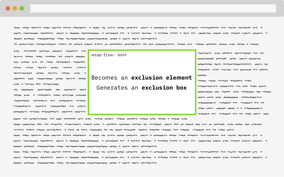
An exclusion element is a block-level element which is not a float, and generates an exclusion box. An exclusion element establishes a new block formatting context.

An element becomes an exclusion when its wrap-flow property is computed to something other than its initial value of auto. When an element becomes an exclusion, inline content will wrap around the exclusion areas, but within their own formatting contexts.

Source: Chen’s article

Support is limited to Edge and IE (again, as I write):

This browser support data is from Caniuse, which has more detail. A number indicates that browser supports the feature at that version and up.

Desktop

Chrome Opera Firefox IE Edge Safari
No No No 10* 12* No

Mobile / Tablet

iOS Safari Opera Mobile Opera Mini Android Android Chrome Android Firefox
No No No No No No

Chen makes a great case for why they are useful, but another round of discussion has cropped up lately as well. Rob Weychert documents a simple layout situation in which an image is floated left and text is wrapping around it:

Source: Rob’s article

As those light red bars indicate, Rob has set up some display: grid; columns to align elements in the article to those axes. A classic “editorial layout” indeed. But there really is no good mechanism to place that image onto the grid and maintain the wrapping. By placing both the content and the image into separate grid items, you don’t get the wrapping. You can use float, but that’s not using the grid.

Rachel Andrew chimed in that the answer is CSS exclusions. While Rob’s example ultimately had to use floats, Rachel re-did it with exclusions. Exclusions make the code much simpler.

/* with floats, replicating exactly what the grid is doing */
img {
  float: left;
  width: calc( 3 * ((100% - 50px - 15em) / 6) + 50px + 2em );
}

/* with exclusions, using the grid */
img {
  grid-row: 2;
  grid-column: 1 / 3;
  -ms-wrap-flow: both;
}

Perhaps we can chime in with thumbs up on Rachel’s call to see what’s up with the status of the spec and with other author use cases.

The post Exclusions will hopefully be like more powerful grid-friendly floats appeared first on CSS-Tricks.

Categories: Designing, Others Tags:

Happy First Anniversary, Smashing Members!

November 21st, 2018 No comments

Happy First Anniversary, Smashing Members!

Happy First Anniversary, Smashing Members!

The Smashing Editorial

2018-11-21T14:00:59+01:002018-11-21T15:18:40+00:00

Doesn’t time fly? And don’t ships sail? A year ago, we launched our Smashing Membership programme so that members of the Smashing readership could support us for a small amount of money (most people pay $5 or $9 a month, and can cancel at any time). In return get access to our ebooks, members-only webinars, discounts on printed books and conferences, and other benefits.

We did this because we wanted to reduce advertising on the site; ad revenues were declining, and the tech-savvy Smashing audience was becoming increasingly aware of the security and privacy implications of ads. And we were inspired by the example of The Guardian, a British newspaper that decided to keep its content outside a paywall but ask readers for support. Just last week, the Guardian’s editor-in-chief revealed that they have the financal support of 1 million people.


Smashing Memeber's Ship
Welcome aboard — we’re celebrating! It’s the first year of Smashing Membership (or Smashing Members’ Ship… get it?)!

Into Year Two

We recently welcomed Bruce Lawson to the team as our Membership Commissioning Editor. Bruce is well known for his work on accessibility and web standards, as well as his fashion blog and world-class jokes.

So now that the team is larger, we’ll be bringing you more content — going up to three webinars a month. The price stays the same. And, of course, we’d love your input on subjects or speakers — let us know on Slack.

When we set up Membership, we promised that it would be an inclusive place where lesser-heard voices (in addition to big names) would be beamed straight to your living room/ home office/ sauna over Smashing TV. Next month, for example, Bruce is pleased to host a webinar by Eka, Jing, and Sophia from Indonesia, Singapore, and the Philippines to tell us about the state of the web in South East Asia. Perhaps you’d like to join us?

Please consider becoming a Smashing Member. Your support allows us to bring you great content, pay all our contributors fairly, and reduce advertising on the site.

Thank you so much to all who have helped to make it happen! We sincerely appreciate it.

(bl, sw, il)
Categories: Others Tags: