Archive

Archive for November, 2018

Incorporate Bohemian Style Into Your Designs

November 17th, 2018 No comments
Bohemian Style

The Bohemian Style, also known as Boho Chic, appeared as a counterculture movement in the early 19th century, in England, but it only became popular worldwide in the 90’s. Back then, the term described the people who rejected the norms of that era. Today, Bohemian is a word describing a style focused on natural elements such as flowers, animals, and patterns based on geometric figures. Albeit it is not hard to recognize the Bohemian Style, not everybody can create a Boho design. Today, we are going to point out some of the main features of the Bohemian style and teach you how to incorporate it into your designs.

Let’s get a better understanding of the term “Bohemian”

In the 90’s, a bohemian person would be interested in “art, music, and/or literature, and lives in a very informal way, ignoring the usually accepted ways of behaving.” The term was directed at outcast artists who lived non-traditional lives. Nowadays, though, it means something totally different. It mainly describes a way of living that includes anything from home decor and clothing, to graphic and web design styles. You can tell it apart due to its main themes: leaves and flowers, vibrant colors that pop, layered clothing, visual textures, arrows, horns and antlers, floral wreaths, indoor plants, animal skulls, macrame, mixed geometric figures. Incorporated into a design, these elements will make your work stand out in the crowd. If this is what you want, let’s see how we can get the job done.

Incorporate Bohemian Style into Graphic Design

As you’ve probably deduced, the Bohemian Style cannot be introduced in all your products due to its specific characteristics. It wouldn’t look right to design a boho logo for a construction company, for example. As we mentioned before, Boho Chic is a way of living, so if you are not an adept, it will look wrong. Your clients, instead, might ask you to design Boho websites, business cards, wedding invitations, book covers, product packaging, clothing prints, greeting cards, wall artwork. In this case, you can take inspiration from the collections we listed below, which are exceptional examples of what your Bohemian Style design should look like.

Boho Bordo Watercolor Flowers
Bohemian Style

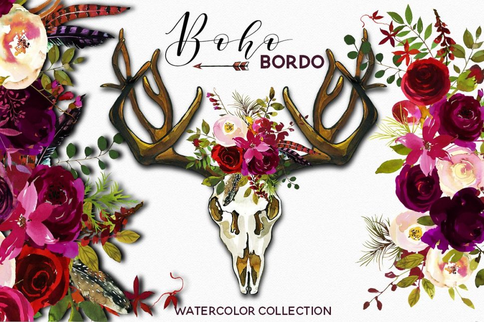
This stunning design was created by whiteheartdesign. If we take a look at this design, we can point out the main Boho elements the designer used:

  • watercolor flowers and nature resembling themes
  • accessories such as feathers, jewel shades of red
  • the decorated skull
  • the arrow
  • handwritten font
  • eucalyptus leaves
  • vibrant colors against a white background
  • mixed textures and patterns

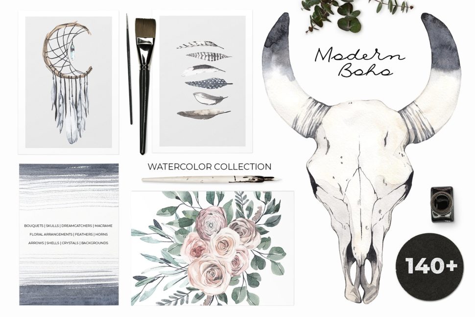
Modern Boho: Pale Watercolor Set

The collection below takes another approach, featuring pastel colors contrasted by darker shades of blue and grey. This choice of colors and shades is specific to the Minimalist style, very popular, as well, among graphic designers. The result? Amazing aesthetics fitted for a more conservative client who doesn’t want a design that screams color.
Bohemian Style

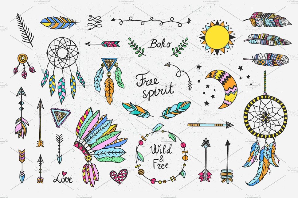
This stunning collection was hand-drawn by Lana Elanor and it includes more than 140 watercolor elements such as:

  • 10 floral arrangements and bouquets
  • 2 clean + 2 decorative dreamcathers
  • 7 embellished floral frames
  • hanging indoor plants
  • set of 10 beachy boho shells
  • set of 20 feathers (peacock feather included)
  • 1 Giant Leopard moth (butterfly)
  • 1 clean + 3 decorative wooden Peace signs (hippie symbol of peace)
  • set of 12 crystals, gems, and slices of minerals (amethyst, quartz, etc.)
  • and much more.

50 Boho – Tribal – Gypsy Ai Brushes

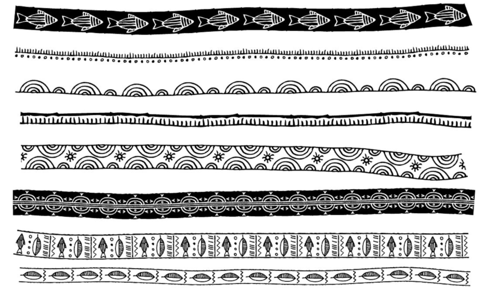
The Boho Style has many elements in common with the tribal aesthetics. The African attire is, regardless of the event, an ocean of colors and geometrical shapes. Marish created a collection of 50 hand-inked tribal inspired brushes that will make your work easier where going for a Bohemian design. The designer assures us that they are great for:

  • Logos
  • Posters
  • Wedding Invites
  • Textile design
  • Mandalas

Bohemian Style

The beauty of this style lays in its imperfections. We rarely have the chance to see perfectly straight lines or perfectly drawn shapes. This will give your design a natural, effortless, yet trendy look. Do yourself a favor and download all the brushes in the collection above and start designing with style… Bohemian Style.

ANIMATED Instagram Posts-Boho chic

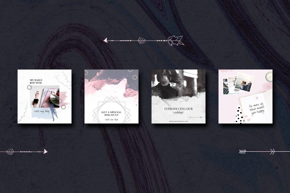
Needless to say, as a graphic or web designer, you need to make an impression by all means. Whether this means a gorgeous website or a stylish social media profile. If you are a fan of the Boho Chic, CreativeFolks will put your work in the spotlight. They created Instagram Story Templates that you can have fun editing depending on your mood. You can change the colors, the text, and even the animation. Check some out below:
Bohemian Style

For more Boho Design inspiration on Instagram, follow BohhoSoul.

Below, we have listed some more resources that will help you give your projects a Boho touch.

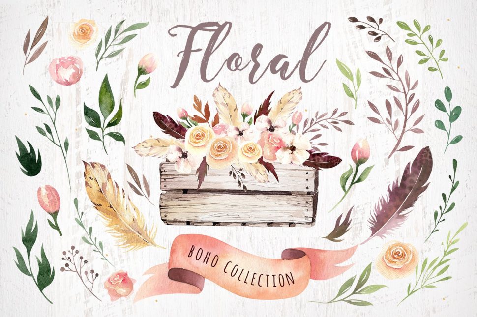
Bohemian watercolor collection II
Bohemian Style

Beautiful Boho Designs

Bohemian Style

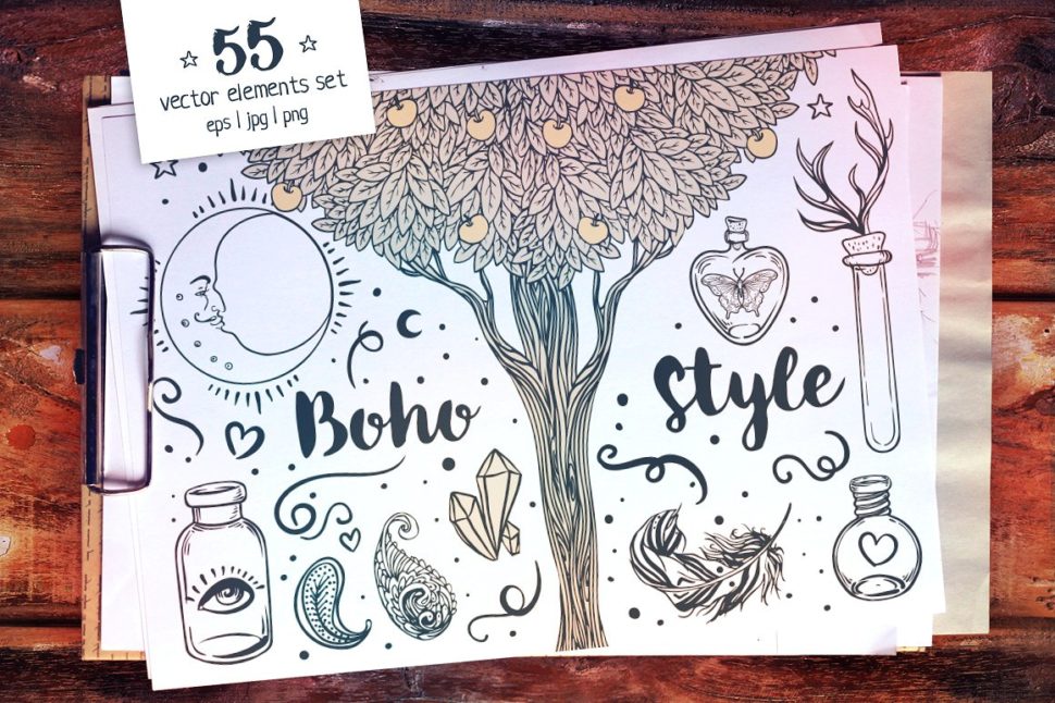
55 Boho Style Vector Set + Bonus

Bohemian Style

Before we close up this article, we listed a few tips for incorporating Bohemian Style into your design in a more natural way:

1. Choose your color range from the beginning. If you prefer vibrant colors, make sure you stick to them to the end of your project. Same case applies to pastels. But don’t be afraid to juggle with them.

2. Don’t over use elements. There are plenty of Boho designs already created out there and it’s very easy to get carried away and add too many to your design.

3. Be consistent. When branding a new company, make sure the website, the logo, and the business card feature the same Bohemian elements.

4. Pay attention to your client’s directives. With such a detailed style like the Boho Chic, you might miss some details your clients want.

5. Creativity has no limits. The Bohemian Style offers you the freedom to express yourself through colors, patterns, themes, and so much more. Make the best of it.

Read More at Incorporate Bohemian Style Into Your Designs
Categories: Designing, Others Tags:

Incorporate Bohemian Style Into Your Designs

November 17th, 2018 No comments
Bohemian Style

The Bohemian Style, also known as Boho Chic, appeared as a counterculture movement in the early 19th century, in England, but it only became popular worldwide in the 90’s. Back then, the term described the people who rejected the norms of that era. Today, Bohemian is a word describing a style focused on natural elements such as flowers, animals, and patterns based on geometric figures. Albeit it is not hard to recognize the Bohemian Style, not everybody can create a Boho design. Today, we are going to point out some of the main features of the Bohemian style and teach you how to incorporate it into your designs.

Let’s get a better understanding of the term “Bohemian”

In the 90’s, a bohemian person would be interested in “art, music, and/or literature, and lives in a very informal way, ignoring the usually accepted ways of behaving.” The term was directed at outcast artists who lived non-traditional lives. Nowadays, though, it means something totally different. It mainly describes a way of living that includes anything from home decor and clothing, to graphic and web design styles. You can tell it apart due to its main themes: leaves and flowers, vibrant colors that pop, layered clothing, visual textures, arrows, horns and antlers, floral wreaths, indoor plants, animal skulls, macrame, mixed geometric figures. Incorporated into a design, these elements will make your work stand out in the crowd. If this is what you want, let’s see how we can get the job done.

Incorporate Bohemian Style into Graphic Design

As you’ve probably deduced, the Bohemian Style cannot be introduced in all your products due to its specific characteristics. It wouldn’t look right to design a boho logo for a construction company, for example. As we mentioned before, Boho Chic is a way of living, so if you are not an adept, it will look wrong. Your clients, instead, might ask you to design Boho websites, business cards, wedding invitations, book covers, product packaging, clothing prints, greeting cards, wall artwork. In this case, you can take inspiration from the collections we listed below, which are exceptional examples of what your Bohemian Style design should look like.

Boho Bordo Watercolor Flowers

Bohemian Style

This stunning design was created by whiteheartdesign. If we take a look at this design, we can point out the main Boho elements the designer used:

  • watercolor flowers and nature resembling themes
  • accessories such as feathers, jewel shades of red
  • the decorated skull
  • the arrow
  • handwritten font
  • eucalyptus leaves
  • vibrant colors against a white background
  • mixed textures and patterns

Modern Boho: Pale Watercolor Set

The collection below takes another approach, featuring pastel colors contrasted by darker shades of blue and grey. This choice of colors and shades is specific to the Minimalist style, very popular, as well, among graphic designers. The result? Amazing aesthetics fitted for a more conservative client who doesn’t want a design that screams color.

Bohemian Style

This stunning collection was hand-drawn by Lana Elanor and it includes more than 140 watercolor elements such as:

  • 10 floral arrangements and bouquets
  • 2 clean + 2 decorative dreamcathers
  • 7 embellished floral frames
  • hanging indoor plants
  • set of 10 beachy boho shells
  • set of 20 feathers (peacock feather included)
  • 1 Giant Leopard moth (butterfly)
  • 1 clean + 3 decorative wooden Peace signs (hippie symbol of peace)
  • set of 12 crystals, gems, and slices of minerals (amethyst, quartz, etc.)
  • and much more.

50 Boho – Tribal – Gypsy Ai Brushes

The Boho Style has many elements in common with the tribal aesthetics. The African attire is, regardless of the event, an ocean of colors and geometrical shapes. Marish created a collection of 50 hand-inked tribal inspired brushes that will make your work easier where going for a Bohemian design. The designer assures us that they are great for:

  • Logos
  • Posters
  • Wedding Invites
  • Textile design
  • Mandalas

Bohemian Style

The beauty of this style lays in its imperfections. We rarely have the chance to see perfectly straight lines or perfectly drawn shapes. This will give your design a natural, effortless, yet trendy look. Do yourself a favor and download all the brushes in the collection above and start designing with style… Bohemian Style.

ANIMATED Instagram Posts-Boho chic

Needless to say, as a graphic or web designer, you need to make an impression by all means. Whether this means a gorgeous website or a stylish social media profile. If you are a fan of the Boho Chic, CreativeFolks will put your work in the spotlight. They created Instagram Story Templates that you can have fun editing depending on your mood. You can change the colors, the text, and even the animation. Check some out below:

Bohemian Style

For more Boho Design inspiration on Instagram, follow BohhoSoul.

Below, we have listed some more resources that will help you give your projects a Boho touch.

Bohemian watercolor collection II

Bohemian Style

Beautiful Boho Designs

Bohemian Style

55 Boho Style Vector Set + Bonus

Bohemian Style

Before we close up this article, we listed a few tips for incorporating Bohemian Style into your design in a more natural way:

1. Choose your color range from the beginning. If you prefer vibrant colors, make sure you stick to them to the end of your project. Same case applies to pastels. But don’t be afraid to juggle with them.

2. Don’t over use elements. There are plenty of Boho designs already created out there and it’s very easy to get carried away and add too many to your design.

3. Be consistent. When branding a new company, make sure the website, the logo, and the business card feature the same Bohemian elements.

4. Pay attention to your client’s directives. With such a detailed style like the Boho Chic, you might miss some details your clients want.

5. Creativity has no limits. The Bohemian Style offers you the freedom to express yourself through colors, patterns, themes, and so much more. Make the best of it.

Read More at Incorporate Bohemian Style Into Your Designs

Categories: Designing, Others Tags:

Can Your Logo Maker Do This: A Real Designer vs A Logo Maker

November 16th, 2018 No comments

  Every business needs a logo and all major ones will view it as a key aspect of their brand building. A logo is the first impression a customer will get of your brand, so it has to look clean, professional and tell a story about who you are and what you do. Which is … Continue reading Can Your Logo Maker Do This: A Real Designer vs A Logo Maker

The post Can Your Logo Maker Do This: A Real Designer vs A Logo Maker appeared first on Design Shard.

Categories: Designing, Others Tags:

Can Your Logo Maker Do This: A Real Designer vs A Logo Maker

November 16th, 2018 No comments

Every business needs a logo and all major ones will view it as a key aspect of their brand building. A logo is the first impression a customer will get of your brand, so it has to look clean, professional and tell a story about who you are and what you do. Which is … Continue reading Can Your Logo Maker Do This: A Real Designer vs A Logo Maker

The post Can Your Logo Maker Do This: A Real Designer vs A Logo Maker appeared first on Design Shard.

Categories: Designing, Others Tags:

Can Your Logo Maker Do This: A Real Designer vs A Logo Maker

November 16th, 2018 No comments

Every business needs a logo and all major ones will view it as a key aspect of their brand building. A logo is the first impression a customer will get of your brand, so it has to look clean, professional and tell a story about who you are and what you do. Which is

Categories: Designing, Others Tags:

GraphQL is Everywhere!

November 16th, 2018 No comments

I find GraphQL extremely fun and empowering tech to work with, even as a novice just getting started. You’ve probably heard the elevator pitch before: it allows you to ask for exactly the data you need whenever you need it (probably at the component level), and it arrives as lovely JSON data for your usage.

I see it used as part of modern website builds all the dang time. The overall vibe is, “I want to do whatever I want on the front end, and that actually allows for more back-end choices as well.” And by “whatever” on the front end, that generally means a fancy SPA-ish JavaScript-powered thing or a static-site generator-ish thing.

Here’s a quick smattering of articles that are everywhere these days. Instead of the actual article titles, I’ll rename with the stack parts.

GraphQL is certainly in the new-and-hip category, but as ever, everything old is new again. Check out Query by Example, a language from the 1970’s:

.....Name: Bob
..Address:
.....City:
....State: TX
..Zipcode:

Resulting SQL:

SELECT * FROM Contacts WHERE Name='Bob' AND State='TX';

The post GraphQL is Everywhere! appeared first on CSS-Tricks.

Categories: Designing, Others Tags:

An Overview of Render Props in React

November 16th, 2018 No comments

An Overview of Render Props in React

Using render props in React is a technique for efficiently re-using code. According to the React documentation, “a component with a render prop takes a function that returns a React element and calls it instead of implementing its own render logic.” To understand what that means, let’s take a look at the render props pattern and then apply it to a couple of light examples.

The render props pattern

In working with render props, you pass a render function to a component that, in turn, returns a React element. This render function is defined by another component, and the receiving component shares what is passed through the render function.

This is what this looks like:

class BaseComponent extends Component {
  render() {
    return <Fragment>{this.props.render()}</Fragment>;
  }
}

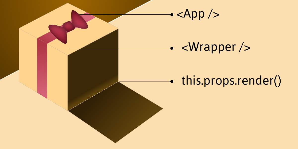
Imagine, if you will, that our App is a gift box where App itself is the bow on top. If the box is the component we are creating and we open it, we’ll expose the props, states, functions and methods needed to make the component work once it’s called by render().

The render function of a component normally has all the JSX and such that form the DOM for that component. Instead, this component has a render function, this.props.render(), that will display a component that gets passed in via props.

Example: Creating a counter

See the Pen React Render Props by Kingsley Silas Chijioke (@kinsomicrote) on CodePen.

Let’s make a simple counter example that increases and decreases a value depending on the button that is clicked.

First, we start by creating a component that will be used to wrap the initial state, methods and rendering. Creatively, we’ll call this Wrapper:

class Wrapper extends Component {
  state = {
    count: 0
  };

  // Increase count
  increment = () => {
    const { count } = this.state;
    return this.setState({ count: count + 1 });
  };

  // Decrease count
  decrement = () => {
    const { count } = this.state;
    return this.setState({ count: count - 1 });
  };

  render() {
    const { count } = this.state;

    return (
      <div>
        {this.props.render({
          increment: this.increment,
          decrement: this.decrement,
          count: count
        })}
      </div>
    );
  }
}

In the Wrapper component, we specify the methods and state what gets exposed to the wrapped component. For this example, we need the increment and decrement methods. We have our default count set as 0. The logic is to either increment or decrement count depending on the method that is triggered, starting with a zero value.

If you take a look at the return() method, you’ll see that we are making use of this.props.render(). It is through this function that we pass methods and state from the Wrapper component so that the component that is being wrapped by it will make use of it.

To use it for our App component, the component will look like this:

class App extends React.Component {
  render() {
    return (
      <Wrapper
        render={({ increment, decrement, count }) => (
          <div>
            <div>
              <h3>Render Props Counter</h3>
            </div>
            <div>
              <p>{count}</p>
              <button onClick={() => increment()}>Increment</button>
              <button onClick={() => decrement()}>Decrement</button>
            </div>
          </div>
        )}
      />
    );
  }
}

Example: Creating a data list

The gain lies in the reusable power of render props, let’s create a component that can be used to handle a list of data which is obtainable from an API.

See the Pen React Render Props 2 by Kingsley Silas Chijioke (@kinsomicrote) on CodePen.

What do we want from the wrapper component this time? We want to pass the source link for the data we want to render to it, then make a GET request to obtain the data. When the data is obtained we then set it as the new state of the component and render it for display.

class Wrapper extends React.Component {
  state = {
    isLoading: true,
    error: null,
    list: []
  };

  fetchData() {
    axios.get(this.props.link)
      .then((response) => {
        this.setState({
          list: response.data,
          isLoading: false
        });
    })
    .catch(error => this.setState({ error, isLoading: false }));
  }

  componentDidMount() {
    this.setState({ isLoading: true }, this.fetchData);
  }

  render() {
    return this.props.render(this.state);
  }
}

The data link will be passed as props to the Wrapper component. When we get the response from the server, we update list using what is returned from the server. The request is made to the server after the component mounts.

Here is how the Wrapper gets used:

class App extends React.Component {
  render() {
    return (
      <Wrapper
        link="https://jsonplaceholder.typicode.com/users"
        render={({ list, isLoading, error }) => (
          <div>
            <h2>Random Users</h2>
            {error ? <p>{error.message}</p> : null}
            {isLoading ? (
              <h2>Loading...</h2>
            ) : (
              <ul>{list.map(user => <li key={user.id}>{user.name}</li>)}</ul>
            )}
          </div>
        )}
      />
    );
  }
}

You can see that we pass the link as a prop, then we use ES6 de-structuring to get the state of the Wrapper component which is then rendered. The first time the component loads, we display loading text, which is replaced by the list of items once we get a response and data from the server.

The App component here is a class component since it does not manage state. We can transform it into a functional stateless component.

const App = () => {
  return (
    <Wrapper
      link="https://jsonplaceholder.typicode.com/users"
      render={({ list, isLoading, error }) => (
        <div>
          <h2>Random Users</h2>
          {error ? <p>{error.message}</p> : null}
          {isLoading ? (
            <h2>Loading...</h2>
          ) : (
            <ul>{list.map(user => <li key={user.id}>{user.name}</li>)}</ul>
          )}
        </div>
      )}
    />
  );
}

That’s a wrap!

People often compare render props with higher-order components. If you want to go down that path, I suggest you check out this post as well as this insightful talk on the topic by Michael Jackson.

The post An Overview of Render Props in React appeared first on CSS-Tricks.

Categories: Designing, Others Tags:

5 Ways to Communicate With Non-Visual Thinkers

November 16th, 2018 No comments

Many, if not most designers will at some point encounter this scenario: they’ve just completed a digital wire-frame for a new project, with a new client. They’ve thought long and hard about the placement of everything, and they’re ready for feedback. They figure it’ll be a short conversation, just enough time for the client to say, “Yeah, that looks fine. Can’t wait to see it with the details filled in!”

The client will take a moment to think, their thoughts briefly visible on their face, and the designer will get nervous. After a minute or so, the client will look up and say, “It looks good…but I’m just not sure about all of those gray boxes.”

Even if they’ve been educated about the use of wireframes, some will still ask, “But you’re going to change the gray boxes, right?” Simply put, assuming that others think like we do is one of the silliest mistakes a designer can make, and we all make it at least once. As designers, even if we don’t start out as visual thinkers, we often end up as visual thinkers after some training.

That may not be so for your clients. For example:

  • Some think in words;
  • Some think in vague impressions and emotions;
  • Others think in pictures, but the images are “blurry”;
  • Some people think primarily in numbers;
  • And then there are spatial thinkers, for whom thoughts are related to each other by a sense of “distance”.

All of these metaphors are imperfect, but serve to highlight the different ways people can think. In fact, people are often on a scale, using one form of thinking or another depending on what they’re thinking about. As a designer, you’re going to have to deal with all of them.

1. Embrace the Differences

Realizing other people don’t think like you is hard, and often involves a rude awakening. It’s like accidentally seeing a roommate naked. It’s uncomfortable, and everyone wishes things were not as they are; but you just have to get on with your life, now.

It’s best if you simply accept that you saw them naked. Holding on to that feeling of awkwardness will lead to difficult communication later. Likewise, you should accept that clients often have a very different idea of what it means to think. Embrace the fact that they see things differently. Realize that their thought processes may yield insights you never dreamed possible. If you go on while feeling as though interacting with them is a chore, they will probably notice; and they will not like it.

On the other hand, nothing smooths over the bumps in a conversation like an open-minded attitude.

2. Build Trust

Building trust with a client is always necessary, but especially helpful when communication is difficult to begin with. When they trust you to do good work for them, they’re less likely to interfere with the smooth running of the project, and provide more constructive feedback.

A number thinker might appreciate hearing some metrics from a previous project. Give them those sweet, sweet percentage values. A verbal thinker is likely going to appreciate written success stories. Throw some number-based metrics into the story for good measure, and you can see why a lot of websites already use this technique.

For the more emotion-thinking clients, however, the best way to build trust is probably just to befriend them as best you can in the limited time you have available. To do this, you might need to make a special effort to listen a lot more closely to the tone of what they say, rather than their actual words. Emotional thinkers often have trouble communicating effectively with pretty much everyone, so making that effort will go a long way toward building trust.

3. Use High-Definition Mockups

Remember back in the day when it was more or less expected that every mockup would be a high-definition mockup? At least, that’s how it felt to me when starting out. I didn’t even know what wireframes were when I started.

Well, for some clients, you may need to go back to the old ways, as it was when web designers roamed the plains, searching for stray DHTML they could copy. Most people, even if not visual thinkers, can sort of visualize things when they put their minds to it. Others have little to no capacity to imagine things visually whatsoever.

For these people, you might have to show them old-fashioned PSD-style high-definition mockups before you’ll get any useful feedback. And they might ask for more than one concept. If you find yourself in this situation, I recommend either charging more, or using UI kits to speed up production.

4. Use Flow Charts

Flow charts are useful ways to organize information (such as site maps) in any case; but can be an especially useful way to convey concepts to spatial thinkers. After all, the whole format is about using spacing for organizational purposes.

That’s really all I’ve got, here; the flow chart is a fairly simple concept.

5. Present Your Work

Don’t wait for your clients to ask you why you made individual design decisions. When you have something to show them, find the time to talk them through everything you’ve done and/or changed, or write it down. Sometimes, just knowing that you have a coherent reason for the things you do is enough to get sign-off.

Even if there are changes to be made, hearing you express your reasoning may give them the information they need to communicate their priorities properly. Basically, the more both parties know, the better.

That last bit right there…that’s the point.

Featured image via DepositPhotos.

Add Realistic Chalk and Sketch Lettering Effects with Sketch’it – only $5!

Source

Categories: Designing, Others Tags: