The State of Web Design, December 2018
Hey there, WDD Readers. Once more, I have spent a whole lot of my life online. My New Year’s resolution is to stay inside and keep doing that. I feel I shall probably succeed.
I have lived and breathed Internet stuff all year, and once again, I don’t even know how much I don’t know. The Internet holds untold numbers of secrets, most of them fairly dull, some of them delightful, and some of them are disgusting enough to inspire a certain awe and respect.
It’s a world unto itself. In my little corner of this world, I’ve once again noticed a few trends, and that’s what I’m here to write about today.
Aesthetic Fusion
Have you ever had Japanese food in Mexico? I’ve consulted with the experts (that is to say, actual Japanese people), and they’ll tell you that the Japanese food here is nothing at all like the real thing. Mexicans took Japanese food, and gave it their own spin, because apparently deep-fried sushi with some avocado in the middle sounded like a good idea to someone down here.
Heck, it sounds good to me. I love avocado as only a millennial raised in Mexico can.
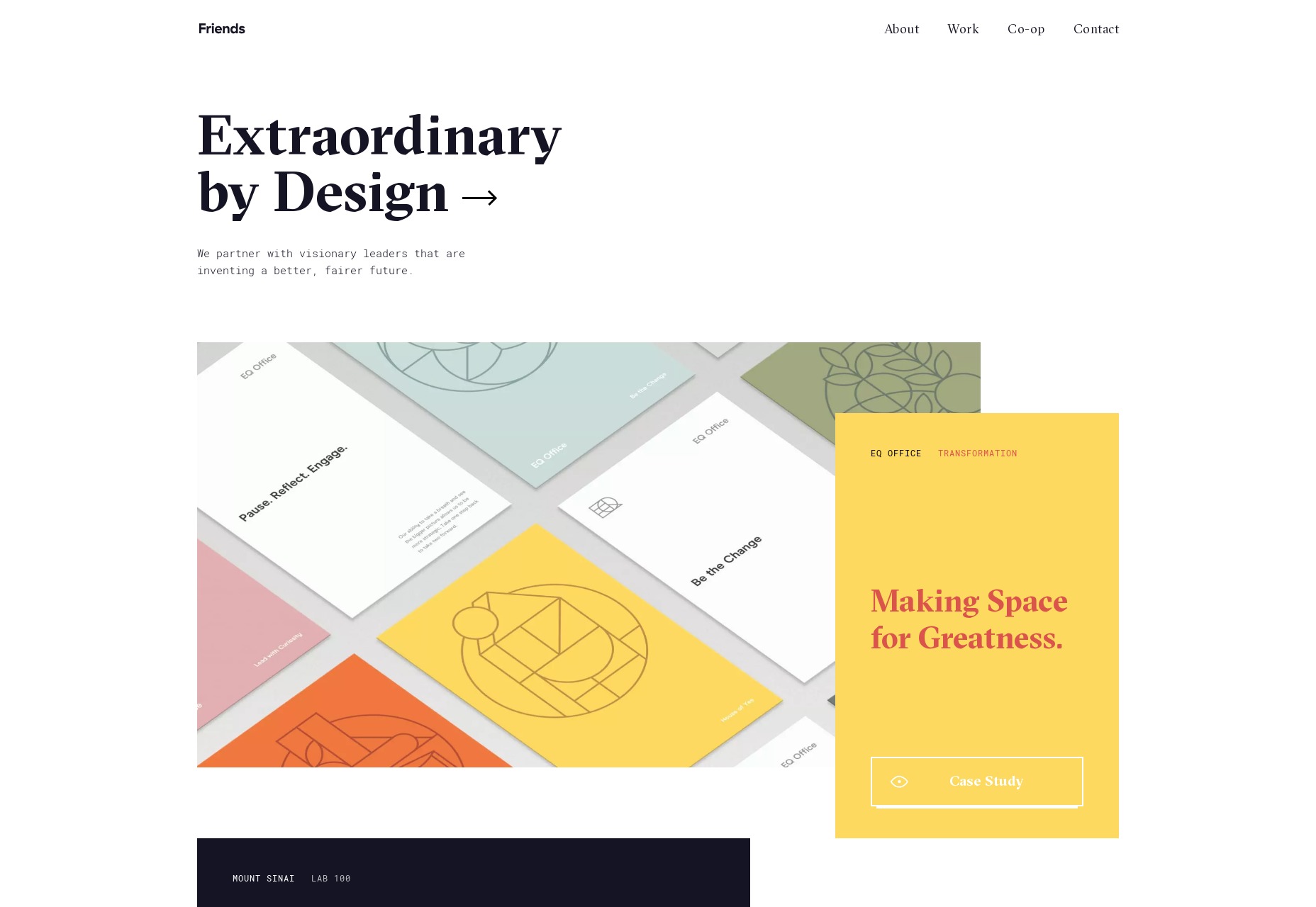
Some people call this “fusion”—others have less complimentary names for it—and it’s happening in web design, too. Over the last couple of years, distinct design aesthetics burst onto the scene, and people went all out for brutalism, postmodernism, and more. Trends were popping up out of seemingly nowhere and taking on a life of their own, at speed.
This last year, though, it seems the emergence of distinct trends has slowed down. I’ve seen a lot more aesthetic fusion going on, with post-modern elements being mixed into fancy, elegant and serif-heavy designs, classical minimalism being given a hint of brutalism, and so on. It’s an interesting twist, and these fusions may eventually become aesthetic schools in their own right, one day. I’ll be watching with interest.
The Return of the “Business” Aesthetic
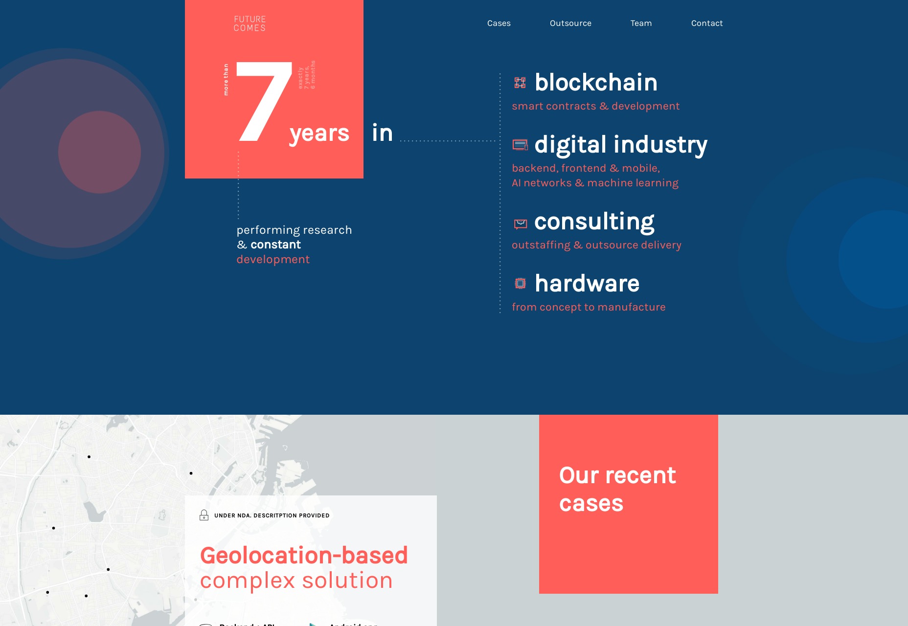
I’ve also noticed an upswing in the number of sites (including non-business sites) that look a bit… well… old. Not vintage or retro, but purposefully dated back to that era when almost every template was a “business” template.
Don’t get me wrong, these sites are built with things like Flexbox and CSS Grid, and they are clearly polished to a level consistent with everything we know about design now. But the bones of the design are old, maybe a little boring, and very business-friendly.
My theory is that after so much artsy design, some customers are asking their designers to go back to something a little more comfortable and familiar. It probably doesn’t help that many of the more experimental design trends can suffer in the usability and accessibility departments.
My prediction: This trend will continue, but only to a point. Some clients will be more concerned with standing out while other will just ask for something that works, and looks like something they expect of a professional business.
We’re Hardly Hearing About VR Anymore
VR is not dead, but we are hearing less and less about it, especially in regards to web design. Though it has been heralded as the next frontier for just about every kind of media, we’re seeing a general slowing of the industry. It is, for now, a niche.
the prophets of the past couple of years got their burning bushes a little too early
It’s not that the platform doesn’t have potential, it’s that the hardware is still prohibitive. It’s prohibitively expensive. It prohibits easily switching from VR to non-VR tasks. It’s nigh-impossible to use outside for a variety of reasons, where most people who aren’t us nerds spend a lot of time.
VR is coming, but the prophets of the past couple of years got their burning bushes a little too early, I think.
Front-end Code is More Developerized
Last year, I went over the battle being waged between groups I called the Experimentalists and the Standardistas. The Experimentalists are currently on a rising tide, buoyed by an influx of back end developers who are attempting to rewrite front end code in their image.
Seriously, the idea of CSS-in-JS used to be a joke, a subject of April Fool’s jokes and satirical articles. People aren’t joking about it so much anymore. The Standardista camp is blaming efforts to “developerize” front-end code on devs who never learned the original concepts and intent behind the way HTML is written, or things like the cascade.
the idea of CSS-in-JS used to be a joke, a subject of April Fool’s jokes and satirical articles
I think that’s more of a symptom than a cause, though. I blame the now nearly-constant demand for full-stack developers. While it’s certainly helpful to know a bit about how “the other side” works, there seems to be a rising aversion to specialization in the job market. As a generalist myself, I can understand that. But specialists exist for a simple reason: the Internet is too darned big for any one person to ever really be able to do it all on their own.
(It’s fairly obvious that I lean towards Standardista myself, isn’t it?)
Content Gets Blocky
I’d be remiss, nay, downright negligent if I didn’t address this: While some CMS creators are focusing on simple, text/Markdown-only solutions (which absolutely have their place), web content in major CMS options seems to be going increasingly the way of LegoTM. It started with more limited CMS like Medium, and is being expanded upon in newer iterations, like WordPress’ Gutenberg.
Block-based content is that most elusive of solutions: a compromise. It combines some flexibility and choice on the part of the user with a degree of control for the designers and developers. It can’t stop bad decisions (few things can stop the really bad ones), but I believe with all my little designer heart that it’s the way forward.
I guess we’ll see where it takes us. Same time next year?
| Add Realistic Chalk and Sketch Lettering Effects with Sketch’it – only $5! |
|


