I’m sure some of that software and hardware has changed since then, but the spirit is the same. It costs money to have the things you need to do this job.
For a lot of designers, standing out can be hard to do. In addition to talent, you need a brand that can easily be recognized and distinguished between all the other designers of the world. Possibly the best way to stand out is to have a website/portfolio that is both unique and professional. Here, we’ll discuss some of the tips you’ll want to consider when you’re setting up your website/portfolio, and how you can use them to reel in those new clients.
Get your domain name right
A domain name can say a lot about a brand. It’s the very first detail that clients will associate with your work, so it has to be easy to remember, and reflect what you do in some way, shape, or form.
If you’re a designer, then you’re in luck. Right now, you can get a free (yes really) .design domain name that comes with all of the right stuff to get you started. If you’ve been holding out for a while because the .com version of the domain name you wanted was taken, now is your chance. Having a .design domain name as a designer is like a dream come true. Your prospective clients will know what you’re all about before they even click on your name. You honestly can’t lose! Take me to me free .design domain name!
Use the right work samples
The easiest way to attract a new client is to show them your previous work. You’ll want to show them the best you have to offer. Is there a project that you’re not particularly proud of? Don’t worry. It’s not a crime to not include it.
In addition to showing off the best of what you’ve got, you should aim for diversity. You never know what kind of client will hit you up, so it’s best that you cover as much ground as possible. Show off multiple different websites you’ve completed for clients in different industries, not just print ad after print ad for the same brewing company. Spice it up a little!
Tell your story
With each project you complete, you should add a few descriptive details about what brought that project together. Without detail, it’s like ordering food at a nice restaurant just by looking at a picture. Just like people want to know what they’re eating, they want details about how you put your projects together.
Another way you can approach this is by describing what the past clients wanted, and then showing what you gave them. Show them step-by-step how you’ve made people’s dreams turn into reality. If people can see how you’ve made other people happy, there’s no reason to think that you couldn’t do the same for them.
Worry about optimization
Looks can be deceiving. A website can look absolutely amazing, but if it performs poorly, then you can scare away clients. Your website should run as smooth as butter and look good while doing so. You want the page to load up quickly, and the transitions between sections of the site to be flawless.
If you’re showing off your best work like we discussed a moment ago, then that means you probably have a lot of images. If your portfolio images load slowly, then the rest of your website will suffer. Here’s how you can avoid that:
Resize your images
Not every image has to be thousands of pixels, especially if only a few hundred can get the job done just as well. Before you upload any image, you should resize them according to the context they’re going into. In most cases, the pixel count shouldn’t exceed 900.
Compress your images
Most of the time, you can shrink your file size without disturbing the pixel count. There are lots of image compressor tools online to choose from, and they’re usually free, so why not?
Now, let’s say that a client sees your work, loves it, and can navigate through your website with ease. How do you land them? Once all of that happens, you simply need to supply them with an easy contact form. Your clients should be able to find your contact form quickly, and be able to fill it out easily. Put the link to contact you in as many reasonable places as you can. Ideally, it should be available on every page.
A lot of times, design agencies will display their phone numbers and emails, and there’s nothing wrong with that. But a contact form makes you much more reachable. The client can contact you straight through your own site.
The conclusion
It can be hard sometimes to stand out in a competitive industry. But, by following the tips above, you’ll be taking your first steps in the right direction. You want to make the user’s experience enjoyable and helpful. Remember that they’re searching online for someone to help them with their needs, not an entire photo album of past projects. Stand out, but look professional doing it.
This is the first post of a two-part series that looks into the way CSS variables can be used to make the code for complex layouts and interactions less difficult to write and a lot easier to maintain. This first installment walks through various use cases where this technique applies. The second post (coming tomorrow!) will cover the use of fallbacks and invalid values to extend the technique to non-numeric values.
What if I told you a single CSS declaration makes the difference in the following image between the wide screen case (left) and the second one (right)? And what if I told you a single CSS declaration makes the difference between the odd and even items in the wide screen case?
Screenshot collage.
Or that a single CSS declaration makes the difference between the collapsed and expanded cases below?
Expanding search.
How is that even possible?
Well, as you may have guessed from the title, it’s all in the power of CSS variables.
There are already plenty of articles out there on what CSS variables are and how to get started with them, so we won’t be getting into that here.
Instead, we’ll dive straight into why CSS variables are useful for achieving these cases and others, then we’ll move on to a detailed explanation of the how for various cases. We’ll code an actual example from scratch, step by step, and, finally, you’ll be getting some eye candy in the form of a few more demos that use the same technique.
So let’s get started!
Why CSS variables are useful
For me, the best thing about CSS variables is that they’ve opened the door for styling things in a logical, mathematical and effortless way.
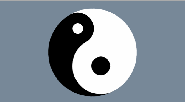
One example of this is the CSS variable version of the yin and yang loader I coded last year. For this version, we create the two halves with the two pseudo-elements of the loader element.
Rotating ? symbol, with its two lobes increasing and decreasing in size.
We use the same background, border-color, transform-origin and animation-delay values for the two halves. These values all depend on a switch variable --i that’s initially set to 0 on both halves (the pseudo-elements), but then we change it to 1 for the second half (the :after pseudo-element), thus dynamically modifying the computed values of all these properties.
Without CSS variables, we’d have to set all these properties (border-color, transform-origin, background, animation-delay) again on the :after pseudo-element and risk making some typo or even forgetting to set some of them.
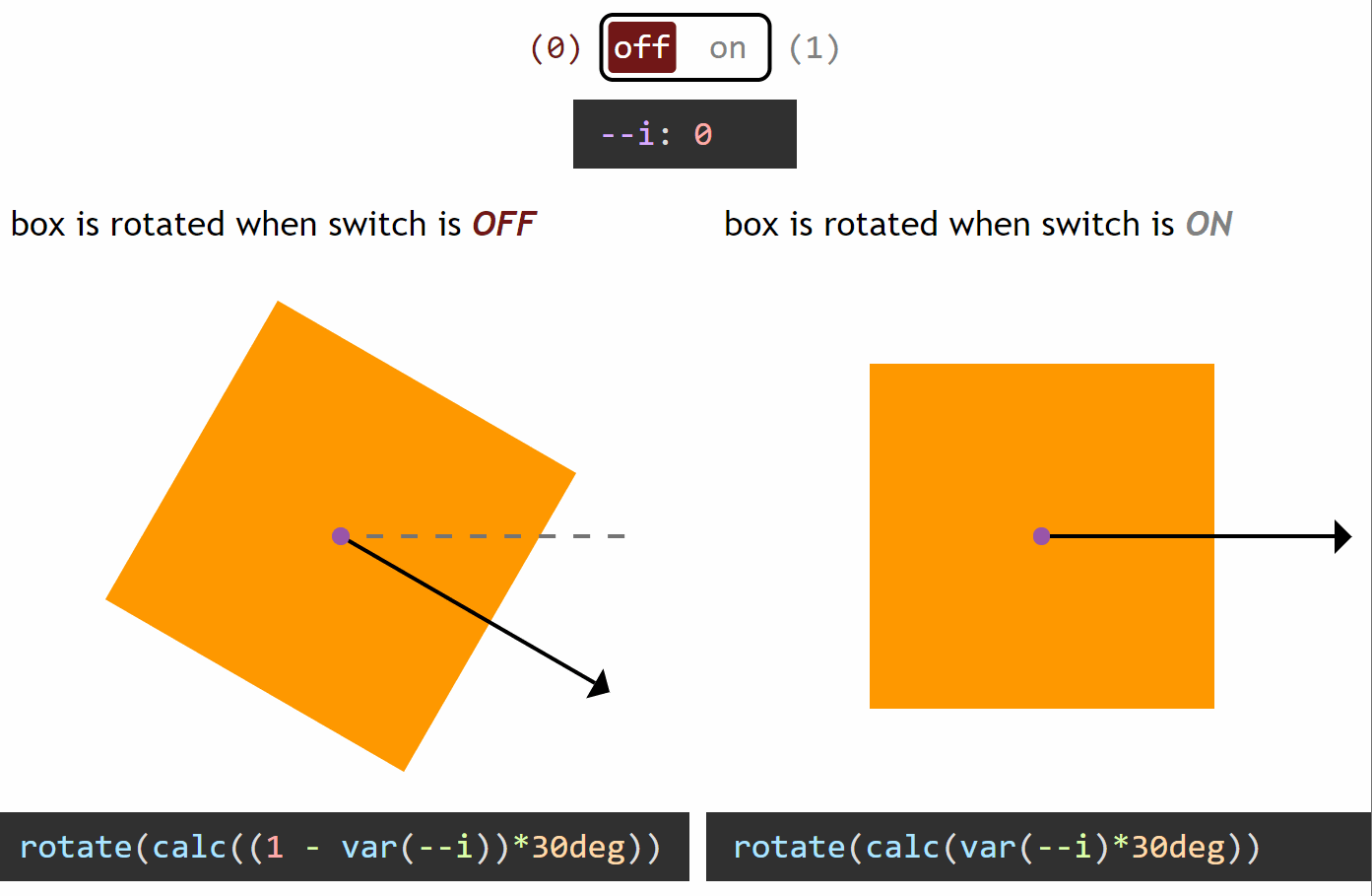
How switching works in the general case
Switching between a zero and a non-zero value
In the particular case of the yin and yang loader, all the properties we change between the two halves (pseudo-elements) go from a zero value for one state of the switch and a non-zero value for the other state.
If we want our value to be zero when the switch is off (--i: 0) and non-zero when the switch is on (--i: 1), then we multiply it with the switch value (var(--i)). This way, if our non-zero value should be, let’s say an angular value of 30deg, we have:
when the switch is off (--i: 0), calc(var(--i)*30deg) computes to 0*30deg = 0deg
when the switch is on (--i: 1), calc(var(--i)*30deg) computes to 1*30deg = 30deg
However, if we want our value to be non-zero when the switch is off (--i: 0) and zero when the switch is on (--i: 1), then we multiply it with the complementary of the switch value (1 - var(--i)). This way, for the same non-zero angular value of 30deg, we have:
when the switch is off (--i: 0), calc((1 - var(--i))*30deg) computes to (1 - 0)*30deg = 1*30deg = 30deg
when the switch is on (--i: 1), calc((1 - var(--i))*30deg) computes to (1 - 1)*30deg = 0*30deg = 0deg
You can see this concept illustrated below:
Switching between a zero and a non-zero value (live demo, no Edge support due to calc() not working for angle values)
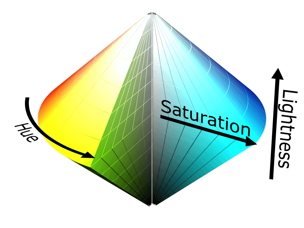
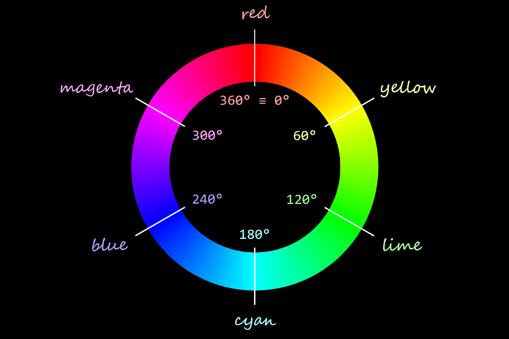
For the particular case of the loader, we use HSL values for border-color and background-color. HSL stands for hue, saturation, lightness and can be best represented visually with the help of a bicone (which is made up of two cones with the bases glued together).
HSL bicone.
The hues go around the bicone, 0° being equivalent to 360° to give us a red in both cases.
Hue wheel.
The saturation goes from 0% on the vertical axis of the bicone to 100% on the bicone surface. When the saturation is 0% (on the vertical axis of the bicone), the hue doesn’t matter anymore; we get the exact same grey for all hues in the same horizontal plane.
The “same horizontal plane” means having the same lightness, which increases along the vertical bicone axis, going from 0% at the black bicone vertex to 100% at the white bicone vertex. When the lightness is either 0% or 100%, neither the hue nor the saturation matter anymore – we always get black for a lightness value of 0% and white for a lightness value of 100%.
Since we only need black and white for our ? symbol, the hue and saturation are irrelevant, so we zero them and then switch between black and white by switching the lightness between 0% and 100%.
.yin-yang {
  /* other styles that are irrelevant here */

  &:before, &:after {
    /* other styles that are irrelevant here */
    --i: 0;

    /* lightness of border-color when
     * --i: 0 is (1 - 0)*100% = 1*100% = 100% (white)
     * --i: 1 is (1 - 1)*100% = 0*100% =   0% (black) */
    border: solid $d/6 hsl(0, 0%, calc((1 - var(--i))*100%));

    /* x coordinate of transform-origin when
     * --i: 0 is 0*100% =   0% (left)
     * --i: 1 is 1*100% = 100% (right) */
    transform-origin: calc(var(--i)*100%) 50%;

    /* lightness of background-color when
     * --i: 0 is 0*100% =   0% (black)
     * --i: 1 is 1*100% = 100% (white) */
    background: hsl(0, 0%, calc(var(--i)*100%));

    /* animation-delay when
     * --i: 0 is 0*-$t = 0s
     * --i: 1 is 1*-$t = -$t */
    animation: s $t ease-in-out calc(var(--i)*#{-$t}) infinite alternate;
  }

  &:after { --i: 1 }
}
Note that this approach doesn’t work in Edge due to the fact that Edge doesn’t support calc() values for animation-delay.
But what if we want to have a non-zero value when the switch is off (--i: 0) and another different non-zero value when the switch is on (--i: 1)?
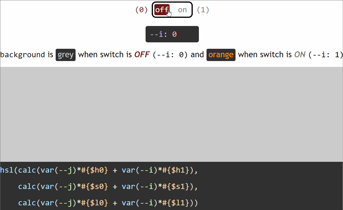
Switching between two non-zero values
Let’s say we want an element to have a grey background (#ccc) when the switch is off (--i: 0) and an orange background (#f90) when the switch is on (--i: 1).
The first thing we do is switch from hex to a more manageable format such as rgb() or hsl().
We could do this manually either by using a tool such as Lea Verou’s CSS Colors or via DevTools. If we have a background set on an element we can cycle through formats by keeping the Shift key pressed while clicking on the square (or circle) in front of the value in DevTools. This works in both Chrome and Firefox, though it doesn’t appear to work in Edge.
<img src="https://css-tricks.com/wp-content/uploads/2018/09/c_format_dev_tools.gif" alt="Animated gif. Shows how to cycle through formats (hex/ RGB/ HSL) via DevTools. In both Chrome and Firefox, we do this by keeping the Shift key pressed and clicking the square or circle in front of the value.”>Changing the format from DevTools.
While rgb() may be the better known format, I tend to prefer hsl() because I find it more intuitive and it’s easier for me to get an idea about what to expect visually just by looking at the code.
So we extract the three components of the hsl() equivalents of our two values ($c0: #ccc when the switch is off and $c1: #f90 when the switch is on) using these functions:
Note that we’ve rounded the results of the hue(), saturation() and lightness() functions as they may return a lot of decimals and we want to keep our generated code clean. We’ve also divided the result of the hue() function by 1deg, as the returned value is a degree value in this case and Edge only supports unit-less values inside the CSShsl() function. Normally, when using Sass, we can have degree values, not just unit-less ones for the hue inside the hsl() function because Sass treats it as the Sass hsl() function, which gets compiled into a CSS hsl() function with a unit-less hue. But here, we have a dynamic CSS variable inside, so Sass treats this function as the CSS hsl() function that doesn’t get compiled into anything else, so, if the hue has a unit, this doesn’t get removed from the generated CSS.
Now we have that:
if the switch is off (--i: 0), our background is hsl($h0, $s0, $l0)
if the switch is on (--i: 1), our background is hsl($h1, $s1, $l1)
We can write our two backgrounds as:
if the switch is off (--i: 0), hsl(1*$h0 + 0*$h1, 1*$s0 + 0*$s1, 1*$l0 + 1*$l1)
if the switch is on (--i: 1), hsl(0*$h0 + 1*$h1, 0*$s0 + 1*$s1, 0*$l0 + 1*$l1)
Using the switch variable --i, we can unify the two cases:
The formula above works for switching in between any two HSL values. However, in this particular case, we can simplify it because we have a pure grey when the switch is off (--i: 0).
Purely grey values have equal red, green and blue values when taking into account the RGB model.
When taking into account the HSL model, the hue is irrelevant (our grey looks the same for all hues), the saturation is always 0% and only the lightness matters, determining how light or dark our grey is.
In this situation, we can always keep the hue of the non-grey value (the one we have for the “on” case, $h1).
Since the saturation of any grey value (the one we have for the “off” case, $s0) is always 0%, multiplying it with either 0 or 1 always gives us 0%. So, given the var(--j)*#{$s0} term in our formula is always 0%, we can just ditch it and our saturation formula reduces to the product between the saturation of the “on” case $s1 and the switch variable --i.
This leaves the lightness as the only component where we still need to apply the full formula.
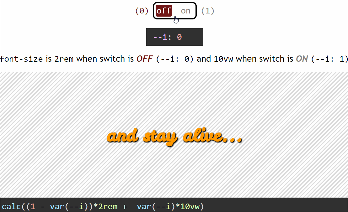
Similarly, let’s say we want the font-size of some text to be 2rem when our switch is off (--i: 0) and 10vw when the switch is on (--i: 1). Applying the same method, we have:
Alright, let’s now move on to clearing another aspect of this: what is it exactly that causes the switch to flip from on to off or the other way around?
What triggers switching
We have a few options here.
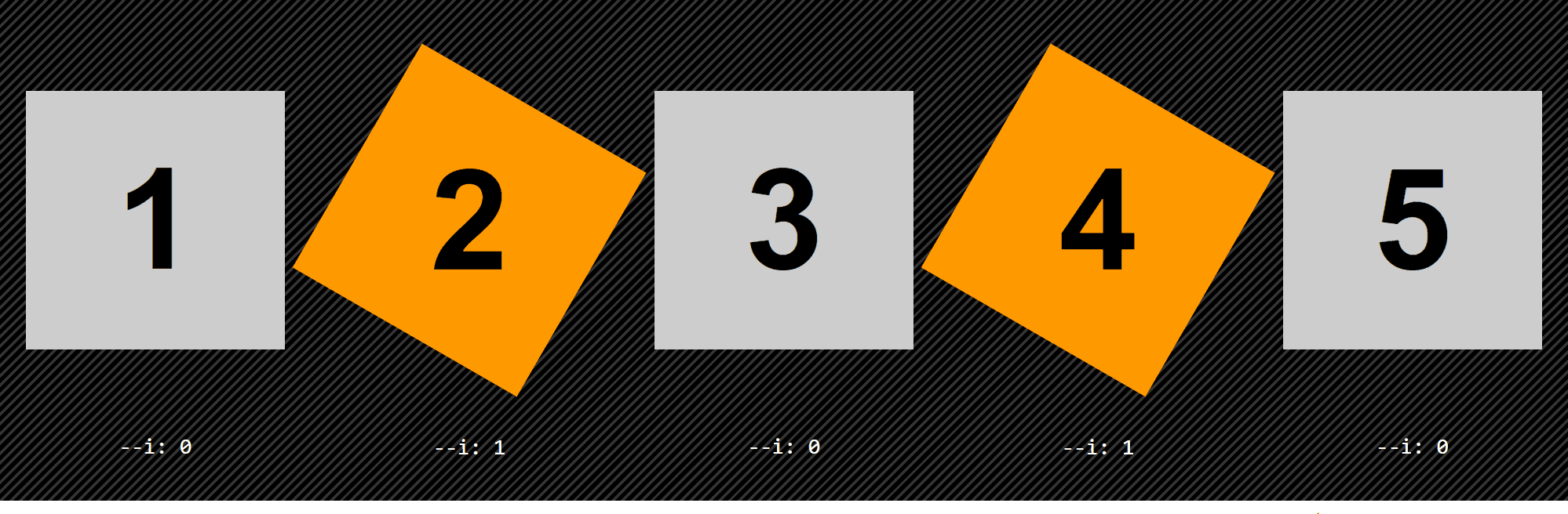
Element-based switching
This means the switch is off for certain elements and on for other elements. For example, this can be determined by parity. Let’s say we want all the even elements to be rotated and have an orange background instead of the initial grey one.
Switching triggered by item parity (live demo, not fully functional in Edge due to calc() not working for angle values)
In the parity case, we flip the switch on for every second item (:nth-child(2n)), but we can also flip it on for every seventh item (:nth-child(7n)), for the first two items (:nth-child(-n + 2)), for all items except the first and last two (:nth-child(n + 3):nth-last-child(n + 3)). We can also flip it on just for headings or just for elements that have a certain attribute.
State-based switching
This means the switch is off when the element itself (or a parent or one of its previous siblings) is in one state and off when it’s another state. In the interactive examples from the previous section, the switch was flipped when a checkbox before our element got checked or unchecked.
We can also have something like a white link that scales up and turns orange when focused or hovered:
Since white is any hsl() value with a lightness of 100% (the hue and saturation are irrelevant), we can simplify things by always keeping the hue and saturation of the :focus/ :hover state and only changing the lightness.
Switching triggered by state change (live demo, not fully functional in Edge due to calc() values not being supported inside scale() functions)
Media query-based switching
Another possibility is that switching is triggered by a media query, for example, when the orientation changes or when going from one viewport range to another.
Let’s say we have a white heading with a font-size of 1rem up to 320px, but then it turns orange ($c) and the font-size becomes 5vw and starts scaling with the viewport width.
Switching triggered by viewport change (live demo)
Coding a more complex example from scratch
The example we dissect here is that of the expanding search shown at the beginning of this article, inspired by this Pen, which you should really check out because the code is pretty damn clever.
Expanding search.
Note that from a usability point of view, having such a search box on a website may not be the best idea as one would normally expect the button following the search box to trigger the search, not close the search bar, but it’s still an interesting coding exercise, which is why I’ve chosen to dissect it here.
To begin with, my idea was to do it using only form elements. So, the HTML structure looks like this:
What we do here is initially hide the text input and then reveal it when the checkbox before it gets checked — let’s dive into how that works!
First off, we use a basic reset and set a flex layout on the container of our input and label elements. In our case, this container is the body, but it could be another element as well. We also absolutely position the checkbox and move it out of sight (outside the viewport).
So what? We have to admit it’s not exciting at all, so let’s move on to the next step!
We turn the checkbox label into a big round green button and move its text content out of sight using a big negative-valued text-indent and overflow: hidden.
$btn-d: 5em;

/* same as before */

[for='search-btn'] {
  overflow: hidden;
  width: $btn-d;
  height: $btn-d;
  border-radius: 50%;
  box-shadow: 0 0 1.5em rgba(#000, .4);
  background: #d9eb52;
  text-indent: -100vw;
  cursor: pointer;
}
At this point, the right edge of the search bar coincides with the left edge of the button. However, we want a bit of overlap — let’s say an overlap such that the right edge of the search bar coincides with the button’s vertical midline. Given that we have a flexbox layout with align-items: center on the container (the body in our case), the assembly made up of our two items (the bar and the button) remains middle-aligned horizontally even if we set a margin on one or on the other or on both in between those items. (On the left of the leftmost item or on the right of the rightmost item is a different story, but we won’t be getting into that now.)
That’s an overlap of .5*$btn-d minus half a button diameter, which is equivalent to the button’s radius. We set this as a negative margin-right on the bar. We also adjust the padding on the right of the bar so that we compensate for the overlap:
$btn-d: 5em;
$btn-r: .5*$btn-d;

/* same as before */

[id='search-bar'] {
  /* same as before */
  margin-right: -$btn-r;
  padding: 0 calc(#{$btn-r} + 1em) 0 1em;
}
We now have the bar and the button in the positions for the expanded state:
Except the bar follows the button in DOM order, so it’s placed on top of it, when we actually want the button on top. Fortunately, this has an easy fix (at least for now — it won’t be enough later, but let’s deal with one issue at a time).
[for='search-btn'] {
  /* same as before */
  position: relative;
}
Now that we’ve given the button a non-static position value, it’s on top of the bar:
In this state, the total width of the bar and button assembly is the bar width $bar-w plus the button’s radius $btn-r (which is half the button diameter $btn-d) because we have an overlap for half the button. In the collapsed state, the total width of the assembly is just the button diameter $btn-d.
Since we want to keep the same central axis when going from the expanded to the collapsed state, we need to shift the button to the left by half the assembly width in the expanded state (.5*($bar-w + $btn-r)) minus the button’s radius ($btn-r).
We call this shift $x and we use it with minus on the button (since we shift the button to the left and left is the negative direction of the x axis). Since we want the bar to collapse into the button, we set the same shift $x on it, but in the positive direction (as we shift the bar to the right of the x axis).
We’re in the collapsed state when the checkbox isn’t checked and in the expanded state when it isn’t. This means our bar and button are shifted with a CSS transform when the checkbox isn’t checked and in the position we currently have them in (no transform) when the checkbox is checked.
In order to do this, we set a variable --i on the elements following our checkbox — the button (created with the label for the checkbox) and the search bar. This variable is 0 in the collapsed state (when both elements are shifted and the checkbox isn’t checked) and 1 in the expanded state (when our bar and button are in the positions they currently occupy, no shift, and the checkbox is checked).
$x: .5*($bar-w + $btn-r) - $btn-r;

[id='search-btn'] {
  position: absolute;
  left: -100vw;

  ~ * {
    --i: 0;
    --j: calc(1 - var(--i)) /* 1 when --i is 0, 0 when --i is 1 */
  }

  &:checked ~ * { --i: 1 }
}

[for='search-btn'] {
  /* same as before */
  /* if --i is 0, --j is 1 => our translation amount is -$x
   * if --i is 1, --j is 0 => our translation amount is 0 */
  transform: translate(calc(var(--j)*#{-$x}));
}

[id='search-bar'] {
  /* same as before */
  /* if --i is 0, --j is 1 => our translation amount is $x
   * if --i is 1, --j is 0 => our translation amount is 0 */
  transform: translate(calc(var(--j)*#{$x}));
}
And we now have something interactive! Clicking the button toggles the checkbox state (because the button has been created using the label of the checkbox).
Except now the button is a bit difficult to click since it’s under the text input again (because we’ve set a transform on the bar and this establishes a stacking context). The fix is pretty straightforward — we need to add a z-index to the button and this moves it above the bar.
[for='search-btn'] {
  /* same as before */
  z-index: 1;
}
But we still have another bigger problem: we can see the bar coming out from under the button on the right side. In order to fix this, we set clip-path with an inset() value on the bar. This specifies a clipping rectangle with the help of the distances from the top, right, bottom and left edges of the element’s border-box. Everything outside this clipping rectangle gets cut out and only what’s inside is displayed.
In the illustration above, each distance is going inward from the edges of the border-box. In this case, they’re positive. But they can also go outwards, in which case they’re negative and the corresponding edges of the clipping rectangle are outside the element’s border-box.
At first, you may think we’d have no reason to ever do that, but in our particular case, we do!
We want the distances from the top (dt), bottom (db) and left (dl) to be negative and big enough to contain the box-shadow that extends outside the element’s border-box in the :focus state as we don’t want it to get clipped out. So the solution is to create a clipping rectangle with edges outside the element’s border-box in these three directions.
The distance from the right (dr) is the full bar width $bar-w minus a button radius $btn-r in the collapsed case (checkbox not checked, --i: 0) and 0 in the expanded case (checkbox checked, --i: 1).
$out-d: -3em;

[id='search-bar'] {
  /* same as before */
  clip-path: inset($out-d calc(var(--j)*#{$bar-w - $btn-r}) $out-d $out-d);
}
We now have a search bar and button assembly that expands and collapses on clicking the button.
Since we don’t want an abrupt change in between the two states, we use a transition:
[id='search-btn'] {
  /* same as before */

  ~ * {
    /* same as before */
    transition: .65s;
  }
}
We also want our button’s background to be green in the collapsed case (checkbox not checked, --i: 0) and pink in the expanded case (checkbox checked, --i: 1). For this, we use the same technique as before:
[for='search-btn'] {
  /* same as before */
  $c0: #d9eb52; // green for collapsed state
  $c1: #dd1d6a; // pink for expanded state
  $h0: round(hue($c0)/1deg);
  $s0: round(saturation($c0));
  $l0: round(lightness($c0));
  $h1: round(hue($c1)/1deg);
  $s1: round(saturation($c1));
  $l1: round(lightness($c1));
  background: hsl(calc(var(--j)*#{$h0} + var(--i)*#{$h1}),
                  calc(var(--j)*#{$s0} + var(--i)*#{$s1}),
                  calc(var(--j)*#{$l0} + var(--i)*#{$l1}));
}
What we still need to do is create the icon that morphs between a magnifier in the collapsed state and an “x” in the expanded state to indicate a closing action. We do this with the :before and :after pseudo-elements. We begin by deciding on a diameter for the magnifier and how much of this diameter the width of the icon lines represent.
We absolutely position both pseudo-elements in the middle of the button taking their dimensions into account. We then make them inherit their parent’s transition. We give the :before a background, as this will be the handle of our magnifier, make the :after round with border-radius and give it an inset box-shadow.
In order to make our icon to look more like a magnifier, we translate both of its components outwards by a quarter of the magnifier’s diameter. This means translating the handle to the right, in the positive direction of the x axis by .25*$ico-d and the main part to the left, in the negative direction of the x axis by the same .25*$ico-d.
We also scale the handle (the :before pseudo-element) horizontally to half its width with respect to its right edge (which means a transform-origin of 100% along the x axis).
We only want this to happen in the collapsed state (checkbox not checked, --i is 0 and, consequently --j is 1), so we multiply the translation amounts by --j and also use --j to condition the scaling factor:
[for='search-btn'] {
/* same as before */
&:before {
/* same as before */
height: $ico-w;
transform:
/* collapsed: not checked, --i is 0, --j is 1
* translation amount is 1*.25*$d = .25*$d
* expanded: checked, --i is 1, --j is 0
* translation amount is 0*.25*$d = 0 */
translate(calc(var(--j)*#{.25*$ico-d}))
/* collapsed: not checked, --i is 0, --j is 1
* scaling factor is 1 - 1*.5 = 1 - .5 = .5
* expanded: checked, --i is 1, --j is 0
* scaling factor is 1 - 0*.5 = 1 - 0 = 1 */
scalex(calc(1 - var(--j)*.5))
}
&:after {
/* same as before */
transform: translate(calc(var(--j)*#{-.25*$ico-d}))
}
}
We now have thew magnifier icon in the collapsed state:
This still leaves the expanded state, where we need to turn the round :after pseudo-element into a line. We do this by scaling it down along the x axis and bringing its border-radius from 50% to 0%. The scaling factor we use is the ratio between the width $ico-w of the line we want to get and the diameter $ico-d of the circle it forms in the collapsed state. We’ve called this ratio $ico-f.
Since we only want to do this in the expanded state, when the checkbox is checked and --i is 1, we make both the scaling factor and the border-radius depend on --i and --j:
$ico-d: .5*$bar-h;
$ico-f: .125;
$ico-w: $ico-f*$ico-d;
[for='search-btn'] {
/* same as before */
&:after{
/* same as before */
/* collapsed: not checked, --i is 0, --j is 1
* border-radius is 1*50% = 50%
* expanded: checked, --i is 1, --j is 0
* border-radius is 0*50% = 0 */
border-radius: calc(var(--j)*50%);
transform:
translate(calc(var(--j)*#{-.25*$ico-d}))
/* collapsed: not checked, --i is 0, --j is 1
* scaling factor is 1 + 0*$ico-f = 1
* expanded: checked, --i is 1, --j is 0
* scaling factor is 0 + 1*$ico-f = $ico-f */
scalex(calc(1 - var(--j)*.5))
}
}
Hmm, almost, but not quite. Scaling has also shrunk our inset box-shadow along the x axis, so let’s fix that with a second inset shadow that we only get in the expanded state (when the checkbox is checked and --i is 1) and therefore, its spread and alpha depend on --i:
$ico-d: .5*$bar-h;
$ico-f: .125;
$ico-w: $ico-f*$ico-d;

[for='search-btn'] {
  /* same as before */
  --hsl: 0, 0%, 0%;
  color: HSL(var(--hsl));

  &:after{
    /* same as before */
    box-shadow:
      inset 0 0 0 $ico-w currentcolor,
      /* collapsed: not checked, --i is 0, --j is 1
       * spread radius is 0*.5*$ico-d = 0
       * alpha is 0
       * expanded: checked, --i is 1, --j is 0
       * spread radius is 1*.5*$ico-d = .5*$ico-d
       * alpha is 1 */
      inset 0 0 0 calc(var(--i)*#{.5*$ico-d}) HSLA(var(--hsl), var(--i))
  }
}
The following are a few more demos that use the same technique. We won’t be building these from scratch — we’ll merely go through the basic ideas behind them.
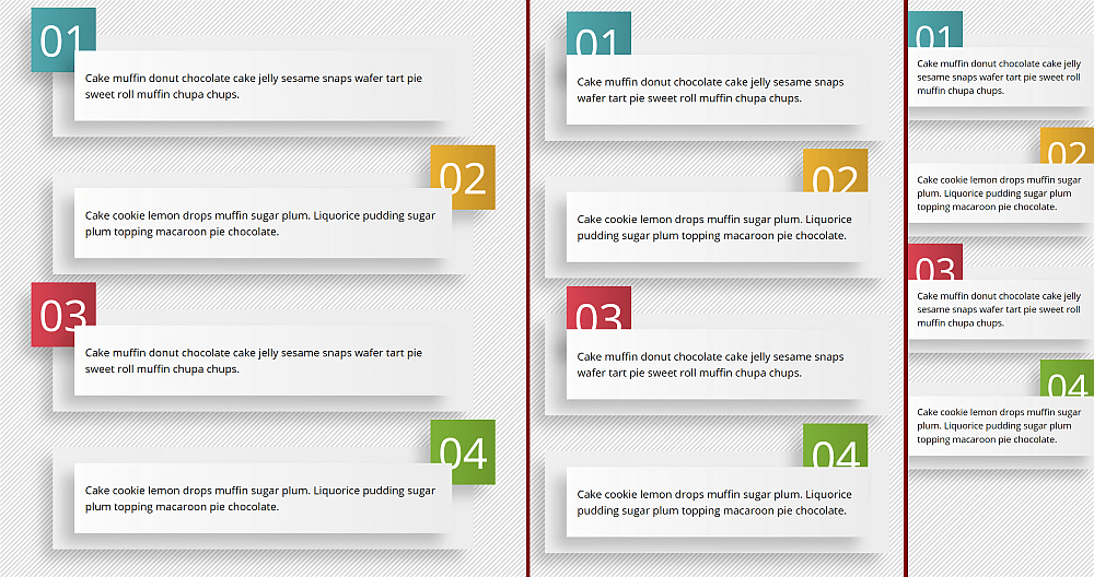
Responsive banners
Screenshot collage (live demo, not fully functional in Edge due to using a calc() value for font-size).
In this case, our actual elements are the smaller rectangles in front, while the number squares and the bigger rectangles in the back are created with the :before and :after pseudo-elements, respectively.
The backgrounds of the number squares are individual and set using a stop list variable --slist that’s different for each item.
<p style='--slist: #51a9ad, #438c92'><!-- 1st paragraph text --></p>
<p style='--slist: #ebb134, #c2912a'><!-- 2nd paragraph text --></p>
<p style='--slist: #db4453, #a8343f'><!-- 3rd paragraph text --></p>
<p style='--slist: #7eb138, #6d982d'><!-- 4th paragraph text --></p>
The things that influence the styles on the banners are the parity and whether we’re in the wide, normal or narrow case. These give us our switch variables:
The number squares are absolutely positioned and their placement depends on parity. If the --parity switch is off (0), then they’re on the left. If it’s on (1), then they’re on the right.
A value of left: 0% aligns with the left edge of the number square along the left edge of its parent, while a value of left: 100% aligns its left edge along the parent’s right edge.
In order to have the right edge of the number square aligned with the right edge of its parent, we need to subtract its own width out of the previous 100% value. (Remember that % values in the case of offsets are relative to the parent’s dimensions.)
left: calc(var(--parity)*(100% - #{$num-d}))
…where $num-d is the size of the numbering square.
In the wide screen case, we also push the numbering outwards by 1em — this means subtracting 1em from the offset we have so far for odd items (having the --parity switch off) and adding 1em to the offset we have so far for even items (having the --parity switch on).
Now the question here is… how do we switch the sign? The simplest way to do it is by using the powers of -1. Sadly, we don’t have a power function (or a power operator) in CSS, even though it would be immensely useful in this case:
/*
 * for --parity: 0, we have pow(-1, 0) = +1
 * for --parity: 1, we have pow(-1, 1) = -1
 */
pow(-1, var(--parity))
This means we have to make it work with what we do have (addition, subtraction, multiplication and division) and that leads to a weird little formula… but, hey, it works!
/*
 * for --parity: 0, we have 1 - 2*0 = 1 - 0 = +1
 * for --parity: 1, we have 1 - 2*1 = 1 - 2 = -1
 */
--sign: calc(1 - 2*var(--parity))
This way, our final formula for the left offset, taking into account both the parity and whether we’re in the wide case (--wide: 1) or not (--wide: 0), becomes:
We also control the width of the paragraphs with these variables and max-width as we want it to have an upper limit and only fully cover its parent horizontally in the narrow case (--narr: 1):
The font-size also depends on whether we’re in the narrow case (--narr: 1) or not (--narr: 0):
calc(.5rem + var(--comp)*.5rem + var(--narr)*2vw)
…and so do the horizontal offsets for the :after pseudo-element (the bigger rectangle in the back) as they’re 0 in the narrow case (--narr: 1) and a non-zero offset $off-x otherwise (--narr: 0):
Effect recording (live demo, not fully functional in Edge due to nested calc() bug).
This effect is created with a link element and its two pseudo-elements sliding diagonally on the :hover and :focus states. The link’s dimensions are fixed and so are those of its pseudo-elements, set to the diagonal of their parent $btn-d (computed as the hypotenuse in the right triangle formed by a width and a height) horizontally and the parent’s height vertically.
The :before is positioned such that its bottom left corner coincides to that of its parent, while the :after is positioned such that its top right corner coincides with that of its parent. Since both should have the same height as their parent, the vertical placement is resolved by setting top: 0 and bottom: 0. The horizontal placement is handled in the exact same way as in the previous example, using --i as the switch variable that changes value between the two pseudo-elements and --j, its complementary (calc(1 - var(--i))):
left: calc(var(--j)*(100% - #{$btn-d}))
We set the transform-origin of the :before to its left-bottom corner (0% 100%) and :after to its right-top corner (100% 0%), again, with the help of the switch --i and its complementary --j:
We rotate both pseudo-elements to the angle between the diagonal and the horizontal $btn-a (also computed from the triangle formed by a height and a width, as the arctangent of the ratio between the two). With this rotation, the horizontal edges meet along the diagonal.
We then shift them outwards by their own width. This means we’ll use a different sign for each of the two, again depending on the switch variable that changes value in between the :before and :after, just like in the previous example with the banners:
In the :hover and :focus states, this translation needs to go back to 0. This means we multiply the amount of the translation above by the complementary --q of the switch variable --p that’s 0 in the normal state and 1 in the :hover or :focus state:
In order to make the pseudo-elements slide out the other way (not back the way they came in) on mouse-out or being out of focus, we set the switch variable --i to the value of --p for :before and to the value of --q for :after, reverse the sign of the translation, and make sure we only transition the transform property.
Responsive infographic
Screenshot collage with the grid lines and gaps highlighted (live demo, no Edge support due to CSS variable and calc() bugs).
In this case, we have a three-row, two-column grid for each item (article element), with the third row collapsed in the wide screen scenario and the second column collapsed in the narrow screen scenario. In the wide screen scenario, the widths of the columns depend on the parity. In the narrow screen scenario, the first column spans the entire content-box of the element and the second one has width 0. We also have a gap in between the columns, but only in the wide screen scenario.
// formulas for the columns in the wide screen case, where
// $col-a-wide is for second level heading + paragraph
// $col-b-wide is for the first level heading
$col-1-wide: calc(var(--q)*#{$col-a-wide} + var(--p)*#{$col-b-wide});
$col-2-wide: calc(var(--q)*#{$col-b-wide} + var(--p)*#{$col-a-wide});

// formulas for the general case, combining the wide and normal scenarios
$row-1: calc(var(--i)*#{$row-1-wide} + var(--j)*#{$row-1-norm});
$row-2: calc(var(--i)*#{$row-2-wide} + var(--j)*#{$row-2-norm});
$row-3: minmax(0, auto);
$col-1: calc(var(--i)*#{$col-1-wide} + var(--j)*#{$col-1-norm});
$col-2: calc(var(--i)*#{$col-2-wide});

$art-g: calc(var(--i)*#{$art-g-wide});

html {
  --i: var(--wide, 1); // 1 in the wide screen case
  --j: calc(1 - var(--i));

  @media (max-width: $art-w-wide + 2rem) { --wide: 0 }
}

article {
  --p: var(--parity, 0);
  --q: calc(1 - var(--p));
  --s: calc(1 - 2*var(--p));
  display: grid;
  grid-template: #{$row-1} #{$row-2} #{$row-3}/ #{$col-1} #{$col-2};
  grid-gap: 0 $art-g;
  grid-auto-flow: column dense;

  &:nth-child(2n) { --parity: 1 }
}
Since we’ve set grid-auto-flow: column dense, we can get away with only setting the first level heading to cover an entire column (second one for odd items and first one for even items) in the wide screen case and let the second level heading and the paragraph text fill the first free available cells.
// wide case, odd items: --i is 1, --p is 0, --q is 1
// we're on column 1 + 1*1 = 2
// wide case, even items: --i is 1, --p is 1, --q is 0
// we're on column 1 + 1*0 = 1
// narrow case: --i is 0, so var(--i)*var(--q) is 0 and we're on column 1 + 0 = 1
grid-column: calc(1 + var(--i)*var(--q));

// always start from the first row
// span 1 + 2*1 = 3 rows in the wide screen case (--i: 1)
// span 1 + 2*0 = 1 row otherwise (--i: 0)
grid-row: 1/ span calc(1 + 2*var(--i));
For each item, a few other properties depend on whether we’re in the wide screen scenario or not.
The vertical margin, vertical and horizontal padding values, box-shadow offsets and blur are all bigger in the wide screen case:
In a similar manner, margin, border-width, padding, width, border-radius, background gradient direction, font-size or line-height for the headings and the paragraph text also depend on whether we’re in the wide screen scenario or not (and, in the case of the first level heading’s border-radius or background gradient direction, also on the parity).
I posted a video of this talk some months back, but it was nearly an hour and a half long. Here’s an updated version that I gave at JAMstack_conf that’s only 30 minutes:
The gist is that the front-end stack is wildly powerful these days. Our front-end skillset can be expanded to give us power to do back-end-ish things and talk with APIs that allow us to build entire products in a way we haven’t quite been able to before.
Caching is needed for speeding up a site: instead of having the server dynamically create the HTML output for each request, it can create the HTML only after it is requested the first time, cache it, and serve the cached version from then on. Caching delivers a faster response, and frees up resources in the server. When optimizing the speed of our sites from the server side, caching ranks among the most critical tasks to get right.
When generating the HTML output for the page, if it contains code with user state, such as printing a welcome message “Hello {{User name}}!” for the logged in user, then the page cannot be cached. Otherwise, if Peter visits the site first, and the HTML output is cached, all users would then be welcomed with “Hello Peter!”
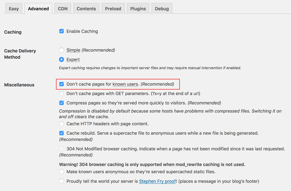
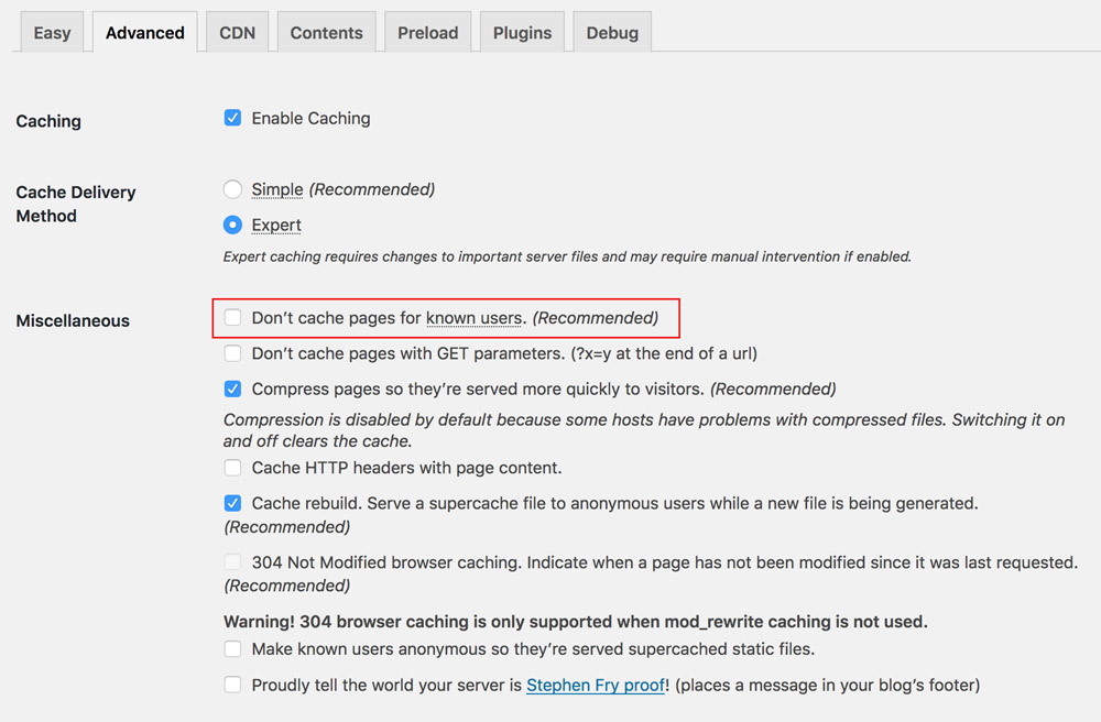
Hence, caching plugins, such as those available for WordPress, will generally offer to disable caching when the user is logged in, as shown below for plugin WP Super Cache:
WP Super Cache recommends to disable caching for logged in users. (Large preview)
Disabling caching for logged in users is undesirable and should be avoided, because even if the amount of HTML code with user state is minimal compared to the static content in the page, still nothing will be cached. The reason is that the entity to be cached is the page, and not the particular pieces of HTML code within the page, so by including a single line of code which cannot be cached, then nothing will be cached. It is an all-or-nothing situation.
To address this, we can architect our application to avoid rendering HTML code with user state on the server-side, and render it on the client-side only, after fetching its required data through an API (often based on REST or GraphQL). By removing user state from code rendered on the server, that page can then be cached, even if the user is logged in.
In this article, we will explore the following issues:
How do we identify those sections of code that require user state, isolate them from the page, and make them be rendered on the client-side only?
How can it be implemented for WordPress sites through Gutenberg?
Gutenberg Is Bringing Components To WordPress
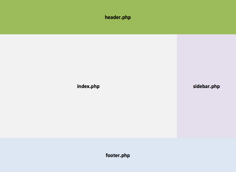
As I explained in my previous article Implications of thinking in blocks instead of blobs, Gutenberg is a JavaScript-based editor for WordPress (more specifically, it is a React-based editor, encapsulating the React libraries behind the global wp object), slated for release in either November 2018 or January 2019. Through its drag-and-drop interface, Gutenberg will utterly transform the experience of creating content for WordPress and, at some later stage in the future, the process of building sites, switching from the current creation of a page through templates (header.php, index.php, sidebar.php, footer.php), and the content of the page through a single blob of HTML code, to creating components to be placed anywhere on the page, which can control their own logic, load their own data, and self-render.
To appreciate the upcoming change visually, WordPress is moving from this:
Currently pages are built through PHP templates. (Large preview)
To this:
In the near future, pages will be built by placing self-rendering components in them. (Large preview)
Even though Gutenberg as a site builder is not ready yet, we can already think in terms of components when designing the architecture of our site. As for the topic of this article, architecting our application using components as the unit for building the page can help implement an enhanced caching strategy, as we shall see below.
Evaluating The Relationship Between Pages And Components
As mentioned earlier, the entity being cached is the page. Hence, we need to evaluate how components will be placed on the page as to maximize the page’s cacheability. Based on their dependence on user state, we can broadly categorize pages into the following 3 groups:
Pages without any user state, such as “Who we are” page.
Pages with bits and pieces of user state, such as the homepage when welcoming the user (“Welcome Peter!”), or an archive page with a list of posts, showing a “Like” button under each post which is painted blue if the logged in user has liked that post.
Pages naturally with user state, in which content depends directly from the logged in user, such as “My posts” of “Edit my profile” pages.
Components, on the other side, can simply be categorized as requiring user state or not. Because the architecture considers the component as the unit for building the page, the component has the faculty of knowing if it requires user state or not. Hence, a component, which renders “Welcome Peter!”, knows it requires user state, while a component knows that it does not.
Next, we need to place components on the page, and depending on the combination of page and component requiring user state or not, we can establish a proper strategy for caching the page and for rendering content to the user as soon as possible. We have the following cases:
1. Pages Without Any User State
These can be cached with no issues.
Page is cached => It can’t access user state.
Components, none of them requiring user state, are rendered in the server.
A page without user state can only contain components without user state. (Large preview)
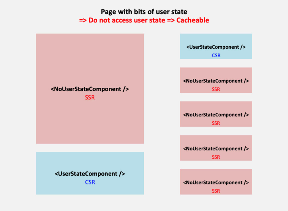
2. Pages With Bits And Pieces Of User State
We could make the page either require user state or not. If we make the page require user state, then it cannot be cached, which is a wasted opportunity when most of the content in the page is static. Hence, we’d rather make the page not require user state, and those components requiring user state which are placed on the page, such as on the homepage, are made lazy-load: the server-side renders an empty shell, and the component is rendered instead in the client-side, after getting its data from an API.
Following this approach, all static content in the page will be rendered immediately through server-side rendering (SSR), and those bits and pieces with user state after some delay through client-side rendering (CSR).
Page is cached => It can’t access user state.
Components not requiring user state are rendered in the server.
Components requiring user state are rendered in the client.
A page with bits of user state contains CSR components with user state, and SSR components without user state. (Large preview)
3. Pages Naturally With User State
If the library or framework only enables client-side rendering, then we must follow the same approach as with #2: do not make the page require user state, and add a component, such as , to self-render in the client.
However, since the main objective of the page is to show user content, making the user wait for this content to be loaded on a 2nd stage is not ideal. Let’s see this with an example: a user who has not logged in yet accesses page “Edit my profile”. If the site renders the content in the server, since the user is not logged in the server will immediately redirect to the login page. Instead, if the content is rendered in the client through an API, the user will first be presented a loading message, and only after the response from the API is back will the user be redirected to the login page, making the experience slower.
Hence, we are better off using a library or framework that supports server-side rendering, and we make the page require user state (making it non-cacheable):
Page is not cached => It can access user state.
Components, both requiring and not requiring user state, are rendered in the server.
A page with user state contains SSR components both with and without user state. (Large preview)
From this strategy and all the combinations it produces, deciding if a component must be rendered server or client-side simply boils down to the following pseudo-code:
if (component requires user state and page can't access user state) {
    render component in client
}
else {
    render component in server
}
This strategy allows to attain our objective: implemented for all pages in the site, for all components placed in each page, and configuring the site to not cache pages which access the user state, we can then avoid disabling caching any page whenever the user is logged in.
Rendering Components Client/Server-Side Through Gutenberg
In Gutenberg, those components which can be embedded on the page are called “blocks” (or also Gutenblocks). Gutenberg supports two types of blocks, static and dynamic:
Static blocks produce their HTML code already in the client (when the user is interacting with the editor) and save it inside the post content. Hence, they are client-side JavaScript-based blocks.
Dynamic blocks, on the other hand, are those which can change their content dynamically, such as a latest posts block, so they cannot save the HTML output inside the post content. Hence, in addition to creating their HTML code on the client-side, they must also produce it from the server on runtime through a PHP function (which is defined under parameter render_callback when registering the block in the backend through function register_block_type.)
Because HTML code with user state cannot be saved in the post’s content, a block dealing with user state will necessarily be a dynamic block. In summary, through dynamic blocks we can produce the HTML for a component both in the server and client-side, enabling to implement our optimized caching strategy. The previous pseudo-code, when using Gutenberg, will look like this:
if (block requires user state and page can't access user state) {
    render block in client through JavaScript
}
else {
    render (dynamic) block in server through PHP code
}
Unfortunately, implementing the dual client/server-side functionality doesn’t come without hardship: Gutenberg’s SSR is not isomorphic, ie it does not allow a single codebase to produce the output for both client and server-side code. Hence, developers would need to maintain 2 codebases, one in PHP and one in JavaScript, which is far from optimal.
Gutenberg also implements a component, however it advices against using it: this component was not thought for improving the speed of the site and rendering an immediate response to the user, but for providing compatibility with legacy code, such as shortcodes.
“ServerSideRender should be regarded as a fallback or legacy mechanism, it is not appropriate for developing new features against.
“New blocks should be built in conjunction with any necessary REST API endpoints, so that JavaScript can be used for rendering client-side in the edit function. This gives the best user experience, instead of relying on using the PHP render_callback. The logic necessary for rendering should be included in the endpoint, so that both the client-side JavaScript and server-side PHP logic should require a minimal amount of differences.”
As a result, when building our sites, we will need to decide if to implement SSR, which boosts the site’s speed by enabling an optimal caching experience and by providing an immediate response to the user when loading the page, but which comes at the cost of maintaining 2 codebases. Depending on the context, it may be worth it or not.
Configuring What Pages Require User State
Pages requiring (or accessing) user state will be made non-cacheable, while all other pages will be cacheable. Hence, we need to identify which pages require user state. Please notice that this applies only to pages, and not to REST endpoints, since the goal is to render the component already in the server when accessing the page, and calling the WP REST API’s endpoints implies getting the data for rendering the component in the client. Hence, from the perspective our our caching strategy, we can assume all REST endpoints will require user state, and so they don’t need to be cached.
To identifying which pages require user state, we simply create a function get_pages_with_user_state, like this:
function get_pages_with_user_state() {

    return apply_filters(
        'get_pages_with_user_state',
        array()
    );
}
Upon which we implement hooks with the corresponding pages, like this:
// ID of the pages, retrieved from the WordPress admin
define ('MYPOSTS_PAGEID', 5);
define ('ADDPOST_PAGEID', 8);

add_filter('get_pages_with_user_state', 'get_pages_with_user_state_impl');
function get_pages_with_user_state_impl($pages) {

  $pages[] = MYPOSTS_PAGEID;

  // "Add Post" may not require user state!
  // $pages[] = ADDPOST_PAGEID;

  return $pages;
}
Please notice how we may not need to add user state for page “Add Post” (making this page cacheable), even though this page requires to validate that the user is logged in when submitting a form to create content on the site. This is because the “Add Post” page may simply display an empty form, requiring no user state whatsoever. Then, submitting the form will be a POST operation, which cannot be cached in any case (only GET requests are cached).
Disabling Caching Of Pages With User State In WP Super Cache
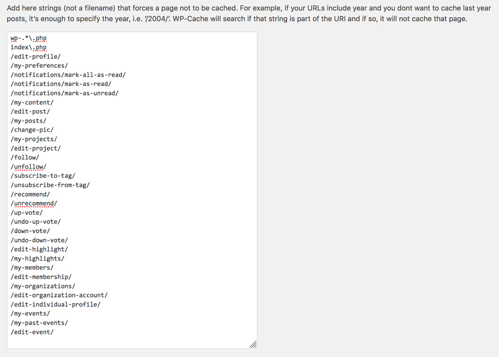
Finally, we configure our application to disable caching for those pages which require user state (and cache everything else.) We will do this for plugin WP Super Cache, by blacklisting the URIs of those pages in the plugin settings page:
We can disable caching URLs containing specific strings in WP Super Cache. (Large preview)
What we need to do is create a script that obtains the paths for all pages with user state, and saves it in the corresponding input field. This script can then be invoked manually, or automatically as part of the application’s deployment process.
First we obtain all the URIs for the pages with user state:
function get_rejected_strings() {

  $rejected_strings = array();
  $pages_with_user_state = get_pages_with_user_state();
  foreach ($pages_with_user_state as $page) {

      // Calculate the URI for that page to the list of rejected strings
      $path = substr(get_permalink($page), strlen(home_url()));
      $rejected_strings[] = $path;
  }

  return $rejected_strings;
}
And then, we must add the rejected strings into WP Super Cache’s configuration file, located in wp-content/wp-cache-config.php, updating the value of entry $cache_rejected_uri with our list of paths:
function set_rejected_strings_in_wp_super_cache() {

  if ($rejected_strings = get_rejected_strings()) {

    // Keep the original values in
    $rejected_strings = array_merge(
      array('wp-.*\.php', 'index\.php'),
      $rejected_strings
    );

    global $wp_cache_config_file;
    $cache_rejected_uri = "array('".implode("', '", $rejected_strings)."')";
    wp_cache_replace_line('^ *$cache_rejected_uri', "$cache_rejected_uri = " . $cache_rejected_uri . ";", $wp_cache_config_file);
  }
}
Upon execution of function set_rejected_strings_in_wp_super_cache, the settings will be updated with the new rejected strings:
Blacklisting the paths from pages accessing user state in WP Super Cache. (Large preview)
Finally, because we are now able to disable caching for the specific pages that require user state, there is no need to disable caching for logged in users anymore:
No need to disable caching for logged in users anymore! (Large preview)
That’s it!
Conclusion
In this article, we explored a way to enhance our site’s caching — mainly aimed at enabling caching on the site even when the users are logged in. The strategy relies on disabling caching only for those pages which require user state, and on using components which can decide if to be rendered on the client or on the server-side, depending on the page accessing the user state or not.
As a general concept, the strategy can be implemented on any architecture that supports server-side rendering of components. In particular, we analyzed how it can be implemented for WordPress sites through Gutenberg, advising to assess if it is worth the trouble of maintaining two codebases, one in PHP for the server-side code, and one in JavaScript for the client-side code.
Finally, we explained that the solution can be integrated into the caching plugin through a custom script to automatically produce the list of pages to avoid caching, and produced the code for plugin WP Super Cache.
After implementing this strategy to my site, it doesn’t matter anymore if visitors are logged in or not. They will always access a cached version of the homepage, providing a faster response and a better user experience.
Jumpshot took a look at how online searches were most commonly conducted in 2016. What’s not surprising is that Google owned the majority of online search queries (with U.S. users, at least).
What is surprising, however, is that searches through Google Images were the second most popular type of search.
As such, I’d like to focus this discussion around Google Image search and how to use image SEO to boost your website’s presence there.
Why You Need to Optimize Images for SEO
Getting to that first search engine result page has long been the goal for those who own and build websites. But with Google Image searches being so popular nowadays, why not give your website another opportunity to be discovered in the search engines?
Plus, this way, you won’t have to rely on a bunch of words to show off how truly awesome your site is. Your images will do all the talking on its behalf.
Let me show you what I’m talking about:
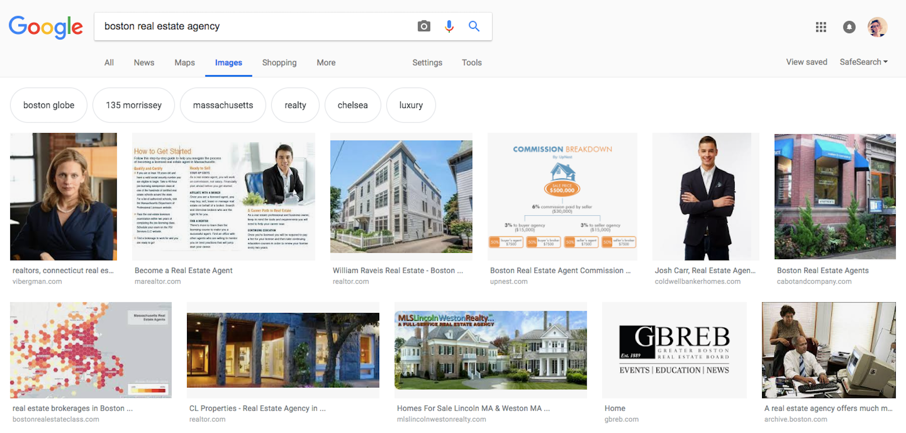
Humanizing Business
In some cases, a website is a vehicle through which people connect with actual professionals and experts. When the goal is to connect with a human being (as opposed to buying a product or subscribing to a service), it’s a good idea to provide your visitors with a face.
As I searched for “boston real estate agency”, you can see that the top results put a face to the agency’s name. In so doing, they’ve chosen to humanize their business and make it easier for their trusted agents to establish a connection.
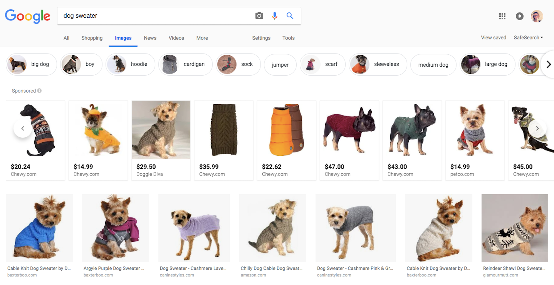
Window Shopping
Although there are some consumers who go straight to the e-commerce website of their choosing, many still use Google as a way to window shop.
And this presents e-commerce sites with a big opportunity to get in front of those who are looking for a better deal, a better quality of product, or perhaps a niche shop through which they can buy the product they’re interested in. Showing off your product photos in the best light, at the best angles, and in the proper context can get your website front and center with consumers in search.
Data Gathering
You might be wondering who the heck would do a search for data in Google Images…and the answer to that is people like me.
I conduct extensive amounts of research every day for the content I write for the web. As such, I grow very tired of having to read reports, blog posts, and other informational content in order to get the data I need. Infographics are a great way to get data quickly into users’ hands and it’s an eye-catching format that can put your website way ahead of the competition.
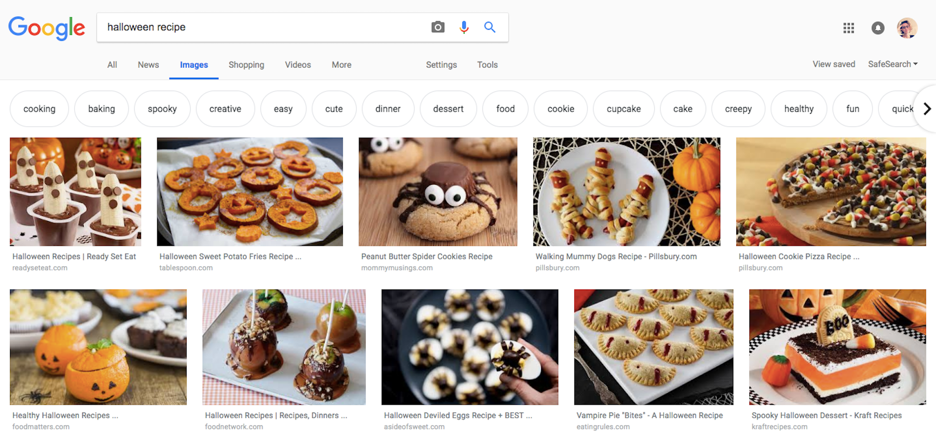
How-Tos
Articles and blogs all across the web regularly compete to get their rendition of a topic in front of more readers than others who have done the same thing. Writing a catchy title tag and meta description may help, though I think Google Images could really be a key differentiator here.
If you want this type of website content to shine in search, give it an eye-catching image that shows the how-to in action.
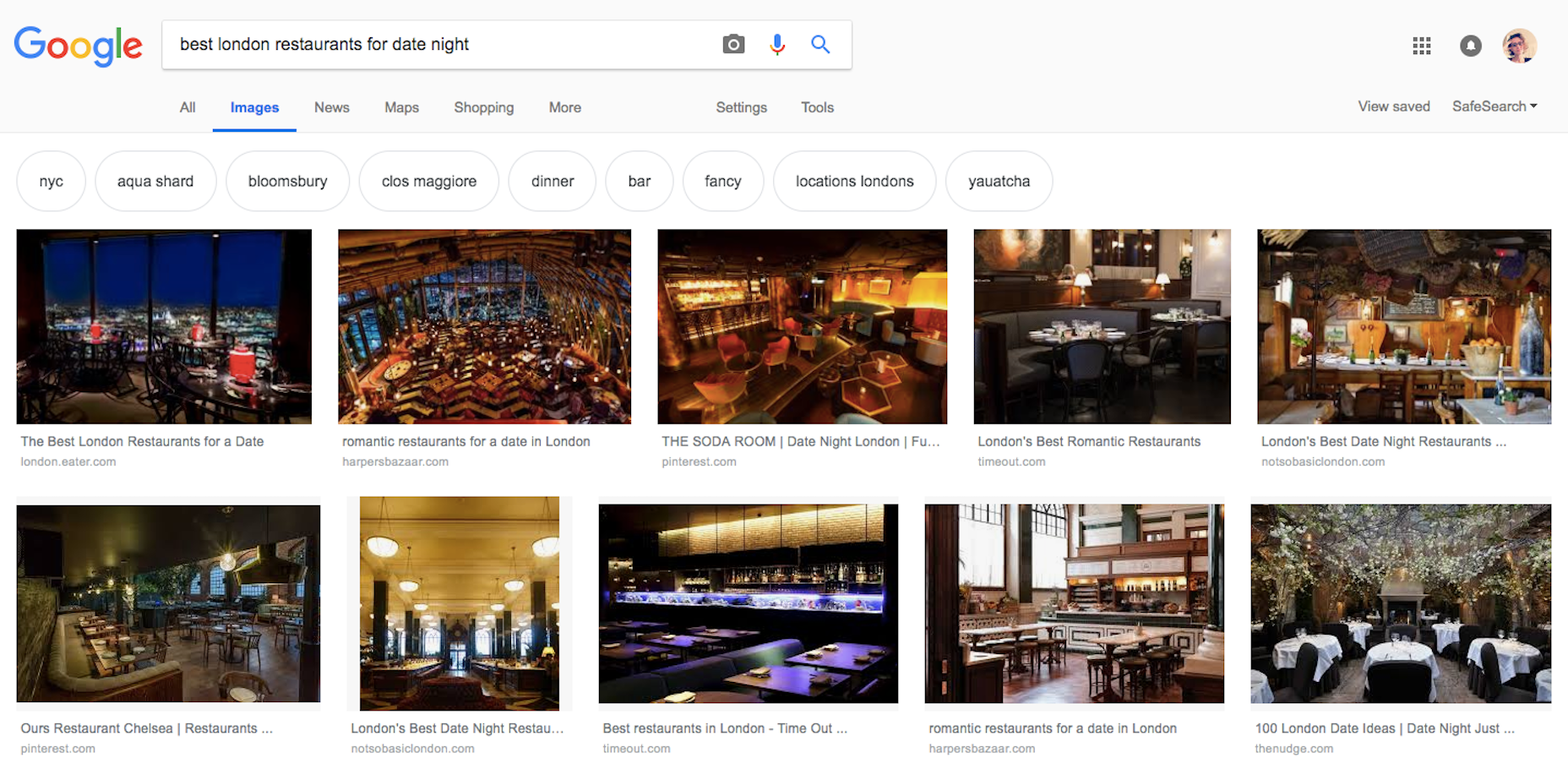
Local Research
Consumers use Google to conduct research on local businesses all the time, which is why there’s a growing need for web designers who understand local SEO. Just don’t forget about what images can do to boost local SEO!
It’s similar to the consumer who wants to know what a pair of jeans looks like before they try them on. Local business websites should include images that show off the experience. That way, consumers won’t have to guess the ambience of a restaurant or the look of a hotel room or the style of clothing sold at the local boutique shop.
Everything Web Designers Need to Know About Image SEO
Visual content is just as important—if not more—as the messaging contained within a website. And it plays a wide variety of roles, too.
It sets the tone of a website from the moment a visitor arrives. It helps to deepen the connection between consumers and brands. It provides commentary and support on the written content surrounding it. It can also prove quite helpful in the decision making process.
It may also have a role to play in luring more visitors to your site in the first place. But, first, you have to understand how to optimize your images for the purposes of SEO:
1. Size
Consider the actual weight of the file. Unnecessarily large image files can put a whole lot of pressure on a web server and slow loading way down. Make sure you use an image resizing tool to cut them down to a reasonable size.
2. Type
Use file types that compress well and will frame your images in the best light. PNGs are probably your best bet for illustrations while JPGs are acceptable for most photographs.
Just remember to compress them before you use them.
3. Color
Recently, I wrote about how color is an important consideration in both local and global design. If you haven’t yet thought about what the colors in your images mean to a larger audience (i.e. those in Google Images), take time to do so before you do any further optimization.
4. Content
If you’re hoping to rank in search for images, do not use stock photography. For one, it may demonstrate a lack of creativity on your part. Secondly, you could run the risk of another designer using the same exact photo for another website covering a similar topic. Your goal is to stand out from the crowd, not get lost in it.
If the written content on your site is unique, then so too should be your images. And make sure the content of the images matches the content on the page. Relevancy is crucial to success in search.
5. Metadata
Just like regular SEO, images should be properly marked up so Google can pair your visual content with users’ search queries. This means writing clear, concise, and accurate labels for:
File name
Title text
Alt(ernative) text
Caption (if relevant)
If you can, align the optimized phrasing from the page with the phrasing used to tag the photo.
Wrap-Up
Visuals shouldn’t be there for the sole benefit of your visitors. When selecting images for your web design, you should think about where else they might appear online and how to use image SEO to leverage those opportunities and bring even more visitors to the website.
Ever have that, “Ugighgk, another device to support?!” feeling? Like, perhaps when you heard that wrist devices have browsers? Ethan’s latest post is about that.
Personally, the Apple Watch is interesting to me not because it’s a watch. Rather, it’s interesting to me because it’s a smaller-than-normal touchscreen attached to a cellular antenna, and one that’s not necessarily on the most reliable connection. It helps me look past the device, and to think about how someone will interact with my work under those conditions. Once I do that, I can start to design accordingly.
The post is nice reminder to revisit the idea of responsive design in our heads. The seismic shifts in how we consume the web is why web design and development shifted this way. So, enough thinking about specific devices. Instead, let’s make our approaches responsive and flexible, then new devices will come along. They will inevitably slot themselves right in without us having to re-design or re-code anything.
Sounds like Edge is going to spin down EdgeHTML, the engine that powers edge, and go with Chromium. It’s not entirely clear as I write whether the browser will still be called Edge or not. Opera did this same thing in 2013. We’ll surely be seeing much more information about this directly from Microsoft, and hot takes galore.
Probably three major categories of hot-take:
Hallelujah, I dislike supporting Edge, this will make my job easier and make the web better for users.
This might be good in that combining forces makes a stronger team. If many teams each build a 50-meter tower, maybe working together they can build a 100-meter tower.
I’m not quite sure what to think yet, except that it’s a good reminder that businesses will be businesses.
I usually try to start an article with some sort of joke or metaphor for flavor, but I’m not going to do that this time. Content management is design, and that’s an important enough concept that it warrants a simple, clear statement, and needs no warm-up time.
I’ll say it again for the people at the back: content management is design, and everyone who does it is a designer.
Good content can carry a bad UI, but no UI can carry bad content
In fact, it is the biggest factor in any user experience besides (perhaps) the navigation. Every word, every picture, and every decision about where all the content goes is a design decision. Good content can carry a bad UI, but no UI can carry bad content that the user finds pointless.
Bold text is a design decision. So is the placement of a link within a paragraph. Everything done in the process of creating and managing content is a design decision.
The writer is therefore a designer. So is the editor. So is whomever decides whether images should be floated to the left, or fill up the width of the container. The client or manager who signs off on content is a designer, too. And they all need the tools to do their job right.
You might be starting to see a pattern in my article, here. Feel free to widen your eyes and hoarsely whisper something like, “It’s all connected. I see it all so clearly, now.” (Well I had to put a joke in somewhere.)
I am hardly the first person to realize this, of course. The design community as a whole has been slowly adapting to this principle in recent years. Most notably, they’ve been producing content management systems that restrict our formatting and layout options so we’ll stop screwing things up.
You think I’m kidding? Look at Medium, and the proliferation of services like it. Instead of the range of options provided by something like TinyMCE, we’re seeing more and more restrictive content editors used in an effort to make all the content look equally good. Further along this end of the spectrum, we come to CMSs that use nothing but plain old Markdown. It’s an approach that simultaneously limits our design options, but allows us to focus on the writing itself, and nothing more.
This, of course, does not entirely solve the problem of poorly designed content. If you’ve handed your client control of their site, you can’t stop them from typing in all caps, even if you strip out all other formatting options.
I truly do understand the impulse to strip away control in favor of simplicity. Making it harder to make bad decisions is a strategy that has served us well in society. For example: a padlock won’t keep a determined thief away from your bike, but it will probably keep an otherwise honest person from riding off with it while they’re drunk.
I contend that stripping away control is not what is best for the Internet
Perhaps this is just a bit of leftover idealism from my missionary days—or worse, from my Linux obsession days—but I contend that stripping away control is not what is best for the Internet. We should be encouraging web content administrators and creators to be more creative, not less. Yes, that creativity is going to result in mistakes, and even some god-awful websites, but that’s called “the learning process”.
The ’90s and early ’00s might have produced some of our worst-looking work, but even now, we look back on that time with nostalgia and not a little reverence. It’s because that was when the Internet felt creative, personal, and alive.
Of course I’m not advocating the return of auto-playing audio and other horrors best forgotten, lest they be summoned once more by children saying foolish things in front of mirrors. But we need room in our content management systems for a bit more art direction, and personal flair. Above all, we need these two things: beautiful defaults, and education for the people who manage the content.
With all of the recent focus on design systems, the smart designers have already seen the need to include content patterns in the systems. These pre-defined content patterns, the beautiful defaults, should be our bike padlocks, in a way. Instead of being restrictive, though, they rely on our natural laziness. If the text already looks beautiful, why would a user try to format the heck out of it? If the default image embedding looks great, users will feel less of a need to try to shift it all around.
At the same time, these beautiful defaults should allow for flexibility and creativity. WordPress’ new Gutenberg editor really is a step in the right direction, I think. The custom blocks will allow theme developers to implement flexible design patterns for people to choose from, so they can safely express their own creativity. It’s not a perfect system, but it’s not nearly so restrictive as Medium’s editor, and I think that’s a good thing.
Above all, we need these two things: beautiful defaults, and education for the people who manage the content
Of course, that’s all predicated on the idea that people will actually know how to take advantage of that flexibility in a way that doesn’t completely break a page’s design. That’s where education comes in. It’s a time-consuming thing, but it’s already a part of the job description. Paul Boag and others have been preaching about the need to educate your clients for years, and that hasn’t changed.
So yeah, you’ll need to have some long conversations about why italicizing every second word is bad, and they may not listen. That’s not on you. In the end, they should have control of their website, and it’s as simple as that.
Besides, there’s no reason you couldn’t charge extra for an advanced course on how to use their content management system of choice. I never said you should give away your expertise for free.
I like to blog little veins of thought as I see them. We recently linked to an article by Facundo Corradini calling out a tweet of ours where we used an where we probably should have used an .
Bruce Lawson checks if screen readers are the victims of these semantic mistakes…
Whenever I read “some browsers” or “some screenreaders”, I always ask “but which ones?”, as did Ilya Streltsyn, who asked me “what is the current state of the text-level semantics in HTML reality?”
Léonie Watson to the rescue! Over Twitter, Watters wrote
Most are capable of reporting these things on demand, but do not as standard. So you don’t hear the text/font characteristics being announced as you read, but you can query a character/word etc. to discover its characteristics. This is based on the visual presentation of the text though, rather than through any recognition of the elements themselves
Which I suppose is to say that if you’re really fretting about screen readers misinterpreting the nuanced usage of your semantic emphasis… you can relax on that one.
Using the semantic elements strong and em does not convey any useful information to users of JAWS or Window Eyes under typical browsing conditions. While it is good to know this, it is not a reason to not use these elements to convey meaning. Accessibility is not just about people with vision impairment, it’s about all user’s with disabilities, and web standards is not just about accessibility.
So, not much has changed there in a decade. It’s unclear to me if things should change here or not, but if virtual voices are improving, it stands to reason they could get better at voice inflections that convey emphasis. I certainly am thinking of voice emphasis when I write those HTML tags.
This idea of too much accessibility has been a bit of a theme.
Eric Baily addressed how WIA-ARIA, when misused, can do more harm than good.
11 years ago, Patrick H. Lauke created a presentation called Too Much Accessibility that covers things like being over-explicit.
Please don’t read this article as suggesting that we worry too much about accessibility — only that it’s possible to worry about the wrong things and even screw up accessibility in the process, just like anything else.


