Archive

Archive for December, 2018

Web Design And Development Advent Roundup For 2018

December 3rd, 2018 No comments
Perl Advent

Web Design And Development Advent Roundup For 2018

Web Design And Development Advent Roundup For 2018

Rachel Andrew

2018-12-03T16:30:30+02:002018-12-04T07:46:31+00:00

In the run-up to Christmas, there is a tradition across the web design and development community to produce advent calendars, typically with a new article or resource for each day of December. In this article, I have rounded up all those that I have found to be running this year, along with RSS feeds where they can be located, and Twitter accounts to make it easier to follow along.

Q: What’s 14 years old and not at all in a last minute panic?

— 24 ways (@24ways) November 27, 2018

It is a lot of work to publish an article every day — as we well know here at Smashing — and we have a whole team here to help. However, the majority of the calendars published here are true community efforts, often with the bulk of the work falling to an individual or tiny team, with no budget to pay authors and editors. So, please join us in supporting these efforts, share the articles that you enjoyed reading, and join the discussions respectfully. Whether you celebrate Christmas or not, you can certainly learn a lot of new things over the next 24 days.

Perl Advent

Perl Advent has been running since 2000 and is the longest running web advent calendar that I know of. Now old enough to enjoy a festive sherry (in Europe at least), they are back for 2018 for 24 merry days of Perl.

24 Ways

I have to admit a little bias in this subject as 24 Ways is the calendar started by my husband, business partner and fellow Smashing Magazine editor, Drew McLellan. 24 Ways has been running since 2005, when Drew had the idea to post a new article each day of December until Christmas. I don’t think either of us expected that on the 30th November 2018, Drew would still be staying up until midnight to check that the first article went live!

PerfPlanet Calendar

Performance CalendarEver since 2009, the Performance Calendar has been helping us to speed up the web. It is up again for the 10th year in a row and is maintained by Sergey Chernyshev.

24 Jours De Web

24 Jours De WebNext on my list is the French language calendar, 24 Jours De Web. Their first year of publication was 2012, and they are supporting the charity L’Auberge des Migrants, asking readers to donate to help refugees in Calais and the North of France, providing material and food aid, support and advocacy.

Christmas XP

Christmas XPThe Christmas XP calendar is a little different. Rather than an article each day, they bring us a WebGL experiment. They have been bringing us experiments in WebGL since 2012.

AWS Advent

AWS AdventIf you would like to brush up on your AWS skills then the AWS Advent calendar promises “a yearly exploration of AWS in 24 parts”. You’ll find a wide range of articles on security, deployment strategy and general tips and techniques to be aware of when using Amazon Web Services.

24 Days In December

24 Days In DecemberIf PHP is your language of choice then you can look forward to 24 days of PHP articles over at 24 Days in December. They began publishing in 2015, when Andreas Heigl realized that he missed Web Advent who had stopped publishing in 2012.

In his wrap-up post after the initial season Andreas wrote:

“I came to realize that I missed the phpadvent/webadvent the last years. And wouldn’t it be great to have a read about something PHP-related for the first 24 Days in December? Even for those people that are not Christian, the time before Christmas has to be a special time. And if it’s only due to the commercials and ads what to present.

So I would wait and see whether someone would arrange something.

But wait! When everyone thinks someone should do something, no-one will do anything.”

I’m happy that the community effort started by Andreas, when he realized that he would need to be the person who did something, is back for another year.

24 Pull Requests

24 Pull RequestsThe 24 Pull Requests calendar is a little different. It began in 2012 with the idea that contributors should, “Send 24 pull requests between December 1st and December 24th.” The idea being that this would be 24 gifts to the open-source community from every contributor. Since the project began, 19,859 have contributed (at the time of writing).

It’s a brilliant idea, and I really love their updated policy for 2018. Recognizing that making Pull Requests is only one way that people contribute to open source, the site has widened the scope of contributions. You can make a Pull Request as before if this is how you contribute. However, you can also complete a form to track your non-PR contribution. Perhaps you wrote a tutorial, ran a meetup, mentored someone — these things are all important contributions too. Read the updated contribution policy for 2018 and join in!

UXmas

UXmasUXmas have been publishing their Advent Calendar for UX folk since 2012. I am very impressed that they already have their call for submissions for 2019 up and running. So, you can read some useful aticles this year and submit your idea for next year at the same time.

24 Accessibility

24 Accessibility24 Accessibility are back for a second year of accessibility posts in the run-up to Christmas. The project was started by Dennis Deacon, an Accessibility Engineer with The Paciello Group, and will be well worth following this year.

Fronteers Advent Calendar

Fronteers Advent CalendarFronteers are running 24 posts in Dutch on their blog. A lovely touch is that each writer chooses a charity, and the Fronteers organization will donate 75 euros on their behalf.
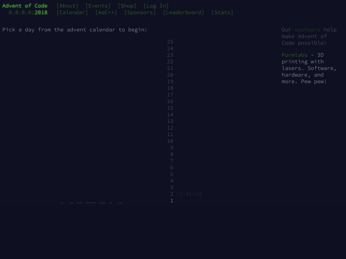
Advent Of Code

Advent Of CodeIf you would prefer a puzzle over an article, take a look at Advent of Code. Created by Eric Wastl, this is an Advent calendar of small programming puzzles for a variety of skill sets and skill levels that can be solved in any programming language you like.

24 Days In Umbraco

24 Days In Umbraco24 Days In Umbraco is a calendar of articles relating to the Umbraco CMS. They have been publishing every December since 2012. Their About page says that the calendar started when:

“… we asked a bunch of Umbraco people if they had a favorite feature, a story or something else that they’d be willing to write a short article about. Then we’d post a new one here every day through December.”

Advent Speaker Tips

Advent Speaker TipsNew this year is a daily public speaking tip on the Notist blog.

Data-Driven Advent Calendar

Data-Driven Advent CalendarThe Data-Driven Advent Calendar will contain an article about data journalism each day of Advent. The project is from Journocode who are computer scientists and journalists working in newsrooms across Germany.

A Computer Of One’s Own

A Computer Of One's OwnPosting to Medium, A Computer Of One’s Own will highlight the lives of the pioneers of the computer age. The project is by Alvaro Videla, with illustrations by Sebastian Navas.

React, JavaScript, Security And Elm Christmas

React, JavaScript, Security And Elm ChristmasA set of calendars sponsored by Norwegian company Bekk. They are supporting React Christmas, JavaScript Christmas, Security Christmas and Elm Christmas. That’s a whole lot of articles to curate!

#devAdvent

Not a website but instead a hashtag: Sarah Drasner tweeted that she would be highlighting a person and project every day of Advent using the hastag #devAdvent. Follow along to get to know some new folks and the work they do.

Tomorrow I’m gonna start a dev advent calendar. Every day from the 1st to the 25th, I’ll highlight a new person and a project of theirs that I’m into and think people would benefit from knowing about. ??

— Sarah Drasner (@sarah_edo) November 30, 2018

Share The Ones I Missed!

If you know of a calendar related to web design and development that I haven’t mentioned here, post a comment. Enjoy your seasonal reading!

Smashing Editorial(il)
Categories: Others Tags:

20 Freshest Web Designs, December 2018

December 3rd, 2018 No comments

Welcome to our roundup of the best websites launched (or relaunched with interesting new updates) in the last month.

Traditionally November is a time of last-minute launches before the holiday season gets into full swing, and the last four weeks are no exception. There’re dozens of great ecommerce stores just launched—we’ve included a few of our favorites—and more than a few studios have updated portfolios so they can hit the ground running in 2019.

The color red is huge right now, and typography seems to becoming a little braver than it has been in throughout 2018. Enjoy!

Red Clay

I defy anyone to name a foodstuff that isn’t improved by the addition of hot sauce. Red Clay‘s hot sauces hail from the South, and the great food photography on its site, combined with brand artwork, and some creative typography really sells them.

Julie Cristobal

Julie Cristobal is a Paris-based fashion stylist. Her simple site is brought to life with sophisticated animation, and a color palette that reflects the shoots she’s worked on. The seamless link to the next project at the bottom each project is exceptional.

Denver & Liely

With Christmas just around the corner, it’s the perfect time to think about a seasonal tipple. Whatever your poison of choice, drinking from a classy glass will make all the difference. Denver & Liely‘s split-screen site, showcases their exceptional glassware.

Eduardo Nunes

The portfolio of Eduardo Nunes opens conventionally enough, with a statement about who he is, with links to his work. Where the site really excels is in the frank, and confessional case studies. This could be the perfect designer portfolio.

Forged by Meta

Meta is a workstation manufactured for use by tattoo artists. Personal recommendations are important to them, so the main section of their homepage is divided into thumbnails linking to testimonial videos. It’s an original and effective approach.

Baunfire

Baunfire is a design agency pitching itself to Silicon Valley. As part of the push, it’s published this excellent microsite, with fun animations, and some well-argued text, explaining exactly what design’s role, in places like Silicon Valley, should be.

Bitmap Typographer

Bitmap Typographer is an minimal site that allows you to design your very own bitmap font. Click on the letter to be designed and click the pixels on the grid to design your own pixel-based alphabet. Once you’ve designed it, type with it to check it out.

Hannes Reeh

Hannes Reeh takes a democratic approach to wine, believing that everyone should be able to enjoy the juice of the vine. This Austrian vineyard offers some characterful wine, at prices anyone can afford, and its modern attitude is embodied by the modern site.

Madina Visconti

Madina Visconti‘s site opens with a bi-directional scroll, a design pattern that’s becoming increasingly familiar to us. Where the site breaks new ground is in rejecting the usual stark white minimalism in favor of a range of soft greens that add extra beauty to the precious metals on display.

Daniel Spatzek

Daniel Spatzek‘s portfolio features an incredible typographic effect, as the titles of each of his projects are bisected by the vertical grid he’s used to divide the page. It just goes to show that an original idea, well executed, can elevate a site beyond its competitors.

Saint Kate of Milwaukee

Saint Kate is an arts hotel, opening in the often under-rated city of Milwaukee, in Spring 2019. The site utilizes bold color and beautiful typography to attract creatives, and travelers, selling the idea to the community before the product is ready to be seen.

Diane Bonheur

Big in Japan, Diane Bonheur pitches itself to an international clientele as the point at which organic meets sexy. The biggest selling point of the site is the amazing way the content animates in as you scroll, without ever feeling gimmicky.

Detective Moustachio

Detective Moustachio is an additive platform game with a plot to keep you tapping. It’s been some time since we’ve seen a truly addictive HTML5 game, but Detective Moustachio certainly steps up to the plate with buzzsaws, bottomless pits, and killer robots.

Jacquemus

Jacquemus is a fashion label with a refined taste. The muted colors of the collection are repeated in the topes, and tans of its site. The shop especially does an incredible job of echoing next season’s products. A highly refined look.

Human Forward

This site is a fun, interactive, animated story for in-house staff to experience “Human Forward” the new brand promise from Randstad. What’s fascinating, is that because it targets a specific demographic, the designers have been able to release a mobile-only experience.

Sim Sim Falafel

Among the numerous benefits immigration has brought to Germany, is the high-standard of North African quisine. Sim Sim Falafel uses primary colors to tempt us into sampling their delicacies. The hummus tahine looks particularly delicious.

Martian Flag Assembly

Interest in Mars has grown in the last decade; according to the Martian Flag Assembly site we’ll be setting foot on the red planet within the next ten years. This site, for a Copenhagen exhibition of proposed flags to be planted on Mars, features some incredible coded animation.

Kopke

With Winter in the Northern hemisphere taking hold, there’s little better than a good port in front of a roaring fire. Kopke is the world’s oldest port house, and this site’s interactive video tells the story of the prestigious brand.

In Praise of Shadows

One of the fascinating aspects of Japan, is the culture’s ability to look at things from a slightly different perspective to Western eyes. In Praise of Shadows is artist Sai Yamazaki’s ode, not to the beauty of light, but to the beauty of its absence.

Timepal

Embracing the colored-blob trend with vigor is Timepal, a Mac app that makes the simple task of time-keeping, and makes it simpler. The bold colors, and abstract shapes, create a sense of simplicity that is perfect for this comprehensive tool.

Add Realistic Chalk and Sketch Lettering Effects with Sketch’it – only $5!

Source

Categories: Designing, Others Tags:

Popular Design News of the Week: November 26, 2018 – December 2, 2018

December 2nd, 2018 No comments

Every week users submit a lot of interesting stuff on our sister site Webdesigner News, highlighting great content from around the web that can be of interest to web designers.

The best way to keep track of all the great stories and news being posted is simply to check out the Webdesigner News site, however, in case you missed some here’s a quick and useful compilation of the most popular designer news that we curated from the past week.

Note that this is only a very small selection of the links that were posted, so don’t miss out and subscribe to our newsletter and follow the site daily for all the news.

Advent of Code 2018

How to Create an Amazing Email Signature

10 UX Trends at Google

Design Trends from Cyber Monday 2018

What if Amazon.com Actually… is a Horrible Website?

Brutalism’s Comeback: Web Design and the Art Movement

Hue – Free Website and App Color Palettes

5 Key Phases to the User Experience Design Process

Major Sites Running Unauthenticated JavaScript on their Payment Pages

Sblack

Progressive Web Apps the Future of Mobile Web

We are Google Employees. Google Must Drop Dragonfly

A Statement About Facebook and Color of Change

New Logo and Identity for the British Academy

The Headspace App Achieves Design Zen

How to Earn a Living as a Freelance Designer

Bad Excuses for not Using TypeScript

Is PHP Dead? No! At Least not According to PHP Usage Statistics

OPTICIAN SANS a Free Font Based on Optical Eye Charts and Optotypes

Why Good Designers Can Never do their Best Work

Who will Fix Facebook?

Microsoft is Worth as Much as Apple. How Did that Happen?

Why do Laptop Makers Have Such Terrible Websites

The Problem with Invisible Branding

How to Balance Full-time Work with Creative Projects

Want more? No problem! Keep track of top design news from around the web with Webdesigner News.

Add Realistic Chalk and Sketch Lettering Effects with Sketch’it – only $5!

Source

Categories: Designing, Others Tags:

11 Web Design Tips For Online Businesses To Improve Conversion Rates

December 1st, 2018 No comments
Web Design Tips

How do you boost your website’s conversion rates when you create your e-commerce website?

While most digital marketers focus on the importance of SEO, social media, and crafting lead magnets that convert, one most commonly overlooked aspect is having an excellent website design. For some people, having a great website design might not seem much, but it has the power to make or break your conversion rates.

Read on to know about the crucial design principles that will give you a boost in conversions:

Consider of applying the F-layout

The F-pattern is the way users eyes move when they read online content. In just a matter of seconds, it will run from a website’s copy, and other visual aspects of the site ? scanning everything.

Here’s the order:

  • First, the eyes will move on the top page to read the headline.
  • Then it moves to the left side of the page to view the number of points and numerals.
  • Finally, across the page again, to quickly scan for bold texts and subheadings.

Keep in mind that the F-pattern doesn’t necessarily follow the F-shape. Instead, it’s more of a rough, more generalized outline. You might be wondering how this applies to landing page. Usually, your viewer’s eyes will start on the topmost left corner of the page, before scanning the entire content.

So, if you have a busy landing page, and you want a particular element to stand out (such as a countdown timer, for instance) you have to place it on the top left corner.

Then, design the page to have a precise flow and visual hierarchy leading users directly to your CTA.

Remove clutter, utilize negative space

Negative space or whitespace is the area in your webpage that isn’t occupied with specific content. Just as the aesthetic of your webpage, you also have to be aware of the physical space that’s being filled by each element.

A properly implemented negative space creates a seamless user experience. It’s a vital tool when building a visual hierarchy, and a must-have for your web design because:

It generates a break on the webpage: When too many messages appear it a single page, it’s difficult for the reader to find essential information and take action.

It features a centralized message: Negative spaces makes the material more readable, without necessarily changing the font or style.

Directs the flow of a page: It subtly redirects movement, creating visual relationships on the subjects of the webpage.

Highlights other visual elements: White spaces make these elements “pop” which has the power to change the visual message a user sees.

Apply the Rule of Thirds

The rule of thirds can be applied to web design to come up with excellent proportions and aesthetics. It creates incredibly stunning layouts, boosting conversions and attracting more visitors to the website.

The central idea behind the rule of thirds layout is that ideally, it should be divided into nine equal sections (two vertical and two horizontal lines.) Each of these sections takes about 33,33% of the total horizontal and vertical space that’s why it’s called, “third.”

Usually, when you apply a rule-of-thirds-based grid to the website’s layout, it helps you find out what elements needed to be arranged, (and what are the ones that need to be placed on the grid.)

Optimize your website speed

These days, a lot of people are impatient when it comes to surfing the net. In fact, in a study by the Aberdeen Group, even a one-second delay of your page loading time can result in a 7% reduction in the total conversions. So, every second does counts when it comes to page loading speed.

Here are some free tools that you can use:

Create an effective landing page

When used the right way, landing pages can give you a large chunk of traffic that could generate a lot of cash flow for your business.

But first and foremost, you need to learn to craft a highly effective landing page. Here are some vital characteristics:

  • It should have the same language and tone your target audience use.
  • Cut down words to a bare minimum.
  • Have a phone number.
  • Have a money-back guarantee.
  • Have a photograph of a human.
  • Use key language in your CTA copy (start, download, join, get.)
  • Creates instant gratification.
  • Stands out from the rest of the page.
  • Anything not directly related to the offer is removed.
  • Pop-ups are disabled.
  • If long, it’s broken down to a series of steps.

Emphasize your call-to-action buttons

A call to action button or a CTA is a situation where you want your readers to do something. No matter how well-informed your readers are, they still need a little push. That’s why you need to craft a CTA that aligns well with your strategy.

A useful CTA button should be easily clickable, prominent and have an excellent background-to-text contrast so that it stands out. Also, it must have a bold and punchy headline, and a precise and on-point button text.

Optimize your checkout form

Remove the hassle from the check-out process by making forms that are well-built and thoughtfully designed. Do all of your fields have clear labels? Is the form human-readable?

Sometimes, paying close attention to these little details can give your users less frustration during the checkout process.

Come up with a great color combination

A great color combination can set the overall mood of your site. Different color combinations as it has the power to evoke different reactions and emotions from your readers.

So when picking a color scheme for your site, see to it that it evokes a particular emotion that your brand or business wants to convey.

Additionally, you also need to use contrast to keep your headlines, texts, and CTAs stand out.

Optimize the images you are going to incorporate

For you to sell more, you need to produce high-quality product images. The idea here is to make it feel personal as possible. So, don’t make your images too “stuffy” and bland as it can turn potential customers away. Instead, focus on creating compelling images!

Provide social proof to build trust

People consider social proof such as testimonials and reviews before making the final purchase. These increase the conversion rates of a website. Take note that these suggestions are usually browsed by a potential customer when purchasing for the first time, so these should be visible and highlighted in your website.

Your social media accounts and activity can be considered social proof as well. If you haven’t already, you should create your social media presence on the different social media channels out there because this gives you credibility because your potential customers can see you engaging with other people. Maybe their friends and colleagues know and talk about you, and they may consider this as a sign that you are trusted and reliable.

A/B test pages in your funnel

You can try testing out minimal changes on the particular elements on your conversion funnel. Then, closely monitor the results of these changes. If there aren’t any substantial results, try introducing different layouts and concepts to boost your conversion funnel.

Initially, if your challenger design loses, try testing an opposite approach when it comes to the content and desired action. Chances are, the rejection of users to your first design can lead you in the right direction when it comes to creating the design that they want.

To Wrap It Up

First impressions do matter. If you don’t build a website that’s attractive enough, users will leave your site altogether and translates to a lot of lost leads. So, now is the time to focus on creating the perfect web design for your business.

Categories: Others Tags: