It’s December, which means it’s officially carol season. Oh well. Whether you’re a curmudgeon about these things like myself, or are even now feeling the heat rise in your elf ears and Santa hat, we can all agree that portfolio sites are cool, right? Let’s see what those wacky designers have come up with now.
There are quite a few modern, as in pre-post-modern designs here. You know, classic, business-friendly minimalist sites. I must say, sometimes my writer and designer sides clash, and I worry about what design trends make me do to the English language.
(Also, I’d like to take a moment to thank Hubert Ga?czy?ski from the previously-featured K2. He has directed me towards Wappalyzer which is a tool that’s helping me more accurately figure out what platforms and CMS everybody is using.)
Note: I’m judging these sites by how good they look to me. If they’re creative and original, or classic but really well-done, it’s all good to me. Sometimes, UX and accessibility suffer. For example, many of these sites depend on JavaScript to display their content at all; this is a Bad Idea, kids. If you find an idea you like and want to adapt to your own site, remember to implement it responsibly.
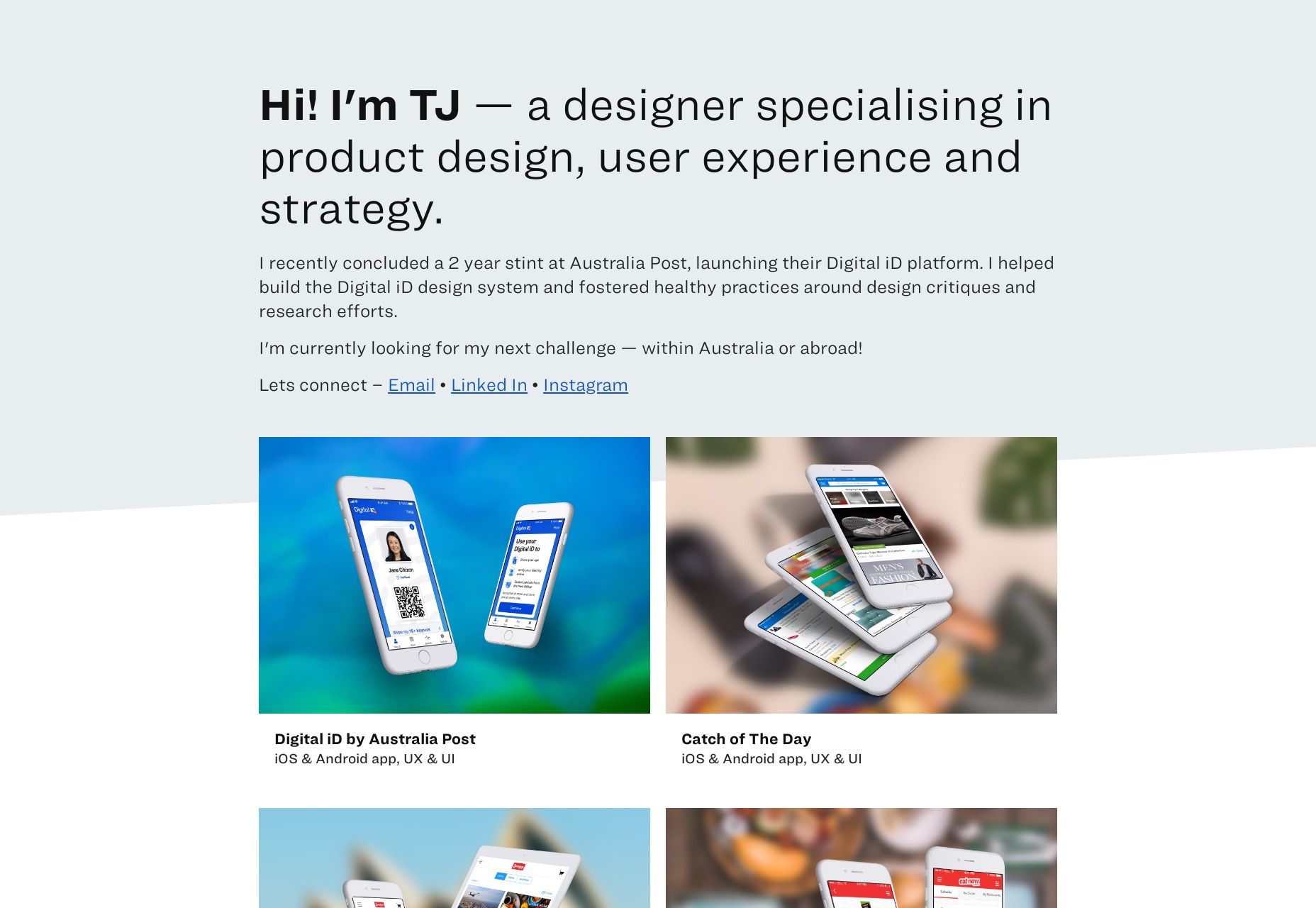
TJ Dhillon
TJ Dhillon’s portfolio starts as the rest of this article will probably go on. It’s simple, it’s clean, it works. It’s got some nice little drop shadows on hovering over certain elements, and is it weird that I’ve actually missed those?
They were never a bad thing in moderation. Moderation might be the key to this whole site design. There are frills, but they’re not overdone.
Platform: Static Site
Matt Kevan
Matt Kevan’s portfolio looks a little bit like a prototype, though it’s obviously polished. As he is a UX designer, the aesthetic certainly works thematically.
He’s also elected to put his writing front and center, rather than his more visual work. It’s certainly one way to demonstrate your expertise, but I wish I had some kind of analytics
Platform: Jekyll
Daniel Spatzek
Daniel Spatzek’s portfolio will take us, just for a moment, to the world of the ultra-modern. You know how I feel about sites that are this JS-heavy, but I’m still a sucker for that grid-based aesthetic, especially when it’s properly using the full width of my desktop screen like this.
Platform: Static Site
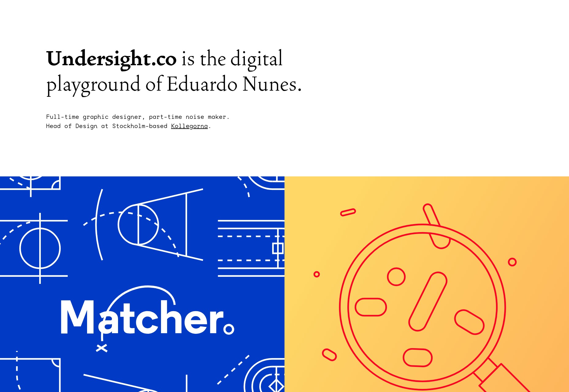
Undersight
Undersight has that clean-and-modern look, but with a little bit of artistic flair provided by the work itself. It feels like the portfolio pieces are almost as much apart of the overall aesthetic as any other element of the site. In a world where so very often the design and content almost feel like separate parts of a website, this is an improvement.
Platform: React
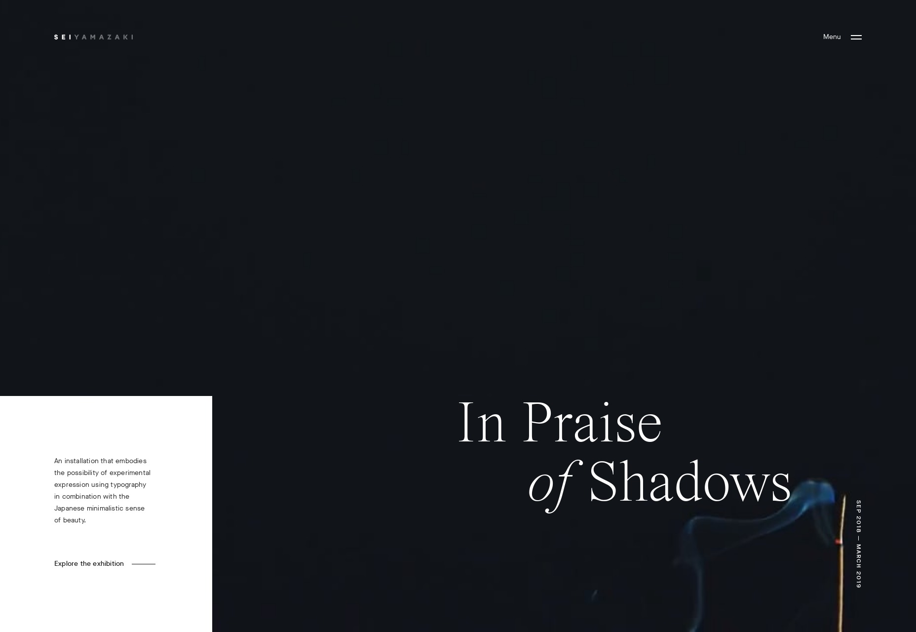
Sei Yamazaki
Sei Yamazaki’s portfolio is focused on art. With this comes the classic “art gallery style” which includes lots of white space, and text that’s perhaps a bit too small at times. Still, the layouts themselves are beautiful, and the featured installation has some of the finest video presentation I’ve seen in a while.
Platform: WordPress
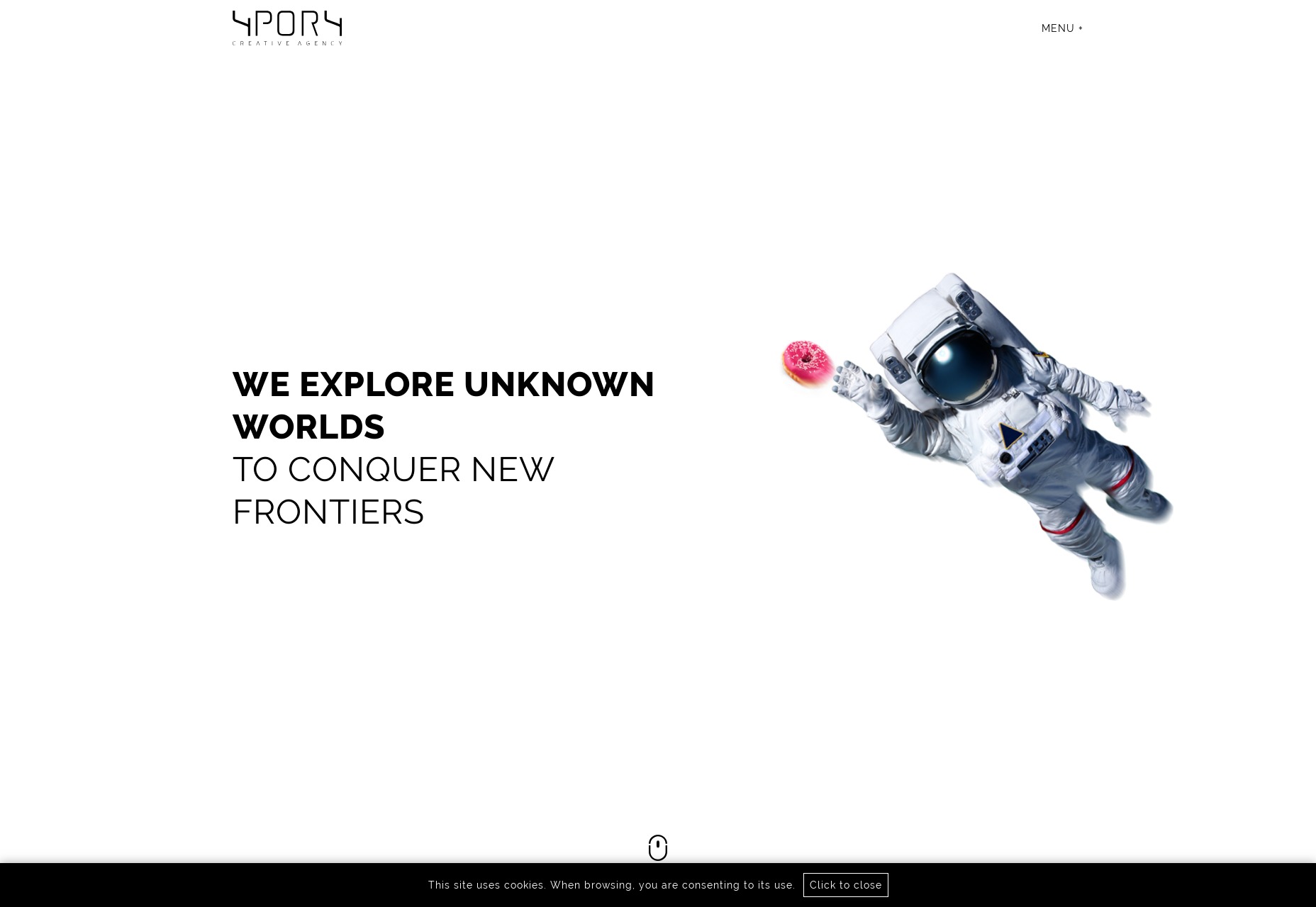
4POR4
4POR4 is a rare breed indeed. Normally websites that use this much space-related imagery have darker layouts. But here we have lots of literal white space mixed with astronaut imagery, illustration, and photomontages. It’s a bit bandwidth-heavy, perhaps, but the overall effect is stunning.
Platform: Static Site
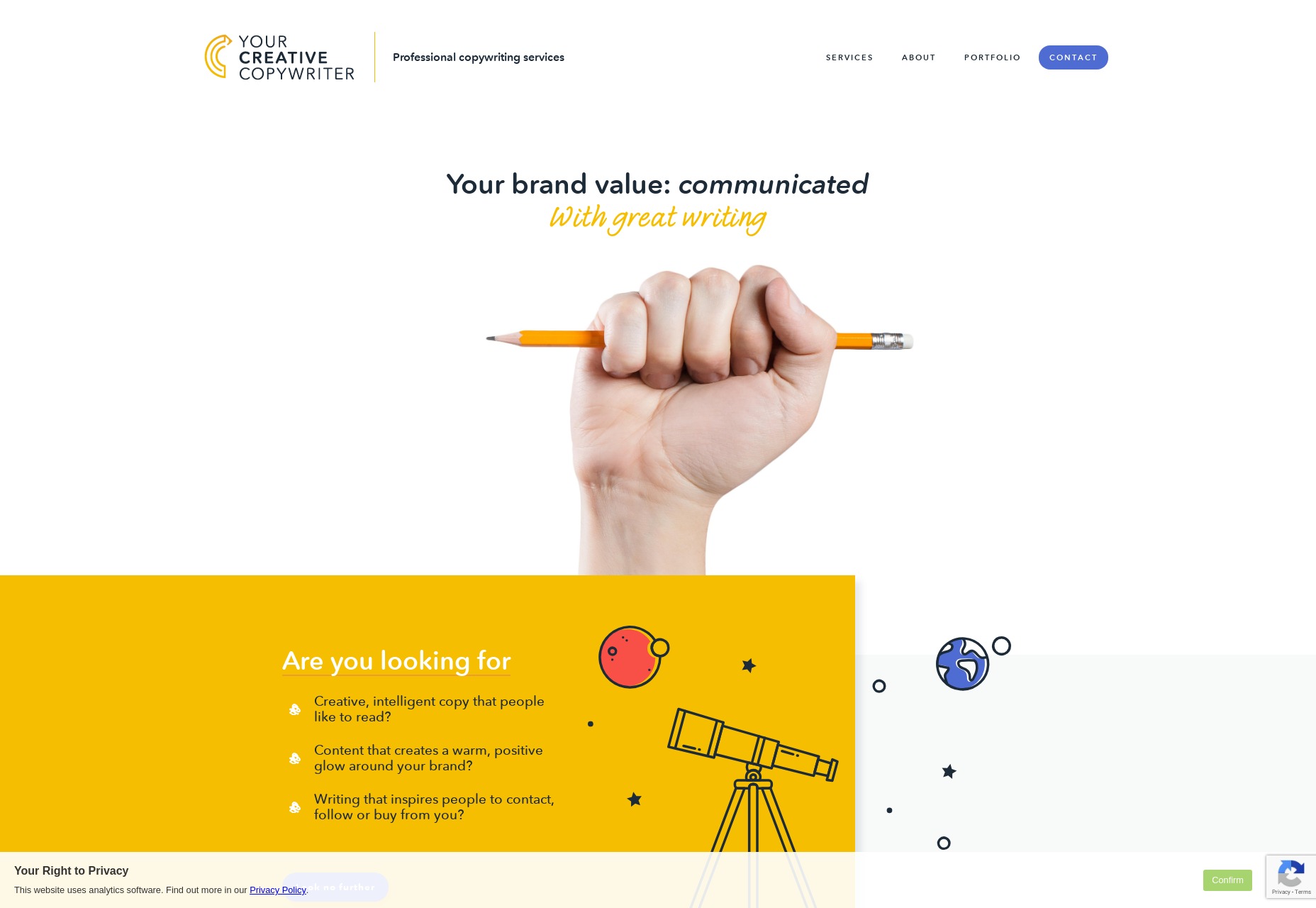
Your Creative Copywriter
Your Creative Copywriter is, as a website, the very picture of business-friendliness. The layout has elements of post-modern asymmetry while maintaining a clearly businesslike look. The illustrations are classic, and even the stock photo of the hand holding the pencil is perfect for the market.
Sure it’s a little cheesy, perhaps, but far from the cheesiest stock photo we’ve ever seen. It’s always interesting to see a site so clearly made with modern tech that feels like something from another era. It doesn’t hurt that this is probably exactly what their clients are looking for.
Platform: Static Site
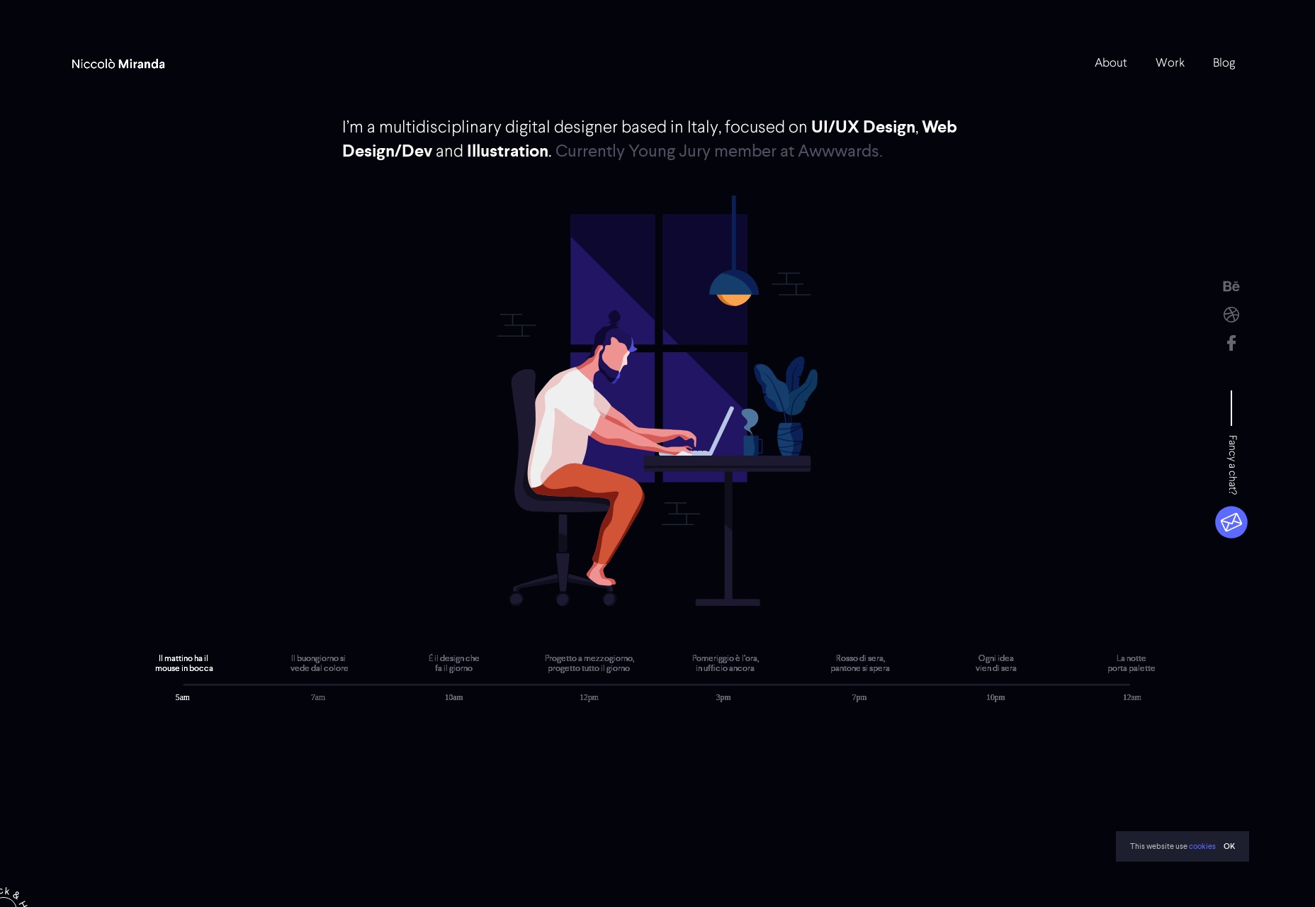
Niccolò Miranda
Niccolò Miranda’s portfolio is one of the most “presentational” sites I’ve ever seen. It’s dark, it’s got animated illustrations, and even the blog is animated to an extent.
This is only possible because every blog post is a YouTube video tutorial, with accompanying practice files. It’s not the most accessible site I’ve seen, but it is beautiful, and it takes an interesting approach to ongoing content.
Platform: Custom CMS (I think)
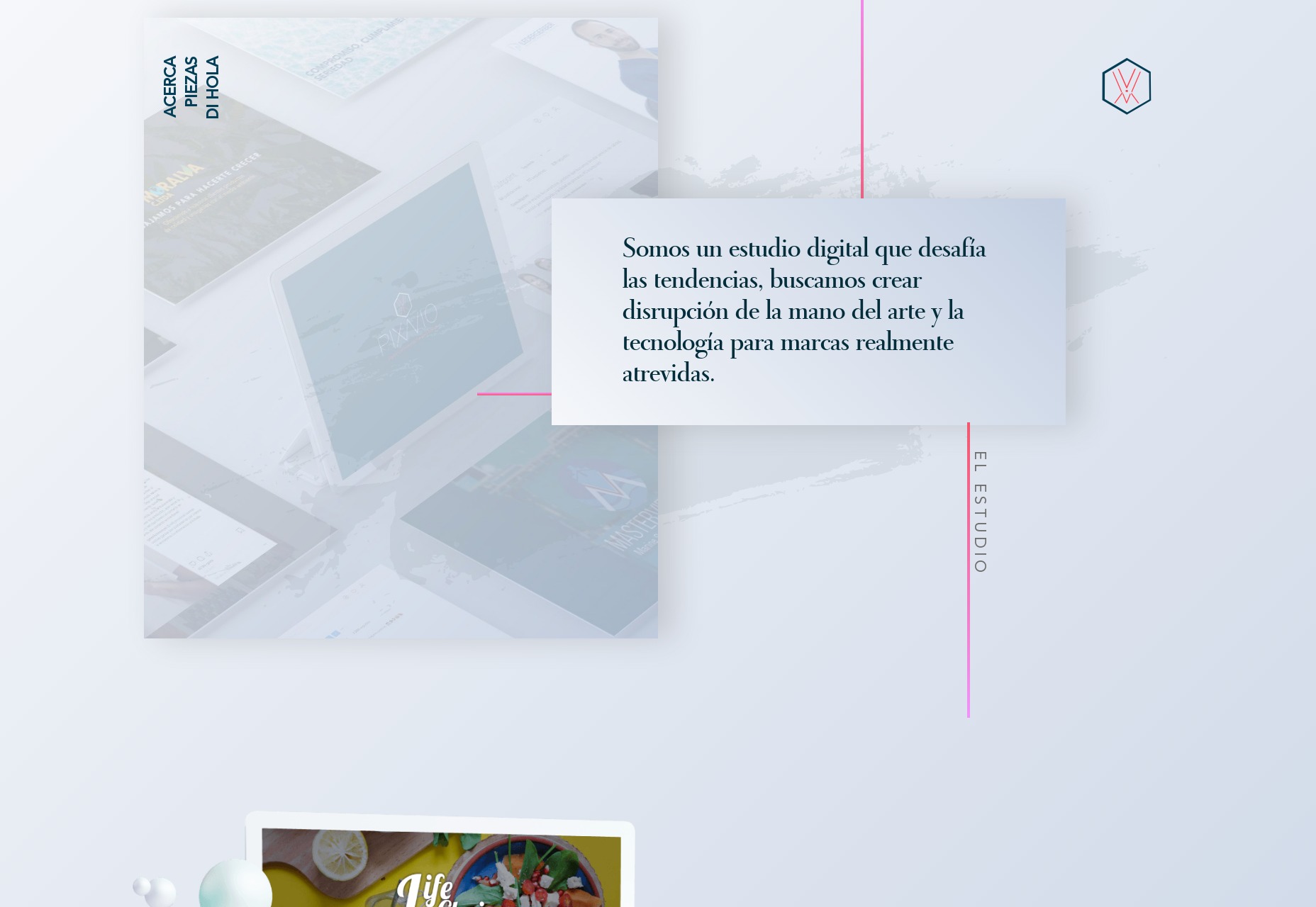
Pixavio
Pixavio is another highly presentational site with a “modern” look so old it reminds me of old fashion magazines and, weirdly enough, a lot of the barber shops I went into as a kid. It’s something about the typography and gradient use.
The site shows off the flexibility of this aesthetic by using a different color scheme for each portfolio page. It feels like a blast from the past, but it still works today.
Platform: Static Site
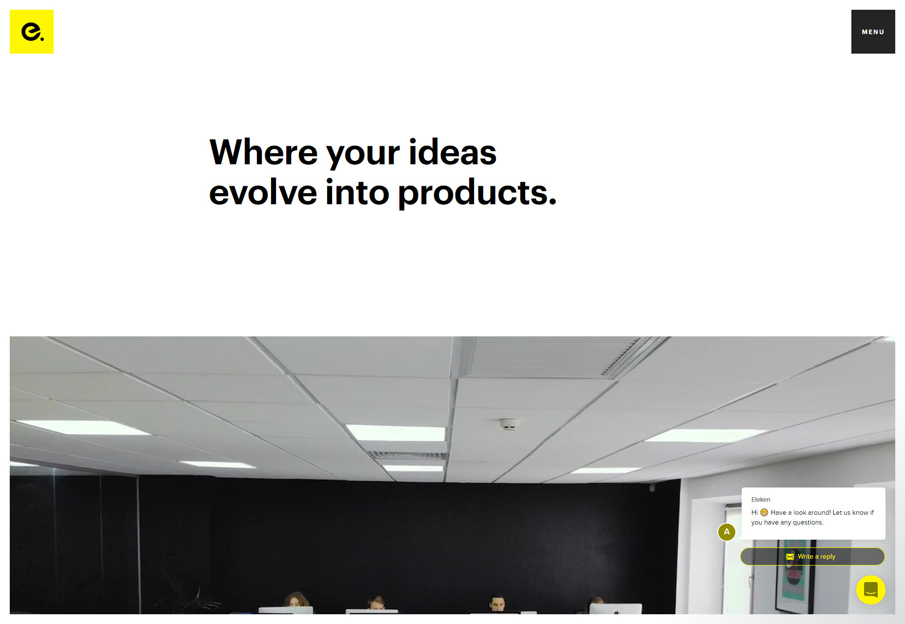
Eleken
Eleken brings me back to a time when everyone was doing design “like Apple but with thicker headings”. It’s pretty classic minimalism, mixed with a little background video, and workplace photography.
Platform: Gatsby
Kobu
Kobu is a rare beauty. It’s sleek, stylish, and makes wonderful use of curves in its illustration and animation. The animations run smoothly, and aren’t altogether too distracting. The color palette is strong, and the headings are thick.
And it does all of this without scroll-jacking. Can you even believe it? A fancy site that performs well and lets me scroll normally. I’m in love.
Being a bit more serious, it’s a lovely looking site. Just wish they had more fallbacks in place for all of the JS stuff.
Platform: WordPress
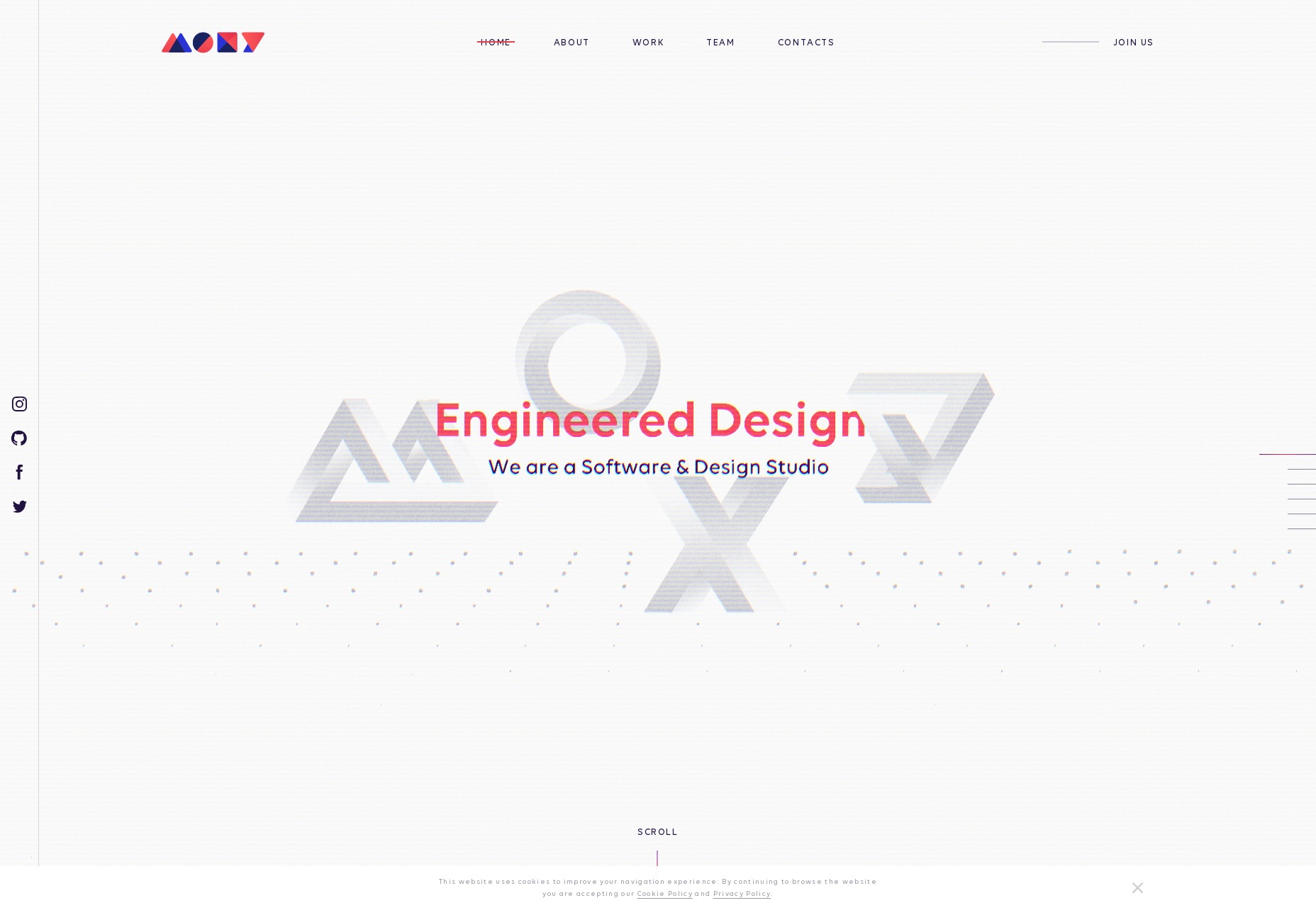
MOXY
And we’re back to the scroll-jacking. But I can forgive MOXY for this because it’s just that pretty. It’s sites like this that remind me why—even though I dislike how JavaScript has become the new Flash—web animation is a discipline and an art form all its own. It’s an art form worth exploring, and MOXY does that beautifully.
Platform: React App/Static Site
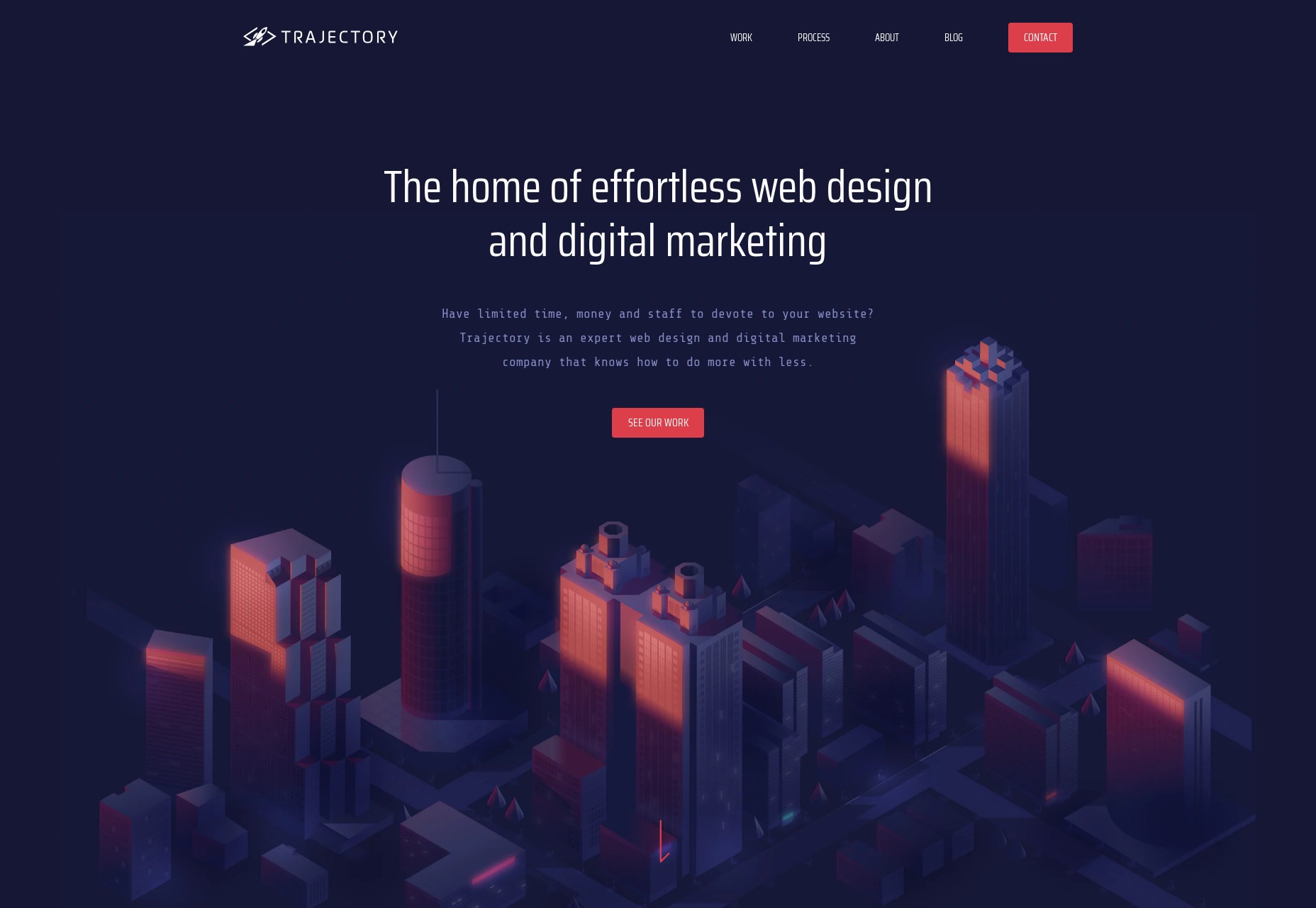
Trajectory
Trajectory is doing it all wrong! If you’re going to use a monospaced font, your site either has to be an ironic brutalist meta-commentary on web design or a post-modernist artsy design. None of this pleasant, business-friendly stuff with smooth illustrations and gorgeous gradient use. [/sarcasm]
Using monospaced type for all the body text might be a bit much, but it certainly does stand out when combined with everything else.
Platform: Craft CMS
Soap Media
Soap Media is hitting all the right buttons for me, personally. It’s bright with bold colors, it’s playful, and it’s got a huge rubber ducky. This is an entirely subjective point, but I just like rubber duckies. The whole site feels creative and whimsical in that “we’ll playfully make you a lot of money” sort of way. It’s genius.
Platform: Static Site
Nate Denton
Random chickens are equal to rubber duckies if you want to be silly and playful. Nate Denton’s portfolio went with a big one, contrasted by a relatively soft and warm color palette. The resulting aesthetic is a combination of professional and artsy that is overall pleasing to the eye, but less likely to scare away the more straight-laced potential clients.
Platform: Static Site
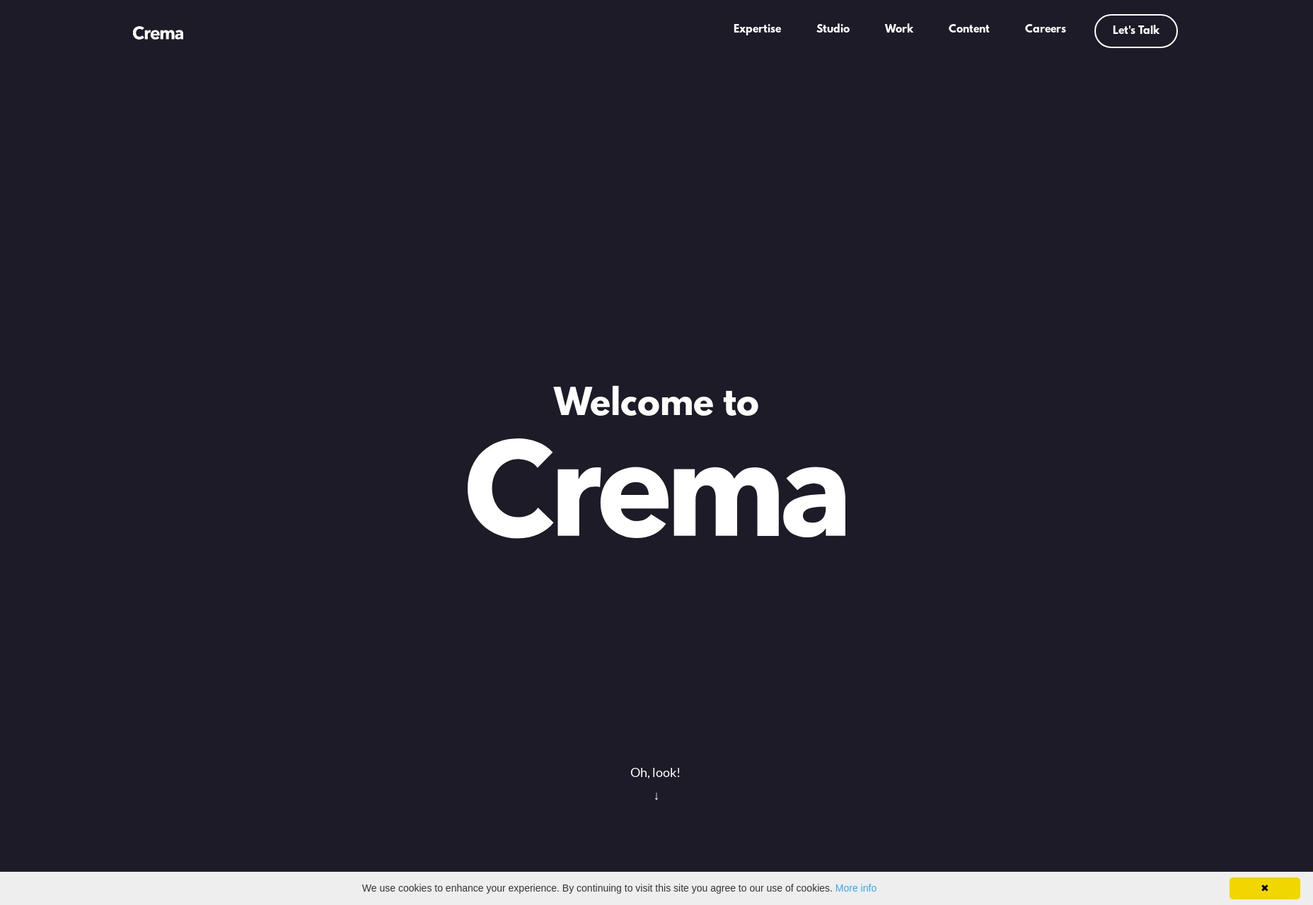
Crema
Crema is this month’s site that isn’t mind-blowingly experimental or anything, but is here because I admire the craftsmanship. Plus rounded corners. We don’t seem them as much as we thought we would, do we?
Platform: Custom CMS (I Think)
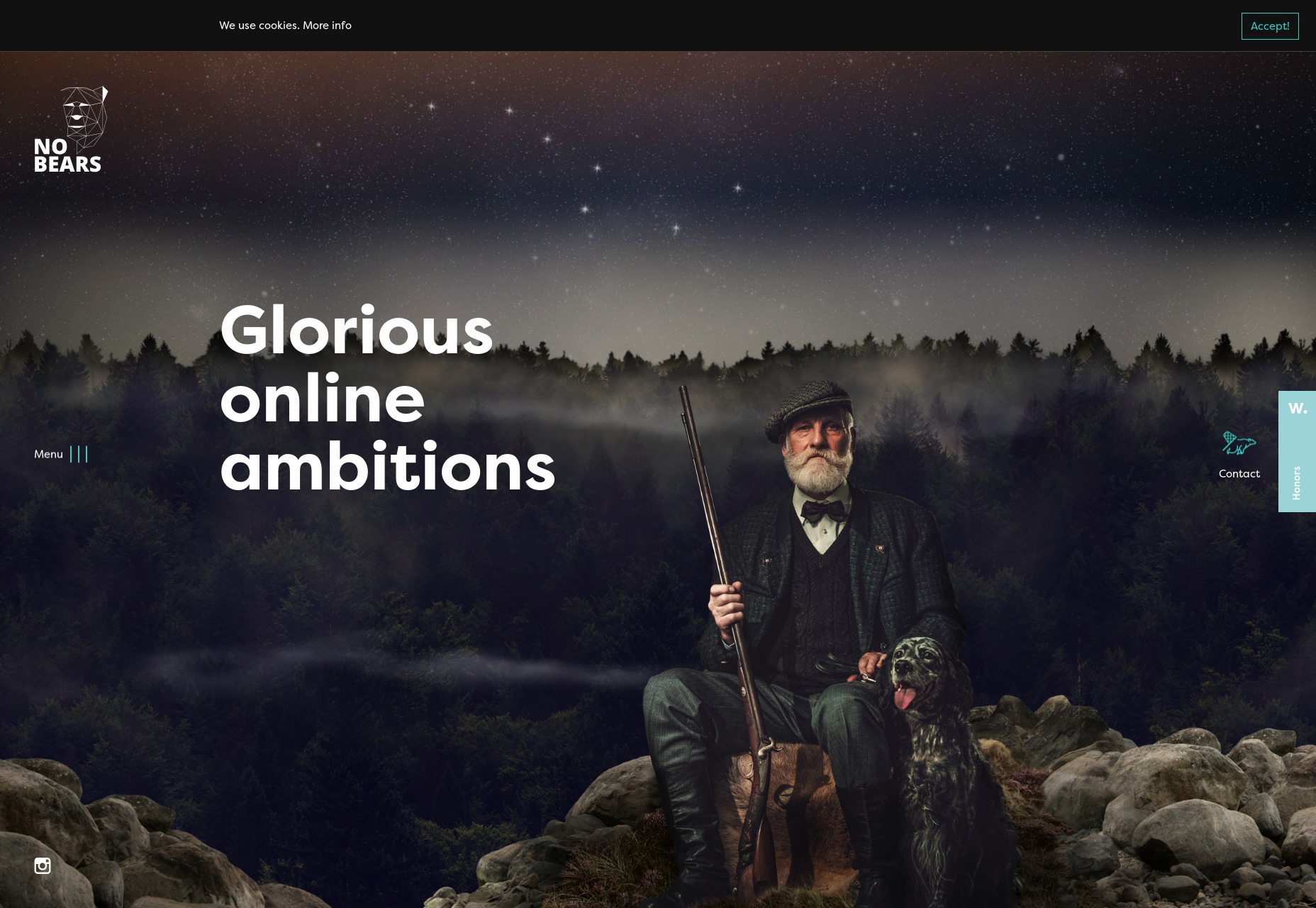
NoBears
The amusingly-named NoBears agency goes with wackiness, combining striking photomontages and background video with a comparatively subdued dark design. I’m still a sucker for those semi-visible grids as part of the design, so of course this one’s on the list.
Platform: Silverstripe
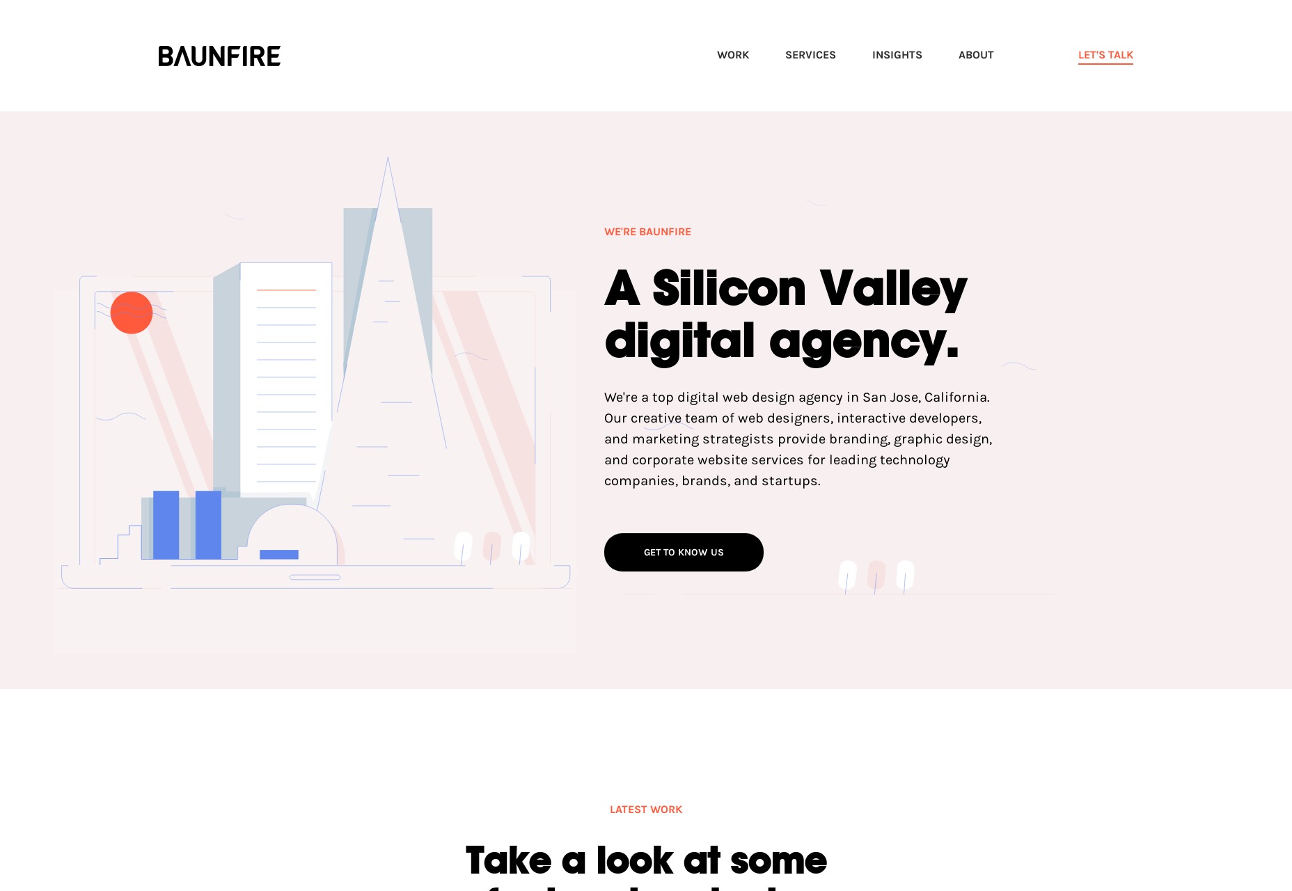
BAUNFIRE
While many other sites are going for bold and bright aesthetics, BAUNFIRE keeps it soft and pleasant with a pastel-infused, and fairly minimalist design. It’s a calming and soothing experience from an agency that presents itself as easy to work with.
Platform: Craft CMS
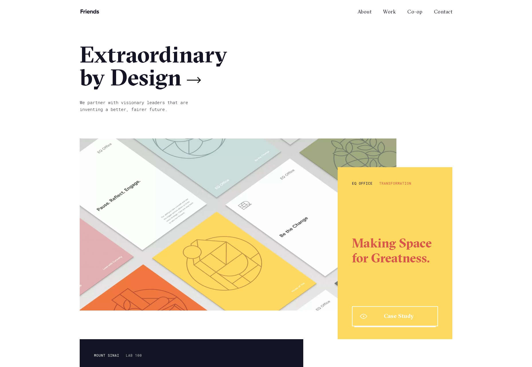
Friends
Friends’ website presents a fusion of that near-postmodern, element-overlapping aesthetic with some more classic-feeling minimalism and typography. That fusion works quite well.
Platform: Craft CMS
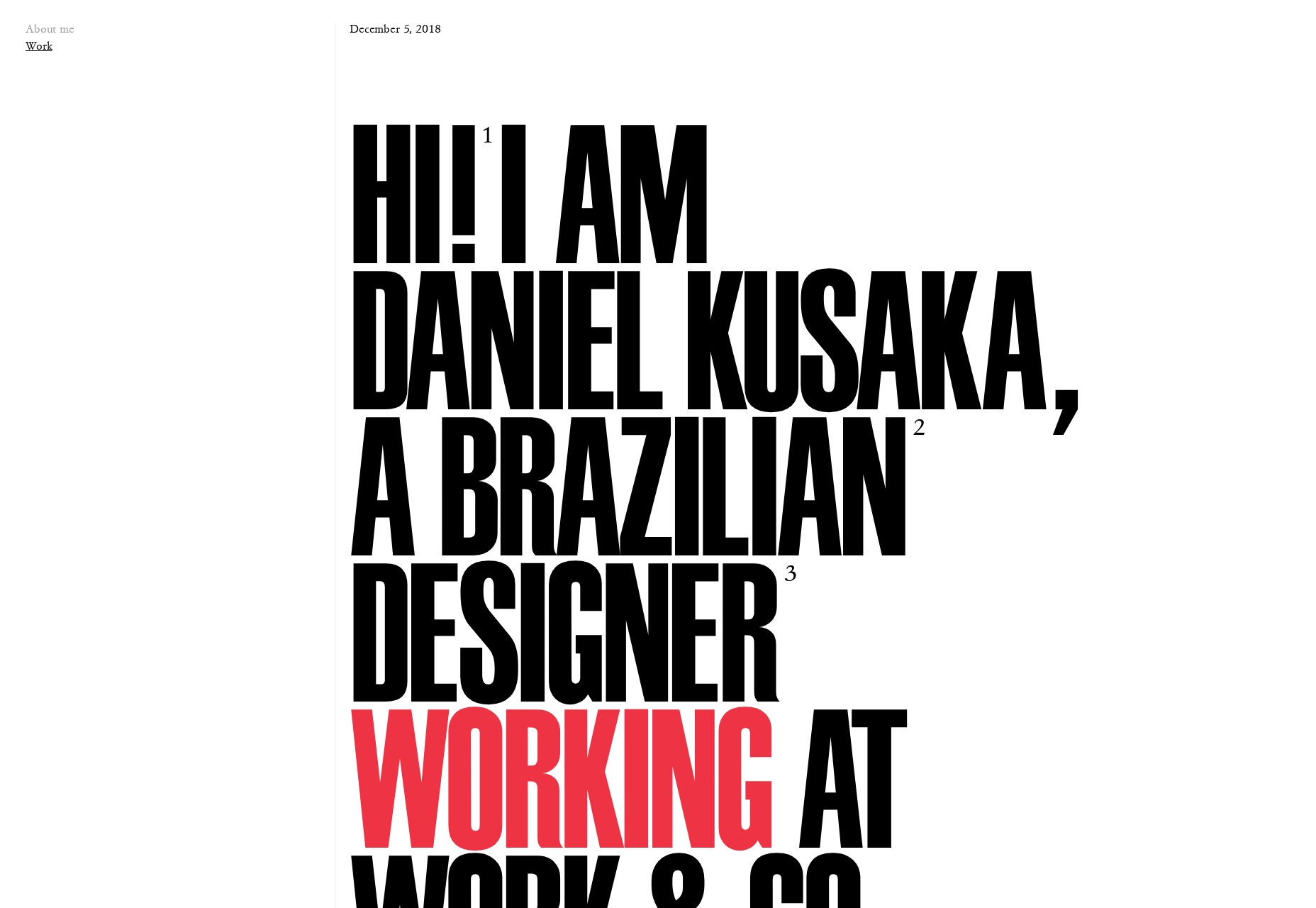
Daniel Kusaka
Daniel Kusaka’s portfolio gives me some of that good old magazine feel that designers wanted to do for years. Well now we can, and I can’t get enough of it. God bless Flexbox and CSS Grid.
Every week users submit a lot of interesting stuff on our sister site Webdesigner News, highlighting great content from around the web that can be of interest to web designers.
The best way to keep track of all the great stories and news being posted is simply to check out the Webdesigner News site, however, in case you missed some here’s a quick and useful compilation of the most popular designer news that we curated from the past week.
Note that this is only a very small selection of the links that were posted, so don’t miss out and subscribe to our newsletter and follow the site daily for all the news.
Google Officially Rolling Out New Search Bar with Sticky Header, Rounded Search Bar
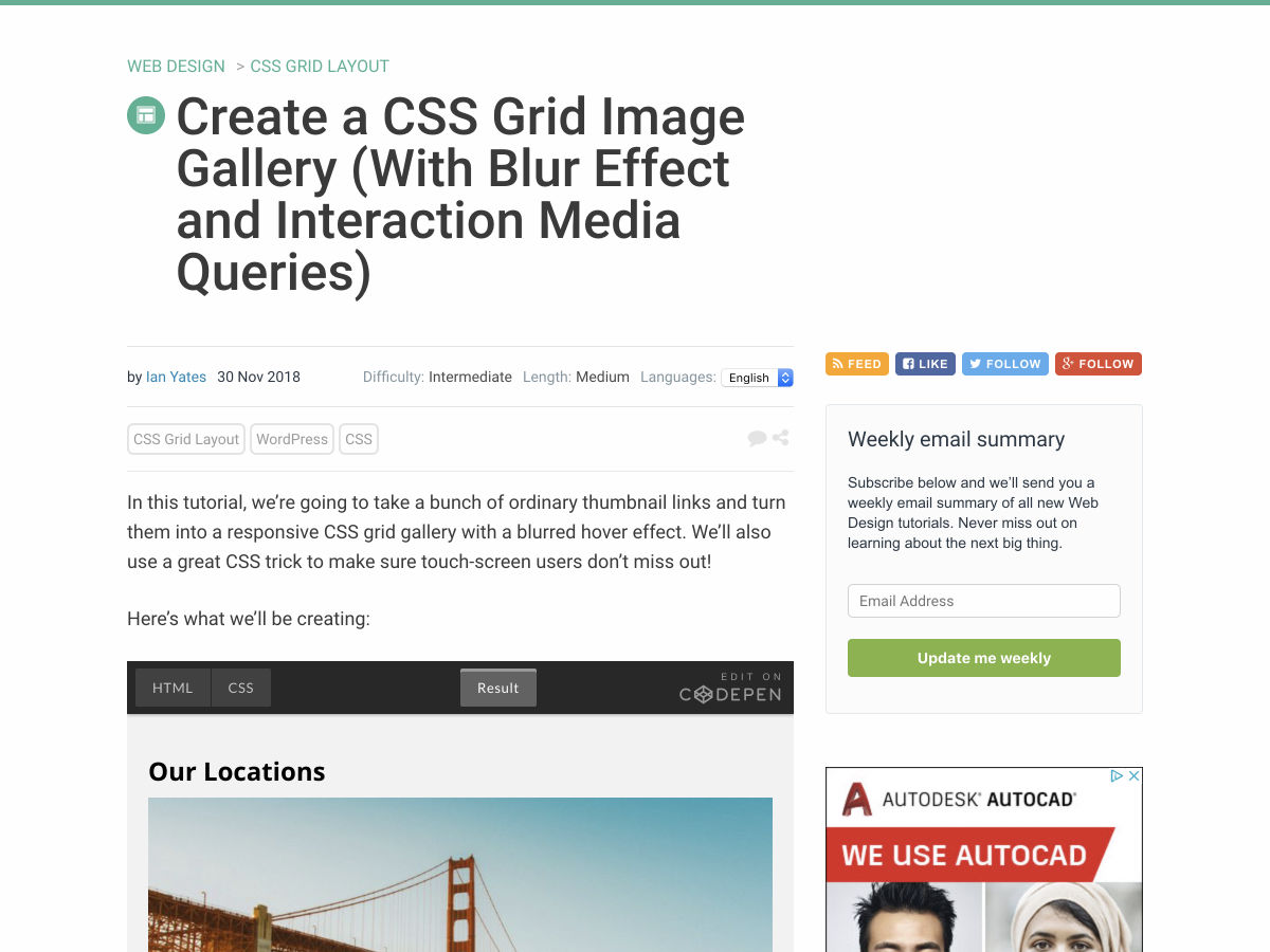
Create a CSS Grid Image Gallery (With Blur Effect and Interaction Media Queries)
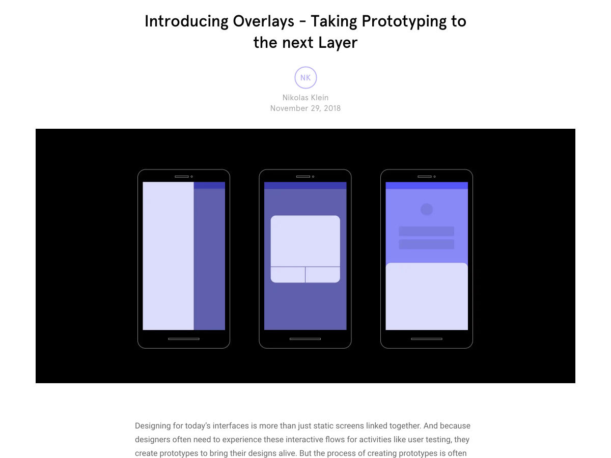
Introducing Overlays
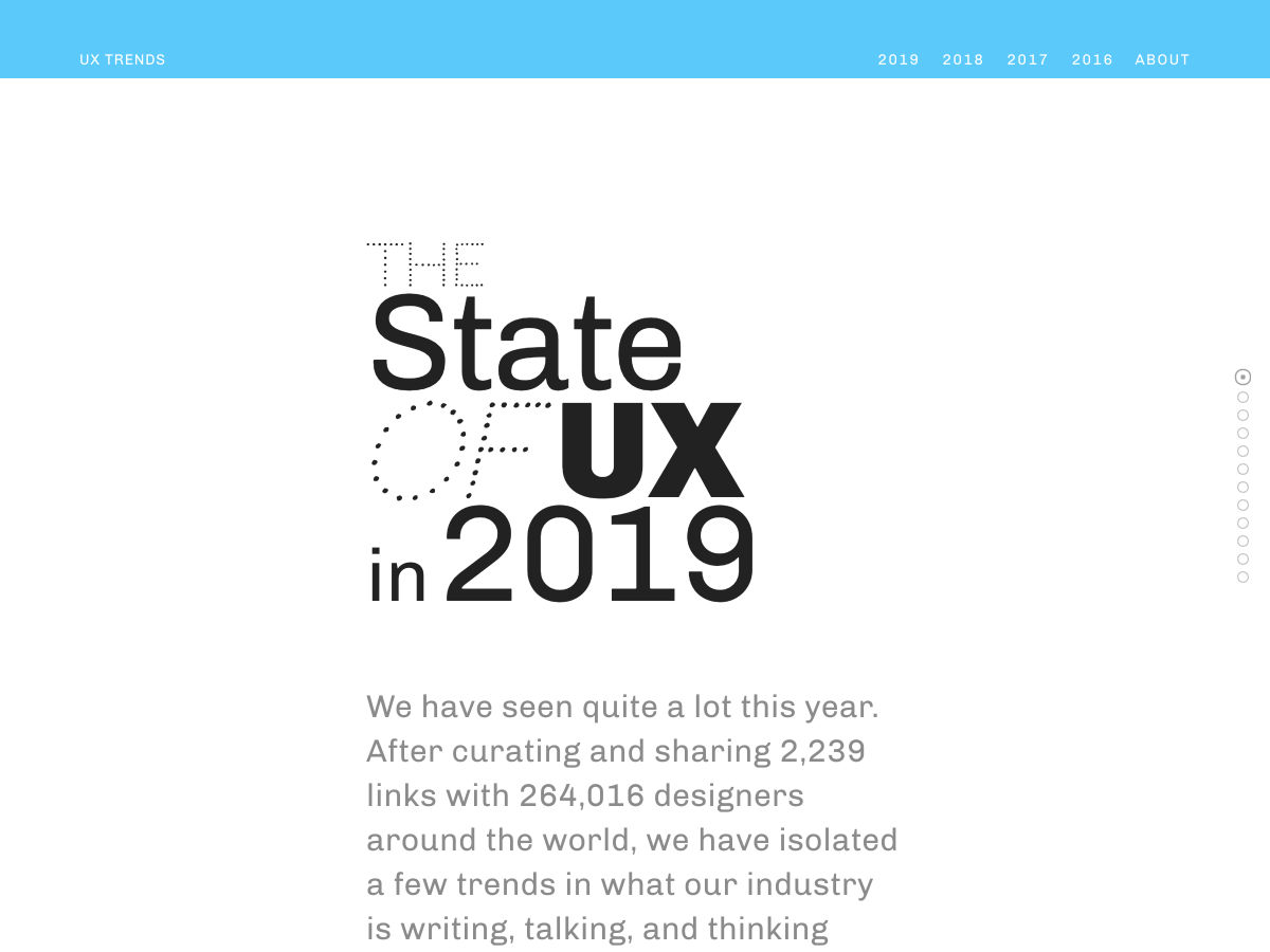
The State of UX in 2019
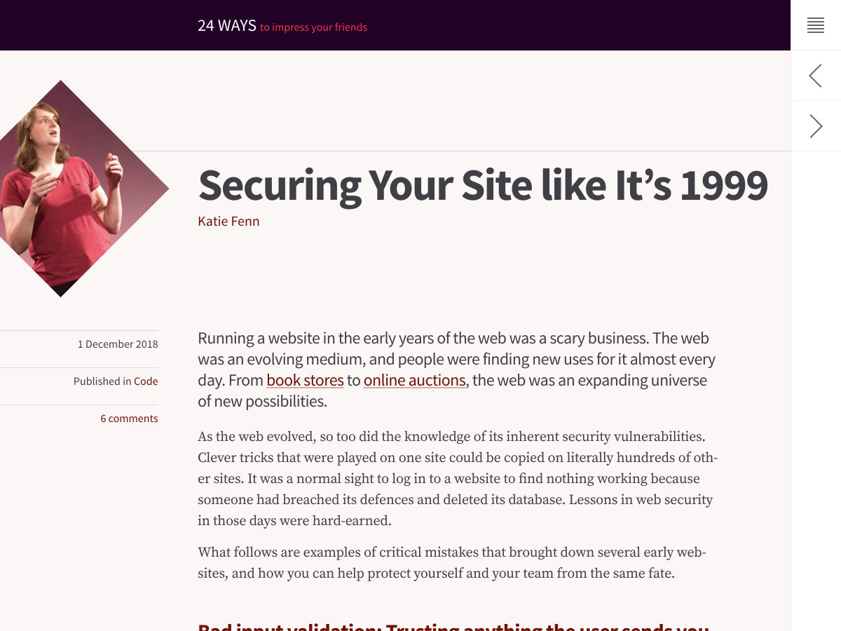
Securing your Site like It’s 1999
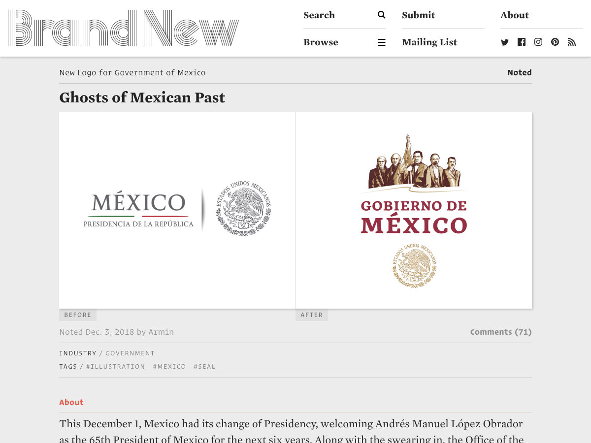
New Logo for Government of Mexico
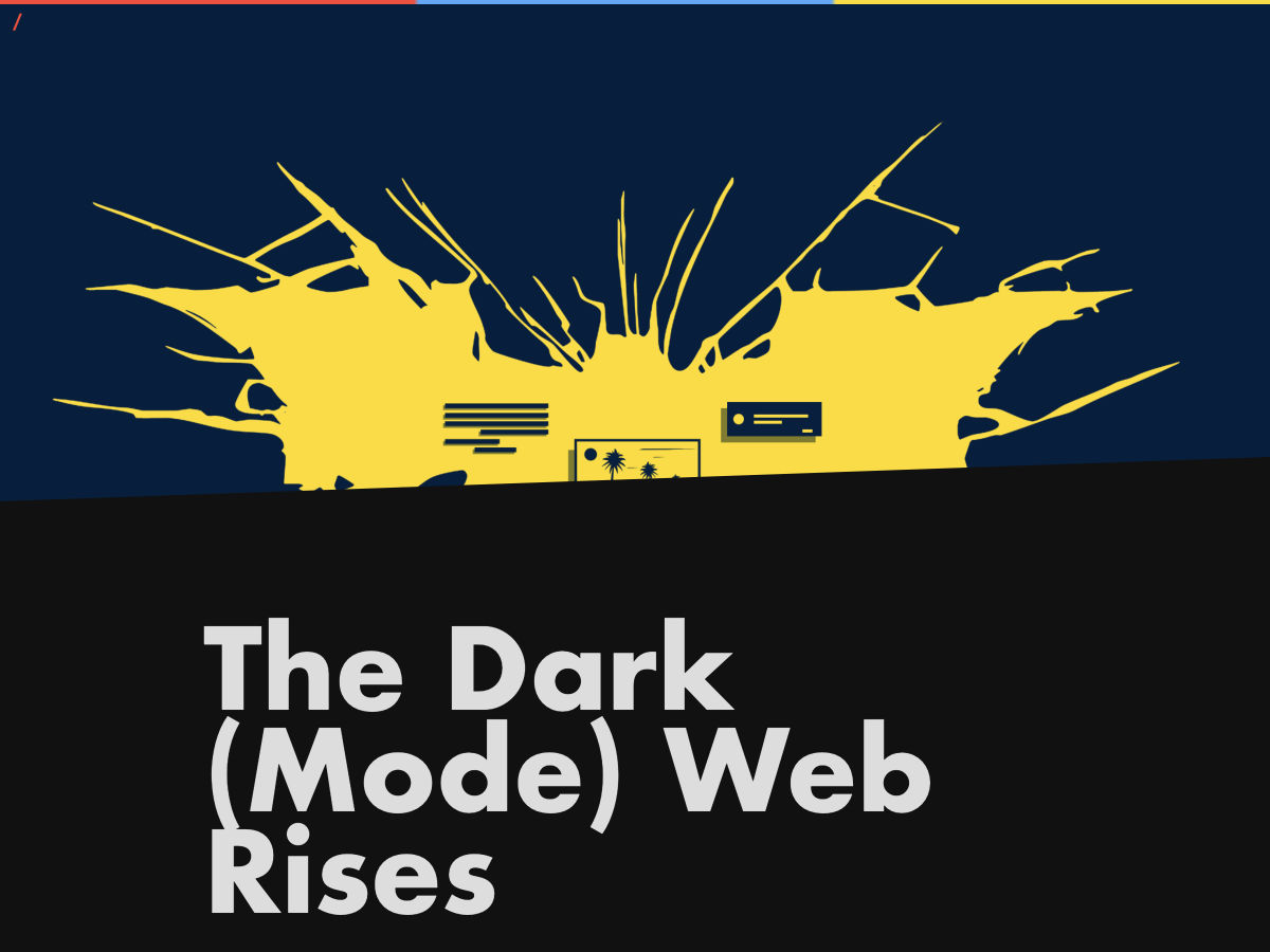
The Dark(mode) Web Rises
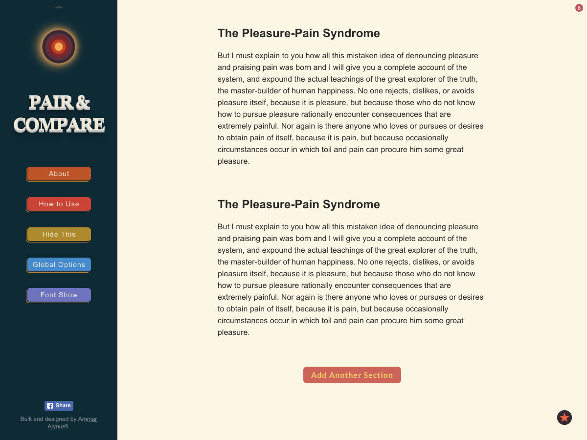
Pair and Compare: Find Great-looking Fonts and Font-pairs
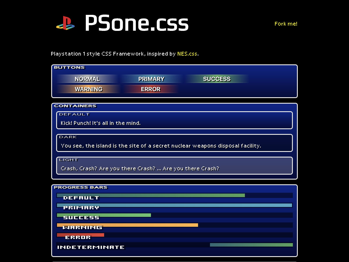
PSone.css- A Small Playstation 1 Style CSS Framework
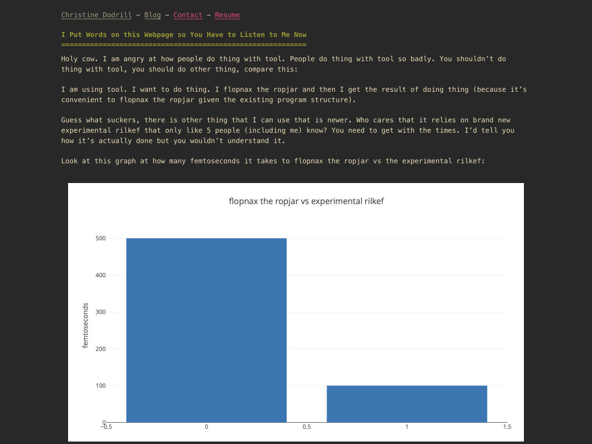
I Put Words on this Webpage so You Have to Listen to Me Now
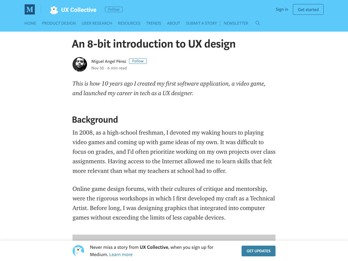
An 8-bit Introduction to UX Design
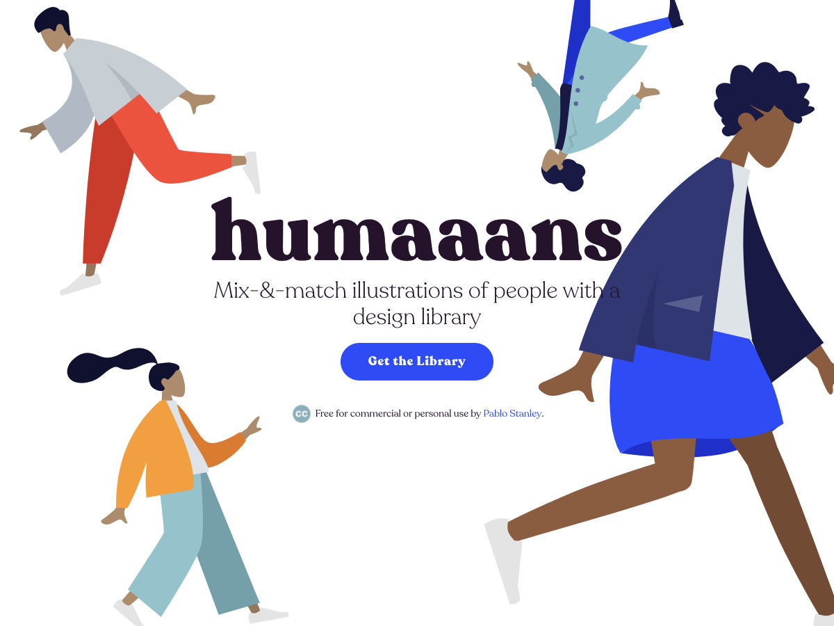
Humaaans. A Library to Mix-and-match Illustrations of People
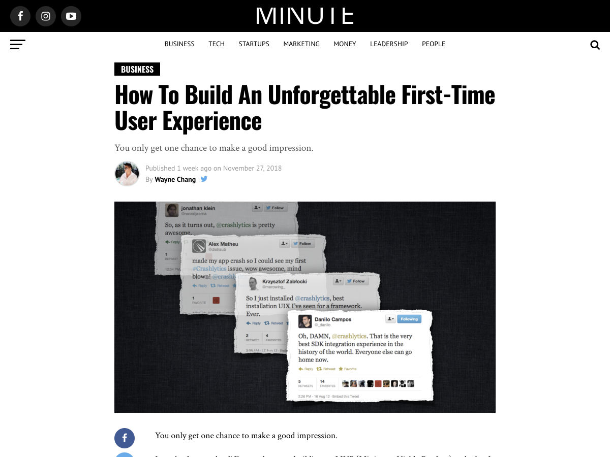
How to Build an Unforgettable First-Time User Experience
Why Most Redesigns Fail
My Struggle with Colors
16 Books Every Graphic Designer Should Read
9 Trends and Ideas You’ll See, Hear and Be a Part of in 2019
Announcing Google Play’s “Best of 2018”
State of Web Browsers in 2018
Eight Lessons from Creating a Design system
Holidays are Coming: 21 Digital Illustrations Full of Christmas Spirit
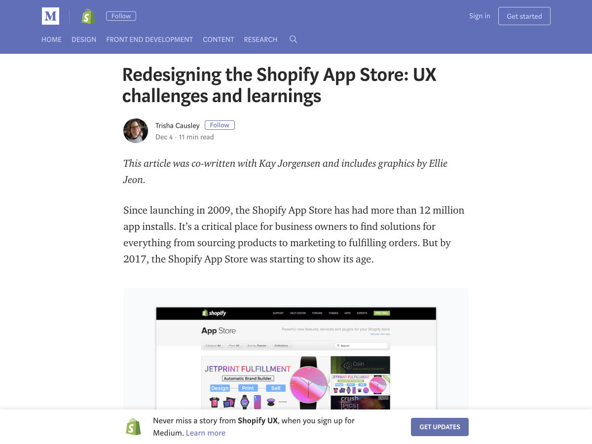
Redesigning the Shopify App Store: UX Challenges and Learnings
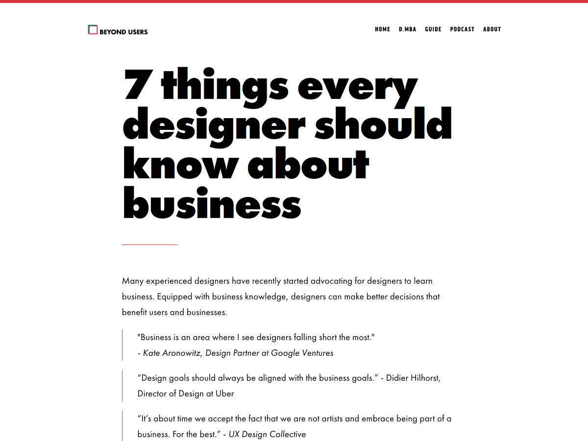
A Comprehensive Guide on What Should Designers Learn About Business
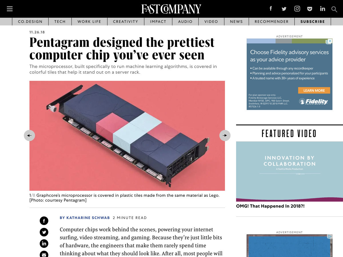
Pentagram Designed the Prettiest Computer Chip You’ve Ever Seen
New Squarespace Branding
Want more? No problem! Keep track of top design news from around the web with Webdesigner News.
What naming scheme do you use for color variables? Have you succeeded at writing CSS that uses color variables in a manner agnostic to the colors they represent? I’ve tried all of the following, and I have yet to succeed at writing CSS that works well with any color scheme. ??
I remember the very first time I tried Sass on a project. The first thing I wanted to do was variablize my colors. From my naming-things-in-HTML skillz, I knew to avoid classes like .header-blue-left-bottom because the color and position of that element might change. It’s better for the to reflect it what it is than what it looks like.
So, I tried to make my colors semantic, in a sense — what they represent not what they literally are:
But I found that I absolutely never remembered them and had to constantly refer to where I defined them in order to use them. Later, in a “screw it” moment, I named colors more like…
I found that to be much more intuitive with little if any negative side effects. After all, this isn’t crossing the HTML-CSS boundary here; this is all within CSS and developer-only-facing, which puts more of a narrow scope on the problem.
In a similar fashion, I’ve tried keeping colors within a Sass map, like:
$colors: (
  light: #ccc,
  dark: #333
);
But the only vague goal there was to clean up the global namespace, which probably isn’t worth the hassle of needing to map-get all the time. Namespacing like $-c-orange is probably an easier approach if you need to do anything at all.
I’ve largely stuck with that just-use-color-names approach today in Sass. As the shift toward CSS custom properties happens, I think having a --c-orange and --c-gray-5 is similarly appropriate.
I’ve used that kind of thing for media query breakpoints before, as the numbering seems to make sense there (i.e. low numbers are smaller screens, big numbers are bigger screens). I could also see that being nice for tints or shades of the same color, but then why not regular numbers?
Another approach I’ve often seen is to combine named colors with abstracted names. Geoff does that and John Carroll lists that here:
How might you pick names for colors? You might get a kick out of what to call a sunny yellow versus a sunflower yellow, or you might just want some help. Here’s one project for that, and here’s another:
It’s not the itself that is interactive — it’s wrapped in a for that.
The .svg-icon class has some nice trickery, like em-based sizing to match the size of the text it’s next to, and currentColor to match the color.
Since real text is next to it, the icon can be safely ignored via aria-hidden="true". If you need an icon-only button, you can wrap that text in an accessibily-friendly .visually-hidden class.
The focusable="false" attribute solves an IE 11 bug.
WordPess 5.0 (codenamed “Bebo”) is officially out and prowling among the servers.
This, then, is when we find out how well Gutenberg works out. And make no mistake, whatever they’ve done under the hood, this release is about Gutenberg, both technically and in the public perception. It’s almost the only thing they talk about in their own blog post about this release.
?
Gutenberg
Automattic has set out to redefine the content editing experience in the CMS that powers at least a third of the Internet, and that is exactly what they’ve done. I think it’s for the better; others…not so much; still others think it’s a good idea that needs more development time.
Personally, I think a lot of that negative perception comes from earlier development builds. Those were builds that I didn’t use much because, well, they weren’t finished. I’d be surprised, honestly, if it was bug-free even now. That’s just not how software development seems to work these days. I’ve got my fingers crossed that it’s finished enough.
I’ve got my fingers crossed that it’s finished enough
I mean hey, I might be used to wrangling with unruly software, but someone who just wants to post on their blog already might not be as forgiving. The point is, whether any of us are ready or not, it’s here, and I personally quite like it.
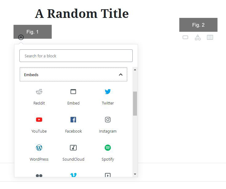
One of the features that I find quite useful is the collection of default embedding blocks that allow you to easily embed content from a wide variety of sources. The classic editor had a bit of this functionality, but the current system gives you a proper idea of what you can and can’t embed by default, and I’m pretty sure some of the options were previously only available through third-party plugins. [Figure 1]
It might be a bit late for that Tumblr Embed Block, though. Ahem.
Another feature I like are contextual icons that appear on the upper-right of any new block, allowing you to select recently-used blocks quickly. That could come in handy when editing a longer document. [Figure 2]
For those of you who want to wait for Automattic to develop Gutenberg a little further, they have a Classic Editor plugin, as promised. The word is they’ll be supporting this plugin until 2021. Incidentally, it has a rating of 4.9 according to wordpress.org’s own rating system, and over 600,000 active installations at the time of this writing.
All plugins that previously made changes and additions to the classic editor should still work with this plugin, so it’s a viable option for those who want to play it safe.
Themes and Such
Twenty-Nineteen made it into the final release. Since that wasn’t always guaranteed, I’m glad it got finished up in time. They needed a way to properly showcase Gutenberg’s capabilities with this release, and now they have one. For a preview of said theme, as well as my thoughts on it, see Previewing the WordPress Twenty-Nineteen Theme. (Side note: all themes from Twenty-Ten to Twenty-Seventeen have been updated to support Gutenberg.)
For designers and developers, theme creation just got a bit easier and a bit more complicated at the same time. On the one hand, it is now possible to handle a lot of content-related layout within the CMS itself, which will save time when developing custom theme options. It gives users more control over the general flow of content, giving them more creative opportunities, and takes some work off your plate.
On the other hand, you need to make sure you have styles ready for all of the default content blocks available in every theme you make. This is not terribly difficult, and it shouldn’t take too long to develop a library of custom styles that can be adjusted to every theme, but it’s something to consider.
Additionally, most of the third-party block plugins I’ve seen are not style-agnostic, though most have multiple style options to choose from. I can see third-party blocks being something of a double-edged sword.
WordPress Support Changes
One last tidbit that was actually announced on December 3rd is a new support platform for WordPress. It’s called “HelpHub”, and it’s located at wordpress.org/support. They’re still migrating content from the old WordPress Codex, so that’s still there for now, but this is the new official help center.
It seems to be pretty heavily integrated with the support forums, so it seems like the general plan was to make help easier to find by putting it all (more or less) in one place. I’d call this an overall improvement.
My Opinion
On my own personal projects, the update installed flawlessly. I can’t report much on potential bugs, as yet, because this release just happened, but so far I like it quite a bit. I honestly like the new editor, and the new direction WordPress is heading in. There’s a lot of potential here. Whether or not you think Gutenberg is ready for release, as I do, the thing to realize is that Gutenberg is only the next step in a long journey.
Automattic has been working long and hard to transform WordPress from a pure-blog CMS into something like a framework or data platform, all without sacrificing usability, or too much in the way of backwards compatibility. The blog you could install in five minutes has more or less become the ecosystem you can install in five minutes, and then build any site you want.
It’s not perfect, and it’s not done yet, but this release is a giant step toward something we’ve never seen before. I’m genuinely excited to find out what it’ll be.
So far, Gutenberg has had a very mixed reception from the WordPress community and that reception has become increasingly negative since a hard deadline was set for the 5.0 release, even though many considered it to be incomplete. A hard release deadline in software is usually fine, but there is a glaring issue with this particular one: what will be the main editor for a platform that powers about 32% of the web isn’t fully accessible. This issue has been raised many times by the community, and it’s been effectively brushed under the carpet by Automattic’s leadership — at least it comes across that way.
Sounds like a messy situation, right? I’m going to dive into what’s happened and how this sort of situation might be avoided by others in the future.
Further Context
For those amongst us who haven’t been following along or don’t know much about WordPress, I’ll give you a bit of context. For those that know what’s gone on, you can skip straight to the main part of the article.
WordPress powers around 32% of the web with both the open-source, self-hosted CMS and the wordpress.com hosted blogs. Although WordPress, the CMS software is open-source, it is heavily contributed to by Automattic, who run wordpress.com, amongst other products. Automattic’s CEO, Matt Mullenweg is also the co-founder of the WordPress open source project.
It’s important to understand that WordPress, the CMS is not a commercial Automattic project — it is open source. Automattic do however make lots of decisions about the future of WordPress, including the brand new editor, Gutenberg. The editor has been available as a plugin while it’s been in development, so WordPress users can use it as their main editor and provide feedback — a lot of which has been negative. Gutenberg is shipping as the default editor in the 5.0 major release of WordPress, and it will be the forced default editor, with only the download of the Classic Editor preventing it. This forced change has had a mixed response from the community, to say the least.
I’ve personally been very positive about Gutenberg with my writing, teaching and speaking, as I genuinely think it’ll be a positive step for WordPress in the long run. As the launch of WordPress 5.0 has come ever closer, though, my concerns about accessibility have been growing. The accessibility issues are being “fixed” as I write this, but the handling of the situation has been incredibly poor, from Automattic.
I invite you to read this excellent, ever-updating Twitter thread by Adrian Roselli. He’s done a very good job of collecting information and providing expert commentary. He’s covered all of the events in a very straightforward manner.
Right, you’re up to speed, so let’s crack on.
What Happened?
For as long as the Gutenberg plugin has been available to install, there have been accessibility issues. Even when I very excitedly installed it and started hacking away at custom blocks back in March, I could see there was a tonne of issues with the basics, such as focus management. I kept telling myself, “This editor is very early doors, so it’ll all get fixed before WordPress 5.” The problem is: it didn’t. (Well, mostly, anyway.)
This situation was bad as it is, but two key things happened that made it worse. The accessibility lead, Rian Rietveld, resigned in October, citing political and codebase issues. The second thing is that Automattic set a hard deadline for WordPress 5’s release, regardless of whether accessibility issues were fixed or not.
Let me just illustrate how bad this is. As cited in Rian’s article: after an accessibility test round in March, the results indicated so many accessibility issues, most testers refused to look at Gutenberg again. We know that the situation has gotten a lot better since then, but there are still a tonne of open issues, even now.
I’ve got to say it how I see it, too. There’s clearly a cultural issue at Automattic in terms of their attitude towards accessibility and how they apparently compensate people who are willing to fix them, with a strange culture of free work, even from “outsiders”. Frankly, the company’s CEO, Matt Mullenweg’s attitude absolutely stinks — especially when he appears to be holding a potential professional engagement hostage over someone’s personal blog decision:
That’s too bad was about to reach out to work with Deque on the audits.
Allow me to double-down on the attitude towards accessibility for a moment. When a big company like Automattic decides to prioritize a deadline they pluck out of thin air over enabling people with impairments to use the editor that they will be forced to use it is absolutely shocking. Even more shocking is the message that it sends out that accessibility compliance is not as important as flashy new features. Ironically, there’s clearly commercial undertones to this decision for a hard deadline, but as always, free work is expected to sort it out. You’d expect a company like Automattic to fix the situation that they created with their own resource, right?
You’ll probably find it shocking that a crowd funding campaign has been put together to get an accessibility audit done on Gutenberg. I know I certainly do. You heard me correctly, too. The Gutenberg editor, which is a product of Automattic’s influence on WordPress who (as a company) were valued at over$1 Billionin 2014 are not paying for a much-needed accessibility audit. They are instead sitting back and waiting for everyone else to pay for it. Well, at least they were, until Matt Mullenweg finallycommitted to funding an audit on 29 November.
How Could This Mess Be Avoided?
Enough dragging people over coals (for now) and let us instead think about how this could have been avoided. Apart from the cultural issues that seem to de-prioritize accessibility at Automattic, I think the design process is mostly at fault in the context of the Gutenberg editor.
A lot of the issues are based around complexity and cognitive load. Creating blocks, editing the content, and maneuvering between blocks is a nightmare for visually impaired and/or keyboard users. Perhaps if accessibility was considered at the very start of the project, the process of creating, editing and moving blocks would be a lot simpler and thus, not a cognitive overload. The problem now is that accessibility is a fix rather than a core feature. The cognitive issues will continue to exist, albeit improved.
Another very obvious thing that could have been done differently would be to provide help and training on the JS-heavy codebase that was introduced. A lot of the accessibility fixing work seems to have been very difficult because the accessibility team had no React developers within it. There was clearly a big decision to utilize modern JavaScript because Mullenweg told everyone to “Learn JavaScript Deeply”. At that point, it would have made a lot of sense to help people who contribute a lot to WordPress for free to also learn JavaScript deeply so that they could have been involved way earlier in the process. I even saw this as an issue and made learning modern JavaScript and React a core focus in a tutorial series I co-authored with Lara Schenck.
I’m convinced that some foresight and investment in processes, planning, and people would have prevented a tonne of the accessibility issues from existing at all. Again, this points at issues with attitude from Automattic’s leader, in my opinion. He’s had the attitude that ignoring accessibility is fine because Gutenberg is a fantastic, empowering new editor. While this is true, it can’t be labeled as truly empowering if it prevents a huge number of users from managing content — in some cases, even doing their jobs. A responsible CEO in this position would probably write an incredibly apologetic statement that addressed the massive oversights. They would probably also postpone the hard deadline set until every accessibility issue was fixed. At the very least, they wouldn’t force the new editor on every single WordPress user.
Wrapping Up
I’ve got to add to this article that I am a massive WordPress fan and can see some unbelievably good opportunities for managing content that Gutenberg provides. It’s not just a new editor — it is a movement. It’s going to shape WordPress for years to come, and it should allow more designers and front-end developers into the ecosystem. This should be welcomed with open arms. Well, if and when it is fully accessible, anyway.
There are also a lot of incredible people working at Automattic and on the WordPress core team, who I have heaps of respect and love for. I know these people will help this situation come good in the end and will and do welcome this sort of critique. I also know that lessons will be learned and I have faith that a mess like this won’t happen again.
Use this situation as a warning, though. You simply can’t ignore accessibility, and you should study up and integrate it into the entire process of your projects as a priority.
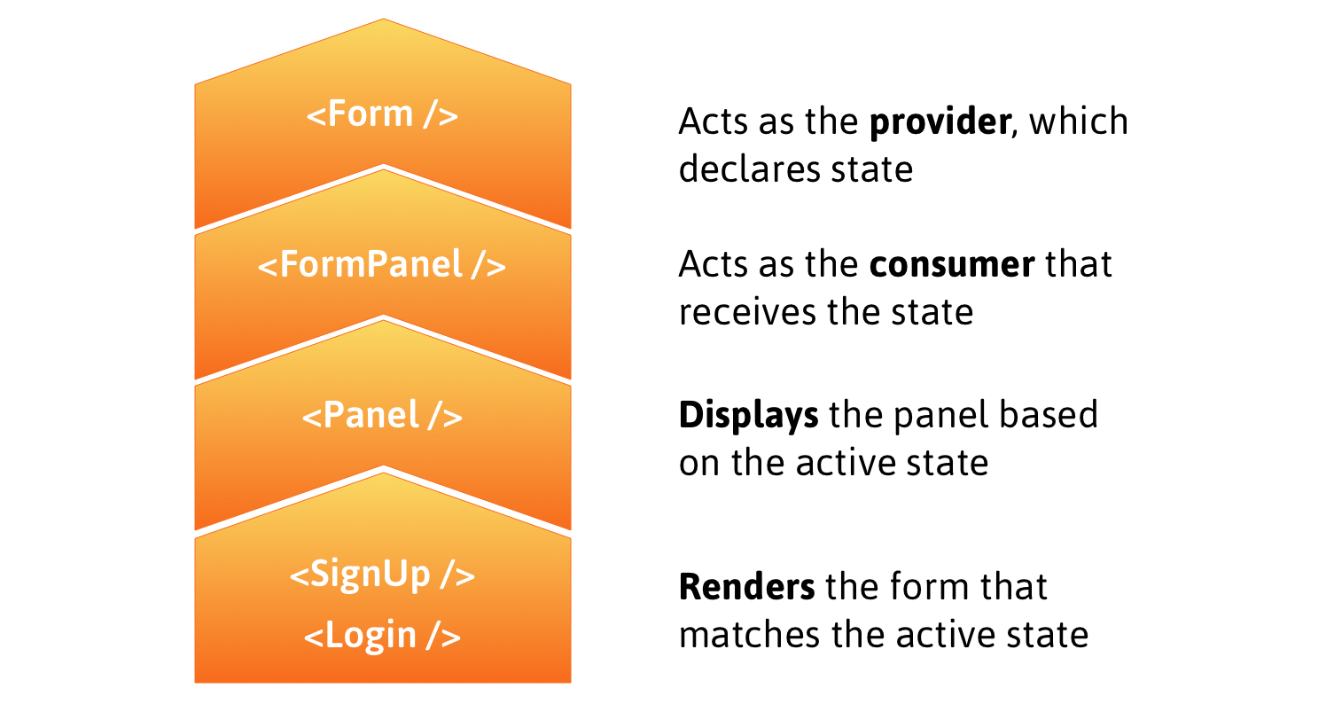
Compound components in React allow you to create components with some form of connected state that’s managed amongst themselves. A good example is the Form component in Semantic UI React.
To see how we can implement compound components in a real-life React application, we’ll build a compound (multi-part) form for login and sign up. The state will be saved in the form component and we’ll put React’s Context AP to use to pass that state and the method from the Context Provider to the component that needs them. The component that needs them? It will become a subscriber to Context Consumers.
Here’s a rough outline that shows how the following steps fit together:
Before treading any further, you may want to brush up on the React Context API if you haven’t already. Neal Fennimore demonstrates the concept in this post and my primer on it is worth checking out as well.
Step 1: Creating context
First, let’s initialize a new context using the React Context API.
The provider, FormProvider, will hold the application state, making it available to components that subscribe to FormConsumer.
Step 2: Implement provider
One panel contains the form to log in and the other contains the form to sign up. In the provider, we want to declare the state, which determines the active panel, i.e. the form currently in display. We’ll also create a method to switch from one panel to another when a heading is clicked.
By default, the login panel will be shown to the user. When the signup panel is clicked, we want to make it the active panel by setting the state of activePanel to signup using the method handlePanelSwitch().
Step 3: Implement Consumers
We’ll use FormConsumer to make context available to the components that subscribe to it. That means the FormPanel component that handles displaying panels will look like this:
To understand what is happening, let’s understand the approach here. The login and signup panels will have unique IDs that get passed via props to the Panel component. When a panel is selected, we get the ID and and use it to set activePanel to swap forms. The FormPanel component also receives the name of the panel via the isActive prop and we then check to see if the returned value is true. If it is, then the panel is rendered!
To get the full context, here is how the App component looks:
You can see how the components are composed when activePanel matches isActive (which is supposed to return true). The component is rendered under those conditions.
With that done, the Login component looks like this:
Ultimately, we want to make the web experience better for many different audiences. People using Microsoft Edge (and potentially other browsers) will experience improved compatibility with all web sites, while getting the best-possible battery life and hardware integration on all kinds of Windows devices. Web developers will have a less-fragmented web platform to test their sites against, ensuring that there are fewer problems and increased satisfaction for users of their sites; and because we’ll continue to provide the Microsoft Edge service-driven understanding of legacy IE-only sites, Corporate IT will have improved compatibility for both old and new web apps in the browser that comes with Windows.
We are making this decision for the long term. We expect our engineers to learn and over time become experts in the Chromium project and grow into active and responsible members of the community. We are eager to increase our contributions to the Chromium project and will continue to maintain any contributions we make.
When seeking improvements in the web platform, our default position will be to contribute. We are focused on delivering a world class browser with Microsoft Edge through its differentiated user experience features and connected services, but where new platform capabilities are concerned, we will seek a ‘rising tide that floats all boats’. We will get started with bug fixes and meaningful contributions in such areas as ARM64 support, accessibility, security, touch input and power enhancements on Windows.
We recognize and will respect the architecture requirements and engineering approach that are intrinsic in web open-source projects and have made Chromium successful. There are many aspects that have governed Chromium OSS and other projects: multi-device support, multi-OS support, rigorous real-time engineering, etc. Although our company has historically had a focus on Windows PCs and we believe we can make contributions that improve browsers on Windows, we also understand that web OSS projects embrace a wide range of device-types, including Android, and that contributions must accommodate this device diversity. We will contribute in a way that is consistent with the architectural design that meets Chromium’s cross-platform and cross-device needs.
We believe the evolution of the open web is best served though the standards communities, and the open web benefits from open debate from a wide variety of perspectives. We will remain deeply and vigorously engaged in the standards discussions in the context of the W3C, ECMA and the WHATWG where the perspectives of vendors developing competing browsers and the larger web community can be heard and considered.
Nothing terribly surprising here. We’re doing this. We think it’ll be good for everybody. I’m slightly surprised they didn’t attempt to answer everyone’s main worry: is the web actually better off with less engine diversity? We’ll never know I guess.
Still no word from the horse’s mouth about the reported EdgeHTML demise, but I hear that’s coming later today. The blog posts are starting to roll in about the possible impact of this though.
Even though Opera, Beaker and Brave are all doing very good work, it is still Chrome engine behind them and that limits the amount of stuff they can build and innovate. It is like as if they were building cars, there is a lot they can do without actually changing the engine itself, and thats what the Web Browsers are becoming, everyone is working on parts of the car but all the engines are now Chrome and believe me, you don’t want all the engines to be the same, not even if they are all Gecko or if somehow we resurrect Presto, we want diversity of engines and not monoculture.
I can understand the logic. Microsoft can’t put as many folks on Edge (including EdgeHTML for rendering and Chakra for JavaScript) as Google has done with Chromium (using Blink for rendering and V8 for JavaScript), so keeping up was always going to be a challenge. Now they can contribute to the same codebase and try to focus on the user-focused features. Whether this gets people to pay more attention to their next browser or not remains to be seen, but I get the thinking behind the move.
The big concern here is we’ve lost another voice from an engine perspective.
Edge is doomed. It was doomed and its next version will be equally doomed from the start. For the simple reason that Microsoft has close to no say in how browsers get installed: on mobile as a default app, and on desktop via web services under the control of Google. Switching to Chromium makes no difference in market share, as the only way to compete now is through the browser’s UI, not via the engine. Which isn’t a competition at all, since browser UI is a commodity.
I’ll link up the official statements as they come out.
This is the second post in a two-part series that looks into the way CSS variables can be used to make the code for complex layouts and interactions less difficult to write and a lot easier to maintain. The first installment walks through various use cases where this technique applies. This post covers the use of fallbacks and invalid values to extend the technique to non-numeric values.
The strategy of using CSS Variables to drive the switching of layouts and interactions that we covered in the first post in this series comes with one major caveat: it only works with numeric values — lengths, percentages, angles, durations, frequencies, unit-less number values and so on. As a result, it can be really frustrating to know that you’re able to switch the computed values of more than ten properties with a single CSS variable, but then you need to explicitly switch the non-numeric values of properties like flex-direction or text-align from row to column or from left to right or the other way around.
One example would be the one below, where the text-align property depends on parity and the flex-direction depends on whether we are viewing the front end in the wide screen scenario or not.
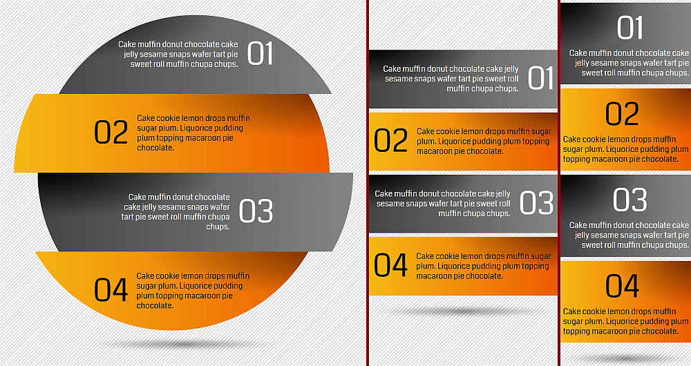
Screenshot collage.
I complained about this and got a very interesting suggestion in return that makes use of CSS variable fallbacks and invalid values. It was interesting and gives us something new to work with, so let’s start with a short recap of what these are and go from there!
Fallback values
The fallback value of a CSS variable is the second and optional argument of the var() function. For example, let’s consider we have some .box elements whose background is set to a variable of --c:
.box { background: var(--c, #ccc) }
If we haven’t explicitly specified a value for the --c variable elsewhere, then the fallback value #ccc is used.
Now let’s say some of these boxes have a class of .special. Here, we can specify --c as being some kind of orange:
.special { --c: #f90 }
This way, the boxes with this .special class have an orange background, while the others use the light grey fallback.
First off, the fallback can be another CSS variable, which can have a CSS variable fallback itself and… we can fall down a really deep rabbit hole this way!
Secondly, a comma separated list is a perfectly valid fallback value. In fact, everything specified after the first comma inside the var() function constitutes the fallback value, as seen in the example below:
And last, but certainly not least, we can have different fallback values for the same variable used in different places, as illustrated by this example:
First off, I want to clarify what I mean by this. “Invalid values” is shorter and easier to remember, but what it really refers to any value that makes a declaration invalid at computed value time.
For example, consider the following piece of code:
--c: 1em;
background: var(--c)
1em is a valid length value, but this is not a valid value for the background-color property, so here this property will take its initial value (which is transparent) instead.
Putting it all together
Let’s say we have a bunch of paragraphs where we change the lightness of the color value to switch between black and white based on parity (as explained in the previous post in this series):
p {
  --i: 0;
  /* for --i: 0 (odd), the lightness is 0*100% = 0% (black)
   * for --i: 1 (even), the lightness is 1*100% = 100% (white)* /
  color: hsl(0, 0%, calc(var(--i)*100%));

  &:nth-child(2n) { --i: 1 }
}
We also want the odd paragraphs to be right-aligned, while keeping the even ones left-aligned. In order to achieve this, we introduce a --parity variable which we don’t set explicitly in the general case — only for even items. What we do set in the general case is our previous variable, --i. We set it to the value of --parity with a fallback of 0:
So far, this achieves exactly the same as the previous version of our code. However, if we take advantage of the fact that, we can use different fallback values in different places for the same variable, then we can also set text-align to the value of --parity using a fallback of… right!
text-align: var(--parity, right)
In the general case, where we’re not setting --parity explicitly; text-align uses the fallback right, which is a valid value, so we have right alignment. For the even items however, we’re setting --parity explicitly to 1, which is not a valid value for text-align. That means text-align reverts to its initial value, which is left.
We set a switch --i that changes value with the parity — it’s 0 for the odd items and 1 for the even ones.
p {
  /* same code as before */
  --i: 0;

  &:nth-child(2n) { --i: 1 }
}
Next, we want the numbering to be on the left for the odd items and on the right for the even ones. We achieve this via the order property. The initial value for this property is 0, for both the :before pseudo-element and the paragraph’s text content. If we set this order property to 1 for the numbering (the :before pseudo-element) of the even elements, then this moves the numbering after the content.
p {
  /* same code as before */
  --i: 0;

  &:before {
    /* same code as before */
    /* we don't really need to set order explicitly as 0 is the initial value */
    order: 0;
  }

  &:nth-child(2n) {
    --i: 1;

    &:before { order: 1 }
  }
}
You may notice that, in this case, the order value is the same as the switch --i value, so in order to simplify things, we set the order to the switch value.
p {
  /* same code as before */
  --i: 0;

  &:before {
    /* same code as before */
    order: var(--i)
  }

  &:nth-child(2n) { --i: 1 }
}
Now we want a bit of spacing (let’s say $gap) in between the numbers and the paragraph text. This can be achieved with a lateral margin on the :before.
For the odd items, the item numbers are on the left, so we need a non-zero margin-right. For the even items, the item numbers are on the right, so we need a non-zero margin-left.
When the parity switch value is 0 for the odd items, the left margin is 0 = 0*$gap, while the right margin is $gap = 1*$gap = (1 - 0)*$gap.
Similarly for the even items, when the parity switch value is 1, the left margin is $gap = 1*$gap, while the right margin is 0 = 0*$gap = (1 - 1)*$gap.
The result in both cases is that margin-left is the parity switch value times the margin value ($gap), while margin-right is 1 minus the parity switch value, all multiplied with the margin value.
$gap: .75em;

p {
  /* same code as before */
  --i: 0;

  &:before {
    /* same code as before */
    margin:
      0                            /* top */
      calc((1 - var(--i))*#{$gap}) /* right */
      0                            /* bottom */
      calc(var(--i)*#{$gap})       /* left */;
  }

  &:nth-child(2n) { --i: 1 }
}
If we use the complementary value (1 - var(--i)) in more than one place, then it’s probably best to set it to another CSS variable --j.
$gap: .75em;

p {
  /* same code as before */
  --i: 0;
  --j: calc(1 - var(--i));

  &:before {
    /* same code as before */
    margin:
      0                      /* top */
      calc(var(--j)*#{$gap}) /* right */
      0                      /* bottom */
      calc(var(--i)*#{$gap}) /* left */;
  }

  &:nth-child(2n) { --i: 1 }
}
Next, we want to give these items a proper background. This is a grey to orange gradient, going from left to right (or along a 90deg angle) in the case of odd items (parity switch --i: 0) and from right to left (at a -90deg angle) in the case of even items (parity switch --i: 1).
This means the absolute value of the gradient angle is the same (90deg), only the sign is different — it’s +1 for the odd items (--i: 0) and -1 for the even items (--i: 1).
In order to switch the sign, we use the approach we covered in the first post:
/*
 * for --i: 0, we have 1 - 2*0 = 1 - 0 = +1
 * for --i: 1, we have 1 - 2*1 = 1 - 2 = -1
 */
--s: calc(1 - 2*var(--i))
This way, our code becomes:
p {
  /* same code as before */
  --i: 0;
  --s: calc(1 - 2*var(--i));
  background: linear-gradient(calc(var(--s)*90deg), #ccc, #f90);

  &:nth-child(2n) { --i: 1 }
}
We can also remove the dummy outline since we don’t need it at this point:
Next, we do something similar for the transform property.
The odd items are translated a bit to the right (in the positive direction of the x axis) and rotated a bit in the clockwise (positive) direction, while the even items are translated a bit to the left (in the negative direction of the x axis) and rotated a bit in the other (negative) direction.
The translation and rotation amounts are the same; only the signs differ.
For the odd items, the transform chain is:
translate(10%) rotate(5deg)
While for the even items, we have:
translate(-10%) rotate(-5deg)
Using our sign --s variable, the unified code is:
p {
  /* same code as before */
  --i: 0;
  --s: calc(1 - 2*var(--i));
  transform: translate(calc(var(--s)*10%))
             rotate(calc(var(--s)*5deg));

  &:nth-child(2n) { --i: 1 }
}
The next step is to round the card corners. For the odd cards, we want the corners on the left side to be rounded to a radius of half the height. For the even items, we want the corners on the right side to be rounded to the same radius.
Given we don’t know the heights of our cards, we just use a ridiculously large value, say something like 50vh, which gets scaled down to fit due to the way border-radius works. In our case, this means scaled down to whichever is smaller between half the item height (since going vertically has both a top and bottom rounded corner on the same side) and the full item width (since going horizontally has one rounded corner; either on the left or on the right, but not on both the right and the left).
This means we want the corners on the left to have this radius ($r: 50vh) for odd items (--i: 0) and the ones on the right to have the same radius for even items (--i: 1). As a result, we do something pretty similar to the numbering margin case:
$r: 50vh;

p {
  /* same code as before */
  --i: 0;
  --j: calc(1 - var(--i));
  --r0: calc(var(--j)*#{$r});
  --r1: calc(var(--i)*#{$r});
  /* clockwise from the top left */
  border-radius: var(--r0) /* top left */
                 var(--r1) /* top right */
                 var(--r1) /* bottom right */
                 var(--r0) /* bottom left */;

  &:nth-child(2n) { --i: 1 }
}
Now comes the truly interesting part — text alignment! We want the text in the odd items to be aligned right, while the text in the even items is aligned left. The only problem is that text-align doesn’t take a number value so, no addition or multiplication tricks can help us here.
What can help is combining the use of fallback and invalid values for CSS variables. To do this, we introduce another parity variable --p and it’s this variable that we actually set to 1 for even items. Unlike --i before, we never set --p explicitly for the general case as we want different fallback values of this variable to be used for different properties.
As for --i, we set it to --p with a fallback value of 0. This fallback value of 0 is the value that actually gets used in the general case, since we never explicitly set --p there. For the even case, where we explicitly set --p to 1, --i becomes 1 as well.
At the same time, we set the text-align property to --p with a fallback value of right in the general case. In the even case, where we have --p explicitly set to 1, the text-align value becomes invalid (because we have set text-align to the value of --p and --p is now 1, which is not a valid value for text-align), so the text reverts to being aligned to the left.
p {
  /* same code as before */
  --i: var(--p, 0);
  text-align: var(--p, right);

  &:nth-child(2n) { --p: 1 }
}
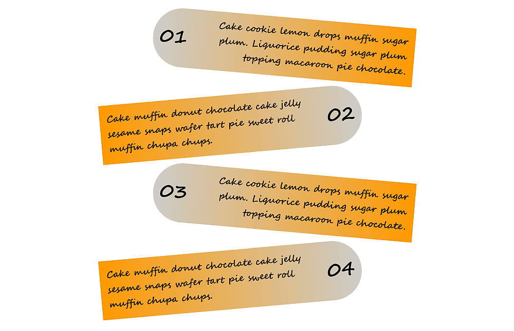
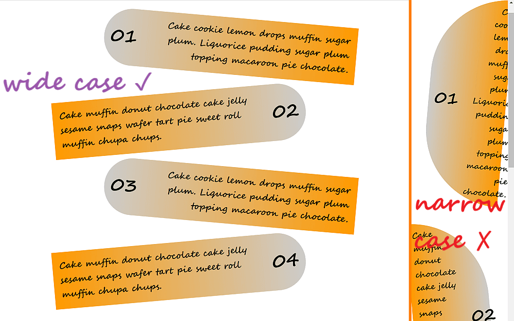
While our cards example looks great on wider screens, the same can’t be said when shrink things down.
The wide screen result (left) vs. the narrow screen result (right)
In order to fix this, we introduce two more custom properties, --wide and --k to switch between the wide and narrow cases. We set --k to --wide with a fallback value of 0 in the general case and then set --wide to 1 if the viewport width is anything 340px and up.
p {
  /* same code as before */
  --k: var(--wide, 0);

  @media (min-width: 340px) { --wide: 1 }
}
Since we only want our items to be transformed and have rounded corners in the wide case, we multiply the translation, rotation and radius values by --k (which is 0, unless the viewport is wide, which switches its value to 1).
p {
  /* same code as before */
  --k: var(--wide, 0);
  --r0: calc(var(--k)*var(--j)*#{$r});
  --r1: calc(var(--k)*var(--i)*#{$r});
  border-radius: var(--r0) /* top left */
                 var(--r1) /* top right */
                 var(--r1) /* bottom right */
                 var(--r0) /* bottom left */;
  transform: translate(calc(var(--k)*var(--s)*10%))
             rotate(calc(var(--k)*var(--s)*5deg));

  @media (min-width: 340px) { --wide: 1 }
}
This is slightly better, but our content still overflows in narrow viewports. We can fix this by only placing the numbering (the :before pseudo-element) on the left or right side only in the wide case then moving it above the card in the narrow case.
In order to do this, we multiply both its order and its lateral margin values by --k (which is 1 in the wide case and 0 otherwise).
We also set flex-direction to --wide with a fallback value of column.
This means the flex-direction value is column in the general case (since we haven’t set --wide explicitly elsewhere). However, if the viewport is wide (min-width: 340px), then our --wide variable gets set to 1. But 1 is an invalid value for flex-direction, so this property reverts back to its initial value of row.
p {
  /* same code as before */
  --k: var(--wide, 0);
  flex-direction: var(--wide, column);

  &:before {
    /* same code as before */
    order: calc(var(--k)*var(--i));
    margin:
      0                               /* top */
      calc(var(--k)*var(--j)*#{$gap}) /* right */
      0                               /* bottom */
      calc(var(--k)*var(--i)*#{$gap}) /* left */;
  }

  @media (min-width: 340px) { --wide: 1 }
}
Coupled with setting a min-width of 160px on the body, we’ve now eliminated the overflow issue:
One more thing we can do is tweak the font-size so that it also depends on --k:
p {
  /* same code as before */
  --k: var(--wide, 0);
  font: 900 calc(var(--k)*.5em + .75em) cursive;

  @media (min-width: 340px) { --wide: 1 }
}
And that’s it, our demo is now nicely responsive!
Responsive cards, font smaller for narrow screens and with no overflow (live demo).
A few more quick examples!
Let’s look at a few more demos that use the same technique, but quickly without building them from scratch. We’ll merely go through the basic ideas behind them.
Just like the cards example we completed together, we can use a :before pseudo-element for the numbering and a flex layout on the paragraphs. The sliced disc effect is achieved using clip-path.
The paragraph elements themselves — the horizontal offsets, the position and intensity of the radial-gradient() creating the shadow effect, the direction of the linear-gradient() and the saturation of its stops, the color and the text alignment — all depend on the --parity variable.
For the numbering (the :before pseudo-elements of the paragraphs), we have that both the margin and the order depend on the --parity in the exact same way as the cards example.
If the viewport width is smaller than the disc diameter $d plus twice the horizontal slice offset in absolute value $x, then we’re not in the --wide case anymore. This affects the width, padding and margin of our paragraphs, as well as their horizontal offset and their shape (because we don’t clip them to get the sliced disc effect at that point).
body {
  /* other styles not relevant here */
  --i: var(--wide, 1);
  --j: calc(1 - var(--i));

  @media (max-width: $d + 2*$x) { --wide: 0 }
}

p {
  /* other styles not relevant here */
  margin: calc(var(--j)*.25em) 0;
  padding:
    calc(var(--i)*#{.5*$r}/var(--n) + var(--j)*5vw) /* vertical */
    calc(var(--i)*#{.5*$r} + var(--j)*2vw) /* horizontal */;
  width: calc(var(--i)*#{$d} /* wide */ +
              var(--j)*100% /* not wide */);
  transform: translate((calc(var(--i)*var(--s)*#{-$x})));
  clip-path:
    var(--wide,

      /* fallback, used in the wide case only */
      circle($r at 50% calc((.5*var(--n) - var(--idx))*#{$d}/var(--n))));
}
We’re in the narrow case below 270px and have a flex-direction of column on our paragraphs. We also zero out both the lateral margins and the order for the numbering.
body {
  /* other styles not relevant here */
  --k: calc(1 - var(--narr, 1));

  @media (min-width: 270px) { --narr: 0 }
}

p {
  /* other styles not relevant here */
  flex-direction: var(--narr, column);

  &:before {
    /* other styles not relevant here */
    margin:
      0                             /* top */
      calc(var(--k)*var(--q)*.25em) /* right */
      0                             /* bottom */
      calc(var(--k)*var(--p)*.25em) /* left */;
    order: calc(var(--k)*var(--p));
  }
}
This works pretty much the same as the previous two examples. We have a flex layout on our paragraphs using a column direction in the narrow case. We also have a smaller font-size in that same case:
body {
  /* other styles not relevant here */
  --k: var(--narr, 1);

  @media (min-width: 400px) { --narr: 0 }
}

p {
  /* other styles not relevant here */
  flex-direction: var(--narr, column);
  font-size: calc((1.25 - .375*var(--k))*1em);
}
The parity determines each paragraph’s text alignment, which lateral border gets a non-zero value, and the position and direction of the border gradient. Both the parity and whether we’re in the wide screen case or not determine the lateral margins and paddings.
body {
  /* other styles not relevant here */
  --i: var(--wide, 1);
  --j: calc(1 - var(--i));

  @media (max-width: $bar-w + .5*$bar-h) { --wide: 0 }
}

p {
  /* other styles not relevant here */
  margin:
    .5em                                 /* top */
    calc(var(--i)*var(--p)*#{.5*$bar-h}) /* right */
    0                                    /* bottom */
    calc(var(--i)*var(--q)*#{.5*$bar-h}) /* left */;
  border-width:
    0                        /* top */
    calc(var(--q)*#{$bar-b}) /* right */
    0                        /* bottom */
    calc(var(--p)*#{$bar-b}) /* left */;
  padding:
    $bar-p                                         /* top */
    calc((var(--j) + var(--i)*var(--q))*#{$bar-p}) /* right */
    $bar-p                                         /* bottom */
    calc((var(--j) + var(--i)*var(--p))*#{$bar-p}) /* left */;
  background:
    linear-gradient(#fcfcfc, gainsboro) padding-box,
    linear-gradient(calc(var(--s)*90deg), var(--c0), var(--c1))
      calc(var(--q)*100%) /* background-position */ /
      #{$bar-b} 100% /* background-size */;
  text-align: var(--parity, right);
}
The icon is created using the :before pseudo-element, and its order depends on the parity, but only if we’re not in the narrow screen scenario — in which case it’s always before the actual text content of the paragraph. Its lateral margin depends both on the parity and whether we are in the wide screen case or not. The big-valued component that positions it half out of its parent paragraph is only present in the wide screen case. The font-size also depends on whether we’re in the narrow screen case or not (and this influences its em dimensions and padding).
order: calc((1 - var(--k))*var(--p));
margin:
  0                                                          /* top */
  calc(var(--i)*var(--p)*#{-.5*$ico-d} + var(--q)*#{$bar-p}) /* right */
  0                                                          /* bottom */
  calc(var(--i)*var(--q)*#{-.5*$ico-d} + var(--p)*#{$bar-p}) /* left */;
font-size: calc(#{$ico-s}/(1 + var(--k)));
The ring is created using an absolutely positioned :after pseudo-element (and its placement depends on parity), but only for the wide screen case.
content: var(--wide, '');
The two-dimension case
Screenshot collage (live demo, no Edge support due to CSS variable and calc() bugs).
Here we have a bunch of article elements, each containing a heading. Let’s check out the most interesting aspects of how this responsive layout works!
On each article, we have a two-dimensional layout (grid) — but only if we’re not in the narrow screen scenario (--narr: 1), in which case we fall back on the normal document flow with the numbering created using a :before pseudo-element, followed by the heading, followed by the actual text. In this situation, we also add vertical padding on the heading since we don’t have the grid gaps anymore and we don’t want things to get too crammed.
html {
  --k: var(--narr, 0);

  @media (max-width: 250px) { --narr: 1 }
}

article {
  /* other styles irrelevant here */
  display: var(--narr, grid);
}

h3 {
  /* other styles irrelevant here */
  padding: calc(var(--k)*#{$hd3-p-narr}) 0;
}
For the grid, we create two columns of widths depending both on parity and on whether we’re in the wide screen scenario. We make the numbering (the :before pseudo-element) span two rows in the wide screen case, either on the second column or the first, depending on the parity. If we’re not in the wide screen case, then the paragraph spans both columns on the second row.
We set the grid-auto-flow to column dense in the wide screen scenario, letting it revert to the initial value of row otherwise. Since our article elements are wider than the combined widths of the columns and the column gap between them, we use place-content to position the actual grid columns inside at the right or left end depending on parity.
Finally, we place the heading at the end or start of the column, depending on parity, and we as well as the paragraph’s text alignment if we’re in the wide screen scenario.
We also have numerical values such as grid gaps, border radii, paddings, font-sizes, gradient directions, rotation and translation directions depending on the parity and/or whether we’re in the wide screen scenario or not.
Even more examples!
If you want more of this, I’ve created an entire collection of similar responsive demos for you to enjoy!
 , kids. If you find an idea you like and want to adapt to your own site, remember to implement it responsibly.
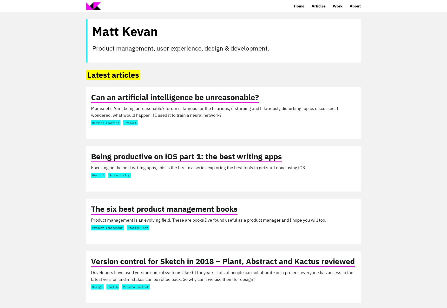


