Descendent selectors are && logic and commas are ||. It just gets more complicated from there, with things like combinators and pseudo selectors. Just look at all the ways styles can cascade.
Jeremy Keith:
If you find you can’t select something in the CSS, that’s a sign that you probably need to add another class name to the HTML. The complexity is confined to the markup in order to keep the CSS more straightforward, modular, and maintainable.
You know how valuable project management is for teams of any size. Whether you’re a small shop or full-blown agency, your clients and projects depend on tracked deliverables, solid communication, and a clear breakdown of the work that’s needed.
You may have a love/hate relationship with whatever project management platform you’re using or have used in the past. It’s common for a platform to be missing that one feature you really need that would make the tool so much better and your work that much easier. But you can’t throw the baby out with the bathwater and ditch project management altogether, right?
What separates monday.com from any other project management tool is the way it humanizes your team and connects each person to the project, rather than treating folks like resources. It sets up a workflow that encourages collaboration and transparency so that no one is left out of the process, every one has a voice, and each person is truly contributing to the big picture and greater good of a project.
Speaking of collaboration and transparency, you can upload your project files directly into monday.com so everyone has easy access to the assets they need to get work done. And, if you’re already using other services like Slack, Google Calendar, Dropbox, Microsoft Excel, Trello, and Jira, there are clean shortcuts to integrate them right in without hassle. Imagine that — one place for everything!
Oh, and you can use monday.com for client-facing exchanges. That means all your messages are consolidated into a single place so that nothing slips through the cracks. No more digging for some lost email or using Reply All on an email chain. It’s all right there so you, your team and your clients are all on the same page.
There’s a whole lot more monday.com can do, from task lists and timelines to news feeds and financial reporting, but the real proof comes in using it yourself. Try monday.com for free with no risk and zero commitment. You’ll be glad you did.
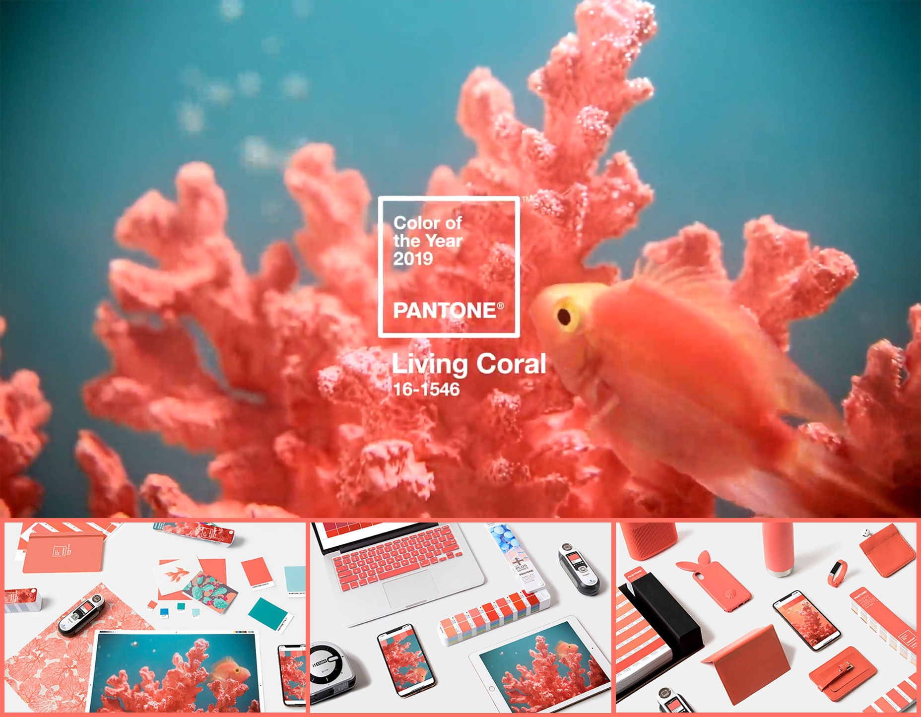
Pantone’s annual quest to dominate the “and finally…” portion of the pre-festive news has kicked off, with the announcement of its Color of the Year for 2019.
The official selection for the coming year is Living Coral, or specifically 16-1546 (that’s #FF6F61 to you and me).
Pantone’s announcement always sets the color agenda for the following 12 months. After all, in 2018 we’ve seen nothing but Ultra Violet color schemes; in 2017 everything was Green; and way back in 2016 everything was Rose Quartz and the Other One. Not true, you say? You’re probably right.
In reality, the designers most affected by Pantone’s announcement are those who were already using Living Coral, or something close, and will now redo their work for fear of appearing to slavishly follow fashion.
The irony from a designer’s point of view is that colors don’t operate in isolation, it’s their combinations that are beautiful, impactful, or communicative.
From a business point of view, what matters is not the substance of your choice, but the choice itself—and of course the way that choice is publicized. Pantone, with its annual press release and its PR friendly choice of color, is (re)establishing itself as the definitive authority on color. It’s a very, very smart strategy. How long before Adobe announces its font of the year, or WordPress announces its plugin of the year.
So what is the significance of Pantone’s selection? Certainly the name is significant; with record levels of coral dying out, the probable loss of the Great Barrier Reef, and whole islands of trash appearing in the Pacific, it’s high time we showed our oceans some love.
With the end of the year quickly approaching, everyone is chiming in with predictions for 2019 web design trends. For the most part, I think these predictions look quite similar to the ones made for 2018 — which is surprising.
As we move deeper into the mobile-first territory, we can’t adhere to the same predictions that made sense for websites viewed on desktop. We, of course, can’t forget about the desktop experience, but it needs to take a backseat to mobile. This is why I wish 2019 predictions (and beyond) would be more practical in nature.
We need to design websites primarily with mobile users in mind, which means having a more efficient system of content delivery. Rather than spend the next year or so adding more design techniques to our repertoire, maybe we should be taking some away?
“The ability to simplify means to eliminate the unnecessary so that the necessary may speak.”
So, today, I’m going to talk about the mobile design elements we’ve held onto for a little too long and what you should do about them going forward.
Why Do We Need To Get Rid Of Mobile Design Elements In 2019?
Although responsive design and minimalism have inched us closer to the desired effect of mobile first I don’t think it’s taken us as far as we can go. And part of that is because we’re reticent to let go of design elements that have been with us for a long time. They might seem essential, but I suspect that many of them can be removed from websites without harming the experience.
This is why: On desktop, there’s a lot of room to play with. Even if you don’t populate every inch of the screen with content, you find creative ways to use the space. With mobile, you’ve drastically reduced the real estate. One of the biggest side effects of this is the amount of scrolling that mobile visitors have to do.
Why does this matter?
A 2018 study from the Nielsen Norman Group on scrolling and attention demonstrates that many users (57%) don’t mind scrolling past the above-the-fold line. That said, 74% of all viewing time occurs within the first two screenfuls.
If you try to fit all of those extraneous design elements from the traditional desktop experience into the mobile one, there’s a good chance your visitors won’t ever encounter them.
Although a longer scroll on mobile might be easy enough to execute, you might also find your visitors suffer from scrolling fatigue. My suggestion is to delete design elements on mobile that create excessive scrolls and, consequently, test visitors’ patience.
4 Mobile Design Elements You Should Ditch In 2019
If we’re not going to drastically change web design trends from 2018 to 2019, then I think now is a great time to clean up the mobile web experience. If you’re looking to increase times spent on site as well as your conversion rates, creating a sleeker and more efficient experience would greatly improve your mobile web designs.
In order to explain which mobile design elements you should ditch this year, I’m going to pit the desktop and mobile experiences against one another. This way you get a sense for why you need to say goodbye to it on mobile.
1. Sidebars
A sidebar has been a handy web design element for blogs and other news authorities for a long time. However, with responsive and mobile-first design taking over, the sidebar tends just to get shoved at the very bottom of blog posts now. But is that the best place for it?
The Blonde Abroad is an example of one that puts most of the sidebar content into the bottom of a post.
Note that this isn’t the end of the sidebar either. There are a number of other widgets below the ones shown in this screenshot. Which is why the mobile counterpart runs on way too long for this website:
What you’re seeing here isn’t a cool social media-centric page. This is what mobile users find after they scroll past:
Ads,
A promotion of her web store,
Recommended/related posts,
A subscriber form,
A comment form.
The Instagram feed then shows up, followed by the subscriber form once again! All in all, it takes about half of the page’s scrolls to get to the end of the content. The rest of the page is then filled with self-promotional material. It’s just way too much.
If Instagram is that prominent of a platform for her, she should have a link to it in the header. I would also suggest cutting back on the number of forms on the mobile web pages. Three forms (two of which are duplicates) is excessive. And I’d also probably recommend turning the recommended posts with images and titles into plain text links.
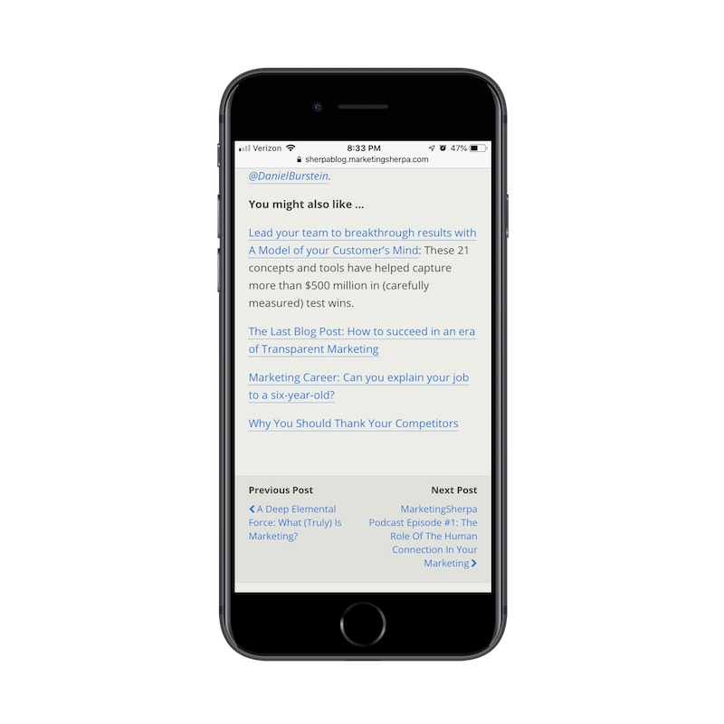
An example of an authority site that handles sidebars well is the MarketingSherpa blog. As you can see here, there is a fairly dense sidebar included in the desktop experience.
Below each post on the blog, you’ll find a succinct list of links recommended by the author. There is also a Previous/Next widget that enables readers to quickly move to the next published post. It’s a great way to keep readers moving through the site without having to make a mobile web page unnecessarily long.
2. Modal Pop-ups
I know that mobile pop-ups aren’t dying, at least so far as Google is concerned. But intrusive pop-ups aside, does the traditional pop-up have a place on mobile anymore? If we’re really thinking about ways to optimize the user experience, wouldn’t it make sense to do away with the modal altogether?
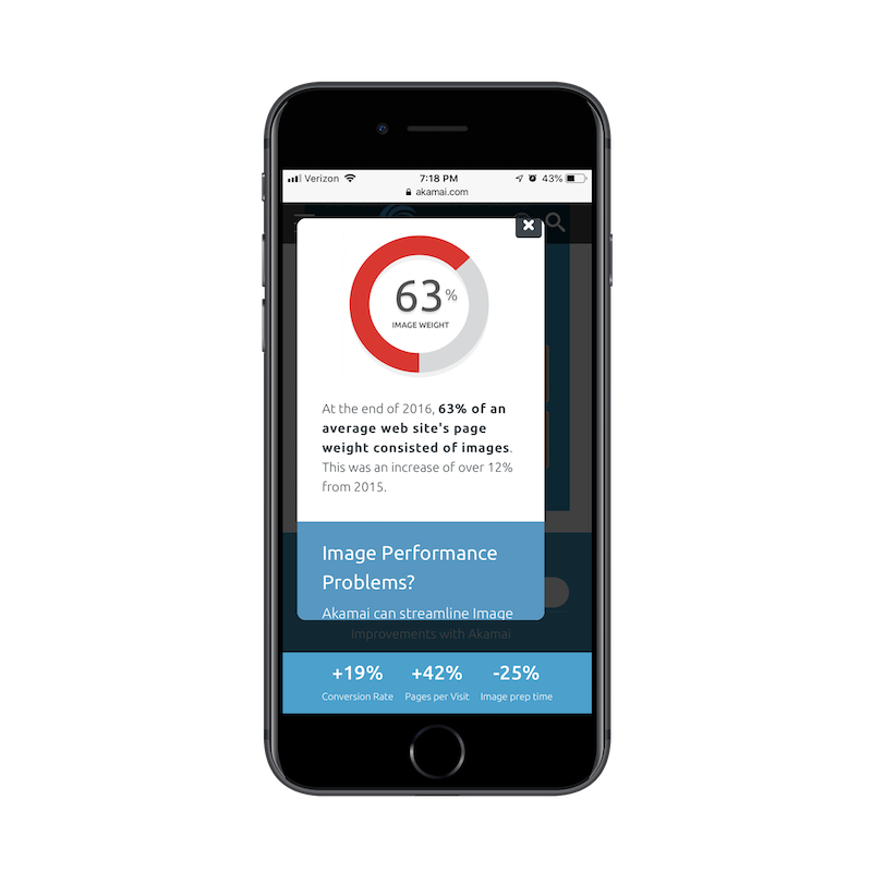
Here’s an example from Akamai that I’m shocked even exists:
The top of a mobile pop-up on the Akamai website (Source: Akamai) (Large preview)
While perusing one of the internal pages of the mobile site, this pop-up appeared on my screen. At first, I thought, “Oh, cool! A pop-up with a graphic and statistic.” But then I read it and realized it was a scrolling pop-up!
The bottom of a mobile pop-up on the Akamai website (Source: Akamai) (Large preview)
I’m honestly not sure I’ve seen one of these before, but I think it’s the perfect example of why modal mobile pop-ups are never a great idea. In addition to blocking the content of the site almost completely, the pop-up requires the visitor to do work in order to see the whole message.
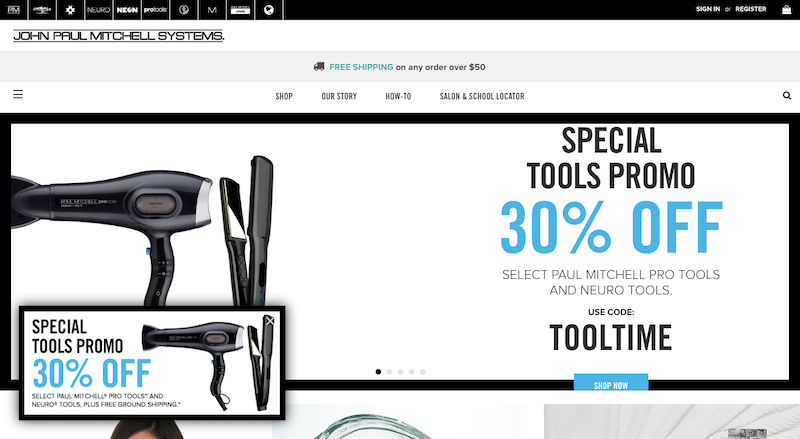
I ran into another example of a bad pop-up. This one is on the Paul Mitchell website:
I thought it was an odd choice to place the same promotion in both the pop-up and the scrolling hero image. This one, however, is easy enough to dismiss since it’s clear what is the pop-up and what is the image.
On mobile, it’s not that easy to distinguish:
A confusing duplication of a mobile ad or pop-up on the Paul Mitchell site (Source: Paul Mitchell) (Large preview)
If I hadn’t seen the matching pop-up on desktop, I likely would’ve thought this web page had an error upon first seeing the duplication. It also doesn’t help that the hero banner now has an arrow icon in a black box, which could easily be confused for the “X” that closes out the matching pop-up.
It’s a very odd design choice and one I’d tell everyone else to stay away from. Not only does the pop-up appear instantly on the home page (which is a no-no), but it creates a confusing first impression. It might not be the traditional modal, but it still looks bad.
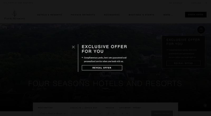
Switching gears, the Four Seasons website does a very nice job of handling its pop-ups. Here is the desktop pop-up widget:
Click on the pop-up, and it will open a full-screen pop-up offer. This is a nice touch as it gives the visitor full control over whether they want to see the pop-up or not.
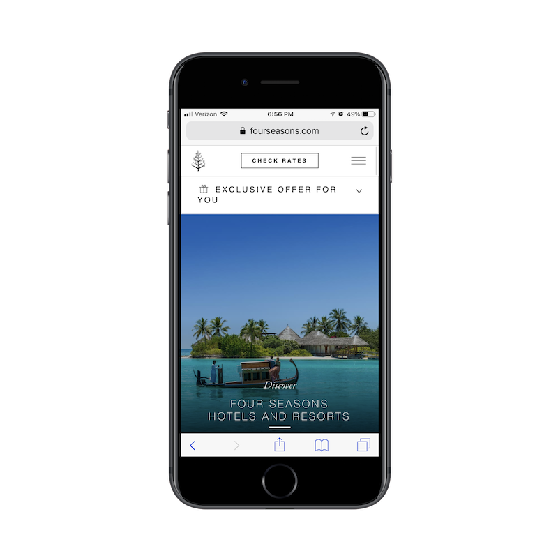
The mobile pop-up counterpart does something similar:
An interactive pop-up offer appears on the Four Seasons mobile site (Source: Four Seasons) (Large preview)
The pop-up offer sits snug against the header, never intruding on the experience of the mobile site.
An interactive pop-up offer expands on the Four Seasons mobile site (Source: Four Seasons) (Large preview)
Even once the pop-up is clicked, it never blocks the mobile website from view. It only pushes the content down further on the page. It’s simply designed, easy to follow and gives all of the control over to the mobile user in terms of engagement. It’s a great design choice and one I’d like to see more mobile designers use when designing pop-up elements going forward.
3. Sticky Side Elements
I think a sticky navigation bar or bottom bar on a mobile website is a brilliant idea. As we’ve already seen, visitors are willing to scroll on a website. But visitors are more likely to scroll further down a page if they have an easy way to go somewhere else — to another page, to check out, to a special discount offer, etc.
That said, I’m not a fan of sticky elements on the side of mobile websites. On desktop, they work well. They’re typically tiny icons or widgets that stick to the side or bottom corner of the site. They’re boldly colored, easy to recognize and give visitors the choice of interacting when they’re ready.
On mobile, however, sticky side elements are a bad idea.
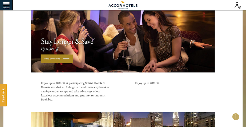
Let’s take a look at the Sofitel website, for example.
Feedback widget sticks to side of Sofitel desktop site (Source: Sofitel) (Large preview)
As you can see, there’s an orange “Feedback” button stuck to the left side of the screen. As you scroll down the page, it remains put, making it convenient for visitors to drop the developer a line if something goes wrong.
Here’s how that same button appears on mobile:
Feedback widget covers content on Sofitel mobile site (Source: Sofitel) (Large preview)
Although the “Feedback” button is not always blocking content, there are occasions where it overlaps an image or text as a user scrolls. It might seem like a minor inconvenience, but it could easily be what takes a visitor from feeling annoyed or frustrated with a website to feeling completely over it.
Wreaths Across America is another example of a sticky element getting in the way. On desktop, the blue live chat widget is well-placed.
If your visitors aren’t actively engaging with live chat or other sticky side elements on mobile (and your statistics should tell you this), don’t leave them there. Or, at the very least, present an easy way to dismiss them.
One way to get around the sticky overlap issue is the solution BuzzFeed has chosen.
In recent years, many websites utilized floating and sticky social media icons. It was a logical choice as you never knew how long it would take for readers to decide that they just had to share your web page or post with their social media connections.
BuzzFeed sticks social media and sharing icons to the bottom of the screen (Source: BuzzFeed) (Large preview)
As we’ve seen with the live chat and Feedback widgets above, elements that stick to the side of the screen just don’t work on mobile. Instead, we should look to what BuzzFeed has done here and make those icons stick flush with the bottom of the screen.
We already know that sticky navigation and bottom bars stay out of the way of content, so let’s use these key areas of the mobile device to place sticky elements we want people to engage with.
4. Content
It’s not just these extraneous design elements or outliers that you should think about removing on the mobile experience. I believe there are times when content itself doesn’t need to be there.
If you want to get visitors to the crux of your message in just a few scrolls, you can’t be afraid to cut out content that isn’t 100% necessary.
I think ads are one of the worst offenders of this. TechRepublic has a particularly nasty example of this — both for desktop and mobile.
This is what the TechRepublic desktop website looks when you first visit it. That alone is horrendous. Why does anyone use ad banners above the header anymore? And why does this one have to be so large in size? Shouldn’t TechRepublic’s logo and navigation be the first thing people see?
It was my hope that, upon visiting the mobile site, the ad would’ve gone away. Sadly, that wasn’t the case.
What we have here is a Best Buy ad that takes up roughly a third of the TechRepublic mobile home page. Sure, once a visitor scrolls down, it will go away. But where do you think visitors’ eyes will go to first? I’m willing to bet some of them will see the logo in the top left and wonder how the heck they ended up on the Best Buy website.
This is one of those times when it’s best to rethink your monetization strategy if it’s going to intrude and confuse the mobile user’s experience.
Now, let’s look at the good.
Kohl’s has a pretty standard product page for an e-commerce website:
Instead of trying to make room for them, the different product views are hidden under a slider. This is a nice choice if you would prefer not to compromise on how much content is displayed — especially if it’s essential to selling the product.
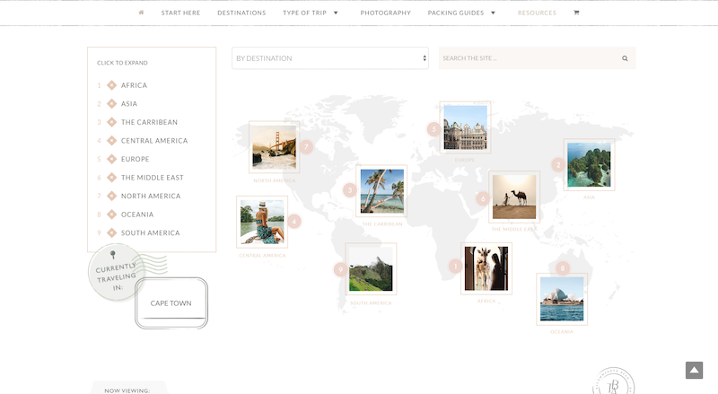
Another great example of picking and choosing your battles when it comes to displaying content on mobile comes from The Blonde Abroad.
Readers of her blog can choose content based on the global destination, as shown here on the desktop website:
While mobile readers might miss out on the mapped content, this provides a much more streamlined experience. Mobile users don’t want to have to scroll left and right, up and down, in order to search for content from an oversized graphic. At its core, this section of the site is about search. And, on mobile, this clean presentation of search options is enough to impress readers and inspire them to read more.
Wrapping Up
In Stephen King’s guide to writing, On Writing, he says something to this extent:
“Create your content. Then, review it and delete 10% of what you created.”
Granted, this applies to writing a story, but I believe this same logic applies to the designing of a mobile website. In other words: Why test your visitors’ patience — or even worse — create too cumbersome of an experience that they miss the most important parts of it? Go ahead and translate the idea you had for the traditional desktop landscape into a mobile setting. Then, review it on mobile and gut all of the unnecessary bits of content or design elements.
(This article is kindly sponsored by Adobe.) You are working on a project for your client, designing the interface for a new application. There have been lots of meetings about the new product, and now it’s time for you to start working on sketching and prototyping a design.
The screens, pages, and forms you are about to create have to fit within the desires and constraints of several players — the marketing department, the developers, the business owner. Some questions start to form as you work on the interface:
“How creative should I be/am I expected to be with this design? Is my role to implement the vision that someone else has come up with? Should I be taking the ideas and constraints and creating my own vision? How much can I stray from the ideas I’ve been given?”
You speak to your main contact on the project and she says:
“Go for it, be creative. Let’s see what you come up with.”
You’re excited to be given a free hand, but now you have to figure out what does it mean to be creative with UX design and how do you go about “being creative”? Is creativity something you can just turn on? Is it a process you go do? Are some people just creative and others aren’t? And if so, which one are you?
Let’s explore.
What Is Creativity?
Creativity can mean a lot of things to a lot of people. The definition I find the most useful is:
“Creativity is a process that results in outcomes that are original and of value.”
This definition has several implications:
Process It’s not just the end result that defines whether someone is creative. In order to be creative the assumption is that you have followed a particular process. We’ll discuss the process a little later in this post.
Outcomes Although process is important, process alone is not enough. In order to claim creativity, you have to have something at the end of the process. You have to have an outcome.
Original and of value The outcome that you have at the end of the process has to be unique and be of some value to someone.
So what is this creative process? In order to know what process would result in creativity, you first have to understand how the brain works in terms of solving problems or coming up with new ideas.
The Brain Science Of Creativity
A popular idea about creativity is that creativity happens in the “right brain”. That’s actually not accurate. There is new and interesting research on what happens in the brain when people are being creative.
Both the left and right half of the brain are involved in creativity. In fact, there is no one area of the brain where creativity happens. Instead, there are three brain “networks” that are involved in creativity. A network is a collection of different parts of the brain that work together.
The Executive Attention Network refers to brain activity when you are focused on identifying and solving a problem, or deciding what you need to be creative about.
“What is the best way to design this form so that people who just want the default selections aren’t distracted, but also so that when someone needs one of the exceptions they can find what they need to fill out the form?”
When you stare at your screen and think of the above, you are using the Executive Attention Network. Once you have focused on the problem you want to solve, or the creative idea you want to work on, the next network that gets to work is called the Imagination Network.
The Imagination Network
The Imagination Network works in a mostly unconscious way. It reviews your knowledge and memories, and then runs simulations of possible ways to create what it is you set your intention to create with the executive attention network.
The Salience Network
Lastly there is the Salience Network. This is also a largely unconscious process. The Salience Network monitors the activity in the Imagination Network, and decides what to pick out and bring to your conscious awareness. This is when you have an “Ah-ha!” moment and say to yourself, “Oh, I know, I could try…”
According to Scott Barry Kaufman, these three networks (all working together) is how our brains normally work to solve problems or create (art, music, screens, writing, and so on).
Putting Your Creativity To Work
Given the way the brain works there are things you can do that help it be more creative. Here’s a list of four practical ideas that may sound like common sense, but actually go further than just common sense. They actually help you work with the three networks.
1. Clearly Identify Your Intention
Whether it is a problem you want to solve or a creative idea you want to work on, state and/or write down exactly what you are working on. For example:
How should I organize the data on this screen so that people can easily find what they need?
What would be a good color to use for the hover on this navigation bar?
Is there a container object I should consider so that the conceptual model of this design is clear?
Is there a way to show this data visually rather than just having it in a table?
By stating clearly what you are wanting to be creative about, you effectively engage the Executive Attention Network.
2. Take A Break
You’ve clearly stated your intention and your Imagination Network is ready to go to work. The next thing you should do is take some time off from that question/issue. In fact, you should take some time off from any intense mental activity.
If your Executive Attention Network is constantly engaged then it is hard for your Imagination Network to do its work. If possible, go do something that doesn’t require much thought. Go to lunch, go for a walk, return some phone calls; anything that will free up your brain is a good idea. Ideally, you would actually take a nap or go to sleep for the night.
Your Salience Network will eventually start sending ideas to your conscious brain, and you need to be ready. Inspiration may arrive at any time, so be sure to be ready. Keep a pen and paper handy everywhere you go, or a phone near you with your voice recording app easy to access.
There is even waterproof paper and pencils that you can buy to keep in your shower (I do). When you get an idea, write it down. Don’t assume that good ideas will come around again. Capture them when they appear.
Research shows that one of the hallmarks of a creative person is their ability to zoom in and out, from the high level to the detail. I have found that to be true of UX Designers as well.
The best and most creative UX Designers that I know are able to think at a conceptual level about a design and then start sketching a detail screen level the next moment. Then they think about the high-level implication of what they just sketched, and then they swoop back down to the detail level.
If you are not used to doing this, then practice. Let’s say you are going to work on a design for an hour. Set a timer for ten minutes and start with some planning and thinking about the problem/solution at hand on a high level.
When the ten minutes are up, do some detail sketching of one detailed part of what you were thinking about. After ten more minutes, stop working on the details and pull back and think about how what you just worked on fits with the larger structure.
Go back and forth every ten minutes. If you are not used to working this way, it may be hard at first, but try it and see if you find that it actually helps your creativity.
I’ve talked to some UX designers that think that this means that they are disorganized, or that they haven’t done enough high-level work upfront. Upfront high-level work can be very important, but you need to allow yourself the freedom to zoom from high level to detail through the creative design process.
Some designers think that the “right” way to design is to go through the design process in a step-by-step way, going from the large picture (macro-design) to the micro-level. But the best designs are the ones that allow you to go back and forth between macro and micro as you need to.
Practice moving back and forth from a high-level macro view to a low-level micro view. The practice will help you to see the relationships between macro and micro and will also help you improve as a designer.
Encouraging A Creative Mindset
Two more ideas that to encourage a creative mindset are:
Don’t be fooled into thinking that following a process is not being creative. A good process helps you be creative. A good process takes care of details, helps you think things through, and helps you set your intention. Most creative UX people follow a process.
Don’t worry about constraints. Some people think that having constraints means they can’t be creative. The research shows that people are more creative when there are constraints. There is a lot of research on this topic, but an example study is one by Brent Rosso who concludes from the research that:
“Teams experiencing the right kinds of constraints in the right environments, and which saw opportunity in constraints, benefitted creatively from them. The results of this research challenge the assumption that constraints kill creativity, demonstrating instead that for teams able to accept and embrace them, there is freedom in constraint.”
Of course, being too tightly constrained can stifle creativity, but most of the time the constraints we have (colors we can or can’t use, standards and guidelines we need to follow, fonts we have to use, technology considerations we have to align with, deadlines about when we have to have the prototype done) can actually help us be more creative because they engage the brain networks.
The best thing to do with constraints is to be very clear with them when you are setting your intention with the Executive Attention Network. For example, let’s say you have to come up with a prototype for an app, but you only have three days. When you set your intention with the Executive Attention Network, don’t forget to explicitly remind yourself you only have three days. Other constraints might have to do with the technology you can or can’t use, the size of the screen, the number of pages or screens, and so on.
I hope these ideas have sparked some creativity for you. The next time you start on a new project, set an intention for the next part of your project, then go for a walk, and bring a small pad of paper and a pen with you. You will be amazed at what happens next.
This article is part of the UX design series sponsored by Adobe. Adobe XD tool is made for a fast and fluid UX design process, as it lets you go from idea to prototype faster. Design, prototype and share — all in one app. You can check out more inspiring projects created with Adobe XD on Behance, and also sign up for the Adobe experience design newsletter to stay updated and informed on the latest trends and insights for UX/UI design.
An animation is a form of art whereby the artist expresses stories through drawings to the audience. The animation part means that the artist has to use characters that are in motion in order to give the storyline life which is an important factor in any animation. The characters you choose to use are essential … Continue reading 10 Tips for Creating the Perfect Animation
An animation is a form of art whereby the artist expresses stories through drawings to the audience. The animation part means that the artist has to use characters that are in motion in order to give the storyline life which is an important factor in any animation. The characters you choose to use are essential … Continue reading 10 Tips for Creating the Perfect Animation
An animation is a form of art whereby the artist expresses stories through drawings to the audience. The animation part means that the artist has to use characters that are in motion in order to give the storyline life which is an important factor in any animation. The characters you choose to use are essential … Continue reading 10 Tips for Creating the Perfect Animation
An animation is a form of art whereby the artist expresses stories through drawings to the audience. The animation part means that the artist has to use characters that are in motion in order to give the storyline life which is an important factor in any animation. The characters you choose to use are essential … Continue reading 10 Tips for Creating the Perfect Animation
An animation is a form of art whereby the artist expresses stories through drawings to the audience. The animation part means that the artist has to use characters that are in motion in order to give the storyline life which is an important factor in any animation. The characters you choose to use are essential


