How to Design a Folder with a Cool Retro Light Leak Effect
Using retro aesthetics in your design doesn’t have to mean adding 70s hippie graphics or neon lasers from the 80s.
You can incorporate elements of the past in much subtler, more meaningful ways.
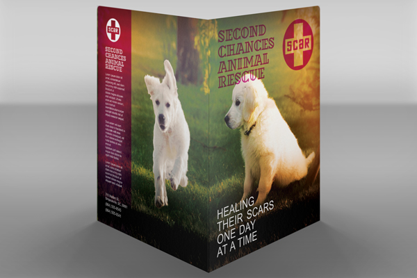
For instance, this folder design for a fictional animal shelter simulates the “light leak” effect you might get when using vintage analog cameras. It’s an understated look that evokes a sense of nostalgia and sentimentality without beating the viewer over the head.
This tutorial will show you how to create the same design. Once you’ve mastered the light leak technique, you can work it into a design of your own.
You’ll need the following before you begin:
- Letter size presentation folder die cut template
- Photo of a young golden retriever
- Photo of a running dog
- A_DexterOtl font
- Vladimir font
- Company logo (for this tutorial, we created a logo in Illustrator beforehand)
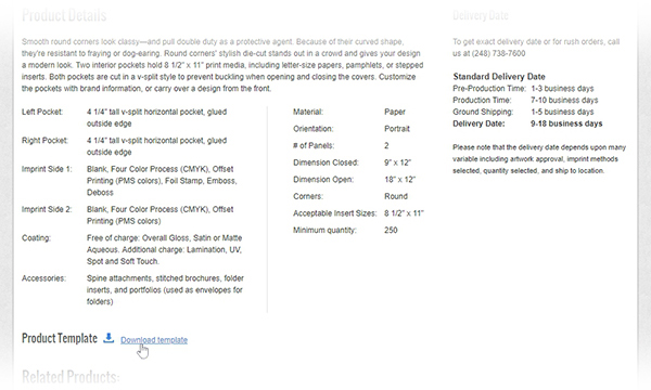
- Download the folder die cut template. (Scroll down the page and click “Download template.”)
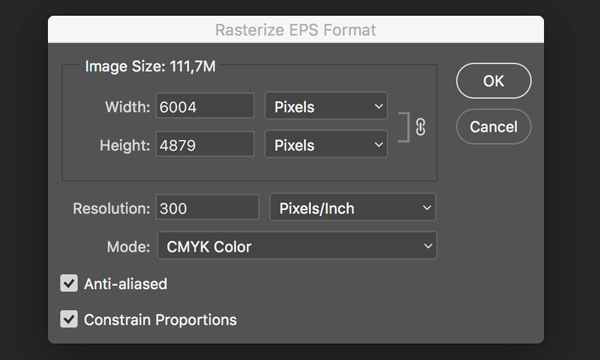
2. Open Photoshop. Click File > Open to open the folder template in Photoshop. Keep the settings in the Rasterize EPS Format window as they are and click the OK button.
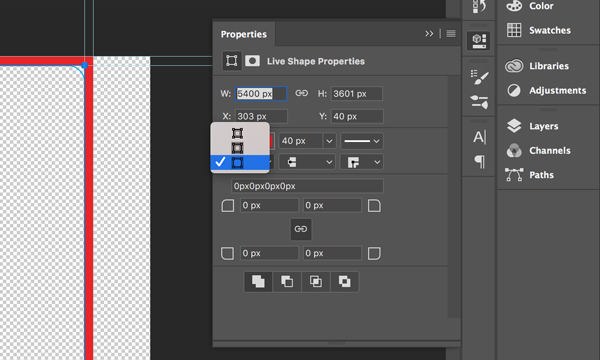
3. Using the Rectangle Tool (U), create a rectangle that covers the left and right panels of the folder. In the Properties Panel, set the Stroke to 40px and select the option shown in the screenshot so that it will appear on the outside edge of the rectangle.
4. Using the Crop Tool (C), cut the canvas down to the rectangle’s outline.
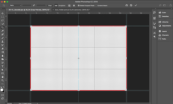
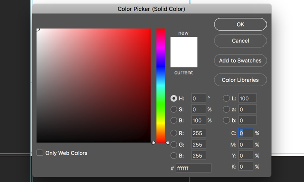
5. Choose Layer > New Fill Layer > Solid Color and press OK. In the Color Picker window, select white.
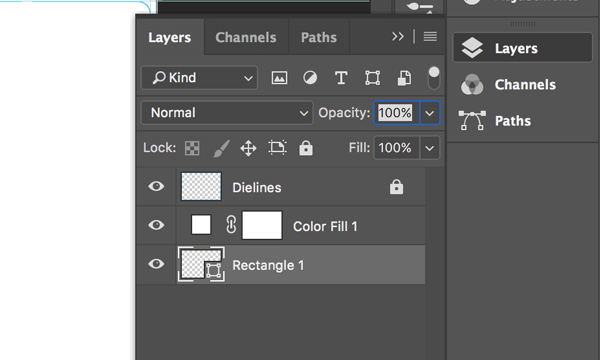
6. Now we can delete the rectangle and move the solid white layer underneath the dieline layer. Name the layer with the lines “Dielines” and lock it by pressing the lock icon on the top of Layers panel; this way you won’t move it accidentally.
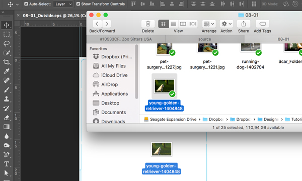
7. Drag the image of the young golden retriever to the canvas.
8. Enlarge the image as shown and flip it horizontally using Edit > Transform > Flip Horizontal.
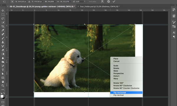
9. In order to fill the extra white space on the bottom and left sides, select the left side of the image using the Marquee Tool (M) and enlarge it to fill the remainder of the left panel using the Free Transform Tool (Ctrl+T). Then, use Cut (Ctrl+X) and Paste (Ctrl+V) to separate this part of image to its own layer. It will automatically be named as Layer 1.
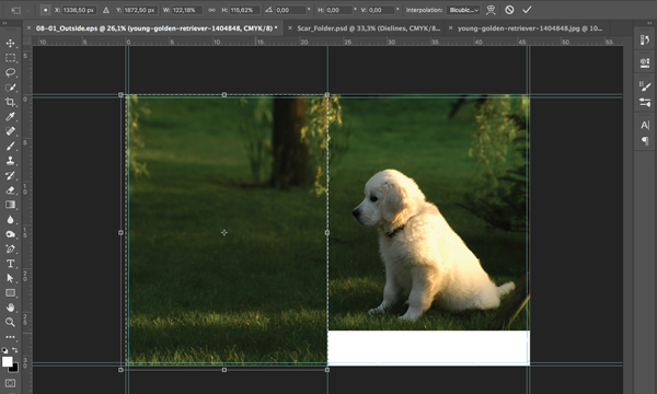
10. Create a copy of Layer 1. In the Layers Panel, move Layer 1 and its copy underneath the layer with the dog photo. On the canvas, move Layer 1 to the right bottom corner in order to fill the white space there.
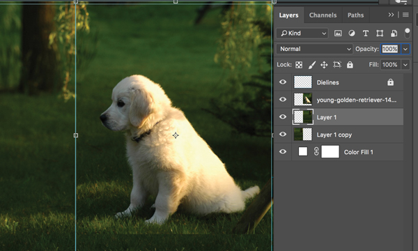
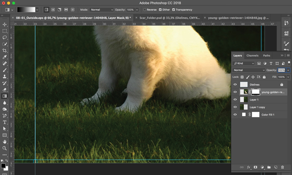
11. Create a mask on the dog photo layer by pressing the appropriate icon on the Layers Panel.
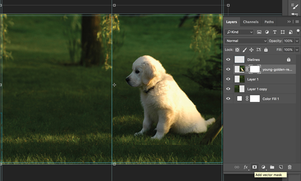
12. Use the Gradient Tool on the mask to make the bottom edge softer so that it blends with the rest of the image.
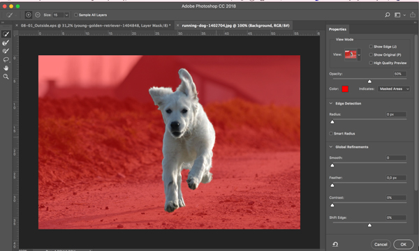
13. Open the image of a running dog. We’ll need to separate the dog from the background. Choose Select > Select and Mask. Then, using the Quick Selection Tool, select the dog. Make sure Layer Mask is selected in the Output Settings area and press OK.
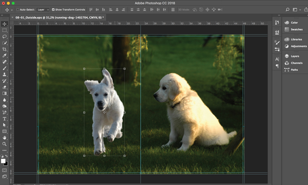
14. Right-click on the layer and choose Duplicate Layer. Make sure that your project’s name appears in the Document dropdown and press OK. Move the dog to the center of the back panel.
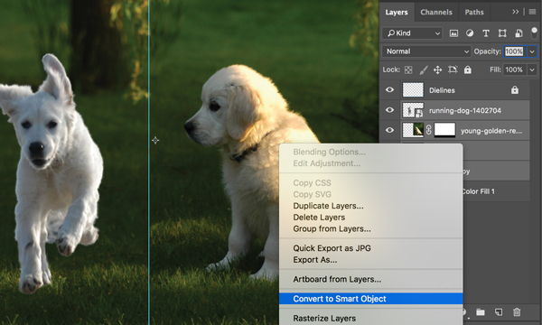
15. Select all layers except Dielines and Color Fill 1 and convert them into a Smart Object by right-clicking and choosing Convert to Smart Object.
16. Choose Layer > New Adjustment Layer > Gradient Map and press OK. Choose the “Violet, Orange” preset.
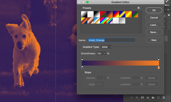
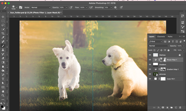
17. Using the Brush Tool, draw at the center of the mask to make the gradient more transparent as shown in the screenshot.
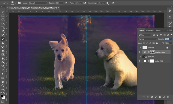
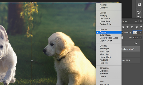
18. Change the blending mode of the Gradient Map layer to Screen with 65% opacity.
19. Using the Gradient Tool, create a gradient with black at the bottom and white at the top as shown in the screenshot.
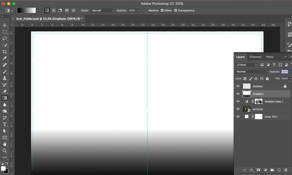
20. Change the blending mode of the gradient to Overlay with 70% opacity.
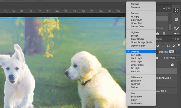
21. Go to Layer > New Adjustment Layer > Photo Filter. Press OK.
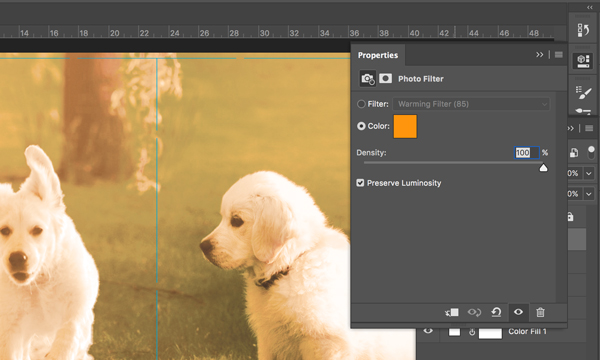
22. Using the Brush Tool, draw on the Photo Filter mask to make gradient more transparent at the center as shown in the screenshot.
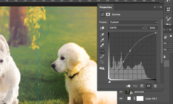
23. Go to Layer > New Adjustment Layer > Curves. Press OK. Set the curve as shown in the screenshot.
24. Create a rectangle using the Rectangle Tool (U) that covers the whole canvas. Set the color to the following: C71 M72 Y61 K84
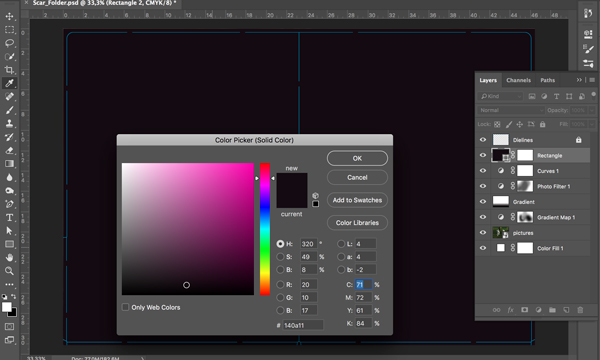
25. Using the Marquee Tool (M), create a selection that comprises nearly the entire width and height of the image. Go to Select > Modify > Feather and set the Feather Radius to 100 pixels. Go to Select > Inverse. Click on the mask icon at the bottom of the Layers panel.
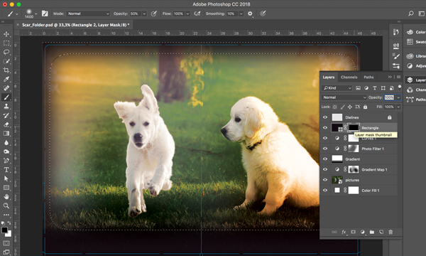
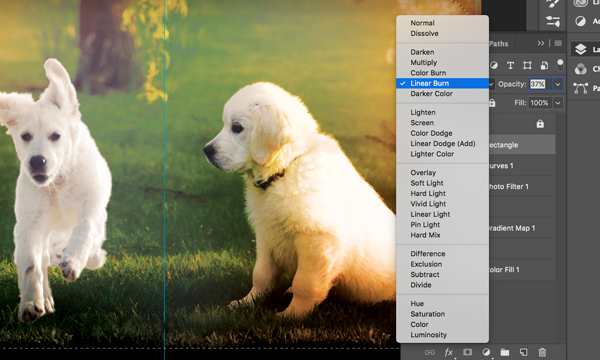
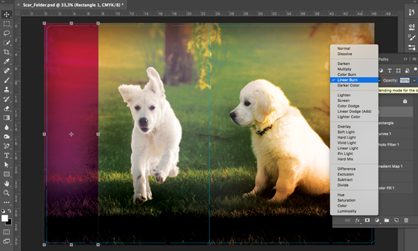
26. Change the blending mode of this rectangle to Linear Burn with 37% opacity.
27. On the left side of the folder, create a rectangle using the Rectangle Tool (R) and set the color to: C13 M86 Y0 K0
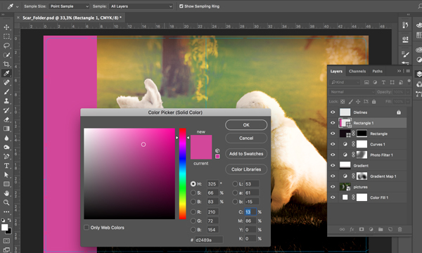
28. Change the blending mode of this rectangle to Linear Burn with 100% opacity.
29. Import all fonts into the project (as well as the company’s logo). Place the logo and add text as shown using the Horizontal Type Tool (T).
Your design is now complete!
You can download the final PSD file to check it against your own work and use this mockup template to display your finished product.
Have you used a similar light leak effect to create your own cool design? Share it in the comments below!
