Piecing Together Approaches for a CSS Masonry Layout
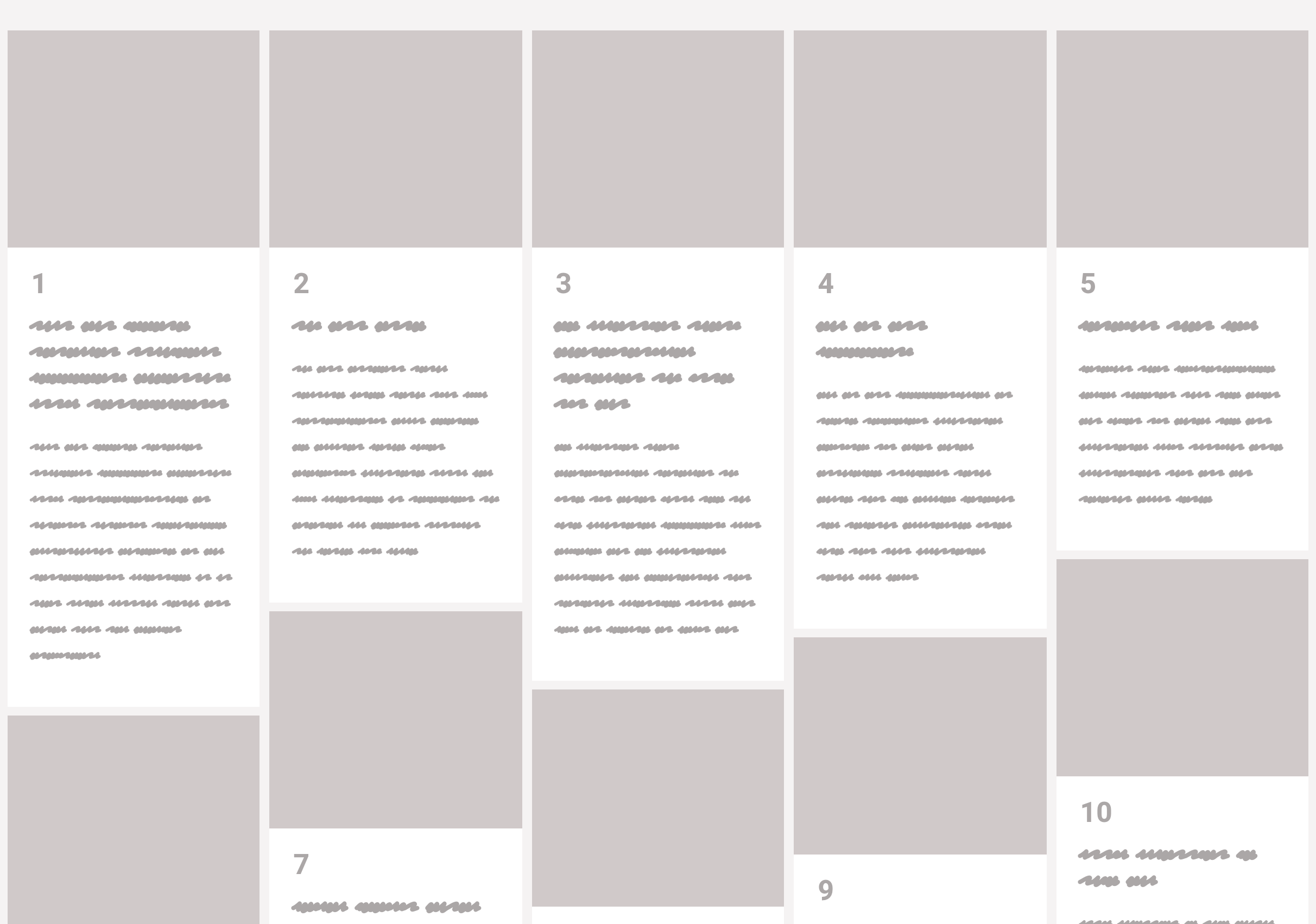
Masonry layout, on the web, is when items of an uneven size are laid out such that there aren’t uneven gaps. I would guess the term was coined (or at least popularized) for the web by David DeSandro because of his popular Masonry JavaScript library, which has been around since 2010.
JavaScript library. Nothing against JavaScript, but it’s understandable we might not want to lean on it for doing layout. Is there anything we can do in CSS directly these days? Sorta.
Is vertical order with ragged bottoms OK?
If it is, then CSS columns will do just fine.
See the Pen Masonry with Columns by Chris Coyier (@chriscoyier) on CodePen.
Flexbox can do vertical columns with ragged endings too
But it’s not quite as clever, because you’ll need to set a height of some kind to get it to wrap the columns. You’ll also have to be explicit about widths rather than having it decide columns for you.
But it’s doable and it does auto space the gaps if there is room.
See the Pen Masonry with Flexbox by Chris Coyier (@chriscoyier) on CodePen.
Do you need a clean bottom edge? A Flexbox/JavaScript combo can help.
Jamie Perkins originally wrote this, then Janosh Riebesell re-wrote it and, now I’m porting it here.
It totally messes with the order and requires the children to be flexy about their height, but it does the trick:
See the Pen Masonry with Flexbox + JS by Chris Coyier (@chriscoyier) on CodePen.
Is horizontal line masonry OK?
If it’s just the uneven brick-like look you’re after, then horizontal masonry is way easier. You could probably even float stuff if you don’t care about the ragged edge. If you wanna keep it a block… flexbox with allowed flex-grow is the ticket.
See the Pen Masonry with Flexbox + JS by Chris Coyier (@chriscoyier) on CodePen.
You’d think CSS grid could help
CSS grid is very amazing and useful in a CSS developer’s everyday life, but it’s not really designed for masonry style layouts. CSS grid is about defining lines and placing things along those lines, where masonry is about letting elements end where they may, but still exerting some positional influence.
Balázs Sziklai has a nice example of auto-flowing grids that all stack together nicely, with pretty good horiziontal ordering:
See the Pen True Masonry with Grid Layout by Balázs Sziklai (@balazs_sziklai) on CodePen.
But you can see how strict the lines are. There is a way though!
Grid + JavaScript-maniplated row spans
Andy Barefoot wrote up a great guide. The trick is setting up repeating grid rows that are fairly short, letting the elements fall into the grid horizontally as they may, then adjusting their heights to match the grid with some fairly light math to calculate how many rows they should span.
See the Pen CSS Grid Masonry (Step 10) by Andy Barefoot (@andybarefoot) on CodePen.
DOM-shifted elements in a CSS columns layout
What people generally want is column-stacking (varied heights on elements), but with horizontal ordering. That last grid demo above handles it pretty well, but it’s not the only way.
Jesse Korzan tackled it with CSS columns. It needs JavaScript as well to get it done. In this case, it shifts the elements in the DOM to order them left-to-right while providing a horizontal stack using a CSS columns layout. This introduces a bit of an accessibility problem since the visual order (left-to-right) and source order (top-to-bottom) are super different & dash; though perhaps fixable with programmatic tabindex?

There’s also the original library
Float away, my pretties.
See the Pen Masonry with Masonry by Chris Coyier (@chriscoyier) on CodePen.
The post Piecing Together Approaches for a CSS Masonry Layout appeared first on CSS-Tricks.
