How Web Designers Can Contribute To Mobile-First Marketing
How Web Designers Can Contribute To Mobile-First Marketing
Suzanne Scacca2019-01-24T22:30:22+01:002019-01-25T13:31:29+00:00
I recently wrote about why we should be working on retiring unnecessary design elements instead of adding more stuff to websites in this mobile-first world. And it got me thinking:
What about marketing? Is there even such a thing as mobile-first marketing?
In short, I believe so.
I’m going to examine the key areas of marketing that stem from the websites we build. Then, zero in on the ways in which designers should adjust these marketing strategies for mobile-friendly and mobile-first audiences.
How Web Designers Can Contribute To Mobile-First Marketing
There are typically three kinds of marketing strategies businesses utilize:
- Content marketing
- Email marketing
- Social media marketing
Similar to how we view web design through a mobile-first lens, a similar process must occur when designing marketing strategies going forward. That means not being afraid to toss out design or even text elements for the mobile experience. It also means taking tried-and-true marketing techniques and compressing them down so they’re more easily digestible for audiences on mobile.
Here are some things to consider as a web designer:
Content Marketing
Traditionally, content marketing has been synonymous with blogging. But, in recent years, this kind of marketing encompasses a much wider range of content creation as consumers demand information more quickly and conveniently than ever before. Many of these blog alternatives (like vlogs and podcasts) do well on mobile. They are easier to get ahold of on these devices and can be consumed at the user’s convenience wherever and whenever they please.
Regardless of the type of content you produce, there are certain ways it should be designed for the mobile-first audience.
Remove Sidebar Elements
To start, you need to ditch those cumbersome sidebar elements (something I talked about in my previous post). I like Airbnb‘s example of this:

As you can see, the bottom of the post isn’t bogged down in a bunch of unnecessary sidebar widgets for mobile users to scroll through. There’s a link to related articles and that’s it.
This enables mobile users to really focus on the content before them and to absorb the message without a bunch of other distractions around.
Use Captivating Visuals For Longer Posts
If you have to write longer pages or posts (which isn’t necessarily a bad thing), make sure you include unique and captivating visuals throughout. Also, make sure they don’t overwhelm the screen.
This is a good example from The Guardian:
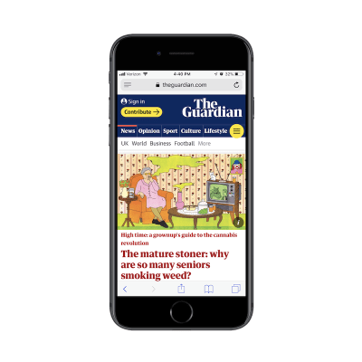
The featured image for the blog post is a custom-drawn illustration. If that didn’t impress readers enough, the matching illustrations placed at regular intervals throughout the post should:
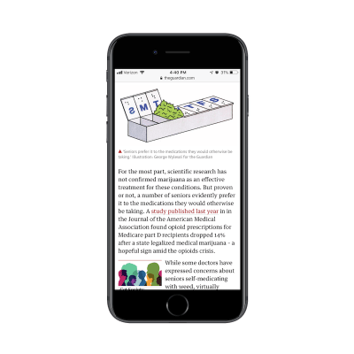
When your mobile site is as content-driven as The Guardian’s, you need to rely heavily on the visual component to support the story on the page. If videos or podcasts can’t completely replace a lengthy post, make sure images can aptly tell a story on their own as well as provide real support to the narrative told on the page.
“Design” The Text
For text-based content marketing, the structure and formatting of it are going to be a big deal.
Case in point: Powell’s Books:
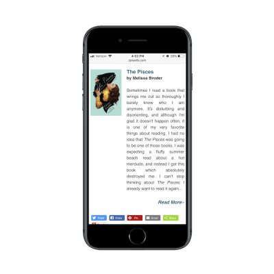
What’s so surprising about this example is that it comes from a very well-known bookstore in the United States. You would think that a business that deals in the written word would take greater care in designing the words on its web pages.
There are a number of problems with the design. For starters, a supporting image has been included next to each of the books included in the roundup, but they’re small and don’t fit well beside the text. Then, you have the text itself which uses justified alignment. This introduces a bunch of awkward white space which makes the text difficult to read.
The big takeaway here is to take time to design the text on the page as much as you do the visuals. If visitors can’t read the content easily, your marketing will be ineffective.
Break Up Lengthy Text
It’s also important to be mindful of the length of the content on your pages. Take a look at this post from the Pitchfork website:

Most of the paragraphs in this write-up look like this. Overly long sentences. Run-on paragraphs. You can’t even see an end to the paragraph in many cases.
Even if you’re not the writer of the content, find ways to break it up for the mobile user. Realistically, desktop websites should have a maximum limit of 3 or 4 lines for paragraphs. On mobile, let’s set that limit to 5 or 6. This ensures readers won’t become overwhelmed with content that seemingly has no end in sight.
I would suggest using the Smashing Magazine website for inspiration when designing the structure and length of marketing content:

The top of each article includes a number of callouts that quickly summarize what you’re about to read. This sets expectations properly.
The rest of the article is just as well-designed:

This example demonstrates how Smashing Magazine has taken the time to properly design the text on the page. A header tag is present. Hyperlinked text stands out well. Text is properly sized for mobile. It also flows naturally from left-to-right with a ragged edge which makes for easier reading. And it’s intercepted by an image/poll.
It might not seem like a big deal on desktop to lay out five or six paragraphs one after the other, but do take a minute to hop over to mobile and see how that translates to the smaller screen. You may be surprised at how much readability differs between the on-site experiences.
Keep Mobile Users Engaged
Getting people to convert on mobile isn’t easy.
But it’s not impossible to get around those traditionally low conversion rates. First, you need to acknowledge that mobile users have shorter attention spans. Check out this blog post from The Home Depot:
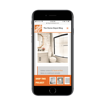
This post serves as an inspirational tutorial for readers, providing them with ideas on how to remodel their own bathroom at home.
But notice the “Shop This Project” bar that sits along the bottom of the post. This is a fantastic idea. Rather than hope that mobile readers will be willing to read the entire post and click the links on their own, the Home Depot has made this nice and easy. This says:
“Hey, this is a great idea if you’re looking to remodel your home… but we get it if you’re short on time. Here are all the materials you need to do it on your own!”
It plays into the idea that the mobile user wants information to be succinct and convenient and also doesn’t have the time to ingest long pages of content — no matter how helpful they may be.
The Home Depot has another great example of how to keep mobile users with limited attention spans engaged:
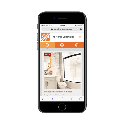
In the above example, you can see the Home Depot has made its images Pinnable. Why is this great? It’s because it embraces the multichannel experience.
Remember; we’re designing websites to be mobile-first, not mobile-all-encompassing.
Chances are good that the majority of your website visitors will start on mobile. It’s your job to ensure that one of two things happens:
If the journey ends on mobile, it ends with a conversion.
or
If the user doesn’t convert on mobile, you’ve provided them with a clear pathway to convert at a later time and from another device.
That’s what the Home Depot has done here by including “Pin It” buttons. Mobile users can save those images (and the links to the posts) to Pinterest for later. Then, when they’re ready to work on that home renovation project, they can open their laptop or tablet and pull up that cool-looking photo and supporting article to guide them through it.
Email Marketing
Without a doubt, email marketing is one of the most effective ways to get in front of a mobile audience and compel them to convert. A report from just a few years ago showed that 80% of respondents believed email marketing to be the key driver in terms of consumer acquisition and retention.
Although email marketing is highly effective in attracting quality customers, you have to be careful with it on mobile. Mobile users don’t think or act the same way as desktop users, as evidenced by the research around micro-moments.
That’s why, when it comes to designing email campaigns and newsletters for clients, you must keep the following tips in mind:
Keep It Simple
Unless your email subscriber list is expecting lengthy messages on a regular basis (and there’s a good reason for it), it’s best to keep email communications simple. That’s why we build websites – so that marketing messages can remain short and to the point and then link out to provide more information.
Here is an example from Chase of a message that went a little overboard:
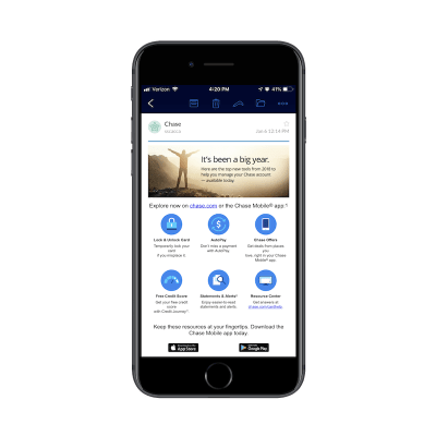
First of all, the message is a little misleading. It talks about the top tools you’re about to discover to manage your Chase account. However, the points broken out below it are nothing more than features included in the mobile app.
Another problem we have is the unevenly distributed text. When you design anything for the web, there should be symmetry. But it’s clear here that the copywriter and designer did not work together to craft the message.
Finally, there’s the linking issue. The goal of this message is to motivate Chase customers to download and use the mobile app. And, yet, there are two links to the Chase website that compete with the two app store links at the bottom.
Overall, there’s just too much going on in the design and message of this email. Chase would’ve been better off simplifying it with an eye-catching graphic and pushing traffic to the website to learn more and download the app from there.
Use Images
While I understand why some marketers think it’s a good idea to write email copy to look like messages people receive from others they know, I don’t think it’s a great idea on mobile.
Here’s an example of a message I received from Small Business Trends:

When I receive messages that look like this (i.e. plain text, no images, free-standing links), my gut reaction is:
This is spam.
It’s not that this email is difficult to read. And, in all fairness, I should have been expecting it since I had signed up for a webinar. While it’s great that the message mostly fits within one screenful of my mobile device, I’m left seriously wanting.
If you intend to impress me with a webinar, why have you made the email such a lackluster experience?
This is a great argument for why images are helpful in convincing mobile email users to stop and read your marketing communication.
Even if images don’t make sense for the message, you should design a professional, branded template that clients can use to skin all messages. This helps guide users to the content framed within it. It also gives marketing messages a consistent and instantly recognizable look.
Make Sure They Can Read the Text
Earlier last year, I explored the role typography played in the mobile user experience. What’s not surprising at all is the fact that the size of the font can seriously hinder the reading experience. Let me show you a couple of examples that demonstrate this point in the context of email:
This is a marketing communication I received from Freelancers Union. I enjoy reading their blog, but I’ve never been a fan of the blog roundup newsletters:
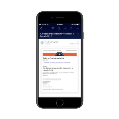
Some of the text is readable, for sure. “Today on Freelancers Union” as well as the title of the excerpt are both legible from where I’m sitting. The rest of the message, however, is quite problematic.
By my count, there are five different font sizes used in this message, not to mention varying styles and colors of hyperlinks included. When I see these messages in my inbox, I know now not to bother with trying to read them. I just go straight to the titles under “Excerpts”. I suspect I’m not the only one who does this.
Then, you have this example from Zendesk:
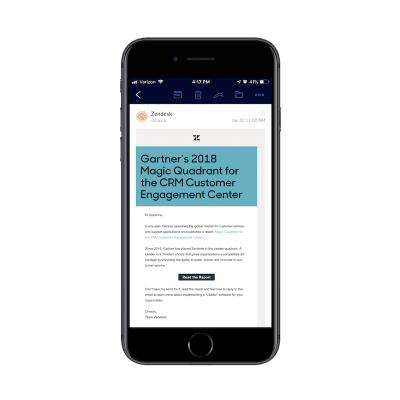
There’s a lot that’s wrong here.
For starters, the headline creates confusion. I thought the message was from Zendesk and, yet, the headline is all about Gartner and a superfluous report name I don’t recognize (at least I think it’s a report?). If there’s a Zendesk connection, it should be in the header. Even if there isn’t, the header should clearly explain why I should keep reading.
Then, there’s the issue of reading. Why the heck is the headline banner so big and the rest of the message in a font face that’s way too small for mobile? It’s almost as if they didn’t want anyone to read the rest.
Also, if we were to look at the hierarchy of the page, why didn’t the report button get more real estate? In terms of taking action on the page, that should be the primary target, but the design would not have you believe that’s the case.
Bottom line: size matters on mobile. If you’re not yet testing your mobile email marketing messages before sending them, do it now.
Tell the Story with an Image
Now that I’ve spent all that time sharing examples of poorly designed mobile newsletters, I want to show you one that’s done quite well.
This one comes to us courtesy of Sweet Frog:
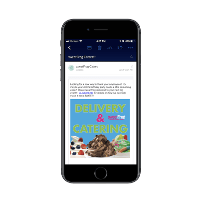
I think the only gripe I have with this message is that the image didn’t come before the text. Otherwise, I think it’s well done.
The image looks great on mobile. It’s well-sized, well-designed, colorful and provides the message in as concise a manner as possible.
The designer has done a nice job with the text as well. The paragraph isn’t too long. Plus, all-caps is a good way to draw mobile users’ attention to the key part of the message. In other words, CONVERT HERE.
Send Relevant Emails
When we looked at the key micro-moments that take place on mobile, we focused on how users are looking to take quick and precise actions. When you craft an email marketing message for those users, you better make sure to keep those in mind as well.
One example I’m particularly fond of is this one from Hotels.com:
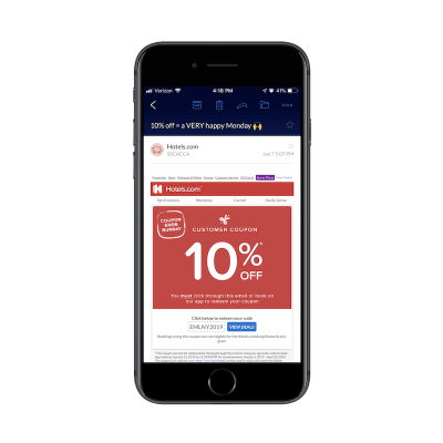
Although there are a few distractors in the email template I’d like to see gone, I really do appreciate how pointed the message is. Hotels.com spells out in the subject line exactly what I’m going to get: 10% off.
Then, using a strong color and impossible-to-miss font, it quickly reiterates that all they want from me at this moment is to share a 10% off coupon. And with a blue button, just a couple paces below it, I can quickly grab my coupon code and explore their offers.
This is absolutely perfect. If you’re paying close attention to what users search for and end up doing when they’re on mobile, you should be able to craft messages like these with ease.
Look for ways to serve up a quick action like:
- Use this coupon.
- Watch this quick video.
- Join us this weekend.
- Etc.
The more you know about your audience and the things you can do to make them take immediate action, the more effective your mobile email marketing will be.
Social Media Marketing
Social media marketing has always been a kind of bite-sized form of marketing. Because of the limited amounts of space available within posts and the emphasis on communicating through videos and images, social media has always provided us with a more succinct and quick way to reach others.
That said, some people still haven’t figured out how to master it.
This is why I’m encouraging you as a web designer to step in and help. Here’s why:
Choose Images Wisely
If you think about the space available on a mobile screen, images and videos on social media are going to comprise a good majority of it. That’s why it’s critical to choose your visual content well.
I’m going to show you two examples from Lyft:
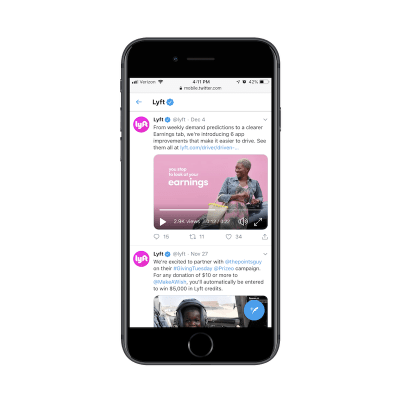
The video in the top post is a great example of social media visuals done well. The video is beautifully shot and matches the branding of the company sharing it. It’s clear that great care was put into this piece of video marketing.
Then, you have this example also from the Lyft Twitter page:
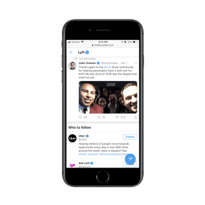
User-generated content can be a wonderful thing for a brand, especially if your company is young and your capacity to create content is somewhat limited. But Lyft is not a new company.
While I appreciate the co-founder’s efforts to show himself driving people around, his photos stand out like a sore thumb in the feed. In the case of this image, the lighting is poor, and many of the passengers get lost in the background. In other photos he’s shared and that Lyft has retweeted, everyone is out-of-focus.
Now, we could just chalk this up to: “Well, he’s not a professional photographer. We shouldn’t expected that much from him.” There’s just one problem with that:
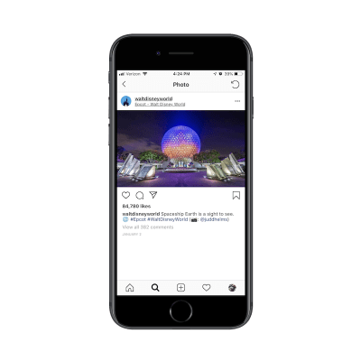
Walt Disney World‘s Instagram feed is mostly comprised of photos and videos taken by visitors of the amusement park. The above example is one of them. And, yet, WDW takes good care in sharing photos that shed the best light on its brand.
As a general rule, whether you’re uploading your own photos, sharing them from others or designing them by hand, make sure you’re okay with them representing your brand. If they’re more appropriate for sharing on a personal account, leave them to the founder of the company to stick them on his or her feed. Keep your professional mobile feeds full of impressive content.
Consider The Space
Although social media typically limits the amount of space one can use to share a post, there are some channels where these limits have been stretched. When considering the “space” your post takes, be sure to go beyond just the physical dimensions of the image or text.
Consider this example from New York Magazine:

This is a post from New York Magazine’s Instagram feed. What I like about this is that they’ve designed the image to include the title, byline and featured image similar to how it would appear on the website’s news feed. That attention to things like consistency from the website to social media is fantastic.
But now let’s scroll down:
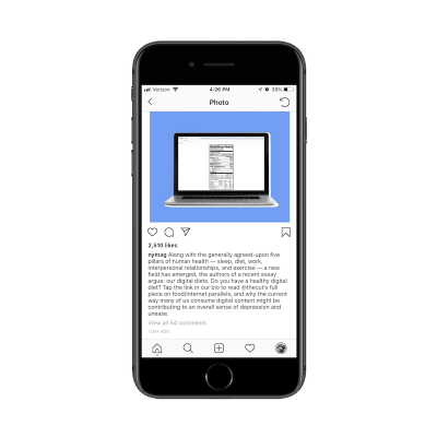
This is the caption you’ll find beneath the image.
Here’s the thing: we already know that this post is promoting a new article on the website. The title is incredibly clear what the post is about and the featured image drives the point home.
There’s no reason to make Instagram users stop scrolling through their news feed to read this lengthy description. It’s just a waste of space and energy at this point. The post could’ve just as easily said:
“Do you have an unhealthy diet? Click the link in our bio to find out about this dangerous trend.”
Another reason why you need to be conscious of space is this:
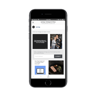
Instagram now has this feature for businesses where they can aggregate a bunch of their post links in one place. This is great considering it was difficult to share content in the past years since links weren’t clickable.
That said, this is yet another step New York Magazine readers have to take to get to that unhealthy eating post. Pay attention to how much work you’re asking mobile readers to do and determine whether or not the payoff is really worth it.
Use Hashtags (and Wisely)
There are certain social media channels where hashtags aren’t really needed and could potentially add friction where you don’t want any. I would say that Facebook and LinkedIn are two such examples of channels where you don’t need them.
That said, as a brand using social media for the purposes of marketing, you’re going to want to use hashtags (#) and handles (@) when crafting posts on places like Instagram, Pinterest, and Twitter. Content can be difficult to find on these channels without them, which is why you can’t afford to go without as Zaftig’s has done here:
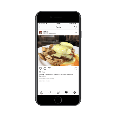
Zaftig’s is one of my favorite restaurants in Boston. It also happens to be a lot of other people’s favorite restaurant as there’s almost always a wait whenever you go. So, I’m surprised to see such an underwhelming post on Instagram.
The photo is great. It reminds me of the many delicious meals I had here. But why no hashtags? A photo like this and a restaurant with such a great reputation in Boston should be able to leverage hashtags to bolster their reputation and extend their reach.
As someone who follows food inspiration Instagram pages, I can tell you I find new places to eat all the time with hashtags as simple as #breakfast. This is a huge missed opportunity for them.
On the other hand, it is possible to go overboard with hashtags on social media.
This is a Twitter post from The Yum Yum Foodie:
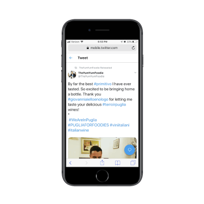
In this example, you can see that there are too many hashtags throughout. This is problematic for a couple reasons:
- Hashtags are like links in that they stand out from the surrounding text. When they’re included in the middle of a post, it disrupts the reading flow.
- These particular hashtags aren’t really click-worthy. I would also suggest they don’t add any value to the post. Again, they’re more a distraction than anything.
As a designer, I’d ask you to look at hashtags and handles similar to how you would a CTA on a website. You know they’re going to stand out from the rest of the text, so make them worth the social media users’ time to look at. If their reason for being isn’t to click, at least infuse them with some of the brand personality.
If there’s no value in hashtagging a word or string of words in a post, don’t do it.
Format Your Posts
Blog posts and emails aren’t the only things where attention to formatting and balance matters. Although an empty message box on Twitter or Facebook might make you want to just type and type and type away, there’s more you can do to enhance the readability of your posts. I’d argue that proper formatting also makes your posts more attractive to the eye.
If you want more mobile users to stop and take a look at what you’ve posted, take a page out of Dr. Bronner‘s book:
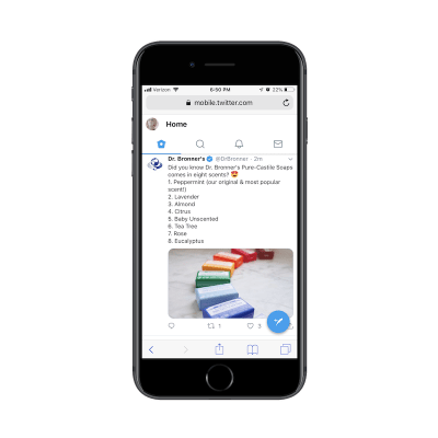
Okay, so the image itself is attention-grabbing, so this company gets major kudos for that.
But have a look at how the post itself is structured.
There’s a one-line sentence that introduces the promotion, topped off with a cute emoji. Emojis are to social media what icons are to websites. Don’t be afraid to use them, especially if your target audience is millennial or Gen-Z.
Then, you have a numbered list! Twitter and other social channels might not make this as easy to write out as a word processor, but so what? Look at how nice that looks? When compared to most posts that usually follow the tired paragraph format, this is sure to stand out and get mobile users to take a look.
Wrapping Up
If you’ve been entrusted to make critical design choices for your clients’ websites, then it’s time to leverage that trust and move into marketing with them.
While the design piece might not be as time- or labor-intensive as what you’d do on websites, online marketing is an ongoing thing. This could open up a new, steady income stream if you can demonstrate your knowledge and expertise in designing for marketing just as well as you did for the web.
 (ra, il)
