Archive

Archive for January, 2019

New ES2018 Features Every JavaScript Developer Should Know

January 9th, 2019 No comments

The ninth edition of the ECMAScript standard, officially known as ECMAScript 2018 (or ES2018 for short), was released in June 2018. Starting with ES2016, new versions of ECMAScript specifications are released yearly rather than every several years and add fewer features than major editions used to. The newest edition of the standard continues the yearly release cycle by adding four new RegExp features, rest/spread properties, asynchronous iteration, and Promise.prototype.finally. Additionally, ES2018 drops the syntax restriction of escape sequences from tagged templates.

These new changes are explained in the subsections that follow.

The Rest/Spread Properties

One of the most interesting features added to ES2015 was the spread operator. This operator makes copying and merging arrays a lot simpler. Rather than calling the concat() or slice() method, you could use the ... operator:

const arr1 = [10, 20, 30];

// make a copy of arr1
const copy = [...arr1];

console.log(copy);    // → [10, 20, 30]

const arr2 = [40, 50];

// merge arr2 with arr1
const merge = [...arr1, ...arr2];

console.log(merge);    // → [10, 20, 30, 40, 50]

The spread operator also comes in handy in situations where an array must be passed in as separate arguments to a function. For example:

const arr = [10, 20, 30]

// equivalent to
// console.log(Math.max(10, 20, 30));
console.log(Math.max(...arr));    // → 30

ES2018 further expands this syntax by adding spread properties to object literals. With the spread properties you can copy own enumerable properties of an object onto a new object. Consider the following example:

const obj1 = {
  a: 10,
  b: 20
};

const obj2 = {
  ...obj1,
  c: 30
};

console.log(obj2);    // → {a: 10, b: 20, c: 30}

In this code, the ... operator is used to retrieve the properties of obj1 and assign them to obj2. Prior to ES2018, attempting to do so would throw an error. If there are multiple properties with the same name, the property that comes last will be used:

const obj1 = {
  a: 10,
  b: 20
};

const obj2 = {
  ...obj1,
  a: 30
};

console.log(obj2);    // → {a: 30, b: 20}

Spread properties also provide a new way to merge two or more objects, which can be used as an alternative to the Object.assign() method:

const obj1 = {a: 10};
const obj2 = {b: 20};
const obj3 = {c: 30};

// ES2018
console.log({...obj1, ...obj2, ...obj3});    // → {a: 10, b: 20, c: 30}

// ES2015
console.log(Object.assign({}, obj1, obj2, obj3));    // → {a: 10, b: 20, c: 30}

Note, however, that spread properties do not always produce the same result as Object.assign(). Consider the following code:

Object.defineProperty(Object.prototype, 'a', {
  set(value) {
    console.log('set called!');
  }
});

const obj = {a: 10};

console.log({...obj});    
// → {a: 10}

console.log(Object.assign({}, obj));    
// → set called!
// → {}

In this code, the Object.assign() method executes the inherited setter property. Conversely, the spread properties simply ignore the setter.

It’s important to remember that spread properties only copy enumerable properties. In the following example, the type property won’t show up in the copied object because its enumerable attribute is set to false:

const car = {
  color: 'blue'
};

Object.defineProperty(car, 'type', {
  value: 'coupe',
  enumerable: false
});

console.log({...car});    // → {color: "blue"}

Inherited properties are ignored even if they are enumerable:

const car = {
  color: 'blue'
};

const car2 = Object.create(car, {
  type: {
    value: 'coupe',
    enumerable: true,
  }
});

console.log(car2.color);                      // → blue
console.log(car2.hasOwnProperty('color'));    // → false

console.log(car2.type);                       // → coupe
console.log(car2.hasOwnProperty('type'));     // → true

console.log({...car2});                       // → {type: "coupe"}

In this code, car2 inherits the color property from car. Because spread properties only copy the own properties of an object, color is not included in the return value.

Keep in mind that spread properties can only make a shallow copy of an object. If a property holds an object, only the reference to the object will be copied:

const obj = {x: {y: 10}};
const copy1 = {...obj};    
const copy2 = {...obj}; 

console.log(copy1.x === copy2.x);    // → true

The x property in copy1 refers to the same object in memory that x in copy2 refers to, so the strict equality operator returns true.

Another useful feature added to ES2015 was rest parameters, which enabled JavaScript programmers to use ... to represent values as an array. For example:

const arr = [10, 20, 30];
const [x, ...rest] = arr;

console.log(x);       // → 10
console.log(rest);    // → [20, 30]

Here, the first item in arr is assigned to x, and remaining elements are assigned to the rest variable. This pattern, called array destructuring, became so popular that the Ecma Technical Committee decided to bring a similar functionality to objects:

const obj = {
  a: 10,
  b: 20,
  c: 30
};

const {a, ...rest} = obj;

console.log(a);       // → 10
console.log(rest);    // → {b: 20, c: 30}

This code uses the rest properties in a destructuring assignment to copy the remaining own enumerable properties into a new object. Note that rest properties must always appear at the end of the object, otherwise an error is thrown:

const obj = {
  a: 10,
  b: 20,
  c: 30
};

const {...rest, a} = obj;    // → SyntaxError: Rest element must be last element

Also keep in mind that using multiple rest syntaxes in an object causes an error, unless they are nested:

const obj = {
  a: 10,
  b: {
    x: 20,
    y: 30,
    z: 40
  }
};

const {b: {x, ...rest1}, ...rest2} = obj;    // no error

const {...rest, ...rest2} = obj;    // → SyntaxError: Rest element must be last element

Support for Rest/Spread Properties

Chrome Firefox Safari Edge
60 55 11.1 No
Chrome Android Firefox Android iOS Safari Edge Mobile Samsung Internet Android Webview
60 55 11.3 No 8.2 60

Node.js:

  • 8.0.0 (requires the --harmony runtime flag)
  • 8.3.0 (full support)

Asynchronous Iteration

Iterating over a collection of data is an important part of programming. Prior to ES2015, JavaScript provided statements such as for, for...in, and while, and methods such as map(), filter(), and forEach() for this purpose. To enable programmers to process the elements in a collection one at a time, ES2015 introduced the iterator interface.

An object is iterable if it has a Symbol.iterator property. In ES2015, strings and collections objects such as Set, Map, and Array come with a Symbol.iterator property and thus are iterable. The following code gives an example of how to access the elements of an iterable one at a time:

const arr = [10, 20, 30];
const iterator = arr[Symbol.iterator]();
  
console.log(iterator.next());    // → {value: 10, done: false}
console.log(iterator.next());    // → {value: 20, done: false}
console.log(iterator.next());    // → {value: 30, done: false}
console.log(iterator.next());    // → {value: undefined, done: true}

Symbol.iterator is a well-known symbol specifying a function that returns an iterator. The primary way to interact with an iterator is the next() method. This method returns an object with two properties: value and done. The value property contains the value of the next element in the collection. The done property contains either true or false denoting whether or not the end of the collection has reached.

By default, a plain object is not iterable, but it can become iterable if you define a Symbol.iterator property on it, as in this example:

const collection = {
  a: 10,
  b: 20,
  c: 30,
  [Symbol.iterator]() {
    const values = Object.keys(this);
    let i = 0;
    return {
      next: () => {
        return {
          value: this[values[i++]],
          done: i > values.length
        }
      }
    };
  }
};

const iterator = collection[Symbol.iterator]();
  
console.log(iterator.next());    // → {value: 10, done: false}
console.log(iterator.next());    // → {value: 20, done: false}
console.log(iterator.next());    // → {value: 30, done: false}
console.log(iterator.next());    // → {value: undefined, done: true}

This object is iterable because it defines a Symbol.iterator property. The iterator uses the Object.keys() method to get an array of the object’s property names and then assigns it to the values constant. It also defines a counter variable and gives it an initial value of 0. When the iterator is executed it returns an object that contains a next() method. Each time the next() method is called, it returns a {value, done} pair, with value holding the next element in the collection and done holding a Boolean indicating if the iterator has reached the need of the collection.

While this code works perfectly, it’s unnecessarily complicated. Fortunately, using a generator function can considerably simplify the process:

const collection = {
  a: 10,
  b: 20,
  c: 30,
  [Symbol.iterator]: function * () {
    for (let key in this) {
      yield this[key];
    }
  }
};

const iterator = collection[Symbol.iterator]();
  
console.log(iterator.next());    // → {value: 10, done: false}
console.log(iterator.next());    // → {value: 20, done: false}
console.log(iterator.next());    // → {value: 30, done: false}
console.log(iterator.next());    // → {value: undefined, done: true}

Inside this generator, a for...in loop is used to enumerate over the collection and yield the value of each property. The result is exactly the same as the previous example, but it’s greatly shorter.

A downside of iterators is that they are not suitable for representing asynchronous data sources. ES2018’s solution to remedy that is asynchronous iterators and asynchronous iterables. An asynchronous iterator differs from a conventional iterator in that, instead of returning a plain object in the form of {value, done}, it returns a promise that fulfills to {value, done}. An asynchronous iterable defines a Symbol.asyncIterator method (instead of Symbol.iterator) that returns an asynchronous iterator.

An example should make this clearer:

const collection = {
  a: 10,
  b: 20,
  c: 30,
  [Symbol.asyncIterator]() {
    const values = Object.keys(this);
    let i = 0;
    return {
      next: () => {
        return Promise.resolve({
          value: this[values[i++]], 
          done: i > values.length
        });
      }
    };
  }
};

const iterator = collection[Symbol.asyncIterator]();
  
console.log(iterator.next().then(result => {
  console.log(result);    // → {value: 10, done: false}
}));

console.log(iterator.next().then(result => {
  console.log(result);    // → {value: 20, done: false} 
}));

console.log(iterator.next().then(result => {
  console.log(result);    // → {value: 30, done: false} 
}));

console.log(iterator.next().then(result => {
  console.log(result);    // → {value: undefined, done: true} 
}));

Note that it’s not possible to use an iterator of promises to achieve the same result. Although a normal, synchronous iterator can asynchronously determine the values, it still needs to determine the state of “done” synchronously.

Again, you can simplify the process by using a generator function, as shown below:

const collection = {
  a: 10,
  b: 20,
  c: 30,
  [Symbol.asyncIterator]: async function * () {
    for (let key in this) {
      yield this[key];
    }
  }
};

const iterator = collection[Symbol.asyncIterator]();
  
console.log(iterator.next().then(result => {
  console.log(result);    // → {value: 10, done: false}
}));

console.log(iterator.next().then(result => {
  console.log(result);    // → {value: 20, done: false} 
}));

console.log(iterator.next().then(result => {
  console.log(result);    // → {value: 30, done: false} 
}));

console.log(iterator.next().then(result => {
  console.log(result);    // → {value: undefined, done: true} 
}));

Normally, a generator function returns a generator object with a next() method. When next() is called it returns a {value, done} pair whose value property holds the yielded value. An async generator does the same thing except that it returns a promise that fulfills to {value, done}.

An easy way to iterate over an iterable object is to use the for...of statement, but for...of doesn’t work with async iterables as value and done are not determined synchronously. For this reason, ES2018 provides the for...await...of statement. Let’s look at an example:

const collection = {
  a: 10,
  b: 20,
  c: 30,
  [Symbol.asyncIterator]: async function * () {
    for (let key in this) {
      yield this[key];
    }
  }
};

(async function () {
  for await (const x of collection) {
    console.log(x);
  }
})();

// logs:
// → 10
// → 20
// → 30

In this code, the for...await...of statement implicitly calls the Symbol.asyncIterator method on the collection object to get an async iterator. Each time through the loop, the next() method of the iterator is called, which returns a promise. Once the promise is resolved, the value property of the resulting object is read to the x variable. The loop continues until the done property of the returned object has a value of true.

Keep in mind that the for...await...of statement is only valid within async generators and async functions. Violating this rule results in a SyntaxError.

The next() method may return a promise that rejects. To gracefully handle a rejected promise, you can wrap the for...await...of statement in a try...catch statement, like this:

const collection = {
  [Symbol.asyncIterator]() {
    return {
      next: () => {
        return Promise.reject(new Error('Something went wrong.'))
      }
    };
  }
};

(async function() {
  try {
    for await (const value of collection) {}
  } catch (error) {
    console.log('Caught: ' + error.message);
  }
})();

// logs:
// → Caught: Something went wrong.

Support for Asynchronous Iterators

Chrome Firefox Safari Edge
63 57 12 No
Chrome Android Firefox Android iOS Safari Edge Mobile Samsung Internet Android Webview
63 57 12 No 8.2 63

Node.js:

  • 8.10.0 (requires the –harmony_async_iteration flag)
  • 10.0.0 (full support)

Promise.prototype.finally

Another exciting addition to ES2018 is the finally() method. Several JavaScript libraries had previously implemented a similar method, which proved useful in many situations. This encouraged the Ecma Technical Committee to officially add finally() to the specification. With this method, programmers will be able to execute a block of code regardless of the promise’s fate. Let’s look at a simple example:

fetch('https://www.google.com')
  .then((response) => {
    console.log(response.status);
  })
  .catch((error) => { 
    console.log(error);
  })
  .finally(() => { 
    document.querySelector('#spinner').style.display = 'none';
  });

The finally() method comes in handy when you need to do some clean up after the operation has finished regardless of whether or not it succeeded. In this code, the finally() method simply hides the loading spinner after the data is fetched and processed. Instead of duplicating the final logic in the then() and catch() methods, the code registers a function to be executed once the promise is either fulfilled or rejected.

You could achieve the same result by using promise.then(func, func) rather than promise.finally(func), but you would have to repeat the same code in both fulfillment handler and rejection handler, or declare a variable for it:

fetch('https://www.google.com')
  .then((response) => {
    console.log(response.status);
  })
  .catch((error) => { 
    console.log(error);
  })
  .then(final, final);

function final() {
  document.querySelector('#spinner').style.display = 'none';
}

As with then() and catch(), the finally() method always returns a promise, so you can chain more methods. Normally, you want to use finally() as the last chain, but in certain situations, such as when making a HTTP request, it’s a good practice to chain another catch() to deal with errors that may occur in finally().

Support for Promise.prototype.finally

Chrome Firefox Safari Edge
63 58 11.1 18
Chrome Android Firefox Android iOS Safari Edge Mobile Samsung Internet Android Webview
63 58 11.1 No 8.2 63

Node.js:

10.0.0 (full support)

New RegExp Features

ES2018 adds four new features to the RegExp object, which further improves JavaScript’s string processing capabilities. These features are as follows:

  • s (dotAll) flag
  • Named capture groups
  • Lookbehind assertions
  • Unicode property escapes

s (dotAll) Flag

The dot (.) is a special character in a regular expression pattern that matches any character except line break characters such as line feed (n) or carriage return (r). A workaround to match all characters including line breaks is to use a character class with two opposite shorthands such as [dD]. This character class tells the regular expression engine to find a character that’s either a digit (d) or a non-digit (D). As a result, it matches any character:

console.log(/one[dD]two/.test('onentwo'));    // → true

ES2018 introduces a mode in which the dot can be used to achieve the same result. This mode can be activated on per-regex basis by using the s flag:

console.log(/one.two/.test('onentwo'));     // → false
console.log(/one.two/s.test('onentwo'));    // → true

The benefit of using a flag to opt in to the new behavior is backwards compatibility. So existing regular expression patterns that use the dot character are not affected.

Named Capture Groups

In some regular expression patterns, using a number to reference a capture group can be confusing. For example, take the regular expression /(d{4})-(d{2})-(d{2})/ which matches a date. Because date notation in American English is different from British English, it’s hard to know which group refers to the day and which group refers to the month:

const re = /(d{4})-(d{2})-(d{2})/;
const match= re.exec('2019-01-10');

console.log(match[0]);    // → 2019-01-10
console.log(match[1]);    // → 2019
console.log(match[2]);    // → 01
console.log(match[3]);    // → 10

ES2018 introduces named capture groups which uses the (?...) syntax. So, the pattern to match a date can be written in a less ambiguous manner:

const re = /(?<year>d{4})-(?<month>d{2})-(?<day>d{2})/;
const match = re.exec('2019-01-10');

console.log(match.groups);          // → {year: "2019", month: "01", day: "10"}
console.log(match.groups.year);     // → 2019
console.log(match.groups.month);    // → 01
console.log(match.groups.day);      // → 10

You can recall a named capture group later in the pattern by using the k syntax. For example, to find consecutive duplicate words in a sentence, you can use /b(?w+)s+kb/:

const re = /b(?<dup>w+)s+k<dup>b/;
const match = re.exec('Get that that cat off the table!');        

console.log(match.index);    // → 4
console.log(match[0]);       // → that that

To insert a named capture group into the replacement string of the replace() method, you will need to use the $ construct. For example:

const str = 'red & blue';

console.log(str.replace(/(red) & (blue)/, '$2 & $1'));    
// → blue & red

console.log(str.replace(/(?<red>red) & (?<blue>blue)/, '$<blue> & $<red>'));    
// → blue & red

Lookbehind Assertions

ES2018 brings lookbehind assertions to JavaScript, which have been available in other regex implementations for years. Previously, JavaScript only supported lookahead assertions. A lookbehind assertion is denoted by (?<=...), and enables you to match a pattern based on the substring that precedes the pattern. For example, if you want to match the price of a product in dollar, pound, or euro without capturing the currency symbol, you can use /(?<=$|£|€)d+(.d*)?/:

const re = /(?<=$|&pound;|€)d+(.d*)?/;

console.log(re.exec('199'));     
// → null

console.log(re.exec('$199'));    
// → ["199", undefined, index: 1, input: "$199", groups: undefined]

console.log(re.exec('€50'));     
// → ["50", undefined, index: 1, input: "€50", groups: undefined]

There is also a negative version of lookbehind, which is denoted by (?<!...). A negative lookbehind allows you to match a pattern only if it is not preceded by the pattern within the lookbehind. For example, the pattern /(?<!un)available/ matches the word available if it does not have a “un” prefix:

const re = /(?<!un)available/;

console.log(re.exec('We regret this service is currently unavailable'));    
// → null

console.log(re.exec('The service is available'));             
// → ["available", index: 15, input: "The service is available", groups: undefined]

Unicode Property Escapes

ES2018 provides a new type of escape sequence known as Unicode property escape, which provides support for full Unicode in regular expressions. Suppose you want to match the Unicode character ? in a string. Although ? is considered a number, you can’t match it with the d shorthand character class because it only supports ASCII [0-9] characters. Unicode property escapes, on the other hand, can be used to match any decimal number in Unicode:

const str = '㉛';

console.log(/d/u.test(str));    // → false
console.log(/p{Number}/u.test(str));     // → true

Similarly, if you want to match any Unicode word character, you can use p{Alphabetic}:

const str = 'ض';

console.log(/p{Alphabetic}/u.test(str));     // → true

// the w shorthand cannot match ض
  console.log(/w/u.test(str));    // → false

There is also a negated version of p{...}, which is denoted by P{...}:

console.log(/P{Number}/u.test('㉛'));    // → false
console.log(/P{Number}/u.test('ض'));    // → true

console.log(/P{Alphabetic}/u.test('㉛'));    // → true
console.log(/P{Alphabetic}/u.test('ض'));    // → false

In addition to Alphabetic and Number, there are several more properties that can be used in Unicode property escapes. You can find a list of supported Unicode properties in the current specification proposal.

Support for New RegExp Features

Chrome Firefox Safari Edge
s (dotAll) Flag 62 No 11.1 No
Named Capture Groups 64 No 11.1 No
Lookbehind Assertions 62 No No No
Unicode Property Escapes 64 No 11.1 No
Chrome (Android) Firefox (Android) iOS Safari Edge Mobile Samsung Internet Android Webview
s (dotAll) Flag 62 No 11.3 No 8.2 62
Named Capture Groups 64 No 11.3 No No 64
Lookbehind Assertions 62 No No No 8.2 62
Unicode Property Escapes 64 No 11.3 No No 64

Node.js:

  • 8.3.0 (requires the –harmony runtime flag)
  • 8.10.0 (support for s (dotAll) flag and lookbehind assertions)
  • 10.0.0 (full support)

Template Literal Revision

When a template literal is immediately preceded by an expression, it is called a tagged template literal. A tagged template comes in handy when you want to parse a template literal with a function. Consider the following example:

function fn(string, substitute) {
  if(substitute === 'ES6') {
    substitute = 'ES2015'
  }
  return substitute + string[1];
}

const version = 'ES6';
const result = fn`${version} was a major update`;

console.log(result);    // → ES2015 was a major update

In this code, a tag expression — which is a regular function — is invoked and passed the template literal. The function simply modifies the dynamic part of the string and returns it.

Prior to ES2018, tagged template literals had syntactic restrictions related to escape sequences. A backslash followed by certain sequence of characters were treated as special characters: a x interpreted as a hex escape, a u interpreted as a unicode escape, and a followed by a digit interpreted as an octal escape. As a result, strings such as "C:xxxuuu" or "ubuntu" were considered invalid escape sequences by the interpreter and would throw a SyntaxError.

ES2018 removes these restrictions from tagged templates and instead of throwing an error, represents invalid escape sequences as undefined:

function fn(string, substitute) {
  console.log(substitute);    // → escape sequences:
  console.log(string[1]);     // → undefined
}

const str = 'escape sequences:';
const result = fn`${str} ubuntu C:xxxuuu`;

Keep in mind that using illegal escape sequences in a regular template literal still causes an error:

const result = `ubuntu`;
// → SyntaxError: Invalid Unicode escape sequence

Support for Template Literal Revision

Chrome Firefox Safari Edge
62 56 11 No
Chrome Android Firefox Android iOS Safari Edge Mobile Samsung Internet Android Webview
62 56 11 No 8.2 62

Node.js:

  • 8.3.0 (requires the –harmony runtime flag)
  • 8.10.0 (full support)

Wrapping up

We’ve taken a good look at several key features introduced in ES2018 including asynchronous iteration, rest/spread properties, Promise.prototype.finally(), and additions to the RegExp object. Although some of these features are not fully implemented by some browser vendors yet, they can still be used today thanks to JavaScript transpilers such as Babel.

ECMAScript is rapidly evolving and new features are being introduced every so often, so check out the list of finished proposals for the full scope of what’s new. Are there any new features you’re particularly excited about? Share them in the comments!

The post New ES2018 Features Every JavaScript Developer Should Know appeared first on CSS-Tricks.

Categories: Designing, Others Tags:

Toggling Animations On and Off

January 9th, 2019 No comments

A nicely detailed tutorial by Kirupa that gets into how you might provide a UI with persisted options that control whether animations run or not.

The trick is custom properties that control the movement:

body {
  --toggle: 0;
  --playState: "paused";
}

Which are used within animations and transitions:

.animation {
  animation: bobble 2s infinite;
  animation-play-state: var(--playState);
}

.transition {
  transition: transform calc(var(--toggle) * .15s) ease-in-out;
}

And toggle-able by JavaScript:

// stop animation
document.body.style.setProperty("--toggle", "0");
document.body.style.setProperty("--playState", "paused");

// play animation
document.body.style.setProperty("--toggle", "1");
document.body.style.setProperty("--playState", "running");

Then get into using the media query to test for reduced motion off the bat, and storing the preferred value in localStorage.

Direct Link to ArticlePermalink

The post Toggling Animations On and Off appeared first on CSS-Tricks.
Categories: Designing, Others Tags:

Powerful Image Analysis With Google Cloud Vision And Python

January 9th, 2019 No comments
Smashing Cat, just preparing to do some magic stuff.

Powerful Image Analysis With Google Cloud Vision And Python

Powerful Image Analysis With Google Cloud Vision And Python

Bartosz Biskupski

2019-01-09T13:45:32+01:002019-01-10T22:17:18+00:00

Quite recently, I’ve built a web app to manage user’s personal expenses. Its main features are to scan shopping receipts and extract data for further processing. Google Vision API turned out to be a great tool to get a text from a photo. In this article, I will guide you through the development process with Python in a sample project.

If you’re a novice, don’t worry. You will only need a very basic knowledge of this programming language — with no other skills required.

Let’s get started, shall we?

Never Heard Of Google Cloud Vision?

It’s an API that allows developers to analyze the content of an image through extracted data. For this purpose, Google utilizes machine learning models trained on a large dataset of images. All of that is available with a single API request. The engine behind the API classifies images, detects objects, people’s faces, and recognizes printed words within images.

To give you an example, let’s bring up the well-liked Giphy. They’ve adopted the API to extract caption data from GIFs, what resulted in significant improvement in user experience. Another example is realtor.com, which uses the Vision API’s OCR to extract text from images of For Sale signs taken on a mobile app to provide more details on the property.

Machine Learning At A Glance

Let’s start with answering the question many of you have probably heard before — what is the Machine Learning?

The broad idea is to develop a programmable model that finds patterns in the data its given. The higher quality data you deliver and the better the design of the model you use, the smarter outcome will be produced. With ‘friendly machine learning’ (as Google calls their Machine Learning through API services), you can easily incorporate a chunk of Artificial Intelligence into your applications.

Recommended reading: Getting Started With Machine Learning

How To Get Started With Google Cloud

Let’s start with the registration to Google Cloud. Google requires authentication, but it’s simple and painless — you’ll only need to store a JSON file that’s including API key, which you can get directly from the Google Cloud Platform.

Download the file and add it’s path to environment variables:

export GOOGLE_APPLICATION_CREDENTIALS=/path/to/your/apikey.json

Alternatively, in development, you can support yourself with the from_serivce_account_json() method, which I’ll describe further in this article. To learn more about authentication, check out Cloud’s official documentation.

Google provides a Python package to deal with the API. Let’s add the latest version of google-cloud-vision==0.33 to your app. Time to code!

How To Combine Google Cloud Vision With Python

Firstly, let’s import classes from the library.

from google.cloud import vision
from google.cloud.vision import types

When that’s taken care of, now you’ll need an instance of a client. To do so, you’re going to use a text recognition feature.

client = vision.ImageAnnotatorClient()

If you won’t store your credentials in environment variables, at this stage you can add it directly to the client.

client = vision.ImageAnnotatorClient.from_service_account_file(
'/path/to/apikey.json'
)

Assuming that you store images to be processed in a folder ‘images’ inside your project catalog, let’s open one of them.


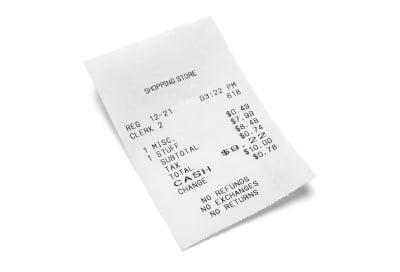
Image of receipt that could be processed by Google Cloud Vision
An example of a simple receipt that could be processed by Google Cloud Vision. (Large preview)
image_to_open = 'images/receipt.jpg'

with open(image_to_open, 'rb') as image_file:
    content = image_file.read()

Next step is to create a Vision object, which will allow you to send a request to proceed with text recognition.

image = vision.types.Image(content=content)

text_response = client.text_detection(image=image)

The response consists of detected words stored as description keys, their location on the image, and a language prediction. For example, let’s take a closer look at the first word:

[
...
description: "SHOPPING"
bounding_poly {
  vertices {
    x: 1327
    y: 1513
  }
  vertices {
    x: 1789
    y: 1345
  }
  vertices {
    x: 1821
    y: 1432
  }
  vertices {
    x: 1359
    y: 1600
  }
}
...
]

As you can see, to filter text only, you need to get a description “on all the elements”. Luckily, with help comes Python’s powerful list comprehension.

texts = [text.description for text in text_response.text_annotations]

['SHOPPING STOREnREG 12-21n03:22 PMnCLERK 2n618n1 MISCn1 STUFFn$0.49n$7.99n$8.48n$0.74nSUBTOTALnTAXnTOTALnCASHn6n$9. 22n$10.00nCHANGEn$0.78nNO REFUNDSnNO EXCHANGESnNO RETURNSn', 'SHOPPING', 'STORE', 'REG', '12-21', '03:22', 'PM', 'CLERK', '2', '618', '1', 'MISC', '1', 'STUFF', '$0.49', '$7.99', '$8.48', '$0.74', 'SUBTOTAL', 'TAX', 'TOTAL', 'CASH', '6', '$9.', '22', '$10.00', 'CHANGE', '$0.78', 'NO', 'REFUNDS', 'NO', 'EXCHANGES', 'NO', 'RETURNS']

If you look carefully, you can notice that the first element of the list contains all text detected in the image stored as a string, while the others are separated words. Let’s print it out.

print(texts[0])

SHOPPING STORE
REG 12-21
03:22 PM
CLERK 2
618
1 MISC
1 STUFF
$0.49
$7.99
$8.48
$0.74
SUBTOTAL
TAX
TOTAL
CASH
6
$9. 22
$10.00
CHANGE
$0.78
NO REFUNDS
NO EXCHANGES
NO RETURNS

Pretty accurate, right? And obviously quite useful, so let’s play more.

What Can You Get From Google Cloud Vision?

As I’ve mentioned above, Google Cloud Vision it’s not only about recognizing text, but also it lets you discover faces, landmarks, image properties, and web connections. With that in mind, let’s find out what it can tell you about web associations of the image.

web_response = client.web_detection(image=image)

Okay Google, do you actually know what is shown on the image you received?

web_content = web_response.web_detection
web_content.best_guess_labels
>>> [label: "Receipt"]

Good job, Google! It’s a receipt indeed. But let’s give you a bit more exercise — can you see anything else? How about more predictions expressed in percentage?

predictions = [
(entity.description, '{:.2%}'.format(entity.score))) for entity in web_content.web_entities
]

>>> [('Receipt', '70.26%'), ('Product design', '64.24%'), ('Money', '56.54%'), ('Shopping', '55.86%'), ('Design', '54.62%'), ('Brand', '54.01%'), ('Font', '53.20%'), ('Product', '51.55%'), ('Image', '38.82%')]

Lots of valuable insights, well done, my almighty friend! Can you also find out where the image comes from and whether it has any copies?

web_content.full_matching_images
 >>> [
url: "http://www.rcapitalassociates.com/wp-content/uploads/2018/03/receipts.jpg", 
url:"https://media.istockphoto.com/photos/shopping-receipt-picture-id901964616?k=6&m=901964616&s=612x612&w=0&h=RmFpYy9uDazil1H9aXkkrAOlCb0lQ-bHaFpdpl76o9A=", 
url: "https://www.pakstat.com.au/site/assets/files/1172/shutterstock_573065707.500x500.jpg"
]

I’m impressed. Thanks, Google! But one is not enough, can you please give me three examples of similar images?

web_content.visually_similar_images[:3]
>>>[
url: "https://thumbs.dreamstime.com/z/shopping-receipt-paper-sales-isolated-white-background-85651861.jpg", 
url: "https://thumbs.dreamstime.com/b/grocery-receipt-23403878.jpg", 
url:"https://image.shutterstock.com/image-photo/closeup-grocery-shopping-receipt-260nw-95237158.jpg"
]

Sweet! Well done.

Is There Really An Artificial Intelligence In Google Cloud Vision?

As you can see in the image below, dealing with receipts can get a bit emotional.


Man screaming and looking stressed while holding a long receipt
An example of stress you can experience while getting a receipt. (Large preview)

Let’s have a look at what the Vision API can tell you about this photo.

image_to_open = 'images/face.jpg'

with open(image_to_open, 'rb') as image_file:
    content = image_file.read()
image = vision.types.Image(content=content)

face_response = client.face_detection(image=image)
face_content = face_response.face_annotations

face_content[0].detection_confidence
>>> 0.5153166651725769

Not too bad, the algorithm is more than 50% sure that there is a face in the picture. But can you learn anything about the emotions behind it?

face_content[0]
>>> [
...
joy_likelihood: VERY_UNLIKELY
sorrow_likelihood: VERY_UNLIKELY
anger_likelihood: UNLIKELY
surprise_likelihood: POSSIBLE
under_exposed_likelihood: VERY_UNLIKELY
blurred_likelihood: VERY_UNLIKELY
headwear_likelihood: VERY_UNLIKELY
...
]

Surprisingly, with a simple command, you can check the likeliness of some basic emotions as well as headwear or photo properties.

When it comes to the detection of faces, I need to direct your attention to some of the potential issues you may encounter. You need to remember that you’re handing a photo over to a machine and although Google’s API utilizes models trained on huge datasets, it’s possible that it will return some unexpected and misleading results. Online you can find photos showing how easily artificial intelligence can be tricked when it comes to image analysis. Some of them can be found funny, but there is a fine line between innocent and offensive mistakes, especially when a mistake concerns a human face.

With no doubt, Google Cloud Vision is a robust tool. Moreover, it’s fun to work with. API’s REST architecture and the widely available Python package make it even more accessible for everyone, regardless of how advanced you are in Python development. Just imagine how significantly you can improve your app by utilizing its capabilities!

Recommended reading: Applications Of Machine Learning For Designers

How Can You Broaden Your Knowledge On Google Cloud Vision

The scope of possibilities to apply Google Cloud Vision service is practically endless. With Python Library available, you can utilize it in any project based on the language, whether it’s a web application or a scientific project. It can certainly help you bring out deeper interest in Machine Learning technologies.

Google documentation provides some great ideas on how to apply the Vision API features in practice as well as gives you the possibility to learn more about the Machine Learning. I especially recommend to check out the guide on how to build an advanced image search app.

One could say that what you’ve seen in this article is like magic. After all, who would’ve thought that a simple and easily accessible API is backed by such a powerful, scientific tool? All that’s left to do is write a few lines of code, unwind your imagination, and experience the boundless potential of image analysis.

Smashing Editorial(rb, ra, il)
Categories: Others Tags:

How to Design a Folder with a Cool Retro Light Leak Effect

January 9th, 2019 No comments
How-to-Design-a-Folder-with-a-Cool-Retro-Light-Leak-Effect

Using retro aesthetics in your design doesn’t have to mean adding 70s hippie graphics or neon lasers from the 80s.

You can incorporate elements of the past in much subtler, more meaningful ways.

For instance, this folder design for a fictional animal shelter simulates the “light leak” effect you might get when using vintage analog cameras. It’s an understated look that evokes a sense of nostalgia and sentimentality without beating the viewer over the head.

This tutorial will show you how to create the same design. Once you’ve mastered the light leak technique, you can work it into a design of your own.

You’ll need the following before you begin:

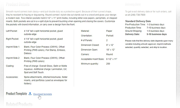
  1. Download the folder die cut template. (Scroll down the page and click “Download template.”)

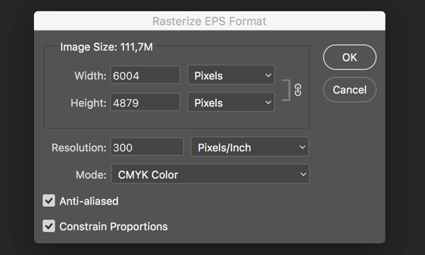
2. Open Photoshop. Click File > Open to open the folder template in Photoshop. Keep the settings in the Rasterize EPS Format window as they are and click the OK button.

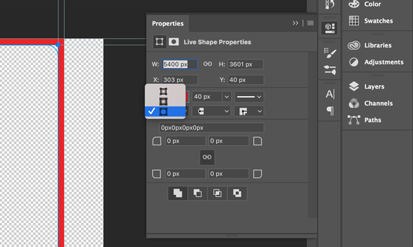
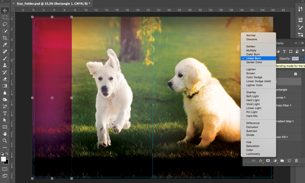
3. Using the Rectangle Tool (U), create a rectangle that covers the left and right panels of the folder. In the Properties Panel, set the Stroke to 40px and select the option shown in the screenshot so that it will appear on the outside edge of the rectangle.

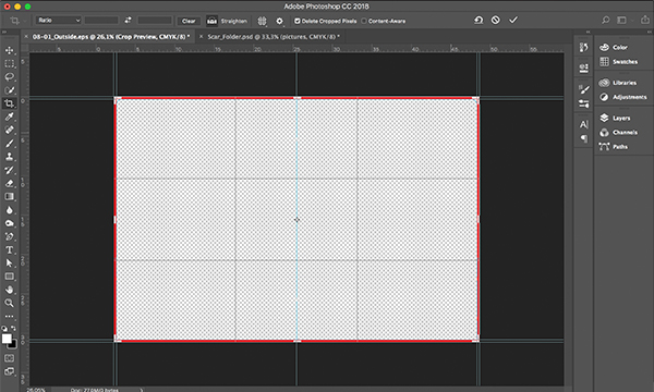
4. Using the Crop Tool (C), cut the canvas down to the rectangle’s outline.

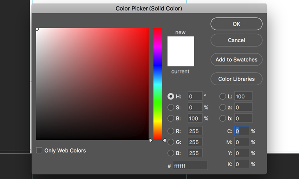
5. Choose Layer > New Fill Layer > Solid Color and press OK. In the Color Picker window, select white.

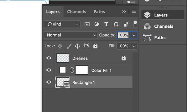
6. Now we can delete the rectangle and move the solid white layer underneath the dieline layer. Name the layer with the lines “Dielines” and lock it by pressing the lock icon on the top of Layers panel; this way you won’t move it accidentally.

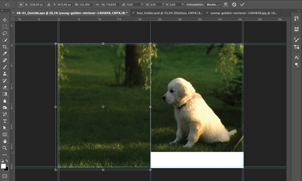
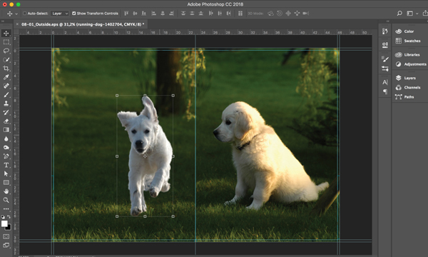
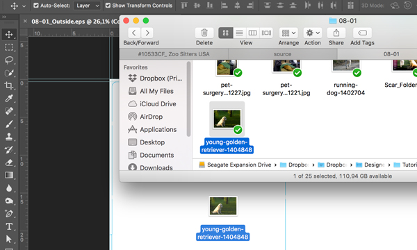
7. Drag the image of the young golden retriever to the canvas.

8. Enlarge the image as shown and flip it horizontally using Edit > Transform > Flip Horizontal.

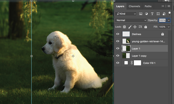
9. In order to fill the extra white space on the bottom and left sides, select the left side of the image using the Marquee Tool (M) and enlarge it to fill the remainder of the left panel using the Free Transform Tool (Ctrl+T). Then, use Cut (Ctrl+X) and Paste (Ctrl+V) to separate this part of image to its own layer. It will automatically be named as Layer 1.

10. Create a copy of Layer 1. In the Layers Panel, move Layer 1 and its copy underneath the layer with the dog photo. On the canvas, move Layer 1 to the right bottom corner in order to fill the white space there.

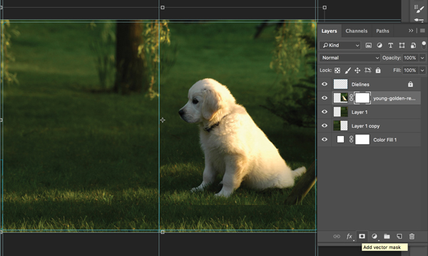
11. Create a mask on the dog photo layer by pressing the appropriate icon on the Layers Panel.

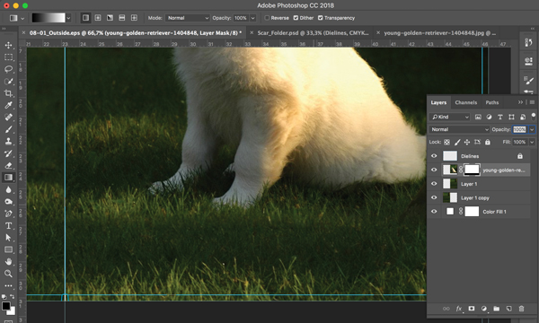
12. Use the Gradient Tool on the mask to make the bottom edge softer so that it blends with the rest of the image.

13. Open the image of a running dog. We’ll need to separate the dog from the background. Choose Select > Select and Mask. Then, using the Quick Selection Tool, select the dog. Make sure Layer Mask is selected in the Output Settings area and press OK.

14. Right-click on the layer and choose Duplicate Layer. Make sure that your project’s name appears in the Document dropdown and press OK. Move the dog to the center of the back panel.

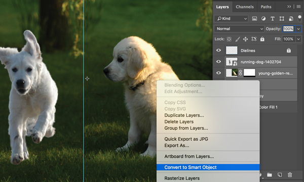
15. Select all layers except Dielines and Color Fill 1 and convert them into a Smart Object by right-clicking and choosing Convert to Smart Object.

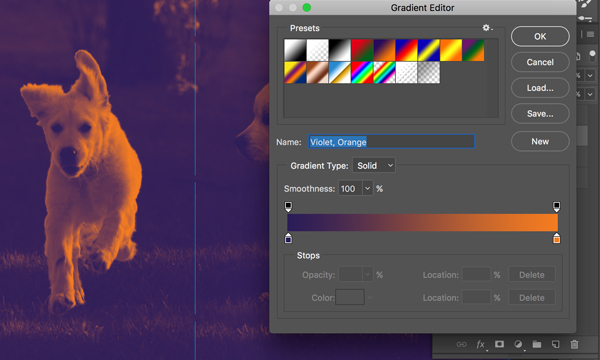
16. Choose Layer > New Adjustment Layer > Gradient Map and press OK. Choose the “Violet, Orange” preset.

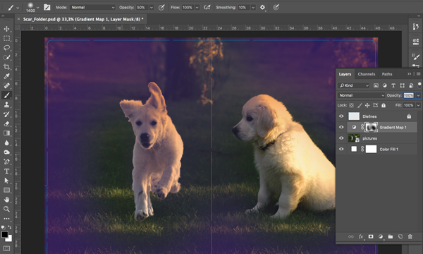
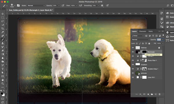
17. Using the Brush Tool, draw at the center of the mask to make the gradient more transparent as shown in the screenshot.

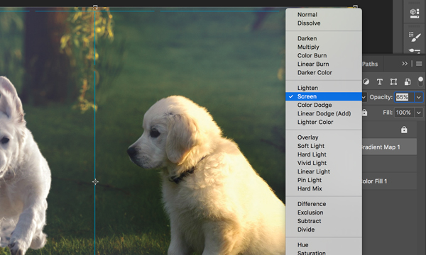
18. Change the blending mode of the Gradient Map layer to Screen with 65% opacity.

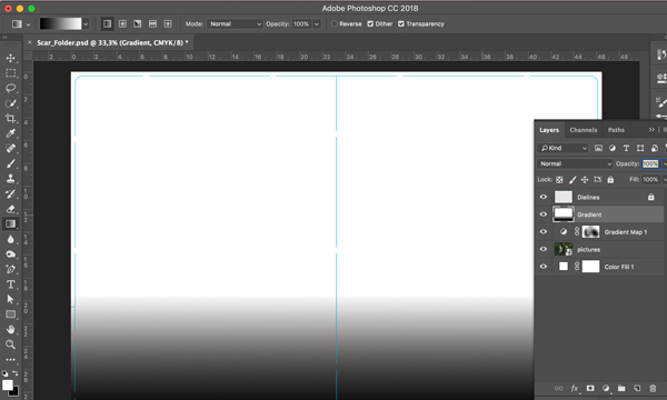
19. Using the Gradient Tool, create a gradient with black at the bottom and white at the top as shown in the screenshot.

20. Change the blending mode of the gradient to Overlay with 70% opacity.

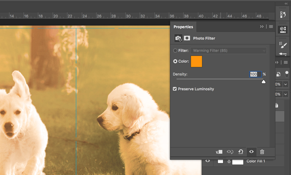
21. Go to Layer > New Adjustment Layer > Photo Filter. Press OK.

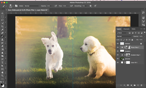
22. Using the Brush Tool, draw on the Photo Filter mask to make gradient more transparent at the center as shown in the screenshot.

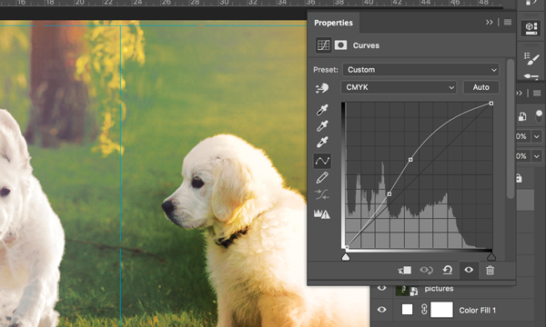
23. Go to Layer > New Adjustment Layer > Curves. Press OK. Set the curve as shown in the screenshot.

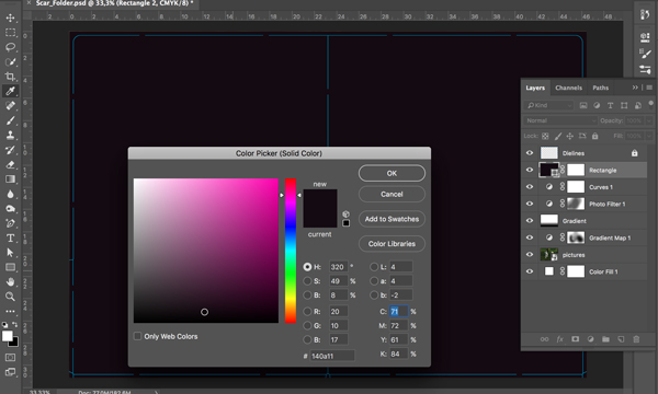
24. Create a rectangle using the Rectangle Tool (U) that covers the whole canvas. Set the color to the following: C71 M72 Y61 K84

25. Using the Marquee Tool (M), create a selection that comprises nearly the entire width and height of the image. Go to Select > Modify > Feather and set the Feather Radius to 100 pixels. Go to Select > Inverse. Click on the mask icon at the bottom of the Layers panel.

26. Change the blending mode of this rectangle to Linear Burn with 37% opacity.

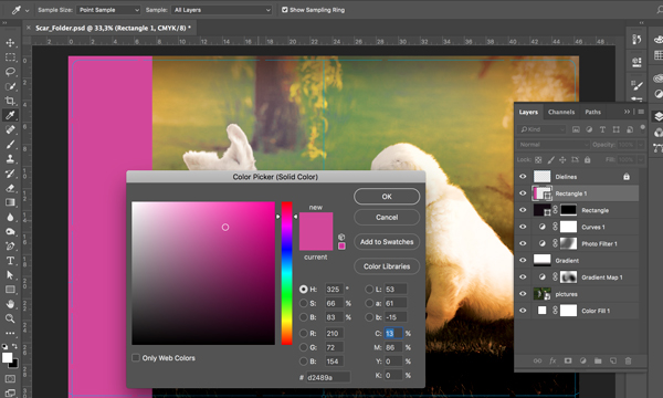
27. On the left side of the folder, create a rectangle using the Rectangle Tool (R) and set the color to: C13 M86 Y0 K0

28. Change the blending mode of this rectangle to Linear Burn with 100% opacity.

29. Import all fonts into the project (as well as the company’s logo). Place the logo and add text as shown using the Horizontal Type Tool (T).

Your design is now complete!

You can download the final PSD file to check it against your own work and use this mockup template to display your finished product.

Have you used a similar light leak effect to create your own cool design? Share it in the comments below!

Categories: Others Tags:

Styling a Web Component

January 8th, 2019 No comments

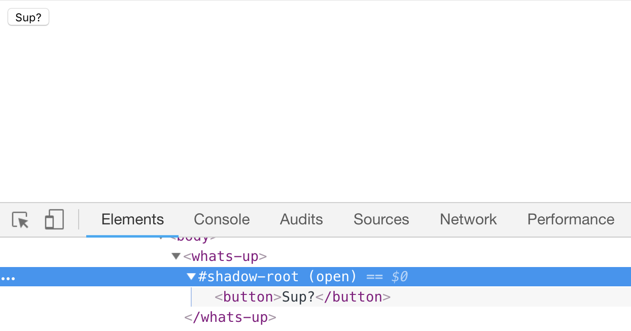
This confused me for a bit here so I’m writing it out while it’s fresh in mind. Just because you’re using a web component doesn’t mean the styles of it are entirely isolated. You might have content within a web component that is styled normally along with the rest of your website. Like this:

See the Pen yGaNKr by Chris Coyier (@chriscoyier) on CodePen.

That element isolated the JavaScript-powered functionality of itself by attaching a click handler to the

Categories: Designing, Others Tags:

How To Learn CSS

January 8th, 2019 No comments

Outside of my extreme envy of the SEO they are going to get out of this, Rachel is spot on here. Learning CSS has some pillars, like language syntax, selectors, layout, and flow that, once learned, unlock your CSS merit badge.

What I would add is that if you really want to learn CSS, give yourself a project that has real-world stakes (like a personal website), so what you are doing with CSS feels important and gives you the incentive to do interesting things and get it right.

Direct Link to ArticlePermalink

The post How To Learn CSS appeared first on CSS-Tricks.
Categories: Designing, Others Tags:

Christmas Gift Ideas for Hipster Designers

January 8th, 2019 No comments
Christmas gift

Do not panic. Breath. You still have about 13 days to get that Christmas gift for your hipster designer friend. If a stuffed polar bear isn’t your type of gift, you should check the polar fox in the list below. JK. We have listed cool gifts, cuz your friend is not a regular friend, he/she is a cool friend. Granted, not all designers are hipsters, but we needed a catchy title. But even so, these gifts are perfect for any type of designers. Don’t believe me? Just check the list below.

This article is for two categories of people:

  1. friends of designers
  2. designers without friends

If you are part of the first group, welcome on WDL. We hope you have a good stay among us. Don’t despair, we’ll make sure you find a great gift for your creative friend. We know, designers can be quite picky when it comes to… everything. Especially when it comes to things they are “forced” to accept to hang on their walls just because it’s Christmas. Please don’t get them an ornament, for God’s sake. Even your granny would accept it out of politeness. The good news is that you don’t need to starve for a week in order to afford a gift for a designer. They are affordable, practical, and will make any designer feel like Charlie Bucket receiving the golden ticket.

If you are part of the second group, we feel ya. We know what’s like sitting in front of a computer for most of the day and then in front of a good book for the remaining part of the day. This summarizes the life of a designer. Of course, there will probably be designers commenting that this is not true. If you are one of those, your best friend is also reading this article right now, trying to figure out what to get you for Christmas. So just pretend that you are surprised, please. But if you know that your focus on work decreased the number of friends (1), there’s nothing wrong with being your own Santa Claus or Willy Wonka. Just don’t act surprised on Christmas morning. That’s just… wrong.

So designers and friends of designers, get on sleight and let’s slide through these festively packed, cinnamon flavored Christmas gifts.

1. Wake-Up Light with Sun Rise Simulation

Some designers wake up early, others don’t, but they all need this light that imitates the sun to shine in their faces to wake them up in the morning. What’s better than waking up early on a summer day, seeing a beautiful simulation of rays shine? This gift will increase the productivity of any designer, giving them more time to spend with friends. Or to make friends. Buy it, it’s cool.

Christmas Gift

2. Teamweek Budget Calculator

Online gifts seem to be the go-to choice for many people nowadays, simply because they are comfortable, fast, and don’t need wrapping paper. Teamweek in itself is a great tool and it would help your friend to get organized. You know designers, they can be messy. Teamweek Budget Calculator is a new feature that allows you to calculate the costs and incomes of any project, lessening the expenses and maximizing the paycheck. Show your designer friends that you care about their finances, and buy them a subscription on Teamweek.

Christmas Gift

3. Touch Screen Gloves

Who doesn’t love skiing and texting? Don’t answer that, please. Anyway, there are parts on the globe where winter is a bit chillier than in Florida. These Touch Screen Gloves are an amazing gift for designers. Besides, who doesn’t know at least an Eskimo designer? They will love this gift!

Christmas Gift

4. Pantone Colour Book

If you know the color of 2019 put your hand up. I see some hands in the back. This Pantone Color Book is essential for every designer who likes keeping up with the trends. It is also useful when clients want a shade of purple that resembles the sunset, but green. Save your designer friend’s life, buy them the Pantone Color Book. Wrap it nicely.

Christmas Gift

5. The Ultimate Guide to Logo Design eBook

Books, as well as e-books, are my ultimate favorite gifts. Every designer who loves to stay informed, evolve into better selves and sharpen their designer’s eye would love this Ultimate Guide to Logo Design eBook. Logos can be tricky and require knowledge. Books equal knowledge. Christmas equals an opportunity to make knowledge a gift.

Christmas Gift

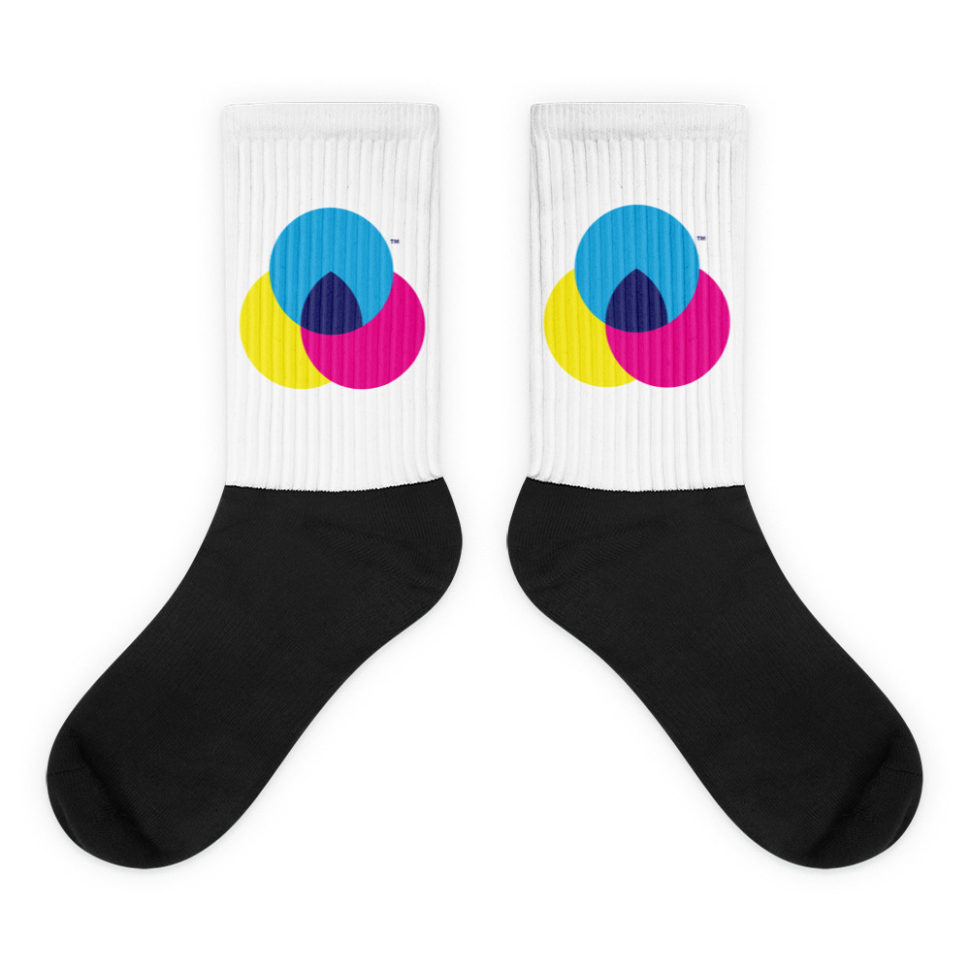
6. CMYK Designer Socks

Socks are always a decent gift. Designer Socks are a GREAT gift. Click on the link and get these amazing socks for your BDF (best designer friend).

Christmas Gift

7. Dot Grid Sketchbook

Whether your designer friend is a novice or experienced, they all need this dot grid integrated pattern book. It is great for logo designs and UI work.

Christmas Gift

8. Online Fonts, Brushes, Patterns, Vectors, Icons

As mentioned previously, online gifts are amazing. There are plenty of websites that offer paid supplies for designers, but one of our favorites is Creative Market. You can get really creative on there and buy the perfect gift from a designer for a designer.

Christmas Gift

9. Online Courses from Udemy

The gift of education is a gift for life. Udemy offers thousands of courses and tutorials that any designer would love to get their hands on.

Christmas Gift

10. Designer T-Shirt

Design is closely related to fashion. It’s hard for me to imagine a designer that can’t dress fashionably. Make sure your friend gets to wear at least one of these amazing designer T-shirts.

Christmas Gift

What do you plan on giving your designer friend this Christmas? Share your ideas in the comment section below. Merry Christmas!

Read More at Christmas Gift Ideas for Hipster Designers

Categories: Designing, Others Tags:

Sass Techniques from the Trenches

January 8th, 2019 No comments

Having been in the web development industry for more than 14 years, I’ve seen and written my fair share of good and bad CSS. When I began at Ramsey Solutions five years ago, I was introduced to Sass. It blew my mind how useful it was! I dove right in and wanted to learn everything I could about it. Over the past five years, I’ve utilized a number of different Sass techniques and patterns and fell in love with some that, to steal Apple’s phrase, just work.

In this article, I’ll explore a wide range of topics:

In my experience, finding the balance between simple and complex is the crucial component to making great software. Software should not only be easy for people to use, but for you and other developers to maintain in the future. I’d consider these techniques to be advanced, but not necessarily clever or complex, on purpose!

“Everyone knows that debugging is twice as hard as writing a program in the first place. So if you’re as clever as you can be when you write it, how will you ever debug it?”

—The Elements of Programming and Style (2nd Edition), Chapter 2

With that in mind, let’s first look at Sass’ ampersand.


The power of the ampersand

There are many different naming conventions you can use to organize your CSS. The one I enjoy using the most is SUIT, a variation of BEM (which is short for Block, Element, Modifier). If you’re unfamiliar with SUIT or BEM, I’d recommend taking a peek at one or both of them before moving on. I’ll be using the SUIT convention throughout the rest of this article.

Whatever naming convention you choose, the base idea is that every styled element gets its own class name, prepended with the component name. This idea is important for how some of the following organization works. Also, this article is descriptive, not prescriptive. Every project is different. You need to do what works best for your project and your team.

The ampersand is the main reason I like to use SUIT, BEM, and conventions like them. It allows me to use nesting and scoping without either biting back with specificity. Here’s an example. Without using the ampersand, I would need to create separate selectors to create -title and -content elements.

.MyComponent {
  .MyComponent-title {}
}

.MyComponent-content {}

// Compiles to
.MyComponent .MyComponent-title {} // Not what we want. Unnecessary specificity!
.MyComponent-content {} // Desired result

When using SUIT, I want the second result for -content to be how I write all my selectors. To do so, I would need to repeat the name of the component throughout. This increases my chance to mistype the name of the component as I write new styles. It’s also very noisy as it ends up ignoring the beginning of many selectors which can lead to glossing over obvious errors.

.MyComponent {}
.MyComponent-title {}
.MyComponent-content {}
.MyComponent-author {}
// Etc.

If this were normal CSS, we’d be stuck writing the above. Since we’re using Sass, there’s a much better approach using the ampersand. The ampersand is amazing because it contains a reference to the current selector along with any parents.

.A {
  // & = '.A'
  .B {
    // & = '.A .B'
    .C {
      // & = '.A .B .C'
    }
  }
}

You can see in the above example how the ampersand references each selector in the chain as it goes deeper into the nested code. By utilizing this feature, we can create new selectors without having to rewrite the name of the component each and every time.

.MyComponent {
  &-title {}
  
  &-content {}
}

// Compiles to
.MyComponent {}
.MyComponent-title {}
.MyComponent-content {}

This is great because we can take advantage of the ampersand to write the name of the component one time and simply reference the component name throughout. This decreases the chance that the component name is mistyped. Plus, the document as a whole becomes easier to read without .MyComponent repeated all over the code.


There are times when the component needs a variant or modifier, as they’re called in SUIT and BEM. Using the ampersand pattern makes it easier to create modifiers.

<div class="MyComponent MyComponent--xmasTheme"></div>
.MyComponent {
  &--xmasTheme {}
}

// Compiles to
.MyComponent {}
.MyComponent--xmasTheme {}

“But, what about modifying the child elements?” you might ask. “How are those selectors created? The modifier isn’t needed on every element, right?”

This is where variables can help!

Variables and scoping

In the past, I’ve created modifiers a few different ways. Most of the time, I’d rewrite the special theme name I want to apply when modifying the element.

.MyComponent {
  &-title {
    .MyComponent--xmasTheme & {
    }
  }
  
  &-content {
    .MyComponent--xmasTheme & {
    }
  }
}

// Compiles to
.MyComponent-title {}
.MyComponent--xmasTheme .MyComponent-title {}
.MyComponent-content {}
.MyComponent--xmasTheme .MyComponent-content {}

This gets the job done, but I’m back to rewriting the component name in multiple places, not to mention the modifier name. There’s definitely a better way to do this. Enter Sass variables.

Before we explore Sass variables with selectors, we need to understand how they’re scoped. Sass variables have scope, just like they would in JavaScript, Ruby, or any other programming language. If declared outside of a selector, the variable is available to every selector in the document after its declaration.

$fontSize: 1.4rem;

.a { font-size: $fontSize; }
.b { font-size: $fontSize; }

Variables declared inside a selector are scoped only to that selector and its children.

$fontSize: 1.4rem;

.MyComponent { 
  $fontWeight: 600;
  font-size: $fontSize; 
  
  &-title {
    font-weight: $fontWeight; // Works!
  }
}

.MyComponent2 { 
  font-size: $fontSize; 
  
  &-title {
    font-weight: $fontWeight; // produces an "undefined variable" error
  }
}

We know variables can store font names, integers, colors, etc. Did you know it can also store selectors? Using string interpolation, we can create new selectors with the variable.

// Sass string interpolation syntax is #{VARIABLE} 
$block: ".MyComponent";

#{$block} {
  &-title {
    #{$block}--xmasTheme & {
    }
  }
}

// Compiles to
.MyComponent {}
.MyComponent-title {}
.MyComponent--xmasTheme .MyComponent-title {}

That’s cool, but the variable is globally scoped. We can fix that by creating the $block variable inside the component declaration, which would scope it to that component. Then we can re-use the $block variable in other components. This helps DRY up the theme modifier.

.MyComponent {
  $block: '.MyComponent';
  
  &-title {
    #{$block}--xmasTheme & {
    }
  }
  
  &-content {
    #{$block}--xmasTheme & {
    }
  }
}

// Compiles to
.MyComponent {}
.MyComponent-title {}
.MyComponent--xmasTheme .MyComponent-title {}
.MyComponent-content {}
.MyComponent--xmasTheme .MyComponent-content {}

This is closer, but again, we have to write the theme name over and over. Let’s store that in a variable too!

.MyComponent {
  $block: '.MyComponent';
  $xmasTheme: '.MyComponent--xmasTheme';
  
  &-title {
    #{$xmasTheme} & {
    }
  }
}

This is much better! However, we can improve this even further. Variables can also store the value of the ampersand!

.MyComponent {
  $block: &;
  $xmasTheme: #{&}--xmasTheme;
  
  &-title {
    #{$xmasTheme} & {
    }
  }
}

// Still compiles to
.MyComponent {}
.MyComponent-title {}
.MyComponent--xmasTheme .MyComponent-title {}

Now that’s what I’m talking about! “Caching” the selector with ampersand allows us to create our modifiers at the top and keep the theme modifications with the element it’s modifying.

“Sure, that works at the top level,” you say. “But what if you are nested really deep, like eight levels in?” You ask great questions.

No matter how deep the nest, this pattern always works because the main component name is never attached to any of the children, thanks to the SUIT naming convention and ampersand combo.

.MyComponent { 
  $block: &;
  $xmasTheme: #{&}--xmasTheme;
  
  &-content {
    font-size: 1.5rem;
    color: blue;
    
    ul {
      li {
        strong {
          span {
            &::before {
              background-color: blue;
              
              #{$xmasTheme} & {
                background-color: red;
              }
            }
          }
        }
      }
    }
  }
}

// Compiles to 
.MyComponent-content {
  font-size: 1.5rem;
  color: blue;
}

.MyComponent-content ul li strong span::before {
  background-color: blue;
}

/*
* The theme is still appended to the beginning of the selector!
* Now, we never need to write deeply nested Sass that's hard to maintain and 
* extremely brittle: https://css-tricks.com/sass-selector-combining/
*/
.MyComponent--xmasTheme .MyComponent-content ul li strong span::before {
  background-color: red;
}

Code organization is the main reason I like to use this pattern.

  • It’s relatively DRY
  • It supports the “opt-in” approach, which keeps modifiers with the elements they modify
  • Naming stuff is hard but this enables us to reuse common element names like “title” and “content”
  • It’s low-lift to add a modifier to a component by placing the modifier class on the parent component

“Hhhmmmmm… doesn’t that get hard to read though after you create a bunch of different components? How do you know where you’re at when everything is named &-title and &-content?”

You continue to ask great questions. Who said the source Sass had to be in one file? We can import those components, so let’s turn to that topic!

The importance of imports

Credit: @Julien_He

One of Sass’ best features is @import. We can create separate Sass files (partials) and import them into other Sass files that compile together with the imported file located at the spot it’s imported. This makes it easy to package up related styles for components, utilities, etc. and pull them into a single file. Without @import, we’d need to link to separate CSS files (creating numerous network requests, which is badong) or write everything in a single stylesheet (which is tough to navigate and maintain).

.Component1 {
  &-title {}
  &-content {}
  &-author {}
}

.Component2 {
  &-title {}
  &-content {}
  &-author {}
}

.Component3 {
  &-title {}
  &-content {}
  &-author {}
}

.Component4 {
  &-title {}
  &-content {}
  &-author {}
}

.Component5 {
  &-title {}
  &-content {}
  &-author {}
}

// A couple hundred lines later...

.Component7384 {
  &-title {}
  &-content {}
  &-author {}
}

// WHERE AM I?

One of the more popular methodologies for organizing Sass files is the 7-1 Pattern. That’s seven distinct folders containing Sass files that are imported into a single Sass file.

Those folders are:

  • abstracts
  • base
  • components
  • layout
  • pages
  • themes
  • vendor

Use @import to pull each Sass file in those folder into a main Sass file. We want to import them in the following order to maintain good scope and avoid conflicts during compilation:

  1. abstracts
  2. vendor
  3. base
  4. layout
  5. components
  6. pages
  7. themes
@import 'abstracts/variables';
@import 'abstracts/functions';
@import 'abstracts/mixins';

@import 'vendors/some-third-party-component';

@import 'base/normalize';

@import 'layout/navigation';
@import 'layout/header';
@import 'layout/footer';
@import 'layout/sidebar';
@import 'layout/forms';

@import 'components/buttons';
@import 'components/hero';
@import 'components/pull-quote';

@import 'pages/home';
@import 'pages/contact';

@import 'themes/default';
@import 'themes/admin';

You may or may not want to use all of these folders (I personally don’t use the theme folder since I keep themes with their components), but the idea of separating all of styles into distinct files makes it easier to maintain and find code.

More of the benefits of using this approach:

  • Small components are easier to read and understand
  • Debugging becomes simpler
  • It’s clearer to determine when a new component should be created — like when a single component file gets to be too long, or the selector chain is too complex
  • This emphasizes re-usage — for example, it might make sense to generalize three component files that essentially do the same thing into one component

Speaking of re-usage, there are eventually patterns that get used often. That’s when we can reach for mixins.

Mixin’ it up

Mixins are a great way to reuse styles throughout a project. Let’s walk through creating a simple mixin and then give it a little bit of intelligence.

The designer I work with on a regular basis always sets font-size, font-weight, and line-height to specific values. I found myself typing all three out every time I needed to adjust the fonts for a component or element, so I created a mixin to quickly set those values. It’s like a little function I can use to define those properties without having to write them in full.

@mixin text($size, $lineHeight, $weight) {
  font-size: $size;
  line-height: $lineHeight;
  font-weight: $weight;
}

At this point, the mixin is pretty simple—it resembles something like a function in JavaScript. There’s the name of the mixin (text) and it takes in three arguments. Each argument is tied to a CSS property. When the mixin is called, Sass will copy the properties and the pass in the argument values.

.MyComponent {
  @include text(18px, 27px, 500);
}

// Compiles to
.MyComponent {
  font-size: 18px;
  line-height: 27px;
  font-weight: 500;
}

While it’s a good demonstration, this particular mixin is a little limited. It assumes we always want to use the font-size, line-height, and font-weight properties when it’s called. So let’s use Sass’ if statement to help control the output.

@mixin text($size, $lineHeight, $weight) {
  // If the $size argument is not empty, then output the argument
  @if $size != null {
    font-size: $size;
  }
  
  // If the $lineHeight argument is not empty, then output the argument
  @if $lineHeight != null {
    line-height: $lineHeight;
  }
  
  // If the $weight argument is not empty, then output the argument
  @if $weight != null {
    font-weight: $weight;
  }
}

.MyComponent {
  @include text(12px, null, 300);
}

// Compiles to
.MyComponent {
  font-size: 12px;
  font-weight: 300;
}

That’s better, but not quite there. If I try to use the mixin without using null as a parameter on the values I don’t want to use or provide, Sass will generate an error:

.MyComponent {
  @include text(12px, null); // left off $weight
}

// Compiles to an error:
// "Mixin text is missing argument $weight."

To get around this, we can add default values to the parameters, allowing us to leave them off the function call. All optional parameters have to be declared after any required parameters.

// We define `null` as the default value for each argument
@mixin text($size: null, $lineHeight: null, $weight: null) {
  @if $size != null {
    font-size: $size;
  }
  
  @if $lineHeight != null {
    line-height: $lineHeight;
  }
  
  @if $weight != null {
    font-weight: $weight;
  }
}

.MyComponent {
  &-title {
    @include text(16px, 19px, 600);
  }
  
  &-author {
    @include text($weight: 800, $size: 12px);
  }
}

// Compiles to
.MyComponent-title {
  font-size: 16px;
  line-height: 19px;
  font-weight: 600;
}

.MyComponent-author {
  font-size: 12px;
  font-weight: 800;
}

Not only do default argument values make the mixin easier to use, but we also gain the ability to name parameters and give them values that may be commonly used. On Line 21 above, the mixin is being called with the arguments out of order, but since the values are being called out as well, the mixin knows how to apply them.


There’s a particular mixin that I use on a daily basis: min-width. I prefer to create all my sites mobile first, or basically with the smallest viewport in mind. As the viewport grows wider, I define breakpoints to adjust the layout and the code for it. This is where I reach for the min-width mixin.

// Let's name this "min-width" and take a single argument we can
// use to define the viewport width in a media query.
@mixin min-width($threshold) {
  // We're calling another function (scut-rem) to convert pixels to rem units.
  // We'll cover that in the next section.
  @media screen and (min-width: scut-rem($threshold)) {
    @content;
  }
}

.MyComponent {
  display: block;
  
  // Call the min-width mixin and pass 768 as the argument.
  // min-width passes 768 and scut-rem converts the unit.
  @include min-width(768) {
    display: flex;
  }
}

// Compiles to 
.MyComponent {
  display: block;
}

@media screen and (min-width: 48rem) {
  .MyComponent {
    display: flex;
  }
}

There are a couple of new ideas here. The mixin has a nested function called @content. So, in the .MyComponent class, we’re no longer calling the mixin alone, but also a block of code that gets output inside the media query that’s generated. The resulting code will compile where @content is called. This allows the mixin to take care of the @media declaration and still accept custom code for that particular breakpoint.

I also am including the mixin within the .MyComponent declaration. Some people advocate keeping all responsive calls in a separate stylesheet to reduce the amount of times @media is written out in a stylesheet. Personally, I prefer to keep all variations and changes that a component can go through with that component’s declaration. It tends to make it easier to keep track of what’s going on and help debug the component if something doesn’t go right, rather than sifting through multiple files.

Did you notice the scut-rem function in there? That is a Sass function taken from a Sass library called Scut, created by David The Clark. Let’s take a look at how that works.

Getting functional

A function differs from a mixin in that mixins are meant to output common groups of properties, while a function modifies properties based on arguments that return a new result. In this case, scut-rem takes a pixel value and converts it to a rem value. This allows us to think in pixels, while working with rem units behind the scenes to avoid all that math.

I’ve simplified scut-rem in this example because it has a few extra features that utilize loops and lists, which are out of the scope of what we’re covering here. Let’s look at the function in its entirety, then break it down step-by-step.

// Simplified from the original source
$scut-rem-base: 16 !default;

@function scut-strip-unit ($num) {
  @return $num / ($num * 0 + 1);
}

@function scut-rem ($pixels) {
  @return scut-strip-unit($pixels) / $scut-rem-base * 1rem;
}

.MyComponent {
  font-size: scut-rem(18px);  
}

// Compiles to
.MyComponent {
  font-size: 1.125rem;
}

The first thing to note is the declaration on Line 2. It’s using !default when declaring a variable, which tells Sass to set the value to 16 unless this variable is already defined. So if a variable is declared earlier in the stylesheet with a different value, it won’t be overridden here.

$fontSize: 16px;
$fontSize: 12px !default;

.MyComponent {
  font-size: $fontSize;
}

// Compiles to
.MyComponent {
  font-size: 16px;
}

The next piece of the puzzle is scut-strip-unit. This function takes a px, rem, percent or other suffixed value and removes the unit label. Calling scut-strip-unit(12px) returns 12 instead of 12px. How does that work? In Sass, a unit divided by another unit of the same type will strip the unit and return the digit.

12px / 1px = 12

Now that we know that, let’s look at the scut-strip-unit function again.

@function scut-strip-unit ($num) {
  @return $num / ($num * 0 + 1);
}

The function takes in a unit and divides it by 1 of the same unit. So if we pass in 12px, the function would look like: @return 12px / (12px * 0 + 1). Following the order of operations, Sass evaluates what’s in the parentheses first. Sass smartly ignores the px label, evaluates the expression, and tacks px back on once it’s done: 12 * 0 + 1 = 1px. The equation is now 12px / 1px which we know returns 12.

Why is this important to scut-rem? Looks look at it again.

$scut-rem-base: 16 !default;

@function scut-rem ($pixels) {
  @return scut-strip-unit($pixels) / $scut-rem-base * 1rem;
}

.MyComponent {
  font-size: scut-rem(18px);  
}

On Line 4, the scut-strip-unit function removes px from the argument and returns 18. The base variable is equal to 16 which turns the equation into: 18 / 16 * 1rem. Remember, Sass ignores any unit until the end of the equation, so 18 / 16 = 1.125. That result multiplied by 1rem gives us 1.125rem. Since Scut strips the unit off of the argument, we can call scut-rem with unit-less values, like scut-rem(18).

I don’t write that many functions because I try to keep the stuff I create as simple as possible. Being able to do some complex conversions using something like scut-rem is helpful though.

The selector order that placeholders mess up

End up where I think it did, that CSS?

I really don’t like to use placeholders and @extend in my code. I find it easy to get in trouble with them for a couple different reasons.

Be careful what is extended

I tried writing out some examples to demonstrate why using @extend can be problematic, but I have used them so little that I can’t create any decent examples. When I first learned Sass, I was surrounded by teammates who’ve already gone through the trials and tribulations. My friend Jon Bebee wrote an extremely excellent article on how @extend can get you into trouble. It’s a quick read and worth the time, so I’ll wait.

About those placeholders…

Jon proposes using placeholders as a solution to the problem he outlines: Placeholders don’t output any code until they’re used with @extend.

// % denotes an extended block
%item {
  display: block;
  width: 50%;
  margin: 0 auto;
}

.MyComponent {
  @extend %item;
  color: blue;
}

// Compiles to
.MyComponent {
  display: block;
  width: 50%;
  margin: 0 auto;
}

.MyComponent {
  color: blue;
}

OK, wait. So it output .MyComponent twice? Why didn’t it simply combine the selectors?

These are the questions I had when I first started using placeholders (and then subsequently stopped). The clue is the name itself. Placeholders simply hold a reference to the place in the stylesheet they were declared. While a mixin copies the properties to the location it is used, placeholders copy the selector to the place where the placeholder was defined. As a result, it copies the .MyComponent selector and places it where %item is declared. Consider the following example:

%flexy {
  display: flex;
}

.A {
  color: blue;
}

.B {
  @extend: %flexy;
  color: green;
}

.C {
  @extend: %flexy;
  color: red;
}

// Compiles to
.B, .C {
  display: flex;
}

.A {
  color: blue;
}

.B {
  color: green;
}

.C {
  color: red;
}

Even though B and C are declared further down in the stylesheet, the placeholder places the extended properties tall the way up to where it was originally declared. That’s not a big deal in this example because it’s really close to the source where it’s used. However, if we’re adhering to something like the 7-1 Pattern we covered earlier, then placeholders would be defined in a partial in the abstracts folder, which is one of the first imported files. That puts a lot of style between where the extend is intended and where it’s actually used. That can be hard to maintain as well as hard to debug.

Sass Guidelines (of course) does a great job covering placeholders and extend and I would recommend reading it. It not only explains the extend feature, but at the end, advocates against using it:

Opinions seem to be extremely divided regarding the benefits and problems from @extend to the point where many developers including myself have been advocating against it, […]


There are many other features of Sass I didn’t cover here, like loops and lists, but I’ve honestly haven’t relied on those features as much as the ones we did cover in this article. Take a look through the Sass documentation, if for nothing else, to see what things do. You may not find a use for everything right away, but a situation may come up and having that knowledge in your back pocket is priceless.

Let me know if I missed something or got something wrong! I’m always open to new ideas and would love to discuss it with you!

Further Reading

The post Sass Techniques from the Trenches appeared first on CSS-Tricks.
Categories: Designing, Others Tags:

The 10,000 Year Clock Design Principals

January 8th, 2019 No comments

In the new year edition of the Clearleft newsletter, Jeremy Keith linked to the design principals Danny Hillis thought about while considering a clock that would work for 10,000 years.

Here’s part of that page, satisfyingly displayed as a

:

Longevity:
Go slow
Avoid sliding friction (gears)
Avoid ticking
Stay clean
Stay dry
Expect bad weather
Expect earthquakes
Expect non-malicious human interaction
Dont tempt thieves
Maintainability and transparency:
Use familiar materials
Allow inspection
Rehearse motions
Make it easy to build spare parts
Expect restarts
Include the manual
Scalability and Evolvabilty:
Make all parts similar size
Separate functions
Provide simple interfaces

How… good.

Direct Link to ArticlePermalink

The post The 10,000 Year Clock Design Principals appeared first on CSS-Tricks.
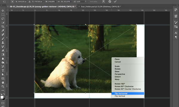
Categories: Designing, Others Tags:

How To Design Search For Your Mobile App

January 8th, 2019 No comments

How To Design Search For Your Mobile App

How To Design Search For Your Mobile App

Suzanne Scacca

2019-01-08T14:00:40+01:002019-01-10T22:17:18+00:00

Why is Google the search behemoth it is today? Part of the reason is because of how it’s transformed our ability to search for answers.

Think about something as simple as looking up the definition of a word. 20 years ago, you would’ve had to pull your dictionary off the shelf to find an answer to your query. Now, you open your phone or turn on your computer, type or speak the word, and get an answer in no time at all and with little effort on your part.
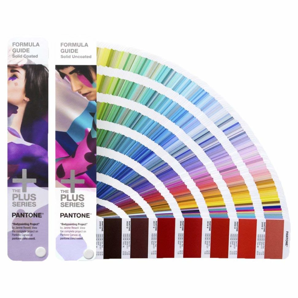
This form of digital shortcutting doesn’t just exist on search engines like Google. Mobile apps now have self-contained search functions as well.

Is a search bar even necessary in a mobile app interface or is it overkill? Let’s take a look at why the search bar element is important for the mobile app experience. Then, we’ll look at a number of ways to design search based on the context of the query and the function of the app.

Using The Web With A Screen Reader

Did you know that VoiceOver makes up 11.7% of desktop screen reader users and rises to 69% of screen reader users on mobile? It’s important to know what sort of first-hand difficulties visually impaired users face and what web developers can do to help. Read article ?

Mobile App Search Is Non-Negotiable

The search bar has been a standard part of websites for years, but statistics show that it isn’t always viewed as a necessity by users. This data from Neil Patel and Kissmetrics focuses on the perception and usage of the search bar on e-commerce websites:


Kissmetrics site search infographic
Data from a Kissmetrics infographic about site search. (Source: Kissmetrics) (Large preview)

As you can see, 60% of surveyed users prefer using navigation instead of search while 47% opt for filterable “search” over regular search functionality.

On a desktop website, this makes sense. When a menu is well-designed and well-labeled — no matter how extensive it may be — it’s quite easy to use. Add to that advanced filtering options, and I can see why website visitors would prefer that to search.

But mobile app users are a different breed. They go to mobile apps for different reasons than they do websites. In sum, they want a faster, concentrated, and more convenient experience. However, since smartphone screens have limited space, it’s not really feasible to include an expansive menu or set of filters to aid in the navigation of an app.

This is why mobile apps need a search bar.

You’re going to find a lot of use for search in mobile apps:

  • Content-driven apps like newspapers, publishing platforms, and blogs;
  • e-Commerce shops with large inventories and categorization of those inventories;
  • Productivity apps that contain documents, calendars, and other searchable records;
  • Listing sites that connect users to the right hotel, restaurant, itinerary, item for sale, apartment for rent, and so on;
  • Dating and networking apps that connect users with vast quantities of “matches”.

There are plenty more reasons why you’d need to use a search bar on your mobile app, but I’m going to let the examples below speak for themselves.

Ways To Design Search For Your Mobile App

I’m going to break down this next section into two categories:

  1. How to design the physical search element in your mobile app,
  2. How to design the search bar and its results within the context of the app.

1. Designing The Physical Search Element

There are a number of points to consider when it comes to the physical presence of your app search element:

Top Or Bottom?

Shashank Sahay explains why there are two places where the search element appears on a mobile app:

  • 1. Full-width bar at the top of the app.
    This is for apps that are driven by search. Most of the time, users open the app with the express purpose of conducting a search.

Facebook app search
Facebook prioritizes app search by placing it at the top. (Source: Facebook) (Large preview)

Facebook is a good example. Although Facebook users most likely do engage with the news feed in the app, I have a sneaking suspicion that Facebook’s data indicates that the search function is more commonly engaged with — at least in terms of first steps. Hence, why it’s placed at the top of the app.

  • 2. A tab in the bottom-aligned navigation bar.
    This is for apps that utilize search as an enhancement to the primary experience of using the app’s main features.

Let’s contrast Facebook against one of its sister properties: Instagram. Unlike Facebook, Instagram is a very simple social media app. Users follow other accounts and get glimpses into the content they share through full-screen story updates as well as from inside their endless-scroll news feed.


Instagram app search
Instagram places its search function in the bottom navigation bar. (Source: Instagram) (Large preview)

With that said, the search function does exist in the navigation bar so that users can look up other accounts to peruse through or follow.

As far as this basic breakdown goes, Sahay is right about how placement of search correlates with intention. But the designing of the search element goes beyond just where it’s placed on the app.

Shallow Or Deep?

There will be times when a mobile app would benefit from a search function deep within the app experience.

You’ll see this sort of thing quite often in e-commerce apps like Bed Bath & Beyond:


Bed Bath & Beyond app search
Bed Bath & Beyond uses deep search to help users find nearby stores (Source: Bed Bath & Beyond) (Large preview)

In this example, this search function exists outside of the standard product search on the main landing page. Results for this kind of search are also displayed in a unique way which is reflective of the purpose of the search:


Bed Bath & Beyond map search results
Bed Bath & Beyond displays search results on a map. (Source: Bed Bath & Beyond) (Large preview)

There are other ways you use might need to use “deep” search functions on e-commerce apps.

Think about stores that have loads of comments attached to each product. If your users want to zero in on what other consumers had to say about a product (for example, if a camping tent is waterproof), the search function would help them quickly get to reviews containing specific keywords.

You’ll also see deep searches planted within travel and entertainment apps like Hotels.com:


Hotels.com app search
Hotels.com includes a deep search to narrow down results by property name. (Source: Hotels.com) (Large preview)

You’re all probably familiar with the basic search function that goes with any travel-related app. You enter the details of your trip and it pulls up the most relevant results in a list or map format. That’s what this screenshot is of.

However, see where it says “Property Name” next to the magnifying glass? This is a search function within a search function. And the only things users can search for here are actual hotel property names.

Bar, Tab, Or Magnifying Glass?

This brings me to my next design point: how to know which design element to represent the search function with.

You’ve already seen clear reasons to use a full search bar over placing a tab in the navigation bar. But how about a miniaturized magnifying glass?

Here’s an example of how this is used in the YouTube mobile app:


YouTube app search icon
YouTube uses a magnifying glass to represent its search function. (Source: YouTube) (Large preview)

The way I see it, the magnifying glass is the search design element you’d use when:

  • One of the primary reasons users come to the app is to do a search,
  • And it competes against another primary use case.

In this case, YouTube needs the mini-magnifying glass because it serves two types of users:

  1. Users that come to the app to search for videos.
  2. Users that come to the app to upload their own videos.

To conserve space, links to both exist within the header of the YouTube app. If you have competing priorities within your app, consider doing the same.

“Search” Or Give A Hint?

One other thing to think about when designing search for mobile apps is the text inside the search box. To decide this, you have to ask yourself:

“Will my users know what sort of stuff they can look up with this search function?”

In most cases they will, but it might be best to include hint text inside the search bar just to make sure you’re not adding unnecessary friction. Here’s what I mean by that:

This is the app for Airbnb:


Airbnb app search text
Airbnb offers hint text to guide users to more accurate search results. (Source: Airbnb) (Large preview)

The search bar tells me to “Try ‘Costa de Valencia’”. It’s not necessarily an explicit suggestion. It’s more helping me figure out how I can use this search bar to research places to stay on an upcoming trip.

For users that are new to Airbnb, this would be a helpful tip. They might come to the site thinking it’s like Hotels.com that enables users to look up things like flights and car rentals. Airbnb, instead, is all about providing lodging and experiences, so this search text is a good way to guide users in the right direction and keep them from receiving a “Sorry, there are no results that match your query” response.

2. Designing The Search Bar And Results In Context

Figuring out where to place the search element is one point to consider. Now, you have to think about how to present the results to your mobile app users:

Simple Search

This is the most basic of the search functions you can offer. Users type their query into the search bar. Relevant results appear below. In other words, you leave it up to your users to know what they’re searching for and to enter it correctly.

When a relevant query is entered, you can provide results in a number of ways.

For an app like Flipboard, results are displayed as trending hashtags:


Flipboard app search results
Flipboard displays search results as a list of hashtags. (Source: Flipboard) (Large preview)

It’s not the most common way you’d see search results displayed, but it makes sense in this particular context. What users are searching for are categories of content they want to see in their feed. These hashtagged categories allow users to choose high-level topics that are the most relevant to them.

ESPN has a more traditional basic search function:


ESPN app search results
ESPN has designed its search results in a traditional list. (Source: ESPN) (Large preview)

As you can see, ESPN provides a list of results that contain the keyword. There’s nothing more to it than that though. As you’ll see in the following examples, you can program your app search to more closely guide users to the results they want to see.

Filtered Search

According to the aforementioned Kissmetrics survey, advanced filtering is a popular search method among website users. If your mobile app has a lot of content or a vast inventory of products, consider adding filters to the end of your search function to improve the experience further. Your users are already familiar with the search technique. Plus, it’ll save you the trouble of having to add advancements to the search functionality itself.

Yelp has a nice example of this:


Yelp app search filters
Yelp users have filter options available after doing a search. (Source: Yelp) (Large preview)

In the search above, I originally looked for restaurants in my “Current Location”. Among the various filters displayed, I decided to add “Order Delivery” to my query. My search query then became:

Restaurants > Current Location > Delivery

This is really no different than using breadcrumbs on a website. In this case, you let users do the initial work by entering a search query. Then, you give them filters that allow them to narrow down their search further.

Again, this is another way to reduce the chances that users will encounter the “No results” response to their query. Because filters correlate to actual categories and segmentations that exist within the app, you can ensure they end up with valid search results every time.

e-Commerce websites are another good use case for filters. Here is how Wayfair does this:


Wayfair app search filters
Wayfair includes filters in search to help users narrow down results. (Source: Wayfair) (Large preview)

Wayfair’s list of search results is fairly standard for an e-commerce marketplace. The number of items are displayed, followed by a grid of matching product images and summary details.

Here’s the thing though: Wayfair has a massive inventory. It’s the same with other online marketplaces like Amazon and Zappos. So, when you tell users that their search query produced 2,975 items, you need a way to mitigate some of the overwhelm that may come with that.

By placing the Sort and Filter buttons directly beside the search result total, you’re encouraging users to do a little more work on their search query to ensure they get the best and most relevant results.

Predictive Search

Autocomplete is something your users are already familiar with. For apps that contain lots of content, utilizing this type of search functionality could be majorly helpful to your users.

For one, they already know how it works and so they won’t be surprised when related query suggestions appear before them. In addition, autocomplete offers a sort of personalization. As you gather more data on a user as well as the kinds of searches they conduct, autocomplete anticipates their needs and provides a shortcut to the desired content.

Pinterest is a social media app that people use to aggregate content they’re interested in and to seek out inspiration for pretty much anything they’re doing in life:


Pinterest app search autocomplete
Pinterest anticipates users’ search queries and provides autocomplete shortcuts. (Source: Pinterest) (Large preview)

Take a look at the search results above. Can you tell what I’ve been thinking about lately? The first is how I’m going to decorate my new apartment. The second is my next tattoo. And despite only typing out the word “Small”, Pinterest immediately knew what’s been top-of-mind with me as of recent. That doesn’t necessarily mean I as a user came to the app with that specific intention today… but it’s nice to see that personalized touch as I engage with the search bar.

Another app I engage with a lot is the Apple Photos app:


Apple Photos app search
Apple Photos uses autocomplete to help users find the most relevant photos. (Source: Apple) (Large preview)

In addition to using it to store all of my personal photos, I use this on a regular basis to take screenshots for work (as I did in this article). As you can imagine, I have a lot of content saved to this app and it can be difficult finding what I need just by scrolling through my folders.

In the example above, I was trying to find a photo I had taken at Niagara Falls, but I couldn’t remember if I had labeled it as such. So, I typed in “water” and received some helpful autocomplete suggestions on “water”-related words as well as photos that fit the description.

I would also put “Recent Search” results into this bucket. Here’s an example from Uber:


Uber app recent search results
Uber’s recent search results provide one-click shortcuts to repeat users. (Source: Uber) (Large preview)

Before I even had a chance to type my search query in the Uber app, it displays my most recent search queries for me.

I think this would be especially useful for people who use ride-sharing services on a regular basis. Think about professionals who work in a city. Rather than own a car, they use Uber to transport to and from their office as well as client appointments. By providing a shortcut to recent trips in search results, the Uber app cuts down the time they spend booking a trip.

If you have enough data on your users and you have a way to anticipate their needs, autocomplete is a fantastic way to personalize search and improve the overall experience.

Limited Search

I think this time savings point is an important one to remember when designing search for mobile apps.

Unlike websites where longer times-on-page matter, that’s not always the case with mobile apps. Unless you’ve built a gaming or news app where users should spend lots of time engaging with the app on a daily basis, it’s not usually the amount of time spent inside the app that matters.

Your goal in building a mobile app is to retain users over longer periods, which means providing a meaningful experience while they’re inside it. A well-thought-out search function will greatly contribute to this as it gets users immediately to what they want to see, even if it means they leave the app just a few seconds later.

If you have an app that needs to get users in and out of it quickly, think about limiting search results as Ibotta has done:


Ibotta app search categories
Ibotta displays categories that users can search in. (Source: Ibotta) (Large preview)

While users certainly can enter any query they’d like, Ibotta makes it clear that the categories below are the only ones available to search from. This serves as both a reminder of what the app is capable of as well as a means for circumventing the search results that don’t matter to users.

Hotels.com also places limits on its search function:


Hotels.com limiting search results
Hotels.com forces users to make a choice so they don’t end up with too many results. (Source: Hotels.com) (Large preview)

As you can see here, users can’t just look for hotels throughout the country of Croatia. It’s just too broad of a search and one that Hotels.com shouldn’t have to provide. For one, it’s probably too taxing on the Hotels.com server to execute a query of that nature. Plus, it would provide a terrible experience for users. Imagine how many hotels would show up in that list of results.

By reining in what your users can search for and the results they can see, you can improve the overall experience while shortening the time it takes them to convert.

Wrapping Up

As you can see here, a search bar isn’t some throwaway design element. When your app promises a speedy and convenient experience to its users, a search bar can cut down on the time they have to spend inside it. It can also make the app a more valuable resource as it doesn’t require much work or effort to get to the desired content.

Smashing Editorial(ra, yk, il)
Categories: Others Tags: