Archive

Archive for January, 2019

Monthly Web Development Update 1/2019: Rethinking Habits And Finding Custom Solutions

January 18th, 2019 No comments
Infographic showing how authentication and verification work without a password

Monthly Web Development Update 1/2019: Rethinking Habits And Finding Custom Solutions

Monthly Web Development Update 1/2019: Rethinking Habits And Finding Custom Solutions

Anselm Hannemann

2019-01-18T12:40:24+01:002019-01-22T07:40:39+00:00

What could be better than starting the new year with some new experiments? Today I figured it was time to rethink JavaScript tooling in one of my projects. And since we wrote everything in plain ECMAScript modules already, I thought it would be easy to serve them natively now and remove all the build and transpilation steps. Until I realized that — although we wrote most code ourselves — we have a couple of third-party dependencies in there and, of course, not all of them are ECMAScript modules. So for now, I have to give up my plans to remove all the build steps and continue to bundle and transpile things, but I’ll try to figure out a better solution to modernize and simplify our tooling setup while providing a smaller bundle to our users.

Another experiment: Just a few weeks ago I had to build a simple “go to the top of the page” button for a website. I used requestAnimationFrame and similar stuff to optimize event handling, but today I found a way nicer and more efficient solution that uses IntersectionObserver to toggle the button on the viewport. You will find that article in the JavaScript section below. The reason I wanted to share these little stories is because I believe that the most important thing is that we review our habits and current solutions and see whether there are better, newer, simpler ideas that could improve a product. Keep playing, keep researching, and be sure to rethink existing systems from time to time.

News

UI/UX

Web Performance

JavaScript


Infographic showing how authentication and verification work without a password
Passwordless authentication? The WebAuthn API makes it possible. (Image credit)

CSS


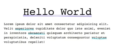
An example text with randomly generated underlines.
Una Kravet’s “super underline” example uses randomly generated underlines for each element. Made possible with Houdini and the Paint API. (Image credit)

Work & Life

  • “Feeling a sense of accomplishment is an important part of our sense of self-worth. Beating up on yourself because you think you could have accomplished more can dent your confidence and self-esteem and leave you feeling depleted at the end of the day.” Lisa Evans shares what we can do to avoid falling into that trap.
  • Itamar Turner-Trauring shares his thoughts on how to get a job with a good work-life balance when you’re competing against people who are willing to work long hours.
  • Is it a good idea to provide healthcare and treatment based on digital products like apps? And if so, what are the requirements, the standards for this? How can we ensure this is done ethically correct? How do we set the limits, the privacy boundaries, how far do we allow companies to go with experiments here? Would personalized content be fine? Is it okay to share data collected from our devices with healthcare providers or insurances? These are questions we will have to ask ourselves and find an individual answer for.
  • This article about how Millenials became the burnout generation hit me hard this week. I see myself in this group of people described as “Millenials” (I do think it affects way more people than just the 20-year-olds) and I could relate to so many of the struggles mentioned in there that I now think that these problems are bigger than I ever imagined. They will affect society, politics, each individual on our planet. Given that fact, it’s crazy to hear that most people today will answer that they don’t have a friend they could talk to about their fears and anything else that disturbs them while two decades ago the average answer was still around five. Let’s assure our friends that we’re there for them and that they can talk to us about tough things. 2019 should be a year in which we — in our circle of influence — make it great to live in a human community where we can think with excitement and happiness about our friends, neighbors, and people we work with or talk to on the Internet.
  • We all try to accommodate so many things at the same time: being successful and productive at work, at home, with our children, in our relationships, doing sports, mastering our finances, and some hobbies. But we blindly ignore that it’s impossible to manage all that on the same level at the same time. We feel regret when we don’t get everything done in a specific timeframe such as at the end of a calendar year. Shawn Blanc argues that we should celebrate what we did do instead of feeling guilty for what we didn’t do.

Going Beyond…

  • There are words, and then there are words. Many of us know how harmful “just” can be as a word, how prescriptive, how passively aggressive it is. Tobias Tom challenges whether “should” is a useful word by examining the implicit and the result of using it in our daily language. Why “should” can be harmful to you and to what you want to achieve.
  • “We all know what we stand for. The trick is to state our values clearly — and to stand by them,” says Ben Werdmuller and points out how important it is to think about your very own red line that you don’t want to cross regardless of external pressure you might face or money you might get for it.
  • Exciting news for climate improvement this week: A team of arborists has successfully cloned and grown saplings from the stumps of some of the world’s oldest and largest coast redwoods, some of which were 3,000 years old and measured 35 feet in diameter when they were cut down in the 19th and 20th centuries. Earlier this month, 75 of the cloned saplings were planted at the Presidio National Park in San Francisco. What makes this so special is the fact that these ancient trees can sequester 250 tons of carbon dioxide from the atmosphere over their lives, compared to 1 ton for an average tree.
  • The ongoing technological development and strive to build new services that automate more and more things make it even more critical to emphasize human connection. Companies that show no effort in improving things for their clients, their employees, or the environment will begin to struggle soon, Ryan Paugh says.
  • We usually don’t expect much nice news about technology inventions from the car industry and their willingness to share it with others. But Toyota now has decided to share their automated safety system ‘Guardian’ with competitors. It uses self-driving technology to keep cars from crashing. “We will not keep it proprietary to ourselves only. But we will offer it in some way to others, whether that’s through licensing or actual whole systems,” says Gill Pratt from the company.

Thank you for reading! I’m happy to be back with this new edition of my Web Development Update in 2019 and grateful for all your ongoing support. It makes me happy to hear that so many people find this resource helpful. So if you enjoyed it, please feel free to share it with people you know, give me feedback, or support it with a small amount of money. —Anselm
(cm)
Categories: Others Tags:

2019 CSS Wishlist

January 17th, 2019 No comments

What do you wish CSS could do natively that it can’t do now? First, let’s review the last time we did this in 2013.

  1. ? “I’d like to be able to select an element based on if it contains another particular selector”
  2. ? “I’d like to be able to select an element based on the content it contains”
  3. ? “I’d like multiple pseudo elements”
  4. ? “I’d like to be able to animate/transition something to height: auto;
  5. ? “I’d like things from Sass, like @extend, @mixin, and nesting”
  6. ? “I’d like ::nth-letter, ::nth-word, etc”
  7. ? “I’d like all the major browsers to auto-update”

Ouch. Oh well. I’m not sure how hotly requested all those actually are or how feasible it is to even implement them. They’re merely ideas that I thought we be useful in 2013, and as it turns out, I still do.

This time, instead of me making my own list, let’s have a gander around the internet at other people who have rounded up CSS desires.

TL;DR List

In observing several sources of conversation around things people desire in CSS, these seem like the most common asks:

  • Parent queries. As in, selecting an element any-which-way, then selecting the parent of that element. We have some proof it’s possible with :focus-within.
  • Container queries. Select a particular element when the element itself is under certain conditions.
  • Standardized styling of form elements.
  • Has/Contains Selectors.
  • Transitions to auto dimensions.
  • Fixed up handling of viewport units.

Notably, what’s interesting to me is the lack of people asking for style scoping. It came up a little, but not a ton. It seems like such a big part of the CSS-in-JS conversation, so I’m surprised to see so little mention of it in the context of general “what does CSS need?” conversations.

Jen Simmons asked what’s on our lists

Making a wish list of all the things I’d love to see happen in the world of CSS in 2019. What’s on your list? Things you want to learn? Problems you want help solving? New properties you need? Design ideas you wish you could code? Resources you’d love to have? Name your desire.

— Jen Simmons (@jensimmons) November 14, 2018

Notable replies from the thread:

  • Aspect ratios (it’s weirdly tricky in CSS, coming to HTML probably, and maybe we’ll get it natively in CSS with a property someday)
  • Exclusions
  • Regions
  • Subgrid (it’s coming!)
  • text-wrap: avoid-widows-and-orphans
  • Nesting
  • Outline with radius
  • Animated background gradients (without faking it by moving them or whatever else)
  • text-overflow:ellipsis over multiple lines / line clamping
  • 0-to-auto transitions
  • Parent selectors
  • Async @import
  • Math functions like sqrt(), sin() and cos()
  • font-min-size and font-max-size
  • Masonry

Tab Atkins wanted to know what parts of CSS give us the most trouble

What parts of CSS give you the most trouble due to browser behavior differences? Collecting some data, please RT. (If answer is different for mobile vs desktop, let me know.)

— ?Taudry Hepburn? (@tabatkins) October 3, 2018

Notable replies from the thread:

  • Tons and tons of requests for a standardized way to style form elements — not just for styling desire, but for accessibility to prevent trading standards for styling.
  • Being able to test browser support of more than just property/values with @supports
  • Improved handling of viewport units and their relationship to other browser UI
  • Improved handling of multi-column layout handling
  • Elastic scrolling

Tommy Hodgins did a CSS+JS advent calendar on Twitter that documents interesting possibilities

Dec 1: Parent Selector ?? Though CSS doesn't have a :parent selector, you can create your own with a small JavaScript function and use a selector like [--parent] in your CSS stylesheets today!

demo: https://t.co/9N1A1Un8XT
code: https://t.co/NNUuvOi1zH#css #javascript pic.twitter.com/Nv8V3rl2AF

— Tommy Hodgins (@innovati) December 1, 2018

Tommy's list:

  • Parent selector
  • Has selector
  • Closest selector
  • First in document (like how querySelector works)
  • Elder sibling selector
  • Previous sibling selector
  • Contains selector
  • Regex selector
  • Computed style selector
  • :nth-letter / :nth-word
  • Media pseudo selectors
  • Not-blank valid/invalid selector
  • Element queries
  • Attribute comparison selectors
  • Custom specificity
  • Visibility selectors
  • Overflow detection selector
  • User agent detection selector
  • Storage queries
  • Date queries
  • Protocol queries
  • Deep hover

We asked as well

Putting together a list of most-wanted native CSS features. There are lots of ideas out there!

Hit me with quick hit ideas. Don't think too hard.

— CSS-Tricks (@css) December 17, 2018

Notable replies from the thread:

  • Container queries
  • Has selector
  • Regions
  • Color modification functions
  • Nesting
  • Shaders
  • Transition to auto dimensions / transition from display: none;
  • Previous sibling selector
  • font-size: fit;
  • Styling grid-template-areas
  • Animation between grid-template-areas
  • Types for custom properties
  • clip-path accepting paths
  • inline-styles: ignore;
  • Aspect ratios
  • Scoping
  • // single line comments
  • Corner shapes

The post 2019 CSS Wishlist appeared first on CSS-Tricks.

Categories: Designing, Others Tags:

Create Smart WordPress Forms in Less Than 5 Minutes with WPForms

January 17th, 2019 No comments

(This is a sponsored post.)

Most online form solutions are either too complex or too expensive.

We believe you shouldn’t have to spend hours creating online forms for your business. That’s why we built WPForms, a drag and drop WordPress form builder that’s both EASY and POWERFUL.

WPForms allows you to create beautiful contact forms, email subscription forms, payment forms, smart survey forms, and basically every other type of form for your website within minutes!

Since launching in 2016, WPForms has taken the market by surprise with it’s pre-built templates and smart workflows. Currently, WPForms is being used on over 1 million WordPress websites.

WPForms also maintains a 4.9 out of 5 star rating average on WordPress.org with over 3,000 five-star ratings.

WPForms Features

Here are the features that makes WPForms the most powerful and user-friendly WordPress form plugin in the market.

  • Drag & Drop Form Builder – create smart forms in minutes without writing any code.
    150+ Pre-Made Form Templates – start with our form templates to save time, and customize them as needed.
    Smart Conditional Logic – customize your forms based on user interaction to collect the most relevant information.
  • Entry Management – See all your leads right inside your WordPress dashboard with Geo-location data, and other powerful features.
  • Instant Form Notifications – Get email notifications when a user submits a form. You can smart routing to send the inquiry to the right person in your team.
  • Spam Protection – Our smart captcha and honeypot automatically prevents all spam submissions. You can also add custom CAPTCHA questions as well.
  • Email Marketing Integrations – Integrate with your email marketing service using our native integration for MailChimp, AWeber, Constant Contact, Drip, and countless others. You can use also use our Zapier integration to connect your forms to over 1000+ other apps.
  • Payment Forms – Create online payments using Stripe or PayPal. Recurring payment support is built-in as well.
  • Surveys & Polls – Easily create smart survey forms and analyze your data with our interactive reports. Our WordPress survey plugin is by far the best solution in the industry.
  • Form Abandonment – Unlock more leads by capturing partial form submissions.
  • Form Permissions – Lock your forms and manage access control with password, logged-in users, and other restrictions.
  • Signature – Allow users to sign your online forms with their mouse or touch screen.
  • Post Submission – Allow users to submit guest blog posts and other content directly to your WordPress site without logging into the dashboard. Great for user-submitted content.
  • User Registration – Create custom user registration and login forms for WordPress with just a few clicks. Also include advanced features like profile field mapping, spam registration protection, etc.
  • All Advanced Fields You Need – From radio button to file uploads to multi-page forms to Likert scale, we have all the fields you need.
  • Easy to Customize – Completely customize your WordPress forms with section dividers, HTML blocks, and custom CSS. WPForms also comes with hooks and filters for developers to extend and create custom functionality.

Smart business owners, designers, and developers love WPForms, and you will too!

Unlike other form solutions that charge a monthly subscription which increases as your business grows, WPForms allows you to create unlimited forms and get unlimited entries for a small yearly fee.

Get Started with WPForms Pro Today

Bonus: CSS Tricks users can get 50% off by using the coupon: SAVE50

Need more social proof? Read WPForms user reviews to see why over 1 million websites choose WPForms to build powerful WordPress forms.

If you’re just starting out and don’t need all the advanced features, then you can try our free WPForms Lite plugin for creating a simple contact form. You can simply download it from your WordPress site by searching for WPForms in the plugin search of your WordPress site.

Direct Link to ArticlePermalink

The post Create Smart WordPress Forms in Less Than 5 Minutes with WPForms appeared first on CSS-Tricks.

Categories: Designing, Others Tags:

How I Built a GPS-Powered Weather Clock With My Old iPhone 4

January 17th, 2019 No comments

My first smartphone was an iPhone 4s. I remember the excitement of exploring its capabilities at a time when it was the coolest thing around. Eventually, of course, I replaced it with a newer model and the old iPhone, still in mint condition, gathered dust for two years. What a waste!

But was it? It occurred to me that I could repurpose the old iPhone to create a useful weather clock for our hallway.

Who needs Nest anyway?

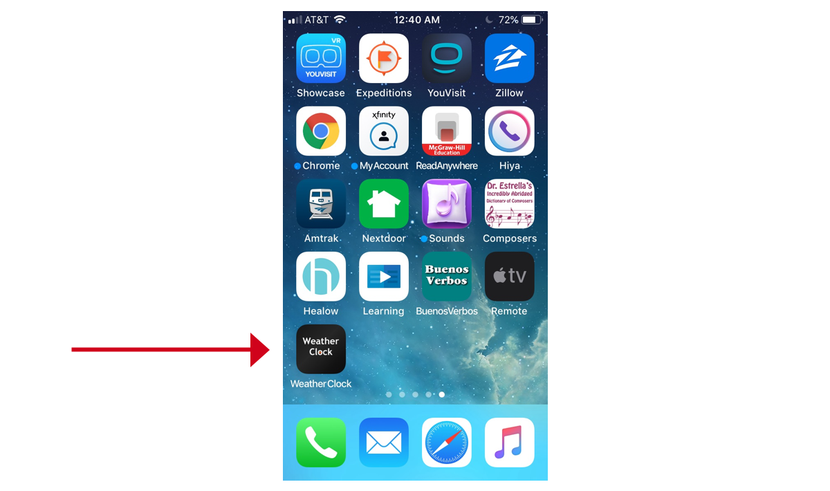
In the process, I discovered that reusing an old device is not only fun and economical, it can also deepen your understanding of web standards. In this tutorial, I will show how I created a small web page to display the date, time, and current weather conditions based on the current GPS location. Together, we’ll retrieve weather data from a public API and hide an API key in a PHP file for security. Finally, we’ll look at adding a manifest file and meta tags so that users can save the page to a device’s home screen and then launch it as a standalone app, including a custom icon for it.

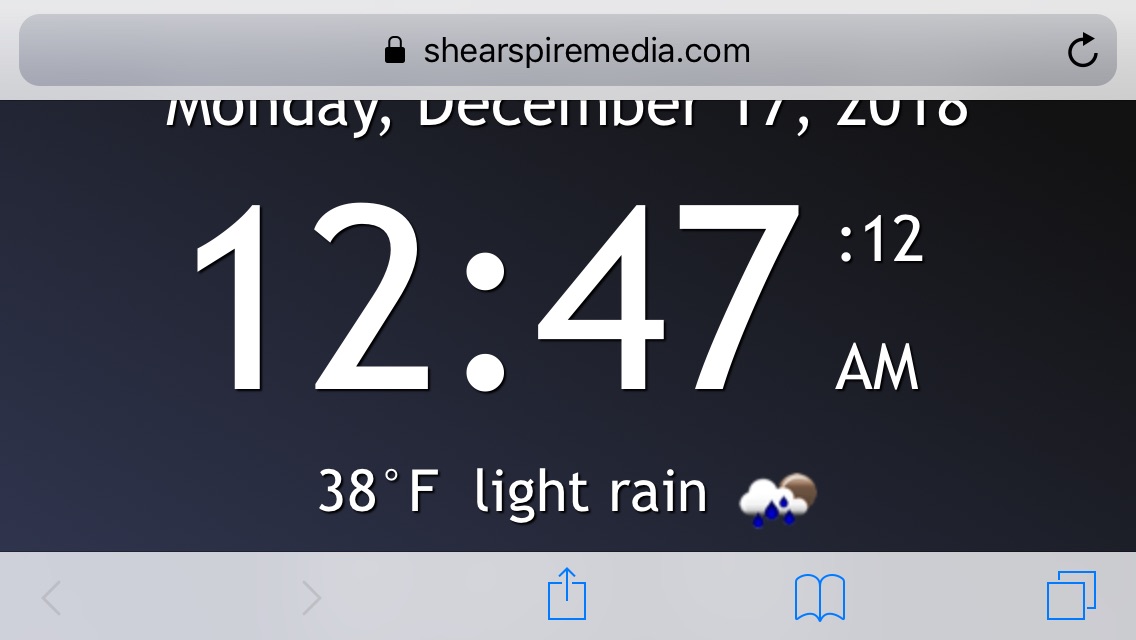
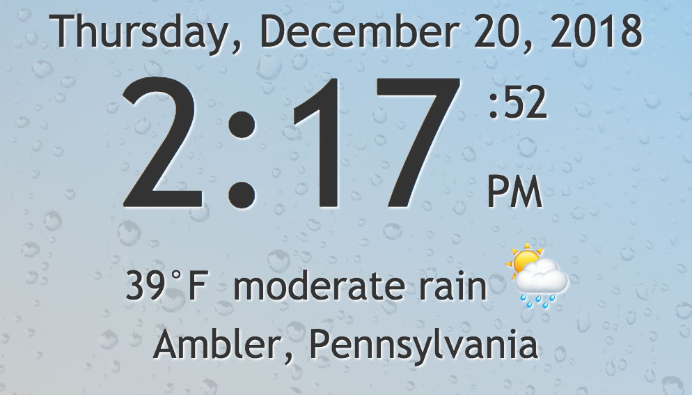
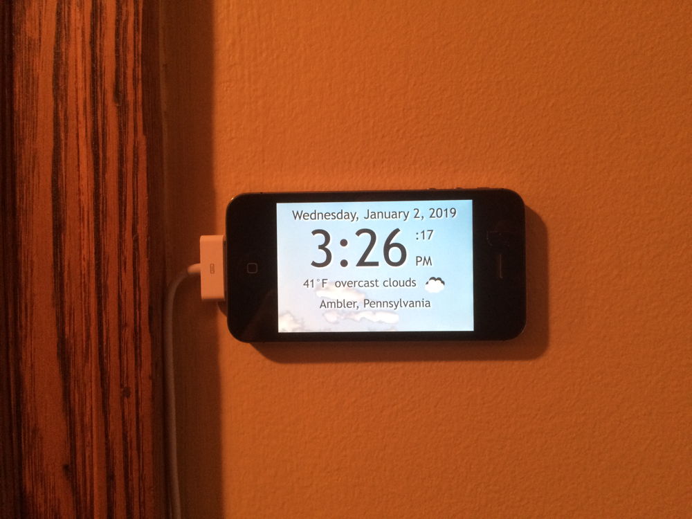
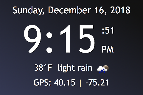
Here is a screen shot of what we’re aiming for:

Step 1: What time is it?

See the Pen Wall Clock by Steven Estrella (@sgestrella) on CodePen.

The HTML for the clock has some placeholder text that we will eventually replace. All we really need at this moment is a centered container element and a couple of semantic elements for the date and time. The tag within the second element will be styled specially to display the running seconds and the meridian. The datetime attribute within the elements will be updated dynamically with JavaScript.

<main id="container" class="daymode">
  <time id="date" datetime="" class="clocktext">Someday, Anymonth 15, 20XX</time>
  <time id="time" datetime="" class="clocktext">12:00<span>:00 PM</span></time>
</main>

A little responsive design is key here. We want this to fit nicely on an iPhone 4s screen or any other small-ish smartphone in both portrait and landscape modes. We also want it to work well on a desktop web browser, of course. We can’t use any bleeding-edge CSS or JavaScript, however, because older devices like my iPhone 4s won’t understand it.

I wound up taking things up a notch by creating styles specific for the time of day and we’ll definitely get to that as well. We could even leverage a media query to darken the daytime style for Mac users who have dark mode turned on in the latest MacOS.

The tag with the running seconds and meridian will wrap nicely based on a width of 2em which is just large enough to accommodate two capital letters (i.e. AM and PM). The final CSS that’s needed is a media query to bump up font sizes when the clock is in landscape mode, or really any device with a viewport wider than 480px.

Here are the base styles we’re looking at, with the more decorative styles in the final app removed for brevity:

/* Base nighttime styles */
.nightmode {
  background-color: #121212;
  color: #fff;
}

/* Base daytime styles */
.daymode {
  background-color: #87ceeb;
  color: #333;
}

/* Target MacOS users who have Dark Mode enabled */
@media (prefers-color-scheme: dark) {
  .daymode {
    background-color: #003;
    color: #ffc;
  }
}

/* Used to wrap any lines of text  */
.clocktext {
  display: block;
  margin: 0;
  padding: 1px 0 0 0;
  text-align: center;
  white-space: nowrap;
  width: 100%;
}

#date {
  font-size: 1.3rem;
  padding-top: 15px;
}

#time {
  font-size: 5rem;
  margin: 1px 0 0 0;
}

#time span {
  display: inline-block;
  font-size: 1.5rem;
  line-height: 1.5;
  margin: 0 0 0 0.5em;
  padding: 0;
  text-align: left;
  vertical-align: baseline;
  white-space: normal;
  width: 2em;
}

@media (min-width: 480px){
  #date {font-size: 2rem;}
  #time {font-size: 8rem;}
  #time span {
    font-size: 2rem;
    line-height: 2;
  }
}

For the JavaScript, I chose ES5 because many features of ES6 don’t work on the mobile Safari browser in iOS 9.35, which is the final iOS that runs on the iPhone 4s. Fortunately, ES5 is more than up to the task and the app runs properly on newer devices as well.

We need variables for the current date and time (now), the element that will display the date (dd), the element that will display the time (td) and the names of the months and days. Once the page is loaded, an init function is called to update the time every second (1000 milliseconds). The getClockStrings() function updates the value in the now Date object and returns an object containing HTML strings for the date and time. Then the updateTime() function updates the HTML to show the time. One lesser-used feature here is the inclusion of the toISOString() method of the Date object which adds a machine-readable date string to the datetime attribute of the two elements.

Here’s what that boils dow to, using the JavaScript from the demo:

// NOTE: ES5 chosen instead of ES6 for compatibility with older mobile devices
var now, dd, td;
var months = ["January","February","March","April","May","June","July","August","September","October","November","December"];
var days = ["Sunday","Monday","Tuesday","Wednesday","Thursday","Friday","Saturday"];

document.addEventListener("DOMContentLoaded", init, false);
function init() {
  dd = document.getElementById("date");
  td = document.getElementById("time");
  updateTime();
  setInterval(updateTime,1000);
}

function updateTime() {
  var clockdata = getClockStrings();
  dd.innerHTML = clockdata.datehtml;
  td.innerHTML = clockdata.timehtml;
  dd.dateTime = now.toISOString();
  td.dateTime = now.toISOString();
}

function getClockStrings() {
  now = new Date();
  var year = now.getFullYear();
  var month = months[now.getMonth()];
  var date = now.getDate();
  var day = days[now.getDay()];
  var hour = now.getHours();
  var minutes = now.getMinutes();
  var seconds = now.getSeconds();
  var meridian = hour < 12 ? "AM" : "PM";
  var clockhour = hour > 12 ? hour - 12 : hour;
  if (hour === 0) {clockhour = 12;}
  var clockminutes = minutes < 10 ? "0" + minutes : minutes;
  var clockseconds = seconds < 10 ? "0" + seconds : seconds;
  var datehtml = day + ", " + month + " " + date + ", " + year;
  var timehtml = clockhour + ":" + clockminutes + "<span>:" + clockseconds + " " + meridian + "</span>";
  return {"datehtml":datehtml,"timehtml":timehtml};
}

Step 2: Where are you?

See the Pen Clock with GPS by Steven Estrella (@sgestrella) on CodePen.

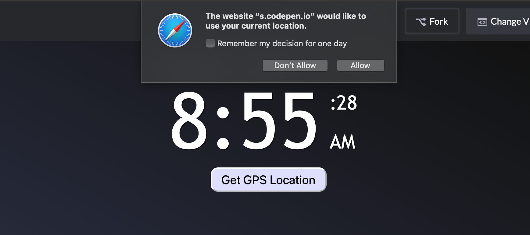
The Geolocation API is an easy way to get the user’s accurate location. We can do that when the page loads, but good manners and Chrome’s best practices audit dictate that we ask the user to initiate the location feature. So, we must add a button and a

to the HTML to display the GPS information we receive.

<button id="gpsbutton">Get GPS Location</button>
<div id="gps" class="clocktext infotext"></div>

These new items require their own styles — mine can be seen in the embedded Pen above. The important thing is to add the class selector rule for the infotext class as well as the two ID selector rules for the gpsbutton.

Finally, we’ll need to add the modified infotext class selector rule within the media query.

Again, the basic styles minus decorative styling for brevity:

/* The geolocation coordinates upon clicking GPS button */
.infotext {
  font-size: 1.3rem;
  line-height: 1.4;
  padding: 0 5px 0 5px;
  width: auto;
}

/* The button itself */
#gpsbutton {
  -webkit-appearance: none;
  -moz-appearance: none;
  display: block;
  margin: 0 auto;
  width: auto;
  cursor: pointer;
}

#gpsbutton:hover {
  /* Styles for the hover state */
}

@media (min-width: 480px){
  /* Add the rule below to the end of the media query */
  .infotext {font-size: 1.8rem;}
}

The JavaScript requires a few new variables for the latitude, longitude, GPS

, and GPS