Getting to Grips with the Airtable API
The Airtable web app is pretty neat. You can use it like a spreadsheet but it’s useful for all sorts of other things too. The neatest thing about it for me is that it has an API so that you can treat it like a database.
I’ve been thinking about making weekly notes for the different teams I work with at Gusto to read about what the design systems team is working on, things we’ve fixed, and any bugs we’ve encountered during that might impact other designers and engineers across our organization. I’ve spent a couple of hours thinking about how we might use Airtable to collect a whole bunch of data and then use its API to extract that info and show it in a web app.
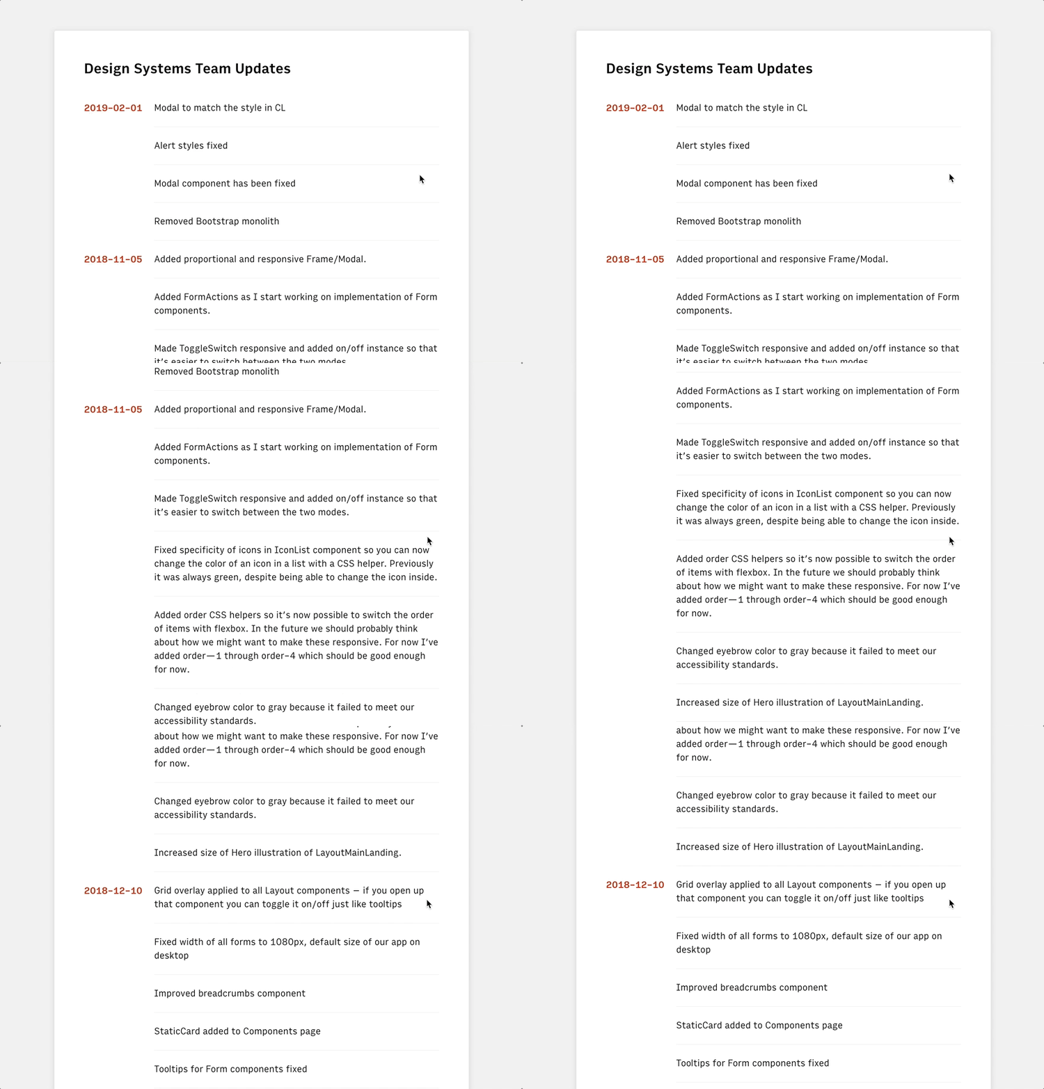
Here’s an example of what we’ll end up building, which is basically a React web app that’s using Airtable as a nifty sorta CMS:
To get started, we have to head on over to the command line and run the following (but first make sure npm is installed):
npx create-react-app airtable-testThis will create a new directory called airtable-test which is where we’ll be making our little React app. If we run yarn start in the command line after that’s finished installing, then we’ll see the default page for the project:
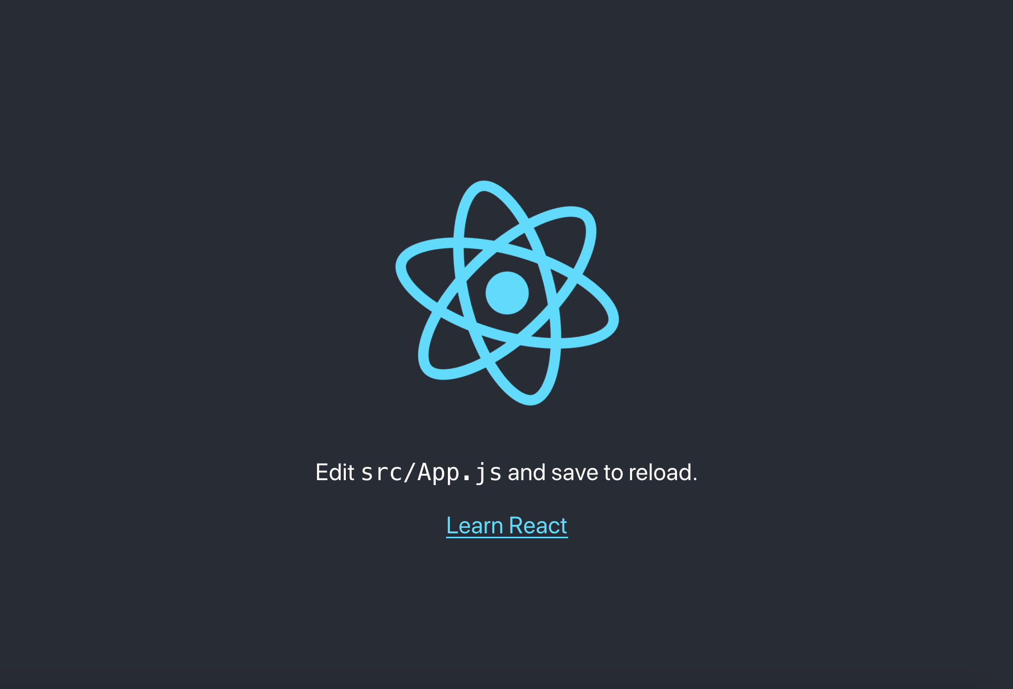
And, if we open up src/App.js in that airtable-test directory, we can see how this page is being rendered with React:
import React, { Component } from 'react';
import logo from './logo.svg';
import './App.css';

class App extends Component {
  render() {
    return (
      <div className="App">
        <header className="App-header">
          <img src={logo} className="App-logo" alt="logo" />
          <p>
            Edit src/App.js and save to reload.
          </p>
          <a
            className="App-link"
            href="https://reactjs.org"
            target="_blank"
            rel="noopener noreferrer"
          >
            Learn React

        </header>
      </div>
    );
  }
}

export default App;
Now that we have React up and running, we can go ahead and install airtable in the command line which will let us interact with the Airtable API:
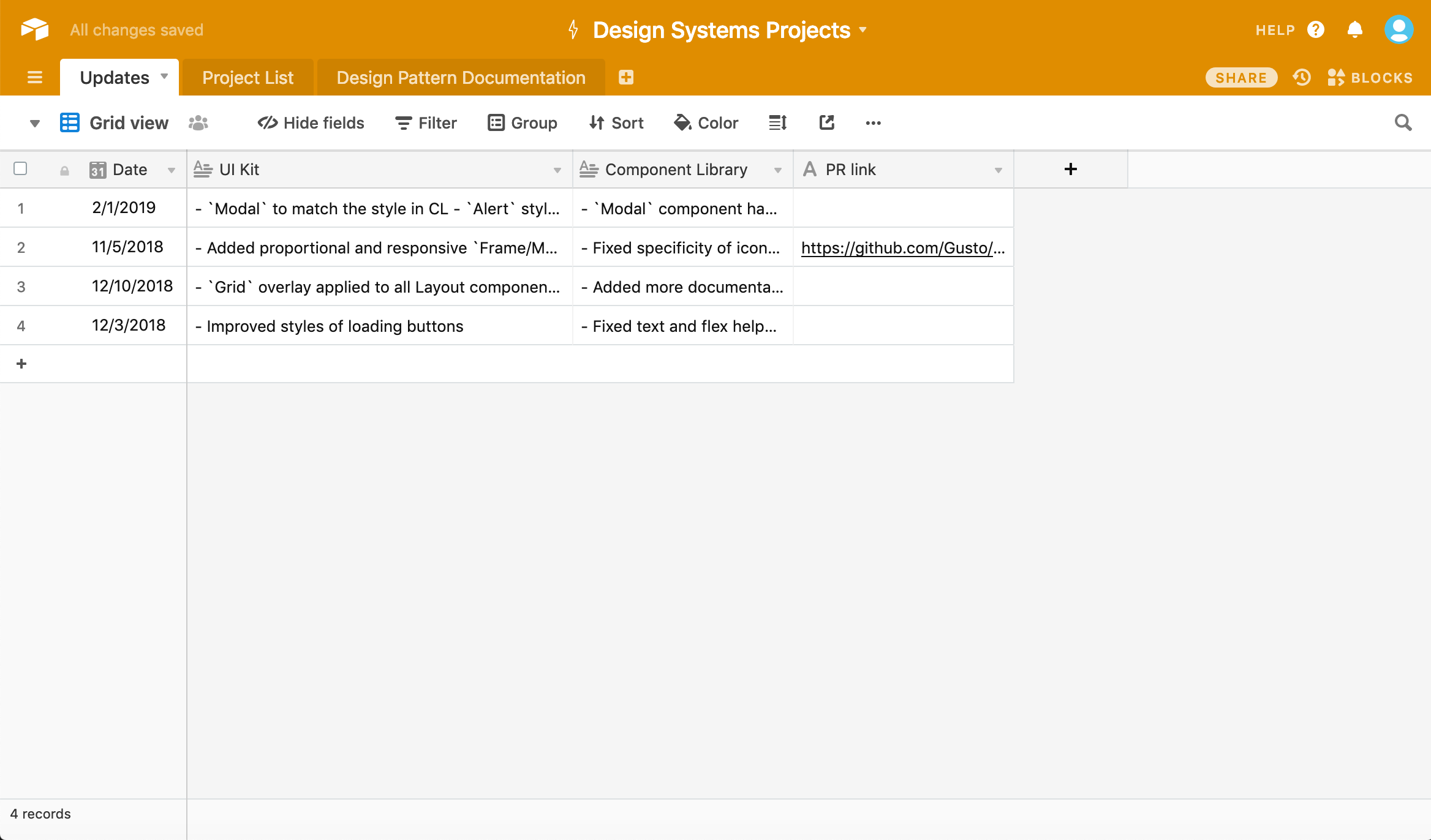
npm i airtableOnce we’ve done that, we’ll need to create an Airtable account and create a project. We should wind up with something like this spreadsheet:
Now we can then head to airtable.com/api and select our project so that is serves as data we’re pulling from. In this case, I selected “Design Systems Projects” which you can see right at the bottom here:
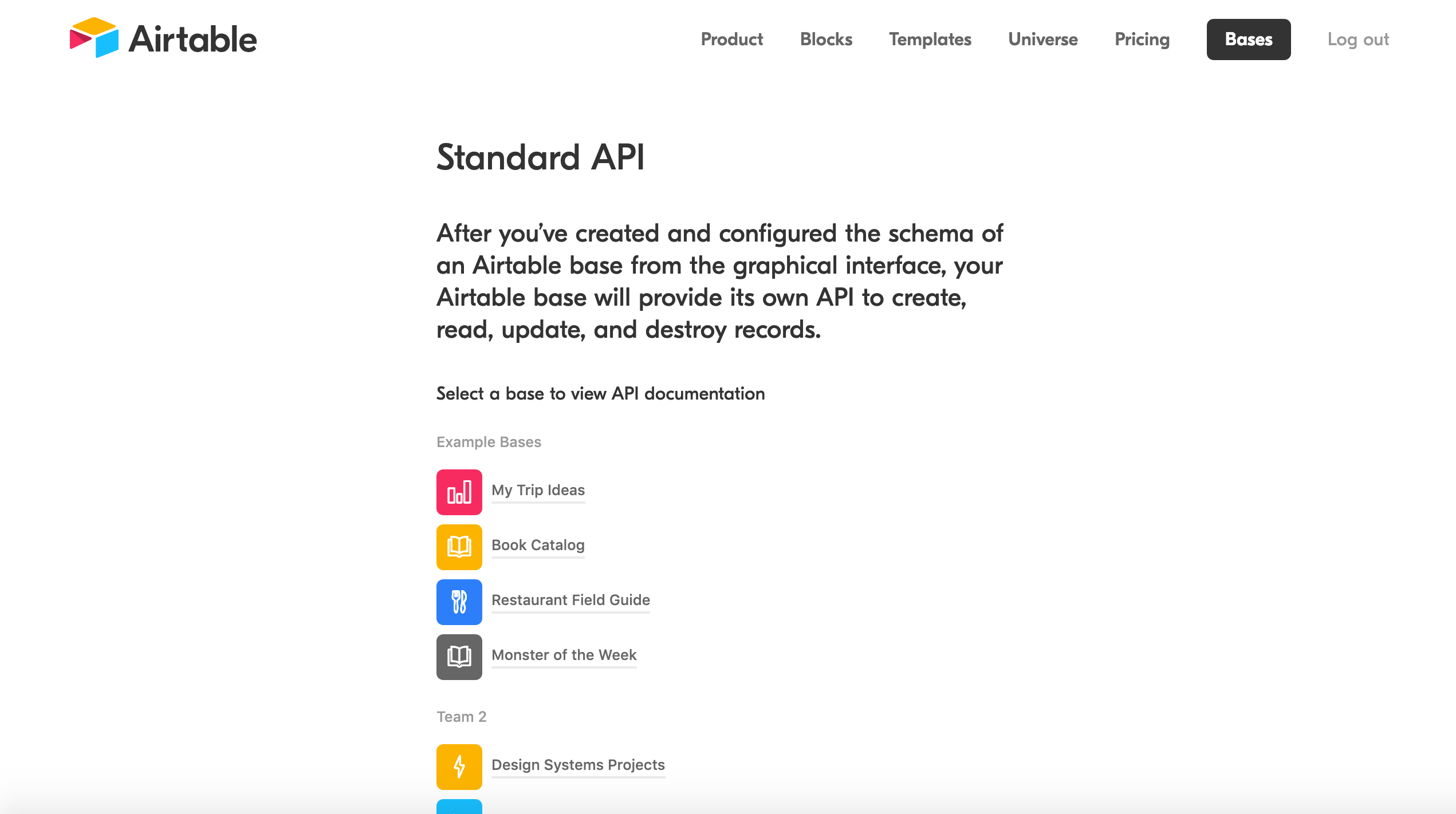
This will send us to a handy docs website that gives us an incredibly easy to read API for our specific project! Scrolling down we’ll find our API key which we’ll need to access this data as well as a ton of examples that we can use to manipulate the data we get back:
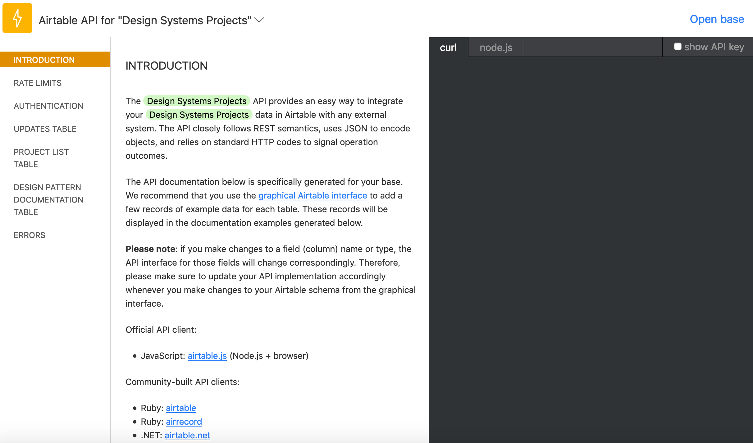
Let’s head back to App.js in our airtable-test directory, delete all the code in that file, and replace it with the following:
import React, { Component } from 'react';
import Airtable from 'airtable';
const base = new Airtable({ apiKey: 'XXXXXXXXXXX' }).base('XXXXXXXXXXX');
Make sure to replace those Xs with the details that you can see in that Airtable API doc we just opened. But now that we’ve done all the setup, we can finally get around to creating our interface by calling data from our spreadsheet.
In App.js we can start to construct the App component:
class App extends Component {
  constructor(props) {
    super(props);
    this.state = {
      records: []
    };
  }
  render() {
    return {
      <div className="App">Hello</div>		}
    }
  }
}
All this will do for now is setup the app’s state and then render “Hello” on the page. Next up, we’ll be add each record from Airtable to that state.
First thing that’s important to note below: in componentDidMount() we’ll be selecting Updates which is just a way of telling Airtable that we want the spreadsheet called Updates. Make sure that this name is the same name as the spreadsheet. We’ll also be looping through all the records, or rows, of our table in that function too:
class App extends Component {
  constructor(props) {
    super(props);
    this.state = {
      records: []
    };
  }
  componentDidMount() {
    base('Updates').select({view: 'Grid view'})
    .eachPage(
      (records, fetchNextPage) => {
        this.setState({
          records
        });
        console.log(records);
        fetchNextPage();
      }
    );
  }
  render() {
    return (
      <div className="App">
        <div>Hello</div>
      </div>
    );
  }
}
fetchNextPage() is the Airtable API’s way of giving us the next record in our spreadsheet and it’s neat that it will keep going until there are no more records. Again, we’re not doing anything with that data yet; we only want to make sure everything is working correctly at this point.
Open up the console in DevTools and we should see something like this:
Array(4) [ {…}, {…}, {…}, {…} ]And if we dive through each of the objects in this array, then we should find all the data from the spreadsheet! Doing this bit always feels like magic to me.
Anyway, next up we can update our render() function like so:
render() {
  return (
    <div className="App">
      {this.state.records.length > 0 ? (
        this.state.records.map((record, index) =>
          <div key={index}>
            <h2>{record.fields['Date']}</h2>
            {record.fields['UI Kit']}
            {record.fields['Component Library']}
          </div>
        )
        ) : (
          <p>Loading...</p>
        )}
      </div>
    </div>
  );
}
We’re going to be looping through the state that we setup earlier and then rendering the record.fields[] for each column in our spreadsheet. We have a Date, UI Kit, and Component Library column, and once we’ve updated our App.js with the code above, we should see all the content from our spreadsheet!
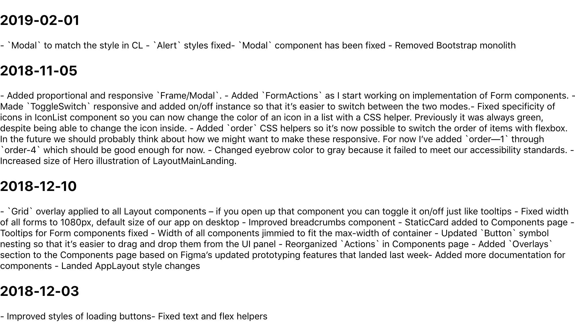
It’s like magic! But why does this data look so weird? Well, it’s because I wanted to write Markdown in each cell, so now we’ll need to use a parser to convert that data into good ol’ fashioned HTML. First, we need to head back to the command line though:
npm i showdown showdown will help us parse all that Markdown we’ve written in our Airtable spreadsheet. After installing it, we only need to import it at the top of our App.js file, like this:
import showdown from 'showdown';
const markdownConverter = new showdown.Converter();
After the componentDidMount() function, we can create another function that will create our HTML using showdown:
createHTML(markdown){
  return(
    markdownConverter.makeHtml(markdown)
  )
}
It’s a little iffy, but it makes me feel like the code is a bit tidier this way. Now we can update our render() function:
  render() {
  return (
    <div className="App">
      {this.state.records.length > 0 ? (
        this.state.records.map((record, index) =>
          <div key={index}>
            <h2>{new Date(record.fields['Date']).toISOString().split('T', 1)}</h2>
            <div dangerouslySetInnerHTML={{__html: this.createHTML(record.fields['UI Kit'])}} />
            <div dangerouslySetInnerHTML={{__html: this.createHTML(record.fields['Component Library'])}} />
          </div>
        )
      ) : (
        <p>Loading...</p>
      )}
    </div>
  );
}
We’re doing a couple of new things here: we’re using dangerouslySetInnerHTML in each div which, in turn, uses our createHTML function to convert the data from each column (specifically, the UI Kit and Component Library columns). We’re also converting the dates of each row into headings to make things a bit easier to read.
And with that we’re pretty much done! Here’s the final App.js:
import React, { Component } from 'react';
import Airtable from 'airtable';
import showdown from 'showdown';

const markdownConverter = new showdown.Converter();

const base = new Airtable({ apiKey: 'xxxxxxx' }).base('xxxxxxx');

class App extends Component {
  constructor(props) {
    super(props);
    this.state = {
      records: []
    };
  }
  componentDidMount() {
    base('Updates').select({view: 'Grid view'})
    .eachPage(
      (records, fetchNextPage) => {
        this.setState({
          records
        });
        fetchNextPage();
      }
    );
  }
  createHTML(markdown){
    return(
      markdownConverter.makeHtml(markdown)
    )
  }
  render() {
    return (
      <div className="App">
        {this.state.records.length > 0 ? (
          this.state.records.map((record, index) =>
            <div key={index}>
              <h2>{new Date(record.fields['Date']).toISOString().split('T', 1)}</h2>
              <div dangerouslySetInnerHTML={{__html: this.createHTML(record.fields['UI Kit'])}} />
              <div dangerouslySetInnerHTML={{__html: this.createHTML(record.fields['Component Library'])}} />
            </div>
          )
        ) : (
          <p>Loading...</p>
        )}
      </div>
    );
  }
}

export default App;
There’s still a ton of updates we could make to improve things. I took a first pass at styling, but we probably want to do things like improve the date format and maybe have some kind of indication as to which updates refer to which rows in the spreadsheet. Maybe we could even toggle showing which information to show depending on whether you’re a designer or engineer.

Anyway! I think this is a good start to getting to grips with the Airtable API and I’d love to hear about how you use it in the comments below.
The post Getting to Grips with the Airtable API appeared first on CSS-Tricks.
