Writing Animations That Bring Your Site to Life
Web animation is one of the factors that can strongly enhance your website’s look and feel. Sadly, unlike mobile apps, there aren’t as many websites using animation to their benefit as you would think. We don’t want to count yours among those, so this article is for you and anyone else looking for ways to use animation for a better user experience! Specifically, we’re going to learn how to make web interactions delightful using CSS animations.
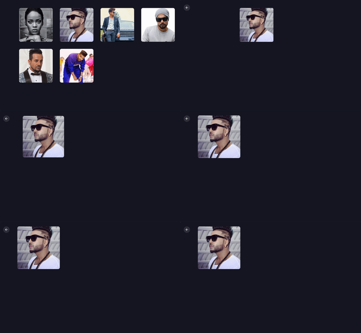
Here’s what we’re going to build together:
Before we move ahead, it’s worth mentioning that I’m going to assume you have at least some familiarity with modern front-end frameworks and a basic understanding of CSS animations. If you don’t, then no fear! CSS-Tricks has a great guides on React and Vue, as well as a thorough almanac post on the CSS animation property.
Good? OK, let’s talk about why we’d want to use animation in the first place and cover some baseline information about CSS animations.
Why would we to animate anything?
We could probably do an entire post on this topic alone. Oh, wait! Sarah Drasner already did that and her points are both poignant and compelling.
But, to sum things up based on my own experiences:
- Animations enhance the way users interact with an interface. For example, smart animations can reduce cognitive load by giving users better context between page transitions.
- They can provide clear cues to users, like where we want them to focus attention.
- Animations serve as another design pattern in and of themselves, helping users to get emotionally attached to and engage with the interface.
- Another benefit of using animations is that they can create a perception that a site or app loads faster than it actually does.
A couple of house rules with animations
Have you ever bumped into a site that animates all the things? Wow, those can be jarring. So, here’s a couple of things to avoid when working with animations so our app doesn’t fall into the same boat:
- Avoid animating CSS properties other than
transformandopacity. If other properties have to be animated, like width or height, then make sure there aren’t a lot of layout changes happening at the same time. There’s actually a cost to animations and you can see exactly how much by referring to CSS Triggers. - Also, just because animations can create perceived performance gains, there’s actually a point of diminishing return when it comes to using them. Animating too many elements at the same time may result in decreased performance.
Now we can get our hands dirty with some code!
Let’s build a music app
We’re going to build the music app we looked at earlier, which is inspired by Aurélien Salomon’s Dribbble shot. I chose this example so that we can focus on animations, not only within a component, but also between different routes. We’ll build this app using Vue and create animations using vanilla (i.e. no framework) CSS.
Animations should go hand-in-hand with UI development. Creating UI before defining their movement is likely to cost much more time. In this case, the Dribbble shot provides that scope for us.
Let’s start with the development.
Step 1: Spin up the app locally
First things first. We need to set up a new Vue project. Again, we’re assuming some base-level understanding of Vue here, so please check out the Learning Vue guide for more info on setting up.
We need a couple of dependencies for our work, notably vue-router for transitioning between views and sass-loader so we can write in Sass and compile to CSS. Here’s a detailed tutorial on using routes and Sass can be installed by pointing the command line at the project directory and using npm install -D sass-loader node-sass.
We have what we need!
Step 2: Setting up routes
For creating routes, we’re first going to create two bare minimum components — Artists.vue and Tracks.vue. We’ll drop a new file in the src folder called router.js and add routes for these components as:
import Vue from 'vue'
import Router from 'vue-router'
import Artists from './components/Artists.vue'
import Tracks from './components/Tracks.vue'

Vue.use(Router)
export default new Router({
	mode: 'history',
	routes: [
		{
			path: '/',
			name: 'artists',
			component: Artists
		},
		{
			path: '/:id',
			name: 'tracks',
			component: Tracks
		}
	]
})
Import router.js into the main.js and inject it to the Vue instance. Lastly, replace the content of your App.vue by .
Step 3: Create the components and content for the music app
We need two components that we’ll transition between with animation. Those are going to be:
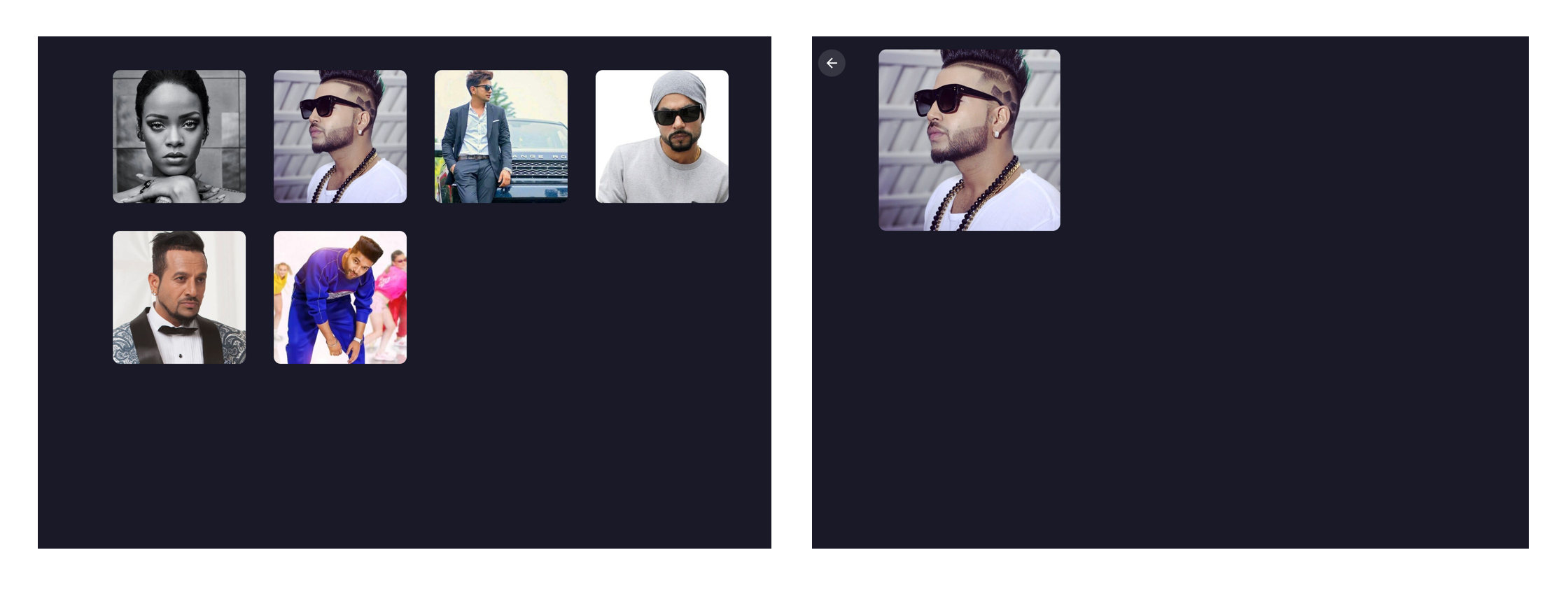
Artists.vue: a grid of artistsTracks.vue: An artist image with a back button
If you wanna jump ahead a bit, here are some assets to work with:
When all is said and done, the two views will come out to something like this:
Step 4: Animate!
Here we are, the part we’ve really wanted to get to all this time. The most important animation in the app is transitioning from Artists to Tracks when clicking on an artist. It should feel seamless where clicking on an artist image puts that image in focus while transitioning from one view into the next. This is exactly the type of animation that we rarely see in apps but can drastically reduce cognitive load for users.
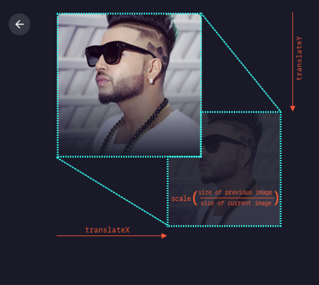
To make sure we’re all on the same page, we’re going to refer to the first image in the sequence as the “previous” image and the second one as the “current” image. Getting the effect down is relatively easy as long as we know the dimensions and position of the previous image in the transition. We can animate the current image by transforming it as per previous image.
The formula that I’m using is transform: translate(x, y) scale(n), where n is equal to the size of previous image divided by the size of current image. Note that we can use a static value of n since the dimensions are fixed for all the images. For example, the image size in the Artists view is 190x190 and 240x240 in the Tracks view. Thus, we can replace n by 190/240 = 0.791. That means the transform value becomes translate(x, y) scale(0.791) in our equation.

Next thing is to find x and y. We can get these values though click event in the Artists view as:
const {x, y} = event.target.getBoundingClientRect()…and then send these values to the Tracks view, all while switching the route. Since we aren’t using any state management library, the two components will communicate via their parent component, which is the top level component, App.vue. In App.vue, let’s create a method that switches the route and sends the image info as params.
gotoTracks(position, artistId) {
	this.$router.push({
		name: 'tracks',
		params: {
			id: artistId,
			position: position
		}
	})
}
Here’s the relevant code from the repo to reference, in case you’re interested.
Since we have received the position and ID of the image in Tracks, we have all the required data to show and animate it. We’ll first fetch artist information (specifically the name and image URL) using artist ID.
To animate the image, we need to calculate the transform value from the image’s starting position. To set the transform value, I’m using CSS custom properties, which can be done with CSS-in-JS techniques as well. Note that the image’s position that we received through props will be relative to window. Therefore we’ll have to subtract some fixed offset caused by the padding of the container
const { x, y } = this.$route.params.position
// padding-left
const offsetLeft = 100
// padding-top
const offsetTop = 30

// Set CSS custom property value
document.documentElement.style.setProperty(
	'--translate',
	`translate(${x - offsetLeft}px, ${y - offsetTop}px) scale(0.792)`
)
We’ll use this value to create a keyframe animation to move the image:
@keyframes move-image {
	from {
		transform: var(--translate);
	}
}
This gets assigned to the CSS animation:
.image {
	animation: move-image 0.6s;
}
…and it will animate the image from this transform value to its original position on component load.

We can use the same technique when going the opposite direction, Tracks to Artists. As we already have the clicked image’s position stored in the parent component, we can pass it to props for Artists as well.

Step 5: Show the tracks!
It’s great that we can now move between our two views seamlessly, but the Tracks view is pretty sparse at the moment. So let’s add the track list for the selected artist.
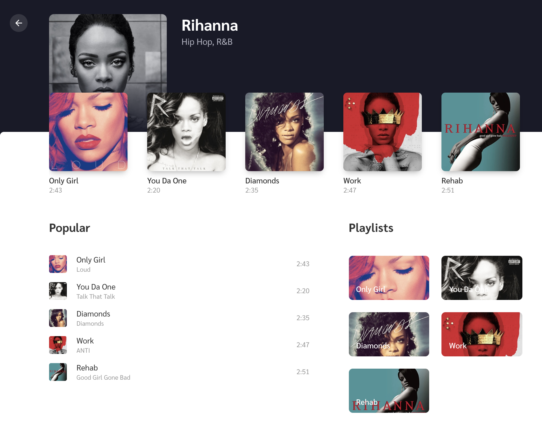
We’ll create an empty white box and a new keyframe to slide it upwards on page load. Then we’ll add three subsections to it: Recent Tracks, Popular Tracks, and Playlist. Again, if you want to jump ahead, feel free to either reference or copy the final code from the repo.

Recent Tracks is the row of thumbnails just below the artist image where each thumbnail includes the track name and track length below it. Since we’re covering animations here, we’ll create a scale-up animation, where the image starts invisible (opacity: 0) and a little smaller than it’s natural size (scale(0.7)), then is revealed (opacity: 1 )and scales up to its natural size (transform: none).
.track {
	opacity: 0;
	transform: scale(0.7);
	animation: scale-up 1s ease forwards;
}

@keyframes scale-up {
	to {
		opacity: 1;
		transform: none;
	}
}
The Popular Tracks list and Playlist sit side-by-side below the Recent Tracks, where Popular tracks takes up most of the space. We can slide them up a bit on initial view with another set of keyframes:
.track {
	...
	animation: slide-up 1.5s;
}

@keyframes slide-up {
	from {
		transform: translateY(140px);
	}
}
To make the animation feel more natural, we’ll create a stagger effect so the Recent Tracks lead a little ahead of the Popular Tracks and Playlist using an incremental animation delay to each item.
@for $i from 1 to 5 {
	&:nth-child(#{$i + 1}) {
		animation-delay: #{$i * 0.05}s;
	}
}
The code above is basically looking for each child element, then adding a 0.05 second delay to each element it finds. So, for example, the first child gets a 0.05 second delay, the second child gets a 0.10 second delay and so on.
Check out how nice and natural this all looks:
Bonus: micro-interactions!
One of the fun things about working with animations is thinking through the small details because they’re what tie things together and add delight to the user experience. We call these micro-interactions and they serve a good purpose by providing visual feedback when an action is performed.
Depending on the complexity of the animations, we might need a library like anime.js or GSAP. This example is pretty straightforward, so we can accomplish everything we need by writing some CSS.
First micro-interaction: The volume icon
Let’s first get a volume icon in SVG format (Noun Project and Material Design are good sources). On click, we’ll animate-in and out its path element to show the level of volume. For this, we’ll create a method which switches its CSS class according to the volume level.
<svg @click="changeVolume">
	<g :class="`level-${volumeLevel}`">
		<path d="..."/> <!-- volume level 1 -->
		<path d="..."/> <!-- volume level 2 -->
		<path d="..."/> <!-- volume level 3 -->
		<polygon points="..."/>
	</g>
</svg>
Based on this class, we can show and hide certain path elements as:
path {
	opacity: 0;
	transform-origin: left;
	transform: translateX(-5px) scale(0.6);
	transition: transform 0.25s, opacity 0.2s;
}

.level-1 path:first-child,
.level-2 path:first-child,
.level-2 path:nth-child(2),
.level-3 path {
	opacity: 1;
	transform: none;
}
Second micro-interaction: The favorite icon
Do you like it when you click on Twitter’s heart button? That’s because it feels unique and special by the way it animates on click. We’ll make something similar but real quick. For this, we first get an SVG heart icon and add it to the the markup. Then we’ll add a bouncy animation to it that’s triggered on click.
@keyframes bounce {
	0%, 100% {
		transform: none;
	}
	30% {
		transform: scale(1.3);
	}
	60% {
		transform: scale(0.9);
	}
}
Another fun thing we can do is add other small heart icons around it with random sizes and positions. Ideally, we’d add a few absolute-positioned HTML elements that a heart as the background. Let’s Arrange each of them as below by setting their left and bottom values.
We’ll also include a fade away effect so the icons appear to dissolve as they move upward by adding a keyframe animation on the same click event.
@keyframes float-upwards {
	0%, 100% {
		opacity: 0;
	}
	50% {
		opacity: 0.7;
	}
	50%, 100% {
		transform: translate(-1px, -5px);
	}
}
Summing up
That’s all! I hope you find all this motivating to try animations on your own websites and projects.
While writing this, I also wanted to expand on the fundamental animation principles we glossed over earlier because I believe that they help choose animation durations, and avoid non-meaningful animations. That’s important to discuss because doing animations correctly is better than doing them at all. But this sounds like a whole another topic to be covered in a future article.
The post Writing Animations That Bring Your Site to Life appeared first on CSS-Tricks.
