Responsive Designs and CSS Custom Properties: Building a Flexible Grid System
Last time, we looked at a few possible approaches for declaring and using CSS custom properties in responsive designs. In this article, we’ll take a closer look at CSS variables and how to use them in reusable components and modules. We will learn how to make our variables optional and set fallback values.
As an example, we will build a simple grid system based on flexbox. Grid systems play a vital role in responsive designs. However, building a grid system that is flexible and lightweight at the same time can be a tricky task. Let’s see what the common approaches towards grid systems are and how CSS custom properties can help us build them.
Article Series:
- Defining Variables and Breakpoints
- Building a Flexible Grid System (This Post)
A simple CSS grid system
Let’s start with a 12-column grid system:
.container {
	max-width: 960px;
	margin: 0 auto;
	display: flex;
}

.col-1 { flex-basis: 8.333%; }
.col-2 { flex-basis: 16.666%; }
.col-3 { flex-basis: 25%; }
.col-4 { flex-basis: 33.333%; }
.col-5 { flex-basis: 41.666%; }
.col-6 { flex-basis: 50%; }
/* and so on up to 12... */
See the Pen
#5 Building responsive features with CSS custom properties by Miko?aj (@mikolajdobrucki)
on CodePen.
There’s quite a lot of repetition and hard-coded values here. Not to mention how many more will be generated once we add more breakpoints, offset classes, etc.
Building a grid system with Sass
To make our grid example more readable and maintainable, let’s use Sass to preprocess our CSS:
$columns: 12; // Number of columns in the grid system

.container {
	display: flex;
	flex-wrap: wrap;
	margin: 0 auto;
	max-width: 960px;
}

@for $width from 1 through $columns {
	.col-#{$width} {
		flex-basis: $width / $columns * 100%;
	}
}
See the Pen
#6 Building responsive features with CSS custom properties by Miko?aj (@mikolajdobrucki)
on CodePen.
This is definitely much easier to work with. As we develop our grid further and, let’s say, would like to change it from 12 columns to 16 columns, all we have to do is to update a single variable (in comparison to dozens of classes and values). But… as long as our Sass is shorter and more maintainable now, the compiled code is identical to the first example. We are still going to end up with a massive amount of code in the final CSS file. Let’s explore what happens if we try to replace the Sass variables with CSS custom properties instead.
Building a grid system with CSS custom properties
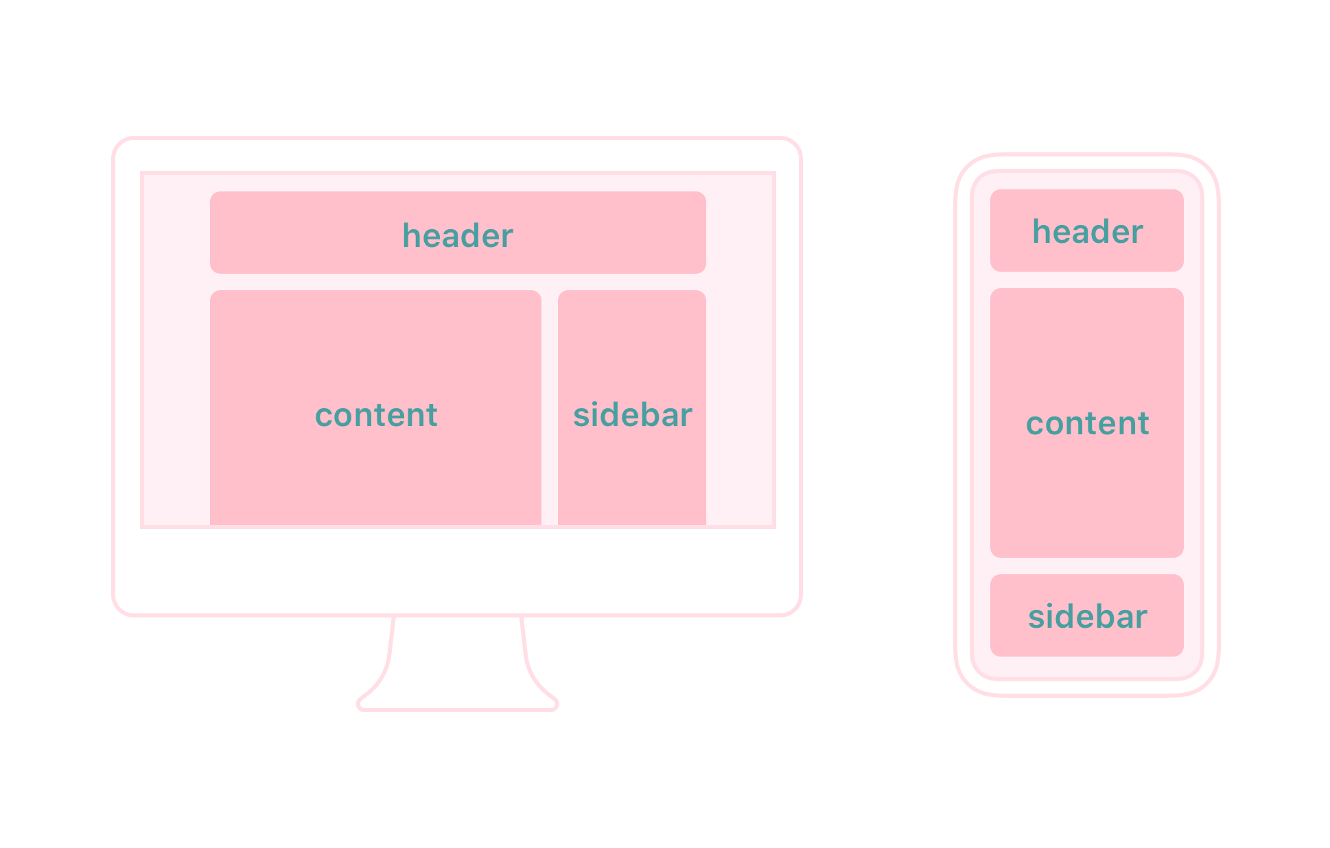
Before we start playing with CSS custom properties, let’s start with some HTML first. Here’s the layout we’re aiming for:
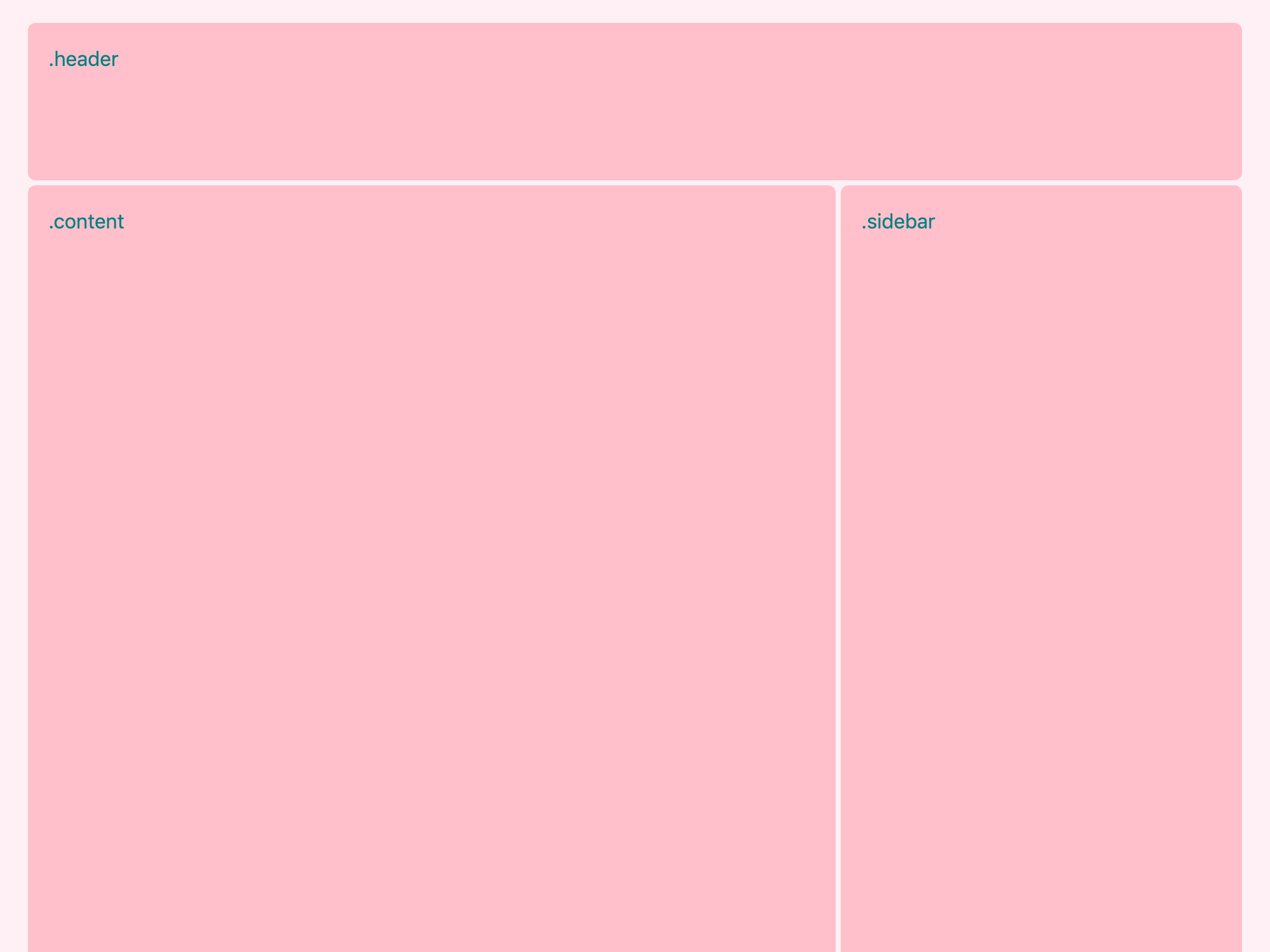
It consists of three elements: a header, a content section and a sidebar. Let’s create markup for this view, giving each of the elements a unique semantic class (header, content, sidebar) and a column class which indicates that this element is a part of a grid system:
<div class="container">
	<header class="header column">
		header
	</header>
	<main class="content column">
		content
	</main>
	<aside class="sidebar column">
		sidebar
	</aside>
</div>
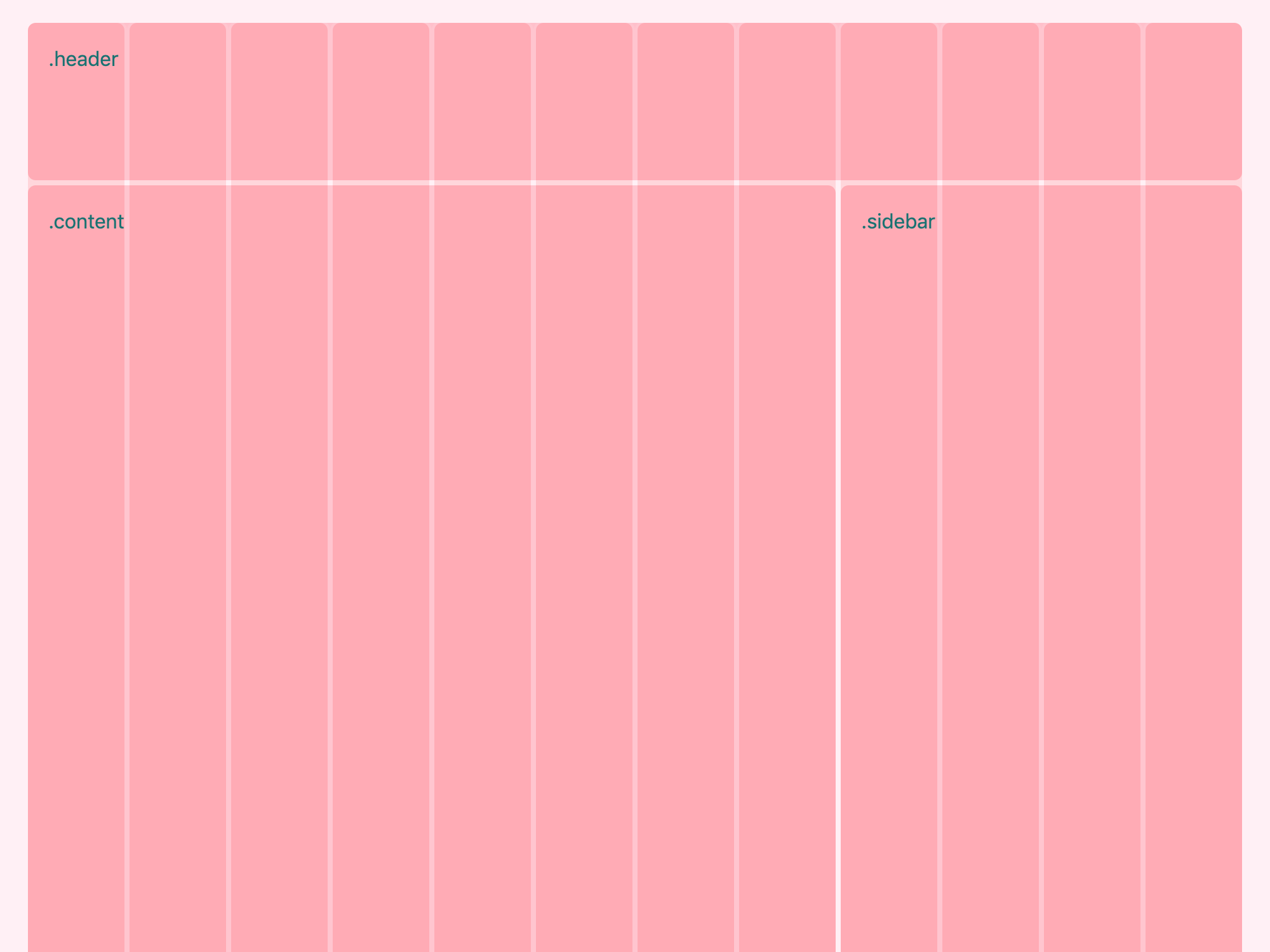
Our grid system, as before, is based on a 12-column layout. You can envision it as an overlay covering our content areas:

So .header takes all 12 columns, .content takes eight columns (66.(6)% of the total width) and .sidebar takes four columns (33.(3)% of the total width). In our CSS, we would like to be able to control the width of each section by changing a single custom property:
.header {
	--width: 12;
}

.content {
	--width: 8;
}

.sidebar {
	--width: 4;
}
To make it work, all we need to do is write a rule for the .column class. Lucky for us, most of the work is already done! We can re-use the Sass from the previous chapter and replace the Sass variables with CSS custom properties:
.container {
	display: flex;
	flex-wrap: wrap;
	margin: 0 auto;
	max-width: 960px;
}

.column {
	--columns: 12; /* Number of columns in the grid system */
	--width: 0; /* Default width of the element */

	flex-basis: calc(var(--width) / var(--columns) * 100%);
}
Notice two important changes here:
- The
--columnsvariable is now declared inside of the.columnrule. The reason is that this variable is not supposed to be used outside of the scope of this class. - The math equation we perform in the
flex-basisproperty is now enclosed within acalc()function. Math calculations that are written in Sass are compiled by the preprocessor and don’t need additional syntax.calc(), on the other hand, lets us perform math calculations in live CSS. The equation always needs to be wrapped within acalc()function.
On a very basic level, that’s it! We’ve just built a 12-column grid system with CSS custom properties. Congratulations! We could call it a day and happily finish this article right now, but… we usually need a grid system that is a bit more sophisticated. And this is when things are getting really interesting.
See the Pen
#8 Building responsive features with CSS custom properties by Miko?aj (@mikolajdobrucki)
on CodePen.
Adding a breakpoint to the grid
Most times, we need layouts to look different on various screen sizes. Let’s say that in our case we want the layout to remain as it is on a large viewport (e.g. desktop) but have all three elements become full-width on smaller screens (e.g. mobile).

So, in this case, we would like our variables to look as follows:
.header {
	--width-mobile: 12;
}

.content {
	--width-mobile: 12;
	--width-tablet: 8; /* Tablet and larger */
}

.sidebar {
	--width-mobile: 12;
	--width-tablet: 4; /* Tablet and larger */
}
.content and .sidebar each hold two variables now. The first variable (--width-mobile) is a number of columns an element should take by default, and the second one (--width-tablet) is the number of columns an element should take on larger screens. The .header element doesn’t change; it always takes the full width. On larger screens, the header should simply inherit the width it has on mobile.
Now, let’s update our .column class.
CSS variables and fallback
To make the mobile version work as expected, we need to alter the .column class as follows:
.column {
	--columns: 12; /* Number of columns in the grid system */
	--width: var(--width-mobile, 0); /* Default width of the element */

	flex-basis: calc(var(--width) / var(--columns) * 100%);
}
Basically, we replace the value of the --width variable with --width-mobile. Notice that the var() function takes two arguments now. The first of them is a default value. It says: “If a --width-mobile variable exists in a given scope, assign its value to the --width variable.” The second argument is a fallback. In other words: “If a --width-mobile variable is not declared in a given scope, assign this fallback value to the --width variable.” We set this fallback to prepare for a scenario where some grid elements won’t have a specified width.
For example, our .header element has a declared --width-mobile variable which means the --width variable will be equal to it and the flex-basis property of this element will compute to 100%:
.header {
	--width-mobile: 12;
}

.column {
	--columns: 12;
	--width: var(--width-mobile, 0); /* 12, takes the value of --width-mobile */

	flex-basis: calc(var(--width) / var(--columns) * 100%); /* 12 ÷ 12 × 100% = 100% */
}
If we remove the --width-mobile variable from the .header rule, then the --width variable will use a fallback value:
.header {
	/* Nothing here... */
}

.column {
	--columns: 12;
	--width: var(--width-mobile, 0); /* 0, takes the the fallback value */

	flex-basis: calc(var(--width) / var(--columns) * 100%); /* 0 ÷ 12 × 100% = 0% */
}
Now, as we understand how to set fallback for CSS custom properties, we can create a breakpoint, by adding a media query to our code:
.column {
	--columns: 12; /* Number of columns in the grid system */
	--width: var(--width-mobile, 0); /* Default width of the element */

	flex-basis: calc(var(--width) / var(--columns) * 100%);
}

@media (min-width: 576px) {
	.column {
		--width: var(--width-tablet); /* Width of the element on tablet and up */
	}
}
This works exactly as expected, but only for the content and sidebar, i.e. for the elements that have specified both --width-mobile and --width-tablet. Why?
The media query we created applies to all .column elements, even those that don’t have a --width-tablet variable declared in their scope. What happens if we use a variable that is not declared? The reference to the undeclared variable in a var() function is then considered invalid at computed-value time, i.e. invalid at the time a user agent is trying to compute it in the context of a given declaration.
Ideally, in such a case, we would like the --width: var(--width-tablet); declaration to be ignored and the previous declaration of --width: var(--width-mobile, 0); to be used instead. But this is not how custom properties work! In fact, the invalid --width-tablet variable will still be used in the flex-basis declaration. A property that contains an invalid var() function always computes to its initial value. So, as flex-basis: calc(var(--width) / var(--columns) * 100%); contains an invalid var() function the whole property will compute to auto (the initial value for flex-basis).
What else we can do then? Set a fallback! As we learned before, a var() function containing a reference to the undeclared variable, computes to its fallback value, as long as it’s specified. So, in this case, we can just set a fallback to the --width-tablet variable:
.column {
	--columns: 12; /* Number of columns in the grid system */
	--width: var(--width-mobile, 0); /* Default width of the element */

	flex-basis: calc(var(--width) / var(--columns) * 100%);
}

@media (min-width: 576px) {
	.column {
		--width: var(--width-tablet, var(--width-mobile, 0));
	}
}
See the Pen
#9 Building responsive features with CSS custom properties by Miko?aj (@mikolajdobrucki)
on CodePen.
This will create a chain of fallback values, making the --width property use --width-tablet when available, then --width-mobile if --width-tablet is not declared, and eventually, 0 if neither of the variables is declared. This approach allows us to perform numerous combinations:
.section-1 {
	/* Flexible on all resolutions */
}

.section-2 {
	/* Full-width on mobile, half of the container's width on tablet and up */
	--width-mobile: 12;
	--width-tablet: 6;
}

.section-3 {
	/* Full-width on all resolutions */
	--width-mobile: 12;
}

.section-4 {
	/* Flexible on mobile, 25% of the container's width on tablet and up */
	--width-tablet: 3;
}
One more thing we can do here is convert the default 0 value to yet another variable so we avoid repetition. It makes the code a bit longer but easier to update:
.column {
	--columns: 12; /* Number of columns in the grid system */
	--width-default: 0; /* Default width, makes it flexible */
	--width: var(--width-mobile, var(--width-default)); /* Width of the element */

	flex-basis: calc(var(--width) / var(--columns) * 100%);
}

@media (min-width: 576px) {
	.column {
		--width: var(--width-tablet, var(--width-mobile, var(--width-default)));
	}
}
See the Pen
#10 Building responsive features with CSS custom properties by Miko?aj (@mikolajdobrucki)
on CodePen.
Now, we have a fully functional, flexible grid! How about adding some more breakpoints?
Adding more breakpoints
Our grid is already quite powerful but we often need more than one breakpoint. Fortunately, adding more breakpoints to our code couldn’t be easier. All we have to do is to re-use the code we already have and add one variable more:
.column {
	--columns: 12; /* Number of columns in the grid system */
	--width-default: 0; /* Default width, makes it flexible */
	--width: var(--width-mobile, var(--width-default)); /* Width of the element */

	flex-basis: calc(var(--width) / var(--columns) * 100%);
}

@media (min-width: 576px) {
	.column {
		--width: var(--width-tablet, var(--width-mobile, var(--width-default)));
	}
}

@media (min-width: 768px) {
	.column {
		--width: var(--width-desktop, var(--width-tablet, var(--width-mobile, var(--width-default))));
	}
}
See the Pen
#11 Building responsive features with CSS custom properties by Miko?aj (@mikolajdobrucki)
on CodePen.
Reducing fallback chains
One thing that doesn’t look that great in our code is that feedback chains are getting longer and longer with every breakpoint. If we’d like to tackle this issue, we can change our approach to something like this:
.column {
	--columns: 12; /* Number of columns in the grid system */
	--width: var(--width-mobile, 0); /* Width of the element */

	flex-basis: calc(var(--width) / var(--columns) * 100%);
}

@media (min-width: 576px) {
	.column {
		--width-tablet: var(--width-mobile);
		--width: var(--width-tablet);
	}
}

@media (min-width: 768px) {
	.column {
		--width-desktop: var(--width-tablet);
		--width: var(--width-desktop);
	}
}
See the Pen
#12 Building responsive features with CSS custom properties by Miko?aj (@mikolajdobrucki)
on CodePen.
This code is doing exactly the same job but in a bit different way. Instead of creating a full fallback chain for each breakpoint, we set a value of each variable to the variable from the previous breakpoint as a default value.
Why so complicated?
It looks like we’ve done quite a lot of work to complete a relatively simple task. Why? The main answer is: to make the rest of our code simpler and more maintainable. In fact, we could build the same layout by using the techniques described in the previous part of this article:
.container {
	display: flex;
	flex-wrap: wrap;
	margin: 0 auto;
	max-width: 960px;
}

.column {
	--columns: 12; /* Number of columns in the grid system */
	--width: 0; /* Default width of the element */

	flex-basis: calc(var(--width) / var(--columns) * 100%);
}

.header {
	--width: 12;
}

.content {
	--width: 12;
}

.sidebar {
	--width: 12;
}

@media (min-width: 576px) {
	.content {
		--width: 6;
	}

	.sidebar {
		--width: 6;
	}
}

@media (min-width: 768px) {
	.content {
		--width: 8;
	}

	.sidebar {
		--width: 4;
	}
}
In a small project, this approach could work perfectly well. For the more complex solutions, I would suggest considering a more scalable solution though.
Why should I bother anyway?
If the presented code is doing a very similar job to what we can accomplish with preprocessors such as Sass, why should we bother at all? Are custom properties any better? The answer, as usually, is: it depends. An advantage of using Sass is better browser support. However, using custom properties has a few perks too:
- It’s plain CSS. In other words, it’s a more standardized, dependable solution, independent from any third parties. No compiling, no package versions, no weird issues. It just works (apart from the browsers where it just doesn’t work).
- It’s easier to debug. That’s a questionable one, as one may argue that Sass provides feedback through console messages and CSS does not. However, you can’t view and debug preprocessed code directly in a browser, whilst working with CSS variables, all the code is available (and live!) directly in DevTools.
- It’s more maintainable. Custom properties allow us to do things simply impossible with any preprocessor. It allows us to make our variables more contextual and, therefore, more maintainable. Plus, they are selectable by JavaScript, something Sass variables are not.
- It’s more flexible. Notice, that the grid system we’ve built is extremely flexible. Would you like to use a 12-column grid on one page and a 15-column grid on another? Be my guest—it’s a matter of a single variable. The same code can be used on both pages. A preprocessor would require generating code for two separate grid systems.
- It takes less space. As long as the weight of CSS files is usually not the main bottleneck of page load performance, it still goes without saying that we should aim to optimize CSS files when possible. To give a better image of how much can be saved, I made a little experiment. I took the grid system from Bootstrap and rebuilt it from scratch with custom properties. The results are as follows: the basic configuration of the Bootstrap grid generates over 54KB of CSS whilst a similar grid made with custom properties is a mere 3KB. That’s a 94% difference! What is more, adding more columns to the Bootstrap grid makes the file even bigger. With CSS variables, we can use as many columns as we want without affecting the file size at all.
The files can be compressed to minimize the difference a bit. The gzipped Bootstrap grid takes 6.4KB in comparison to 0.9KB for the custom properties grid. This is still an 86% difference!
Performance of CSS variables
Summing up, using CSS custom properties has a lot of advantages. But, if we are making the browser do all the calculations that had been done by preprocessors, are we negatively affecting the performance of our site? It’s true that using custom properties and calc() functions will use more computing power. However, in cases similar to the examples we discussed in this article, the difference will usually be unnoticeable. If you’d like to learn more about this topic, I would recommend reading this excellent article by Lisi Linhart.
Not only grid systems
After all, understanding the ins and outs of custom properties may not be as easy as it seems. It will definitely take time, but it’s worth it. CSS variables can be a huge help when working on reusable components, design systems, theming and customizable solutions. Knowing how to deal with fallback values and undeclared variables may turn out to be very handy then.
Thanks for reading and good luck on your own journey with CSS custom properties!
The post Responsive Designs and CSS Custom Properties: Building a Flexible Grid System appeared first on CSS-Tricks.
