Archive

Archive for February, 2019

The Cloud is Just Someone Else’s Computer

February 17th, 2019 No comments
there-is-no-cloud

When we started Discourse in 2013, our server requirements were high:

  • 1GB RAM
  • modern, fast dual core CPU
  • speedy solid state drive with 20G+

I’m not talking about a cheapo shared cpanel server, either, I mean a dedicated virtual private server with those specifications.

We were OK with that, because we were building in Ruby for the next decade of the Internet. I predicted early on that the cost of renting a VPS with those specs would drop to $5 per month, and courtesy of Digital Ocean that indeed happened in January 2018.

The cloud got cheaper, and faster. Not really a surprise, since the price of hardware trends to zero over time. But it’s still the cloud, and that means it isn’t exactly cheap, because it is, after all, someone else’s computer that you pay for the privilege of renting.

But wait … what if you could put your own computer “in the cloud”?

Wouldn’t that be the best of both worlds? Reliable connectivity, plus a nice low monthly price for extremely fast hardware? If this sounds crazy, it shouldn’t – Mac users have been doing this for years now.
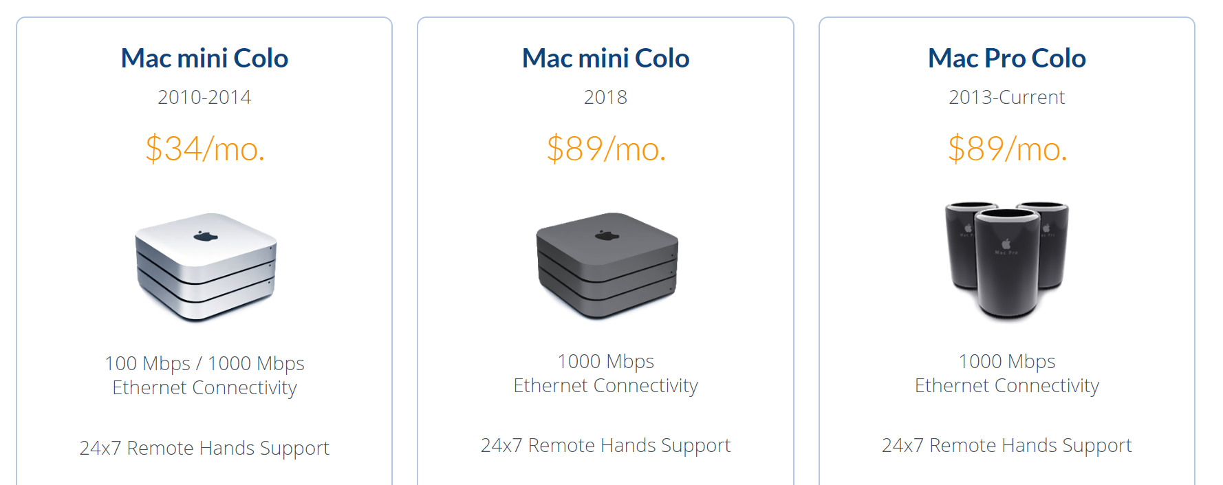
mac-colocation-2019-1

I suppose it’s understandable that Mac users would be on the cutting edge here since Apple barely makes server hardware, whereas the PC world has always been the literal de-facto standard for server hardware.

mac-stadium-colocation

Given the prevalence and maturity of cloud providers these days, it’s even a little controversial these days to colocate servers, but we’ve also experimented with colocating mini-pcs in various hosting roles. I’m still a little curious why there isn’t more of a cottage industry for colocating mini PCs. Because … I think there should be.

I originally wrote about the scooter computers we added to our Discourse infrastructure in 2016, plus my own colocation experiment that ran concurrently. Over the last three years of both experiments, I’ve concluded that these little boxes are plenty reliable, with one role specific caveat that I’ll explain in the comments. I remain an unabashed fan of mini-PC colocation. I like it so much I put together a new 2019 iteration:

2017 — $670 2019 — $820
i7-7500u
2.7-3.5 Ghz, 2c / 4t
i7-8750h
2.2-4.1 Ghz, 6c / 12t
16GB DDR3 RAM 32GB DDR4 RAM
500GB SATA SSD 500GB NVMe SSD

This year’s iteration of the scooter computer offers 3× the cores, 2× the memory, and 3× faster drive. It is, as the kids say … an absolute unit. ?

2019-scooter-computer-top-interior-1

2019-scooter-computer-bottom-interior

2019-scooter-computer-front-and-back

It also has a rather elegant dual-sided internal layout. There is a slot for an old-school 2.5″ drive, plus built in wi-fi, but you won’t see it in these pictures because I physically removed both.

I vetted each box via my recommended burn in and stability testing and they all passed with flying colors, though I did have to RMA one set of bodgy RAM sticks in the process. The benchmarks tell the story, as compared to the average Digital Ocean droplet:

Per-core performance
sysbench cpu --cpu-max-prime=20000 run

DO Droplet 2,988
2017 Mini-PC 4,800
2019 Mini-PC 5,671

Multi-core performance
sysbench cpu --cpu-max-prime=40000 --num-threads=8 run

DO Droplet 2,200
2017 Mini-PC 5,588
2019 Mini-PC 14,604

Disk performance
dd bs=1M count=512 if=/dev/zero of=test conv=fdatasync hdparm -Tt /dev/sda

DO Droplet 701 / 8818 / 471 MB/sec
2017 Mini-PC 444 / 12564 / 505 MB/sec
2019 Mini-PC 1200 / 17919 / 3115 MB/sec

Discourse rebuild
time ./launcher rebuild app

DO Droplet 6:59
2017 Mini-PC 3:41
2019 Mini-PC 3:24

Power consumption could be a concern, as the 2017 version had a much lower 15 watt TDP, compared to the 45 watts of this version. That 3× increase in core count ain’t free! So I tested that, too, with a combination of i7z, stress, and my handy dandy watt meter.

2019-mini-pc-i7z-testing

(idle login) 800 Mhz 10w
stress --cpu 1 4.1 GHz 30w
stress --cpu 2 4.1 GHz 42w
stress --cpu 3 4.0 GHz 53w
stress --cpu 4 3.9 GHz 65w
stress --cpu 5 3.7 GHz 65w
stress --cpu 6 3.5 GHz 65w
stress --cpu 12 3.3 Ghz 65w

I’d expect around 10-15 watts doing typical low-load stuff that isn’t super CPU intensive. Note that running current-ish versions of mprime jacks power consumption up to 75w ? and the overall clock scales down to 3.1 Ghz … let me tell you, I’ve learned to be very, very afraid of AVX2 extensions.

(If you’re worried about noise, don’t be. This active cooling solution is clearly overkill for a 65w load, because it barely spun up at all even under full core load. It was extremely quiet.)

So we’re happy that this machine is a slammin’ deal for $820, it’s super fast, and plenty reliable. But how about colocation costs? My colocation provider is EndOffice out of Boston, and they offer very competitive rates, at $29/month for colocating a Mini-PC.

I personally colocate three Mini-PCs for redundancy and just-in-case; there are discounts for colocating more than one. Here they are racked up and in action. Of course I labelled the front and rear before shipping because that’s how I roll.

endoffice-colocated-2019-mini-pcs

Let’s break this down and see what the actual costs of colocating a Mini-PC are versus the cloud. Let’s assume a useful life of say, three years? Given the plateauing of CPU speeds, I think five years is more realistic, but let’s use the more conservative number to be safe.

  • $880 mini-pc 32GB RAM, 6 CPUs, 500GB SSD
  • $120 taxes / shipping / misc
  • $29 × 12 × 3 = $1,044

That’s $2,044 for three years of hosting. How can we do on Digital Ocean? Per their current pricing page:

  • 32GB RAM, 8 vCPUs, 640GB SSD
  • $160/month
  • $160 × 12 × 3 = $5,760

This isn’t quite apples to apples, as we are getting an extra 140GB of disk and 2 bonus CPUs, but let’s assume the CPUs can be partially consumed by multi-tenancy compared to our dedicated, isolated CPUs. Still, you pay almost three times as much for a cloud server. ?

I’m not saying this is for everyone. If you just need to spin up a quick server or two for testing and experimentation, there’s absolutely no way you need to go to the trouble and up-front cost of building and then racking colocated mini-pcs. There’s no denying that spinning servers up in the cloud offers unparalleled flexibility and redundancy. But if you do have need for dedicated computing resources over a period of years, then building your own small personal cloud, with machines you actually own, is not only one third the cost but also … kinda cool?

your-own-personal-cloud

If you’d also like to embark upon this project, you can get the same Partaker B19 box I did for $490 from Amazon, or $460 direct from China via AliExpress. Add memory and drive to taste, build it up, then check out endoffice.com who I can enthusiastically recommend for colocation, or the colocation provider of your choice.

Let’s do our part to keep the internet fun and weird!

Categories: Others, Programming Tags:

The Magic of React-Based Multi-Step Forms

February 15th, 2019 No comments
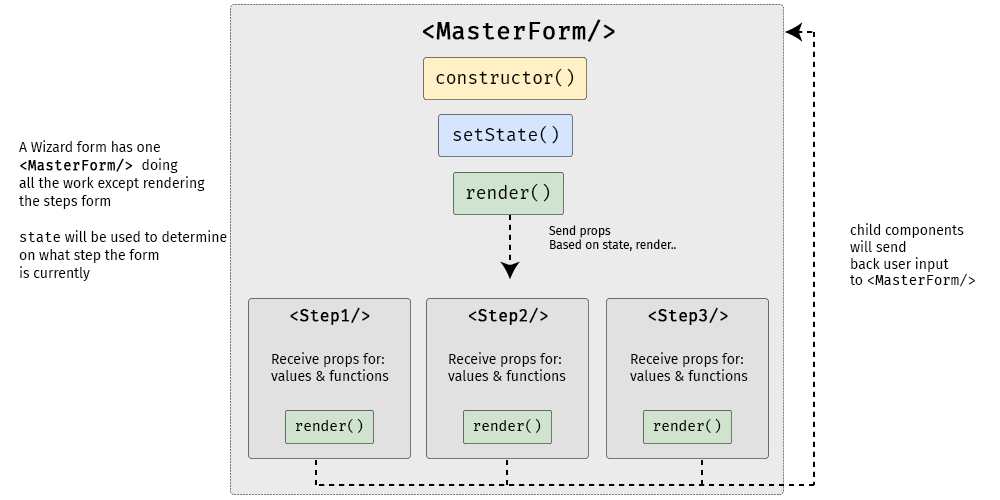
A diagram showing the master form component above three rectangles representing the three steps of the form, from left to right. Between the master form and the steps is a constructor, setState, and render.

One way to deal with long, complex forms is to break them up into multiple steps. You know, answer one set of questions, move on to another, then maybe another, and so on and so forth. We often refer to these as multi-step forms (for obvious reasons), but others also take to calling it a “wizard” form.

Multi-step forms can be a great idea! By only showing a few inputs on a screen at a time, the form may feel more digestible and prevent users from feeling overwhelmed by a sea of form fields. Although I haven’t looked it up, I’m willing to say no one enjoys completing a ginormous form — that’s where multiple steps can come in handy.

The problem is that multi-step forms — while reducing perceived complexity on the front end — can feel complex and overwhelming to develop. But, I’m here to tell you that it’s not only achievable, but relatively straightforward using React as the base. So, that’s what we’re going to build together today!

Here’s the final product:

See the Pen
React Simple Wizard Form
by Nathan Sebhastian (@nathansebhastian)
on CodePen.

Let’s build it!

The easiest way to create a multi-step form is to create a container form element that contains all the steps inside of it as components. Here’s a visual showing that container (), the components inside of it (, , ) and the way states and props are passed between them.

serves as the container while three child components inside of it act as each step of the form.

Although it seems to be more complex than a regular form, a multi-step form still uses the same principles as a React form:

  • State is used for storing data and user inputs.
  • Component is used for writing methods and the interface.
  • Props are used for passing data and function into elements.

Instead of having one form component, we will have one parent component and three child components. In the diagram above, will send data and functions to the child components via props, and in turn, the child components will trigger a handleChange() function to set values in the state of . It’s one big happy family over here!

We’ll need a function to move the form from one step to another as well, and we’ll get to that a little later.

The step child (get it?) components will receive props from the parent component for value and onChange props.

  • component will render an email address input
  • will render a username input
  • will render a password input and a submit button

will supply both data and function into child components, and child components will pass user inputs back to the parent using its props.

Creating the step (child) components

First, we’ll create the form’s child components. We’re keeping things pretty barebones for this example by only using one input per step, but each step could really be as complex as we’d like. Since the child components look almost similar between one another, I’m just gonna show one of them here. But be sure to take a look at the demo for the full code.

class Step1 extends React.Component {
  render() {
    if (this.props.currentStep !== 1) { // Prop: The current step
      return null
    }
    // The markup for the Step 1 UI
    return(
      <div className="form-group">
        <label htmlFor="email">Email address</label>
        <input
          className="form-control"
          id="email"
          name="email"
          type="text"
          placeholder="Enter email"
          value={this.props.email} // Prop: The email input data
          onChange={this.props.handleChange} // Prop: Puts data into state
        />
      </div>
    )
  }
}

Now we can put this child component into the form’s render() function and pass in the necessary props. Just like in React’s form documentation, we can still use handleChange() to put the user’s submitted data into state with setState(). A handleSubmit() function will run on form submit.

Next up, the parent component

Let’s make the parent component — which we’re all aware by now, we’re calling — and initialize its state and methods.

We’re using a currentStep state that will be initialized with a default value of 1, indicating the first step () of the form. We’ll update the state as the form progresses to indicate the current step.

class MasterForm extends Component {
  constructor(props) {
    super(props)
    // Set the initial input values
    this.state = {
      currentStep: 1, // Default is Step 1
      email: '',
      username: '',
      password: '', 
    }
    // Bind the submission to handleChange() 
    this.handleChange = this.handleChange.bind(this)
  }

  // Use the submitted data to set the state
  handleChange(event) {
    const {name, value} = event.target
    this.setState({
      [name]: value
    })    
  }
  
  // Trigger an alert on form submission
  handleSubmit = (event) => {
    event.preventDefault()
    const { email, username, password } = this.state
    alert(`Your registration detail: n 
      Email: ${email} n 
      Username: ${username} n
      Password: ${password}`)
  }
  
  // Render UI will go here...
}

OK, that’s the baseline functionality we’re looking for. Next, we want to create the shell UI for the actual form add call the child components in it, including the required state props that will be passed from via handleChange().

render() {    
return (
  <React.Fragment>
  <h1>A Wizard Form!</h1>
  <p>Step {this.state.currentStep} </p> 
    
  <form onSubmit={this.handleSubmit}>
  
    // Render the form steps and pass in the required props
    <Step1 
      currentStep={this.state.currentStep} 
      handleChange={this.handleChange}
      email={this.state.email}
    />
    <Step2 
      currentStep={this.state.currentStep} 
      handleChange={this.handleChange}
      username={this.state.username}
    />
    <Step3 
      currentStep={this.state.currentStep} 
      handleChange={this.handleChange}
      password={this.state.password}
    />       

  </form>
  </React.Fragment>
)
}

One step at a time

So far, we’ve allowed users to fill the form fields, but we’ve provided no actual way to proceed to the next step or head back to the previous one. That calls for next and previous functions that check if the current step has a previous or next step; and if it does, push the currentStep prop up or down accordingly.

class MasterForm extends Component {
  constructor(props) {
    super(props)
    // Bind new functions for next and previous
    this._next = this._next.bind(this)
    this._prev = this._prev.bind(this)
  }

  // Test current step with ternary
  // _next and _previous functions will be called on button click
  _next() {
    let currentStep = this.state.currentStep
    // If the current step is 1 or 2, then add one on "next" button click
    currentStep = currentStep >= 2? 3: currentStep + 1
    this.setState({
      currentStep: currentStep
    })
  }
    
  _prev() {
    let currentStep = this.state.currentStep
    // If the current step is 2 or 3, then subtract one on "previous" button click
    currentStep = currentStep <= 1? 1: currentStep - 1
    this.setState({
      currentStep: currentStep
    })
  }
}

We’ll use a get function that will check whether the current step is 1 or 3. This is because we have three-step form. Of course, we can change these checks as more steps are added to the form. We also want to display the next and previous buttons only if there actually are next and previous steps to navigate to, respectively.

// The "next" and "previous" button functions
get previousButton(){
  let currentStep = this.state.currentStep;
  // If the current step is not 1, then render the "previous" button
  if(currentStep !==1){
    return (
      <button 
        className="btn btn-secondary" 
        type="button" onClick={this._prev}>
      Previous
      </button>
    )
  }
  // ...else return nothing
  return null;
}

get nextButton(){
  let currentStep = this.state.currentStep;
  // If the current step is not 3, then render the "next" button
  if(currentStep <3){
    return (
      <button 
        className="btn btn-primary float-right" 
        type="button" onClick={this._next}>
      Next
      </button>        
    )
  }
  // ...else render nothing
  return null;
}

All that’s left is to render those buttons:

// Render "next" and "previous" buttons
render(){
  return(
    <form onSubmit={this.handleSubmit}>
      {/* 
        ... other codes
      */}
      
      {this.previousButton}
      {this.nextButton}
      
    </form>
  )
}

Congrats, you’re a form wizard! ?

That was the last step in this multi-step tutorial on multi-step forms. Whoa, how meta! While we didn’t go deep into styling, hopefully this gives you a solid overview of how to go about making complex forms less… complex!

Here’s that final demo again so you can see all the code in it’s full and glorious context:

See the Pen
React Simple Wizard Form
by Nathan Sebhastian (@nathansebhastian)
on CodePen.

React was made for this sort of thing considering it makes use of states, property changes, reusable components and such. I know that React may seem like a high barrier to entry for some folks, but I’ve written a book that makes it a much lower hurdle. I hope you check it out!

The post The Magic of React-Based Multi-Step Forms appeared first on CSS-Tricks.

Categories: Designing, Others Tags:

The #StateOfCSS 2019 Survey

February 15th, 2019 No comments

You know about the State of JavaScript survey, where thousands upon thousands of developers were surveyed about all-things-JS, from frameworks to testing and many other things in between? Well, Sacha Greif has launched one focused entirely on CSS.

This is super timely given a lot of the content we and other sites have been posting lately centered around learning, complexity, changing roles, and more. Sacha captures it nicely:

This is especially interesting since it comes at a time where many are talking about a “Great Divide” between the “front” of the front-end (HTML, CSS) and the “back” of the front-end (JavaScript and its many frameworks and libraries). […] [T]he survey will be a great chance to take a snapshot of the community as it currently exists, and see how this evolves over the next couple years.

Sounds like a good goal. Let’s help by putting some responses in there!

Take Survey

Direct Link to ArticlePermalink

The post The #StateOfCSS 2019 Survey appeared first on CSS-Tricks.

Categories: Designing, Others Tags:

App vs. Website: What Is the Best Mobile Option for eCommerce Businesses?

February 15th, 2019 No comments
Mobile app vs mobile website

Don’t get confused. The two has a lot of differences. But they’re quite simple to understand.

Mobile websites are browser-based, which means you can access them through the internet without installing an application. They can work just like usual websites on your computer. However, some websites automatically adjust to different devices with additional features specially designed for mobile solutions.

Mobile applications, on the other hand, are apps that can be downloaded or installed in your phone or tablets usually through Google Play or Apple Store. They can also be accessed through the internet and download information, which are stored in the phone memory. Many mobile apps don’t require an internet connection to function because the data and information have already been downloaded inside the app.

In this article, we are going to compare mobile websites and mobile solutions. Let’s dig deeper on how they can each platform be advantageous in terms of functionality, features, and other factors that affect the overall success of an e-commerce business.

A- Mobile Applications

Mobile Application Pros and Cons

Advantages of Mobile Applications

1- Faster than Mobile Websites

Have you ever experienced when your browser keeps on loading? Having such a slow internet connection is frustrating. But don’t judge too quickly. Maybe the culprit is the mobile website itself. People prefer to use mobile applications because they are faster and more efficient. They are specially designed to perform specific tasks, unlike mobile websites that can function as a browser to access different internet sites.

2- Provides Better User Experience

Mobile apps have higher functionality and user-friendly features as compared to mobile websites. App developers are continually working to improve their app solutions, which is why mobile applications are becoming more intuitive and advanced.

The primary goal of mobile app development is not just to create apps that can function properly. Successful mobile apps are made with an excellent user interface.

3- Specialized Features for Devices

More and more apps are being integrated with high-tech devices. The internet of things, for example, connect smart devices to streamline complicated tasks.

Tech-companies are working with app developers to maximize the capabilities of their devices and increase their sales. Point of sale systems, trackers, camera devices, and radio frequency identifications are used to help the e-commerce business flourish.

4- More Time Spent in Mobile Apps

Mobile apps are taking over the world. Users are spending more hours on mobile apps rather than browsing the internet through mobile websites. This is a good indicator that creating a mobile app is the best option when creating an e-commerce website.

A report from reputable sources shows that the number of people using mobile applications has been exponentially increasing by 6% every year, especially in fields of business such as e-commerce and retail.

5- Offers Accessibility Without Internet

The internet will not always be there to help you. But your mobile app will. Most mobile apps can still be operated without an internet connection because they are installed in your devices. This feature allows you to continue working and accomplish minor tasks until the internet comes back.

Disadvantages of Mobile Applications

1- Requires More Time and Expenses

Apps could be hard to develop for your e-commerce business – and more expensive too! The process is complicated. It means building apps compatible with both Android and IOS, which could mean hiring two separate developer teams for each platform. More cost and more time!

2- Comes with a Complicated Process

It’s more complicated than you think. It doesn’t stop with hiring talented developers. There are also lots of things to consider more than just a well-planned development. You have to make many crucial decisions which can affect the entire operation of your business in the long run. Without technical expertise, you would have to rely on your team and hope that it will turn out just okay.

3- Problems in the Maintenance Process

You have to consider the future problems that may arise due to the changing needs of the people. Don’t forget about the trends and issues that may come along as you go forth with your business. App support is also essential. Daily maintenance should be considered to avoid losing customers. Otherwise, your client may look for better platforms.

B- Mobile Websites

Mobile Website Pros and Cons

Advantages of Mobile Websites

1- Accessible to All Devices

Mobile websites accessed through any device as long as there is an internet browser. Compatibility will not be a problem, giving your business a broader grasp among your customers. It doesn’t matter whether it’s Android or Apple. They don’t even need to download anything, just a good Wi-Fi connection, and they’re good to go.

2- Search Engine Optimization

If you want to boost your business significantly, Google ranking is your best bet. Creating a website platform for your e-commerce business will allow you to formulate SEO strategies that can increase your traffic significantly, which is currently considered as the best way to promote a brand.

3- Cost-Effectiveness

Unlike app development, it’s relatively easier and faster to create websites. It requires less work and complicated technical stuff. In short, mobile web development requires fewer expenses and less effort, giving you more time to focus on other important matters in your e-commerce business.

Disadvantages of Mobile Websites

1- Without Offline Accessibility

You probably already know this already, but it’s still worth mentioning. What if your customers want to browse their cart or wish list? They can’t do that in a mobile web version of your site, and that’s an automatic turn off for your customers.

2- Turtle-Like Loading Speed

This is arguably the weakest part of mobile web solutions, especially for online shops. It hampers the performance and potential of the business just because the interface is inconvenient to use. Those pesky little buttons, zooming in and zooming out, tiny texts, and almost everything about it makes customers press the exit button with relief.

3- Maintenance and Maintenance

Websites also need to be maintained daily. Most website owners hire skilled and knowledgeable programmers who can do the job for them. Also, contents for the website will also cost a lot, especially if you are aiming to improve your SEO.

4- Not-Too-Friendly Interface

We all know this. It’s the reason why most users prefer to use mobile apps rather than browsing the web to use their favorite platforms. A mobile website doesn’t usually adjust its interface based on the device, leading to the poor user experience.

Conclusion

There you go! The answer should be evident by now. There are a lot of opportunities in the e-commerce business, considering the pace of technological advancement nowadays.

You can quickly gain momentum once you launch a successful marketing strategy for your business. It’s easy to increase your traffic when you use the power of the internet. Many marketing options are being offered in the market.

But no matter what option you might choose, the key factor will remain. You have to plan carefully and consider your situation. Gather as much information as possible to formulate the right strategy on how you can increase your sales without spending too much time, money, and effort.

Categories: Others Tags:

How to Design for 3D Printing

February 15th, 2019 No comments

3D Printing is a revolutionary new technology that allows you to realize, well, just about anything. The most common form of 3D printers use a special form of plastic filament to print durable, hard ABS plastic components or items.

However, there are 3D printers—industrial mostly—that can work with materials like concrete, glass, titanium, steel and more. The tougher materials aren’t really necessary for design, but it’s still a great thing to know especially when you need to consider material design guidelines.

In design and graphic art, you mostly work with hand sketches, digital content and imaging software, and flat, 2D-style designs. How would a 3D printer offer you anything new? Maybe you dabble in the occasional 3D modeling from time to time, or maybe you don’t. Whatever the case, the two mediums just don’t seem to correlate.

We’re going to explain some design tips you should be aware of and how that applies to your particular industry: graphic and visual design.

Major Brands Are Already Using 3D Printing for Design

A variety of large corporations and organizations have not only realized the potential of 3D printing technology — they’ve implemented it in their regular routines.

Nike, Nokia, Ittala, Coca-Cola and even Volkswagen have all been creating and designing with 3D printing tools. Nike even took their 3D printed concepts and rolled them into manufactured products, some of which you can buy on store shelves right now.

If the bigger companies and organizations are starting to adopt and utilize this technology, that will soon trickle down to smaller companies

The reason they’ve taken to this technology is because it streamlines their design and manufacturing processes. All product designs or prototypes can be constructed in-house, and then when it’s time to ship something, they can be manufactured internally as well.

This doesn’t relate to graphic design, but it does point out one obvious thing. If the bigger companies and organizations are starting to adopt and utilize this technology, that will soon trickle down to smaller companies, including you.

More companies will desire 3D printing compatible concepts and visuals, which means turning to professionals who can work with the necessary tools and software. If you haven’t already begun training with these technologies and tools, now is the ideal time.

Learn Printing Technologies

Before diving into the design process, you need to spend some time researching and getting to know the various 3D printing technologies and hardware you’ll be working with. Why? Because depending on the materials and the printer used, you’ll need to work with unique specifications.

ABS, alumide, polyamide, and rubber-like materials all allow you to create components and designs that incorporate interlocking parts. That is, you can build snap-together components that are incredibly easy to assemble. Unfortunately, this is not possible with materials like bronze, gold, silver and resin, but it’s not the consistency of the materials or even textures to blame. It’s really the hardware and 3D printers used during these processes. The latter materials aren’t compatible with the types of printers that can create interlocking parts.

In addition, the way in which these printers create components also differs depending on the material. Be sure to do the research so that you understand how they are all different and how this will influence your design.

Mind the Wall Thickness

When working with traditional 2D-based designs, dimensions are important, but you don’t necessarily have to worry about the thickness of your models. You can use specifications and number measurements to indicate true size, but you don’t actually have to design to scale — at least in many cases.

That’s not so with 3D printing, as you’ll always want to mind the wall thickness of the items you’re creating. Walls that are too thick can generate too much internal stress, causing the item itself to collapse or the surfaces to crack. If the walls are too thin, it can make the concept or prototype fragile and easy to break.

Considering you’ll likely be designing and planning the dimensions so that you end up with a durable, reliable product this is one feature you’ll want to brush up on.

File Resolution Is Still Important

With 3D printing, the designs are still parsed and transferred via digital files or blueprints, if you will. In graphic and visual design, file resolution is extremely important especially when working with larger products or prints.

If you stretch a smaller resolution file too much, it ends up looking grainy and pixelated. That’s why it’s important you always design in larger environments and dimensions because scaling down is more accurate than scaling back up.

The common file format for 3D printing designs is STL, or standard triangle language format. The design—when printed—is translated into triangles in a wider 3D space, which makes it easier for the printers and related hardware to construct the resulting item.

Similar to visual design, you don’t want the resolution or file size of your blueprint to be too big, or too small. Too big means the internal content will be too much for machines and other designers to handle. Too small means no one will ever be able to get a quality print out of your STL.

The solution is to consider not just the file resolution, but something called “tolerance” in the world of 3D modeling.

3D Printing Is Not So Different

At a glance, it seems as though 3D printing, and designing for the medium, are much different than the current work you do in graphic and visual design. That’s not necessarily the case though, as both forms of design require you to have working knowledge of modern digital software and tools.

Sure, you might use a different tool to design say, an infographic or visual model than you would a 3D STL file, but the concepts and mechanics are similar.

As long as you mind the tips discussed here, you should do just fine. If you haven’t already started learning how to work with 3D modeling and design tools, you might want to get on that as soon as possible.

The market for additive and manufacturing products and services—which will call for reliable designers and visual artists—is predicted to increase by as much as seven times the current rate by 2020. At that time, the market value is expected to surpass $20 billion.

Featured image via Unsplash

Add Realistic Chalk and Sketch Lettering Effects with Sketch’it – only $5!

Source

Categories: Designing, Others Tags:

Monthly Web Development Update 2/2019: Web Authentication And The Problem With UX

February 15th, 2019 No comments

Monthly Web Development Update 2/2019: Web Authentication And The Problem With UX

Monthly Web Development Update 2/2019: Web Authentication And The Problem With UX

Anselm Hannemann

2019-02-15T11:42:15+01:002019-02-15T11:04:16+00:00

The only constant in life is change, they say. And it’s true, even if we think nothing changes at all. Whether you notice change or not is only a question of how you perceive and how you observe things. In the tech industry, it’s easy to see how fast things evolve — read a summary article like this one, and you’ll suddenly become aware of how much has happened in just one month. Since I took up meditation again, I gained a new perspective, and it helps me to deliberately appreciate such change and find personal value and gratefulness even in things that didn’t seem particularly positive at first.

Like this week, for example. I was reminded of a fact we usually forget: how the Internet is structured. If you browse the web, most traffic is directed through Amazon at some point, so if you block their servers, — or Google’s or Apple’s, or all of them —, there’s not much left of the Internet. I have used a Pi-Hole DNS blocker in my network for three years now, but never really appreciated it, until I learned about its real value this week — the security and privacy it provides considering our dependency on tech giants. Isn’t it remarkable how a big part of my perceived online security relies on one piece of open-source software that the authors spent so much time and efforts on to provide it for free in the end?

News

  • Firefox 65 was released. The new version dispatches events on disabled HTML elements and comes with support for the referrerpolicy attribute on script elements, CSS environment variables (the env() function), Intl.RelativeTimeFormat for JavaScript, and WebP images.
  • Safari Tech Preview 74 brings abortable fetch, support for U2F HID Authenticators on macOS, and new Web Authentication API features.
  • With Chrome 72, Chrome introduced the User Activation API. The new version also disallows popups on pageunload.
  • The Chrome 72 update for Android shipped the long-awaited Trusted Web Activity feature, which means we can now distribute PWAs in the Google Play Store.
  • Safari 12.1 release notes are up (iOS 12.2, macOS 10.14.4). What’s new? Dark mode for the web, intelligent tracking prevention, the push notification prompt for Safari on macOS now requires a user gesture, motion and orientation settings on iOS to enable DeviceMotionEvent and DeviceOrientationEvent (this means it’s disabled by default now). Also new are the Intersection Observer API, Web Share API, and the element.

General

  • Max Böck shares his thoughts on why simplicity is the most valuable and important thing in projects.
  • Ian Littman on Twitter: “Moving 50% of servers to PHP 7 from PHP 5 would save $2.5 (edited to 2.0) billion in energy costs per year, and avoid billions of kilograms of CO2 emissions. Upgrade to PHP 7. Save the planet.”
  • How did you start to learn web development? I guess most of us relied on our browsers’ “view source” functionality and still do. But with JavaScript SPAs and more tooling that mangles, minifies and uglifies sources, we block this road of self-education for countless people out there. Let’s move to a more open approach and at least provide source maps on production servers so that people can access the actual sources via Developer Tools.

UI/UX


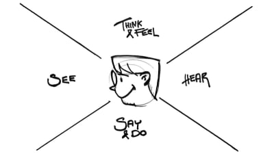
Sketch of a face with the terms see, say and do, hear, think and feel floating around it
To create stellar user experiences we need to see our users as humans. (Image credit)

HTML & SVG

  • Sara Soueidan wrote a 101 course on SVG filters to help you understand what they are and how to use them to create your own visual effects.

Accessibility

Privacy

  • Google is one of those companies which always find new, clever ways to expose user location data and sell it to third parties. Now Google wants to sell the exact location data of users to improve planning for urban planners, for example. Useful on the one hand, but still worrying for all users of Google products who might not be aware of what happens with their data.
  • I was wrong about Google and Facebook: there’s nothing wrong with them (so say we all),” says Aral Balkan. This piece explains how even the most honorable open-source projects struggle to make ethical choices and the fallacies of offering the best UX instead of promoting ethically correct solutions.

Web Performance

  • Jens Oliver Meiert shares his research on how the way you write HTML influences performance. Leaving out optional tags and quotes can make a difference, even though we’re able to use gzip or other techniques to optimize the document response in the browser.

JavaScript


Excerpt from the guide. It shows an illustration of a tiny woman who tries to prevent a giant wad of keys from tumbling over.
The Guide to Web Authentication is a handy introduction to securing sensitive information online. (Image credit)

CSS


Solar system built with CSS
Explore the solar system in Fabricius Seifert’s fantastic CSS experiment. (Image credit)

Work & Life

  • Paul Greenberg is in search of lost screen time and explores what our lives could look like and how much more time we’d have if we escaped the screens. There are some revealing numbers in the article: The average American spends $14,000 per decade on smartphones. That’s $70,000 over the course of an average working life. More than 29% of Americans would rather give up sex for three months than give up their smartphone for a single week. Or you could plant 150 trees and buy half an acre of land for the amount of money you’d spent on your smartphone and apps per year.
  • Are you a patient person? Regardless of if you are or not, the experiment that Jason Fried wants to try is certainly a challenge: Try to pick the longest line at the supermarket, cancel Amazon Prime so that delivery takes longer, and take the chance to wait whenever possible. Embrace slowness.
  • In Praise of Extreme Moderation” shares an interesting perspective on why the culture of over-committing, over-working, and over-delivering in all areas of life isn’t healthy, and how we can shift towards a more moderate, calmer path.

Going Beyond…

  • It must be free.” On services we obviously don’t need but want to have. My essay about the importance of seeing value in the things we really need and why less is more.
  • How can we make our lives better? By maintaining essential relationships, avoiding technology, and embracing values instead of lifehacks, says Eric Barker.
  • Watch this talk of Greta Thunberg, a sixteen-year-old woman who tells all the well-known and influential people out there that she doesn’t care about money and why we need to view climate change from a perspective like hers — her life is in danger and no money will be able to save it. We need more people like her who aren’t led by corporate or financial rules.
Smashing Editorial(cm)
Categories: Others Tags:

4 ways to attract customers by simplifying your website design

February 15th, 2019 No comments
website design

There are times when customers want as much content as possible, as many design elements and drop-downs as possible. They saw some cool sites and they wanted a little of everything.

That’s quite understandable, but we’re trying to explain that a site with a lot of content and complicated design is not necessarily easy to use, sometimes even having the opposite effect for users.

That’s why we’ve created a mini guide of 4 Ways To Simplify Your Website Design To Attract Customers:

1) Shorten the content of the website:

Web visitors rarely read line by line, usually, they only scan the web pages and their focus is only on a few words and images. However, there are many web pages that have content that is not needed to send the message. You can clean up a lot of the content of a website by limiting the number of words on the screen. Try refraining text to remove parasite words.

How can you do that? You can practice by expressing a single idea in a single paragraph – it’s a good way to write and helps readers “scan” the text with the look. Another way to write is the “pyramid” format, that is, start from the conclusion and add content along the way. A site that I really like for the simplicity offered is Apple.com.

2) Delete the visual decorations:

When it comes to visuals, it often happens that we want to add extra elements because it ‘looks good’. Everyone desires a design that looks good and unique. But although intentions are good, the end result may be disastrous. Try to have as little decoration as possible or other items that won’t distract the reader from what is important.

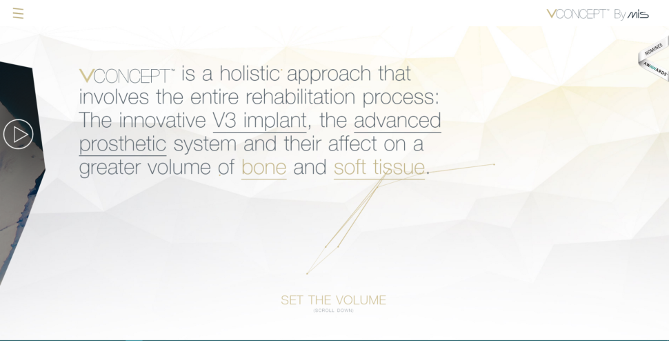
Below I attached a screenshot on the Vconcept.com page. It can be noticed that they do not have a lot of text, but the text is very difficult to understand and they have a problem with the fonts. They use plain text, underlined text, some words have a different color, and the first word that represents the company’s logo is a different font. We can also talk about all triangles flying in the background, a decoration that does not bring any benefit to the site.

3) Reuse design elements:

Try to create repetitive elements and consolidate them. If you use a lot of colors, fonts and style variations, the result will be overwhelming, but in a ba way. I recommend that you re-use the design elements to maintain a consistent design on the page. There are also some basic rules such as: Do not use more than two types of font per page. The same rule applies to colors and design elements. If you have a quote at the end of each page, make sure it looks the same on all pages.

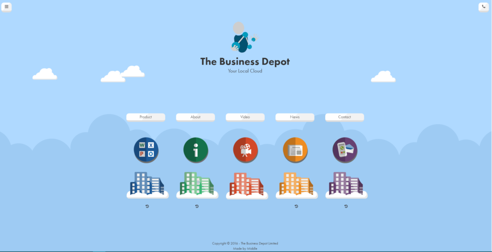
An example would be thebusinessdepot.co.uk. They seem to use a simple theme, but too many colors are used. Also for each page, there is a different color that has no meaning.

4) Have one user as target:

I know it sounds a little crazy for me to tell you this, but it works. I’ve encountered too many companies that are trying to address a wide range of clients, different ages, different backgrounds, different sexes, and so on. Which person do you think your message will reach if you have such a large target? Surely the message will be very diluted and so will be the results. Try to have one user in the head when thinking about the design of a site. Think exactly who you are addressing, what age you have, what educational profile, what gender, what hobbies and concentrate all your energy and resources on this person.

Also, if you have product campaigns on your site, try making them as clear as possible. If your goal is to make a customer purchase a particular online course, delete all the things that might distract him. I also recommend a landing page dedicated to each marketing campaign you have. This way you can send a much clearer message to your customers.

We hope that you found these tips helpful and that you will make your website stand out in the crowd.

Read More at 4 ways to attract customers by simplifying your website design

Categories: Designing, Others Tags:

10 WordPress plugins you need to try (You’re welcome!)

February 14th, 2019 No comments

The cool thing about plugins is that most of them either make something easier, make it better or both. They do so by extending the functionality of software programs. This is why they’re sometimes referred to as software extensions. They benefit web designers and website owners and their users.

The main problem you might have in
selecting a useful plugin would be a need to sift through thousands of them. It
is not easy to find a “must-have” solution or at least one that would best
serve your needs.

Some plugins, like page builders or
sliders, you need to use often, if not always. Your need for others, like many
of those we’ve listed here, would typically depend on the type of your website.
Purpose, and niche matter a lot, too.

If you spot one you could use, grab it. It
could make your day!

1.
Amelia

Taking
an appointment is a simple task. Taking and scheduling multiple appointments
and managing them in a way that satisfies all parties concerned is a different
manner.

Doing so manually takes time managers and
employees alike would rather spend on their core responsibilities. Manual
processes can also be error prone, which in this case could lead to unhappiness
among clients and employees alike.

Amelia is a professionally-designed
automatic booking system that’s fast, efficient, and essentially error free.
The ROI this WordPress plugin provides is in most instances nearly
instantaneous. Amelia is on the job around the clock, it matches clients with
employees, and it doesn’t make mistakes or let appointments fall through the
cracks.

Amelia also manages booking changes and
cancellations, sends out reminders, collects payments online, and has been used
by more than 1000 businesses that have given it a 4.8 rating in its first 6
months.

2. wpDataTables

“Advanced”,
“powerful”, and “game-changing” are adjectives you see all too often in
software product ads and even in reviews. In the case of the wpDataTables
WordPress plugin however, they seem to fit quite nicely.

Here are several situations you might
typically encounter where wpDataTables will really strut its stuff:


You need to create a table or tables based on massive amounts of complex
data (and do so relatively quickly).


Data you’ll be using can come from a variety of sources and in a variety
of formats.


You want to build a table (or chart) that’s totally responsive,
interactive, and front-end editable so it can easily be changed or updated.


Your table or chart should fit in nicely with the overall appearance of
your site (i.e., it’s customizable and responsive) and key data elements or
functions should be color coded or otherwise highlighted.

In other words, you’re looking for a plugin
that’s advanced, powerful, a game changer, and has been used by more than
20,000 businesses and individuals.

That’s why we recommend trying
wpDataTables.

3. NextGEN Gallery & NextGEN Pro

When
a software solution is available in both free and premium versions, it usually
makes sense to try the free version first. That may be true for the NextGEN
WordPress gallery plugins as well. The free version, NextGEN Gallery, has the
tools to take your gallery building projects a long way. It allows you to
manage and display thousands of images in various gallery and album styles and
formats.

The premium version, NextGEN Pro, offers
more as you would expect, thanks to its comprehensive set of software extensions
that give you a wealth of gallery-building tools, options and additional
approaches to building award-winning galleries.

There’s also a middle approach in which for
a fee a bundle of Pro extensions can be used with the free version. Once you’ve
settled on a NextGEN solution that works best for you, you should never have to
search for another gallery-building software solution.

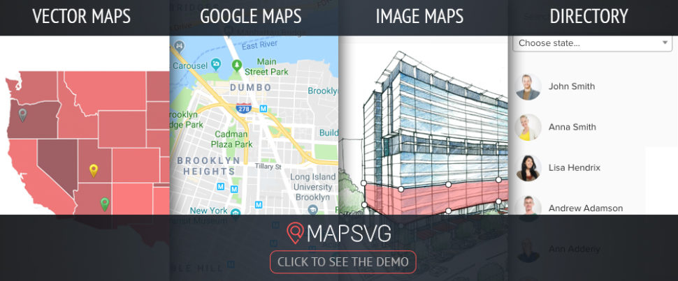
4. MapSVG WordPress map plugin

In
terms of map-making options, MapSVG may well offer more than any map-producing
WordPress plugin or software solution on the market. The MapSVG WordPress
plugin lets you incorporate customized interactive vector maps, Google maps,
and image maps into your website designs.

You can also make maps from PNG and JPEG
files, add markers and directory information to existing maps, and overlay
custom SVG files on Google maps with this handy WordPress plugin.

5. Logic Hop – Personalized Marketing for WordPress

Imagine
the power of being able to change design elements automatically based on who’s
visiting your site. With Logic Hop for WordPress you can! Sound difficult?
Logic Hop makes it easy with ready-made recipes, smart CTAs and conditional
CSS. Personalize your site using geolocation, social media posts, visitors
actions, and even what they’re interested in. Wow your visitors and clients!
Try it free for 14 days and take your designs to the next level.

6.
Rank Math SEO

Rank
Math’s Content Analysis feature makes it much easier to overcome the challenges
associated with a website’s SEO and writing SEO-friendly content. This
WordPress plugin can do much more than that however.

Rank Math is a veritable Swiss Army knife
of search engine optimization tools designed to make your websites as SEO
friendly as possible.

7.
Heroic FAQs

As
a business’s website attracts more visitors, its owner is often faced with
having to respond to more questions, the bulk of which are repetitive. The
Heroic FAQs plugin is a real time saver in this respect.

Heroic FAQs is an excellent tool for
creating website FAQ pages. Using drag and drop, you can assemble, order, and
categorize questions and answers and add images and videos as appropriate.

8.
Heroic Knowledge
Base

If
you’ve been looking for a WordPress knowledge base plugin to beef up your
online presence you can stop right here. With the Heroic Knowledge Base plugin,
you can create a knowledge base to help users find information they are looking
for or of interest to them and do so rapidly thanks to its super-speedy Ajax
search feature.

You can also get feedback that will help
you determine where your website needs improvement.

9. Blog2Social – Smart social media automation for WordPress

More
and more website owners post on one or more social media networks to get their
messages across. Blog2Social gives you access to all 16 major social media
networks.

With the help of its social media calendar,
you can schedule posts on Facebook, LinkedIn, and the other social media
networks at the times and in the formats you choose. Share your posts
effectively, efficiently, automatically, and error free.

10.
WordLift

If
you’ve been wondering when or if you’d be able to put the power of artificial
intelligence to good use, here’s your chance. WordLift is an AI-driven
WordPress plugin that measures a website content’s performance in a way that
enables you optimizing the content, improve your website’s navigation, and
boost search engine rankings.

Conclusion

There
should be at least one of these best in their class plugins that could make
your day. That being the case, imagine the potential rewards if you find
several you could put to good use.

What these software extensions have in
common is the ability to make your work easier, extend the features and
capabilities of a website to benefit its owner and users, or all the above.

Read More at 10 WordPress plugins you need to try (You’re welcome!)

Categories: Designing, Others Tags:

Getting to Grips with the Airtable API

February 14th, 2019 No comments

The Airtable web app is pretty neat. You can use it like a spreadsheet but it’s useful for all sorts of other things too. The neatest thing about it for me is that it has an API so that you can treat it like a database.

I’ve been thinking about making weekly notes for the different teams I work with at Gusto to read about what the design systems team is working on, things we’ve fixed, and any bugs we’ve encountered during that might impact other designers and engineers across our organization. I’ve spent a couple of hours thinking about how we might use Airtable to collect a whole bunch of data and then use its API to extract that info and show it in a web app.

Here’s an example of what we’ll end up building, which is basically a React web app that’s using Airtable as a nifty sorta CMS:

To get started, we have to head on over to the command line and run the following (but first make sure npm is installed):

npx create-react-app airtable-test

This will create a new directory called airtable-test which is where we’ll be making our little React app. If we run yarn start in the command line after that’s finished installing, then we’ll see the default page for the project:

And, if we open up src/App.js in that airtable-test directory, we can see how this page is being rendered with React:

import React, { Component } from 'react';
import logo from './logo.svg';
import './App.css';

class App extends Component {
  render() {
    return (
      <div className="App">
        <header className="App-header">
          <img src={logo} className="App-logo" alt="logo" />
          <p>
            Edit src/App.js and save to reload.
          </p>
          <a
            className="App-link"
            href="https://reactjs.org"
            target="_blank"
            rel="noopener noreferrer"
          >
            Learn React
          
        </header>
      </div>
    );
  }
}

export default App;

Now that we have React up and running, we can go ahead and install airtable in the command line which will let us interact with the Airtable API:

npm i airtable

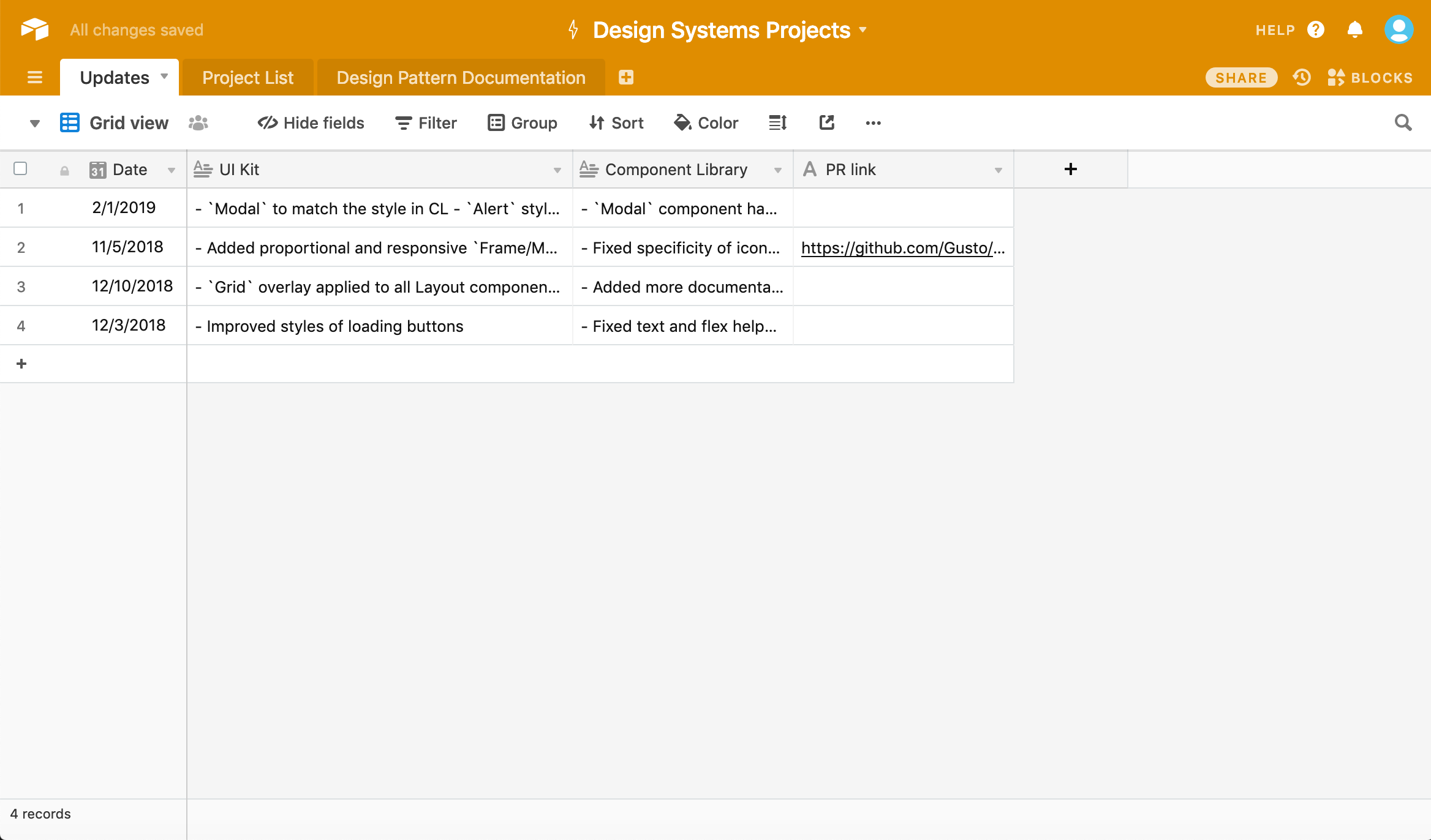
Once we’ve done that, we’ll need to create an Airtable account and create a project. We should wind up with something like this spreadsheet:

A screenshot of a spreadsheet. The header is a bright orange and the sheet contains four rows and four columns of content, ordered by date.

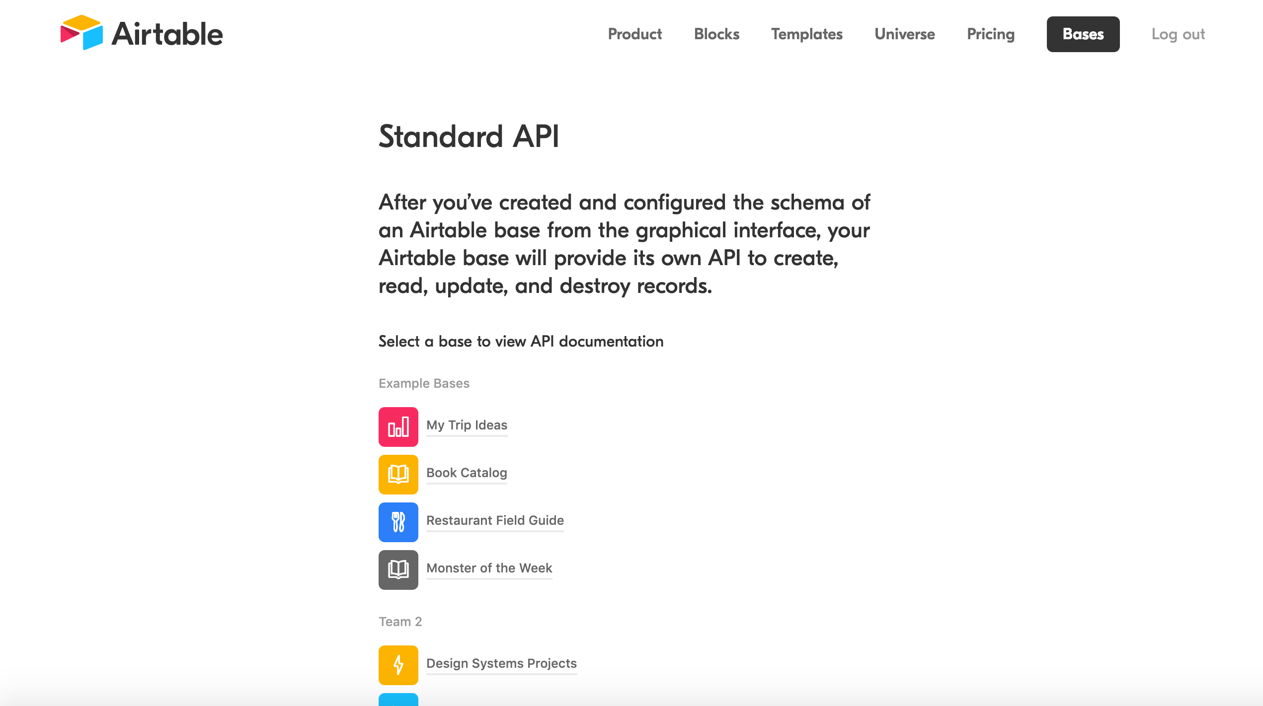
Now we can then head to airtable.com/api and select our project so that is serves as data we’re pulling from. In this case, I selected “Design Systems Projects” which you can see right at the bottom here:

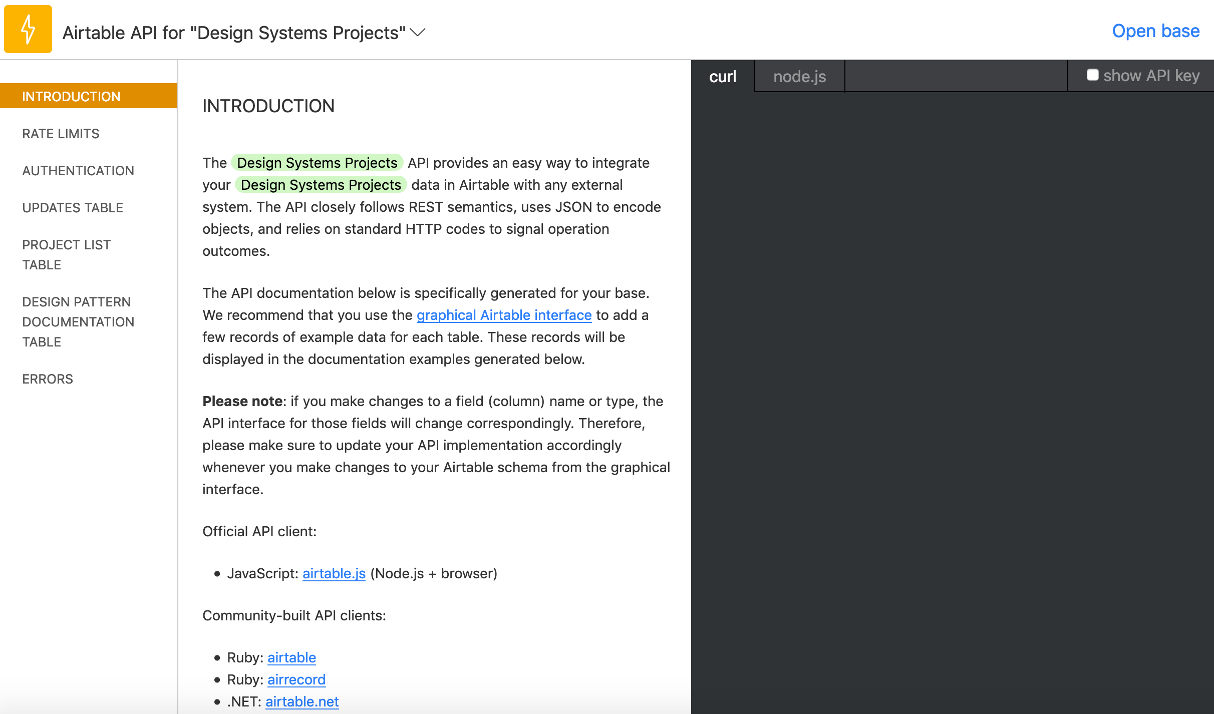
This will send us to a handy docs website that gives us an incredibly easy to read API for our specific project! Scrolling down we’ll find our API key which we’ll need to access this data as well as a ton of examples that we can use to manipulate the data we get back:

A screenshot of the Airtable API webpage. The heading says Standard API and a list of options, including example projects, is provided. Below the example projects is the project configured in this post, called Design Systems Project.

Let’s head back to App.js in our airtable-test directory, delete all the code in that file, and replace it with the following:

import React, { Component } from 'react';
import Airtable from 'airtable';
const base = new Airtable({ apiKey: 'XXXXXXXXXXX' }).base('XXXXXXXXXXX');

Make sure to replace those Xs with the details that you can see in that Airtable API doc we just opened. But now that we’ve done all the setup, we can finally get around to creating our interface by calling data from our spreadsheet.

In App.js we can start to construct the App component:

class App extends Component {
  constructor(props) {
    super(props);
    this.state = {
      records: []
    };
  }
  render() {
    return {
      <div className="App">Hello</div>		}
    }
  }
}

All this will do for now is setup the app’s state and then render “Hello” on the page. Next up, we’ll be add each record from Airtable to that state.

First thing that’s important to note below: in componentDidMount() we’ll be selecting Updates which is just a way of telling Airtable that we want the spreadsheet called Updates. Make sure that this name is the same name as the spreadsheet. We’ll also be looping through all the records, or rows, of our table in that function too:

class App extends Component {
  constructor(props) {
    super(props);
    this.state = {
      records: []
    };
  }
  componentDidMount() {
    base('Updates').select({view: 'Grid view'})
    .eachPage(
      (records, fetchNextPage) => {
        this.setState({
          records
        });
        console.log(records);
        fetchNextPage();
      }
    );
  }
  render() {
    return (
      <div className="App">
        <div>Hello</div>
      </div>
    );
  }
}

fetchNextPage() is the Airtable API’s way of giving us the next record in our spreadsheet and it’s neat that it will keep going until there are no more records. Again, we’re not doing anything with that data yet; we only want to make sure everything is working correctly at this point.

Open up the console in DevTools and we should see something like this:

Array(4) [ {…}, {…}, {…}, {…} ]

And if we dive through each of the objects in this array, then we should find all the data from the spreadsheet! Doing this bit always feels like magic to me.

Anyway, next up we can update our render() function like so:

render() {
  return (
    <div className="App">
      {this.state.records.length > 0 ? (
        this.state.records.map((record, index) =>
          <div key={index}>
            <h2>{record.fields['Date']}</h2>
            {record.fields['UI Kit']}
            {record.fields['Component Library']}
          </div>
        )
        ) : (
          <p>Loading...</p>
        )}
      </div>
    </div>
  );
}

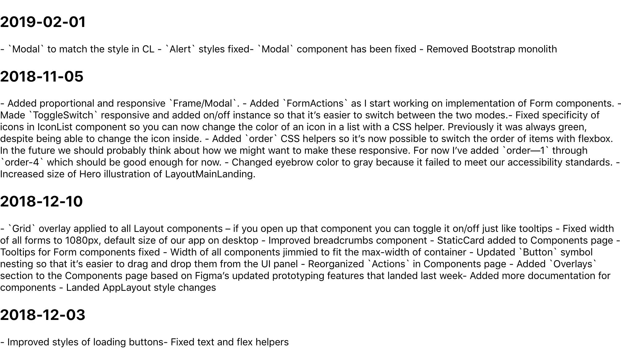
We’re going to be looping through the state that we setup earlier and then rendering the record.fields[] for each column in our spreadsheet. We have a Date, UI Kit, and Component Library column, and once we’ve updated our App.js with the code above, we should see all the content from our spreadsheet!

A screenshot of a default webpage with no styling with four headings containing dates in year/month/day numeric format following by a block of text containing content from the spreadsheet.

It’s like magic! But why does this data look so weird? Well, it’s because I wanted to write Markdown in each cell, so now we’ll need to use a parser to convert that data into good ol’ fashioned HTML. First, we need to head back to the command line though:

npm i showdown 

showdown will help us parse all that Markdown we’ve written in our Airtable spreadsheet. After installing it, we only need to import it at the top of our App.js file, like this:

import showdown from 'showdown';
const markdownConverter = new showdown.Converter();

After the componentDidMount() function, we can create another function that will create our HTML using showdown:

createHTML(markdown){
  return(
    markdownConverter.makeHtml(markdown)
  )
}

It’s a little iffy, but it makes me feel like the code is a bit tidier this way. Now we can update our render() function:

  render() {
  return (
    <div className="App">
      {this.state.records.length > 0 ? (
        this.state.records.map((record, index) =>
          <div key={index}>
            <h2>{new Date(record.fields['Date']).toISOString().split('T', 1)}</h2>
            <div dangerouslySetInnerHTML={{__html: this.createHTML(record.fields['UI Kit'])}} />
            <div dangerouslySetInnerHTML={{__html: this.createHTML(record.fields['Component Library'])}} />
          </div>
        )
      ) : (
        <p>Loading...</p>
      )}
    </div>
  );
}

We’re doing a couple of new things here: we’re using dangerouslySetInnerHTML in each div which, in turn, uses our createHTML function to convert the data from each column (specifically, the UI Kit and Component Library columns). We’re also converting the dates of each row into headings to make things a bit easier to read.

And with that we’re pretty much done! Here’s the final App.js:

import React, { Component } from 'react';
import Airtable from 'airtable';
import showdown from 'showdown';

const markdownConverter = new showdown.Converter();

const base = new Airtable({ apiKey: 'xxxxxxx' }).base('xxxxxxx');

class App extends Component {
  constructor(props) {
    super(props);
    this.state = {
      records: []
    };
  }
  componentDidMount() {
    base('Updates').select({view: 'Grid view'})
    .eachPage(
      (records, fetchNextPage) => {
        this.setState({
          records
        });
        fetchNextPage();
      }
    );
  }
  createHTML(markdown){
    return(
      markdownConverter.makeHtml(markdown)
    )
  }
  render() {
    return (
      <div className="App">
        {this.state.records.length > 0 ? (
          this.state.records.map((record, index) =>
            <div key={index}>
              <h2>{new Date(record.fields['Date']).toISOString().split('T', 1)}</h2>
              <div dangerouslySetInnerHTML={{__html: this.createHTML(record.fields['UI Kit'])}} />
              <div dangerouslySetInnerHTML={{__html: this.createHTML(record.fields['Component Library'])}} />
            </div>
          )
        ) : (
          <p>Loading...</p>
        )}
      </div>
    );
  }
}

export default App;

There’s still a ton of updates we could make to improve things. I took a first pass at styling, but we probably want to do things like improve the date format and maybe have some kind of indication as to which updates refer to which rows in the spreadsheet. Maybe we could even toggle showing which information to show depending on whether you’re a designer or engineer.

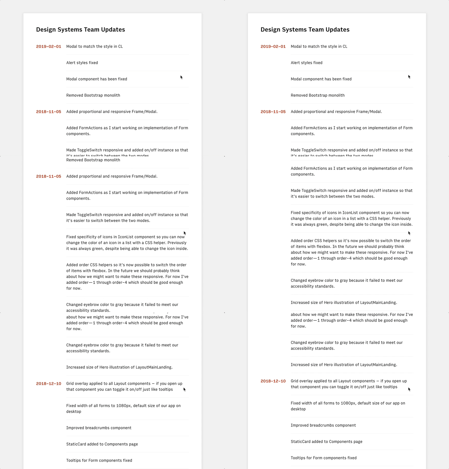
An animating screenshot of the final result which contains the same content as the earlier example but with extra spacing between sections and the column headings in dark orange and flushed to the left of the content instead of above it.

Anyway! I think this is a good start to getting to grips with the Airtable API and I’d love to hear about how you use it in the comments below.

The post Getting to Grips with the Airtable API appeared first on CSS-Tricks.

Categories: Designing, Others Tags:

Use monday.com to manage and share projects all in one place

February 14th, 2019 No comments

(This is a sponsored post.)

We’ve talked quite a bit about project management and workflows around here at CSS-Tricks, not because it’s the core of what we do as designers and developers, but because we all play a role in it as part of a team and because it impacts the quality of our work at the end of the day.

That’s why having a good system in place is such a benefit both to us and to teams as a whole. Where can you find a system like that? You might want to start by looking at monday.com. Yes, it’s a project management tool but it actually goes way beyond that. Where some other platforms out there stop at task lists, calendars, and milestones, monday.com does those plus team collaboration.

If you’ve ever felt out of the loop on a project, had a surprise change in scope, or even been curious what other folks on your team have been up to, that’s where monday.com really shines. It’s people-centric, giving you and others insight into activity across an entire project through news feeds, messaging, shared assets, clearly defined user roles, among any other things. It’s what a healthy, transparent, and collaborative team environment looks like.

We’ve only scratched the surface here, but lucky for you, there’s a free 14-day trial to check out everything that monday.com has to offer. Go for it!

Try it Now

Direct Link to ArticlePermalink

The post Use monday.com to manage and share projects all in one place appeared first on CSS-Tricks.

Categories: Designing, Others Tags: