Archive

Archive for February, 2019

Managing Image Breakpoints With Angular

February 14th, 2019 No comments

Managing Image Breakpoints With Angular

Managing Image Breakpoints With Angular

Tamas Piros

2019-02-14T13:00:08+01:002019-02-14T16:05:03+00:00

As web developers, we are often required to create applications that are responsive as well as media-rich. Having such requirements in place means that we need to work with image breakpoints, as well as media queries since we want to provide the best experience to the end users. Adding to the list of requirements we may need to use a front-end framework such as Angular which is great for creating SPAs and other application types.

In this article, we’ll take a look at image breakpoints, their use-cases and throughout a hands-on example; we’ll implement them in an Angular application using Angular’s own BreakPoint Observer. While using this approach, we’ll also highlight why this popular framework helps us work with the aforementioned techniques in a seamless way.

Image Breakpoints And Responsive Images

In the era of responsive layouts (where we capture breakpoints based on the viewport size and based on the breakpoint we change the layout of the page), we also need to make sure that images can be displayed with the right dimensions — even after a layout change. Selecting the right image is quite challenging for modern responsive websites.

Let’s discuss two options that developers can utilize at the moment.

srcset

srcset lets us define a list of images that the browser switches between based on the rendered size and the density of the display.

Let’s take a look at an example:

<img
  srcset="tuscany-sm.jpg 600w, tuscany-md.jpg 900w, tuscany-lg.jpg 1440w" sizes="100vw"
  src="tuscany.jpg" />

In the above, we specify 3 images, with the w indicating the pixel width for the image. When using the above with srcset we also need to specify the sizes attribute (this is required because the spec mandates that if we use srcset and w we must have a sizes attribute as well). What is the purpose of this attribute? Browsers need to pick which resource to load out of a source set before they layout the page (before they know how big the image will end up being). We can think of sizes as a hint to the browser that, after layout, the image will occupy 100% of the width of the viewport (that’s what vw refers to). The browser knows the actual viewport width (as well as the DPR of the image) at load-time, so it can do the math to figure out what size resource it needs and pick one out of the source set.

The and element combinations let us switch out image resources in response to media queries, like the ones at layout breakpoints.

Let’s take a look at an example of this as well:

<picture>
    <source media="(min-width: 1440px)" srcset="../assets/images/tuscany-lg.jpg">
    <source media="(min-width: 900px)" srcset="../assets/images/tuscany-md.jpg">
    <source media="(min-width: 600px)" srcset="../assets/images/tuscany-sm.jpg">
    <img src="../assets/images/tuscany-sm.jpg" />
  </picture>

Change the code above locally with an image of your choice that has a small, medium and large size. Notice how, by resizing the browser, you get a different image.

The key takeaway from all the above is that if we want to swap out images at specific breakpoints, we can use the element to put media queries right into the markup.

Note: If you’re interested in exploring the differences between and srcset + sizes, I recommend reading Eric Portis’ great article: srcset and sizes.

So far we have discussed how to use image breakpoints along with media queries in a pure HTML environment. Wouldn’t it be a lot better to have a convenient, almost semi-automated way of generating image breakpoints as well as the corresponding images for the breakpoints even without having to specify media queries at all? Luckily for us Angular has a built-in mechanism to help us out and we’ll also take a look at generating the appropriate images dynamically based on certain conditions by using a third-party service.

Angular Layout Module

Angular comes with a Layout Module which lives in the CDK (Component Dev Kit) toolset. The Angular CDK contains well-tested tools to aid with component development. One part of the CDK is the Layout Module which contains a BreakpointObserver. This helper gives access to media-query breakpoints, meaning that components (and their contents) can adapt to changes when the browser size (screen size) is changed intuitively.

Recommended reading: Layout Module

Now that we have the theory out of the way let’s get down to business and create an application that will implement responsive image breakpoints. In this first iteration, we’ll create the shell of the application via the Angular CLI: ng new bpo and select the necessary options.

To use the BreakpointObserver we also need to install the Angular’s CDK Layout Module, which we can do via npm: npm i @angular/cdk.

After the installation, we will be able to add the necessary import statements to any component that we wish:

// app.component.ts
import { BreakpointObserver, Breakpoints } from '@angular/cdk/layout';

Using the BreakpointObserver we can subscribe to changes in the viewport width and Angular gives us convenient accessors which mean that we don’t need to use media queries at all! Let’s go ahead and try this out:

// app.component.ts
constructor(public breakpointObserver: BreakpointObserver) { }

ngOnInit() {
    this.breakpointObserver.observe([
      Breakpoints.XSmall,
      Breakpoints.Small,
      Breakpoints.Medium,
      Breakpoints.Large,
      Breakpoints.XLarge
    ]).subscribe(result => {
      if (result.breakpoints[Breakpoints.XSmall]) {
       // handle XSmall breakpoint
      }
      if (result.breakpoints[Breakpoints.Small]) {
       // handle Small breakpoint
      }
      if (result.breakpoints[Breakpoints.Medium]) {
      // handle Medium breakpoint
      }
      if (result.breakpoints[Breakpoints.Large]) {
        // handle Large breakpoint
      }
      if (result.breakpoints[Breakpoints.XLarge]) {
        // handle XLarge breakpoint
      }
    });
  }

As mentioned before the accessor properties above reflect media queries in the following way:

  • Breakpoints.XSmall: max-width = 599.99px
  • Breakpoints.Small: min-width = 600px and max-width = 959.99px
  • Breakpoints.Medium: min-width = 960px and max-width = 1279.99px
  • Breakpoints.Large: min-width = 1280px and max-width = 1919.99px
  • Breakpoints.XLarge: min-width = 1920px

We now have everything in place which means, we can start to generate the appropriate images.

Responsive Breakpoints For Images

We have a few options to generate responsive images:

  1. Responsive Image Breakpoints Generator
    Using this tool, we can upload any image, setup various options, e.g. the number of images that we wish to generate. After running the tool, we’ll have a visual representation about the generated images, and we can download them as a zip file along with some generated code which uses the previously mentioned element.
  2. Another solution would be to create a build step for our project to generate breakpoints via some packages available in the NPM repository, such as gulp-responsive or grunt-responsive-images. Both of these depend on additional libraries that we are required to install for our operating system. (Please check the appropriate repositories for additional information.)
  3. Yet another solution would be to use a service such as Cloudinary to store the images and serve them in a size and format that we need only by modifying the URL for the requested resource. This will be our approach since this gives us the most flexibility.

Recommended reading: Automating Art Direction With The Responsive Image Breakpoints Generator by Eric Portis

I have uploaded the original image to my Cloudinary account which means that I can access that image via the following URL:

https://res.cloudinary.com/tamas-demo/image/upload/breakpoints-article/tuscany.jpg

This is the full-sized, raw, original and unchanged image that we’ll work with.

We can modify the URL of the image to generate a much smaller version. For example, if we want to have an image with a width of 600 pixels, we could update the Cloudinary URL* to be the following:

https://res.cloudinary.com/tamas-demo/image/upload/w_600/breakpoints-article/tuscany.jpg
 

* Note the w_600 added to the URL.

Hopefully, by this point, you see where all this is going. Based on the approach above, we can very quickly start to generate the right image for the right breakpoint.

Using Cloudinary means that we don’t need to create, store and manage multiple version of the same image — it is done for us by Cloudinary on-the-fly.

Let’s update our code:

<!-- app.component.html -->
<div>
  <h1>Current breakpoint: {{ breakpoint }}</h1>
  <img [src]="imagePath">
</div>
// app.component.ts
import { Component, OnInit } from '@angular/core';
// ...
export class AppComponent implements OnInit {
  imagePath;
  constructor(public breakpointObserver: BreakpointObserver) { }
  ngOnInit() {
    this.breakpointObserver.observe([ ...
  }
}

We can pick any number of breakpoints to observe from the list mentioned previously, and since we have an Observer we can subscribe to the changes and act on them:

this.breakpointObserver.observe([
  Breakpoints.XSmall,
  Breakpoints.Small,
  Breakpoints.Medium,
  Breakpoints.Large,
  Breakpoints.XLarge
]).subscribe(result => {
  if (result.breakpoints[Breakpoints.XSmall]) {
    // handle this case
  }
});

To handle the options for the different images in Cloudinary, we’ll utilize an approach that will be very easy to follow. For each case, we’ll create an options variable and update the final Cloudinary URL.

Add the following at the top of the component definition:

// app.component.ts
imagePath;
  breakpoint;
  cloudinaryOptions;
  baseURL = 'https://res.cloudinary.com/tamas-demo/image/upload/breakpoints-article/tuscany.jpg';

And add the following as well to the first if statement:

// app.component.ts
let url = this.baseURL.split('/');
let insertIndex = url.indexOf('upload');
const options = 'c_thumb,g_auto,f_auto,q_auto,w_400';
url.splice(insertIndex + 1, 0, options);
this.imagePath = url.join('/');
this.breakpoint = Breakpoints.XSmall;

The result is going to be an updated Cloudinary URL:

https://res.cloudinary.com/tamas-demo/image/upload/c_thumb,g_auto,f_auto,q_auto,w_400/breakpoints-article/tuscany.jpg

What are the options that we are setting here?

  • c_thumb (generates a thumbnail of the image);
  • g_auto (focuses on the most interesting part; we see the cathedral in the thumbnail);
  • f_auto (serves the most appropriate format for a given browser, i.e. WebP for Chrome);
  • q_auto (reduces the quality — and therefore the overall size — of the image without impacting the visuals);
  • w_400 (sets the width of the image to 400px).

For the sake of curiosity, let’s compare the original image size with this newly generated image: 2.28 MBs vs 29.08 KBs!

We now have a straightforward job: we need to create different options for different breakpoints. I created a sample application on StackBlitz so you can test it out immediately (you can also see a preview here).

Conclusion

The variety of desktop and mobile devices and the amount of media used in today’s web has reached an outstanding number. As web developers, we must be at the forefront of creating web applications that work on any device and doesn’t impact the visual experience.

There are a good number of methods that make sure the right image is loaded to the right device (or even when resizing a device). In this article, we reviewed an approach that utilizes a built-in Angular feature called BreakPoint Observer which gives us a powerful interface for dealing with responsive images. Furthermore, we also had a look at a service that allows us to serve, transform and manage images in the cloud. Having such compelling tools at our hands, we can still create immersive visual web experiences, without losing visitors.

Smashing Editorial(dm, il)
Categories: Others Tags:

9 Tips for Designing an Email Signature in 2019

February 14th, 2019 No comments

It’s no secret that email signatures have a major impact in the world of email marketing. It’s also clear that they are one of the easiest ways to re-engage with your existing customers, without spending any (or very little) money.

Successful businesses are using the untapped power of their email signatures because they know that decisions are all about prioritizations based on invested effort vs benefit.

Let’s take a look at how you can revamp your email signature for 2019 to give it that “pop” factor.

1. Create Your Signature with Mobile in Mind

It’s amazing how many people completely skip over this step, without knowing the consequences. Mobiles account for 46% of all email opens, meaning that testing your email signature for mobile compatibility is essential.

A common misconception is that your email signature will be compatible across all email clients. The sad truth is…it won’t. Although I would love to blame Outlook for this, the reason is actually that most email clients (mobile included) use different HTML rendering engines and that means they all display email signatures differently.

In addition, mobile screens are much smaller than PC displays, and they also use scaling. Because of this, vertical layouts work much better on mobiles. Using a wide layout on mobile devices can cause your signature to look squashed and the images to be scaled up which makes them look blurry.

2. Include Only Essential Details

The details a college student includes in their signature will be a lot different to the details a lawyer includes. Only include the details which are relevant to you. For example, if you’re a college student, you would probably include the university you’re attending and the subject you’re studying. You wouldn’t include those details if you’re a lawyer.

Most people aren’t interested in knowing your favorite band, or color. Your email signature should include the information needed to contact you, and any other relevant information. If you’re unsure, ask yourself “Would I give that information to a business associate I had just met?”.

Here are the most popular fields to include in your email signature:

  • Full Name
  • Job Position
  • Company
  • Mobile Phone Number
  • Office Phone Number
  • Office Address
  • Profile Picture and/or Logo (or both)
  • Social Icons (optional, but recommended)
  • Promotional Banner (optional)
  • Disclaimer (optional)

Details which are not needed only bloat the signature and make it hard for your recipient to find the details they actually need.

3. Consider Fonts

A font can completely change the look and feel of an email signature. The same can be said for the colors and spacing. You should never use multiple fonts in your email signature. The only exception is if your logo uses a different font to your signature.

In terms of font sizes, you shouldn’t have more than 2-3 different sizes throughout your whole signature.

4. Use Colors Which Reflect Your Brand

Like fonts, keep your selection to around 2-3 different colors. Any more and you risk creating that “rainbow email signature”.

It’s important that the colors match your logo as much as possible. Otherwise, your logo can look misplaced, or your signature could have that “template” look which you don’t want.

5. Use Beautiful Images

In sales-based roles (such as real estate agents) where you’re dealing directly with the public, using an image of your face can add a personal touch to your signature. If you’re not too fond of using a profile picture in your signature, you can just use your company logo.

Only use good quality images which have been professionally taken.

Use PNG or JPEG type images for maximum compatibility and always ensure you compress them using a tool like TinyPNG.

PNG’s work best for logos and when you need transparency in your images. JPEG’s are best for profile pictures where the color quality needs to be perfect.

Avoid using GIF animations (more on this later).

6. Tweak the Spacing

Behind every great looking email signature is consistent spacing. If you’ve got 10 pixels of spacing above the contact information, then you should have the same spacing under the contact information too. The same goes for all sections of the signature.

Consistent spacing makes the signature look professional and clean, even at a quick glance. It also makes it easier to spot information that you’re trying to find.

7. Keep an Eye on Size

With email signatures, there’s 2 sizes to check. The size in pixels, and the size in kilobytes (KB).

Size in Pixels

The size in pixels determines visually how big your signature is, and whether it will fit mobile screens. Keep in mind that narrower signatures look better on mobiles because of screen sizes and scaling.

For desktops and larger screen sizes that don’t use scaling, the recommended maximum email signature size is 700(w) x 300(h) pixels.

For mobile phones which have smaller screens that use scaling, the recommended maximum email signature size is 320(w) x 600(h) pixels.

Checking the size of your signature is as simple as opening your signature in a web browser like Google Chrome, right clicking on it and clicking inspect element. You should then be able to hover over the outer most table, and it should show you the height and width of the signature.

Size in KB

The size in KB is the amount of disk space the email signature will take up when it’s stored on a mail server. If you send roughly 30 emails a day, your email signature will be stored 30 times on your server, which can take up valuable space in the long run. And that’s only with you sending emails. If you have multiple staff sending emails, it can add up very quickly.

You should aim to keep your email signature under 50KB in size. There generally isn’t a need to have an email signature that is any larger (even if you have a promotional banner).

8. Test Your Email Signature for Compatibility

Remember earlier we touched on the subject of email signature compatibility? To ensure your signature looks the same in all email clients, you must cross test it between all the popular email clients. Just because your signature looks perfect in Outlook, doesn’t mean it will look perfect in Gmail.

  • This is an example of how cross testing should be done:
  • Sending from Outlook 2013 to Gmail
  • Sending from Outlook 2016 to Gmail
  • Sending from Gmail to Outlook 2013
  • Sending from Gmail to Outlook 2016

…and so on.

Hopefully, now you can see what an enormous task cross testing can be if want your signature to be compatible with the top 10 email clients. Just because you have done cross testing, it doesn’t mean that your email signature will work flawlessly in all email clients. For example, Gmail inserts gaps below images, and there is nothing you can do about it.

Sometimes you can fix compatibility issues, other times you simply can’t.

9. Things You Shouldn’t Do

Don’t make your whole email signature an image

If you’re considering making a fancy email signature, but you can’t do it using HTML + CSS, then either change the design so it can be coded, or don’t do it at all.

Whatever you do, don’t make your whole email signature an image, as the size (in KB) is usually large and your recipients won’t be able to copy your phone number or other details out of it.

Basically, it screams “I care more about looks, than I do about functionality”.

Also, you can’t do split testing on things like CTA buttons, and you can’t easily make changes to the signatures.

Don’t Over Complicate the Design

A simple design goes a long way. Don’t think of your signature as needing to cram as much information into it as possible. Simple designs are easier to code, and also have a much higher chance of looking consistent across all mail clients.

Don’t Insert GIF Animations

Animations are fun to look at, but most of the time they don’t work with email signatures. In addition to possibly being perceived as immature, animations don’t always technically work with email clients.

Some email clients convert GIF animations to still images. So, if you have an animation of your head moving around, your recipient might see a still image of the side of your head…not a good look.

Don’t Use Inspirational Quotes

There isn’t enough room for them, and the idea is to keep your email signature clean and clutter free. Avoid using quotes in email signatures, unless it’s something like a CEO quote that enhances the brand image.

Conclusion

Creating an email signature is quite straight forward as long as you keep these tips in mind. Hopefully, now you should be fully equipped to make a really great looking email signature that will be compatible and at the same time have all the features you want.

Featured image via DepositPhotos.

Add Realistic Chalk and Sketch Lettering Effects with Sketch’it – only $5!

Source

Categories: Designing, Others Tags:

The Smart Ways to Correct Mistakes in Git

February 13th, 2019 No comments

The world of software development offers an infinite amount of ways to mess up: deleting the wrong things, coding into dead ends, littering commit messages with typos, are a mere few of the plentitude.
??
??Fortunately, however, we have a wonderful safety net under our feet in the form of Git when we’re working with version control. Not that you and I need a safety net, of course, because we never make mistakes, right? Sure, sure. But for the benefit of everyone else, let’s take a tour of some of the “undo” tools in Git that can save us from ourselves.
??
??
??
??

Fixing the last commit

??
??Messing up a commit is all too easy. Classic case in point: making a typo in a commit message. Another? Forgetting to add a change to the staging area. And in many cases, we instantly realize our mistake — right after hitting the Enter key, naturally.
??
??Luckily, Git makes it ridiculously easy to fix the very last commit. Let’s say we had just hit Enter on the following command:

??

git commit -m "Massage full of typohs"

??
??And (as if this orthographic mess wasn’t bad enough) let’s say we also forgot to add another changed file to the staging area. We can correct both of our mistakes with the following two commands:
??

git add forgotten-changes.js
​​git commit --amend -m "A sensible message"

??
??The magic ingredient is the --amend? flag: when using it on a commit, Git will correct the very last commit — with any staged changes and the new message.
??
??A short word of warning, though: only use --amend? on commits that haven’t been pushed to a remote repository, yet. The reason is that Git replaces the original, bad commit with the amended version. Afterwards, it looks as if the original commit never happened. Yeah, that’s good for concealing mistakes, but only if we haven’t already published this mistake on the remote server.
????
??

Undoing local changes

??
??Everyone’s had days like this: spend all morning hacking away, only to admit to yourself that the last few hours were a waste of time. Gotta start over and undo much (or all) of that work.
??
??But this is one of the reasons for using Git in the first place — to be able to try out things without the fear that we might break something.
??
??Let’s take stock in an example situation:
??

git status
​​  modified: about.html
​​  deleted:  imprint.html
​​  modified: index.html

??
??Now, let’s assume that this is one of the wasted hacking days described above. We ought to have kept our hands off of about.html and not deleted imprint.html. What we now want is to discard our current changes in these files — while keeping the brilliant work done in index.html. ??The git checkout? command can help in this case. Instead, we’ve gotta get more specific with which files to check out, like this:

??

git checkout HEAD about.html imprint.html

??This command restores both about.html and imprint.html to their last committed states. Phew, we got away from a black eye!
??
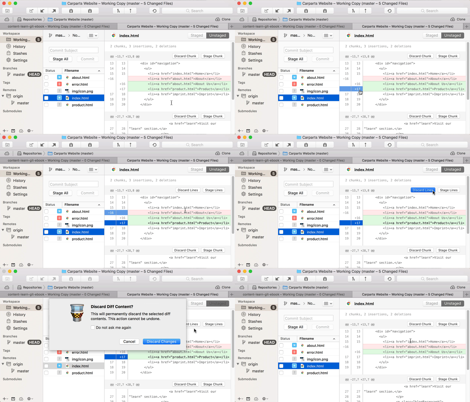
??We could take this one step further and discard specific individual lines in a changed file instead of tossing out the entire thing! I’ll admit, it’s rather complicated to make it happen on the command line, but using a desktop Git client like Tower is a great way to go about it:

??
??For those really bad days, we might want to bring out the big guns in the form of:
??
??

git reset --hard HEAD

??
??While we only restored specific files with checkout?, this command resets our whole working copy. In other words, reset? restores the complete project at its last committed state. ??Similar to --amend?, there’s something to keep in mind when using checkout? and reset?: discarding local changes with these commands cannot be undone! They have never been committed to the repository, so it’s only logical that they cannot be restored. Better be sure that you really want to get rid of them because there’s no turning back!
??
??

Undoing and reverting an older commit

??
??In many cases, we only realize a mistake much later, after it has long been committed to the repository.

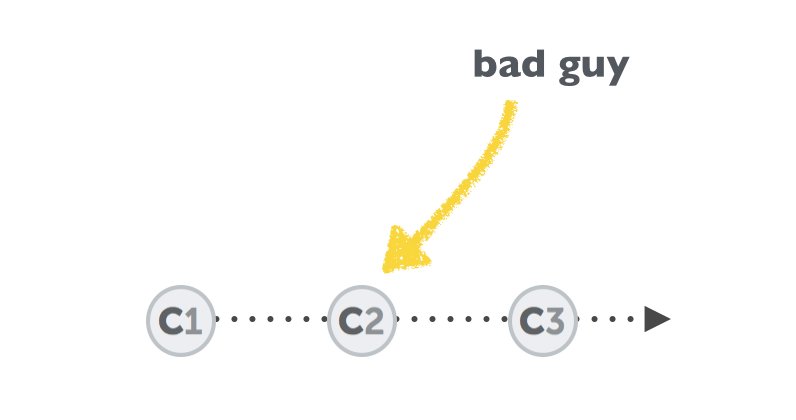
??How can we get rid of that one bad commit? Well, the answer is that we shouldn’t… at least in most cases. Even when “undoing” things, Git normally doesn’t actually delete data. It corrects it by adding new data. Let’s see how this works using our “bad guy” example:
??
??

git revert 2b504bee

??
??By using git revert? on that bad commit, we haven’t deleted anything. Quite the contrary:

??Git automatically created a new commit with changes that reverts the effects of the “bad” commit. So, really, if we started with three commits and were trying to correct the middle one, now we have four total commits, with a new one added that corrects the one we targeted with revert?.
????
??

Restoring a previous version of a project

??
??A different use case is when we want to restore a previous version of our project. Instead of simply undoing or reverting a specific revision somewhere in our commit history, we might really want to turn back time and return to a specific revision.
??
??In the following example scenario, we would declare all the commits that came after “C2” as unwanted. What we want is to return to the state of commit “C2” and forget everything that came after it in the process:

??The command that’s necessary is already (at least partly) familiar to you based on what we’ve already covered:
??
??

git reset --hard 2b504bee

??
??This tells git reset? the SHA-1 hash of the commit we want to return to. Commits C3 and C4 then disappear from the project’s history.
??
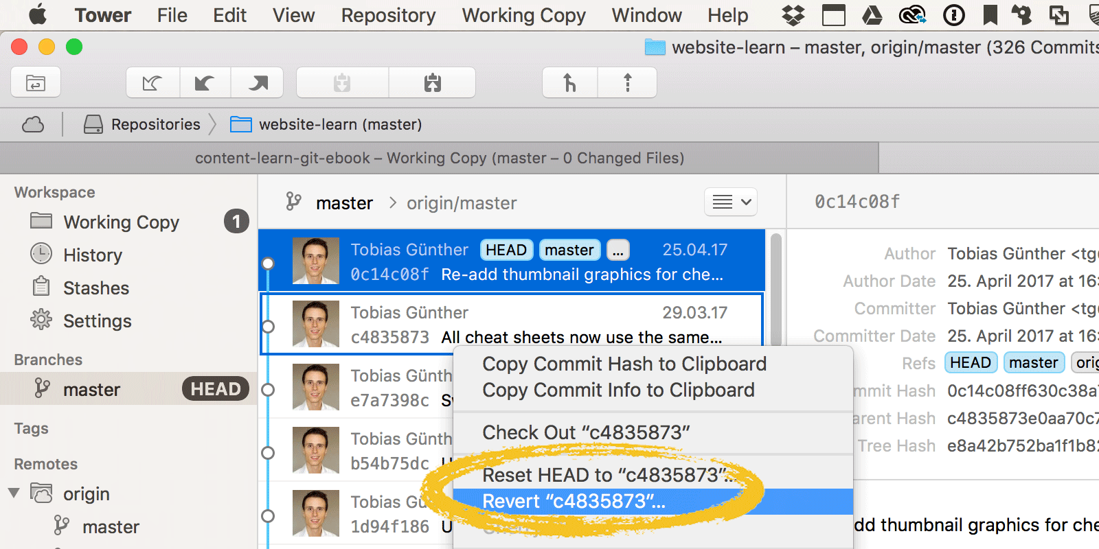
??If you’re working in a Git client, like Tower, both git revert? and git reset are available from the contextual menu of a commit item:

??

??Deleting commits, restoring deleted branches, dealing with conflicts, etc. etc. etc.

??
??Of course, there are many other ways to mess up things in a software project. But luckily, Git also offers many more tools for undoing the mess.
??
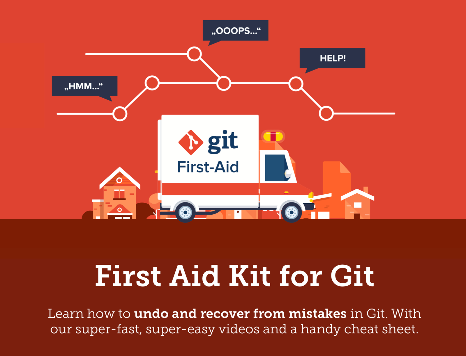
??Have a look at the “First Aid Kit for Git” project that I and other folks on the Tower team have created if you want to learn more about the scenarios we covered in this post, or about other topics, like how to move commits between branches, delete old commits, restore deleted branches or gracefully deal with merge conflicts. It’s a totally free guide that includes 17 videos and a handy cheat sheet you can download and keep next to your machine.

??In the meantime, happy undoing!

The post The Smart Ways to Correct Mistakes in Git appeared first on CSS-Tricks.

Categories: Designing, Others Tags:

“the closest thing web standards have to a golden rule”

February 13th, 2019 No comments

The internet’s own Mat Marquis plucks this choice quote from the HTML Design Principals spec:

In case of conflict, consider users over authors over implementors over specifiers over theoretical purity.

And then he applies the idea to putting images on websites in 2019.

Direct Link to ArticlePermalink

The post “the closest thing web standards have to a golden rule” appeared first on CSS-Tricks.

Categories: Designing, Others Tags:

An Introduction To WebBluetooth

February 13th, 2019 No comments

An Introduction To WebBluetooth

An Introduction To WebBluetooth

Niels Leenheer

2019-02-13T13:00:51+01:002019-02-13T20:05:50+00:00

With Progressive Web Apps, the web has been ever more closely moving towards native apps. However, with the added benefits that are inherent to the web such as privacy and cross-platform compatibility.

The web has traditionally been fantastic about talking to servers on the network, and to servers on the Internet specifically. Now that the web is moving towards applications, we also need the same capabilities that native apps have.

The amount of new specifications and features that have been implemented in the last few years in browsers is staggering. We’ve got specifications for dealing with 3D such as WebGL and the upcoming WebGPU. We can stream and generate audio, watch videos and use the webcam as an input device. We can also run code at almost native speeds using WebAssembly. Moreover, despite initially being a network-only medium, the web has moved towards offline support with service workers.

That is great and all, but one area has been almost the exclusive domain for native apps: communicating with devices. That is a problem we’ve been trying to solve for a long time, and it is something that everybody has probably encountered at one point. The web is excellent for talking to servers, but not for talking to devices. Think about, for example, trying to set up a router in your network. Chances are you had to enter an IP address and use a web interface over a plain HTTP connection without any security whatsoever. That is just a poor experience and bad security. On top of that, how do you know what the right IP address is?

HTTP is also the first problem we run into when we try to create a Progressive Web App that tries to talk to a device. PWAs are HTTPS only, and local devices are always just HTTP. You need a certificate for HTTPS, and in order to get a certificate, you need a publicly available server with a domain name (I’m talking about devices on our local network that is out of reach).

So for many devices, you need native apps to set the devices up and use them because native apps are not bound to the limitations of the web platform and can offer a pleasant experience for its users. However, I do not want to download a 500 MB app to do that. Maybe the device you have is already a few years old, and the app was never updated to run on your new phone. Perhaps you want to use a desktop or laptop computer, and the manufacturer only built a mobile app. Also not an ideal experience.

WebBluetooth is a new specification that has been implemented in Chrome and Samsung Internet that allows us to communicate directly to Bluetooth Low Energy devices from the browser. Progressive Web Apps in combination with WebBluetooth offer the security and convenience of a web application with the power to directly talk to devices.

Bluetooth has a pretty bad name due to limited range, bad audio quality, and pairing problems. But, pretty much all those problems are a thing of the past. Bluetooth Low Energy is a modern specification that has little to do with the old Bluetooth specifications, apart from using the same frequency spectrum. More than 10 million devices ship with Bluetooth support every single day. That includes computers and phones, but also a variety of devices like heart rate and glucose monitors, IoT devices like light bulbs and toys like remote controllable cars and drones.

Recommended reading: Understanding API-Based Platforms: A Guide For Product Managers

The Boring Theoretical Part

Since Bluetooth itself is not a web technology, it uses some vocabulary that may seem unfamiliar to us. So let’s go over how Bluetooth works and some of the terminology.

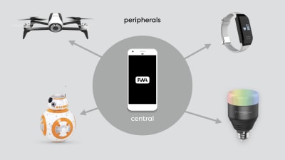
Every Bluetooth device is either a ‘Central device’ or a ‘Peripheral’. Only central devices can initiate communication and can only talk to peripherals. An example of a central device would be a computer or a mobile phone.

A peripheral cannot initiate communication and can only talk to a central device. Furthermore, a peripheral can only talk to one central device at the same time. A peripheral cannot talk to another peripheral.


a phone in the middle, talking to multiple peripherals, such as a drone, a robot toy, a heart rate monitor and a lightbulb
A central device can talk to multiple peripherals. (Large preview)

A central device can talk to multiple peripherals at the same time and could relay messages if it wanted to. So a heart rate monitor could not talk to your lightbulbs, however, you could write a program that runs on a central device that receives your heart rate and turns the lights red if the heart rate gets above a certain threshold.

When we talk about WebBluetooth, we are talking about a specific part of the Bluetooth specification called Generic Attribute Profile, which has the very obvious abbreviation GATT. (Apparently, GAP was already taken.)

In the context of GATT, we are no longer talking about central devices and peripherals, but clients and servers. Your light bulbs are servers. That may seem counter-intuitive, but it actually makes sense if you think about it. The light bulb offers a service, i.e. light. Just like when the browser connects to a server on the Internet, your phone or computer is a client that connects to the GATT server in the light bulb.

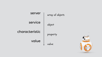
Each server offers one or more services. Some of those services are officially part of the standard, but you can also define your own. In the case of the heart rate monitor, there is an official service defined in the specification. In case of the light bulb, there is not, and pretty much every manufacturer tries to re-invent the wheel. Every service has one or more characteristics. Each characteristic has a value that can be read or written. For now, it would be best to think of it as an array of objects, with each object having properties that have values.


the hierarchy of services and characteristics compared to more familiar constructs from JavaScript - a server is similar to an array of objects, a service to an object in that array, a characteristic to a property of that object and both have values
A simplified hierarchy of services and characteristics. (Large preview)

Unlike properties of objects, the services and characteristics are not identified by a string. Each service and characteristic has a unique UUID which can be 16 or 128 bits long. Officially, the 16 bit UUID is reserved for official standards, but pretty much nobody follows that rule.
Finally, every value is an array of bytes. There are no fancy data types in Bluetooth.

A Closer Look At A Bluetooth Light Bulb

So let’s look at an actual Bluetooth device: a Mipow Playbulb Sphere. You can use an app like BLE Scanner, or nRF Connect to connect to the device and see all the services and characteristics. In this case, I am using the BLE Scanner app for iOS.

The first thing you see when you connect to the light bulb is a list of services. There are some standardized ones like the device information service and the battery service. But there are also some custom services. I am particularly interested in the service with the 16 bit UUID of 0xff0f. If you open this service, you can see a long list of characteristics. I have no idea what most of these characteristics do, as they are only identified by a UUID and because they are unfortunately a part of a custom service; they are not standardized, and the manufacturer did not provide any documentation.

The first characteristic with the UUID of 0xfffc seems particularly interesting. It has a value of four bytes. If we change the value of these bytes from 0x00000000 to 0x00ff0000, the light bulb turns red. Changing it to 0x0000ff00 turns the light bulb green, and 0x000000ff blue. These are RGB colors and correspond exactly to the hex colors we use in HTML and CSS.

What does that first byte do? Well, if we change the value to 0xff000000, the lightbulb turns white. The lightbulb contains four different LEDs, and by changing the value of each of the four bytes, we can create every single color we want.

The WebBluetooth API

It is fantastic that we can use a native app to change the color of a light bulb, but how do we do this from the browser? It turns out that with the knowledge about Bluetooth and GATT we just learned, this is relatively simple thanks to the WebBluetooth API. It only takes a couple of lines of JavaScript to change the color of a light bulb.

Let’s go over the WebBluetooth API.

Connecting To A Device

The first thing we need to do is to connect from the browser to the device. We call the function navigator.bluetooth.requestDevice() and provide the function with a configuration object. That object contains information about which device we want to use and which services should be available to our API.

In the following example, we are filtering on the name of the device, as we only want to see devices that contain the prefix PLAYBULB in the name. We are also specifying 0xff0f as a service we want to use. Since the requestDevice() function returns a promise, we can await the result.

let device = await navigator.bluetooth.requestDevice({
    filters: [ 
        { namePrefix: 'PLAYBULB' } 
    ],
    optionalServices: [ 0xff0f ]
});

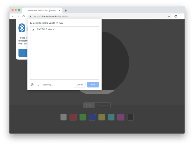
When we call this function, a window pops up with the list of devices that conform to the filters we’ve specified. Now we have to select the device we want to connect to manually. That is an essential step for security and privacy and gives control to the user. The user decides whether the web app is allowed to connect, and of course, to which device it is allowed to connect. The web app cannot get a list of devices or connect without the user manually selecting a device.


the Chrome browser with the window that the user needs to use to connect to a device, with the lightbulb visible in the list of devices
The user has to manually connect by selecting a device. (Large preview)

After we get access to the device, we can connect to the GATT server by calling the connect() function on the gatt property of the device and await the result.

let server = await device.gatt.connect();

Once we have the server, we can call getPrimaryService() on the server with the UUID of the service we want to use as a parameter and await the result.

let service = await server.getPrimaryService(0xff0f);

Then call getCharacteristic() on the service with the UUID of the characteristic as a parameter and again await the result.

We now have our characteristics which we can use to write and read data:

let characteristic = await service.getCharacteristic(0xfffc);

Writing Data

To write data, we can call the function writeValue() on the characteristic with the value we want to write as an ArrayBuffer, which is a storage method for binary data. The reason we cannot use a regular array is that regular arrays can contain data of various types and can even have empty holes.

Since we cannot create or modify an ArrayBuffer directly, we are using a ‘typed array’ instead. Every element of a typed array is always the same type, and it does not have any holes. In our case, we are going to use a Uint8Array, which is unsigned so it cannot contain any negative numbers; an integer, so it cannot contain fractions; and it is 8 bits and can contain only values from 0 to 255. In other words: an array of bytes.

characteristic.writeValue(
    new Uint8Array([ 0, r, g, b  ])
);

We already know how this particular light bulb works. We have to provide four bytes, one for each LED. Each byte has a value between 0 and 255, and in this case, we only want to use the red, green and blue LEDs, so we leave the white LED off, by using the value 0.

Reading Data

To read the current color of the light bulb, we can use the readValue() function and await the result.

let value = await characteristic.readValue();
    
let r = value.getUint8(1); 
let g = value.getUint8(2);
let b = value.getUint8(3);

The value we get back is a DataView of an ArrayBuffer, and it offers a way to get the data out of the ArrayBuffer. In our case, we can use the getUint8() function with an index as a parameter to pull out the individual bytes from the array.

Getting Notified Of Changes

Finally, there is also a way to get notified when the value of a device changes. That isn’t really useful for a lightbulb, but for our heart rate monitor we have constantly changing values, and we don’t want to poll the current value manually every single second.

characteristic.addEventListener(
    'characteristicvaluechanged', e => {
        let r = e.target.value.getUint8(1); 
        let g = e.target.value.getUint8(2);
        let b = e.target.value.getUint8(3);
    }
);

characteristic.startNotifications();

To get a callback whenever a value changes, we have to call the addEventListener() function on the characteristic with the parameter characteristicvaluechanged and a callback function.
Whenever the value changes, the callback function will be called with an event object as a parameter, and we can get the data from the value property of the target of the event. And, finally extract the individual bytes again from the DataView of the ArrayBuffer.

Because the bandwidth on the Bluetooth network is limited, we have to manually start this notification mechanism by calling startNotifications() on the characteristic. Otherwise, the network is going to be flooded by unnecessary data. Furthermore, because these devices typically use a battery, every single byte that we do not have to send will definitively improve the battery life of the device because the internal radio does not need to be turned on as often.

Conclusion

We’ve now gone over 90% of the WebBluetooth API. With just a few function calls and sending 4 bytes, you can create a web app that controls the colors of your light bulbs. If you add a few more lines, you can even control a toy car or fly a drone. With more and more Bluetooth devices making their way on to the market, the possibilities are endless.

Further Resources

Smashing Editorial(dm, ra, il)
Categories: Others Tags:

A Site for Front-End Development Conferences (Built with 11ty on Netlify)

February 12th, 2019 No comments

I built a new little site! It’s a site for listing upcoming conferences in the world of front-end web design and development. In years past (like 2017), Sarah Drasner took up this daunting job. We used a form for new conference submissions, but it was still a rather manual task of basically manually editing a blog post. I wanted to keep doing this, as I think it’s valuable to have a simple reference page for conferences in our niche slice of the web, but I wanted the site to be able to live on year after year with lower maintenance-related technical debt.

So this is what I did!

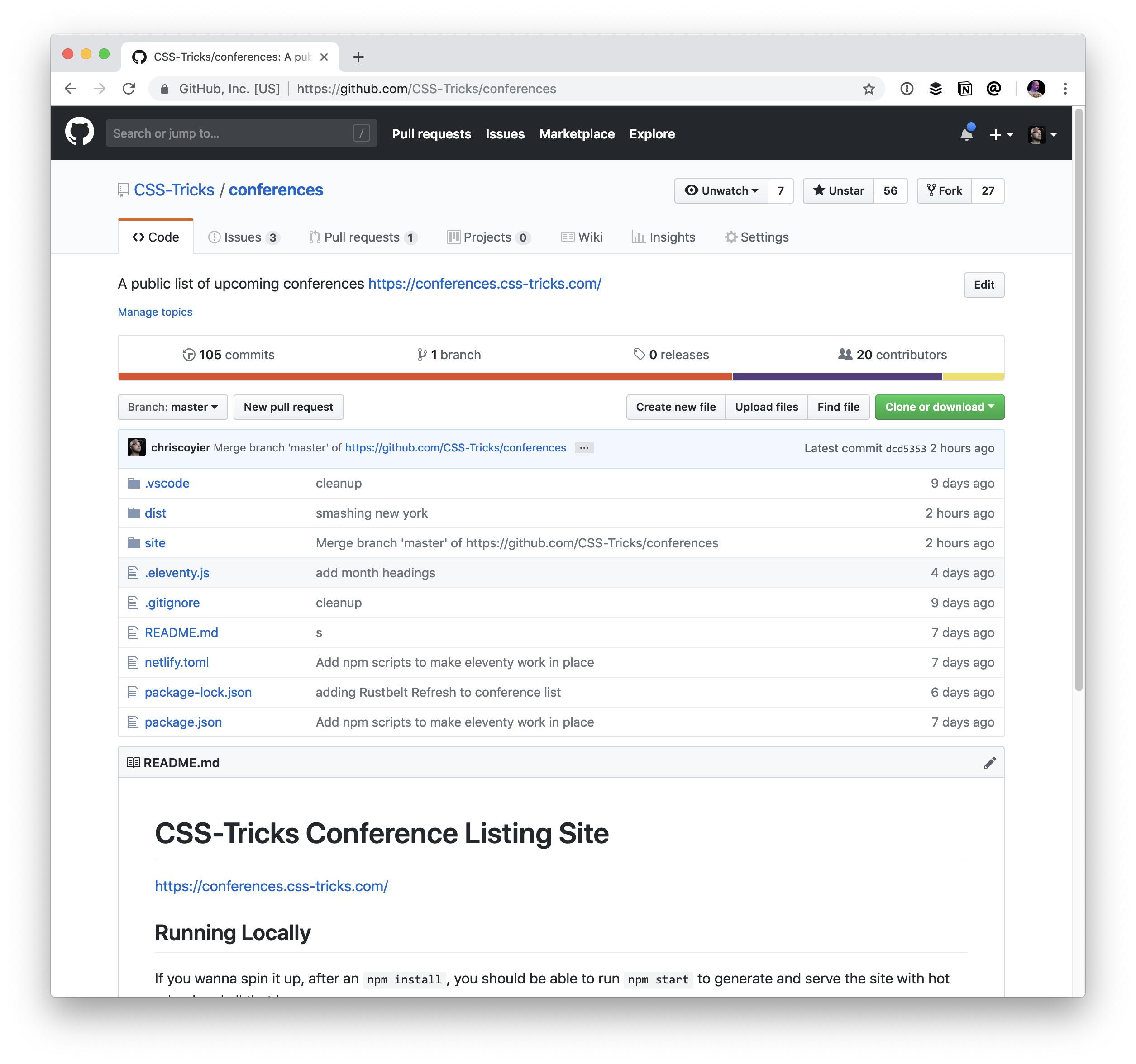
I wanted to get it on GitHub.

So I put it there. Part of the beauty of GitHub is that it opens up the idea of collaboration through pull requests to really anyone in the world. You need to have a GitHub account, but that’s free, and you need to understand Git at least on some minor level (which is a barrier that I’d like to resolve in time), but it invites more collaboration than something like just asking people to email you content and ideas.

I wanted the content in Markdown in the Repo.

The Front Matter format, which is Markdown with some data the the top, is such a useful and approachable format. You need almost zero knowledge, not even HTML, to be able to create/edit a file like this:

Having the actual conference data in the repo means that pull requests aren’t just for design or features; more commonly, they will be for actual conference data. The work of making this site full of all the best conferences is the work of all of us, not just one of us.

At the time of this writing there have already been 30 closed pull requests.

I used 11ty to build the site.

11ty is almost fascinatingly simple. It looks in one directory for what it needs to process or move to another directory. It supports my favorite templating system out of the box: Nunjucks. Plus front matter Markdown like I mentioned above.

I was able to essentially design a card that displays the data we get from the Markdown files, and then build the homepage of the site by looping over those Markdown files and applying the templated card.

11ty is based on Node.js, so while I did have some learning-curve moments, it was comfortable for me to work in. There definitely is configuration for doing the things I wanted to be doing. For example, this is how I had to make a “collection” of conferences in order to loop over them:

config.addCollection("conferences", function(collection) {
  let allConferences = collection.getFilteredByGlob("site/conferences/*.md");
  let futureConferences = allConferences.filter(conf => {
    return conf.data.date >= new Date();
  });
  return futureConferences;
});

The site is hosted on Netlify.

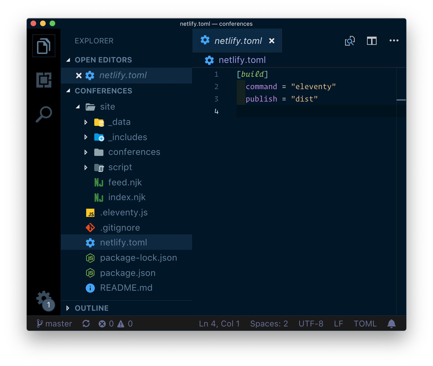
One reason to use Netlify here is that it’s incredibly easy. I made a site site in Netlify by connecting it to the GitHub repo. I told it how to build the site (it’s a single command: eleventy) and where the built site files are (dist), and that’s it. In fact, that’s even part of the repo:

Now whenever I push to the master branch (or accept a pull request into master), the site automatically rebuilds and deploys. Just takes seconds. It’s really amazing.

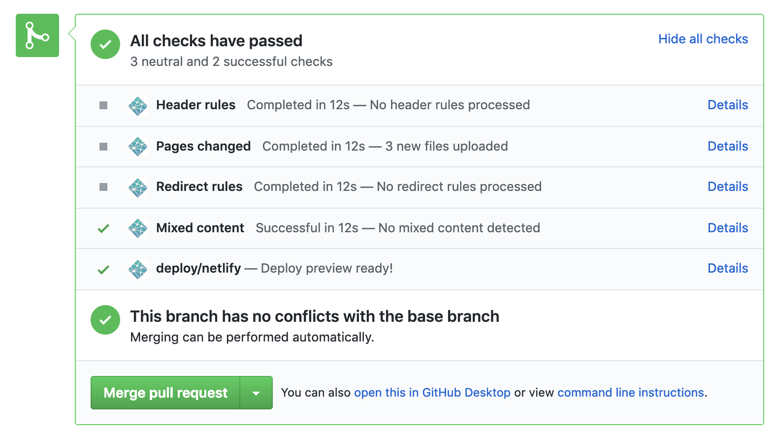
Better, for each pull request, Netlify makes sure everything is in order first:

My favorite is the deploy preview. It gives you an (obscure) URL that will literally last forever (immutable) and that serves as a look at the built version of this site with that pull request.

So, not only is it extremely easy to use Netlify, but I get a bunch of stuff for free, like the fact that the site is smokin’ fast on their CDNs and such.

I’m also excited that I’ve barely tapped into Netlify’s features here, so there is a lot of stuff I can dig into over time. And I intend to!

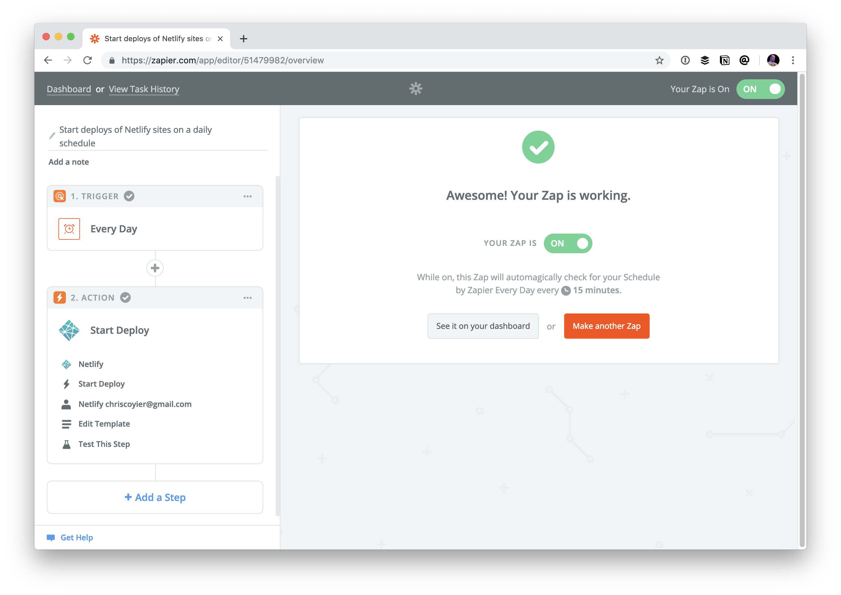
I use Zapier to re-build the site every day.

There is a bit of a time-sensitive nature to this site. The point of this site is to reference it for upcoming conferences. It’s less interesting to see past conferences (although maybe we can have a browse-able archive in the future). I like the idea of ripping off past conferences for the homepage. If this was PHP (or whatever), we could do that at runtime, but this is a static site (on purpose). Doing something like this at build time is no big deal (see that code snippet above that only returns conferences past today’s date). But we can’t just waiting around for pull requests to re-build the site, nor do I want to make it a manual thing I need to do every day.

Fortunately, this is easy as pie with Zapier:

Phil Hawksworth took this to the extreme once and built a clock website that rebuilds every minute.


This site wasn’t just an experiment. I’d like to keep it going! If you’re part of running a conference, I’m quite sure it doesn’t hurt to add it to add yours, just so long as it has an enforcable and actionable Code of Conduct, and is within the world of front-end web design and development.

The post A Site for Front-End Development Conferences (Built with 11ty on Netlify) appeared first on CSS-Tricks.

Categories: Designing, Others Tags:

Quick! What’s the Difference Between Flexbox and Grid?

February 12th, 2019 No comments

Let’s go rapid fire and try to answer this question with quick points rather than long explanations. There are a lot of similarities between flexbox and grid, starting with the fact that they are used for layout and much more powerful than any layout technique that came before them. They can stretch and shrink, they can center things, they can re-order things, they can align things… There are plenty of layout situations in which you could use either one to do what we need to do, and plenty of situations where one is more well-suited than the other. Let’s focus on the differences rather than the similarities:


Flexbox can optionally wrap. If we allow a flex container to wrap, they will wrap down onto another row when the flex items fill a row. Where they line up on the next row is independent of what happenned on the first row, allowing for a masonry-like look.

Grid can also optionally wrap (if we allow auto filling) in the sense that items can fill a row and move to the new row (or auto place themselves), but as they do, they will fall along the same grid lines all the other elements do.

Flexbox on top, Grid on bottom

You could think of flexbox as “one dimensional.” While flexbox can make rows and columns in the sense that it allows elements to wrap, there’s no way to declaratively control where elements end up since the elements merely push along a single axis and then wrap or not wrap accordingly. They do as they do, if you will, along a one-dimensional plane and it’s because of that single dimension that we can optionally do things, like align elements along a baseline — which is something grid is unable to do.

.parent {
  display: flex;
  flex-flow: row wrap; /* OK elements, go as far as you can on one line, then wrap as you see fit */
}

You could think of grid as “two dimensional in that we can (if we want to) declare the sizing of rows and columns and then explicitly place things into both rows and columns as we choose.

.parent {
  display: grid;
  grid-template-columns: 3fr 1fr; /* Two columns, one three times as wide as the other */
  grid-template-rows: 200px auto 100px; /* Three columns, two with explicit widths */
  grid-template-areas:
    "header header header"
    "main . sidebar"
    "footer footer footer";
}

/*
  Now, we can explicitly place items in the defined rows and columns.
*/
.child-1 {
  grid-area: header;
}

.child-2 {
  grid-area: main;
}

.child-3 {
  grid-area: sidebar;
}

.child-4 {
  grid-area: footer;
}
Flexbox on top, Grid on bottom

I’m not the world’s biggest fan of the “1D” vs. “2D” differentiation of grid vs. flexbox, only because I find most of my day-to-day usage of grid is “1D” and it’s great for that. I wouldn’t want someone to think they have to use flexbox and not grid because grid is only when you need 2D. It is a strong distinction though that 2D layout is possible with grid though in ways it is not in flexbox.


Grid is mostly defined on the parent element. In flexbox, most of the layout (beyond the very basics) happen on the children.

/*
  The flex children do most of the work
*/
.flexbox {
  display: flex;
  > div {
    &:nth-child(1) { // logo
      flex: 0 0 100px;
    }
    &:nth-child(2) { // search
      flex: 1;
      max-width: 500px;
    }
    &:nth-child(3) { // avatar
      flex: 0 0 50px;
      margin-left: auto;
    }
  }
}

/*
  The grid parent does most of the work
*/
.grid {
  display: grid;
  grid-template-columns: 1fr auto minmax(100px, 1fr) 1fr;
  grid-template-rows: 100px repeat(3, auto) 100px;
  grid-gap: 10px;
}

Grid is better at overlapping. Getting elements to overlap in flexbox requires looking at traditional stuff, like negative margins, transforms, or absolute positioning in order to break out of the flex behavior. With grid, we can place items on overlapping grid lines, or even right within the same exact grid cells.

Flexbox on top, Grid on bottom

Grid is sturdier. While the flexing of flexbox is sometimes it’s strength, the way a flex item is sized gets rather complicated. It’s a combination of width, min-width, max-width, flex-basis, flex-grow, and flex-shrink, not to mention the content inside and things like white-space, as well as the other items in the same row. Grid has interesting space-occupying features, like fractional units, and the ability for content to break grids, though, generally speaking, we’re setting up grid lines and placing items within them that plop right into place.


Flexbox can push things away. It’s a rather unique feature of flexbox that you can, for example, put margin-right: auto; on an element and, if there is room, that element will push everything else as far away as it can go can.


Here are some of my favorite tweets on the subject:

flexbox looks like it does what you want
but grid is usually what you want

— Old Guard Rupert (@davatron5000) January 25, 2019

Grid makes actual columns and rows. Content will line up from one to the other, as you ask it to. Flexbox doesn’t. Not only in the second dimension (which is easiest to talk about), but also in the first dimension. Flexbox isn’t for most of the things we’ve been using it for.

— Jen Simmons (@jensimmons) January 26, 2019

How about this:#Flexbox is for alignment. #CSSGrid is for layout.

This is almost always how I wind up using them. It allows them to preserve their relationships to one another. It also allows each to be used for its strength, even though each can do the other thing.

— Brian Haferkamp (@BrianHaferkamp) January 25, 2019

If you start constraining all your flex items with a width, then more often than not it will be easier to use grid.

— Rachel Andrew (@rachelandrew) January 25, 2019

Here’s another difference, but it’s not a favorite way of describing them, just fun dumb knowledge:

flexbox takes 2 passes to finish
grid takes 3

so one could say, grid is slow and flexbox is fast lol

— Adam Argyle (@argyleink) January 25, 2019

For me Grid is there to great full layout..grids…with more control over how the whole are/page comes together, whereas flexbox helps me to position and align (whether it’s in a grid or not).

For me it’s about purpose.

— Mandy Michael (@Mandy_Kerr) January 25, 2019

The distinction between the two is often blurry, especially now that we also have `gap` for flexbox. Grid is best suited for a few specific use cases (2D obviously, but also things like overlapping elements) while flexbox usually shines in simpler yet common layout requirements.

— Benjamin De Cock (@bdc) January 25, 2019

Use grid when you already have the layout structure in mind, and flex when you just want everything to fit. Layout first vs content first.

— Beverly (@aszenitha) January 25, 2019

The post Quick! What’s the Difference Between Flexbox and Grid? appeared first on CSS-Tricks.

Categories: Designing, Others Tags:

A Funny Thing Happened on the Way to the JavaScript

February 12th, 2019 No comments

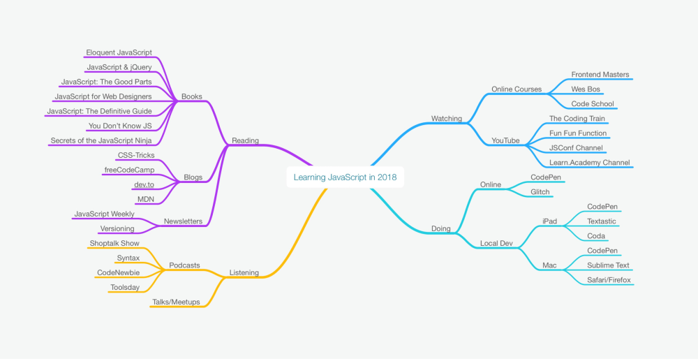
Around this time last year, I wrote an article about the JavaScript learning landscape. Within that article, you’ll find my grand plans to learn JavaScript — complete with a link to a CodePen Collection I started for tracking my progress, and it even got dozens of comments cheering me on.

Like most people, I was ambitious. It was a new year and I was excited to tackle a long-standing project. It was my development version of losing 30 pounds (which I also need to do). But, if you follow that link to the CodePen Collection, you’ll see that there’s nothing there. If you were to scour my hard drive or cloud storage, you’d see that there aren’t any JavaScript files or projects there, either.

Over the past year, I didn’t make any progress on one of my main goals. So, what the hell happened?

A Story as Old as Time

The internet is littered with similar tweets and blog posts. Inboxes are filled with TinyLetters of resolutions and there’s no shortage of YouTubers teaching anyone who will listen how to have their best year ever. But very few people follow through on their goals. This might be even more true in the design and development world, what with the plethora of new technologies, languages, libraries, and tools that hit the scene on a regular basis.

These stories all follow a similar path:

  1. Person determines major goal
  2. Person tells friends (or who knows how many CSS-Tricks visitors)
  3. Person gets distracted, overwhelmed, disinterested, or all three
  4. Goal is completely forgotten about after X amount of time
  5. Person apologizes and makes up excuses for friends (or, again, who know how many CSS-Tricks visitors)

In my experience, it’s not the goal-setting or telling everyone about said goal that’s the problem. It’s step three above. When goals go off the rails, at least for me, it’s due to three main issues: distraction, stress, and lack of interest. Barring unforeseen life events, these three issues are responsible for all those unachieved goals that we struggle with.

In thinking about my goals for this year, I decided to start first with deconstructing why I couldn’t reach the one major goal I set for myself last year. So, let’s dig into those three issues and see if there’s a way to prevent any of them happening this time around.

Distraction

Distraction seems to be the big one here. We all have a lot going on. Between job and family responsibilities, other hobbies and hanging out with friends, it’s hard to fit in new projects. As necessary as they are, all those other interests and responsibilities are distractions when it comes to our goals.

The whole point of setting a goal is carving out time to work towards it. It’s about prioritizing the goal over other things. For me, I found myself letting all of those other distractions in life work their way into my day. It was all too easy to work through lunch instead of taking that time to tackle a chapter in a JavaScript book. I would get sucked into the latest Netflix series after the kids went to bed. I didn’t prioritize learning JavaScript and I had nothing to show for it at the end of the year.

Overcoming Distraction

The key here is to block out those distractions, which is easier said than done. We can’t simply ignore the needs of our families and careers, but we need to give ourselves time to focus without distractions. For me, I’m increasingly convinced that the solution is time blocking.

Time blocking is exactly what it sounds like: You block out specific periods of time on your calendar to focus on certain tasks. Time blocking allows you to prioritize what’s important. It doesn’t force you to sit down, crack open a book, or start coding, but it gives you the time to do it.
There are a ton of articles online that go into different time blocking methods, a few of which are below:

For me, I’m going to block out specific times throughout the week to focus on learning JavaScript in 2019. I’m trying to be realistic about how much time I can invest, weighing it against other obligations. Then I’m putting those time blocks on my shared family calendar to make it clear to everyone what I’m prioritizing. More importantly, I’m making it clear that this time is for focus, and to leave the other distractions at the door.

It can also be helpful to block smaller, but just as impactful, distractions on your phone and computer. Closing out browser tabs not related to your task, silencing notifications, and clearing your desk of otherwise distracting items should be part of the routine when you sit down to start working on your task. It’s easy to scroll through Twitter, Hacker News, or even CSS-Tricks and convince yourself that it’s time well spent (that last one usually is, though) but that time adds up and doesn’t always result in learning or growing your skills like you think it will. Cutting out those distractions and allowing yourself to focus on what you want to accomplish is a great way to, you know, actually accomplish your goals.

Stress

Last year’s post lays out a landscape full of interesting articles, books, podcasts, and courses. There is no lack of things to learn about and enough resources to keep anyone busy for way longer than just a year. And, when it comes to JavaScript, it seems like there’s always some new technique or framework that you need to learn.

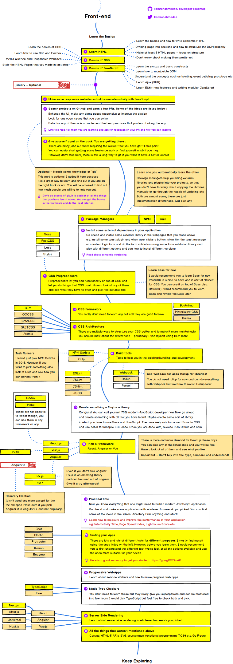
Combine that with all of the ancillary topics you need to understand when learning JavaScript and you end up with one of those overwhelming developer roadmaps that Chris collected a while back.

I don’t care how smart you are, that’s intimidating as hell. Feeling overwhelmed on the web is common place. How do you think it feels as someone just starting out? Combined with all the responsibilities and distractions from the last section, and you have a killer recipe for burnout.

I had originally intended to work my way through Marijn Haverbeke’s Eloquent JavaScript as a first step towards learning the language. But I also mentioned all the podcasts, YouTube channels, and newsletters with which I was surrounding myself. The intention was to learn through immersion, but it quickly resulted in feeling stressed and overwhelmed. And when I felt overwhelmed, I quickly allowed all those distractions to pull my attention away from learning JavaScript.

Overcoming Stress

Just like when dealing with distraction, I think the key to dealing with stress is to focus on one or two things and cut out all the rest. Instead of fully immersing myself in the JavaScript world, I’m going to stick to just the book, work my way through that, and then find the next resource later down the road. I’m going to intentionally ignore as much of the JavaScript world as I can in order to get my bearings and only open myself up to the stress of the developer roadmap if, and when, I feel like I want to journey down that path.

Disinterest

Flipping through any programming book (at least for a beginner) causes most people’s eyes to glaze over. The code looks overly complex and it resembles a math textbook. I don’t know about you, but I hated math class and I found it hard to get excited about investing my free time in something that felt a lot like going back to high school.

But I know that learning JavaScript (and programming, in general) is a worthwhile pursuit and will let me tackle projects that I’ve long wanted to complete but haven’t had the chops to do. So, how can I get interested in what, at first glance, looks like such a boring task?

Overcoming Disinterest

I think the key here is to relate what I learn to some subject that I find fascinating.

I’ve been interested in data visualization for a long time. Blogs like Flowing Data are fascinating, and I’ve wanted to be able to create data visualizations of my own for years. And I know that JavaScript is increasingly a viable way to create those graphics. Tools like D3.js and p5.js are first-class frameworks for creating amazing visualizations — so why not learn the underlying language those tools use?

My plan to overcome disinterest is to work my way towards a project that I want to build. Go through all the basics, trudge through the muck, and then use the concepts learned along the way to understand more advanced tools, like D3.js.

Anytime you can align your learning to areas you find interesting, you’re more likely to be successful. I think that’s what was missing the first time around, so I’m setting up targets to aim for when learning JavaScript, things that will keep me interested enough to learn what I need to learn.

It’s a Hard Road

Learning is rarely easy. But, sometimes, it’s when it’s the hardest that it pays off the most.

I’m convinced that the more we can uncover our own mental roadblocks and deconstruct them, the better positioned we are to achieve our goals. For me, my mental roadblocks are distraction, stress, and disinterest. The three work together to keep me from my goals, but I’m putting plans into motion to overcome all three. Your roadblocks may differ, but you probably have ways of dealing with them, too.

I’d love to hear from everyone how they overcame their own challenges when learning a new skill. Leave a comment below telling me your story. Sharing it may help me, and others, finally achieve what we’ve always wanted, whether it’s learning JavaScript, digging into the latest framework, or running that marathon we’ve all been putting off for so long.

The post A Funny Thing Happened on the Way to the JavaScript appeared first on CSS-Tricks.

Categories: Designing, Others Tags:

Webhosting Compared: Testing The Uptime Of 32 Hosts In 2018

February 12th, 2019 No comments
MidPhase 2018 statistics

Webhosting Compared: Testing The Uptime Of 32 Hosts In 2018

Webhosting Compared: Testing The Uptime Of 32 Hosts In 2018

John Stevens

2019-02-12T12:00:22+01:002019-02-13T08:14:38+00:00

(This is a sponsored article.) Many surveys have indicated that uptime is number one factor when choosing a web host and although most, if not all, web hosting services “promise” 99.99% uptime, it’s not the case with our case-study.

According to our latest research, the average uptime of 32 shared web hosting providers is 99.59%. That’s approximately 35 hours 32 minutes of downtime per year, per website.

And downtime even happens to online giants. A Dun & Bradstreet study found that nearly 60 percent of Fortune 500 companies experience a minimum of 1.6 hours of downtime every week.

As a rule of thumb, if you are experiencing an uptime of 99.90% or below, you should switch your web host. A good web host should provide you with an uptime of at least 99.94%.

To run this series of tests, we have signed up for all of the 32 web hosting providers as a regular user, using the cheapest plan available. After that, we set up a basic WordPress website and start monitoring them with Pingdom.com. (Tools like Pingdom or Appoptics let you regularly check if a website or app is available.) Our uptime check interval was set to 1 minute, which means all of the sites are scanned every minute to get the most accurate statistics.

Please note that many hosts don’t define uptime like that, so they will often refuse to pay out on the guarantee because they say it was “planned maintenance” etc.

Let’s take a closer look.

Web Hosting Provider Average Uptime ? Total Outages Total Downtime Per Year
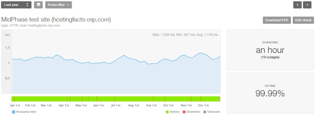
1. MidPhase 99.991% 19 outages 45 minutes
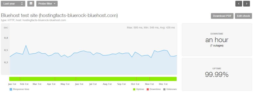
2. Bluehost 99.991% 7 outages 52 minutes
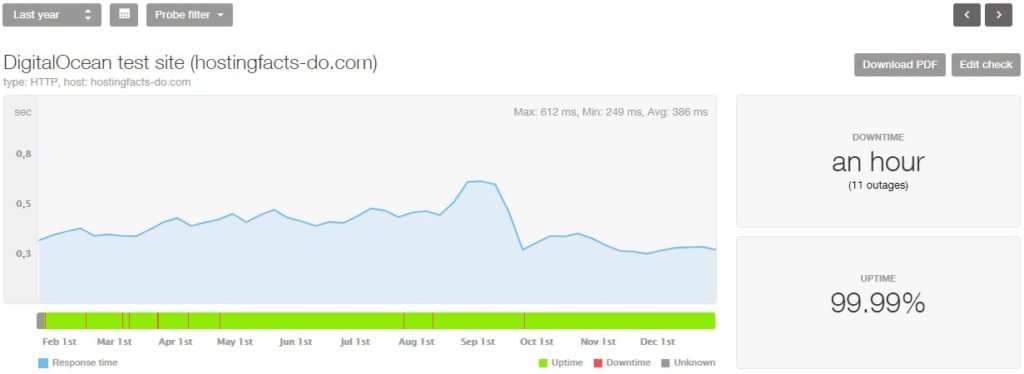
3. DigitalOcean* 99.989% 11 outages 58 minutes
4. SiteGround* 99.988% 26 outages 73 minutes
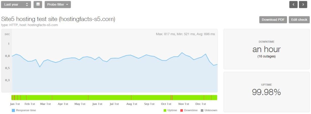
5. Site5* 99.986% 16 outages 83 minutes
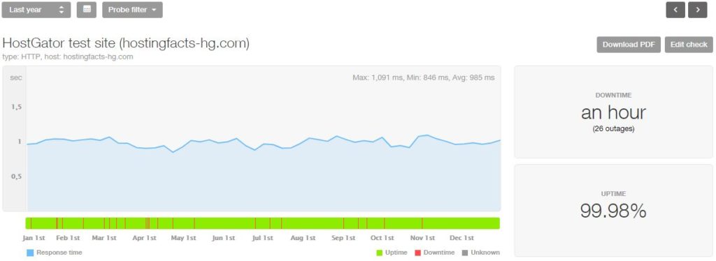
6. HostGator* 99.984% 19 outages 84 minutes
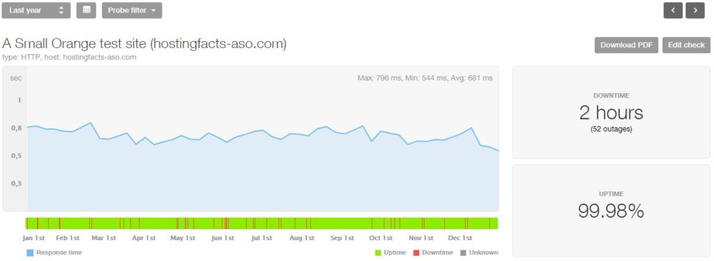
7. A Small Orange* 99.978% 52 outages 125 minutes
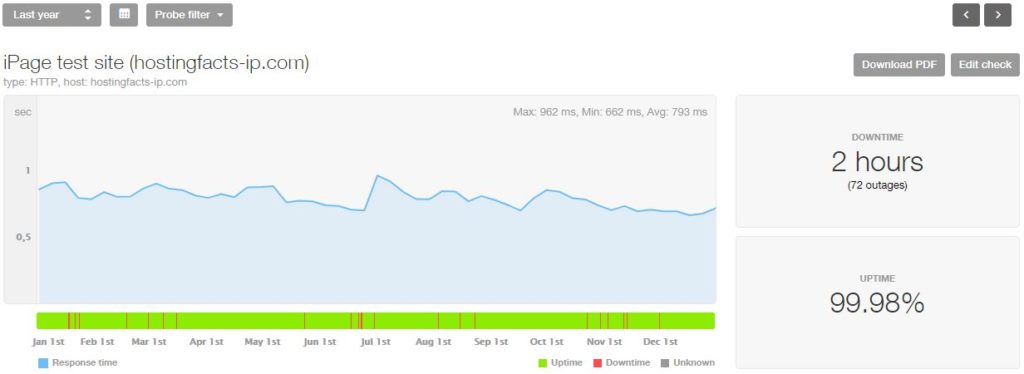
8. iPage 99.975% 72 outages 131 minutes
9. HostPapa 99.975% 39 outages 144 minutes
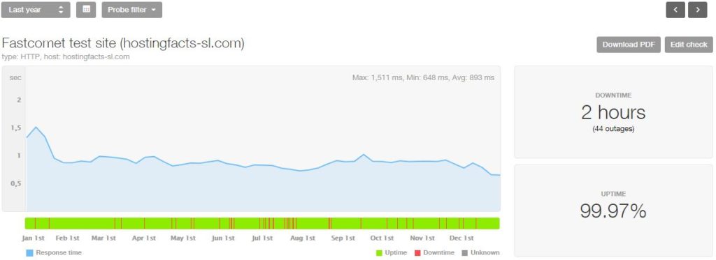
10. FastComet 99.973% 44 outages 146 minutes
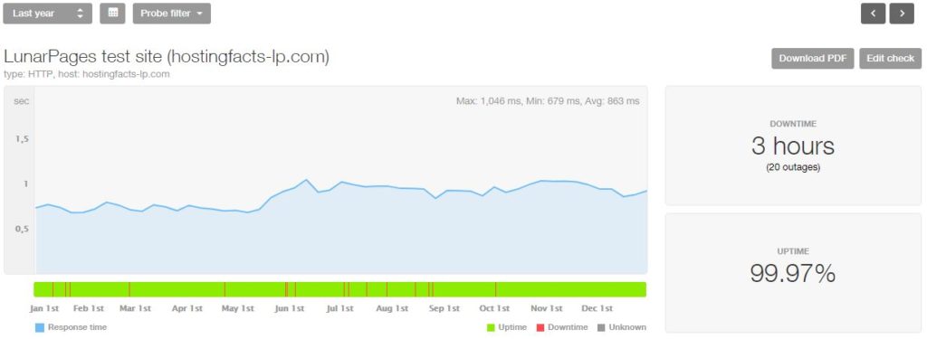
11. LunarPages* 99.972% 20 outages 153 minutes
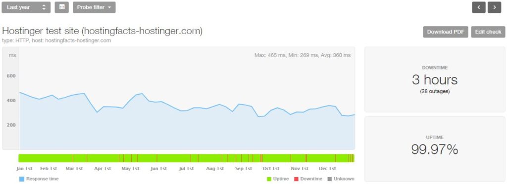
12. Hostinger* 99.971% 28 outages 154 minutes
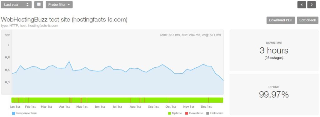
13. WebHostingBuzz 99.969% 28 outages 163 minutes
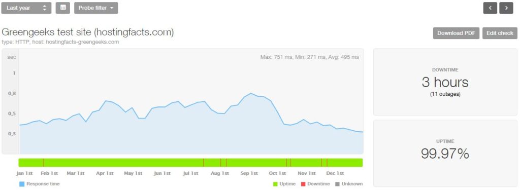
14. GreenGeeks* 99.969% 11 outages 164 minutes
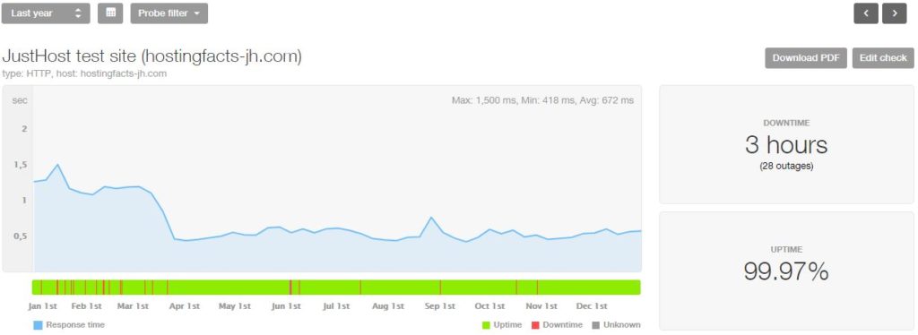
15. JustHost 99.968% 28 outages 165 minutes
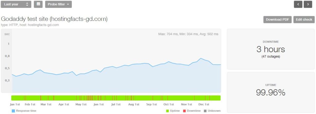
16. GoDaddy 99.965% 47 outages 184 minutes
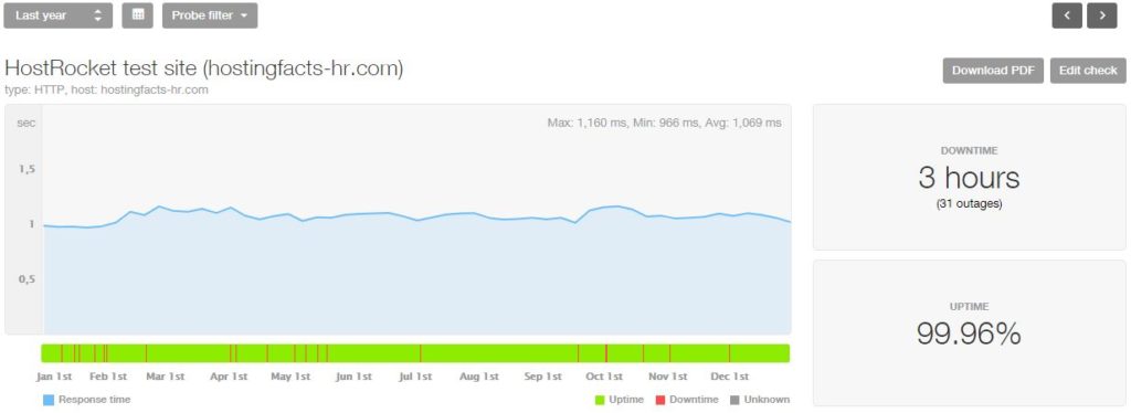
17. HostRocket 99.960% 31 outages 202 minutes
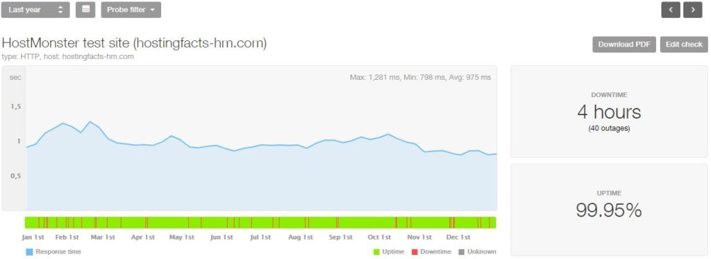
18. HostMonster 99.955% 40 outages 235 minutes
19. DreamHost* 99.953% 40 outages 239 minutes
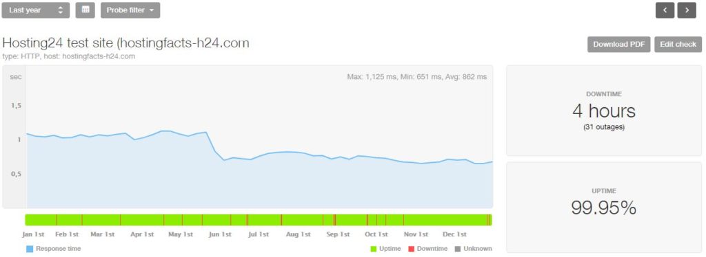
20. Hosting24 99.951% 31 outages 264 minutes
21. WestHost* 99.948% 48 outages 271 minutes
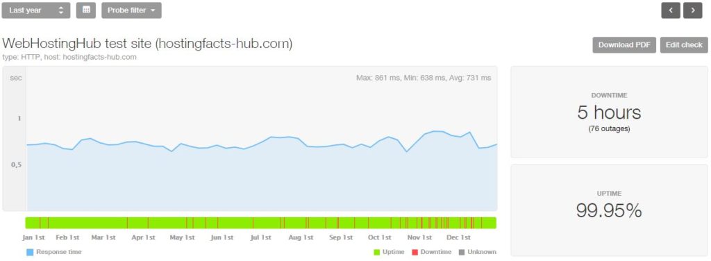
22. WebHostingHub 99.948% 76 outages 278 minutes
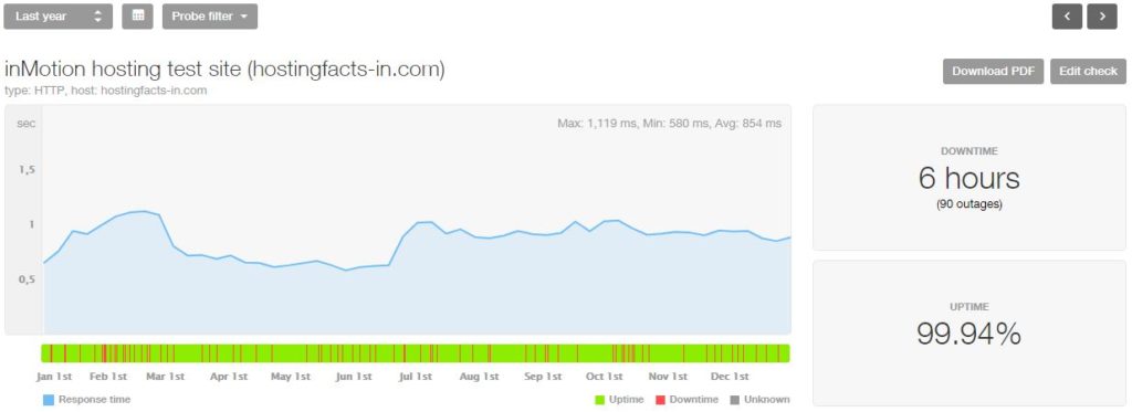
23. inMotion Hosting 99.935% 90 outages 341 minutes
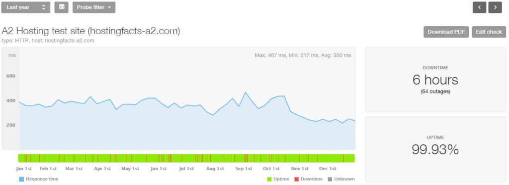
24. A2 Hosting 99.928% 64 outages 375 minute
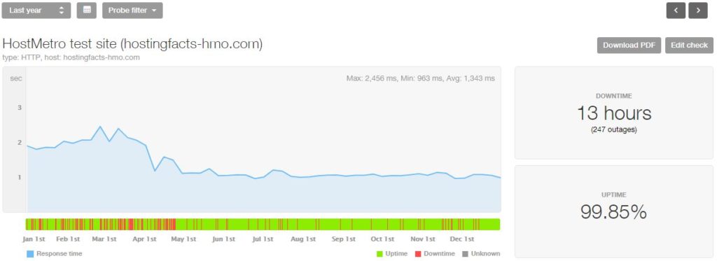
25. HostMetro 99.852% 247 outages 763 minutes
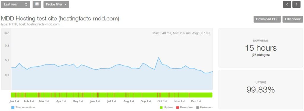
26. MDD Hosting* 99.833% 76 outages 874 minutes
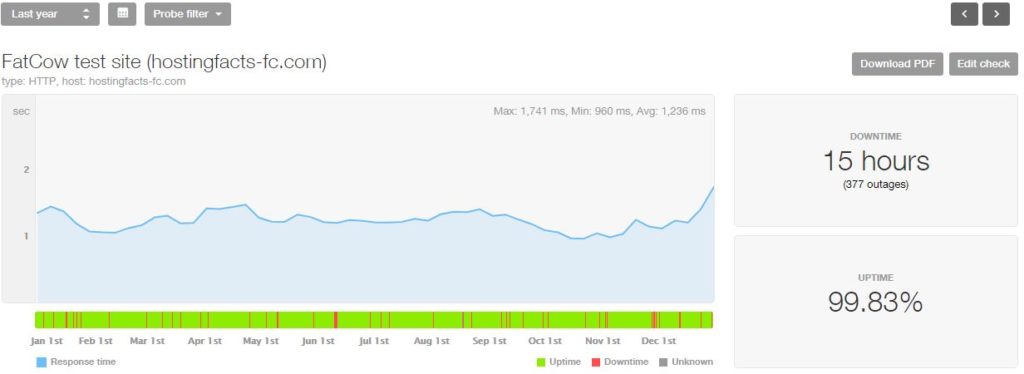
27. FatCow 99.829% 377 outages 899 minutes
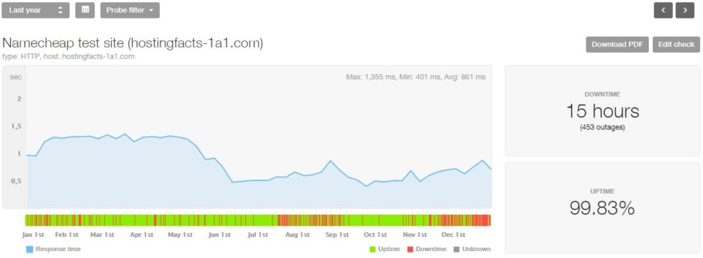
28. NameCheap* 99.826% 453 outages 917 minutes
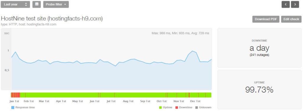
29. HostNine 99.723% 241 outages 1448 minutes
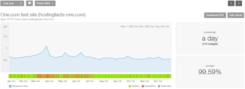
30. One.com 99.593% 419 outages 2132 minutes
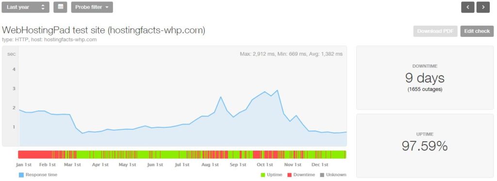
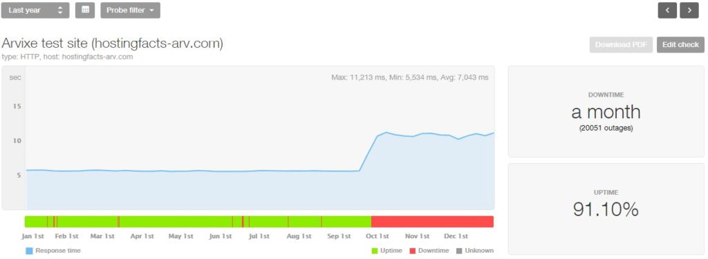
31. WebHostingPad 97.588% 1,655 outages 9 days
32. Arvixe* 91.098% 20,051 outages 1 month

* These web hosting providers offer an uptime guarantee. If they’ve failed on promised uptime, you can ask for your money back.

If you’re into each month overviews with more detailed data, take a look at these pages below:

1. MidPhase.com

No uptime guarantee:

Although MidPhase doesn’t mention any uptime guarantee on their website, they are the clear winner of this case-study hitting nearly 100% uptime in 2018.

2. Bluehost.com

Bluehost 2018 statistics
No uptime guarantee:

Similarly to MidPhase, Bluehost doesn’t offer any uptime guarantees either (just a network/server uptime agreement). However, their servers have been working very steadily, with the exception of one bigger outage (42 minutes).

3. DigitalOcean.com

Digital Ocean 2018 statistics
Uptime guarantee available:

DigitalOcean is a cheap cloud hosting that promises 99.99% uptime which they have greatly succeeded in our test. If you see uptime less than 99.99% using DigitalOcean, you can ask your money back.

4. SiteGround.com

SiteGround 2018 statistics
Uptime guarantee available:

SiteGround is a hosting provider with an excellent uptime score. They also offer uptime guarantee, providing you with one month of free service if uptime falls below 99.99% and an additional month if uptime falls below 99.90%.

5. Site5.com

Site5 2018 statistics
Uptime guarantee available:

99.98% is still decent uptime. What’s even better – Site5 comes with an uptime guarantee of 99.9% – anything below that is eligible for a % of credit back. They even offer 100% credit back when uptime falls below 99.5% on their fully managed VPS

6. HostGator.com

HostGator 2018 statistics
Uptime guarantee available:

HostGator comes with a decent uptime. On top of that, they even provide an uptime guarantee of 99.9% and you get credit back when it falls below. Just beware that it only applies for the actual server downtime excluding server maintenance.

7. ASmallOrange.com

A Small Orange 2018 statistics
Uptime guarantee available:

ASmallOrange offers an uptime guarantee of 99.9%. When it’s below that, you get a refund of one day of service per every 45-min downtime. Beware of the specific clauses. Just note the high number of outages we experienced in the test period.

8. iPage.com

iPage 2018 statistics
No uptime guarantee:

iPage does not offer an uptime guarantee. Luckily, considering their ranking in overall uptime, we’re pretty sure you wouldn’t need it anyway. One thing to be aware of is the high number of outages we experienced.

9. HostPapa.com

HostPapa 2018 statistics
No uptime guarantee:

Even though they mention under their Terms of Service using “reasonable efforts to maintain 99.9% of uptime”, HostPapa does not exactly provide an uptime guarantee.

10. FastComet.com

Fastcomet 2018 statistics
No uptime guarantee:

Even though their live chat agent said that they guarantee a 99% uptime, there is no official uptime guarantee on FastComet’s Terms of Service or refund/credit policy if it falls below what’s promised. The total amount of outages is somewhat concerning.

11. LunarPages.com

LunarPages 2018 statistics
Uptime guarantee available:

For every 15min of downtime, LunarPages credits client’s account with an equal of a full day of service. That guarantee excludes scheduled maintenance.

12. Hostinger.com

Hostinger 2018 statistics
Uptime guarantee available:

Hostinger’s above average uptime is backed up by their uptime guarantee of 99.9%. As in all cases, scheduled maintenance is excluded.

13. WebHostingBuzz.com

WebHostingBuzz 2018 statistics
No uptime guarantee:

WHB does not provide any uptime guarantee per se. Based on our experience, you most likely wouldn’t need one anyway.

14. GreenGeeks.com

GreenGeeks 2018 statistics
Uptime guarantee available:

GreenGeeks offers a 99.9% uptime guarantee. However, it only applies to their own servers and is not applicable for client errors.

15. JustHost.com

JustHost 2018 statistics
No uptime guarantee:

There’s no uptime guarantee on their website, whatsoever.

16. GoDaddy.com

GoDaddy 2018 statistics
No uptime guarantee:

Despite their big name, huge client-base and decent service, GoDaddy does not provide any uptime guarantee. You should also beware of their rather high number (compared to other top hosts) of outages.

17. HostRocket.com

HostRocket 2018 statistics
Limited uptime guarantee:

HostRocket has an official 99.5% uptime guarantee. Like others, it only applies for their own direct services.

18. HostMonster.com

18. HostMonster.com

HostMonster 2018 statistics
No uptime guarantee:

Even though you can find a statement claiming to strive for their best, there is no official uptime guarantee.

19. DreamHost.com

Dreamhost 2018 statistics
Uptime guarantee available:

Finally, there you have it – an official 100% uptime guarantee.” DreamHost guarantees 100% uptime. A failure to provide 100% uptime will result in customer compensation pursuant to guidelines established herein.”

20. Hosting24.com

Hosting24 2018 statistics
Limited uptime guarantee:

They offer a service uptime guarantee of 99.9%. It’s solely determined by them and you get 5% of your monthly hosting fee as credit back. It’s only usable to purchase further service of products from Hosting24.

21. WestHost.com

WestHost 2018 statistics
Uptime guarantee available:

At close investigation, we found a 99.9% service uptime guarantee. When outages happen which are directly related to WestHost, you get a credit of 5-100% of your monthly hosting fee depending on the total downtime.

22. WebHostingHub.com

WebHostingHub 2018 statistics
No uptime guarantee:

WHH claims on their front page to have a 99.9% uptime guarantee. Unfortunately, we did not find an official guarantee under their terms of service and other binding policies.

23. inMotionHosting.com

inMotion Hosting 2018 statistics
Limited uptime guarantee:

Uptime guarantee only applies to Business Pro accounts. Even though it’s a really sweet one (99.999%), there is no uptime guarantee for other hosting plans.

24. A2Hosting.com

A2 Hosting 2018 statistics
No uptime guarantee:

A2 comes with a 99.9% uptime commitment. Similarly to other hosting providers, when it comes to credit, there are clauses related to server maintenance and the outage being not-their-responsibility.

25. HostMetro.com

HostMetro 2018 statistics
Limited uptime guarantee:

When the total uptime in a year is less than 99%, you get a 1-month service for free.

26. MDDHosting.com

MDD Hosting 2018 statistics
Uptime guarantee available:

They have an official 1000% service uptime guarantee (it’s not as cool as it sounds).

“If your server has a physical downtime of more than 1 hour, you can request for 10 times (1000%) the actual amount of downtime. This means that if your server has a physical downtime of 1 hour, you will receive 10 hours of credit.”

27. FatCow.com

FatCow 2018 statistics
No uptime guarantee:

It doesn’t seem that uptime is one of the strengths of FatCow – despite our research, we did not find any uptime guarantee.

28. NameCheap.com

NameCheap 2018 statistics
Uptime guarantee available:

NameCheap offers one full day of service for every 1h that your server is down in a month. Beware that the first 45min are not applicable.

29. HostNine.com

HostNine 2018 statistics
No uptime guarantee:

An uninspiring total uptime is even further disappointing as there is no uptime guarantee under their ToS.

30. One.com

One.com 2018 statistics
No uptime guarantee:

A day without service is a serious issue by itself. Despite our serious efforts, we could not find any uptime guarantee either that would make you eligible for at least some credit.

31. WebHostingPad.com

WebHostingPad 2018 statistics
Limited uptime guarantee:

There is a 99% official uptime guarantee. However, it’s most likely that you wouldn’t really care about the few free days you get when the service performance is this bad.

32. Arvixe.com

Arvixe 2018 statistics
Uptime guarantee available:

Despite their bad performance (the worst ever, by far, anywhere…), Arvix actually does have an official uptime guarantee of 99.9%. But does it really matter to get a refund or some credit when your website has lost all its traffic because of its non-existent performance?

Smashing Editorial(ms, ra, il)
Categories: Others Tags:

How to Increase Mobile Engagement with Simpler Contact Forms

February 12th, 2019 No comments

Contact forms are a necessity for websites. Without them, your clients would be relegated to handling website- or business-related matters over the phone or email. Worse, they’d have absolutely no context for the call or message, which would increase the amount of time they’d have to spend responding to it.

Contact forms, instead, gather essential details from visitors so that your clients can go into each conversation better prepared.

Of course, mobile contact forms are tricky. With less screen space to work with, how do you design a form that captures all the details your clients require? The fact of the matter is, you might not be able to. Instead, you’ll have to look at ways to do more with less.

Even if all a form does is collect a name, email, and phone number for someone interested in learning more about a service, the digital collection of that data ensures your clients won’t lose track of leads or capture details incorrectly when writing them by hand. And when forms collect more than that (say, details about an issue they’re experiencing with the website or product), your clients can better prepare themselves for a possibly stressful encounter.

But there’s a delicate balance you must strike when designing forms for mobile users. If you want them to engage with the forms so you can keep your clients from missing out on leads as well as sales, you have to keep a number of things in mind.

Columns

Plain and simple: there’s no excuse for using more than one column on a mobile contact form. Leadformly has a beautiful example of a mobile contact form that keeps everything in a vertical line.

The same principle applies to the fields themselves. If you’re thinking about breaking up the “Name” field into “First Name” and “Last Name”, don’t do it. It’s hard enough inputting information into a mobile contact form. Instead, only place one field per horizontal line and always merge fields that belong together.

Fields

When creating a contact form for your clients’ website, ask yourself: Is each of these fields necessary?

Take, for instance, the Shopify mobile contact form:

Although the store address field is optional, it’s a good choice in this context since this is a support contact form. If someone’s asking for support, then they’re a Shopify customer with a corresponding store address to share.

The “Subject” field, on the other hand, seems like a waste. This form is coming from the help desk. The designer could easily program submissions from this form to include a descriptive subject line so the support representative knows what he or she is about to read.

When too many unnecessary or optional fields are shown, a few things can happen:

  1. Visitors will be frustrated with the extra time spent reading each label, deciding whether or not it’s necessary, and then tabbing over to the next one.
  2. Visitors will give up before they ever get started because the length of the form alone is daunting.
  3. Visitors will be confused by some of the fields, wondering what they’re for and trying to figure out the answer to them.

All in all, a poor selection of form fields can lead to a negative user experience. But only your client and the end user will know which of these fields is absolutely necessary, so make sure you engage with them so you can create the optimal mobile form experience.

Pages

In cases when you have a lengthy contact form you want to put on mobile, you have to think of ways to keep it from appearing overwhelmingly long.

One way to do this is by creating a multi-page form. While you can do this for mobile contact forms that are legitimately lengthy, this is something anyone could use really. Here’s an example from Typeform:

With a handy progress bar at the bottom of the form, users have a clear picture of how much more is left to fill out.

I’d also argue that this is a more engaging mobile contact form experience than a static form stuck to the page.

If you’re not too keen on creating multi-page forms, that’s fine too. There are other things you can do to shorten the space without compromising how many fields are shown. For instance, you can use collapsible menus to only display certain parts of the form at any given time. You can also turn checkbox or radio dial lists into hidden dropdowns.

Labels

In your attempts to conserve space in mobile contact forms, you have to be careful with labels, hints, and error messages that appear within them. Just because you make a form faster to get through space-wise doesn’t mean the instructive text won’t cause friction.

Here’s a good example from MailChimp you can use:

Within this form:

  • Each field is succinctly and clearly labeled outside of the field.
  • Any hint text (i.e. instructions on what to do with the field) appears inside the field in a lighter color.
  • Error messages immediately appear once a user has failed to properly fill in a field.

Also, take notice of the fact that MailChimp does not use asterisks to indicate required fields. This keeps labels clear of unnecessary debris and easy to focus on. If the majority or all of your fields are required, it’s not necessary to mark them as such.

Keyboards

Want to decrease the time it takes users to fill out your mobile contact form? Program it to display the correct keyboard per field. Here is how WPForms does this:

Basic text fields show a standard alpha keyboard:

Email fields show a lowercase alpha keyboard along with punctuation commonly used in email addresses:

Website fields provide options for “/” as well as “.com”:

Saving users time hunting down punctuation and numbers, or typing out expected responses or snippets, will encourage more of them to complete your form.

Wrap-Up

Let’s be honest: for most businesses, the chances of someone converting from a mobile website are quite low — at least lower than they are on desktop. Until consumers become more confident in converting from a smartphone, we have to find other ways to capture their information so we can stay in touch.

That said, just because mobile visitors are unwilling to convert doesn’t mean they’ll be unwilling to fill out a mobile contact form. It’s a low-risk alternative to entering their sensitive data into a mobile website and device, and puts the onus on the company to take the next step. Of course they’re going to prefer this option, so make sure it’s a worthwhile one to take.

Featured image via Unsplash.

Add Realistic Chalk and Sketch Lettering Effects with Sketch’it – only $5!

Source

Categories: Designing, Others Tags: