Little Things That Tickled My Brain from An Event Apart Seattle
I had so much fun at An Event Apart Seattle! There is something nice about sitting back and basking in the messages from a variety of such super smart people.
I didn’t take comprehensive notes of each talk, but I did jot down little moments that flickered my brain. I’ll post them here! Blogging is fun! Again, note that these moments weren’t necessarily the main point of the speaker’s presentation or reflective of the whole journey of the topic — they are little micro-memorable moments that stuck out to me.
Jeffrey Zeldman brought up the reading apps Instapaper (still around!) and Readability (not around… but the technology is what seeped into native browser tech). He called them a vanguard (cool word!) meaning they were warning us that our practices were pushing users away. This turned out to be rather true, as they still exist and are now joined by new technologies, like AMP and native reader mode, which are fighting the same problems.
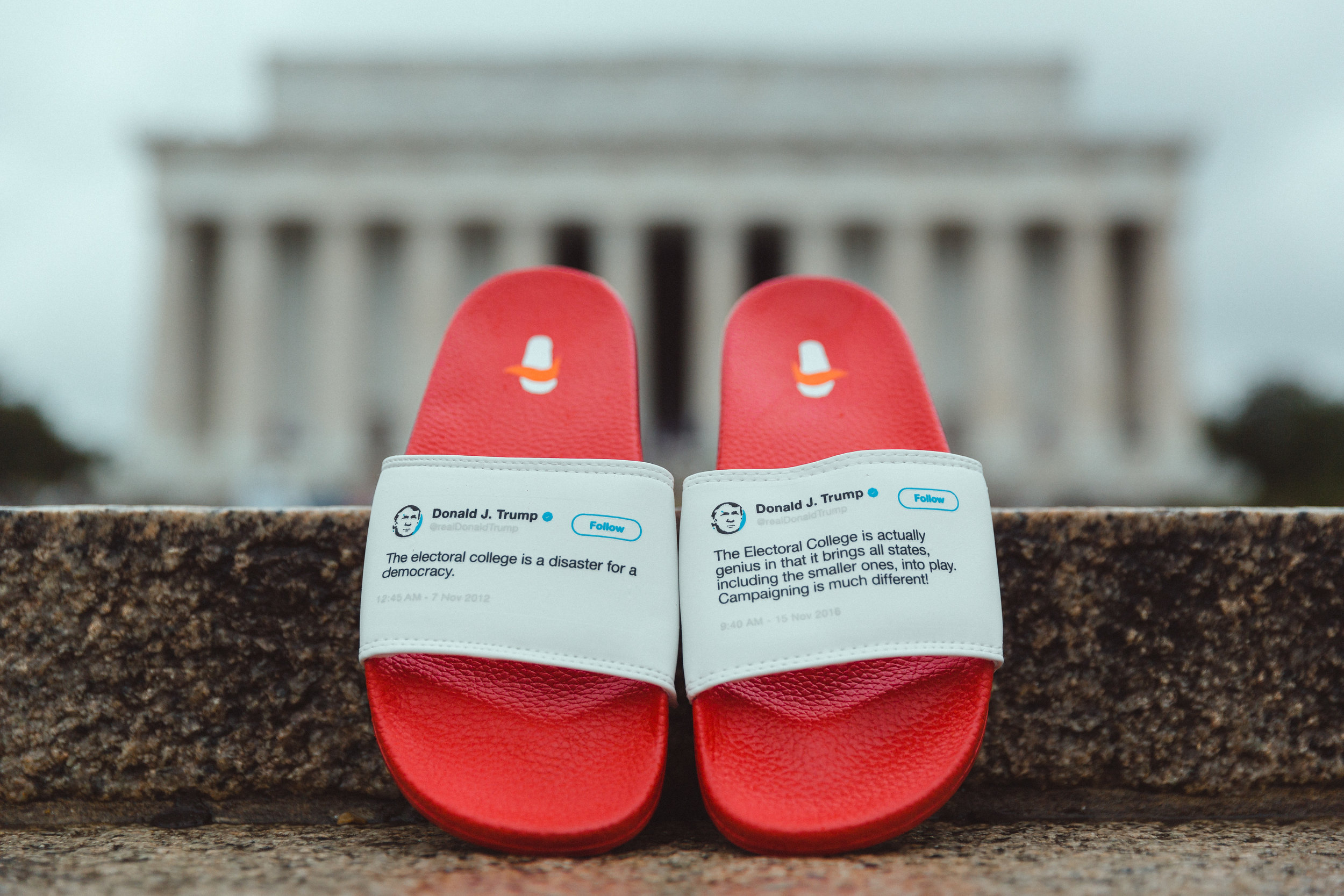
Margot Bloomstein made a point about inconsistency eroding our ability to evaluate and build trust. Certainly applicable to websites, but also to a certain President of the United States.
Sarah Parmenter shared a powerful moment where she, through the power of email, reached out to Bloom and Wild, a flower mail delivery service, to tell them a certain type of email they were sending she found to be, however unintentionally, very insensitive. Sarah was going to use this as an example anyway, but the day before, Bloom and Wild actually took her advice and implemented a specialized opt-out system.
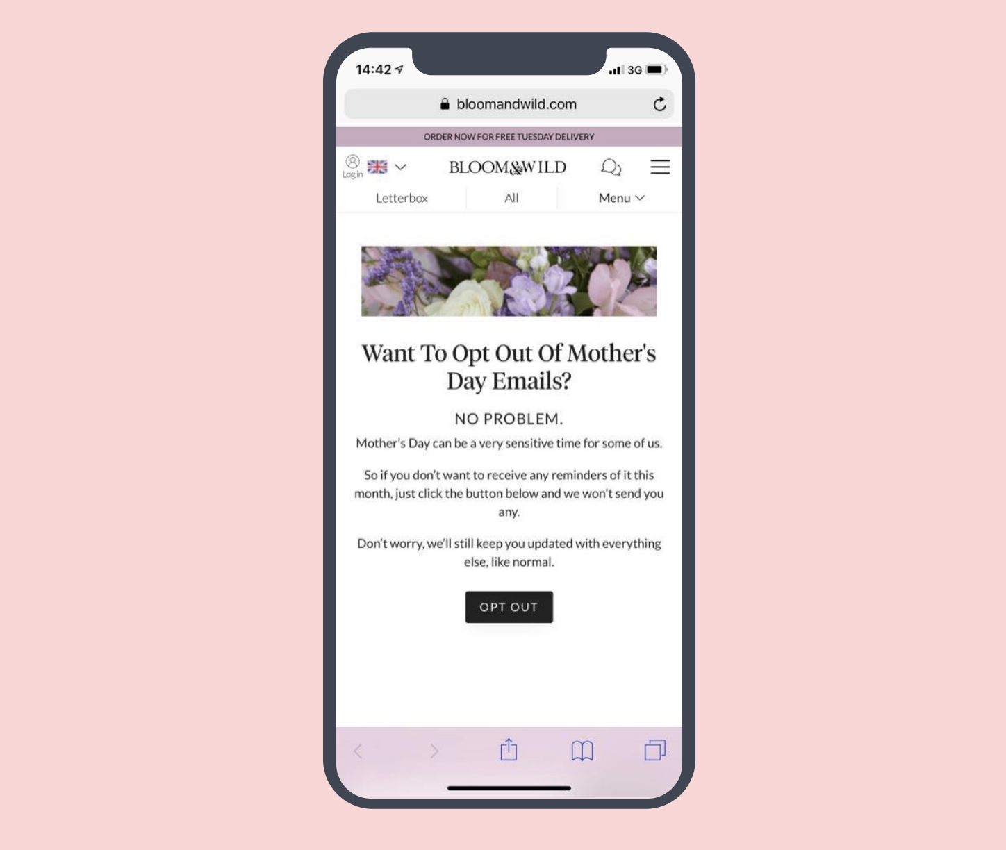
This not only made Sarah happy that a company could actually change their systems to be more sensitive to their customers, but it made a whole ton of people happy, as evidenced by an outpouring of positive tweets after it happened. Turns out your customers like it when you, ya know, think of them.
Eric Meyer covered one of the more inexplicable things about pseudo-elements: if you content: url(/icons/icon.png); you literally can’t control the width/height. There are ways around it, notably by using a background image instead, but it is a bit baffling that there is a way to add an image to a page with no possible way to resize it.
Literally, the entire talk was about pseudo-elements, which I found kinda awesome as I did that same thing eight years ago. If you’re looking for some nostalgia (and are OK with some cringe-y moments), here’s the PDF.
Eric also showed a demo that included a really neat effect that looks like a border going from thick to thin to thick again, which isn’t really something easily done on the web. He used a pseudo, but here it is as an
element:
See the Pen
CSS Thick-Thin-Thick Line by Chris Coyier (@chriscoyier)
on CodePen.
Rachel Andrew had an interesting way of talking about flexbox. To paraphrase:
Flexbox isn’t the layout method you think it is. Flexbox looks at some disparate things and returns some kind of reasonable layout. Now that grid is here it’s a lot more common to use that to be more much explict about what we are doing with layout. Not that flexbox isn’t extremely useful.
Rachel regularly pointed out that we don’t know how tall things are in web design, which is just so, so true. It’s always been true. The earlier we embrace that, the better off we’ll be. So much of our job is dealing with overflow.
Rachel brought up a concept that was new to me, in the sense that it has an official name. The concept is “data loss” through CSS. For example, aligning something a certain way might cause some content to become visually hidden and totally unreachable. Imagine some boxes like this, set in flexbox, with center alignment:

No “data loss” there because we can read everything. But let’s say we have more content in some of them. We can never know heights!
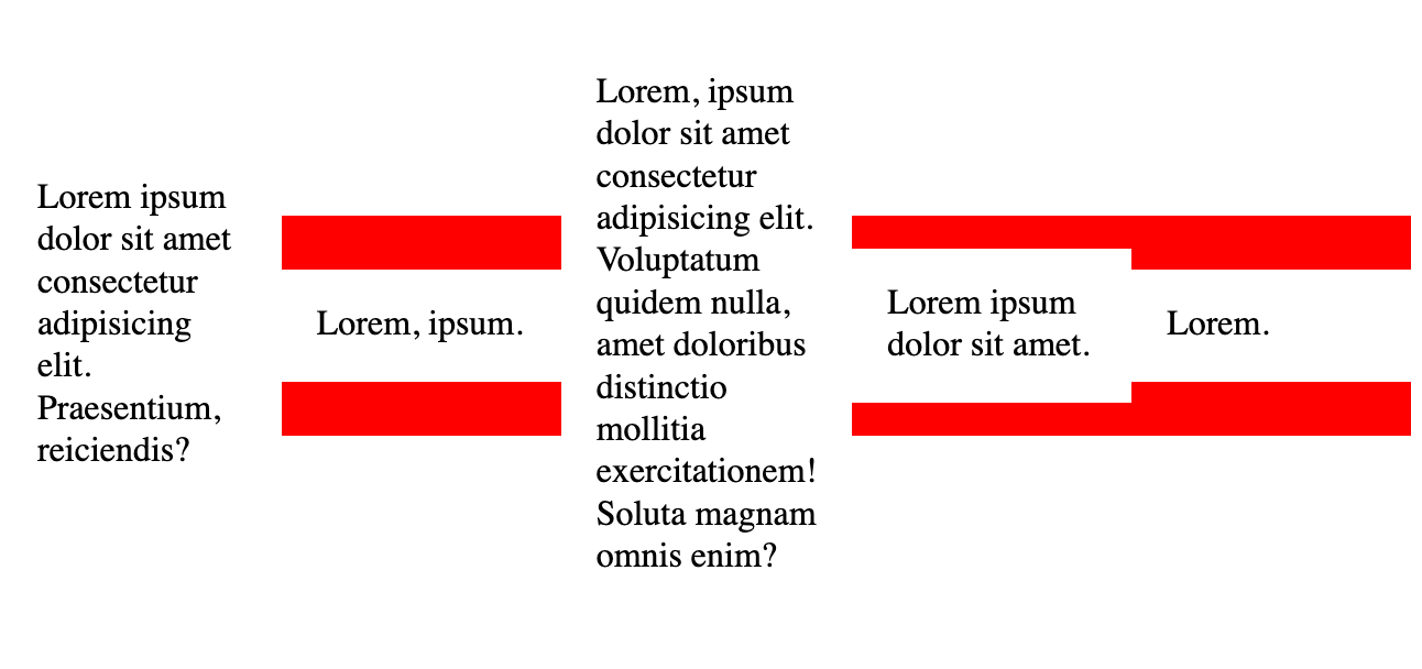
If that element was along the top of a page, for example, no scrollbar will be triggered because it’s opposite the scroll direction. We’d have “data loss” of that text:
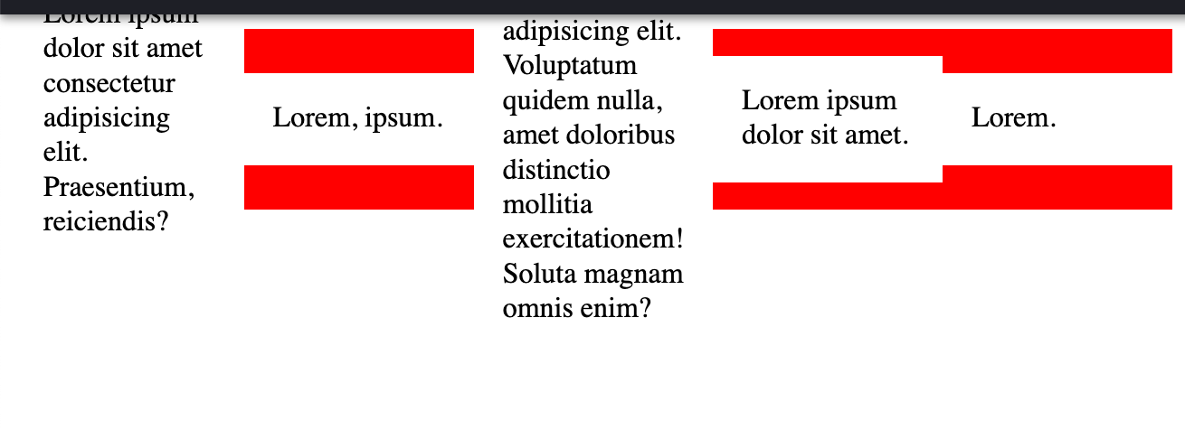
We now alignment keywords that help with this. Like, we can still attempt to center, but we can save ourselves by using safe center (unsafe center being the default):
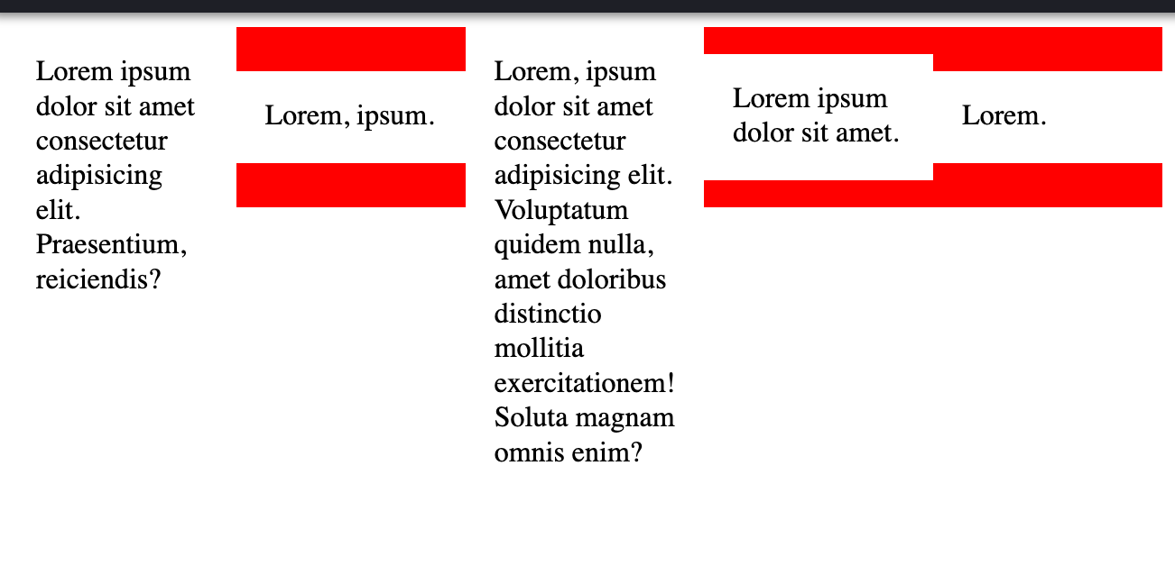
Rachel also mentioned overlapping as a thing that grid does better. Here’s a kinda bad recreation of what she showed:
See the Pen
Overlapping Figure with CSS Grid by Chris Coyier (@chriscoyier)
on CodePen.
I was kinda hoping to be able to do that without being as explicit as I am being there, but that’s as close as I came.
Jen Simmons showed us a ton of different scenarios involving both grid and flexbox. She made a very clear point that a grid item can be a flexbox container (and vice versa).
Perhaps the most memorable part is how honest Jen was about how we arrive at the layouts were shooting for. It’s a ton of playing with the possible values and employing a little trial and error. Happy accidents abound! But there is a lot to know about the different sizing values and placement possibilties of grid, so the more you know the more you can play. While playing, the layout stuff in Firefox DevTools is your best bet.
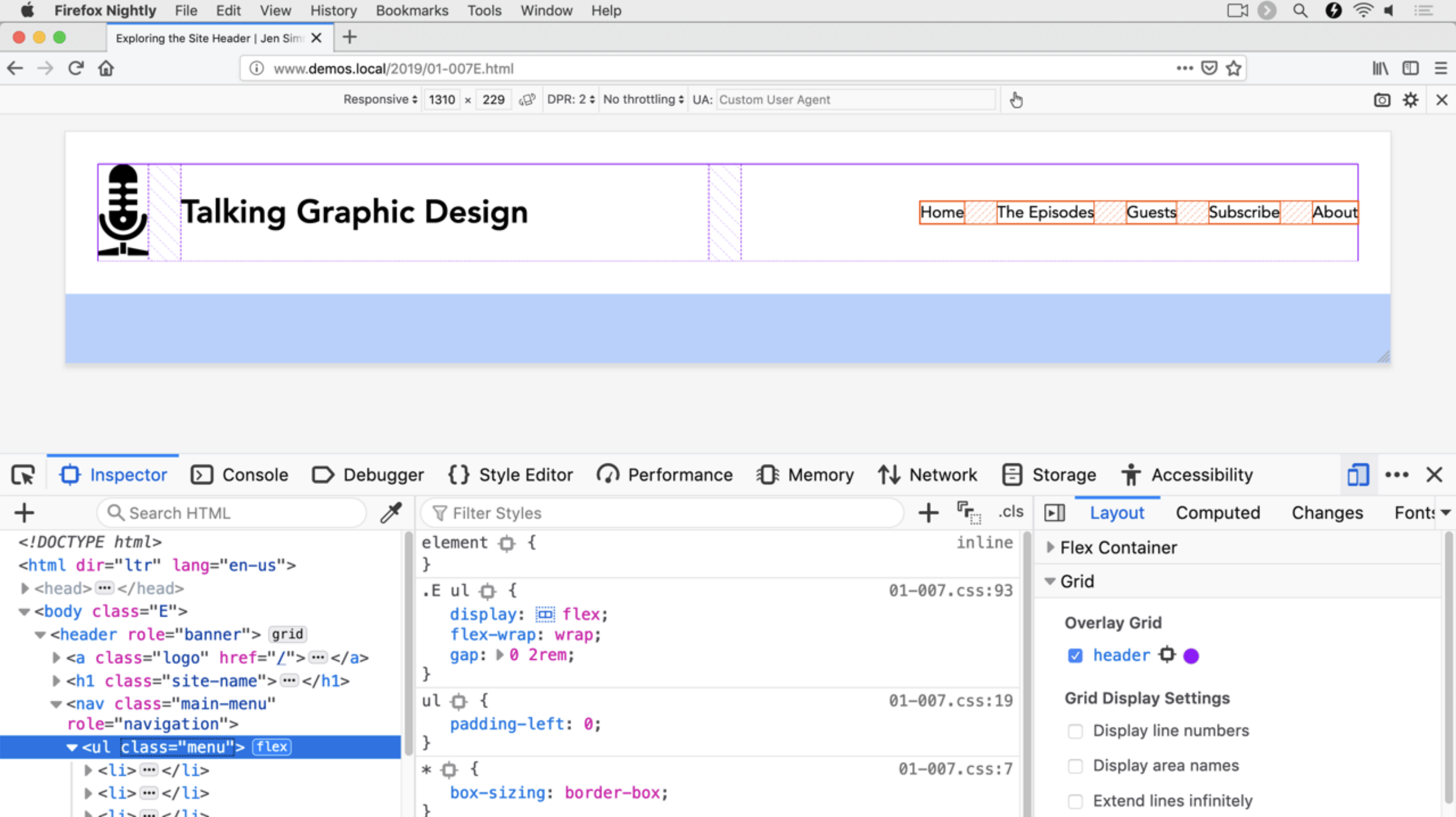
gap is gonna be sweet.There was a funny moment in Una Kravets’ talk about brainstorming the worst possible ideas.
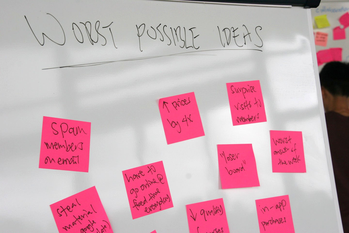
The idea is that even though brainstorm sessions are supposed to be judgment-free, they never are. Bad ideas are meant to be bad, so the worst you can do is have a good idea. Even better, starting with good ideas is problematic in that it’s easy to get attached to an idea too early, whereas bad ideas allow more freedom to jump through ideation space and land on better ideas.
Scott Jehl mentioned a fascinating idea where you can get the benefits of inlining code and caching files at the same time. That’s useful for stuff we’ve gotten used to seeing inlined, like critical CSS. But you know what else is awesome to inline? SVG icon systems. Scott covered the idea in his talk, but I wanted to see if it I could give it a crack myself.
The idea is that a fresh page visit inlines the icons, but also tosses them in cache. Then other pages can them out of the cache.
Here’s my demo page. It’s not really production-ready. For example, you’d probably want to do another pass where you Ajax for the icons and inject them by replacing the so that everywhere is actually using inline the same way. Plus, a server-side system would be ideal to display them either way depending on whether the cache is present or not.
Jeremy Keith mentioned the incredible prime number shitting bear, which is, as you might suspect, computationally expensive. He mentioned it in the context of web workers, which is essentially JavaScript that runs in a separate thread, so it won’t/can’t slow down the operation of the current page. I see that same idea has crossed other people’s minds.
I’m sad that I didn’t get to see every single talk because I know they were all amazing. There are plenty of upcoming shows with some of the same folks!
The post Little Things That Tickled My Brain from An Event Apart Seattle appeared first on CSS-Tricks.
