Rundown Of Gen Z: What Does This Mean For Mobile Designers?
Rundown Of Gen Z: What Does This Mean For Mobile Designers?
Suzanne Scacca2019-03-29T12:30:08+01:002019-03-30T08:05:44+00:00
Just a few years ago, design blogs were all abuzz with tips on how to build websites for the millennial consumer. At this point, however, that’s old news. We know what millennials want from the online experience and have, for the most part, been able to meet their expectations.
But now we have a new generation of consumers to worry about: Generation Z.
Are they all that different from millennials?
As an old millennial myself, I can tell you that this next generation is one I don’t feel much of a connection to. I can remember a time when the most exciting part of my day was when my mom got off the phone and I was able to finally connect to the Internet with our dial-up AOL account.
This next generation doesn’t understand any of that. They weren’t caught between worlds the way many millennials were, which means they have a whole different set of expectations when it comes to the technology they interact with on a daily basis.
Consider this your quick and dirty guide to designing mobile websites for Gen Z.
What You Need to Know About Designing Mobile Web for Gen Z
According to Reality Bytes, a report published by WP Engine and The Center For Generational Kinetics, Gen Z cannot live without Internet access. More specifically:
- 55% won’t go more than five hours without it.
- 27% won’t go more than one.
Now, what’s really interesting about this particular generation is that, despite their attachment to the Internet, 61% of them prefer to shop on websites instead of mobile apps.
Considering how long they’ve had smart devices in their hands, it’s surprising that they’d gravitate towards browsers over native applications. That just goes to show you that native apps aren’t necessarily the best way to reach a mobile audience (especially if you want to make money from your app).
But all this is good news for you. Mobile apps are expensive to build and time-consuming to maintain. Plus, it’s quite difficult to convert users on mobile apps. If you were nervous about having to make the leap into mobile app development, or about losing money to those working in that field, don’t be. Generation Z wants your clients’ websites.
Now that you know which experience Gen Z is more likely to lean towards, it’s time to discuss designing for it.
Entertain Them
Before you do anything else, think about how to engage Gen Z visitors with entertainment.
According to Reality Bytes, entertainment is the primary reason why they visit the Internet:

Until now, the primary reason why consumers flocked to the Internet was for informational purposes. But that’s not all bad news for you as it means you have an excuse to reach out to older clients and say:
“Hey, times are changing! Here’s what’s on trend now and what your website needs in order to reach these new consumers.”
Just be careful: even for the most relaxed and youthful company, you don’t want to go over the top with adding entertaining elements into a mobile website. Just because 66% of Generation Z consumers name gaming as their #1 hobby doesn’t mean you need to build a mobile game and put it on your site. (Leave that to the gaming app developers.)
Instead, look at subtle ways to surprise Generation Z with something unexpected and engaging.
The first place to start? Video.
KFC has a great example of this right on its home page:
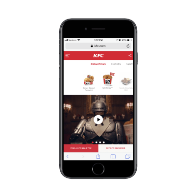
There’s a number of reasons why this video example is so awesome.
First, every visitor to the website — both on desktop and mobile — will see it right away. On mobile, visitors can’t even scroll down the home page. What you see above is what you get.
Next, this ensures your visitors get a taste of the brand’s humor and personality. Whereas content-driven sites or blogs can do that with GIFs and memes, Gen Z might not take the time to read content. Video makes sure they won’t miss out.
Also, this video is totally on brand, showcasing KFC’s humor in video form.
Even if you don’t have a humorous mascot to trot around, show off your client’s CEO or other engaging brand ambassador. Video is a great way to quickly suck Gen Z visitors in and let them know this is not going to be a dry or unmemorable experience.
If you don’t have video to play with, that’s okay. Think about adding humor as you educate visitors. Old Spice demonstrates:

Old Spice is another company that’s known for its entertaining video ads. However, their website also contains some humorous gems where you’d least expect them:
In the Ingredients section.
Visitors that are concerned about the ingredients within their deodorant can visit this page to learn more about what goes into each of the products. But read those descriptions closely. Not only are they transparent about what’s inside, but they also do it in a casual and playful way which says:
“Hey, we’re taking your concerns seriously. But don’t sweat it. We got you.”
Another way you can appeal to the entertainment-loving Generation Z is to add a social component to your site.
Don’t worry about building your own social network, community or forum either. Gen Z is going to flock to their favorite social platforms for that purpose: YouTube, Snapchat, Instagram, etc.
Instead, think about what it is that makes those environments so engage-worthy. Here’s an example from the Gymshark Central blog:
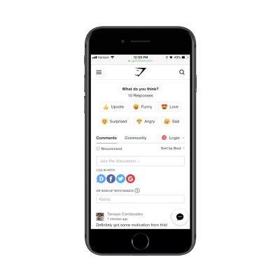
The blog post looks like any other. However, at the bottom of each post is this emoji reaction system. That’s pretty unique, right? Plus, this type of engagement doesn’t require much work from the reader. Simply click on the recognizable and well-labeled emoji and let the writer know what you thought of the content.
Another reason why this works so well is because Gymshark actively targets Gen Z customers. If you look on their website, you’ll see a section where they give discounts to college students.
So, if your client’s website needs to reach a younger audience, take a lesson from Gymshark. There’s no need to do a complete overhaul and convert an otherwise well-designed website into a superficial social network. Instead, add the most engaging elements from social networks and encourage your Gen Z visitors to interact more.
Personalize It
Think about what makes video games and social media so attractive to Gen Z. There’s obviously the fun aspect of it, but there’s another force at play that keeps users returning time and time again:
And that’s personalization.
This is something you should already be designing your mobile websites for as you target millennial consumers. However, if you haven’t bothered to add personalized touches to your sites, yet, you’re going to need to take this more seriously now.
Forbes Agency Council and YPulse worked together to find out what Generation Z really wants in terms of personalized experiences. Here’s a snippet from their findings:
“71% of the 3,000 respondents ages 14–29 said they prefer to receive offers that are customized to their location. In the same survey, 80% said they expect tailored onscreen experiences that not only target location but also recognize their interests and habits — who they are and how they self-identify.”
With 44% of Gen Z more likely to give up their personal data than other generations, you can’t afford to ignore this one.
One way to deliver a personalized experience based on what Gen Z visitors want is through push notifications. The only problem is, whether you have a mobile website or a progressive web app, push notifications are not supported on iOS devices.
While you can still use them to connect with Android users, consider other means for personalization that will help you connect with 100% of them.
Take, for instance, something as seemingly simple as what Amazon does with data:
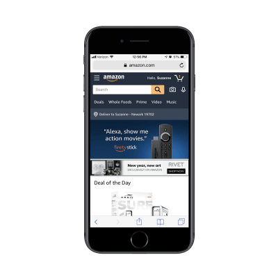
As you can see here, Amazon has saved a whole bunch of information about me:
- My name and account information;
- My cart items (which were not put there on this shopping trip);
- My delivery location.
I also happen to own a Fire TV Stick, so this top ad is super relevant to me. Overall, I’m quite pleased with how tailor-made this first step inside the mobile website feels.
If you’re building a registration or membership system into your client’s website, make sure you’re leveraging user data to provide a personalized experience for them.
And if you don’t have a reason to ask mobile visitors to log in, that’s okay. You can still gather information by placing simply designed email subscription forms on the mobile website — preferably above the fold or at the very bottom. And most definitely on the home page.
Here’s a nice example from inkbox:

inkbox has done a nice job with this subscription form. Even if mobile users scroll past the content on the page, they’re likely to see that white box screaming back at them, begging them to sign up.
Because there’s such a low commitment compared to the potential for such valuable rewards (like information on new products and access to exclusive discounts), Generation Z visitors will love this. Like I said earlier, they’re more than willing to give you their personal data if you can make it worth their while.
For mobile websites with a brick-and-mortar presence, geolocation features are non-negotiable. Generation Z shoppers often use their mobile devices while in-store, so this would definitely take their experience to the next level.
One of the easiest ways to implement this is with geolocation sensors like the ones used by The North Face:
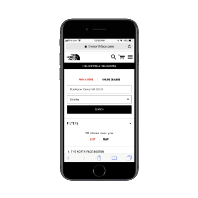
The above screenshot is what happens when I use the Find a Store feature on the mobile website. What’s great about this is it detected my location (which is currently Boston) and it auto-populated my search query with a nearby store.
Mobile users don’t have time to waste and Gen Z certainly won’t take kindly to a website that forces them to do all the work. Take what you know about your user — even if all you can detect is a location — and make their job of connecting with you easier.
Make Them Feel Special
Now, there’s a difference between adding personal touches to a website and taking it up a notch so that Generation Z visitors feel special. They’re going to need you to make them feel like their money and opinions and faces are worth more than anyone else’s.
You have to remember, this is the generation that grew up with reality TV and smartphone cameras pointed at their faces. That’s why it’s no surprise they’re known as the “influencer” generation.
On a related note, this makes Generation Z much more likely to build a relationship with brands as there’s the hope that, someday, they’ll reward their loyalty with a public-facing partnership.
Your clients will ultimately have to decide how far they want to take this. After all, affiliate partnerships and influencer marketing won’t make sense for everyone. That said, there are other ways to reap the advantages of having a generation of consumers willing to “help” a brand out.
According to data from the IBM Institute for Business Value and the National Retail Federation, 44% of Generation Z consumers said they’d be happy to share ideas for product design. That makes sense as that level of contribution will make them feel like they have more invested in the relationship with the company.
While your clients need to decide if consumers have any say in the shaping of their offering, you can do something about this from the web design side of things.
Check out what the Panera website is doing to solicit visitors for feedback:
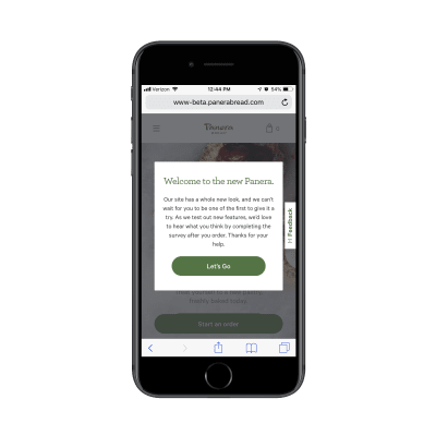
These “Feedback” tabs are a somewhat new feature on the web, but more and more websites are certainly taking advantage of it. With this intro pop-up from Panera, it’s looking as though they want to make sure their visitors take notice, too.
This is a smart move in terms of trying to appeal to a younger audience. You let them know, straight out the gate, “We made some changes!” and then ask them to provide feedback. But that’s not all. Panera is saying: “Thanks for your help.” This implies that they want customers to take a greater part in shaping both the online experience and the brand itself.
There are other ways to make Generation Z feel like they’re more than just the average customer.
Sephora has created something called the “Rewards Bazaar” to layer on top of its more traditional BeautyInsider loyalty program:

The Rewards Bazaar program works similarly to credit card points or airline miles programs. In other words, the more money customers spend with Sephora, the more points they accumulate.
And points don’t just buy them more Sephora goods. Points buy them experiences, like an Algenist R&R sleep retreat in Tucson, Arizona. They can also get “swag” bundles full of makeup and body products, clothes, artwork and more.
Sephora is rewarding their loyalty with celeb-like treats.
If you want to go crazy and actually encourage Gen Z customers to act like the influencers they so desire to be, take inspiration from this American Eagle example:
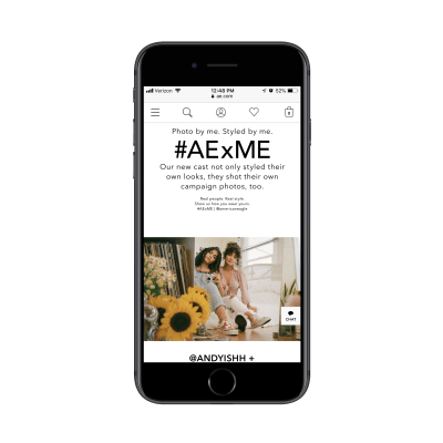
Generation Z customers already have their cameras ready to snap the next Insta-worthy photo, so why not give them a reason to put it to good use?
American Eagle has created an influencer-like program called AE x ME. Really, this is nothing more than a brilliant ploy to ask customers for user-generated content that American Eagle can then use on its website and beyond.
Whereas brands usually have to dig around for these types of photos or videos featuring their products in action, American Eagle is saying:
“You’re going to take pictures of your awesome new duds anyway. Why not let us show them off to a much larger audience for you?”
That’s not the only reward American Eagle dangles in front of influencers. While most of the people featured get a unique URL that features their Instagram handle and some information about them, there’s a profile at the bottom of this page that suggests there might be a greater opportunity here.
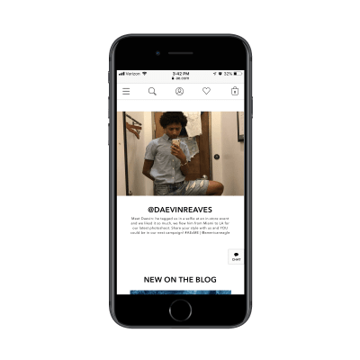
Daevin tagged American Eagle in one of his posts and then was flown out to become one of the faces in an upcoming campaign for the famous clothing brand. If that’s not living the dream for Gen Z influencer wannabes, I don’t know what is.
Keep It Real
One last thing to keep in the back of your minds as you design websites for Generation Z is the “keep it real” component. Anyone else remember this Dave Chappelle gem?
Gen Z has very high standards when it comes to the authenticity of a company. And, not only that, they expect brands to be socially good, too.
Reality Bytes reports that:
- 79% of Gen Z consumers respect brands more if they keep their images Photoshop-free.
- 84% of them trust companies that put real customers in their ad campaigns (see American Eagle’s example above).
- 69% of them will buy from companies that give money to and support good causes.
Really, what all of this data points to is this:
Generation Z wants to know that they’re engaging with genuinely good and honest people; not just a brand name.
That’s why, if your clients have a strong mission and values, their websites need to have one page specifically dedicated to them.
One way to do this is with a partnership highlight page like eos has:
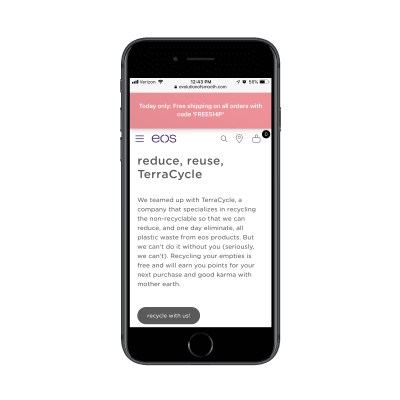
The eos website actually has two pages dedicated to this recycling cause. The first is called “Social Responsibility” where the company discusses its mission to build clean products. The second is called “TerraCycle” where it goes more into the recycling partnership.
For consumers looking to buy from companies that take causes like this seriously, these landing pages may be all they need to convince them to convert.
Samsung does something similar on its About Us page, except the key difference is that it calls out social responsibility and sustainability as part of its core company values:
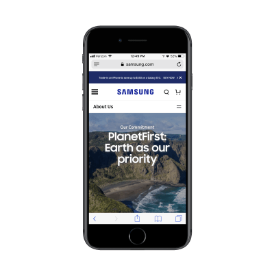
This way, it’s not just Samsung telling customers where their products come from or where they end up. Instead, their entire identity becomes synonymous with this mission to create a better world.
When you compare them to companies that prioritize profit before anything else or who have been accused of being dishonest for the purposes of driving up their bottom line, Samsung stands out as a shining example of what to do.
Another way to stand out with this concept of social goodness is by showing customers how they’re contributing to a good cause by giving their business to them.
The Giving Keys is a brand that’s built its entire concept around this.
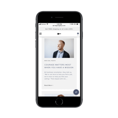
The Giving Keys isn’t just a website to buy jewelry from. This is a place where consumers can make a difference in more ways than one. It works like this:
- Customers purchase a piece of jewelry and add a personalized inscription to the key charm.
- They then give the inspirational message jewelry to someone who needs it. (The website features a section where customers can “Share Your Story” to talk about who they gave it to and why.)
- In turn, the company uses a portion of the sale to help create jobs for the homeless.
This is the kind of thing that makes Generation Z stop and think twice about giving their money to a money-hungry mega brand instead of a smaller company that backs a good cause.
Wrapping Up
It’s an interesting thing, isn’t? Raise kids in a certain timeframe and environment and they’ll turn out to be completely different shoppers than the generations before them.
Thankfully, the same kinds of technologies that have powered Generation Z’s lives are the ones we can use to learn more about them. And we’ve certainly learned a lot. As you go about designing websites for clients in the future, don’t forget to bring up the Gen Z question to them. Even if they’re not selling to them now, someday in the not-so-distant future, they will.
Further Reading on SmashingMag:
- Connecting Children With Nature Through Smart Toy Design
- Designing For Kids Is Not Child’s Play
- A Dad’s Plea To Developers Of iPad Apps For Children
- How To Design Global Applications For Children