Archive

Archive for March, 2019

Extending Google Analytics on CSS-Tricks with Custom Dimensions

March 11th, 2019 No comments

The idea for this article sparked when Chris wrote this in Thank You (2018 Edition):

I almost wish our URLs had years in them because I still don’t have a way to scope analytic data to only show me data from content published this year. I can see the most popular stuff from the year, but that’s regardless of when it was published, and that’s dominated by the big guides we’ve had for years and keep updated.

I have been a long-time reader of CSS-Tricks, but have not yet had something to contribute with. Until now. Being a Google Analytics specialist by day, this was at last something I could contribute to CSS-Tricks. Let’s extend Google Analytics on CSS-Tricks!

Enter Google Analytics custom dimensions

Google Analytics gives you a lot of interesting insights about what visitors are doing on a website, just by adding the basic Google Analytics snippet to every page.

But Google Analytics is a one-size-fits-all tool.

In order to make it truly meaningful for a specific website like CSS-Tricks we can add additional meta information to our Google Analytics data.

The year an article was posted is an example of such meta data that Google Analytics does not have out of the box, but it’s something that is easily added to make the data much more useful. That’s where custom dimensions come in.

Create the custom dimension in Google Analytics

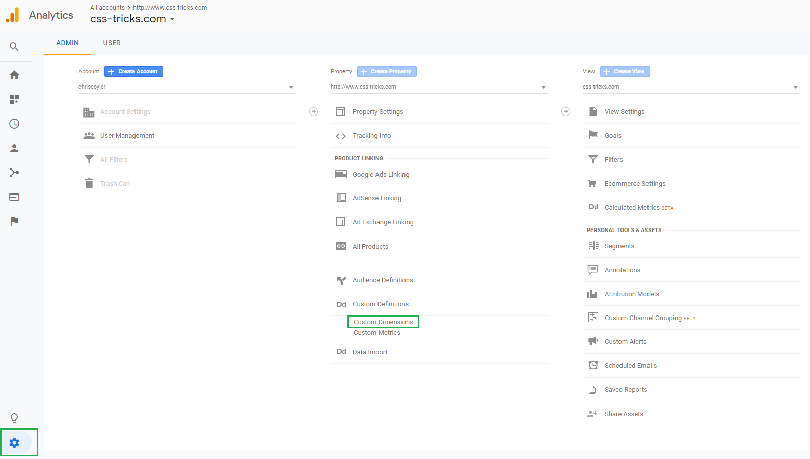
The first thing to do is create the new custom dimension. In the Google Analytics UI, click the gear icon, click Custom Definitions and then click Custom Dimensions.

Google Analytics admin interface

This shows a list of any existing custom dimensions. Click the red button to create a new custom dimension.

Custom dimensions overview

Let’s give the custom dimension a descriptive name. In this case, “year” seems quite appropriate since that’s what we want to measure.
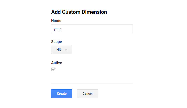
The scope is important because it defines how the meta data should be applied to the existing data. In this case, the article year is related to each article the user is viewing, so we need to set it to the “hit” scope.
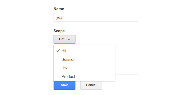
Another example would be meta data about the entire session, like if the user is logged in, that would be saved in a session-scoped custom dimension.

Alright, let’s save our dimension.

When the custom dimension is created, Google Analytics provides examples for how to implement it using JavaScript. We’re allowed up to 20 custom dimensions and each custom dimension is identified by an index. In this case, “year” is the first custom dimension, so it was created in Index 1 (see dimension1 in the JavaScript code below).
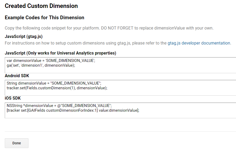
Custom dimension created at Index 1

If we had other custom dimensions defined, then those would live in another index. There is no way to change the index of a custom dimension, so take note of the one being used. A list of all indices can always be found in the overview:

That’s it, now it’s time to code!

Now we have to extract the article year in the code and add it to the payload so that it is sent to Google Analytics with the page view hit.

This is the code we need to execute, per the snippet we were provided when creating the custom dimension:

var dimensionValue = 'SOME_DIMENSION_VALUE';
ga('set', 'dimension1', dimensionValue);

Here is the tricky part. The ga() function is created when the Google Analytics snippet is loaded. In order to minimize the performance hit, it is placed at the bottom of the page on CSS-Tricks. This is what the basic Google Analytics snippet looks like:

<script>
(function(i,s,o,g,r,a,m){i['GoogleAnalyticsObject']=r;i[r]=i[r]||function(){
(i[r].q=i[r].q||[]).push(arguments)},i[r].l=1*new Date();a=s.createElement(o),
m=s.getElementsByTagName(o)[0];a.async=1;a.src=g;m.parentNode.insertBefore(a,m)
})(window,document,'script','//www.google-analytics.com/analytics.js','ga');
ga('create', 'UA-12345-1', 'auto');
ga('send', 'pageview');
</script>

We need to set the custom dimension value after the snippet is parsed and before the page view hit is sent to Google Analytics. Hence, we need to set it here:

// ...
ga('create', 'UA-12345-1', 'auto');
ga('set', 'dimension1', dimensionValue); // Set the custom dimension value
ga('send', 'pageview');

This code is usually placed outside a WordPress Loop, but that’s where we would have access to meta information like the article year. Because of this, we need to store the article year in a JavaScript variable inside the loop, then reference that variable in the Google Analytics snippet when we get to the bottom of the page.

Save the article year within the loop

In WordPress, a standard loop starts here:

<?php if ( have_posts() ) : while ( have_posts() ) : the_post(); ?>

…and ends here:

<?php endwhile; else : ?>
	<p><?php esc_html_e( 'Sorry, no posts matched your criteria.' ); ?></p>
<?php endif; ?>

Somewhere between those lines, we extract the year and save it in a JavaScript variable:

<script>
	var articleYear = "<?php the_time('Y') ?>";
</script>

Reference the article year in the Google Analytics snippet

The Google Analytics snippets is placed on all pages of the website, but the year does not make sense for all pages (e.g. the homepage). Being the good JavaScript developers that we are, we will check if the variable has been defined in order to avoid any errors.

ga('create', 'UA-68528-29', 'auto');
if (typeof articleYear !== "undefined") {
		ga('set', 'dimension1', articleYear);
}
ga('send', 'pageview');

That’s it! The Google Analytics page view hit will now include the article year for all pages where it is defined.

Custom dimensions do not apply to historical data

One thing to know about custom dimension — or any other modifications to your Google Analytics data — is that they only apply to new data being collected from the website. The custom dimensions described in this article was implemented in January 2019, and that means if we look at data from 2018 it will not have any data for the custom dimensions.

This is important to keep in mind for the rest of this article, when we begin to look into the data. The custom dimensions are added to all posts on CSS-Tricks, going all the way back to 2007, but we are only looking at page views that happened in 2019 — after the custom dimensions was implemented. For example, when we look at articles from 2011, we are not looking at page views in 2011 — we are looking at page views of posts from 2011 in 2019. This is important to keep in mind, when we start to look at posts from previous years.

All set? OK, let’s take a look at the new data!

Viewing the data in Google Analytics

The easiest way to see the new data is to go to Behavior ? Site Content ? All Pages, which will show the most viewed pages:
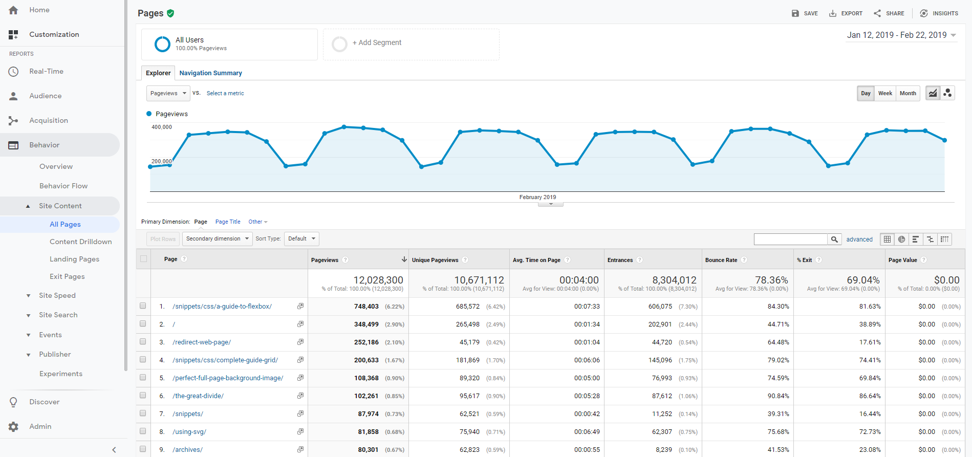
All Pages report

In the dropdown above the table, select “year” as a secondary dimension.
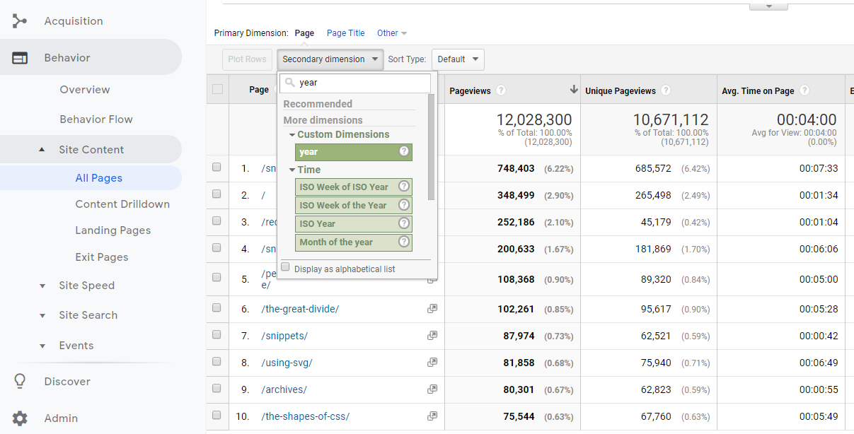
Year as secondary dimension

That gives us a table like the one below, showing the year for all articles. Notice how the homepage, which is the second most viewed page, is removed from the table because it does not have a year associated with it.

We start to get a better understanding of the website. The most viewed page (by far) is the complete guide to Flexbox which was published back in 2013. Talk about evergreen content!
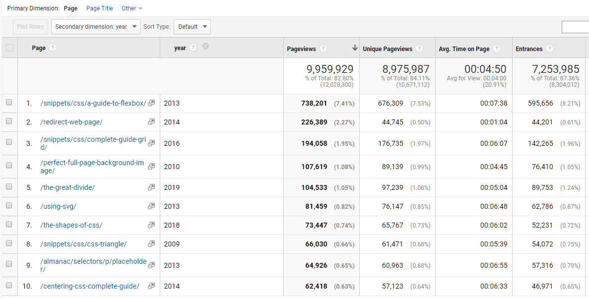
Table with year as secondary dimension

Secondary is good, primary is better

OK, so the above table adds some understanding of the most viewed pages, but let’s flip the dimensions so that year is the primary dimension. There is no standard report for viewing custom dimensions as the primary dimension, so we need to create a custom report.
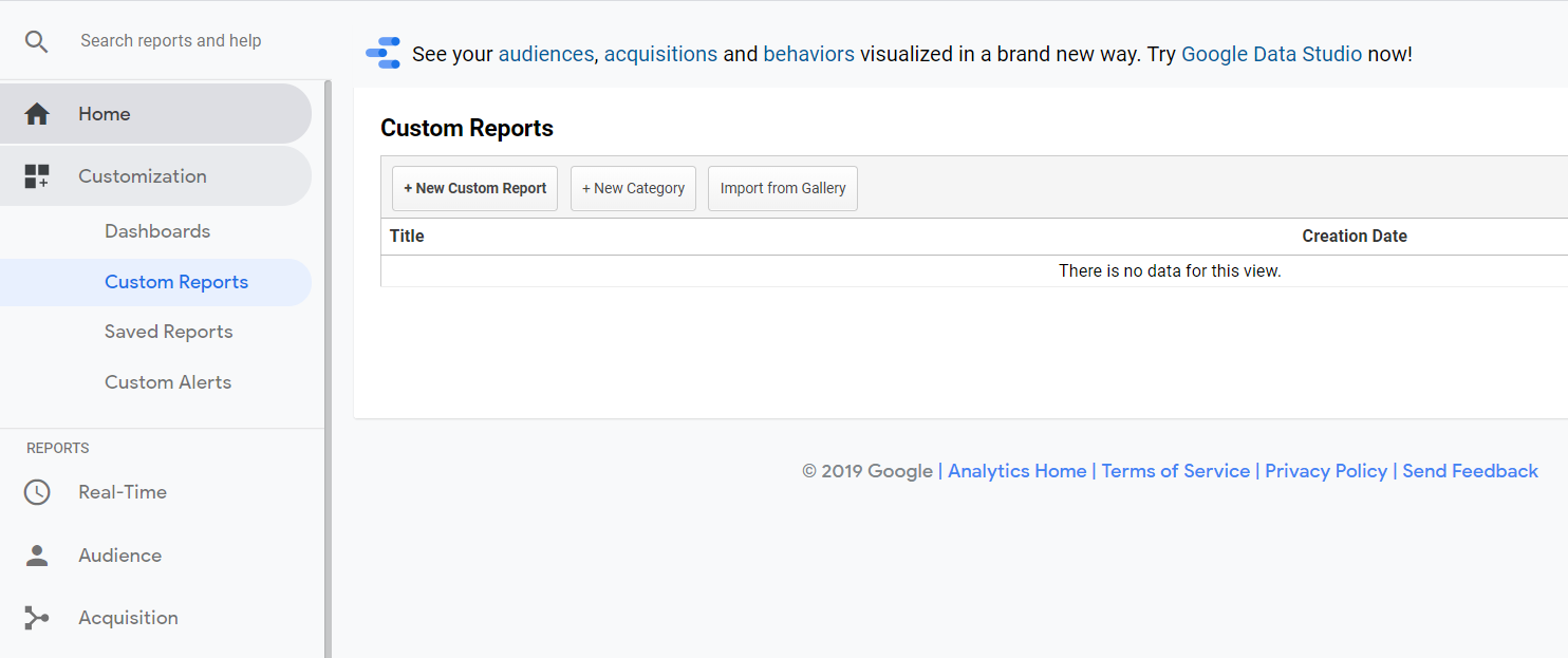
Custom Reports overview

Give the Custom Report a good name. Finding the metrics (blue) and dimensions (green) is easiest by searching.
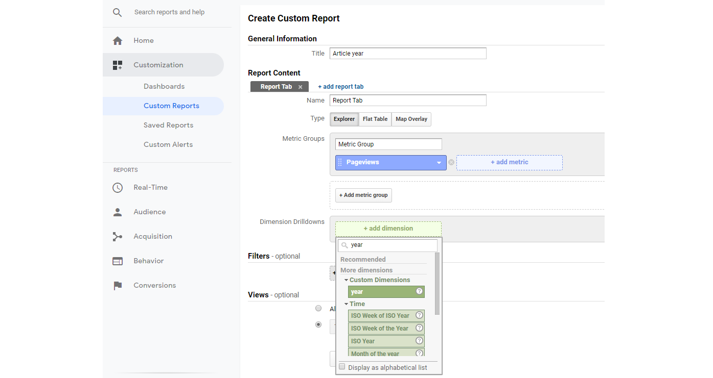
Create the Custom Report

Here is what the final Custom Report should look like, with some useful metrics and dimensions. Notice how we have selected Page below Year. This will become useful in a second.
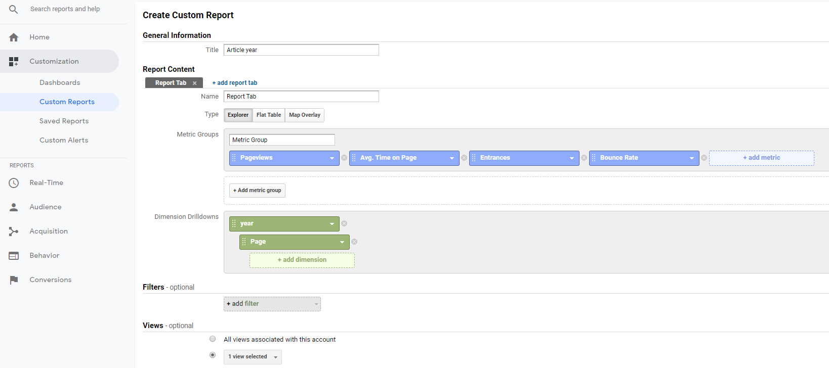
The final Custom Report

Once we hit Save, we see the aggregate numbers for all article years. 2013 is still on top, but we now see that 2011 also had some great content, which was not in the top 10 lists we previously looked at. This suggests that no single article from 2011 stood out, but in total, 2011 had some great articles that still receive a lot of views in 2019.
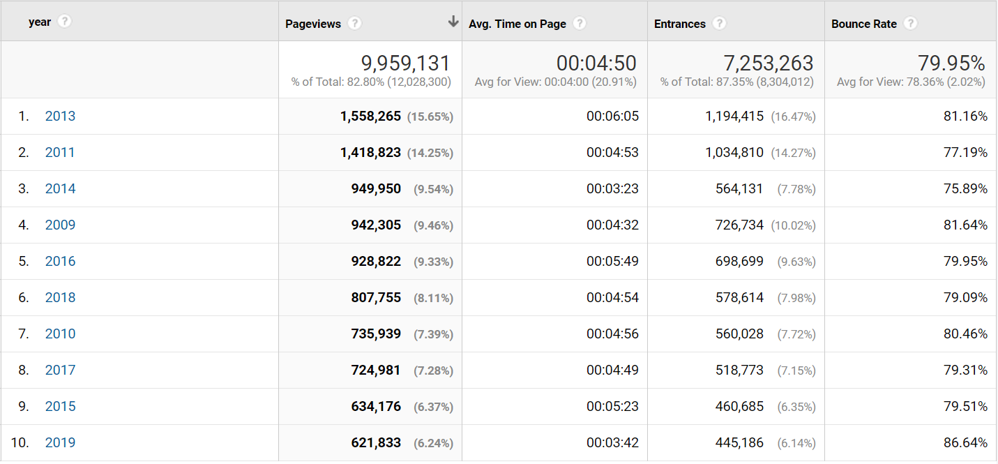
Aggregated numbers for article years

The percentage next to the number of page views is the percentage of the total page views. Notice how 2018 “only” accounts for 8.11% of all page views and 2019 accounts for 6.24%. This is not surprising, but shows that CSS-Tricks is partly a huge success because of the vast amount of strong reference material posted over the years, which users keep referring to.

Let’s look into 2011.

Remember how we set up the Custom Report with the Page below the Year in dimensions? This means we can now click 2011 and drill-down into that year.
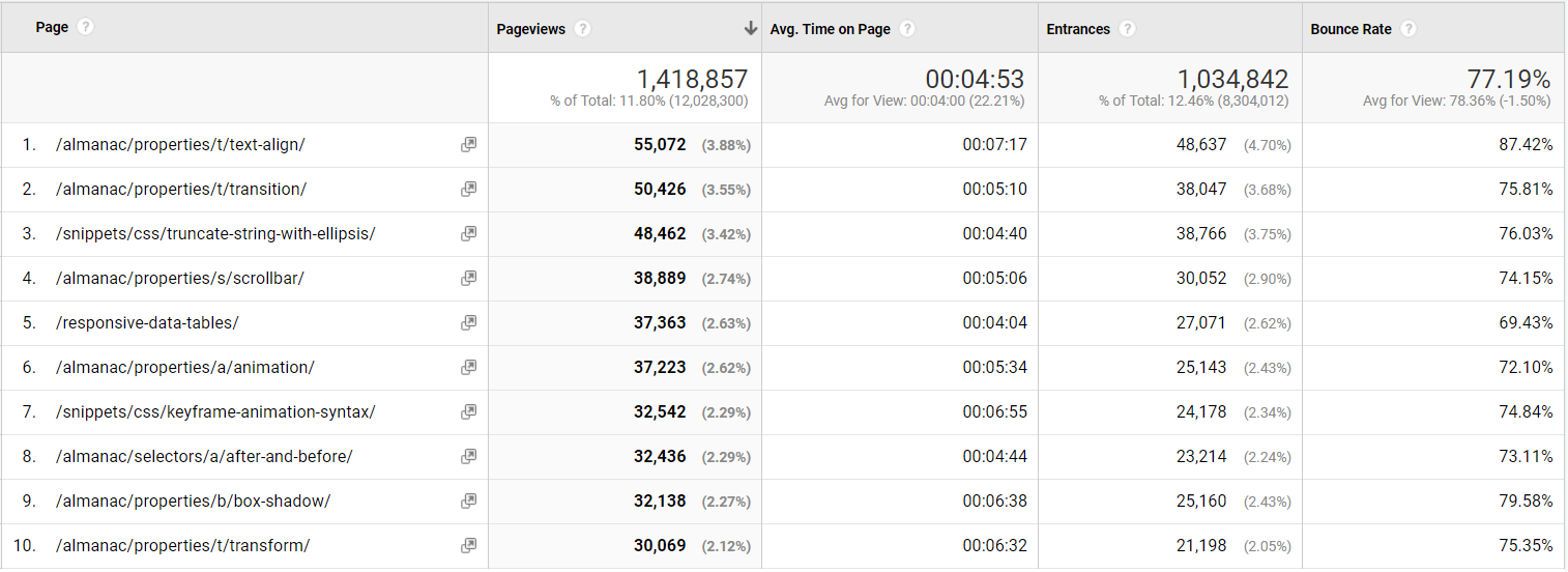
It looks like a lot of almanac pages were published in 2011, which in aggregate has a lot of page views. Notice the lower-right corner where it says “1-10 of 375.” This means that 375 articles from 2011 have been viewed on the site in 2019. That is impressive!

Back to the question: Great content from 2018

Before I forget: Let’s answer that initial question from Chris.

Let’s scope the analytics data to content published this year (2018). Here are the top 10 posts:
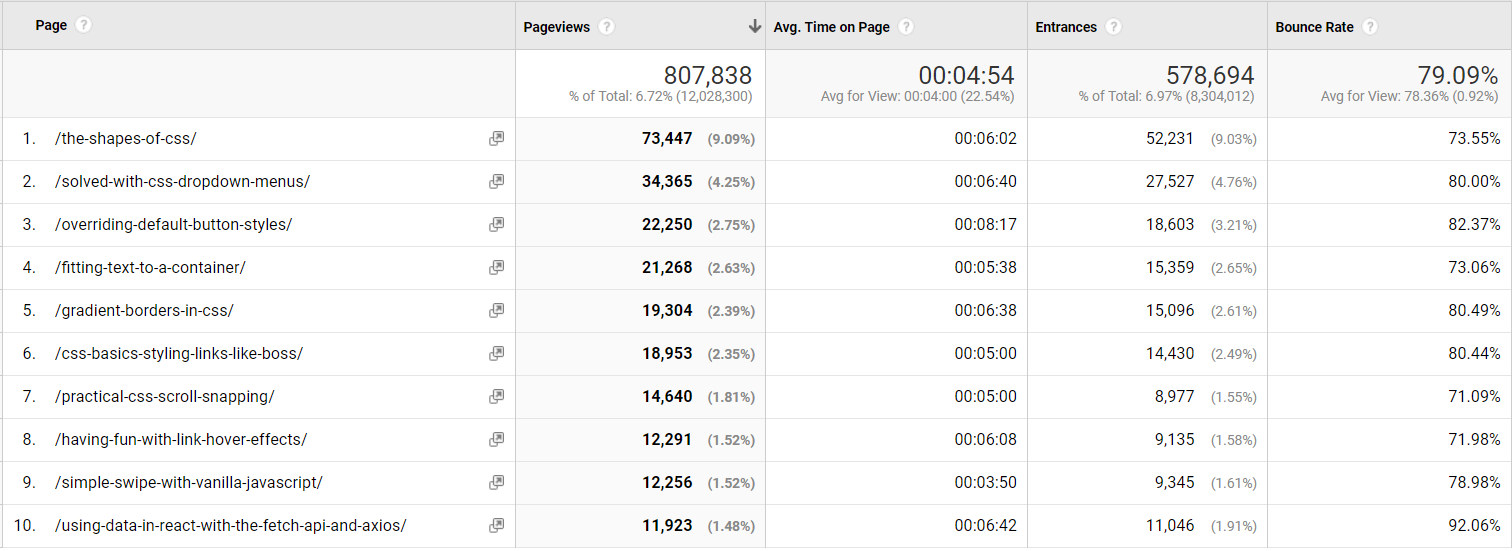
Top 10 posts published in 2018

Understanding the two-headed beast

In Thank You (2018 Edition), Chris also wrote:

For the last few years, I’ve been trying to think of CSS-Tricks as this two-headed beast. One head is that we’re trying to produce long-lasting referential content. We want to be a site that you come to or land on to find answers to front-end questions. The other head is that we want to be able to be read like a magazine. Subscribe, pop by once a week, snag the RSS feed… whatever you like, we hope CSS-Tricks is interesting to read as a hobbyist magazine or industry rag.

Let’s dig into that with another custom dimension: Post type. CSS-Tricks uses a number of custom post types like videos, almanac entries, and snippets in addition to the built-in post types, like posts or pages.

Let’s also extract that, like we did with the article year:

<script>
	var articleYear = "<?php the_time('Y') ?>";
	var articleType = "<?php get_post_type($post->ID) ?>";
</script>

We’ll save it into custom dimension Index 2, which is hit-scoped just like we did with year. Now we can build a new custom report like this:

Custom post types

Now we know that blog posts account for 55% of page views, while snippets and almanac (the long-lasting referential content) account for 44%.

Now, blog posts can also be referential content, so it is safe to say that at least half of the traffic on CSS-Tricks is coming because of the referential content.

From a one-man band to a 333-author content team

When CSS-Tricks started in 2007 it was just Chris. At the time of writing, 333 authors have contributed.
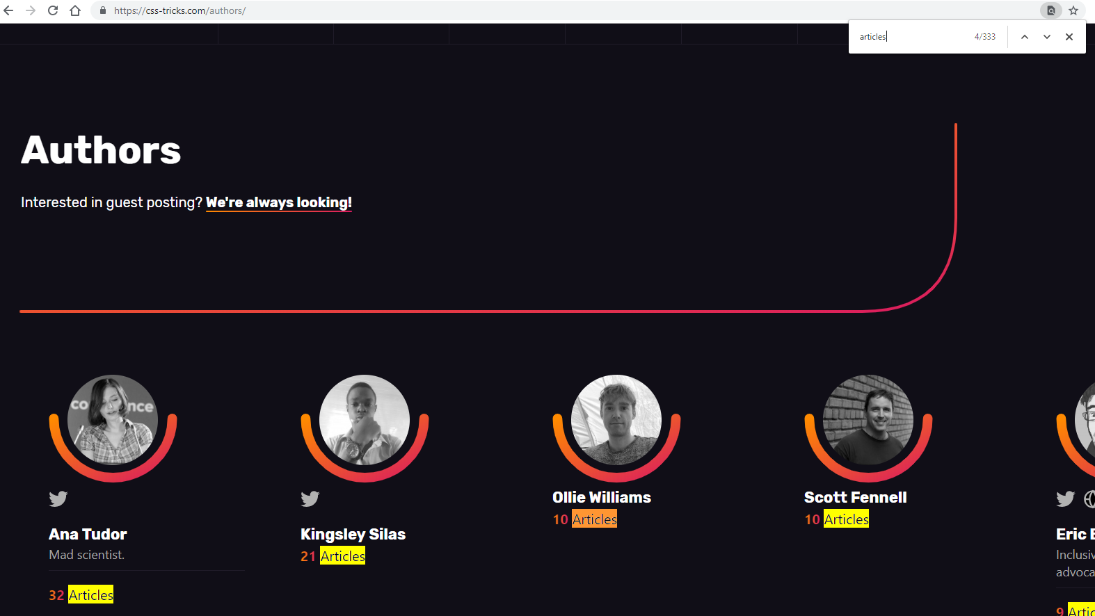
Let’s see how those authors have contributed to the page views on CSS-Tricks using — you probably guessed it — another custom dimension!

<script>
	var articleYear = "<?php the_time('Y') ?>";
	var articleAuthor = "<?php the_author() ?>";
	var articleType = "<?php get_post_type($post->ID) ?>";
</script>

Here are the top 10 most viewed authors in 2019.
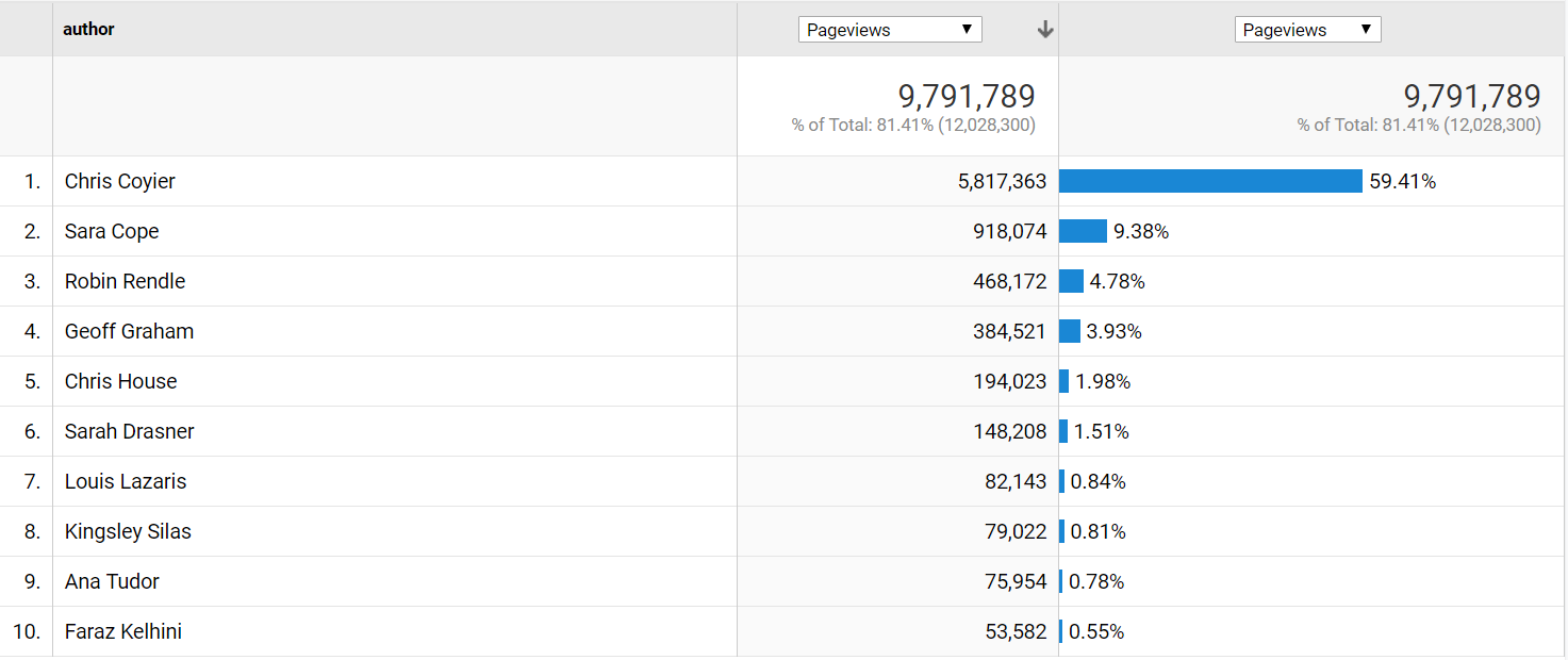
Top 10 authors on CSS-Tricks

Let’s break this down even further by year with a secondary dimension and select 500 rows in the lower-right corner, so we get all 465 rows.
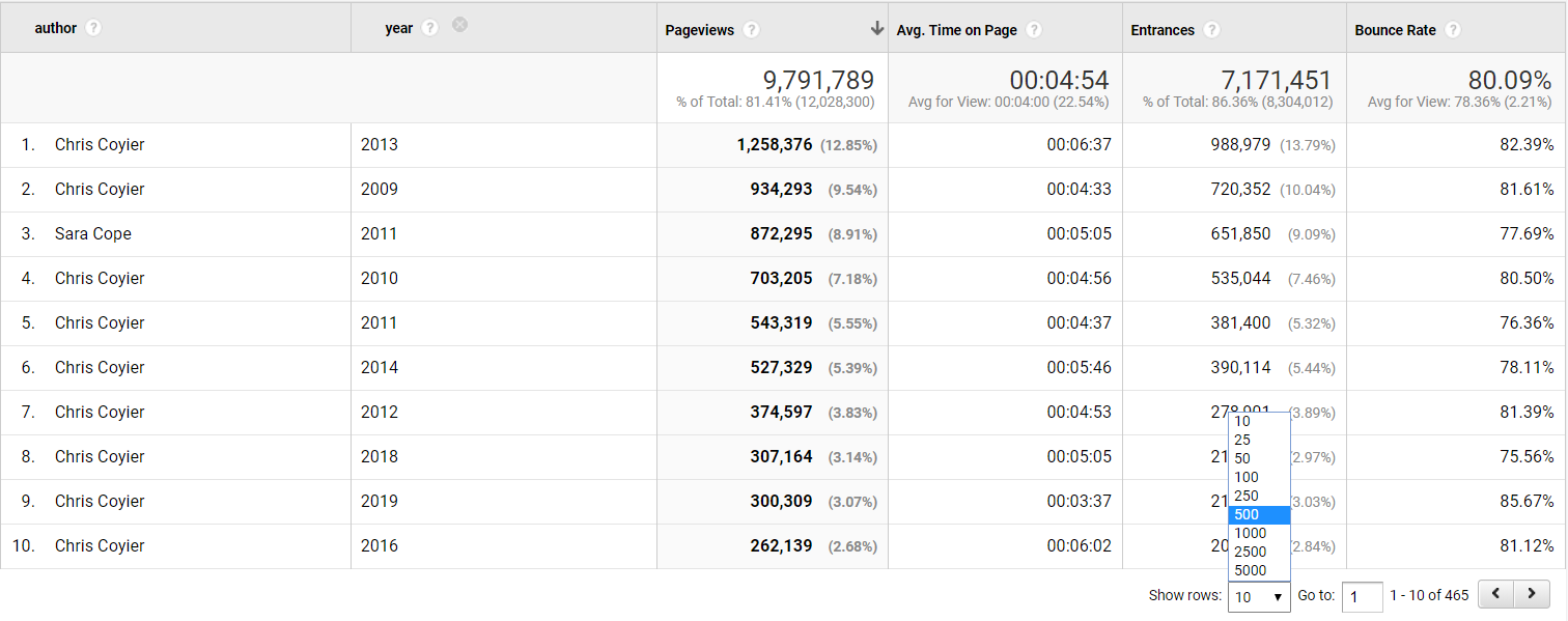
Top 10 authors and year

We can then export the data to Excel and make a pivot table of the data, counting authors per year.
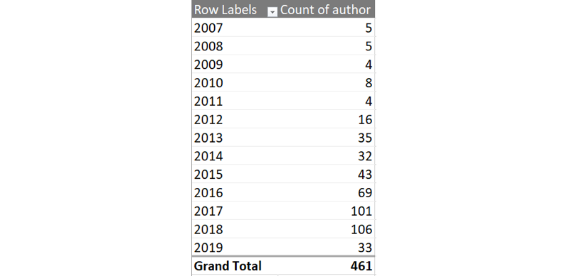
Excel pivot table with count of authors per year

You like charts? We can make one with some beautiful v17 colors, showing the number of authors per year.
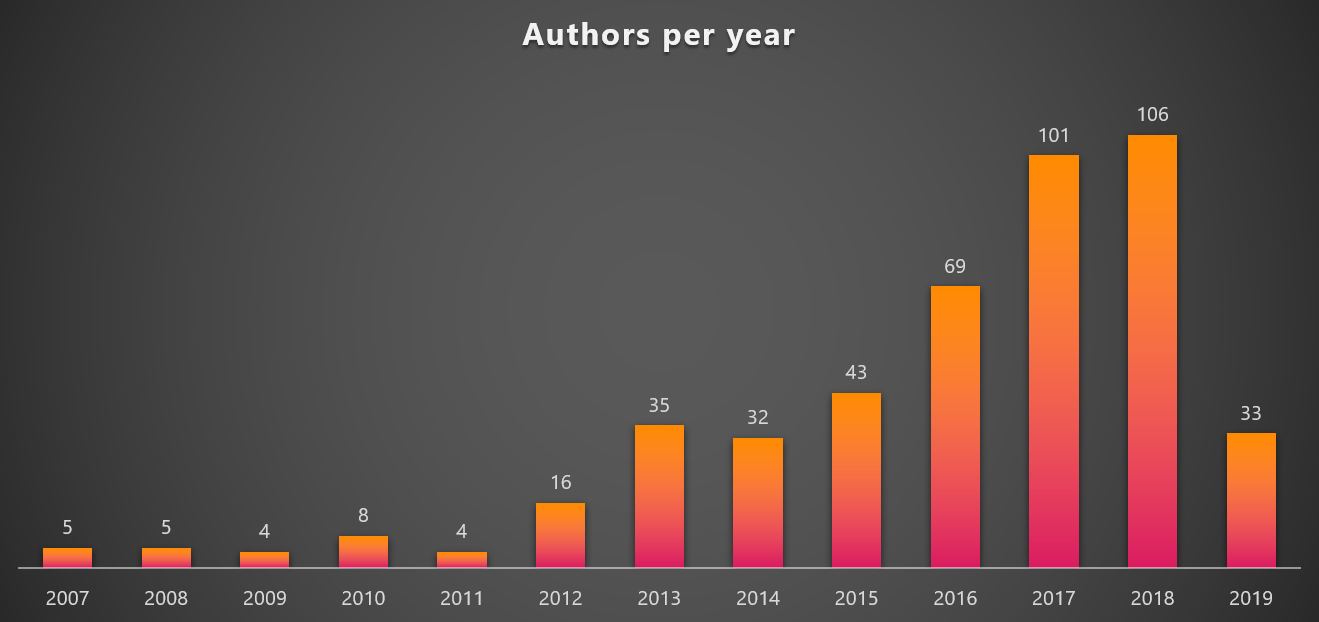
Authors per year

It is amazing to see the steady growth in authors contributing to CSS-Tricks per year. And given 2019 already has 33 different authors, it looks like 2019 could set a new record.

But are those new authors generating any page views?

Let’s make a new pivot chart where we compare Chris to all other authors.
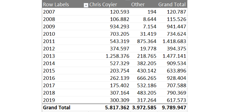
Pivot table comparing page views

…and then chart that over time.

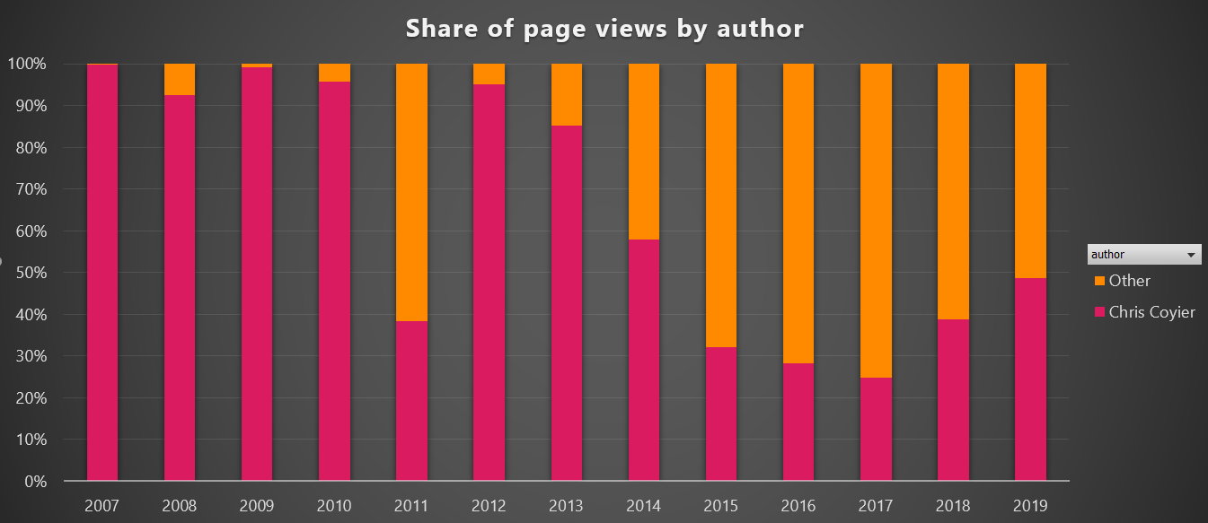
Share of page views by author per year

It definitely looks like CSS-Tricks is becoming a multi-author site. While Chris is still the #1 author, it is good to see that the constant flow of new high-quality content does not solely depend on him, which is a good trend for CSS-Tricks and makes it possible to cover a lot more topics going forward.

But what happened in 2011, you might ask? Let’s have a look. In a custom report, you can have five levels of dimensions. For now we will stick with four.

Custom report with four dimensions to drill into

Now we can click on the year 2011 and get the list of authors.

2011 authors

Hello Sara Cope! What awesome content did you write in 2011?

Sara Cope almanac pages

Looks like a lot of those almanac pages we saw earlier. Click that!
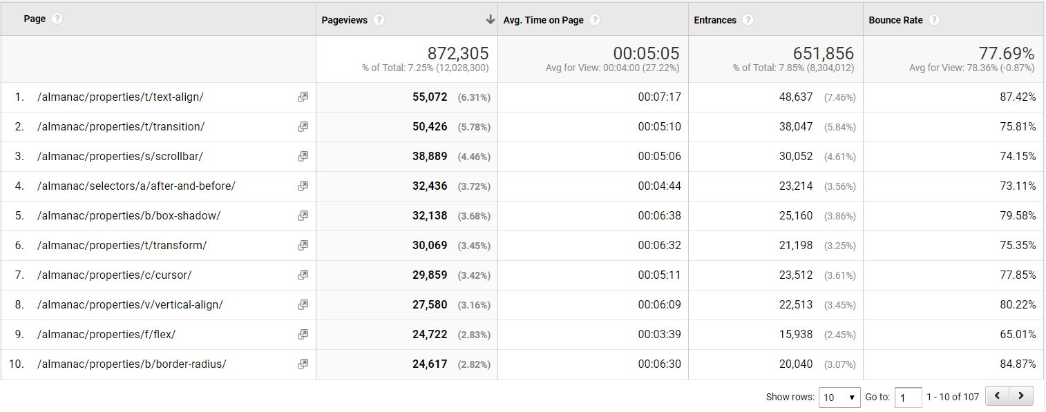
107 almanac pages by Sara Cope

Indeed, a lot of almanac pages! 107 to be exact. A lot of great content that still receives lots of page views in 2019 to boot.

Summary

Google Analytics is a powerful tool to understand what users are doing on your website, and with a little work, meta data that is specific to your website can make it extra powerful. As seen in this article, adding a few simple meta data that’s already accessible in WordPress can unlock a world of opportunities to analyze and add a whole new dimension of knowledge about the content and visitors of a site, like we did here on CSS-Tricks.


If you’re interested in another similar journey involving custom dimensions and making Google Analytics data way more useful, check out Chris Coyier and Philip Walton in Learning to Use Google Analytics More Effectively at CodePen.

The post Extending Google Analytics on CSS-Tricks with Custom Dimensions appeared first on CSS-Tricks.
Categories: Designing, Others Tags:

Get Started with Node: An Introduction to APIs, HTTP and ES6+ JavaScript

March 11th, 2019 No comments

Jamie Corkhill has written this wonderful post about Node and I think it’s perhaps one of the best technical articles I’ve ever read. Not only is it jam-packed with information for folks like me who aren’t writing JavaScript everyday, it is also incredibly deliberate as Jamie slowly walks through the very basics of JavaScript (such as synchronous and asynchronous functions) all the way up to working with our very own API.

Jamie writes:

What is Node in the first place? What exactly does it mean for Node to be “asynchronous”, and how does that differ from “synchronous”? What is the meaning “event-driven” and “non-blocking” anyway, and how does Node fit into the bigger picture of applications, Internet networks, and servers?

We’ll attempt to answer all of these questions and more throughout this series as we take an in-depth look at the inner workings of Node, learn about the HyperText Transfer Protocol, APIs, and JSON, and build our very own Bookshelf API utilizing MongoDB, Express, Lodash, Mocha, and Handlebars.

I would highly recommend this post if JavaScript isn’t your day job but you’ve always wanted to learn about Node in a bit more detail.

Direct Link to ArticlePermalink

The post Get Started with Node: An Introduction to APIs, HTTP and ES6+ JavaScript appeared first on CSS-Tricks.

Categories: Designing, Others Tags:

Designing An Aspect Ratio Unit For CSS

March 11th, 2019 No comments
Smashing Editorial

Designing An Aspect Ratio Unit For CSS

Designing An Aspect Ratio Unit For CSS

Rachel Andrew

2019-03-11T15:00:41+01:002019-03-12T09:56:44+00:00

One of the things that come up again and again in CSS is the fact that there is no way to size things based on their aspect ratio. In particular when working with responsive designs, you often want to be able to set the width to a percentage and have the height correspond to some aspect ratio. This is something that the folks who are responsible for designing CSS (i.e. the CSS Working Group) have recently been discussing and a proposed solution was agreed upon at a recent CSSWG meeting in San Francisco.

This is a new resolution, so we have no browser implementations yet, but I thought it would be worth writing up the proposal in case anyone in the wider web community could see a showstopping issue with it. It also gives something of an insight into the work of the CSSWG and how issues like this are discussed, and new features designed.

What Is The Problem We Are Trying To Solve?

The issue in in regard to non-replaced elements, which do not have an intrinsic aspect ratio. Replaced elements are things like images or a video placed with the element. They are different to other boxes in CSS as they have set dimensions, and their own behavior. These replaced elements are said to have an intrinsic aspect ratio, due to them having dimensions.

A div or some other HTML element which may contain your content has no aspect ratio, you have to give it a width and a height. There is no way to say that you want to maintain a 16 / 9 aspect ratio, and that whatever the width is, the height should be worked out using the given aspect ratio.

A very common situation is when you want to embed an iframe in order to display a video from a video sharing site such as YouTube. If you use the element then the video has an aspect ratio, just like an image. This isn’t the case if the video is elsewhere and you are using an embed. What you want is for your video to be responsive, yet remain at the correct aspect ratio for the video. What you get however, if you set width to 100%, is the need to then set a height. Your video ends up stretched or squished.

Let’s also look at a really simple case of creating a grid layout with square cells. If we were using fixed column track sizes, then it is easy to get our square cells as we can define rows to be the same size as the column tracks. We could also make our row tracks auto-sized, and have items and set the height on the items.

The problem comes when we want to use auto-fill and fill a container with as many column tracks as will fit. We now can’t simply give the items a height, as we don’t know what the width is. Our items are no longer square.

Being able to size things based on their aspect ratio would mean we could calculate the correct aspect ratio once the grid item is laid out. Thus making the grid items as tall as they are wide, so that they always maintain as a square no matter what their width.

Current Aspect Ratio Solutions

Web developers have been coping with the lack of any aspect ratio in CSS in various ways — the main one being the “padding hack”. This solution uses the fact that padding % in the block direction (so top and bottom padding in a horizontal top to bottom language) is calculated from the inline size (width).

The article “Aspect Ratio Boxes” on CSS-Tricks has a good rundown of the current methods of creating aspect ratio boxes. The padding hack works in many cases but does require a bunch of hoops to jump through in order to get it working well. It’s also not in the slightest bit intuitive — even if you know why and how it works. It’s those sort of things that we want to try and solve in the CSS Working Group. Personally, I feel that the more we get elegant solutions for layout in CSS, the more the messy hacks stand out as something we should fix.

For the video situation, you can use JavaScript. A very popular solution is to use FitVids — as also described in the CSS-Tricks article. Using JavaScript is a reasonable solution, but there’s more script to load, and also something else to remember to do. You can’t simply plonk a video into your content and it just works.

The Proposed Solution

What we are looking for is a generic solution that will work for regular block layouts (such as a video in an iframe or a div on the page). It should also work if the item is a grid or flex item. There is a different issue of wanting grid tracks to maintain an aspect ratio (having the row tracks match the columns), this solution would fix many cases, however, where you might want that (you would be working from the item out rather than the track in).

The soluion will be part of the CSS Sizing Specification, and is being written up in the CSS Sizing 4 specification. This is the first step for new features being designed by the CSS Working Group, the idea is discussed, and then written up in a specification. An initial proposal for this feature was brought to the group by Jen Simmons, and you can see her slide deck which goes through many of the use cases discussed in this article here.

The new property introduced to the Sizing specification is the aspect-ratio property. This property will accept a value which is an aspect ratio such as 16/9. For example, if you want a square box with the same width and height, you would use the following:

.box {
  width: 400px;
  height: auto;
  aspect-ratio: 1/1;
}

For a 16 / 9 box (such as for a video):

.box {
  width: 100%;
  height: auto;
  aspect-ratio: 16/9;
}

For the example with the square items in a grid layout, we leave our grid tracks auto-sized, which means they will take their size from the items; we then make our items sized with the aspect-ratio unit.

.grid {
    display: grid;
    grid-template-columns: repeat(autofill, minmax(200px, 1fr));
}

.item {
    aspect-ratio: 1/1;
}

Features often go through various iterations before browsers start to implement them. Having discussed the need for an aspect ratio unit previously, this time we were looking at one particular concern around the proposal.

What happens if you specify an aspect ratio box, but then add too much content to the box? This same issue is brought up in the CSS-Tricks article about the padding hack — with equally unintuitive solutions required to fix it.

Dealing With Overflow

What we are dealing with here is overflow, as is so often the case on the web. We want to have a nice neatly sized box: our design asks for a nice neatly sized box, our content is less well behaved and turns out to be bigger than we expected and breaks out of the box. In addition to specifying how we ask for an aspect ratio in one dimension, we also have to specify what happens if there is too much content, and how the web developer can tell the browser what to do about that overflowing content.

There is a general design principle in CSS that we use in order to avoid data loss. Data loss in a CSS context is where some of your content vanishes. That might either be because it gets poked off the side of the viewport, or is cropped when it overflows. It’s generally preferable to have a messy overflow (as you will notice it and do something about it). If we cause something to vanish, you may not even realize it, especially if it only happens at one breakpoint.

We have a similar issue in grid layout which is nicely fixed with the minmax() function for track sizes. You can define grid tracks with a fixed height using a length unit. This will give you a lovely neat grid of boxes, however, as soon as someone adds more content than you expected into one of those boxes, you will get overflow.

The fix for this in grid layout is to use minmax() for your track size, and make the max value auto. In this case, auto can be thought of as “big enough to fit the content”. What you then get is a set of neat looking boxes that, if more content than expected gets in, grow to accept that content. (Infinitely better than a messy overflow or cropped content.)

In the example below, you can see that while the first row with the box with extra content has grown, the second row is sized at 100 pixels.

We need something similar for our aspect ratio boxes, and the suggestion turns out to be relatively straightforward. If you do nothing about overflow, then the default behavior will be that the content is allowed to grow past the height that is inferred by the aspect ratio. This will give you the same behavior as the grid tracks size with minmax(). In the case of height, it will be at least the height defined by the aspect ratio, i.e. if the content is taller, the height can grow to fit it.

If you don’t want that, then you can change the value of overflow as you would normally do. For example hiding the overflow, or allowing it to scroll.

Commenting On Proposals In Progress

I think that this proposal covers the use cases detailed in the CSS-Tricks article and the common things that web developers want to do. It gives you a way to create aspect ratio-sized boxes in various layout contexts, and is robust. It will cope with the real situation of content on the web, where we don’t always know how much content we have or how big it is.

If you spot some real problem with this, or have some other use case that you think can’t be solved, you can directly comment on the proposal by raising an issue in the CSSWG GitHub repo. If you don’t want to do that, you can always comment here, or post to your own blog and link to it here so I can see it. I’d be very happy to share your thoughts with the working group as this feature is discussed.

(il)
Categories: Others Tags:

20 Best New Portfolios, March 2019

March 11th, 2019 No comments

It’s March, dear Readers, and here in Monterrey, the weather can’t seem to make up its darned mind. Is it Spring? Early Summer? Are we getting a plague of groundhogs? None can tell.

On the whole, it would be best to stay inside, grab a nice beverage that could be hot or cold depending on your weather, and browse through some portfolios. We’ve got a rather varied mix, and a continuation of the amorphous blob trend, which I’m still not tired of. Enjoy!

Note: I’m judging these sites by how good they look to me. If they’re creative and original, or classic but really well-done, it’s all good to me. Sometimes, UX and accessibility suffer. For example, many of these sites depend on JavaScript to display their content at all; this is a Bad Idea™, kids. If you find an idea you like and want to adapt to your own site, remember to implement it responsibly.

John Henry Müller

John Henry Müller’s portfolio does several things very right. For one, the way responsive typography is handled makes me feel all warm and fuzzy inside. Secondly, I love the way testimonials are sprinkled throughout the home page, between other things.

And hey, anyone who can get a good review from both Zeldman and their own mother deserves to be on this list.

Platform: Static Site

Victor Vergara

If you’re going to go all out on animation and flashy stuff, do it like Victor Vergara. The site loads fast, the 3D objects are kept simple, and they the animations run smoothly. The whole aesthetic of the site plays heavily into the retro-3D feel, and it looks fantastic.

As presentational sites go, it’s good. Just go ahead and assume that I’ve done some griping about fallbacks, but otherwise it’s beautiful.

Platform: Static Site (I think)

Peak

Peak has achieved something simple yet wonderful with diagonal lines, silhouettes, and a cool (as in mostly blue) color scheme that I absolutely adore. Plus, they’re actually pulling off the logo-in-the-sidebar layout that it took me ages to get right.

Platform: WordPress

Designerpart

Designerpart reminds me of the old days where everything had to look like a shiny vector, but in a good way. This time, they use shiny vector blobs in the background as a motif, and while I think they could have made some of the text on top a bit darker, the whole effect is nostalgic and modern at the same time.
Is it weird that I’ve come to love “blobs” as a trend?

Platform: WordPress

Florian Monfrini

Many sites go for the collage look, but Florian Monfrini’s portfolio is one of the few that actually makes use of the full screen at large resolutions. I mean, why not? If you’re going to cover the screen with your work, really cover it.

After that, it’s pretty much standard post-modernist faire, but it does look good, and it does stand out.

Platform: Static Site

Bethany Heck

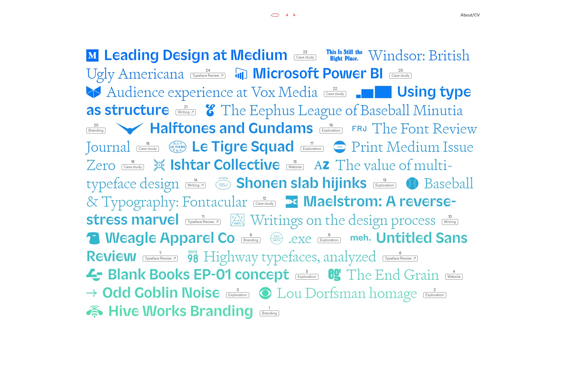
Bethany Heck’s portfolio has what might be one of my favorite URLs of all time: heckhouse.com. Also, the entire portfolio consists of project titles, sometimes joined by the logos associated with the project. Some lead to external links, and others to lightly art-directed sub pages with impeccable typography.

It’s so simple, yet it slams you in the eyeballs with lots of high-quality, high profile work all at once. I love it.

Platform: WordPress

Nicky Tesla

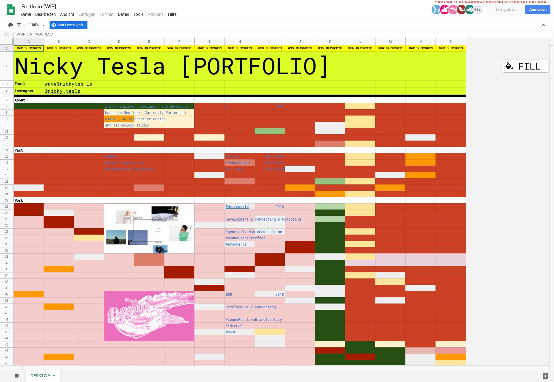
If you keep up with various design blogs and news sites, you might have seen Nicky Tesla’s portfolio, and for good reason: it’s a spreadsheet. No, it doesn’t “look like” a spreadsheet, we’ve had those before. It’s literally a publicly available spreadsheet on Google sheets, with a domain attached to it.

I wouldn’t call it the most usable site, what with a few text contrast issues, but on the whole… it works. And it’s certainly intriguing. There’s also a mobile-specific version that is a lot easier to read.

Platform: Google Sheets

Pixelfish

Pixelfish is a fairly standard business site, but it’s good-looking for all that. Just a simple, good website. Can never have too many of those around.

Platform: Concrete5

Alex Faure

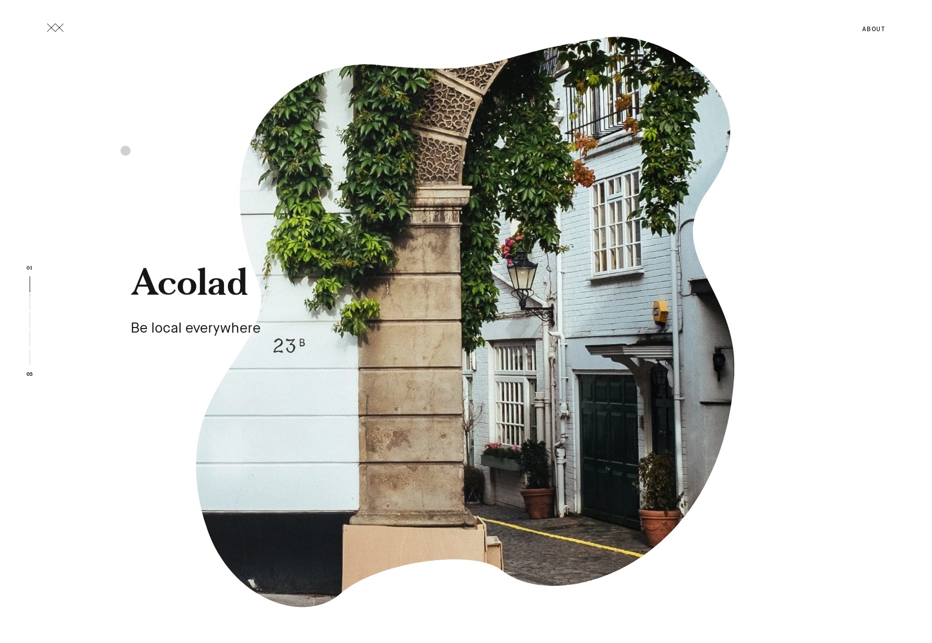
Alex Faure’s portfolio brings us more blobs, but with pictures in them! Everything else about the site is almost “standard elegant minimalist portfolio”, but the blobs make it stand out amongst the other sites in the genre. It’s gorgeous.

Platform: Static Site (or a CMS based on Node)

Ada Sokol

Ada Sokol’s portfolio uses that “preview on hover” technique popular with many artsy portfolios, but adds a sort of pseudo-3D smudge effect to the mix. The rest of the layout is familiarly asymmetrical with overlapping elements, but it’s always nice to see a small new twist added to an old formula… Even if the formula’s not actually that old yet.

Platform: WordPress

Shonen

Shonen is, as far as I can tell, some sort of art portfolio. It goes hard on the minimalism, monospaced type, and a typeface called MAD sans that I have just now fallen in love with.

Platform: Squarespace

ONNO

ONNO brings us a classically modernist (Is that a thing, now?) portfolio that focuses on white space, gray backgrounds, and the occasional light drop shadow. It’s simple, reliable stuff, and always looks elegant. And it works without JavaScript!

Platform: Static Site

Kairos Studio

Kairos Studio is our one video-focused portfolio on this month’s list. They keep it simple: scroll down to watch videos (silently!) play. The navigation in particular interests me because it combines primary navigation with contextual navigation based on where in the site you are. Sure, the text is a little small, but I’d like to explore the basic concept further.

Platform: Static Site

PBDA

Have you ever seen a semi-post-minimalist collage-style industrial-artsy site in Russian? Well now you can, because that’s the only way I can describe PBDA. With all of that, plus the bold yellow, it’s a site that takes familiar elements and turns them into something of a spectacle. I want more.

Platform: Custom CMS (probably)

Vincit

Vincit is a pretty large design studio with a lot of high-profile work, so their style runs toward the business-friendly minimalism in such a way that their whole site looks a bit like a tech company advertisement.

It’s also a highly varied design, that evolves rather dramatically as you scroll down the main pages of the site. I particularly like the animations as well, because they run fast. You can tell they’re there, but they don’t ever slow the experience down.

Platform: Craft CMS

3 Sided Cube

3 Sided Cube is an app development company, so it makes sense that they lean hard into the “programmer” aesthetic with monospaced type. They mixed all of that up with bright colors and distinctly presentation-style layout and navigation to create a site that’s bold and brash while still being easy enough to read.

Platform: WordPress

LOOP

LOOP is on the list because it’s pretty. The site’s look is pretty standard business-minimalism, but don’t let that stop you from enjoying a well-crafted portfolio site.

Platform: Craft CMS

5S

5S is a content studio that starts off with a bold promise, and goes on with a boldly modernist aesthetic that combines some pastels, some light illustration, and a fair amount of the now-requisite animation. The aesthetic feels a little odd sometimes, but hey, that’ll just make it stick in your head better.

Platform: WordPress

ejeeban

ejeeban is a Malaysian design studio that embraces the now-familiar put-a-grid-in-the-background trend, combined with pretty good type, and the occasional use of (gasp) texture. I know! None of the individual elements of the design are particularly new, but the overall effect is nonetheless striking and memorable.

Platform: Custom CMS (Probably)

Voga

Voga gives us more blobs! What is that now, three? Anyway, we’ve got blobs, minimalism, beautiful typography, and a very strong focus on using photos to show off their work in the real world.

Platform: WordPress

Add Realistic Chalk and Sketch Lettering Effects with Sketch’it – only $5!

Source

Categories: Designing, Others Tags:

The Dark Side of the Grid

March 10th, 2019 No comments

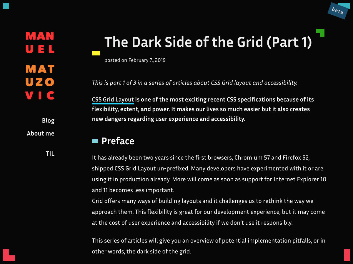
Manuel Matuzovic makes the point that in order to use CSS grid in some fairly simple markup scenarios, we might be tempted to flatten our HTML to make sure all the elements we need to can participate on the grid. What we need is subgrid and non-buggy display: contents;, so I’d like to think in a year or so we’ll be past this.

Direct Link to ArticlePermalink

The post The Dark Side of the Grid appeared first on CSS-Tricks.

Categories: Designing, Others Tags:

Popular Design News of the Week: March 4, 2019 – March 10, 2019

March 10th, 2019 No comments

Every week users submit a lot of interesting stuff on our sister site Webdesigner News, highlighting great content from around the web that can be of interest to web designers.

The best way to keep track of all the great stories and news being posted is simply to check out the Webdesigner News site, however, in case you missed some here’s a quick and useful compilation of the most popular designer news that we curated from the past week.

Note that this is only a very small selection of the links that were posted, so don’t miss out and subscribe to our newsletter and follow the site daily for all the news.

WDRfree – Free Web Design Resources Library

Site Design: Superrb

Stop Using Responsive Design

The Google Cemetery – A List of Dead Google Products and Why They Died

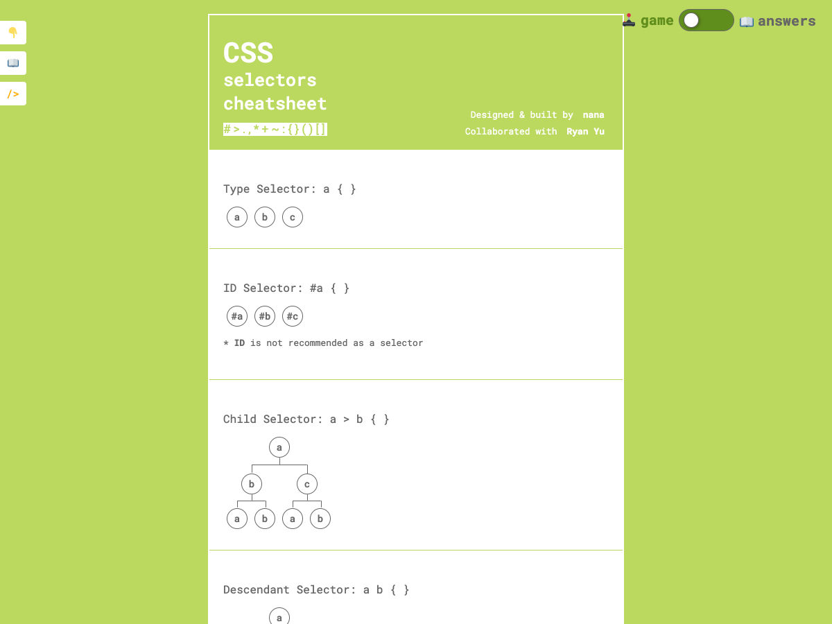
CSS Selectors Cheatsheet

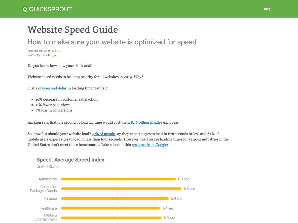
Website Speed Guide

You are Killing Me with your Tiny Fonts

Site Design: Mixpanel

Introducing Latitude: Flexport’s Design System

Effective Use of Gradients in Design

20 CSS Color Palettes

This is the Best Ad Blocker We’ve Seen (and Heard)

The Top Ten Fonts of 2018 at YouWorkForThem

Accessible Brand Colors

The Bottleneck of the Web

Best Practices: Component, Styles, and Shared Libraries

The Dark Side of the Grid

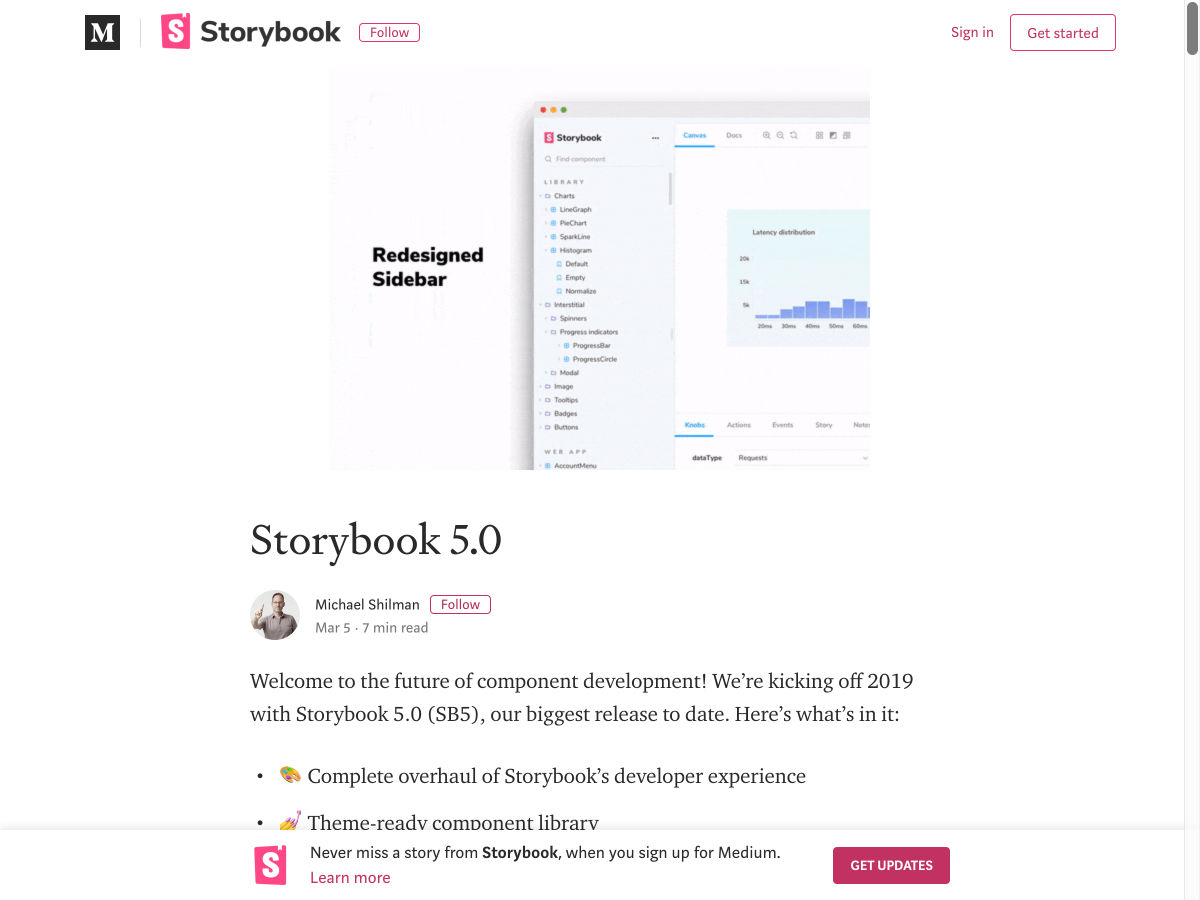
Introducing Storybook 5.0

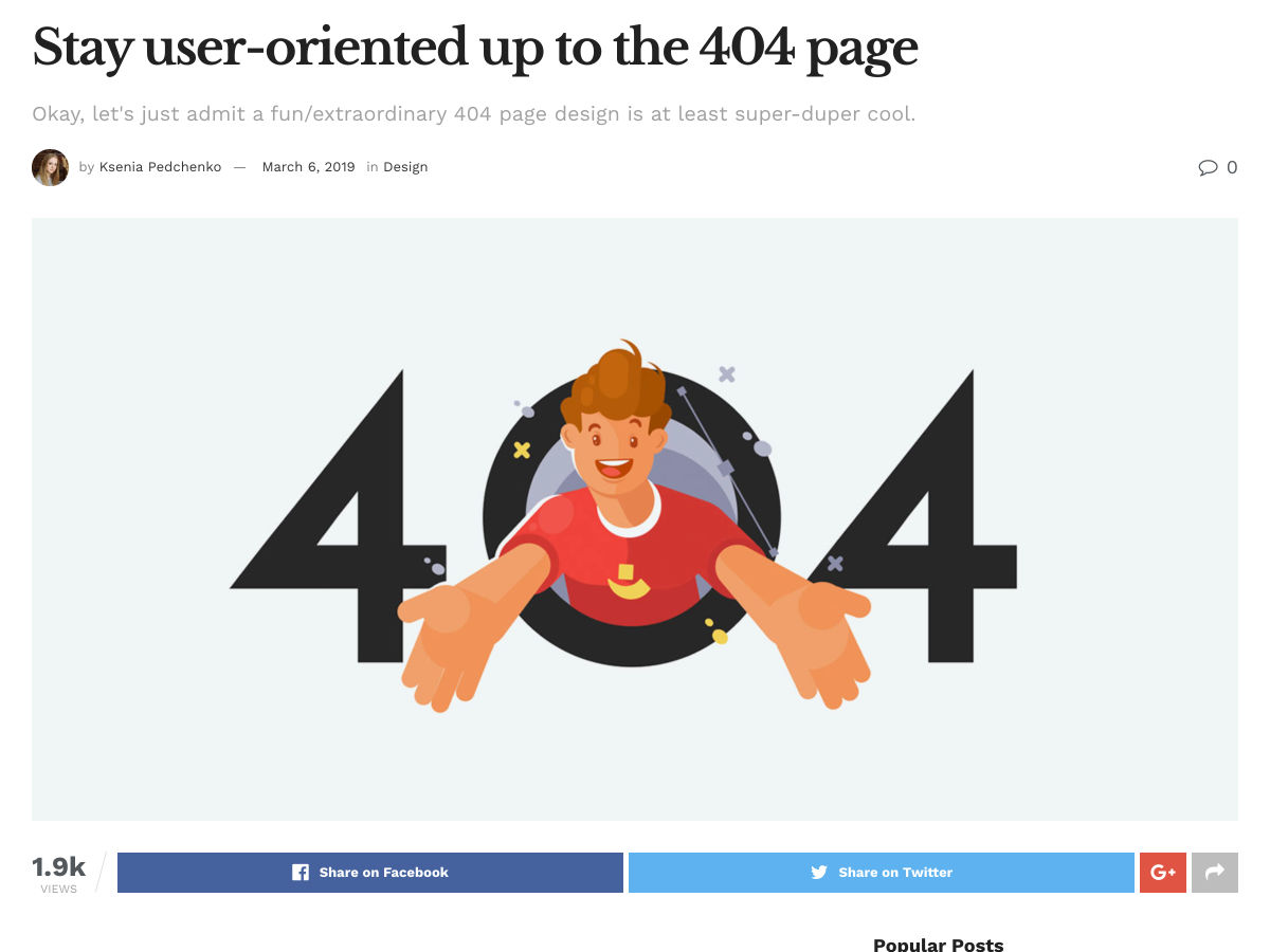
Stay User-oriented up to the 404 Page

28 Design Tools in 28 Days

EditorConfig: Consistent Coding Styles Across Various Editors and IDEs

Best Free Photo Editing Software 2019

5 Awesome Tips to Grow your Business with Instagram

One Minute of Silence for Digital Design

There are 7 Types of Logo Designs

Want more? No problem! Keep track of top design news from around the web with Webdesigner News.

Add Realistic Chalk and Sketch Lettering Effects with Sketch’it – only $5!

Source

Categories: Designing, Others Tags:

HMTL, CSS and JS in an ADD, OCD, Bi-Polar, Dyslexic and Autistic World

March 8th, 2019 No comments
A black and white tree illustration.

Hey CSS-Tricksters! A lot of folks tweeted, emailed, commented and even courier pigeoned (OK, maybe not that) stories about their personal journeys learning web development after we published “The Great Divide” essay. One of those stories was from Tim Smith and, it was so interesting, that we invited him to share it with the broader community. So, please help us welcome him as he elaborates on his unique personal experience and how it feels to be in his shoes as a front-ender.

Hi folks, my name is Tim Smith

I have ADD, OCD, Bi-Polar, Dyslexia… and not to mention that I am on the Autism spectrum. This combination (apart from causing me to feel a lot of personal shame) makes coding very hard — especially learning how to code, which I am trying to do. Things get mixed up in my head and appear backwards to the point that I find it nearly impossible to focus any longer than 15-20 minutes at a time. Perhaps I will expand on this in another post. Even now as I write this, I feel pulled to rate each song on YouTube Music and attempt to correct every mistake I make. And since I keep switching “write” with “right,” this becomes infuriating and discouraging, to say the least.

I do not read well, so learning from books is the least effective way for me to learn (sorry O’Reilly). Online tutorials are OK, but I tend to sell myself short by being lazy with copy and paste for the code examples. If I force myself to hand-type the examples, I get the benefit of muscle memory but drown in the words of the tutorial and eventually lose interest altogether.

Video tutorials are my ideal learning method. There’s no reading involved and no way for me to copy and paste my way out of things. Having to stop and start the videos in order to type the code is maddening, but well worth it. YouTube is a great place for video tutorials if you have the patience to wade through them… which I don’t.

I found Chris Coyier in the early 2000s. The treasure trove of articles, guides, and videos contained here on CSS-Tricks has been a major benefit for me and actually progressed my ability to learn code. Later, I found Wes Bos. He, too, has been a leading contributor to my web learning. Wes unlocked many of the things I struggled with, namely React and the new features of ES6.

Together, I’d say Chris and Wes are responsible for at least 80% of my collective front-end knowledge. (Personal aside: Chris and Wes, you two are my heroes and secret mentors.) Both Chris and Wes have a way of giving me the information that’s relevant to what I’m learning in a way that is fun and entertaining as well as straightforward and precise. They don’t just present the code; they explain the why and history behind each topic. Wes is a little better at this, but the sheer number of videos Chris has created has kept me busy for years and will continue to into the future.

Simply writing code is another effective way for me to learn. I like to geek-out and setup development servers for various web languages and libraries and play around. I have learned a lot about MacOS and Linux (mostly Ubuntu) while also learning the basics of many web languages and libraries: PHP (for WordPress themes), Python, React, Vue and many others. I learned to embrace the command line and avoid GUIs when possible. Nothing against GUIs; I simply find the command line more precise (and just between you and me, way cooler to brag about to non-coders).

I still do use the command line — or at least I would if I still had a laptop or desktop to work on. I am actually writing this on an iPad Mini 2. However, I have found another great way to write and share code without the need to set up servers and complicated environments: CodePen. I joined an early beta way back when and it was love at first sight. I can now write code, share it and get feedback all in one place (here’s my profile). Every time I get a fun idea or find a fun kata, I fire up Codepen and just start coding. No tricky dev setup. There are other apps that do this but CodePen is unique because of the social aspect and the ability to easily embed code samples on forums.

So, that’s a little about me. What I want to get into is how I learn HTML and CSS because it’s probably somewhat similar to yours, but different than how you might have gone about it.

Breaking into HTML

I learned HTML in a few different ways. At first, I would look at the source code of popular web sites. In the early nineties, when I started to learn HTML many, if not most, web browsers had the ability to show the source code of a website. I saw all of the tags, how they were used and the basic structure of the sites. I was able to reverse-engineer them. I had not learned CSS at the time, so my first websites were single column and very boring.

Quick aside: Without CSS, all websites are perfectly responsive and look great on any device or screen size. We break them with CSS, then need to fix them… ponder that a bit.

Thanks to source code, I began reading articles on the web and studied constantly. I found the DreamInCode forum which serves as a forum for all code disciplines and languages — similar to StackOverflow because, like StackOverflow, the people were arrogant and rude to newbies, at least in my experience. Still, I was able to see how people approached various HTML concepts and problems and this was the springboard upon which I launched my learning adventure. I received blunt, often harsh feedback on my code examples. As hard as it is to hear hard criticism, it benefitted me as it taught me the right and — even more importantly, the wrong — way to approach and write HTML.

Like most things, writing and mastering HTML is all about trial and error. I had to create hundreds of horrible websites (if you could call them that) before it “clicked” for me. But that’s better than nothing, as we’ve all heard it said before:

Just build websites!
— Chris Coyier

It was not long after that I was introduced to CSS, and then the real journey began…

Along came CSS

Tree illustration with green background

The easiest way for me to describe CSS is this: It’s the code that makes your HTML look nice.” I had to adopt a KISS attitude as I learned CSS because I found that I was overthinking it. CSS is simple if you let it be. Let’s have a look:

See the Pen
Thing
by Tim Smith (@WebRuin)
on CodePen.

This is about as simple as CSS is. Name your block in HTML (e.g.

...

), then target that name in a CSS file with properties to describe the block, like colors, borders, font treatments among much, much more.

At first, I would spend all my time trying to memorize as many CSS properties as I could. I would “Alta Vista” (remember that?!) around for what sort of things others were doing with CSS and how they were doing it. This was fun and informative but only served to confuse me to no end. Trying to reverse-engineer CSS as I did with HTML only got me so far. My memory for stuff like this is poor, at best. I had to step back, take a deep breath (literally and figuratively) and find a new approach.

My thought process typically goes something like this:

  1. Do I want the words to be black? If so, do nothing
  2. What about the background color? The default white is boring so… give it a background color.
  3. How big do I want the element to be? Don’t overthink this as far as measurement units go, because pixels are fine and, well, height and width seem pretty logical to me.

And so on. Simple questions with simple property names. My point is you can do some amazing things with simple CSS. It was that simplicity that made me want to learn and apply everything I found. But, at the same time, I was so overwhelmed that I almost quit web development for good. It’s an awkward conflict: the simplicity and elegance are welcoming and fun but the myriad possibilities are dizzying and impossible to retain.

What worked for me was taking an incremental approach to learn CSS. By starting small and slowly adding more as I truly learned and understood the properties. I found I could have fun and be creative at a comfortable pace without putting too much pressure on myself.

I won’t lie. I am not a designer. Given a blank canvas, I will freeze or come up with a mediocre design that’s derivative of a mish-mash of other designs I like. That said, I am great at coding a design that someone with actual design skills can put together (like this).

I fell in love with CSS for one reason: it is the perfect balance of logic and design. A lot of coding is like this. Code can be beautiful, but CSS is the bee’s knees for me!

JavaScript is hard! But I’m trying.

Full color tree illustration

HTML and CSS came relatively easily to me. I stumbled a bit on CSS Grid and some of the more advanced stuff, but it just clicked for me. As I alluded to earlier, I am a visual learner. Both HTML and CSS are inherently visual languages, and they give me the instant gratification my ADD needs. Both are straightforward and commonsensical to me.

In contrast, Javascript is something I find to be very, very difficult. It is a logic-based language which would ordinarily be my cup of tea; nevertheless, I have found it challenging to “click” with. Despite a few epiphanies while learning it, JavaScript seems to elude me beyond the basics. I have completed Wes Bos’ JavaScript30 course along with many other tutorials. They make sense in the moment it’s being explained to me, but even still, when presented with a “blank canvas” so to speak, I forget most of the concepts and either write the same ol’ stuff over and over or simply give up.

Surprisingly, React came much more naturally to me. I think it has to do with its modularity and my love for blocks, LEGOs, and puzzles. I have learned it well enough that I have been able to be creative with it and have started writing an app with it: a crowd-sourced urban bathroom locator. I have written and rewritten the start of the app with various Flux libraries and backend data libraries. I invariably give up only to start again, like the famous definition of insanity. I just keep thinking I will figure it out and/or find someone to do the hard parts for me.

My roadblock with React is JavaScript, of course. That may not make sense, but remember my stance on blocks. I know React is JavaScript. To me, though, it is quite different than vanilla JavaScript. Closures, pure functions, arrow functions, let vs. const vs. var, the enormous set of built-in methods, not to mention imported libraries, classes, and of course, my nemesis, Big O (how I loath Big-O)… my head is spinning even as I write this.

I want so badly to be, at the very least, decent at Javascript so I keep trying. Hundreds of tutorials, code schools like freeCodeCamp.org, Treehouse, Khan Academy, and yes, even muscling through many books (I love JavaScript: The Good Parts).

I have no trouble learning the syntax. The hangup, I think, lays in a lack of computer science knowledge and this inability to think mathematically. Algorithms make sense in concept, but their practical application simply blows my mind.

For mental health reasons, it was necessary for me to step away from my web development career in 2005. I was able to get back into it around 2010 when I worked for a few startups, but I never truly got back in. Javascript is my Achilles heel. I was lucky to find a few jobs that were truly light on JavaScript so I could focus on HTML and CSS — the things I thought added up to front-end development — but inevitably, I was expected to write JavaScript beyond basic interface enhancements and the jobs fell apart. So I either quit or was fired.

The ongoing search for work

Animated version of all tree images from start to finish.

Looking for work in recent times has been a nightmare! We now live in a world dominated by JavaScript and it seems no one wants a front-end developer whose strengths lie in HTML, CSS with an intermediate knowledge of Javascript — especially those without a degree in Computer Science. I can’t even find a job posting for this on any major job site.

I have had the honor of interviewing with recruiters at Facebook, Google, and Apple but I could not get past the first round of phone screening. I was asked questions that I felt have little-to-nothing to do with what I understand front-end development to be. There were no questions about CSS best practices and even nothing about semantic HTML or the proper use of ARIA attributes. All they seemed to care about was Big O and efficient loops. Even interviews with smaller companies were like this. Have services like Wix and the like taken all the core front-end jobs away?

Despite all the challenges I have faced, I feel I have mastered HTML and CSS and have a baseline grasp on JavaScript. I am very proud of that. While I dream of getting a job at a large company like Facebook, Google, or Apple, I really just hope to find a role where my HTML and CSS skills will shine and I can gain real-world experience with JavaScript as a junior developer with the benefit of mentoring somewhere, like the San Francisco Bay Area where I currently live.

We all have different learning styles and paces, so don’t give up before you have tried every possible way to learn what you are trying to do. And, if you come up with a new way, please share so we can all broaden our individual and collective knowledge.

I hope this article has reached at least one other developer like me! Thank you to all my predecessors. Happy coding!

The post HMTL, CSS and JS in an ADD, OCD, Bi-Polar, Dyslexic and Autistic World appeared first on CSS-Tricks.

Categories: Designing, Others Tags:

Can You Make More Money With A Mobile App Or A PWA?

March 8th, 2019 No comments

Can You Make More Money With A Mobile App Or A PWA?

Can You Make More Money With A Mobile App Or A PWA?

Suzanne Scacca

2019-03-08T13:00:16+01:002019-03-10T22:34:36+00:00

Let’s be honest. The idea behind building mobile apps, websites or any other branded platforms online is to make money, right? Your clients have contacted you to do this for them in order to maximize their results and, consequently, their profits. If money didn’t matter, they’d use a free website builder tool to throw something — anything — up there and you’d no longer be part of the equation.

Money does matter, and if your clients don’t see a huge return on their investment in an app, it’s going to be quite difficult to sustain a business built around designing apps.

Today, I’m going to talk about why app monetization needs to be one of the first things you think about before making a choice between designing a mobile app or PWA for your clients. And why the smartest thing you can do right now is to steer profit-driven clients to a PWA.

Your Guide To Progressive Web Apps

There are a lot of pain points that users face when browsing old non-PWA websites. Make sure you’re familiar with important technologies that make for cool PWAs, like service workers, web push notifications and IndexedDB. ?

PWA vs. Mobile App Monetization: Consider This

I’ve been watching the MoviePass app closely since it came out. Part of me wanted to hop aboard and start reaping the benefits of the too-good-to-be-true movie app’s promise, but part of me just didn’t see how that kind of business model could be viable or sustainable.

For starters, the subscription service was way underpriced. I realize the makers of the app hoped that many users wouldn’t use their subscriptions to the fullest, or at all, which would then drive profits up on their end. They had a similar suspicion regarding the amount of data they’d be able to mine from users and sell to advertisers and marketers. But, in 2019, that all seems to have been faulty logic with the app in a major downward spiral of profit loss.

It just goes to show you that no matter how popular your mobile app may be, it’s really difficult to make a profit with one. Now, “difficult” does not mean “impossible”. There are certainly mobile apps that make incredible amounts of money. But just because you can make money with a mobile app, does it mean it’s the smartest option for your client? If your client’s end users are craving a convenient, fast and intuitively designed app experience, couldn’t you give them a PWA instead?

If you look at the big picture, you’ll find that there’s a greater opportunity to make money (and, not only that, make a profit) with a PWA when compared to a mobile app.

Let’s explore how we get to that point and how you can use these calculations to determine what the best option is for your client.

  1. The Cost To Build
  2. The Cost To Maintain
  3. The Cost To Acquire Users
  4. The Cost To Monetize

#1: The Cost To Build

Building an app is no easy feat, whether it be a native mobile app or PWA. According to Savvy, there are three tiers of mobile app development options:


Savvy app cost estimates
Savvy breaks down app building costs into three categories (Source: Savvy) (Large preview)

According to Savvy, small development shops may charge up to $100,000 to build an app. App development agencies can charge up to $500,000. And those targeting enterprises may bill up to $1,000,000.

That said, PWAs aren’t cheap either.

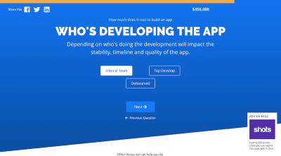
Give Otreva’s “How Much to Build an App” calculator a try. These are the estimated costs I received (top-right corner) to build an e-commerce mobile app that’s feature-rich:


Otreva calculator mobile app calculations
Otreva calculates the cost of building an ecommerce app to be $356k. (Source: Otreva Calculator) (Large preview)

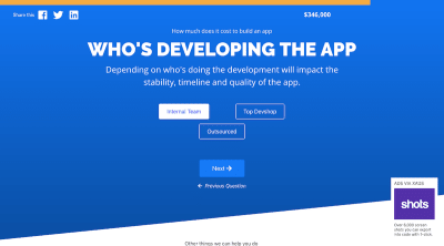
Compare that to the estimated costs to build a progressive web app with the same exact features:


Otreva calculator PWA calculations
Otreva calculates the cost of building an ecommerce app to be $346k. (Source: Otreva Calculator) (Large preview)

Although the costs here aren’t too far apart, I don’t suspect that to be the case when building less robust apps for clients. As you decrease the amount of features included, you’re likely to find that the gap between the cost of mobile apps and PWAs grows.

Even so, let’s say what you plan to build is comparable in pricing regardless of which app you choose. Keep in mind that these calculators don’t take into consideration the cost of building out the backend server environment (which is something a PWA doesn’t need). Plus, when you compare the timeline of developing a mobile app against a PWA, mobile apps will almost always take longer as you have to build an app for each of the stores you want it to appear in.

So, when you consider the upfront costs of building an app, be sure to look a bit more closely at everything involved. At some point, the revenue you generate is going to have to make up for that investment (i.e. loss).

#2: The Cost To Maintain

Software of any kind must be updated regularly — as does anything you build with it. That’s because designs go stale, security bugs require patches and performance can always be improved. But the way you manage and maintain mobile apps vs. PWAs is incredibly different.

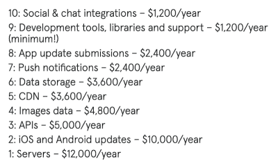
BuildFire has a great roundup of the hidden costs that come with having a mobile app. In it, author Ian Blair shares the most expensive maintenance costs associated with apps:


Hidden mobile app costs
BuildFire estimates the most expensive mobile app hidden costs. (Source: BuildFire) (Large preview)

Some of these will certainly overlap with PWAs. However, take a look at these three that are specific to mobile apps:

  • App update submissions = $2,400
  • iOS and Android updates = $10,000
  • Servers = $12,000

That’s why you’ll find that most estimates put the cost of annual mobile app maintenance at about 20% of the original upfront cost to build it.

One thing that’s missing from this breakdown is the time-cost of maintaining a mobile app. Because not only are updates costly to manage, but they take a while to happen, too, as app stores have to review any changes to the software or content you’re attempting to push through.

PWAs are significantly easier and cheaper to maintain as they’re web-based applications. So, it’s not all that different from what you would do to keep a website up-to-date.

Yes, the surrounding web hosting architecture, SSL certificate, payment gateways and other integrated technology will require monitoring and maintenance. However, a lot of that stuff is managed by the provider itself. Most of what you have to concern yourself with in terms of maintaining a PWA is the update piece.

When the underlying software has an update available or you simply want to make a change to the content of the PWA, you can push it through to your site (after testing on a staging server first, of course). There’s no app store process you have to follow or to wait for approval from. Changes immediately go live.

Recommended reading: Native And PWA: Choices, Not Challengers!

#3: The Cost To Acquire Users

Once you have a handle on how much the app itself costs, it’s time to wrap your head around the cost of customer acquisition. This is where we’ll start to see PWAs pull far ahead of mobile apps.

For example, here are all the things you have to do in order to acquire users for a mobile app:

Get An App Store Membership

Pay the $99/year Apple Developer Program membership fee or pay the $25 one-time fee to create a Google Play Developer account. You can’t publish to the stores without them.

In-Depth Market Testing

Because a mobile app is such an expensive investment, you can’t afford to throw something into the app store without first doing in-depth audience research and beta testing.

This means looking at the current app market to see if there’s even a need or room for your mobile app. Then, study the target audience and how they’re likely to stumble upon it and convert. Once you have a good hypothesis in place, beta testing will be key to ensure you have a viable strategy in place. (It’ll also be quite expensive, too.)

Decide On A Customer Acquisition Model

Getting someone to install your app from an app store is one thing. Getting users to become an actual customer is another. If you haven’t done so already, figure out what sort of action you’ll require of them before you’re willing to call them a “customer”.

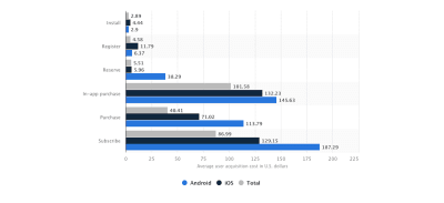
Statista’s 2017–2018 data on the average mobile app user acquisition costs might have you reconsidering your original choice though:


Mobile app customer acquisition costs
Statista presents estimates for the cost of mobile app customer acquisition. (Source: Statista) (Large preview)

Not only is there a great discrepancy between acquiring a user who’s willing to install your app and someone who’s willing to pay for a subscription, but there’s also a large discrepancy between the cost of converting Android vs. iOS users.

You might find that the monetization model you had hoped to use just won’t pay off in the end. (More on that down below.)

App Store Optimization

Publishing a mobile app to an app store isn’t enough to guarantee users will want to install it. You have to drive traffic to it within each app store.

If you don’t have a tool that’ll help you write descriptions and metadata for the listing, you’ll need to hire a copywriter or agency who can help (and they’re not cheap). Plus, don’t forget about the screenshots of the app in action. There’s still a bit of work to do before you can get that app out to the app stores for review and approval.

Build A Website

Yep, that’s right. Even though your client has spent all this money to build a mobile app, they’re still going to need a website when all is said and done. It’s not going to be a duplicate of the app store though. All they really need is a high-converting landing page that’ll rank in search, bring attention to the app and help drive engaged leads to it.

That said, websites cost money. You’ll need a domain name, web hosting, SSL certificate and perhaps a premium theme or plugin to design it.

Get Good Press

Because you can’t leverage regular ol’ search marketing to drive traffic to your app (since there’s no link to share), you have to rely on online publications and influencers to talk it up on your behalf. You should also be doing this on your own through social media. The only thing is, organic social media marketing takes time.

If you want good press for your mobile app, you’ll have to use paid social ads, search ads and affiliate relationships to help you spread the word quickly.

Retention Rate Optimization

One final customer acquisition cost to factor in is retention rate optimization. As we’ve seen before, all it takes is 30 days for a mobile app to lose up to 90% of its user base. If you’re not continually evaluating the quality of your app and refining it to create a better experience, you might as well double the cost of customer acquisition now.

Consumers, in general, aren’t as eager to spend money with new brands and definitely don’t spend as much as long-time customers do. If you don’t have a plan to develop ways to breed loyalty with current ones, your mobile app is going to bleed a lot of money along the way.

On the other hand, there’s a lot less you must do to acquire users for a progressive web app:

Search Engine Optimization

A PWA is already on the web, so there’s no need to build an additional website to promote it. All you need to worry about now is optimizing it for search. You could do this on your own with free keyword tools and SEO plugins.

However, it’s probably worth investing in an SEO pro or agency if you’re trying to get the app to the top of search ASAP.

Paid Promotions

There’s no need to go to the extent of a mobile app with press pitches, affiliate links or influencer marketing. Instead, you can use paid ads on social media and Google (all within a reasonable budget) to increase the presence of your PWA in search.

Leverage The “Add To Homescreen” Button

Unlike mobile apps which need users to find them within app stores, PWAs are searchable. However, if you’re trying to retain these users and convert them into customers, your best bet is to put the “Add to Homescreen” button in front of them like The Weather Channel does.


Weather Channel PWA add to homescreen
The Weather Channel asks visitors to add the PWA to the home screen. (Source: The Weather Channel) (Large preview)

All it takes it one click and they’ll have instant access to your PWA right from their mobile homescreen.

#4: The Cost To Monetize

That doesn’t make sense, does it? The “cost” to monetize? Sadly, it does.

Before I explain the costs, let’s discuss the kinds of monetization that are available for each.

Mobile App Monetization

Paid apps are ones that are completely gated off unless a user pays for subscription access. The New York Times does this, though it gives users a handful of articles to read for free to give them a taste of what they’re missing.


New York Times app subscription
The New York Times app is subscription only. (Source: The New York Times) (Large preview)

Freemium apps are ones that are mostly free, but ask for payment to access certain parts of the app. An example of this is Jackpot Magic Slots, which allows users to create competitive clubs like this one which requires “member” funding:


Jackpot Magic Slots club funding
Jackpot Magic Slots enables users to create clubs that receive funding. (Source: Jackpot Magic Slots) (Large preview)

The catch is that users will inevitably need to purchase coins or spend a lot of time gambling in the app in order to afford those funding fees. So, Jackpot Magic Slots is indirectly making money off of its users.

In-app purchase apps are ones that allow unfettered access to the app. However, they ask for payment from users that want to upgrade their experience with in-app currency, premium features and more. Words with Friends sells Power Ups, Premiums and Coins to customers who want to get more out of their gameplay.


Words with Friends upgrades
Words with Friends charges for in-app upgrades. (Source: Words with Friends) (Large preview)

Sponsored content apps are ones that publish sponsored ads and content to generate revenue. Facebook, of course, is a master of this seeing as how it’s nearly impossible for businesses to get in front of users otherwise:


Facebook business ads
Facebook is basically a pay-to-play platform for businesses. (Source: Facebook) (Large preview)

Ad-free apps are ones that accept payment to remove intrusive ads from getting in the way of the app interface.

eCommerce apps are ones that sell goods through their own payment gateways as Fashion Nova does:


Fashion Nova ecommerce
Fashion Nova has a mobile app store, too. (Source: Fashion Nova) (Large preview)

Free apps are just what they sound like. However, they aren’t typically available to the public at large. Instead, loyalty users, enterprise customers and others who pay for a premium service in person or online gain access for free.

There’s another way free apps make money and that’s to reward users for referring others to it as is the case with Wordscapes:


Wordscapes referral rewards
Wordscapes rewards users for inviting others to join the app. (Source: Wordscapes) (Large preview)

It might not lead directly to cash in the bank for the app, but it does increase the amount of word-of-mouth referrals which tend to be more valuable in the long run anyway.

The Cost…
As great as all these monetization methods are, there are two big things to note here in terms of what mobile app monetization is going to cost you:

Mobile app stores take a portion of money earned through your app. More specifically, app stores take 30% of your earnings.

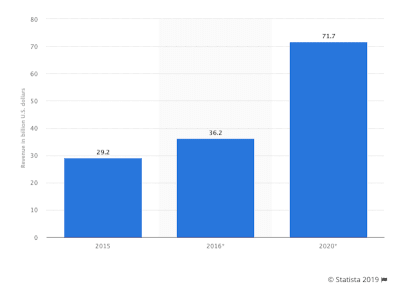
This becomes obvious when you compare app store revenues:


Mobile app store revenue
Statista tracks mobile app store revenue trends from 2015 to 2020. (Source: Statista) (Large preview)

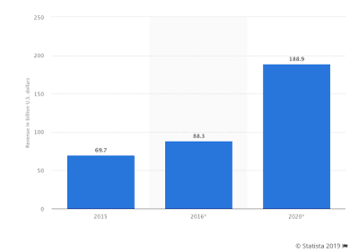
Against mobile app revenues:


Mobile app revenue
Statista tracks mobile app revenue trends from 2015 to 2020. (Source: Statista) (Large preview)

Note that the app store revenues shown above are about a third of total mobile app revenues. So, your earnings with a mobile app are more like 70% of your projected total earnings.

Another monetization “cost” you have to think about is the fact that app stores don’t pay you out right away.

According to Apple:

Payments are made within 45 days of the last day of the month in which book purchases were made. To receive payment, you must have provided all required banking and tax information and documentation, as well as meeting the minimum payment threshold.

Not only that, but you have to meet a certain minimum threshold. If your app doesn’t generate over a certain limit based on which country you operate out of, you might have to wait longer.

According to Google:

In many cases, Google will initiate a payment on the 15th day of each month or on the next business day, if your bank account has been verified and you’ve reached a minimum balance, which varies by region.

Google’s minimum threshold is much higher than Apple’s, so you could end up waiting even longer to get paid your app earnings.

In sum, not only are you paying the app stores a membership fee and letting them take a good chunk of your earnings, but you’re paying with your time as well.

PWA Monetization

Subscriptions: Just like mobile apps, PWAs can sell premium access. The Financial Times is an online newspaper that sells premium access to its stories through its PWA:


Financial Times PWA subscription
Financial Times has a PWA that’s subscription-only. (Source: Financial Times) (Large preview)

Freemium access: Since you’re not apt to find a lot of gaming apps as PWAs, freemium access won’t come in the form of things like in-app upgrades. Instead, you’ll see examples like The Billings Gazette which offer subscriptions for a more streamlined news-reading experience:


Billing Gazette monetizes a streamlined experience
The Billings Gazette offers survey-free articles for a subscription. (Source: The Billings Gazette) (Large preview)

Advertising: Ads have been a part of the web’s monetization model for a long time now, so it would be odd for PWAs to ignore this obvious choice. Forbes is one such example that uses a lot of advertising on its PWA:


Forbes PWA ads
Forbes makes the most of its ad space on its PWA. (Source: Forbes) (Large preview)

Affiliate marketing is another way to collect ad revenue with PWAs.

eCommerce: Traditional ecommerce sales can take place on PWAs, especially since an SSL certificate is required in order to have one. Debenhams is a nice example of a PWA that sells products online through a PWA to generate revenue.


Debenhams ecommerce PWA
Debenhams attracts mobile shoppers with its ecommerce PWA. (Source: Debenhams) (Large preview)

But that’s not all. Any kind of business can easily convert its website into a PWA and continue selling its products, services, and downloadables. eCommerce monetization is available to everyone.

The Cost…
Compared to how many ways you can earn money with a mobile app, this might seem like a tawdry list. But here’s the thing:

When you make money with a PWA, it’s yours to keep. That is, aside from any affiliate commissions or e-commerce gateway fees you may owe. But neither of those come close to the 30% take the app stores claim.

Additionally, if you’re helping your client make the move from website to PWA (which is much more seamless than website to native app), you can expect a major leap in revenue generation almost right away.

Think with Google interviewed Mobify CEO Igor Faletski to see what sort of monetization trends his company has noticed when it comes to PWAs. Here’s what he said:

Not only can a PWA provide your customers with a richer mobile experience sooner, it can deliver a faster return on investment. And that ROI can potentially offset the cost and risk of the larger digital transformation project.
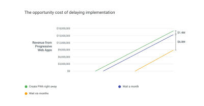
Our customers typically see a 20% revenue boost with a PWA, so every minute you don’t have a PWA is a minute spent with 20% less revenue on your busiest customer touchpoint. As an example, a retailer with $20 million in annual e-commerce revenue could lose $1.4 million by waiting a month to offer a PWA and another $6.8 million by waiting for six months.


PWA possible earnings timeline
Think with Google shows how much money you can earn if you launch a PWA today. (Source: Think with Google) (Large preview)

Want to see a real-life example of how businesses are earning more money by creating a progressive web app? Check out this story about JM Bullion.

Thanks to the major increase in speed with its PWA:

JMBullions.com’s smartphone conversion rate is 28% higher this month compared with the month prior to switching over.

Wrapping Up

Before you go rushing out to build a mobile app for your clients, think about the kind of ROI they can realistically expect compared to a PWA.

The upfront costs and ongoing maintenance of a native mobile app are huge. If your client isn’t generating huge sums of money right away (or even before launch), the app itself might not even be a sustainable venture.

However, if you look at the PWA counterpart, not only is it less expensive to build and maintain, but the turnaround times ensure that cash will start to flow in sooner rather than later. Plus, since PWAs are web-based, there’s really no secret to how much work is involved in optimizing them for search or marketing them to the world.

With a shorter learning curve and lower costs, it seems odd to opt for a mobile app when a PWA can provide nearly as good of an experience.

Further Reading on SmashingMag:

Smashing Editorial(ra, yk, il)
Categories: Others Tags:

The Hidden Costs of Minimalism in Design

March 8th, 2019 No comments

Minimalism is a trend that has largely defined the best part of the last decade. Its rise to prominence came as a reaction to the abundance of heavy styling which preceded it. It offered a simpler and cleaner design direction for websites and interfaces. Web and app designs became less complex in terms of styling, speeding up development time and resulting in digital products that loaded quicker.

As a design direction, minimalism has been around for a long time. Whether you look back at product design and companies like Braun, or to modernist architects like Mies van der Rohe, designers have always looked to simple forms for inspiration.

designers have always looked to simple forms for inspiration

In more recent times, it was the introduction of iOS 7 which really pushed designers away from the rich styles and effects we had become so accustomed to. Apple looked to create an interface that reflected the design of the Apple product hardware itself. The result included buttons replaced with thin ambiguous icons, little differentiation between elements, and a general lack of any sort of feeling: it was stark and severe. Since then, iOS has made some improvements while still opting for a direction that strips back as much detailing as possible.

Apple is always an intriguing example when it comes to minimalism in general. It brings up important questions surrounding aesthetics and user experience. As a company, their sales rely heavily on a reductionist technique. They sell products through apparent simplicity; creating something that anyone can look at and understand how it works and how to use it. Decisions like the removal of the headphone jack, I/O ports, and home button are all long-term decisions to work further toward this goal. This is what Apple was founded upon and why it created beautiful user-friendly products like the iMac G3.

Apple’s mice and keyboards are beautiful, but offer some of the very worst ergonomics to have ever been designed

But as you begin to look deeper into Apple’s minimalist design direction, it becomes clear that the aesthetics are by far the most important consideration to drive sales, and something of an obsession. Apple’s minimalist approach to product and software design is very much ‘one size fits all’. At a product and software level, this comes at a cost to user experience. For example, Apple’s mice and keyboards are beautiful, but offer some of the very worst ergonomics to have ever been designed. The sleek, low-profile designs cause wrists and hands to lie in unnatural positions and can put them under considerable strain over time. Contrast this with Microsoft’s offering which looks to a more balanced design which is simple but ergonomic.

You can also look to products like the iPod Shuffle 3rd Gen which removed the pause/prev/next track buttons for the sake of minimalism. It entirely took away its ease-of-use, replacing it with something that was aesthetically attractive, but lacking in any sort of consideration for the end user. It’s not just Apple who can be known to apply minimalism in such an extreme way. From magazine publishers to car companies, it’s present across almost all industries in some form. It’s a coveted style for consumers, thus providing an incentive for companies to produce products which fill this criteria.

The tradeoffs of minimalism in product design are much the same as in digital product and web design. It’s become the norm to push minimalism to extremes, rather than present a more balanced design. This often results in ineffective color schemes, a lack of element differentiation, poor accessibility, and frustrating navigation practices.

Primary actions are frequently hard to spot, using blacks/greys and ambiguous icons with no accompanying text label. Content typography is often too small, presenting accessibility issues for a great number of users and visitors.

It’s these design decisions which become destructive and can have a profoundly negative effect on users, particularly those most in need of adequate accessibility considerations.

Minimalism will always primarily be about aesthetics. It’s about taking away from a design, rather than adding to it, and making informed design decisions. Renowned architect, Frank Gehry, once summed minimalism up as a ‘dead end’. In this short interview, he highlights how minimalism strips a design of all emotion and feeling, and is always headed toward an extreme.

As a designer, it’s a difficult task to manage. On one hand, it’s a coveted trend with beautiful visual direction which can be impressive when implemented with care. On the other hand, the question is whether aesthetic considerations should even play such a large part in digital product design. The optimal design for accessibility and ease-of-use will rarely fall within the bounds of minimalism.

This suggests it should be confined primarily to visual areas of design; not areas that have usability at their core. That includes user interfaces, websites, and physical products too. More than anything, it’s about finding balance in design as opposed to taking it to either extreme, be it minimalism, or maximalism.

Add Realistic Chalk and Sketch Lettering Effects with Sketch’it – only $5!

Source

Categories: Designing, Others Tags:

10 Best Free Logo Maker Tools You Should Try In 2019

March 8th, 2019 No comments
Free Logo Maker Tools

The year 2019 welcomes the time of modernization and advancements. We are living in the world surrounded by the superhuman intelligence of AI and the fascination of augmented reality.

With the assistance of Machine Learning and AI-bots, graphic designing has become more interactive and intuitive. However, to execute such an advanced technology you must possess exceptional design skills and expertise to drive excellence using the professional software. You cannot rely on outdated methods and mundane techniques to generate innovations. You need to gear up with resources that can make you score a leading position and sustain it for longer.

Every aspect of a logo from its color to design aesthetics influences the target viewers. Your design must have the potential to connect and convince the viewers. It must have the comprehensive abilities to spread brand awareness, boost online presence and engage the target audience. You cannot simply rely on the fickle and elusive trends; you need to get your hands on a number of promising tools and software to create engaging logos. Moreover, remember that you need to be adaptable and smart if you want to outshine the best in 2019. To help you give a fistfight to your rivals, here is a list of top logo makers that guarantee the creation of compelling logos.

1- LogoVerge

LogoVerge is an AI-based free logo design tool that offers free logo creation to professional designers. The tool has a variety of ready-to-use of templates. With its seamless interface, it attracts millions of users from around the world. Making logo creation easier, it is equipped with an easy-to-use functionality. You simply have to drag and drop the elements to complete your design. If you lack design inspiration, you can sneak into its gallery and look for niche-specific icons, design patterns, and fonts.

Moreover, to assist designers, it has a broad range of color palette. You can adjust the intensities and tone to add the different effects. You can even try the color transition effect to add a compelling fair within your creation. Above all, it welcomes novices. A section of tutorials is there that guides the newbies about creating fascination in their design. Furthermore, with its efficient operating system, it facilitates users with highly intuitive and fast processing functionality. Get yourself registered, and you can enjoy the bundle of benefits.

Key Features:

  • AI-Based Custom Logos
  • Thousands Of Image Illustrations
  • Unlimited Options For Patterns And Icons

2- Canva

As fresh as its interface is, so are its design features- Canva is among the leading logo making tools present over the internet. Facilitating users with a vast variety of templates and industry-specific icons, the tool assist professionals as well as beginners in creating captivating graphics. You can bring a boost in your brand’s overall online presence by relying on a tool like this. Canva is equipped with billions of images, patterns and design features. It has image filters and free shapes to add appeal in your design. With the help of hundreds of fonts, you can make appropriate logos for your niche.

With its availability for a diverse range of platform- IOS, Android, or Windows, the tool provides the ability to resize and edit your logos. You can download the file in any format you want whether JPG, PDF or PNG. Moreover, upon subscribing for premium accounts, you get access to its promising directory of exclusive fonts, icons, and high definition templates.

Key Features:

  • Free Design Re-Edits
  • Social Media Buttons
  • Broad Range Of Color Palette

3- DesignHill

Designhill is an AI-based logo maker that assists users in making appealing logos within minutes. The tool, with its smart bots, quickly identifies the right features and requirements for each customer and offers a valuable suggestion. Achieving the highest rating, the tool within a short period has gained a lot of online recognition. You can browse through a vast variety of icons, pictures, industry-specific templates, and professional features. It’s the best platform to seek inspiration to create high-definition logos for your brand. Tailoring to your needs, the tool provides exceptionally customized logos with appropriate logo fonts and types.

Core Features

  • Downloadable high-quality vector files
  • Copyright ownership of your work
  • Multiple color variations for your logo
  • Unlimited design revisions
  • Social media kit for over 50+ logo design versions

4- Squarespace logo

Squarespace logo has made its name by offering limited but high quality features to users. It facilitates small-scale businesses with a variety of templates to save time in logo creation. Due to its sleek interface, many professional graphics designers recommend it. The tool has a comparatively smaller directory of icons and images, but it stands out for its unbeatable quality graphics.

The variety of tools and options to enhance a simple idea depict the superior traits the tool acquires. To add life to your idea, you have to sign up select your industry and then browse through the hundreds of design features. You can put a filter on your search and in no time get the best logo designed.

Key Features:

  • Unlimited Downloading
  • Millions Of Niche-Specific Templates
  • Smooth Functionality

5- Online Logo Maker

Knowing the amount of frustration users encounters when they come across troublesome interface with limited features, the Online Logo Maker has created a highly professional and sleek logo maker for you. It provides absolutely free logo creation with bundle of other features. Backed with powerful technology, the tool bridges the gap between creativity and resources.

Just when an amazing idea hits you, get on the tool and add life in it. You can accelerate the brand awareness and reach out to millions of users around the world by creating an authoritative brand personality using Online Logo Maker.

Key Features:

  • High Quality Vector files
  • Multiple color variations
  • Unlimited logo icons

6- DesignEvo

Aimed at bringing ease in the cumbersome process of logo designing the tool- DesignEvo is the premier logo making online tool. The tool is equipped with hundreds of high definition templates that occupy unique flair of creativity. You can create enticing logos all on your own whether you have prior designing experience or an expert at work.

It facilitates designers with various skills to unleash your creativity and spread glamour around the world by producing eye-pleasing logos. You can add icons and patterns to connect with viewers and boost its productivity.

Key Features:

  • Free to Use
  • Drag & Drop Interface
  • Hundreds of Fonts

7- Logojoy

Logojoy was founded in 2016 and within such a short period it got acknowledged as one of the smartest and most efficient tools for creating logo designs. The tool has AI-integration and has been known for creating the most intuitive graphics. From adding high definition colors to pixel-perfect features, the tool not just saves time but it keeps a tap on investments too.

With the use of AI technology, it has eliminated the use of a middleman-the designer. Logojoy is super-efficient to grab the best design features out of the requirements users insert. It filters down the search and assists users in producing eye-pleasing and industry-specific logos for their brands.

Key Features:

  • Easy-To-Use Interface
  • Organized Gallery And Directories
  • Most Affordable Pricing

8- Foundry

Foundry is an IOS logo design tool that facilitates users with a proficient interface to create and design highly responsive logos. You can access the tool using your IPad or iPhone and indulge in the amusement of creating appealing artwork. The tool is full of over 3000 icons and symbols. Moreover, with the facility to use advanced text and a variety of fonts, you can produce engaging typography and entice your viewers. Above all, it offers unlimited downloads in JPG and PNG formats.

Key Features:

  • Unlimited Effects And Visuals
  • Rework Options
  • Facility To Download Vector File Format

9- Shopify

Shopify is a massive platform that provides efficient and effective logo making features. With the huge gallery of high-resolution features, icons, shapes, and symbol, you can produce out-of-the-box logos within no time. The tool is equipped with millions of options to browse through.

You can seek inspiration form the many design templates available online. If you want to create a logo that stand out of the clutters, you can subscribe or its premium membership where professional assists the users to unleash their creativity. The logos created at Shopify depict unique traits and are powerful enough to enhance your online reach.

Key Features:

  • Fully Customizable Templates
  • Over 8000+ Amazing Templates
  • Expert Tutorials

10- Logo Genie

Logo Genie provides low budget logo creation. The tool is designed for novices and small-scale companies. It assists users in producing successful logos at most affordable pricing and rates. The tool is tailored to the needs of users and provide a highly customizable interface. Within few clicks, you can give your idea a beautiful outlook.

Key Features:

  • Access To Over 20,000 Symbols
  • Support For Multiple File Formats
  • Easy-To-Resize Logos
Categories: Others Tags: