Archive

Archive for March, 2019

Recreating the Facebook Messenger Gradient Effect with CSS

March 1st, 2019 No comments

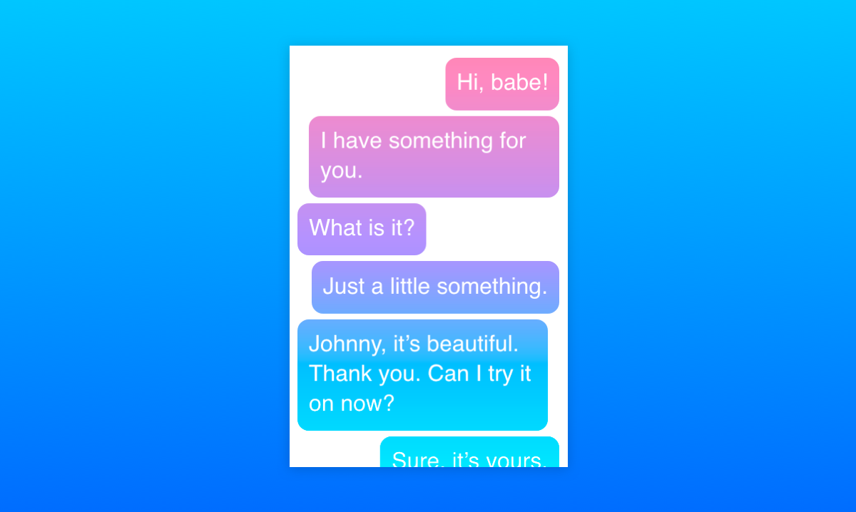
One Sunday morning, I woke up a little earlier than I would’ve liked to, thanks to the persistent buzzing of my phone. I reached out, tapped into Facebook Messenger, and joined the conversation. Pretty soon my attention went from the actual conversations to the funky gradient effect of the message bubbles containing them. Let me show you what I mean:

This is a new feature of Messenger, which allows you to choose a gradient instead of a plain color for the background of the chat messages. It’s currently available on the mobile application as well as Facebook’s site, but not yet on Messenger’s site. The gradient appears “fixed” so that chat bubbles appear to change background color as they scroll vertically.

I thought this looked like something that could be done in CSS, so… challenge accepted!

Let’s walk through my thought process as I attempted to recreate it and explain the CSS features that were used to make it work. Also, we’ll see how Facebook actually implemented it (spoiler alert: not the way I did) and how the two approaches compare.

Getting our hands dirty

First, let’s look at the example again to see what exactly it is that we’re trying to achieve here.

In general, we have a pretty standard messaging layout: messages are divided into bubbles going from top to bottom, ours on the right and the other people in the chat on the left. The ones on the left all have a gray background color, but the ones on the right look like they’re sharing the same fixed background gradient. That’s pretty much it!

Step 1: Set up the layout

This part is pretty simple: let’s arrange the messages in an ordered list and apply some basic CSS to make it look more like an actual messaging application:

<ol class="messages">
  <li class="ours">Hi, babe!</li>
  <li class="ours">I have something for you.</li>
  <li>What is it?</li>
  <li class="ours">Just a little something.</li>
  <li>Johnny, it's beautiful. Thank you. Can I try it on now?</li>
  <li class="ours">Sure, it's yours.</li>
  <li>Wait right here.</li>
  <li>I'll try it on right now.</li>
</ol>

When it comes to dividing the messages to the left and the right, my knee-jerk reaction was to use floats. We could use float: left for messages on the left and float: right for messages on the right to have them stick to different edges. Then, we’d apply clear: both to on each message so they stack. But there’s a much more modern approach — flexbox!

We can use flexbox to stack the list items vertically with flex-direction: column and tell all the children to stick to the left edge (or “align the cross-start margin edges of the flex children with cross-start margin edges of the lines,” if you prefer the technical terms) with align-items: flex-start. Then, we can overwrite the align-items value for individual flex items by setting align-self: flex-end on them.

What, you mean you couldn’t visualize the code based on that? Fine, here’s how that looks:

.messages {
  /* Flexbox-specific styles */
  display: flex;
  flex-direction: column;
  align-items: flex-start;

  /* General styling */
  font: 16px/1.3 sans-serif;
  height: 300px;
  list-style-type: none;
  margin: 0 auto;
  padding: 8px;
  overflow: auto;
  width: 200px;
}

/* Default styles for chat bubbles */
.messages li {
  background: #eee;
  border-radius: 8px;
  padding: 8px;
  margin: 2px 8px 2px 0;
}

/* Styles specific to our chat bubbles */
.messages li.ours {
  align-self: flex-end; /* Stick to the right side, please! */
  margin: 2px 0 2px 8px;
}

Some padding and colors here and there and this already looks similar enough to move on to the fun part.

Step 2: Let’s color things in!

The initial idea for the gradient actually came to me from this tweet by Matthias Ott (that Chris recreated in another post):

This is a nasty hack with a pseudo-element on top of the text and mix-blend-mode doesn’t work in IE / Edge, but: Yes, this is possible to do with CSS! ?https://t.co/FLKGvd1YoI

— Matthias Ott (@m_ott) December 3, 2018

The key clue here is mix-blend-mode, which is a CSS property that allows us to control how the content of an element blends in with what’s behind it. It’s a feature that has been present in Photoshop and other similar tools for a while, but is fairly new to the web. There’s an almanac entry for the property that explains all of its many possible values.

One of the values is screen: it takes the values of the pixels of the background and foreground, inverts them, multiplies them, and inverts them once more. This results in a color that is brighter than the original background color.

The description can seem a little confusing, but what it essentially means is that if the background is monochrome, wherever the background is black, the foreground pixels are shown fully and wherever it is white, white remains.

With mix-blend-mode: screen;</code on the foreground, we'll see more of the foreground as the background is darker.

So, for our purposes, the background will be the chat window itself and the foreground will contain an element with the desired gradient set as the background that's positioned over the background. Then, we apply the appropriate blend mode to the foreground element and restyle the background. We want the background to be black in places where we want the gradient to be shown and white in other places, so we'll style the bubbles by giving them a plain black background and white text. Oh, and let's remember to add pointer-events: none

to the foreground element so the user can interact with the underlying text.

At this point, I also changed the original HTML a little. The entire chat is a wrapper in an additional container that allows the gradient to stay “fixed" over the scrollable part of the chat:

.messages-container:after {
  content: '';
  background: linear-gradient(rgb(255, 143, 178) 0%, rgb(167, 151, 255) 50%, rgb(0, 229, 255) 100%);
  position: absolute;
  left: 0;
  top: 0;
  height: 100%;
  width: 100%;
  mix-blend-mode: screen;
  pointer-events: none;
}

.messages li {
  background: black;
  color: white;
  /* rest of styles */
}

The result looks something like this:

The gradient applied to the chat bubbles

Step 3: Exclude some messages from the gradient

Now the gradient is being shown where the text bubbles are under it! However, we only want it to be shown over our bubbles — the ones along the right edge. A hint to how that can be achieved is hidden in MDN's description of the mix-blend-mode property:

The mix-blend-mode CSS property sets how an element's content should blend with the content of the element's parent and the element's background.

That's right! The background. Of course, the effect only takes into account the HTML elements that are behind the current element and have a lower stack order. Fortunately, the stacking order of elements can easily be changed with the z-index property. So all we have to do is to give the chat bubbles on the left a higher z-index than that of the foreground element and they will be raised above it, outside of the influence of mix-blend-mode! Then we can style them however we want.
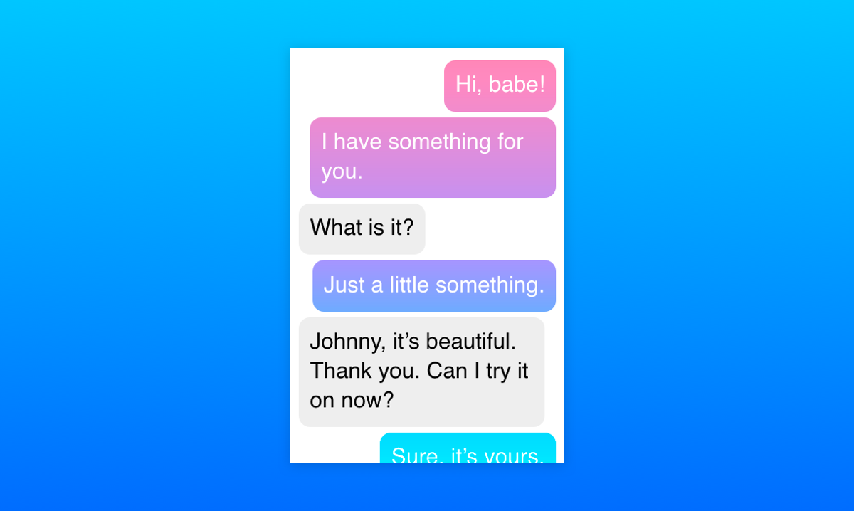
The gradient applied to the chat bubbles.

Let's talk browser support

At the time of writing, mix-blend-mode is not supported at all in Internet Explorer and Edge. In those browsers, the gradient is laid over the whole chat and others' bubbles appear on top of it, which is not an ideal solution.

This browser support data is from Caniuse, which has more detail. A number indicates that browser supports the feature at that version and up.

Desktop

Chrome Opera Firefox IE Edge Safari
41 29 32 No No TP

Mobile / Tablet

iOS Safari Opera Mobile Opera Mini Android Android Chrome Android Firefox
12.2 46 No 67 71 64

So, this is what we get in unsupported browsers:
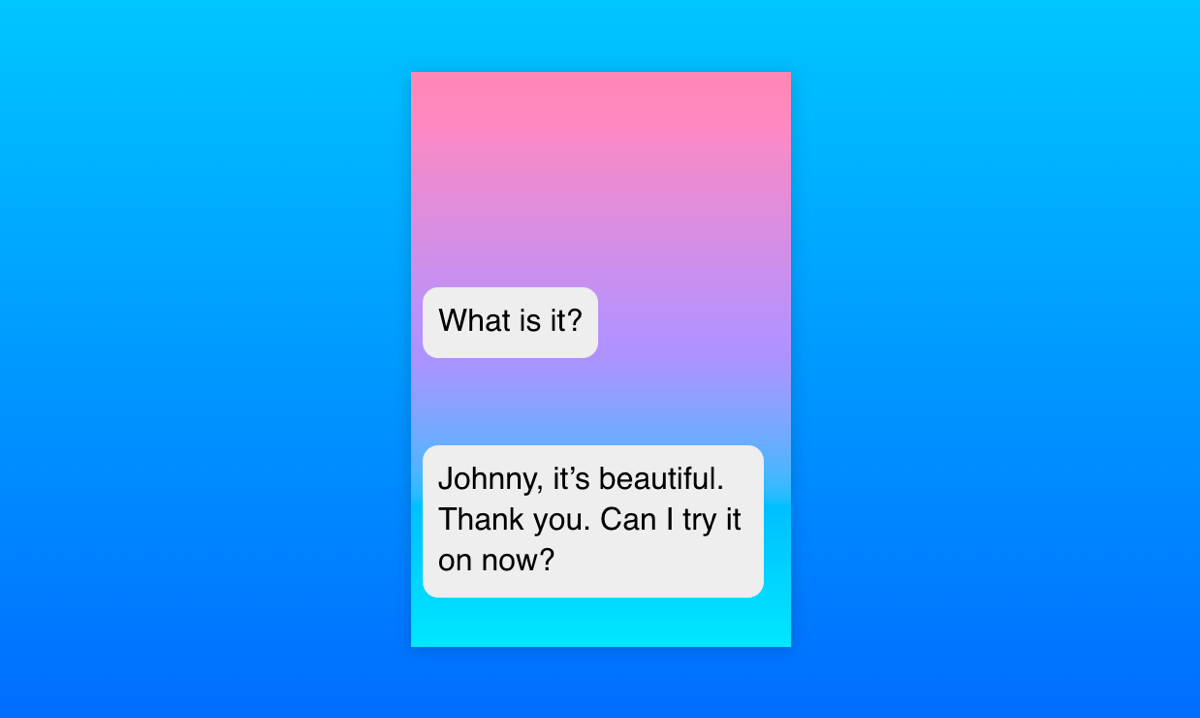
How browsers that don't support mix-blend-mode render the chat.

Fortunately, all the browsers that support mix-blend-mode also support CSS Feature Queries. Using them allows us to write fallback styles for unsupported browsers first and include the fancy effects for the browsers that support them. This way, even if a user can't see the full effect, they can still see the whole chat and interact with it:
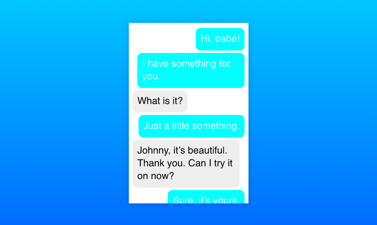
A simplified UI for older browsers, falling back to a plain cyan background color.

Here's the final Pen with the full effect and fallback styles:

See the Pen
Facebook Messenger-like gradient coloring in CSS
by Stepan Bolotnikov (@Stopa)
on CodePen.

Now let's see how Facebook did it

Turns out that Facebook's solution is almost the opposite of what we've covered here. Instead of laying the gradient over the chat and cutting holes in it, they apply the gradient as a fixed background image to the whole chat. The chat itself is filled with a whole bunch of empty elements with white backgrounds and borders, except where the gradient should be visible.

The final HTML rendered by the Facebook Messenger React app is pretty verbose and hard to navigate, so I recreated a minimal example to demonstrate it. A lot of the empty HTML elements can be switched for pseudo-elements instead:

See the Pen
Facebook Messenger-like gradient coloring in CSS: The Facebook Way
by Stepan Bolotnikov (@Stopa)
on CodePen.

As you can see, the end result looks similar to the mix-blend-mode solution, but with a little bit of extra markup. Additionally, their approach provides more flexibility for rich content, like images and emojis . The mix-blend-mode approach doesn't really work if the background is anything but monochrome and I haven't been able to come up with a way to “raise" inner content above the gradient or get around this limitation in another way.

Because of this limitation, it's wiser to use Facebook's approach in an actual chat application. Still, our solution using mix-blend-mode showcases an interesting way to use one of the most under-appreciated CSS properties in modern web design and hopefully it has given you some ideas on what you could do with it!

The post Recreating the Facebook Messenger Gradient Effect with CSS appeared first on CSS-Tricks.

Categories: Designing, Others Tags:

Organizing Brainstorming Workshops: A Designer’s Guide

March 1st, 2019 No comments
Form Design Patterns — a practical guide for anyone who needs to design and code web forms

Organizing Brainstorming Workshops: A Designer’s Guide

Organizing Brainstorming Workshops: A Designer’s Guide

Slava Shestopalov

2019-03-01T15:00:28+01:002019-03-01T15:22:54+00:00

When you think about the word “brainstorming”, what do you imagine? Maybe a crowd of people who you used to call colleagues, outshouting each other, assaulting the whiteboard, and nearly throwing punches to win control over the projector? Fortunately, brainstorming has a bright side: It’s a civilized process of generating ideas together. At least this is how it appears in the books on creativity. So, can we make it real?

I have already tried the three methodologies presented in this article with friends of mine, so there is no theorizing. After reaching the end of this article, I hope that you’ll be able to organize brainstorming sessions with your colleagues and clients, and co-create something valuable. For instance, ideas about a new mobile application or a design conference agenda.

Building Diverse Design Teams

What is diversity and what does it have to do with design? It’s important to understand that design is not only critical to solving problems on the product and experience level, but also relevant on a bigger scale to close social divides and to create inclusive communities. Learn more ?

Universal Principles

Don’t be surprised to notice all brainstorming techniques have much in common. Although “rituals” vary, the essence is the same. Participants look at the subject from different sides and come up with ideas. They write their thoughts down and then make sorting or prioritizing. I know, sounds easy as pie, doesn’t it? But here’s the thing. Without the rules of the game, brainstorming won’t work. It all boils down to just three crucial principles:

  1. The more, the better.
    Brainstorming aims at the quantity, which later turns into quality. The more ideas a team generates the wider choice it gains. It’s normal when two or more participants say the same thing. It’s normal if some ideas are funny. A facilitator’s task is encouraging people to share what is hidden in their mind.
  2. No criticism.
    The goal of brainstorming is to generate a pool of ideas. All ideas are welcome. A boss has no right to silence a subordinate. An analyst shouldn’t make fun of a colleague’s “fantastic” vision. A designer shouldn’t challenge the usability of a teammates’ suggestion.
  3. Follow the steps.
    Only a goal-oriented and time-bound activity is productive, whereas uncontrolled bursts of creativity, as a rule, fail. To make a miracle happen, organize the best conditions for it.

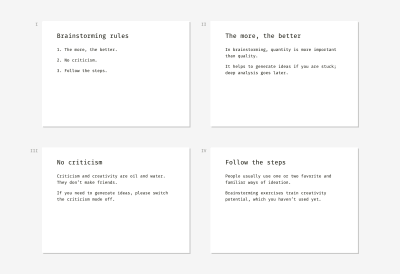
Here are the universal slides you can use as an introduction to any brainstorming technique.


Examples of slides that describe the three core brainstorming rules
(Large preview)

Now when the principles are clear, you are to decide who’s going to participate. The quick answer is diversity. Invite as many different experts as possible including business owners, analysts, marketers, developers, salespeople, potential or real users. All participants should be related to the subject or be interested in it. Otherwise, they’ll fantasize about the topic they’ve never dealt with and don’t want to.

One more thing before we proceed with the three techniques (Six Thinking Hats, Walt Disney’s Creative Strategy, and SCAMPER). When can a designer or other specialist use brainstorming? Here are two typical cases:

  1. There is a niche for a new product, service or feature but the team doesn’t have a concept of what it might be.
  2. An existing product or service is not as successful as expected. The team generally understands the reasons but has no ideas on how to fix it.

1. Six Thinking Hats

The first technique I’d like to present is known as “Six Thinking Hats”. It was invented in 1985 by Edward de Bono, a Maltese physician, psychologist, and consultant. Here’s a quick overview:

Complexity Normal
Subject A process, a service, a product, a feature, anything. For example, one of the topics at our session was the improvement of the designers’ office infrastructure. Another team brainstormed about how to improve the functionality of the Sketch app.
Duration 1–1.5 hours
Facilitation One facilitator for a group of 5–8 members. If there are more people, better divide them into smaller groups and involve assistants. We split our design crew of over 20 people into three workgroups, which were working simultaneously on their topics.

A photo of the brainstorming session using the Six Thinking Hats technique
Brainstorming workshop for the ELEKS design team (Large preview)

Materials

  • Slides with step-by-step instructions.
  • A standalone timer or laptop with an online timer in the fullscreen mode.
  • 6 colored paper hats or any recognizable hat symbols for each participant. The colors are blue, yellow, green, white, red, and black. For example, we used crowns instead of hats, and it was fun.
  • Sticky notes of 6 colors: blue, yellow, green, white, red, and brown or any other dark tint for representing black. 1–2 packs of each color per team of 5–8 people would be enough.
  • A whiteboard or a flip-chart or a large sheet of paper on a table or wall.
  • Black marker pens for each participant (markers should be whiteboard-safe if you choose this kind of surface).

Process

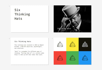
Start a brainstorming session with a five-minute intro. What will participants do? Why is it important? What will the outcome be? What’s next? It’s time to explain the steps. In my case, we described the whole process beforehand to ensure people get the concept of “thinking hats.” De Bono’s “hat” represents a certain way of perceiving reality. Different people are used to “wearing” one favorite “hat” most of the time, which limits creativity and breeds stereotypes.

For example, risk analysts are used to finding weaknesses and threats. That’s why such a phenomenon as gut feeling usually doesn’t ring them a bell.


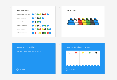
A set of slide samples for conducting a brainstorming session due to the method of Six Thinking Hats
(Large preview)

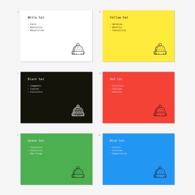
Trying on “hats” is a metaphor that helps people to start thinking differently with ease. Below is an example of the slides that explain what each “hat” means. Our goal was to make people feel prepared, relaxed, and not afraid of the procedure complexity.


A set of slide samples for conducting a brainstorming session due to the method of Six Thinking Hats
(Large preview)

The blue “hat” is an odd one out. It has an auxiliary role and embodies the process of brainstorming itself. It starts the session and finishes it. White, yellow, black, red, and green “hats” represent different ways to interpret reality.

For example, the red one symbolizes intuitive and emotional perception. When the black “hat” is on, participants wake up their inner “project manager” and look at the subject through the concepts of budgets, schedule, cost, and revenue.

There are various schemas of “hats” depending on the goal. We wanted to try all the “hats” and chose a universal, all-purpose order:

Blue Preparation
White Collecting available and missing data
Red Listening to emotions and unproven thoughts
Yellow Noticing what is good right now
Green Thinking about improvements and innovations
Black Analyzing risks and resources
Blue Summarizing

A set of slide samples for conducting a brainstorming session due to the method of Six Thinking Hats
(Large preview)

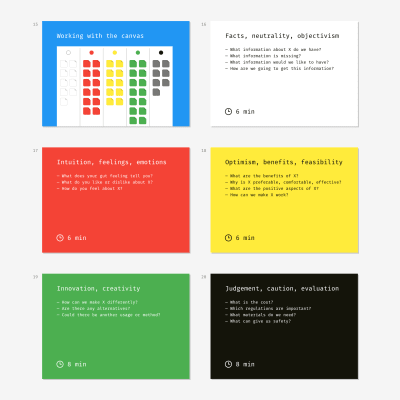
Now the exercise itself. Each slide is a cheat sheet with a task and prompts. When a new step starts and a proper slide appears on the screen, a facilitator starts the timer. Some steps have an extended duration; other steps require less time. For instance, it’s easy to agree on a topic formulation and draw a canvas but writing down ideas is a more time-consuming activity.

When participants see a “hat” slide (except the blue one), they are to generate ideas, write them on sticky notes and put the notes on the whiteboard, flip-chart or paper sheet. For example, the yellow “hat” is displayed on the screen. People put on yellow paper hats and think about the benefits and nice features the subject has now and why it may be useful or attractive. They concisely write these thoughts on the sticky notes of a corresponding color (for the black “hat”?—?any dark color can be used so that you don’t need to buy special white markers). All the sticky notes of the same color should be put in the corresponding column of the canvas.


A set of slide samples for conducting a brainstorming session due to the method of Six Thinking Hats
(Large preview)

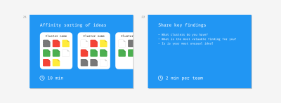
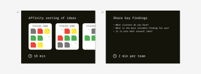
The last step doesn’t follow the original technique. We thought it would be pointless to stick dozens of colored notes and call it a day. We added the Affinity sorting part aimed at summarizing ideas and making the moment of their implementation a bit closer. The teams had to find notes about similar things, group them into clusters and give a name to each cluster.

For example, in the topic “Improvement of the designers’ office infrastructure,” my colleagues created such clusters as “Chair ergonomics,” “Floor and walls,” “Hardware upgrade.”


A set of slide samples for conducting a brainstorming session due to the method of Six Thinking Hats
(Large preview)

We finished the session with the mini-presentations of findings. A representative from each team listed the clusters they came up with and shared the most exciting observation or impression.

Walt Disney’s Creative Strategy

Walt Disney’s creative method was discovered and modeled by Robert Dilts, a neuro-linguistic programming expert, in 1994. Here’s an overview:

Complexity Easy
Subject Anything, especially projects you’ve been postponing for a long time or dreams you cannot start fulfilling for unknown reasons. For example, one of the topics I dealt with was “Improvement of the designer-client communication process.”
Duration 1 hour
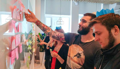
Facilitation One facilitator for a group of 5–8 members. When we conducted an educational workshop on brainstorming, my co-trainers and I had four teams of six members working simultaneously in the room.

A photo of the brainstorming session using Walt Disney's Creative Strategy
Educational session on brainstorming for the Projector Design School (Large preview)

Materials

  • Slides with step-by-step instructions.
  • A standalone timer or laptop with an online timer in the fullscreen mode.
  • Standard or large yellow sticky notes (1–2 packs per team of 5–8 people).
  • Small red sticky notes (1–2 packs per team).
  • The tiniest sticky stripes or sticky dots for voting (1 pack per team).
  • A whiteboard or a flip-chart or a large sheet of paper on a table or wall.
  • Black marker pens for each participant (markers should be whiteboard-safe if you choose this kind of surface).

Process

This technique is called after the original thinking manner of Walt Disney, a famous animator and film producer. Disney didn’t use any “technique”; his creative process was intuitive yet productive. Robert Dilts, a neuro-linguistic programming expert, discovered this creative knowhow much later based on the memories of Disney’s colleagues. Although original Dilts’s concept is designed for personal use, we managed to turn it into a group format.


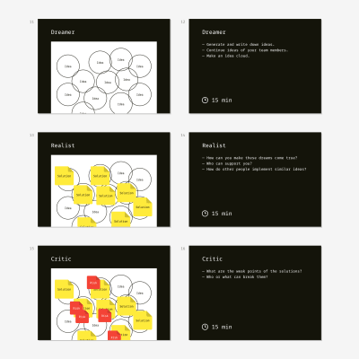
Slide examples for conducting a rainstorming workshop according to Walt Disney's Strategy
(Large preview)

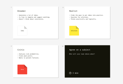
Disney’s strategy works owing to the strict separation of three roles?—?the dreamer, the realist, and the critic. People are used to mixing these roles while thinking about the future, and that’s why they often fail. “Let’s do X. But it’s so expensive. And risky… Maybe later,” this is how an average person dreams. As a result, innovative ideas get buried in doubts and fears.

In this kind of brainstorming, the facilitator’s goal is to prevent participants from mixing the roles and nipping creative ideas in the bud. We helped the team to get into the mood and extract pure roles through open questions on the slides and introductory explanations.


Slide examples for conducting a rainstorming workshop according to Walt Disney's Strategy
(Large preview)

For example, here is my intro to the first role:

“The dreamer is not restrained by limitations or rules of the real world. The dreamer generates as many ideas as possible and doesn’t think about the obstacles on the way of their implementation. S/he imagines the most fun, easy, simple, and pleasant ways of solving a problem. The dreamer is unaware of criticism, planning, and rationalism altogether.”

As a result, participants should have a bunch of encircled ideas.

When participants come up with the cloud of ideas, they proceed to the next step. It’s important to explain to them what the second role means. I started with the following words:

“The realist is the dreamer’s best friend. The realist is the manager who can convert a vague idea into a step-by-step plan and find necessary resources. The realist has no idea about criticism. He or she tries to find some real-world implementation for dreamer’s ideas, namely who, when, and how can make an idea true.”

Brainstormers write down possible solutions on sticky notes and put them on the corresponding idea circles. Of course, some of the ideas can have no solution, whereas others may be achieved in many ways.


Slide examples for conducting a rainstorming workshop according to Walt Disney's Strategy
(Large preview)

The third role is the trickiest one because people tend to think this is the guy who drags dreamer’s and realist’s work through the mud. Fortunately, this is not true.

I started my explanation:

“The critic is the dreamer’s and realist’s best friend. This person analyses risks and cares about the safety of proposed solutions. The critic doesn’t touch bare ideas but works with solutions only. The critic’s goal is to help and foresee potential issues in advance.”

The team defines risks and writes them down on smaller red notes. A solution can have no risks or several risks.

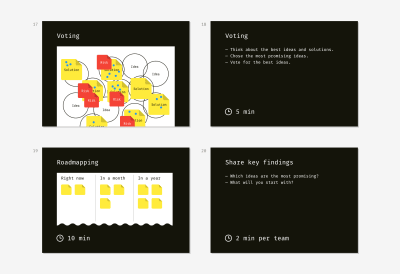
After that’s done, team members start voting for the ideas they consider worth further working on. They make a decision based on the value of an idea, the availability of solutions, and the severity of connected risks. Ideas without solutions couldn’t be voted for since they had no connection with reality.

During my workshops, each participant had three voting dots. They could distribute them in different ways, e.g. by sticking the dots to three different ideas or supporting one favorite idea with all of the dots they had.


Slide examples for conducting a rainstorming workshop according to Walt Disney's Strategy
(Large preview)

The final activity is roadmapping. The team takes the ideas that gained the most support (typically, 6–10) and arrange them on a timeline depending on the implementation effort. If an idea is easy to put into practice, it goes to the column “Now.” If an idea is complex and requires a lot of preparation or favorable conditions, it’s farther on the timeline.

Of course, there should be time for sharing the main findings. Teams present their timelines with shortlisted ideas and tell about the tendencies they have observed during the exercise.

SCAMPER

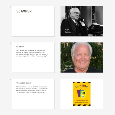
This technique was proposed in 1953 by Alex Osborn, best known for co-founding and leading BBDO, a worldwide advertising agency network. A quick overview:

Complexity Normal to difficult
Subject Ideally, technical or tangible things, although the author and evangelists of this method say it’s applicable for anything. From my experience, SCAMPER works less effective with abstract objects. For example, the team barely coped with the topic “Improve communication between a designer and client,” but it worked great for “Invent the best application for digital prototyping.”
Duration Up to 2 hours
Facilitation One facilitator for a group of 5–8 members

A photo of the brainstorming session using the SCAMPER technique
Brainstorming workshop for the ELEKS design team (Large preview)

Materials

  • Slides with step-by-step instructions.
  • A standalone timer or laptop with an online timer in the fullscreen mode.
  • Standard yellow sticky notes (7 packs per team of 5–8 people).
  • A whiteboard or a flip-chart or a large sheet of paper on a table or wall.
  • Black marker pens for each participant (markers should be whiteboard-safe if you choose this kind of surface).
  • Optionally: Thinkpak cards by Michael Michalko (1 pack per team).

Process

This brainstorming method employs various ways to modify an object. It’s aimed at activating the inventory thinking and helps to optimize an existing product or create a brand new thing.


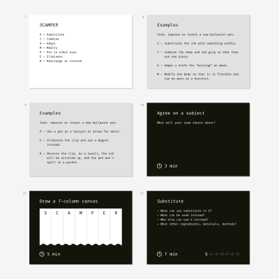
Samples of slides for conducting a brainstorming workshop employing SCAMPER method
(Large preview)

Each letter in the acronym represents a certain transformation you can apply to the subject of brainstorming.

S ?Substitute
C Combine
A Adapt
M Modify
P Put to other uses
E Eliminate
R Rearrange/Reverse

It’s necessary to illustrate each step with an example and ask participants to generate a couple of ideas themselves for the sake of training. As a result, you’ll be sure they won’t get stuck.

We explained the mechanism by giving sample ideas for improving such an ordinary object as a ballpoint pen.

  • Substitute the ink with something edible.
  • Combine the body and the grip so that they are one piece.
  • Adapt a knife for “writing” on wood like a pen.
  • Modify the body so that it becomes flexible?—?for wearing as a bracelet.
  • Use a pen as a hairpin or arrow for darts.
  • Eliminate the clip and use a magnet instead.
  • Reverse the clip. As a result, the nib will be oriented up, and the pen won’t spill in a pocket.

Samples of slides for conducting a brainstorming workshop employing SCAMPER method
(Large preview)

After the audience doesn’t have questions left, you can start. First of all, team members agree on the subject formulation. Then they draw a canvas on a whiteboard or large paper sheet.

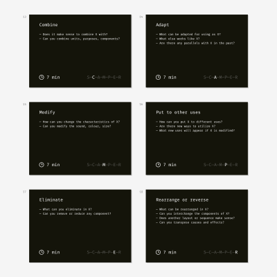
Once a team sees one of the SCAMPER letters on the screen, they start generating ideas using the corresponding method: substitute, combine, adapt, modify, and so on. They write the ideas down and stick the notes into corresponding canvas columns.

The questions on the slides remind what each step means and help to get in a creative mood. Time limitation helps to concentrate and not to dive into discussions.


Samples of slides for conducting a brainstorming workshop employing SCAMPER method
(Large preview)

Affinity sorting?—?the last step?—?is our designers’ contribution to the original technique. It pushes the team to start implementation. Otherwise, people quickly forget all valuable findings and return to the usual state of things. Just imagine how discouraging it will be if the results of a two-hour ideation session are put on the back burner.


Samples of slides for conducting a brainstorming workshop employing SCAMPER method
(Large preview)

Thinkpak Cards

It’s a set of brainstorming cards created by Michael Michalko. Thinkpak makes a session more exciting through gamification. Each card represents a certain letter from SCAMPER. Participants shuffle the pack, take cards in turn and come up with corresponding ideas about an object. It’s fun to compete in the number of ideas each participant generates for a given card within a limited time, for instance, three or five minutes.

My friends and I have tried brainstorming both with and without a Thinkpak; it works both ways. Cards are great for training inventory thinking. If your team has never participated in brainstorming sessions, it’ll be great to play the cards first and then switch to a business subject.

Lessons Learned

  1. Dry run.
    People often become disappointed in brainstorming if the first session they participate in fails. Some people I worked with have a prejudice towards creativity and consider it the waste of time or something not proven scientifically. Fortunately, we tried all the techniques internally?—?in the design team. As a result, all the actual brainstorming sessions went well. Moreover, our confidence helped others to believe in the power of brainstorming exercises.
  2. Relevant topic and audience.
    Brainstorming can fail if you invite people who don’t have a relevant background or the power and willing to change anything. Once I asked a team of design juniors to ideate about improving the process of selling design services to clients. They lacked the experience and couldn’t generate plenty of ideas. Fortunately, it was a training session, and we easily changed the topic.
  3. Documenting outcomes.
    So, the session is over. Participants go home or return to their workplaces. Almost surely the next morning they will recall not a single thing. I recommend creating a wrap-up document with photos and digitized canvases. The quicker you write and share it, the higher the chances will be that the ideas are actually implemented.

Further Resources

Smashing Editorial(dm, ra, il)
Categories: Others Tags:

How to Make Gamification Work on the Web

March 1st, 2019 No comments

The somewhat controversial topic of the usefulness of gamification in business has been sparking debates recently.

One claim is that it’s a great business tool that helps engage and retain clients, as well as lead them in the right direction. The opposite view holds that there are few real successes in gamification.

Today we’re going to the consider the case for gamification in interactive design, and illustrate it with some great examples.

The ABCs of Gamification

Gamification applies game elements, game mechanics and game thinking into non-game processes, like apps or websites, in an effort to make them more fun and engaging. However, it’s important to point out that gamification does not equal gaming or creating games for businesses. It simply borrows game features.

According to Statista calculations, the gamification market is expected to grow from the $4.91bn it was valued in 2016 to almost $12bn by 2021. The impressive gamification statistics doesn’t end at that. 40% of top organizations in the world are using gamification as their primary mechanism to transform business operations. The faith in this business tool is so big that some experts believe that by 2020 gamification will be widespread.

The main components that game mechanics are based on are the following:

  • Motivation — The reason users have to care, act or behave in a certain way;
  • Mastery — A set of rules, skills and knowledge users need to have to complete the task;
  • Triggers — The implementation of opportunities for users to fulfill their motivation.

Motivation is the first important element in this chain. It gives users a reason to behave a certain way, to take a desired action, complete that training or adopt a healthier lifestyle. Studying how users behave and how to motivate them to take a desired action has a lot to do with behavior design. The principles of Burrhus Frederic Skinner and his Operant Conditioning Chamber lay the basis for studies on how to influence a certain human behavior in order to design a certain habit.

Next follows the How or Mastery — game mechanics can’t be based purely on a random luck, skills, knowledge or some rules needed to be involved in gamification as well. For a successful gamified experience, users need to feel a sense of achievement and improvement. That they are leveling up their skills. It should trigger a feeling of achieving something or mastering a skill. And as a user levels up, the difficulty of a task should go up as well.

And finally Triggers, cues to action. Effective triggers are essential for gamification. Very often between motivation and mastery, one very important element is missing, that will help your users overcome fears, doubt or distraction and finally complete the action. These are triggers.

According to behavior scientist, BJ Fogg, there are three types of triggers: facilitator (for users that have high motivation but the lack of ability), signal (is a reminder, users already have the motivation and ability to perform an action), and spark (for users that have high ability but low motivation).

And in order to achieve a desired action, gamification uses the following mechanics that serve as rewards: goals; badges; leveling up; fast feedback; leaderboards; competition; collaboration; points.

How to Make Gamification Work

Gamification rises quite high expectations. It’s believed to be a great tool to motivate users to change their behavior, develop skills and habits and solve problems. Businesses apply it to increase customer engagement, improve employee performance, to help with training, education and onboarding, personal development, innovation management, and the list goes on.

Businesses that used gamification drive more website traffic and lower time for conversions and onboarding. Even potential employees are gamification proponents. According to a study, 55% of Americans are interested in working for a company that uses gamification as a tool to increase productivity.

Can gamification really be the answer business has been looking for? Well, you never know until you try. But the important thing is to set the right expectations and use business gamification the right way:

It’s All About Correctly Designed Experiences

We know that poor UX design is the death of any product. So happens to be the case with gamification elements. If poorly designed, and that includes setting the right business objectives, the whole project will collapse.

Have Clear Business Goals

Don’t incorporate gamification just because it’s a trend. They’re has to be a clear business objective behind this decision. After business goals are set you have to perform a deep analysis to see if gamification is really the best tool to achieve them.

Create a Meaningful Motivation

Simply giving away badges, points or creating leaderboards is not enough. To truly engage for users, you need to offer them rewards that have some meaning and can be a real motivator to proceed with the desired action.

When Business Objectives Meet User Objectives

Don’t design gamification elements with purely your business goals in mind, failing to think that your efforts should be client-centered and with their desires and objectives in mind is the biggest misconception businesses have when opting for gamification.

Gamification Apps

What better way to understand how to apply gamification and whether it can really be a game changer for your business than through the success stories of others? Here are some of the most fruitful cases of applying gamification in business apps.

Magnum Pleasure Hunt

An AR app that gamifies its interaction with customers. As a result, a game where users can complete puzzles and collect Magnum ice cream bars has gathered more than 20 million plays and created a significant marketing buzz.

eBay

One of the eCommerce leaders has been gamifying shopping experience of its customers for years. eBay uses a bidding system, mutual buyer seller feedback interface, leveling up, and achievements to make online shopping a lot more fun.

Duolingo

A learning gamification app with around 60 million users. Duolingo has its own currency, badges, challenges, and achievements and the whole experience looks more like a game than learning.

Starbucks App

After adding gamification features to their app, Starbucks has managed to achieve shocking results — they’ve amassed 120 million users. The update included such fun features like using AR technology to play with your cup, sending a Valentine card and added some rewards like free downloads, product giveaways etc.

Nike+

The app uses rewards, trophies, and surprise gifts to help the users achieve their running goals — the more you run, the more rewards you get. By introducing an element of competition, the app allows its user to track and challenge their friends.

Foursquare & Swarm

By using gamification the app managed to grow their users base to 50 million users. The main game components they are using are check-ins and location sharing. They also motivate users by giving out points, badges, and mayorships to the most active ones.

Conclusion

Gamification offers wonders to business. It is deemed to able to solve many of its pressing issues: engage and retain customers, help with employee training and onboarding, attract more visitors to your website and convert them into your customers with a higher success rate. It’s important to remember that gamification isn’t a solution to every business problem, but if designed correctly, it can assist in achieving certain goals. The most important thing to remember is that it should be aligned not only with the business problems but customer problems, their goals and wishes as well.

Add Realistic Chalk and Sketch Lettering Effects with Sketch’it – only $5!

Source

Categories: Designing, Others Tags: