Archive

Archive for March, 2019

Breaking CSS Custom Properties out of :root Might Be a Good Idea

March 27th, 2019 No comments

CSS Custom Properties have been a hot topic for a while now, with tons of great articles about them, from great primers on how they work to creative tutorials to do some real magic with them. If you’ve read more than one or two articles on the topic, then I’m sure you’ve noticed that they start by setting up the custom properties on the :root about 99% of the time.

While putting custom properties on the :root is great for things that you need to be available throughout your site, there are times when it makes more sense to scope your custom properties locally.

In this article, we’ll be exploring:

  • Why we put custom properties on the :root to begin with.
  • Why global scoping isn’t right for everything.
  • How to overcome class clashing with locally scoped custom properties

What’s the deal with custom properties and :root?

Before we jump into looking at the global scope, I think it’s worth looking at why everyone sets custom properties in the :root to begin with.

I’ve been declaring custom properties on the :root without even a second thought. Pretty much everyone does it without even a mention of why — including the official specification.

When the subject of :root is actually breached, it mentions how :root is the same as html, but with higher specificity, and that’s about it.

But does that higher specificity really matter?

Not really. All it does is select html with a higher specificity, the same way a class selector has higher specificity than an element selector when selecting a div.

:root {
  --color: red;
}

html {
  --color: blue;
}

.example {
  background: var(--color);
  /* Will be red because of :root's higher specificity */
}

The main reason that :root is suggested is because CSS isn’t only used to style HTML documents. It is also used for XML and SVG files.

In the case of XML and SVG files, :root isn’t selecting the html element, but rather their root (such as the svg tag in an SVG file).

Because of this, the best practice for a globally-scoped custom property is the :root. But if you’re making a website, you can throw it on an html selector and not notice a difference.

That said, with everyone using :root, it has quickly become a “standard.” It also helps separate variables to be used later on from selectors which are actively styling the document.

Why global scope isn’t right for everything

With CSS pre-processors, like Sass and Less, most of us keep variables tucked away in a partial dedicated to them. That works great, so why should we consider locally scoping variables all of a sudden?

One reason is that some people might find themselves doing something like this.

:root {
  --clr-light: #ededed;
  --clr-dark: #333;
  --clr-accent: #EFF;
  --ff-heading: 'Roboto', sans-serif;
  --ff-body: 'Merriweather', serif;
  --fw-heading: 700;
  --fw-body: 300;
  --fs-h1: 5rem;
  --fs-h2: 3.25rem;
  --fs-h3: 2.75rem;
  --fs-h4: 1.75rem;
  --fs-body: 1.125rem;
  --line-height: 1.55;
  --font-color: var(--clr-light);
  --navbar-bg-color: var(--clr-dark);
  --navbar-logo-color: var(--clr-accent);
  --navbar-border: thin var(--clr-accent) solid;
  --navbar-font-size: .8rem;
  --header-color: var(--clr-accent);
  --header-shadow: 2px 3px 4px rgba(200,200,0,.25);
  --pullquote-border: 5px solid var(--clr-light);
  --link-fg: var(--clr-dark);
  --link-bg: var(--clr-light);
  --link-fg-hover: var(--clr-dark);
  --link-bg-hover: var(--clr-accent);
  --transition: 250ms ease-out;
  --shadow: 2px 5px 20px rgba(0, 0, 0, .2);
  --gradient: linear-gradient(60deg, red, green, blue, yellow);
  --button-small: .75rem;
  --button-default: 1rem;
  --button-large: 1.5rem;
}

Sure, this gives us one place where we can manage styling with custom properties. But, why do we need to define my --header-color or --header-shadow in my :root? These aren’t global properties, I’m clearly using them in my header and no where else.

If it’s not a global property, why define it globally? That’s where local scoping comes into play.

Locally scoped properties in action

Let’s say we have a list to style, but our site is using an icon system — let’s say Font Awesome for simplicity’s sake. We don’t want to use the disc for our ul bullets — we want a custom icon!

If I want to switch out the bullets of an unordered list for Font Awesome icons, we can do something like this:

ul {
  list-style: none;
}

li::before {
  content: "f14a"; /* checkbox */
  font-family: "Font Awesome Free 5";
  font-weight: 900;
  float: left;
  margin-left: -1.5em;
}

While that’s super easy to do, one of the problems is that the icon becomes abstract. Unless we use Font Awesome a lot, we aren’t going to know that f14a means, let alone be able to identify it as a checkbox icon. It’s semantically meaningless.

We can help clarify things with a custom property here.

ul {
  --checkbox-icon: "f14a";
  list-style: none;
}

This becomes a lot more practical once we start having a few different icons in play. Let’s up the complexity and say we have three different lists:

<ul class="icon-list checkbox-list"> ... </ul>

<ul class="icon-list star-list"> ... </ul>

<ul class="icon-list bolt-list"> ... </ul>

Then, in our CSS, we can create the custom properties for our different icons:

.icon-list {
  --checkbox: "f14a";
  --star: "f005";
  --bolt: "f0e7";

  list-style: none;
}

The real power of having locally scoped custom properties comes when we want to actually apply the icons.

We can set content: var(--icon) on our list items:

.icon-list li::before {
  content: var(--icon);
  font-family: "Font Awesome Free 5";
  font-weight: 900;
  float: left;
  margin-left: -1.5em;
}

Then we can define that icon for each one of our lists with more meaningful naming:

.checkbox-list {
  --icon: var(--checkbox);
}

.star-list {
  --icon: var(--star);
}

.bolt-list {
  --icon: var(--bolt);
}

We can step this up a notch by adding colors to the mix:

.icon-list li::before {
  content: var(--icon);
  color: var(--icon-color);
  /* Other styles */
}

Moving icons to the global scope

If we’re working with an icon system, like Font Awesome, then I’m going to assume that we’d be using them for more than just replacing the bullets in unordered lists. As long as we’re using them in more than one place it makes sense to move the icons to the :root as we want them to be available globally.

Having icons in the :root doesn’t mean we can’t still take advantage of locally scoped custom properties, though!

:root {
  --checkbox: "f14a";
  --star: "f005";
  --bolt: "f0e7";
  
  --clr-success: rgb(64, 209, 91);
  --clr-error: rgb(219, 138, 52);
  --clr-warning: rgb(206, 41, 26);
}

.icon-list li::before {
  content: var(--icon);
  color: var(--icon-color);
  /* Other styles */
}

.checkbox-list {
  --icon: var(--checkbox);
  --icon-color: var(--clr-success);
}

.star-list {
  --icon: var(--star);
  --icon-color: var(--clr-warning);
}

.bolt-list {
  --icon: var(--bolt);
  --icon-color: var(--clr-error);
}

Adding fallbacks

We could either put in a default icon by setting it as the fallback (e.g. var(--icon, "/f1cb")), or, since we’re using the content property, we could even put in an error message var(--icon, "no icon set").

See the Pen
Custom list icons with CSS Custom Properties
by Kevin (@kevinpowell)
on CodePen.

By locally scoping the --icon and the --icon-color variables, we’ve greatly increased the readability of our code. If someone new were to come into the project, it will be a whole lot easier for them to know how it works.

This isn’t limited to Font Awesome, of course. Locally scoping custom properties also works great for an SVG icon system:

:root {
  --checkbox: url(../assets/img/checkbox.svg);
  --star: url(../assets/img/star.svg);
  --baby: url(../assets/img/baby.svg);
}

.icon-list {
  list-style-image: var(--icon);
}

.checkbox-list { --icon: checkbox; }
.star-list { --icon: star; }
.baby-list { --icon: baby; }

Using locally scoped properties for more modular code

While the example we just looked at works well to increase the readability of our code — which is awesome — we can do a lot more with locally scoped properties.

Some people love CSS as it is; others hate working with the global scope of the cascade. I’m not here to discuss CSS-in-JS (there are enough really smart people already talking about that), but locally scoped custom properties offer us a fantastic middle ground.

By taking advantage of locally scoped custom properties, we can create very modular code that takes a lot of the pain out of trying to come up with meaningful class names.

Let’s um, scope the scenario.

Part of the reason people get frustrated with CSS is that the following markup can cause problems when we want to style something.

<div class="card">
  <h2 class="title">This is a card</h2>
  <p>Lorem ipsum dolor sit, amet consectetur adipisicing elit. Libero, totam.</p>
  <button class="button">More info</button>
</div>

<div class="cta">
  <h2 class="title">This is a call to action</h2>
  <p>Lorem, ipsum dolor sit amet consectetur adipisicing elit. Aliquid eveniet fugiat ratione repellendus ex optio, ipsum modi praesentium, saepe, quibusdam rem quaerat! Accusamus, saepe beatae!</p>
  <button class="button">Buy now</button>
</div>

If I create a style for the .title class, it will style both the elements containing the .card and .cta classes at the same time. We can use a compound selector (i.e. .card .title), but that raises the specificity which can lead to less maintainability. Or, we can take a BEM approach and rename our .title class to .card__title and .cta__title to isolate those elements a little more.

Locally scoped custom properties offer us a great solution though. We can apply them to the elements where they’ll be used:

.title {
  color: var(--title-clr);
  font-size: var(--title-fs);
}

.button {
  background: var(--button-bg);
  border: var(--button-border);
  color: var(--button-text);
}

Then, we can control everything we need within their parent selectors, respectively:

.card {
  --title-clr: #345;
  --title-fs: 1.25rem;
  --button-border: 0;
  --button-bg: #333;
  --button-text: white;
}

.cta {
  --title-clr: #f30;
  --title-fs: 2.5rem;
  --button-border: 0;
  --button-bg: #333;
  --button-text: white;
}

Chances are, there are some defaults, or commonalities, between buttons or titles even when they are in different components. For that, we could build in fallbacks, or simply style those as we usually would.

.button {
  /* Custom variables with default values */
  border: var(--button-border, 0);    /* Default: 0 */
  background: var(--button-bg, #333); /* Default: #333 */
  color: var(--button-text, white);   /* Default: white */

  /* Common styles every button will have */
  padding: .5em 1.25em;
  text-transform: uppercase;
  letter-spacing: 1px;
}

We could even use calc() to add a scale to our button, which would have the potential to remove the need for .btn-sm, btn-lg type classes (or it could be built into those classes, depending on the situation).

.button {
  font-size: calc(var(--button-scale) * 1rem);
  /* Multiply `--button-scale` by `1rem` to add unit */
}

.cta {
  --button-scale: 1.5;
}

Here is a more in-depth look at all of this in action:

See the Pen
Custom list icons with CSS Custom Properties
by Kevin (@kevinpowell)
on CodePen.

Notice in that example above that I have used some generic classes, such as .title and .button, which are styled with locally scoped properties (with the help of fallbacks). With those being setup with custom properties, I can define those locally within the parent selector, effectively giving each its own style without the need of an additional selector.

I also set up some pricing cards with modifier classes on them. Using the generic .pricing class, I set everything up, and then using modifier classes, I redefined some of the properties, such as --text, and --background, without having to worry about using compound selectors or additional classes.

By working this way, it makes for very maintainable code. It’s easy to go in and change the color of a property if we need to, or even come in and create a completely new theme or style, like the rainbow variation of the pricing card in the example.

It takes a bit of foresight when initially setting everything up, but the payoff can be awesome. It might even seem counter-intuitive to how you are used to approaching styles, but next time you go to create a custom property, try keeping it defined locally if it doesn’t need to live globally, and you’ll start to see how useful it can be.

The post Breaking CSS Custom Properties out of :root Might Be a Good Idea appeared first on CSS-Tricks.
Categories: Designing, Others Tags:

Building Real-Time Charts With GraphQL And Postgres

March 27th, 2019 No comments
GIF Demo of the realtime chart

Building Real-Time Charts With GraphQL And Postgres

Building Real-Time Charts With GraphQL And Postgres

Rishichandra Wawhal

2019-03-27T13:00:08+01:002019-03-27T12:04:51+00:00

Charts form an integral part of any industry that deals with data. Charts are useful in the voting and polling industry, and they’re also great at helping us better understand the different behaviors and characteristics of the users and clients we work with.

Why are real-time charts so important? Well, they’re useful in cases when new data is produced continuously; for example, when using live-time series for visualizing stock prices is a great use for real-time charts. In this tutorial, I’ll explain how to build real-time charts with open-source technologies apt for exactly this particular task.

Note: This tutorial requires basic knowledge of React and GraphQL.

Stack

  1. PostgreSQL
    The very point behind using Charts is to visualize “huge” volumes data. We, therefore, need a database that efficiently handles large data and provides an intuitive API to restructure it. SQL databases allow us to make views that abstract and aggregate data for us. We will be using Postgres which is a time-tested and highly efficient database. It also has fancy open-source extensions like Timescale and PostGIS which allow us to build geolocation-based and time-series-based charts respectively. We will be using Timescale for building our time series chart.
  2. GraphQL Engine
    This post is about building real-time charts, and GraphQL comes with a well-defined spec for real-time subscriptions. Hasura GraphQL Engine is an open-source GraphQL server that takes a Postgres connection and allows you to query the Postgres data over realtime GraphQL. It also comes with an access control layer that helps you restrict your data based on custom access control rules.
  3. ChartJS
    ChartJS is a popular and well maintained open source library for building charts with JavaScript. We will use chart.js along with its ReactJS abstraction react-chartjs-2. About why React, it is because React empowers developers with an intuitive event-driven API. Also, React’s unidirectional data flow is ideal for building charts that are data-driven.

Requirements

For this tutorial, you will need the following on your system:

  1. Docker CE
    Docker is a software that lets you containerize your applications. A docker image is an independent packet that contains software along with its dependencies and a minimalistic operating system. Such docker images can be technically run in any machine that has docker installed. You will need docker for this tutorial.

  2. npm: npm is the package manage for JavaScript.

Demo

We will build the following live time series chart that shows the maximum temperature of a location in intervals of 5 seconds over the past 20 minutes from the present moment.

GIF Demo of the realtime chart

Setting Up The Backend

Running The Services

The backend comprises of a Postgres database, its timescale extension, and Hasura GraphQL Engine. Let us get the database and our GraphQL server running by running the respective docker images. Create a file called docker-compose.yaml and paste this content into it.

Note: docker-compose is a utility to run multiple docker images declaratively.

version: '2'
services:
  timescale:
    image: timescale/timescaledb:latest-pg10
    restart: always
    environment:
      POSTGRES_PASSWORD: postgrespassword
    volumes:
    - db_data:/var/lib/postgresql/data
  graphql-engine:
    image: hasura/graphql-engine:v1.0.0-alpha38
    ports:
    - "8080:8080"
    depends_on:
    - "timescale"
    restart: always
    environment:
      HASURA_GRAPHQL_DATABASE_URL: postgres://postgres:postgrespassword@timescale:5432/postgres
      HASURA_GRAPHQL_ACCESS_KEY: mylongsecretkey
    command:
      - graphql-engine
      - serve
      - --enable-console
volumes:
  db_data:

This docker-compose.yaml contains the spec for two services:

  1. timescale
    This is our Postgres database with Timescale extension installed. It is configured to run at port 5432.
  2. graphql-engine
    This is our Hasura GraphQL Engine instance, i.e. the GraphQL server that points to the database and gives GraphQL APIs over it. It is configured to run at the port 8080, and the port 8080 is mapped to the port 8080 of the machine that this docker container runs on. This means that you can access this GraphQL server through at localhost:8080 of the machine.

Let’s run these docker containers by running the following command wherever you have placed your docker-compose.yaml.

docker-compose up -d

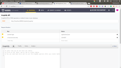
This command pulls the docker images from the cloud and runs them in the given order. It might take a few seconds based on your internet speed. Once it is complete, you can access your GraphQL Engine console at http://localhost:8080/console.


Hasura GraphQL Engine Console
Hasura GraphQL Engine console (Large preview)

Setting Up The Database

Next, let us create a table called temperature that stores the values of temperatures at different times. Go to the Data tab in the console and go to the SQL section. Create our temperature table by running this SQL block:

CREATE TABLE temperature (
  temperature numeric not null,
  location text not null,
  recorded_at timestamptz not null default now()
);

This creates a simple Postgres table in the database. But we wish to leverage the time interval partitioning of the Timescale extension. To do this, we must convert this table into timescale’s hypertable by running the SQL command:

SELECT create_hypertable('temperature', 'recorded_at');

This command creates a hypertable that is partitioned by time in the field recorded_at.

Now, since this table is created, we can directly start making GraphQL queries over it. You can try them out by clicking on the GraphiQL tab on top. Try making a mutation first:

mutation {
  insert_temperature (
    objects: [{
      temperature: 13.4
      location: "London"
    }]
  ) {
    returning {
      recorded_at
      temperature
    }
  }
}

The GraphQL mutation above inserts a row in the temperature table. Now try to make a GraphQL query to check if the data was inserted.

Then try making a query:

query {
  temperature {
    recorded_at
    temperature
    location
  }
}

Hope it worked 🙂

Now, the task at our hand is to create a live time-series chart that shows the maximum temperature of a location in intervals of 5 seconds over the past 20 minutes from the present moment. Let’s create a view that gives us exactly this data.

CREATE VIEW last_20_min_temp AS (
  SELECT time_bucket('5 seconds', recorded_at) AS five_sec_interval,
  location,     
    MAX(temperature) AS max_temp
  FROM temperature
  WHERE recorded_at > NOW() - interval '20 minutes'    
  GROUP BY five_sec_interval, location    
  ORDER BY five_sec_interval ASC
);

This view groups the data from the temperature table in 5-second windows with their max temperature (max_temp). The secondary grouping is done using the location field. All this data is only from the past twenty minutes from the present moment.

That’s it. Our backend is set up. Let us now build a nice real-time chart.

Frontend

Hello GraphQL Subscriptions

GraphQL subscriptions are essentially “live” GraphQL queries. They operate over WebSockets and have exactly the same response structure like GraphQL queries. Go back to http://localhost:8080/console and try to make a GraphQL subscription to the view we created.

subscription {
  last_20_min_temp(
    order_by: {
      five_sec_interval: asc
    }
    where: {
      location: {
        _eq: "London"
      }
    }
  ) {
    five_sec_interval
    location
    max_temp
  }
}

This subscription subscribes to the data in the view where the location is London and it is ordered in ascending order of the five_second_intervals.

Naturally, the response from the view would be an empty array because we have not inserted anything in the database in the past twenty minutes. (You might see the entry that we inserted sometime back if you reached this section within twenty minutes.)

{
  "data": {
    "last_20_min_temp": []
  }
}

Keeping this subscription on, open another tab and try inserting another value in the temperatures table using the same mutation that we performed earlier. After inserting, if you go back to the tab where the subscription was on, you would see the response having updated automatically. That’s the realtime magic that GraphQL Engine provides. Let’s use this subscription to power our real-time chart.

Getting Started With Create-React-App

Let us quickly get started with a React app starter using create react app. Run the command:

npx create-react-app time-series-chart

This will create an empty starter project. cd into it and install the GraphQL and chart libraries. Also, install moment for converting timestamps to a human-readable format.

cd time-series-chart
npm install --save apollo-boost apollo-link-ws subscriptions-transport-ws graphql react-apollo chart.js react-chartjs-2 moment

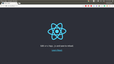
Finally, run the app with npm start and a basic React app would open up at http://localhost:3000.


Raw create-react-app
Raw creat-react-app (Large preview)

Setting Up Apollo Client For Client-Side GraphQL

Apollo client is currently the best GraphQL client that works with any GraphQL compliant server. Relay modern is good too but the server must support the relay spec to leverage all the benefits of Relay modern. We’ll use Apollo client for client-side GraphQL for this tutorial. Let us perform the setup to provide Apollo client to the app.

I am not getting into the subtleties of this setup because the following code snippets are taken directly from the docs. Head to src/index.js in the React app directory and instantiate Apollo client and add this code snippet above ReactDOM.render.

import { WebSocketLink } from 'apollo-link-ws';
import { ApolloClient } from 'apollo-client';
import { ApolloProvider } from 'react-apollo';
import { InMemoryCache } from 'apollo-cache-inmemory';

// Create a WebSocket link:
const link = new WebSocketLink({
  uri: 'ws://localhost:8080/v1alpha1/graphql',
  options: {
    reconnect: true
  }
});
const cache = new InMemoryCache();
const client = new ApolloClient({
  link,
  cache
});

Finally, wrap the App inside ApolloProvider so that we can use Apollo client in the children components. Your App.js should finally look like:

import React from 'react';
import ReactDOM from 'react-dom';
import './index.css';
import App from './App';
import { WebSocketLink } from 'apollo-link-ws';
import { ApolloClient } from 'apollo-client';
import { ApolloProvider } from 'react-apollo';
import { InMemoryCache } from 'apollo-cache-inmemory';

// Create a WebSocket link:
const link = new WebSocketLink({
  uri: `ws://localhost:8080/v1alpha1/graphql`,
  options: {
    reconnect: true
  }
});
const cache = new InMemoryCache();
const client = new ApolloClient({
  link,
  cache
});

ReactDOM.render(
  (
    <ApolloProvider client={client}> 
      <App />
    </ApolloProvider>
  ),
  document.getElementById('root')
);

Apollo client has been set up. We can now easily use real-time GraphQL from our App. Head to src/App.js.

Building The Chart

ChartJS provides a pretty neat API for building charts. We will be building a line chart; so a line chart expects data of the form:

{
  "labels": ["label1", "label2", "label3", "label4"],
  "datasets": [{
    "label": "Sample dataset",
    "data": [45, 23, 56, 55],
    "pointBackgroundColor": ["red", "brown", "green", "yellow"],
    "borderColor": "brown",
    "fill": false
  }],
}

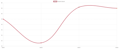
If the above dataset is used for rendering a line chart, it would look something like this:


Sample line chart
Sample line chart (Large preview)

Let us try to build this sample chart first. Import Line from react-chartjs-2 and render it passing the above object as a data prop. The render method would look something like:

render() {
  const data = {
    "labels": ["label1", "label2", "label3", "label4"],
    "datasets": [{
      "label": "Sample dataset",
      "data": [45, 23, 56, 55],
      "pointBackgroundColor": ["red", "brown", "green", "yellow"],
      "borderColor": "brown",
      "fill": false
    }],
  }
  return (
    <div
      style={{display: 'flex', alignItems: 'center', justifyContent: 'center', margin: '20px'}}
    >
      <Line
        data={data}
      />
    </div>
  );
}

Next, we will subscribe to the data in our view and feed it to the Line chart. But how do we perform subscriptions on the client?

Apollo’s components work using the render prop pattern where the children of a component are rendered with the context of the subscription data.

<Subscription
  subscription={gql`subscription { parent { child } }`}
/>
  {
    ({data, error, loading}) => {
      if (error) return <Error error={error} />;
      if (loading) return <Loading />;
      return <RenderData data={data} />;
    }
  }
</Subscription>

Let us use one such Subscription component to subscribe to our view and then transform the subscription data to the structure that ChartJS expects. The transforming logic looks like this:

let chartJSData = {
  labels: [],
  datasets: [{
    label: "Max temperature every five seconds",
    data: [],
    pointBackgroundColor: [],
    borderColor: 'brown',
    fill: false
  }]
};
data.last_20_min_temp.forEach((item) => {
  const humanReadableTime = moment(item.five_sec_interval).format('LTS');
  chartJSData.labels.push(humanReadableTime);
  chartJSData.datasets[0].data.push(item.max_temp);
  chartJSData.datasets[0].pointBackgroundColor.push('brown');
})

Note: You can also use the open-source library graphq2chartjs for transforming the data from GraphQL response to a form that ChartJS expects.

After using this inside the Subscription component, our App.js looks like:

import React, { Component } from 'react';
import { Line } from 'react-chartjs-2';
import { Subscription } from 'react-apollo';
import gql from 'graphql-tag';
import moment from 'moment';

const TWENTY_MIN_TEMP_SUBSCRIPTION= gql'
  subscription {
    last_20_min_temp(
      order_by: {
        five_sec_interval: asc
      }
      where: {
        location: {
          _eq: "London"
        }
      }
    ) {
      five_sec_interval
      location
      max_temp
    }
  }
'

class App extends Component {
  render() {
    return (
      <div
        style={{display: 'flex', alignItems: 'center', justifyContent: 'center', margin: '20px'}}
      >
        <Subscription subscription={TWENTY_MIN_TEMP_SUBSCRIPTION}>
          {
            ({data, error, loading}) => {
              if (error) {
                console.error(error);
                return "Error";
              }
              if (loading) {
                return "Loading";
              }
              let chartJSData = {
                labels: [],
                datasets: [{
                  label: "Max temperature every five seconds",
                  data: [],
                  pointBackgroundColor: [],
                  borderColor: 'brown',
                  fill: false
                }]
              };
              data.last_20_min_temp.forEach((item) => {
                const humanReadableTime = moment(item.five_sec_interval).format('LTS');
                chartJSData.labels.push(humanReadableTime);
                chartJSData.datasets[0].data.push(item.max_temp);
                chartJSData.datasets[0].pointBackgroundColor.push('brown');
              })
              return (
                <Line
                  data={chartJSData}
                  options={{
                    animation: {duration: 0},
                    scales: { yAxes: [{ticks: { min: 5, max: 20 }}]}
                  }}
                />
              );
            }
          }
        </Subscription>
      </div>
    );
  }
}

export default App;

You will have a fully working real-time chart ready at http://localhost:3000 . However, it would be empty, so let’s populate some sample data so we can actually see some magic happen.

Note: I have added some more options to the Line chart because I don’t like those fancy animations in ChartJS. A time series looks sweet when it’s simple, however, you can remove the options prop if you like.

Inserting Sample Data

Lets write a script that populates our database with dummy data. Create a separate directory (outside this app) and create a file called script.js with the following content,

const fetch = require('node-fetch');
setInterval(
  () => {
    const randomTemp = (Math.random() * 5) + 10;
    fetch(
      `http://localhost:8080/v1alpha1/graphql`,
      {
        method: 'POST',
        body: JSON.stringify({
          query: `
            mutation ($temp: numeric) {
              insert_temperature (
                objects: [{
                  temperature: $temp
                  location: "London"
                }]
              ) {
                returning {
                  recorded_at
                  temperature
                }
              }
            }
          `,
          variables: {
            temp: randomTemp
          }
        })
      }
    ).then((resp) => resp.json().then((respObj) => console.log(JSON.stringify(respObj, null, 2))));
  },
  2000
);

Now run these two commands:

npm install --save node-fetch
node script.js

You can go back to http://localhost:3000 and see the chart updating.

Finishing Up

You can build most of the real-time charts using the ideas that we discussed above. The algorithm is:

  1. Deploy GraphQL Engine with Postgres;
  2. Create tables where you wish to store data;
  3. Subscribe to those tables from your React app;
  4. Render the chart.

You can find the source code here.

Smashing Editorial(dm, ra, il)
Categories: Others Tags:

Why E-Commerce Businesses Fail – Infographic

March 27th, 2019 No comments

E-commerce business is very productive yet quite challenging to make a mark.

Sometimes it becomes difficult for entrepreneurs to make their business a success and many online businesses end up being an ultimate failure.

Lack of knowledge and expertise may drag you to a blind path, which eventually ends nowhere. No matter your business is flourishing well there are always chances of losing the track and loss of interest from the target audience.

Not Appearing in Top Searches

When you will not show up in the top of search rankings, eventually you will get ignored by many. You shouldn’t expect to be found either way by your potential customers instead there is foremost need of each website to be optimized according to the advanced SEO standards. As nearly as 35% people prefer to search for products through search engines like Google. Now almost every brand has its online presence and products are listed with their specifications and prices.

Impatience for Success

Most of the times entrepreneurs seem to be in a rush for making fast and easy money without even considering to amplify their websites and following the guidelines. That’s why many stores fail in their first attempt of achieving recognition and get abandoned within a few months. The patience and deep knowledge about buyer’s interests and purchasing behaviors are the keys to get leverage in the eCommerce field.

Excessive Shipping Rates

Meanwhile, when you are doing well with your eCommerce business, consider cutting off shipping rates to a minimum. As a startup, you can also facilitate shoppers by not deducting shipping charges as nearly 23% of shoppers made their purchases when online stores don’t take shipping charges at all. It is ideal to provide an excellent shopping experience to buyers, who have chosen your platform over hundreds of others.

Insecure Website and Payment Gateways

Your platform should also be fully secured so the buyer feels comfortable shopping there. Due to the huge number of cyber crimes, buyers are reluctant to approach a website that has higher chances of getting hacked. So, make sure you have taken every precaution for securing your website from online threats.

Another reason for the loss of visitors and sales is the poor user interface of your online store. People will leave the website if it is not loaded with essential functionalities and execute impression.

The compiled infographic has showcased some contingent facts that are the ultimate cause of e-commerce business failure. To explore more facts and statistics that why eCommerce businesses fail? Review this infographic:

Infographic by – FME Extensions

Categories: Others Tags:

10 Alternative Typefaces to the Ubiquitous Gotham

March 26th, 2019 No comments
Gotham Alternatives

Gotham has become one of the most ubiquitous typographies of the 21st century. Its versatility and, undoubtedly, its good design makes it useable in many spaces. Even more, since it became the official typography of the campaign that led Obama to become president. However, in the typographic universe, there are hundreds and hundreds of typefaces to choose from. Since we live in a world that loves variety, here are 10 alternative typefaces to the Gotham.

1. Proxima Nova

Gotham Alternatives

Designed by Mark Simonson, Proxima Nova is perhaps one of the fonts that best presents itself as an alternative to the Gotham family. According to the author, this source “closes the gap between fonts such as Futura and Akzidenz Grotesk.” The result is a hybrid that combines modern proportions with a geometric appearance. It is a balanced and versatile source – the complete family includes 48 sources, eight pesos in three widths with their italics – the result of extensive work dating back to 1994. In recent years, Proxima Nova has become of the most popular web sources.

2. Montserrat

Gotham Alternatives

Montserrat was created by the designer Julieta Ulanovsky. He took inspiration from the architecture, the old posters, the luminous signs and the canopies of the neighborhood named after him in Buenos Aires. Ulanovsky’s intention was to rescue the beauty of urban typography from the first half of the 20th century. This inspiration taken from the local signs and architectural ques bring it closer to Gotham. Even so, the Montserrat forms are a little broader, giving a less solemn and more relaxed feeling that Gotham doesn’t provide. Montserrat was chosen to be among the 10 best fonts of Google Fonts in 2017.

3. Nexa

Gotham Alternatives

Directly from FontFabric comes Nexa, a sans serif font available in Light & Bold. This alternative to Gotham is possibly more expressive typography than some of the fonts that appear in this list. For example, the lowercase letter ‘g’ and the capital letters ‘J’ and ‘Q’ are far more expressive. In terms of its uses and applications, Nexa is perfect for branding and packaging projects. Nexa Light & Bold is freely available for download.

4. Sans Museo

Gotham Alternatives

Sans Museo coems directly from Exljbris foundry. This type of sans serif is robust, geometric, low contrast and highly readable; very suitable for use on any screen or for any text. This family of OpenType fonts is in all the languages ??of the European Union and even in Esperanto. The Sans Museo package contains 10 fonts, 5 pesos, and their respective italics.

5. Pier Sans

Gotham Alternatives

According to Mathieu Desjardins, the designer of Pier Sans, it is a modern and geometric typeface, specially designed to be able to adapt to any size of text without losing legibility. This font, besides being a good alternative to Gotham typography, is quite useful for projects of all kinds, since it is able to cover the needs of any text.

6. Vision

Gotham Alternatives

Vision is a complete typographic package. It is elegant and offers very good readability, both on screen and in the text. It consists of 12 free sources available for commercial and non-commercial work. As an alternative to Gotham, it presents a more humanistic invoice, especially in its lowercase. It was born to be versatile, a clear and modern font with great readability in large and short texts. In addition, it has ligatures, alternative glyphs and OpenType features that provide flexibility and uniqueness wherever they are placed.

7. Avenir

Gotham Alternatives

Designed by Adrian Frutiger in 1988 and published by Linotype, Avenir is one of the best-known sans serif typefaces from the Swiss typographer. The word ‘Avenir’ comes from the French and means ‘future’. Frutiger wanted Avenir to convey a more organic interpretation of the geometric style. He wanted it to be more uniform for extensive texts, with details reminiscent of more traditional typefaces, such as ‘a’ and ‘t’ – two letters with a curl at the bottom, and letters like the ‘o’ that are not exact or perfect circles, but with optical correction. Avenir is not purely geometric. The vertical strokes are thicker than their horizontal ones, the ascending ones are shortened and the ‘o’ is not perfectly round, adjustments that help readability and give the typeface a more harmonious appearance.

8. Lato

Gotham Alternatives

Lato is the most popular font from ?ukasz Dziedzic, a designer based in Warsaw. Designed in 2010, this free font contains more than 3,000 glyphs in 18 styles. It offers solutions to virtually everything a designer may need. Lato, which means ‘summer’ in Polish, is a semi-rounded sans serif that, like Gotham, achieves a convincing balance between what can be a serious and friendly conversation.

9. Foundry Sterling

Gotham Alternatives

Foundry Sterling is a functional and eloquent typographic family. It was born from the desire to create a modern sans serif with an essentially English flavor. It has been designed by paying special attention to the classical proportion and the purity of the forms, which has resulted in the creation of functional, beautiful and elegant typography. Like Gotham, Foundry Sterling has a wide range of weights that make it very versatile in its applications, whether for identity, editorial, signage or other uses.

10. Gothvetica

Gotham Alternatives

Its name says it all. Gothvetica is a hybrid between Gotham and Helvetica. This MarkStudio typographic exercise began as a question: How similar are Gotham and Helvetica? What would happen if they both merged? The result is this typographic mix, a kind of Frankenstein font, and we must admit that it works as alternative typography to Gotham and can give a solution to certain projects. Oh! and, by the way, it’s free.

Conclusion

Although Gotham is one of the most popular fonts on the market today, it doesn’t mean we all have to follow its trends. There are plenty of alternatives out there, and we shouldn’t limit ourselves. Try out one or all of the fonts above and let your creative spirit fly.

Read More at 10 Alternative Typefaces to the Ubiquitous Gotham

Categories: Designing, Others Tags:

An Illustrated (and Musical) Guide to Map, Reduce, and Filter Array Methods

March 26th, 2019 No comments
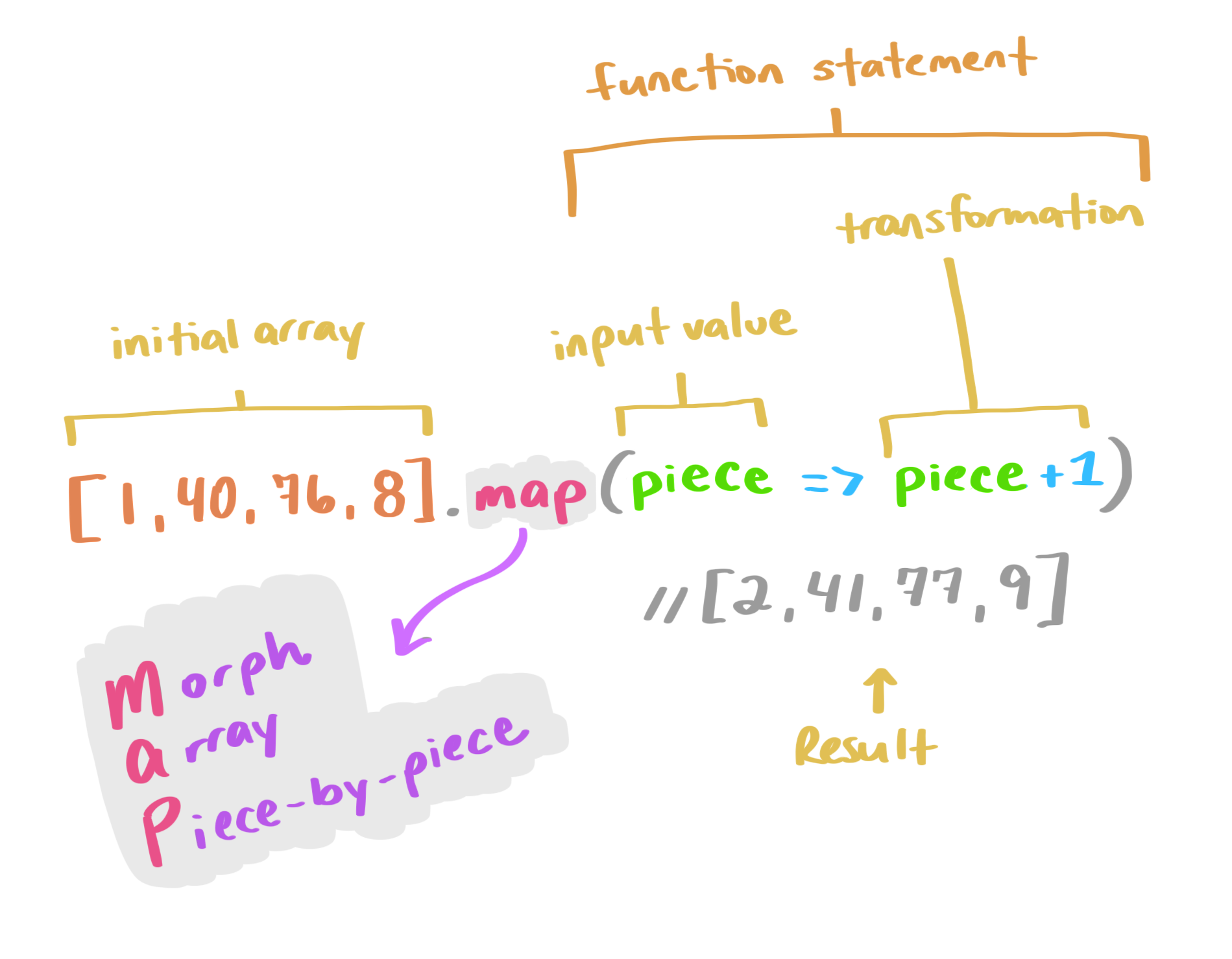
An illustration of the code examples covered in this section.

Map, reduce, and filter are three very useful array methods in JavaScript that give developers a ton of power in a short amount of space. Let’s jump right into how you can leverage (and remember how to use!) these super handy methods.

Array.map()

Array.map() updates each individual value in a given array based on a provided transformation and returns a new array of the same size. It accepts a callback function as an argument, which it uses to apply the transform.

let newArray = oldArray.map((value, index, array) => {
  ...
});

A mnemonic to remember this is MAP: Morph Array Piece-by-Piece.

Instead of a for-each loop to go through and apply this transformation to each value, you can use a map. This works when you want to preserve each value, but update it. We’re not potentially eliminating any values (like we would with a filter), or calculating a new output (like we would use reduce for). A map lets you morph an array piece-by-piece. Let’s take a look at an example:

[1, 4, 6, 14, 32, 78].map(val => val * 10)
// the result is: [10, 40, 60, 140, 320, 780]

In the above example, we take an initial array ([1, 4, 6, 14, 32, 78]) and map each value in it to be that value times ten (val * 10). The result is a new array with each value of the original array transformed by the equation: [10, 40, 60, 140, 320, 780].

Array.filter()

Array.filter() is a very handy shortcut when we have an array of values and want to filter those values into another array, where each value in the new array is a value that passes a specific test.

This works like a search filter. We’re filtering out values that pass the parameters we provide.

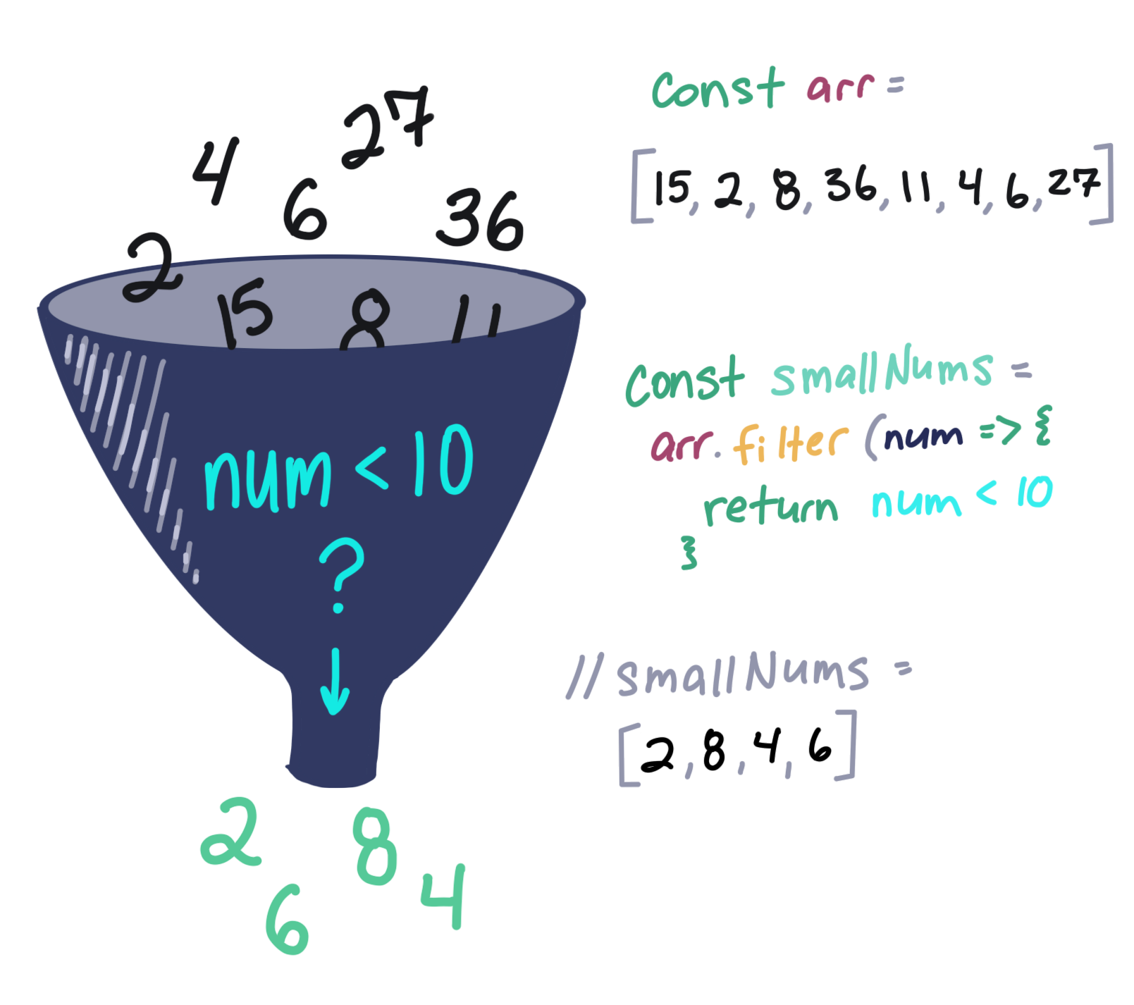
For example, if we have an array of numeric values, and want to filter them to just the values that are larger than 10, we could write:

[1, 4, 6, 14, 32, 78].filter(val => val > 10)
// the result is: [14, 32, 78]

If we were to use a map method on this array, such as in the example above, we would return an array of the same length as the original with val > 10 being the “transform,” or a test in this case. We transform each of the original values to their answer if they are greater than 10. It would look like this:

[1, 4, 6, 14, 32, 78].map(val => val > 10)
// the result is: [false, false, false, true, true, true]

A filter, however, returns only the true values. So the result is smaller than the original array or the same size if all values pass a specific test.

Think about filter like a strainer-type-of-filter. Some of the mix will pass through into the result, but some will be left behind and discarded.

An illustration of a funnel with numbers going in the top and a few coming out of the bottom next to a handwritten version of the code covered in this section.

Say we have a (very small) class of four dogs in obedience school. All of the dogs had challenges throughout obedience school and took a graded final exam. We’ll represent the doggies as an array of objects, i.e.:

const students = [
  {
    name: "Boops",
    finalGrade: 80
  },
  {
    name: "Kitten",
    finalGrade: 45
  },
  {
    name: "Taco",
    finalGrade: 100
  },
  {
    name: "Lucy",
    finalGrade: 60
  }
]

If the dogs get a score higher than 70 on their final test, they get a fancy certificate; and if they don’t, they’ll need to take the course again. In order to know how many certificates to print, we need to write a method that will return the dogs with passing grades. Instead of writing out a loop to test each object in the array, we can shorten our code with filter!

const passingDogs = students.filter((student) => {
  return student.finalGrade >= 70
})

/*
passingDogs = [
  {
    name: "Boops",
    finalGrade: 80
  },
  {
    name: "Taco",
    finalGrade: 100
  }
]
*/

As you can see, Boops and Taco are good dogs (actually, all dogs are good dogs), so Boops and Taco are getting certificates of achievement for passing the course! We can write this in a single line of code with our lovely implicit returns and then remove the parenthesis from our arrow function since we have single argument:

const passingDogs = students.filter(student => student.finalGrade >= 70)

/*
passingDogs = [
  {
    name: "Boops",
    finalGrade: 80
  },
  {
    name: "Taco",
    finalGrade: 100
  }
]
*/

Array.reduce()

The reduce() method takes the input values of an array and returns a single value. This one is really interesting. Reduce accepts a callback function which consists of an accumulator (a value that accumulates each piece of the array, growing like a snowball), the value itself, and the index. It also takes a starting value as a second argument:

let finalVal = oldArray.reduce((accumulator, currentValue, currentIndex, array) => {
  ...
}), initalValue;
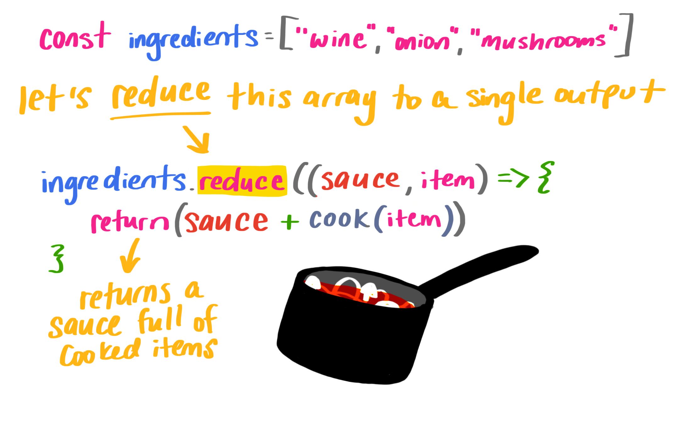
An illustration of a saucepan cooking ingredients next to handwritten code from the examples covered in this section.

Let’s set up a cook function and a list of ingredients:

// our list of ingredients in an array
const ingredients = ['wine', 'tomato', 'onion', 'mushroom']

// a cooking function
const cook = (ingredient) => {
    return `cooked ${ingredient}`
}

If we want to reduce the items into a sauce (pun absolutely intended), we’ll reduce them with reduce()!

const wineReduction = ingredients.reduce((sauce, item) => {
  return sauce += cook(item) + ', '
  }, '')
  
// wineReduction = "cooked wine, cooked tomato, cooked onion, cooked mushroom, "

That initial value ('' in our case) is important because if we don’t have it, we don’t cook the first item. It makes our output a little wonky, so it’s definitely something to watch out for. Here’s what I mean:

const wineReduction = ingredients.reduce((sauce, item) => {
  return sauce += cook(item) + ', '
  })
  
// wineReduction = "winecooked tomato, cooked onion, cooked mushroom, "

Finally, to make sure we don’t have any excess spaces at the end of our new string, we can pass in the index and the array to apply our transformation:

const wineReduction = ingredients.reduce((sauce, item, index, array) => {
  sauce += cook(item)
  if (index < array.length - 1) {
        sauce += ', '
        }
        return sauce
  }, '')
  
// wineReduction = "cooked wine, cooked tomato, cooked onion, cooked mushroom"

Now we can write this even more concisely (in a single line!) using ternary operators, string templates, and implicit returns:

const wineReduction = ingredients.reduce((sauce, item, index, array) => {
  return (index < array.length - 1) ? sauce += `${cook(item)}, ` : sauce += `${cook(item)}`
}, '')

// wineReduction = "cooked wine, cooked tomato, cooked onion, cooked mushroom"

A little way to remember this is to recall how you make sauce: you reduce a few ingredients down to a single item.

Sing it with me!

I wanted to end this blog post with a song, so I wrote a little diddy about array methods that might just help you to remember them:

The post An Illustrated (and Musical) Guide to Map, Reduce, and Filter Array Methods appeared first on CSS-Tricks.

Categories: Designing, Others Tags:

Buddy: 15 Minutes to Automation Nirvana

March 26th, 2019 No comments

(This is a sponsored post.)

Deploying a website to the server in 2019 requires much more effort than 10 years ago. For example, here’s what needs to be done nowadays to deliver a typical JS app:

  • split the app into chunks
  • configure webpack bundle
  • minify .js files
  • set up staging environment
  • upload the files to the server

Running these steps manually takes time, so an automation tool seems like an obvious choice. Unfortunately, most of contemporary CI/CD software provide nothing more than infrastructure in which you have to manually configure the process anyway: spend hours reading the documentation, writing scripts, testing the outcome, and maintaining it later on. Ain’t nobody got time for that!

This is why we created Buddy: to simplify deployment to the absolute minimum by creating a robust tool whose UI/UX allows you configure the whole process in 15 minutes.

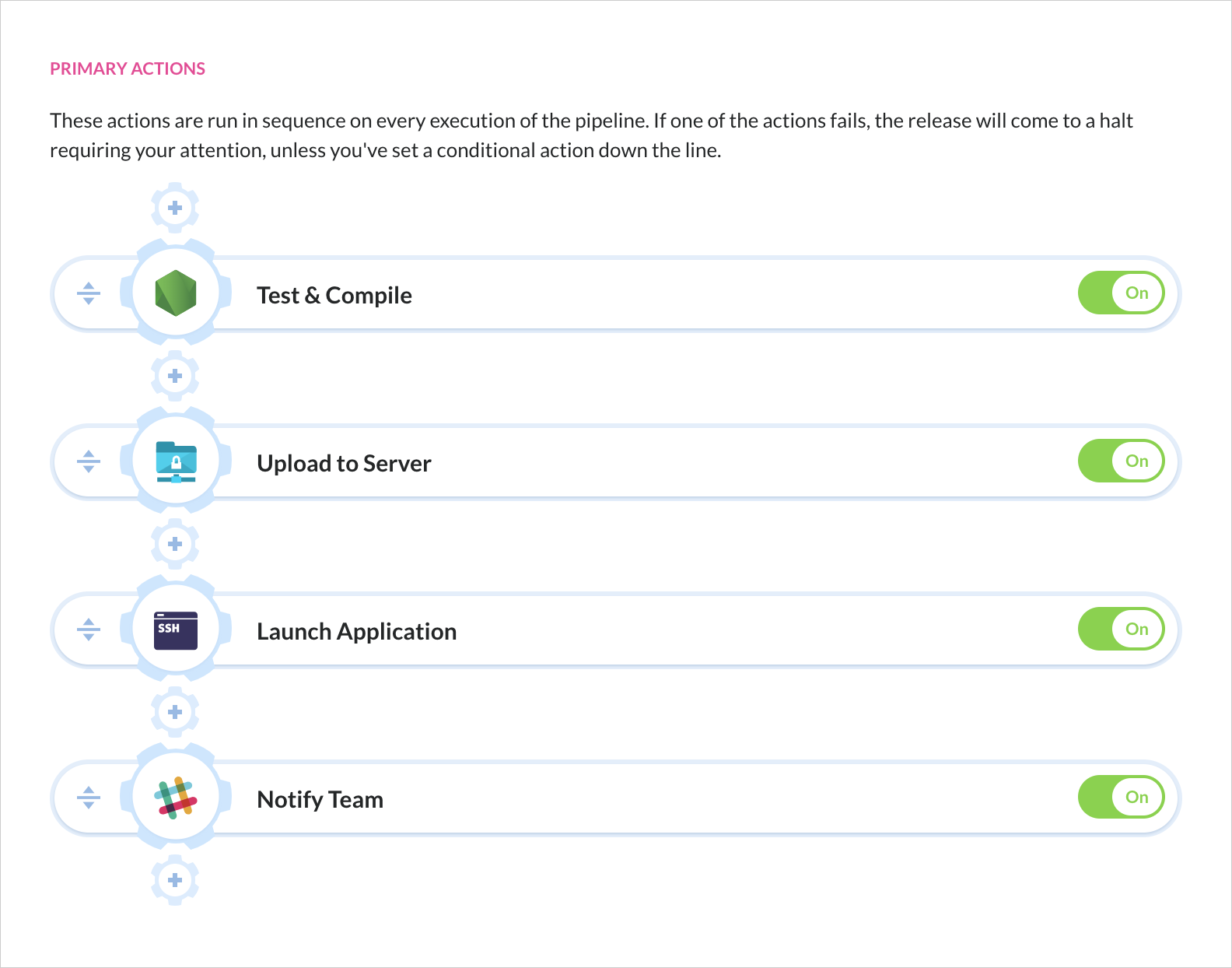
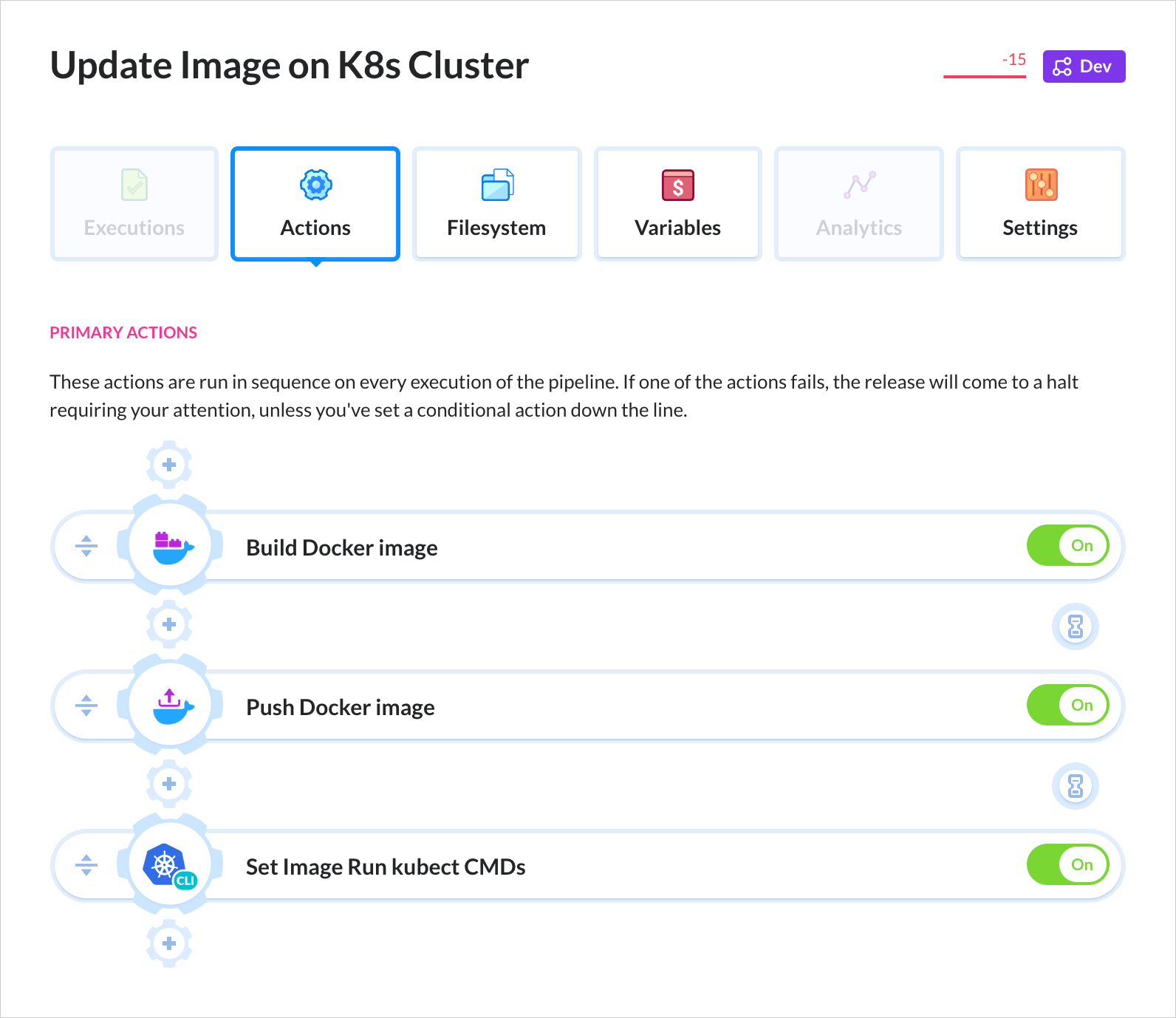
Here’s how the delivery process looks in Buddy CI/CD:

This is a delivery pipeline in Buddy. You select the action that you need, configure the details, and put it down in place—just like you’re building a house of bricks. No scripting, no documentation, no nothing. Currently, Buddy supports over 100 actions: builds, tests, deployments, notifications, DevOps tools & many more.

Super-Smooth Deployments

Buddy’s deployments are based on changesets which means only changed files are deployed – there’s no need to upload the whole repository every time.

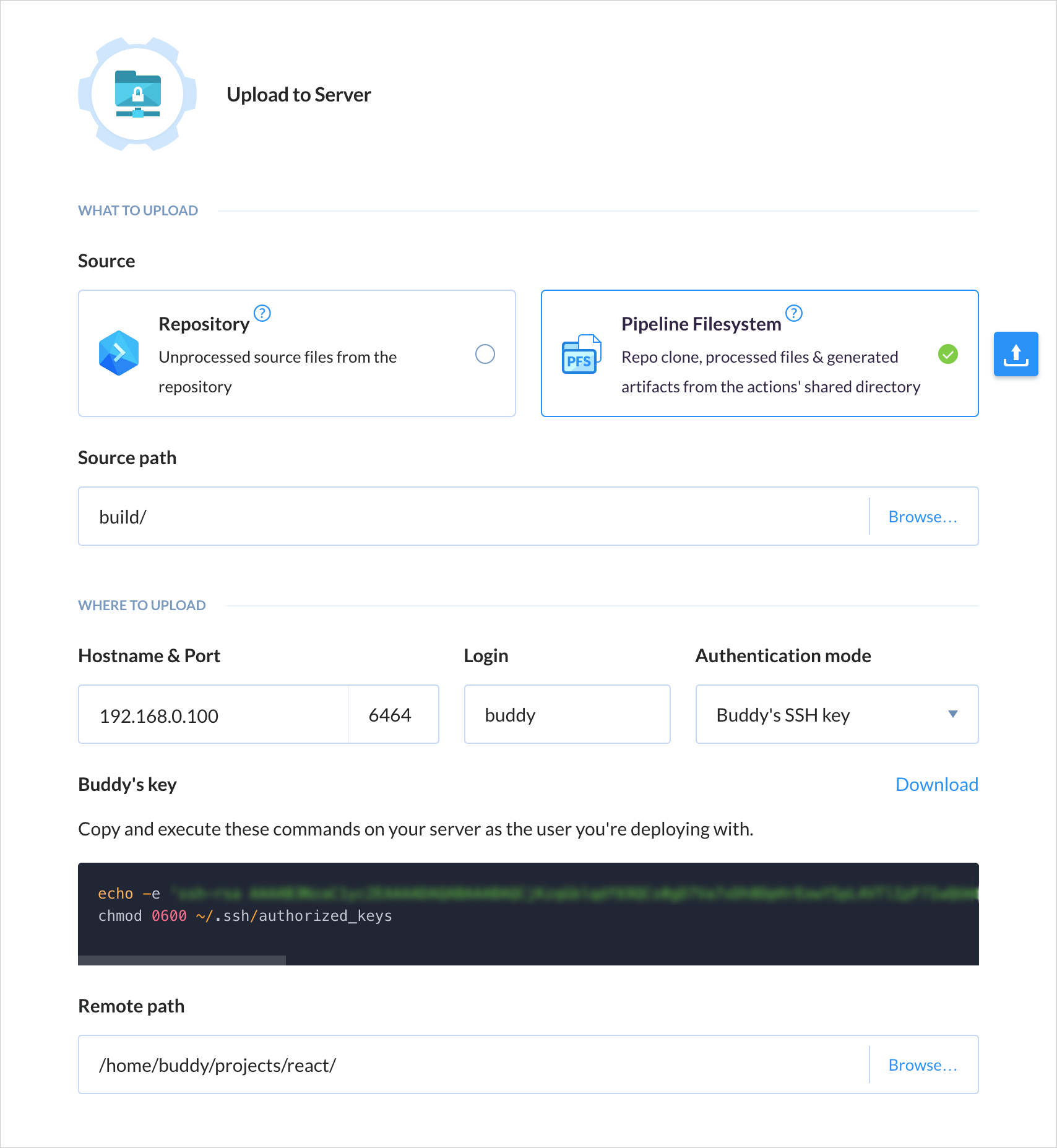
Configuration is very simple. For example, in order to deploy to SFTP, you just need to enter authentication details and the target path on the server:

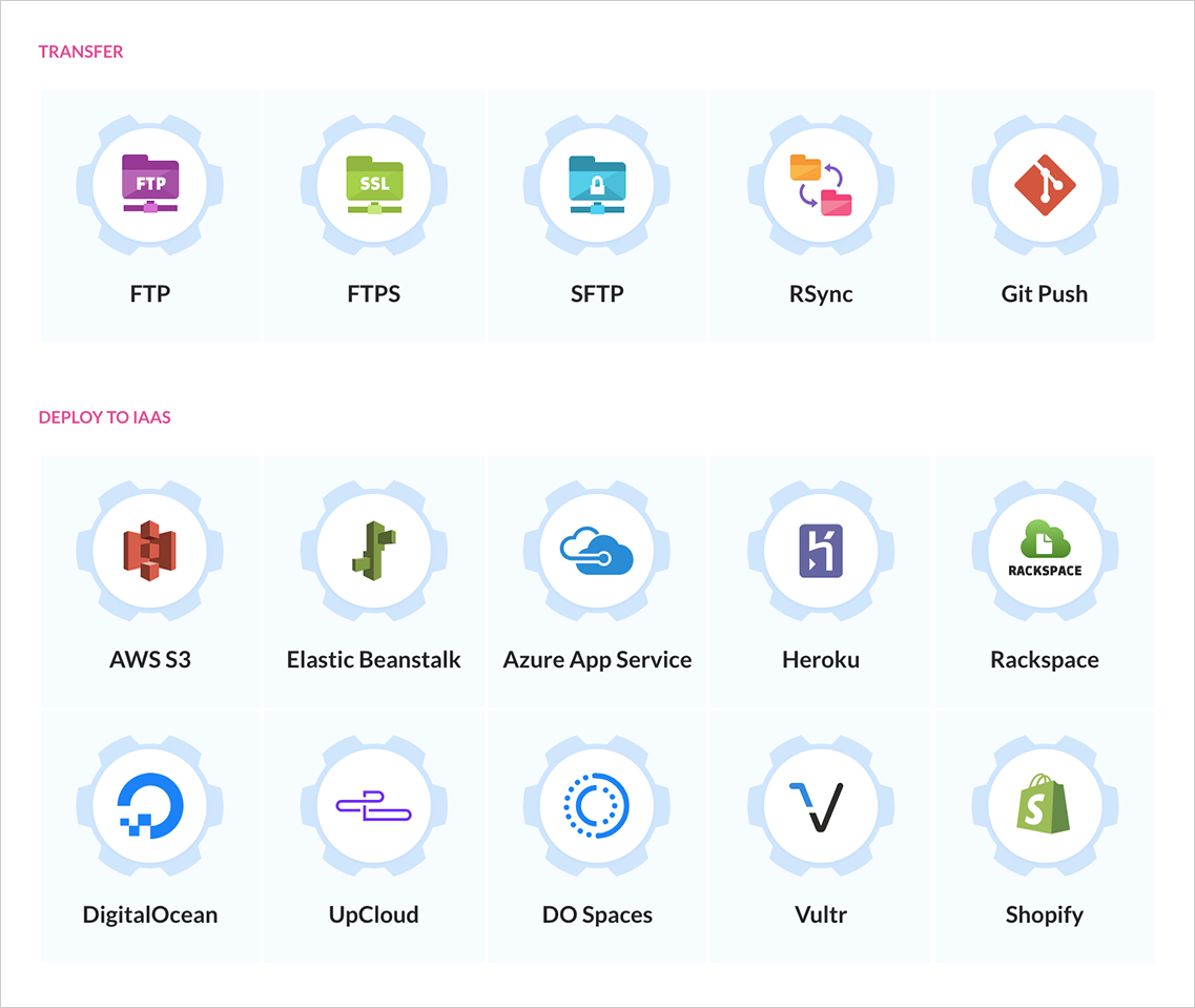
Buddy supports deployments to all popular stacks, PaaS, and IaaS services, including AWS, Google Cloud, Microsoft Azure, and DigitalOcean. Here’s a small part of the supported integrations:

Faster Builds, Better Apps

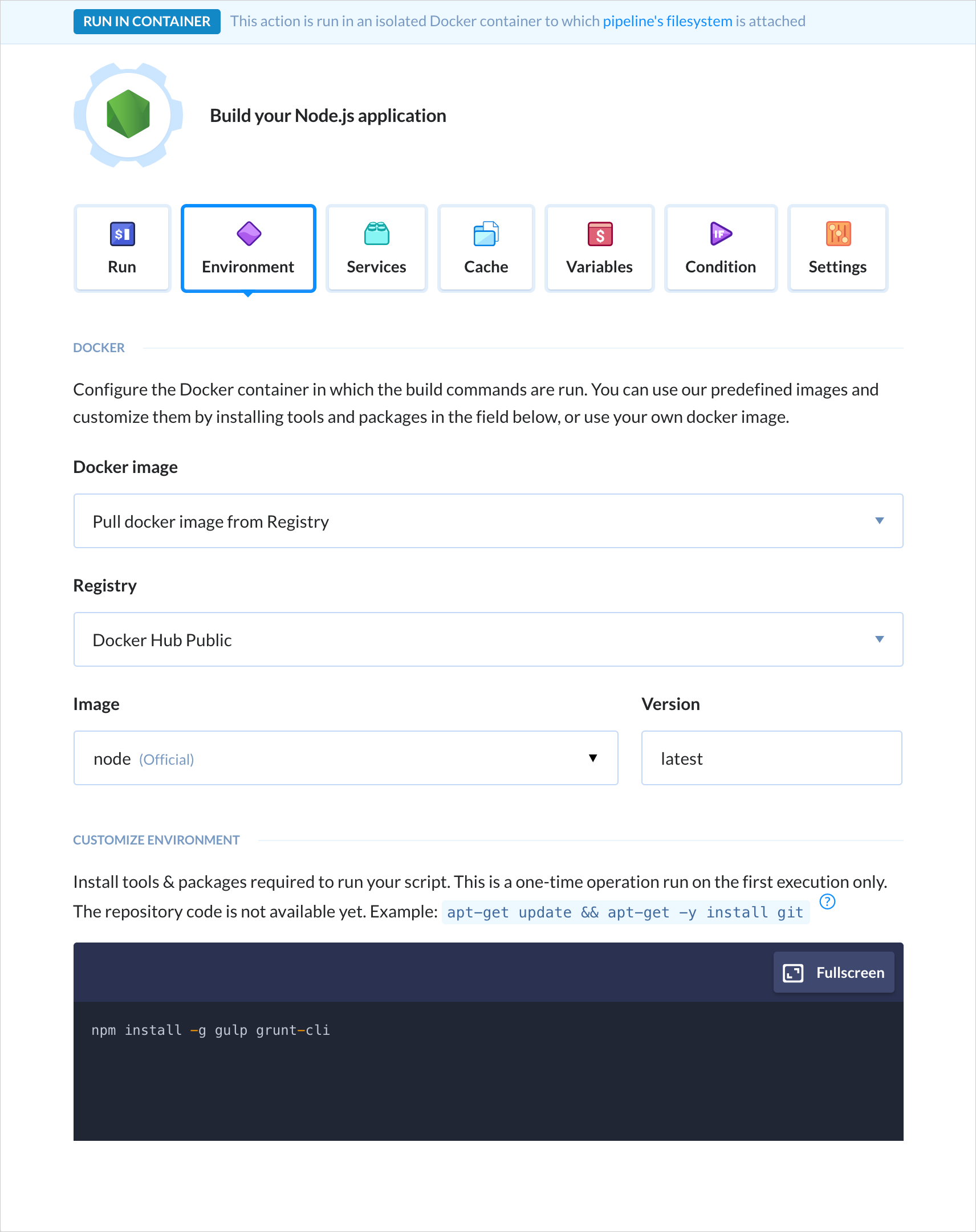
Builds are run in isolated containers with a preconfigured dev environment. Dependencies and packages are downloaded on the first execution and cached in the container, which massively improves build performance.

Buddy supports all popular web developer languages and frameworks, including Node.js, PHP, Ruby, WordPress, Python, .NET Core and Go:

Docker for the People

Being a Docker-based tool itself, Buddy helps developers embrace the power of containers with a dedicated roster of Docker actions. You can build custom images and use them in your builds, run dockerized apps on a remote, and easily orchestrate containers on a Kubernetes cluster.

Buddy has dedicated integrations with Google GKE, Amazon EKS, and Azure AKS. You can also push and images to and from private registries.

Automate now!

Sign up to Buddy now and get 5 projects forever free when your trial is over. The process is simple: click the button below, hook up your GitHub, Bitbucket or GitLab repository (or any other), and let Buddy carry you on from there. See you onboard!

Create free account

Direct Link to ArticlePermalink

The post Buddy: 15 Minutes to Automation Nirvana appeared first on CSS-Tricks.

Categories: Designing, Others Tags:

In Defense of the Word “User”

March 26th, 2019 No comments

Recently-ish, there has been a small but noticeable backlash to the word “user”. Yeah, the word for people who do, in fact, use our websites, web apps, and products.

Now, the word isn’t going anywhere, and if you like the word, no one’s saying you must stop using it. I mean, some people are saying that, but you have no obligation to actually do what they say.

So why does it matter? Why would I die on this hill? Because I think this discussion perfectly outlines the fraught relationship our industry has with words and buzzwords. Designers struggle to the complex emotional interactions between human being and interface. Developers struggle to convey math and layers upon layers of abstract-seeming logic. And don’t get me started on what happens when we try to take these concepts and reduce them to job titles…

We change job titles almost as fast as we change JavaScript Frameworks

So what’s going on with “user”? Some people consider the word outdated, which is a fair opinion to have. Some go so far as to call the current use of the word unethical, which I think might be a bit much. Some think it’s not nearly specific enough a word to use in your code, which I think is exactly right.

Now, our language does need to change and evolve with the times. That’s a part of life, and there’s no getting away from it. However at times our industry can get a little too eager to jump from one bandwagon or trend to the next without seriously considering the consequences. We change job titles almost as fast as we change JavaScript Frameworks. We tire of a buzzword, and so we start hunting for a new one, often without seriously asking ourselves these important questions:

  1. Why would we really make this change?
  2. What do we stand to lose?
  3. What do we stand to gain?

Why Would We Really Make This Change?

Taking “user” for an example: arguments against the word range from “it doesn’t reflect the relationship we have with our customers”, to “Saying ‘user’ strips a person of their circumstances…”. Then there was a mention of how the term “drug user” comes with negative connotations, and the insinuation that the negativity of that use of the word could leak into our use of the word.

I’m not going to argue these points individually, because some of them are definitely subjective and personal. If anyone thinks changing the word is going to make them a better designer, there’s no reason they shouldn’t give it a try. Heck, get back to me with the results!

If you think that being called a “user” is inherently a bad thing, maybe the problem isn’t entirely about the word

And if you feel the word doesn’t reflect your values and attitude, that’s fair too. Just don’t make the mistake of changing the word in the hopes of changing people’s attitudes. The great comedian Doug Stanhope made a fantastic point about this:

Basically he noted that back in the day, doctors would refer to developmentally disabled people as “imbeciles” or “morons”, so that’s what Doug and his friends called each other when they did something stupid. People got offended, so doctors started saying “mentally retarded”, so that’s what Doug and his friends started calling each other when they did something stupid. People now get offended at the word “retarded”, so doctors started saying…

You get the idea. If you think that being called a “user” is inherently a bad thing, maybe the problem isn’t entirely about the word. How do you feel about being called a “consumer”? There’s nothing wrong with consuming stuff, and spending money to support the people who made it, but some may find it offensive to be called by that word.

If you change the word without changing the attitude first, if you start calling users your “dear special bestest friends” in the hopes that a change in terminology alone will make for better design, you may be very disappointed. And people might start using “dear special bestest friends” as a low-key insult.

What Do We Stand to Lose?

I contend that to lose the word “user” is to lose a perfectly normal, non-insulting word that is intentionally vague and all-encompassing. Rather than stripping people of their circumstances, I rather feel it includes people regardless of circumstance.

There are certainly times when it’s far too vague, and you might want a term based on the way in which people interact with your site or app. Sure, that’s fine. But we need room for general, catch-all terms when discussing concepts at an abstract level.

I also contend that we’d be losing a well-known, mostly self-explanatory word that can help us quickly impart information to people who are new to the industry. You yourself may have no use for “user”, but it’s a great word for communicating with clients, as well as newbie designers and devs.

Seriously, every time we change the word we use for a single concept, the more confusing talking to designers gets.

What Do We Stand to Gain?

I guess if we ditch the word “user”, there might be an increased focus on specificity. A blog would have “readers”, a store could have “customers”, and so on. Being that specific and accurate all the time could certainly have its benefits.

But then what about those times when we want to be vague?

You could also argue that picking a different word might help to remind us that users aren’t just numbers, that they’re human. A different word might help you better place them in context. But then, if you need to use a different word to help you remember that users are human, with their own circumstances and contexts, perhaps the word being used is the least of your problems.

In The End:

It’s like I said: “user” is (currently) not going anywhere. The point of this article is not to alarm, or to provoke anything but thought. At this point, I think the word is like underlining hyperlinks; were we to suddenly stop, we’d just confuse a whole lot of people to no real benefit.

And yet, there’s nothing to stop you from trying something new, and switching up your vocabulary a bit. I could be wrong, and ditching the word “user” will finally get us all those jetpacks and flying cars. I have my doubts, though.

Featured image via DepositPhotos

Add Realistic Chalk and Sketch Lettering Effects with Sketch’it – only $5!

Source

Categories: Designing, Others Tags:

Meet “Art Direction For The Web,” A New Smashing Book By Andy Clarke

March 26th, 2019 No comments
A hardcover book laying on a wooden floor, called “Art Direction for the Web”

Meet “Art Direction For The Web,” A New Smashing Book By Andy Clarke

Meet “Art Direction For The Web,” A New Smashing Book By Andy Clarke

Bruce Lawson

2019-03-26T10:40:39+01:002019-03-26T14:05:50+00:00

A page on the Web isn’t like a printed page. Many of us learned that the hard way when we abandoned fixed-width layouts and embraced the web’s inherent flexibility and responsiveness. Read the excerpt chapter.

Modern web technologies like CSS Grid, Flexbox and Shapes have made it possible for us to implement print’s often distinctive designs, and the web’s now full of tutorials on how to use them. But the most important question is not “how” we can use art direction techniques to improve our designs for the web, but instead “when” and “why”.


A hardcover book laying on a wooden floor, called “Art Direction for the Web”

eBook

$14.90 $19Get the eBook

PDF, ePUB, Kindle.
Free for Smashing Members.

Hardcover

$29 $39Get the Print (incl. eBook)

Printed, quality hardcover.
Shipping starts mid-April.

This is the reason why Andy Clarke wrote his new book Art Direction for the Web. This is a book about why art direction matters and how you can art-direct compelling and effective experiences across devices and platforms.

Andy explores the work of some of the most influential art directors, luminaries like Alexey Brodovitch, Bea Feitler, and Neville Brody. He doesn’t encourage us to merely mimic work from a previous era and medium, but to understand their thinking and learn how to apply that knowledge to art direction for the web.

Andy writes,

“You needn’t have been to art school to learn and apply the principles I teach you. Just like art direction itself, they’re something which everyone — no matter what your background and current area of expertise — can use every day to improve the effectiveness of a product or website’s design.”

Andy’s goal is to teach people about the importance of art direction for the web and explain how art direction can help people tell stories by using design. That way, products and websites will connect with audiences and also manage to keep them engaged. After a thorough investigation of the methodology of art direction, Andy teaches how to accomplish it by embracing the web using modern CSS.

Art Direction for the Web will help you make your sites more effective at communicating, persuading, and selling. If you develop products, this book will make them more compelling and more enjoyable to use. Read the excerpt chapter ?


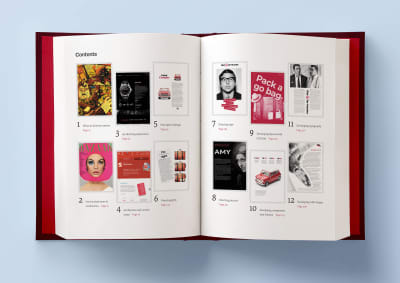
A hardcover book laying open on a light blue background, with two pages open that are showing the table of contents

Table Of Contents

Part 1: Explaining Art Direction

  • What Art Direction Means
    Ask what art direction means to developers, and they might answer: using the element or sizes attribute in HTML for responsive images; presenting alternative crops, orientations, or sizes at various screen sizes. But there’s more to it.
  • One Hundred Years Of Art Direction
    Bradley, Brodovitch, Brody, and Feitler — together, their names sound like a Mad Men-era advertising agency. In this chapter, we’ll take a look at their iconic works, from the 1930’s to the 1980’s.
  • Art-Directing Experiences
    Whether we write fact or fiction, sell or make products, the way to engage people, create desire, make them happy, and encourage them to stay that way, is by creating narratives. So what do we need to consider when doing so?
  • Art Direction And Creative Teams
    Let’s take a look at how we can embrace collaboration and form teams who follow strategies built around common goals.

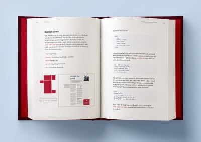
A hardcover book laying open on a light blue background, with two pages open that are showing some artwork examples from the 1930s, by Alexey Brodovitch

Part 2: Designing For Art Direction

  • Principles Of Design
    Are the principles which have guided design in other media for generations relevant to the world of digital products and websites? Of course! In this chapter, we’ll explore the principles of symmetry, asymmetry, ratios, and scale.
  • Directing Grids
    Grids have a long and varied history in design, from the earliest books, through movements like constructivism right up to the present-day popularity of grids in frameworks like Bootstrap and material design. This chapter explains grid anatomy and terminology and how to use modular and compound grids.
  • Directing Type
    White space, typographic scale, and creative uses of type are the focus in this chapter.
  • Directing Pictures
    Images and how we display them have an enormous impact on how people perceive our designs, whether that be on a commercial or editorial website, or inside a product. In this chapter, you’ll learn how to position and arrange images to direct the eye.

A hardcover book laying open on a light blue background, with two pages open that are showing some artwork examples of Bond conference and Medium Memberships

Part 3: Developing For Art Direction

  • Developing Layouts With CSS Grids
    CSS Grid plus thoughtful, art-directed content offers us the best chance yet of making websites which are better at communicating with our audiences. In this chapter, Andy explains properties and techniques which are most appropriate for art direction.
  • Developing Components With Flexbox
    While Grid is ideal for implementing art-directed layouts, Flexbox is often better suited to developing molecules and organisms such as navigation links, images, captions, search inputs, and buttons. This chapter explores how to make use of it.
  • Developing Typography
    From multi-column layout and arranging type with writing modes to text orientation and decorative typography, this chapter dives deep into the code side of type.
  • Developing With Images
    How do you fit your art-directed images to a user’s viewport? And what do CSS shapes and paths have in store for your design? Let’s find out in this final chapter.

A hardcover book laying open on a light blue background, with two pages open that are showing some artwork examples of Bond conference and Medium Memberships

Smashing TV Webinars

To accompany this book, Andy is also giving a series of webinars on Smashing TV. Webinars are free with Smashing Membership, which costs a couple of cups of coffee a month (cancel anytime).

About The Author

Andy Clarke is a well-known designer, design consultant, and mentor. He has been called plenty of things since he started working on the web. His ego likes terms such as “Ambassador for CSS,” “industry prophet,” and “inspiring,” but he’s most proud that Jeffrey Zeldman once called him a “triple-talented bastard.”

With his wife, Sue, Andy founded Stuff & Nonsense in 1998. They’ve helped companies around the world to improve their designs by providing consulting and design expertise.

Andy’s written several popular books on website design and development, including Hardboiled Web Design: Fifth Anniversary Edition, Hardboiled Web Design, and Transcending CSS: The Fine Art Of Web Design. He’s a popular speaker and gives talks about art direction and design-related topics all over the world.

Testimonials

It has been our goal to make the book as inspiring, practical, and useful as possible, and we feel honored to have already received such positive reviews.

“With ‘Art Direction for the Web,’ Andy provides a framework for harnessing the web’s potential. With historical context and real-life examples, Andy inspires each of us to be more purposeful about the choices we make. And true to form, he follows up all that inspiration with demos and the practical knowledge needed to see our ideas manifest online.”

— Trent Walton, co-founder of Paravel Inc.

Why This Book Is For You

The content of this book is based on Andy’s twenty years’ experience of working with clients, plus the expertise of the art directors and designers he interviewed. You’ll learn:

  1. What art direction means, why it matters, and who can do it.
  2. How to make art direction work for digital products and websites.
  3. How to improve conversions and bring your customers’ journeys to life.
  4. How to maintain brand values and design principles by connecting touch points across marketing, product design, and websites.
  5. How to use art direction priciples such as layout, typography, proportions, ratio, and grids in a more imaginative way to communicate what you’re trying to do much better.
  6. How to implement your designs on any platform with the latest HTML and CSS.
  7. …Plus, we’ll explore outstanding designs from 100 years of media and print publishing for some extra art direction inspiration.

A hardcover book laying on a wooden floor, called “Art Direction for the Web”
Andy’s new book explores 100 years of art direction and how we can use this knowledge and the newest web technologies to create better digital products.

eBook

$14.90 $19Get the eBook

PDF, ePUB, Kindle. Free for Smashing Members.

Hardcover

$29 $39Get the Print (incl. eBook)

Printed, quality hardcover.
Shipping starts mid-April.

Technical Details

  • 344 pages, 14 × 21 cm (5.5 × 8.25 inches)
  • ISBN: 978-3-945749-76-0 (print)
  • Quality hardcover with stitched binding and a ribbon page marker.
  • The eBook is available in PDF, ePUB, and Amazon Kindle.
  • Free worldwide airmail shipping from Germany. Starting mid-April. (See delivery times.)
  • Available as printed, quality hardcover and eBook.
(cm, bl, il)
Categories: Others Tags:

Understanding Event Emitters

March 26th, 2019 No comments

Consider, a DOM Event:

const button = document.querySelector("button");

button.addEventListener("click", (event) => /* do something with the event */)

We added a listener to a button click. We’ve subscribed to an event being emitted and we fire a callback when it does. Every time we click that button, that event is emitted and our callback fires with the event.

There may be times you want to fire a custom event when you’re working in an existing codebase. Not specifically a DOM event like clicking a button, but let’s say you want to emit an event based on some other trigger and have an event respond. We need a custom event emitter to do that.

An event emitter is a pattern that listens to a named event, fires a callback, then emits that event with a value. Sometimes this is referred to as a “pub/sub” model, or listener. It’s referring to the same thing.

In JavaScript, an implementation of it might work like this:

let n = 0;
const event = new EventEmitter();

event.subscribe("THUNDER_ON_THE_MOUNTAIN", value => (n = value));

event.emit("THUNDER_ON_THE_MOUNTAIN", 18);

// n: 18

event.emit("THUNDER_ON_THE_MOUNTAIN", 5);

// n: 5

In this example, we’ve subscribed to an event called “THUNDER_ON_THE_MOUNTAIN” and when that event is emitted our callback value => (n = value) will be fired. To emit that event, we call emit().

This is useful when working with async code and a value needs to be updated somewhere that isn’t co-located with the current module.

A really macro-level example of this is React Redux. Redux needs a way to externally share that its internal store has updated so that React knows those values have changed, allowing it to call setState() and re-render the UI. This happens through an event emitter. The Redux store has a subscribe function, and it takes a callback that provides the new store and, in that function, calls React Redux’s component, which calls setState() with the new store value. You can look through the whole implementation here.

Now we have two different parts of our application: the React UI and the Redux store. Neither one can tell the other about events that have been fired.

Implementation

Let’s look at building a simple event emitter. We’ll use a class, and in that class, track the events:

class EventEmitter {
  public events: Events;
  constructor(events?: Events) {
    this.events = events || {};
  }
}

Events

We’ll define our events interface. We will store a plain object, where each key will be the named event and its respective value being an array of the callback functions.

interface Events {
  [key: string]: Function[];
}

/**
{
  "event": [fn],
  "event_two": [fn]
}
*/

We’re using an array because there could be more than one subscriber for each event. Imagine the number of times you’d call element.addEventLister("click") in an application… probably more than once.

Subscribe

Now we need to deal with subscribing to a named event. In our simple example, the subscribe() function takes two parameters: a name and a callback to fire.

event.subscribe("named event", value => value);

Let’s define that method so our class can take those two parameters. All we’ll do with those values is attach them to the this.events we’re tracking internally in our class.

class EventEmitter {
  public events: Events;
  constructor(events?: Events) {
    this.events = events || {};
  }

  public subscribe(name: string, cb: Function) {
    (this.events[name] || (this.events[name] = [])).push(cb);
  }
}

Emit

Now we can subscribe to events. Next up, we need to fire those callbacks when a new event emits. When it happen, we’ll use event name we’re storing (emit("event")) and any value we want to pass with the callback (emit("event", value)). Honestly, we don’t want to assume anything about those values. We’ll simply pass any parameter to the callback after the first one.

class EventEmitter {
  public events: Events;
  constructor(events?: Events) {
    this.events = events || {};
  }

  public subscribe(name: string, cb: Function) {
    (this.events[name] || (this.events[name] = [])).push(cb);
  }

  public emit(name: string, ...args: any[]): void {
    (this.events[name] || []).forEach(fn => fn(...args));
  }
}

Since we know which event we’re looking to emit, we can look it up using JavaScript’s object bracket syntax (i.e. this.events[name]). This gives us the array of callbacks that have been stored so we can iterate through each one and apply all of the values we’re passing along.

Unsubscribing

We’ve got the main pieces solved so far. We can subscribe to an event and emit that event. That’s the big stuff.

Now we need to be able to unsubscribe from an event.

We already have the name of the event and the callback in the subscribe() function. Since we could have many subscribers to any one event, we’ll want to remove callbacks individually:

subscribe(name: string, cb: Function) {
  (this.events[name] || (this.events[name] = [])).push(cb);

  return {
    unsubscribe: () =>
      this.events[name] && this.events[name].splice(this.events[name].indexOf(cb) >>> 0, 1)
  };
}

This returns an object with an unsubscribe method. We use an arrow function (() =>) to get the scope of this parameters that are passed to the parent of the object. In this function, we’ll find the index of the callback we passed to the parent and use the bitwise operator (>>>). The bitwise operator has a long and complicated history (which you can read all about). Using one here ensures we’ll always get a real number every time we call splice() on our array of callbacks, even if indexOf() doesn’t return a number.

Anyway, it’s available to us and we can use it like this:

const subscription = event.subscribe("event", value => value);

subscription.unsubscribe();

Now we’re out of that particular subscription while all other subscriptions can keep chugging along.

All Together Now!

Sometimes it helps to put all the little pieces we’ve discussed together to see how they relate to one another.

interface Events {
  [key: string]: Function[];
}

export class EventEmitter {
  public events: Events;
  constructor(events?: Events) {
    this.events = events || {};
  }

  public subscribe(name: string, cb: Function) {
    (this.events[name] || (this.events[name] = [])).push(cb);

    return {
      unsubscribe: () =>
        this.events[name] && this.events[name].splice(this.events[name].indexOf(cb) >>> 0, 1)
    };
  }

  public emit(name: string, ...args: any[]): void {
    (this.events[name] || []).forEach(fn => fn(...args));
  }
}

Demo

See the Pen
Understanding Event Emitters
by Charles (@charliewilco)
on CodePen.

We’re doing a few thing in this example. First, we’re using an event emitter in another event callback. In this case, an event emitter is being used to clean up some logic. We’re selecting a repository on GitHub, fetching details about it, caching those details, and updating the DOM to reflect those details. Instead of putting that all in one place, we’re fetching a result in the subscription callback from the network or the cache and updating the result. We’re able to do this because we’re giving the callback a random repo from the list when we emit the event

Now let’s consider something a little less contrived. Throughout an application, we might have lots of application states that are driven by whether we’re logged in and we may want multiple subscribers to handle the fact that the user is attempting to log out. Since we’ve emitted an event with false, every subscriber can use that value, and whether we need to redirect the page, remove a cookie or disable a form.

const events = new EventEmitter();

events.emit("authentication", false);

events.subscribe("authentication", isLoggedIn => {
  buttonEl.setAttribute("disabled", !isLogged);
});

events.subscribe("authentication", isLoggedIn => {
  window.location.replace(!isLoggedIn ? "/login" : "");
});

events.subscribe("authentication", isLoggedIn => {
  !isLoggedIn && cookies.remove("auth_token");
});

Gotchas

As with anything, there are a few things to consider when putting emitters to work.

  • We need to use forEach or map in our emit() function to make sure we’re creating new subscriptions or unsubscribing from a subscription if we’re in that callback.
  • We can pass pre-defined events following our Events interface when a new instance of our EventEmitter class has been instantiated, but I haven’t really found a use case for that.
  • We don’t need to use a class for this and it’s largely a personal preference whether or not you do use one. I personally use one because it makes it very clear where events are stored.

As long as we’re speaking practicality, we could do all of this with a function:

function emitter(e?: Events) {
  let events: Events = e || {};

  return {
    events,
    subscribe: (name: string, cb: Function) => {
      (events[name] || (events[name] = [])).push(cb);

      return {
        unsubscribe: () => {
          events[name] && events[name].splice(events[name].indexOf(cb) >>> 0, 1);
        }
      };
    },
    emit: (name: string, ...args: any[]) => {
      (events[name] || []).forEach(fn => fn(...args));
    }
  };
}

Bottom line: a class is just a preference. Storing events in an object is also a preference. We could just as easily have worked with a Map() instead. Roll with what makes you most comfortable.


I decided to write this post for two reasons. First, I always felt I understood the concept of emitters made well, but writing one from scratch was never something I thought I could do but now I know I can — and I hope you now feel the same way! Second, emitters are make frequent appearances in job interviews. I find it really hard to talk coherently in those types of situations, and jotting it down like this makes it easier to capture the main idea and illustrate the key points.

I’ve set all this up in a GitHub repo if you want to pull the code and play with it. And, of course, hit me up with questions in the comments if anything pops up!

The post Understanding Event Emitters appeared first on CSS-Tricks.

Categories: Designing, Others Tags:

Turkish Airlines Updated its Logo

March 25th, 2019 No comments
Turkish Airlines

The national airline of Turkey, which flies to 122 countries around the world, has updated its branding hand in hand with the Imagination studio.

Airlines always look for the best design that defines their identity. Therefore, Turkish Airlines has renewed its image, refining its traditional bird symbol and adopting a new wave that seeks to reflect the seven continents of the world to which the company travels.

Turkish Airlines

The previous logo showed the name of the airline in bold, typography sans serif in blue on the left, with a red circle and an abstract image of a bird in the center on the right. According to the Turkish airline, the shape of a bird drawn on a line represents a “wild goose”. This has been chosen as his mascot, since geese are well known for traveling great distances.

Turkish Airlines

The new brand presents a refined version of the goose symbol encapsulated within the circle, which is now red in color. The goose has been adjusted, now placed at a more diagonal angle, and is smaller in size, as it does not reach the edges of the circle.

Turkish Airlines

The logo is now configured in white within the circumference, created with a palette of colors in red and white. The typography has been modified and now has rounded corners in some characters. The logo is accompanied by a wave chart composed of seven horizontal lines, which seek to refer to the seven continents of the world, in an attempt to transmit the airline as an international entity.

The logo is located at the point of convergence, or center of the graphic line, which appears to represent “Turkish Airlines at the center of global travel,” the design consultancy mentioned.

Red and white are the main corporate colors of the brand, and have been used to represent the economy class, while a combination of golden and black rose is the main palette of the business class, to create a more “premium” feeling and “distinctive” look.

In addition, a new set of graphic icons has been designed, representing different elements of the airline’s experience, including hold baggage and items that are restricted by airport security.

The presentation of this new image coincides with the launch of the new Istanbul airport in Turkey, which will become the new center of Turkish Airlines operations and which will open its doors in April. The current hubs of the airline are Istanbul-Atatürk Airport and Ankara Airport.

The new brand has begun to expand, starting with signage, positioning, billing counters and other interior points of contact at the new airport.

This new rebranding will continue to be implemented over the next few months in interior aircraft designs, digital platforms that include the website and social networks, printed advertising materials and merchandise.

Imagination has also created a set of guidelines for Turkish Airlines, so that the company can continue to produce branded products in the future, such as signs, shoes and blankets in the cabin.

Read More at Turkish Airlines Updated its Logo

Categories: Designing, Others Tags: