Firefox Mobile Introduces Left-Handed Browsing
Firefox’s mobile browser’s nightly release has become the first browser to implement a left-handed option in its preferences.
First proposed at the then bi-annual web conference, way back in 1998, the left-handed web protocol was initially envisaged as a way to enable left-handed browsing online. The protocol was never officially adopted, thanks to ambidextrous hardware.
However, the rise of the touch screens has lead to an unexpected revival of the idea, and although still not officially adopted by the W3C, browser manufacturers are beginning to implement it, with Firefox being the first, and Opera expected to follow shortly.
Championed by usability experts like Caitlin Fring, the original left-handed browsing protocol is being reinterpreted for touchscreens:
Back when the web was controlled by a trackpad, or a mouse, there was no use case for a left-handed web, but with the exponential growth of touchscreens across mobile, and desktop devices, we’re finding that it’s increasingly essential for many of our customers.
~Jason Sommer, Senior Usability Designer, Mozilla
What is the Left-Handed Web?
When users browse the web on a touchscreen phone, especially on a larger device, certain areas are easier to tap than others, due to the reach of the user’s thumb. When held in the other hand, the available hit area is mirrored.
Globally, around one in ten people are left-handed, which means that for around 10% of any site’s users, the navigation and CTAs (Calls to Action) are inaccessible.
The LHW (Left-Handed Web) protocol is an option in the browser preferences that enables users to set their browser to invert the horizontal rendering of the page so that elements that appear on the right move to the left, and vice versa. (Elements such as text remain left aligned, and images aren’t flipped.) By repositioning elements based on this preference, hit areas become more accessible.

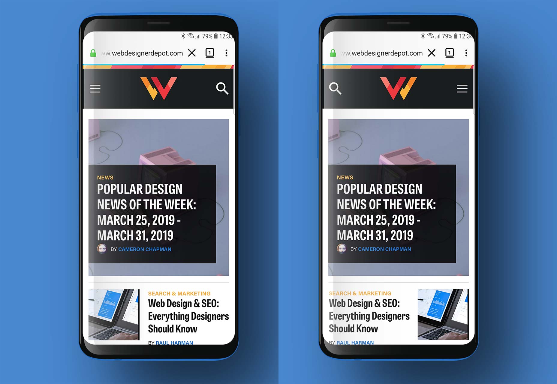
Webdesignerdepot.com rendered normally in Firefox mobile (left) and with the Left-Handed option enabled (right).
In simple terms, the LHW option—it’s important to note that the LHW is an opt-in preference; only those users that want to enable it will do so—simply flips the layout order of a site; if your logo is in the top left and your hamburger menu the top right, then with the LHW option enabled, your logo will move to the top right, and your hamburger menu to the top left.
Firefox’s implementation has come to market so quickly because it is piggy-backing on the CSS Flexbox’s ability to reverse the horizontal order of items laid out on screen.
What Does the LHW Mean for UX?
One of the biggest issues with the LHW is how different browser manufacturers choose to interpret the recommendations; as no formal recommendation has yet been made, those interpretations are likely to be wildly different.
When CSS Flexbox was introduced, there were radically different interpretations made by browser manufacturers, resulting in the need for numerous browser prefixes. Microsoft in particular implemented a very different set of rules to anyone else. Implementations of the LHW are likely to be even worse.
The most contentious issue is whether navigation should be reversed. Firefox’s implementation does not reverse navigation, so if your site’s header is structured as ‘logo > home > services > about > contact’ then it will be rendered as ‘home > services > about > contact > logo’ (assuming that the logo is a separate element, and the navigation is correctly marked up with a
