Edge Goes Chromium: What Does it Mean for Front-End Developers?
In December 2018, Microsoft announced that Edge would adopt Chromium, the open source project that powers Google Chrome. Many within the industry reacted with sadness at the loss of browser diversity. Personally, I was jubilant. An official release date has yet to be announced, but it will be at some point this year. With its release, a whole host of HTML, JavaScript and CSS features will have achieved full cross-browser support.
The preview build is now available for Windows, and coming soon for Mac.
? Calling all web devs and tinkerers! ?
The first preview builds of the next version of #MicrosoftEdge are ready for you – try it out now! https://t.co/I531hfmD3G pic.twitter.com/Tvh6OGGouO
— Microsoft Edge Dev (@MSEdgeDev) April 8, 2019
Not so long ago, I penned an article titled “The Long Slow Death of Internet Explorer.” Some of us are lucky enough have abandoned that browser already. But it wasn’t the only thing holding us back. Internet Explorer was the browser we all hated and Edge was meant to be its much-improved replacement. Unfortunately, Edge itself was quite the laggard. EdgeHTML is a fork of Trident, the engine that powered Internet Explorer. Microsoft significantly under-invested in Edge. The apple didn’t fall far from the tree. Edge’s User Voice website was a nice idea, allowing developers to vote for which features they wanted to be implemented. Unfortunately, as Dave Rupert put it, voting on the site was “like throwing coins in a wishing well.” The most requested features were left unimplemented for years.
There are a lot of features that pre-Chromium Edge doesn’t currently support but are available in other modern browsers and, once they’ve made the switch, we’ll be able to use them. Many of them can’t be polyfilled or worked around, so this release is a big deal.
caniuse.com comparing the final non-Chromium version of Edge to the other popular modern browser
Features we can look forward to using
So just what are those features, exactly? Let’s outline them right here and start to get excited about all the new things we’ll be able to do.
Custom Elements and Shadow DOM
Together, custom elements and shadow DOM allow developers to define custom, reusable and encapsulated components. A lot of people were asking for this one. People have been voting for its implementation since 2014, and we’re finally getting it.
HTML details and summary elements
The
elements are part of HTML5 and have been supported since 2011 in Chrome. Used together, the elements generate a simple widget to show and hide content. While it is trivial to implement something similar using JavaScript, the
and
elements work even when JavaScript is disabled or has failed to load.
See the Pen
details/summary by CSS GRID (@cssgrid)
on CodePen.
Javascript Font Loading API
This one means a lot to some people. All modern browsers now support the CSS font-display property. However, you still might want to load your fonts with JavaScript. Font-loading monomaniac Zach Leatherman has an explainer of why you might want to load fonts with JavaScript even though we now have broad support for font-display. Ditching polyfills for this API is important because this JavaScript is, according to Zach:
[…] usually inlined in the critical path. The time spent parsing and executing polyfill JavaScript is essentially wasted on browsers that support the native CSS Font Loading API.”
In an article from 2018, Zach lamented:
[…] browser-provided CSS Font Loading API has pretty broad support and has been around for a long time but is confoundedly still missing from all available versions of Microsoft Edge.”
No longer!
JavaScript flat and flatMap
Most easily explained with a code snippet, flat() is useful when you have an array nested inside another array.
const things = ['thing1', 'thing2', ['thing3', ['thing4']]]
const flattenedThings = things.flat(2); // Returns ['thing1', 'thing2', 'thing3', 'thing4']
As its name suggests, flatMap() is equivalent to using both the map() method and flat().
These methods are also supported in Node 11. ?
JavaScript TextEncoder and TextDecoder
TextEncoder and TextDecoder are part of the encoding spec. They look to be useful when working with streams.
JavaScript Object rest and object spread
These are just like rest and spread properties for arrays.
const obj1 = {
  a: 100,
  b: 2000
}

const obj2 = {
  c: 11000,
  d: 220
}

const combinedObj = {...obj1, ...obj2}
// {a: 100, b: 2000, c: 11000, d: 220}
JavaScript modules: dynamic import
Using a function-like syntax, dynamic imports allow you to lazy-load ES modules when a user needs them.
button.addEventListener("click", function() {
  import("./myModule.js").then(module => module.default());
});
CSS background-blend-mode property
background-blend-mode brings Photoshop style image manipulation to the web.
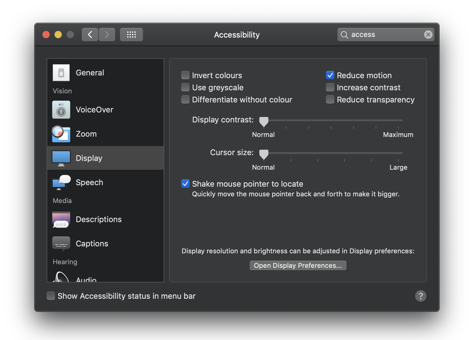
CSS prefers-reduced-motion media query
I can’t help feeling that not making people feel sick should be the default of a website, particularly as not all users will be aware that this setting exists. As animation on the web becomes more common, it’s important to recognize that animation can cause causes dizziness, nausea and headaches for some users.
CSS font-display property
font-display has been well-covered on CSS-Tricks before. It’s a way to control the perceived performance of font loading.
CSS caret-color property
Admittedly a rather trivial feature, and one that could have safely and easily been used as progressive enhancement. It lets you style the blinking cursor in text input fields.
8-digit hex color notation
It’s nice to have consistency in a codebase. This includes sticking to either
the RGB, hexadecimal or HSL color format. If your preferred format is hex, then you had a problem because it required a switch to rgba() any time you needed to define transparency. Hex can now include an alpha (transparency) value. For example, #ffffff80 is equivalent to rgba(255, 255, 255, .5). Arguably, it’s not the most intuitive color format and has no actual benefit over rgba().
Intrinsic sizing
I’ve not seen as much hype or excitement for intrinsic sizing as some other new CSS features, but it’s the one I’m personally hankering for the most. Intrinsic sizing determines sizes based on the content of an element and introduces three new keywords into CSS: min-content, max-content and fit-content(). These keywords can be used most places that you would usually use a length, like height, width, min-width, max-width, min-height, max-height, grid-template-rows, grid-template-columns, and flex-basis.
CSS text-orientation property
Used in conjunction with the writing-mode property, text-orientation, specifies the orientation of text, as you might expect.
See the Pen
text-orientation: upright by CSS GRID (@cssgrid)
on CodePen.
CSS :placeholder-shown pseudo-element
placeholder-shown was even available in Internet Explorer, yet somehow never made it into Edge… until now. UX research shows that placeholder text should generally be avoided. However, if you are using placeholder text, this is a handy way to apply styles conditionally based on whether the user has entered any text into the input.
CSS place-content property
place-content is shorthand for setting both both the align-content and justify-content.
See the Pen
place-content by CSS GRID (@cssgrid)
on CodePen.
CSS will-change property
The will-change property can be used as a performance optimization, informing the browser ahead of time that an element will change. Pre-Chromium Edge was actually good at handling animations performantly without the need for this property, but it will now have full cross-browser support.
CSS all property
all is a shorthand for setting all CSS properties at once.
For example, setting button { all: unset; } is equivalent to:
button {
  background: none;
  border: none;
  color: inherit;
  font: inherit;
  outline: none;
  padding: 0;
}
Sadly, though, the revert keyword still hasn’t been implemented anywhere other than Safari, which somewhat limits the mileage we can get out of the all property.
CSS Shapes and Clip Path
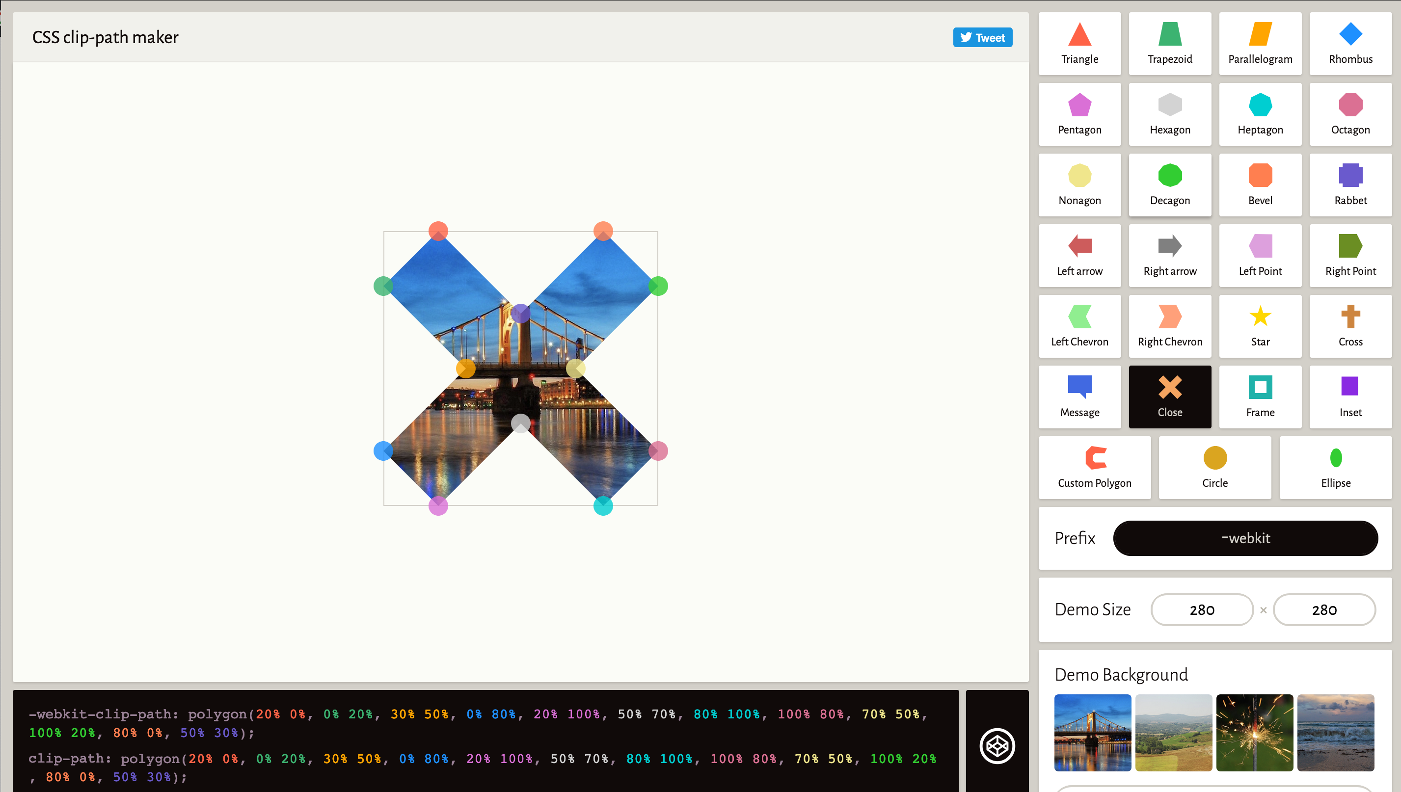
Traditionally, the web has been rectangle-centric. It has a box model, after all. While we no longer need floats for layout, we can use them creatively for wrapping text around images and shapes with the shape-outside property. This can be combined with the clip-path property, which brings the ability to display an image inside a shape.
clip-path editorCSS :focus-within pseudo-class
If you want to apply special styles to an entire form when any one of its inputs are in focus, then :focus-within is the selector for you.
CSS contents keyword
This is pretty much essential if you’re working with CSS grid. This had been marked as “not planned” by Edge, despite 3,920 votes from developers.
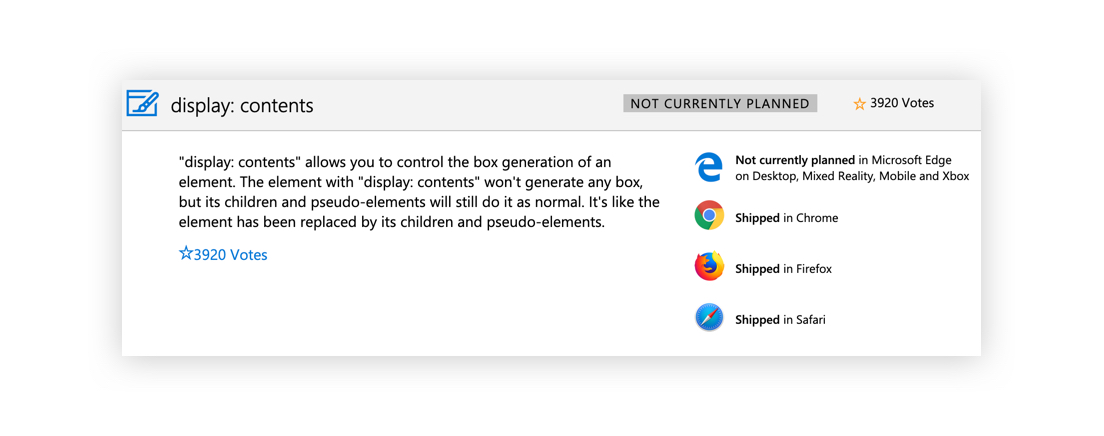
For both flexbox and grid, only direct children become flex items or grid items, respectively. Anything that is nested deeper cannot be placed using flex or grid-positioning. In the words of the spec, when display: contents is applied to a parent element, “the element must be treated as if it had been replaced in the element tree by its contents,” allowing them to be laid out with a grid or with flexbox. Chris goes into a more thorough explanation that’s worth checking out.
There are, unfortunately, still some bugs with other browser implementations that affect accessibility.
The future holds so much more promise
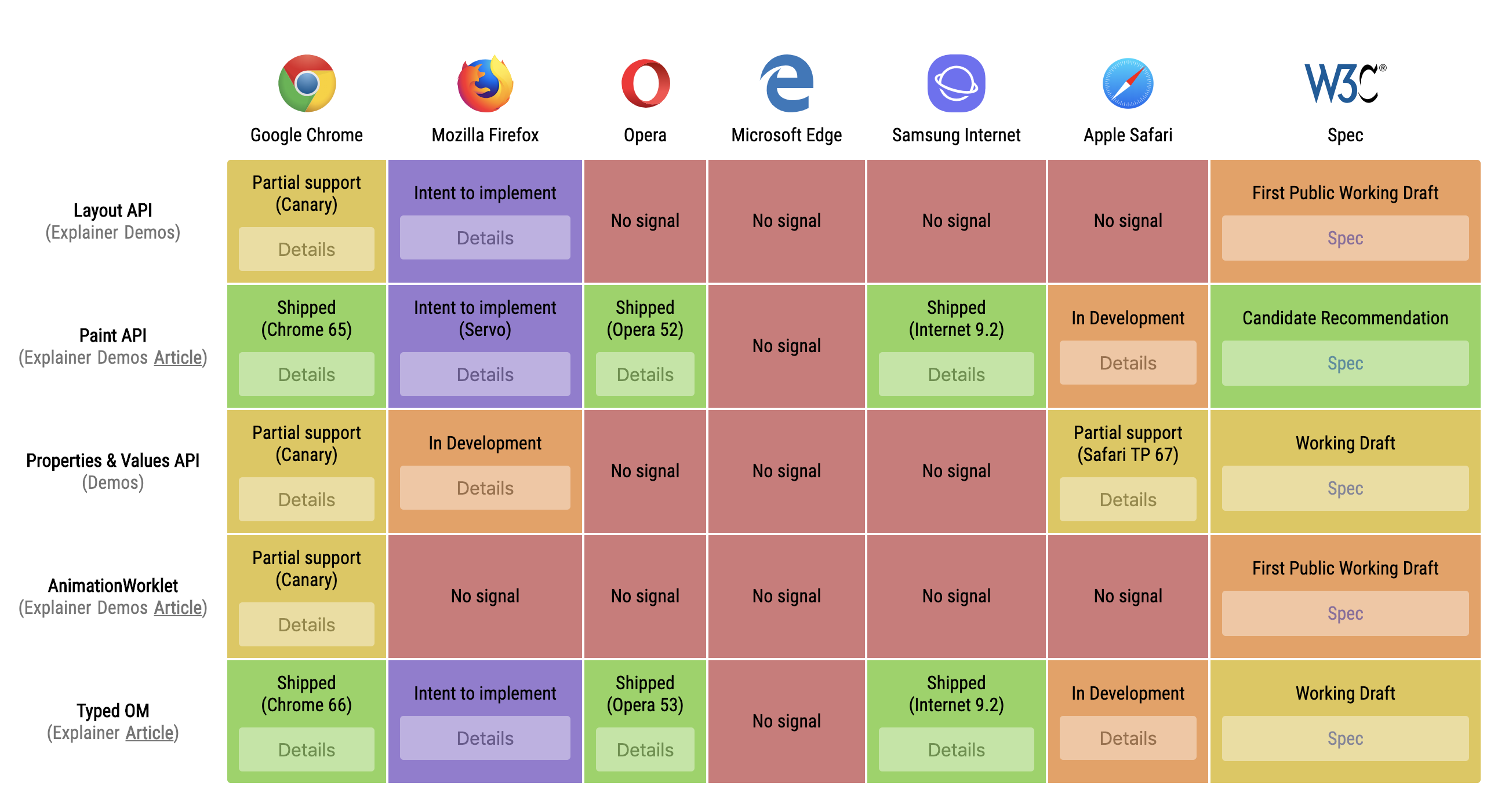
We’ve only looked at features that will be supported by all modern browsers when Edge makes the move to Chromium. That said, the death of legacy Edge also makes a lot of other features feel a lot closer. Edge was the only browser dragging its feet on the Web Animation API and that showed no interest in any part of the Houdini specs, for example.
The impact on browser testing
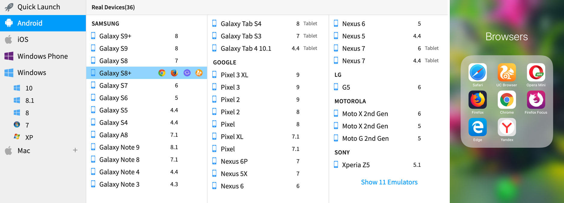
Of course, the other huge plus for web developers is less testing. A lot of neglected Edge during cross-browser testing, so Edge users were more likely to have a broken experience. This was the main reason Microsoft decided to switch to Chromium. If your site is bug-free in one Chromium browser, then it’s probably fine in all of them. In the words of the Edge team, Chromium will provide “better web compatibility for our customers and less-fragmentation of the web for all web developers.” The large variety of devices and browsers makes browser testing one of the least enjoyable tasks that we’re responsible for as front-end developers. Edge will now be available for macOS users which is great for the many of us who work on a Mac. A subscription to BrowserStack will now be slightly less necessary.
Do we lose anything?
To my knowledge, the only feature that was supported everywhere except Chrome is SVG color fonts, which will no longer work in the Edge browser. Other color font formats (COLR, SBIX, CBDT/CBLC) will continue to work though.
Uh, @GoogleChrome Are you planning to support #OpenTypeSVG soon? Supported in Safari (12+), Firefox (26+) even EdgeHTML (38+) Photoshop, Illustrator – but not Chrome
/cc @colorfontswtf pic.twitter.com/tgwJ3AqHm2— Chris Lilley (@svgeesus) February 15, 2019
What about other browsers?
Admittedly, Edge wasn’t the last subpar browser. All the features in this article are unsupported in Internet Explorer, and always will be. If you have users in Russia, you’ll need to support Yandex. If you have users in Africa, you’ll need to support Opera Mini. If you have users in China, then UC and QQ will be important to test against. If you don’t have these regional considerations, there’s never been a better time to ditch support for Internet Explorer and embrace the features the modern web has to offer. Plenty of PC users have stuck with Internet Explorer purely out of habit. Hopefully, a revamped Edge will be enough to tempt them away. An official Microsoft blog entry titled “The perils of using Internet Explorer as your default browser” concluded that, “Internet Explorer is a compatibility solution…developers by and large just aren’t testing for Internet Explorer these days.” For its remaining users, the majority of the web must look increasingly broken. It’s time to let it die.
Is Google a megalomaniac?
Life is about to get easier for web developers, yet the response to the Microsoft’s announcement was far from positive. Mozilla, for one, had a stridently pessimistic response, which accused Microsoft of “officially giving up on an independent shared platform for the internet.” The statement described Google as having “almost complete control of the infrastructure of our online lives” and a “monopolistic hold on unique assets.” It concluded that “ceding control of fundamental online infrastructure to a single company is terrible.”
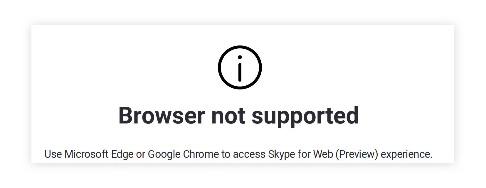
Many have harked back to the days of IE6, the last time a browser achieved such an overwhelming market share. Internet Explorer, having won the browser war, gave in to total stagnation. Chrome, by contrast, ceaselessly pushes new features. Google participates actively with the web standards bodies the W3C and the WHATWG. Arguably though, it has an oversized influence in these bodies and the power to dictate the future shape of the web. Google Developer Relations does have a tendency to hype features that have shipped only in Chrome.
From competition to collaboration
Rather than being the new IE, Edge can help innovate the web forward. While it fell behind in many areas, it did lead the way for CSS grid, CSS exclusions, CSS regions and the new HTML imports spec. In a radical departure from historical behavior, Microsoft have become one of the world’s largest supporters of open source projects. That means all major browsers are now open source. Microsoft have stated that they intend to become a significant contributor to Chromium — in fact, they’ve already racked up over 300 merges. This will help Edge users, but will also benefit users of Chrome, Opera, Brave, and other Chromium-based browsers.
The post Edge Goes Chromium: What Does it Mean for Front-End Developers? appeared first on CSS-Tricks.
