Archive

Archive for April, 2019

Going Serverless With Cloudflare Workers

April 4th, 2019 No comments
Cloudflare data center map

Going Serverless With Cloudflare Workers

Going Serverless With Cloudflare Workers

Leonardo Losoviz

2019-04-04T15:00:34+02:002019-04-05T11:29:44+00:00

(This is a sponsored article.) It is a truth universally acknowledged, that a website in pursuit of success must be in want of speed. And so, it goes serverless.

At its core, serverless is a strategy for a website’s architecture, based on deploying static files (the good old HTML, CSS and image files) on cloud-based hosting, and augmenting the website’s capabilities by accessing cloud-based, charge-per-use dynamic functionality. There is nothing mystical or mysterious about serverless: its end result is simply a website or application.

In spite of its name, “serverless” doesn’t mean “without a server”. It simply means “without my own server”. This means that my site is still hosted on some server, but by offloading this responsibility to the cloud services provider, I can devote all my energies to developing my own product (the website) and not have to worry about the infrastructure.

Serverless is very appealing for several reasons:

  • Low-cost
    You only pay for what you use. Hosting static files on the cloud can cost just a few cents a month (or even be free in some cases).
  • Fast
    Static files can be delivered to the user from a Content Delivery Network (CDN) located near the user.
  • Secure
    The cloud provider constantly keeps the underlying platform up-to-date.
  • Easy to scale
    The cloud provider’s business is to scale up the infrastructure on demand.

Serverless is also becoming increasingly popular due to the increasing availability of services offered by cloud providers, simple-yet-powerful template-based static site generators (such as Jekyll, Hugo or Gatsby) and convenient ways to feed data into the process (such as through one of the many git based CMS’s).

The Network Is The Computer: Introducing Cloudflare Workers

Cloudflare, one of the world’s largest cloud network platforms, is well versed in providing the benefits we are after through serverless: for some time now they have made their extensive CDN available to make our sites fast, offered DDoS protection to make our sites secure, and made their 1.1.1.1 DNS service free so we could afford having privacy on the Internet, among many other services.

Their new serverless offering, Cloudflare Workers (or simply “Workers”), runs on the same global cloud network of over 165 data centers that powers those services. Cloudflare Workers is a service that provides a lightweight JavaScript execution environment to augment existing applications or create new ones.

Being stacked on top of Cloudflare’s widespread network makes Cloudflare Workers a big deal. Cloudflare can scale up its infrastructure based on spikes in demand, serving a serverless application from locations on five continents and supporting millions of users, making our applications fast, reliable, and scalable.


Cloudflare data center map
The Cloudflare network is powered by 165 data centers around the world. (Large preview)

On top of that, Cloudflare Workers provides unique features that make it an even more compelling service. Let’s explore these in detail.

Architecture Based On V8 For Fast Access And Low Cost

The Cloudflare engineers went out of their way to architect Workers, as they proudly explain in depth. Whereas almost every provider offering cloud computing has an architecture based on containers and virtual machines, Workers uses “Isolates”, the technology that allows V8 (Google Chrome’s JavaScript engine) to run thousands of processes on a single server in an efficient and secure manner.

Compared to virtual machines, Isolates greatly reduce the overhead required to execute user code, which translates into faster execution and lower use of memory.


Architecture of Isolates
Isolates allow thousands of processes to run efficiently on a single machine (Large preview)

Cloudflare Workers is not the first serverless cloud computing platform in operation: for instance, Amazon has offered AWS Lambda and Lambda@Edge. However, as a consequence of the lower overhead produced by Isolates, Cloudflare claims that when executing a similar task, Workers beats the competition where it matters most: speed and money.

Lower Price

While a Worker offering 50 milliseconds of CPU costs $0.50 per million requests, the equivalent Lambda costs $1.84 per million. Hence, running Workers ends up being around 3x cheaper than Lambda per CPU-cycle.

Faster Access

The Cloudflare team ran tests comparing Workers against AWS Lambda and Lambda@Edge, and came to the conclusion that Workers is 441% faster than a Lambda function and 192% faster than Lambda@Edge.
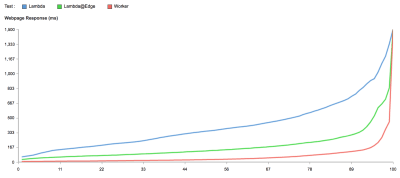

Speed comparison chart
This chart shows what percentage of requests to Lambda, Lambda@Edge, and Cloudflare Workers were faster than a given number of milliseconds. (Large preview)

The better performance achieved by Cloudflare Workers is confirmed by the third-party site serverless-benchmark.com, which measures the performance of serverless providers and provides continuously updated statistics.
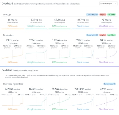

Performance comparison
Statistics for Overhead (the time from request to response without the actual time the function took) and Cold start (the latency it takes a function to respond to the event) for Cloudflare Workers and its competitors. (Large preview)

Coded In JavaScript, Modeled On The Service Workers API

Because it is based on V8, programming for Workers is done in those languages supported by V8: JavaScript and languages that support compilation to WebAssembly, such as Go and Rust. V8’s code is merged into Workers at least once a week, so we can always expect it to support the latest implemented flavor of ECMAScript.

Workers are modeled on the Service Workers available in modern web browsers, and they use the same API whenever possible. This is significant: Because Service Workers are part of the foundation to create a Progressive Web App (PWA), creating Workers is done through an API that developers are already familiar with (or may be in the process of learning) for creating modern web applications.

In addition, relying on the Service Workers API allows developers to boost their productivity since it allows isomorphism of code, i.e. the same code that powers the Service Worker can be used for a Cloudflare Worker. Even though this is not always feasible because of the different contexts (while a Service Worker runs in the browser, the Cloudflare Worker runs in the network), certain use cases could apply to both contexts.

For instance, among the Service Workers recipes described in serviceworke.rs, recipes for API Analytics, Load Balancer, and Dependency Injection can be implemented on both the client side and the network using the same code (or most of it). And even when the functionality makes sense only on either the client-side or the network, it can be partly implemented using chunks of code that are context-agnostic and can be conveniently reused.

Furthermore, using the same API for Service Workers and Cloudflare Workers makes it easy to provide progressive enhancement. An application can execute a Service Worker whenever possible, and fall back on a Cloudflare Worker when the user visits the site for the first time (when the Service Worker is still not installed on the client), or when Service Workers are not supported (for instance, when the browser is old, or it is just Opera mini).

Finally, relying on a unique API simplifies the overall language stack, once again making it easier for the developer to get more work done. For instance, defining a caching policy for the CDN in Varnish is done through the Varnish Configuration Language, which has its own syntax. Cloudflare Workers, though, enables develpers to code the same tasks through, you guessed it, the Service Workers API.

It Leverages The Modern Toolbox

In addition to Workers not requiring developers to learn any new language or API, it follows modern conventions and provides integration with popular technologies, allowing us to use our current toolbox:

Let’s See Some Practical Examples

It’s time to have fun! Let’s play with some Workers based on common use cases to see how we can augment our sites or even create new ones.

Cloudflare makes available a browser-based testing tool, the Cloudflare Workers Playground. This tool is very comprehensive and easy to use: simply copy the Worker script on the left-side panel, execute it against the URL defined on the top-right bar, see the results on the ‘Preview‘ tab and the source code on the ‘Testing‘ tab (from where we can also add custom headers), and execute console.log inside the script to bring the results on the DevTools on the bottom-right. To share (or also store) your script, you can simply copy your browser’s URL at that point in time.
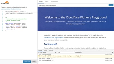

Screenshot of Playground website
The Playground allows us to test-drive our Cloudflare Workers (Large preview)

Starting with the Playground will take you far, but, at some point, you will want to test on the actual Cloudflare network and, even better, deploy your scripts for production. For this, your site must be set up with Cloudflare. If you already are a Cloudflare user, simply sign in, navigate to the ‘Workers’ tab on the dashboard, and you are ready to go.

If you are not a Cloudflare user, you can either sign up, or you can request a workers.dev subdomain, under which you will soon be able to deploy your Workers. The workers.dev site is currently accepting reservations of subdomains, so hurry up and reserve yours before it is taken by someone else!


Screenshot of workers.dev
workers.dev is currently accepting reservations of subdomains (Large preview)

The recipes below have been taken from the Cloudflare Workers Recipe cookbook, from the examples repository in Github, and from the Cloudflare blog. Each example has a link to the script code in the Playground.

Static Site Hosting

The most straightforward use case for Workers is to create a new site, dynamically responding to requests without needing to connect to an origin server at all. So, hello world!

addEventListener('fetch', event => {
  event.respondWith(new Response('<html><body><p>Hello world!</p></body></html>'))
})

? See code in Playground

Instead of printing the HTML output in the script, we can also host static HTML files with some hosting service, and fetch these with a simple Worker script. Indeed, the Worker script can retrieve the content of any file available on the Internet: While the domain under which the Worker is executed must be handled by Cloudflare, the origin website from which the script fetches content does not have to. And this works not just for HTML pages, but also for CSS and JS assets, images, and everything else.

The script below, for instance, renders a page that is hosted under DigitalOcean Spaces:

addEventListener('fetch', event => {
  event.respondWith(handleRequest(event.request))
})

async function handleRequest(request) {
  const parsedUrl = new URL(request.url)
  let path = parsedUrl.pathname

  let lastSegment = path.substring(path.lastIndexOf('/'))
  if (lastSegment.indexOf('.') === -1) {
    path += '/index.html'
  }

  return fetch("https://cloudflare-example-space.nyc3.digitaloceanspaces.com" + path)
}

? See code in Playground

Building APIs

A prominent use case for Workers is creating APIs. For instance, the script below powers an API service that states if a domain redirects to HTTPS or not:

addEventListener('fetch', event => {
 event.respondWith(handleRequest(event.request))
})

/**
* Fetch a request and follow redirects
* @param {Request} request
*/
async function handleRequest(request) {
 let headers = new Headers({
   'Content-Type': 'text/html',
   'Access-Control-Allow-Origin': '*'
 })
 const SECURE_RESPONSE = new Response('secure', {status: 200, headers: headers})
 const INSECURE_RESPONSE = new Response('not secure', {status: 200, headers: headers})
 const NO_SUCH_SITE = new Response('website not found', {status: 200, headers: headers})

 let domain = new URL(request.url).searchParams.get('domain')
 if(domain === null) {
   return new Response('Please pass in domain via query string', {status: 404})
 }
 try {
   let resp = await fetch(`http://${domain}`, {headers: {'User-Agent': request.headers.get('User-Agent')}})
   if(resp.redirected == true && resp.url.startsWith('https')) {
     return SECURE_RESPONSE 
   }
   else if(resp.redirected == false && resp.status == 502) {
     return NO_SUCH_SITE
   }
   else {
     return INSECURE_RESPONSE
   }
 }
  catch (e) {
   return new Response(`Something went wrong ${e}`, {status: 404})
 }
}

? See code in Playground

Workers can also connect to several origins in parallel and combine all the responses into a single response. For instance, the script below powers an API service that simultaneously retrieves the price for several cryptocurrency coins:

addEventListener('fetch', event => {
    event.respondWith(fetchAndApply(event.request))
})
  
/**
 * Make multiple requests, 
 * aggregate the responses and 
 * send it back as a single response
 */
async function fetchAndApply(request) {
    const init = {
      method: 'GET',
      headers: {'Authorization': 'XXXXXX'}
    }
    const [btcResp, ethResp, ltcResp] = await Promise.all([
      fetch('https://api.coinbase.com/v2/prices/BTC-USD/spot', init),
      fetch('https://api.coinbase.com/v2/prices/ETH-USD/spot', init),
      fetch('https://api.coinbase.com/v2/prices/LTC-USD/spot', init)
    ])
  
    const btc = await btcResp.json()
    const eth = await ethResp.json()
    const ltc = await ltcResp.json()
  
    let combined = {}
    combined['btc'] = btc['data'].amount
    combined['ltc'] = ltc['data'].amount
    combined['eth'] = eth['data'].amount
  
    const responseInit = {
      headers: {'Content-Type': 'application/json'}
    }
    return new Response(JSON.stringify(combined), responseInit)
}

? See code in Playground

Making the API highly dynamic by retrieving data from a database is covered too! Workers KV is a global, low-latency, key-value data store. It is optimized for quick and frequent reads, and data should be saved sparingly. Then, it is a sensible approach to input data through the Cloudflare API:

curl "https://api.cloudflare.com/client/v4/accounts/$ACCOUNT_ID/storage/kv/namespaces/$NAMESPACE_ID/values/first-key" 
-X PUT 
-H "X-Auth-Email: $CLOUDFLARE_EMAIL" 
-H "X-Auth-Key: $CLOUDFLARE_AUTH_KEY" 
--data 'My first value!'

And then the values can be read from within the Worker script:

addEventListener('fetch', event => {
 event.respondWith(handleRequest(event.request))
})

async function handleRequest(request) {
 const value = await FIRST_KV_NAMESPACE.get("first-key")
 if (value === null)
   return new Response("Value not found", {status: 404})

 return new Response(value)
}

At the time of writing, KV is still in beta and released only to beta testers. If you are interested in testing it out, you can reach out to the Cloudflare team and request access.

Geo-Targeting

Cloudflare detects the origin IP of the incoming request and appends a two-letter country code to header ‘Cf-Ipcountry’. The script below reads this header, obtains the country code, and then redirects to the corresponding site version if it exists:

addEventListener('fetch', event => {
 event.respondWith(fetchAndApply(event.request))
})

async function fetchAndApply(request) {

   const country = request.headers.get('Cf-Ipcountry').toLowerCase() 
   let url = new URL(request.url)

   const target_url = 'https://' + url.hostname + '/' + country
   const target_url_response = await fetch(target_url)

   if(target_url_response.status === 200) {
       return new Response('', {
         status: 302,
         headers: {
           'Location': target_url
         }
       })     
   } else {
       return fetch(request)
   }
}

? See code in Playground

A similar approach can apply to implement load balancing, choosing from among multiple origins to improve speed or reliability.

Enhanced Security

The scripts below add security rules and filters to block unwanted visitors and bots.

Ignore the POST and PUT HTTP requests:

addEventListener('fetch', event => {
  event.respondWith(fetchAndApply(event.request))
})

async function fetchAndApply(request) {  
  if (request.method === 'POST' || request.method === 'PUT') {
    return new Response('Sorry, this page is not available.',
        { status: 403, statusText: 'Forbidden' })
  }

  return fetch(request)
}

? See code in Playground

Deny a spider or crawler:

addEventListener('fetch', event => {
  event.respondWith(fetchAndApply(event.request))
})

async function fetchAndApply(request) {  
  if (request.headers.get('user-agent').includes('annoying_robot')) {
    return new Response('Sorry, this page is not available.',
        { status: 403, statusText: 'Forbidden' })
  }

  return fetch(request)
}

? See code in Playground

Prevent a specific IP from connecting:

addEventListener('fetch', event => {
  event.respondWith(fetchAndApply(event.request))
})

async function fetchAndApply(request) {  
  if (request.headers.get('cf-connecting-ip') === '225.0.0.1') {
    return new Response('Sorry, this page is not available.',
        { status: 403, statusText: 'Forbidden' })
  }

  return fetch(request)
}

? See code in Playground

A/B Testing

We can easily create a Worker to control A/B tests:

addEventListener('fetch', event => {
  event.respondWith(fetchAndApply(event.request))
})

async function fetchAndApply(request) {
  const name = 'experiment-0'
  let group          // 'control' or 'test', set below
  let isNew = false  // is the group newly-assigned?

  // Determine which group this request is in.
  const cookie = request.headers.get('Cookie')
  if (cookie && cookie.includes(`${name}=control`)) {
    group = 'control'
  } else if (cookie && cookie.includes(`${name}=test`)) {
    group = 'test'
  } else {
    // 50/50 Split
    group = Math.random() 

? See code in Playground

Serving Device-Based Content

The script below delivers different content based on the device being used:

addEventListener('fetch', event => {
  event.respondWith(fetchAndApply(event.request))
})

async function fetchAndApply(request) {
  let uaSuffix = ''

  const ua = request.headers.get('user-agent')
  if (ua.match(/iphone/i) || ua.match(/ipod/i)) {
    uaSuffix = '/mobile'
  } else if (ua.match(/ipad/i)) {
    uaSuffix = '/tablet'
  }

  return fetch(request.url + uaSuffix, request)
}

? See code in Playground

Conditional Routing

By passing custom values through headers, we can fetch most-specific content:

addEventListener('fetch', event => {
  event.respondWith(fetchAndApply(event.request))
})

async function fetchAndApply(request) {
  let suffix = ''
  //Assuming that the client is sending a custom header
  const cryptoCurrency = request.headers.get('X-Crypto-Currency')
  if (cryptoCurrency === 'BTC') {
    suffix = '/btc'
  } else if (cryptoCurrency === 'XRP') {
    suffix = '/xrp'
  } else if (cryptoCurrency === 'ETH') {
    suffix = '/eth'
  }

  return fetch(request.url + suffix, request)
}

? See code in Playground

Enhanced Performance

Workers makes available a Cache API through which we can save computationally intensive data and have it ready for immediate use from then on:

async function handleRequest(event) {
  let cache = caches.default
  let response = await cache.match(event.request)
      
  if (!response) {
    response = doSuperComputationallyHeavyThing()
    event.waitUntil(cache.put(event.request, response.clone()))
  }
        
  return  response
}

For instance, through the Cache API we can store GraphQL requests whose results have not changed:

async function handleRequest(event) {
  let cache = caches.default
  let response = await cache.match(event.request)
  
  if (!response){
    response = await fetch(event.request)
    if (response.ok) {
      event.waitUntil(cache.put(event.request, response.clone()))
    }
  }
        
  return response
}

Many Others

The list of useful applications goes on and on. Below are links to several additional examples:

Wrapping Up: “The Network Is The Computer”

Because speed matters, websites are going serverless. Cloudflare Workers is a new offering that enables this transition. It blurs the boundaries between the computer and the network, enabling developers to deploy apps globally that run on the fabric of the Internet itself, leveraging Cloudflare’s worldwide network of servers to run our code near where our users are located. It is fast, cheap, and secure, and it scales as much as we need it.

If you want to find out more, check it out or ask the community.

(il)
Categories: Others Tags:

DeviantArt Has a Redesign in Beta

April 4th, 2019 No comments

Wow. DeviantArt; there’s a blast from the past, where I’m concerned. I used to have an account where I posted my amateur web design, photography, and photomanipulation-based art.

I actually remember making art and website mockups on my PC at home, writing the files to a rewritable CD, and taking them to the local Internet café to post them on DA for feedback. It was the site for all artists and designers, at every skill level. And now, it’s getting redesigned.

Finally.

The site has been pretty much the same for years, with updates generally tweaking the design rather than completely redefining it. But Wix bought the site for $36million back in 2017, and it seems they’ve been working on something very different.

The new redesign has been named “Eclipse”, and the opinion of the community is mixed. It’s intended to be dark, sleek, and aimed at professional creators who’d like to sell their work. While that is certainly one subset of the userbase, a very large and vocal portion of the community is made up of amateurs, hobbyists, and fan artists. These users seem to be less happy.

I’ve listed some of the major changes to the site below, and you can find all the changes on the Eclipse Preview Site.

New Aesthetic

Obviously, there’s the brand new aesthetic for the site. It’s dark, it’s clean, it’s hyper-modern. While it still has hints of green, green will no longer be the dominant color all over the experience.

The current DA home page

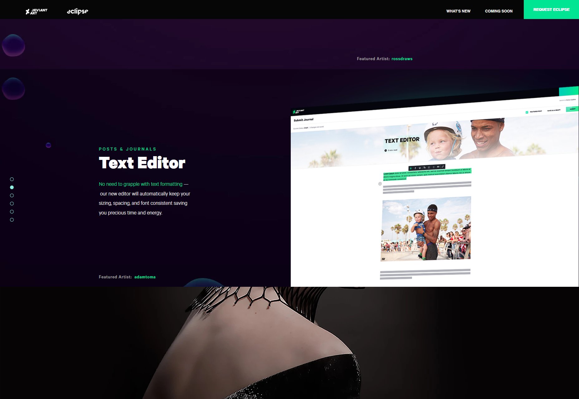
I personally like it well enough, but it’s the sort of design I like. Objections raised by the community include the fact that the new design seems to be breaking a lot of the old customization options. Another seems to be the apparent similarity to the design of DeviantArt competitor ArtStation.

I’d include more screenshots of the actual UI, but I don’t have access to the redesign yet (it’s still in Beta), and actual detailed screenshots are almost non-existent. It’s a little weird, actually…

No 3rd Party Ads

DeviantArt has decided that with some forty-million users, they don’t need 3rd party ads. They’re going to advertise their own products and services, and run ads for a few “trusted partners” in their own ad program. For a site this big, that’s not a bad idea. It could seriously cut down on malware.

User Profiles

The big changes here are the introduction of header images (because every site has them now), and masonry layouts for the actually galleries. The header image is a nice touch, I guess, but current users don’t seem to think that’s enough, considering all the other custom profile features that are currently broken.

Deviations

Individual art pieces (known as Deviations) will now have the option of using a background image or pattern to present them. It’s a little hard on the bandwidth, I think, but then again you get to present your art piece much like you would in an actual gallery. It’s an interesting concept.

A small but very important change is that photographers can now “tag” the models in their work (if they have accounts on DeviantArt as well). People usually just linked to their profiles in the image description before, so making this bit of professional behavior a bit easier is actually pretty great.

General Browsing Changes

This redesign seems to be bringing in an algorithm to help people find more art they like. Each individual art piece will be judged by the user’s pre-established tastes, and a private “love meter” will be shown to each user based on how well the art aligns with the algorithm’s idea of the user, which I think is perhaps a bit silly.

I already know when I love something.

You can also now browse several post types separately, including commissions, polls, and status updates from your favorite creators.

Journal and Literature Updates

DeviantArt has supported literature as an art form for a while now, and you can post writing to your gallery. There’s also the Journal, which is basically a profile-specific blog available to each user. Interestingly, Eclipse now provides both of these writing features with a Medium-style WYSIWYG editor. As long as they still allow for custom CSS, I’m calling this a positive change.

Premium Digital Content

DeviantArt has allowed people to buy prints and commission art from other artists for a long time, but now, you can also sell digital content online. You can sell stock photos, Photoshop brushes, basically anything you can think of.

My Opinion

DeviantArt is a community-based site, first and foremost. While I generally like the aesthetic of the redesign, the success of it is going to come down to the people who use it (or not) every day. Right now it seems that a significant portion of the community is unhappy with the upcoming changes as they are.

Now, negative feedback can be loud on the Internet, we all know this. But it seems that, at present, I don’t think this redesign does enough to cater to the millions of people who use the platform as a place for self-expression, rather than to build professional careers in art.

But it’s not hit a full release yet, so that may change. I hope it does.

Add Realistic Chalk and Sketch Lettering Effects with Sketch’it – only $5!

Source

Categories: Designing, Others Tags:

Fixed Headers, On-Page Links, and Overlapping Content, Oh My!

April 3rd, 2019 No comments

Let’s take a basic on-page link:

<a href="#section-two">Section Two</a>

When clicked, the browser will scroll itself to the element with that ID:

. A browser feature as old as browsers themselves, just about.

But as soon as we position: fixed; came into play, it became a bit of an issue. The browser will still jump to bring the newly targeted element into view, but that element may be obscured by a fixed position element, which is pretty bad UX.

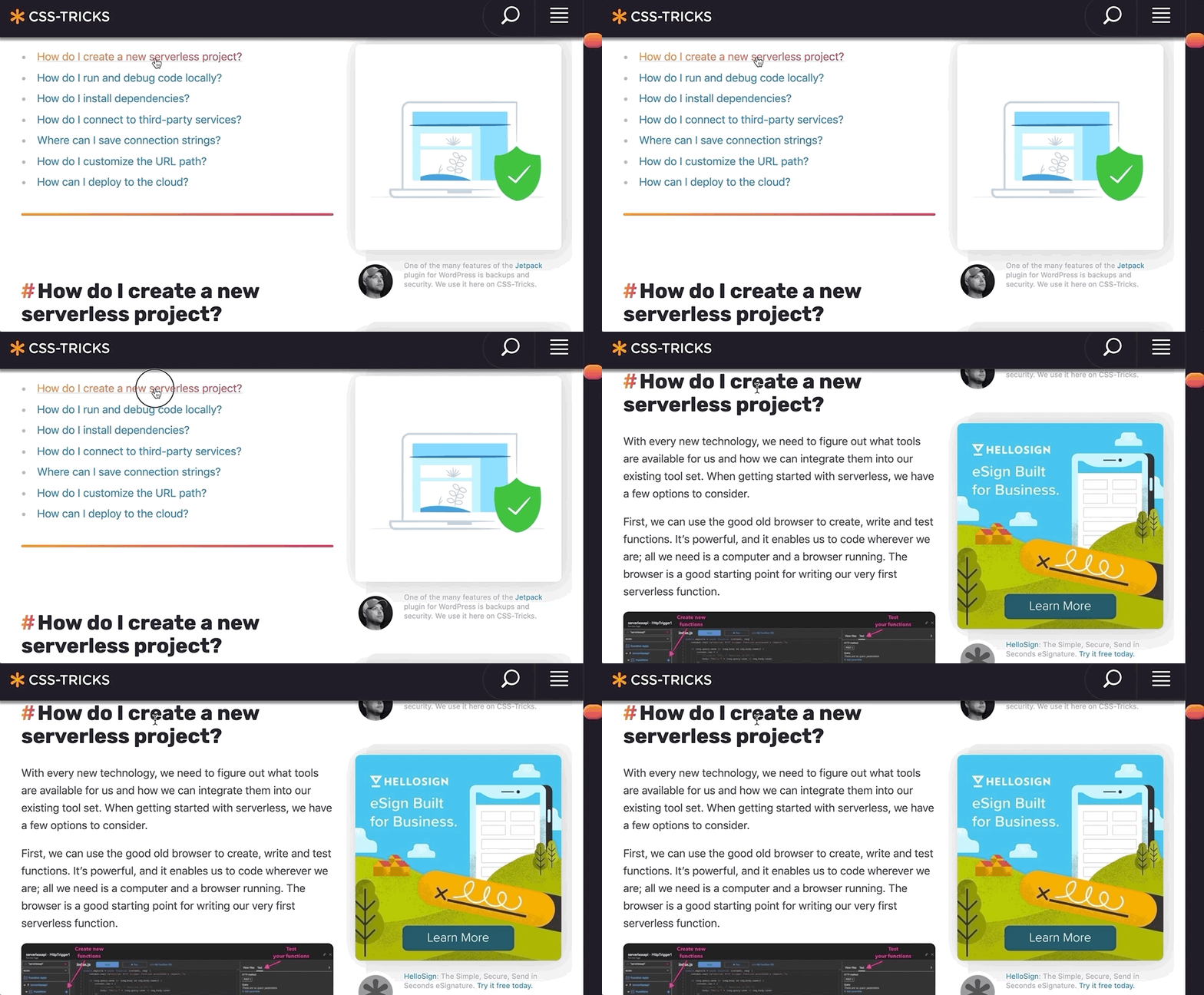
I called this “headbutting the browswer window” nearly 10 years ago, and went over some possible solutions. Nicolas Gallager documented five different techniques. I’m even using a fixed position header here in v17 of CSS-Tricks, and I don’t particularly love any of those techniques. I sort of punted on it and added top padding to all my

elements, which is big enough for the header to fit there.

There is a new way though! Finally!

Šime Vidas documented this in Web Platform News. There are a bunch of CSS properties that go together as part of CSS scroll snapping, but it turns out that scroll-padding and scroll-margin can be used outside of a scroll snapping container.

body {
  scroll-padding-top: 70px; /* height of sticky header */
}

This only works in Chromium browsers:

See the Pen
Scroll Padding on Fixed Postion Headers
by Chris Coyier (@chriscoyier)
on CodePen.

This is such a useful thing we shoot hoot and holler for WebKit and Firefox to do it.

The post Fixed Headers, On-Page Links, and Overlapping Content, Oh My! appeared first on CSS-Tricks.

Categories: Designing, Others Tags:

Responsible JavaScript

April 3rd, 2019 No comments

We just made a note about this article by Jeremy Wagner in our newsletter but it’s so good that I think it’s worth linking to again as Jeremy writes about how our obsession with JavaScript can lead to accessibility and performance issues:

What we tend to forget is that the environment websites and web apps occupy is one and the same. Both are subject to the same environmental pressures that the large gradient of networks and devices impose. Those constraints don’t suddenly vanish when we decide to call what we build “apps”, nor do our users’ phones gain magical new powers when we do so.

It’s our responsibility to evaluate who uses what we make, and accept that the conditions under which they access the internet can be different than what we’ve assumed. We need to know the purpose we’re trying to serve, and only then can we build something that admirably serves that purpose—even if it isn’t exciting to build.

That last part is especially interesting because it’s in the same vein as what Chris wrote just the other day about embracing simplicity in our work. But it’s also interesting because I’ve overheard a lot of engineers at work asking how we might use CSS-in-JS tools like Emotion or Styled Components, both of which are totally neat in and of themselves. But my worry is about jumping to a cool tool before we understand the problem that we want to tackle first.

Jumping on a bandwagon because a Twitter celebrity told us to do so, or because Netflix uses tool X, Y or Z is not a proper response to complex problems. And this connects to what Jeremy says here:

This is not to say that inaccessible patterns occur only when frameworks are used, but rather that a sole preference for JavaScript will eventually surface gaps in our understanding of HTML and CSS. These knowledge gaps will often result in mistakes we may not even be aware of. Frameworks can be useful tools that increase our productivity, but continuing education in core web technologies is essential to creating usable experiences, no matter what tools we choose to use.

Just – yikes. This makes me very excited for the upcoming articles in the series.

Direct Link to ArticlePermalink

The post Responsible JavaScript appeared first on CSS-Tricks.

Categories: Designing, Others Tags:

What Are Design Tokens?

April 3rd, 2019 No comments

I’ve been hearing a lot about design tokens lately, and although I’ve never had to work on a project that’s needed them, I think they’re super interesting and worth jotting down a few notes about. As I understand it, the general idea is this: design tokens are an agnostic way to store variables such as typography, color, and spacing so that your design system can be shared across platforms like iOS, Android, and regular ol’ websites.

Design tokens are starting to gain a bit of momentum in the design systems community, but they’re not an entirely new concept. There’s a great talk with Jina Anne and Jon Levine from 2016 where they talk about how design tokens are used in the Lightning Design System at Salesforce. They describe the complexity of the world we’re living in where a single organization that is building multiple web apps and native applications need to feel and look the same whilst not slowing down the development team. Jina also has made an in-depth video course about design tokens and in the preview for that she writes:

With design tokens, you can capture low-level values and then use them to create the styles for your product or app. You can maintain a scalable and consistent visual system for UI development.

Let’s take just one example: you probably have a typographic scale that you want to be identical across a bunch of platforms. Instead of storing the values for that scale in a CSS file and replicating them in every app or website, they can be stored in a JSON file that will then be transformed into the code needed for all those other platforms. Something like this:

{
  "global": {
    "type": "token",
    "category": "typography"
  },
  "aliases": {
    "TYPE_SIZE_SM": {
      "value": "14px"
    },
    "TYPE_SIZE_MD": {
      "value": "25px"
    },
    "TYPE_SIZE_LG": {
      "value": "44px"
    }
  },

You could write your own code to take this JSON file and convert it into all the variables you might need, for example, a Sass file would depend upon these tokens and might consume them as variables to be used elsewhere in a web app. One example of a tool that can do a lot of the hard work for us is Amazon’s Style Dictionary and here’s an example of how that works in practice:

I think this is ridiculously neat stuff. And I can see how it saves a ton of duplicate code and confusion across multiple teams since it serves as a single source of truth as opposed to having several codebases that have the same design requirements and their own stylesheets to maintain. Cristiano Rastelli also wrote about managing design tokens with Style Dictionary a little while ago and goes into a lot more depth on how to get started.

Your source of truth doesn’t even have to be a JSON file! In a post from earlier this year, Pavel Laptev shows us how to make these design tokens in Figma and, by using their API, abstract those values out of design mockups and use them in a codebase.

Pavel broke up his Figma doc into separate pages for his grid, spacers, palette and typography like this:

Right now, it seems like this requires a ton of effort to set up, but I reckon that tools like Sketch and Figma are only going to make stuff like this way easier for us in the near future – they probably want the source of truth to be in their specific design tool instead of some other tool.

The last thing I want to mention is this post by Brent Jackson where he wrote up some thoughts about interoperability when it comes to design systems. Specifically, he argues that there should be a specification for design tokens so that any CSS-in-JS library could consume that code in any format or style:

Design system tokens are meant to be flexible and work cross-platform, which means different teams, different implementations, and different libraries will name things differently. This is where this specification would fit in. A lot of interoperability could be realized, if we all, for example, named our color palette colors and named the font sizes we use fontSizes. What you do beyond that and what data format you use to store these values, is up to you. It’s trivial to convert JSON to ES modules to YAML or even TOML, if that’s your thing. It’s also just a data structure, so transforming between other data structures (e.g. design tools or a GraphQL API) should also be possible. This standard also wouldn’t try to solve the extremely complex problems of how to name the colors themselves.

Brent then went ahead and created a theme specification to solve this very problem. It looks like having a single standard for writing all our variables and settings would help us if we wanted to switch from one CSS-in-JS library to another, or if we wanted to switch to some other system that we haven’t imagined yet.

Anyway, I believe that design tokens are only starting to become mainstream and their popularity is about to increase as these tools, workflows, and standards become better with time — it’s all thoroughly exciting stuff!

The post What Are Design Tokens? appeared first on CSS-Tricks.

Categories: Designing, Others Tags:

Is your E-commerce Store performing poorly? – Here are essential tips to turn around tables and boosts your sales on e-commerce.

April 3rd, 2019 No comments
e-commerce

When setting up an e-commerce store, the majority of the entrepreneurs usually assume things will automatically work out, and they will start making good money from sales.

Unfortunately, this is not always the case. Setting up an e-commerce store is just a fraction of the work and plenty much is required to attract visitors to the site, convert the traffic and retain customers by winning their royalty. If your website is not performing as expected, it is wise to first to investigate where your e-commerce store is failing.

Where is your website failing? An e-commerce website has three levels where failure in either can deny you the much-needed sales.

  • 1st Level – Attracting-the-buyers phase:- to make sales you need to attract buyers. You need to attract new visitors and returning visitors to your site. Failure to attract visitors means you will have no one to sell two.
  • 2nd Level – Conversion stage:- Attracting visitors to your site is not enough if they will visit and leave without interaction or buying. Consequently, it is essential first to attract the right or most appropriate customers. Otherwise, if you net the wrong traffic, you will end up with just a high bouncing rate. You also need to avoid losing visitors due to inaccessibility by ensuring your e-commerce is responsive and easily accessible on any device.
  • 3rd Level – Retention stage:- After making the first sale to a client things don’t just stop there; you need the customer to come back and buy more. The 3rd stage is all about ensuring the return of the clients.

With the correct identification of the stage, your website is failing you can amicably solve the bottleneck and boost your sales. Here are the basic tips we have found to work wonders to non-performing e-commerce sites.

Tips to attract traffic to your e-commerce site

1- Vigorous, specific-target-market oriented advertising – Yes, this may sound a cliché, but advertising remains a principal aspect in sales and marketing. For a site to be known, especially a start-up making an entry into the marketing, it essential to market it. Advertising is all about familiarizing your products and services to consumers with an emphasis on how your product is better than alternatives. E-commerce has emerged in an era that has seen a drastic evolution of advertising from the use of mainstream media to digital platforms with numerous new advertising techniques. The secret behind successful advertising is knowing the right platform to advertise and the most appropriate advertising technique to use.

Digital advertising offers many advertising platforms/channels one can use including social media marketing, search engine marketing, influencer marketing, etc.. Identify the right platform is guided by the target market; aim to advertise on the platform where your target market is dominant. For example, if your target market is the youth, the social media where the youth dominates such as Facebook, Instagram, Twitter, etc., should be your primary advertising platform and your language should be more informal and fun. On the other hand, if your target market is other businesses, LinkedIn is the best social media platform for B2B advertising, and your advertisement should be more formal with an official tone. Advertising on these platforms can take different forms from having a branded account, publishing posts or paid ads.

Digital Marketing (Source: Martech Today)

With the right platform, you also need to adopt the appropriate technique to net the most appropriate traffic. Among the most effective advertising techniques for e-commerce sites include:

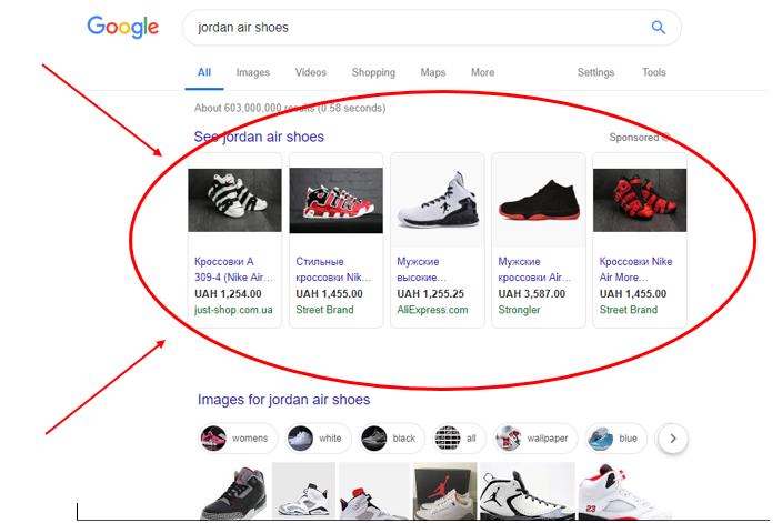
Google shopping advertising – is a type of ad designed for e-commerce site where a product, its image and detailed information including its price are featured on the search engine result page. The listing can be individual items referred to as “Product Shopping ads” or several related items referred to as “Showcase Shopping Ads. Shopping Ads makes it easy for the consumer to find a specific item instantly on the search result page and on clicking the ad the potential buyer is directed to the product’s e-commerce page. The technique nets more traffic compared to the standard search engine ranking and can be the breakthrough a non-performing e-commerce site needs.

Google Shopping Ads triggered by the search query “Jordan Air Shoes”

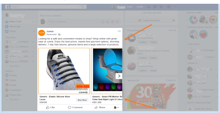
Remarketing/Retargeted advertising – if you browse or buy products/services on e-commerce site, I am sure you must have notices ads of the very same products you were viewing or related product following you as you visit other websites, social media or email especially Yahoo mail. This technique is retargeted-advertising – an effective marketing technique that utilizes the user’s browsing habit. It is a form of Pay-Per-Click advertising that any website owner can utilize to net traffic of either people who had visited their site earlier or those who had visited another site with similar products. The technique uses browsers’ cookies to gather information about the users browsing habit. The collected browsing data is then used to direct the ads to the specific users who had visited an e-commerce site re-netting the bouncing. This traffic is very likely to make a purchase.

Example of a retargeted marketing on social media

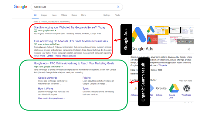
Search advertising – this is search result oriented advertising and include Google Ads and Bing Ads. When a user searches a set of keywords, Ads appears alongside the organic search results usually at the top of the organic search result. As a result, an e-commerce site that would have barely made it to the first search-result page gets a competitive advantage and ranks at the top. The website ranking is pushed to a position that nets huge traffic increasing the probability of conversion.

Google Ads ranking at the top of the organic search result.

2- Optimizing your content with a target of ranking position zero (at the top of the search result page) – paying alone to rank at the top of the search result page cannot be sustainable, your website also needs to rank well organically which can only be achieved through optimization. The higher your e-commerce site ranks on the search result page, the higher the traffic it nets. Optimize your e-commerce site with a target of ranking first on the search result page and this supplemented with paid ads is a sustainable way of getting high traffic.

Tips to boost traffic conversion

3- Reduce site bureaucracy – e-commerce sites lose a significant percentage of their incoming traffic to the complex long registration process that is compulsory in many e-commerce sites. The forced registration is estimated to account for up to 35% of the abandonment rates. The sign-up process should be as easy, short and less time consuming as possible. If possible configure your site to facilitate guest’s check-outs making signing up optional. In such a scenario you can entice clients to sign-up such as by offering a percentage discount to the registered users or free delivery. The less the bureaucracy, the less the traffic bouncing rate.

Multiple check-out options on Walmart.com (Source: Econsultancy)

4- Improve user experience – the current generation is a generation of less patience, less tolerance, high efficiency and always looking for a better option, and for your e-commerce to be successful, it must meet the current generation demands. Improve your website UX ensuring the site is light enough to load quickly, is accessible on any device, is easy to navigate and the best-selling items or items on sale/offer are showcased. Besides, you can try to improve the readability of your e-commerce site by de-cluttering the pages, easing navigation, maintaining adequate whitespace between products, and using manifest headers and price listing.

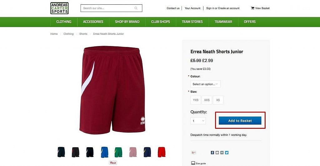
5- Personalized call-to-action – another prone area that potential buyers get lost on e-commerce site is the call-to-action. Some e-commerce sites are developed complicated with hidden call-to-action buttons, ending up losing potential buyers who have no time to browse around and experiment. A good e-commerce website should have a clear, personalized call-to-action. For example, the experienced buyers who do not necessarily need to read through the product details should be able to see and click the buy button on the product listing page. On the other hand, the in-experienced buyers who need to click to view or preview the product should also have the buy button on the subsequent pages.

A clear call-to-action button on an e-commerce site (source: Big Commerce)

Tips to retain customers.

6- Clear communication – communication is key to every business and an active ingredient in building customer loyalty. For an e-commerce website communication should be two way, buyers/potential buyers to the e-commerce site and e-commerce site to the buyers. From the onset, potential buyers should be able to contact customer care as efficiently as possible either through live chat or email. After making a purchase, buyers should also be able to reach customer care in case they have issues with the delivery, they are unsatisfied with the product or to make any other inquiry. On the other hand, the e-commerce site should be able to respond to the buyers’ inquiries as instantly as possible and offer them the needed assistance. After, a successful transaction, a client should also get an opportunity to give their review, which should be displayed publicly on the site whether negative or positive. The reviews boosts the e-commerce site legitimacy and authority, builds customers trust and statistically over 70% of the consumers consults a product’s review/rating before making a purchase. The site should also respond to the consumers’ review where necessary. Effective communication that solves issues leaves the clients satisfied and loyal to the e-commerce site.

Reviews and ratings on e-commerce website (Source: Digital Point US)

7- Email marketing – the operation of an e-commerce site is more of a cycle than a linear process. Making a successful transaction is not the end of the road; the e-commerce site requires the buyers to return and buy more in the future. As a result, the technique of email marketing was developed which is an effective way of contact buyers who have registered on your e-commerce informing them of new goods, new offers and discount to attract them back.

Remarks

Earning from an e-commerce website takes more than just having an e-commerce website developed. It is one thing to have an e-commerce website up and running and a different thing to start making sales from the e-commerce site. There are three other phases that follow the development of an e-commerce website; introducing the website to the consumers and attracting them to the website, converting the traffic landing on an e-commerce website and finally attracting back the successful buyers. Knowing the stage your e-commerce site is failing is the first step of turning around the tables and boosting the sales. The tips above for different stages may a be a good starting point of having a functional e-commerce site.

Categories: Others Tags:

Managing Z-Index In A Component-Based Web Application

April 3rd, 2019 No comments
Smashing Editorial

Managing Z-Index In A Component-Based Web Application

Managing Z-Index In A Component-Based Web Application

Pavel Pomerantsev

2019-04-03T14:00:08+02:002019-04-04T06:34:44+00:00

If you’ve done any complex web UI development, you must have at least once furiously tried driving an element’s z-index up to thousands, only to see that it’s not helping position it on top of some other element, whose z-index is lower or even not defined at all.

Why does that happen? And more importantly, how to avoid such issues?

In this article, I’ll recap what z-index actually is and how you can stop guessing whether it might work in any specific case and start treating it just like any other convenient tool.

The Hierarchy Of Stacking Contexts

If you imagine the webpage as having three dimensions, then z-index is a property that defines the z coordinate of an element (also called its “stacking order”): the larger the value, the closer the element is to the observer. You can also think of it as a property affecting paint order, and this will in fact be more correct since the screen is a two-dimensional grid of pixels. So, the larger the z-index value, the later the element is painted on the page.

There is, however, one major complication. The z-index value space is not flat — it’s hierarchical. An element can create a stacking context which becomes the root for z-index values of its descendants. It would be best to explain the concept of stacking contexts by using an example.

The document body has five div descendants: div1, div2, div3, div1-1, and div2-1. They’re all absolutely positioned and overlap with each other. div1-1 is a child of div1, and div2-1 is a child of div2.

See the Pen stacking-contexts by Pavel Pomerantsev.

Let’s try to understand why we see what we see. There are quite elaborate rules to determine paint order, but here we only need to compare two things:

  • z-index Values
    If an element has a higher z-index, it’s painted later.
  • Source Order
    If z-index values are the same, then the later it’s in the source, the later it’s painted.

So if we don’t take stacking contexts into account, the order should be as follows:

  • div1
  • div2
  • div3
  • div1-1
  • div2-1

Note that div2-1 is in fact overlapped by div3. Why is that happening?

If an element is said to create a stacking context, it creates a basis for its children’s z-index values, so they’re never compared with anything outside the stacking context when determining paint order. To put it another way, when an element creating a stacking context is painted, all its children are painted right after it and before any of its siblings.

Going back to the example, the actual paint order of body‘s descendant divs is:

  • div1
  • div2
  • div3
  • div1-1

Notice the absence of div2-1 in the list — it’s a child of div2 which creates a stacking context (because it’s an absolutely positioned element with a z-index other than the default value of auto), so it’s painted after div2, but before div3.

div1 doesn’t create a stacking context, because its implicit z-index value is auto, so div1-1 (its child) is painted after div2 and div3 (since its z-index, 10, is larger than that of div2 and div3).

Don’t worry if you didn’t fully grasp this on first reading. There’s a bunch of online resources that do a great job in explaining these concepts in more detail:

Note: It’s also great to be familiar with general paint order rules (which are actually quite complex).

The main point of this piece, however, is how to deal with z-index when your page is composed of dozens and hundreds of components, each potentially having children with z-index defined.

One of the most popular articles on z-index proposes grouping all z-index values in one place, but comparing those values doesn’t make sense if they don’t belong to the same stacking context (which might not be easy to achieve in a large application).

Here’s an example. Let’s say we have a page with header and main sections. The main section for some reason has to have position: relative and z-index: 1.

We’re using a component architecture here, so CSS for the root component and every child component is defined in dedicated sections. In practice, components would live in separate files, and the markup would be generated using a JavaScript library of your choice, like React, but for demonstration purposes it’s fine to have everything together.

Now, imagine we’re tasked with creating a dropdown menu in the header. It has to be stacked on top of the main section, of course, so we’ll give it a z-index of 10:

Now, a few months later, in order to make something unrelated work better, we apply the translateZ hack to the header.

As you can see, the layout is now broken. An element with z-index: 1 sits on top of an element with z-index: 10, in the absence of any other z-index rules. The reason is that the header now creates a stacking context — it’s an element with a transform property whose value is anything other than none (see full rules) and its own z-index (0 by default) is lower than that of the main section (1).

The solution is straightforward: give the header a z-index value of 2, and it’ll be fixed.

The question is, how are we supposed to come to this solution if we have components within components within components, each having elements with different z-indices? How can we be sure that changing z-index of the header won’t break anything else?

The answer is a convention that eliminates the need for guesswork, and it’s the following: changing z-indices within a component should only affect that component, and nothing else. To put it differently, when dealing with z-index values in a certain CSS file, we should ideally only concern ourselves with other values in that same file.

Achieving it is easy. We should simply make sure that the root of every component creates a stacking context. The easiest way to do it is to give it position and z-index values other than the default ones (which are static and auto, respectively).

Here’s one of the ways to structure the application. It uses more elements than the previous one, but computation associated with extra DOM elements is cheap whereas developer’s time (a lot of which can sometimes be spent on debugging stacking issues) is definitely not.

  • header__container and main__container both have position: relative and z-index: 0;
  • header__overlay now has z-index: 1 (we don’t need a large value since it’s only going to compete for stacking order with other elements within the header);
  • root__header now has z-index: 2, whereas root__main keeps its z-index: 1, and this is what makes the two siblings stack correctly.

(Note also that both have position: relative since z-index doesn’t apply to statically positioned elements.)

If we look at the header code now, we’ll notice that we can remove the z-index property from both the container and the overlay altogether because the overlay is the only positioned element there. Likewise, the z-index is not required on the main container. This is the biggest benefit of the proposed approach: when looking at z-indices, it’s only the component itself that matters, not its context.

Such an architecture is not without its drawbacks. It makes the application more predictable at the expense of some flexibility. For example, you won’t be able to create such overlays inside both the header and the main section:

In my experience, however, this is rarely a problem. You could make the overlay in the main section go down instead of up, in order for it to not intersect with the header. Or, if you really needed it to go up, you could inject the overlay HTML at the end of the body and give it a large z-index (“large” being whatever’s larger than those of other sections at the top level). In any case, if you’re not in a competition to build the most complicated layout, you should be fine.

To recap:

  • Isolate components in terms of z-index values of elements by making the root of each component a stacking context;
  • You don’t have to do it if no element within a component needs a z-index value other than auto;
  • Within a component’s CSS file, maintain z-index values any way you like. It might be consecutive values, or you could give them a step of 10, or you can use variables — it all depends on your project’s conventions and the size of the component (although making components smaller is never a bad thing). Preferably, only assign z-index to sibling elements. Otherwise, you may inadvertently introduce more stacking contexts within a component, and you’re faced with the same issue again, luckily on a smaller scale;
  • Debugging becomes easy. Find the first ancestor component of the two elements that are not stacked correctly, and change z-indices within that component as necessary.

This approach will hopefully bring back some sanity to your development process.

(dm, ra, il)
Categories: Others Tags:

Make it hard to screw up driven development

April 2nd, 2019 No comments

Development is complicated. Our job is an ongoing battle between getting the job done and doing that job in a safe, long-lasting way.

Developers say things like, “I’m just going to do this quick and dirty first,” because it’s taken as fact that if you code anything quickly, it not only will be prone to mistakes, but that you’ll be deliberately not honoring established conventions and skipping tasks that make for more solid code.

There is probably no practical way to make it impossible to write sloppy, bad code, but it is fascinating to consider how tooling has evolved to make it harder.

Let’s get all Poka-yoke on development.

The obvious ones are automated code quality tools.

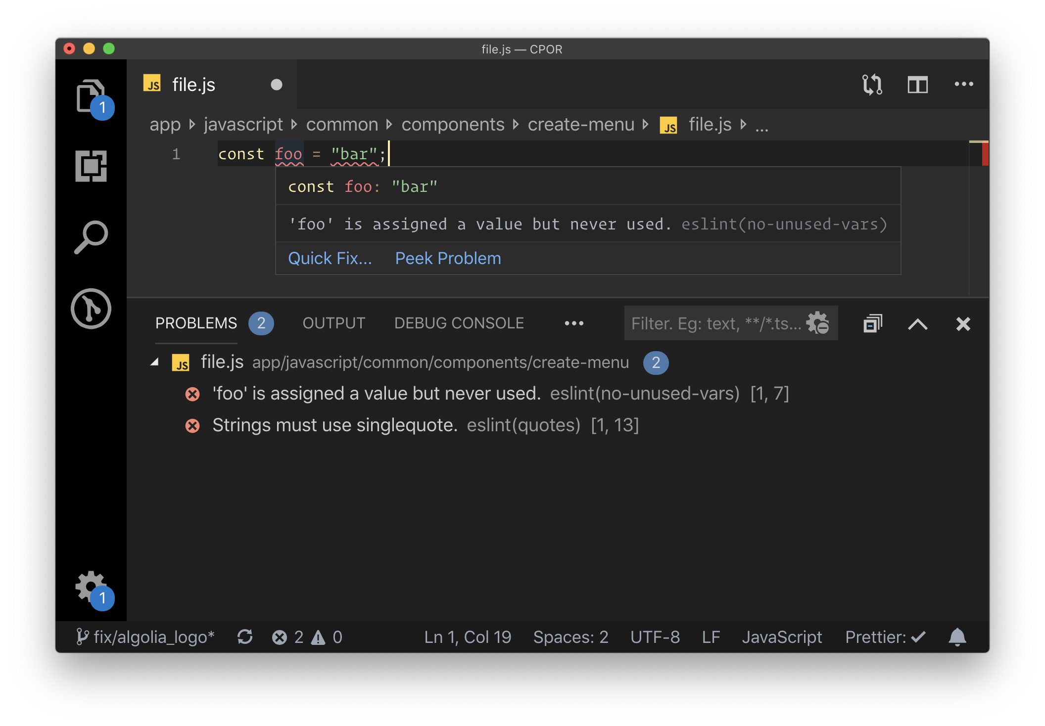
Say you’re writing JavaScript. ESLint is a mega-popular tool that looks at your code as you are writing it and lets you know about issues.

ESLint is configurable and those configurations can be enforced to a team’s liking. If you’d prefer to use some strong and established conventions, I believe the most popular out there is AirBnbs configuration.

There are alternatives to everything, of course. This post isn’t so much about a comprehensive tooling list as it is about considering the types of tools that help us push us toward writing better code. That said, stylelint is good for CSS, PHP_CodeSniffer is good for PHP, and Rubocop is good for Ruby.

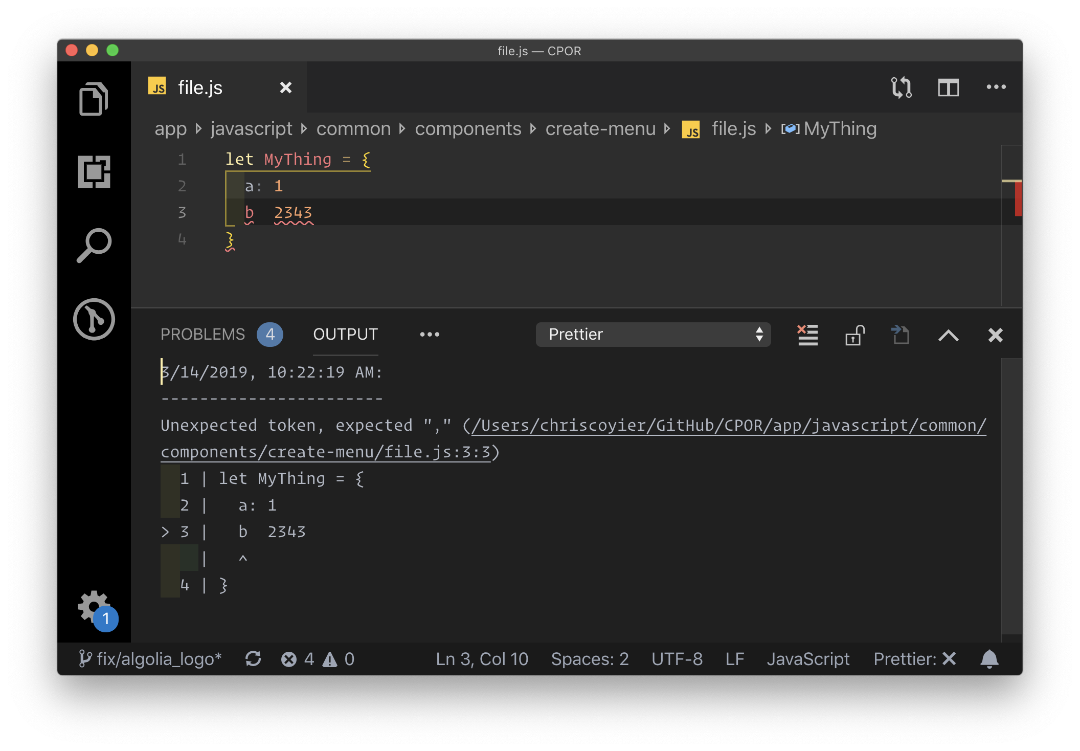
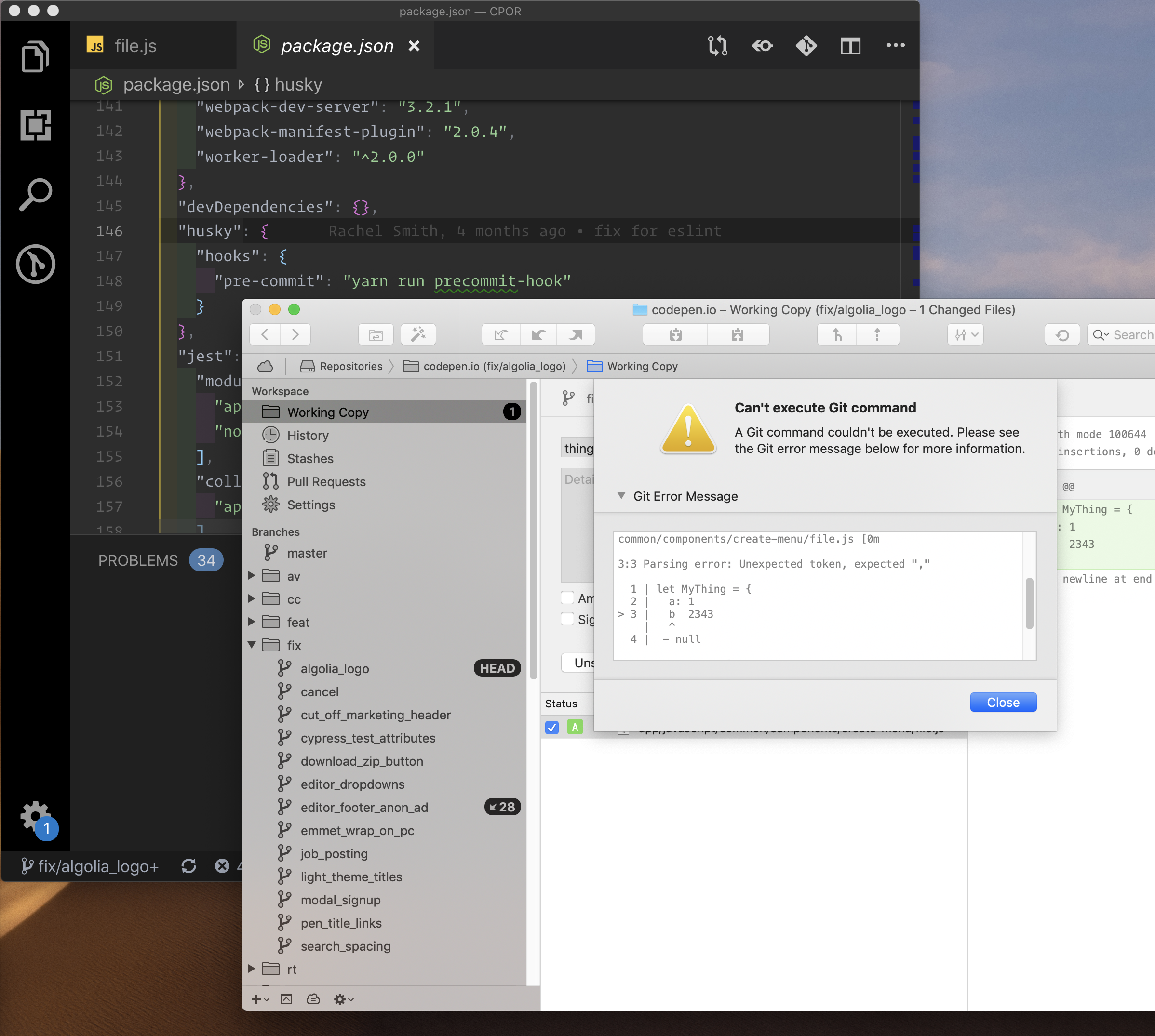
Prettier is in a similar, but unique category. It is like a “beautifier” for your code, in that it helps you reformat it not only to look good but to follow team conventions (e.g. single quotes! Two space indentions!) as well. The most common way to use Prettier is that it runs as you save the file. So perhaps you write quickly and don’t worry about formatting as much, because it happens for you the second you save. There is an interesting side-benefit of quality here as Prettier can fail, and if it does, you have a problem in the syntax of your code you need to fix. Super useful.

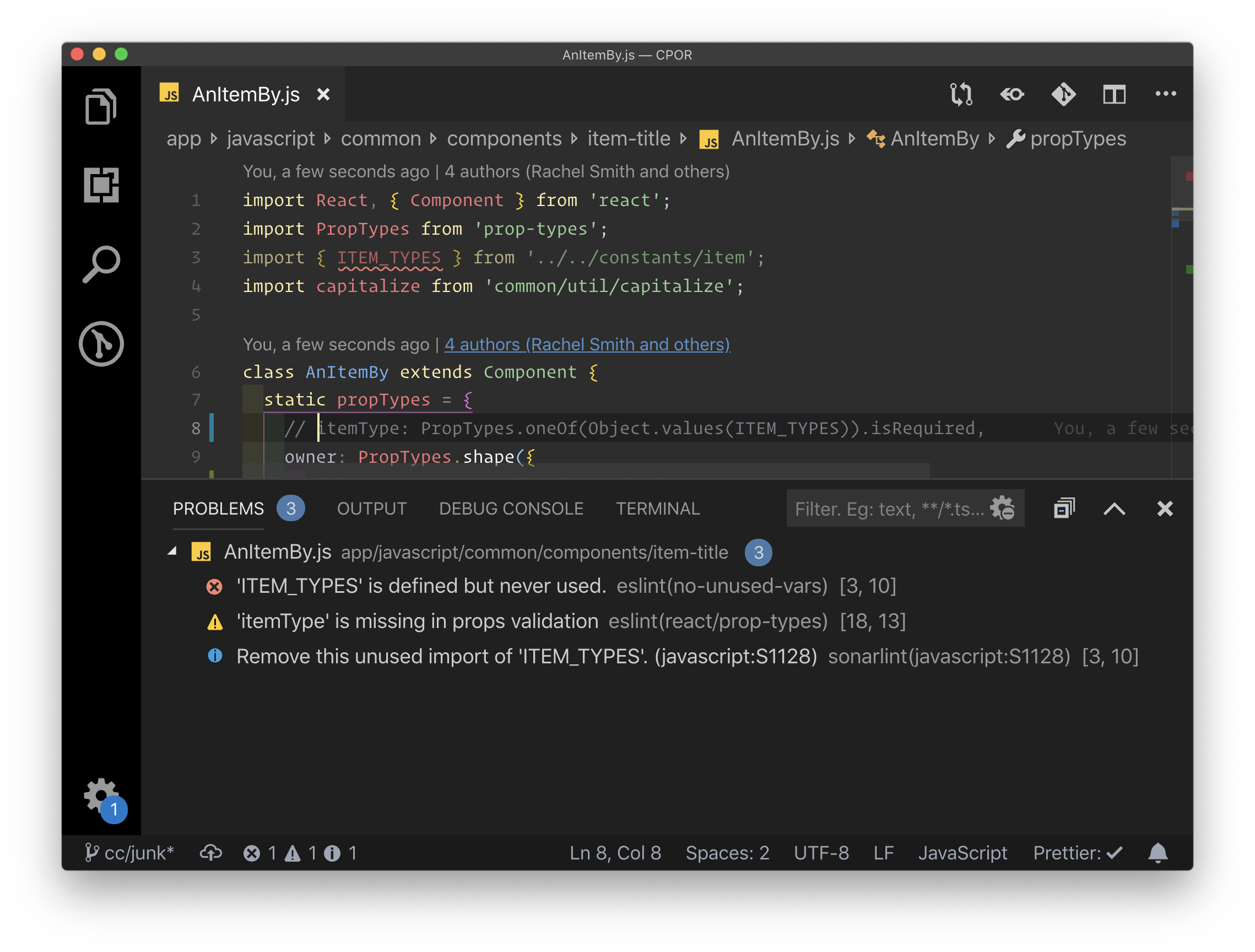
Prettier failing.

I’m intrigued by tools like Sonarlint, Code Climate, and Resharper that look, to me, essentially like linters, but deliver only a best-practice analysis rather than configuring things yourself. It also claims to understand your code at a deeper level. Webhint and Deepscan look similarly interesting. Feel free to correct me if I have this wrong because I haven’t gotten a chance to use any of them yet.

Taking linting a step further, you can make passing lint tests a requirement before files can even be committed into Git. Git hooks are the ticket here, and the most popular tool for managing them is Husky.

Similarly, actual tests are powerful preventers of bad code.

It’s always smart to write tests. Deploying code that breaks features is embarrassing, a waste of time, and can negatively impact your business. Yet we do it all too often. The whole point of tests is to prevent that.

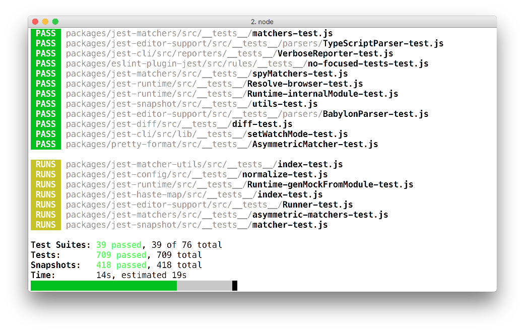
Things like Jest for JavaScript and RSpec for Ruby are useful, and considered unit testing. It’s work! You manually write functions that expect certain results. I expect that if I call a function with these parameters it returns this value!

Test-Driven Development (TDD) is a practice in which you write the test before you write the actual code that does the thing you’re trying to do. It’s a nice way to work if you can pull it off, as you’ve got code coverage from the get-go.

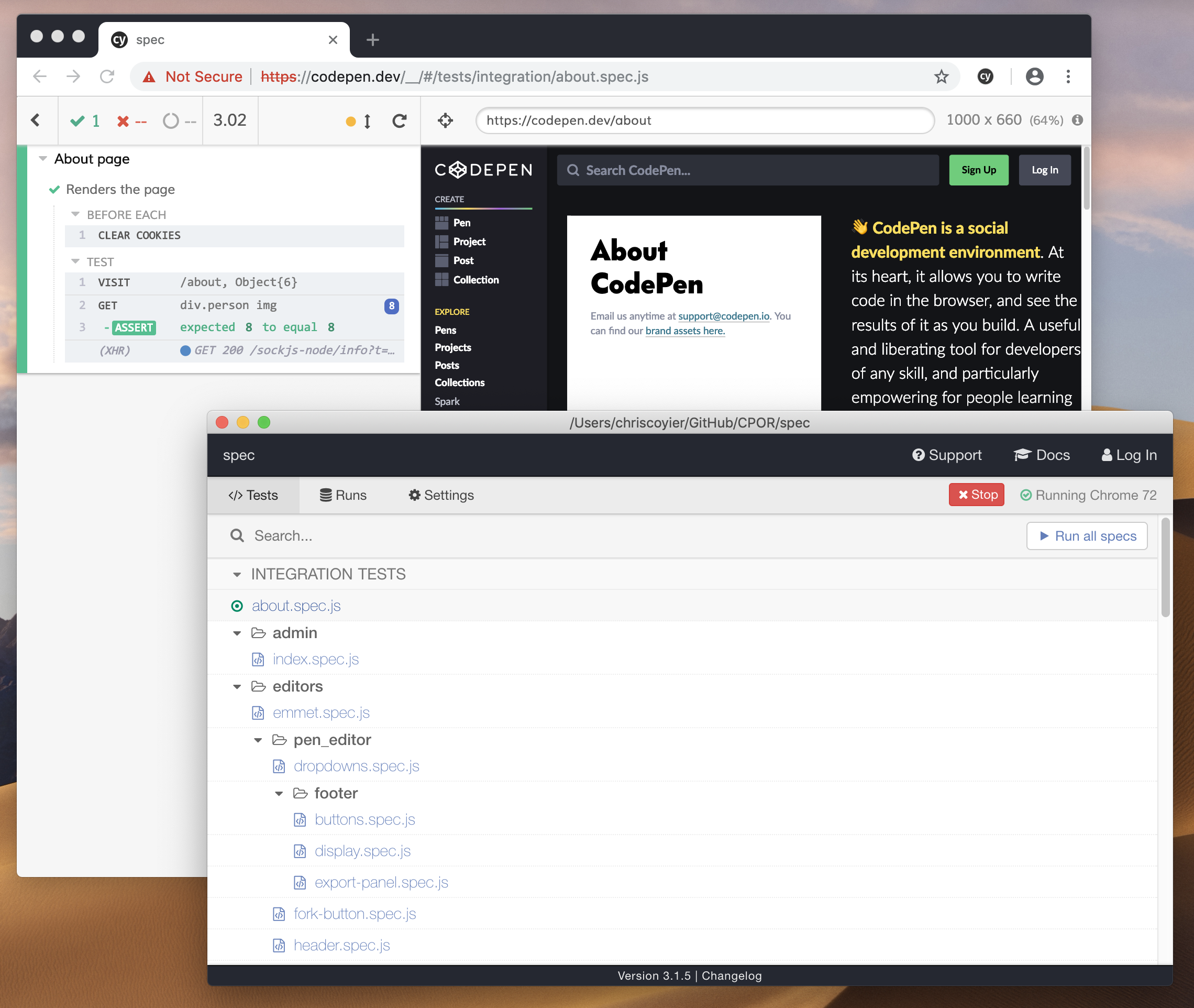
Another type of automated testing is integration (also known as end-to-end) testing. I’m a fan of Cypress for that. It simulates a user actually using a browser. Go to this URL! Click this! Fill out this field and submit the form! Does this thing exist now? Is the URL what it’s supposed to be? Is this other thing visible? That kind of testing is powerful in that a lot of things have to be going right for these to pass, so there is a ton of implied testing.

As a CSS kinda guy, I’m also a fan of tests that watch to make sure the site looks how it’s supposed to look and there aren’t unintended consequences of styling changings. Percy is awesome for that (see our video).

And while we’re talking about all the different types of automated testing you can do, there are all sorts of tools to automate some level of accessibiilty testing. Plus, there are tools like Calibre and SpeedCurve that automate Lighthouse for watching performance.

Languages and language features that help us, wittingly or not

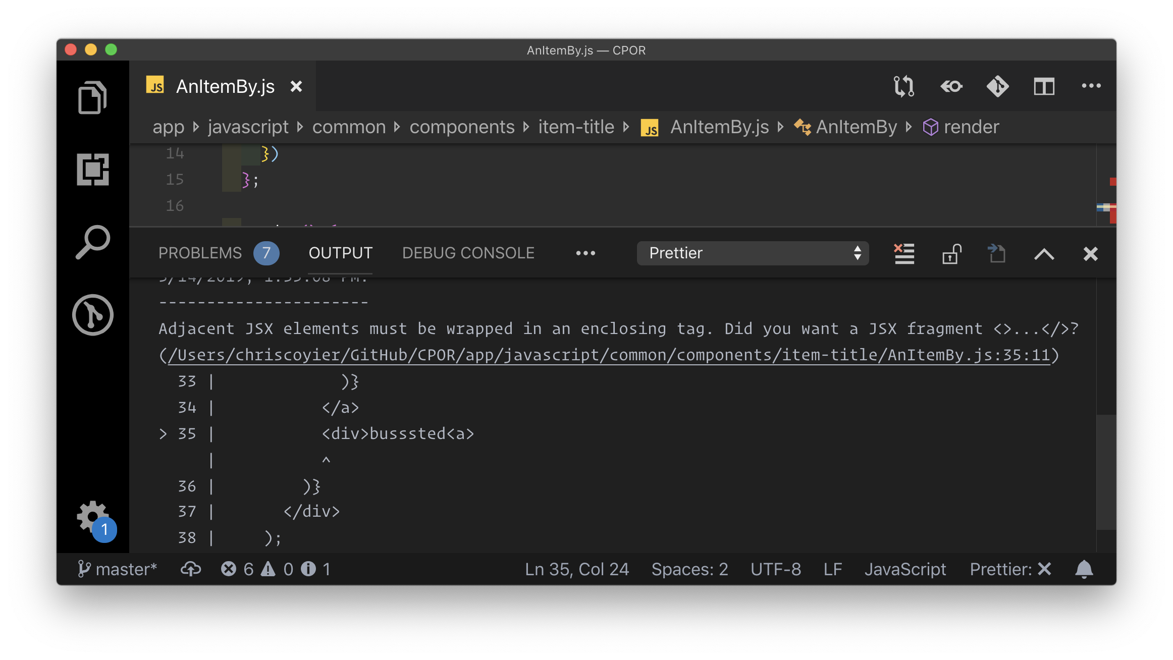
Take JSX, for example. It’s entirely possible to write bad HTML in JSX, but you can’t write broken HTML. The component will error out entirely and you’ll know as you’re working. That’s not even close to the reason JSX exists, but I find it an interesting side effect. I’ve fixed many bugs in my career that had to do with malformed HTML causing problems, ranging from tiny side effects to massive layout blunders.

Prettier is catching the problem here, but we’d see an error in the console if this compiled and went to the browser.

Similarly, a tool like Emmet can help generate valid HTML. I use Emmet all the time, and didn’t even think of that until it was mentioned to me.

I also think of React features, like PropTypes, that throw errors when missing or unexpected data is thrown at them. Not to mention you can configure your linter to yell at you if you’re missing the PropType. That’s pretty powerful testing to be enforced for a fairly small amount of labor (compared to, say, writing a test). You can even force them to help with accessibility.

It would be impossible to not mention TypeScript here. One of the major points of using TypeScript is code safety. The fact that it’s getting huge (listen to Laurie Voss on this) points to the fact that we want to enforce that safety. I remember when Angular 2 came out, there were long, solid explanations as to why. People also talk about the tooling improvements you get with TypeScript: advanced autocompletion, navigation, and refactoring. They are all, in a way, also about code safety — having the editor help you write correct file names and function names. TypeScript or not, any sort of autocomplete/IntelliSense is great to have.

The whole idea of this post came from me thinking about how GraphQL has this “you can’t screw it up” quality to it. You can’t ask for data that isn’t there, as it will error right as you’re working with it — and then you’ll fix it. And you can’t get back data that you aren’t expecting, as you’ve described exactly what you want back and that’s what GraphQL does. It’s not that you can’t write bad code that uses GraphQL or write a bad GraphQL implementation, but the technology sort of encourages better code and I’m fascinated by that.

CSS-in-JS, while that’s probably too broad a term generally, applies to this discussion. Most of the solutions on that spectrum involve some kind of style scoping, and style scoping provides this “you can’t screw it up” topic we’re focusing on. You can’t cause unintended side effects when the selector you’ve just written compiles to something you’ve never hand-written, like .SpecificComponent_root_34lkj4x.

Your co-workers are an awesome line of defense

First, give y’allselves a system. Nothing goes to the master branch directly, and everything has to be a Merge/Pull Request. That gives you a spot to talk about code quality — not to mention a place where you can run a suite of automated tests before the code is dangerously close to production.

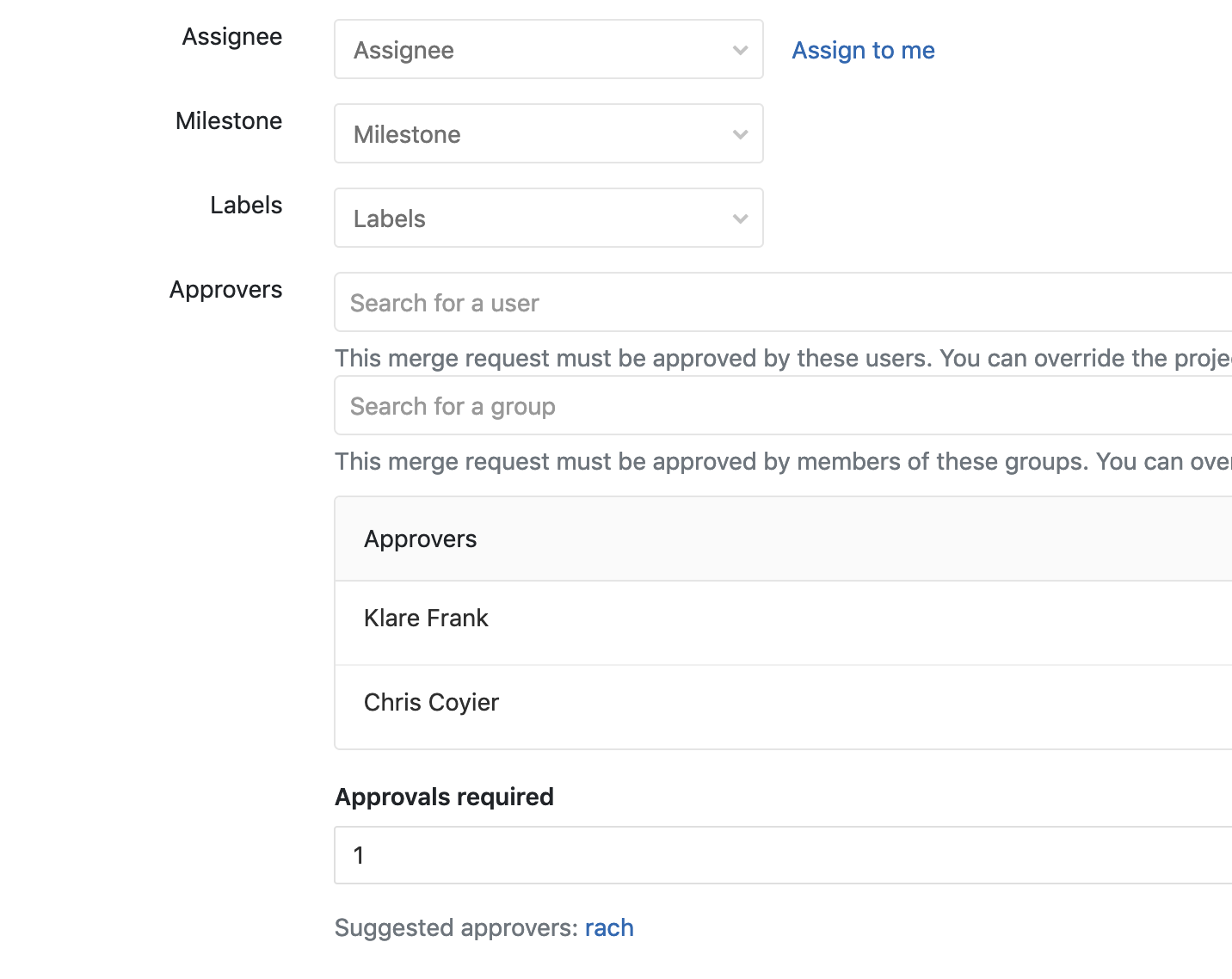
GitLab has a concept of approvers for a Merge Request. You pick some people that have to approve the branch before it can be merged.

GitHub has the same concept with protected branches. Perhaps the best thing you can do to prevent bad code is to widen the responsibility. There is always a risk this just becomes a glance-at-the-code-for-two-seconds-and-give-it-a-? motion, but that’s on y’all to make sure reviews are taken seriously. I’ve seen lots of value in a requirement that many sets of eyeballs need to be on code before it goes out. “Given enough eyeballs, all bugs are shallow” and all that.


We’ll always be screwing up code, but we can also always be finding ways not to.

The post Make it hard to screw up driven development appeared first on CSS-Tricks.

Categories: Designing, Others Tags:

Form Validation in Under an Hour with Vuelidate

April 2nd, 2019 No comments
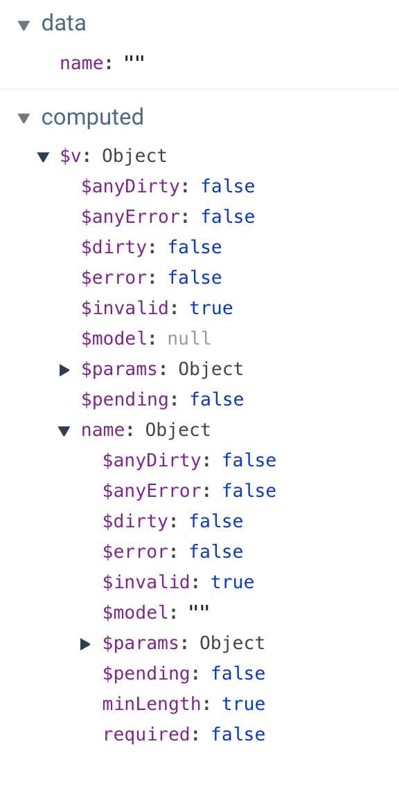
computed properties when empty

Form validation has a reputation for being tricky to implement. In this tutorial, we’ll break things down to alleviate some of that pain. Creating nice abstractions for forms is something that Vue.js excels at and Vuelidate is personally my favorite option for validations because it doesn’t require a lot of hassle. Plus, it’s really flexible, so we don’t even have to do it how I’m going to cover it here. This is just a launching point.

If you simply want to copy and paste my full working example, it’s at the end. Go ahead. I won’t tell. Then your time spent is definitely under an hour and more, like, two minutes amirite?! Ahh, the internet is a beautiful place.

You may find you need to modify the form we’re using in this post so, in that case, you can read the full thing. We’ll start with a simple case and gradually build out a more concrete example. Finally, we’ll go through how to show form errors when the user has completed the form.

Simplest case: showing the entry once you’re done with the input

First, let’s show how we’d work with Vuelidate. We’ll need to create an object called validations that will mirror the data structure of what we’re trying to capture in the form. In the simplest terms, it would look like this:

data: {
  name: ‘'
},
validations: {
  name: {
    required
  }
}

This would create an object within computed properties that we can find with $v. It looks like this in Vue DevTools:

A couple things to note here: $v is a computed property. This is great because that means it’s cached until something updates, which is a very performant way to deal with these state changes. Check out my article here if you want more background on this concept.

Another thing to note: there are two objects — one general object about all validations (there’s only one here currently) and one about the property name in specific. This is great because if we’re looking for general information about all fields, we have that information. And if we need to gather specific data, we have that too.

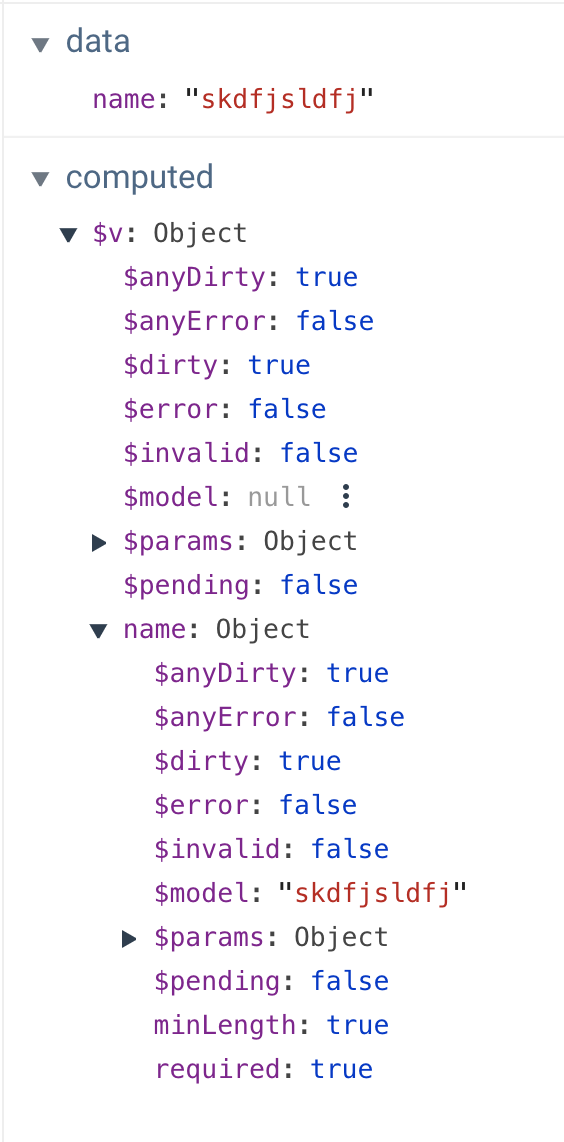
Let’s take a look at what happens when we start typing in that input:

random typing shown in computed properties

We can see in data that we have… well, me typing like a lunatic. But let’s check out some of these other fields. $dirty, in this case, refers to whether the form has been touched at all. We can also see that the $model field is now filled in for the name object, which mirrors what’s in data.

$error and $invalid sound the same but are actually a little different. $invalid is checking if it passes validation, but $error checks both for something that’s $invalid and whether or not it’s $dirty (whether the form has been touched yet or not). If this all seems like a lot to parse (haha get it? parse?), don’t worry, we’ll walk through many of these pieces step by step.

Installing Vuelidate and creating our first form validation

OK, so that was a very simple example. Let’s build something real out of it. We’ll bring this into our application and this time we’ll make the field required and give it a minimum length requirement. In the Vue app, we’ll first add Vuelidate:

yarn add vuelidate

Now, let’s go into the main.js file and update it as follows:

import Vue from 'vue';
import Vuelidate from "vuelidate";
import App from './App.vue';
import store from './store';

Vue.use(Vuelidate);
Vue.config.productionTip = false

new Vue({
 store,
 render: h => h(App)
}).$mount('#app')

Now, in whatever component holds the form element, let’s first import the validators we’ll need:

import { required, minLength } from 'vuelidate/lib/validators'

Then, we’ll put the data inside of a function so we can reuse the component. You likely know about that one. Next, we’ll put our name form field in an object, because typically, we’d want to capture all of the form data together.

We’ll also need to include the validations, which will mirror our data. We’ll use required again, but this time we’ll also add a key/value pair for the minimum length of the characters, minLength(x), which will look something like this:

<script>
import { required, minLength } from 'vuelidate/lib/validators'

export default {
 data() {
   return {
     formResponses: {
       name: '',
     }
   }
 },
 validations: {
   formResponses: {
     name: {
       required,
        minLength: minLength(2)
     },
   }
 }
}
</script>

Next, in the template, we’ll create a label for accessibility purposes. Instead of using what’s in the data to create the relationship in v-model, we’ll use that computed property ($model) that we saw earlier in the validations object.

<template>
 <div id="app">
   <label for="fname">Name*</label>
   <input id="fname" class="full" v-model="$v.formResponses.name.$model" type="text">
 </div>
</template>

Finally, beneath the form input, we’ll place some text beneath the form. We can use required attached to formResponses.name to see if it evaluates correctly and whether it’s provided at all. We can also see if there’s more than the minimum length of characters. We even have a params object that will tell us the number of characters we specified. We’ll use all of this to create informative error messages for our user.

<p class="error" v-if="!$v.formResponses.name.required">this field is required</p>
<p class="error" v-if="!$v.formResponses.name.minLength">Field must have at least {{ $v.formResponses.name.$params.minLength.min }} characters.</p>

And we’ll style our error class so it’s clear at a glance that they’re errors.

.error {
  color: red;
}

Be a little lazy

You may have noticed in that last demo that the errors are present right away and update while typing. Personally, I don’t like to show form validations that way because I think it’s distracting and confusing. What I like to do is wait to evaluate until typing has completed. For that kind of interaction, Vue comes equipped with a modifier for v-model: v-model.lazy. This will only evaluate the two-way binding once the user has completed the task with the input.

We can now improve on our single form input like this:

<label for="fname">Name*</label>
<input id="fname" class="full" v-model.lazy="$v.formResponses.name.$model" type="text">

Creating custom validators

Vuelidate comes with a lot of validators out of the box, which is really helpful. However, there are times when we need something a little more custom. Let’s make a custom validator for a strong password, and check that it matches with Vuelidate’s sameAs validator

The first thing we’ll do is make a label attached to an input, and the input will be type="password".

<section>
  <label for="fpass1">Password*</label>
  <input id="fpass1" v-model="$v.formResponses.password1.$model" type="password">
</section>

In our data, we’ll create password1 and password2 (which we’ll use these in a moment to validate matching passwords) in our formResponses object, and import what we need from the validators.

import { required, minLength, email, sameAs } from "vuelidate/lib/validators";

export default {
 data() {
   return {
     formResponses: {
       name: null,
       email: null,
       password1: null,
       password2: null
     }
   };
 },

Then, we’ll create our custom validator. In the code below you can see that we’re using regex for different types of evaluation. We’ll create a strongPassword method, passing in our password1, and then we can check it several ways with .test(), which works as you might expect: it has to pass true if it is passing and false if not.

validations: {
  formResponses: {
    name: {
      required,
      minLength: minLength(3)
    },
    email: {
      required,
      email
    },
    password1: {
      required,
      strongPassword(password1) {
        return (
          /[a-z]/.test(password1) && // checks for a-z
          /[0-9]/.test(password1) && // checks for 0-9
          /W|_/.test(password1) && // checks for special char
          password1.length >= 6
        );
      }
    },
 }

I am separating out each line so you can see what’s going on, but we could also write the whole thing as a one-liner like this:

const regex = /^[a-zA-Z0-9!@#$%^&*)(+=._-]{6,}$/g

I prefer to break it out because it is easier to modify.

This allows us to make the error text for our validation. We can make it say whatever we like, or even take this out of a v-if and make it present on the page. Up to you!

<section>
  <label for="fpass1">Password*</label>
  <input id="fpass1" v-model="$v.formResponses.password1.$model" type="password">
  <p class="error" v-if="!$v.formResponses.password1.required">this field is required</p>
  <p class="error" v-if="!$v.formResponses.password1.strongPassword">Strong passwords need to have a letter, a number, a special character, and be more than 8 characters long.</p>
</section>

Now we can check if the second password matches the first with Vuelidate’s sameAs method:

validations: {
  formResponses: {
    password1: {
      required,
      strongPassword(password1) {
        return (
          /[a-z]/.test(password1) && // checks for a-z
          /[0-9]/.test(password1) && // checks for 0-9
          /W|_/.test(password1) && // checks for special char
          password1.length >= 6
        );
      }
    },
    password2: {
      required,
      sameAsPassword: sameAs("password1")
    }
  }
}

And we can create our second password field:

<section>
  <label for="fpass2">Please re-type your Password</label>
  <input id="fpass2" v-model="$v.formResponses.password2.$model" type="password">
  <p class="error" v-if="!$v.formResponses.password2.required">this field is required</p>
  <p class="error" v-if="!$v.formResponses.password2.sameAsPassword">The passwords do not match.</p>
</section>

Now you can see the whole thing in action all together:

Evaluate on completion

You can see how noisy that last example is until the form has been completed. In my opinion, a better route is to evaluate when the entire form is completed so the user isn’t interrupted in the process. Here’s how we can do that.

Remember when we looked at the computed properties $v contained? It had objects for all the individual properties, but also one for all validations as well. Inside, there were three very important values:

  • $anyDirty: if the form was touched at all or left blank
  • $invalid: if there are any errors in the form
  • $anyError: if there are any errors at all (even one), this will evaluate to true

You can use $invalid, but I prefer $anyError, because it doesn’t require us to check if it’s dirty as well.

Let’s improve on our last form. We’ll put in a submit button, and a uiState string to keep track of, well, the UI state! This is incredibly useful as we can keep track of whether we’ve attempted submission, and whether we’re ready to send what we’ve collected. We’ll also make a small style improvement: position the error on the form so that it’s not moving around to in order to show the errors.

First, let’s add a few new data properties:

data() {
  return {
    uiState: "submit not clicked",
    errors: false,
    empty: true,
    formResponses: {
      ...
    }
  }
}

Now, we’ll add in a submit button at the end of the form. The .prevent modifier at the end of the @click directive acts like preventDefault, and keeps the page from reloading:

<section>
  <button @click.prevent="submitForm" class="submit">Submit</button>
</section>

We’ll handle some different states in the submitForm method. We’re going to use that computed property from Vuelidate ($anyDirty) to see if the form is empty. Remember, we can gather that information from this.$v. We used the formResponses object to hold all the form responses, so what we’ll use is this.$v.formResponses.$anyDirty. We’ll map that value to our “empty” data property. We’ll also do the same with errors and we’ll change the uiState to "submit clicked":

submitForm() {
  this.formTouched = !this.$v.formResponses.$anyDirty;
  this.errors = this.$v.formResponses.$anyError;
  this.uiState = "submit clicked";
  if (this.errors === false && this.formTouched === false) {
    //this is where you send the responses
    this.uiState = "form submitted";
  }
}

If the form has no errors and it’s not empty, we’ll send the responses and change the uiState to “form submitted” as well.

Now, we can handle some states for errors and empty states as well and, finally, if the form is submitted, we’ll evaluate a success.

<section>
  <button @click.prevent="submitForm" class="submit">Submit</button>
  <p v-if="errors" class="error">The form above has errors,
    <br>please get your act together and resubmit
  </p>
  <p v-else-if="formTouched && uiState === 'submit clicked'" class="error">The form above is empty,
    <br>cmon y'all you can't submit an empty form!
  </p>
  <p v-else-if="uiState === 'form submitted'" class="success">Hooray! Your form was submitted!</p>
</section>

In this form, we’ve given each section relative positioning and added a little padding at the bottom. That will allow us to give absolute positioning to the error state, which will prevent the form from moving around.

.error {
  color: red; 
  font-size: 12px;
  position: absolute;
  text-transform: uppercase;
}

There’s one last thing we need to do: now that we’ve placed the errors in the form absolutely, they’ll stack on top of each other unless we place them next to each other instead. We also want to check if the form is in the error state, which will be true only after the submit button is clicked. This can be a useful way of doing things- we won’t show the errors until the user is done with the form, which can be less invasive. It’s up to you if you’d like to do it this way or the v-model.lazy example used in previous sections.

Our previous errors looked like this:

<section>
  ...
  <p class="error" v-if="!$v.formResponses.password2.required">this field is required</p>
  <p class="error" v-if="!$v.formResponses.password2.sameAsPassword">The passwords do not match.</p>
 </section>

Now, they’ll be contained together like this:

<p v-if="errors" class="error">
  <span v-if="!$v.formResponses.password1.required">this field is required.</span>
  <span v-if="!$v.formResponses.password1.strongPassword">Strong passwords need to have a letter, a number, a special character, and be more than 8 characters long.</span>
</p>

To make things even easier on you, there’s a library that dynamically figures out what error to display based on your validation. Super cool! If you’re doing something simple, it’s probably too much overhead, but if you have a really complex form, it might save you time 🙂

And there we have it! Our form is validated and we have both errors and empty states when we need them, but none while we’re typing.

Sincere thanks to Damian Dulisz, one of the maintainers for Vuelidate, for proofing this article.

The post Form Validation in Under an Hour with Vuelidate appeared first on CSS-Tricks.

Categories: Designing, Others Tags:

Who has the fastest website in F1?

April 2nd, 2019 No comments

Jake Archibald looks at the websites of Formula One race teams and rates their performance, carefully examining their images and digging into the waterfall of assets for each site:

Trying to use a site while on poor connectivity is massively frustrating, so anything sites can do to make it less of a problem is a huge win.

In terms of the device, if you look outside the tech bubble, a lot of users can’t or don’t want to pay for a high-end phone. To get a feel for how a site performs for real users, you have to look at mid-to-lower-end Android devices, which is why I picked the Moto G4.

This reminds me of Tim Kadlec’s post earlier in the year about the ethics of performance:

Poor performance can, and does, lead to exclusion. This point is extremely well documented by now, but warrants repeating. Sites that use an excess of resources, whether on the network or on the device, don’t just cause slow experiences, but can leave entire groups of people out.

Anyway, back to Jake’s post about Formula One websites. I love that Jake writes in such a way that his points aren’t insulting to those who work on these sites, but hones in on what we can learn about the myriad issues that lead to bad web performance. Subsequently, Jake provides us all with a ton of useful ideas for fixing performance issues like annoying layout changes, scripts that block rendering, unused CSS issues that also block rendering, and loading states.

Oh, and this reminds me that Chris noted a while back that the loading experience for most websites can be vastly improved:

Client side rendering is so interesting. Look at this janky loading experience. The page itself isn’t particularly slow, but it loads in very awkwardly. A whole thing front-end devs are going to have to get good at. pic.twitter.com/sMcD4nsL98

— Chris Coyier (@chriscoyier) October 30, 2018

Direct Link to ArticlePermalink

The post Who has the fastest website in F1? appeared first on CSS-Tricks.

Categories: Designing, Others Tags: