Archive

Archive for April, 2019

Popular Design News of the Week: April 22, 2019 – April 28, 2019

April 28th, 2019 No comments

Every week users submit a lot of interesting stuff on our sister site Webdesigner News, highlighting great content from around the web that can be of interest to web designers.

The best way to keep track of all the great stories and news being posted is simply to check out the Webdesigner News site, however, in case you missed some here’s a quick and useful compilation of the most popular designer news that we curated from the past week.

Note that this is only a very small selection of the links that were posted, so don’t miss out and subscribe to our newsletter and follow the site daily for all the news.

UI Design Inspiration – Apr 2019

New Logo and Identity for Nike by You

Are You Making these UX Errors?

The Ugly Truth Why your Website is Slow

Color Designer – Simple Color Palette Generator

Top 5 Design Tools for Getting Striking Visual Content

What Does Unsplash Cost in 2019?

How to Protect the Admin Area of your WordPress Site

Nord Design System

LinkedIn Redesign UI/UX Concept

Tips on Using Colors in UI Design

Open-source Illustrations for Every Project You Can Imagine and Create

Three – Free Semi Condensed Typeface with Four Weights

Accenture Sued Over Website Redesign so Bad it Hertz

The Story Behind the Redesigned Game of Thrones Title Sequence

Choose the Right Navigation for your Mobile App

Two Words that Have Made Millions

Instagram Hides like Counts in Leaked Design Prototype

Site Design: Museum of Digital Art

Greater than Avatars

What Creative Visionaries do that Most People Overlook

Ikonate: Fully Customisable & Accessible Vector Icons

Gangster Grotesk: A Sharp Typeface Free for Personal and Commercial Use

Will these UX Trends Stick or Fade Away?

The Art of Simplicity in Product Design

Want more? No problem! Keep track of top design news from around the web with Webdesigner News.

Add Realistic Chalk and Sketch Lettering Effects with Sketch’it – only $5!

Source

Categories: Designing, Others Tags:

Interviewing for a Technical Position Doesn’t Have to Be Scary

April 26th, 2019 No comments

Jacob Schatz (@jakecodes) is a staff engineer over at GitLab and was kind enough to share how he conducts job interviews for technical positions and his thinking process for them. Technical interviews are talked about often and can be a touchy subject for some, so it’s worth noting that this article expresses Jacob’s own opinions and are not necessarily shared by his employer.

Are you an interviewee who is terrified, exhausted, sad, or disappointed? I’d love to change that stigma.

I believe that people can have a great interview experience, and that I can simultaneously find the right candidate. Both things can happen at the same time! After your interview process is over, in a perfect world, regardless of outcome, you should feel good about yourself and the process. You might feel sad that you didn’t get the job or excited to start your new job, but you should understand why in either situation.

At GitLab, I was put in charge of hiring very early on, and as such, I’ve seen thousands of resumes. When I first joined, I was asked to hire and form a team of front-end developers. I was employee #29 (we now have 500+), and I was the first front-end developer, so there was no hiring process for our team. We gradually created a process.

This article is aimed at both the interviewee, and interviewer. For the interviewee, I want you to know what a perfect interview can be like. Interviewing should not be scary or intimidating. This is a guide you can follow to do your part in creating the perfect interview. If you are an interviewer, maybe you have perfected your process. This is my view on how interviews can go in a perfect world. There are all different types of interviews, and this article focuses on interviewing developers of all experience levels. Over the years, I’ve latched on to some great processes, and this article is a behind-the-scenes look at that process for both sides of the candidacy.

Before I begin, it’s important to remember that everyone is human and humans are not perfect. There are no perfect developers. Treat everyone like a regular human being. It’s OK to be amazed at what some people are doing, but not OK to worship others. Talent is both congenital and acquired and you can acquire it too. Your interviewer and you are both imperfect. Interviews should not be focused around perfection. Here’s what interviews should be.

Five things I look for in a candidate

The GitLab Values cover a lot of great points and you should read it. This is loosely based on those.

As an interviewer, I can only focus on so many things at once while being a productive, active listener. But I do have five specific things I am try to focus on:

  1. Does this person have a “good head on their shoulders”?
  2. Is this person technically where they need to be for this role?
  3. Is this person going to be self sufficient in this role?
  4. Does this person communicate well and will they communicate well with the team?
  5. Does this person handle positive and negative feedback well?

There are other things I’m looking for, of course, but these five things are enough to get you the job you want if you’re interviewing with me.

Forget nervousness. I won’t ever hold it against you. I know you may be nervous, and that’s totally fine. There is the rare occasion that nervousness becomes a debilitating factor, and in those cases, I just ask that you reschedule. Just don’t hang up on me!

Recognize there’s going to be bias

We have training on bias at GitLab. One thing I learned from the training is that everyone is biased, whether or not you think you are. At one point, I had the idea of doing blind interviews like they do for some orchestras. We never implemented it (and it would be tough) but that’s why I keep a list of questions and a summary of what I want to cover in each interview. Each interview has a script I can follow. Everything is as repeatable and similar as possible. As the interview progresses, I’ll be able to tell if I can hit the harder questions. Harder questions are not there to disqualify people, but to qualify people. If you get to my hard questions it means you have a ton of experience and knowledge under your belt. It’s really important to know that I must ask trivia questions in some form but I don’t qualify candidates based on trivia questions. It’s about figuring the depth of your JavaScript knowledge and programming in general.

That being said, there is still one trivia question no one has ever gotten right. I’ll just keep asking it, and I am sure some day, someone will get it. Trivia questions are fun, because I am a major JavaScript dork. I just love talking about all the ins and outs of JavaScript. I am looking for people that can be my coding buddy. Hiring people is about finding other people you can work with, not people that will work for you.

Inexperienced interviewers tend to test you on what THEY know (so they can feel a little more secure when they can ding you on an “wrong” answer).

In contrast, great interviewers focus on what YOU know, and facilitating a two-way conversation to explore a mutual fit.

— Jennifer Kim (@jenistyping) April 8, 2019

I want to know you’re technically sound

This may be people’s worst fear. The part of the interview where we ask questions like, “Why are manholes round?” The truth is that some companies may ask the medium-to-hard questions from LeetCode, and some may never ask any technical questions.

What I’m looking for in your skillset

Experience speaks louder than any technical interview question I can ask. For example, if I’m hiring for a front-end engineering role and someone tells me they built their own cool things that we can talk about, then that’s awesome. I still may need to throw some more questions their way after that, or maybe the demo answers all my questions (though unlikely, but possible). But if we can walk through the code of something that you are super proud of, that’s great.

It’s helpful if you can tell me about something that you built for another company where I can see your code, or you can explain it sufficiently enough. What were the challenges? How did you deal with 10,000 comments? How did you deal with mobile? What were some challenges? I’ll give you an example: You built the comment system for GitLab. For the comment system, an interesting challenge was dealing with loading users for the @ drop-down to mentioning other users. It turns out that the JSON payload for that drop-down can get quite large and loading it on page load makes the page load significantly slower. But loading that data on the first @ keypress is also slow because the payload can be more than 10 MB. We want the user to have a seamless experience and not realize the data needs time to load. So, a good way to talk about that experience would be to describe some of the approaches you considered, like:

  1. Load the data when the comment box first appears in the viewport.
  2. Load the data on the user’s first mouseover of the textarea.
  3. Load the data once the user starts scrolling with enough momentum.

That last one isn’t a boring solution, but is something I’ve heard someone say in an interview.

I might ask about algorithms and data structures

Hey interviewers, are you hiring someone for your marketing site? Don’t ask them the hardest algorithms and data structure questions. Yes, algorithms and data structures play a huge part in everything, but it’s more important that the candidate knows about responsive design, and maybe animations, and performance. Since we are talking about performance, they should know about Big O notation. They should know what causes re-paints. Look at Firefox Monitor and compare it to Salesforce. Everything about the Firefox site is much more snappy. Why is it more snappy? Why is the Salesforce site so chunky and slow? Resize them… oy vey! Big O would probably help you explain some parts, but being able to explain the whole picture is important.

Quick aside on Big O notation since I brought it up.

Big O is a way of describing the time your code will run in and/or the memory space your code will take up in a worst case scenario. I think it’s really great to learn, and helps out in every day programming. You can and should learn it, which might take about an hour. After one hour, done or not, you’ll more than likely be prepared for any legitimate Big O question that interviewers would ask.

Big O is not something you need to take a course on. Here are some articles that can explain it to you in under an hour:

OK, back to algorithms and data structures in interviews.

Since there’s a chance these types of questions will come up, it’s worth doing a little homework in advance. There are two typical gold standards when studying for interviews that ask about algorithms and data structures.

There are many other things that are recommended for algorithm and data structure, heavy coding interviews, but rather than memorizing every example in the world (which won’t solve any problems for you), it’s better to learn how to solve these problems.

As I said above, front-end engineers should learn Big O for their health, because it’s good for you, like eating your Wheaties. Interviewers should not ask extensive algorithms and data structure questions unless the job requires extensive knowledge of them. If I was designing a front-end framework, say like Vue, it would be important to optimize a DOM diffing algorithm or at least understand the implementation of the algorithm you are using. But does that mean I would ask seven extra hard questions from a CTCI? No. You are testing for understanding, not for memorization. When people work through these questions (when I ask them), I want to see that they thought through the problem and we worked it out together more than I want to see that they got the right answer. It’s all about figuring out what you will be able to do, as an engineer, when you get the job — not what you memorized yesterday. A person who has knowledge of algorithms is going to be better at implementing them than someone who has to learn them on the job.

Are you hiring someone to build a dependency management system? This person needs to know a lot about algorithms and data structures.

These are two extreme ends of the spectrum, but in my opinion, not everyone needs to know how to write a red-black tree from scratch — but everyone should understand Big O. However, it will dramatically improve your skills as a software developer to learn typical algorithms and data structures.

When I do ask algorithm and data structure questions here are a few I do ask:

  • What is a linked list and can you show me how to implement one with and without an array in JavaScript?
  • What is the difference between BFS and DFS and can you implement one of them?

Getting these wrong will not disqualify anyone. Remember, I don’t use trivia to qualify people.

Do you have a good head on your shoulders?

There are a lot of soft skills I’m looking for as well during the interview. It’s my way of determining whether you have a “good head on your shoulders.”

Pedantically speaking, that means you make good decisions, but it’s much more than that to me. People who have a good head on their shoulders make sound decisions. It’s good to have different opinions than me, but there is a standard of knowledge we should agree on. For example, we should all agree that laying out an entire blog with only absolute positioning is a bad idea. That is not a sound decision.

But I might create a scenario like this to check on those skills:

Let’s go into CodePen and create a static blog homepage. We’ll need a navigation menu, and we’ll need a place for the title and article, and then at the bottom let’s have some comments and a footer.

I’d then talk you through different ways you could create the navigation and the pros and cons to each. For a lot of the front-end developers I hire, I’d like to know that they know some core JavaScript so I might ask them add some small functionality using only vanilla JavaScript.

When a framework does everything for you, you don’t need to do things yourself. I want to know that you get the whole picture.

A “good head on you shoulders” is a fancy way of telling me that you have your crap together. This is not an exhaustive list, but are the types of things that catch my attention:

  • You take care of yourself
  • You speak professionally (this has more of an impact than most people know)
    • Leave out super personal details
    • Answer questions succinctly
    • Take time to think
    • Say, “I don’t know,” when you don’t know
    • Be confident, but not cocky, even if you aren’t
  • You finish what you start
  • You are honest
  • You are able to say no
  • You know what you want and you want to help others get what they want
  • You’ll disagree and even debate, but know when to let something go
  • You are able to effectively communicate in an interview
    • Is this conversation easy or exhausting?
    • Are you fluent in English? Accents are totally OK!
    • Do you grasp the concepts being discussed?
  • You’re a kind person.

On that last point: kindness doesn’t mean you are a pushover. Kindness is a major part of challenging others and giving feedback.

I want to see that you are self-sufficient

It seems obvious now, but I am convinced — after working at GitLab — that self-sufficiency is what interviewers should seek in everyone being hired. Self-sufficiency plays a big part in your role in the company.

For example, to go extreme, think about a GM, who may have the least amount of external direction of anyone on a team. Everyone has responsibilities, but a GM must often be good at many things, including (but not limited to) marketing, sales, and management. All this changes based on the size of the team. Their role may be the most vague. They are very self-sufficient. A senior developer (in my opinion) should be able to take on an entire large piece of functionality and implement it properly.

This is not to say a developer shouldn’t communicate during the process. They should ask questions, and pair with other people to find the best way forward.

Reviewing an interviewee’s code has the opportunity to be boring (in a good way) as we know what to expect from them. We are relying on them to mentor less experienced developers. Junior developers should be self sufficient too, but probably won’t take on large initiatives alone. Junior developers often work great in small chunks. For example, it might be a great thing for a junior developer to take on the smaller tasks that a senior developer has on a larger project. Senior developers can also mentor junior developers and nudge them in the right direction to help them become more self-sufficient, which is a great thing for both parties — and also a great thing for the manager, as they can delegate more work to a senior developer.

If you are a front-end developer and need hand-holding at this point in your career, that is totally 100% OK, and everyone has been there. Or, if you are applying to a lot of places and not getting anywhere, and are extremely frustrated: I suggest that you become a little more self-sufficient before you apply. One way I suggest to become more self-sufficient and nab that job you want: Forget code examples, little shopping cart apps, and their ilk, as they don’t fair well for job interviews. Build something full-fledged for someone and do it for cheap or free. Find a church, synagogue, homeless shelter or someone near you and offer to make them a website.

Just remember that free clients are often the worst clients. It will be worth it when you can say that you’ve done work for a few clients. For bonus points, document your work in a few blog posts. This stuff looks great on resumes and will make you stick out from the rest. I know that anyone can get an easy website through Wix or other site building platforms, but there’s nothing like a wonderful custom-designed website. I think I made around 10 or so websites before I had my first programming job. I could fill a book with crazy stories from those times.

Communication and feedback is key

This is another point that seems obvious, but is hard to do right. Communication is well documented in the GitLab Handbook so I won’t cover it, except to say that I follow GitLab’s values and we are looking for others who desire to follow those values as well. Positive and negative feedback is also well documented in the GitLab Handbooks, so I won’t cover it here.

How I go about the rest of the interview

Because we interview a lot of candidates at GitLab, we follow a common flow so we can repeat it easily. I won’t go into specifics about our interview process, because it’s constantly evolving. But, in general, this is the flow I follow.

Tell me about yourself

You’ll get asked the famous question that goes along the lines of “tell me about yourself,” “tell me what you’ve been doing,” or “tell me about your time at [Company Name].” When I ask this question, I am trying to find the connection between the job you applied for and the jobs you’ve had in the past. It’s good to find the common ground ahead of time.

Like, for example, as an employee of GitLab, if I were personally applying to a FAANG as a front-end engineer, I am sure both GitLab and that company are trying to get page load times to be faster. Maybe I noticed there were 26K event listeners on a page when I first joined GitLab and was able to reduce it down to 0, decrease the loading time by 50%, down to a speed of 200ms. I am sure this would be something relevant to the conversation.

So, as an interviewee, I might say something like this:

“Hi! I am a front-end engineer at GitLab, I’ve been here for 3.5 years and during my tenure I’ve made a ton of huge improvements, some of the areas I loved working on are performance, UX design implementation, and architectural design.

You don’t want to get into tons of details at this point, but it’s good to give the interviewer some facts to work with. It is frustrating when I ask this question and someone goes into a 10-minute detailed account of their entire career.

What made you apply to our company?

The interviewer might ask, “What made you decide to apply to our company?” Hopefully, you are excited to work at this company — otherwise, why bother applying for it?

For some reason or another, this question often sends a candidate into overdrive and they wind up mixing up the name our company. That’s perfectly normal behavior, especially if your company sounds like another company.

What I’m looking for at this point is to see whether you are just looking for a job or that you’re really excited to work with us. We want people who really want to work with us. This is when I can also see if a person knows anything about our company. For example, some people like our values, have read them and want to work at a company with these values. Some people want to solve big problems like the ones we are tackling. Some people have seen talks and read articles from our team and would love to work around smart people like them.

What are your five things?

Lastly, I like to ask if a candidate has any questions for me. This is an important part of the interview, and you should extensively think this through beforehand. Your goal is to make me respond with: “Oooohhh, great question!” On one hand, I am truly trying to answer any questions you have, so don’t be shy. On the other hand, I am also trying to gauge your interest in the job, so something like, “Uh, I dunno,” is usually a big bummer to hear because it signals that maybe you’ve tuned out, or the job is not interesting to you. that’s can leave an undesirable aftertaste.

Look up your interviewers and find out about them. Doing this in advance can be an eye-opening exercise. You might find out about their customer acquisition strategy which could lead to a ton of other interesting questions. If the company is a startup, do they plan on being acquired, or do they want to IPO? When you have a clear, well-thought question, it makes you sound professional, which again, is one of the things I listed as important.

If you can’t think of any questions to ask, then do you really want this job in the first place? If the interviewer has a personal website, go check it out, and if nothing else, you can ask them about the comic book they wrote and posted to their website.

But I’d advise:

  1. Ask the interview questions that you are generally interested about. Think about this before the interview because a really thoughtful question generally improves your candidacy quite a bit.
  2. What are you, the candidate, looking for in a company? What does this person, the interviewer, need to prove to you in order for you to take this job?
  3. Do these people have a good head on their shoulders like you do? It works both ways, you know.
  4. Does this look like a fun job? Do you even want a fun job?
  5. Who would you report to? Did you talk to them? Will you get a chance to during the interview process?
  6. Are you underrepresented? Like, are you replacing someone or filling a new role? How many others will be doing what you’re doing? What signs should other underrepresented people look out for? What signs would show you that this is a good environment for you?

Don’t ask about money or benefits at this point; those things can (and likely should) be covered with a recruiter introduction call before you get to a person like me.

Conclusion

Interviewing, unlike programming, is not an exact science. You’re trying to prove that you are excited about the prospect of working with a company. You want to prove this to the interviewer and yourself. Hopefully, you want a job that is interesting. This guide isn’t a script to follow, but more of a few loose ideas to help you get into the mindset of the interviewer, with a few tips for other interviewers strung in there as well. Maybe I pointed out things you might not have known before.

Just remember that, in theory, interviewing should not be a scary process, but more of a find-some-buddies-to-work-with process.

The post Interviewing for a Technical Position Doesn’t Have to Be Scary appeared first on CSS-Tricks.

Categories: Designing, Others Tags:

Getting To Know The MutationObserver API

April 26th, 2019 No comments
Smashing Editorial

Getting To Know The MutationObserver API

Getting To Know The MutationObserver API

Louis Lazaris

2019-04-26T13:30:16+02:002019-04-28T16:06:00+00:00

In complex web apps, DOM changes can be frequent. As a result, there are instances where your app might need to respond to a specific change to the DOM.

For some time, the accepted way to look for changes to the DOM was by means of a feature called Mutation Events, which is now deprecated. The W3C-approved replacement for Mutation Events is the MutationObserver API, which is what I’ll be discussing in detail in this article.

A number of older articles and references discuss why the old feature was replaced, so I won’t go into detail on that here (besides the fact that I wouldn’t be able to do it justice). The MutationObserver API has near complete browser support, so we can use it safely in most — if not all — projects, should the need arise.

Basic Syntax For A MutationObserver

A MutationObserver can be used in a number of different ways, which I’ll cover in detail in the rest of this article, but the basic syntax for a MutationObserver looks like this:

let observer = new MutationObserver(callback);
    
function callback (mutations) {
  // do something here
}

observer.observe(targetNode, observerOptions);

The first line creates a new MutationObserver using the MutationObserver() constructor. The argument passed into the constructor is a callback function that will be called on each DOM change that qualifies.

The way to determine what qualifies for a particular observer is by means of the final line in the above code. On that line, I’m using the observe() method of the MutationObserver to begin observing. You can compare this to something like addEventListener(). As soon as you attach a listener, the page will ‘listen’ for the specified event. Similarly, when you start observing, the page will begin ‘observing’ for the specified MutationObserver.

The observe() method takes two arguments: The target, which should be the node or node tree on which to observe for changes; and an options object, which is a MutationObserverInit object that allows you to define the configuration for the observer.

The final key basic feature of a MutationObserver is the disconnect() method. This allows you to stop observing for the specified changes, and it looks like this:

observer.disconnect();

Options To Configure A MutationObserver

As mentioned, the observe() method of a MutationObserver requires a second argument that specifies the options to describe the MutationObserver. Here’s how the options object would look with all possible property/value pairs included:

let options = {
  childList: true,
  attributes: true,
  characterData: false,
  subtree: false,
  attributeFilter: ['one', 'two'],
  attributeOldValue: false,
  characterDataOldValue: false
};

When setting up the MutationObserver options, it’s not necessary to include all these lines. I’m including these simply for reference purposes, so you can see what options are available and what types of values they can take. As you can see, all except one are Boolean.

In order for a MutationObserver to work, at least one of childList, attributes, or characterData needs to be set to true, otherwise an error will be thrown. The other four properties work in conjunction with one of those three (more on this later).

So far I’ve merely glossed over the syntax to give you an overview. The best way to consider how each of these features works is by providing code examples and live demos that incorporate the different options. So that’s what I’ll do for the rest of this article.

Observing Changes To Child Elements Using childList

The first and simplest MutationObserver you can initiate is one that looks for child nodes of a specified node (usually an element) to be added or removed. For my example, I’m going to create an unordered list in my HTML, and I want to know whenever a child node is added or removed from this list element.

The HTML for the list looks like this:

<ul id="myList" class="list">
  <li>Apples</li>
  <li>Oranges</li>
  <li>Bananas</li>
  <li class="child">Peaches</li>
</ul>

The JavaScript for my MutationObserver includes the following:

let mList = document.getElementById('myList'),
options = {
  childList: true
},
observer = new MutationObserver(mCallback);

function mCallback(mutations) {
  for (let mutation of mutations) {
    if (mutation.type === 'childList') {
      console.log('Mutation Detected: A child node has been added or removed.');
    }
  }
}

observer.observe(mList, options);

This is only part of the code. For brevity, I’m showing the most important sections that deal with the MutationObserver API itself.

Notice how I’m looping through the mutations argument, which is a MutationRecord object that has a number of different properties. In this case, I’m reading the type property and logging a message indicating that the browser has detected a mutation that qualifies. Also, notice how I’m passing the mList element (a reference to my HTML list) as the targeted element (i.e. the element on which I want to observe for changes).

Use the buttons to start and stop the MutationObserver. The log messages help clarify what’s happening. Comments in the code also provide some explanation.

Note a few important points here:

  • The callback function (which I’ve named mCallback, to illustrate that you can name it whatever you want) will fire each time a successful mutation is detected and after the observe() method is executed.
  • In my example, the only ‘type’ of mutation that qualifies is childList, so it makes sense to look for this one when looping through the MutationRecord. Looking for any other type in this instance would do nothing (the other types will be used in subsequent demos).
  • Using childList, I can add or remove a text node from the targeted element and this too would qualify. So it doesn’t have to be an element that’s added or removed.
  • In this example, only immediate child nodes will qualify. Later in the article, I’ll show you how this can apply to all child nodes, grandchildren, and so on.

Observing For Changes To An Element’s Attributes

Another common type of mutation that you might want to track is when an attribute on a specified element changes. In the next interactive demo, I’m going to observe for changes to attributes on a paragraph element.

let mPar = document.getElementById('myParagraph'),
  options = {
    attributes: true
  },
  observer = new MutationObserver(mCallback);

function mCallback (mutations) {
  for (let mutation of mutations) {
    if (mutation.type === 'attributes') {
      // Do something here...
    }
  }
}

observer.observe(mPar, options);

Again, I’ve abbreviated the code for clarity, but the important parts are:

  • The options object is using the attributes property, set to true to tell the MutationObserver that I want to look for changes to the targeted element’s attributes.
  • The mutation type I’m testing for in my loop is attributes, the only one that qualifies in this case.
  • I’m also using the attributeName property of the mutation object, which allows me to find out which attribute was changed.
  • When I trigger the observer, I’m passing in the paragraph element by reference, along with the options.

In this example, a button is used to toggle a class name on the targeted HTML element. The callback function in the mutation observer is triggered every time the class is added or removed.

Observing For Character Data Changes

Another change you might want to look for in your app is mutations to character data; that is, changes to a specific text node. This is done by setting the characterData property to true in the options object. Here’s the code:

let options = {
    characterData: true
  },
  observer = new MutationObserver(mCallback);
  
function mCallback(mutations) {
  for (let mutation of mutations) {
    if (mutation.type === 'characterData') {
      // Do something here...
    }
  }
}

Notice again the type being looked for in the callback function is characterData.

In this example, I’m looking for changes to a specific text node, which I target via element.childNodes[0]. This is a little hacky but it will do for this example. The text is user-editable via the contenteditable attribute on a paragraph element.

Challenges When Observing For Character Data Changes

If you’ve fiddled around with contenteditable, then you might be aware that there are keyboard shortcuts that allow for rich text editing. For example, CTRL-B makes text bold, CTRL-I makes text italic, and so forth. This will break up the text node into multiple text nodes, so you’ll notice the MutationObserver will stop responding unless you edit the text that’s still considered part of the original node.

I should also point out that if you delete all the text, the MutationObserver will no longer trigger the callback. I’m assuming this happens because once the text node disappears, the target element is no longer in existence. To combat this, my demo stops observing when the text is removed, although things do get a little sticky when you use rich text shortcuts.

But don’t worry, later in this article, I’ll discuss a better way to use the characterData option without having to deal with as many of these quirks.

Observing For Changes To Specified Attributes

Earlier I showed you how to observe for changes to attributes on a specified element. In that case, although the demo triggers a class name change, I could have changed any attribute on the specified element. But what if I want to observe changes to one or more specific attributes while ignoring the others?

I can do that using the optional attributeFilter property in the option object. Here’s an example:

let options = {
      attributes: true,
      attributeFilter: ['hidden', 'contenteditable', 'data-par']
    },
    observer = new MutationObserver(mCallback);

function mCallback (mutations) {
  for (let mutation of mutations) {
    if (mutation.type === 'attributes') {
      // Do something here...
    }
  }
}

As shown above, the attributeFilter property accepts an array of specific attributes that I want to monitor. In this example, the MutationObserver will trigger the callback each time one or more of the hidden, contenteditable, or data-par attributes is modified.

Again I’m targeting a specific paragraph element. Notice the select drop down that chooses which attribute will be changed. The draggable attribute is the only one that won’t qualify since I didn’t specify that one in my options.

Notice in the code that I’m again using the attributeName property of the MutationRecord object to log which attribute was changed. And of course, as with the other demos, the MutationObserver won’t start monitoring for changes until the “start” button is clicked.

One other thing I should point out here is that I don’t need to set the attributes value to true in this case; it’s implied due to attributesFilter being set to true. That’s why my options object could look as follows, and it would work the same:

let options = {
  attributeFilter: ['hidden', 'contenteditable', 'data-par']
}

On the other hand, if I explicitly set attributes to false along with an attributeFilter array, it wouldn’t work because the false value would take precedence and the filter option would be ignored.

Observing For Changes To Nodes And Their Sub-Tree

So far when setting up each MutationObserver, I’ve only been dealing with the targeted element itself and, in the case of childList, the element’s immediate children. But there certainly could be a case where I might want to observe for changes to one of the following:

  • An element and all its child elements;
  • One or more attributes on an element and on its child elements;
  • All text nodes inside an element.

All of the above can be achieved using the subtree property of the options object.

childList With subtree

First, let’s look for changes to an element’s child nodes, even if they’re not immediate children. I can alter my options object to look like this:

options = {
  childList: true,
  subtree: true
}

Everything else in the code is more or less the same as the previous childList example, along with some extra markup and buttons.

Here there are two lists, one nested inside the other. When the MutationObserver is started, the callback will trigger for changes to either list. But if I were to change the subtree property back to false (the default when it’s not present), the callback would not execute when the nested list is modified.

Attributes With subtree

Here’s another example, this time using subtree with attributes and attributeFilter. This allows me to observe for changes to attributes not only on the target element but also on the attributes of any child elements of the target element:

options = {
  attributes: true,
  attributeFilter: ['hidden', 'contenteditable', 'data-par'],
  subtree: true
}

This is similar to the previous attributes demo, but this time I’ve set up two different select elements. The first one modifies attributes on the targeted paragraph element while the other one modifies attributes on a child element inside the paragraph.

Again, if you were to set the subtree option back to false (or remove it), the second toggle button would not trigger the MutationObserver callback. And, of course, I could omit attributeFilter altogether, and the MutationObserver would look for changes to any attributes in the subtree rather than the specified ones.

characterData With subtree

Remember in the earlier characterData demo, there were some problems with the targeted node disappearing and then the MutationObserver no longer working. While there are ways to get around that, it’s easier to target an element directly rather than a text node, then use the subtree property to specify that I want all the character data inside that element, no matter how deeply nested it is, to trigger the MutationObserver callback.

My options in this case would look like this:

options = {
  characterData: true,
  subtree: true
}

After you start the observer, try using CTRL-B and CTRL-I to format the editable text. You’ll notice this works much more effectively than the previous characterData example. In this case, the broken up child nodes don’t affect the observer because we’re observing all nodes inside the targeted node, instead of a single text node.

Recording Old Values

Often when observing for changes to the DOM, you’ll want to take note of the old values and possibly store them or use them elsewhere. This can be done using a few different properties in the options object.

attributeOldValue

First, let’s try logging out the old attribute value after it’s changed. Here’s how my options will look along with my callback:

options = {
  attributes: true,
  attributeOldValue: true
}

function mCallback (mutations) {
  for (let mutation of mutations) {
    if (mutation.type === 'attributes') {
      // Do something here...
    }
  }
}

Notice the use of the attributeName and oldValue properties of the MutationRecord object. Try the demo by entering different values in the text field. Notice how the log updates to reflect the previous value that was stored.

characterDataOldValue

Similarly, here’s how my options would look if I want to log old character data:

options = {
  characterData: true,
  subtree: true,
  characterDataOldValue: true
}

Notice the log messages indicate the previous value. Things do get a little wonky when you add HTML via rich text commands to the mix. I’m not sure what the correct behavior is supposed to be in that case but it is more straightforward if the only thing inside the element is a single text node.

Intercepting Mutations Using takeRecords()

Another method of the MutationObserver object that I haven’t mentioned yet is takeRecords(). This method allows you to more or less intercept the mutations that are detected before they are processed by the callback function.

I can use this feature using a line like this:

let myRecords = observer.takeRecords();

This stores a list of the DOM changes in the specified variable. In my demo, I’m executing this command as soon as the button that modifies the DOM is clicked. Notice that the start and add/remove buttons don’t log anything. This is because, as mentioned, I’m intercepting the DOM changes before they are processed by the callback.

Notice, however, what I’m doing in the event listener that stops the observer:

btnStop.addEventListener('click', function () {
  observer.disconnect();
  if (myRecords) {
    console.log(`${myRecords[0].target} was changed using the ${myRecords[0].type} option.`);
  }
}, false);

As you can see, after stopping the observer using observer.disconnect(), I’m accessing the mutation record that was intercepted and I’m logging the target element as well as the type of mutation that was recorded. If I had been observing for multiple types of changes then the stored record would have more than one item in it, each with its own type.

When a mutation record is intercepted in this way by calling takeRecords(), the queue of mutations that would normally be sent to the callback function is emptied. So if for some reason you need to intercept these records before they’re processed, takeRecords() would come in handy.

Observing For Multiple Changes Using A Single Observer

Note that if I’m looking for mutations on two different nodes on the page, I can do so using the same observer. This means after I call the constructor, I can execute the observe() method for as many elements as I want.

Thus, after this line:

observer = new MutationObserver(mCallback);

I can then have multiple observe() calls with different elements as the first argument:

observer.observe(mList, options);
observer.observe(mList2, options);

Start the observer, then try the add/remove buttons for both lists. The only catch here is that if you hit one of the “stop” buttons, the observer will stop observing for both lists, not just the one it’s targeting.

Moving A Node Tree That’s Being Observed

One last thing I’ll point out is that a MutationObserver will continue to observe for changes to a specified node even after that node has been removed from its parent element.

For example, try out the following demo:

This is another example that uses childList to monitor for changes to the child elements of a target element. Notice the button that disconnects the sub-list, which is the one being observed. Click the “Start…” button, then click the “Move…” button to move the nested list. Even after the list is removed from its parent, the MutationObserver continues to observe for the specified changes. Not a major surprise that this happens, but it’s something to keep in mind.

Conclusion

That covers just about all the primary features of the MutationObserver API. I hope this deep dive has been useful for you to get familiar with this standard. As mentioned, browser support is strong and you can read more about this API on MDN’s pages.

I’ve put all the demos for this article into
a CodePen collection
, should you want to have an easy place to mess around with the demos.

(dm, il)
Categories: Others Tags:

10 Ways to Connect With Your Users

April 26th, 2019 No comments

Who’s your audience? It sounds like an easy question, but it’s not. Knowing your audience helps keep eyeballs on your site, website traffic up, and visitors eagerly returning to your site to consume your content, and buy your products.

But a lack of understanding leads to a potentially dangerous domino effect. If you don’t understand your audience, you won’t understand what content it wants, and without that knowledge, your site traffic will suffer.

Read on for 10 strategies to understand your website audience so that you can ultimately protect and grow your business:

1. Use an Analytics Tool

This point may seem elementary, but it’s not. Roughly one-third of all websites monitored by W3Techs don’t have analytics attached to their sites. And an even worse statistic — less than 30% of small businesses use analytics, according to a 2017 study by the U.S. Small Business Administration. That’s an audience killer.

Analytics is the backbone for understanding your audience’s behavior. Analytics helps answer the most important questions in the process of identifying your audience. For instance, what content do your clients read? What time of day do they come to your website? How long do they spend with you? And where do they go after they visit you? You’ll certainly want to know if your audience is headed to a competitor after they visit your site.

More than half of all websites, according to W3Techs, use Google Analytics, though there are dozens of other available programs. If you don’t have an analytics program, do yourself a favor and get one.

2. Understand Your Analytics

We already know that a sizeable number of websites don’t attach analytics to their sites. In reality, having analytics is just a small part of what comes next. You have to have someone who understands the data. It doesn’t do you any good to have the data if you can’t tell what it means and you can’t use it to understand and then grow your audience.

Reading the numbers isn’t hard, but putting the numbers together to tell a story is far more difficult. For example, if you have data coming from Facebook, Twitter, and Google, you’ll need someone who can take the numbers and paint the picture of your audience’s habits, needs, and wants. Even if you use a social media management tool like Hootsuite, you still must have the skills to analyze the data. Having analytics and understanding them goes hand-in-hand.

3. Understand Keywords

Keywords are the words and phrases users type into a search engine. They’re important because they either send web traffic to your site or drive it away. A part of understanding your audience is knowing how people find your site. What search terms do they use? To start, you have to understand the keywords relevant to your business. The right keywords help; the wrong keywords drive no traffic.

Also, customers may ask for content in a way that’s different than how you describe the service. For instance, if you own a “wiener stand” but customers are searching for “hot dogs”, your search results will suffer. That’s why it’s critical to know what keywords your audience uses when searching. Use Google Keyword Research and WordTracker to find out what keywords work best for you.

4. Learn How to Use Facebook

You may think you know how to use Facebook. You may think that it’s simply a matter of posting something on the world’s largest social media channel and then waiting for your audience to land on your website. How wrong you are. There’s an underappreciated art to using Facebook and crafting messages that audiences find useful.

All of the parts of your Facebook post have to be in harmony. The overline — the part above the photo — must be catchy without being clickbait. The photo has to be alluring while conveying a message. The headline has to pull your audience in and make them want to click through to your site. We could spend multiple blogs discussing how to use Facebook to your advantage, but instead, take advantage of some of the free online tools that will put you on the road to knowledge. Facebook has lots of free tutorials, as does LifeWire and WikiHow.

5. Understand How Your Audience Reacts on Social Media

Facebook is the biggest social media site with nearly 1.7 billion worldwide users, according to data featured on Statista. But other social sites can help attract an audience, even though they all act differently. For instance, Pinterest makes heavy use of photos and graphics, while Instagram uses photos and messaging. And Twitter has become an outstanding tool for breaking news and marketing messages that are pushing a specific product.

There is no one size fits all in social media, and it’s incumbent on businesses to understand how their audiences use all of the available social tools.

6. Monitor Your Audience’s Comments

I know a business owner who stopped monitoring customers comments. Why? Because she didn’t like criticism. Sure, it’s hard when customers say bad things, and it’s harder if you consider the comments unjust. But audience comments, unjust or not, provide a window into what your customers think and how they expect to be treated.

Experienced media managers know the value of monitoring comments and using the available tools to talk directly to customers. Ignoring your customer’s comments means you’re not only throwing away a valuable source of information, but you’re also potentially losing eyeballs and business.

7. Let Your Audience Tell You What’s Important

Let’s use a newspaper analogy here. Newsroom editors decide what the most important news is each day, and those stories show up on the front page of the newspaper. That’s the way the news business has operated for centuries — an editor decides what’s important. But not anymore. Now, the audience tells you what’s important through analytics.

An audience tells you what they care about by the amount of time they spend on your site, by the number of times they click on your site, whether they make a purchase or click on an ad, and whether or not they come back. This may seem harsh, but the only opinion that matters belongs to your audience. Giving your audience anything besides what they crave means you don’t understand their needs, and those customers will go elsewhere.

8. Understand Your Business and What You Provide

As Forbes notes, the niche business market continues to grow, offering opportunities for entrepreneurs. That’s fantastic. But you have to know your business and what you provide, and not chase any business opportunities that detract from your core offerings.

Additionally, you’ll know exactly what you should provide through your marketing data and analytics. To illustrate, Tom Cruise’s character in the movie “Jerry McGuire” famously said, “Show me the money.” In this case, “show me the data” helps identify whether the niche works, and if it doesn’t, it also helps to determine what changes you need to make. Don’t stay too far afield from the business core.

9. Don’t Be Everything to Everybody

This point ties very nicely into understanding your business. In today’s growing niche marketplace, you can’t be everything to everybody. A cosmetics company trying to expand into apparel might work, but at what cost?

In addition to the startup costs of a new venture, there’s also the lost opportunity cost when you take your eye off of your primary business. Besides, as I’ve said, the audience will tell you what it wants. Give them what they want, and you will have a better chance of thriving.

10. Survey Your Audience

Surveys are an easy and often free or low-cost way to understand your audience’s desires. Short surveys with specific questions yield results you can use to keep customers.

A collection of statistics put together by Access show that loyal customers come back and spend more money with a business, and these surveys can help identify areas in which you can improve. However, the surveys also yield marketing data that will show customer concerns and provide clues for marketing strategies adjustment. Helpful tools include sites like SurveyMonkey, GutCheck, and AYTM, all of which offer free or low-cost surveys.

Final Word

Understanding your audience isn’t easy. You need a strong website analytics tool and someone who can interpret the data for you. Social media complicates matters since the biggest platforms — Facebook, Twitter, Instagram, and Pinterest — each attract audiences in different ways. The analytics help to paint a picture of who your customer is so that you can ultimately increase your users.

However, without a strong understanding of your audience, that growth will suffer. A lack of understanding can result in businesses moving too far away from their core offerings, paying less attention to their strength. A strong analytics program and analytics team helps organizations better understand why customers come to your website, giving you a better chance of increasing the number of repeat visitors.

Featured image via Unsplash.

Add Realistic Chalk and Sketch Lettering Effects with Sketch’it – only $5!

Source

Categories: Designing, Others Tags:

Corvid by Wix: Accelerated Development of Web Applications

April 25th, 2019 No comments

(This is a sponsored post.)

It’s been interesting to watch Wix evolve from a website builder into a full-fledged platform for developing web applications. It’s still just as easy for anyone to spin up a website with the visual builder that’s always been there, but Wix Code was introduced a little while back as a way to give developers more hands-on control of the code under the hood to make custom sites.

Well, that evolution continues as Wix Code recently became Corvid by Wix.

Why the name change? It’s totally understandable when you see just how many new features and tools are available for developers. There are literally 28 features in all, from a payment API and custom forms to CRM functionality and a Node.js server for writing JavaScript for both the front and back end. There’s a ton of control and power and it’s certainly worth checking out.

But what we really want to spotlight here are the brand-new features the Wix team rolled out along with the name change earlier this month.

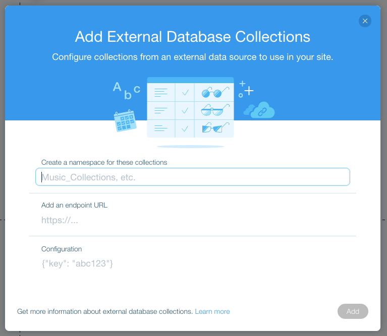
Connect to External Data Sources

Wix has provided a built-in database for a while, but now Corvid works with external data. That means you get even more control over the data on a Wix site and moer opportunities to fetch and optimize data. We’ve talked about the numerous ways to use spreadsheets as data sources before. Now, that same concept can be brought into the Wix ecosystem!

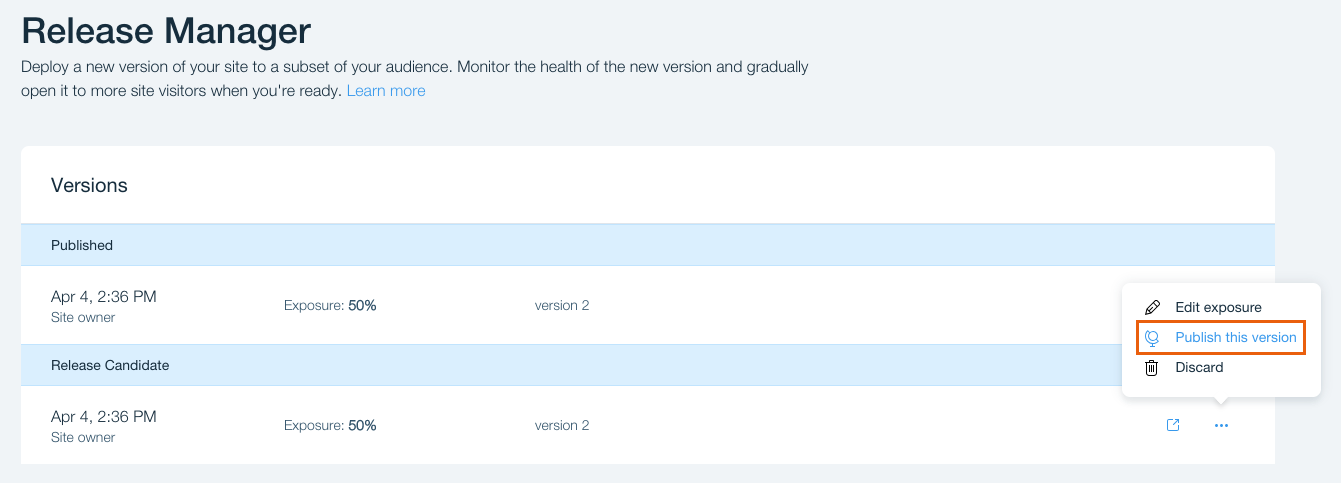
Testing and Deploying Changes

Want to see if changing the color of a button from green to purple increases conversion? Or maybe you’re trying to decide between two new page layouts and aren’t sure which one will work best? Corvid lets you have it both ways with a feature to create a release candidate and serve it to a percentage of visitors before rolling it out to everyone. It’s native A/B testing, which is a powerful marketing technique, not to mention a solid way to test user experience.

Local Development

The front-end visual editor in Wix makes building and editing sites an easy experience. It’s especially great for those who don’t work with code often or even at all.

But many CSS-Tricks readers like yourself enjoy working with code and are good at it. Corvid brings a built-in IDE to the table. Or, if you prefer, pull your Wix project files into your local environment and use the code editor of your choice.

So, whether you’re more comfortable working with a visual interface, a built-in editor, or locally, Corvid has got you covered.

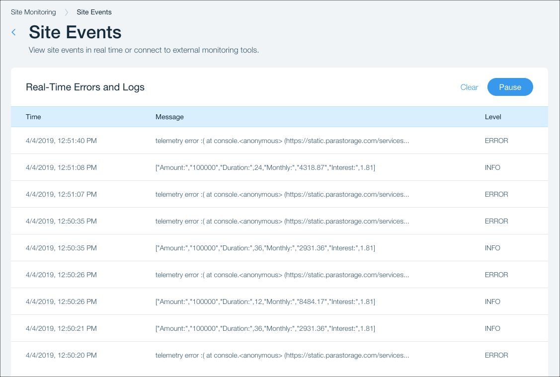
App Monitoring

Need access to console logs, HTTP functions, and web module functions? Yep, Corvid offers all of that, too. The system continually monitors Wix sites and logs activity all the while so you know when an error takes place and what caused it. Those of you who have worked with monitoring services before know how great it is to have error logs for quickly finding and fixing the source of an issue — and now it’s built right into Wix.

Speaking of working with monitoring services, Corvid will integrate with those as well so you never have to interrupt things or make a switch if you don’t want to. So nice!

Start Playing with Corvid!

What we’ve covered here is merely the tip of the iceberg when it comes to Corvid and all that it offers for a complete development platform and framework. Plus, there’s so much more to come, so definitely keep an eye out for new updates and releases as they’re announced… which we’ve seen moves at a fast pace.

Meet Corvid

Direct Link to ArticlePermalink

The post Corvid by Wix: Accelerated Development of Web Applications appeared first on CSS-Tricks.

Categories: Designing, Others Tags:

Using Parcel as a Bundler for React Applications

April 25th, 2019 No comments

You may already be familiar with webpack for asset management on projects. However, there’s another cool tool out there called Parcel, which is comparable to webpack in that it helps with hassle-free asset bundling. Where Parcel really shines is that it requires zero configuration to get up and running, where other bundlers often require writing a ton code just to get started. Plus, Parcel is super fast when it runs because it utilizes multicore processing where others work off of complex and heavy transforms.

So, in a nutshell, we’re looking at a number of features and benefits:

  • Code splitting using dynamic imports
  • Assets handling for any type of file, but of course for HTML, CSS and JavaScript
  • Hot Module Replacement to update elements without a page refresh during development
  • Mistakes in the code are highlighted when they are logged, making them easy to locate and correct
  • Environment variables to easily distinguish between local and production development
  • A “Production Mode” that speeds up the build by preventing unnecessary build steps

Hopefully, you’re starting to see good reasons for using Parcel. That’s not to say it should be used 100% or all the time but rather that there are good cases where it makes a lot of sense.

In this article, we’re going to see how to set up a React project using Parcel. While we’re at it, we’ll also check out an alternative for Create React App that we can use with Parcel to develop React applications. The goal here is see that there are other ways out there to work in React, using Parcel as an example.

Setting up a new project

OK, the first thing we need is a project folder to work locally. We can make a new folder and navigate to it directly from the command line:

mkdir csstricks-react-parcel && $_

Next, let’s get our obligatory package.json file in there. We can either make use of npm or Yarn by running one of the following:

## Using npm
npm init -y

## Using Yarn, which we'll continue with throughout the article
yarn init -y

This gives us a package.json file in our project folder containing the default configurations we need to work locally. Speaking of which, the parcel package can be installed globally, but for this tutorial, we’ll install it locally as a dev dependency.

We need Babel when working in React, so let’s get that going:

yarn add parcel-bundler babel-preset-env babel-preset-react --dev

Next, we install React and ReactDOM…

yarn add react react-dom

…then create a babel.rc file and add this to it:

{
  "presets": ["env", "react"]
}

Next, we create our base App component in a new index.js file. Here’s a quick one that simply returns a “Hello” heading:

import React from 'react'
import ReactDOM from 'react-dom'
class App extends React.Component {
  render() {
    return (
      <React.Fragment>
        <h2>Hello!</h2>
      </React.Fragment>
    )
  }
}

const rootElement = document.getElementById("root");
ReactDOM.render(<App />, rootElement);

We’ll need an HTML file where the App component will be mounted, so let’s create an index.html file inside the src directory. Again, here’s a pretty simple shell to work off of:

<html lang="en">
  <head>
    <meta charset="UTF-8">
    <meta name="viewport" content="width=device-width, initial-scale=1.0">
    <meta http-equiv="X-UA-Compatible" content="ie=edge">
    <title>Parcel React Example</title>
  </head>
  <body>
    <div id="root"></div>
    <script src="./index.js"></script>
  </body>
</html>

We will make use of the Parcel package we installed earlier. For that to work, we need to edit the start script in package.json file so it looks like this:

"scripts": {
  "start": "NODE_ENV=development parcel src/index.html --open"
}

Finally, let’s go back to the command line and run yarn start. The application should start and open up a fresh browser window pointing at http://localhost:1234/.

Working with styles

Parcel ships with PostCSS out of the box but, if we wanted to work with something else, we can totally do that. For example, we can install node-sass to use Sass on the project:

yarn add --dev node-sass autoprefixer

We already have autoprefixer since it’s a PostCSS plugin, so we can configure that in the postcss block of package.json:

// ...
"postcss": {
  "modules": false,
  "plugins": {
    "autoprefixer": {
      "browsers": [">1%", "last 4 versions", "Firefox ESR", "not ie < 9"],
      "flexbox": "no-2009"
    }
  }
}

Setting up a production environment

We’re going to want to make sure our code and assets are compiled for production use, so let’s make sure we tell our build process where those will go. Again, in package-json:

"scripts": {
  "start": "NODE_ENV=development parcel src/index.html --open",
  "build": "NODE_ENV=production parcel build dist/index.html --public-url ./"
}

Running the yarn run build will now build the application for production and output it in the dist folder. There are some additional options we can add to refine things a little further if we’d like:

  • --out-dir directory-name: This is for using another directory for the production files instead of the default dist directory.
  • --no-minify: Minification is enabled by default, but we can disable with this command.
  • --no-cache: This allows us to disable filesystem cache.

? CRAP (Create React App Parcel)

Create React App Parcel (CRAP) is a package built by Shawn Swyz Wang to help quickly set up React applications for Parcel. According to the documentation, we can bootstrap any application by running this:

npx create-react-app-parcel my-app

That will create the files and directories we need to start working. Then, we can migrate over to the application folder and start the server.

cd my-app
yarn start

Parcel is all set up!

Parcel is worth exploring in your next React application. The fact that there’s no required configuration and that the bundle time is super optimized makes Parcel worth considering on a future project. And, with more than 30,000 stars on GitHub, it looks like something that’s getting some traction in the community.

Additional resources

  • Parcel Examples: Parcel examples using various tools and frameworks.
  • Awesome Parcel: A curated list of awesome Parcel resources, libraries, tools and boilerplates.

The source code for this tutorial is available on GitHub

The post Using Parcel as a Bundler for React Applications appeared first on CSS-Tricks.

Categories: Designing, Others Tags:

Moving from Gulp to Parcel

April 25th, 2019 No comments

Ben Frain just made some notes about the switch from Gulp to Parcel, a relatively new “web application bundler” which, from a quick look at things, is similar to webpack but without all the hassle of setting things up. One of the things I’ve always disliked about webpack is that you kinda have to teach it what CSS, HTML and JS are before making whatever modifications you want to those files. However, Parcel does a lot of the asset management and configuration stuff for us which is super neat — hence, Parcel claim that it requires “zero configuration.”

If you’d like to learn more about Parcel then there’s a great post by Indrek Lasn that details how to get started and even shows off a little bit about how Parcel is often faster than alternatives like webpack. We also just published a post by Kingsley Silas that explains how to use Parcel with React.

Direct Link to ArticlePermalink

The post Moving from Gulp to Parcel appeared first on CSS-Tricks.

Categories: Designing, Others Tags:

Privacy UX: Privacy-Aware Design Framework

April 25th, 2019 No comments
'Just-in-time' explanations

Privacy UX: Privacy-Aware Design Framework

Privacy UX: Privacy-Aware Design Framework

Vitaly Friedman

2019-04-25T13:30:16+02:002019-04-28T16:06:00+00:00

We’ve already explored approaches for better cookie consent prompts, permission requests, and notifications UX, but how do they fit into an overall design strategy as we make design decisions in our design tools?

In her article “What does GDPR mean for UX?”, Claire Barrett, a UX and UI designer at Mubaloo in Bristol, UK, has shared a very practical, actionable set of UX guidelines that the design agency has been following in respect to GDPR. While these guidelines specifically target GDPR, they are applicable to a much wider scope of user-friendly and privacy-aware interactions, and could therefore be applicable to any kind of project:

  1. Users must actively opt in to having their data collected and used.
  2. Users must give consent to every type of data-processing activity.
  3. Users should have the right to easily withdraw their consent at any time.
  4. Users should be able to check every organization and all third parties that will handle the data.
  5. Consent isn’t the same as agreeing to the terms and conditions, so they shouldn’t be bundled together; they are separate, and should have separate forms.
  6. While asking for consent at the right times is good, it’s even better to clearly explain why consent will benefit their experience.

One of the interesting things that Claire recommends in her article is to focus on “just-in-time” data collection (mentioned in part 3 of this series); that is, explain why data is required, and how it will and will not be used — but only when the app or website actually needs it. Obviously, this could be done by including an “info” icon next to the more personal bits of information collected, and showing the tooltip with the benefits and rationale behind data collection on request.

'Just-in-time' explanations

‘Just-in-time’ explanations with the info tooltip in forms. (Image source: Claire Barrett) (Large preview)

Many mobile applications require access to location, photos, and even the camera during installation, which isn’t something most customers would be happy to consent to. A more effective way of getting permission is to explain the need for data at the point of collection by using “just-in-time” prompts, so users can give consent only when they understand the purpose of it, very much like we’ve seen with permissions earlier in this series.

'Just-in-time' prompts

‘Just-in-time’ prompts, asking for access to location only when it’s actually required. (Image source: Claire Barrett) (Large preview)

The explanations should also inform customers how to withdraw consent where applicable, and provide a link to the privacy policy. These have been a matter of ongoing complaints for years, as lengthy privacy policies written in perfectly obscure legalese are almost impossible to comprehend without a dedicated review session. (In fact, a 2008 study showed it would take the average person roughly 244 hours per year to read all of the privacy policies for the sites they use, which translates to about 40 minutes per day.)

Rather than presenting the privacy policy as a wall of convoluted text, it could be chunked and grouped into clearly labelled sections and expandable text, optimized for scanning, locating, and understanding.

Separated policy actions

Separated policy actions, presented as accordions. Optimized for easy scanning and comprehension. (Image source: Claire Barrett) (Large preview)

Once consent is granted, customers should have full control over their data; that is, the ability to browse, change, and delete any of the data our applications hold. That means data settings in our mobile applications need to provide granular options to revoke consent, and opt out from marketing preferences, as well as the option to download and delete any data without wandering around the convoluted maze of help sections and ambiguous setting panels.

'data settings' menu

Customers should have full control over their data, so our ‘data settings’ menu should provide granular options to revoke consent, opt out from preferences, and download/or delete all data. (Image source: Claire Barrett) (Large preview)

The main issue with privacy-aware design decisions is that it’s difficult to assess the impact of data collection and all the interface challenges it poses on design and development. Being humble and subtle isn’t just a matter of respect, but also about reducing technical debt and avoiding legal battles down the road. For that, the following general guidelines could help as well.

Save As Little Data As Possible

If you choose to store credit card data, you have to be upfront about the security measures you take to store them confidentially. The less data you require and store, the less of an impact a potential breach would have.

Treat Personal Data Well

Not all data is created equal. When users provide personal information, distinguish between different strata of data, as private information is probably more sensitive than public information. Treat personal data well, and never publish it by default. For example, as a user completes their profile, provide an option to review all the input before publishing it. Be humble, and always ask for permission first; proactively protect users and don’t store sensitive data. That might help prevent uncomfortable situations down the line.

This goes not only for the procedure of storing and publishing user data on your servers, but also when it comes to password recovery or using customer data for any kind of affiliate partnerships. In fact, handing over a customer’s email to somebody else without explicit consent is a breach of trust and privacy, and often results in emails marked as spam because customers are suddenly confronted with an unfamiliar brand they don’t trust. In fact, the latter is almost like a defence mechanism against rapacious websites that continuously harvest emails in exchange for a free goodie, access to videos, and freemium offerings.

Explain Early What Kind Of User Data Third Parties Will Receive

When providing an option for social sign-in, be specific about what will happen to the user’s data and what permissions third parties will have. Usually a subtle note appears when social sign-in is prompted, but it’s a good idea to be explicit straightaway about how data will be treated, and specifically what will not happen to a user’s data.

It’s common to see user interactions coming to a halt once customers are forced into connecting their brand new accounts with already existing ones, or when they are encouraged to use their social profiles to make progress with the app. That’s never a straightforward step to take, and requires some explanation and assurance that revoking access is easy.

Prepare Customer Data For Export

It’s not trivial to get a complete picture of the collected data, especially if third parties are involved. Make sure that whenever personal data is collected, it’s structured in a way that’s optimized for export and deletion later on. Bonus points if it’s also digestible for the end user, so they can find the bits and pieces they need once they are interested in something very specific. That also means tracking what types of data are collected and where data flows, as we can use this structure later to provide granular control over data settings and privacy preferences in our UI.

You might have heard of a few friendly companies that make importing personal data remarkably seamless, yet exporting user data is painfully difficult, or close to impossible. Unsurprisingly, this practice isn’t perceived well by customers; and especially at times when they are thinking about deleting their account, such a pervasive lock-in will lead to customer support complaints, call centre calls, and angry outbursts in social channels. That’s not a delightful feature that will keep them loyal long-term.

While some companies can take public blaming because of their sheer size, for many small and mid-sized companies, reputation is the most precious asset they have, and so it’s wise not to gamble with it. You could even think of partnering with similar services and make user data seamlessly portable and transferrable to each of them, while expecting the same feature to be supported by partners as well.

Making It Difficult To Close Or Delete An Account Fails In The Long Term

Corporate behemoths have excelled in making it remarkably difficult for customers to close or delete their accounts. And this technique works when when moving away is painfully difficult — that’s the case for Amazon and Facebook.

However, if you are working on a relatively small website which strives for its loyal customers, you might not be able to pull it off successfully, at least not long-term. The overall impact is even more harmful if you make it difficult to cancel a recurring payment, as is often the case with subscriptions. (In fact, that’s why subscriptions are also difficult to sell — it’s not just the commitment to monthly payments, but rather the difficulty of cancelling the subscription at a later time without extra charge due to early cancellation.)

In fact, just as designers are getting better at hiding notorious profile settings for deleting an account, so too are customers at finding ways to navigate through the maze, often supported by the infinite wisdom of easily discoverable tutorials in blogs. If it’s not the case, customers resort to the tools they know work best: turning their back on the service that shows no respect towards their intentions — usually by marking emails as spam, blocking notifications, and using the service less. It doesn’t happen overnight; but slowly and gradually, and as interviews showed, these customers are guaranteed to not recommend the service to their friends or colleagues.

Surprisingly, it’s the other way around when it’s remarkably easy to close the account. Just like with notifications, there might be good reasons why the user has chosen to move on, and very often it has nothing to do with the quality of service at all. Trying to convince the customer to stay, with a detailed overview of all the wonderful benefits that you provide, might be hitting the wrong targets: in corporate settings especially, the decision will have been made already, so the person closing the account literally can’t do much about changing the direction.

examples of cancellation of account and terminated subscription in smashing magazine

With Smashing Membership, we try to explain what happens to the data in a clear way, and give an option to leaving Members to export their data without any hidden tricks. (Large preview)

For Smashing Membership, we’ve tried to keep the voice respectful and humble, while also showing a bit of our personality during offboarding. We explain what happens to the data and when it will be irrevocably deleted (seven days), provide an option to restore the plan, allow customers to export their orders and guarantee no sharing of data with third parties. It was surprising to see that a good number of people who canceled their Membership subscription, ended up recommending it to their friends and colleagues, because they felt there was some value in it for them even though they didn’t use it for themselves.

Postpone Importing Contacts Until The User Feels Comfortable With The Service

Of course, many of our applications aren’t particularly useful without integrating the user’s social circle, so it seems plausible to ask customers to invite their friends to not feel lonely or abandoned early on. However, before doing so, think of ways of encouraging customers to use the service for a while and postpone importing contacts until the point when users are more inclined to do so. By default, many customers would block an early request as they haven’t yet developed trust for the app.

Save User Data For A Limited Amount Of Time After Account Closure

Mistakes happen, and it holds true for accidental mis-taps as much as deleting all personal data after a remarkably bad day. So while we need to provide an option to download and delete data, also provide an option to restore an account within a short amount of time. That means that data will be saved after the account is deleted, but will be irrevocably removed after that grace period has passed. Usually, 7–14 days is more than enough.

However, you could also provide an option for users to request the immediate deletion of data via email request, or even with a click on a button. Should users be informed about the ultimate deletion of their files? Maybe. The final decision will probably depend on how sensitive the data is: the more sensitive it is, the more likely users will want to know the data is gone for good. The exception is anonymized data: most of the time, customers won’t care about it at all.

Provide User-Friendly Summaries Of Privacy Policy Changes

Nothing is set in stone, and so your privacy policy and default privacy settings might need to adjust because of new personalization features or a change of the tracking script. Whenever this happens, rather than highlighting the importance of privacy in lengthy passages of text, provide clear, user-friendly summaries of changes. You could structure the summary by highlighting how things used to be and how they are different now. Don’t forget to translate legalese into something more human-readable, explaining what the change actually means for the user.

Frankly, most users didn’t seem to care much about privacy policy changes. After the never-ending stream of policy update notifications in 2018, the default reaction is usually immediate consent. Once they’ve noticed anything related to privacy policy in the subject line or the email body, they immediately accept changes before even scrolling to the bottom of the email. However, the more personal the data stored is, the more time was spent reviewing the changes, which often were remarkably confusing and unclear.

medium.com privacy policy

Microcopy has always been at the very heart of Medium.com. A well-designed and well-structured privacy policy with clear summaries of privacy policy changes. (Image source: Email Design BeeFree) (Large preview)

mailchimp privacy policy

MailChimp, with a concise summary of changes of its privacy policy. (Large preview)

Note: The folks at Really Good Emails have collected some great examples of email design related to GDPR if you’re looking for more inspiration on how to share privacy policy changes with your users and subscribers.

Set Up A Communication Strategy In Case Of A Breach

Nobody wants havoc after user data is compromised. In such situations, it’s critical to have a clear and strong communication strategy. Have an explanation prepared in case some user data is compromised. Mandy Brown published a fantastic article, “Fire Drills: Communications Strategy in a Crisis”, on A List Apart, explaining how to set one up, and a few things to consider when doing it.

Privacy By Design

It might sound like visiting websites is a quite ordinary activity, and users should feel comfortable and familiar with features such as social sign-in, importing contacts, and cookie prompts. As we’ve seen in this series, there are many non-trivial privacy considerations, and more often than not, customers have concerns, doubts, and worries about sharing their personal data.

Of course, the scope of this series could stretch out much further, and we haven’t even looked into password recovery, in-app privacy settings design, floating chat windows and pop-ups, performance and accessibility considerations, or designing privacy experiences for the most vulnerable users — children, older people, and those with disadvantages. The critical point when making design decisions around privacy is always the same, though: we need to find a balance between strict business requirements and respectful design that helps users control their data and keep track of it, instead of harvesting all the information we can and locking customers into our service.

A good roadmap for finding that balance is adopting a privacy-first best-practice framework, known as Privacy by Design (PbD). Emerging in Canada back in the 1990s, it’s about anticipating, managing, and preventing privacy issues before a single line of code is written. With the EU’s data protection policy in place, privacy by design and data protection have become a default across all uses and applications. And that means many of its principles can be applied to ensure both GDPR-compliance and better privacy UX of your website or application.

In essence, the framework expects privacy to be a default setting, and a proactive (not reactive) measure that would be embedded into a design in its initial stage and throughout the life cycle of the product. It encourages offering users granular privacy options, respectful privacy defaults, detailed privacy information notices, user-friendly options, and clear notification of changes. As such, it works well with the guidelines we’ve outlined in this series.

I highly recommend reading one of Heather Burns’ articles, “How To Protect Your Users With The Privacy By Design Framework,” in which she provides a detailed guide to implementing the Privacy by Design framework in digital services.

Where to start, then? Big changes start with small steps. Include privacy in the initial research and ideation during the design stage, and decide on defaults, privacy settings, and sensitive touchpoints, from filling in a web form to onboarding and offboarding. Minimize the amount of collected data if possible, and track what data third parties might be collecting. If you can anonymize personal data, that’s a bonus, too.

Every time a user submits their personal information, keep track of how the questions are framed and how data is collected. Display notifications and permission requests just in time, when you are almost certain that the customer would accept. And in the end, inform users in digestible summaries about privacy policy changes, and make it easy to export and delete data, or close an account.

And most importantly: next time you are thinking of adding just a checkbox, or providing binary options, think about the beautifully fuzzy and non-binary world we live in. There are often more than two available options, so always provide a way out, no matter how obvious a choice might appear. Your customers will appreciate it.

(yk, il)
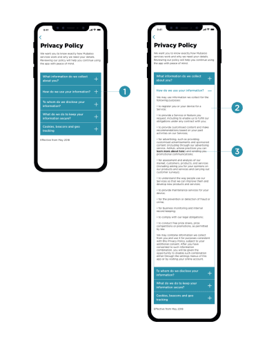
Categories: Others Tags:

8 Things Every Designer Needs

April 25th, 2019 No comments
things every designer needs

Every profession, be it a designer, an architect or a cook, has its own set of necessary tools. But what are the most important tools for a graphic designer? What does a graphic designer use to do their job well? I know very well that, if you are reading this article, you are most likely already a graphic designer and you already know the essential tools and things with which you work in this profession. Those tools will be the focus of this article. Whether they’re obvious or not, they’re worth talking about. These are the 8 things every designer needs:

1. A computer (duh)

The first point is pretty obvious, isn’t it? Every graphic designer of this century spends almost more time in front of a screen than sleeping. The computer is a crucial element of work as a creative person, as it is for anyone who works in the industry of the creative world.

things  every designer needs

But with the computer, the right programs are needed. As a graphic designer, you will probably end up using more online tools than you can count. We won’t really mention online tools in this list other than this mention, but it’s important to note why you computer is so important.

2. A smartphone

things  every designer needs

Smartphones are a busy person’s answer to pretty much everything. Smartphones are great for reading and sending messages, emails, or taking important phone calls.

A smartphone, however, also has a very important function for us designers: the camera! Yep, that tiny little lense that you use to upload your dog to Instagram can also be used in your graphic design adventures. You can use it in many ways such as photographing something like a poster, a texture or anything else that inspires us, then creating a note on Evernote and quietly reviewing it at home.

One of the best uses I make of it in the workplace is to photograph a drawing or a sketch I just made. When I have to vectorize on Illustrator, I then pass it on the computer via DropBox or AirDroid. This technique incredibly speeds up my manufacturing process! In a matter of seconds, I transferred my drawing made on a sheet of paper to the Illustrator workspace, ready to be traced and transformed into a vector!

Another very useful application on my phone is Wunderlist, which allows me to organize to-do lists.

3. A trustworthy Moleskine

things  every designer needs

Believe it or not, not every graphic designer is a great drawing. Because our designs are mostly digital, the skill required to make perfect hand-drawn sketches isn’t necessarily required. But, that doesn’t mean that drawing isn’t a useful skill to have. After all, most designs usually start with a sketch.

So why the Moleskine? Well, because it’s convenient! You can put it in your backpack and draw on it at any time and in any place. You can almost think of it as a pocketbook that contains drawings instead of money.

4. A graphics tablet

things  every designer needs

To be honest, a tablet isn’t 100% needed, but it’s super convenient. It’s fast, portable, and it gets little tasks done. Plus, they’re usually capable of running tools like Photoshop or InDesign.

There are lots of tablets to choose from out there, and that list seems to get bigger year after year. Of course, not everyone’s budget allows for such a tool, but there are quite a few that are on the more budget-friendly side of the fence. Bottom line is that if you can afford one, you’ll definitely find a use for it.

5. Books, many books

things  every designer needs

There are lots of people out there that are designers, but don’t have a degree. To be honest, in this day and age, it’s not mandatory. There are lots and lots of ways you can get the same education you would get in college, but without taking the courses.

And how do you study without attending courses? Reading!

This is not meant to convince you to not further your education. This is simply an alternative for those who choose not to go to college.

Read, study, repeat.

6. A portfolio

Until a few years ago the portfolio was the paper collection of projects to show to possible clients or employers to get a commission or get a job. In my opinion, this system, this way of doing things, is outdated today. The internet has fortunately changed everything and a graphic designer must have an online portfolio.

There are mainly two options:

The first is to create your own website: buying the domain with your name and surname or with the name of your agency and building the website on it. If you don’t have one yet, find out how to create an online portfolio!

The second is to exploit the Behance platform. A free platform that allows you to upload your best works and to receive and give feedback from other creatives like you.

7. A good online presence

things  every designer needs

As a direct consequence of creating an online portfolio, there must also be good management of your profiles on social networks and on the internet in general.

It is very useful for a designer to share their works (without exaggerating) on ??social networks like Facebook or even Instagram, which is a phenomenal social media platform to promote yourself as a designer.

By sharing your work, you can show many people at one time what you’re capable of. You’re able to show off what you’ve done, and the skills required to do such things.

8. Feedback

things  every designer needs

Another positive element that can lead to exhibiting one’s skills online is to get feedback. Of course, the opinions of those who are in the same industry as you are much more valuable and more “technical” than those who know nothing about graphics and design, but you always have to accept criticism from anyone in order to grow.

As a side note, accepting criticism does not mean getting yelled at or scolded for doing a bad job. No, it’s not fun to hear that someone doesn’t like your project, but it’s a vital part of your job. After all, it’s better to hear “I don’t like that” from a friend or colleague than it is from a paying client.

The conclusion

In conclusion, there are many useful tools out there to help you in your graphic design career. Some of these tools are more obvious than others, but they’re all equally as useful if you use them correctly.

Read More at 8 Things Every Designer Needs

Categories: Designing, Others Tags:

How to Pick Your Next Tech Focus

April 25th, 2019 No comments

Every day, people are asking themselves things like, “React or Vue?” “VR or no VR?” “CSS Grid or Flexbox?” These are the wrong questions entirely, because the technology you focus on or use next should always be matched to both the job and the people at hand.

Besides, here are the answers:

  1. Personal preference.
  2. Not yet, wait ‘til the market starts to truly expand again.
  3. CSS Grid for known quantities, Flexbox for unknown quantities. Except for all the times where that’s wrong. CSS is a bit like English that way.

And that “Except for all the times where that’s wrong” bit is exactly the problem with making definite pronouncements about which technologies you should focus on next. I can’t reliably do that. However, in my years of muddling through tech problems, I’ve discovered ways to make an educated guess. Since people often use the new year as an excuse to try new things, I thought I’d share my principles of educated guesswork with you all.

1. Watch People

Watch how people use tech: Don’t be creepy about it. Conduct studies with willing participants, if you can. Otherwise, keep a non-invasive eye on your spouse, friends, and any kids you might have just lying around. If you see them using an app (for example), try it out for yourself. If you notice them ditch an app, maybe ask them why.

If you want to understand why VR hasn’t taken off on billion-dollar wings yet, look no further than smartphones. The smartphone has something everyone wants, and just about anyone can use one anywhere, and at any time. VR has yet to make that connection with people.

Watch what people do, not just what they say looks cool.

Watch the people who make tech: Research the people who make the tech you’re considering buying into. Do they listen to their community? Do they consider the edge cases? Do they care? Can they write clear documentation?

While there’s something to be said for the brilliant visionary who drags everyone else along with them to distant visions of grandeur, you should mostly be looking for the people solving simpler, more everyday problems. Stable people make stable tech.

Unstable people are better advertisers though. ahem Steve Jobs ahem.

2. Look For Convenience (For Your Users)

Because your users are looking for it, too. If a new bit of tech only adds steps to the process of just… getting things done, users will be frustrated. Now, when choosing between programming languages, for example, it’s all down to what you build with it. PHP, Node.js, Python, and ASP.NET can all process form data, after all.

But if, for example, you’re choosing pre-built software like a CMS, this factor becomes a whole lot more important. People don’t care how powerful their new content editor is, if they now have to do more things before they finally get to hit “publish”. A new tool that’s more convenient for you is all well and good; your users may have an entirely different opinion. Do not sacrifice their convenience for yours.

3. Integration

No tool is an island. Everything you use gets used in tandem with a bunch of other stuff. It’s for this very reason that some companies have opted to stick to older operating systems or browsers, sometimes. Ask anybody in IT or InfoSec: new software can upset entire ecosystems if you don’t do your research first.

Now sometimes that’s a good thing. Using an OS after support has officially ended, for example, is not a thing you want to do. But as web designers and devs, the choice is not always so clear. With the sheer massive numbers of libraries we use nowadays, conflicts can come out of nowhere. So maybe—just maybe—if your entire layout up to this point is still based on Bootstrap 3.x, starting to use CSS Grid everywhere can wait until you have the budget for a full redesign.

4. What Happens When Things go Wrong?

How Does the Tech Respond to Bugs? An improperly coded WordPress theme, for example, can refuse to display anything at all if something goes wrong in a single function. It’s one thing for a single feature to break on your site. As long as it’s not the navigation, or anything else that’s critical, chances are your users will ignore it. It’s quite another thing to have your whole site go down because someone mistyped something.

What are Your Support Options? At the very least, you want an active community and a developer that responds to questions when things go really wrong. Paid support options aren’t bad, either. A little money for support, or other expert help, can save a lot of lost sales.

5. Extra Tips

Remember that your needs are not necessarily everyone else’s needs. Tech that sounds like it might improve things for your users needs to be tested on a smaller scale. The world is littered with dead products and features that sounded useful and even delightful until you actually bothered to think about them.

Buzzwords be damned. Most likely whatever you’re doing does not need to be on the blockchain, or whatever else is popular this week. Chances are that trying to implement a “fashionable” solution to your problems may cause more harm than good. Again: test.

Perceived value is value. Think of website optimization. A website that feels fast is almost the same thing, in the eyes of the user, as a website that actually is fast. They want things to be snappy. The same goes for value: no matter how amazing a new bit of tech actually is, it’s got to feel valuable to the people who actually have to use it. If they do not feel as if it does them any good, they may forget about it or worse, actively avoid it.

If it ain’t broke, implement all fixes with caution.

Featured image via DepositPhotos.

Add Realistic Chalk and Sketch Lettering Effects with Sketch’it – only $5!

Source

Categories: Designing, Others Tags: