Archive

Archive for April, 2019

Optimizing Performance With Resource Hints

April 17th, 2019 No comments
Smashing Editorial

Optimizing Performance With Resource Hints

Optimizing Performance With Resource Hints

Drew McLellan

2019-04-17T12:30:16+02:002019-04-20T10:07:34+00:00

Modern web browsers use all sorts of techniques to help improve page load performance by guessing what the user may be likely to do next. The browser doesn’t know much about our site or application as a whole, though, and often the best insights about what a user may be likely to do come from us, the developer.

Take the example of paginated content, like a photo album. We know that if the user is looking at a photo in an album, the chance of them clicking the ‘next’ link to view the following image in the album is pretty high. The browser, however, doesn’t really know that of all the links on the page, that’s the one the user is most likely to click. To a browser, all those links carry equal weight.

What if the browser could somehow know where the user was going next and could fetch the next page ahead of time so that when the user clicks the link the page load is much, much faster? That’s in principal what Resource Hints are. They’re a way for the developer to tell the browser about what’s likely to happen in the future so that the browser can factor that into its choices for how it loads resources.

All these resource hints use the rel attribute of the element that you’ll be familiar with finding in the of your HTML documents. In this article we’ll take a look at the main types of Resource Hints and when and where we can use them in our pages. We’ll go from the small and subtle hints through to the big guns at the end.

DNS Prefetching

A DNS lookup is the process of turning a human-friendly domain name like example.com into the machine-friendly IP address like 123.54.92.4 that is actually needed in order to fetch a resource.

Every time you type a URL in the browser address bar, follow a link in a page or even load a resource like an image from a different domain, the browser needs to do a DNS lookup to find the server that holds the resource we’ve requested. For a busy page with lots of external resources (like perhaps a news website with loads of ads and trackers), there might be dozens of DNS lookups required per page.

The browser caches the results of these lookups, but they can be slow. One performance optimization technique is to reduce the number of DNS lookups required by organizing resources onto fewer domains. When that’s not possible, you can warn the browser about the domains it’s going to need to look up with the dns-prefetch resource hint.

<link rel="dns-prefetch" href="https://images.example.com">

When the browser encounters this hint, it can start resolving the images.example.com domain name as soon as possible, even though it doesn’t know how it’ll be used yet. This enables the browser to get ahead of the game and do more work in parallel, decreasing the overall load time.

When Should I Use dns-prefetch?

Use dns-prefetch when your page uses resources from a different domain, to give the browser a head start. Browser support is really great, but if a browser doesn’t support it then no harm done — the prefetch just doesn’t happen.

Don’t prefetch any domains you’re not using, and if you find yourself wanting to prefetch a large number of domains you might be better to look at why all those domains are needed and if anything can be done to reduce the number.

Preconnecting

One step on from DNS prefetching is preconnecting to a server. Establishing a connection to a server hosting a resource takes several steps:

  • DNS lookup (as we’ve just discussed);
  • TCP handshake
    A brief “conversation” between the browser and server to create the connection.
  • TLS negotiation on HTTPS sites
    This verifies that the certificate information is valid and correct for the connection.

This typically happens once per server and takes up valuable time — especially if the server is very distant from the browser and network latency is high. (This is where globally distributed CDNs really help!) In the same way that prefetching DNS can help the browser get ahead of the game before it sees what’s coming, pre-connecting to a server can make sure that when the browser gets to the part of the page where a resource is needed, the slow work of establishing the connection has already taken place and the line is open and ready to go.

<link rel="preconnect" href="https://scripts.example.com">

When Should I Use preconnect?

Again, browser support is strong and there’s no harm if a browser doesn’t support preconnecting — the result will be just as it was before. Consider using preconnect when you know for sure that you’re going to be accessing a resource and you want get ahead.

Be careful not to preconnect and then not use the connection, as this will both slow your page down and tie up a tiny amount of resource on the server you connect to too.

Prefetching The Next Page

The two hints we’ve looked at so far are primarily focussed on resources within the page being loaded. They might be useful to help the browser get ahead on images, scripts or fonts, for example. The next couple of hints are concerned more with navigation and predicting where the user might go after the page that’s currently being loaded.

The first of these is prefetching, and its link tag might look like this:

<link rel="prefetch" href="https://example.com/news/?page=2" as="document">

This tells the browser that it can go ahead and fetch a page in the background so that it’s ready to go when requested. There’s a bit of a gamble here because you have to preempt where you think the user will navigate next. Get it right, and the next page might appear to load really quickly. Get it wrong, and you’ve wasted time and resources in downloading something that isn’t going to be used. If the user is on a metered connection like a limited mobile phone plan, you might actually cost them real money.

When a prefetch takes place, the browser does the DNS lookup and makes the server connection we’ve seen in the previous two types of hint, but then goes a step further and actually requests and downloads the files. It stops at that point, however, and the files are not parsed or executed and they are in no way applied to the current page. They’re just requested and kept ready.

You might think of a prefetch as being a bit like adding a file to the browser’s cache. Instead of needing to go out to the server and download it when the user clicks the link, the file can be pulled out of memory and used much quicker.

The as Attribute

In the example above, you can see that we’re setting the as attribute to as="document". This is an optional attribute that tells that browser that what we’re fetching should be handled as a document (i.e. a web page). This enables the browser to set the same sort of request headers and security policies as if we’d just followed a link to a new page.

There are lots of possible values for the as attribute by enabling the browser to handle different types of prefetch in the appropriate way.

Value of as Type of resource
audio Sound and music files
video Video
Track Video or audio WebVTT tracks
script JavaScript files
style CSS style sheets
font Web fonts
image Images
fetch XHR and Fetch API requests
worker Web workers
embed Multimedia requests
object Multimedia requests
document Web pages

The different values that can be used to specify resource types with the as attribute.

When Should I Use prefetch?

Again prefetch has great browser support. You should use it when you have a reasonable amount of certainty of the user might follow through your site if you believe that speeding up the navigation will positively impact the user experience. This should be weighed against the risk of wasting resources by possibly fetching a resource that isn’t then used.

Prerendering The Next Page

With prefetch, we’ve seen how the browser can download the files in the background ready to use, but also noted that nothing more was done with them at that point. Prerendering goes one step further and executes the files, doing pretty much all the work required to display the page except for actually displaying it.

This might include parsing the resource for any subresources such as JavaScript files and images and prefetching those as well.

<link rel="prerender" href="https://example.com/news/?page=2">

This really can make the following page load feel instantaneous, with the sort of snappy load performance you might see when hitting your browser’s back button. The gamble is even greater here, however, as you’re not only spending time requesting and downloading the files, but executing them along with any JavaScript and such. This could use up memory and CPU (and therefore battery) that the user won’t see the benefit for if they end up not requesting the page.

When Should I Use prerender?

Browser support for prerender is currently very restricted, with really only Chrome and old IE (not Edge) offering support for the option. This might limit its usefulness unless you happen to be specifically targeting Chrome. Again it’s a case of “no harm, no foul” as the user won’t see the benefit but it won’t cause any issues for them if not.

Putting Resource Hints To Use

We’ve already seen how resource hints can be used in the of an HTML document using the tag. That’s probably the most convenient way to do it, but you can also achieve the same with the Link: HTTP header.

For example, to prefetch with an HTTP header:

Link: <https://example.com/logo.png>; rel=prefetch; as=image;

You can also use JavaScript to dynamically apply resource hints, perhaps in response to use interaction. To use an example from the W3C spec document:

var hint  = document.createElement("link");
hint.rel  = "prefetch";
hint.as   = "document";
hint.href = "/article/part3.html";
document.head.appendChild(hint);

This opens up some interesting possibilities, as it’s potentially easier to predict where the user might navigate next based on how they interact with the page.

Things To Note

We’ve looked at four progressively more aggressive ways of preloading resources, from the lightest touch of just resolving DNS through to rending a complete page ready to go in the background. It’s important to remember that these hints are just that; they’re hints of ways the browser could optimize performance. They’re not directives. The browser can take our suggestions and use its best judgement in deciding how to respond.

This might mean that on a busy or overstretched device, the browser doesn’t attempt to respond to the hints at all. If the browser knows it’s on a metered connection, it might prefetch DNS but not entire resources, for example. If memory is low, the browser might again decide that it’s not worth fetching the next page until the current one has been offloaded.

The reality is that on a desktop browser, the hints will likely all be followed as the developer suggests, but be aware that it’s up to the browser in every case.

The Importance Of Maintenance

If you’ve worked with the web for more than a couple of years, you’ll be familiar with the fact that if something on a page is unseen then it can often become neglected. Hidden metadata (such as page descriptions) is a good example of this. If the people looking after the site can’t readily see the data, then it can easily become neglected and drift out of date.

This is a real risk with resource hints. As the code is hidden away and goes pretty much undetected in use, it would be very easy for the page to change and any resource hints to go un-updated. The consequence of say, prefetching a page that you don’t use, means that the tools you’ve put in place to improve the performances of your site are then actively harming it. So having good procedures in place to key your resource hints up to date becomes really, really important.

Resources

(il)
Categories: Others Tags:

Famous Fonts Used by Powerful Companies

April 17th, 2019 No comments
famous fonts

Have you ever wondered what the most used fonts in the most famous logos are? Those logos that happen to be seen hundreds of times, repeated on all the screens, shirts and sheets of paper that surround you.

Well, then this article is made just for you!

In fact, in this article, I want to talk to you about which fonts are used in some of the most famous logos ever.

We’re going to try and understand why these specific fonts were chosen. Because choosing a font is not a simple thing, and behind the choice of a font, there is a very precise message that any brand wants to convey.

In this article, I wanted to analyze 6 fonts in depth.

Ready? Then let’s get started!

A little clarification before starting: many famous brands use private fonts

Almost every major brand opts for a custom font. Of course, these fonts aren’t generally available to the public.

Very often, however, these proprietary fonts are based on already existing and already famous characters. And in a lot of cases, custom fonts that you can purchase or even download for free follow suit shortly after.

Now, let’s really get into it!

What font does YouTube use in its logo?

Bold and tight, the Alternate Gothic was designed by Morris Fuller Benton in 1903 for the American Type Founders Company.

It is a font with a long history, designed at the beginning of the 20th century so that it could be perfect to insert titles in narrow columns.

It was the font used in the YouTube logotype until a few years ago (August 2017, to be precise) when YouTube rebranded. Since then, they’ve used a custom font called YouTube Sans.

Famous Fonts

This font was designed from scratch, by the Saffron branding agency, starting right from the shapes and aesthetics of the Alternate Gothic used previously.

Why was this font chosen?

This current one, according to what the Saffron designers write, was chosen to “communicate its brand with only a glance”, that is, to be able to immediately communicate that it is YouTube.

With this, being a reference to the Alternate Gothic that they used previously, the recognition of the brand is strengthened.

But why had the Alternate Gothic been chosen?

Nobody can really say for sure. Most people speculate that it was chosen because of its super easy readability. Being a massive international company, readability in the logo font is a must.

It was designed for editorial use in the minuscule dimensions of column headings but also in the enormous dimensions of the main titles. And so it was readable in every dimension.

What font does Adidas use in its logo?

L’Avant Garde, which in French means cutting-edge, is one of the most influential of the 900 fonts. Created in 1970 by Herb Lubalin (along with Tom Carnase), it was introduced into the font family. Its original intention was to be in the logo of their magazine, which was called “Avant Garde”.

The forms of the Avant-Garde recall very much the natural elegance of the Art Deco of the 1920s and 30s. While transmitting a vintage effect, it is nevertheless able to tell it always in a contemporary way, thanks to its flexibility and naturalness.

In reality, however, the font used in the Adidas logo is not the Avant-Garde.

Here too, it is a proprietary font, AdiHaus. A font inspired, of course, by the Avant-Garde but also by the FF Din (one of my absolute favorites).

Why was the Avant-Garde / AdiHaus chosen?

The Avant Garde was chosen in 1971 by the designers who worked on the first restyling of the Adidas logo.

Famous Fonts

It was chosen both because it was a font very similar to the one originally designed in ’49, and, I believe, because of its qualities: elegance, naturalness, cleanliness.

What font does Nike use in its logo?

The Futura is one of the most important and influential typefaces in the history of graphics.

Designed in 1928 by Paul Renner, it is now considered the geometric font par excellence.

And it is also used, among the multitude of applications, for the Nike logo.

In particular, in the Bold Condensend Oblique version.

Even more specifically, in the Bold Condensend Oblique version, but with some substantial changes regarding the inclination and kerning (the space between the glyphs).

Why the Futura?

Famous Fonts

Because, like the “whisker” of the logo, the chosen font also transmits a message: strength (the bold version), dynamism (inclination), stability (the geometry of the Futura).

And it tells, along with with the rest of the image, a very clear message: Nike is a strong brand, buy Nike and you will be strong too.

What font does Instagram use in its logo?

Instagram, in its new logo of May 2016, does not use a real font.

Before now, the Instagram logo was made using the Billabong font. This is a 2006 script font, which has nothing special, other than the fact that it is the font of the Instagram logo.

In 2016, however, there was the famous Instagram rebrand (extremely criticized at the beginning, but now most people think it’s amazing) in which the logo has also changed.

The new logo was created without using any files, no fonts. It is simply designed to be the word “Instagram”.

It was designed by Mackey Saturday starting from the Billabong font, so that it was more functional and harmonious than the previous one while maintaining some characteristic elements.

Why this font?

Famous Fonts

Here the answer is simple: because Instagram was born as an application that presented itself as something dynamic, fun, and energetic. That font exactly reflected the kind of message they wanted to convey.

What fonts does Linkedin use in its logo?

Very little is known about the Linkedin brand choices, in reality. There are no real studies of designers or agencies that have worked with them, nor is there any mention in the brand manuals.

What is known is that the font used in the logo is certainly the Avenir (at least from 2012 onwards, before it was the Myriad Pro).

The Avenir is one of the many wonderful fonts designed by the extraordinary Adrian Frutiger, in 1988.

It is undoubtedly one of the typefaces I like most. He is able to combine the geometric shapes of the sans serif of the 1920s (such as the Futura), with the more natural and flexible forms of the grotesk characters of the late 1800s (such as the Akzidenz Grotesk) and the post-World War II period (like the Univers, always by Adrian Frutiger).

Why this font?

Because it inspires respect and professionalism. Exactly what a working network like Linkedin wants to convey.

Famous Fonts

Few other typographical choices would be so suitable.

What font does McDonald’s use in its logo?

McDonald’s has been using for years what is among the most important and today undervalued fonts in the history of graphics: the Akzidenz Grotesk.

It is extremely readable, simple, flexible and of great impact.

It was produced by the German foundry H. Berthold AG in 1896 by an unknown author. The current version available is the one reworked by Günter Gerhard Lange in the 1950s.

Why is it so difficult to recognize it? Well, because it is the base on which some of the most used and known fonts have been built today. Like Helvetica, Univers, Arial, Frutiger, all inspired by the ancestor Akzidenz.

Famous Fonts

Why exactly this font?

First of all, in my opinion, because it is very beautiful.

But then, I believe, also because it represents tradition, history. Which at McDonald’s, at the beginning, was very interesting to tell.

Conclusion

In this article, I wanted to talk about the font choices of some of the most famous brands in order to give you creative ideas for choosing a font for your project.

Analyzing what other designers have done before you is crucial.

But even more fundamental is trying to understand the reason for certain choices. What did they want to communicate? Why that font instead of another?

The choice of a font is, in fact, a crucial aspect in the process of creating a logo but also in any other aspect of graphic design.

Read More at Famous Fonts Used by Powerful Companies

Categories: Designing, Others Tags:

The 6 Principles of UX

April 16th, 2019 No comments
UX

If you are approaching the world of UX or you are already a navigated UX / UI Designer, then this article, in which I am going to talk about 6 principles that every UX Designer should know, is designed for you.

In this article, I want to deepen the discussion on what the founding principles of UX are and cause us all to think a little outside of the box.

The principles of UX: first of all, we need to know the people

Designing the experience of any product (physical or digital), or a service, means putting the user at the center of the project and then applying a user-centric thought.

Before getting in front of a computer, designing UX means knowing the people for whom we have to design and empathize with them through all our senses. It means observing them, listening to them, asking them questions; it even means smelling the smells of the context in which they live: yes, everything becomes fundamental!

Since birth, we have had 5 powerful tools that allow us to interact and retrieve information in the world we live in: the senses. Without them it would be impossible (or very complicated) to move independently in the spaces that surrounds us.

User Experience

Precisely for this reason, understanding how people interact, through the senses, in the area in which we are going to treat their experience as users, is fundamental.

So if we need to know people to make UX, who can help us do it correctly?

The most correct answer is certainly psychology. In particular, some strands that have focused more on the study of human perception and experience.

Obviously this does not mean having the presumption of knowing it all! However, having familiarity with some theories and principles helps the designer to understand (first) and design (after) the most comfortable and rewarding experience for their user.

Here I would like to start with some key principles that govern the interaction between man and the real and / or virtual world. There are not many, but they are sufficient to determine the success or failure of the products with which we relate every day.

The most fascinating thing (for a UX Designer, of course) is that these theories apply to any existing object, and sector, that can come to mind.

To start talking about it – though – it is necessary to reference one of the fathers of this discipline who theorized them, and who presented himself with the title of the first UX designer.

The 6 ” never again without” UX principles.

Donald Arthur Norman, a US psychologist and engineer, along with another guru and his partner Jakob Nielsen, has dedicated himself to the research and study of ergonomics, design, and more generally of the human cognitive process. He based his analysis on anthropocentric design, bringing together two fields that, at the time, did not communicate: technology and psychology.

In the well-known book The Coffee Maker of the Masochist , the “bible” for the true aspiring UX designer, tells the deduction of the principles of usability and ergonomics that govern our world since ancient times. Subsequently, in a second text equally worthy of mention, Emotional design , Norman maintains that a product capable of stimulating positive emotions – through an experience – is perceived as “more beautiful” and “better functioning”.

30 years have passed since the publication of his first text, yet the principles listed are still alive and well, and most definitely put into practice today.

Let’s walk through them together:

1. Affordance

The affordance (which we could translate with “invitation”) is defined as the physical quality of an object that suggests appropriate actions to manipulate it.

As Norman writes,

Perceived affordances help us guess what actions are possible, without the need for signs or instructions.

In interactive design affordance is the first fundamental rule: being intuitive. That is, the interface must be understandable from the first glance, without needing instructions (labels, texts, CTA, and so forth).

User Experience

2. Significance

The signifiers are “elements” that enrich an object, telling the intrinsic meaning of the same. In other words, they signal the possible actions through that object and how to execute them. They have the task of triggering the Feedforward, which means anticipating exactly what will happen.

The signifiers must be perceptible, otherwise they do not work.

User Experience

– Donald Arthur Norman

A classic example is the anti-panic door handle, you don’t need to know it or even accompany it with the word “push”. There is only one correct way to use it.

In interactivity, in order to exploit the concept of signifiers, you have to be careful not to make two serious mistakes :

  1. The signifiers that do not make sense: that is, the use of texts (in call-to-action) that do not clearly tell the action or page that the user is about to visit. To give an example just think of the superfluous Click here, which turns out to be a real tautology. It is obvious that a button needs to be clicked, tell me what happens if I do it! Another similar example of significant error is the Discover more, often inserted too generally in texts, videos or CTAs. As Yvonne Bindi, information architect and expert in language and communication, writes in his “Language design. Guide to the usability of words for communication professionals”:

    ” Discover thus becomes an empty navigation word, all too obviously borrowed from marketing.”

  2. The excess of icons: In visual design, the overabundant use of icons, or icons that are forced where they aren’t necessary, gives rise to what is called visual pollution. The user is overloaded with information and is therefore impaired in the use of the product. The icon is useful when alone it represents something unequivocally, without being accompanied by texts. It is also necessary to pay close attention to cultural conventions.

3. Mapping

How many times have you mistaken the light switch or the cooktop knob?

Here, it means that there was a mapping error in the design phase.

The mapping principle indicates the relationship between two things. For example, between the operation of a key and its effects. A good mapping takes into account the cultural models learned or spatial analogies.

Let’s think about activating the directional arrows of a car.

To indicate the right, move the lever upwards (making a semicircular movement to the right) and vice versa for the left, move the lever downwards.

Norman writes:

When the mapping uses the spatial correspondence between the placement of the commands and that of the commanded devices, it is easy to understand how to use them.

In web design the mapping is extremely linked to the signifiers and is conveyed by the position and behavior of the elements. The most classic example is the vertical scroll on a screen, which indicates where you are compared to the page. As you drag it down (or up) the page moves at the same speed, maintaining the place of positioning in space.

4. Constraints

The limits are divided into physical, cultural, semantic and logical, depending on the context, but define, with the same force, “obligations” that guide the user along a path.

In an interface, the constraints can be obvious, like the physical ones of the screen size, or more refined ones, like the logical ones of a deactivated icon.

They are logical constraints of anticipation, like the images half inside the screen and half outside, which allow us to intuit a slideshow and swipe. Or the visualization of the steps of a process, for example during the checkout of an e-commerce sale, which allow the user to immediately understand the correct path to follow to get to the end.

5. Feedback

The feedback (which we can translate as a “response”) is a return message from an object that tells us that our action has been implemented.

Norman points out to us that

The feedback must be immediate, even a delay of one tenth of a second can be disconcerting.

User Experience

Every day we receive feedback from the products / services we use: the light on the button of the elevator, or of the pedestrian traffic light, or of the coffee machine. They allow us to have confirmations, without groping in the darkness of uncertainty.

Also and above all, feedback is fundamental on the web. When we select a folder with a mouse click, for example, the folder takes on a different color, which tells us that the system has learned our request. If, on the contrary, this type of feedback does not occur, we would continue to click spasmodically on the folder, in the grip of a sense of frustration (why does it not open?!).

6. Conceptual model

A good example that helps us understand are the icons of files and folders on your computer. In the computer there are really no sheets or folders, but the concept of a “binder” (recovered from the way we organize things in reality) facilitates understanding and interaction.

Interactive design, as we have just understood, makes extensive use of this principle. In association with the signifiers (Home = house, Size = scissors, Funnel = filter), the conceptual models allow us to associate a virtual action with one that we perform in everyday life, and therefore more concrete, for an immediate and simple understanding.

In the design phase it is important to take into account the fact that, as in reality, even in the virtual experience users expect a similar response to that which they experience in everyday life.

Conclusion

Norman’s 6 principles are timeless because they are based on human psychology, and applying them in design is a way to ensure a significantly higher level of usability and clarity.

But I must be honest in telling you that they are not the only ones and it is not enough to know only these. There are other very interesting theories that explain the complex but fascinating way in which people act in front of daily stimuli.

And above all, remember that, although it may seem complicated at first, becoming a UX designer is a journey that must be cultivated day after day. (As with everything).

Pay attention to every experience you go through because each of them pays a small roll in the way a designer, whether they be UX or otherwise, conducts themselves and their work.

Read More at The 6 Principles of UX

Categories: Designing, Others Tags:

The Power of Named Transitions in Vue

April 16th, 2019 No comments

Vue offers several ways to control how an element or component visually appears when inserted into the DOM. Examples can be fading in, sliding in, or other visual effects. Almost all of this functionality is based around a single component: the transition component.

A simple example of this is with a single v-if based on a Boolean. When the Boolean is true, the element appears. When the Boolean is false, the element disappears. Normally, this element would just pop in and out of existence, but with the transition component you can control the visual effect.

<transition>
  <div v-if="isVisible">is this visible?</div>
</transition>

Several articles have been written that cover the transition component quite well, like articles from Sarah Drasner, Nicolas Udy, and Hassan Djirdeh. Each article covers different aspects of Vue’s transition component in detail. This article will expand on the topic by focusing on one aspect of the transition component; the fact that they can be “named.”

<transition name="fade">
  <div v-if="isVisible">is this visible?</div>
</transition>

The initial change this attribute offers is that the CSS classes injected onto the element during the transition sequence will be prefixed by the given name. Basically, it would be fade-enter instead of v-enter from the example above. This single attribute can go well beyond this simple option. It can be used to leverage certain features of Vue and CSS which allows for some interesting outcomes.

Another thing to consider is that the name attribute can be bound:

<transition v-bind:name="currentTransition">
  <div v-if="isVisible">is this visible?</div>
</transition>

In this example, the transition will be named the value currentTransition resolves to. This simple change provides another level of options and features to an app’s animations. With static and dynamic named transitions, a project can have a series of prebuilt transitions ready to apply throughout the entire app, components that can extend existing transitions applied to them, switch a transition being used before or after being applied, allowing users to choose transitions, and control how individual elements of a list transition into place based on the current state of that list.

This article is intended to explore these features and explain how to use them.

What happens when transitions are named?

By default, when a transition component is used, it applies specific classes in a specific sequence to the element. These classes can be leveraged in CSS. Without any CSS, these classes, in essence, do nothing for the element. Therefore, there is a need for CSS of this nature:

.v-enter,
.v-leave-to {
  opacity: 0;
}

.v-enter-active,
.v-leave-active {
  transition: 0.5s;
}

This causes the element to fade in and out with a duration of half a second. A minor change to the transition provides for elegant visual feedback to the user. Still, there is an issue to consider. But first, what’s different with a named transition?

.fade-enter,
.fade-leave-to {
  opacity: 0;
}

.fade-enter-active,
.fade-leave-active {
  transition: 0.5s;
}

Essentially the same CSS but with fade- prefixed instead of v-. This naming addresses the potential issue that can happen when using the default class names of the transition component. The v- prefix makes the classes global in effect, especially if the CSS is placed in the style block of the app’s root level. This would, in effect, make *all* transitions without a name attribute throughout the entire app use the same transition effect. For small apps this may suffice, but in larger, more complex apps, it may lead to undesirable visual effects, as not everything should fade in and out over half a second.

Naming transitions provides a level of control for developers throughout the project as to how different elements or components are inserted or removed visually. It is suggested that all transitions be named — even if there is just one — to establish the habit of doing so. Even if an app has only one transition effect, there may be a need to add a new one at a future point. Having already named existing transitions in the project eases the effort of adding a new one.

Building a collection of transition effects

Naming transitions provides for a simple yet very useful process. A common practice might be to create the transition classes as part of the component that is using them. If another common practice of scoping styles for a component is done, those classes will only be available to that particular component. If two different components have similar transitions in their style blocks, then we are just duplicating code.

So, let’s consider keeping CSS for transitions in the style block of the root of the app, typically the app.vue file. For most of my projects, I place them as the last section of the style block, making them easy to locate for adjustments and additions. Keeping the CSS in this location makes the transition effects available to every use of the transition component throughout the entire app. Here are examples from some of my projects.

.fade-enter,
.fade-leave-to { opacity: 0; }
.fade-enter-active,
.fade-leave-active { transition: 0.5s; }

.slide-enter {
  opacity: 0;
  transform: scale3d(2, 0.5, 1) translate3d(400px, 0, 0);
}

.slide-enter-to { transform: scale3d(1, 1, 1); }
.slide-enter-active,
.slide-leave-active { transition: 0.5s cubic-bezier(0.68, -0.55, 0.265, 1.55); }
.slide-leave { transform: scale3d(1, 1, 1); }

.slide-leave-to {
  opacity: 0;
  transform: scale3d(2, 0.5, 1) translate3d(-400px, 0, 0);
}

.rotate-enter { transform: perspective(500px) rotate3d(0, 1, 0, 90deg); }
.rotate-enter-active,
.rotate-leave-active { transition: 0.5s; }
.rotate-leave-to { transform: perspective(500px) rotate3d(0, 1, 0, -90deg); }

There are multiple ways to store these transition classes depending on your preferences and the needs of the project. The first, as mentioned earlier, is to keep it all in the style block of the app.vue file. You can also keep a Sass partial of all the transitions in the project’s assets folder and import it into the app’s style block.

<style lang="scss">
  @import "assets/_transitions.scss";
</style>

This method allows for adjustments and additions to the collection of transitions outside of the Vue files. Another benefit of this setup is that such a file can be easily transferred between projects if they share transition effects. If one project gets a new transition, then it’s easy enough to transfer the addition to another project without having to touch main project files.

If you’re using CSS instead of Sass, then you can include the file as a requirement of the project. You can accomplish this by keeping the file in the assets folder of the project and placing a require statement in the main.js file.

require("@/assets/transitions.css");

Another option is keep the transition styles in a static CSS file that can be stored elsewhere, either in the public folder of the project or just on the server itself. Since this is a regular CSS file, no building or deployment would be required — just include a link reference in the index.html file.

<link rel="stylesheet" type="text/css" href="/css/transitions.css">

This file could also potentially be stored in a CDN for all projects to share. Whenever the file is updated, the changes are immediately available everywhere it is referenced. If a new transition name is created, then existing projects can start using the new name as needed.

Now, let’s slow down a minute

While we’re building a collection of transitions to use throughout our project, let’s consider users out there who may not want abrupt animations, or who may want no animations at all. Some people could consider our animations over-the-top and unnecessary, but for some, they can actually cause problems. Some time ago, WebKit introduced the prefers-reduced-motion media query to assist with possible Vestibular Spectrum Disorder issues. Eric Bailey also posted a nice introduction to the media query as well.

In most cases, adding the media query as part of our collection of transitions is quite easy and should be considered. We can either reduce the amount of motion involved in the transition to reduce the negative effects or simply turn them off.

Here’s a simple example from one of my demos below:

.next-enter {
  opacity: 0;
  transform: scale3d(2, 0.5, 1) translate3d(400px, 0, 0);
}

.next-enter-to { transform: scale3d(1, 1, 1); }
.next-enter-active,
.next-leave-active { transition: 0.5s cubic-bezier(0.68, -0.55, 0.265, 1.55); }
.next-leave { transform: scale3d(1, 1, 1); }

.next-leave-to {
  opacity: 0;
  transform: scale3d(2, 0.5, 1) translate3d(-400px, 0, 0);
}

/* If animations are reduced at the OS level, use simpler transitions */
@media screen and (prefers-reduced-motion: reduce) {
  .next-enter {
    opacity: 0;
    transform: translate3d(100px, 0, 0);
  }

  .next-enter-active,
  .next-leave-active { transition: 0.5s; }

  .next-leave-to {
    opacity: 0;
    transform: translate3d(-100px, 0, 0);
  }
}

In that example, I took what was a rather exaggerated transition and made it simpler. The animation is a slide that moves to the left with an elastic ease, then scales down and fades out as it moves away. If someone has the reduce motion preference set, then the animation becomes a much simpler transition with a shorter distance (which gives it a slower velocity) and keeps the fade. If we had wanted to turn them off, then we’d only need to reference the classes with the transition property and set their value to none.

To test this requires finding and selecting a checkbox on your respective OS. On Windows, you will find it in Control Panel > Ease of Access Center > Make the computer easier to see section; look for “Turn off all unnecessary animations (when possible).” On a Mac, look under System Preferences > Accessibility > Display; look for “Reduce motion.” The latest iOS devices have a similar setting under Accessibility as well.

Let’s stay flexible with our transitions collection

With this collection of transitions, there is the potential snag of a lack of flexibility with the effects. For instance, what if one element needs a slightly slower fade time? Let’s say that everything else in the effect can stay the same, only the transition-duration needs to be different. There are ways to adjust for that without having to create a whole new transition name.

The easiest method is to use an inline style directly on the element within the transition component.

<transition name="fade">
  <div style="transition-duration: 6s;" v-if="isVisible">this has a different duration</div>
</transition>

Such a change can also be done through the various ways Vue offers handling styles and classes.

Let’s say you are using the component element with the is attribute for dynamic components such as this:

<transition name="fade" mode="out-in">
  <component :is="currentComponent"></component>
</transition>

Even with this dynamic component, we have options to adjust properties of the transition effect. Again, we can apply an inline style on the component element, which will be placed on the root element of the component. The root element also receives the transition classes, so we would directly override their properties.

<transition name="fade" mode="out-in">
  <component :is="currentComponent" style="transition-duration: 6s;"></component>
</transition>

Another option is to pass in props to our components. That way, the desired changes can be applied through the component’s code to its root element.

<transition name="fade" mode="out-in">
  <component :is="currentComponent" duration="6s"></component>
</transition>
<template>
  <div :style="`transition-duration: ${duration}`">component one</div>
</template>

<script>
export default {
  name: "component-one",
  props: {
    duration: String
  }
};
</script>

We can also override the properties of the transition’s classes inside the component’s style block, especially if it is scoped.

<style scoped>
  .fade-enter-active,
  .fade-leave-active { transition-duration: 1s; }
</style>

In this case, the component will have a fade duration of one second instead of the global duration of half-a-second. We can even take it a step further and have different durations for each side of the sequence.

<style scoped>
  .fade-enter-active { transition-duration: 1s; }
  .fade-leave-active { transition-duration: 2s; }
</style>

Any of the global transition classes can be altered within the component when needed. Although this isn’t quite as flexible as changing the property outside of a class structure, it can still be quite useful in certain circumstances.

As you can see, even with our collection of prebuilt transitions, we still have options for flexibility.

Dynamic transitions

Even after all these interesting things we can do with Vue’s transition component, yet another interesting feature waits to be explored. The name attribute on the transition component can be dynamic in nature, meaning we can change the current transition in use at will.

This means that the transition can be changed to have different animation effects with different situations, based in code. For example, we could have a transition change because of the answer to a question, transitions decided from user interaction, and have a list use different transitions based on the current state of the list itself.

Let’s look into these three examples.

Example 1: Change transition based on an answer

In this example, we have a simple math question that must be answered. Two numbers are randomly selected and we are expected to provide the sum. Then the button is clicked to check the answer against the expected answer. A small notification appears above the equation that indicates whether the answer is true or false. If the answer is correct, the notification is given a transition that suggests a head nodding yes with an up and down animation. If your answer is incorrect, the notification goes side-to-side suggesting a head shaking no.

See the Pen
VueJS Dynamic Transitions: Change Transition Based on an Answer
by Travis Almand (@talmand)
on CodePen.

The logic behind this is not overly complicated, nor is the setup of the transition. Here’s the HTML:

<transition :name="currentTransition">
  <div id="notification" :class="response.toString()" v-if="answerChecked">{{ response }}</div>
</transition>

Rather simple in nature. We have a bound name on the transition and then a v-if on the notification div. We also apply a true or false class to decorate the notification based on the response.

Here’s the CSS for the transitions:

.positive-enter-active { animation: positive 1s; }
@keyframes positive {
  0% { transform: translate3d(0, 0, 0); }
  25% { transform: translate3d(0, -20px, 0); }
  50% { transform: translate3d(0, 20px, 0); }
  75% { transform: translate3d(0, -20px, 0); }
  100% { transform: translate3d(0, 0, 0); }
}

.negative-enter-active { animation: negative 1s; }
@keyframes negative {
  0% { transform: translate3d(0, 0, 0); }
  25% { transform: translate3d(-20px, 0, 0); }
  50% { transform: translate3d(20px, 0, 0); }
  75% { transform: translate3d(-20px, 0, 0); }
  100% { transform: translate3d(0, 0, 0); }
}

You’ll see that I’m using CSS animations to accomplish the up-and-down and side-to-side effects.

Here’s some of the JavaScript:

methods: {
  randomProblem: function () {
    this.a = Math.floor(Math.random() * Math.floor(10));
    this.b = Math.floor(Math.random() * Math.floor(10));
  },
  check: function () {
    this.response = this.a + this.b === parseInt(this.answer);
    this.answerChecked = true;
    this.currentTransition = this.response ? 'positive' : 'negative';
  },
  reset: function () {
    this.answer = null;
    this.answerChecked = false;
    this.randomProblem();
  }
}

There’s the randomProblem method that sets up our equation. The check method that decides on which transition effect to use based on comparing the provided answer with the correct answer. Then the simple reset method that just, well, resets everything.

This is just a simple example. Another possible example is having a notification that has two different effects based on whether the notification is important or not. If the message is not overly important, then we can have a subtle animation that doesn’t drive the user’s eyes away from the current task. If it is important, we could use an animation that is more direct in nature in an effort to force the eyes up to the notification.

Example 2: Change transition based on user interaction

Another thing we can build is a carousel of some sort. This could be presentation slides, an image gallery, or a series of instructions. The basic idea is that we have a need to present information to the user in a sequence. In this presentation, the user gets to decide when to proceed and whether to move forward or to go backward.

See the Pen
VueJS Dynamic Transitions: Change Transition Based on User Interaction
by Travis Almand (@talmand)
on CodePen.

This, again, is a rather simple setup. The example, more or less, is a slide presentation type of situation. The two buttons at the bottom shift between two components with a sliding transition. A real project would have more components or perhaps logic to change the contents of the components based on the current slide. This example shall stay simple to demonstrate the idea.

Here’s the HTML:

<transition :name="currentTransition" mode="out-in">
  <component :is="slides[currentSlide]"></component>
</transition>

You’ll see that we’re merely transitioning whenever the component is switched out by a bound is attribute on the component element.

Here’s the CSS:

.next-enter {
  opacity: 0;
  transform: scale3d(2, 0.5, 1) translate3d(400px, 0, 0);
}

.next-enter-to { transform: scale3d(1, 1, 1); }
.next-enter-active,
.next-leave-active { transition: 0.5s cubic-bezier(0.68, -0.55, 0.265, 1.55); }
.next-leave { transform: scale3d(1, 1, 1); }

.next-leave-to {
  opacity: 0;
  transform: scale3d(2, 0.5, 1) translate3d(-400px, 0, 0);
}

.prev-enter {
  opacity: 0;
  transform: scale3d(2, 0.5, 1) translate3d(-400px, 0, 0);
}

.prev-enter-to { transform: scale3d(1, 1, 1); }
.prev-enter-active,
.prev-leave-active { transition: 0.5s cubic-bezier(0.68, -0.55, 0.265, 1.55); }
.prev-leave { transform: scale3d(1, 1, 1); }

.prev-leave-to {
  opacity: 0;
  transform: scale3d(2, 0.5, 1) translate3d(400px, 0, 0);
}

/* If animations are reduced at the OS level, use simpler transitions */
@media screen and (prefers-reduced-motion: reduce) {
  .next-enter { opacity: 0; transform: translate3d(100px, 0, 0); }
  .next-enter-active,
  .next-leave-active { transition: 0.5s; }
  .next-leave-to { opacity: 0; transform: translate3d(-100px, 0, 0); }
  
  .prev-enter { opacity: 0; transform: translate3d(-100px, 0, 0); }
  .prev-enter-active,
  .prev-leave-active { transition: 0.5s; }
  .prev-leave-to { opacity: 0; transform: translate3d(100px, 0, 0); }
}

Here we have two transitions, one for when the user clicks on the “next” button and the other is for the “prev” button. Each essentially slides the component in the appropriate direction with the transform property, but with a few extras to create a kind of squeezing effect for a cartoonish feel. We also make use of prefers-reduced-motion to change the animation to be a simpler fade with a small slide to the side in the appropriate direction.

Now, for the JavaScript:

methods: {
  changeSlide: function (dir) {
    this.currentSlide = dir === 'next' ? this.currentSlide + 1 : this.currentSlide - 1;
    this.currentTransition = dir;
  }
}

Each button calls the changeSlide method on its click event and passes which direction it represents. Then we have some logic to keep track of what the current slide happens to be. A single line controls which transition to use. Since the “next” button passes “next” as the direction it corresponds to the “next” transition in the CSS. Same for the “prev” button. Each time the user clicks a button, the app automatically knows which transition to use. Thus, we have nice transition effects that provide context as to which direction the user is progressing through the sequence.

Example 3: Change transition based on list state

For our final example, we’ll see how to change transitions based on the current state of a list inside a transition-group component. The idea here is a list to be updated an item at a time with a different transition each time.

See the Pen
VueJS Dynamic Transitions: Change Transition Based on List State
by Travis Almand (@talmand)
on CodePen.

In this example, we are presented with a list of cities on the right and a blank list on the left. As cities are chosen on the right, they fill in the blanks on the left. The first city slides in from above while fading into view. The next cities before the last will slide in either from the right or the left, depending on the previous transition, and the last city slides in from below.

Here’s the HTML:

<transition-group :name="currentListTransition" tag="ul" class="list">
  <li v-for="(item, index) in selectedItems" :key="item">{{ item }}</li>
</transition-group>

As usual, a rather simple setup. Here are the transitions in CSS:

.top-enter-active,
.top-leave-active { transition: 0.5s; }
.top-enter,
.top-leave-to {
  opacity: 0;
  transform: translate3d(0, -40px, 0);
}

.top-move {
  opacity: 0.5;
  transition: 0.5s;
}

.left-enter-active,
.left-leave-active { transition: 0.5s; }
.left-enter,
.left-leave-to {
  opacity: 0;
  transform: translate3d(-40px, 0, 0);
}

.left-move {
  opacity: 0.5;
  transition: 0.5s;
}

.right-enter-active,
.right-leave-active { transition: 0.5s; }
.right-enter,
.right-leave-to {
  opacity: 0;
  transform: translate3d(40px, 0, 0);
}

.right-move {
  opacity: 0.5;
  transition: 0.5s;
}

.bottom-enter-active,
.bottom-leave-active { transition: 0.5s; }
.bottom-enter,
.bottom-leave-to {
  opacity: 0;
  transform: translate3d(0, 30px, 0);
}

.bottom-move {
  opacity: 0.5;
  transition: 0.5s;
}

/* If animations are reduced at the OS level, turn off transitions */
@media screen and (prefers-reduced-motion: reduce) {
  .top-enter-active,
  .top-leave-active { transition: none; }
  .top-move { transition: none; }
  .left-enter-active,
  .left-leave-active { transition: none; }
  .left-move { transition: none; }
  .right-enter-active,
  .right-leave-active { transition: none; }
  .right-move { transition: none; }
  .bottom-enter-active,
  .bottom-leave-active { transition: none; }
  .bottom-move { transition: none; }
}

As you can see, a transition for each possible direction of the cities appearing the blank list.

Now, for our JavaScript:

methods: {
  chooseCity: function (index) {
    let selectedLength = this.selectedItems.length;
    let citiesLength = this.cities.length;
    let clt = this.currentListTransition;
    
    if (selectedLength === 0) {
      clt = 'top';
    } else if (selectedLength > 0 && selectedLength < citiesLength - 1) {
      clt = clt === 'top' || clt === 'left' ? 'right' : 'left';
    } else if (selectedLength === citiesLength - 1) {
      clt = 'bottom';
    }
    
    this.currentListTransition = clt;
    this.selectedItems.push(this.cities[index]);
    document.querySelector(`.city:nth-child(${index + 1})`).classList.add('selected');
  },

  clearSelection: function () {
    this.currentListTransition = 'right';
    this.selectedItems = [];
    document.querySelectorAll('.city.selected').forEach(element => {
      element.classList.remove('selected');
    });
  }
}

The chooseCity method handles what happens as you choose each city. What we mostly care about is the series of if and if/else statements in the middle of the method. As cities are selected, the logic looks at the current length of the selectedItems array that the selected cities eventually get pushed into. If the length is zero, then that’s the first city, so the transition should have it come in from the top. If the length is between zero and the total number of our cities list, then the transition should be right or left. The new direction used is based on the direction of the previous transition direction. Then, finally, if we’re on the last city to be chosen, it’ll change to the bottom transition. Again we use prefers-reduced-motion, in this case to turn off the transitions altogether.

Another option to change transitions for a list is changing according to the type of items chosen; such as east coast versus west coast cities, each having different transitions. Consider changing the transition based on the current number of items added to the list; for instance, a different transition for every five items.

So long, and thanks for all the transitions

After all these examples and ideas, I hope that you will consider leveraging Vue’s transition component in your own projects. Exploring the possibilities of adding transitions and animations to your apps to provide context and interest for your users. In many cases, additions such as these are rather simple to implement, almost to the point of it being a shame not to add them. Vue offers an exciting and highly useful feature, the transition component, out of the box and I can only encourage its usage.

Cheers.

The post The Power of Named Transitions in Vue appeared first on CSS-Tricks.

Categories: Designing, Others Tags:

The User’s Perspective: Using Story Structure To Stand In Your User’s Shoes

April 16th, 2019 No comments
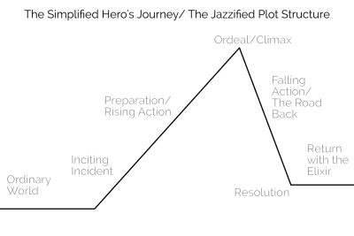
The Hero's journey begins in the ordinary world. An inciting incident happens to draw the hero into the story. The hero prepares to face the ordeal/climax. The hero actually faces the ordeal. Then the hero must return to the ordinary world, his problem solved by the story.

The User’s Perspective: Using Story Structure To Stand In Your User’s Shoes

The User’s Perspective: Using Story Structure To Stand In Your User’s Shoes

John Rhea

2019-04-16T16:00:16+02:002019-04-16T16:35:26+00:00

Every user interaction with your website is part of a story. The user—the hero—finds themselves on a journey through your website on the way to their goal. If you can see this journey from their perspective, you can better understand what they need at each step, and align your goals with theirs.

My first article on websites and story structure, Once Upon a Time: Using Story Structure for Better Engagement, goes into more depth on story structure (the frame around which we build the house of a story) and how it works. But here’s a quick refresher before we jump into implications:

The Hero’s Journey

Most stories follow a simple structure that Joseph Campbell in his seminal work, Hero with a Thousand Faces, called the Hero’s Journey. We’ll simplify it to a hybrid of the plot structure you learned in high school and the Hero’s Journey. We’ll then take that and apply it to how a user interacts with a website.

The Hero's journey begins in the ordinary world. An inciting incident happens to draw the hero into the story. The hero prepares to face the ordeal/climax. The hero actually faces the ordeal. Then the hero must return to the ordinary world, his problem solved by the story.

Once upon a time… a hero went on a journey. (Large preview)
Ordinary World The ordinary world is where the user starts (their every day) before they’ve met your website.
Inciting Incident/Call To Adventure Near the beginning of any story, something will happen to the hero that will push (or pull) them into the story (the inciting incident/call to adventure). It will give them a problem they need to resolve. Similarly, a user has a problem they need to be solved, and your website might be just the thing to solve it. Sometimes though, a hero would rather stay in their safe, ordinary world. It’s too much cognitive trouble for the user to check out a new site. But their problem — their call to adventure — will not be ignored. It will drive the user into interacting with your site.
Preparation/Rising Action They’ve found your website and they think it might work to solve their problem, but they need to gather information and prepare to make a final decision.
The Ordeal/Climax In stories, the ordeal is usually the fight with the big monster, but here it’s the fight to decide to use your site. Whether they love the video game news you cover or need the pen you sell or believe in the graphic design prowess of your agency, they have to make the choice to engage.
The Road Back/Falling Action Having made the decision to engage, the road back is about moving forward with that purchase, regular reading, or requesting the quote.
Resolution Where they apply your website to their problem and their problem is *mightily* solved!
Return With Elixir The user returns to the ordinary world and tells everyone about their heroic journey.

The User’s Perspective

Seeing the website from the user’s perspective is the most important part of this. The Hero’s Journey, as I use it, is a framework for better understanding your user and their state of mind during any given interaction on your site. If you understand where they are in their story, you can get a clearer picture of where and how you fit in (or don’t) to their story. Knowing where you are or how you can change your relationship to the user will make a world of difference in how you run your website, email campaigns, and any other interaction you have with them.

Numerous unsubscribes might not be a rejection of the product, but that you sent too many emails without enough value. Great testimonials that don’t drive engagement might be too vague or focused on how great you are, not what solutions you solve. A high bounce rate on your sign up page might be because you focused more on your goals and not enough on your users’ goals. Your greatest fans might not be talking about you to their friends, not because they don’t like you, but because you haven’t given them the opportunity for or incentivized the sharing. Let’s look at a few of these problems.

Plan For The Refusal Of The Call To Adventure

Often the hero doesn’t want to engage in the story or the user doesn’t want to expend the cognitive energy to look at another new site. But your user has come to your site because of their call to adventure—the problem that has pushed them to seek a solution—even if they don’t want to. If you can plan for a user’s initial rejection of you and your site, you’ll be ready to counteract it and mollify their concerns.

Follow up or reminder emails are one way to help the user engage. This is not a license to stuff your content down someone’s throat. But if we know that one or even seven user touches aren’t enough to draw someone in and engage them with your site, you can create two or eight or thirty-seven user touches.

Sometimes these touches need to happen outside of your website; you need to reach out to users rather than wait for them to come back to you. One important thing here, though, is not to send the same email thirty-seven times. The user already refused that first touch. The story’s hero rarely gets pulled into the story by the same thing that happens again, but rather the same bare facts looked at differently.

So vary your approach. Do email, social media, advertising, reward/referral programs, and so on. Or use the same medium with a different take on the same bare facts and/or new information that builds on the previous touches. Above all, though, ensure every touch has value. If it doesn’t, each additional touch will get more annoying and the user will reject your call forever.

Nick Stephenson is an author who tries to help other authors sell more books. He has a course called Your First 10K Readers and recently launched a campaign with the overall purpose of getting people to register for the course.

Before he opened registration, though, he sent a series of emails. The first was a thanks-for-signing-up-to-the-email-list-and-here’s-a-helpful-case-study email. He also said he would send you the first video in a three-part series in about five minutes. The second email came six minutes later and had a summary of what’s covered in the video and a link to the video itself. The next day he emailed with a personal story about his own struggles and a link to an article on why authors fail (something authors are very concerned about). Day 3 saw email number four… you know what? Let’s just make a chart.

Day Value/Purpose Email #
1 Case Study 1
1 Video 1 of 3 2
2 Personal Story and Why Authors Fail Article 3
3 Video 2 of 3 4
4 Honest discussion of his author revenue and a relevant podcast episode 5
5 Video 3 of 3 6
6 Testimonial Video 7
7 Registration Opens Tomorrow 8
8 Registration Info and a pitch on how working for yourself is awesome 9

By this point, he’s hooked a lot of users. They’ve had a week of high quality, free content related to their concerns. He’s paid it forward and now they can take it to the next level.

I’m sure some people unsubscribed, but I’m also sure a lot more people will be buying his course than with one or even two emails. He’s given you every opportunity to refuse the call and done eight different emails with resources in various formats to pull you back in and get you going on the journey.

I’ve Traveled This Road Before

It takes a lot less work to follow a path than to strike a new one. If you have testimonials, they can be signposts in the wilderness. While some of them can and should refer to the ordeal (things that might prevent a user from engaging with you), the majority of them should refer to how the product/website/thing will solve whatever problem the user set out to solve.

“This article was amazing!” says the author’s mother, or “I’m so proud of how he turned out… it was touch-and-go there for a while,” says the author’s father. While these are positive (mostly), they aren’t helpful. They tell you nothing about the article.

Testimonials should talk about the road traveled: “This article was awesome because it helped me see where we were going wrong, how to correct course, and how to blow our competitor out of the water,” says the author’s competitor. The testimonials can connect with the user where they are and show them how the story unfolded.

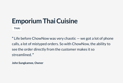
This testimonial for ChowNow talks about where they’ve been and why ChowNow worked better than their previous setup.

“Life before ChowNow was very chaotic — we got a lot of phone calls, a lot of mistyped orders. So with ChowNow, the ability to see the order from the customer makes it so streamlined.” John Sungkamee, Owner, Emporium Thai Cuisine

“I struggled with the same things you did, but this website helped me through.” (Large preview)

So often we hear a big promise in testimonials. “Five stars”, “best film of the year,” or “my son always does great.” But they don’t give us any idea of what it took to get where they are, that special world the testifier now lives in. And, even if that company isn’t selling a scam, your results will vary.

We want to trumpet our best clients, but we also want to ground those promises in unasterisked language. If we don’t, the user’s ordeal may be dealing with our broken promises, picking up the pieces and beginning their search all over again.

The Ordeal Is Not Their Goal

While you need to help users solve any problems preventing them from choosing you in their ordeal, the real goal is for them to have their problem solved. It’s easy to get these confused because your ordeal in your story is getting the user to buy in and engage with your site.

Your goal is for them to buy in/engage and your ordeal is getting them to do that. Their goal is having their problem solved and their ordeal is choosing you to solve that problem. If you conflate your goal and their goal then their problem won’t get solved and they won’t have a good experience with you.

This crops up whenever you push sales and profits over customer happiness. Andrew Mason, founder of Groupon, in his interview with Alex Bloomberg on the podcast “Without Fail”, discusses some of his regrets about his time at Groupon. The company started out with a one-deal-a-day email — something he felt was a core of the business. But under pressure to meet the growth numbers their investors wanted (their company goals), they tried things that weren’t in line with the customer’s goals.

Note: I have edited the below for length and clarity. The relevant section of the interview starts at about 29:10.

Alex: “There was one other part of this [resignation] letter that says, ‘my biggest regrets are the moments that I let a lack of data override my intuition on what’s best for our company’s customers.’ What did you mean by that?”

Andrew: “Groupon started out with these really tight principles about how the site was going to work and really being pro customer. As we expanded and as we went after growth at various points, people in the company would say, ‘hey why don’t we try running two deals a day? Why don’t we start sending two emails a day?’ And I think that sounds awful, like who wants that? Who wants to get two emails every single day from a company? And they’d be like, ‘Well sure, it sounds awful to you. But we’re a data driven company. Why don’t we let the data decide?’ …And we’d do a test and it would show that maybe people would unsubscribe at a slightly higher rate but the increase in purchasing would more than make up for it. You’d get in a situation like: ‘OK, I guess we can do this. It doesn’t feel right, but it does seem like a rational decision.’ …And of course the problem was when you’re in hypergrowth like [we were] …you don’t have time to see what is going to happen to the data in the long term. The churn caught up with [us]. And people unsubscribed at higher rates and then before [we] knew it, the service had turned into… a vestige of what it once was.”

Without Fail, Groupon’s Andrew Mason: Pt. 2, The Fall (Oct. 8, 2018)

Tools For The Return With The Elixir

Your users have been on a journey. They’ve conquered their ordeal and done what you hoped they would, purchased your product, consumed your content or otherwise engaged with you. These are your favorite people. They’re about to go back to their ordinary world, to where they came from. Right here at this pivot is when you want to give them tools to tell how awesome their experience was. Give them the opportunity to leave a testimonial or review, offer a friends-and-family discount, or to share your content.

SunTrust allows electronic check deposit through their mobile app. For a long while, right after a deposit, they would ask you if you wanted to rate their app. That’s the best time to ask. The user has just put money in their account and are feeling the best they can while using the app.

suntrust app check deposit screen

“Money, money, money! Review us please?” (Large preview)

The only problem was is that they asked you after every deposit. So if you had twelve checks to put in after your birthday, they’d ask you every time. By the third check number, this was rage inducing and I’m certain they got negative reviews. They asked at the right time, but pestered rather than nudged and — harkening back to the refusal of the call section — they didn’t vary their approach or provide value with each user touch.

Note: Suntrust has since, thankfully, changed this behavior and no longer requests a rating after every deposit.

Whatever issue you’re trying to solve, the Hero’s Journey helps you see through your user’s eyes. You’ll better understand their triumphs and pain and be ready to take your user interactions to the next level.

So get out there, put on some user shoes, and make your users heroic!

(cc, il)
Categories: Others Tags:

7 Steps to Successfully Onboarding Design Clients

April 16th, 2019 No comments

You’ve done the hard work: you’ve taken a lead and turned them into a paying customer. Congrats! Now, you have to build their website.

But is it that simple? The client signs the contract and you immediately get to work on designing the website?

You could certainly approach the kickoff of a web design project that way. However, you’d be missing out on the huge benefits of having a well-laid-out onboarding process.

By the time you have a signed contract in hand, you’ve already established some basic expectations with your client. That’s good. You never want to enter into a relationship with a client if they (or you) don’t know what they’re getting themselves into.

Onboarding further strengthens the basic groundwork you’ve laid down.

Use this onboarding checklist to ensure you give each of your web design projects as strong a start as possible.

Step 1: Duplicate Your Project Management Template

This first step assumes that you have a web design project template. If you haven’t created one yet, I’d strongly encourage you to do so. Each project you take on will have the same basic structure, so why not spare yourself the trouble of having to recreate it every time?

Regardless of which project management software you use, duplicating your template is easy.

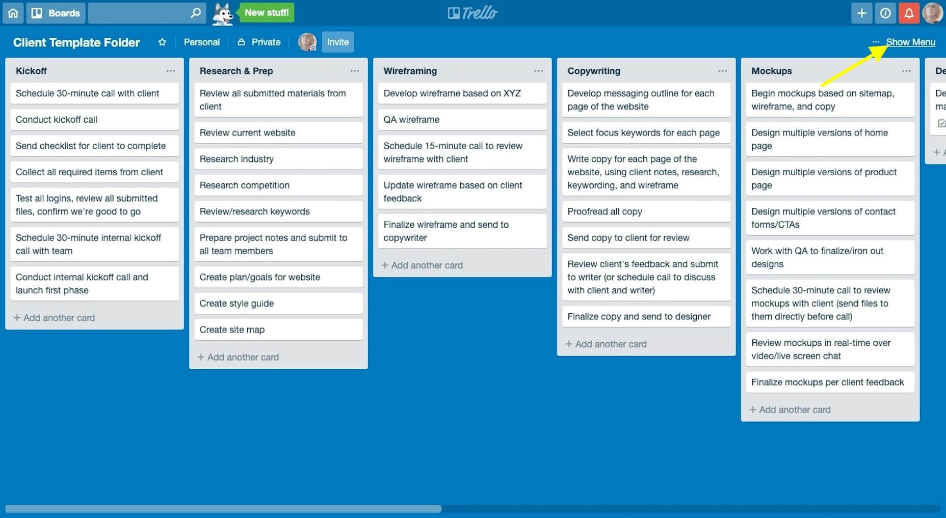
In Trello, you’ll click “Show Menu”:

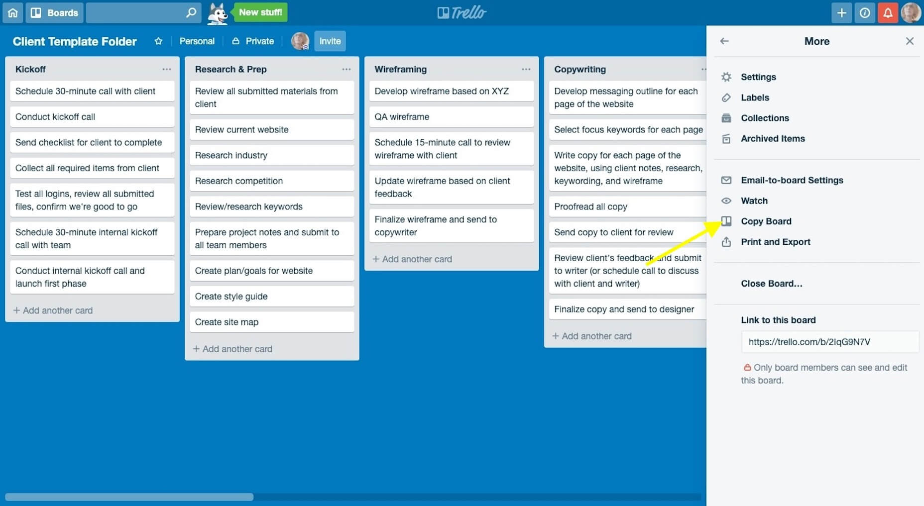
Then, “Copy Board”:

Name it with the new client’s name and click “Create”.

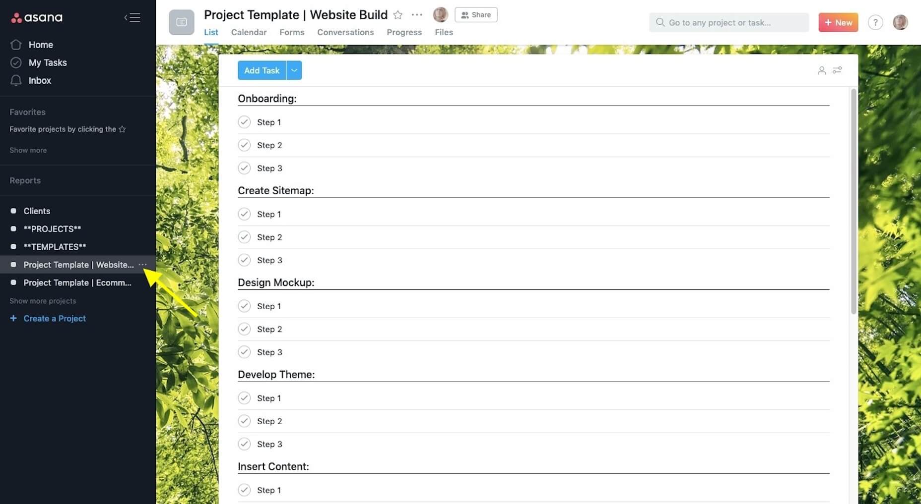
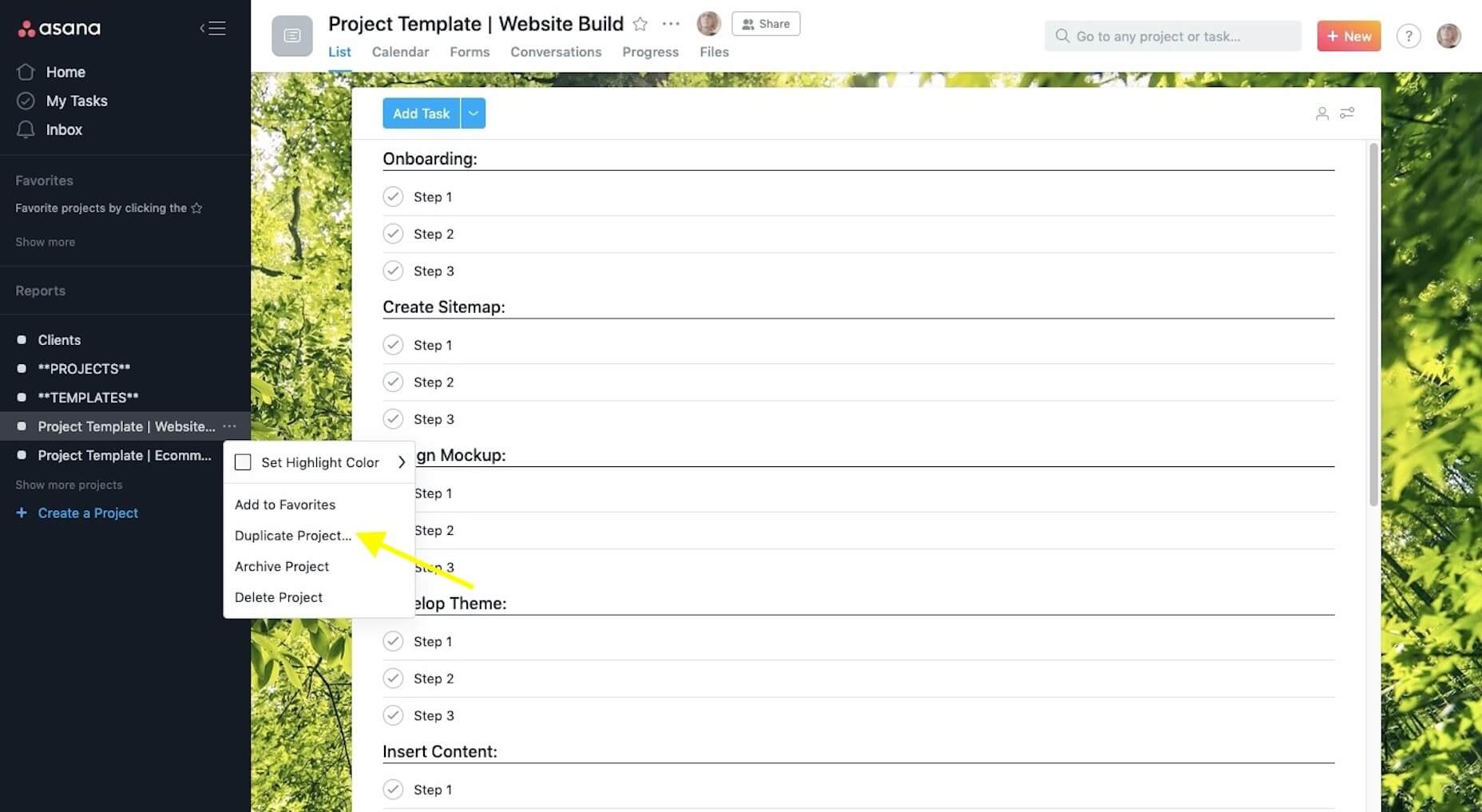
Or, in Asana, you’ll click on the “More” (three dots) icon:

Then, “Duplicate Project”:

Name it with the new client’s name and then click “Create New Project”.

Add any team members that will be working on the job to the folder now.

Step 2: Save Project Documents to the Folder

Centralize all of your documents, communications, and deliverables in the new project management folder. Start with the scope-of-work (SOW), proposal, and any notes you gathered on the client prior to the signing of the contract.

Step 3: Schedule a Kickoff Call with the Key Stakeholder

If you haven’t already done so, identify who the key stakeholder is on the client’s side. Ideally, this is one person. Is it the CEO? The marketing admin? A project manager? Whoever you will be dealing with throughout the project (i.e. the decision-maker) should be the one to attend the kickoff call.

This will streamline all communications during the project to ensure you’re not having to field requests or feedback from multiple parties.

Step 4: Reinforce Expectations During the Kickoff Call

Over the course of 30 minutes, it’s your job to briefly communicate what the client can expect from you over the course of the job while reinforcing what you need from them to make it happen.

This means talking about things like:

  • Your process;
  • Project timeline;
  • The feedback process;
  • Milestones and progress calls;
  • An introduction of your project management software (if you can do it through a live screen-share, that would be best).

This is also when you’ll reinforce the accountability piece by letting them know that “homework” will follow shortly.

Step 5: Send the Welcome Questionnaire

In the Welcome questionnaire you send after kickoff, explain to the client that they don’t have to worry about a thing in terms of building a beautiful website for their business. That’s your job. However, you do need certain things from them in order to do the job well.

Although I don’t build websites for clients anymore, I still use the same onboarding process for my copywriting clients. Here is the Welcome email I send to them (feel free to tailor this to your own needs):

Welcome aboard, [client name]!
I’m very excited to get started and hope you are, too!
I know what a pain it is to create content for your own brand, so I’m happy you’ve entrusted it to me.
As we get moving here, I’m going to ask you for just a few things: [link].
Please fill this out within the next seven days. If I have any questions, I’ll be in touch as soon as I can.

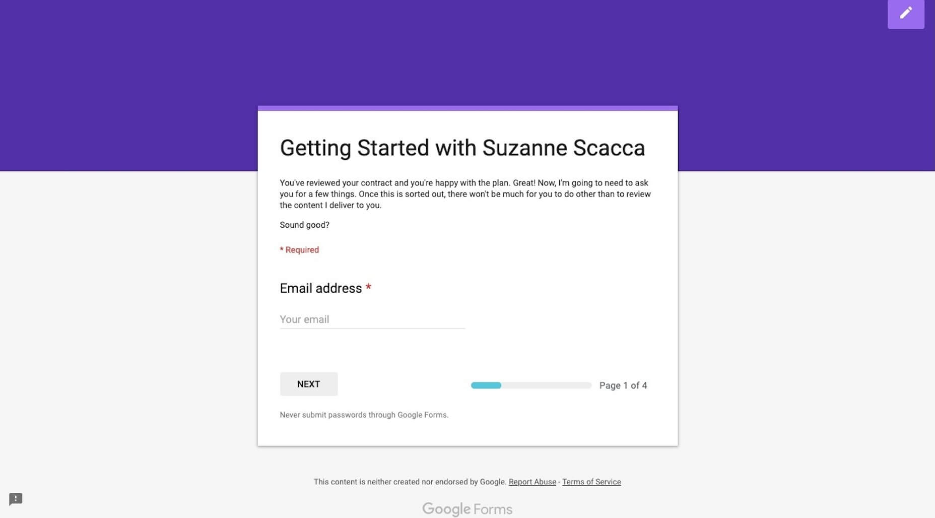
It’s succinct and let’s the client know I’m not asking for much. I then send them a Google Forms questionnaire to collect all the remaining details, documents, and logins I need from them:

Personally, I love Google Forms for onboarding copywriting clients, but you may want to use something like Content Snare if you expect to receive lots of design assets and content.

In terms of what you ask for? It depends on how much you’re doing for the website, but I’d suggest starting with these:

  • Logins to their content management system and control panel (plus, logins to third-party integrations if you need them)
  • Logo
  • Brand guidelines
  • 3-5 websites they like the look of
  • Top 3 competitors’ websites
  • Images, videos, and other brand assets
  • Website pages (navigation)
  • Content (if they’re writing it)

Don’t start any work until you receive everything they owe you. One of the reasons you have an onboarding process is so they can’t drag their feet and cause delays later on.

Step 6: Generate the Creative Brief

Based on everything you know about the client, their target audience, and goals for the website, you now need to generate the creative brief.

This is a succinct document that lays out the details and plan for the website. It ensures that all parties — you, your team (if you have others working for you), and the client — are on the same page and in agreement of what’s to be done. That way, if questions or disagreements come up later, the creative brief will put any doubts to rest.

You should include the following:

  • Title (i.e. website name)
  • Project summary
  • Start date
  • Projected end date
  • Deliverables
  • Problems to be solved
  • Goals/objectives
  • Target audience
  • Project milestones and due dates

Also, if you’re in the habit of creating moodboards for clients, you can send that over with the creative brief.

Make sure to get a signature of approval before moving on. HelloSign can help you do this easily and cheaply.

Step 7: Schedule Progress Calls

One last thing to do is to schedule progress calls with the client. It might seem too early to do this, but it’s not really.

You have a project start and end date. You have projected milestones. By scheduling progress calls for each milestone now, you can put the website on everyone’s radar, which will keep everyone involved (including the client) accountable to the project.

Once your client has accepted the invitations, it’s time to start assigning tasks in your project management software and get to work!

The Benefits of Onboarding

Think about all those times a client failed to deliver something that was owed to you (like logins, logos, or content) — and how that set your project timeline back.

Think about all those times a client said, “I hate it” or asked for a fifth or sixth round of revisions despite clearly not knowing what they really wanted.

Think about all those times you missed a step and had to backtrack once you were hip-deep in the design process.

Onboarding web design clients helps you avoid common issues and strengthen your workflow by:

  • Documenting and storing everything in a centralized spot;
  • Setting and reinforcing client expectations;
  • Preventing scope creep;
  • Designing websites with better outcomes;
  • Boosting trust in your business.

As you refine this predictable onboarding process, you’ll be able to complete website projects more efficiently which, in turn, will lead to higher profit margins.

Featured image via Unsplash

Add Realistic Chalk and Sketch Lettering Effects with Sketch’it – only $5!

Source

Categories: Designing, Others Tags:

A Website is a Car and Not a Book

April 15th, 2019 No comments
I’ve been wondering for a good long while why it feels like web design and development isn’t respected as much as native app development= and why the front-end role in many organizations is seen as a nice-to-have rather than a vital part of the business. Why is it so hard to see that this gig we call “front-end development” is crucial for business and even the day-to-day lives of users?

Is it just me that feels this way?

Categories: Designing, Others Tags:

10 of the best number fonts out there

April 15th, 2019 No comments
number font

Although typography is nothing new, it changes all the time, and we love it. It’s always fun to see what kind of cool and unique combination you can come up with to make your brand, logo, and content stand out. But today, while continuing to talk about fonts, let’s focus on some of the characters that are included with them: numbers.

We know that there are several factors to take into account when it comes to the choice of our typography. For example, if you want to write in uppercase and lowercase, if you have a specific style in kind, and so on. It is also very important to know if you have the numbers and the character of the chosen font.

You might think that this need is pretty specific – number fonts. But the truth is, you use numbers more often than you think, so it’s better to have a specific style and have it all uniform throughout all your content. If these are the point of focus, it is very important that the aesthetics of the numbers correspond to the surrounding content correctly.

With all of that said, number fonts are overlooked quite often. It’s very common to see fancy typography and designs paired with simple numbers. Perhaps it’s because they didn’t want a number font, or perhaps they didn’t even know they existed.

For that reason, we’re going to go over 10 of the best number fonts out there today. Fasten your seatbelts everyone, it’s about to get mathematical.

1. Deadhead Scrip

number fonts

Deadhead Scrip is a handwritten style of font that pairs nicely with other handwritten typography. The thickness of the lines varies as the curves go on, giving it the perfect handwritten look.

You can find these numbers in the link for about $20, so go check it out!

2. Dear Prudence

number fonts

Dear Prudence is another good example of a handwritten font. But, just as handwriting styles vary, so should the fonts. This particular font is a much different and unique take on the traditional handwritten font. I like its irregularity but at the same time harmony. It would go great on a calendar or a homegoods shop.

For the versatility that this font provides, it’s a steal at around $4.

3. Have a Great Day

number fonts

Have a Great Day font is yet another handwritten font that you really don’t see every day. The style is like that of a thick marker. The irregularity shines through and gives each and every line a personal touch that simply can’t be duplicated by a standard font.

4. Story

number fonts

Story is perhaps the simplest typeface of this group. The strokes are perfect and remind us of when we first started to learn to write as kids. Its price is quite admirable as well (about $6), and you can do a lot with it.

5. Amatic SC

number fonts

The Amatic SC font is a Google Font that was quite popular a few years ago. It’s not as popular now, but it still looks great. This is definitely the kind of typography that would go well with a variety of different brands. It could even be paired with other fonts to make a unique combination.

As of right now, Amatic SC is free to download and use, so get downloading!

6. Abril Fatface

number fonts

We could talk about an infinite number of serifs with original numbers, but since I decided to shone a light on more “creative” fonts, we chose this one to fill in for serifs. You can find this particular font in a lot of places, but its thickness and style make it absolutely perfect to be the main focus of any project that include numbers.

To top it all off, this one is a freebie.

7. Montserrat

number fonts

As with most cases, I could probably add an infinite amount of serifs to this list, but we won’t. Instead, I’ll chose this one and the one above to highlight their variety. In this case the Montserrat is well known to all. Just like it’s perfect for a lot of titles, it’s also perfect for its numbers.

Since this is another Google Font, you can get your hands on it completely free of charge.

8. Catamaran

number fonts

As with most typographies, the thickness of Catamaran gives us a lot of font to play with. We can combine these giving more hierarchy to a certain element, or just use them to draw attention to a specific number.

Like the previous few, this one is free since it’s a Google Font.

9. Pacifico

number fonts

Pacifico is a very popular Google Font that has made its name through its use. But, the numbers are often overlooked, and it’s such a shame. The curves and swirly-like design of this number font are quite unique, and give lots of flare to any project that they find themselves in.

10. Monoton

number fonts

Last but most certainly not the least, we find Monton. As you can see, this font has quite the unique design, and comes off very retro. As specific as the niche might seem, this font actually goes well with a variety of projects. It draws attention and leaves people curious.

This one is also a Google Font, so you know what that means. That’s right, it’s free!

The conclusion

Hopefully you find at least one of the number fonts above useful, and you use it in the near future. If you didn’t find one that you like, remember to always check in package deals for the number fonts next time you purchase a font. If not, seek out a number font by itself, and combine it with your own typography to make a truly one-of-a-kind project.

Read More at 10 of the best number fonts out there

Categories: Designing, Others Tags:

Simulating Mouse Movement

April 15th, 2019 No comments

If you’ve ever had to display an interactive animation during a live talk or a class, then you may know that it’s not always easy to interact with your slides and while talking.

This happened to me when I needed to show this particles demo to my students. I didn’t want to have to stay next to my computer to move my mouse in order to show off the demo.

See the Pen
Particles (on move)
by Louis Hoebregts (@Mamboleoo)
on CodePen.

If you do not interact with the iframe, you will see nothing but a blank space. As soon as you start moving your mouse or your finger, you can see the animation.

For that reason, I created the same demo but I used some extra code to simulate someone interacting with the demo.

See the Pen
Particles (fake)
by Louis Hoebregts (@Mamboleoo)
on CodePen.

Simplex noise

The trick here is to use an algorithm that will generate “smooth” random positions. If we use a classic random function, the fake mouse will be at a purely random position on every frame. What we want is to have a position on every frame that is directly linked to the previous one. Thankfully, there is a technique that does exactly what we need: Simplex noise (or more commonly known as Perlin noise).

Let’s take a look at this image where the height of each column is defined with random values on top, and values from Simplex noise algorithm below.

You can quickly notice that the bottom graph seems much smoother because every column height is connected to the previous one. Those graphs are only showing one dimension (the x-axis, from left to right) but with Simplex noise you can get values in multiples dimensions. In our case, we will need two dimensions for the X and Y coordinates of the fake mouse we’re simulating.

If you are more interested to know how Simplex noise works, check out the video “I.5: Perlin Noise – The Nature of Code” by Daniel Shiffman

Get noise coordinates

The first thing we need to make our demo work is to implement a script that generates noise. In my case, I’m using this script by Seph.

Once the noise script is loaded, we can start using it on every frame to make our mouse move.

I will be using an image of a mouse for the demos that I put on position: fixed; with a class .mouse, but you could animate anything else for your own projects.

So, let’s take a look at the code:

// We retrieve the image from the DOM
const el = document.querySelector('.mouse');

// The render function is called on every frame
function render (a) {
  // The a variable is the amount of milliseconds since we started our script
  
  // Get a noise value based on the elapsed time to get a new value on every frame
  // This noise algorithm is returning values between [-1, 1] so we need to map them to [0, 1] by adding one to the value and dividing it by 2
  const noiseX = (noise.simplex2(0, a*0.0005) + 1) / 2;
  // We get another noise value for the y axis but because we don't want the same value than x, we need to use another value for the first parameter
  const noiseY = (noise.simplex2(1, a*0.0005) + 1) / 2;
  
  // Convert the noise values from [0, 1] to the size of the window
  const x = noiseX * window.innerWidth;
  const y = noiseY * window.innerHeight;
  
  // Apply the x & y coordinates on our element
  el.style.transform = `translate(${x}px, ${y}px)`;
  
  // Call the render function once the browser is ready to make it an infinite loop
  requestAnimationFrame(render);
}

// Ask the browser to call render to start our animation
requestAnimationFrame(render);

Here is the result we get with the above script:

See the Pen
Virtual user 1
by Louis Hoebregts (@Mamboleoo)
on CodePen.

Allow interactivity

With the current code, we are not allowed to interact with our demo anymore. Let’s add a bit more code to use our real mouse position when we interact with the demo and switch back to a fake mouse as soon as we stop.

const el = document.querySelector('.mouse');
let lastMove = 0;

// When the mouse is being moved
function onMouseMove (e) {
  // Get the x and y coordinates
  x = e.clientX;
  y = e.clientY;
  
  // Save the last move time
  lastMove = Date.now();
}

// Update the mouse position based on x & y
function updateMouse (x, y) {
  el.style.transform = `translate(${x}px, ${y}px)`;
}

function render (a) {
  // Check if last move was more than 500ms ago
  if (Date.now() - lastMove > 500) {
    // Generate a fake mouse position
    ...
    updateMouse(x, y);
  }
}

// Listen to mouse events
window.addEventListener('mousemove', onMouseMove);

Now, if you move your mouse, the fake mouse will follow yours. If you stop moving for 500ms, the fake mouse will start moving again.

See the Pen
Virtual user 3
by Louis Hoebregts (@Mamboleoo)
on CodePen.

Customized movement

The speed of the mouse can be updated by changing the value of the third parameter. So far, we are setting this value by taking the elapsed time multiplied by 0.0005, which is equal to a/2000.

// Define a speed ratio
const speed = a * 0.0005;
// Use the speed
const noiseX = (noise.simplex3(1, 0, speed) + 1) / 2;

We can also add a bit more randomness in the changes of direction by adding more noise from its position.

let random = 0;
function render (a) {
  ...
  // Update the random value
  random += 0.1;
  // Compute a x random offset based on the window width
  const randX = noise.simplex3(1, 0, random) * window.innerWidth * 0.1;
  // Compute a y random offset based on the window height
  const randY = noise.simplex3(3, 0, random) * window.innerHeight * 0.1;
  
  // Define the x & y values based on (noise * screen) + randomness
  const x = noiseX * innerWidth + randX;
  const y = noiseY * innerHeight + randY;
  ...
}

Play with the inputs to see how speed and randomly calculated values can influence the fake mouse movement.

See the Pen
Virtual user 4
by Louis Hoebregts (@Mamboleoo)
on CodePen.

More mice

Now that we have created one fake mouse, why not create 500 of them?

See the Pen
Virtual user 5
by Louis Hoebregts (@Mamboleoo)
on CodePen.

I now use this trick for almost all my demos. I think it’s really cool to be able to display a project without using a video or being forced to keep moving the mouse randomly while trying to talk about the demo.

If you have any questions or remarks, please leave a comment below or ping me on Twitter.

The post Simulating Mouse Movement appeared first on CSS-Tricks.

Categories: Designing, Others Tags:

Native vs. Hybrid App: Choosing the Best Solution in 2019

April 15th, 2019 No comments
Native vs. Hybrid App

Mobile app development is all about making informed decisions.

And prior to hiring a team of developers, you should take into account numerous factors to create a functional and cost-effective application.

Many product owners wonder who wins in native app vs. hybrid app battle. Spoiler: no one. And here comes our explanation of the pros and cons of native apps vs. hybrid apps. Stay tuned!

Difference between native and hybrid apps

The main difference between native and hybrid apps is that the first ones are developed for a specific platform like iOS or Android. On the contrary, hybrid apps are cross-platform and have one code base. They cover multiple platforms.

Now, a few words about tech differences. Native apps are created with the help of programming languages – JavaandKotlin for Android and Objective-C or Swift for iOS. While hybrid apps are built with the help of JavaScript, HTML&CSS that are web technologies.

Simply put, hybrid apps are websites that look and function like native apps. They both can be distributed via Google Play and App Store.

So it’s a bit hard to define which app is hybrid and which is native, isn’t it? Still, there are some hints. When it comes to cross-platform app building, devs use the web technologies we’ve mentioned previously and also non-web ones like .NET-oriented. It’s possible due to hybrid app frameworks (e.g. Xamarin and Ionic) and gives developers more power.

So, what do we have? Native apps are built for one platform, and hybrid apps run across multiple platforms. At the core, they’re websites put into app’s shell. Believe it or not, Uber, Instagram, and Twitter are actually hybrid apps. Fantastic.

Hybrid apps benefits and drawbacks

Prior to creating a hybrid app, you should know all their pros and cons. First of all, mind that to access native features, hybrid products have to use APIs. So their abilities are limited.

Hybrid apps are a good fit when you’re focused on the content. But if you need something more sophisticated, it may be a pure waste of time and money. Here’s our short review of what you should know prior to choosing hybrid app development.

Main benefits of hybrid applications include:

Cross-platform capabilities. These apps run on both Android and iOS as they have one code base. So you don’t need to choose which platform goes first. It’s also a good choice when you need to increase brand awareness and hit as many users as possible.

Faster delivery. It takes a lot of time to create a native app. And if you’re eager to use the product as soon as possible, stop on hybrid version. Devs don’t have to create a code base for each platform which reduces the overall development time. By the way, QA engineers need less time to check a hybrid app too.

Easier to make changes. Devs don’t have to work with each platform specifically to replace or change some elements. It’s enough to make changes once and they will be applied across all the platforms.

Reduced building cost. It’s same code base again. Hybrid apps delivery takes as much time as building one app for iOS or Android platforms. And hybrid applications run on both!

In order to get a full picture of hybrid development, let’s review the main cons of such apps:

Internet connection. Hybrid apps require non-stop internet connection to work. In addition, it takes more time for hybrid applications to load so they run slower compared to native apps.

Limited capabilities. Hybrid apps rely on plugins to access the built-in device features. However, these plugins can be out of date or unreliable. And if there’re no ready-made solutions that help you access a certain feature, developers will have to create it from scratch.

Poor UX. User experience is one thing that should be of a high level no matter what product you create. Unfortunately, UX in hybrid apps leaves much to be desired. Developers focus on something in the middle of iOS and Android versions to please users of both platforms.

Need for native app developers. That’s right – you may need native app devs to build a hybrid application. The approach accepted during hybrid app delivery can’t solve all the functional problems that are basic for native building. Thus, you may need to hire a native developer to create a top-rated product.

Pros and cons of native apps

Native apps are developed for a specific OS. Developers align the UX within the operating system and stick to guidelines during its delivery. So let’s take a look at the advantages and downfalls of native apps.

Advantages of native apps include:

Great user experience. While working on a native application, developers tailor the app’s functionality to one platform. It allows them to create a more intuitive interface and understand app functionality better.

Top performance. The app created for a specific platform shows a high-performance level. Native apps run fast not only because of optimization but due to the code itself. It’s written in the language natively supported by the platform so it performs faster.

Security means. The only way to guarantee your users’ data protection is to deliver a native app. In this case, the full power of hardware is engaged to process tasks.
Full-fledged functionality. Here comes another reason why native apps are better. Mind that they have full access to databases and hardware features of a device. Their functionality can’t be limited to plugins or any third-party tools. And there’s no need to consider the peculiarities of several operating systems at once.

Personalization. Due to fragmentation, adjusting the layout for different devices becomes way too complex. Especially when it comes to Android-based devices. With native apps, you can keep the design at a high level and implement great UX.

Finally, let’s check the flip side of the coin, the disadvantages:

Development cost. Native app building is a complex process that requires more experienced developers to work on it. And their services won’t be cheap.

…and time. Time is money again, and more time is needed to deliver a native app. If you need the product to be released on both App Store and Google Play, native apps may not be the best choice.

Which option is best?

Hybrid apps work great when you’re dealing with simple and content-oriented projects. They will be your perfect choice if you’re on a tight budget or have little time. By the way, you can also build a hybrid app you want to test your product without significant spendings.

But if you’re aimed at adding custom features, top performance, and good design, then native app development is what you actually need.
I hope that this short guide helped you to find out what option works better for your project. Still, I always mention that it’s better to contact an experienced app development team to be sure. They will check your objectives and find the best way to bring the project to live. Good luck with building your perfect application!

Categories: Others Tags: