Archive

Archive for April, 2019

How artificial intelligence will affect mobile application development

April 10th, 2019 No comments

Today every person whether from a technical background or not is aware of Artificial Intelligence.

It has been a hot topic of discussion for a few years now. It would not be a mistake to state that Artificial Intelligence is everywhere on this globe & impacting day-to-day life in a positive way.

Artificial Intelligence is changing the way humans are interacting with devices in the contemporary world. This is the reason why every software development company is focusing on artificial intelligence.

In a review study by Boston Consulting Group and MIT Sloan Management, it was found out that 84% of respondents say that Artificial Intelligence will enable them to obtain or sustain a competitive advantage over other software development companies.

They have calculated findings of many other parameters as well. Below is an image of the findings of the same study:

It is true that this technology has been welcomed over the years by many enterprises in web development as well as other sectors with open arms.

There are some challenges also to adopt this technology. For example, the huge costs involved in its projects restrains software development companies to plan a full-fledged strategic idea about it. Here is an image of the findings of the same study which shows that not many companies have invested in artificial technology.

According to the above graphical representation, maximum companies have not adopted artificial intelligence projects yet. Only 5% have extensively incorporated in processes and offerings.

The huge cost encourages only the web development companies with well-planned strategies to introduce software that can think with the same intelligence as humans. Software developers are working to provide optimum comfort in humans’ life.

The contemporary age is the time when we carry a supercomputer in our pockets as a mobile device. The companies involved in mobile development are using brilliant innovations to incorporate artificial intelligence.

The maximum support of this new technology in mobile application development is important to revolutionize the whole society. This is because today we are all carrying a smartphone in our hands.

Below is a graphical representation of research done by Statista. It shows an estimation that the number of mobile users will reach to 4.78 billion by 2020. This is a huge number which motivates mobile app developers to inculcate AI in their idea to deliver maximum output.

The constant craving to attain greater comfort by humans has given rise to contributions of AI in almost every field. Mobile application development is a no different sector. Here are some effects of artificial intelligence on mobile application development:

Camera detection
Accelerometers
Gyroscopes
Face recognition

Let’s discuss these effects in a detailed way:

Camera detection:

Does your camera detect your face while capturing a picture? Probably, yes! It even blurs the things that are out of focus. Have you ever wondered how does it do this? It is possible because android app developers are constantly doing research and development.

We have come to an age when smartphones have such a camera installed that has sensors working to detect the object that has to be highlighted. There are various beauty and filter applications as well that works on your phone in a similar manner.

The image below shows how AI helps the cameras in smartphones to detect the object of focus brilliantly.

Have you ever used apps like IKEA, SnapChat, google translate? These apps allow customers to have a glimpse of after purchase experience. They are using artificial intelligence to detect foods, landscapes, faces etc.

Accelerometers:

Gone are those days when we had to purchase separate wearables to track our fitness. In the contemporary digitalized age, mobile application development companies have introduced specific apps for this purpose.

These apps work by sensing the motion of your smartphone along with you. This helps them in detecting the number of steps you have taken. They can be termed as accelerometers that track your acceleration.

Below is an image that shows the findings by research on the usage of fitness apps worldwide. These apps are mostly depended on the working of accelerometers and show the popularity of this technology.

There are various other features like microscopic crystal structures that can be used while driving. Moreover, they can be used for detecting earthquakes, vibrations etc. These applications have taken the mobile technology to another level.

Gyroscopes:

The gyroscope in mobile phones works hand in hand with the accelerometer. It is an additional sensor that works on earth’s gravity. It detects the tilts, twists, and turns. It is added by software development companies to measure the angular rotational velocity.
Are you fond of playing mobile games? In research by Statista, it estimated the global mobile revenue for smartphones and tablets from the year 2017 to 2021. Here is the graphical representation of their study:

Gaming interests all age groups, we are sure you must have played too! Have you ever wondered how your phone detects your tilts while playing a racing game? While you tilt your screen to steer, it is the gyroscope which detects that movement.

Face recognition:

Here comes a smarter way to authenticate your identity. The new feature introduced in smartphones is a step towards making mobiles more smarter. By just looking at your face, your phone will be unlocked.

This technique is marvelous as it records even the facial movements while carrying on the detection process. The face IDs have evolved in recent years remarkably. Today, devices have come that accurately captures your face.

It has been added by several mobile developers worldwide in the latest mobile phones that are introduced in the market. Although, the fingerprints unlocking system still remains the most popular and trusted one.

Final words:

The effects of artificial intelligence discussed above are just a glimpse that could be covered in this post. There are various other features that have been introduced by web developing companies in the new generation of mobile phones.

It will not be an understatement to say that artificial intelligence has introduced some drastic changes in mobile application development. The added features have changed the smartphones usage to a great extent.

Categories: Others Tags:

What’s in a Name? How to Name Your App Startup?

April 10th, 2019 No comments

One of the most interesting stories about a startup name is how Steve Jobs decided to name his startup.

“Apple” has very little to do with what the company does. However, if Jobs were to name his company in 2019, he would’ve gone for something more relevant.

Naming conventions change with time. Today, startups must be very particular about their app or brand name. Not only does it have to be catchy and interesting, but it also needs to be SEO friendly. But that isn’t the only factor that counts.

Naming your app startup is nothing short of a science. There are certain rules to follow. There are certain limitations as well. Today, we will break it down to help you systematically manage the process of choosing a name that sticks.

Start with the Purpose

So, let’s get back to one of the most important aspects we have discussed – relevance. And by relevance, I mean how accurately it defines the purpose or features of your app. There are literally hundreds of apps that share the same features and users are most likely to tap on one that sounds most relevant.

Now, the same rule applies to your startup name. Your startup name also needs to be relevant to the app’s features and its name.

Imagine looking for an app for budgeting or any other finance-related task. Would you click on an app that has a relevant name but is created by a company called xyz Fashion Store? Both the startup and app names should clearly define the purpose so that users can put their trust in your hands.

To get a better idea, look at all the utility apps you have on your phone now and see how the name related to their function.

Play with Words

Nothing catches attention like some funny wordplay. It is smart, yet understandable. A great example of how startups play with words when naming their apps is “Waze.” The app literally helps people find numerous ways to reach a place. In simpler words, it is a map app. Also, Pinterest is a fine example of play on words for an app.

Wordplay isn’t as easy as it sounds, but if you have a knack for puns, you will do great. Puns are funny, and they can really make your startup name catch on. Some of my favorite puny brand names include “Wooden-it-be-nice” furniture store and the classic “Tequila Mockingbird” bar. These are all retail businesses, but worthy of mention.

Another way to make use of wordplay is to use rhyming words to stick them together like WerdNerd, SnapChat, and FitBit.

Keep Things Short

Google, Tinder, Apple, Skype – what do they have in common. Their name is short and memorable. Unlike retail stores that can do with longer names, app startups must deal with a target audience with a shorter attention span. You don’t just need to grab attention, you need to snatch it away from the long line up of competitors showing right next to your app on the store.

A golden rule here is to keep it within eight characters with two to three syllables. Now, can you think of an app that defies that rule? Probably not.

However, short doesn’t always mean simple. Some short names are more complicated to pronounce. A friend once complained about how she faces trouble saying B614. Despite being short, the name can be tough on some people’s tongue. And you don’t have to hire a linguist to tell you that. Ask just as many people as you can to say the name, and you will know if there is a problem.

Make it SEO Friendly

Like we said earlier, relevance is the key. And it is not limited to how people see the relevance. Search engines should also be able to see it.

Both Google and Apple might have gone with a more SEO friendly name if they were to name their apps in 2019. It would have been a more tech-friendly name that shows they are IT firms.

It is an important factor because around 63 percent of the traffic on app stores is generated by search. When people search for an app for a purpose, they use keywords such as a calculator or puzzle games. It helps to have your keyword in your name.

There are hundreds of examples of apps that make great use of their strongest, most relevant keywords. LiveAuction is one of them. People will literally type “live auction” in the search bar to find live auction platforms.

While we are talking about searchability, let’s not overlook the idea of piggybacking on most searched terms. In 2016, a gaming app company decided to make the most out of Trump’s presidential campaign with an app called “The Great Wall of Trump.” While it is a simple brick game, the app showed in numerous searches for Trump or his idea of the great wall.

Verbability

Never heard of verbability? Well, I just created a new word.

Some words have the power to become a verb. Google is the biggest example in this case. People now tell each other to go “Google it” whenever they mean to say search it online. In all honesty, it is because it is easier on the tongue and it is an action verb. If Google had a name like “YourSearchBar,” things would’ve been different.

So, it is always a good idea to think of action verbs that can catch on as a trend. Think of how the name can be used in everyday language. If it can replace the action it does, it is verbable. It doesn’t even have to be a verb that already exists. It just must sound like it should.

Watch Your Competitors

There is nothing wrong in taking a hint from your competitors. Look for apps that appear on the top for your strongest keywords and see how they name their app and their startup. Take notes.

However, that doesn’t mean you should come up with a name so similar that it almost sounds like a rip-off. You want your startup and app to stand out rather than seem like a copycat brand. It is just like all those “angry-xyz” apps that were launched after Angry Birds. No one really liked them.

Use your own creativity to come up with an even better name. Keep your USPs in mind. Even if there is just one feature that sets you apart, use it to your advantage.

Running a little competitor search is also helpful in avoiding conflicts. Sometimes startups think they have come up with an amazing name, they create an entire app and branding campaign based on that name, only to be hit by a lawsuit by a company that is already using that name.

Conclusion

Now that you know the dos and don’ts of naming your app startup, take your time and think of more than one options. Take opinions from other team members and even people in your circle who fit the description of your target audience. Once you have a name that checks all the boxes and has a general likeability factor, make it official.

Categories: Others Tags:

6 Actionable Tips for Accessible Emails

April 10th, 2019 No comments

WHO suggests that 1.3 billion people all around the world have some kind of visual impairment – which includes 217 million people with moderate to severe vision impairment; 36 million people are blind worldwide; 15% of the global population have some kind of disability.

With the advancements in adaptive technologies, such as screen readers, magnifiers, eye-tracking, joysticks, and sip-and puff technology, visually impaired and disabled people are able to use computers, tablets, and smartphones.

Emails that are designed taking into consideration only people with a normal range of vision, hearing, and mobility, may not be usable for others. As a result, email accessibility is now a must-know topic for designers.

Let’s take a deep dive into how to design accessible emails, and reach each and every subscriber on your list.

1. Email Copy

Divide your copy into easily readable chunks with the help of headings. By doing so, your email will be easily understandable for every subscriber, including those who are listening to the email with the help of a screen reader. Check your emails with Flesch-Kincaid Reading Ease test in Microsoft Word. It will let you know the readability score of your emails:

  • 90-100: Easily understood by child of 11 years.
  • 60-70: Easy to understand by 13-15 years old teens.
  • 30-50: Easy to understand by college students.
  • 0-30: Understood by college graduates.

Use lucid and to-the-point language to get a better (higher) score.

Take a look at this email by SurveyMonkey. It has a succinct copy with a neat presentation. The ample white space makes it easy to read. The contrasting CTAs in the white background are clearly visible to the reader.

2. Visual Elements

If you are creating an accessible email, the imagery should not contain the text that conveys the core message of the email. Even if you decide to use text in the images, write illustrative copy.

GIFs are being used in emails extensively but you should refrain from designing animated GIFs that flash repeatedly, lest they trigger photo-sensitive seizures in some users; use a GIF that stops after three cycles or within five seconds.

Never forget to add a suitable alt attribute inside each tag. For example: Add the company name as the alternative text for the logo.

Here’s a nice example by Carnival Cruise Line:

3. Email Buttons

Design bullet-proof buttons that can be selected across the entire area with the help of a finger or thumb. In case you have multiple buttons in your email, write a different call-to-action for each. Your button should have a minimum height of 44px so that it is easily tappable.

4. Formatting Email Copy

Your email should have enough paragraph spacing so that the reader can easily discern the paragraphs. Every line of text should be around 60-70 characters. Have typographic margins with related content grouped together, and separate every group with the help of white space for enhanced readability. Set the right visual hierarchy by placing the most important message at the top. This will help subscribers with neurological and cognitive disability.

Your body copy should be left-aligned; rather than right aligned, centered or justified. Design an email in such a way that there is no repositioning of the content with CSS; it should be easy to read from top to bottom. You can check the reading order of your email through the Web Accessibility Toolbar or the WAI HTML Table Linearizer.

Fonts

Avoid using fancy or light-weight typefaces that are difficult to read. It is strongly recommended to use serif or sans-serif typefaces that are not only accessible but also rendered well on all email clients and devices. Determine a minimum readable font size for your email copy. For a font-family with a large x-height, a minimum font size of 14px is recommended and for a font family like Arial that has a standard x-height, use at least 16px as the size.

5. Color

Colors are an important aspect when it comes to subscribers who have light sensitivity and migraines. Backlit screens can lead to eye strain and cause migraines when looking at bright, saturated hues of blue and red.

The next condition to be considered is color blindness as it prevents the subscribers from differentiating between certain colors used in the email.

Did you know that according to the National Eye Institute, 0.5% women and 8% men are color blind? This implies that 1 in 200 women and 1 in 12 men are color blind.

When it comes to emails, you should always check your emails with the help of the Color BLIndness Simulator. Additionally, you should use WebAim Color Contrast Checker to get an idea of the color contrast between the text and background color.

  • Don’t rely on color to convey your message;
  • Use good contrast to ensure your text is readable;
  • Restrict the number of colors, and if possible be monochromatic;
  • Ensure the color of links contrasts with text so that they are clearly marked;
  • Test your email with color blind users, or use an app such as Color Oracle.

6. Email Coding

The first requisite is to design a responsive email that renders well, regardless of the screen size, device type, and screen reader used.

tags should be used to wrap the headlines while

to

tags for headings and

tags for paragraphs.

Use mso-line-height-rule:exactly; in your tags so that the line-height rule is maintained for Microsoft Outlook email clients.

Write the code style=”margin:0;” into the opening tags so that email and webmail clients do not add any extra line space.

Add aria-hidden=”true” on spacer elements so that screen readers ignore the spacers in the email.

Add role=”presentation” into every opening

tag so that the screen readers do not read every cell into the email.

Avoid any unnecessary code that makes the HTML heavy and may lead to rendering issues.

Last but not the least, it is imperative to have both plain text and HTML versions of the email. The HTML emails will let the user see the images while the text-only email shows the text and makes it convenient to read the entire email, especially for screen readers.

Tools to Test Emails for Accessibility

Wave Tool is a Chrome and Firefox extension that lets you check your emails and calls attention to things that make it inaccessible.

With the help of AChecker, you can check the email accessibility by any of the three methods: pasting the URL of your email or upload your HTML file or copy and paste the code.

IA Toolkit is available as a Chrome browser extension that checks emails and web content for accessibility. You get an extensive analysis of the code with errors and warnings.

VoiceOver on MacOS and iOS, Narrator on Windows, and TalkBack on Android are used to get a clear idea on how the email will be experienced by the subscriber.

Final Thoughts

Accessibility has become an integral facet of email marketing nowadays. Before you set up an accessible email campaign, use these tips to follow email marketing and design best practices. That will, in turn, increase the reach of your email and enable a smooth experience for each and every subscriber.

Featured image via DepositPhotos

Add Realistic Chalk and Sketch Lettering Effects with Sketch’it – only $5!

Source

Categories: Designing, Others Tags:

The Serif Tax

April 9th, 2019 No comments
The vector points on the letters of Lorem Ipsum text shown on Open Sans and Garamond. It's not incredibly dramatic, but there are more points on Garamond

Fonts are vector. Vector art with more points makes for larger files than vector art with fewer points. Custom fonts are downloaded. So, fonts with less points in their vector art are smaller. That’s the theory anyway. Shall we see if there is any merit to it?

Open Sans (top) and Garamond (bottom)

Let’s take two fonts off of Google Fonts: Open Sans and EB Garamond. The number of points isn’t a dramatic difference, but the seriffed Garamond does have more of them, particularly in looking at the serif areas.

It’s not just serifs, but any complication. Consider Bleeding Cowboys, a masterpiece of a font and a favorite of pawn shops and coffee carts alike where I live in the high desert:

Let’s stick to our more practical comparison.

We get some hint at the size cost by downloading the files. If we download the default “Latin” set, and compare the regular weight of both:

OpenSans-Regular.ttf 96 KB
EBGaramond-Regular.ttf 545 KB

I’m not 100% sure if that’s apples-to-apples there, as I’m not exactly a font file expert. Maybe EB Garamond has a whole ton of extra characters or something? I dunno. Also, we don’t really use .ttf files on the web where file size actually matters, so let’s toss them through Font Squirrel’s generator. That should tell us whether we’re actually dealing with more glyphs here.

A screenshot of the results from running the fonts through Font Squirrel, showing 3,095 glyphs for Garamond and 938 glyphs for Open Sans.

It reports slightly different sizes than the Finder did and confirms that, yes, Garamond has way more glyphs than Open Sans.

In an attempt to compare sizes with a font file with the same number of available characters, I’m did a custom subset of just upper, lower, punctuation, and numbers (things that both of them will have), before outputting them as .woff2 files instead of .ttf.

A screenshot of the selected types of glyphs to export.

After that…

opensans-regular-webfont.woff2 10 KB
ebgaramond-regular-webfont.woff2 21 KB

I didn’t serve them over a network with GZIP or brotli or anything, but my understanding is that WOFF2 is already compressed, so it’s not super relevant.

Roughly two-to-one when comparing the file size of these two pretty popular fonts? Seems somewhat significant to me. I’m not above picking a font, assuming it works with the brand and whatnot because of size.

What made me think of this is a blog post about a font called Ping. Check out this “human hand” drawing principle it’s made from:

Whoa! A single stroke? Unfortunately, I don’t think actual fonts can be make from strokes, so the number-of-points savings can’t come from that. I purchased the “ExtraLight” variation and the points are like this:

Still pretty lean on points.

The TTF is 244 KB, so not the sub-100 of Open Sans, but again I’m not sure how meaningful that is without a matching subset and all that. Either way, I wasn’t able to do that as it’s against the terms of Ping to convert it.

The post The Serif Tax appeared first on CSS-Tricks.

Categories: Designing, Others Tags:

Using a Mixin to Take the Math out of Responsive Font Sizes

April 9th, 2019 No comments

Responsive Font Size (RFS) is an engine that automatically calculates and updates the font-size property on elements based on the dimensions of the browser viewport.

If you’re thinking that sounds familiar, that’s because there is a slew of tools out there that offer various approaches for fluid typography. In fact, Chris compiled a bunch of those a little while back. Check that out because it’s always good to know what’s out there and what fits best for a particular task.

RFS is different in that it makes writing code for fluid type feel a lot like writing native CSS (or, more accurately, like writing with a preprocessor) directly in the stylesheets you’re already working in — only without having to wrangle and manage a bunch of media queries. It’s even compatible with Sass, Less, Stylus and PostCSS, so it plugs into just about any stack.

Just how integrated is it? Well, let’s compare a snippet for fluid typography that uses the calc() function…

html {
  font-size: 16px;
}

@media screen and (min-width: 320px) {
  html {
    font-size: calc(16px + 6 * ((100vw - 320px) / 680));
  }
}

@media screen and (min-width: 1200px) {
  html {
    font-size: 22px;
  }
}

…with a similar example of how it can be done with RFS in Sass:

.title {
  @include font-size(4rem);
}

Which compiles to:

.title {
  font-size: 4rem;
}

@media (max-width: 1200px) {
  .title {
    font-size: calc(1.525rem + 3.3vw);
  }
}

Curious how that works? Let’s check it out and then go into how to set it up for a project.

The magic behind automatic re-scaling

Here’s a graph to get a better understanding of how RFS re-scales font sizes:

Every color represents a font size that gets passed to the font-size() mixin provided by RFS. The y-axis of the graph represents the font size (in px) and the x-axis represents the width of the viewport (again, in px).

Let’s focus on the green line, which is generated by applying a mixin to an element:

.title {
  @include font-size(40);
}

In this case, a font size of 40px is passed into the mixin. That value serves as the maximum font size of the element and reaches that size when the viewport is 1200px or wider, at which point it stays at that size.

Conversely, the font size will bottom out at 20px, never going below that mark.

Everything else? Well, that’s where the font size value is automatically calculated, using a function behind the scenes to determine the number according to the current width of the viewport.

RFS is also a little opinionated in that it limits itself to font sizes that are 20px and above. The reasoning is that smaller text (e.g. normal body text) normally does not need to flex as much and is a lot easier to manage than larger pieces of content, like titles and such. That’s very much in line with FitText, which also prefers being used on large text (even though it will not stop you from doing it).

If you’re the type of person who likes to look under the hood, the mixin for each preprocessor is available to view in the RFS GitHub repo. For example, here’s a direct link to the SCSS version. It’s a lot of math!

Note that every font size is generated in a combination of rem and vw units, but they are mapped to px in the graph to make it easier to understand. In other words, it really takes all the mathwork out of the mix.

Everything is configurable

Seriously. Every. Single. Thing.

For example, you may have wondered why the font size capped out at viewports 1200px and wider in the previous example. That can be changed, as well as a ton of other things, including:

  • Base font size: The lowest font size value.
  • Font size unit: The type of unit to use in the output value (px or em).
  • Breakpoint: The maximum width of the viewport where the font size of the element reaches its maximum value.
  • Breakpoint unit: The unit used for the media query that the mixin generates (px, em or rem).
  • Factor: This serves as a sorta volume control that informs the mixin how aggressive it should be in calculating font sizes from the maximum viewport width all the way down.
  • Rem value: This defines the value of 1rem in pixel (px) units.
  • Two dimensional: A feature that sniffs out the smallest side of a viewport and uses it to calculate the font size value. This comes in handy when, say, you’d like to keep the font from getting smaller when a device is rotated from a portrait orientation to landscape.
  • Class: Provides class names that can be added to an element in the HTML to either enable or disable fluid sizing.

So, yeah. A lot of options and flexibility here. The important thing to know is that all of these options are variables that can be defined in your stylesheets.

All this said, the default settings are pretty safe to use, and they will prevent a lot of longer words truncating from the viewport. This is especially true for some languages — like German or Dutch — that contain a lot of compound words.

Using RFS in a project

Let’s dive straight into to the code. It would be exhaustive to look at the code for each preprocessor, so I’ll be explaining everything in the .scss syntax. But if you prefer something else, you can check out the examples in other languages in the GitHub repo in the Usage section.

First and foremost, RFS needs to be installed on the project. It’s available in npm and Yarn:

## npm
npm install rfs

## Yarn
yarn add rfs

## Bower is available, but has been deprecated
bower install rfs --save

Then, gotta make sure the mixin is imported with the rest of the styles, wherever you do your imports for other partials:

@import "~rfs/scss";

Now, we can start cooking with the mixin!

.title {
  color: #333;
  @include font-size(64px);
}

.subtitle {
  color: #666;
  @include font-size(48px);
}

.paragraph {
  @include font-size(16px);
}

I passed values in px, but rem units are also supported. If a value without a unit is passed, px is used by default. The font sizes are always rendered in rem (in combination with vw) to make sure the font sizes also increase when the default font size is increased in the browser (this is a feature often used by visually impaired people).

The output is:

.title {
  color: #333;
  font-size: 4rem;
}

@media (max-width: 1200px) {
  .title {
    font-size: calc(1.525rem + 3.3vw);
  }
}

.subtitle {
  color: #666;
  font-size: 3rem;
}

@media (max-width: 1200px) {
  .subtitle {
    font-size: calc(1.425rem + 2.1vw);
  }
}

.paragraph {
  font-size: 1rem;
}

Notice that the mixin is font-size(), but RFS will also let you use it in two other ways:

.title {
  @include font-size(4rem);
  // or
  @include responsive-font-size(64px);
  // or
  @include rfs(64);
}

RFS is baked right into Bootstrap

Here’s a little story for you.

One day, I had this incredibly impulsive idea to put RFS into Bootstrap. I actually did not use Bootstrap at that time, but believed it was a feature Bootstrap could definitely use. I made a pull request and waited a couple months to see what would happen.

In the meantime, I was getting more and more intrigued by Bootstrap and version 4 had just been released. Slowly but surely, I got more involved in contributing to the project and a whole new world opened for me when I discovered the community behind it. It was during hacktoberfest (oh yes, I got my t-shirt) in October 2018 that I got asked to join the Bootstrap team by mdo.

I believe contributing to open source projects is such a fun and rewarding thing. Andrés Galante has a great post on the topic if you’re interested in becoming a contributor.

Since then, RFS has become a project of the Bootstrap team, and on February 11th this year, we launched Bootstrap 4.3 which includes RFS right out of the box. It’s currently disabled by default, but can easily be switched on by setting the Sass variable $enable-responsive-font-sizes: true.

But make no mistake: RFS can still be used on its own. Just cool that it’s baked right into a widely used framework.

Oh yeah, let’s talk browser support

Support is pretty darn good! In fact, RFS will work anywhere that supports media queries and viewport units. RFS will set a font size for Legacy browsers, like Internet Explorer 8, but the fluidity won’t be there. In other words, should be safe for production!

What’s next for RFS

The next major version of Bootstrap is version 5 and we’re planning to enable RFS by default. We don’t have any plans to change the way it works for now. More than likely, the $enable-responsive-font-sizes variable will simply be set to true and that’s it.

In the future, I hope I can make use of the min() function because it would generate less CSS and make things a lot less complex. Browsers don’t seem to support this function all too well just yet, but if you’re interested in this feature, you can follow the progress in this GitHub issue.

Anything else? No, but I can leave you with a little song and dance: Na na na na, na na na na, hey hey hey goodbye!

The post Using a Mixin to Take the Math out of Responsive Font Sizes appeared first on CSS-Tricks.

Categories: Designing, Others Tags:

Understanding Subresource Integrity

April 9th, 2019 No comments
Network tab

Understanding Subresource Integrity

Understanding Subresource Integrity

Drew McLellan

2019-04-09T12:30:59+02:002019-04-09T12:06:06+00:00

If you’ve ever used a CDN-hosted version of a JavaScript library, you may have noticed a strange looking integrity attribute on the script tag. This attribute contains seemingly endless alphanumeric junk that you may be tempted to strip out in the quest for cleaner code.

All that junk is actually a really useful security feature called Subresource Integrity (SRI) that can help to defend your site against certain types of hacks and compromises. In this article, we’ll take a look at what SRI is, how it can help protect you, and how you can start using it in your own projects, not just for files hosted on CDNs.

A Bit Of History

Way back in the days when JavaScript was very much the poorer cousin to HTML and CSS, we didn’t need to think too much about how our scripts could be used as an attack vector for our websites. Most sites were all hosted on a single physical server somewhere on our own hosting infrastructure, and it was the server we thought about defending when it came to security best practices.

As browsers became more capable and net connections got fatter, we started to use more and more JavaScript, and eventually, reusable JavaScript libraries began to spring up. In those early days libraries like script.aculo.us, Prototype and eventually jQuery began to gain adoption amongst developers looking to add more interactivity into their pages.

With these added libraries and subsequent plugins came added page weight, and before long we were starting to think seriously about front-end performance. Resources like Content Delivery Networks (CDNs) that had previously been the reserve of giant corporations were becoming commonplace for everyday folk building snappy websites.

Along the way, some bright spark noticed that sites were all requesting their own copies of common libraries — things like the latest jQuery — and if there was a common CDN version of those libraries that could be used by every site, then the user wouldn’t need to keep downloading the same file. They’d take the hit for the first site to use the file, but then it would sit in their local browser cache and downloads could be skipped for each subsequent site. Genius!

This is why you’ll see CDN links for your favorite libraries using URLs like jsdelivr.com — they’re making use of a common CDN to host the files so that their users see the performance benefits.

What Could Go Wrong?

This remains a good, practical way to work, but it does introduce a potential vector for attack. Let’s imagine that it’s 2012 and everyone is using the brand new jQuery 1.8. Back with the traditional way of doing things, everyone would have their own jQuery 1.8 file hosted as part of their own website on their own server.

If you were some kind of evil actor — like some sort of jQuery-based Hamburglar — and had figured out a sneaky way to hack the library for your own evil gains, you’d have to target every website individually and compromise their servers to have any impact. That’s a lot of effort.

But that’s not how things are now, as everyone is using jQuery loaded from a common CDN. And when I say everyone, I don’t mean hundreds of web pages. I mean millions of web pages. Suddenly that one file has become a very attractive target for our shady hacker. If they can compromise that one file, they can very quickly have code running in millions of web pages across the globe.

It doesn’t matter what that code is. It could be a prank to deface pages, it could be code to steal your passwords, it could be code to mine cryptocurrency, or it could be sneaky trackers to follow you around the web and make a marketing profile. The important thing is that the innocent file that the developer added to a page has been changed and you now have some evil JavaScript running as part of your site. That’s a big problem.

Enter Subresource Integrity

Rather than rolling back the clocks and abandoning a useful way to use code, SRI is a solution that adds a simple level of security on top. What SRI and the integrity attribute does is make sure that the file you linked into a page never changes. And if it does change, then the browser will reject it.

Checking that code hasn’t changed is a very old problem in computer science and thankfully it has some very well established solutions. SRI does a good job of adopting the simplest — file hashing.

File hashing is the process of taking a file and running it through an algorithm that reduces it to a short string representation, known as a hash or checksum. Without getting into the weeds, the process is either repeatable or reversible, so much that if you were to give someone else a file along with the hash they’d be able to run the same algorithm to check that the two match. If the file changes or the hash changes, then there’s no longer a match and you know something is wrong and should distrust the file.

When using SRI, your webpage holds the hash and the server (CDN or anywhere) holds the file. The browser downloads the file, then quickly computes to make sure that it is a match with the hash in the integrity attribute. If it matches the file is used, and if not it is blocked.

Trying It Out

If I go to getbootstrap.com today to get a CDN link to a version of Bootstrap, I’m given a tag that looks like this:

<script src="https://stackpath.bootstrapcdn.com/bootstrap/4.3.1/js/bootstrap.min.js" integrity="sha384-JjSmVgyd0p3pXB1rRibZUAYoIIy6OrQ6VrjIEaFf/nJGzIxFDsf4x0xIM+B07jRM" crossorigin="anonymous"></script>

You can see that the src attribute is as we’re used to, and the integrity attribute holds what we now know to be a hash.

The hash is actually in two parts. The first is a prefix to declare which hashing algorithm to use. In this case, it’s sha384. This is followed by a dash and then the hash itself, encoded with base64.

(You may be familiar with base64 as a way of encoding inline files like images into pages. It’s not a cryptographic process — it’s just a fast and convenient way to encode potentially messy data in a way that translates neatly to ASCII. This is why it’s used a lot on the web.)

On seeing this the browser will download bootstrap.min.js. Before executing it, it will base64 decode the hash and then use the sha384 hashing algorithm to confirm that the hash matches the file it’s just downloaded. If it matches, the file is executed.

I can test this out by putting that tag in a page, and then flipping to the Network tab in my browser tools to see that the file has been loaded.


Network tab
(Large preview)

I can see that bootstrap.min.js (and also the jQuery file it needs) have loaded successfully.

Let’s see what would happen if I update the hash to be something I know to be incorrect.

<script src="https://stackpath.bootstrapcdn.com/bootstrap/4.3.1/js/bootstrap.min.js" integrity="sha384-SmashingMagazineIsCoolForCats" crossorigin="anonymous"></script>

hash
(Large preview)

As you can see, the hash that’s specified in my page no longer matches the file, so the file gets blocked.

Using SRI In Your Own Projects

Having this capability for libraries on a CDN is great, and if you see the option to use an embedded file with an integrity attribute then you should definitely favor that option. But it’s not limited to big projects on CDNs, you can use this yourself for your own sites.

It’s not at all far fetched to imagine a scenario where a hacker manages to get access to just a few files on your site. I think most of us have see a client, colleague or friend who has at some point had a WordPress site compromised with a load of nasty junk that they didn’t even realise was there.

SRI can protect you from this too. If you generate integrity hashes for your own files, then you can have your site reject any changes just as it would for a remotely hosted file.

Generating Hashes

You can, as you’d expect, run some commands at your computer’s terminal to generate a hash for a file. This example of how to do so comes from the MDN Subresource Integrity page:

cat FILENAME.js | openssl dgst -sha384 -binary | openssl base64 -A  

That’s getting the content of FILENAME.js and passing it as input to openssl to create a digest using sha384, which is then passed as input into another openssl command to base64 encode the result. Not only is that complicated and obscure, but it’s also not the sort of thing you want to be doing by hand every time your JavaScript file changes.

More usefully, you’ll want to integrate this somehow into your site’s build process, and as you’d imagine, there are plenty of ready-made options there. The exact implementation is going to vary wildly based on your project, but here are some building blocks.

If you use Gulp to build your sites, there’s gulp-sri which will output a JSON file with a list of your files and their hashes. You can then make use of this in your site. For example, for a dynamically rendered site, you might create a template plugin to read that file and add the hashes to your templates where needed.

If you’re still with Gulp but have a static site (or a statically generated site) you might use gulp-sri-hash which will actually run through your HTML pages and modify the pages to add hashes where needed, which is very handy.

If you’re using Webpack, there’s webpage-subresource-integrity which in true Webpack style is more complex than any human might expect it to be, but does appear to work.

For those using the Handlebars templating engine, there appear to be options available to you, and if your build process is just basic JavaScript, there are simple solutions there too.

If you’re using a CMS like WordPress, I found a plugin that appears to make it easy, although I’ve not tried it myself. Googling for your own platform of choice with SRI or Sub Resource Integrity will likely point you in the right direction.

You essentially want to hook your hashing in after your JavaScript files have been minified and then make that hash available in some way to whatever part of your system outputs the tags. One of the wonders of the web platform is that it’s so technically diverse, but that sadly leaves me unable to give you good implementation instructions!

Other Things To Note

In this article, I’ve talked a lot about JavaScript files because that’s really where it makes the most sense to defend against hacking attacks. SRI also works with CSS, and so you can use it in exactly the same way there. The risk for malicious CSS is much lower, but the potential to deface a site still exists and who knows what browser bugs could also lead to CSS inadvertently exposing your site to a hacker. So it’s work using SRI there too.

Another interesting thing you can do is use a Content Security Policy to specify that any script (or styles) on your page must use SRI, and of course that SRI must validate.

Content-Security-Policy: require-sri-for script;  

This is a way to ensure that SRI is always used, which could be useful on sites worked on by multiple team members who may or may not be fully up to speed with how to do things. Again, a good place to read more about this is the always-great MDN docs for Subresource Integrity.

The last thing that’s worth talking about is browser support for SRI. Support in modern browsers is broad, with the main exception being Internet Explorer. Due to the backwards-compatible way the specification has been implemented, however, it’s safe to use immediately. Browsers that understand the integrity attribute will use the hash and check integrity, and older browsers will just carry on as they always have and keep working. Of course, you’ll not get the added protection in those older browsers, but you will in the browsers that do offer support.

Conclusion

We’ve seen not only what those weird hashes in the integrity attributes do, but how we can use them to defend against certain types of attacks on our website. Of course, there’s no one silver bullet that will defend our sites against every type of exploit, but Subresource Integrity is a really useful tool in the chain.

Exploiting a security flaw is often about getting multiple small pieces to line up. If A is in place, and you can make B happen, then a bug in C makes D possible. Browser features like SRI give us a good way to tie things down just a little bit more and potentially break that chain and prevent a hacker from getting what they want. What’s more, if you can integrate it into your build process or CMS, it’s something you should be able to set up once and then forget about and it won’t cause you day to day inconvenience.

As such, I’d really recommend taking a serious look at Subresource Integrity and implementing it on your sites if you can.

(yk, il)
Categories: Others Tags:

Native Lazy Loading

April 8th, 2019 No comments

IntersectionObserver has made lazy loading a lot easier and more efficient than it used to be, but to do it really right you still gotta remove the src and such, which is cumbersome. It’s definitely not as easy as:

<img src="celebration.jpg" loading="lazy" alt="..." />

Addy Osmani says it’s coming in Chrome 75:

The loading attribute allows a browser to defer loading offscreen images and iframes until users scroll near them. loading supports three values:

  • lazy: is a good candidate for lazy loading.
  • eager: is not a good candidate for lazy loading. Load right away.
  • auto: browser will determine whether or not to lazily load.

I’ll probably end up writing a WordPress content filter for this site that adds that attribute for every dang image on this site. Hallelujah, I say, and godspeed other browsers.

Easy lazy loading of images will have the biggest impact on the site as a whole, but lazy loaded iframes will be even bigger for the individual sites that use them. I’m into it.

Yes yes whatever native lazy loading of images but lazy loading of iframes is gonna be a goddamn game changer for ad tech: https://t.co/ADGc1UsVBf

— Laurie Voss (@seldo) April 8, 2019

I hope this pushes along the need for native aspect ratios as well, since a major reason for that is preventing content reflow from things loading later. We do have ways now, though.

The post Native Lazy Loading appeared first on CSS-Tricks.

Categories: Designing, Others Tags:

Testing for Visual Regressions with Percy

April 8th, 2019 No comments

While this post is not sponsored (it is based on Paul’s own personal experience), we have worked with Percy before on a sponsored video, that also goes through the process of setting up Percy on a site. It’s fascinating, powerful, useful stuff and I highly recommend checking it out.


Let me set the stage:

  1. You’ve pushed some code and all the meticulously unit tests you wrote pass. Fantastic! Let’s get this branch into QA.
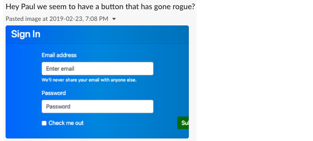
  2. You receive a Slack message from your QA team asking why a button is now floating off the screen?
  3. “But… I didn’t touch any code in that part of the application,” you think to yourself.
  4. Then you remember you did change some CSS.
  5. Panic! What else has changed in the UI? Does this affect iPad? Will Firefox behave differently than Chrome? What about mobile?

This is a very common scenario many of us face when building large-scale applications that deal with different screen sizes and browsers. It’s a Herculean task to test UI for each and every change to code.

What now, throw in the towel and move to the mountains? Thankfully, no. We have Percy to help save the day! And it’s really the best friend we have for testing unexpected outcomes that impact design and layout. Percy has become an indispensable part of my development stack and I convinced CSS-Tricks to let me share some things about it that have made my code stronger and helped prevent errors from shipping.

Plus, it integrates well with other tooling and is a relative breeze to set up. So hang with me a bit as we walk through what Percy is and how to leverage it for your projects.

So, what exactly is Percy?

According to Percy’s site, it’s an “all in one visual review platform.”

I’ve found that holds true. What it boils down to is that Percy provides a way to test visual regressions. That’s pretty awesome if you think about it. Many changes to a codebase — especially working with CSS — can introduce breaking changes to a site’s design. If you’ve ever inherited a large legacy stylesheet, modified a class, and hit Save, then you probably have a great idea of how nerve-wracking that can feel. Percy’s goal is to provide confidence in those types of situations where it’s difficult to know all of the UI that depends on the same line of code.

Excited? Let’s get started.

Setting up an example site

Let’s set up a little site that Percy can hook into and test some UI we’re going to make together. These days, this couldn’t be easier, thanks to Gatsby and Netlify. It is way beyond the scope of this article to do a deep dive into these technologies, but rest assured, they are wonderful as well and can get us online without a bunch of server setup.

Head over over to Netlify templates and click the “Deploy to Netlify” button, which will set up a git repo on your GitHub account and also deploy the app using Netlify.

After completing the setup steps, we should get something like this (after the site is deployed):

Magically, our site is now live! We will use this to get to grips with Percy.

Using CircleCI for automated testing

Percy works best in a continuous integration (CI) environment that will trigger testing based on an action. We will use CircleCI to make it happen by integrating with the example site’s GitHub repo and running the builds, allowing us to test every commit.

The first thing we need to do is clone down our new repo on GitHub, I clone mine as follows:

git clone https://github.com/PaulRyanStitcherAds/gatsby-starter-netlify-cms.git

With our repo now cloned, we can head over to CircleCI and sign up with a GitHub account.

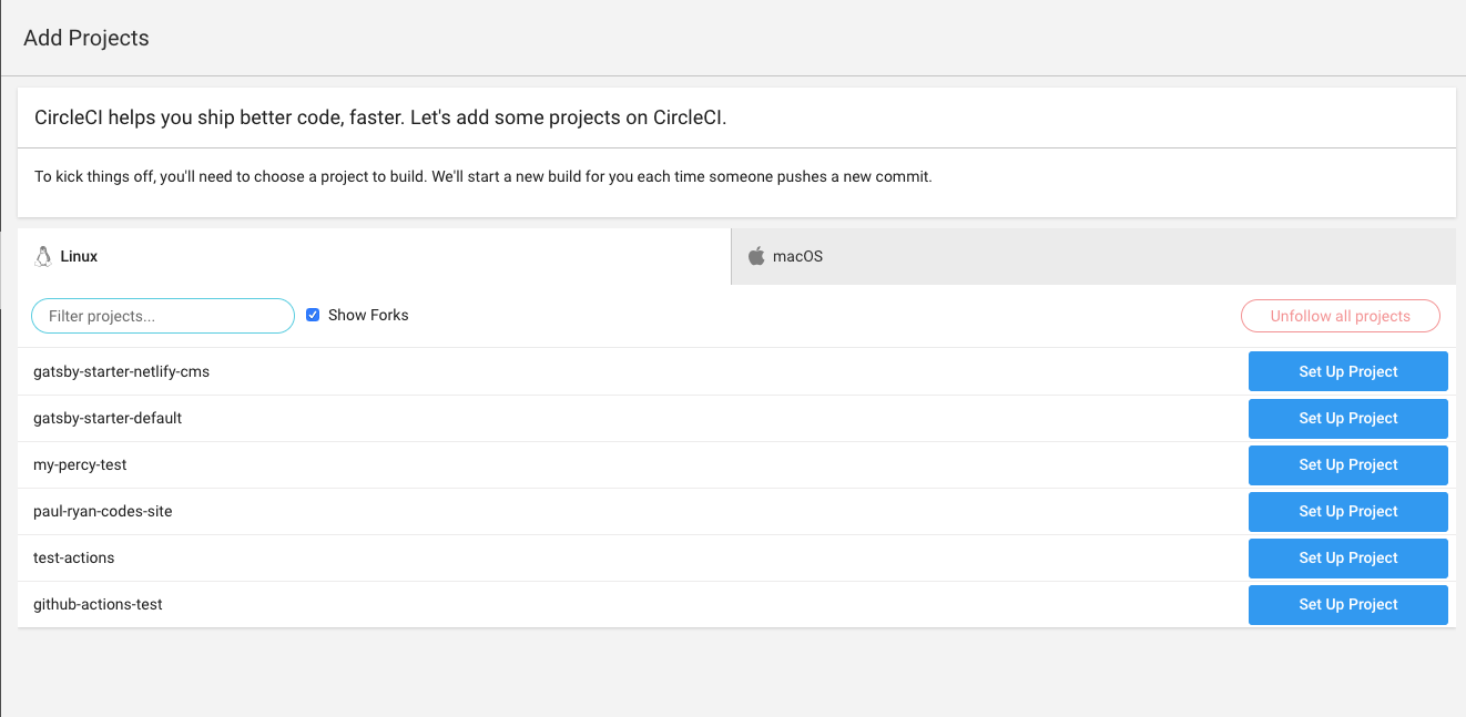
We now need to add our project, so click “Add Projects” in the side navigation and you should see a screen like the following screenshot. Find the project we just cloned and click “Set Up Project.”

In the Set Up Project area, we want to select Linux as our operating system and Ruby as our language (pery-cli is in Ruby). Here are the rest of the steps for this part:

CircleCI tells us that we need a .circleci directory and that we need a config.yml file in it. Create the following structure within your project.

CircleCI offers a configuration snippet to copy and paste for our configuration, but it is far too verbose for us; we only need a simple config.yml file.

Go ahead and use the following snippet. You’ll see that we install the percy-cli gem along with Percy in our tests:

version: 2
jobs:
  build:
    docker:
      - image: circleci/ruby:2.4.1-node-browsers
    working_directory: ~/repo
    steps:
      - checkout
      - run:
          name: install dependencies
          command: |
            npm install
            gem install percy-cli
      
      - run: 
          name: run our tests
          command: |
            npm run build
            percy snapshot public

This config is all we need.

At first, It took me a while to figure out why my build was failing and turned out I was trying to install percy-cli as an npm module. Yikes!

We now have the CircleCI configuration set up so finally we can start using Percy!

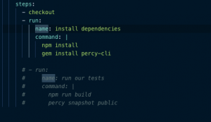
As a sanity check, comment out the run our tests step above and push your code to the master branch.

Now click the “Start building” button which will use the configuration you just pushed to create a build. Here’s what you should see in the workflows section:

From here on out, CircleCI will create a build for us whenever we do a push.

Hooking Percy up to CircleCI

A Percy account is needed to use the service. Head over to Percy’s site and sign up with your GitHub account.

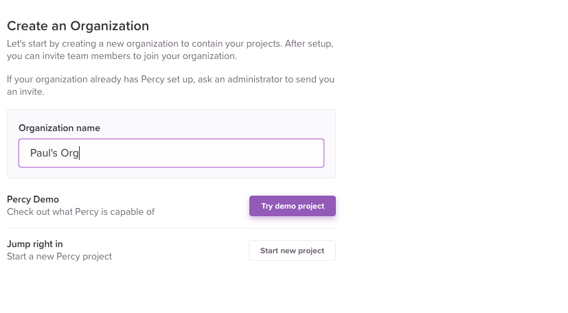
Once signed up, you can create a new organization (if you don’t already have one) and call it whatever you want.

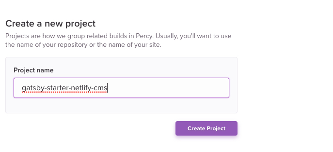
Next thing to do is add a project to the organization. It’s probably a good idea to call the project something matching the name of the repo so that it’s recognizable later.

Now we need to add a Percy token to CircleCI. Percy tokens are located under “Project Settings.”

My access token is blocked out.

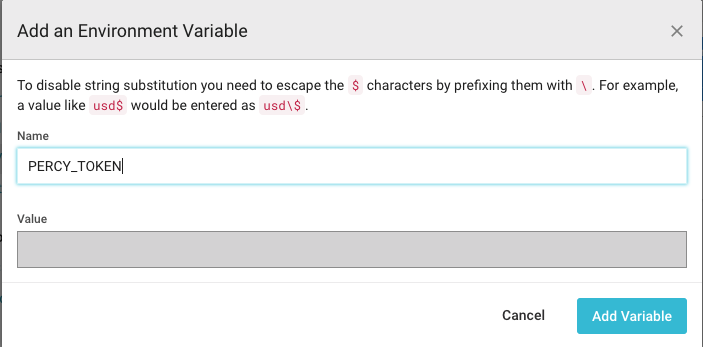
Alright, let’s add the token in CircleCI in Environment Variables under “Build Settings.” You can find Build Settings by clicking the gear icon beside your project in the workflows section.

Again, my token is blocked out.

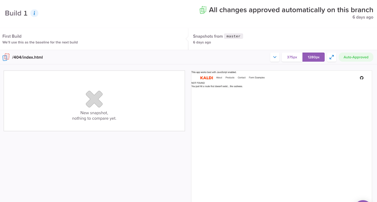
It’s time to run Percy! If you commented out the run our tests line in the config file earlier, then remove the comment because that command will run Percy. Push to master again and then head over to the Percy app — we will see Percy has started its own build for creating snapshots. If all goes well, this is what we should get:

If you click on this build, then you can see all the screens Percy has snapped of the application.

You might be wondering what the deal is with that empty left column. That’s where the original screen normally is, but since this is the first test, Percy informs us that there are no previous snapshots to compare.

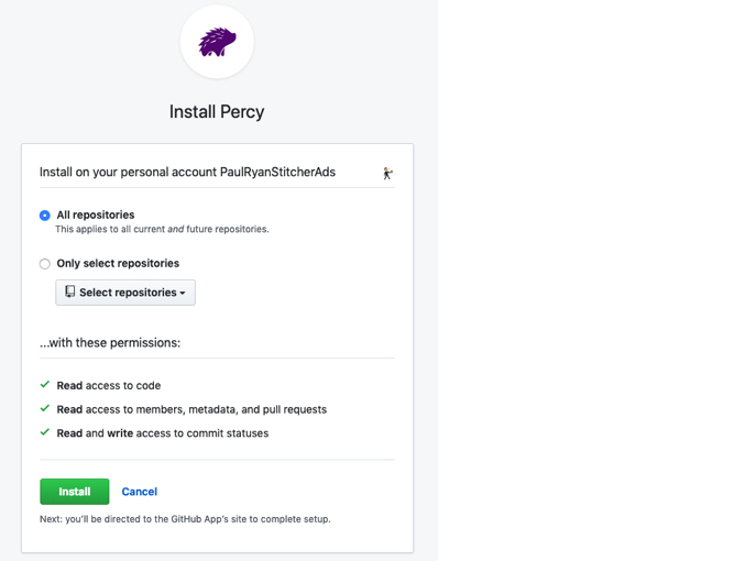
The final thing we need to do to wrap up this connection is link our repo to Percy. So, in Percy, click “Project Settings” then click on the “install an integration” link.

Select the organization and hit install for all repositories:

Finally! We can link to our repository.

Unlocking the true power of Percy

Since we now have everything set up, we can see how Percy can be used in a code review workflow! The first thing we will do is create a branch from master. I’m calling my branch “changing-color.”

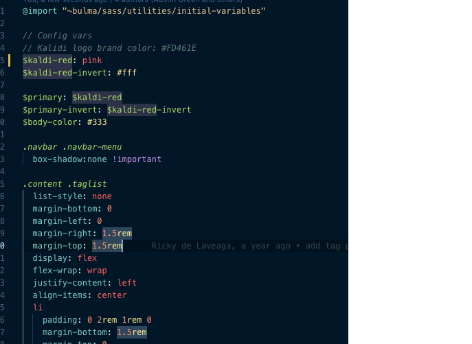
Go to the /src/components/all.sass file, change Line 5 to use the color pink, then push the change to the repo. This is what we’re going to evaluate in our visual test.

Create a pull request for the change in GitHub.

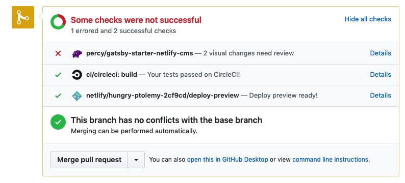
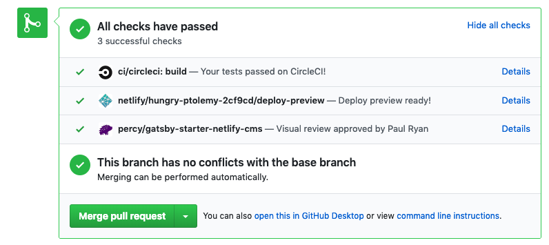
CircleCI is carrying out checks for us but the one we are focused on is the Percy step. It may need a minute or two for Percy to pop up:

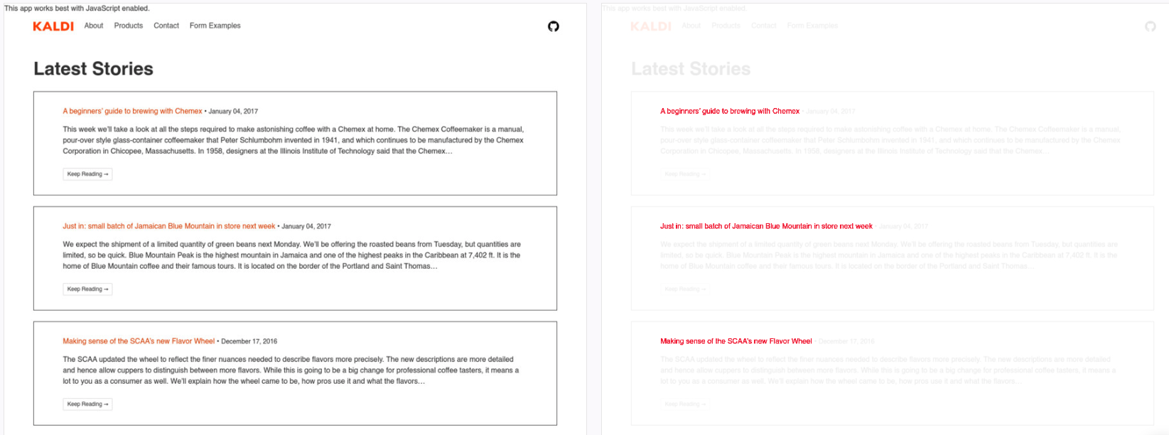
Percy is letting us know that we need to review changes we made, which in this case, is the change from red to pink. We can see the impact of that change:

Although the changes on the right are red, that is highlighting the areas that have been changed to pink. In other words, red is indicating the change rather than the actual appearance.

We can give this a quick glance and then click the “Approve” button which will give us a green tick on GitHub indicating we’re free to merge the pull request.

This is the true power of Percy: allowing us to see the impact of a small change and giving us the option to approve the changes.

Fantastic! We have now taking a tour on how to set Percy up in our projects along with how to integrate CircleCI. I really hope this will save you many headaches in the future when managing your UI.

The post Testing for Visual Regressions with Percy appeared first on CSS-Tricks.

Categories: Designing, Others Tags:

Digging Into The Display Property: The Two Values Of Display

April 8th, 2019 No comments
Smashing Editorial

Digging Into The Display Property: The Two Values Of Display

Digging Into The Display Property: The Two Values Of Display

Rachel Andrew

2019-04-08T13:00:59+02:002019-04-09T04:35:40+00:00

A flex or grid layout starts out with you declaring display: flex or display: grid. These layout methods are values of the CSS display property. We tend not to talk about this property on its own very much, instead concentrating on the values of flex or grid, however, there are some interesting things to understand about display and how it is defined that will make your life much easier as you use CSS for layout.

In this article, the first in a short series, I’m going to take a look at the way that the values of display are defined in the Level 3 specification. This is a change to how we defined display in earlier versions of CSS. While it may seem unusual at first for those of us who have been doing CSS for many years, I think these changes really help to explain what is going on when we change the value of display on an element.

Block And Inline Elements

One of the first things we teach people who are new to CSS are the concepts of block and inline elements. We will explain that some elements on the page are display: block and they have certain features because of this. They stretch out in the inline direction, taking up as much space as is available to them. They break onto a new line; we can give them width, height, margin as well as padding, and these properties will push other elements on the page away from them.

We also know that some elements are display: inline. Inline elements are like words in a sentence; they don’t break onto a new line, but instead reserve a character of white space between them. If you add margins and padding, this will display but it won’t push other elements away.

The behavior of block and inline elements is fundamental to CSS and the fact that a properly marked up HTML document will be readable by default. This layout is referred to as “Block and Inline Layout” or “Normal Flow” because this is the way that elements lay themselves out if we don’t do anything else to them.

Inner And Outer Values Of display

We understand block and inline elements, but what happens if we make an item display: grid? Is this something completely different? If we look at a component on which we have specified display: grid, in terms of the parent element in the layout it behaves like a block level element. The element will stretch out and take up as much space in the inline dimension as is available, it will start on a new line. It behaves just like a block element in terms of how it behaves alongside the rest of the layout. We haven’t said display: block though, or have we?

It turns out that we have. In Level 3 of the Display specification, the value of display is defined as two keywords. These keywords define the outer value of display, which will be inline or block and therefore define how the element behaves in the layout alongside other elements. They also define the inner value of the element — or how the direct children of that element behave.

This means that when you say display: grid, what you are really saying is display: block grid. You are asking for a block level grid container. An element that will have all of the block attributes — you can give it height and width, margin and padding, and it will stretch to fill the container. The children of that container, however, have been given the inner value of grid so they become grid items. How those grid items behave is defined in the CSS Grid Specification: the display spec gives us a way to tell the browser that this is the layout method we want to use.

I think that this way of thinking about display is incredibly helpful; it directly explains what we are doing with various layout methods. If you were to specify display: inline flex, what would you expect? Hopefully, a box that behaves as an inline element, with children that are flex items.

There are a few other things neatly explained by thinking about display in this new way, and I’ll take a look at some of these in the rest of this article.

We Are Always Going Back To Normal Flow

When thinking about these inner and outer display properties, it can be helpful to consider what happens if we don’t mess around with the value of display at all. If you write some HTML and view it in a browser, what you get is Block and Inline Layout, or Normal Flow. The elements display as block or inline elements.

See the Pen Block and Inline Layout by Rachel Andrew.

See on Codepen

The example below contains some markup that I have turned into a media object, by making the div display: flex (the two direct children) now become flex items, so the image is now in a row with the content. If you see in the content, however, there is a heading and a paragraph which are displaying in normal flow again. The direct children of the media object became flex items; their children return to normal flow unless we change the value of display on the flex item. The flex container itself is a block box, as you can see by the fact the border extends to the edge of its parent.
See the Pen Block and Inline Layout With Flex Component by Rachel Andrew.

See on Codepen

If you work with this process, the fact that elements on your page will lay themselves out with this nice readable normal flow layout, rather than fighting against it and trying to place everything, CSS is much easier. You are also less likely to fall into accessibility issues, as you are working with the document order, which is exactly what a screen reader or a person tabbing through the document is doing.

Explaining flow-root And inline-block

The value of inline-block is also likely to be familiar to many of us who have been doing CSS for a while. This value is a way to get some of the block behavior on an inline element. For example, an inline-block element can have a width and a height. An element with display: inline-block also behaves in an interesting way in that it creates a Block Formatting Content (BFC).
A BFC does some useful things in terms of layout, for example, it contains floats. To read about Block Formatting Contexts in more detail see my previous article “Understanding CSS Layout And The Block Formatting Context.” Therefore saying display: inline-block gives you an inline box which also establishes a BFC.

As you will discover (if you read the above-mentioned article about the Block Formatting Context), there is a newer value of display which also explicitly creates a BFC. This is the value of flow-root. This value creates a BFC on a block, rather than an inline element.

  • display: inline-block gives you a BFC on an inline box.
  • display: flow-root gives you a BFC on a block box.

You are now probably thinking that is all a bit confusing: why do we have two completely different keywords here, and what happened to the two-value syntax we were talking about before? This leads neatly into the next thing I need to explain about display, i.e. the fact that CSS has a history we need to deal with in terms of the display property.

Legacy Values Of Display

The CSS2 Specification detailed the following values for the display property:

  • inline
  • block
  • inline-block
  • list-item
  • none
  • table
  • inline-table

Also defined were the various table internal properties such as table-cell which we are not dealing with in this article.

We then added to these some values for display, to support flex and grid layout:

  • grid
  • inline-grid
  • flex
  • inline-flex

Note: The specification also defines ruby and inline-ruby to support Ruby Text which you can read about in the Ruby specification.

These are all single values for the display property, defined before the specification was updated to explain CSS Layout in this way. Something very important about CSS is the fact that we don’t go around breaking the web; we can’t simply change things. We can’t suddenly decide that everyone should use this new two-value syntax and therefore every website ever built that used the single value syntax will break unless a developer goes back and fixes it!

While thinking about this problem, you may enjoy this list of mistakes in the design of CSS which are less mistakes in many cases as things that were designed without a crystal ball to see into the future! However, the fact is that we can’t break the web, which is why we have this situation where right now browsers support a set of single values for display, and the specification is moving to two values for display.

The way we get around this is to specify legacy and short values for display, which includes all of these single values. This means that a mapping can be defined between single values and new two keyword values. Which gives us the following table of values:

Single Value Two-Keyword Values Description
block block flow Block box with normal flow inner
flow-root block flow-root Block box defining a BFC
inline inline flow Inline box with normal flow inner
inline-block inline flow-root Inline box defining a BFC
list-item block flow list-item Block box with normal flow inner and additional marker box
flex block flex Block box with inner flex layout
inline-flex inline flex Inline box with inner flex layout
grid block grid Block box with inner grid layout
inline-grid inline grid Inline box with inner grid layout
table block table Block box with inner table layout
inline-table inline table Inline box with inner table layout

To explain how this works, we can think about a grid container. In the two-value world, we would create a block level grid container with:

.container {
    display: block grid;
}

However, the legacy keyword means that the following does the same thing:

.container {
    display: grid;
}

If, instead, we wanted an inline grid container, in the two-value world we would use:

.container {
    display: inline grid;
}

And if using the legacy values:

.container {
    display: inline-grid;
}

We can now go back to where this conversation began and look at display: inline-block. Looking at the table, you can see that this is defined in the two-value world as display: inline flow-root. It now matches display: flow-root which in a two-value world would be display: block flow-root. A little bit of tidying up and clarification of how these things are defined. A refactoring of CSS, if you like.

Browser Support For The Two-Value Syntax

As yet, browsers do not support the two-value syntax for the display property. The implementation bug for Firefox can be found here. Implementation — when it happens — would essentially involve aliasing the legacy values to the two-value versions. It’s likely to be a good while, therefore, before you can actually use these two-value versions in your code. However, that really isn’t the point of this article. Instead, I think that looking at the values of display in the light of the two-value model helps explain much of what is going on.

When you define layout on a box in CSS, you are defining what happens to this box in terms of how it behaves in relation to all of the other boxes in the layout. You are also defining how the children of that box behave. You can think in this way long before you can explicitly declare the values as two separate things, as the legacy keywords map to those values, and it will help you understand what happens when you change the value of display.

(il)
Categories: Others Tags:

20 Best New Portfolios, April 2019

April 8th, 2019 No comments

Greetings, Readers! It’s April, so there will be no joke here. You’re welcome.

This month, designers seem to have hit the minimalism button hard. There is a bit of variety in there, but if you like lots of white space, you’re in luck. A few Powerpoint-ish sites, too. Enjoy!

Note: I’m judging these sites by how good they look to me. If they’re creative and original, or classic but really well-done, it’s all good to me. Sometimes, UX and accessibility suffer. For example, many of these sites depend on JavaScript to display their content at all; this is a Bad Idea™, kids. If you find an idea you like and want to adapt to your own site, remember to implement it responsibly.
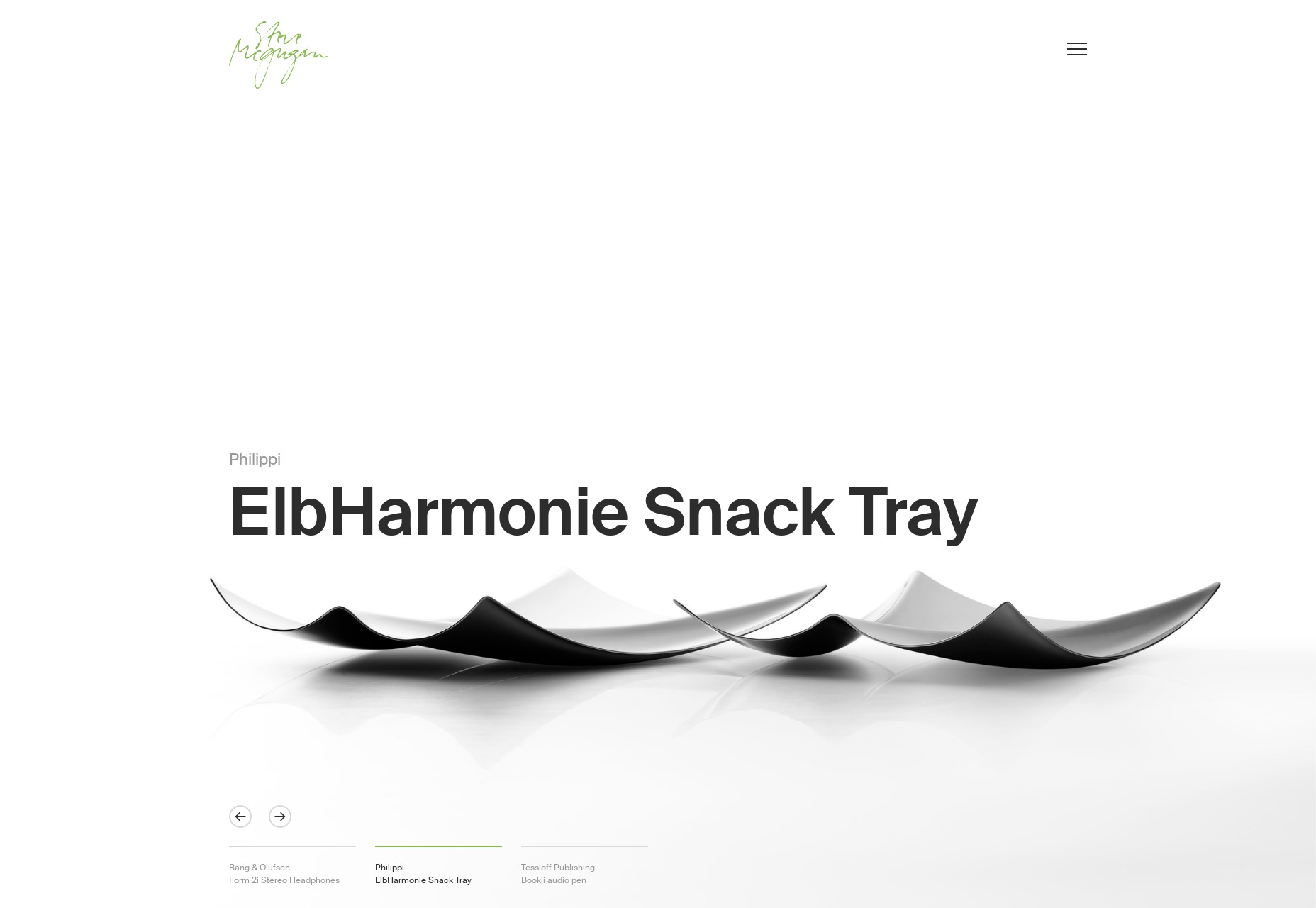
Steve Mcgugan

Steve Mcgugan has a name that is a lot of fun to say out loud, the first Drupal site we’ve had on this list in a while, and a quite minimalist approach to showing off his work. It’s clean, it’s pretty, and it’s mostly monochromatic with just a splash of green here and there. Classic and effective.

Platform: Drupal

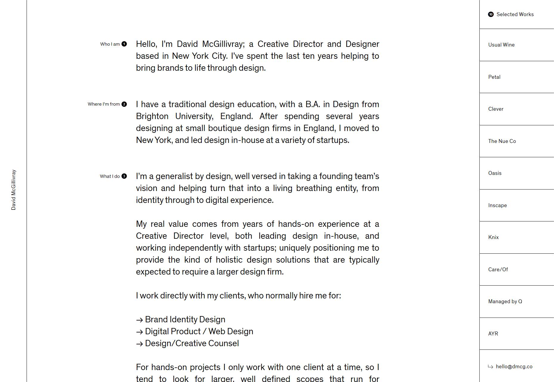
David McGillivray

David McGillivray continues the trend of the mostly black-and-white site, but with an interesting twist in the way the layout is organized. There’s just a curated list of ten projects on the right, and that’s it. Hover for a preview, then click and go.

It’s not terribly scalable, perhaps, but if you’ve curated your work down to a list of ten projects that show you off at your best, why not? We all end up redesigning our sites at least once a year anyway, right?

Platform: Custom CMS (I think)

Outline

Outline is another wonderfully minimalist site, but this time with a bit more color thrown into the mix. One thing I like is that they built a multi-step pre-project interview right into the site. Sure, it’ll probably deter customers that are in a hurry, but that’s the point, right? You want the ones who have clearly thought about what they want.

My only complaint is that one of their fancier typefaces (Saol Display Light) is a bit harder to read at smaller sizes. This could be an issue with how Windows renders the typeface, but it’s something to keep in mind.

Platform: WordPress

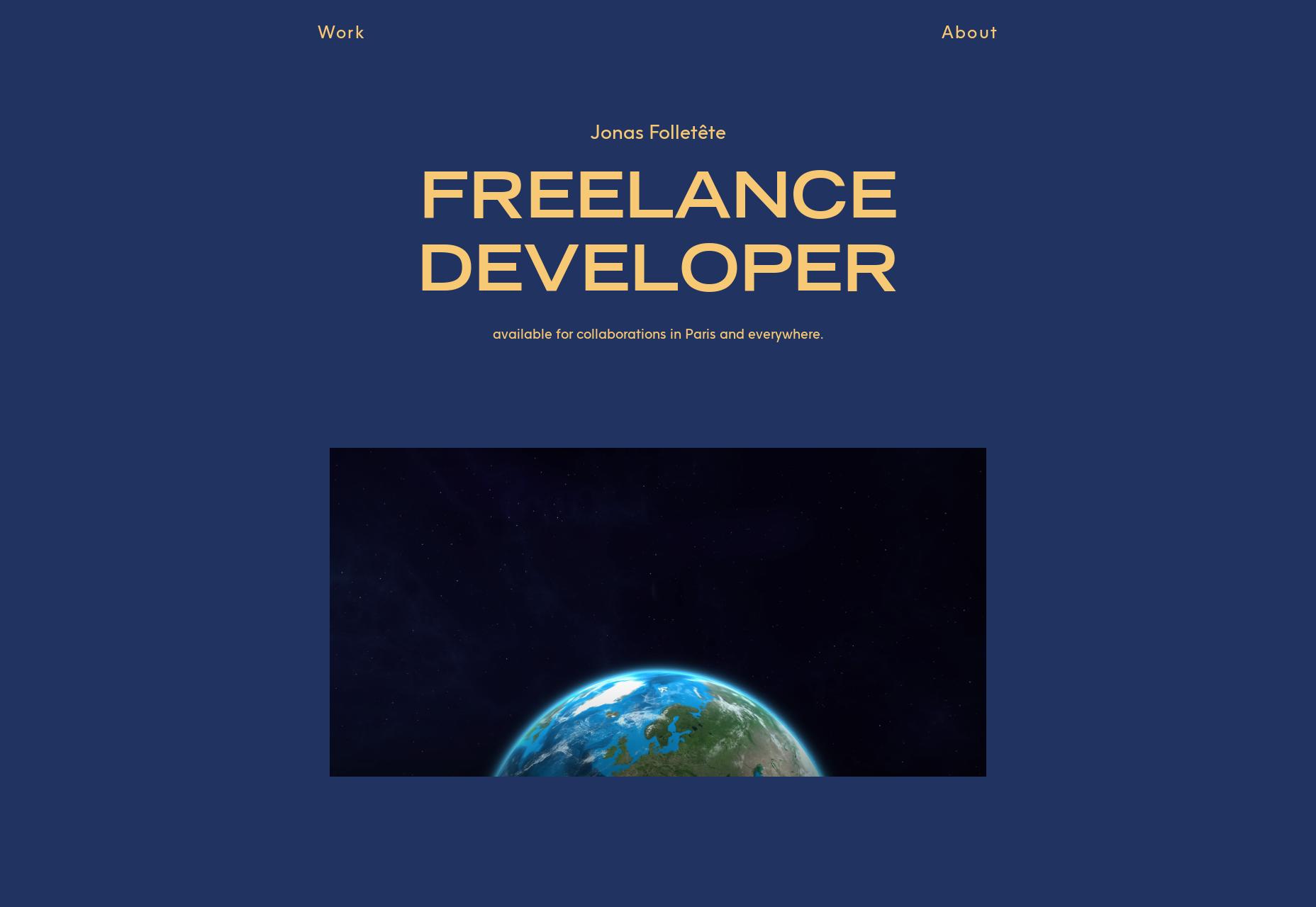
Jonas Folletête

Jonas Folletête embraces a clearly modernist aesthetic, and is one of those odd sites that, although very minimalist, would not be the same without its animated bits. It’s also odd, but the typography feels “French”, you know, like all the fashion magazines that try to look French. Given that Jonas is himself based in France, it makes sense, and it’s cool that this part of his identity is baked right into the design in a subtle way.

Platform: Custom CMS (maybe)

Soumya Ranjan

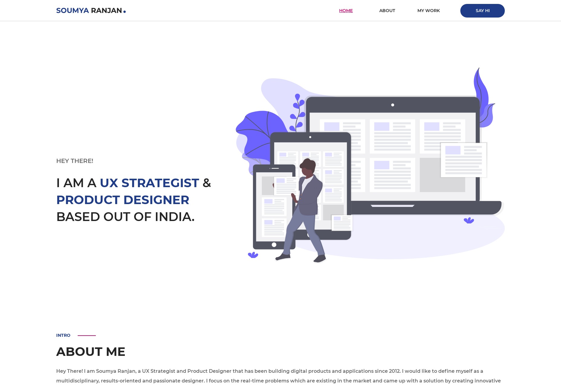
It’s not often that a portfolio site literally feels like a CV without directly copying a classic CV layout, but Soumya Ranjan made it happen. It’s a fairly common classic layout and aesthetic, but there are just enough small twists all over the design to make it stand out, even if only on a subconscious level.

Platform: Static Site

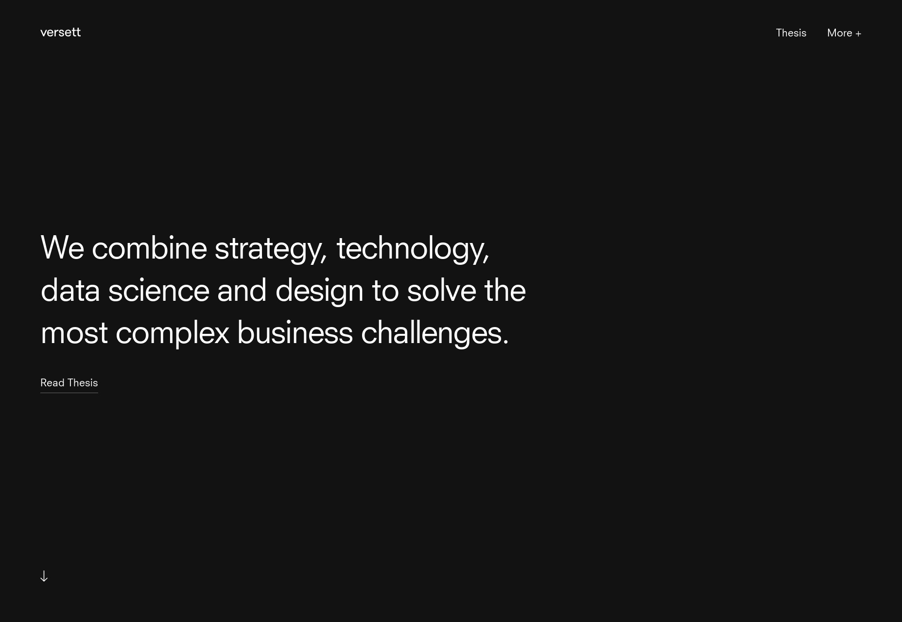
Versett

Versett is clean and modern, and while it’s not a one-page portfolio, precisely, it depends on the home page to do a lot of the heavy lifting. For example, they put all of their featured work on the home page, I particularly appreciate that they added filters for the projects section.

I also really like their “More+” menu, which describes their services in terms of what a client might want to accomplish, such as “Design a new product”, “Launch a new company”, etc.

Platform: Gatsby

Gilles Rivière

Gilles Rivière’s portfolio is highly Powerpoint-like, and still… I find myself impressed by the general sense of style. Stranger still, I find myself impressed by the animations used, and while it’s not uncommon for me to like a site’s animations, it’s rare for me to be impressed by them. There’s a lot of personality here.

Platform: Static Site (probably)

Wassim Nasr

Wassim Nasr has done two impressive things with his site. First and foremost, he build a lovely purple and pink portfolio that is just plain easy on the eyes, though I wish his input forms were perhaps a bit less transparent on that background photo.

Secondly, he built this near-masterpiece on Wix. Yeah. Wix. I know.

Platform: Wix

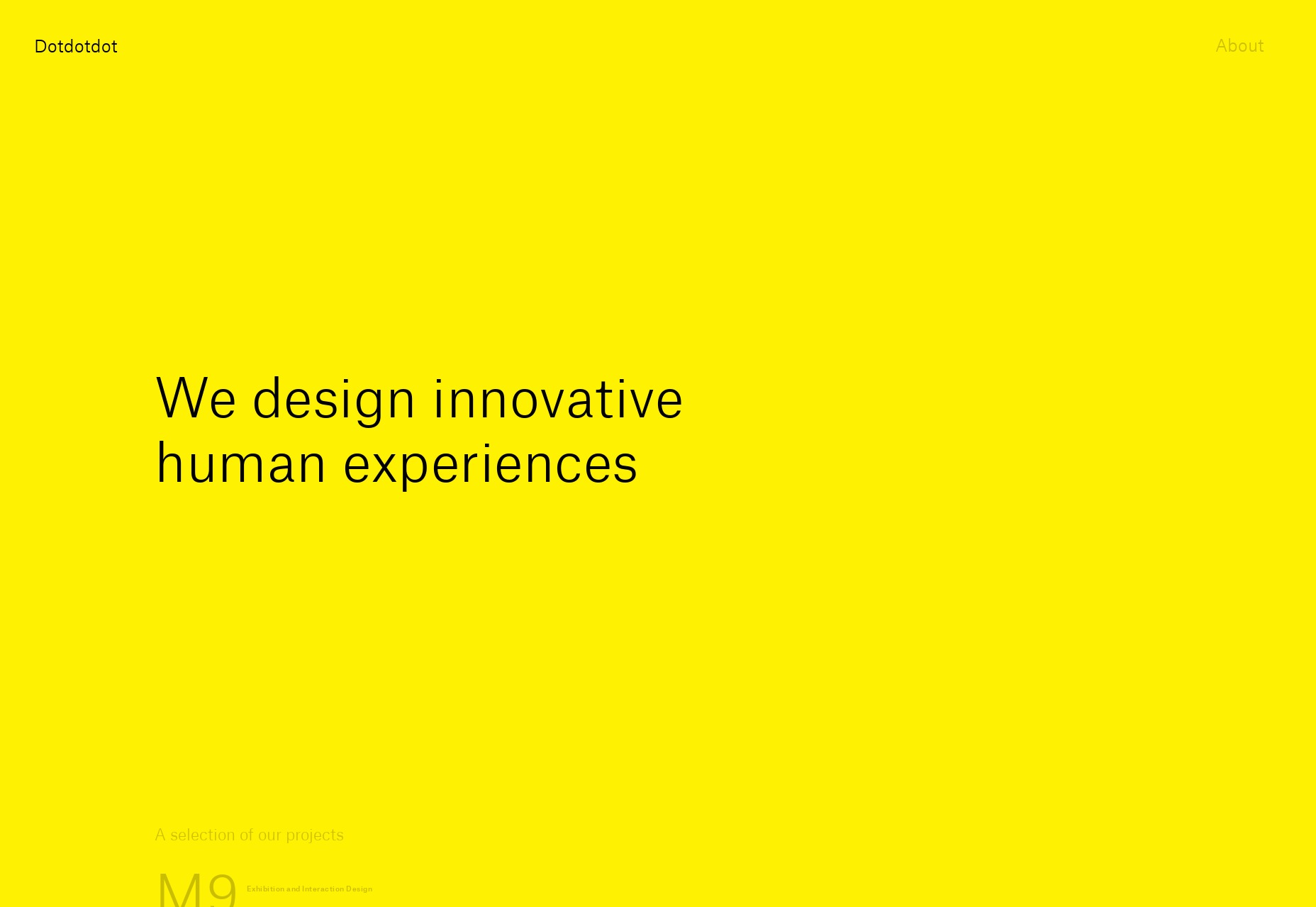
Dotdotdot

The ellipsis, AKA “…”, AKA Dotdotdot is maybe one of my favorite bits of punctuation… which is why I try not to use it too often. It’s also a design agency with a snazzy portfolio done up in bright, bright yellow, and big type. Well, long time readers will know about me and the color yellow. When people use it right, I put their site on the list.

Platform: Custom CMS (probably)

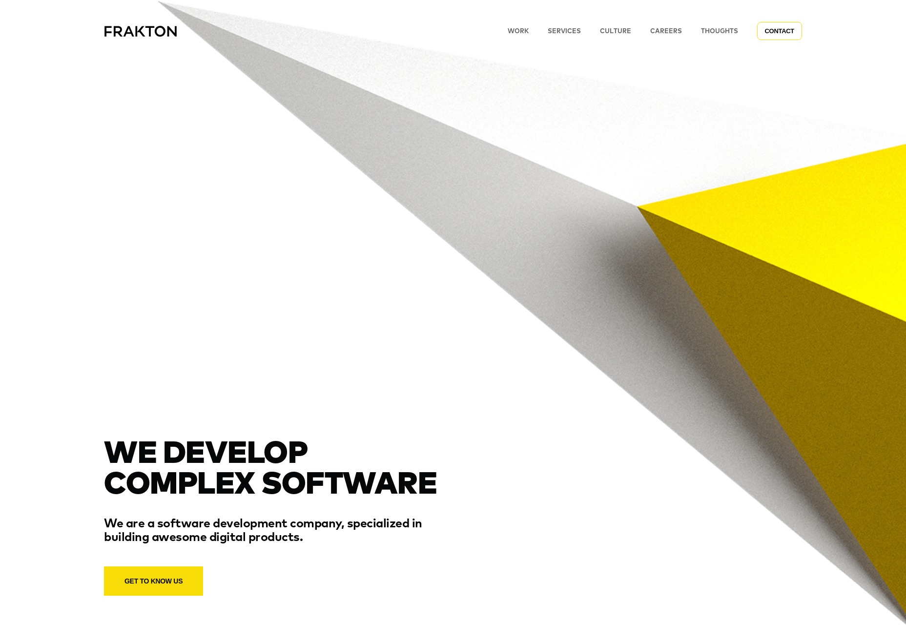
Frakton

Frakton brings us yet more yellow, but in less eyeball-smacking amounts. They’ve also brought us a heavy focus on abstract geometric shapes, and strong contrast.

Platform: WordPress

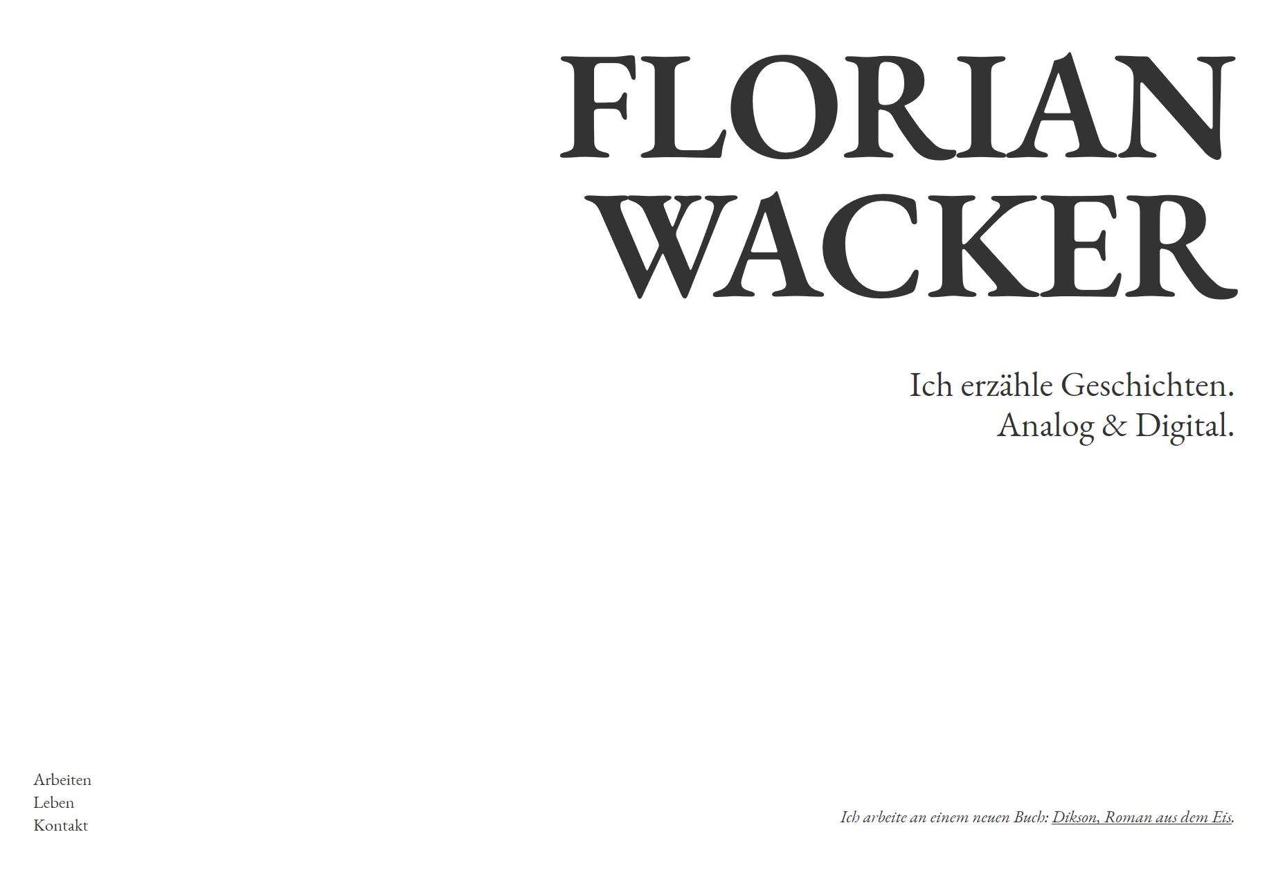
Florian Wacker

Florian Wacker’s portfolio is here because of the gorgeous typography, and especially the rendering of that type. I don’t know what they did to make it look that good on a Windows PC, I don’t know what they configured where, but it’s a pleasure to read… even if I can’t understand a word of it.

(Oh, and don’t be alarmed by the project name that mentions “Nazis”. It’s for a project that is decidedly anti-those-jerks. I checked.)

Platform: Static Site

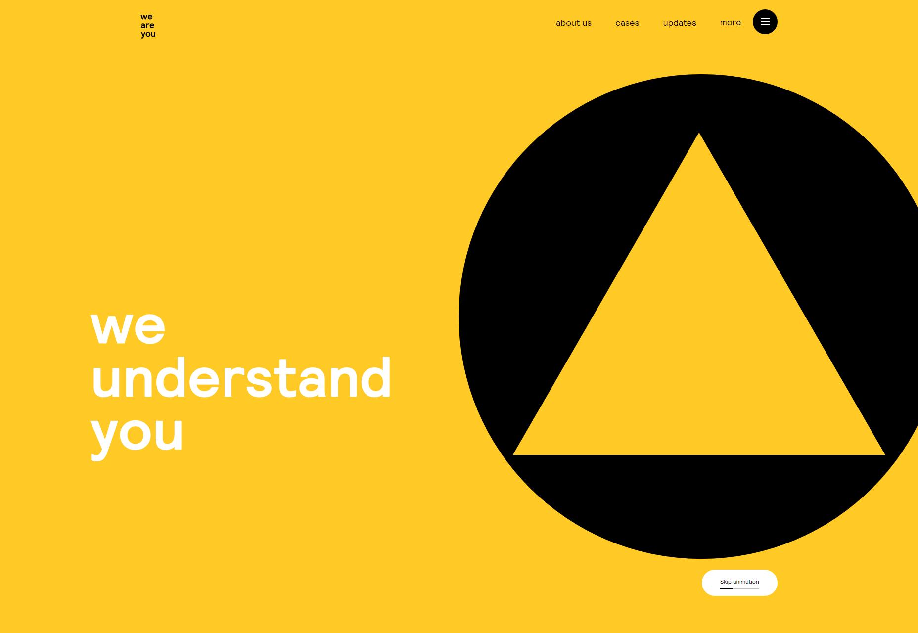
we are you

The interestingly-named we are you is on the list because it looks darned good, and that’s really enough, sometimes. Side note, they invite you to watch a video on the “About Us” page, and they tell you how long the video will be before you ever set eyes on the video player. I appreciate this a lot.

Platform: Sitecore

Atelier Ramos

Atelier Ramos is a simple portfolio that just puts the work in front of you with little fuss. It take masonry style layouts, horizontal scrolling, and other layout tricks, and mixes them all up with a high fashion aesthetic, and it works quite nicely.

Platform: WordPress

Shotaro Momoi

Shotaro Momoi (AKA Momotaro, apparently) brings us a lovely, simple dark design with lots ok pinks, blues, and a film grain effect that doesn’t get in the way at all. Also, I’m not sure how that overlapping text effect works (it’s rendered live), but I like it.

Of course, I would not be me unless I professed my dislike for custom cursors, but with that done, go check this one out. It really is just that pretty.

Platform: Static Site

Weight Creative

Weight Creative hits hard with a design that’s bright, bold, and just loaded with intentionally cheesy stock photos. It’s like a local business flyer had a baby with a modern web design, and it’s actually delightful. Sure, it’s a corporate sort of playfulness, but this is a business.

Platform: WordPress

Kazuki

Kazuki is an art director, signer-songwriter, and stylist. Her work is thus eclectic and colorful as all getout. The style of the website is a bit more familiar, with a collage-style presentational layout and the requisite serif-based type. I do have to say I like the way some of the “handwriting” was animated, though. It’s a familiar sort of site, but an excellent example of its kind.

Platform: Static Site

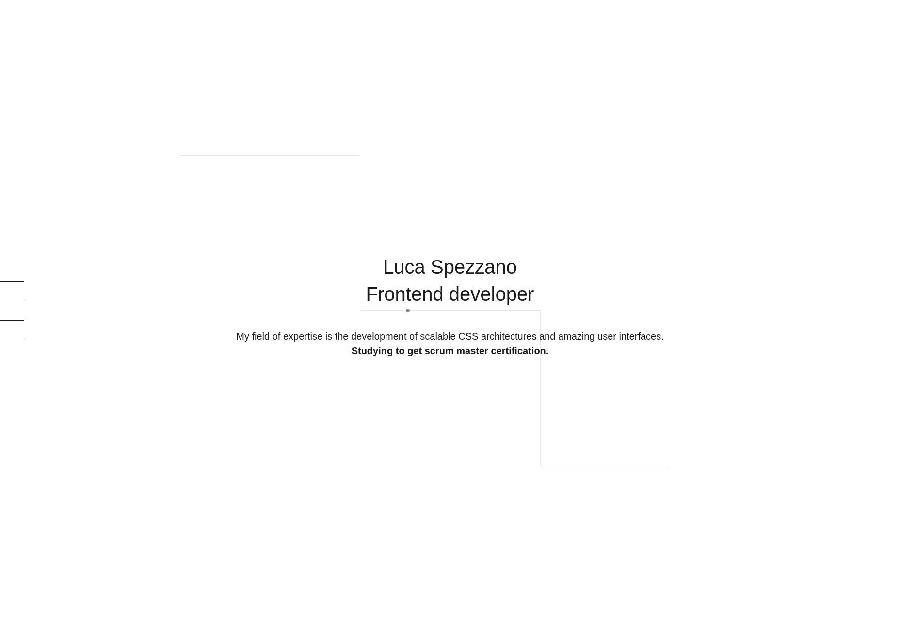
Luca Spezzano

Luica Spezzano is a front-end developer, so there is not much of an emphasis on screenshots on their one-page portfolio. I do rather like the grid of logos showcasing their various skills, but I especially appreciate that the actual name of each technology is shown on hover, just in case you don’t recognize the logos.

I also appreciate that there is an outline of things Luca learned while working on each project listed. It’s the sort of thing a potential employer would want to know.

Platform: Static Site

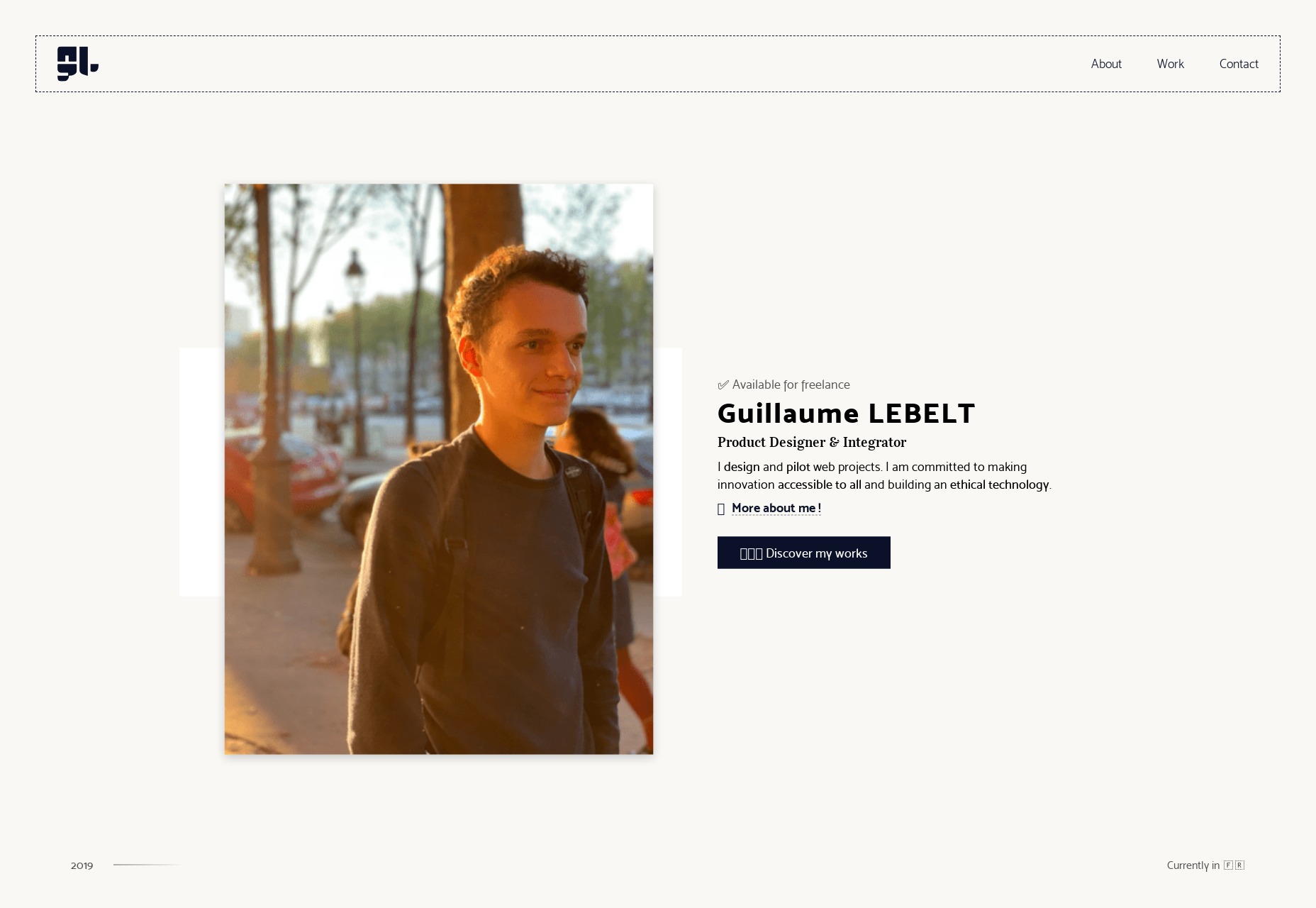
Guillame Lebelt

Guillame Lebelt’s portfolio is an excellent showcase of the way you can combine a simple design system with a certain amount of restrained art direction. Every page is different, and every bit of content was carefully planned, and not copy-pasted. Still, the whole design still feels consistent and uncomplicated.

Platform: Static Site

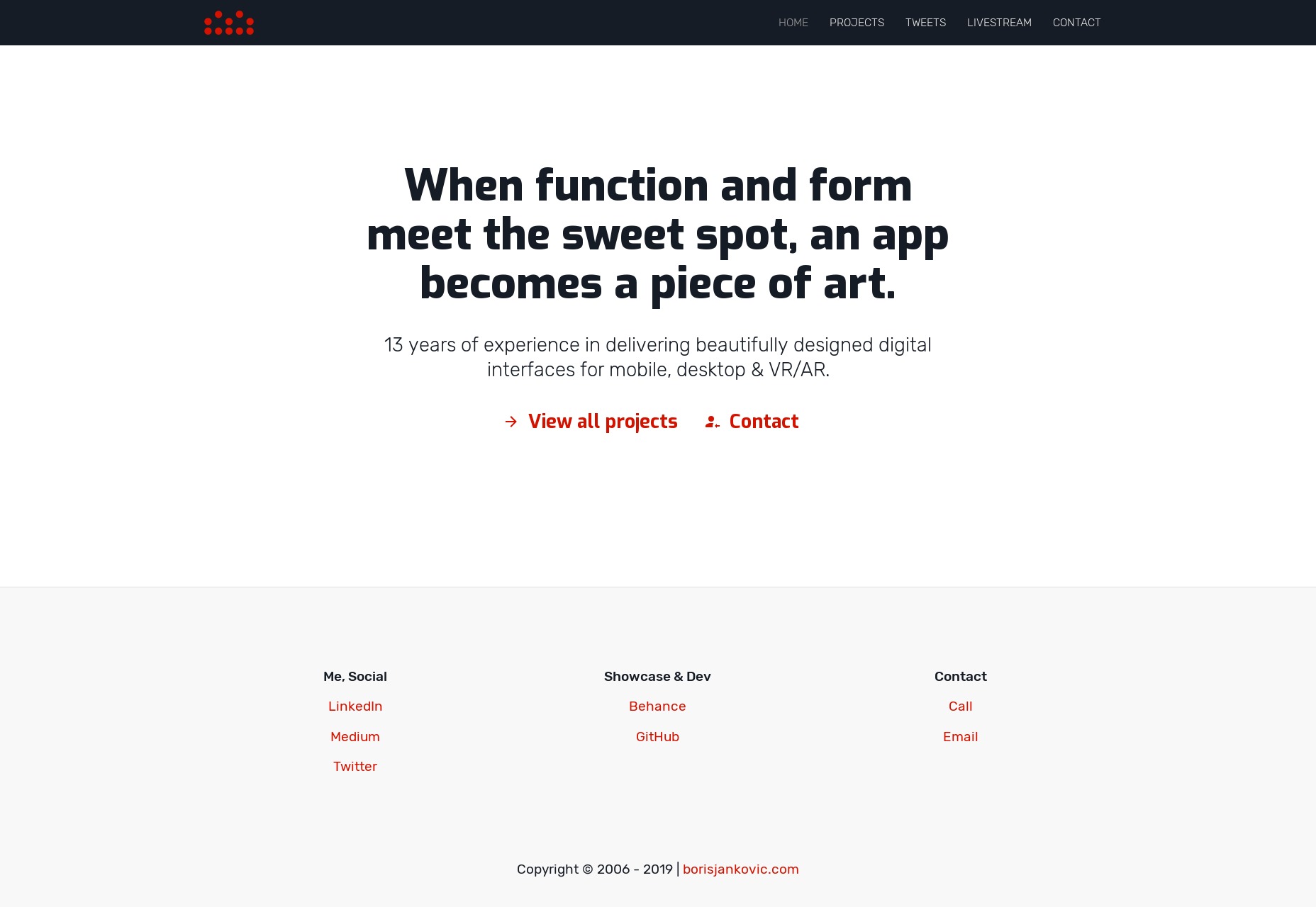
Boris Jankovic

Boris Jankovic’s portfolio is one of those less-common design portfolios that puts a heavy emphasis, not just on type, but on the writing. While it’s perfectly fine to post images and let your work sell itself, it’s always interesting to see a portfolio so clearly based on text-based storytelling. It helps that the type, while simple, is pleasant to read.

Platform: Static Site

Alexis Benoliel

Alexis Benoliel’s portfolio has the sort of typography and overlapping-element style that you might expect from a more monochromatic design. But no, while there is plenty of literal white space, there’s also a very strong emphasis on color to shake things up. They took that serious, hyper-modern style and actually made it sort of… cheerful. And I like that.

Platform: Static Site

Add Realistic Chalk and Sketch Lettering Effects with Sketch’it – only $5!

Source

Categories: Designing, Others Tags: