Archive

Archive for May, 2019

Implementing Private Variables In JavaScript

May 31st, 2019 No comments

JavaScript (or ECMAScript) is the programming language that powers the web. Created in May 1995 by Brendan Eich, it’s found its place as a widely-used and versatile technology. Despite its success, it’s been met with its fair share of criticism, especially for idiosyncrasies. Things like objects being casted to string form when used as indices, 1 == "1" returning true, or the notoriously confusing this keyword. A particularly interesting quirk though, is the existence of various techniques for variable privacy.

In its current state, there is no “direct” way to create a private variable in JavaScript. In other languages, you can use the private keyword or double-underscores and everything works, but variable privacy in JavaScript carries characteristics that make it seem more akin to an emergent trait of the language rather than an intended functionality. Let’s introduce some background to our problem.

The “var” keyword

Before 2015, there was essentially one way to create a variable, and that was the var keyword. var is function-scoped, meaning that variables instantiated with the keyword would only be accessible to code within the function. When outside of a function, or “global” essentially, the variable will be accessible to anything executed after the definition of the variable. If you try to access the variable in the same scope before its definition, you will get undefined rather than an error. This is due to the way the var keyword “hoists.”

// Define "a" in global scope
var a = 123;

// Define "b" in function scope
(function() {
  console.log(b); //=> Returns "undefined" instead of an error due to hoisting.
  var b = 456;
})();

console.log(a); // => 123
console.log(b); // Throws "ReferenceError" exception, because "b" cannot be accessed from outside the function scope.

The birth of ES6 variables

In 2015, ES6/ES2015 was made official, and with it came two new variable keywords: let and const. Both were block-scoped, meaning that variables created with the keywords would be accessible from anything within the same pair of braces. Same as with var, but the let and const variables could not be accessed outside of block scope with loops, functions, if statements, braces, etc.

const a = 123;

// Block scope example #1
if (true) {
  const b = 345;
}

// Block scope example #2
{
  const c = 678;
}

console.log(a); // 123
console.log(b); // Throws "ReferenceError" because "b" cannot be accessed from outside the block scope.
console.log(c); // Throws "ReferenceError" because "b" cannot be accessed from outside the block scope.

Since code outside of the scope cannot access the variables, we get an emergent trait of privacy. We’re going to cover some techniques for implementing it in different ways.

Using functions

Since functions in JavaScript also are blocks, all variable keywords work with them. In addition, we can implement a very useful design pattern called the “module.”

The Module Design Pattern

Google relies on the Oxford Dictionary to define a “module”:

Any of a number of distinct but interrelated units from which a program may be built up or into which a complex activity may be analyzed.

—”Module” Definition 1.2

The module design pattern is very useful in JavaScript because it combines public and private components and it allows us to break a program into smaller components, only exposing what another part of the program should be able to access through a process called “encapsulation.” Through this method, we expose only what needs to be used and can hide the rest of the implementation that doesn’t need to be seen. We can take advantage of function scope to implement this.

const CarModule = () => {
  let milesDriven = 0;
  let speed = 0;

  const accelerate = (amount) => {
    speed += amount;
    milesDriven += speed;
  }

  const getMilesDriven = () => milesDriven;

  // Using the "return" keyword, you can control what gets
  // exposed and what gets hidden. In this case, we expose
  // only the accelerate() and getMilesDriven() function.
  return {
    accelerate,
    getMilesDriven
  }
};

const testCarModule = CarModule();
testCarModule.accelerate(5);
testCarModule.accelerate(4);
console.log(testCarModule.getMilesDriven());

With this, we can get the number of miles driven, as well as the amount of acceleration, but since the user doesn’t need access to the speed in this case, we can hide it by only exposing the accelerate() and getMilesDriven() method. Essentially, speed is a private variable, as it is only accessible to code inside of the same block scope. The benefit to private variables begins to become clear in this situation. When you remove the ability to access a variable, function, or any other internal component, you reduce the surface area for errors resulting from someone else mistakenly using something that wasn’t meant to be.

The alternative way

In this second example, you’ll notice the addition of the this keyword. There’s a difference between the ES6 arrow function ( => ) and the traditional function(){}. With the function keyword, you can use this, which will be bound to the function itself, whereas arrow functions don’t allow any kind of use of the this keyword. Both are equally-valid ways to create the module. The core idea is to expose parts that should be accessed and leave other parts that should not be interacted with, hence both public and private data.

function CarModule() {
  let milesDriven = 0;
  let speed = 0;

  // In this case, we instead use the "this" keyword,
  // which refers to CarModule
  this.accelerate = (amount) => {
    speed += amount;
    milesDriven += speed;
  }

  this.getMilesDriven = () => milesDriven;
}

const testCarModule = new CarModule();
testCarModule.accelerate(5);
testCarModule.accelerate(4);
console.log(testCarModule.getMilesDriven());

Enter ES6 Classes

Classes were another addition that came with ES6. Classes are essentially syntactic sugar — in other words, still a function, but potentially “sweetening” it into a form that’s easier to express. With classes, variable privacy is (as of now) close to impossible without making some major changes to the code.

Let’s take a look at an example class.

class CarModule {
  /*
    milesDriven = 0;
    speed = 0;
  */
  constructor() {
    this.milesDriven = 0;
    this.speed = 0;
  }
  accelerate(amount) {
    this.speed += amount;
    this.milesDriven += this.speed;
  }
  getMilesDriven() {
    return this.milesDriven;
  }
}

const testCarModule = new CarModule();
testCarModule.accelerate(5);
testCarModule.accelerate(4);
console.log(testCarModule.getMilesDriven());

One of the first things that stands out is that the milesDriven and speed variable are inside of a constructor() function. Note that you can also define the variables outside of the constructor (as shown in the code comment), but they are functionally the same regardless. The problem is that these variables will be public and accessible to elements outside of the class.

Let’s look at some ways to work around that.

Using an underscore

In cases where privacy is to prevent collaborators from making some catastrophic mistake, prefixing variables with an underscore (_), despite still being “visible” to the outside, can be sufficient to signal to a developer, “Don’t touch this variable.” So, for example, we now have the following:

// This is the new constructor for the class. Note that it could
// also be expressed as the following outside of constructor().
/*
  _milesDriven = 0;
  _speed = 0;
*/
constructor() {
  this._milesDriven = 0;
  this._speed = 0;
}

While this does work for its specific use case, it’s still safe to say that it’s less than ideal on many levels. You can still access the variable but you also have to modify the variable name on top of that.

Putting everything inside the constructor

Technically, there is a method for variable privacy in a class that you can use right now, and that’s placing all variables and methods inside the constructor() function. Let’s take a look.

class CarModule {
  constructor() {
    let milesDriven = 0;
    let speed = 0;

    this.accelerate = (amount) => {
      speed += amount;
      milesDriven += speed;
    }

    this.getMilesDriven = () => milesDriven;
  }
}

const testCarModule = new CarModule();
testCarModule.accelerate(5);
testCarModule.accelerate(4);
console.log(testCarModule.getMilesDriven());
console.log(testCarModule.speed); // undefined -- We have true variable privacy now.

This method accomplishes true variable privacy in the sense that there is no way to directly access any variables that aren’t intentionally exposed. The problem is that we now have, well, code that doesn’t look all that great compared to what we had before, in addition to the fact that it defeats the benefits of the syntactic sugar we had with classes. At this point, we might as well be using the function() method.

Using WeakMap

There’s another, more creative way to go about making a private variable, and that’s using WeakMap(). Although it may sound similar to Map, the two are very different. While maps can take any type of value as a key, a WeakMap only take objects and deletes the values in the WeakMap when the object key is garbage collected. In addition, a WeakMap cannot be iterated through, meaning that you must have access to the reference to an object key in order to access a value. This makes it rather useful for creating private variables, since the variables are effectively invisible.

class CarModule {
  constructor() {
    this.data = new WeakMap();
    this.data.set(this, {
      milesDriven: 0,
      speed: 0
    });
  }

  accelerate(amount) {
    // In this version, we instead create a WeakMap and
    // use the "this" keyword as a key, which is not likely
    // to be used accidentally as a key to the WeakMap.
    const data = this.data.get(this);
    const speed = data.speed + amount;
    const milesDriven = data.milesDriven + data.speed;
    this.data.set({ speed, milesDriven });
  }

  this.getMilesDriven = () => this.data.get(this).milesDriven;
}

const testCarModule = new CarModule();
testCarModule.accelerate(5);
testCarModule.accelerate(4);
console.log(testCarModule.getMilesDriven());
console.log(testCarModule.data); //=> WeakMap { [items unknown] } -- This data cannot be accessed easily from the outside!

This solution is good at preventing an accidental usage of the data, but it isn’t truly private, since it can still be accessed from outside the scope by substituting this with CarModule. In addition, it adds a fair amount of complexity to the mix and, therefore, isn’t the most elegant solution.

Using symbols to prevent collisions

If the intent is to prevent name collisions, there is a useful solution using Symbol. These are essentially instances that can behave as unique values that will never be equal to anything else, except its own unique instance. Here’s an example of it in action:

class CarModule {
  constructor() {
    this.speedKey = Symbol("speedKey");
    this.milesDrivenKey = Symbol("milesDrivenKey");
    this[this.speedKey] = 0;
    this[this.milesDrivenKey] = 0;
  }

  accelerate(amount) {
    // It's virtually impossible for this data to be
    // accidentally accessed. By no means is it private,
    // but it's well out of the way of anyone who would
    // be implementing this module.
    this[this.speedKey] += amount;
    this[this.milesDrivenKey] += this[this.speedKey];
  }

  getMilesDriven() {
    return this[this.milesDrivenKey];
  }
}

const testCarModule = new CarModule();
testCarModule.accelerate(5);
testCarModule.accelerate(4);
console.log(testCarModule.getMilesDriven());
console.log(testCarModule.speed); // => undefined -- we would need to access the internal keys to access the variable.

Like the underscore solution, this method more or less relies on naming conventions to prevent confusion.

TC39 private class field proposal

Recently, a new proposal was introduced that would introduce private variables to classes. It’s rather simple: put a # before the name of a variable, and it becomes private. No extra structural changes needed.

class CarModule {
  #speed = 0
  #milesDriven = 0
  
  accelerate(amount) {
    // It's virtually impossible for this data to be
    // accidentally accessed. By no means is it private,
    // but it's well out of the way of anyone who would
    // be implementing this module.
    this.#speed += amount;
    this.#milesDriven += speed;
  }

  getMilesDriven() {
    return this.#milesDriven;
  }
}

const testCarModule = new CarModule();
testCarModule.accelerate(5);
testCarModule.accelerate(4);
console.log(testCarModule.getMilesDriven());
console.log(testCarModule.speed); //=> undefined -- we would need to access the internal keys to access the variable.

The private class field proposal is not standard and cannot be done without using Babel as of this writing, so you’ll have to wait a bit for it to be usable on major browsers, Node, etc.

Conclusion

That sums up the various ways you can implement private variables in JavaScript. There isn’t a single “correct” way to do it. These will work for different needs, existing codebases, and other constraints. While each has advantages and disadvantages, ultimately, all methods are equally valid as long as they effectively solve your problem.

Thanks for reading! I hope this provides some insight into how scope and variable privacy can be applied to improve your JavaScript code. This is a powerful technique and can support so many different methods and make your code more usable and bug-free. Try out some new examples for yourself and get a better feel.

The post Implementing Private Variables In JavaScript appeared first on CSS-Tricks.
Categories: Designing, Others Tags:

40 of the Best Free Typography Fonts Choosen by Designers

May 31st, 2019 No comments
typography fonts

The past few articles covered four of the most important categories of fonts: modern fonts, classic fonts, retro fonts, and vintage fonts. For today’s article, we won’t focus on a single category, but we will list the best typography fonts out there. What does this mean? Our professional designers have put up a list of the fonts they use the most and like the most. This list will include all kinds of fonts, from script, serif, sans serif, calligraphic, geometric fonts, to rounded, slab serif, and handwritten.

If the word FREE is music to your ears, then you better expect to see the best of the best free typography fonts cataloged below. Most of these amazing typography examples come from awwwards.com, so show your appreciation for their hard work by sharing, liking, and commenting in the comment section below. Let’s get started!

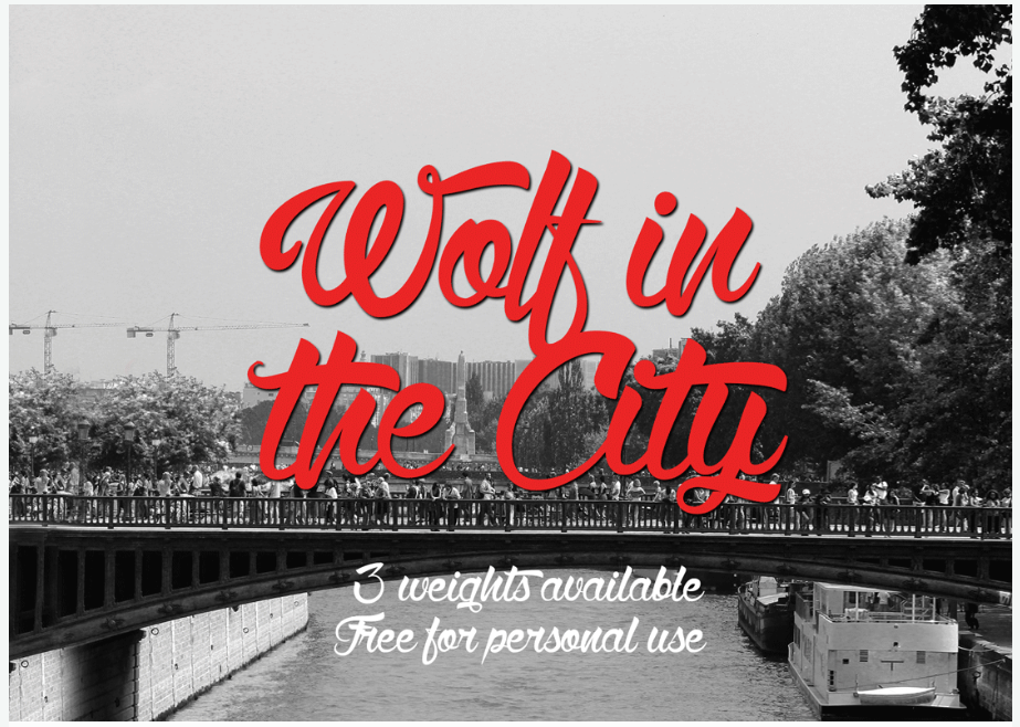
1. Wolf in the City

typography fonts

Wolf in the City is a classic, elegant handwritten font with amazing details, and 3 weights available.

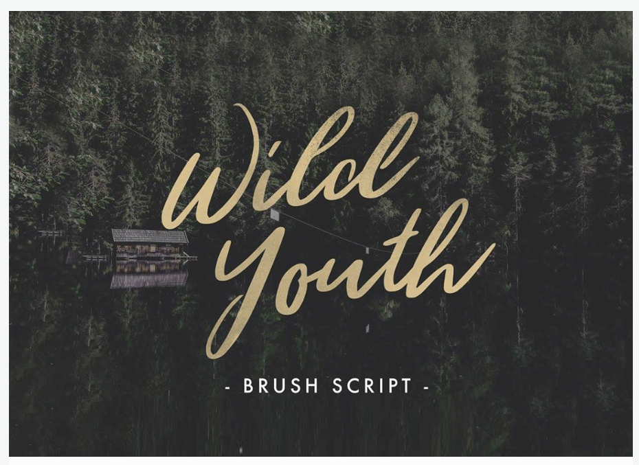
2. WILD YOUTH

typography fonts

Wild Youth is a gorgeous brush script that will give your designs a natural look.

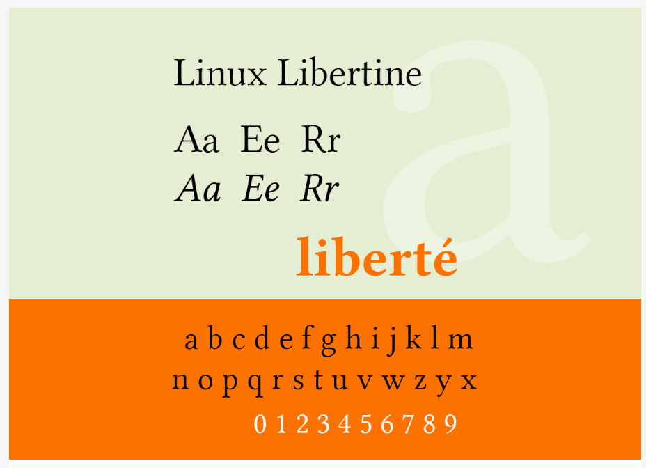
3. Linux Libertine

typography fonts

Linux is for fonts what Zeus is for Greek mythology. This typography font can easily be introduced to many projects, and will always be an important font found in books, dictionaries, and magazines.

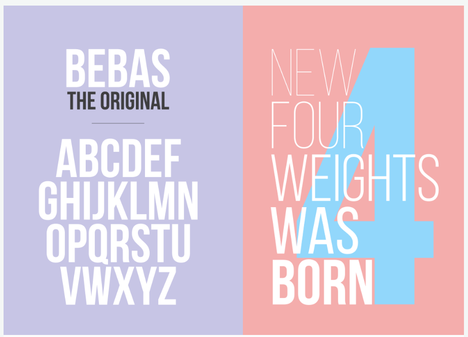
4. Bebas Neue

typography fonts

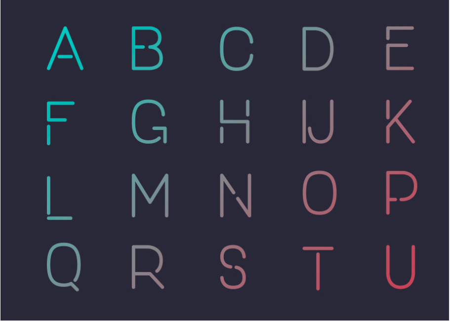
Bebas Neue Sans Serif font inspires a versatility without limits.

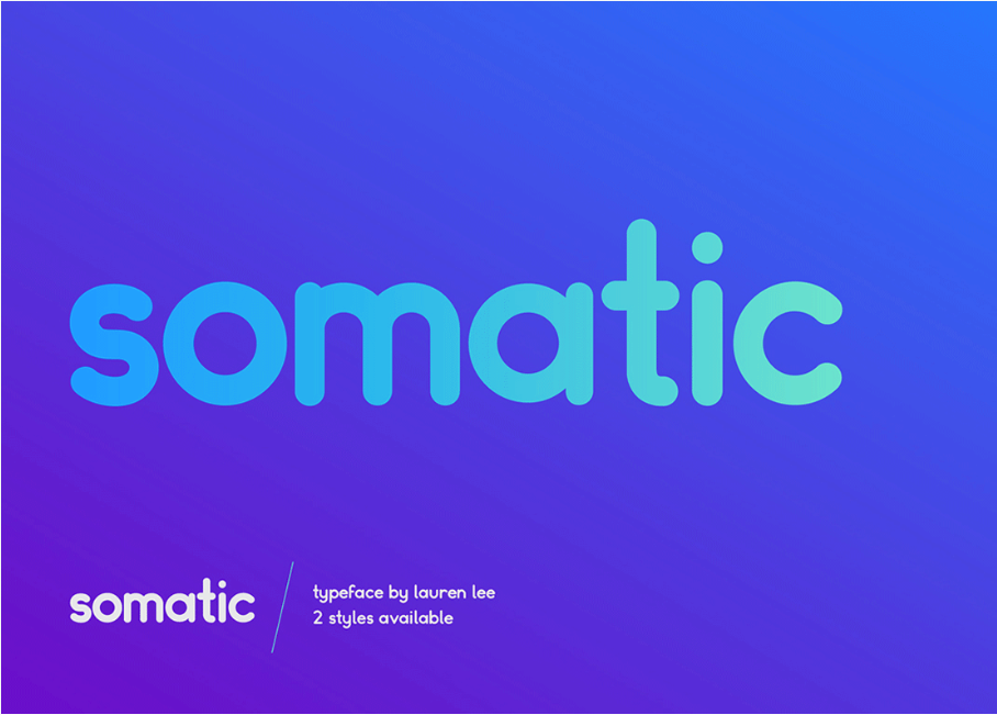
5. Somatic Rounded

typography fonts

Risking to be a little bit predictable, this font looks like the best font for any mobile app.

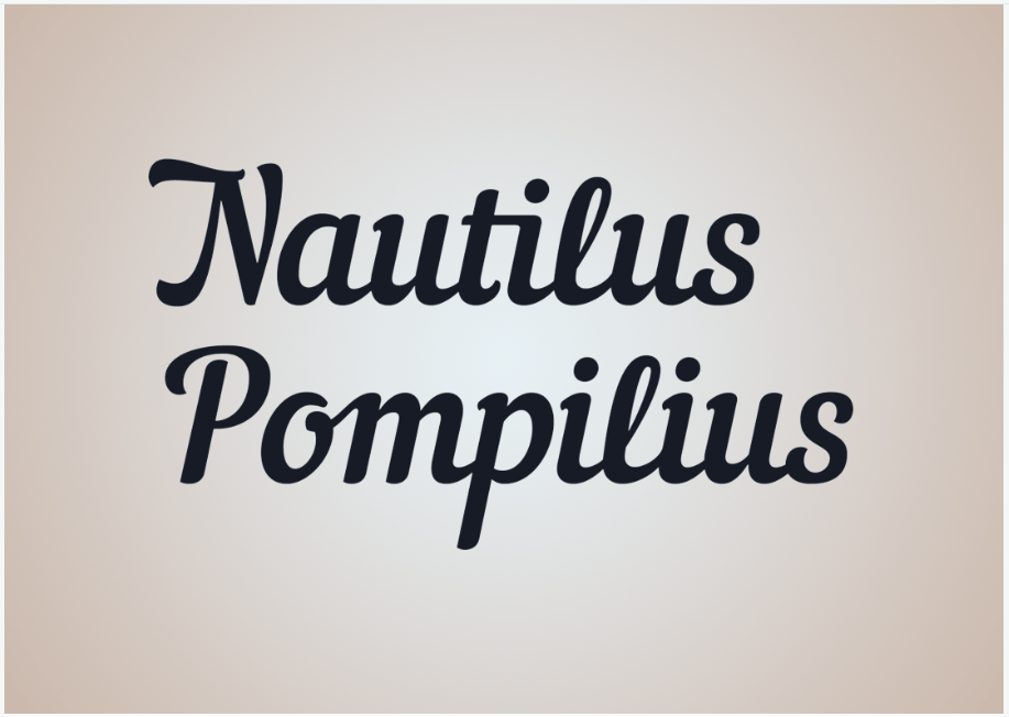
6. Nautilus Pompilius

typography fonts

Nautilus Pompilius is a perfect script font that excels in symmetry and precision.

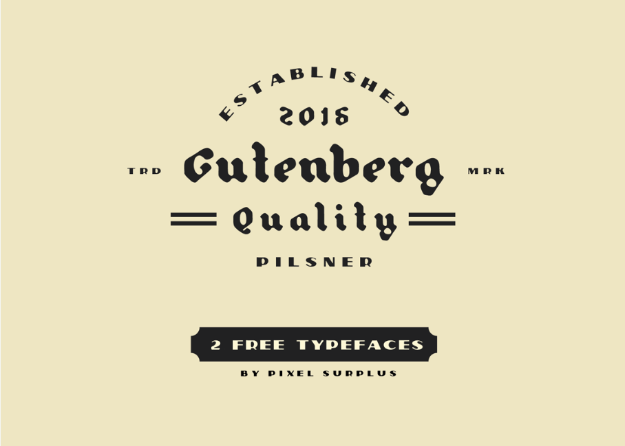
7. PILSNER & GUTENBERG

typography fonts

Yes, Gutenberg does have the smell of an old newspaper and will give your projects the needed old-school look.

8. Tracks Type

typography fonts

And if I said that Gutenberg smells like old newspapers, Tracks Type screams urban, modern font.

9. Campton Typefamily

typography fonts

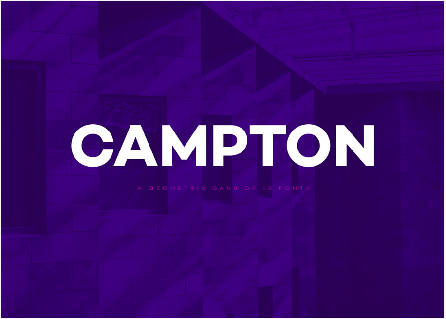
This geometric sans that features perfect circles has a futuristic touch, one that will not go outdated any time soon.

10. Gandhi Sans

typography fonts

We need creative typography fonts like Gandi Sans when the meaning of the text is more important than the looks of a text. Use this font for meaningful projects.

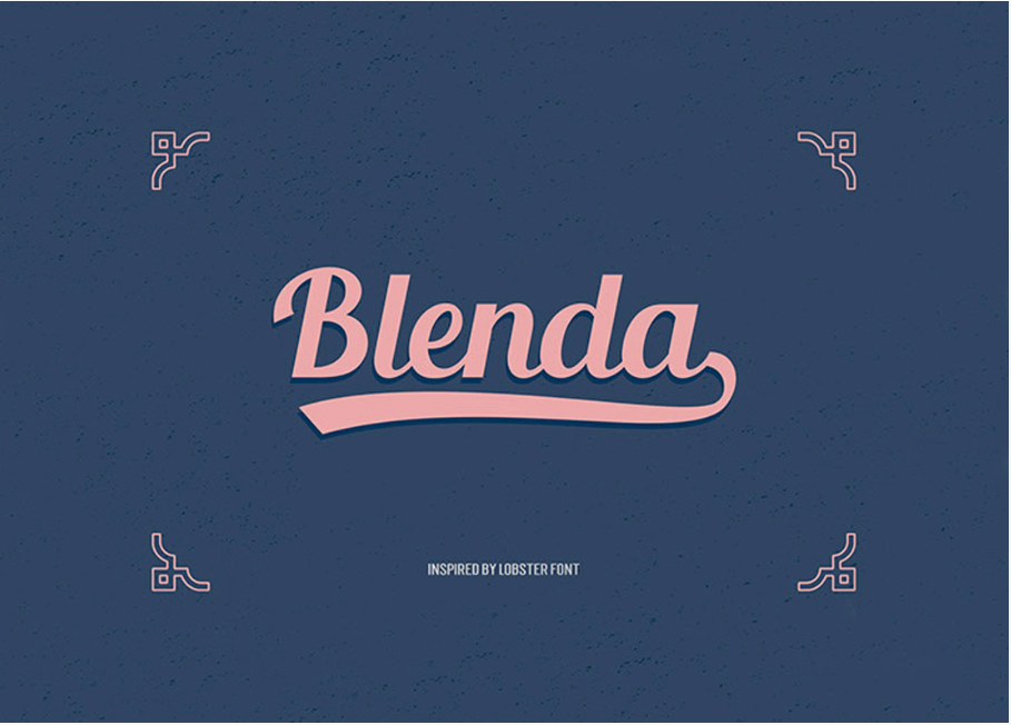
11. Blenda Script

typography fonts

Blenda is a classic font that will always look perfect on packaging designs.

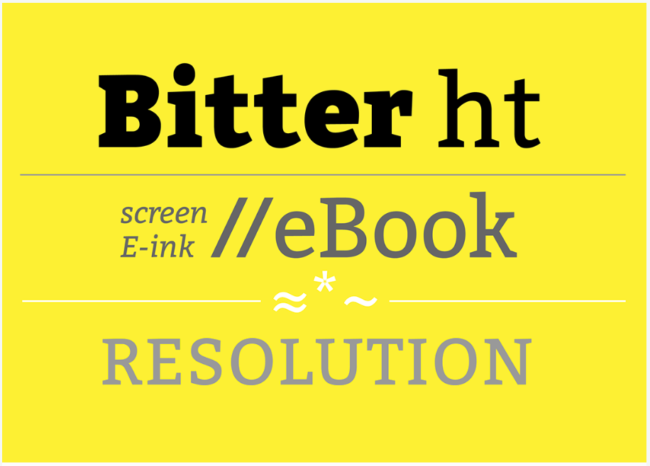
12. Bitter Ht

typography fonts

Serif fonts add wight to a font, making it stand out in the crowd. The same thing applied regarding this bold font.

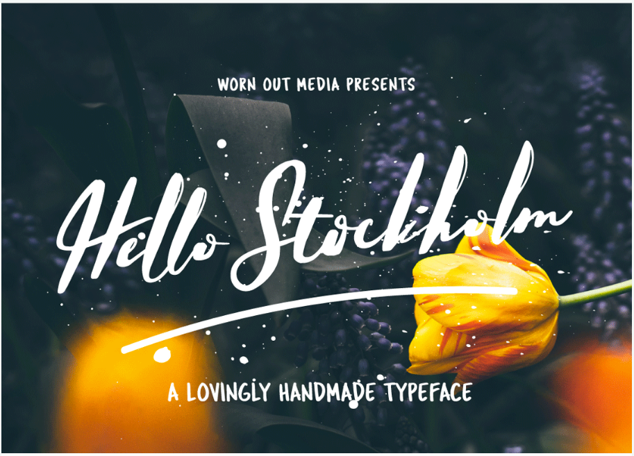
13. Hello Stockholm

typography fonts

Hello Stockholm makes me nostalgic. This is the perfect example of how fonts carry a certain message and a certain feeling with them. You can enhance the meaning of a text by using an expressive font,

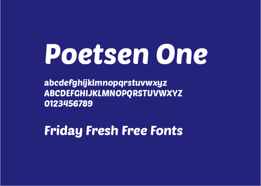
14. Poetesen One

typography fonts

Poesten One makes a great font for company logos and branding.

15. Free Font – New Day

typography fonts

New Day talks about a project that needs a futuristic touch.

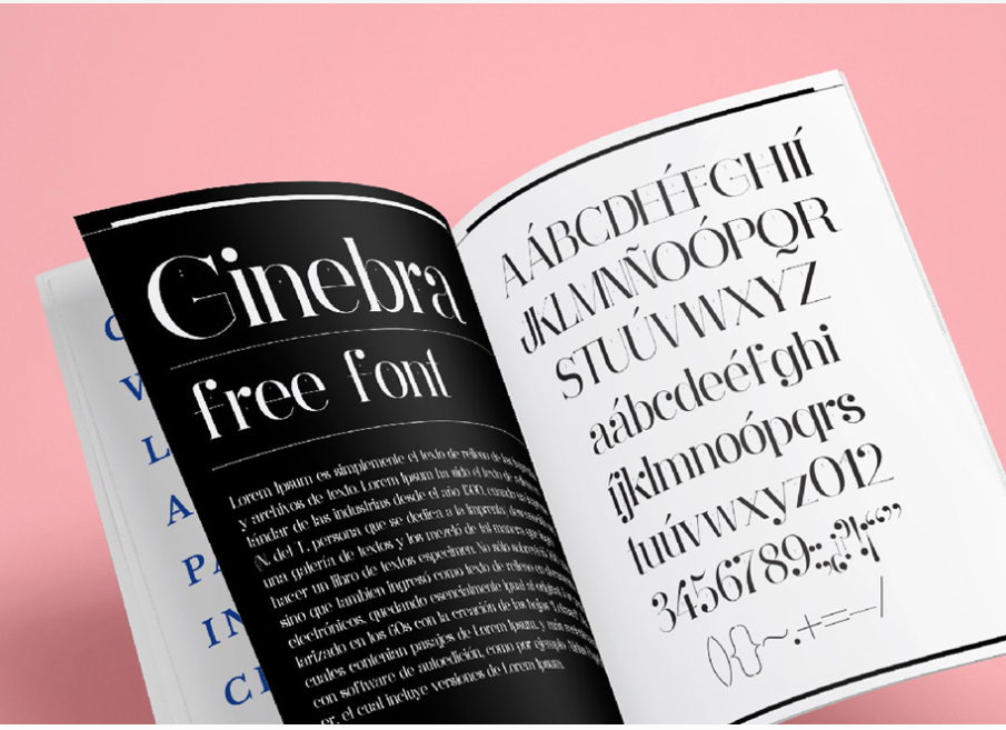
16. Ginebra free font

typography fonts

Ginebra, as shown in the presentation image, is an amazing font suited for magazines.

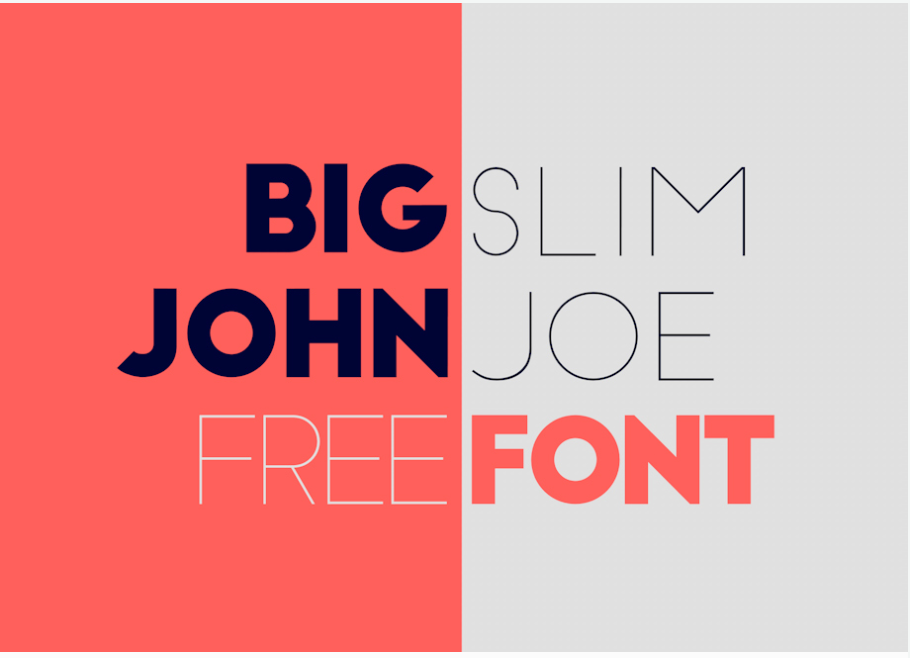
17. Big John – Free Font

typography fonts

Both BIG JOHN and SLIM JOE want to be displayed on the billboards. Want to fulfill their wishes?

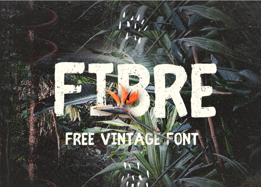
18. Fibre Free Vintage Font

typography fonts

This free vintage font features a great chuck texture, great for posters, book titles, and packaging.

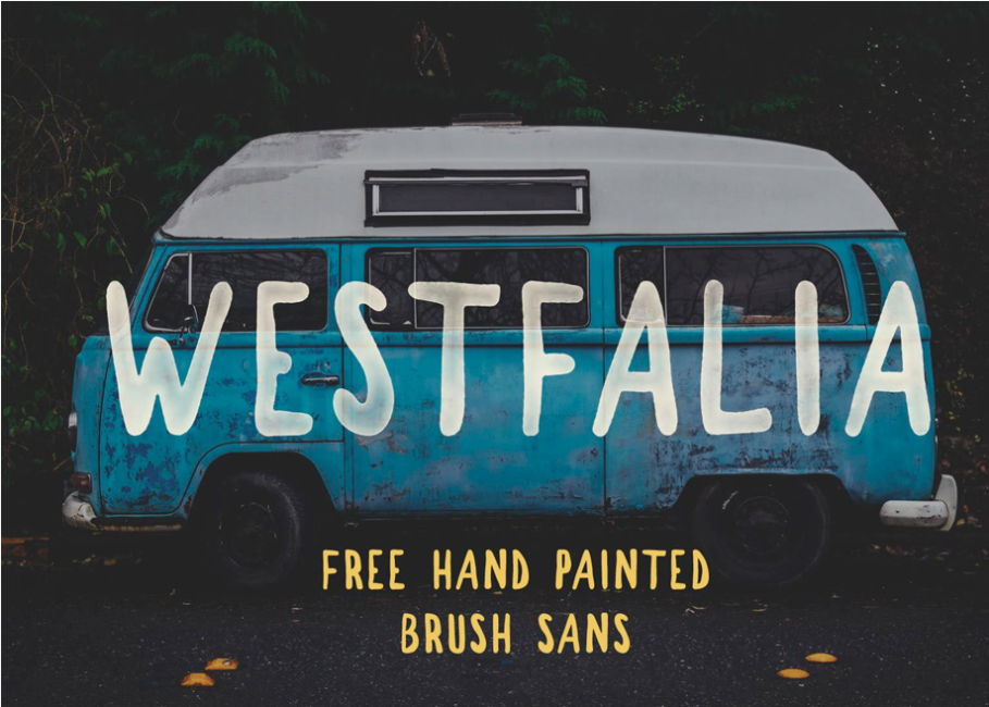
19. Westfalia Free Font

typography fonts

You’ve probably seen this brush sans before because designers fell in love with it from the first sight. Did you?

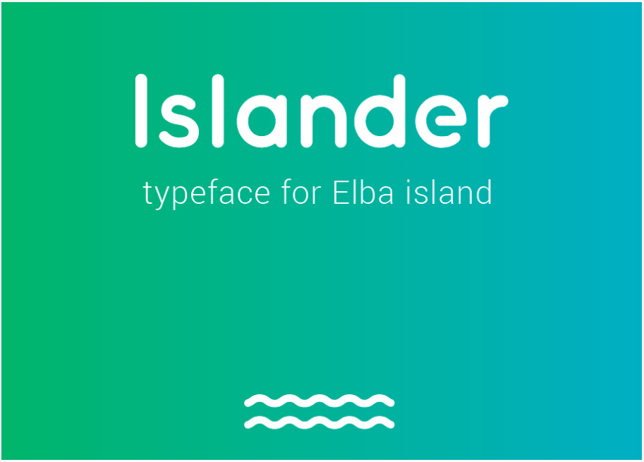
20. Islander free font

typography fonts

Islander, just like Somatic Rounded, looks like the perfect font for a mobile app.

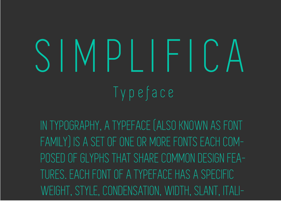
21. Simplifica – Free Font

typography fonts

Simplifica is not as simple as its name suggests. It actually comes with many alternatives to the font which will make it very difficult to choose the right one for your project.

22. Bohem Free Font

typography fonts

Bohem vintage font is the perfect font for all vintage product packaging and branding.

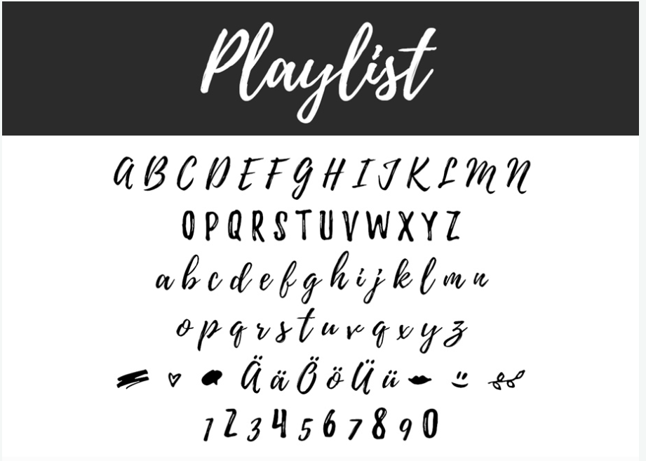
23. Playlist Free Font

typography fonts

Playlist has a natural feel to it, the right amount of naturalness for a cursive font.

24. Cast Iron

typography fonts

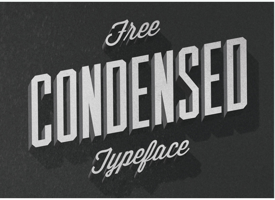
Cast Iron features elements of a unique 3D typeface which will make your text pop.

25. Noway Free Font

typography fonts

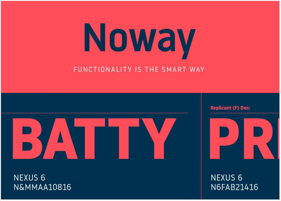
“Functionality is the smart way,” says the motto of this strong, bold font. No further description needed.

26. Elisabeth Font

typography fonts

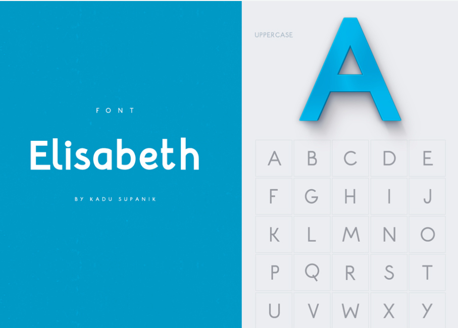
Elisabeth is simple but modern, easy to incorporate into various projects.

27. Wavehaus Sans Typeface

typography fonts

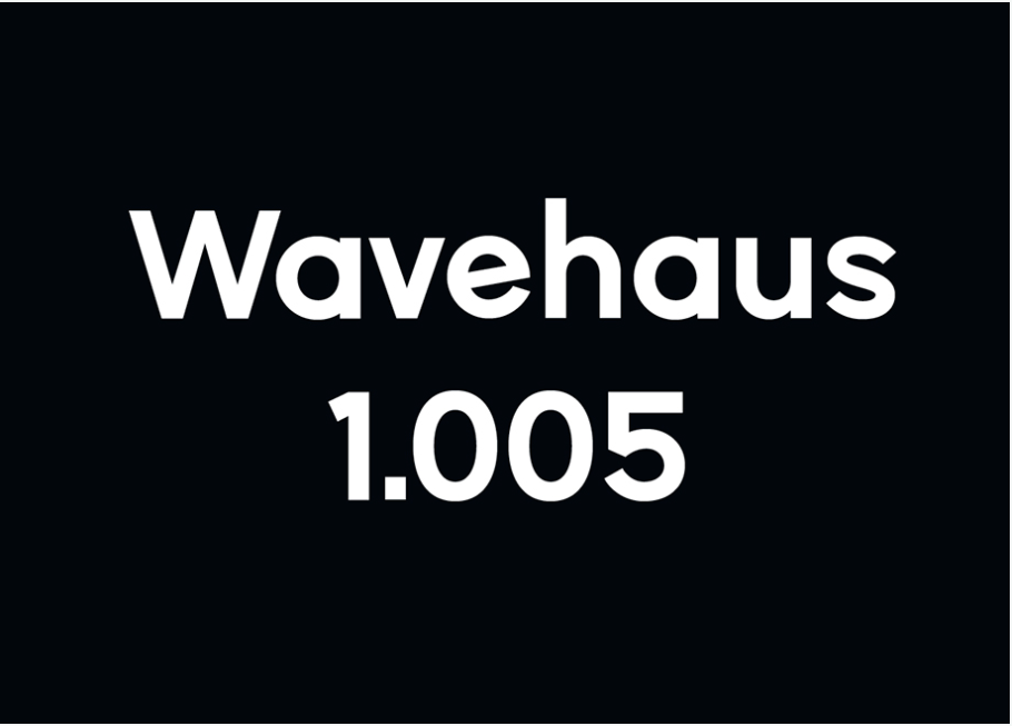
Details make the difference. Did you not see the details of this font? Look again!

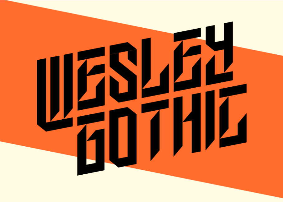
28. Wesley Gothic

typography fonts

If Wesley Gothic is indeed a gothic font, then it must be a modernized one. Use this unique font with care, as it might not do the magic to all your projects due to its complex particularities.

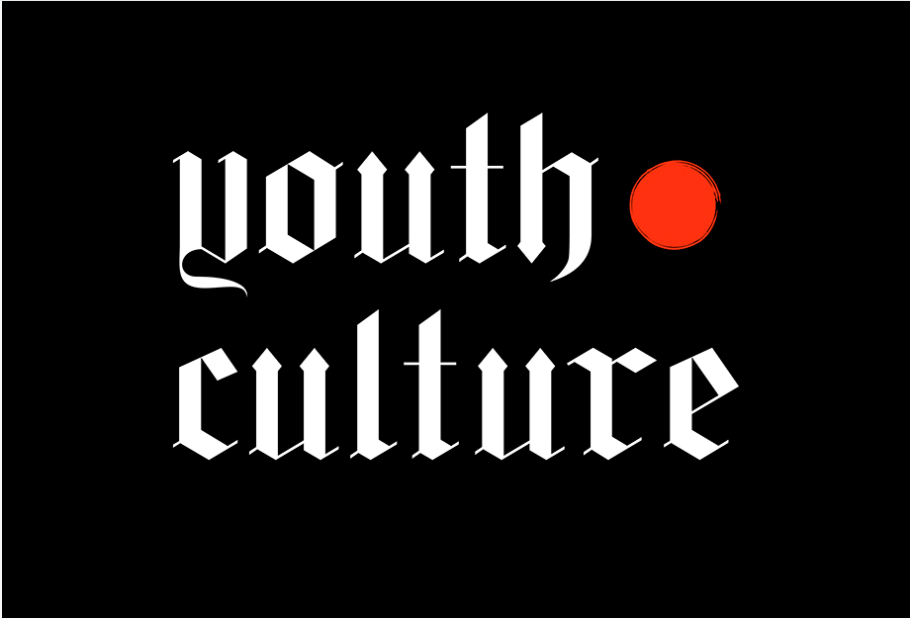
29. Youth Culture

typography fonts

Youth Culture reminds me of tattoo fonts. This says a lot about the personality of this amazing font.

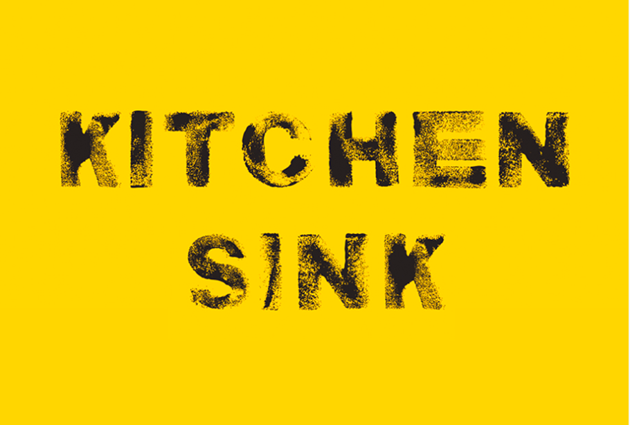
30. Kitchen Sink

typography fonts

This wall texture marks an innovation in the history of textured fonts. Hard to miss in this sea of fonts online.

31. HK NOVA

typography fonts

HK NOVA’s bold font deserves to be placed on the cover of magazines and books of science.

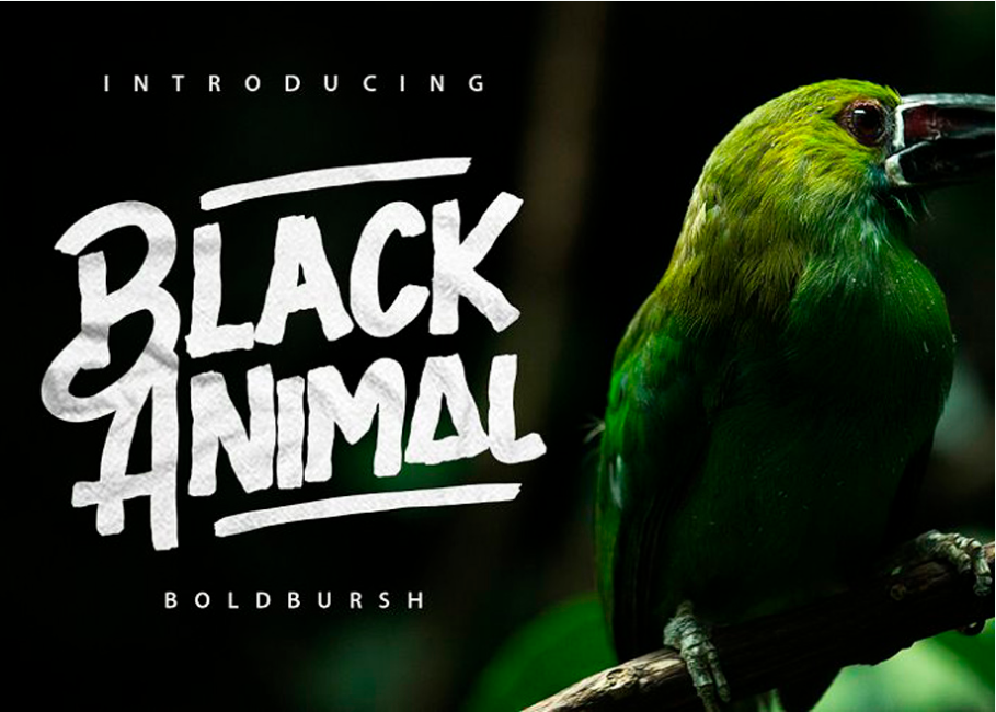
32. Black Animal

typography fonts

This bold brush looks rather like a bold marker that highlights an important message.

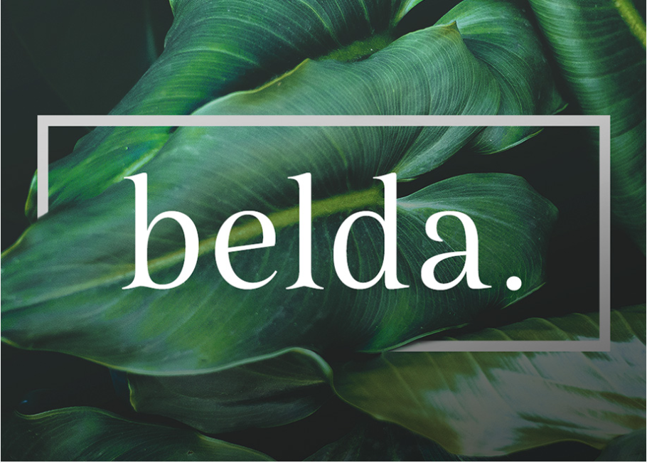
33. Belda Regular

typography fonts

Belda is such an elegant and delicate font, exactly the looks this font will offer your designs.

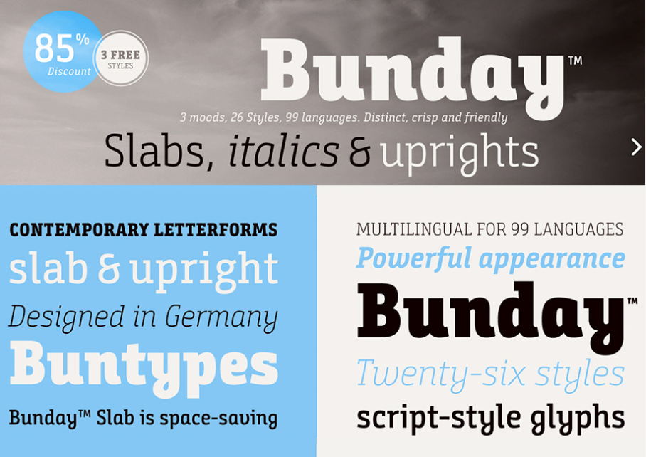
34. Bunday Slab Bold , Light & Italic

typography fonts

Bunday comes with a package of contemporary moods and styles in almost 100 languages/

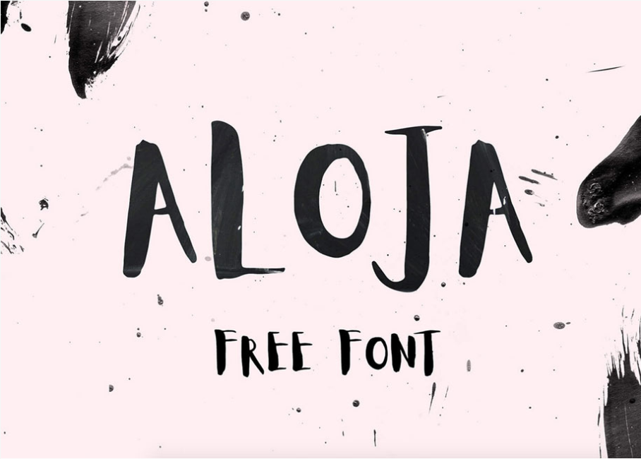
35. Aloja handwriting font

typography fonts

Aloja is such a joyful font, perfect for party posters, wedding invitations with a twist, and any other project you think it would work with.

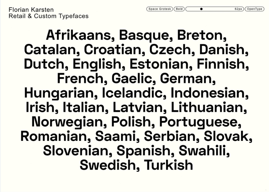
36. Space Grotesk

typography fonts

At first glance, Space Grotesk looks like any classic font, but when studied a little bit more, you notice those little details that will intrigue any reader.

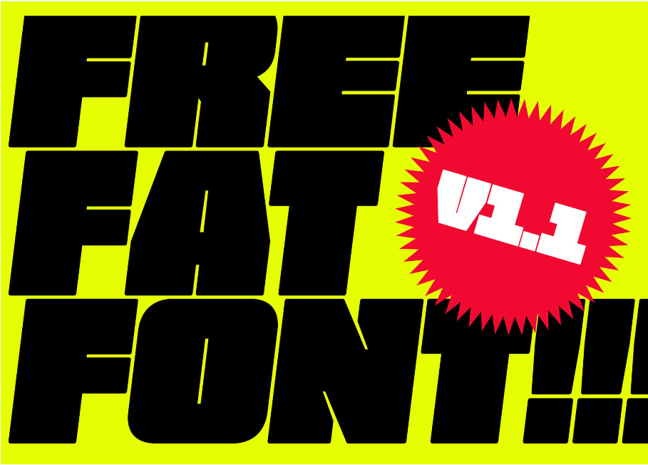
37. Fat Font

typography fonts

Fat fonts have one purpose only: to be the center of attention. And oh, do they do it with ease.

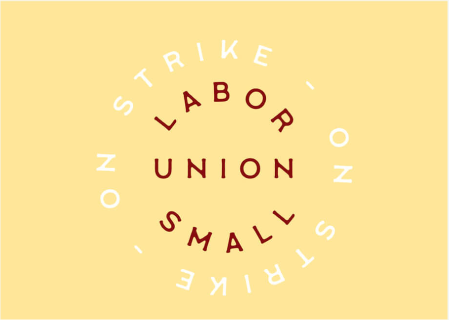
38. Labour Union

typography fonts

The Labor Union calls out for all the farmers to gather at the market.

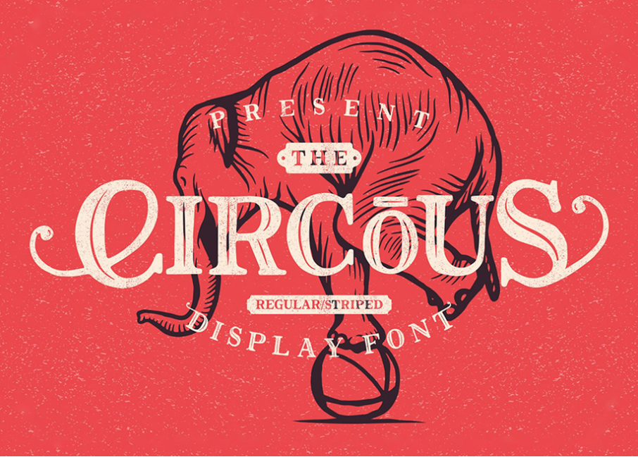
39. Circus Display Font

typography fonts
The Circous explains itself and it does it right. It’s a font so full of personality!

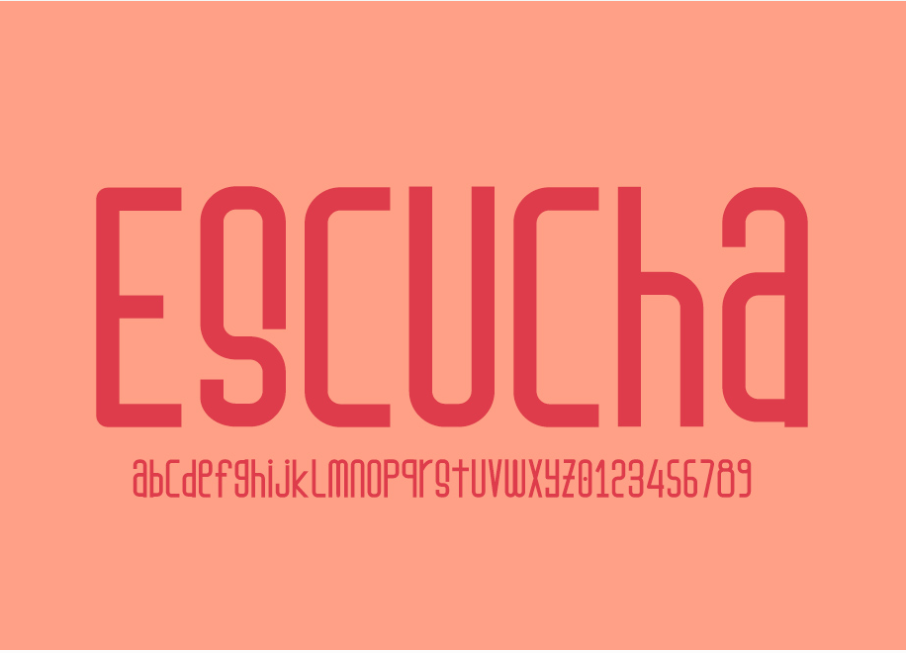
40. Escucha (+ Consuela font duo)

typography fonts

Last, but not least, Escucha is the modern font that every designer needs in their tool kit yesterday.

Did I mention that all these fonts are free? Hurry to download them as soon as possible. Until later,

WDL

Read More at 40 of the Best Free Typography Fonts Choosen by Designers

Categories: Designing, Others Tags:

Weekly Platform News: Favicon Guidelines, Accessibility Testing, Web Almanac

May 31st, 2019 No comments

Šime posts regular content for web developers on webplatform.news.

Google posts guidelines for defining favicons

Jamie Leach: Google Search now displays favicons in search results on mobile. Your favicon should be a multiple of 48×48 (Google will re-scale it to 16×16 for use in search results). If a website doesn’t have a favicon or Google deems the favicon inappropriate, a generic globe icon will be displayed instead.

Your favicon should be a visual representation of your website’s brand, in order to help users quickly identify your site when they scan through search results.

Top websites are surprisingly inconsistent in the way they declare icons (via elements in the page’s head). Twitter and Pinterest, two relatively modern progressive web apps, provide icons in two sizes.

<!-- example -->
<link rel="icon" href="/icon-32x32.png">
<link rel="apple-touch-icon" href="/icon-192x192.png">

The Paciello Group releases ARC Toolkit

In honor of Global Accessibility Awareness Day, TPG is releasing our professional-level accessibility testing tool to the public. Learn all about it at https://t.co/ol33pizq2v and download it from the Google Chrome store today. #GAAD

— The Paciello Group (@paciellogroup) May 16, 2019

The Paciello Group: ARC Toolkit, our professional-level accessibility testing tool, is now available as a Chrome DevTools extension. This tool detects issues related to the WCAG 2.1 guidelines. You can run the test on the entire page or just the node selected in the DevTools Elements panel.

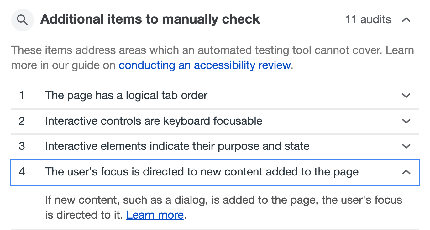
Remember, automated accessibility tools are only able to find some accessibility issues, and manual testing is necessary to ensure full accessibility. Lighthouse (via the Audits panel) suggests manual checks after performing an accessibility audit.

Other news

  • Jeff Jaffe: W3C and WHATWG have reached an agreement to collaborate on the development of HTML. “W3C shall encourage the community … to contribute directly to the WHATWG HTML and DOM repositories; raising issues, proposing solutions, commenting on proposed solutions, and indicating support or otherwise for proposals.”
  • Paul Calvano: “There is a significant gap in the first- vs. third-party resource age of CSS and web fonts. 95% of first-party fonts are older than one week compared to 50% of third-party fonts … This makes a strong case for self-hosting web fonts!”
  • Rachel Andrew: The CSS subgrid value is a relatively straightforward addition to grid layout. For example, if you have nested grids, and you apply grid-template-rows: subgrid to the child grid, then this grid will use the row tracks of the parent grid instead of creating its own row tracks. That’s all there is to it. (This feature is currently only supported in Firefox Nightly.)
  • GitHub Blog: GitHub can now generate automated security fixes for your dependencies with known security vulnerabilities. On GitHub’s website, check your repository’s Security tab for security alerts. If you open an alert and press the “Create automated security fix” button, GitHub will create an automated pull request that fixes the security vulnerability.
  • Rick Viscomi: HTTP Archive plans to release the first annual Web Almanac in November, a report of the state of the web with interesting insights written by different experts. About 50 volunteers from the web community are currently working on it, and they are looking for more contributors.

The post Weekly Platform News: Favicon Guidelines, Accessibility Testing, Web Almanac appeared first on CSS-Tricks.

Categories: Designing, Others Tags:

Reducing motion with the picture element

May 31st, 2019 No comments

Here’s a bonafide CSS/HTML trick from Brad Frost and Dave Rupert where they use the element to switch out a GIF file with an image if the user has reduced motion enabled. This is how Brad goes about implementing that:

<picture>
  <!-- This image will be loaded if the media query is true  -->
  <source srcset="no-motion.jpg" media="(prefers-reduced-motion: reduce)"></source>

  <!--  Otherwise, load this gif -->
  <img srcset="animated.gif alt="brick wall"/>
</picture>

How nifty is this? It makes me wonder if there are other ways this image-switching technique can be used besides accessibility and responsive images…

Also it’s worth noting that Eric Bailey wrote about the reduced motion media query a while back where he digs into its history and various approaches to use it.

Direct Link to ArticlePermalink

The post Reducing motion with the picture element appeared first on CSS-Tricks.

Categories: Designing, Others Tags:

Inspiring Wallpapers For A Colorful June (2019 Edition)

May 31st, 2019 No comments
Summer Is Coming

Inspiring Wallpapers For A Colorful June (2019 Edition)

Inspiring Wallpapers For A Colorful June (2019 Edition)

Cosima Mielke

2019-05-31T14:43:34+02:002019-05-31T14:03:09+00:00

No matter if June means the beginning of summer for you, that monsoon season is here, or that winter is just around the corner, our new wallpapers are bound to sweeten the beginning of the month with some fresh inspiration.

Created by artists and designers from across the globe, the designs featured in this collection are part of our wallpaper series which has been going on for more than nine years already. Every month, we challenge you, the community, to submit your wallpaper designs to it. It’s an opportunity to let your creative ideas run free and use your favorite tools — without the pressure of meeting project requirements or satisfying stakeholders. It’s only you and your creative process. And, well, we are very thankful to everyone who has taken on this challenge and is still continuing to do so to cater for diverse and unique results each time anew.

To accompany you through the new month — and beyond — the wallpapers all come in versions with and without a calendar for June 2019 and can be downloaded for free. For some extra variety, you’ll also find a selection of favorites from past years’ editions at the end of this post. Enjoy!

Please note that:

  • All images can be clicked on and lead to the preview of the wallpaper,
  • You can feature your work in our magazine, too. So if you have an idea for a July wallpaper design, please don’t hesitate to submit it. We’d love to see what you’ll come up with.

Further Reading on SmashingMag:

Summer Is Coming

“Imagine a sunny beach and an endless blue sea. Imagine yourself right there. Is it somewhere in Greece? The Mediterranean? North Africa? Now turn around and start wandering through those picturesque, narrow streets. See all those authentic white houses with blue doors and blue windows? Feel the fragrance of fresh flowers? Stop for a second. Take a deep breath. Seize the moment. Breathe in. Breathe out. Now slowly open your eyes. Not quite there yet? Don’t worry. You will be soon! Summer is coming…” — Designed by PopArt Studio from Serbia.

Melting Away

Designed by Ricardo Gimenes from Sweden.

It’s Bauhaus Year

“This year is Bauhaus year – therefore I created a screenprint of one of the most famous buildings from the Bauhaus architect Mies van der Rohe for you. So, enjoy the Barcelona Pavillon for your June wallpaper.” — Designed by Anne Korfmacher from Germany.

It's Bauhaus Year

Sunset With Crabs

“In the sunset the crabs come to the surface. That little boat can’t sail, but after seeing the crabs it gets power and finally… it sails!” — Designed by Veronica Valenzuela from Spain.

Sunset With Crabs

Monsoon Season

“Rain is the art of nature, and umbrella the art of man. Walking with your umbrella on a rainy day, you connect these arts!” — Designed by Themehigh from Calicut.

Monsoon Season

Take Your First Step In Spirituality

“Yoga is a way of finding your true self. This International Yoga Day, take a path of a spiritual journey and see where it leads you in your life.” — Designed by Kiran Shirke from India.

Take Your First Step In Spirituality

Oldies But Goodies

So many beautiful, unique, and inspiring wallpapers have come to life as a part of our monthly challenge in the past nine years. Here are some June favorites from past editions. Please note that these wallpapers don’t come with a calendar.

Deep Dive

“Summer rains, sunny days and a whole month to enjoy. Dive deep inside your passions and let them guide you.” — Designed by Ana Masnikosa from Belgrade, Serbia.

Deep Dive

Pineapple Summer Pop

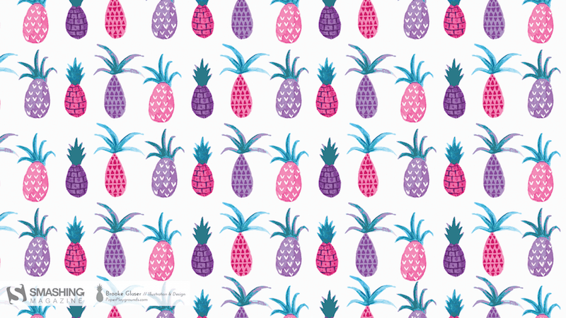
“I love creating fun and feminine illustrations and designs. I was inspired by juicy tropical pineapples to celebrate the start of summer.” — Designed by Brooke Glaser from Honolulu, Hawaii.

Pineapple Summer Pop

Travel Time

“June is our favorite time of the year because the keenly anticipated sunny weather inspires us to travel. Stuck at the airport, waiting for our flight but still excited about wayfaring, we often start dreaming about the new places we are going to visit. Where will you travel to this summer? Wherever you go, we wish you a pleasant journey!” — Designed by PopArt Studio from Serbia.

Travel Time

Summer Surf

“Summer vibes…” — Designed by Antun Hirsman from Croatia.

Summer Surf

Shine Your Light

“Shine your light, Before the fight, Just like the sun, Cause we don’t have to run.” — Designed by Anh Nguyet Tran from Vietnam.

Shine Your Light

Tropical Vibes

“With summer just around the corner, I’m already feeling the tropical vibes.” — Designed by Melissa Bogemans from Belgium.

Tropical Vibes

Window Of Opportunity

“‘Look deep into nature and then you will understand everything better,’ A.E.” — Designed by Antun Hiršman from Croatia.

Window Of Opportunity

Start Your Day

Designed by Elise Vanoorbeek from Belgium.

Start Your Day

Doughnuts Galore

“Friday, June 6th is National Doughnut Day. Designer Dorothy Timmer found inspiration in the sweet treats and brought the obscure holiday into the spotlight. Doughnuts are delicious. That is all.” — Designed by Clarity Creative Group from Orlando, FL.

Doughnuts Galore

Nine Lives!

“I grew up with cats around (and drawing them all the time). They are so funny… one moment they are being funny, the next they are reserved. If you have place in your life for a pet, adopt one today!” — Designed by Karen Frolo from the United States.

Nine Lives!

Getting Better Everyday

“The eternal forward motion to get better and excel.” — Designed by Zachary Johnson-Medland from the United States.

Getting Better Everyday

Expand Your Horizons

“It’s summer! Go out, explore, expand your horizons!” — Designed by Dorvan Davoudi from Canada.

Expand Your Horizons

Handmade Pony Gone Wild

“This piece was inspired by the My Little Pony cartoon series. Because those ponies irritated me so much as a kid, I always wanted to create a bad ass pony.” — Designed by Zaheed Manuel from South Africa.

Hand made pony gone wild

The Kids Looking Outside

“These are my cats looking out of the window. Because it is Children’s Day in June in a lot of countries I chose to make a wallpaper with this photo of my cats. The cats are like kids, they always want to play and love to be outside! Also, most kids love cats!” — Designed by Kevin van Geloven from The Netherlands.

The Kids Looking Outside

Good Design Is A Tough Knitted Job

“I came across this awesome tutorial on Tuts+, about creating a card with knitted effect, so I took it up a notch and said, hey, why can’t I make a couple wallpapers using what I’ve learnt… So here we are.” — Designed by Brian Jangima from Kenya.

Good Design is a Tough Knitted Job

Viking Meat War

Designed by Ricardo Gimenes from Sweden.

Viking Meat War

Sunset In Jamaica

“Photo from a recent trip to Jamaica edited to give a retro look and feel.” — Designed by Tommy Digiovanni from the USA.

Sunset In Jamaica — Preview

Gipsy Spirit

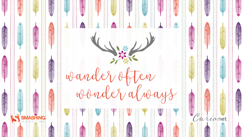
“Soft spring colors and boho feathers.” — Designed by Denise Johnson from Chicago.

Gipsy Spirit
  • preview
  • without calendar: 1024×768, 1280×800, 1280×1024, 1440×900, 1600×1200, 1920×1200
  • Hello Winter!

    Designed by Tazi Design from Australia.

    Hello Winter!

    Join In Next Month!

    Please note that we respect and carefully consider the ideas and motivation behind each and every artist’s work. This is why we give all artists the full freedom to explore their creativity and express emotions and experience throughout their works. This is also why the themes of the wallpapers weren’t anyhow influenced by us but rather designed from scratch by the artists themselves.

    Thank you to all designers for their participation. Join in next month!

    Categories: Others Tags:

    Top 10 Color Pickers for 2019

    May 31st, 2019 No comments

    Saving color palettes you find online or as you’re working on a design is not always an easy process. You could use the browser’s Inspect tool to grab the hex code or grab a screenshot and use Photoshop later on to pull the colors from it.

    Or you could simplify the process and grab a dedicated color picker tool that will allow you to grab color from any website, on desktop or on mobile without having to leave your browser window. Here are 10 best color pickers that will make it easy to save color palettes.

    1. Instant Eyedropper

    Instant Eyedropper is a free Windows-only tool that makes it easy to grab a color from anywhere on your screen. Once you install this lightweight app, it will sit in your system tray. All you have to do is click its icon and choose a color, then the app will copy the code to your clipboard. The app supports the following color code formats: HTML, HEX, Delphi Hex, Visual Basic Hex, RGB, HSB, and Long.

    2. ColorPic

    ColorPic is another lightweight Windows color picker tool that works with all major versions of Windows. It’s not a free program although it offers a free trial. It was designed to work specifically with high resolution screens and supports HEX, RGB, and CMYK color formats. You can save up to 16 colors in the palettes, and use 4 advanced color mixers to adjust the colors.

    3. Eye Dropper

    Eye Dropper is a browser extension that works on Google Chrome and any other Chromium-based browser. The extension allows you to quickly and easily grab a color from anywhere in your browser and displays it in HEX or RGB format. You can save colors to history and they are automatically copied to your clipboard when you pick a color. The extension is free to use.

    4. ColorPick Eyedropper

    ColorPick Eyedropper is the second-most popular browser extension that works in Chrome and Chromium-based browsers. What sets it apart from the Eye Dropper extension above is the ability to zoom in on any area of the browser window to help you focus in on the exact color you want. The app is free for personal use and it also has its own desktop app if you want a tool that works outside your browser window.

    5. ColorZilla

    ColorZilla is a Firefox extension that allows you to grab any color from any page that’s open in your Firefox browser window. This extension has a built-in palette that allows you to quickly choose a color and save the most used colors in a custom palette. You can also easily create CSS gradients. The extension is free and supports HEX and RGB color formats. It can also be used with a Chrome browser.

    6. Rainbow Color Tools

    Rainbow Color Tools is another free Firefox extension that makes color picking easy. The extension lets you easily pick a color and it also includes a website analyzer that extracts the color scheme from the current website’s images and CSS. It supports RGB and HSV color formats and allows you to save the colors into your own personal library that lets you tag images based on websites you picked colors from or your own tags.

    7. ColorSnapper 2

    The ColorSnapper 2 is a color picker for Mac users that helps them find a color anywhere on their screen. The app is invoked by clicking the menu icon or through a global shortcut and it has a unique high-precision mode for better accuracy. You can choose between 10 different color formats and control the app with gestures and keyboard shortcuts. The app is available in the app store and comes with a 14-day free trial.

    8. Just Color Picker

    Just Color Picker is a multi-platform utility for choosing colors. This tool allows you to pick colors, save them, edit them, and combine them into color palettes ready for use in other applications. It supports a wide range of color formats and includes a zoom tool for better accuracy, the ability to edit Photoshop and Gimp color swatches, and it can even calculate distance between two pixels.

    9. iDropper

    iDropper is a color picker for iOS devices. It’s compatible with iPhones and iPads so if you do design work on your iPad, you’ll easily be able to grab colors, save them, and use them in any application. You can save colors to your favorites and supports RGB, HEX, HSV, and CMYK format. The app is free to download and use.

    10. Pixolor

    If you belong to team Android, then be sure to check out the Pixolor app. When you enable the app, it shows a floating circle over other apps along with the color information beneath it. To copy the color code, all you have to do is click the Share button or tap outside the circle overlay. The app supports RGB and HEX color formats.

    Featured image via DepositPhotos.

    Add Realistic Chalk and Sketch Lettering Effects with Sketch’it – only $5!

    Source

    Categories: Designing, Others Tags:

    10 Best Animated Video Production Companies That Businesses Should Indulge In

    May 31st, 2019 No comments

    Animated Videos are a remarkable resource to better present a complex topic of your business and industry in the most appealing, compelling and absorbent manner.

    Approaching the correct animated video production company is highly mandatory in order to have your content composed and presented to the market as a standout. Then again how to identify which of these companies to opt for as there are a variety of animation production companies that facilitate according to the numerous requirements of businesses such as Budget, Company Size, and even the Video Style.

    This is why this post is created to list some of the top and most popular animated video production companies that are found amongst businesses preference. This post would be of great assistance and of uttermost importance as a reference guide to help know and vet the top trending video production companies. That are strongly residing because of their better features and are primarily gaining more acclamation in the market as well. Added up by all to the same reasons mentioned above.

    Here are the 10 best Animated Video Production Companies that businesses would benefit by indulging with them:

    1- Video Animation Inc

    2- Animation Monster

    Animation Monster has gained much popularity as a successful animation company because it has been able to maintain its market competitiveness as they have strategically been introducing very attractive special discounts and offers. They have a well-established team of competent ambitious and hardworking designers. That is the reason Animation Monster has been able to achieve potential demand in the market of the UK because of the quality they provide. Due to their diverse and newer tech collaboration, they have an unparalleled name in the industry of animation. Animation Monster has served over 1100 clients while producing approximately 5000 videos since the company has been formed. They also have a large operation as they provide services to over 100 countries.

    3- Animation Sharks

    Animation Sharks is well recognized to deliver exclusive animated video production services that will be aided to better empower the brands. The company has been an asset to numerous businesses enabling them to increase their prospective with state of the art 2D Character Animation, Live Action, Animated Screen Cast and much more services that perfectly would be able to add up to the need of the business. Animation shark has an effective and suitable procedure for their clients to tail from the initiating steps of Creative Brief, to the Script, Storyboard, and Characters, Voiceover, Animation &SFX till finally the content being published. Animation Shark has been a contributor to uplift many businesses due to their dedicated and diligent animators who provide astounding Whiteboard Board Animation thus opening new horizons to take up.

    4- Animation Wonder

    Animation Wonder has been helping businesses to enhance tremendously well by supplying exceptional services. They provide advanced Motion Graphic Services covering each and every diverse branch in it such as Stop Motion, 2D & 3D Character Animation, and many others. They serve businesses in revamping their branding solutions to an extraordinary level in each video production project they take on. Animation wonder has been a distributor of Typography, Logo Animation, and other services. By best featuring their clients with creative instincts and value since they provide topnotch quality to the satisfaction of entities. As their video production is able to gain advantages to the businesses by providing the results they wanted to accomplish via adapting with these animation and video contents.

    5- Video Cubix

    Video Cubix is a marvelous company to have your business to indulge in since many of the businesses who have taken part with the company were able to heavily lift their sales to nearly the increase of 300%. They have been able to collaborate award-winning animators to their professional team to give the brand far-fetched custom animation services. Video Cubix is one of those animated video production companies that cater to customers across the globe. Their animation studios have given businesses that indulged with them highly creative and inspiring customer explainer videos. Video Cubix has been able to incorporate unconventional skills to create excellent engaging 2D and 3D videos for their clients.

    6- The Animation Studio

    The Animation studio is considered as a top leading video production service provider. As it primarily is most known for its services of YouTube Intro Maker, Cartoon Maker, and even Explainer Videos although it provides a number of other services as well. They are able to improvise greatly in the market due to their substantial adaption of technology, expertise, and science to the composition production given to their clients. The company Animation Studio has gained preference and higher clients because they have been known to provide immense satisfaction to them in terms to the video pricing to the project deliver they are able to keep their clients looped in by taking consents throughout the entire process.

    7- Pro Video Animation

    Pro Video Animation Company has a vast and huge market demand in the UAE. It has been able to contribute significantly for the businesses in Dubai due to its unmatched proficiency to animate and create video productions. While specializing in 2D Explainer Videos, Motion Graphics, and Whiteboard Animation services. Pro Video Animation Company has spectacular service while also having cost-effective plans. Giving out pricing packages to suit according to the various client portfolio or requirements. The company has grown to be a leading animation production entity because of its advanced 3D Modelling with fast turnaround time and animation analysis. Video Animation Company Dubai gives out services with the benefits of unlimited revision and money back guarantee.

    8- 3D Animation Rendering

    3D Animation Rendering is the ultimate powerhouse that provides incredible animated Models. It services are quite demanded in the market and with many advancements to it. 3D Animation Rendering Company is composed to provide services that are Architectural Rendering, Interior Rendering, Exterior Rendering, Walkthrough Rendering, and Product Rendering. With all the services that they offer businesses hugely gain many advantages by availing services from them. Due to their specialized team who gives the uttermost productive results to their clients such as innovative 3D Interactive Modeling, engaging conceptualization, flawless Storyboarding, punctual delivery, and that also with their affordable pricing. They have created animation using best of the class software, interactive models with technical resources and rapid turnaround time.

    9- 3D Animation Inc

    3D Animation Inc. is considered to be much ahead of many traditional 3D animation companies as it has been able to increase its standards by creating lively and enticing 3D animations. They have a well adverse team of excellence in their 3D animation team who are skilled to design all most every concept presented to them by their clients such as Cooperate Professional Videos, 3D Cartoon Maker, 3D Intro Maker/ Animation Maker and etc. They add up to the businesses by profiting them as 3D Animation Inc. is recognized to create absolute pitched perfect animated videos through conceptualization, innovation, and artistry. They have the highest clients from the industry of furniture to assist in product and furniture modeling as the developers can leverage marvelous cutting edge 3D animation studio strategies and techniques.

    10- Route 66 Design Inc

    Route 66 Design Inc. is counted to be one of the most preferred animated video production companies amongst businesses as they have well diverse and potential developers. They contribute in the market by providing services of Website Designing/ Development, Logo Design and Branding, Video Animation and Content Writing to the utmost satisfying of their clients. All done in order to boost the business’s income and produce endless benefiting results. Route 66 Design Inc. of tremendous assistance to several brands by providing digital production contents and also in regards to helping create a stronger digital presence to indulge with the business’s required targeted audience around the globe.

    Categories: Others Tags:

    40 Of the best Free vintage Fonts picked by professional designers

    May 30th, 2019 No comments
    Vintage Fonts

    In the past few articles on Web Design Ledger, we tried to bring into your attention some of the most important categories of fonts:

    modern, classic, and retro. Today we will continue with another important category: Vintage Fonts. Designers say that, in order for a fashion product, be it clothing, font, or a decorative piece, to become “vintage” they need at least 40-years-period from the time they were released. Based on that definition, we could consider anything older than 40 as being vintage, or new products that have the vintage vibe, well, not vintage. So in order to make peace with everybody, the fonts our professional designers have chosen for this article, are exclusively based on their looks, not on the time they were created.

    What particularities do vintage fonts have? you might be wondering. Well, as dictionaries tell us, vintage means “something from the past of high quality, especially something representing the best of its kind.” My question then is: are vintage fonts the best? They may very well be for some. Usually, vintage fonts stand out because of their complex details, exquisite calligraphy, and versatile looks.

    Keeping these details in mind, we’ve put together a list of some of our favorite vintage fonts, both free and premium, so you can stay stocked up.

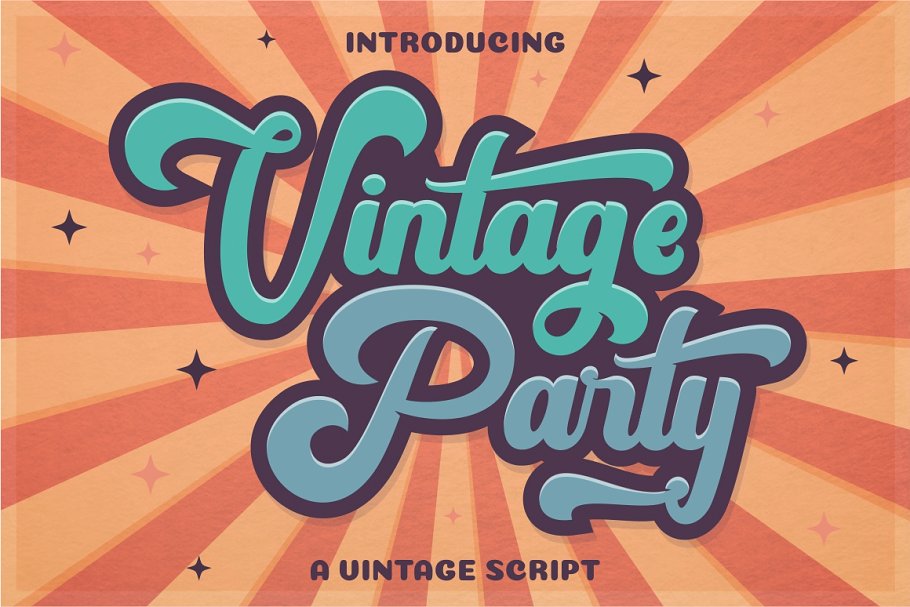
    1. Vintage Party – Bold Retro Script

    Vintage Fonts

    Vintage Party font screams fun. Use this font in any project that is meant to bring people joy.

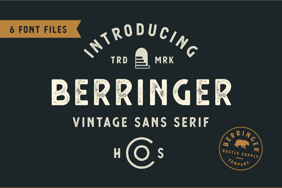
    2. Berringer – Vintage Type Family

    Vintage Fonts

    Berringer is a beautiful vintage font for when a sans serif is a must.

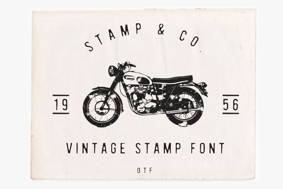
    3. Stamp & Co – Vintage Stamp Font

    Vintage Fonts

    Nothing gives a project the vintage look better than a stamp vintage font.

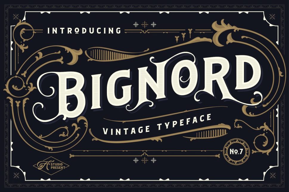
    4. Bignord – Vintage Typeface

    Vintage Fonts

    Bignord is a classic vintage featuring amazing and detailed serifs.

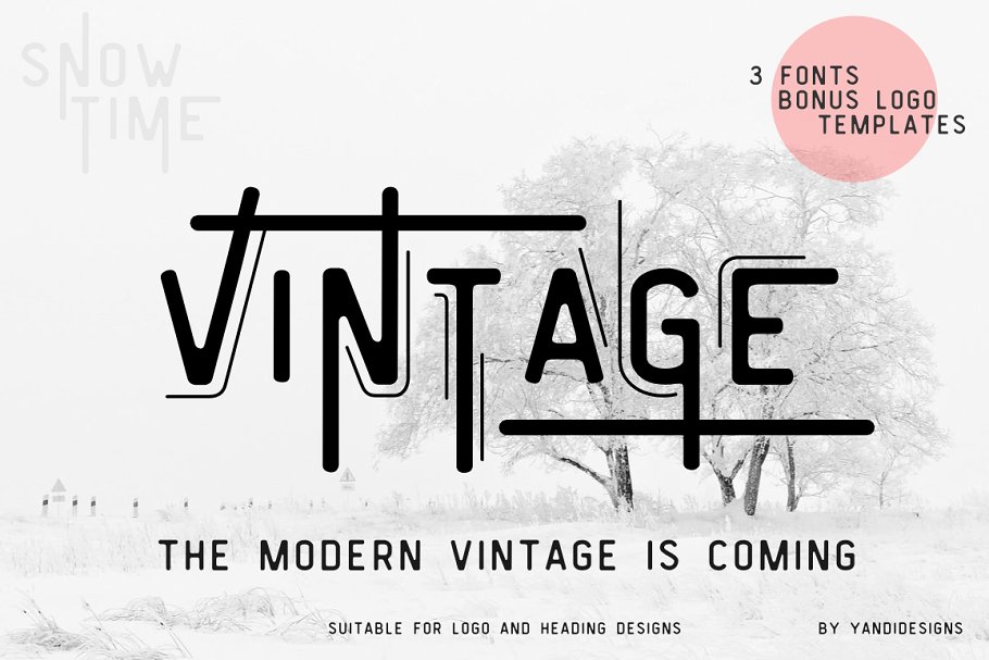
    5. Vintage Modern Typeface

    vintage fonts

    If you’ve ever wondered what a vintage font with modern features would look like, here you have it.

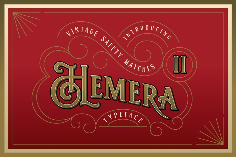
    6. Hemera II – Vintage Decorative Font

    Vintage Fonts

    This elegant vintage typeface will make any packaging shine.

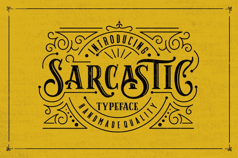
    7. Sarcastic Typeface + Extras

    Vintage Fonts

    Can fonts inspire attitudes? Sarcastic can answer that question the best.

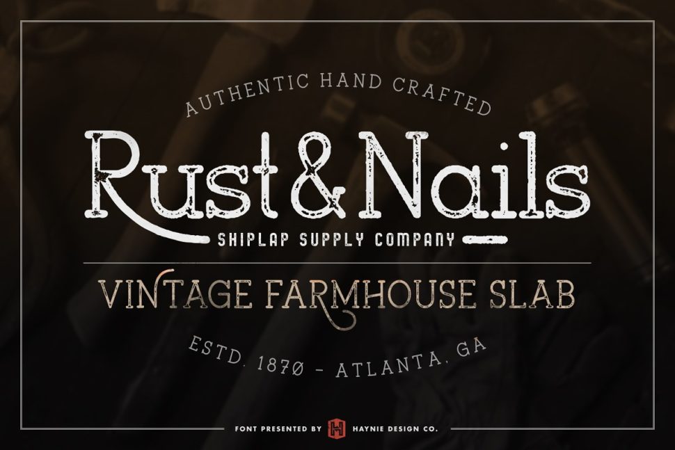
    8. Rust & Nails Vintage Farmhouse Slab

    Vintage Fonts

    Rust & Nailsis a rustic and charming font inspired by vintage farmers markets and mid-century modern farmhouse signage.

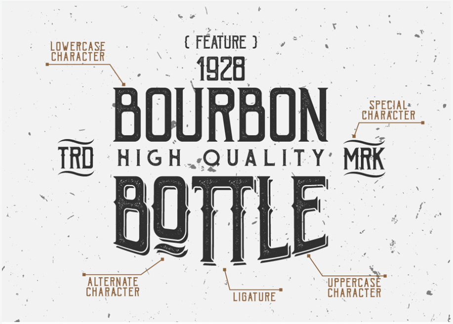
    Vintage Fonts

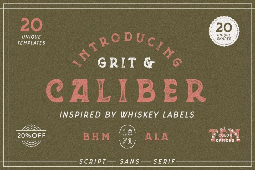
    Caliber is inspired by the Whiskey Labels, and for other lables that need the vintage look.

    Vintage Fonts

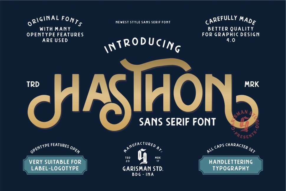
    Hasthon features polished letters, very suitable for label and logo designs.

    11. Arber Vintage font

    Vintage Fonts

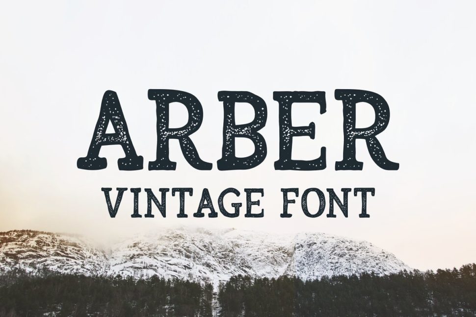
    Arber gives your projects a wintery and cinematic look.

    12. Chivels – Chiseled Vintage 3D Type

    Vintage Fonts

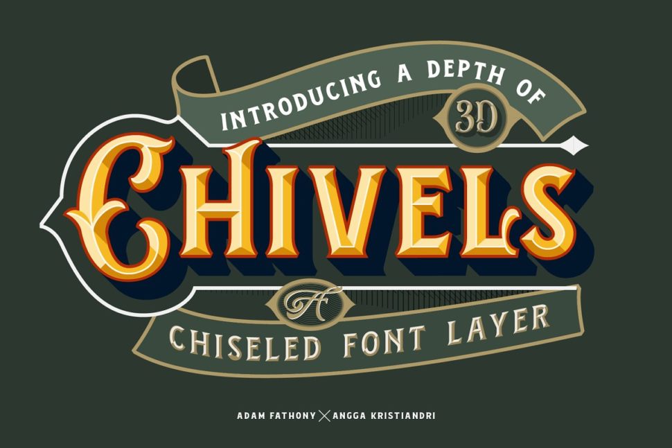
    This 3D font would make a great ornament on any packaging designs.

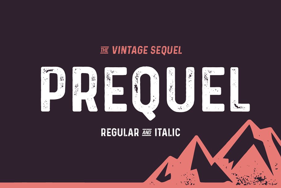
    13. Prequel – The vintage Sequel

    Vintage Fonts

    Prequel’s stony texture will help your poster catch the attention of all pass-byers.

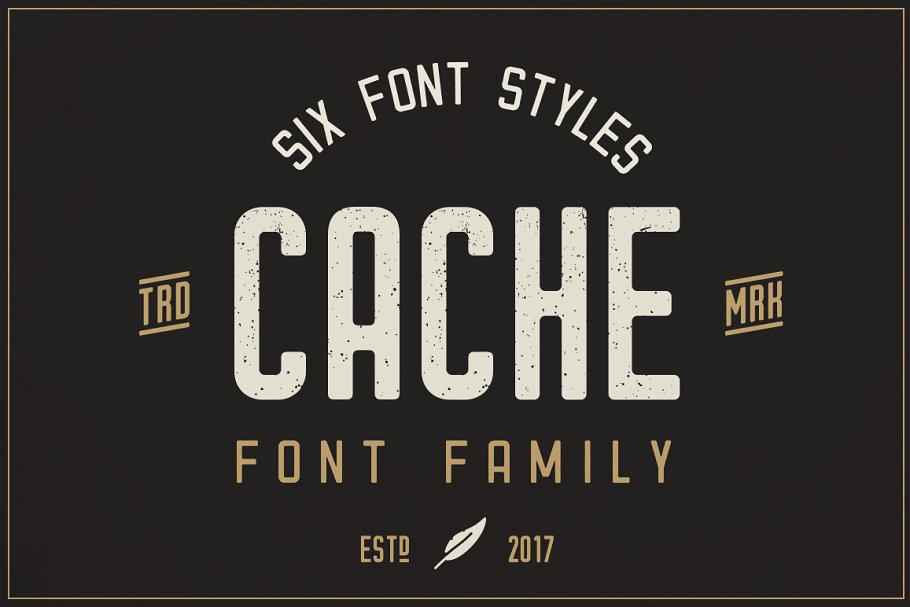
    14. Cache – Vintage Font Family

    Vintage Fonts

    Its authentic vintage look and feel will give you that exact look you’ve been aiming for.

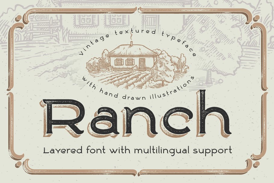
    15. Ranch vintage font & illustrations

    Vintage Fonts

    This layered font reminds me of quality bakery products, quality being the words you should be looking for when designing.

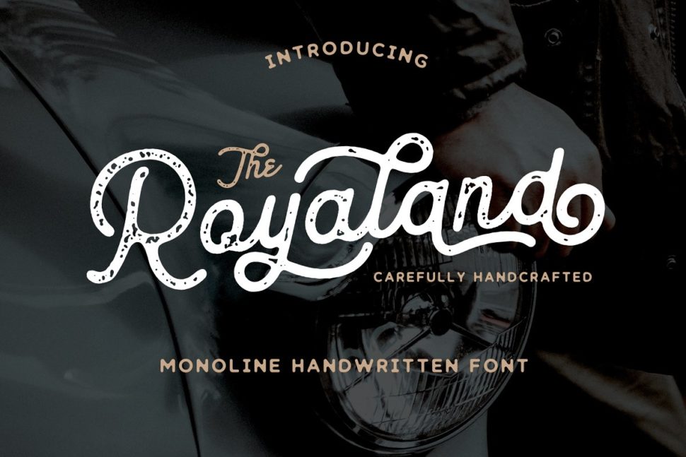
    16. Royaland Vintage Font

    Vintage Fonts

    The Royaland Font is a monoline font which has two styles, Clean and Rough (stamped). Featureing these styles, The Royaland Font will give your projects a more vintage look.

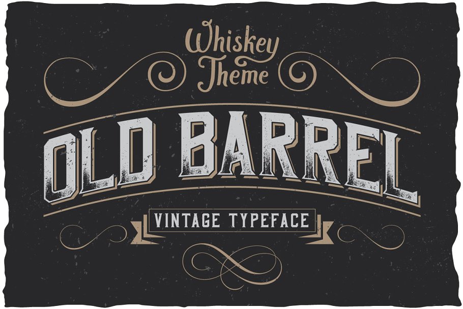
    17. OldBarrel Vintage Typeface

    Vintage Fonts

    Old Barrel is made in a strong and dynamic label style. The font is perfect for any labels designed for whiskey, rum or brandy.

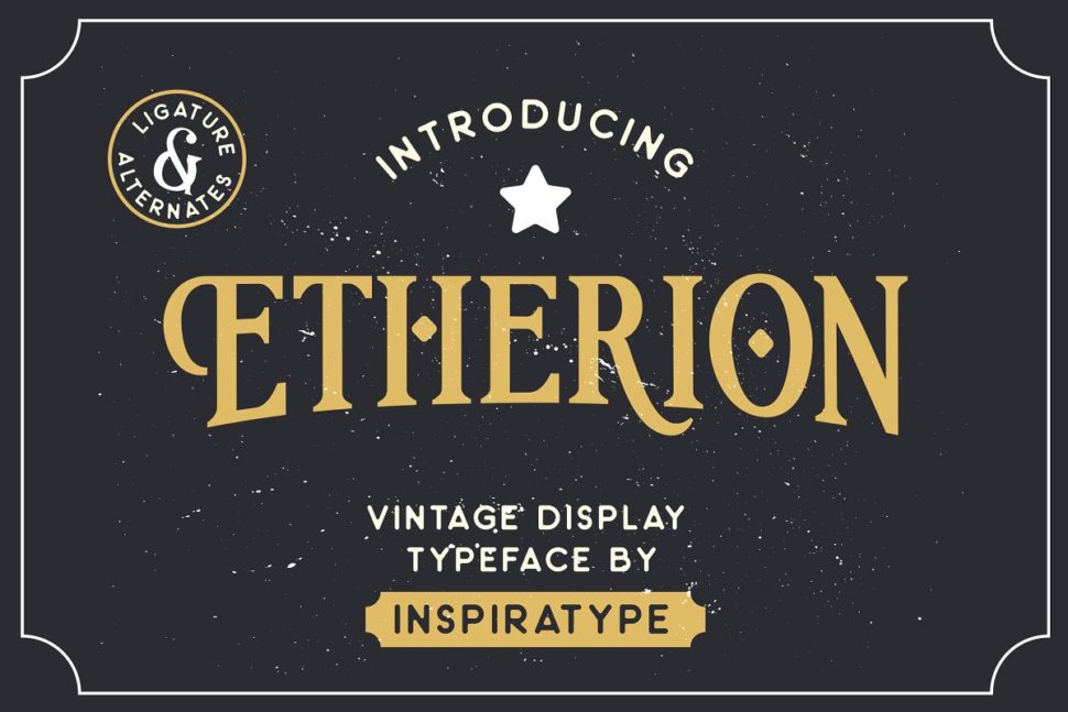
    18. Etherion – Vintage Display

    Vintage Fonts

    “Etherion” is a font display made by hand and inspired by classic posters.

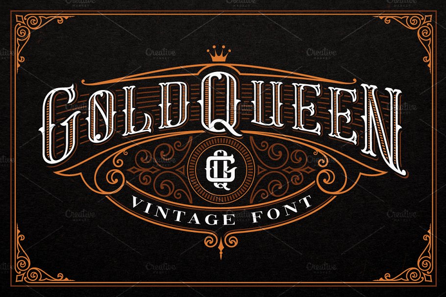
    19. Gold Queen Vintage Font

    Vintage Fonts

    Remember the saying “Oldie, but Goldie?” Gold Queen is this saying’s illustration.

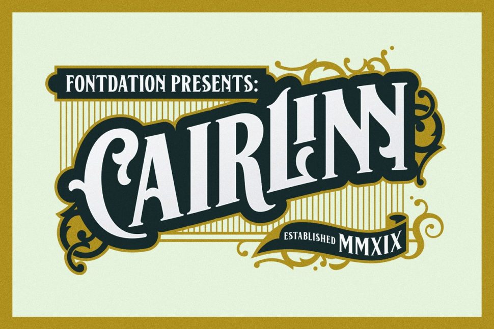
    20. Cairlinn | Vintage Font

    Vintage Fonts

    Clairlinn was inspired by the old letters that are used in classic advertisements.

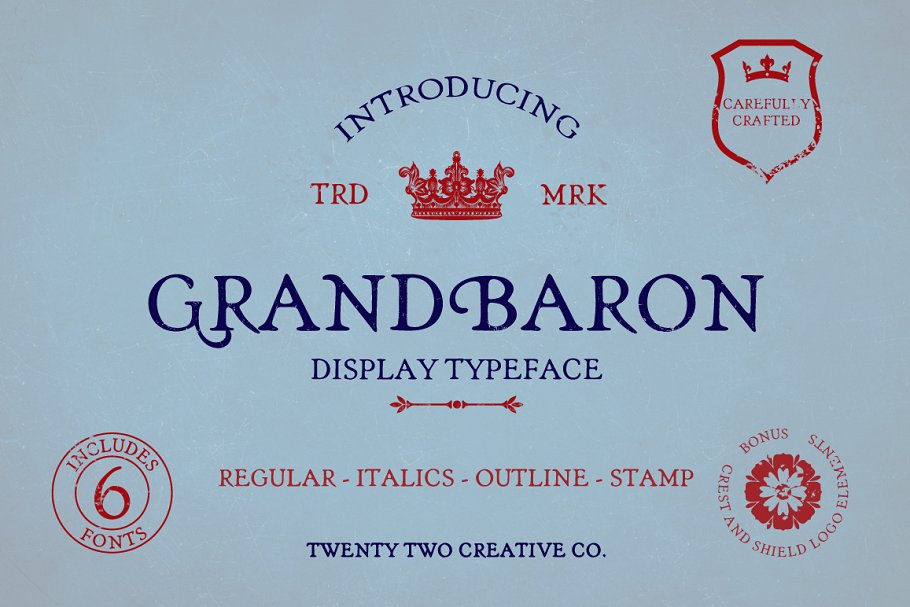
    21. Grand Baron – A Vintage Typeface

    Vintage Fonts

    GRANDBARON takes my imagination to Transylvania, in Dracula’s Castle.

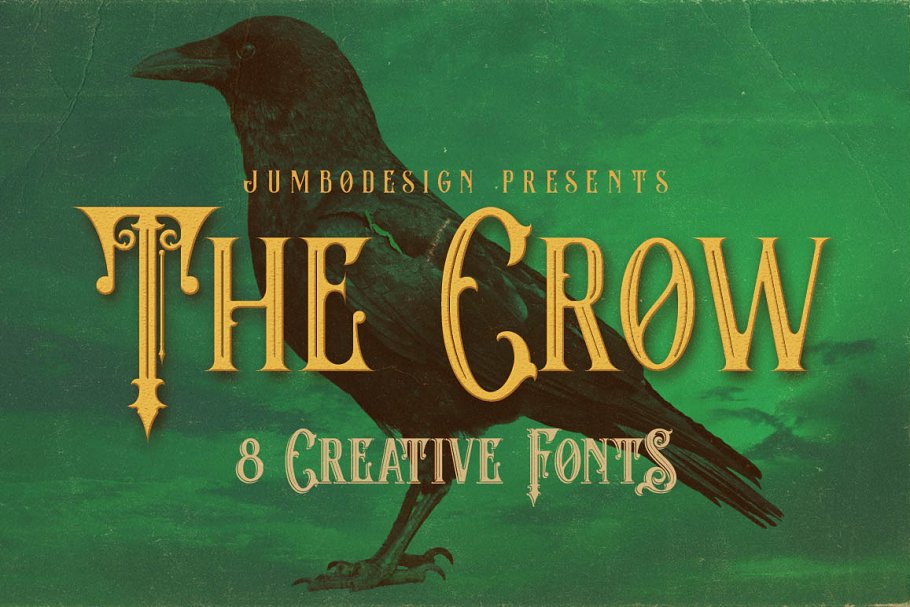
    22. The Crow – Vintage Style Font

    Vintage Fonts

    The Crow is an elegant, cinematic, and detailed font, perfect for fantasy-book covers.

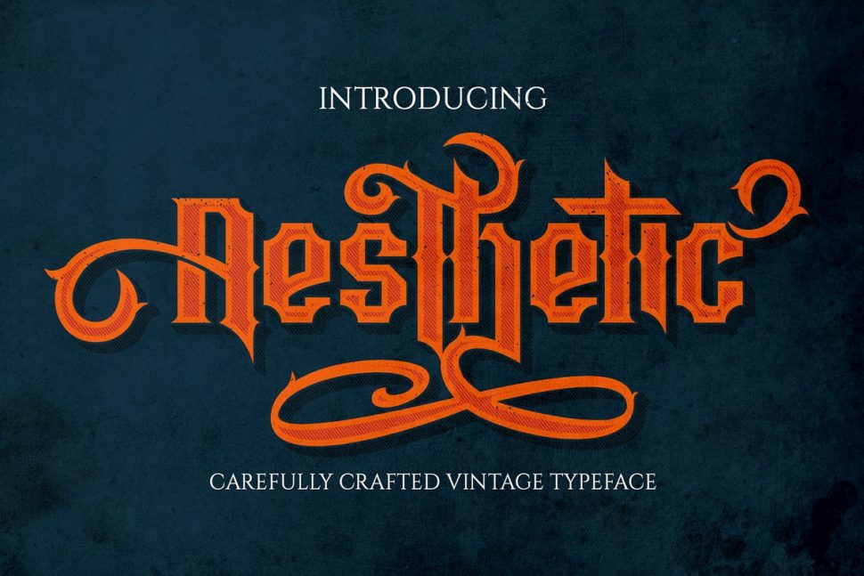
    23. Aesthetic – vintage typeface

    Vintage Fonts

    At first glance, Aesthetic has a pixeled look. Use that to your advantage in an original design.

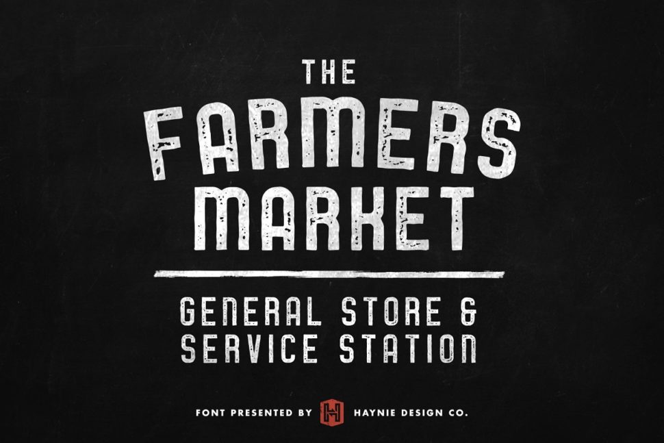
    24. Service Station Vintage Market Font

    Vintage Fonts

    The Farmers Market font is inspired by the classic styles of vintage signage, retro gas stations, and old repair shops.

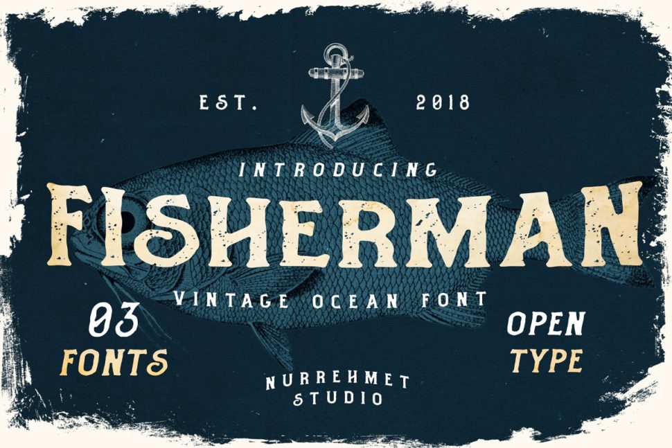
    25. Fisherman – Vintage Ocean Font

    Vintage Fonts

    Fisherman Fonts is perfect for branding projects, logos, wedding designs, social media posts, product packaging, product designs, labels, photography, watermarks, invitations, stationery and any project that needs an ocean and beach feel.

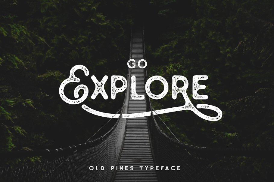
    26. Old Pines Vintage Type

    Vintage Fonts

    Go Explore is an invitation to adventure. Go Explore, Go Design.

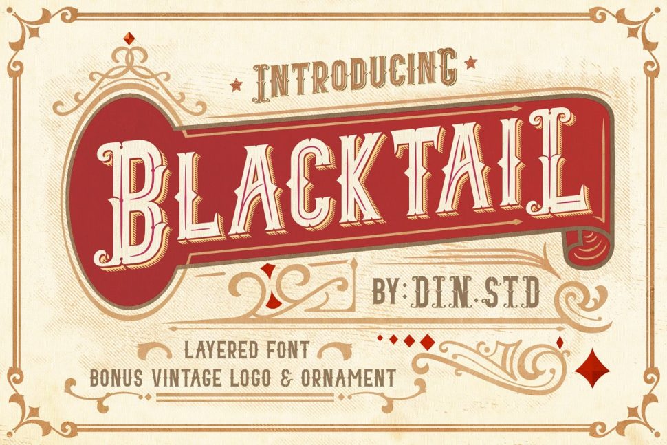
    27. Blacktail – Vintage Font

    Vintage Fonts

    This font presents a vintage and layered style that contains four detailed layers.

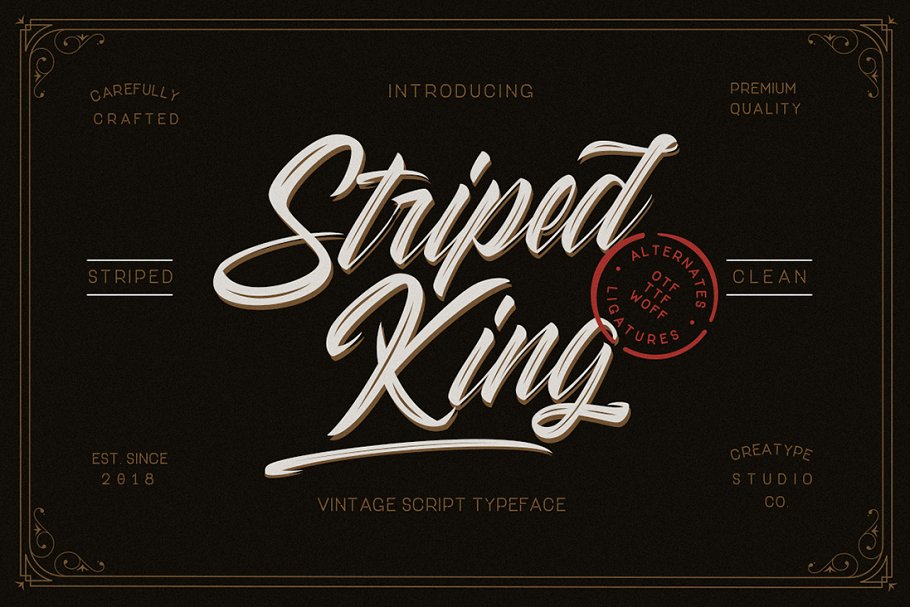
    28. Striped King Vintage Script

    vintage fonts

    Striped Kind is the script typeface you need in your tool kit, due to its versatile looks.

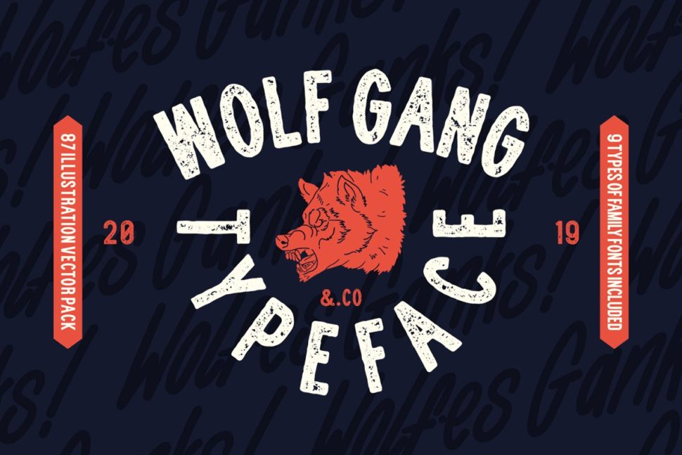
    29. Wolf Gang – Vintage Typeface

    Vintage Fonts

    WOLF GANG was created with the concept of the wild in the designer’s mind, by adding pictorial elements such as wolves and other wildlife.

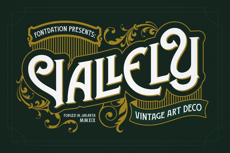
    30. Vallely | Vintage Font

    Vintage Fonts

    Vallely is a classic art-deco-ish serif inspired by the old typography/letterings used in packaging labels and advertisements

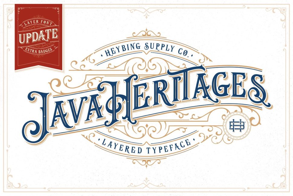
    31. Java Heritages + Extras (UPDATE)

    Vintage Fonts

    Java Heritages Typeface is a multi-layered typeface family with OpenType features, inspired by the vintage signage that has unique decorative shapes.

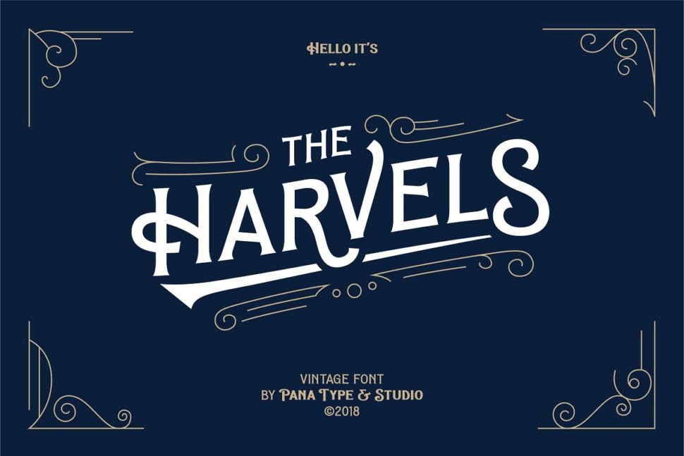
    32. Vintage Font – Harvels

    Vintage Fonts

    This amazing font comes in different weights so that you can customize it to your preferences.

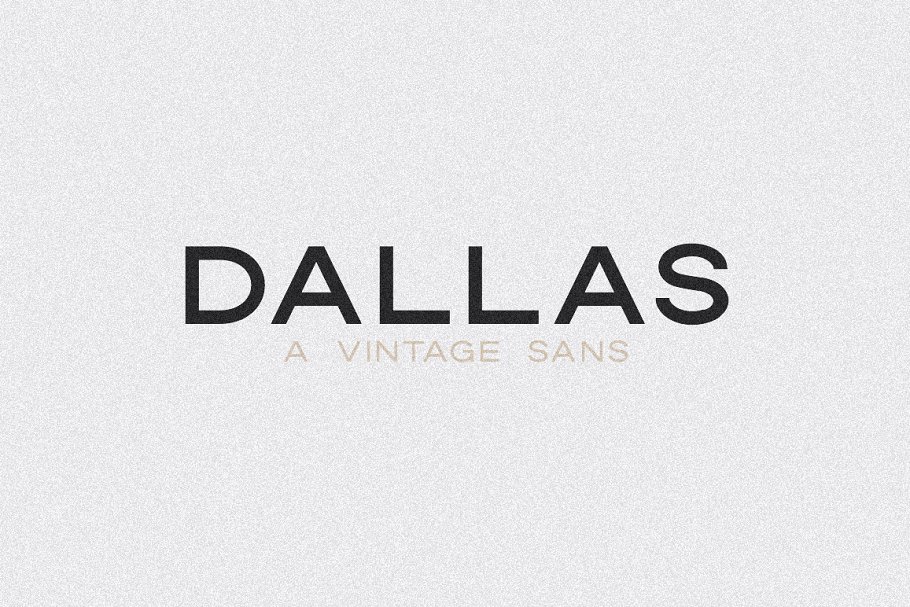
    33. Dallas | A Vintage Sans

    Vintage Fonts

    This beautiful all caps vintage sans serif is so versatile and looks great in just about any context.

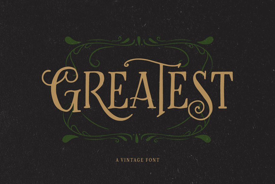
    34. Greatest – A Vintage Font

    Vintage Fonts

    Greatest will remind the readers of gardens and forests instantly. It looks like the perfect look for a fantasy book cover.

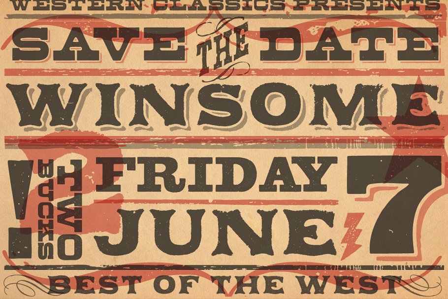
    35. Vintage Wood Type Classics

    Vintage Fonts

    The Vintage Wood Type Classics set contains the Applewood, Bootstrap and Buckboard families, all worth including to your projects.

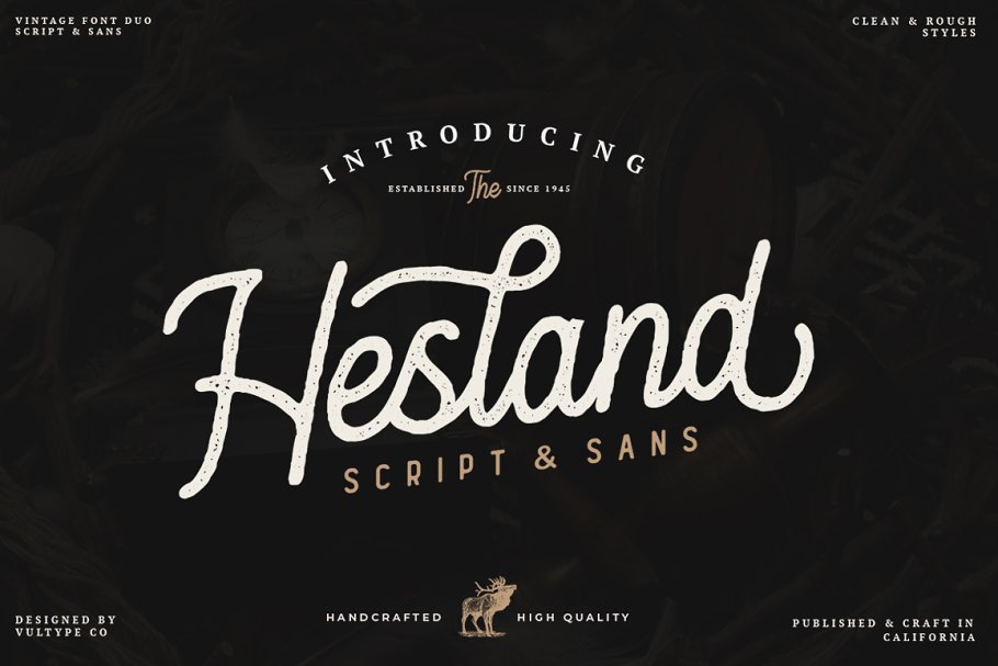
    36. Hesland – Vintage Font Duo

    vintage fonts

    Hesland Vintage Font Duo was inspired by the vintage old American labels and has two styles: Clean and Stamped.

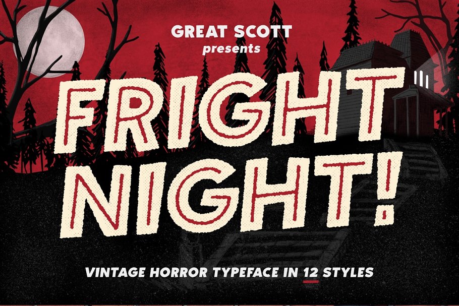
    37. Fright Night! A vintage horror font

    vintage fonts

    The Horror! The Horror! will be the first thing that comes to your clients’ minds when they’ll see this font. But that’s a good thing.

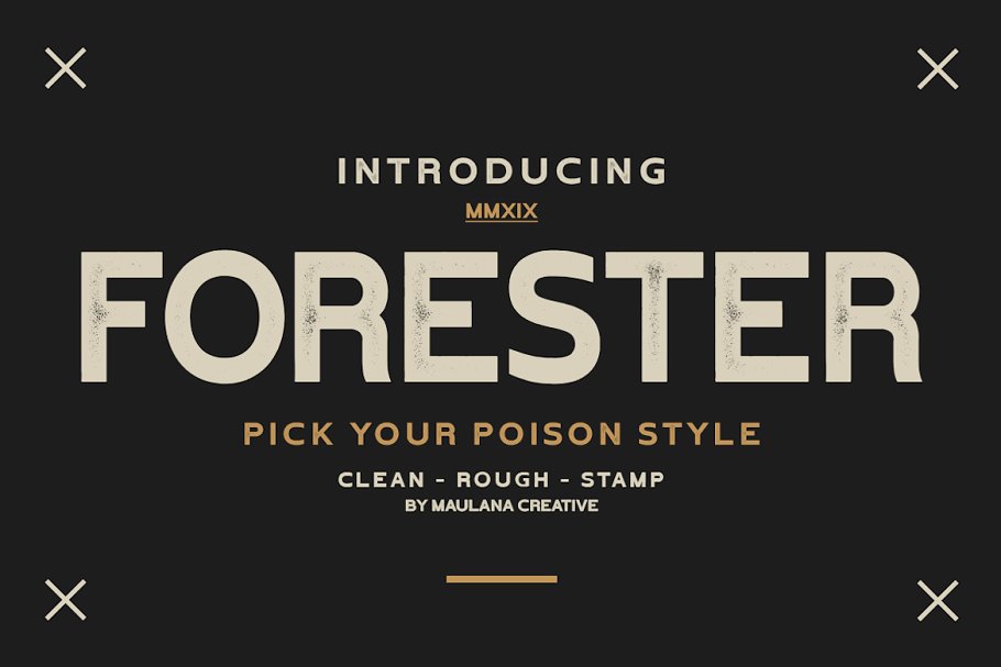
    38. Forester Vintage Sans Serif

    vintahge fonts

    Forester Vintage makes a perfect font for branding, logos, magazines, films, websites, headlines, titles, captions, games, apps, posters, t-shirts and more.

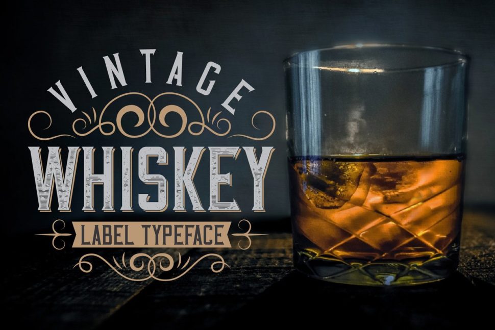
    39. Vintage Whiskey Typeface

    vintage fonts

    Whiskey can give your project an eye-turning effect. And it’s suited for more than just Whiskey labels.

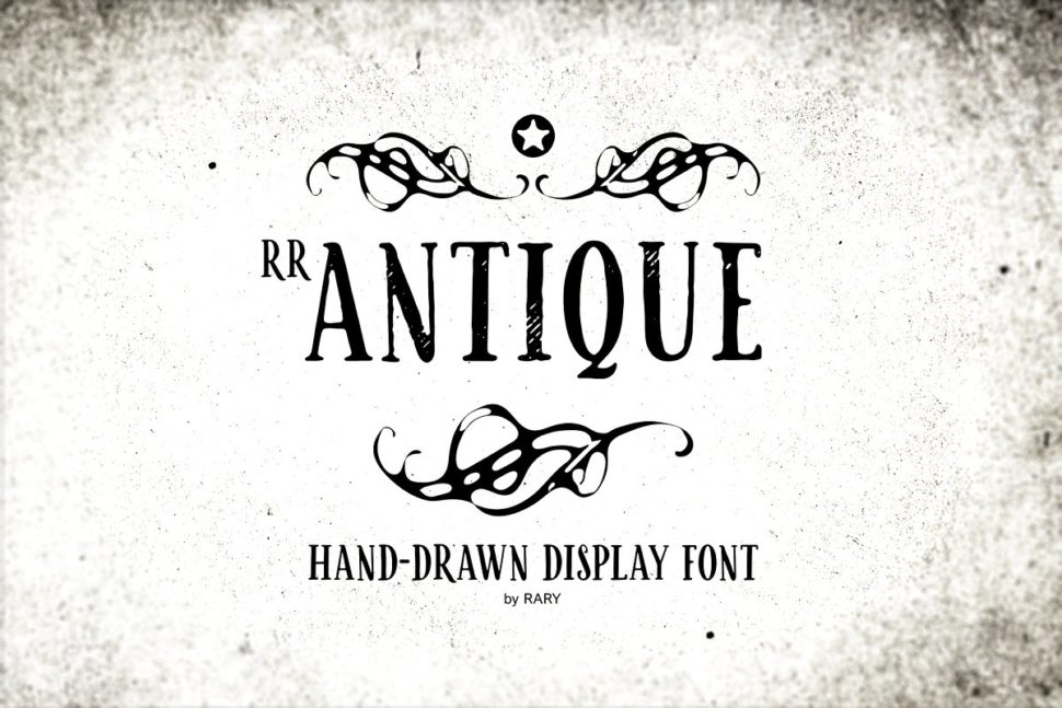
    40. RR Antique / Vintage branding font

    vintage fonts
    Designed for branding, stamps, tags or logos, it comes in a regular, denim textured version with rough edges.
    All the fonts mentioned above belong to designers who have chosen to market their work on Creative Market. Let’s help the world’s community of designers by purchasing their amazing fonts and sharing this article. Until later,
    WDL

    Read More at 40 Of the best Free vintage Fonts picked by professional designers

    Categories: Designing, Others Tags:

    A Practical Use Case for Vue Render Functions: Building a Design System Typography Grid

    May 30th, 2019 No comments
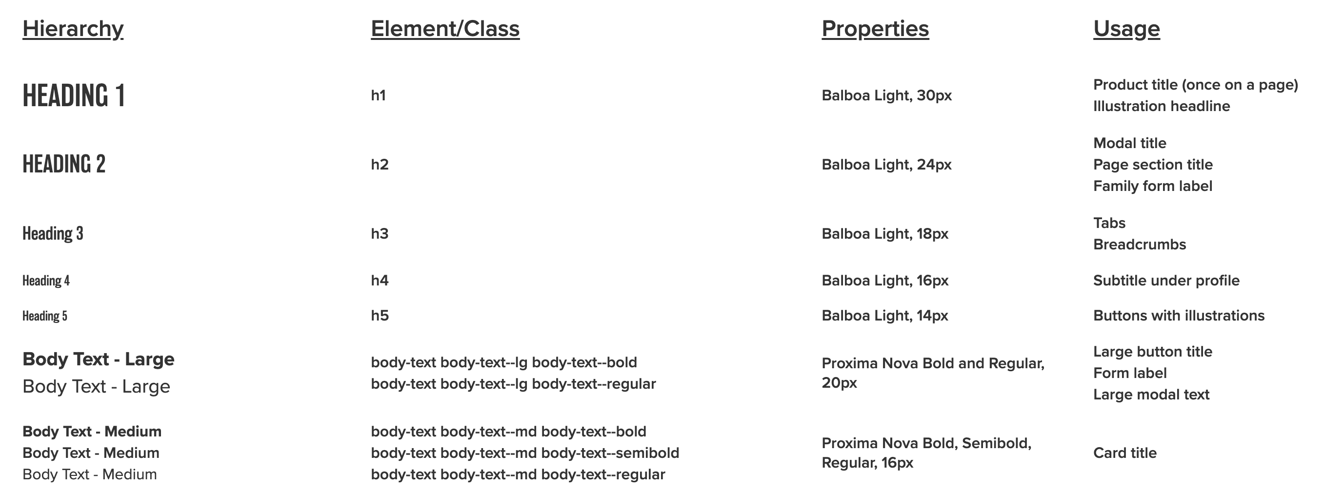
    A screenshot of the typographic design system. There are four columns where the first shows the style name with the rendered style, second is the element or class, third shows the properties that make the styles, and fourth is the defined usage.

    This post covers how I built a typography grid for a design system using Vue render functions. Here’s the demo and the code. I used render functions because they allow you to create HTML with a greater level of control than regular Vue templates, yet surprisingly I couldn’t find very much when I web searched around for real-life, non-tutorial applications of them. I’m hoping this post will fill that void and provide a helpful and practical use case on using Vue render functions.

    I’ve always found render functions to be a little out-of-character for Vue. While the rest of the framework emphasizes simplicity and separation of concerns, render functions are a strange and often difficult-to-read mix of HTML and JavaScript.

    For example, to display:

    <div class="container">
      <p class="my-awesome-class">Some cool text</p>
    </div>

    …you need:

    render(createElement) {
      return createElement("div", { class: "container" }, [
        createElement("p", { class: "my-awesome-class" }, "Some cool text")
      ])
    }

    I suspect that this syntax turns some people off, since ease-of-use is a key reason to reach for Vue in the first place. This is a shame because render functions and functional components are capable of some pretty cool, powerful stuff. In the spirit of demonstrating their value, here’s how they solved an actual business problem for me.

    Quick disclaimer: It will be super helpful to have the demo open in another tab to reference throughout this post.

    Defining criteria for a design system

    My team wanted to include a page in our VuePress-powered design system showcasing different typography options. This is part of a mockup that I got from our designer.

    And here’s a sample of some of the corresponding CSS:

    h1, h2, h3, h4, h5, h6 {
      font-family: "balboa", sans-serif;
      font-weight: 300;
      margin: 0;
    }
    
    h4 {
      font-size: calc(1rem - 2px);
    }
    
    .body-text {
      font-family: "proxima-nova", sans-serif;
    }
    
    .body-text--lg {
      font-size: calc(1rem + 4px);
    }
    
    .body-text--md {
      font-size: 1rem;
    }
    
    .body-text--bold {
      font-weight: 700;
    }
    
    .body-text--semibold {
      font-weight: 600;
    }

    Headings are targeted with tag names. Other items use class names, and there are separate classes for weight and size.

    Before writing any code, I created some ground rules:

    • Since this is really a data visualization, the data should be stored in a separate file.
    • Headings should use semantic heading tags (e.g.

      ,

      , etc.) instead of having to rely on a class.

    • Body content should use paragraph (

      ) tags with the class name (e.g.

      ).

    • Content types that have variations should be grouped together by wrapping them in the root paragraph tag, or corresponding root element, without a styling class. Children should be wrapped with and the class name.
    <p>
      <span class="body-text--lg">Thing 1</span>
      <span class="body-text--lg">Thing 2</span>
    </p>
    • Any content that’s not demonstrating special styling should use a paragraph tag with the correct class name and for any child nodes.
    <p class="body-text--semibold">
      <span>Thing 1</span>
      <span>Thing 2</span>
    </p>
    • Class names should only need to be written once for each cell that’s demonstrating styling.

    Why render functions make sense

    I considered a few options before starting:

    Hardcoding

    I like hardcoding when appropriate, but writing my HTML by hand would have meant typing out different combinations of the markup, which seemed unpleasant and repetitive. It also meant that data couldn’t be kept in a separate file, so I ruled out this approach.

    Here’s what I mean:

    <div class="row">
      <h1>Heading 1</h1>
      <p class="body-text body-text--md body-text--semibold">h1</p>
      <p class="body-text body-text--md body-text--semibold">Balboa Light, 30px</p>
      <p class="group body-text body-text--md body-text--semibold">
        <span>Product title (once on a page)</span>
        <span>Illustration headline</span>
      </p>
    </div>

    Using a traditional Vue template

    This would normally be the go-to option. However, consider the following:

    See the Pen
    Different Styles Example
    by Salomone Baquis (@soluhmin)
    on CodePen.

    In the first column, we have:

    – An

    > tag rendered as-is.
    – A

    tag that groups some children with text, each with a class (but no special class on the

    tag).
    – A

    tag with a class and no children.

    The result would have meant many instances of v-if and v-if-else, which I knew would get confusing fast. I also disliked all of that conditional logic inside the markup.

    Because of these reasons, I chose render functions. Render functions use JavaScript to conditionally create child nodes based on all of the criteria that’s been defined, which seemed perfect for this situation.

    Data model

    As I mentioned earlier, I’d like to keep typography data in a separate JSON file so I can easily make changes later without touching markup. Here’s the raw data.

    Each object in the file represents a different row.

    {
      "text": "Heading 1",
      "element": "h1", // Root wrapping element.
      "properties": "Balboa Light, 30px", // Third column text.
      "usage": ["Product title (once on a page)", "Illustration headline"] // Fourth column text. Each item is a child node. 
    }

    The object above renders the following HTML:

    <div class="row">
      <h1>Heading 1</h1>
      <p class="body-text body-text--md body-text--semibold">h1</p>
      <p class="body-text body-text--md body-text--semibold">Balboa Light, 30px</p>
      <p class="group body-text body-text--md body-text--semibold">
        <span>Product title (once on a page)</span>
        <span>Illustration headline</span>
      </p>
    </div>

    Let’s look at a more involved example. Arrays represent groups of children. A classes object can store classes. The base property contains classes that are common to every node in the cell grouping. Each class in variants is applied to a different item in the grouping.

    {
      "text": "Body Text - Large",
      "element": "p",
      "classes": {
        "base": "body-text body-text--lg", // Applied to every child node
        "variants": ["body-text--bold", "body-text--regular"] // Looped through, one class applied to each example. Each item in the array is its own node. 
      },
      "properties": "Proxima Nova Bold and Regular, 20px",
      "usage": ["Large button title", "Form label", "Large modal text"]
    }

    Here’s how that renders:

    <div class="row">
      <!-- Column 1 -->
      <p class="group">
        <span class="body-text body-text--lg body-text--bold">Body Text - Large</span>
        <span class="body-text body-text--lg body-text--regular">Body Text - Large</span>
      </p>
      <!-- Column 2 -->
      <p class="group body-text body-text--md body-text--semibold">
        <span>body-text body-text--lg body-text--bold</span>
        <span>body-text body-text--lg body-text--regular</span>
      </p>
      <!-- Column 3 -->
      <p class="body-text body-text--md body-text--semibold">Proxima Nova Bold and Regular, 20px</p>
      <!-- Column 4 -->
      <p class="group body-text body-text--md body-text--semibold">
        <span>Large button title</span>
        <span>Form label</span>
        <span>Large modal text</span>
      </p>
    </div>

    The basic setup

    We have a parent component, TypographyTable.vue, which contains the markup for the wrapper table element, and a child component, TypographyRow.vue, which creates a row and contains our render function.

    I loop through the row component, passing the row data as props.

    <template>
      <section>
        <!-- Headers hardcoded for simplicity -->
        <div class="row">
          <p class="body-text body-text--lg-bold heading">Hierarchy</p>
          <p class="body-text body-text--lg-bold heading">Element/Class</p>
          <p class="body-text body-text--lg-bold heading">Properties</p>
          <p class="body-text body-text--lg-bold heading">Usage</p>
        </div>  
        <!-- Loop and pass our data as props to each row -->
        <typography-row
          v-for="(rowData, index) in $options.typographyData"
          :key="index"
          :row-data="rowData"
        />
      </section>
    </template>
    <script>
    import TypographyData from "@/data/typography.json";
    import TypographyRow from "./TypographyRow";
    export default {
      // Our data is static so we don't need to make it reactive
      typographyData: TypographyData,
      name: "TypographyTable",
      components: {
        TypographyRow
      }
    };
    </script>

    One neat thing to point out: the typography data can be a property on the Vue instance and be accessed using $options.typographyData since it doesn’t change and doesn’t need to be reactive. (Hat tip to Anton Kosykh.)

    Making a functional component

    The TypographyRow component that passes data is a functional component. Functional components are stateless and instanceless, which means that they have no this and don’t have access to any Vue lifecycle methods.

    The empty starting component looks like this:

    // No <template>
    <script>
    export default {
      name: "TypographyRow",
      functional: true, // This property makes the component functional
      props: {
        rowData: { // A prop with row data
          type: Object
        }
      },
      render(createElement, { props }) {
        // Markup gets rendered here
      }
    }
    </script>

    The render method takes a context argument, which has a props property that’s de-structured and used as the second argument.

    The first argument is createElement, which is a function that tells Vue what nodes to create. For brevity and convention, I’ll be abbreviating createElement as h. You can read about why I do that in Sarah’s post.

    h takes three arguments:

    1. An HTML tag (e.g. div)
    2. A data object with template attributes (e.g. { class: 'something'})
    3. Text strings (if we’re just adding text) or child nodes built using h
    render(h, { props }) {
      return h("div", { class: "example-class }, "Here's my example text")
    }

    OK, so to recap where we are at this point, we’ve covered creating:

    • a file with the data that’s going to be used in my visualization;
    • a regular Vue component where I’m importing the full data file; and
    • the beginning of a functional component that will display each row.

    To create each row, the data from the JSON file needs to be passed into arguments for h. This could be done all at once, but that involves a lot of conditional logic and is confusing.

    Instead, I decided to do it in two parts:

    1. Transform the data into a predictable format.
    2. Render the transformed data.

    Transforming the common data

    I wanted my data in a format that would match the arguments for h, but before doing this, I wrote out how I wanted things structured:

    // One cell
    {
      tag: "", // HTML tag of current level
      cellClass: "", // Class of current level, null if no class exists for that level
      text: "", // Text to be displayed 
      children: [] // Children each follow this data model, empty array if no child nodes
    }

    Each object represents one cell, with four cells making up each row (an array).

    // One row
    [ { cell1 }, { cell2 }, { cell3 }, { cell4 } ]

    The entry point would be a function like:

    function createRow(data) { // Pass in the full row data and construct each cell
      let { text, element, classes = null, properties, usage } = data;
      let row = [];
      row[0] = createCellData(data) // Transform our data using some shared function
      row[1] = createCellData(data)
      row[2] = createCellData(data)
      row[3] = createCellData(data)
    
      return row;
    }

    Let’s take another look at our mockup.

    The first column has styling variations, but the rest seem to follow the same pattern, so let’s start with those.

    Again, the desired model for each cell is:

    {
      tag: "",
      cellClass: "", 
      text: "", 
      children: []
    }

    This gives us a tree-like structure for each cell since some cells have groups of children. Let’s use two functions to create the cells.

    • createNode takes each of our desired properties as arguments.
    • createCell wraps around createNode so that we can check if the text that we’re passing in is an array. If it is, we build up an array of child nodes.
    // Model for each cell
    function createCellData(tag, text) {
      let children;
      // Base classes that get applied to every root cell tag
      const nodeClass = "body-text body-text--md body-text--semibold";
      // If the text that we're passing in as an array, create child elements that are wrapped in spans. 
      if (Array.isArray(text)) {
        children = text.map(child => createNode("span", null, child, children));
      }
      return createNode(tag, nodeClass, text, children);
    }
    // Model for each node
    function createNode(tag, nodeClass, text, children = []) {
      return {
        tag: tag,
        cellClass: nodeClass,
        text: children.length ? null : text,
        children: children
      };
    }

    Now, we can do something like:

    function createRow(data) {
      let { text, element, classes = null, properties, usage } = data;
      let row = [];
      row[0] = ""
      row[1] = createCellData("p", ?????) // Need to pass in class names as text 
      row[2] = createCellData("p", properties) // Third column
      row[3] = createCellData("p", usage) // Fourth column
    
      return row;
    }

    We pass properties and usage to the third and fourth columns as text arguments. However, the second column is a little different; there, we’re displaying the class names, which are stored in the data file like:

    "classes": {
      "base": "body-text body-text--lg",
      "variants": ["body-text--bold", "body-text--regular"]
    },

    Additionally, remember that headings don’t have classes, so we want to show the heading tag names for those rows (e.g. h1, h2, etc.).

    Let’s create some helper functions to parse this data into a format that we can use for our text argument.

    // Pass in the base tag and class names as arguments
    function displayClasses(element, classes) {
      // If there are no classes, return the base tag (appropriate for headings)
      return getClasses(classes) ? getClasses(classes) : element;
    }
    
    // Return the node class as a string (if there's one class), an array (if there are multiple classes), or null (if there are none.) 
    // Ex. "body-text body-text--sm" or ["body-text body-text--sm body-text--bold", "body-text body-text--sm body-text--italic"]
    function getClasses(classes) {
      if (classes) {
        const { base, variants = null } = classes;
        if (variants) {
          // Concatenate each variant with the base classes
          return variants.map(variant => base.concat(`${variant}`));
        }
        return base;
      }
      return classes;
    }

    Now we can do this:

    function createRow(data) {
      let { text, element, classes = null, properties, usage } = data;
      let row = [];
      row[0] = ""
      row[1] = createCellData("p", displayClasses(element, classes)) // Second column
      row[2] = createCellData("p", properties) // Third column
      row[3] = createCellData("p", usage) // Fourth column
    
      return row;
    }

    Transforming the demo data

    This leaves the first column that demonstrates the styles. This column is different because we’re applying new tags and classes to each cell instead of using the class combination used by the rest of the columns:

    <p class="body-text body-text--md body-text--semibold">

    Rather than try to do this in createCellData or createNodeData, let’s make another function to sit on top of these base transformation functions and handle some of the new logic.

    function createDemoCellData(data) {
      let children;
      const classes = getClasses(data.classes);
      // In cases where we're showing off multiple classes, we need to create children and apply each class to each child.
      if (Array.isArray(classes)) {
        children = classes.map(child =>
          // We can use "data.text" since each node in a cell grouping has the same text
          createNode("span", child, data.text, children)
        );
      }
      // Handle cases where we only have one class
      if (typeof classes === "string") {
        return createNode("p", classes, data.text, children);
      }
      // Handle cases where we have no classes (ie. headings)
      return createNode(data.element, null, data.text, children);
    }

    Now we have the row data in a normalized format that we can pass to our render function:

    function createRow(data) {
      let { text, element, classes = null, properties, usage } = data
      let row = []
      row[0] = createDemoCellData(data)
      row[1] = createCellData("p", displayClasses(element, classes))
      row[2] = createCellData("p", properties)
      row[3] = createCellData("p", usage)
    
      return row
    }

    Rendering the data

    Here’s how we actually render the data to display:

    // Access our data in the "props" object
    const rowData = props.rowData;
    
    // Pass it into our entry transformation function
    const row = createRow(rowData);
    
    // Create a root "div" node and handle each cell
    return h("div", { class: "row" }, row.map(cell => renderCells(cell)));
    
    // Traverse cell values
    function renderCells(data) {
    
      // Handle cells with multiple child nodes
      if (data.children.length) {
        return renderCell(
          data.tag, // Use the base cell tag
          { // Attributes in here
            class: {
              group: true, // Add a class of "group" since there are multiple nodes
              [data.cellClass]: data.cellClass // If the cell class isn't null, apply it to the node
            }
          },
          // The node content
          data.children.map(child => {
            return renderCell(
              child.tag,
              { class: child.cellClass },
              child.text
            );
          })
        );
      }
    
      // If there are no children, render the base cell
      return renderCell(data.tag, { class: data.cellClass }, data.text);
    }
    
    // A wrapper function around "h" to improve readability
    function renderCell(tag, classArgs, text) {
      return h(tag, classArgs, text);
    }

    And we get our final product! Here’s the source code again.

    Wrapping up

    It’s worth pointing out that this approach represents an experimental way of addressing a relatively trivial problem. I’m sure many people will argue that this solution is needlessly complicated and over-engineered. I’d probably agree.

    Despite the up-front cost, however, the data is now fully separated from the presentation. Now, if my design team adds or removes rows, I don’t have to dig into messy HTML — I just update a couple of properties in the JSON file.

    Is it worth it? Like everything else in programming, I guess it depends. I will say that this comic strip was in the back of my mind as I worked on this:

    A three-panel comic strip. First panel is a stick figure at a dinner table asking to pass the salt. Second panel is the same figure with no dialogue. Third panel is another figure saying he's building a system to pass the condiments and that it will save time in the long run. First figure says it's already been 20 minutes.
    Source: https://xkcd.com/974

    Maybe that’s an answer. I’d love to hear all of your (constructive) thoughts and suggestions, or if you’ve tried other ways of going about a similar task.

    The post A Practical Use Case for Vue Render Functions: Building a Design System Typography Grid appeared first on CSS-Tricks.
    Categories: Designing, Others Tags: