Design Your Website to Sell While You Work
Design work is very time consuming. But it’s not just the labor you put into building websites that takes time and concentration.
Because the projects you work on typically have a short shelf life, you’re constantly having to find new gigs, woo potential clients, and sign them onto your service — which is like another job in and of itself. So, when do you find time to look for more work when you’re so busy actually doing it?
You could set aside time on the weekends to work on drumming up new projects, but that’s the last thing you want to do. Imagine spending that time booking new business and then being too burned out to get started with any of them? That’s no good.
You could, of course, do it during the workweek. It would just require you to dedicate otherwise billable hours to non-billable work and cut into your business’s profitability.
Without hiring someone to handle sales for you, what’s the solution?
It’s your website.
Here are some things you can do to design a website that relieves you of at least some of the burden of finding and selling to new clients.
1. Design for Your Niche
One of the best things you can do as a web designer (or any creative freelancer, really) is to carve out a highly specific niche. For instance, you could design websites for:
- Real estate agents
- Female-owned businesses
- Restaurants in your city
The more targeted your audience, the easier it will be to sell to them (and to build their websites).
I’m going to take this one step further as I don’t just think it’s enough to choose a niche to design for.
I think your own website should be reflective of your niche. More specifically, it should be designed to look like a website your client would want as their own. What better way to sell a prospect on a website than to show them that you know exactly how to build the solution they need?
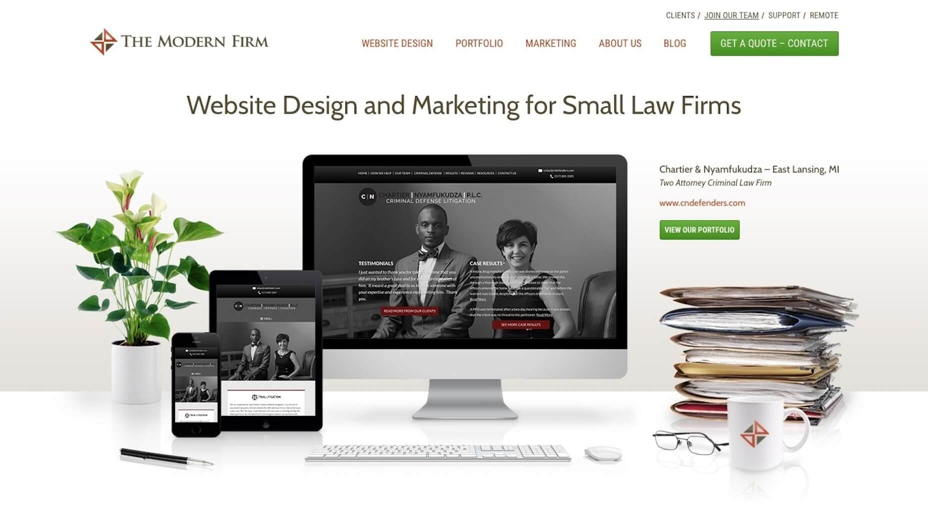
The Modern Firm is an excellent example of this:
Visit the website and you’ll notice:
- The company name sounds like it should be working for law firms.
- The design is super buttoned-up — traditionally-structured, muted color palette, and minimalism at its best.
- Copy is professional, honest, and straight to the point.
In other words, this website looks and sounds like one that its target clientele would want for themselves.
2. Answer Their Questions
Think about how much time you spend dealing with objections as you talk to prospective clients. That’s either because their expectations haven’t been set properly before meeting with you or they’re a bad fit.
If you use your website to answer those questions, though, you can significantly decrease the amount of time you spend on sales calls with prospects.
One way to do this is to explain in the simplest terms what your clients get. Here’s how I handle this for prospective copywriting clients:
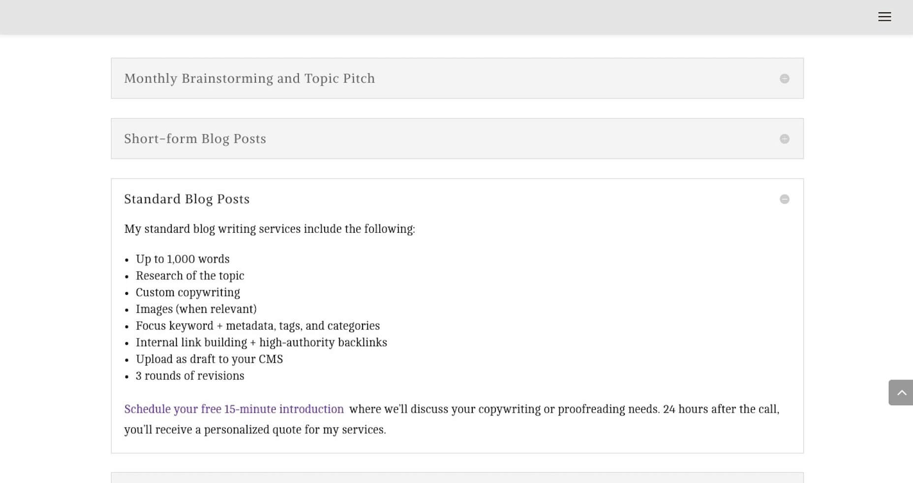
I was frustrated that I had to explain over and over again to prospects what it meant to create optimized content. The question continued to come up on calls, so I decided to just provide the answer on my website.
I now no longer get questions about my services. Prospects hop on the phone with me and ask how much they have to pay to get started. It’s been a huge time-saver.
As a web designer, it might not be as simple as to say, “You’ll get a 10-page website, built using X theme, optimized for speed with caching, etc.” When it comes to websites, you’re just delivering too technical of a product.
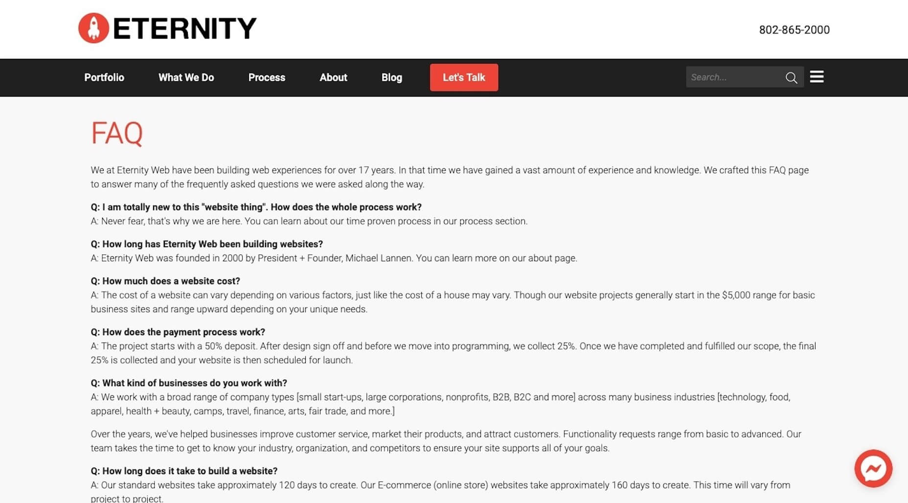
So, for you, I’d suggest taking the same basic principle of “answer their questions”, but tackle them with an FAQs like Eternity does:
They’ve done such a great job of providing simple and straightforward answers to the kinds of questions I’m sure all of you get. Not only will this decrease the amount of time people have to spend with them on sales calls, but it’ll help weed out bad-fit clients.
3. Create a More Impressive Portfolio
There’s absolutely no question that your website needs to include an awesome portfolio of websites. Just make sure that any samples you include in your portfolio:
- Are 100% something you’re proud to show off;
- Are relevant to your target audience;
- Are consistently designed.
Here’s what I mean:
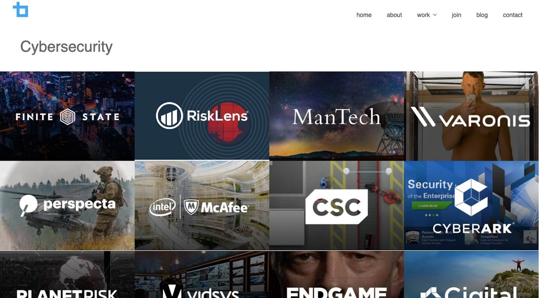
Bluetext is in the business of creating digital campaigns (including web design) for clients. Although they build solutions for a couple dozen industries, they keep their portfolio well-organized, grouping sample work based on category.
For example, this is what their “Cybersecurity” portfolio looks like:
Notice how well put together this portfolio is — everything is clearly labeled, designed in a similar style, and is impressive to look at. It also helps clients in quickly see the potential for their specific business without the distraction of other types of websites getting in the way.
4. Establish Trust
As a web designer, you have to build trust with clients if you want them to pay top-dollar for your services. While you can certainly do that throughout the web design process, why wait? Use your website as a vehicle for establishing trust now.
One way to do this is with your portfolio.
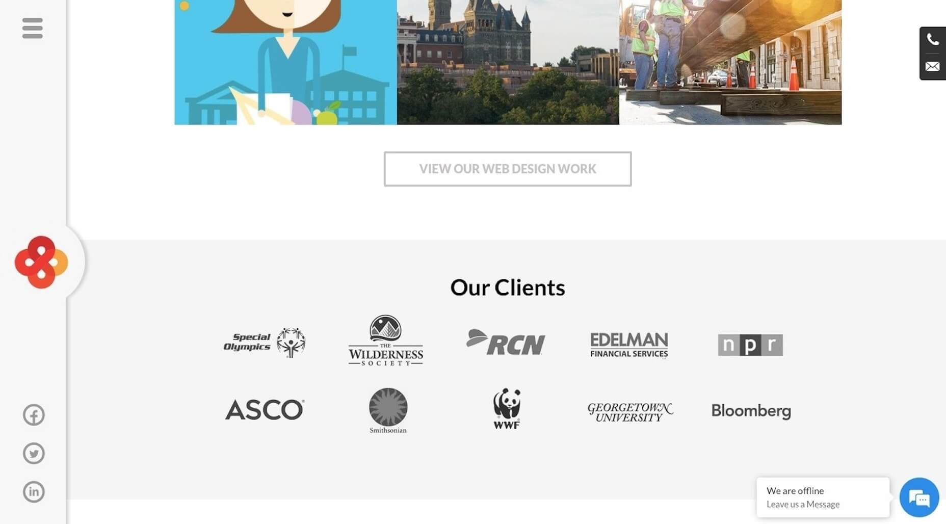
Another way to do this is by including testimonials or, at the very least, logos from clients who are happy to connect their brand to yours. Interactive Strategies uses a dedicated banner on its home page to show off brands who’ve trusted them:
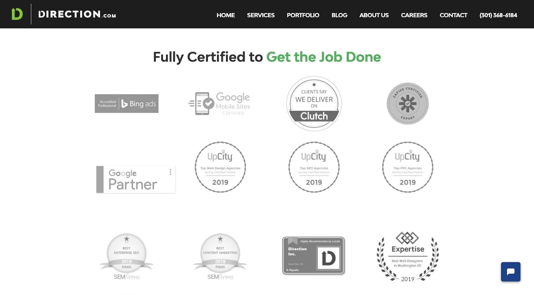
If you don’t have a client base with recognizable names, or you’re still working to amass an impressive list of clients, don’t worry. You can use other trust marks to establish trust now as Direction.com does:
Prospective clients can see all of their awards and certifications in one place — and it’s definitely something to marvel at.
5. Simplify Next Steps
If you’ve been doing this for long enough, I bet you can anticipate what prospective clients’ next steps are after they’ve visited your website.
For my business, I know that they’ll see my site and then reach out for pricing. However, I know that I can’t actually answer that question during a first phone call. I have to review their needs, business, industry, and a whole host of other details before I can provide a quote.
So, I give them two options:
- Fill out a contact form if you have further questions;
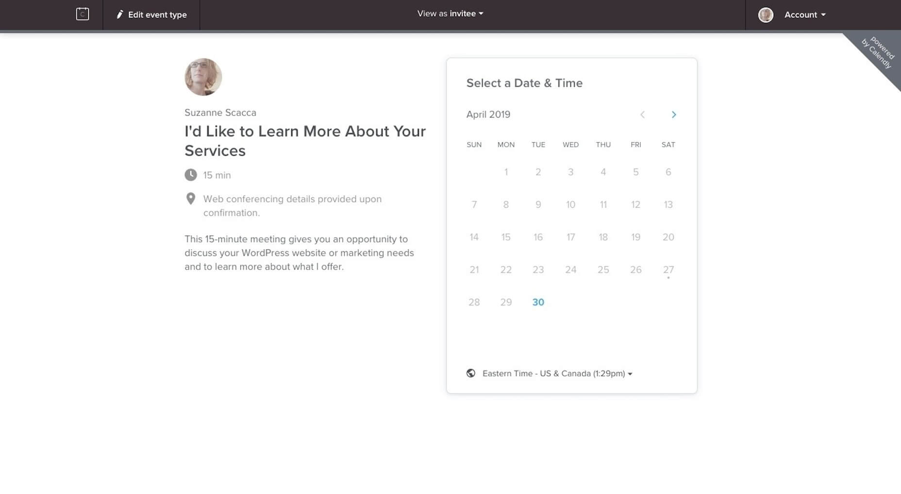
- Schedule a 15-minute call with me through Calendly.
There’s just one caveat to the phone call though. I don’t get on the phone with anyone until they fill out my questionnaire (which their “Thank You” email sends to them). It asks them everything I need to know to provide them with a quote.
That way, when I do get on the phone, I’m fully prepared to talk about my process, explain final questions, and give them a number.
I would suggest building out a similar set of contact options (e.g. contact form and scheduler, chatbot and scheduler, chatbot and email, etc.), so you can spend less time going back-and-forth on the phone or over email and instead get them a quote and contract right away.
Design Your Website to Sell While You Work
Would you like to stop spending so much time on job boards, social media, and in search trying to find new clients? You already know how to build websites to help your clients sell their businesses, so why aren’t you doing the same for your own?
| Add Realistic Chalk and Sketch Lettering Effects with Sketch’it – only $5! |
|
