How to use grids in graphic design
Do you want to know the best way to set up any graphic design? How about one of the most useful concepts of all graphic design? In short, do you want to understand how to use graphic grids?
In this article, I want to discuss the topic of graphic grids in detail, through rules, useful examples and design resources that you can download and save on your computer. I will tell you how much of the grids are necessary for the construction of any graphic design, the aesthetic-usability effect and how to build a grid in a harmonious way.
Come on, let’s start that there is so much to talk about!
What are the graphic grids?
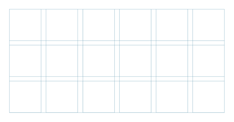
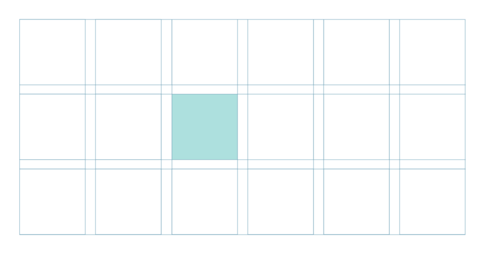
A grid, or cage, is essentially a subdivision of the workspace through vertical and horizontal lines aimed at organizing the spaces and defining the elements that will make up a project. Let’s think more specifically, and try to understand why the division and organization of a workspace in graphic design are so fundamental.
The composition of the grids is the basis of graphic design
Whether you work with the press or with the web, on the design of a logo or on the construction of a font, on packaging design or layout, understanding how to compose grids is something you need to consider essential among your skills as a designer. A grid is like an invisible glue that holds the project together and gives it coherence. For many designers, though, grids are an almost unknown thing, especially among the many self-teachers who, of course, were not taught about the theoretical aspect of design and therefore about grid theories.
The fact that a good organization of the project is so often overlooked is one of the reasons why around the streets and on the web we often see projects with bad balances or alignments. This article was born just to try to fill this “hole” in the training of many creatives. Without a starting grid, a project is born already messy.
Always start with a grid
Whatever your project, once thought and sketched (because making sketches is very important), you have to start realizing the final project starting from a grid.
Why? Well, try considering each of your projects as if it were a building. A building without its supporting structure collapses or at least is very unstable when that structure is poorly designed. In addition to being fundamental to creating a supporting structure for your layout, the cages are also extremely important for creating harmony between shapes and relationships. For example, the balance between the white spaces and the text or imagery in the middle of a web page. In fact, a good composition can lead to much more usable projects, as stated in the Aesthetic-Usability Effect theory.
The aesthetic-usability effect
There is a theory about design called the Aesthetic-Usability Effect. Essentially this theory states that when something is designed to be beautiful, consequently and naturally, then it will be something that will also be easily usable. It is a very important concept in all design: from graphics to interface design. A well-designed grid makes your design not only more beautiful but also more usable!
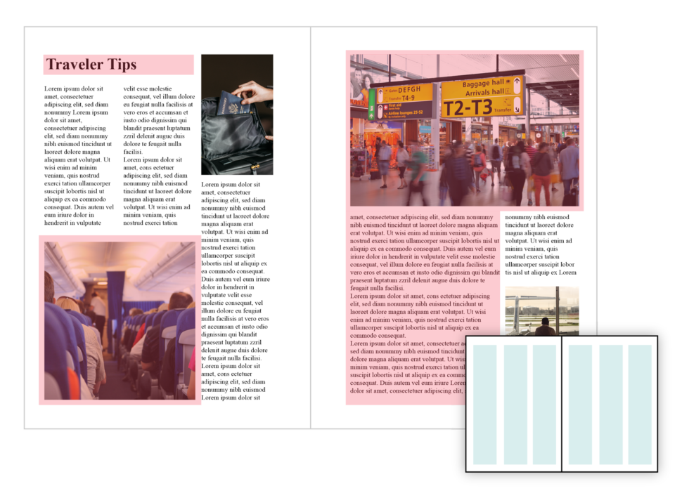
So how do you design something beautiful and easily useable? Ok, you have to start from a grid, but what kind of grid? Based on which principles and which theories? We’ll discuss this a little further below.
How to build a functional grid
I told you how a harmonious composition plays a crucial role in determining the success of a project. To construct a harmonious design project it is therefore necessary to construct a graphic grid that is also harmonic. Yes, but how do you construct a harmonious graphic grid?
One of the most effective ways to do this is to use mathematics (nothing complicated) and specific mathematical relationships to construct the structure of the grid itself. Here’s how it’s done:
Follow the paper format
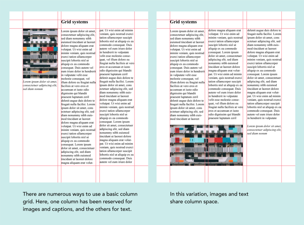
The first method is to exploit the dimensional relationships of the support on which you are working. For example, if you are working on an international sheet of paper, such as the A4, it will have a ratio between the two sides of 1: 1.414 and you can then use this mathematical relationship to create the divisions given within the sheet itself.
Creating divisions in a stable relationship with each other inside the sheet will create an important visual harmony.
How to create a grid on A4 paper
Once you have built a grid, you absolutely must not limit your creativity. A grid serves to channel creativity towards your goal. Alas, grid construction is not a science with a set of rules to learn by heart. Many of the most effective grids in graphic design were born from experiments with mathematical relationships, with texts, photographs, and elements of the page or website. Sometimes even from random experiments!
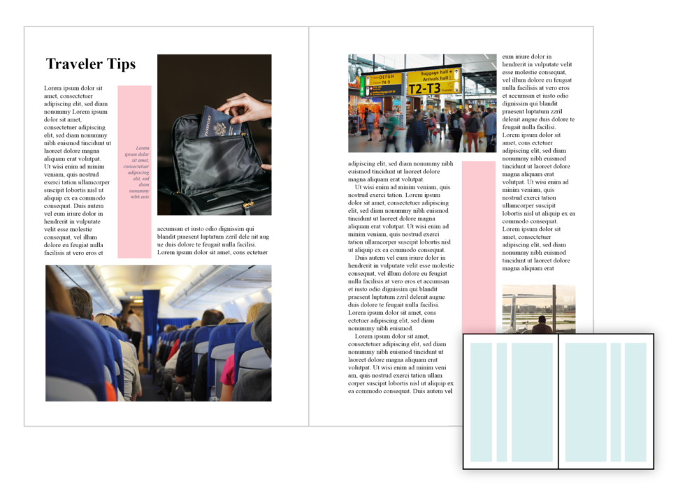
You, as a graphic designer, do not have to invent new grids or new methods to build graphic elements, you can simply rely on mathematical conventions, such as those I mentioned in this article. You can even take visual inspiration from highly published magazines and from other websites. The important thing is this: the grids are a great help if they become the most difficult and expensive part of your job, maybe you are doing something wrong. Grids should decrease and not increase the time spent on your project.
Resources
Before concluding, I think it may be useful to have some useful resources for building grids. Let’s start with books, or rather with a book in particular because knowledge is power, isn’t it?
One of the most useful resources in graphic design is the book (in English and German) of one of the masters of Swiss design in the mid-1900s, Josef Muller-Brockmann entitled “Grid Systems in Graphic Design”. This really is a MUST for every graphic designer professional. A historical and precious piece for your library. The price is directly proportional to the quality, really.
Even if you get the smallest chance to read it, it’s very worth it. You could even try getting it at a library. Here are some easy online tools that will also help in your grid creating adventures:
Gridulator – create simple grids that can be quickly saved in .png
Grid Designer – very useful for web designers to design columns and export with .css files
Searching on Google for keywords such as “grid building tool” or “grid builder” can find an infinite number of free tools that do more or less the same simple things.
Conclusion
That’s it for today. I hope I have convinced you of the importance of building a good and balanced grid in all your graphics and design projects. I also hope that this has helped you find a few new resources for designing and creating the perfect grid.
This is just an introductory article on the grids in graphic design. In short, this is just the tip of the iceberg. There are many design theories and strategies out there that will help you perfect your grid related design technique, so always be on the lookout!
Read More at How to use grids in graphic design