Footnotes That Work in RSS Readers
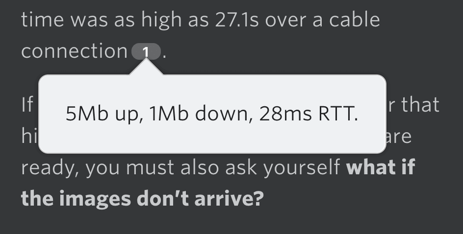
Feedbin is the RSS reader I’m using at the moment. I was reading one of Harry’s blog posts on it the other day, and I noticed a nice little interactive touch right inside Feedbin. There was a button-looking element with the number one which, as it turned out, was a footnote. I hovered over it, and it revealed the note.
The HTML for the footnote on the blog post itself looks like this:
<p>...they'd managed to place 27.9MB of images onto the Critical Path.
Almost 30MB of previously non-render blocking assets had just been
turned into blocking ones on purpose with no escape hatch. Start
render time was as high as 27.1s over a cable connection<sup id="fnref:1">
<a href="#fn:1" class="footnote">1</a></sup>.</p>
Just an anchor link that points to #fn:1, and the makes it look like a footnote link. This is how the styling would look by default:

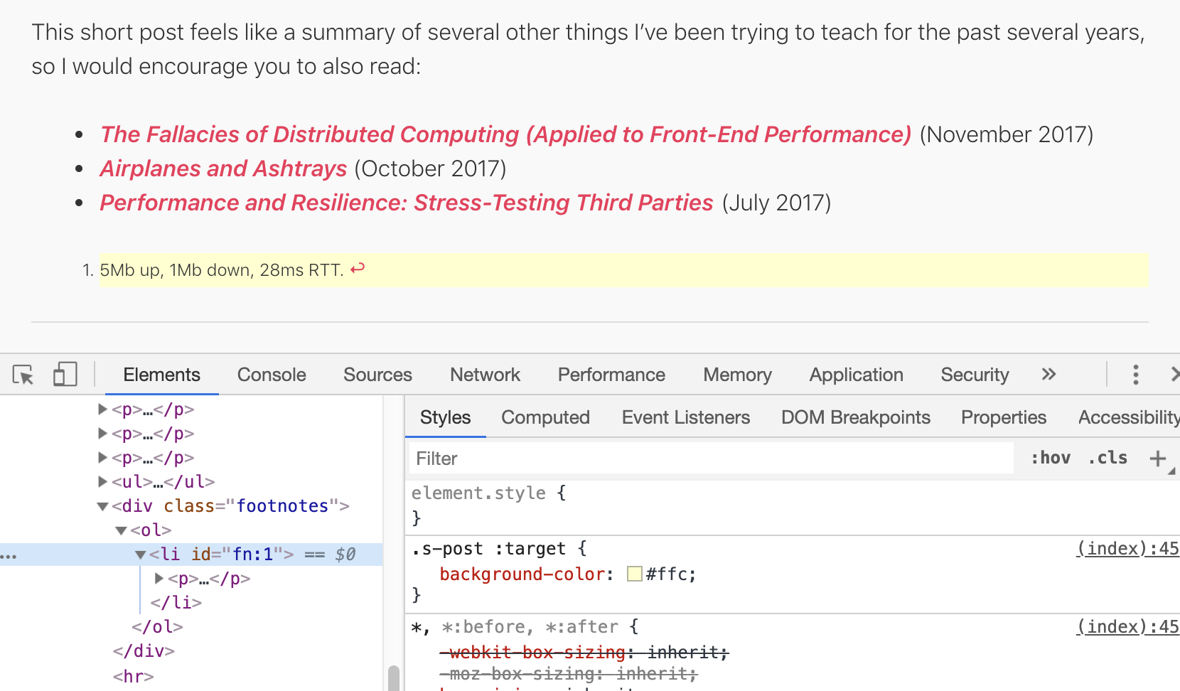
The HTML for the list of footnotes at the bottom of the blog post looks like this:
<div class="footnotes">
<ol>
<li id="fn:1">
<p>5Mb up, 1Mb down, 28ms RTT. <a href="#fnref:1" class="reversefootnote">↩</a></p>
</li>
</ol>
</div>As a little side note, I notice Harry is using scroll-behavior to smooth the scroll. He’s also got some nice :target styling in there.

All in all, we have:
- a link to go down and read the note
- a link to pop back up
Nothing special there. No fancy libraries or anything. Just semantic HTML. That should work in any RSS reader, assuming they don’t futz with the hash links and maintain the IDs on the elements as written.
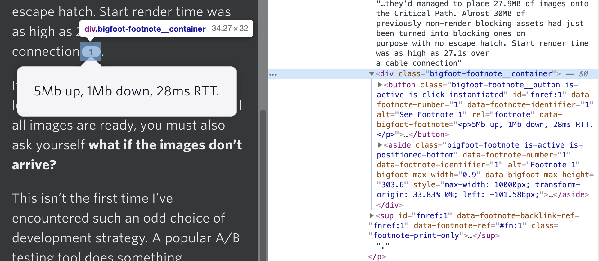
It’s Feedbin that sees this markup pattern and decides to do the extra UI styling and fancy interaction. By inspecting what’s going on, it looks like they hide the originals and replace them with their own special stuff:

Ah ha! A Bigfoot spotting! It’s right in their source.
That means they fire off Bigfoot when articles are loaded and it does the trick. Like this:
See the Pen
Bigfoot Footnotes by Chris Coyier (@chriscoyier)
on CodePen.
That said, it’s based on an already functional foundation. Lemme end this with that same markup pattern, and I’ll try to look at it in different RSS readers to see what they do. Feel free to report what it does in your RSS reader of choice in the comments, if it does anything at all.
Azul is an abstract board game designed by Michael Kiesling and released by Plan B Games1 in 2017. From two to four players collect tiles to fill up a 5×5 player board. Players collect tiles by taking all the tiles of one color from a repository, and placing them in a row, taking turns until all the tiles for that round are taken. At that point, one tile from every filled row moves over to each player’s 5×5 board, while the rest of the tiles in the filled row are discarded. Each tile scores based on where it is placed in relation to other tiles on the board. Rounds continue until at least one player has made a row of tiles all the way across their 5×5 board.
- Plan B makes other cool games like Century and Reef. ?
The post Footnotes That Work in RSS Readers appeared first on CSS-Tricks.
