Digging Into The Display Property: Grids All The Way Down
Digging Into The Display Property: Grids All The Way Down
Rachel Andrew2019-05-24T13:00:59+02:002019-05-26T13:06:35+00:00
Today, we are going to take a look at what happens when we use display: grid and how we might use the new subgrid value of grid-template-columns and grid-template-rows to allow for grids all the way down through our markup, which relate to each other.
This article is part of a series that look at various aspects of the CSS display property, and is a follow-on to the first two articles:
- The Two Values Of
display - Box Generation
- Grids All The Way Down
What Happens When We Create A Grid Container?
CSS Grid Layout is switched on by using display: grid. If you have read the first article in this series, you will know that what this single value property actually means is display: block grid. We get a block level box which is defined as a grid container, with direct children that are grid items and participate in grid layout.
If you take a look at the display specification, you will see that in the table that defines all of the different values for display. The words grid container are linked to the definition of a grid container in the Grid Specification. Therefore, to find out what this actually means we need to go look there. When we do, we get some useful clarification of the behavior of a grid container.
A grid container is said to establish a Grid Formatting Context which is similar to a Block Formatting Context (BFC). I’ve written an extensive guide to the Block Formatting Context. In that article you will discover two things about a BFC that are the same for a grid formatting context. Floats do not intrude into the grid container, and the margins on the container do not collapse with those of the contents.
There are differences, however, only once we get inside the grid container. The children of a grid container and not participating in block and inline layout, they are grid items and therefore participating in grid layout. This means that a few things we are used to in block and inline layout do not hold true.
If any item in the layout is floated or cleared, the float and clear properties do not have an effect once the item becomes a grid item. The vertical-align property has no effect, and the ::first-letter and ::first-line pseudo-elements cannot be used.
The fact that an item cannot be both floated and a grid item is helpful in terms of creating fallbacks. When creating a fallback for browsers which do not support grid using floats (when grid is supported), you don’t need to do anything special: the float is overwritten.
I outline this approach in my article on supporting browsers without grid. There are situations where the behavior has turned out to be problematic, although these issues could be solved by using another part of CSS as described in this post unpacking an issue with grid and floats, “Editorial Layouts, Exclusions, and CSS Grid”.
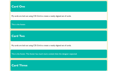
With all that said, if we do nothing else than change the value of display to grid, we won’t see much of a difference to our layout. The direct children are grid items, however, by default we end up with a one-column grid. A grid always has one column and one row. The rest of the rows that we can see after doing this are implicit rows, i.e. rows created to hold the content.

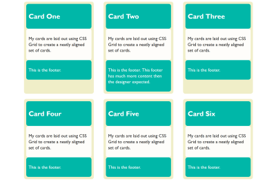
We can start to form something that looks more like a grid to us by giving the property grid-template-columns a value. The property takes a track listing as a value; if I give it three 1fr tracks, we now find ourselves with a three-column grid, and using the gap property gives me spacing between those cards.
We now have something that looks to us like a grid:

Each of the grid items in our example has children of its own. The cards have headers and footers and an area for the main content of the card. These children are grid items, but their children have returned to block and inline layout. The header, content area and footer do not do any grid like things. This is because when we change the value of display to grid, it doesn’t inherit but instead only the children become grid items; their children return to block layout.
Nesting Grids
If a card has more content than the other cards, the cards in that row get taller. The initial value of align-items for grid items is stretch. Our cards stretch to full height. The items inside, however, are in normal block and inline flow and so they don’t stretch magically to fill the card. (This is why in the image above you can see that the cards with less content have a gap at the bottom.)
If we wanted them to (in order to make that footer always sit at the bottom), we could make our grid item a grid, too. In this case, a single-column grid is all we need. We can then define row tracks, giving the area into which the div with a class of content sits, a track size of 1fr. This causes it to take up all of the available space in the container, and will push the footer to the bottom of the card.
See the Pen display: subgrid is not what we want by Rachel Andrew.
You can do this nesting of grids as much as you need. I don’t really think of it as nesting since we’re not creating nested tables here, and we are usually using the structural HTML elements already in place. We are just changing the value of display one level at a time to what is most appropriate for the children of that element. That might be flex layout or grid layout, but most often it will be block and inline layout. In that case, we don’t need to do anything because that is what happens by default.
Lining Up The Headers And Footers
As we have now seen, if we want a set of cards laid out on a grid, and we want them to display as tall as the tallest card, and we want the footers pushed to the bottom of the card, we need very little CSS. The layout CSS for the above example is as follows:
.cards {
  display: grid;
  gap: 20px;
  grid-template-columns: 1fr 1fr 1fr;
}

article {
  display: grid;
  grid-template-rows: auto 1fr auto;
  row-gap: 20px;
}
What if we want the background color on the headers and footers to line up though? Each card is a grid item, but the headers and footers are in the grid on the item. They have no relationship to each other and so we can’t line them up. Here it would be nice if we could somehow inherit the grid through the children.
If we could define a grid on the parent which had three rows, then place the cards across these three rows and have the header, content and footer each sit in one of the rows. That way, each header would be in the same row, and therefore if one header got taller, the whole row would get taller.
We don’t have a good solution to that in browsers today, but it is on the way. The subgrid feature of CSS Grid Layout Level 2 will enable this exact pattern. You will be able to create a grid on the parent and then selectively opt the rows and/or columns to use that grid, rather than define a new grid on the child element which is completely independent of that grid.
Note that the examples which follow only work at the time of writing in Firefox Nightly. The subgrid value of grid-template-columns and grid-template-rows is a new feature and part of Level 2 of the CSS Grid Specification. To try out this feature, download a copy of Firefox Nightly.
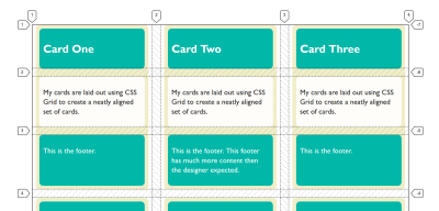
You can see how this works in the images below. In the first image, I have created three row tracks on the parent and spanned the card across them. With the Firefox Grid Inspector highlighting the grid, you can see that the rows of the parent don’t relate to the rows used by the children.

If, instead of defining three rows on the child, I use the subgrid value for grid-template-rows, the card now uses those rows on the parent. You can see how the two are now aligned and therefore the headers and footers align as well:

What we are doing here with subgrid isn’t a new value of display. The item which is a subgrid is a grid container itself, as we have set display: grid on it. The grid items are behaving as grid items normally do. This is regular grid layout — no different from the original nested grid except that (instead of the item having its own row track sizing) it is using the tracks of the parent.
.cards {
  display: grid;
  gap: 20px;
  grid-template-columns: 1fr 1fr 1fr;
  grid-template-rows: repeat(2,auto 1fr auto);
}

article {
  grid-row-end: span 3;
  display: grid;
  grid-template-rows: subgrid;
}
This is the nice thing about subgrid; there isn’t a whole lot to learn if you already know how to use grid layout. You can read about the rest of the details in my previous post here on Smashing Magazine, “CSS Grid Level 2: Here Comes Subgrid”.
Yesterday (23rd May 2019), subgrid landed in Firefox Nightly, so we have a testable implementation of the subgrid value of grid-template-columns and grid-template-rows. Please do grab a copy of Nightly and try this out. With a copy of Nightly, you can see the final example working in this CodePen:
See the Pen display: subgrid is not what we want by Rachel Andrew.
See if you can think up other use cases that are solved by having the subgrid feature, or perhaps things which you think are missing. While a feature is only available in a Nightly browser, that’s the time where it is possible to make changes to the spec if some issue are discovered. So, do a favor to your future web developing self and try out features like this in order that you can help contribute to the web platform and make things better.
If you think you have found a bug in the Firefox implementation, you can take a look at the main implementation bug on Bugzilla which links to related issues in the Depends on section. If you can’t see your issue, create as a simple a reduced test case as possible and raise the bug. If you think that subgrid should do something in order to solve a use case, and that is something not detailed in the specification, you can raise an issue on the CSS Working Group GitHub for a potential enhancement.
What About display: contents?
If you have been following along, you might think that display: contents (as described in the previous article about display) might solve the problems that subgrid seeks to solve — that of allowing indirect children to participate in a grid layout. That isn’t the case, and our example of cards is a perfect way to demonstrate the difference.
If, instead of making our card a grid layout with display: grid, we removed the box using display: contents, we would get this result in this next CodePen. (Try removing the display: contents line from the rules for .card to see the difference.)
See the Pen display: subgrid is not what we want by Rachel Andrew.
In this example, the box of the card has been removed and so the header, content and footer directly participate in grid layout and are autoplaced across the grid. This wasn’t what we wanted at all! The contents value of display will be really helpful once the accessibility issues in browsers mentioned in my last article are dealt with, however, it solves different problems to the one that we are exploring.
More Reading And Examples
I’ve been creating a number of examples and demos to help everyone understand subgrid. You can try those out at the links below:
- CSS Grid Level 2 Examples
- CSS Grid Level 2: Here Comes Subgrid
- Grids All The Way Down (Presentation)
- MDN Documentation For Subgrid