Archive

Archive for May, 2019

SVG Web Page Components For IoT And Makers (Part 1)

May 8th, 2019 No comments
A web page architecture for treating the IoT as a form server - looking for something better.

SVG Web Page Components For IoT And Makers (Part 1)

SVG Web Page Components For IoT And Makers (Part 1)

Richard Leddy

2019-05-08T13:00:16+02:002019-05-08T22:33:30+00:00

The IoT market is still in its early stages, but gathering steam. We are at a cusp in the history of IoT. Markets are quadrupling in the course of five years, 2015 to 2020. For web developers, this IoT growth is significant. There is already a great demand for IoT web techniques.

Many devices will be spread out geospatially, and its owners will desire remote control and management. Full web stacks must be made in order to create channels for teleoperation. Also, the interaction will be with one or more IoT devices at a time. The interaction must be in the real time of the physical world.

This discussion delves into the interface requirements using Vue.js as a catalyst and illustrates one method of webpage to device communication out of many subsitutions.

Here are some of the goals planned for this discussion:

  1. Create a single page web app SPWA that hosts groups of IoT human-machine interfaces (we may call these “panel groups”);
  2. Display lists of panel group identifiers as a result of querying a server;
  3. Display the panels of a selected group as a result of a query;
  4. Ensure that the panel display is loaded lazily and becomes animated quickly;
  5. Ensure that panels synchronize with IoT devices.

IoT And The Rapid Growth Of Web Pages

The presentation of graphics for visualization and remote control of hardware along with synchronization of web pages with real-time physical processes are within the realm of web page problem solving inherent in this IoT future.

Many of us are beginning our search for IoT presentation techniques, but there are a few web standards along with a few presentation techniques that we can begin using now. As we explore these standards and techniques together, we can join this IoT wave.

Dashboards and data visualization are in demand. Furthermore, the demand for going beyond web pages that provide forms or display lists or textual content is high. The dashboards for IoT need to be pictographic, animated. Animations must be synchronized with real-time physical processes in order to provide a veridical view of machine state to users. Machine state, such as a flame burning or not, trumps application state and provides critical information to operators, perhaps even safety information.

The dashboards require more than the visualization of data. We have to keep in mind that the things part of IoT is devices that not only have sensors but also control interfaces. In hardware implementations, MCUs are extended with switches, threshold switches, parameter settings, and more. Still, web pages may take the place of those hardware control components.

Nothing new. Computer interfaces for hardware have been around for a long time, but the rapid growth of web page use for these interfaces is part of our present experience. WebRTC and Speech API are on a development path that started in 2012. WebSockets has been developing in a similar time frame.

IoT has been in our minds for a long time. IoT has been part of the human dialog since 1832. But, IoT and wireless as we are coming to know it was envisioned by Tesla around 1926. Forbes 2018 State of Iot tells us the current market focus for IoT. Of interest to web developers, the article calls out dashboards:

“IoT early adopters or advocates prioritize dashboards, reporting, IoT use cases that provide data streams integral to analytics, advanced visualization, and data mining.”

The IoT market is huge. This Market Size article gives a prediction for the number of devices that will appear: 2018: 23.14 billion ? 2025: 75.44 billion. And, it attempts to put a financial figure on it: 2014: $2.99 trillion ? 2020: $8.90 trillion. The demand for IoT skills will be the fastest growing: IoT in Demand.

As we develop clear interfaces for controlling and monitoring devices, we encounter a new problem for developing our interfaces. All the many billions of devices will be owned by many people (or organizations). Also, each person may own any number of devices. Perhaps even some of the devices will be shared.

Modern interfaces that have been made for machine controls often have a well-defined layout specific to a particular machine or installation of a few machines. For instance, in a smart house, a high-end system will have an LCD with panels for carefully placed devices. But, as we grow with the web version of IoT, there will be any number of panels for a dynamic and even mobile stream of devices.

The management of panels for devices becomes similar to managing social connections on social web sites.

“Our user interfaces will have to be dynamic in managing which highly animated real-time panel must be displayed at any one time for each particular user.”

The dashboard is a single page web app SPWA. And, we can imagine a database of panels. So, if a single user is going to access a number of panels and configurations for his devices strewn about the planet, the SPWA needs to access panel components on demand. The panels and some of their supporting JavaScript will have to load lazily.

“Our interfaces will have to work with web page frameworks that can allow incorporating asynchronous component bindings without reinitializing their frameworks.”

Let’s use Vue.js, WebSockets, MQTT, and SVG to make our step into the IoT market.

Recommended reading: Building An Interactive Infographic With Vue.js

High-Level Architecture For An IoT Web App

When designing the interface for the IoT web page, one always has many options. One option might be to dedicate one single page to one single device. The page might even be rendered on the server side. The server would have the job of querying the device to get its sensor values and then putting the values into the appropriate places in the HTML string.

Many of us are familiar with tools that allow HTML templates to be written with special markers that indicate where to put variable values. Seeing {{temperature}} in such a template tells us and the view engine to take the temperature queried from a device and replace the {{temperature}} symbol with it. So, after waiting for the server to query the device, the device responding, rendering the page, and delivering the page, the user will finally be able to see the temperature reported by the device.

For this page per device architecture, the user may then wish to send a command to the device. No problem, he can fill out an HTML form and submit. The server might even have a route just for the device, or perhaps a little more cleverly, a route for the type of device and device ID. The server would then translate the form data into a message to send to the device, write it to some device handler and wait for an acknowledgment. Then, the server may finally respond to the post request and tell the user that everything is fine with the device.

A web page architecture for treating the IoT as a form server - looking for something better.

A web page architecture for treating the IoT as a form server — looking for something better. (Large preview)

Many CMSs work in this way for updating blog entries and the like. Nothing seems strange about it. It seems that HTML over HTTP has always had the design for getting pages that have been rendered and for sending form data to be handled by the web server. What’s more, there are thousands of CMS’s to choose from. So, in order to get our IoT system up, it seems reasonable to wade through those thousands of CMS’s to see which one is right for the job. Or, we might apply one filter on CMS’s to start with.

We have to take the real-time nature of what we are dealing with into consideration. So, while HTML in its original form is quite good for many enterprise tasks, it needs a little help in order to become the delivery mechanism for IoT management. So, we need a CMS or custom web server that helps HTML do this IoT job. We can also just think of the server as we assume CMS’s provide server functionality. We just need to keep in mind that the server has to provide event-driven animation, so the page can’t be 100% finalized static print.

Here are some parameters that might guide choices for our device-linked web page, things that it should do:

  1. Receive sensor data and other device status messages asynchronously;
  2. Render the sensor data for the page in the client (almost corollary to 1);
  3. Publish commands to a particular device or group of devices asynchronously;
  4. Optionally send commands through the server or bypass it.
  5. Securely maintain the ownership relationship between the device and the user;
  6. Manage critical device operation by either not interfering or overriding.

The list comes to mind when thinking about just one page acting as the interface to a selected device. We want to be able to communicate with the device freely when it comes to commands and data.

As for the page, we need only ask the web server for it once. We would expect that the web server (or associated application) would provide a secure communication pathway. And, the pathway does not have to be through the server, or maybe it should avoid the server altogether as the server may have higher priority tasks other than taking care of one page’s communication for data coming from sensors.

In fact, we can imagine data coming in from a sensor once a second, and we would not expect the web server itself to provide a constant second by the second update for thousands of individual sensor streams multiplied by thousands of viewers. Of course, a web server can be partitioned or set up in a load balancing framework, but there are other services that are customized for sensor delivery and marshaling commands to hardware.

The web server will need to deliver some packet so that the page may establish secure communication channels with the device. We have to be careful about sending messages on channels that don’t provide some management of the kinds of messages going through. There has to be some knowledge as to whether a device is in a mode that can be interrupted or there may be a demand for user action if a device is out of control. So, the web server can help the client to obtain the appropriate resources which can know more about the device. Messaging could be done with something like an MQTT server. And, there could be some services for preparing the MQTT server that can be initiated when the user gains access to his panel via the web server.

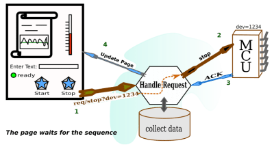
Because of the physical world with its real-time requirements and because of additional security considerations, our diagram becomes a little different from the original.

A single page app that talks to one MCU.

A single page app that talks to one MCU. It now interacts asynchronously with the MCU independently of the web page server. (Large preview)

We don’t get to stop here. Setting up a single page per device, even if it is responsive and handles communication well, is not what we asked for. We have to assume that a user will log in to his account and access his dashboard. From there, he will ask for some list of content projects (most likely projects he is working on). Each item in the list will refer to a number of resources. When he selects an item by clicking or tapping, he will gain access to a collection of panels, each of which will have some information about a particular resource or IoT device.

Any number of the panels delivered in response to the query generated as a result of the user’s interface action may be those panels that interact with live devices. So, as soon as a panel comes up, it will be expected to show real-time activity and to be able to send a command to a device.

How the panels are seen on the page is a design decision. They might be floating windows, or they might be boxes on a scrollable background. However that is presented, panels will be ticking off time, temperature, pressure, wind speed, or whatever else you can imagine. We expect the panels to be animated with respect to various graphic scales. Temperature can be presented as a thermometer, speed as a semicircular speed gauge, sound as a streaming waveform, and so on.

The web server has the job of delivering the right panels to the right user given queries to a database of panels and given that devices have to be physically available. What’s more, given that there will be many different kinds of devices, the panels for each device will likely be different. So, the web server should be able to deliver the pictographic information needed for rendering a panel. However, the HTML page for the dashboard should not have to be loaded with all the possible panels. There is no idea of how many there will be.

Here are some parameters that might guide choices for our dashboard page, things that it should do:

  1. Present a way of selecting groups of related device panels;
  2. Make use of simultaneous device communication mechanisms for some number of devices;
  3. Activate device panels when the user requests them;
  4. Incorporate lazily loaded graphics for unique panel designs;
  5. Make use of security tokens and parameters with respect to each panel;
  6. Maintain synchronicity with all devices under user inspection.

A single page app that talks to multiple MCU's, asynchronously and independently of the web page server.

A single page app that talks to multiple MCU’s, asynchronously and independently of the web page server. (Large preview)

We can begin to see how the game changes, but in the world of dashboard design, the game has been changing a little bit here and there for some time. We just have to narrow ourselves down to some up to date and useful page development tools to get ourselves up and going.

Let’s start with how we can render the panels. This already seems like a big job. We are imagining many different kinds of panels. But, if you ever used a music DAW, you would see how they have used graphics to make panels look like the analog devices used by bands from long ago. All the panels in DAW’s are drawn by the plugins that operate on sound. In fact, a lot of those DAW’s plugins might use SVG to render their interfaces. So, we limit ourselves to handling SVG interfaces, which in turn can be any graphic we can imagine.

Choosing SVG For Panels

Of course, I like DAWs and would use that for an example, but SVG is a web page standard. SVG is a W3C standard. It is for carrying line drawings to the web pages. SVG used to be a second class citizen on the web page, required to live in iFrames. But, since HTML5, it has been a first class citizen. Perhaps, when SVG2 comes out, that it will be able to use form elements. For now, form elements are Foreign Objects in SVG. But, that should not stop us from making SVG the substrate for panels.

SVG can be drawn, stored for display, and it can be lazily loaded. In fact, as we explore the component system we will see that SVG can be used for component templates. In this discussion, we will be using Vue.js to make components for the panels.

Drawing SVG is not difficult, because there are many line drawing programs that are easy to get. If you spend the money, you can get Adobe Illustrator, which exports SVG. Inkscape has been a goto for SVG creation for some time. It is open source and works well on Linux, but can also be run on Mac and Windows. Then, there are several web page SVG editing programs that are open source, and some SaaS versions as well.

I have been looking around for an open-source web-based SVG editor. After some looking around, I came upon SVG-Edit. You can include it in your own web pages, perhaps if you are making an SVG based blog or something.

Electric diagram in SVG ready for animation.

An electric diagram is pretty detailed, but we can obtain it easily in SVG and animate it with just a little code. (Large preview)

When you save your work to a file, SVG-Edit downloads it in your browser, and you can pick up the file from your download directory.

The picture I have drawn shows an AND gate controlling an integrator. That is not what one would usually expect to see in a panel for an MCU. The panel might have a button to feed one of the AND gate inputs, perhaps. Then it might have a display from an ADC that reads the output of the integrator. Perhaps that will be a line chart on a time axis. Most panels will have graphics that allow the user to relate to what is going on inside the MCU. And, if our circuit is going to live anywhere, it will be inside the MCU.

All the same, our electronic diagram can be used to discuss animation. What we want to do is take a look at the SVG and see where we can get at some of the DOM tags that we would like to change in some way. We can then animate the SVG by using a little vanilla JavaScript and a timer. Let’s make the AND gate blink in different colors.

The SVG that we are looking for is in the following code box. It doesn’t look very friendly for the programmer, although the user will be quite happy. Nevertheless, there are still some cues to go on for finding which DOM element we wish to operate on. First, most SVG drawing tools have a way of getting at object properties, in particular, the id attribute. SVG-Edit has a way, too. In the editor, select the AND gate and observe the toolbar. You will see a field for the id and the CSS class as well.

One of the SVG drawing tools with a way to capture the object id using the provided interface.

One of the SVG drawing tools with a way to capture the object id using the provided interface. (Large preview)

If you can’t get to an editing tool for some reason, you can open the SVG up in a browser and inspect the DOM. In any case, we have found that our gate had id = “svg_1”.

<svg width="640" height="480" xmlns="http://www.w3.org/2000/svg" xmlns:svg="http://www.w3.org/2000/svg">
 <g class="layer">
  <title>Layer 1</title>
  <path d="m80.59881,87.020171l14.714795,0m-14.714793,-11.938687l14.714797,0.000004m-0.033867,-6.543869l0,24.758504c42.377882,2.221929 43.364812,-27.139117 0,-24.758504zm47.366321,12.333056l-15.303943,0m-48.188699,-6.489897l1.454753,0l0,1.454751l-1.454753,0l0,-1.454751zm-0.068425,11.869359l1.454753,0l0,1.454753l-1.454753,0l0,-1.454753zm63.545246,-6.089294l1.454751,0l0,1.454751l-1.454751,0l0,-1.454751z" fill="#FF0000" id="svg_1" stroke="#000000"/>
  <path d="m48.58886,119.662231l18.234678,0l2.523043,-7.173309l4.128604,13.808613l4.587337,-13.987948l4.013933,13.808613l4.35797,-13.629278l4.35797,13.718944l2.408353,-6.72497l18.349357,0m-64.482612,-0.623112l1.515724,0l0,1.515728l-1.515724,0l0,-1.515728zm64.484275,-0.103111l1.515721,0l0,1.515728l-1.515721,0l0,-1.515728z" fill="#FF0000" id="svg_3" stroke="#000000" stroke-dasharray="null" stroke-linecap="null" stroke-linejoin="null" transform="rotate(90.3367 80.0675 119.304)"/>
  <polygon cx="108.5" cy="79.5" edge="0" fill="#ffffff" id="svg_6" orient="x" shape="regularPoly" sides="3" strokeWidth="null" strokecolor="#000000"/>
  <polygon cx="215.5" cy="192.5" edge="0" fill="#ffffff" id="svg_7" orient="x" shape="regularPoly" sides="3" strokeWidth="null" strokecolor="none"/>
  <polygon cx="165.5" cy="164.5" edge="0" fill="#ffffff" id="svg_8" orient="x" shape="regularPoly" sides="3" strokeWidth="null" strokecolor="none"/>
  <polygon cx="161.5" cy="138.5" edge="0" fill="#ffffff" id="svg_9" orient="x" shape="regularPoly" sides="3" strokeWidth="null" strokecolor="none"/>
  <polygon cx="160.5" cy="161.5" edge="0" fill="#ffffff" id="svg_10" orient="x" shape="regularPoly" sides="3" strokeWidth="null" strokecolor="none"/>
  <g id="svg_23">
   <path d="m225.016923,53.008793l0,3.419331m-4.558966,-1.709666l9.11791,0m10.303228,4.235512l-25.770656,0m-34.429182,0l24.544724,0m0.220544,-4.058194l1.543807,0l0,8.164451l-1.543807,0l0,-8.164451zm7.939567,-4.473673l1.543805,0l0,16.999955l-1.543805,0l0,-16.999955zm-34.176663,8.126854l1.474036,0l0,0.747515l-1.474036,0l0,-0.747515zm61.677552,0.018809l1.474038,0l0,0.747515l-1.474038,0l0,-0.747515z" fill="#FF0000" id="svg_4" sides="3" stroke="#000000" stroke-dasharray="null" stroke-linecap="null" stroke-linejoin="null" stroke-width="null"/>
   <polygon cx="171.5" cy="159.5" edge="43.256342" fill="#ffffff" id="svg_5" orient="x" points="223.47406005859375,91.5 186.01296997070312,113.128173828125 186.01296997070312,69.871826171875 223.47406005859375,91.5 " shape="regularPoly" sides="3" stroke="#000000" stroke-width="null" strokeWidth="null" strokecolor="#000000"/>
   <line fill="none" id="svg_12" stroke="#000000" stroke-dasharray="null" stroke-linecap="null" stroke-linejoin="null" stroke-width="null" x1="171" x2="186" y1="103.5" y2="103.5"/>
   <path d="m130.801817,80.659041l15.333707,0l2.12165,-4.564833l3.47178,8.787299l3.857534,-8.901421l3.375353,8.787299l3.664657,-8.673176l3.664657,8.730237l2.025206,-4.279526l15.430142,0m-54.224016,-0.396526l1.274586,0l0,0.964554l-1.274586,0l0,-0.964554zm54.225414,-0.065616l1.274584,0l0,0.964554l-1.274584,0l0,-0.964554z" fill="none" id="svg_14" stroke="#000000" stroke-dasharray="null" stroke-linecap="null" stroke-linejoin="null" stroke-width="null"/>
   <line fill="none" id="svg_15" stroke="#000000" stroke-dasharray="null" stroke-linecap="null" stroke-linejoin="null" stroke-width="null" x1="171.5" x2="171.5" y1="103.75" y2="135.388167"/>
   <line fill="none" id="svg_16" stroke="#000000" stroke-dasharray="null" stroke-linecap="null" stroke-linejoin="null" stroke-width="null" x1="177.75" x2="177.75" y1="58.75" y2="80.255951"/>
   <line fill="none" id="svg_17" stroke="#000000" stroke-dasharray="null" stroke-linecap="null" stroke-linejoin="null" stroke-width="null" x1="223.75" x2="266.854524" y1="91.75" y2="91.75"/>
   <line fill="none" id="svg_18" stroke="#000000" stroke-dasharray="null" stroke-linecap="null" stroke-linejoin="null" stroke-width="null" x1="241.75" x2="241.75" y1="59.75" y2="91.754167"/>
   <line fill="none" id="svg_19" stroke="#000000" stroke-dasharray="null" stroke-linecap="null" stroke-linejoin="null" stroke-width="null" x1="168.25" x2="180.75" y1="135.75" y2="135.75"/>
   <line fill="none" id="svg_20" stroke="#000000" stroke-dasharray="null" stroke-linecap="null" stroke-linejoin="null" stroke-width="null" x1="169.75" x2="179.25" y1="138.5" y2="138.5"/>
   <line fill="none" id="svg_22" stroke="#000000" stroke-dasharray="null" stroke-linecap="null" stroke-linejoin="null" x1="171" x2="179.75" y1="141.25" y2="141.25"/>
  </g>
 </g>
 </svg>

All we need now is a little JavaScript. We do take note first that the element attribute “fill” is present. Then there is just the simple program that follows:

<html>
    <head>
    </head>
<body>
        <!-- ALL THE SVG FROM ABOVE GOES HERE -->
</body>
<html>
</svg>
<script>
  // Set up a timer interval flash the color.
  var gateElement = document.getElementById("svg_1");
  if ( gateElement ) {
      setInterval( () => {
                    var fillC = gateElement.getAttribute("fill");
                    gateElement.setAttribute("fill", (fillC == "#00FF00") ? "#FF0000" : "#00FF00" );
                  }, 2000 )
    
  }
</script>

Notice that what we have is a minimal HTML page. You can cut and paste the code into your favorite editor. And, then don’t forget to cut and paste the SVG to replace the comment. My version of Chrome requires the page to be HTML in order to have the JavaScript section. So, that is one browser still treating SVG as something separate. But, it is a long way from the days.

If you cut and paste just right, you can bring up the page and see the AND gate go from red to green over and over.

Recommended reading: SVG Circle Decomposition To Paths

Building Panels From VUE Components

We are already on our way to making any single panel come alive, but if we want to manage large collections of panels in sensible ways, we would have our work cut out for us. That would especially be the case if we simply built on our first example.

While the first example shows us how we can asynchronously change an object view, it does not show us how to tie the view to the state of any data object let alone one that manages a machine. We can certainly understand how the setInterval demonstration can be replaced by a fetch handler, but we might not even get the state of a machine from the web server that serves the SVG containing page. Also, when we get the data, our programs are now required to know about the DOM structure of the given page.

Fortunately, frameworks such as Vue have become popular, and they can save us a lot of work.

It’s easy to find out about Vue. The Vue documentation is very accessible. So, if this discussion jumps too far ahead, then you may spend some time learning about Vue on its own web site. But, there are very good discussions within the Smashing pages. Krutie Patel wrote a stunning article on making an infographic. Souvik Sarkar tells us how to build a weather dashboard with Vue.

Group Selection of Related Panels

For the first step, we should address searching for groups of panels. One reason for doing this first is that it is at the framework level of our human interactions.

The user searches for something he is interested in. Perhaps he is interested in all the devices at locations in one town. Perhaps he has many batches of liquid products and he wants to narrow down to one type of product with each batch governed by a small collection of IoT devices. So, the user will first search to get a small list.

Here is the process:

  1. Search for groups of panels by features/parameters.
  2. View a list of icons representing groups.
  3. Select an icon (click/tap).
  4. Start using panels identified with the icon when they come up.

Another reason this is a good first step is that we can use Vue in its simplest form. No build tools needed. We will just include vue.js with a script tag in HTML. In fact, we don’t even have to download it. There is a site where a working copy of vue.js is being served.

All we need is the following tag:

<script src="https://cdn.jsdelivr.net/npm/vue@2.6.7/dist/vue.js"></script>

I copied the script tag directly from the Vue documentation about installation.

Now, we need a web page that can load icons and make them into something that clicks. Vue makes that very easy. In fact, I just wrote a little app to manage a Twitter list using Vue. It just manages text fields. As it is a tiny bit simpler than an SPWA using icons, we can have a look at it and then change it to be our desired single page app framework.

Here is part of what the page looks like:

A text-based page to use as a starting point for building a graphics application.

A text-based page to use as a starting point for building a graphics application. (Large preview)

This looks like a fairly simple page. Each outer numerical entry is a time slot with one or two tweets in it. The second tweet is optional. If you edit a tweet, Vue mechanisms update a JavaScript object. This page leaves it up to the user to click the “update entries” button to tell the server that something has changed, via its button handler function.

In order for the button handler to relay data to the server, it must change the Vue data object into a JSON string. Now, you may wonder just how difficult translating a Vue object to JSON will be. It turns out to be one line of code. You can find the line in the following source code, but if you want to find it faster, it is highlighted in the paragraph after the source code.

The page looks simple. Looks can be deceiving. Of course, the page looks simple, but is the code simple? Yes, indeed it is! Using Vue, the page manages the contents of the fields almost magically. Here is the code:

<!DOCTYPE html>
<html lang="en" prefix="og: http://ogp.me/ns#">
  <!-- define microdata scope and type -->
  <head itemscope itemtype="http://schema.org/Article">
        <title>Tweet Keeper</title>
        <style>
            body {
                margin: 2em;
            }
            .entryart {
                border: solid 1px navy;
                width: 80%;
                padding: 2px;
                padding-left: 6px;
                margin-bottom: 3px;
                background-color: #EEF4EE;
            }
        </style>
        <script src="https://cdn.jsdelivr.net/npm/vue@2.6.7/dist/vue.js"></script>
    </head>
    <body onload="GetTweets()">  <!-- some old fashioned handling -->

        <!-- The Vue app starts here. This is the HTML part of the Vue object -->
        <div id="tweetAppDiv">  <!-- Recognize the name from the Vue doc -->
            <div itemscope itemtype="http://schema.org/Article">
                <h1 itemprop="name">mangage tweets</h1>
                <p itemprop="description">My personal Tweet engine.
                This page accesses a personal tweet page that belongs to {{tweetOwner}}.</p> <!-- {{tweetOwner}} is in the data model. -->
                <button onclick="sendTweets(event)">Update Entries</button>
            </div>
            
          <!-- Here is a Vue loop for generating a lit -->
          <ol>
            <li v-for="tweet in tweets">
                <!-- here is the first tweet represented as an object with a lable and tweet text -->
                <div class="entryart">
                    <input v-model="tweet.def[0].label" />
                    <input style="width:40%" v-model="tweet.def[0].tweet" />
                </div>
                <!-- here is the second tweet in the slot. But, notice that it is optional.  -->
                <div class="entryart" v-if="tweet.def.length > 1">
                    <input v-model="tweet.def[1].label"/>
                    <input style="width:40%" v-model="tweet.def[1].tweet"/>
                </div>
            </li>
          </ol>
        </div>
        <script>
            var twtApp = new Vue({
                                  el: '#tweetAppDiv',
                                  data: {
                                    tweets: [  // Where is the data? Still on the server.s
                                    ],
                                    tweetOwner : "Lucky Dude"  // picked a name for demo
                                  }
                            });
        </script>
    </body>
</html>
<script>
    
    // Notice that you don't have to do everything in the Vue framework.
    // Here we are using some native API calls
    
    var gDefaultPostInfo = {  // there server is beyond simple - an example from node.js docs
        method: 'POST', // or 'PUT'
        mode: "cors", // no-cors, cors, *same-origin
        cache: "no-cache", // *default, no-cache, reload, force-cache, only-if-cached
        credentials: "same-origin", // include, *same-origin, omit
        redirect: "follow", // manual, *follow, error
        referrer: "no-referrer", // no-referrer, *client
        
        body: "",
        headers:{
            'Content-Type': 'application/json'
        }
    }
//
//
// recall the "onload"
function GetTweets(event) {
    var url = "http://localhost:8080/twitlist1.json"   // We have a fixed file name.
    fetch(url).then((response) => {  // this is now browser native
                    response.text().then((text) => {
                                         var newData = JSON.parse(text);  // DATA UPDATE! This is it.
                                         twtApp.tweets = newData   // the page update right away with new data.
                                    });
                    });
}

function sendTweets() {  // recall the button up above. This is not a Vue style button, but still in the Vue app.
    var url = "http://localhost:8080/"
    var data = twtApp.tweets;  // GET THE DATA OUT OF VUE. That's all folks.
    //
    // so happens that Vue pulls out the right data and stringifies it.
    var jdata = JSON.stringify(data); // data can be `string` or {object}!
    //
    gDefaultPostInfo.body = jdata;  // that's for fetch - not Vue related
    //
    fetch(url,gDefaultPostInfo).then(res => {  // We use fetch to POST as well as GET
                                        res.json()
                                   }).then(response => {
                                        console.log('Success:', JSON.stringify(response)) // promises
                                   }).catch(error => {
                                        console.error('Error:', error)
                                   });
}
//
//
//

</script>

So, just to highlight the amazing lines that speak to the power of the framework, let’s repeat here:

A. This is pulling the data out.

postOptionsObject.body = JSON.stringify(twtApp.tweets);

B. This is putting the data into Vue and seeing the screen update:

twtApp.tweets = JSON.parse(text)  // text is the server response

How much work is that?

It looks like there is going to be a nice way to express how data will update panels for IoT.

Now, let’s turn the tweets into clickable icons designed to fetch components from the web server.

From Tweets to Panel Fetching Icons

People like to use SVG for icons. They like that use for SVG more than for other things as far as I can tell. I am only going on the number of web sites that sell or give away icons made in SVG. The selling point is that line graphics has fewer bytes than images. And, if I were going to ask for lists of pictures with button-like behavior, I might have grabbed for PNGs or JPEGs in the days SVG was in iframes. But, we can even find libraries in the Vue contributor lists that help us to a serving of icons.

We can turn the tweets page into an icon list returned as a search result. Just a little code has to be changed. Of course, there are a few things to be careful about if we want SVG icons to be loaded as buttons. Vue provides mechanisms for putting HTML into the application. These mechanisms have to be used or DOM elements fetched from the server don’t get interpreted.

Here is the kind of rendering you can get from view if you follow your first impulse in creating a handlebars style variable location in the application DOM.

Vue will quote the HTML an insert it as text.

Vue will quote the HTML an insert it as text. (Large preview)

Here is the code that produces the result in the picture:

<div id="iconAppTry">
          <div class="entryart" style="padding:4px">
            <span class="oneItem" v-for="icon in iconList">
                {{icon}}
            </span>
          </div>
        </div>
        <script>
            var iconApp = new Vue({
                                  el: '#iconAppTry',
                                  data: {
                                    iconList: [  // Where is the data? Still on the server.
                                    ],
                                    queryToken : "Thermo Batches"  // picked a name for demo
                                  }
                            });
        </script>

Notice that we have gone from looping over tweets to looping over icons. tweet in tweets changed into icon in iconList. Our twtApp hooks into the DOM element #tweetAppDiv, while our iconApp hooks into the DOM element #iconAppTry. Within the Vue option object, the data subobject has a tweets in the first app, and iconList in the second. The fields are both empty arrays that receive data when the fetch routine does its job.

But, we have imitated our tweet app too closely. In the code above, the iconList is an array, and the server is expected to send an array of strings. So, let’s say the server has sent us HTML, and we have it properly decoded with the array assigned to data.iconList. Then, the picture above can be seen.

Now, let’s change the code just a little. In this revised code, we can see the following:

v-html="icon">

Vue responds to the v-html syntax by putting in the DOM of the icon element. Notice that the syntax is included after the loop directive as another attribute to the span tag.

By removing the handlebars syntax and using v-html, our picture changes to something more comprehensible:

 <div id="iconAppTry2">
          <div class="entryart" style="padding:4px">
            <span class="oneItem" v-for="icon in iconList" v-html="icon">
            </span>
          </div>
        </div>
        <script>
            var iconApp = new Vue({
                                  el: '#iconAppTry2',
                                  data: {
                                    iconList: [  // Where is the data? Still on the server.
                                    ],
                                    queryToken : "Thermo Batches"  // picked a name for demo
                                  }
                            });
        </script>                 

Using the right directive, Vue inserts DOM, resulting in the rendering of desired graphics.

Using the right directive, Vue inserts DOM, resulting in the rendering of desired graphics. (Large preview)

While v-html is a quick way to do things, the Vue team recommends using components to get the desired HTML into the page. That seems like a good idea, and we shall soon set about doing that.

But, let’s use the v-html syntax for our next example.

It’s time to set up our working example for fetching SVG icons. Let’s have those icons be responsive to a button click. Once those are working, we can get the panels associated with an icon.

Let’s suppose that the SVG required for icons is stored in a database. For our example, we can just fetch a JSON file from the server. The grown-up version of the icon server would store many such files in a database, and deliver them to the page with the same mechanisms.

Also, it’s best if the SVG arrives on the page URL encoded since we will be using JSON parse. The SVG can be decoded by calling JavaScript’s decodeURIComponent function.

In order to simulate the response to searching, we can make use of several JSON files. The page can have one button for each file. Here is the code for the page:

<!DOCTYPE html>
<html lang="en" prefix="og: http://ogp.me/ns#">
  <!-- define microdata scope and type -->
  <head itemscope itemtype="http://schema.org/Article">
        <title>Search Bar</title>
        <style>
            body {
                margin: 2em;
            }
            div {
                margin: 6px;
            }
            .entryart {
                border: solid 1px navy;
                width: 80%;
                padding: 2px;
                padding-left: 6px;
                margin: 2px;
                margin-bottom: 3px;
                background-color: #EEF4EE;
            }
            .oneItem {
                background-color: #EEFFFF;
                margin: 2px;
                padding: 4px;
                border: solid 1px purple;
            }
        </style>
        <script src="https://cdn.jsdelivr.net/npm/vue@2.6.7/dist/vue.js"></script>
    </head>
    <body>  <!-- some old fashioned handling -->

        <!-- The Vue app starts here. This is the HTML part of the Vue object -->
        <div id="iconAppTry">  <!-- Recognize the name from the Vue doc -->
            <div>
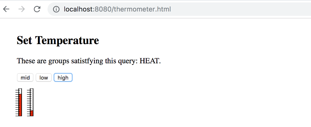
            <h2 itemprop="name">Request MCU Groups</h2>
            <p itemprop="description">These are groups satistfying this query: {{queryToken}}.</p> <!-- {{tweetOwner}} is in the data model. -->
            <button onclick="GetIcons(11)">Find All</button>
            <button onclick="GetIcons(5)">Find 5 Point</button>
            <button onclick="GetIcons(6)">Find 6 Point</button>
            </div>

          <!-- Here is a Vue loop for generating a lit -->
          <div class="entryart" style="padding:4px">
            <button v-for="iconEntry in iconList" @click="goGetPanel(iconEntry.name)" >
                <div v-html="iconEntry.icon">
                </div>
            </button>
          </div>
        </div>
        <script>
            var iconApp = new Vue({
                                  el: '#iconAppTry',
                                  data: {
                                    iconList: [  // Where is the data? Still on the server.
                                    ],
                                    queryToken : "Thermo Batches"  // picked a name for demo
                                  },
                                  methods : {
                                      goGetPanel: (pname) => {
                                          // `this` inside methods points to the Vue instance
                                          alert('Hello ' + pname + '!')
                                      }
                                  }
                            });
        </script>
    </body>
</html>
<script>
//
// recall the "onclick" on the <buttons>
function GetIcons(points) {
    // special file names instead of search parameters
    //
    var url = (points == 11) ? "http://localhost:8080/batchQuery-all.json"
                             : ((points == 5) ? "http://localhost:8080/batchQuery-five.json" : "http://localhost:8080/batchQuery-six.json")
    
    
    fetch(url).then((response) => {  // this is now browser native
                    response.text().then((text) => {
                                         var newData = JSON.parse(text);  // DATA UPDATE! This is it.
                                         newData = newData.map(obj => {
                                                                   obj.icon = decodeURIComponent(obj.icon);
                                                                   return(obj)
                                                               });
                                         iconApp.iconList = newData;   // the page update right away with new data.
                                    });
                    });


}

</script>

Here is one display of icons that have been fetched from the server:

Icons that might be returned from a search for MCU groups.

An artistic idea suggesting how search could return icons indicating certain groups of MCU’s to interact with. (Large preview)

The data being sent is an array with the following kind of structure:

{
 "style" : {
     "color" : "red",
     "backgroundColor" : "yellow"
 },
 "icon" : svg1,
 "name" : "thermos"
},

Here, svg1 is SVG taken from a file. Of course, a righteous server would have taken the structure from a database, where the SVG would be stored in the structure.

Here is a snippet from the above code. This is the code that fetches the JSON and places the array of structures into the Vue app. You can see the promise structure of fetch in use. The text is parsed, and in the next line, the encoded SVG is decoded. One more line, and Vue updates the page. The number of buttons in the button bar will be equal to the length of the JSON array.

fetch(url).then((response) => {  // this is now browser native
    response.text().then((text) => {
             var newData = JSON.parse(text);  // DATA UPDATE! This is it.
                newData = newData.map(obj => {
                           obj.icon = decodeURIComponent(obj.icon);
                           return(obj)
                       });
             // the page update right away with new data.  
             iconApp.iconList = newData;  
        });
});

Now, just two more snippets. The Vue app. The reader will notice that the @click directive has been included on the buttons. The data element, iconEntry.name, is passed to a method within quotes.

The method is defined within the Vue app:

<div class="entryart" style="padding:4px">
<button v-for="iconEntry in iconList" @click="goGetPanel(iconEntry.name)" >
    <div v-html="iconEntry.icon">
    </div>
</button>
</div>
</div>

Here is the snippet for the definition of methods. The methods object is added just after the data object within the app parameter object:

,
methods: {
  goGetPanel: (pname) => {
      // `this` inside methods points to the Vue instance
      alert('Hello ' + pname + '!')
  }
}

The reader should find the goGetPanel definition, and the use of it was pointed out for the @click handler. In our final application, the alert call can be replaced by a function that fetches panels from the server.

A Component Library For IoT Panels

We could just decide that panels that we fetch from the server can be HMTL or just SVG drawings, but if there are going to be many kinds of panels, we would hope that the job of creating panels could be simplified by having libraries of components to choose from. We can imagine that SVG editors could be improved to allow library components to be dropped onto pictures as part of editing. Then, if the SVG editor could output a version of the picture with component tags, then the use of Vue would allow the picture to be created while ensuring that the JavaScript automation and animation is neatly woven together. For our discussion, some hand editing can help us get there.

If we want to create panels out of Vue components, then we had better figure out how to make the components and then collect them together into something useful. We will have to switch to using command line tools provided by Vue and organize our workflow.

Components

The Vue documentation points out that the component data section (subobject) of the component definition needs to be a function that returns data. The reason for this is that Vue needs to keep data separate among the instances. So, in going from a Vue application initialization to a component definition there is another small code change.

In this first snippet of code a Vue application is being initialized:

var iconApp = new Vue({
      el: '#iconApp',
      data: {  // this is the data field that can be easily updated
      },
      methods : {
        ...
      }
});

In this new snippet of code, a component is being defined and registered. First, notice that instead of creating a new Vue instance, a component named iconic is being registered. Then, the data field returns custom data for any iconic instance that the Vue app makes. Finally, the template field is present at the end of the component registration. Any HTML that might have been written on the web page to display the component can be part of the template.

Vue.component('iconic',
          data: () => { 
            var instanceData = {
                // data fields named for the 
                // variables appearing in the template
                onevar : "test"
            }
            return(instanceData);
          },
          methods : {
            ...
          },
          template: '<div>This appears in every instance {{onevar}}</div>'
    });

So, we can imagine a panel with thermometers. So, if someone provided a thermometer component, we would expect a component definition somewhere in our code. As such:

Vue.component('thermometer',
          data: () => { 
            var instanceData = {
                // data fields named for the 
                // variables appearing in the template
                temperature : 0
            }
            return(instanceData);
          },
          methods : {
            ...
          },
          template: '<div>Some SVG will go here</div>'
    });

We are trying to create something that looks like this:

Animated thermometer application in Vue before exploring components.

Animated thermometer application in Vue before exploring components. (Large preview)

The thermometer component is very similar to the first components that you will come across in the Vue tutorials. But, it’s a little tricky to figure out how to update it. There is a better way of defining the component for reactivity using properties. And, that is in the following:

Vue.component('thermometer', {
    props: ['temperature'],
    computed : {
        y: function() {
            var t = this.temperature/100;
            var h = 54.724472;
            var y_bar = 41.176476  // starts near the top
            // pretend the scale is 1 to 100, so that the temperature is a precentage
            return((1 - t)*h + y_bar)
        },
        height : function() {
            var t = this.temperature/100;
            var h = 54.724472; // as high as the whole range
            var y_bar = 41.176476
            // pretend the scale is 1 to 100, so that the temperature is a precentage
            return(t*h)
        }
    },
    template: '#thermometer-template'
})

So, instead of representing temperature as a data element. It is represented as a property under props. Then, there is a new section, computed, that provides variables that are functions of the property. We see this.temperature being used for both y and height. These computed variables are being used in the SVG as attributes for a rectangle.

In SVG, y grows from the top down. So, when we want the rectangle to be small at the bottom of the thermometer, the y of the red box has to be lower, and the height has to be reduced so that (y + height) stays at the thermometer zero.

Notice the template field in the definition of the components. It is in fact, a document element ID. The element being referred to is a script section with the special type: type="text/x-template". The script element is where the SVG for the thermometers is. And, the SVG makes use of Vue variables and control terms so that reactivity can be defined.

Here is some of the SVG:

<script type="text/x-template" id="thermometer-template">
<svg
   xmlns:svg="http://www.w3.org/2000/svg"
   xmlns="http://www.w3.org/2000/svg"
   width="20"
   height="70"
   version="1.1"
  >
  <g transform="translate(0,-180)">
    <g transform="matrix(2.0111869,0,0,1.0489665,-215.11053,144.5592)">
      <rect
         style="fill:#fffcfc;stroke:#000000;stroke-width:0.68848258;stroke-miterlimit:4;stroke-dasharray:none"
         stroke-linecap="null" stroke-linejoin="null" width="2.9665921" height="54.724472" x="111.90748" y="41.176476" />
      <rect
         style="fill:#e82b0d;stroke:#000000;stroke-width:0.68848258;stroke-miterlimit:4;stroke-dasharray:none"
         stroke-linecap="null"
         stroke-linejoin="null"
         width="2.9665921"
         x="111.90748"
         :height="height"
         :y="y"
      />
      <g transform="matrix(0.76503813,0,0,1,26.586929,0)">
        <line y2="57.306953" y1="57.306953" x2="113.15423" x1="107.22105" stroke-linejoin="null" stroke-linecap="null"
           style="fill:none;stroke:#000000;stroke-width:0.787139;stroke-miterlimit:4;stroke-dasharray:none" />
        <line y2="74.408356" y1="74.408356" x2="113.15423" x1="107.22105" stroke-linejoin="null" stroke-linecap="null"

The reader can find id="thermometer-template" at the top, and looking further down to the rect elements, the computed variables can be found.

Here the variable uses are separated out. The Vue shorthand syntax for v-bind is in use, with :height="height" and the same for y:

 x="111.90748"
         :height="height"
         :y="y"

When the parent of the SVG elements sets variables that act as input to the thermometer property temperature, Vue recalculates height and y. As a result, the position and height of the red box change.

It helps to have a listing of the Vue app that makes use of the thermometer.

<body>
    <!-- The Vue app starts here. This is the HTML part of the Vue object -->
    <div id="thermoApp">  <!-- Recognize the name from the Vue doc -->
        <div>
            <h2 itemprop="name">Set Temperature</h2>
            <p itemprop="description">These are groups satistfying this query: {{queryToken}}.</p> <!-- {{tweetOwner}} is in the data model. -->
            <button @click="updateTemp(50,50)">mid</button>
            <button @click="updateTemp(20,80)">low</button>
            <button @click="updateTemp(80,20)">high</button>
        </div>
        
        <thermometer :temperature="temp1" ></thermometer>
        <thermometer :temperature="temp2" ></thermometer>

    </div>
    <script>
        var thermoApp = new Vue({
                              el: '#thermoApp',
                              data: {
                                 temp1 : 30,
                                temp2 : 60,
                                 queryToken : "HEAT"
                              },
                              methods : {
                                  updateTemp: function (tval1,tval2) {
                                        this.temp1 = tval1;
                                        this.temp2 = tval2;
                                  }
                              }
                        });
    </script>
</body>

That is the whole thing. There are three buttons which call the updateTemp method of the thermoApp Vue application. The data section has two temperature variables. And, each thermometer updates its temperature when the values change.

The code for the two thermometers called out below can be found on the HTML assigned to the Vue app.

<thermometer :temperature="temp1" ></thermometer>
        <thermometer :temperature="temp2" ></thermometer>

Notice that application uses the function formalism for the method definition. Defining updateTemp this way updateTemp: function (tval1,tval2) allows for the instance variable this to be accessed.

Also, defining updateTemp this way updateTemp: (tval1,tval2) => assigns this to an internal data structure that does not react and update the view.

Assembling a Panel

Each IoT panel can be a component. Vue provides a way of defining components with subcomponents. Alternatively, there is a slot mechanism that can be used to yield a component that can wrap around any HTML content.

In the following few paragraphs, let’s look at making a panel out of subcomponents. There are two forms that follow quickly from our examples. In one case, the thermometers can be subcomponents called out in JavaScript. In another case, the components are defined independently but are mentioned in the HTML.

In both cases, the same HTML can be used for the template. Here is our panel as a template:

<script type="text/x-template" id="thermo-panel-template">
    <div>
        <thermometer :temperature="temp1" ></thermometer>
        <thermometer :temperature="temp2" ></thermometer>
    </div>
</script>

The only difference between the first detailing of the application is that a div element is surrounding the two thermometers. Vue will throw an error if the template is missing a top level DOM element. The div passes the Vue requirement, and the multiple elements may be included inside of it.

Now, we may see the two thermometers side by side. Passing the temperatures from the top to the final thermometer has values cascading down. At the top level, the panel joins the application when a single line is included in the application DOM.

<themo-panel :temp1="temp1" :temp2="temp2" ></themo-panel>

The template for the panel, although simple, seems to indicate that panels can be easily designed in term of components. It’s as if a language for just IoT components is possible.

Now, the template definition for the panel is simple enough. Here it is with the subcomponents defined independently:

Vue.component('thermo-panel', {
              props: ['temp1','temp2'],
              template: '#thermo-panel-template'
            });

That is about as much as is required to make the panel functional. It is true that this version relies on a long list of properties for defining values to be updated as messages come into the page. But, this is a good start. Updating the data object at the top level does the job of animating the thermometers. However, as the panels become complicated, there may need to be another method for showing change.

Having made mention to the other ways of specifying subcomponents, for the panel, we should take a look at it. Here it is:

Vue.component('thermo-panel', {
              props: ['temp1','temp2'],
              template: '#thermo-panel-template',
              components: {
                // a sub component for the labels
                'thermometer': {
                  props: {
                    temperature: Number,
                  },
                  template: '#thermometer-template',
                  computed : {
                    y: function() {
                        var t = this.temperature/100;
                        var h = 54.724472;
                        var y_bar = 41.176476  // starts near the top
                        // pretend the scale is 1 to 100, so that the temperature is a precentage
                        return((1 - t)*h + y_bar)
                    },
                    height : function() {
                        var t = this.temperature/100;
                        var h = 54.724472; // as high as the whole range
                        var y_bar = 41.176476
                        // pretend the scale is 1 to 100, so that the temperature is a precentage
                        return(t*h)
                    }
                  }
              }
            }
        });

There is certainly more code, but that is because the JavaScript for the thermometer component is included within the components list of thermo-panel. The two approaches do the same job, but they offer different ways of packaging component definitions.

At the moment, my preference is for the first way. It should be considerably easier to revise panels and have them retrieved dynamically if only changing template and properties is required. To this end, the independently defined components form a component library. But, although that seems better, in the following it becomes more convenient to use the second, seemingly more verbose way.

Given that we can make responsive panels out of components in clearly defined ways, I’ll explain how we can manage them as a database that can make simple queries in the next part of my article. Stay tuned!

(dm, yk, il)
Categories: Others Tags:

Are office wall murals just a trend? [Infographic]

May 7th, 2019 No comments

Beloved by some of the biggest names in tech, wall murals can be seen decking the halls of some of the hippest, most enviable workplaces around the globe. Used by the likes of Spotify, Airbnb, and Google, graffiti-style murals have moved from urban street corners into the backdrop of modern office spaces.

But if this gives you the impression that wall murals are just a trend concocted by the tech-elite, think again. Wall murals are one of the oldest, most enduring forms of art in the history of mankind. There is evidence of humanity’s proclivity for wall murals dating all the way back to the caveman days, and many of the most famous works of classical art, like Michaelangelo’s frescoes in the Sistine Chapel, are wall murals.

There is good reason for the staying power of and renewed interest in wall murals. Especially in the workplace, wall murals are an excellent story-telling medium that is at once efficient, attractive, and versatile.

Whether you want a millennial-minded design inspired by street art or a tasteful peace reminiscent of renaissance frescoes, a wall mural can instantly improve the feel of your office. The following infographic from Coastal Creative showcases a wide range of stylish office wall mural ideas that forward-thinking companies are using to create effective and inspiring workplaces:

View Details at: https://www.coastalcreative.com/office-wall-mural-ideas/

Categories: Others Tags:

How to Recognize a Quality Font

May 7th, 2019 No comments
quality font

To understand when a typeface is of good quality and well designed, we must first understand that within type design, or font design, there are innumerable technical aspects to consider, which contribute to the final result of that font. We talk about things like the quantity of styles, typographical variations like bold, italic, black, thin, small caps. But also things like space management and therefore kerning, tracking and leading.

All the proportions between the various glyphs, between the vertical and horizontal rods. Or even the management of open type features of a font. These are all functional, technical and aesthetic aspects that help us understand how the quality font is… or isn’t. The knowledge necessary to build a complete and well-made font are many and are not limited to aesthetic or stylistic choices only.

Technical aspects to be analyzed

The best way to understand if a font is of quality or not is to verify if, within it, there are these technical and design features. A typeface, to be considered quality, obviously also needs to respond to certain aesthetic characteristics.

And here everything becomes a little more complex. Because if, on the one hand, the technical aspects are easily analyzed and identifiable, the aesthetic canons are more subjective, right? No. I will explain this to you shortly.

Now, let’s focus on some technical aspects that I personally use to check the quality of a font:

Glyphs must be well designed

quality font

The first thing to do is to observe and analyze the individual glyphs. There are some features that make a quality typeface, and there are some that make them quite the opposite. The thing to look at is how the various glyphs are consistent with each other in terms of style and design. Individual letters must communicate in the same way within each typeface.

To do this kind of analysis, there are some tricks that type designers have used for hundreds of years. For example, there are some groups of letters that are designed using the same compositional elements, such as h / n / m / r / u. As well as the b / d / p / q or uppercase letters like O / Q / C / G, which have similar structures and curves.

It is this set of elements that make up the supporting structure of a typeface. When you go to analyze the quality of a font, you need to look for that repetition of those shapes, of those curves, of that thickness of the rods. In this way, reading a text with a quality font, one perceives a sense of rhythm. There is nothing out of place.

Furthermore, one way to analyze the design coherence of the glyphs is to compare certain details and their components.

Graces must be visually consistent

In a quality serif font, for example, the graces must be visual all the same or at least coherent with each other. And the same goes for the punctuation, the eyelets, the thickness of the temples, the ends of the temples and, in short, all the details.

Diacritical marks must be well balanced between them

Other things I always look at are the accents and diacritics, especially those of glyphs not commonly used in English as circumflex accents. Even if these elements are well designed and balanced, following the same aesthetic principles and with attention to detail, it is often an excellent sign of quality.

The number of glyphs

Furthermore, the quantity of glyphs contained within a given typeface is also attentive. Having many glyphs is not a collector’s habit, but it is simply a tool that makes the font you use flexible since it makes it adaptable to all the various languages ??that use those specific glyphs or diacritics. For example, German uses the double S (or scharfes S ) ß, the Polish, the ogonek ?, again the French, the cedilla ç.

quality font

So, if you plan to write a long text, I suggest you choose a font that also contains these diacritical marks, because every now and then you will have to enter foreign words.

How to understand if a font is of quality

Now let’s take an example of everything we’ve said so far. Take the Helvetica Neue, Minion Pro and Melisande Sharp fonts. There is no doubt about the perfection of the first two, both designed with undoubted coherence. Writing a text in one of these two fonts, everything will appear in its place, coherent and linear.

Melisande Pro (downloaded for free), on the other hand, is not horrifying but appears to be of poor quality. Analyzing the first group of letters of the image, we can see that the h / n / m / u have the same basic forms. However, the r does not recall the form of n, as happens in the other two fonts.

quality font

Furthermore, m / n / r do not have optical corrections, which is very important when working with typography.

Another mistake can be seen in the accents, which are inconsistent with one another. This denotes a lack of attention to detail, which makes this font altogether of low quality.

1. Does it have different weights?

The fact that a character has many different weights does not mean that it is by force of quality, but it is a sign of design care, which is often a sign of care in other areas. Furthermore, having fonts with many weights is quite useful for one’s own projects, because it allows us to create contrast and visual hierarchy.

Generally, it goes from a minimum of 4 style and weight variations, namely roman and bold, and roman italic and bold italic. But it’s always better when there is more.

quality font

When you have to use the font only for a logo, or for a single title, it’s not essential, but to have more flexibility, I suggest you consider how many weight variations a font has.

2. Do you have any real text variations?

In particular, I refer to italic, oblique and small caps. Generally, a quality font, especially if it is to be used for a long text, needs true italics that is a variant of the font that has different glyphs, especially if it is a serif or pardoned. For example, in this case, the Minion Pro has true italics. If it does not have an italic type, it must have an oblique, as in the case of geometric or neo-grotesque sans-serif fonts such as Futura, Helvetica or Univers. They do not have a true italics but they still remain quality fonts if used in the right ways. The important thing is that they don’t have an oblique version which is simply a stretched version of the font in the regular version.

quality font

Another variation that I think is very important is the small caps. To understand if a font you already have has a TRUE small-case, just open a program like Illustrator or InDesign, set a few small caps and check the thickness of the rods compared to that of lower case. If they are the same, then it is a real small cap, if they aren’t, then it is not a real small caps.

3. Does it have good space management?

Managing spaces within a typeface is an art. Really. The real type designers keep their tricks to manage the various kerning pairs as something extremely precious. A quality font is one in which, when used, almost no changes are to be made in kerning and spacing (apart from cases where there are design needs to do so).

4. Do you use Open Type features?

The last aspect is that the font has open type functionality. Open Type is a font file format, developed in the late 1990s by Microsoft, which has become the main format when it comes to font files. This is because an open type font allows for many glyphs, many features, such as the use of ligatures, the use of different numbers (such as apex, as a subscript), which are all consistent with the rest of the font.

Conclusion

I really hope this article has been useful to you and that it has provided you with the necessary tools to be able to recognize a quality font for your next projects. Obviously yes, it is important to assess whether a font is of quality or not, but at some point the final question to ask before the fateful choice is: is this font suitable for the project in which it will be used?

Until later,

WDL

Read More at How to Recognize a Quality Font

Categories: Designing, Others Tags:

Why, How, and When to Use Semantic HTML and ARIA

May 7th, 2019 No comments
A screenshot of the HTML rendered on the front end, which displays as a single line of text.

Semantic HTML and Accessible Rich Internet Applications (ARIA) help create interfaces that work for everyone in the most performant, robust, and simple way possible. They add essential meaning to your content, which lets web browsers, search engines, screen readers, RSS readers, and ultimately users understand it.

And yet, many people still don’t use them. I wanted to know why, so I set up a Twitter poll. The most common reason people gave was a lack of awareness and understanding of the benefits of using semantic HTML and ARIA.

Let’s look over the benefits of using HTML and ARIA, why starting with semantic HTML is the way to go, and why ARIA ought to come in as a last resort.

Starting with raw text

The element of an HTML document contains the main content a user sees on a page. If content is put inside the body without any additional elements, the browser has no way of differentiating between different types of content, like paragraphs and headings.

<body>
A Study of Butterflies

Butterflies are little bugs with cute wings.

Butterfly Habitats

Butterflies live in flower houses and hang out at dank coffeeshops.
</body>

If the browser can’t differentiate between pieces of content, then it can’t present that content to the user in a meaningful way. That means:

  • We can’t style the headings differently from paragraphs.
  • It’s harder for search engines to interpret the content, meaning it’s likely to rank poorly and be difficult for users to find.
  • Screen readers and other assistive technology can’t communicate it properly to the user.

Not to mention, it’s more than a bit awkward visually:

Adding some structure with HTML

To provide some structure we could wrap the lines of text here in divs like this:

<div>A Study of Butterflies.</div>
<div>Butterflies are little bugs with cute wings.</div>
<div>Butterfly Habitats</div>
<div>Butterflies live in flower houses and hang out at dank coffeeshops.</div>

This is slightly better because each piece of content is displayed in the browser on its own line instead of one long unbroken line of text.

A screenshot of the HTML rendered on the front-end showing the content on four lines, one for each div.

But there’s still a distinct lack of meaning.

Which are headings and which are paragraphs? It’s hard to tell, and impossible for assistive technology to determine. That’s because the headings and paragraphs are wrapped in divs which are meaningless on their own. In this example, browsers, CSS, search engines and screen readers are still none the wiser.

Communicating meaning with styles

We could add styling to the divs because they can be targetted with CSS. This lets us improve the visual appearance to provide meaning, context, and hierarchy.

See the Pen
Non-Semantic HTML Demo
by Geoff Graham (@geoffgraham)
on CodePen.

Here the CSS targets the first and third divs to apply heading styles. This isn’t maintainable because another paragraph added afterward, for example, would get styled as a heading.

We could give each div a unique attribute such as an ID or class name, to give us more styling control, like this:

<div class="heading1">A Study of Butterflies</div>
<div class="paragraph">Butterflies are little bugs with cute wings.</div>
<div class="heading2">Butterfly Habitats</div>
<div class="paragraph">Butterflies live in flower houses and hang out at dank coffeeshops.</div>

I explain why you should use classes instead of IDs for styling in my online book, MaintainableCSS.

Now we can target the different elements with CSS like this:

.heading1 { /* styles here */ }
.paragraph { /* styles here */ }
.heading2 { /* styles here */ }

While this approach is a little better, it only communicates meaning for sighted users. It doesn’t provide meaning to search engines, RSS readers and screen readers. In other words, it’s not semantic and not very accessible as a result.

Introducing semantic HTML

HTML provides many elements that are designed to give meaning to content, including elements for headings and paragraphs. So, instead of relying on divs with classes named by the developer, we can use predefined HTML elements instead.

<h1>A Study of Butterflies</h1>
<p>Butterflies are little bugs with cute wings.</p>
<h2>Butterfly Habitats</h2>
<p>Butterflies live in flower houses and hang out at dank coffeeshops.</p>

Much better! With semantic HTML like this, the content will inherit default styles from the browser (aka User Agent). We can even use other semantic HTML elements, like which tells the browser to “bring to attention” by making text bold.

A screenshot of the HTML rendered on the front end showing the content with a clearer hierarchy of a Heading 1, paragraph, Heading 2 and paragraph, thanks to semantic HTML.

Crucially, using semantic HTML also means:

  • We can use CSS to add our own styling.
  • Search engines can index the content so that it ranks well enough that users can find it.
  • RSS readers can parse and style the elements appropriately.
  • Screen readers and other assistive technologies can communicate elements properly to the user.

While it’s not massively important in these short examples, the code is also more concise which makes a big difference when considering an entire site.

Semantic HTML is standards-based and stable. This means any HTML processor in the future will be able to understand it and present it correctly to users. It will also help subsequent code authors if they need to make changes.

Additional benefits of semantic HTML

In addition to the benefits we’ve covered so far, some browsers add useful enhancements to semantic HTML for free.

For example, using the HTML telephone input () will give users a telephone-specific keypad on some mobile browsers.

Identifying a form input as a telephone field will produce a telephone-specific keypad in iOS. Careful though, because it’s just for telephone numbers and not meant for any number, like credit cards.

Other browsers give users the option to switch to a simplified view of the page, like Safari’s Reader Mode. Without semantic HTML, Reader Mode would produce something much like the one-line string of text we started with. But, by using semantic HTML, we get a clean reading experience without any additional styling on our end:

The About page on my personal website viewed with Safari’s Reader Mode, comparing unsemantic HTML (left) with semantic HTML (right).

You can read more about this in Mandy Michael’s article on building websites for Safari Reader Mode and other reading apps.

When ARIA makes things better

Like semantic HTML, ARIA is a W3 standard that helps make interfaces more accessible to people who use screen readers and other assistive technologies to consume content.

Error messages are a good example. If a user leaves a required form field blank, the HTML for the error might look like this:

<label for="first-name">First name</label>
<span>Enter your first name</span> 
<input type="text" name="first-name" id="first-name">

A sighted user will be able to see the error above the field. But when a screen reader focuses on the input, the error won’t be announced because the error message isn’t linked to the input.

ARIA can be used to associate the error with the input like this:

<label for="first-name">First name</label>
<span id="first-name-error">Enter your first name</span>
<input type="text" name="first-name" id="first-name" aria-describedby="first-name-error">

Now the error message is announced when the input is in focus.

Using ARIA and JavaScript together

ARIA is most useful when JavaScript is involved. JavaScript is usually required to create more complex and dynamic interactions like hiding, showing and changing elements without a page refresh. Think toggle menus, accordions, tabs, auto-completes, sortable tables, loading content and saving, sending or getting data. Enhancing interfaces like this often breaks the experience for screen reader users.

Take a button that, when selected, reveals other content. In the original state, a sighted user will initially see a button and no content and, when the button is clicked, the content appears.

A visually-impaired user with a screen reader, however, usually relies on spoken cues as they navigate through an interface. But when a screen reader focuses on the button, there’s nothing to tell it if the content is currently in view and needs to be read.

The aria-expanded attribute can be added to the button, and JavaScript can toggle its value between true (content is showing) and false (content is hidden). This helps to meet Inclusive Design Principle #1, provide a comparable experience to screen reader users.

<button aria-expanded="false">Toggle content</button>
<div hidden>Some content</div>

Try to avoid using ARIA to fix unsemantic HTML

ARIA attributes can be used to make unsemantic HTML more accessible to screen reader users. For example, a developer who is struggling to style a native checkbox across multiple browsers might decide to use a div and some JavaScript to emulate one.

We can add a role of checkbox to make the div identity itself as a checkbox to screen reader users:

<div role="checkbox"></div>

We must also use the aria-checked attribute to indicate whether or not the checkbox is checked like this:

<div role="checkbox" aria-checked="false"></div>

But, this still isn’t enough to make it behave like a checkbox because divs aren’t focusable by keyboards like is. We could make them focusable by adding tabindex="0":

<div role="checkbox" aria-checked="false" tabindex="0"></div>

But even then, a real checkbox, when submitted as part of a form, will send its value. Because this isn’t an actual a checkbox, it won’t submit its value without using JavaScript.

And if that weren’t enough already, users can check or un-check a real checkbox by pressing the Space key. And, the form the checkbox belongs to can be submitted by pressing Enter when the checkbox is in focus. But the div-version checkbox won’t do this without even more JavaScript.

Not only is this more work and more code, but the approach only actually works for people who use technology that understands these particular ARIA attributes. That’s a lot of effort, a lot of code and a lot of problems that we can avoid entirely if we just use semantic HTML:

<input type="checkbox">

There’s no denying that ARIA is useful in certain situations, but starting with semantic, accessible HTML where possible is infinitely simpler and more reliable. That’s why the first rule of ARIA is not to use it.

Conclusion

Inclusive design is about providing the best possible experience to the broadest range of users. Semantic HTML helps technologies and therefore users understand content on the web. Enhancements offered by some browsers and devices mean that users get an even better experience baked in.

And when semantic HTML alone is not enough on its own, ARIA can provide more context for users of assistive technologies, but use it with caution. It’s not a hard and fast cure for unsemantic markup and can become complicated, as we saw in that last example.

In short, do the hard work to make things inclusive. It’s a win for you and a win for the web.

The post Why, How, and When to Use Semantic HTML and ARIA appeared first on CSS-Tricks.

Categories: Designing, Others Tags:

The Place of UX

May 7th, 2019 No comments

Every time “UX” comes out of my mouth or is typed by my fingers, I think, “did I just use that term correctly?” It feels like such a big and loaded term these days, that perhaps the way I use it only contributes to the confusion. Ryan Singer frames that problem well:

Debates continue to rage about the role of UX designers, user research, and how far knowledge about the user should permeate the organization. On one extreme, UX is seen as a specialized pocket of knowledge that informs the definition of projects and sets requirements. On the other, UX is something for which the entire organization should somehow feel responsible.

It can feel so big, like UX is literally the only thing that matters in an entire project. It can also feel so small, like 2px of extra padding on a specific dropdown will make the options easier to tap.

Direct Link to ArticlePermalink

The post The Place of UX appeared first on CSS-Tricks.

Categories: Designing, Others Tags:

6 Tips For Tackling Inherited Code

May 7th, 2019 No comments

When you’ve worked in the digital industry for long enough, eventually you’re going to have to work with code that you’ve inherited from someone else. Whether this is part of a handover process from another company, written by a developer that has since moved on or written by a freelancer, sooner or later you’ll find yourself sifting through line after line of code that you didn’t write.

When this happens it’s easy to slip into a negative mindset. It might be using a structure you are unfamiliar with, seem over complicated, disorganized, or just different to your regular development approach — it’s rarely plain sailing.

Something built using a slightly different approach can quickly become unmanageable

It’s not my fault, It’s already a mess” – letting yourself off easy with this type of attitude can create a Frankenstein’s monster of a website if you’re not careful. Something built using a slightly different approach can quickly become unmanageable if every developer who works on the project adds their subjective approach. Whether it be naming conventions, class identifiers or even JavaScript functions.

Below are some tips to help you prepare for and manage inherited websites and see them as something to nurture rather than dread.

1. Ask Nicely for Documentation

Documentation for a site will often exist somewhere in some form. Hopefully! It may be out of date but anything is infinitely better than nothing. When receiving the codebase for a site, always make sure this question is raised early to ensure that any and all documentation is provided during the handover process.

2. Invest the Time Early

Take the time to understand the code you have received. Don’t just glance at it. Invest the time to really look at the file structure, CMS, task runners and whether or not the site is relying on any template engines.

Older sites…can often carry a lot of excess baggage

This would be a good time to start some documentation for the site if it doesn’t already exist, or add your own notes to any existing documentation.

You won’t be able to successfully carry out updates to a site you don’t understand. The result will be obfuscated, bug-ridden code that will only lengthen the time required to carry out even the smallest of tasks.

Make sure you know the site map, how many pages there are, and where the code for those pages is within the structure. This will help you to identify any obsolete or unused code that can be stripped out. Check for unused JavaScript libraries too. Older sites, or sites that have had multiple developers or agencies working on them, can often carry a lot of excess baggage. Anything you can tidy up or clear out will undeniably benefit the site’s longevity.

3. Tackle Unknown Functionality

Don’t wait for it to break! Take a look at any scary functionality on the site and make sure you’re fully aware of any and all complex API integrations. Make sure these are understood and documented clearly.

When working with this functionality, add or update comments in the code to make it clear what functions are doing what and why; saving yourself and others from having to figure it out every time the project is picked up.

4. Keep it Consistent

Learn the system and adjust your code writing habits to fit the current style. Familiarize yourself with reusable classes and functions so you aren’t duplicating any code. This will help reduce overall bloat, increase longevity and improve readability if the site is passed on to another development team.

Adding your own coding methods to an inherited site will make it much harder for other developers to pick up; so although adapting your approach might seem counter-intuitive, a willingness to be flexible is really beneficial here.

5. Spend Some Time in the Analytics

It’s important to familiarize yourself with as much of the site as possible, and digging around in the analytics can give you a lot of useful information. Get to know what devices users are viewing the site on and which browsers require support. Having this knowledge early on means you are prepared when new work comes through and know what fallbacks to put in place and can be prepared for testing.

Always run the site through a site speed test to flag any major performance issues. There may be a few quick wins you can implement to improve the site — such as optimizing large images or minifying CSS or JavaScript files.

6. Don’t Use “Someone Else Built it” as an Excuse

We need to get ourselves out of the habit of writing bad, lazy code because ‘it’s already a mess’. Creating a nightmare project is not something your wider team will want to touch. We’ve all written code we weren’t particularly proud of at some point, often for reasons outside of our control.

We’ve all written code we weren’t particularly proud of…

Tight deadlines, scope creep, and difficult clients are just a few factors that can affect the quality of a site build. Move away from looking for someone to blame and focus on ways you can improve what you have. Always take pride in your work.

The time and effort you put into any site, whether building from scratch or inheriting, pays off in the long term as it creates a readable, maintainable project. You, the team around you and the client will benefit enormously from having a positive attitude towards inherited sites.

So the next time you find yourself having to pick up someone else’s code (before you roll your eyes and start muttering obscenities to yourself) run through these tips and you may just turn a potential nightmare project into a breeze.

Featured image via Unsplash.

Add Realistic Chalk and Sketch Lettering Effects with Sketch’it – only $5!

Source

Categories: Designing, Others Tags:

Why Mason And Front-End As A Service Will Be A Game Changer For Product Development

May 7th, 2019 No comments
Mason Airtable to-do list demo

Why Mason And Front-End As A Service Will Be A Game Changer For Product Development

Why Mason And Front-End As A Service Will Be A Game Changer For Product Development

Suzanne Scacca

2019-05-07T12:30:59+02:002019-05-07T14:33:56+00:00

(This is a sponsored article.) Take a look around at the apps and software you interact with on a regular basis. Each has its own unique design, right? And, yet, there’s something similar about each of them. Navigation bars, contact forms, feature boxes, CTAs — certain elements tend to be present no matter where you go.

That’s because these elements play a crucial part in how users engage with the products that you’ve built. From the users’ end, this is a good thing. By including these recognizable and predictable elements within the frontend structure of an application, the user’s focus is on the content before them; not on trying to solve the mystery of the UI.

From the software developers’ end, though, this is a pain. You know what kinds of components need to be included in a product. However, until now, you’ve had to build them from-scratch time and time again. Worse, any time something needs to be updated, it rides on you to implement the update and push it to the live site — and it’s not often you have the bandwidth to make those changes right away.

That’s why what Mason is doing with front-end-as-a-service (FEaaS) is so interesting. In this article, I’m going to give you a closer look at FEaaS, who it’s for and why empowering product and marketing teams with it is a big deal.

What Is FEaaS?

You know what software-as-a-service (SaaS) is. But have you heard of software-components-as-a-service (SCaaS)?

There were some light grumblings around SCaaS a number of years back. The basic idea was that you could create and easily maintain reusable UI components and widgets for your software. However, it never really caught on — and that’s probably because it was too restrictive in what it enabled developers to do.

With FEaaS, though, you have a much more valuable and powerful solution. Essentially, Mason’s front-end-as-a-service solution enables you to quickly and effectively build the visual aspects and functionality of your software.

This means that you’re building complex features and making them talk to APIs. An example of different designed, complex forms connected to Airtable as the datasource can be found here.

What’s more, each feature you build with Mason lives in the same codebase as the rest of your product. Let’s take a look at a customizable Apixu-powered Chatbot that was made with Mason:

Mason Airtable to-do list demo

An example of the kinds of dynamic content you can build with FEaaS. (Source: Mason) (Large preview)

And this is a hero banner I created for an ebook giveaway using a Mason template:

Mason hero template

An example of a hero image template, customized and published with Mason. (Source: Mason) (Large preview)

Make no mistake: this is not a website builder. Mason empowers you and your team to build individual components and fully functional features; not entire managed hosting websites or products. This way, you’re no longer restricted by the capabilities of your site builder solution.

You can build your website, app, or other software product in the tool of your choice. Then, design and export really complex features from Mason to be integrated into your code base. It’s important to point out that unlike a platform that locks you and your customer data in, Mason lets product teams augment their current products and own everything (not like some website buiders that own your whole website and business instead).

Who Is Mason For?

With Mason, you should already have a fully developed software product or, at the very least, a solution to build it with. Mason is the tool you’ll use to build and design the features (and their functionality) for your product — and to do so with ease (i.e. no coding).

Those features will then be self-contained and dropped into the product when they’re good to go.

As for the actual people that Mason was built for, Tom McLaughlin, Mason’s CEO, explains:

“Today, the entire product lives in the codebase, so it becomes the de facto realm of the engineering team only, even though so many of the features that make up the product can be found in every other codebase on earth — they’re just not that unique. Mason lets your product team build these common features faster, but, more importantly, lets anyone in the organization — technical or not — manage them, even once they’re in production.”

Your product team — your software developers and designers — are the ones that will use Mason to build your software. However, your marketing and content teams will gain the ability to update the features you’ve built in Mason after they’ve been deployed, without needing to wait on engineering to deploy every new edit or tweak.

This means that maintenance of front end features is no longer solely dependent on you, the developer. Anyone on your team — designers, marketers, content creators, etc. — can use Mason’s FEaaS platform to build and update your software’s features.

So, not only can you more efficiently build powerful features for your products, your team can deploy updates in real-time, rather than allowing them to pile up on your open ticket list.

Why FEaaS Matters

Has your software development, deployment or update schedule suffered in the past due to (albeit completely understandable) software developer bottlenecks? If so, then FEaaS should sound like a dream to you.

Until now, there’s really been no other option for software engineers. If you wanted to build a product for the web, everything had to be built from scratch and it required a good amount of time on your part to do so, especially if your aims were more complex in nature. All the while, the rest of your team was left waiting in the wings for you to do your part.

With Mason leading the charge with its FEaaS solution, I’d like to take a look at how its capabilities are going to revolutionize your product development workflow.

Design UI Components Visually

FEaaS takes engineers and developers out of a product’s code base and into a visual build interface. As such, you see exactly what you’re building without having to switch back and forth between your code and a visual preview of what it’ll look like once deployed.

With Mason’s visual builder, you can design complex but essential UI components using a system of containers, columns, layers and pre-configured elements like text, form fields, buttons and more.

Mason visual builder

A look inside Mason’s visual builder tool. (Source: Mason) (Large preview)

Similar to how other modern builder tools work, there is an abundance of options available to help you do more without ever having to write a line of code. And thanks to a convenient toggle between desktop, mobile and tablet views, responsive design is no problem either.

In addition, Mason comes with a full-featured UI kit that includes a variety of templates for the most common UI components. Or you can hand-select the ones you need:

Mason templates

Mason’s pre-built UI component library of templates. (Source: Mason) (Large preview)

Feature cards. Login screens. Blog content blocks. Hero images. CTA buttons. All of the core components you need to get visitors to engage with your product and take action have already been built for you.

If you’re tired of creating them from scratch in each and every product you build, these templates will be a huge help. As you can imagine, having the ability to design and customize product components this way would be a great boon to your team’s productivity.

Build Components And Functionality More Quickly

Now, being able to style components visually is just one of the benefits of using an FEaaS platform like Mason. As you might expect, a tool like this was manufactured for speed.

In terms of actually using Mason, it’s a tool that loads insanely quickly — which would make this quite valuable to anyone who’s lost time in the past waiting for their tools to launch, save changes or move from one view to another.

In terms of how it affects your workflow, expect to gain speed there as well.

With the Mason builder, you can:

  • Add new containers, columns, rows, content blocks or custom-coded elements with a simple drag-and-drop:

Mason Design choices

Mason’s comprehensive set of design layouts, components, and coding options. (Source: Mason) (Large preview)
  • Review, edit, duplicate, move or delete the layers of your component using this visualized hierarchy of elements:

Mason layers

Mason’s easy-to-manage layer controls. (Source: Mason) (Large preview)
  • It’s not just the UI design piece that’s simplified either. You can connect your components to other sources through APIs with ease, too.

mason datasources

Connecting datasources to Mason features to prepare for mapping. (Source: Mason) (Large preview)

Mason API mapping

Connecting APIs to Mason components through mapping. (Source: Mason) (Large preview)

Mason’s “Configure” tab enables you to quickly integrate with other applications, like:

  • Authy
  • Facebook
  • Hubspot
  • Stripe
  • Twilio
  • And more.

So, let’s say you want to sell the eBook promoted in your hero banner instead of just collect leads with it. The first thing you’d do is set up the Stripe integration.

All you need are the Publishable and Secret keys from Stripe‘s Developer dashboard:

Stripe API keys

Retrieve the API keys from your Stripe developer dashboard. (Source: Stripe) (Large preview)

Then, input each of the keys into the corresponding field in Mason:

Mason third-party integrations

Integrate other applications with Mason components as datasources, like this Stripe example. (Source: Mason) (Large preview)

Return to the “Design” tab and drag the Credit Card Form Element into the component.

Mason credit card form element

Use the Credit Card Form Element in Mason to accept payments through components. (Source: Mason) (Large preview)

With your form added to the page, there’s one final step to take to set up this integration.

Return to the Configure tab. You’ll now see a new option on the sidebar called “Forms”:

Mason integration with Stripe

Configure a Stripe payment form in just a few steps with Mason. (Source: Mason) (Large preview)

You can see that all of the pertinent details have already been added here and the connection already made to your form.

Again, Mason makes light work of something that would typically take software engineers awhile to do if they were to build a component from-scratch. Instead, you now have all the tools you need to quickly design and program new features for your product.

Deploy New Features With Ease

To be sure, being able to design new features quickly is important for product teams. However, that still doesn’t fix the issue of deployment.

Bottlenecks can occur at various points of a product’s development. And when you build a piece of software that’s so complex that only an engineer can readily launch it or deploy updates, well, you can only expect further delays in the pipeline.

Mason has developed a solution for this. To start, publishing a component to Mason’s library is a cinch. Simply click the “Publish” button in the top-right corner of the builder and Mason takes care of the rest.

To get the component inside your product or app, though, a developer needs to get involved — but only just this once and it shouldn’t take more than five minutes.

To do this, use the “ Deploy” button in the the top-right corner of the builder. It will then prompt you to do the following:

Mason deployment process

Deploying a Mason component takes just five minutes and four steps. (Source: Mason) (Large preview)

Essentially, what you’re doing is taking the unique identifier Mason has created for the feature you built and adding it to your codebase. When set up correctly, your product will call on the Mason API to render the component app-side. And those on the front end of the site will be none the wiser.

It’s as simple as that to push a new component and all its functionality live.

Empower Everyone To Make Changes And Push Updates

All of the points I’ve made here about the benefits of FEaaS have been dancing around this final — and huge — benefit, which is this:

FEaaS empowers everyone to make changes to features and push them to a live application.

Think about that for a moment.

How much time has your team spent waiting around for an engineer to implement the changes that they need? And what has that done in terms of stunting your app’s ability to engage and convert visitors? Without an impressive-looking UI, without properly functioning features, without all of the critical elements needed to compel visitors to take action.

You’re ultimately costing the business money by holding the software hostage. Until now, that’s something that software product teams couldn’t help. It was just the nature of their work. But with FEaaS by Mason, this finally changes.

Once you have (1) published your component and (2) deployed it to your application, the feature will appear within your product. But let’s say changes are needed to it. For example:

  • Your designer wants to change the style of a form to mirror the revamped landing page design.
  • Your marketing manager has a new branded image that needs to replace the home page hero image.
  • Your editor has decided to tweak the wording for the latest lead gen offer and wants to update the CTA.

It doesn’t matter who steps inside the Mason builder to change a component. The second it happens, that faded “Saved” button in the top-right corner of the builder turns to a green “Go to Publish” button.

Mason software component updates

Updating Mason components can be done by anyone. (Source: Mason) (Large preview)

And guess what? No technical experience is needed to click it.

Mason simplifies publication

Mason takes care of publishing your components and its updates to its library. (Source: Mason) (Large preview)

Mason takes care of publishing and deploying the changes, so as long as the connection has already been made between your app and Mason, these updates should instantly go live for visitors to see.

If you and your product team have been bogged down with a barrage of tickets, asking you to build new components or to tweak existing ones, this will effectively put a stop to that.

Wrapping Up

One of the wonderful things about building products for the web is that someone’s always developing a new way to help us accomplish more while simultaneously doing less.

With software applications, in general, it’s been a long time coming. Thankfully, FEaaS is here and it looks as though Mason has developed a supremely valuable tool to speed up software development, improve output, and also empower more of your team to pitch in.

(md, yk, il)
Categories: Others Tags:

A CSS Golfing Exercise

May 6th, 2019 No comments

Code golfing is a type of programming where the goal is to accomplish a task using as few bytes as possible. CSSBattle is a code golfing battleground where players complete to recreate target images using CSS and HTML.

The rules are fairly simple:

  • No external resources (sorry, no )
  • Your solution must render correctly in Chrome (just for scoring purposes)

This can be a pretty fun departure from day-to-day front-end work. There’s no need to worry about maintainability, semantics, performance, accessibility, or anything other than making a thing really, really small and still render correctly.

A golf solution in 12 attempts

This type of thinking is a pretty dramatic departure from how most of us are writing front-end code for production sites (I hope!), so I’ve been posting all of my solutions on GitHubhttps://github.com/alexzaworski/cssbattle-solutions) in an effort to both share some knowledge and learn from others. As a fortunate side effect, it also means there’s a fairly detailed history of my submissions.

Here’s a start-to-finish account of my attempts CSSBattle’s 7th target, which looks like this:

CSSBattle Target #7 — Leafy Trail

The “just center the dang thing” method

A reasonable first approach is to simply stick an element in the middle of the page, slap a box shadow and a border radius on it, and call it done. If we were writing this “for real,” it might look like this:

<!DOCTYPE html>
<html>
  <head>
    <style>
      body {
        background: #0B2429;
        margin: 0;
      }

      .leaf {
        width: 150px;
        height: 150px;
        border-radius: 67% 0;
        background: #F3AC3C;
        margin: 75px 0 75px 175px;
        box-shadow:
          -50px 0 #998235, 
          -100px 0 #1A4341
      }
    </style>
  </head>
  <body>
    <div class="leaf"/>
  </body>
</html>

But that’s 423 bytes! That won’t do for CSS golf, so let’s see what we can remove.

Attempt 1: 144 bytes

<p style="margin:75 167;height:150;width:150;border-radius:67%0;box-shadow:-50px 0#998235,-100px 0#1A4341,0 0 0 5in #0B2429;background:#F3AC3C">

Here’s a golfed version. There’s definitely some weirdness going on here — no , no , no , no nothin’. The browser doesn’t need them (and, in fact, inserts them for us), so we save a lot of bytes by leaving them out. We’re using

instead of

since it’s shorter, and we don’t close the tag at all since it’s not required for things to render.

The CSS itself isn’t much different, aside from the fact that we’ve used a huge box shadow instead of a background on the body element (“background” is long so avoiding it can be beneficial). It’s also inlined in the element since a tag costs extra bytes.

You may have noticed that we used 5in for the spread in our last box shadow. Playing with weird units is a huge part of CSS golfing. In this case, we just need the shadow to cover the 400×300 canvas and ‘5in‘ (480px) is shorter than any pixel value.

Attempt 2: 141 bytes

<p style=margin:75+167;height:150;width:150;border-radius:67%0;box-shadow:-50px+0#998235,-100px+0#1A4341,0+0+0+5in#0B2429;background:#F3AC3C>

This introduces a pretty important golfing trick: replacing spaces with plus signs allows us to remove the quotes around attributes, saving a couple bytes. I’m not totally sure why this works. Someone suggested it may be related to this part of the HTML spec. If you have a better answer, please let me know!

This attempt also cleans up a couple of whitespace mistakes from the last attempt.

Attempt 3: 126 bytes

<body bgcolor=F3AC3C style=margin:75+75+75+175;border-radius:67%+0;box-shadow:-50px+0#998235,-100px+0#1A4341,0+0+0+5in#0B2429>

Using a tag instead of a

means that:

  • We no longer spend bytes setting height or width on a paragraph
  • We get access to bgcolor

bgcolor is a deprecated attribute that comes up often in CSS golf solutions. It only works on a few tags ( included), and does two great things:

  • Saves us from spending bytes on “background:
  • Saves us a byte by allowing us to omit # in hex colors. Additionally, if a color ends in one or two zeros, we can remove them and it will still render correctly. For example, FFFF00 is the same as FFFF.

There’s a golf regression in this iteration! Can you spot it?

The “border” method

By this point, I had spent quite a few hours tinkering on and off with this target and was getting pretty stuck. Fortunately, CSSBattle has a friendly community on Spectrum that is more than willing to lend a hand.

At the time, Praveen held the #1 spot with two bytes fewer than I had managed, so I asked for some help. He suggested leveraging both the and elements to position everything while using borders in place of a background color.

Attempt 4: 126 bytes

<style>*{border-radius:67%+0;border:75px solid#F3AC3C;margin:0 50;box-shadow:-50px 0#998235,-100px 0#1A4341,0 0 0 5in#0B2429

This is a pretty huge departure from our last strategy. Our body tag is gone and we’re using *{ to target the and tags that the browser inserts for us. The combination of margin and border nudges our shape exactly where it needs to be, and the box-shadow on covers all the excess stuff you’d see from styling on .

This was tough for me to grok, but Praveen made a diagram that explains things pretty well. Here’s a prettied up version:

Margins and borders on and

a and b are the margin and border on , and c is the margin on . The right margin on doesn’t do anything since there’s no room to push the to the left and it already has zero width.

Once our box shadows are applied, b is covered up and all that’s left is our target image.

There are still some optimizations missing here though. Dorus van den Oord was able to take the border method down to a lean 121 bytes, offering this cryptic bit of advice:

small hint for getting to that 121: What if you could move an element by a quarter of a …?

Attempts 5 and 6: 122 bytes

<style>*{border-radius:67%+0;border:75px solid#F3AC3C;margin:0 50;box-shadow:-53q 0#998235,-25vw 0#1A4341,0 0 0 5in#0B2429

Turns out all we needed was a unit hardly anyone’s ever heard of (q) (and the humble vw). Having to write “px” is rarely correct in CSS golf, so it’s something to be on the lookout for. Here, we can replace 100px with 25vw and 50px with 53q.

A q, or quarter-millimeter, is exactly that — 1/4th of a millimeter, or just under a pixel. The q unit is a staple of CSS golf as one of two values (the other being %) that require just one byte to express. I’ve combined my 5th and 6th attempts here since both were just unit tweaks. We’re still a byte off from 121 though!

Attempt 7: 121 bytes

<style>*{border-radius:67%0;border:75px solid#F3AC3C;margin:0 50;box-shadow:-53q 0#998235,-25vw 0#1A4341,0 0 0 5in#0B2429

We finally fixed that regression from the third attempt, thanks to a pull request from Praveen. A percentage doesn’t need a space between it and subsequent values, so we can save a byte in our border-radius. This is a great example of how sharing code can help everyone involved. I had been stuck on this for a pretty dang long time.

The “funky margin” method

Borders aren’t the only approach, though! Enter Rasmus Fløe‘s funky margin:

I got 123 chars on #7 by using box-shadow and a funky margin:75 400 75-150 🙂

Attempt 8: 120 bytes

<body bgcolor=0B2429 style=border-radius:67%0;margin:75+400+75-150;box-shadow:86mm+0#F3AC3C,73mm+0#998235,75vh+0#1A4341>

Here’s how this works, as Rasmus explains it:

positive right margin pushes it off canvas to the left — and negative left margin stretches the element to the wanted width 🙂

Here it is drawn out:

The Rasmus Fløe “funky margin” method

The right margin (b) pushes the element all the way to the left, collapsing it to zero width. The negative left margin (a) then stretches it back to 150px wide (the width of the leaf shape), and then our box shadow (c) is offset enough to be in view. This is awesome because we no longer have to deal with negative box shadows in order to get everything to layer correctly.

We’re also back to bgcolor and get to leverage a nice quirk of background colors: because doesn’t have its own background color, it inherits one from .

Attempts 9 and 10: 118 bytes

<body bgcolor=0B2429 style=border-radius:67%0;margin:75+340+75-90;box-shadow:7cm+0#F3AC3C,57mm+0#998235,55vh+0#1A4341>

With a bit more unit-wrangling we’re able to save ourselves two more bytes (props to Dorus, who was the first to discover this optimization). Adjusting the margins saves a digit (150 becomes 90), and, as a sweet bonus, we get to convert 86mm to 70mm, which becomes 7cm. I’ve again combined two attempts here which were minor unit fixes. (I’m embarrassed to say I initially missed the mmcm conversion.)

Attempt 11: 117 bytes

<body bgcolor=0B2429 style=border-radius:67%0;margin:75+85%75-90;box-shadow:7cm+0#F3AC3C,57mm+0#998235,55vh+0#1A4341>

Romain Deltour was the first to find this 117-byte solution. Changing 340 to 85% means we get to omit a space after one of our values (just like we did with border-radius), saving another byte.

Attempt 12: 115 bytes

<body bgcolor=0B2429 style=border-radius:67%0;margin:75+85%75-90;box-shadow:7cm+0#F3AC3C,57mm+0#998235,55vh+0#7fd2>

Two full weeks after Romain’s 117-byte solution, Viacheslav Popov was able to alpha composite his way to 115 bytes via 4-digit hex codes.

I really love this because — not only is it dang clever — but a lot of people (myself included) thought the target had already been fully optimized. Viacheslav’s persistence both sparked a new round of discussion and added another CSS-Trick™ to our arsenal for future targets.

Attempt 13:

This seems awfully close to optimal to me but that certainly doesn’t mean it can’t be beat — why not give it a shot? There’s prior art to get you started, plenty of folks willing to help, and even some tooling. Happy golfing ??

The post A CSS Golfing Exercise appeared first on CSS-Tricks.

Categories: Designing, Others Tags:

A Conspiracy to Kill IE6

May 6th, 2019 No comments

Chris Zacharias published a few notes about why the team at YouTube added a banner that asked users to switch from IE6 to a more modern browser back in 2009:

The bittersweet consequence of YouTube’s incredible growth is that so many stories will be lost underneath all of the layers of new paint. This is why I wanted to tell the story of how, ten years ago, a small team of web developers conspired to kill IE6 from inside YouTube and got away with it.

I do not recall the exact triggering event that led to our web development team laying out plans to kill IE6 over lunch in the YouTube cafeteria. Perhaps it was the time I pushed out a CSS stylesheet that included an attribute selector on a semi-supported HTML element. Any reasonable web developer would expect this to be ignored by browsers not up to the task. This was not the case with older flavors of IE. Under very specific conditions, an attribute selector on an unsupported HTML element in IE would create an internal recursion that would at best, cause the browser to crash and at worst, trigger a blue screen of death.

There are a lot of interesting things to consider here. IE6 was notoriously difficult for developers to work with and would cause teams to spend a great deal of time fixing game-breaking bugs for what often represented a mere slither of their overall site traffic. However, it’s important to note that as soon as you make a call like this, where do you stop? It suddenly becomes easier to make a Chrome-only website, to ignore basic accessibility principles, to ignore semantic markup, and to make a website optimized for yourself. That leads us to more sticky topics, such as browser diversity and proprietary resources that seem at odds with an open, inclusive web.

I’m reminded here of Jeremy Keith’s book, Resilient Web Design, where he writes:

If a website is built using progressive enhancement then it’s okay if a particular feature isn’t supported or fails to load: Ajax, geolocation, whatever. As long as the core functionality is still available, web designers don’t need to bend over backwards trying to crowbar support for newer features into older browsers.

And Jeremy quotes Mat Marquis, who happened to work on the responsive redesign of The Boston Globe, where he argued that:

Lots of cool features on the Boston Globe don’t work when JS breaks; “reading the news” is not one of them.

Maybe there’s a middle ground here; maybe there’s not. But I find Mat and Jeremy’s approach to be more inspiring and kinder to the overall health of the web.

Direct Link to ArticlePermalink

The post A Conspiracy to Kill IE6 appeared first on CSS-Tricks.

Categories: Designing, Others Tags:

Influential Tips To Improve Your Website’s UX In 2019

May 6th, 2019 No comments

UX I.e., User Experience is the phrase, which has been on the tongue of the website designing experts for the past many years.

It compelled the users and made them a big fan of having smooth website navigation experience. Since the technological advancement has touched the momentum, the users have centered around ultra-modern devices, apps and also web experiences. In short, they demand exquisitely designed websites that not only groom brands visible appeal but also made it a superb experience for the users who explore it.

Creating a high-class website with exceptional UX is all a business needs to compete with the burgeoning competition. It’s the only aspect, which makes the users run towards the website and eager to explore it for more. If a website provides a smooth browsing experience, seamless navigation, and non-hectic web page exploration, it definitely possesses a strong UX.

As the success bar of competitive brands gets higher, many businesses, especially the small ones are getting afraid of surviving with their less known brands. But, with the enhancement in the website’s UX, these small brands also make utmost money for their businesses. It’s not tough to improve the UX of a website as on should only be focused and well-versed in implementing web design related changes. And, believe us, that sometimes small UX changes made a huge difference in user attraction and conversion ratio.

Now, you must have understood why enhancing your website’s UX is important.

Have a glance at the tricks that you can use to improve your website’s UX:

  • Create a mobile-friendly website

Today, everything is mobile and people want their tasks to be handled by their smart device only. In this case, if your business website is not mobile-friendly, then you are lacking behind in grabbing targeted customers. Because today’s customer is so much oriented towards making their activities through mobile only. Therefore, make sure that you will first work on making your website responsive so that the content and other aspects can be easily accessed by any smart device at any time.

  • Reduce the number of web pages

Convenience and browsing efficiency are the major factors that customers’ value the most while exploring a website over the web. If a user finds it difficult to navigate the services available to the website, it’s of no use then. So, it’s better to make things easier for the users by reducing the number of pages from the website. It helps by increasing your website performance. For small businesses that are struggling for better customer reach, keeping limited service pages is the best option to improve the website’s UX.

  • Focus on page loading time

The biggest flaw a website can have is the slow loading. It always frustrates visitors and leaves them with disappointment. Further, the users who know that your website is slow loading will never come again which leads to hampering your website conversion rates. Making your website fast loading is the topmost trend or trick which needs to be implemented by all the web owners. Remember, if you don’t want to underserve your customers, improve your site’s loading time and make them come again to get ultimate user experience.

  • Attention to website security

Having a security seal on your website makes you and the users completely satisfied. It’s the best trick you can use to build trust with your customers. For site security, you can use different security traits that also guarantee to provide an exceptional user experience. Due to robust website security, the users will feel secure while sharing their details which later results in maximized leads and conversions.

  • Stay away from 404 errors

Most of the websites abandon cases are generated when the users are redirected to a 404 page instead of a working website. If you want to make your visitors run away from your website, redirect them to a 404 error. It’s a fact that without any delay, you’ll get a minus balance of the users on your site. It’s not a joke! If you mostly lead your website through a 404 error page, it’s not good enough as it will eat all your brand’s reputation and make your visitors never come again here. So, try not to keep your website on such error pages where the users are unable to proceed with other steps.

  • Usage of appealing CTAs

CTAs add life to a webpage. When there’s a CTA given after service description, it clearly depicts that your webpage is complete and ready to serve the customers with corresponding services. CTAs add unique user experience to the pages. For better UX, one can put the call to action button above the fold so that visitors can easily see this and take actions accordingly by observing the page information.

  • Make wise website color choice

Website colors matter a lot when it comes to catching the attention of quality customers. Today, branding is all about making your website professional and attractive. This has become possible with the wise selection of website colors and pallets. Big brands marked a strong presence in customers heart only because of their branding style, website appearance, and quality information. If you’re one of them who want to leave a mark of robustness among the customers, designing website with superb looking color themes and pallets is crucial.

  • Integrate webpage with motion and animation

Adding and using animations to the webpages to describe the concept has its own advantages in improving website’s UX. However, it’s strictly prohibited to use these elements in the ongoing content and in crucial headings. But, these can be used at a defined page to attract users’ attention. Using moving motions images and animations will help you get optimum user base and augmented business revenue.

  • Make use of adequate images and videos

Excessive usage of images and videos can also irritate visitors as due to these factors they will not get the right information they are searching for. It’s suggested to use limited and relevant videos and images to serve the users with right and impressive information. While uploading these elements, make sure you leave ample white space around them. This makes the element visible to the users and ultimately enhances the user experience.

  • Flow focused website design

In a professional business website, everything should be well-managed and aligned. Here, every aspect should make a sense and provide a flow to understand other associated website aspects. A study states that the visitors find it annoying when they don’t find the relevant information on the website they clicked to explore. This has become the very first reason that the users usually prefer exit from the current website. If you want to render your visitors’ quality and complete information, ask your website designing partners to create a flow focused interface.

  • Conduct regular site audits

In order to achieve exceptional website success results, you need to dedicate your time to audit the website’s regular progress. Dong this make you aware of all the flaws you have made to your website and also let you know about the plus points that your website already has. Regular audits may include UX scrutinizing and SEO optimization. These are considered the best tricks to make a website fully user-friendly.

Ending Note:

Website abandon rates have been rising for the past few years and it’s all because of the bad user experience. When you decide to be on the web, your topmost priority should be to satisfy your customer need with every possible aspect. If you want to make your visitors glued to your website, you have to create exceptional UX for them by using any or all of the given tactics. It’s the finest option you can have to boost your website’s traffic and conversion.

Categories: Others Tags: