In the past few weeks, you might have heard or read about native lazy loading, which is coming to Chromium 75 in the upcoming months.
“Yeah, great news, but we’ll have to wait until all browsers support it.”
If this was the first thing that crossed your mind, keep reading. I will try and convince you of the opposite.
Let’s start with a comparison between native lazy loading and the good ol’ JavaScript-driven one.
Native Versus JavaScript-Driven Lazy Loading
Lazy loading is a way to improve the performance of a website or web application by maximizing the rendering speed of the above-the-fold images and iframes (and sometimes videos) by deferring the loading of below-the-fold content.
JavaScript-Driven Lazy Loading
In order to lazy load images or iframes, it’s a very common practice to mark them up by replacing the proper src attribute with a similar data attribute, data-src, then to rely on a JavaScript solution to detect when the images/iframes are getting close to the visible portion of the website (typically because the user scrolled down) and to copy the data attributes into the proper ones, then triggering the deferred loading of their content.
According to the native lazy loading specification (still under development), if you want to lazy load images or iframes using the native lazy loading feature, you would just need to add the loading=lazy attribute on the related tag.
Addy Osmani wrote extensively about this topic in his article “Native Image Lazy-Loading For The Web!” in which he stated that the Google Chrome team are already developing the feature and intend to ship it in Chrome 75.
Other Chromium-based browsers like Opera and Microsoft Edge will also benefit from this development by gaining the same feature in their first update based on Chromium 75.
Get Started With Native Lazy Loading
In case your website’s images are downloaded all at once at page landing without lazy loading, you can enable (where supported) native lazy loading in your website as easily as adding an HTML attribute. The loading attribute tells browsers which images are important to load immediately, and which ones can be downloaded lazily as the users scroll down. The same attribute can be applied to iframes.
In order to tell browsers that a particular image is important so they can load it as soon as possible, you must add the loading="eager" attribute on the img tag. The best practice is to do this for the primary images — typically for the ones that will be displayed above the fold.
To tell browsers that an image should be downloaded lazily, just add the loading="lazy" attribute. This is a best practice only if you do it only to secondary images — typically for the ones will be displayed below the fold.
Just by adding the loading attribute to your images and iframes, you will enable your website to use native lazy loading as a progressive enhancement. Your website will gradually benefit from it as support arrives to your users in most modern browsers.
This is the best approach to use if your website is not using any kind of lazy loading today, but if you already implemented a JavaScript-driven lazy loading solution, you might want to keep it while progressively switching to native lazy loading.
The ideal solution would be to start using native lazy loading right away, and use a polyfill to make it work across all browsers. Unfortunately, native lazy loading is not a feature we can polyfill with JavaScript.
No Use For A Polyfill
When a new browser technology is released to a single browser, the open-source community usually releases a JavaScript polyfill to provide the same technology to the rest of the browsers. For example, the IntersectionObserver polyfill uses JavaScript and DOM elements to coordinate Element.getBoundingClientRect() to reproduce the behavior of the native API.
But the case of native lazy loading is different because a JavaScript polyfill for loading="lazy" would have to prevent browsers from loading content as soon as they find a URL in the markup of an image or iframe. JavaScript has no control on this initial stage of page rendering, therefore it is not possible to polyfill native lazy loading.
Hybrid Lazy Loading
If you are not satisfied with having native lazy loading only as a progressive enhancement, or you have already implemented JavaScript-based lazy loading and don’t want to lose this feature in less modern browsers (but still want to enable native lazy loading on browsers that support it), then you need a different solution. Introducing: hybrid lazy loading.
In order to do hybrid lazy loading, you need to mark up your lazy content using the data attributes instead of the real ones (such as in JavaScript-driven lazy loading), and to add the loading="lazy" attribute.
Then you require some JavaScript. In the first place, you need to detect whether or not native lazy loading is supported by the browser. Then, do one of the following for every element with the loading="lazy" attribute:
If native lazy loading is supported, copy the data-src attribute value to the src attribute;
If not supported, initialize a JavaScript lazy loading script or plugin to do that as the elements enter the viewport.
It’s not very hard to write the JavaScript code required to perform these operations on your own. You can detect if native lazy loading is supported with the condition:
if ('loading' in HTMLImageElement.prototype)
If it is, just copy the src attribute value from data-src. If it’s not, initialize some lazy-loading script of your choice.
Here’s a snippet of code that does that.
<!-- In-viewport images should be loaded normally, or eagerly -->
<img src="important.jpg" loading="eager" alt="Important image">

<!-- Let's lazy-load the rest of these images -->
<img data-src="lazy1.jpg" loading="lazy" alt="Lazy image 1">
<img data-src="lazy2.jpg" loading="lazy" alt="Lazy image 2">
<img data-src="lazy3.jpg" loading="lazy" alt="Lazy image 3">

<script>
  (function() {
    if ("loading" in HTMLImageElement.prototype) {
      var lazyEls = document.querySelectorAll("[loading=lazy]");
      lazyEls.forEach(function(lazyEl) {
        lazyEl.setAttribute(
          "src",
          lazyEl.getAttribute("data-src")
        );
      });
    } else {
      // Dynamically include a lazy loading library of your choice
      // Here including vanilla-lazyload
      var script = document.createElement("script");
      script.async = true;
      script.src =
        "https://cdn.jsdelivr.net/npm/vanilla-lazyload@12.0.0/dist/lazyload.min.js";
      window.lazyLoadOptions = {
        elements_selector: "[loading=lazy]"
        //eventually more options here
      };
      document.body.appendChild(script);
    }
  })();
</script>
Still, that is a very basic script, and things can get complicated when you’re using additional attributes or tags to get responsive images (such as the srcset and sizes attributes or even the picture and source tags).
A Little Third-Party Help
For the past four years, I’ve been maintaining an open-source lazy load script named “vanilla-lazyload” and, in a couple of days after Addy Osmani wrote about native lazy loading, the community reacted by asking me if my script could act as a polyfill.
As I explained before, you cannot create a polyfill for the native lazy loading feature, however, I thought of a solution that would make it easier for developers to begin the transition to native lazy loading, without needing to write any of the JavaScript code that I’ve mentioned before.
Starting from version 12 of vanilla-lazyload, you can just set the use_native option to true to enable hybrid lazy loading. The script is only 2.0 kB gzipped and it’s already available on GitHub, npm, and jsDelivr.
You can start playing around with native lazy loading today by downloading Chrome Canary or Microsoft Edge Insider (dev channel) then enabling the flags “Enable lazy image loading” and “Enable lazy frame loading”. To enable these flags, enter about:flags in your browser’s URL field and search for “lazy” in the search box.
Native Lazy Loading Demo
To analyze how native lazy loading works in the developer tools, you can start playing with the following demo. In this one, not a single line of JavaScript is used. Yes, it’s just full plain native lazy loading.
What to expect: All images are fetched at once, but with different HTTP responses. The ones with the response code 200 are the eagerly loaded images, while the ones with the response code 206 are only partially fetched in order to get the initial information about the images. Those images will then be fetched completely with a 200 response code when you scroll down.
Hybrid Lazy Loading Demo
To analyze how hybrid lazy loading works, you can start playing with the next demo. Here, vanilla-lazyload@12.0.0 is used and the use_native option is set to true:
What to expect: Try the demo on different browsers to see how it behaves. On browsers that support native lazy loading, the behavior would be the same as in the native lazy loading demo. On browsers that do not support native lazy loading, the images will be downloaded as you scroll down.
Please note that vanilla-lazyload uses the IntersectionObserver API under the hood, so you would need to polyfill it on Internet Explorer and less recent versions of Safari. It’s not a big deal if a polyfill is not provided, though, because in that case vanilla-lazyload would just download all the images at once.
It’s also possible to use an async script with automatic initialization; load it as a ES module using type="module" or load it as AMD using RequireJS. Find more ways to include and use vanilla-lazyload in the “Getting Started” script section of the readme file.
Then, in your website/web application’s JavaScript code, include the following:
var pageLazyLoad = new LazyLoad({
    elements_selector: "[loading=lazy]",
    use_native: true // ← enables hybrid lazy loading
});
Note: The script has plenty of other settings you can use to customizevanilla-lazyload‘s behavior, e.g. to increase the distance of the scrolling area from which to start loading the elements or to load elements only if they stayed in the viewport for a given time. Find more settings in the API section of the readme file.
All Together, Using An async Script
To put it all together and use an async script to maximize performance, please refer to the following HTML and JavaScript code:
<!-- In-viewport images should be loaded normally, or eagerly -->
<img src="important.jpg" loading="eager" alt="Important image">

<!-- Let's lazy-load the rest of these images -->
<img data-src="lazy1.jpg" loading="lazy" alt="Lazy image 1">
<img data-src="lazy2.jpg" loading="lazy" alt="Lazy image 2">
<img data-src="lazy3.jpg" loading="lazy" alt="Lazy image 3">

<!-- Set the options for the global instance of vanilla-lazyload -->
<script>
  window.lazyLoadOptions = {
    elements_selector: "[loading=lazy]",
    use_native: true // ← enables hybrid lazy loading
  };
</script>

<!-- Include vanilla lazyload 12 through an async script -->
<script async src="https://cdn.jsdelivr.net/npm/vanilla-lazyload@12.0.0/dist/lazyload.min.js"></script>
That’s it! With these very simple and easy steps, you’ll have enabled hybrid lazy loading in your website!
Important Best Practices
Apply lazy loading only to the images that you know that will probably be displayed below the fold. Eagerly load the ones above the fold to maximize performance. If you just apply lazy load to all images in your page, you’ll slow down rendering performance.
Use CSS to reserve some space for the images before they are loaded. That way, they’ll push the rest of the content below. If you don’t do that, a larger number of images will be placed above the fold before they should, triggering immediate downloads for them. If you need a CSS trick to do that, you can find one in the tips and tricks section of the readme of vanilla-lazyload.
Pros And Cons
NATIVE LAZY LOADING
PROS
No JavaScript required;
No setup headaches, it just works;
No need to reserve space for images using CSS tricks;
CONS
It does not work today on all browsers;
The initial payload is higher, because of the prefetch of the initial 2 kb for every image.
JAVASCRIPT-DRIVEN LAZY LOADING
PROS
It works consistently across all browsers, right now;
You can do very highly customized UI tricks, like the blur-in effect or the delayed loading.
CONS
It relies on JavaScript to load your content.
HYBRID LAZY LOADING
PROS
It gives you the chance to enable and test native lazy loading where supported;
It enables lazy loading on all browsers;
You can transparently remove the script dependency as soon as native lazy loading support will be widespread.
CONS
It still relies on JavaScript to load your content.
Wrapping Up
I’m very excited that native lazy loading is coming to browsers, and I can’t wait for all browser vendors to implement it!
In the meantime, you can either choose to enrich your HTML markup for progressive enhancement and get native lazy loading only where supported, or you can go for hybrid lazy loading and get both native and JavaScript-driven lazy loading until the day native lazy loading will be supported by the vast majority of browsers.
Hello all, as Justin Timberlake once predicted, it is now May. Now that I’ve subjected you to the latest and greatest in boy band jokes from the ‘90s, let’s check out this month’s portfolios.
It should be noted that as I write this, I am working with Internet that I borrowed from my new neighbor (yes, I did ask) and the speed is fairly slow. That’s not a complaint; it’s a warning. It means I’m going to be a lot happier with portfolios that load fast and don’t make me wait behind a preloader…Just sayin’.
Note: I’m judging these sites by how good they look to me. If they’re creative and original, or classic but really well-done, it’s all good to me. Sometimes, UX and accessibility suffer. For example, many of these sites depend on JavaScript to display their content at all; this is a Bad Idea, kids. If you find an idea you like and want to adapt to your own site, remember to implement it responsibly.
Up Late
Up Late is the one of the best neon-soaked portfolios I’ve come across, because it combines those bright and occasionally-flashing colors with considerable restraint in the rest of the design. The one-page portfolio is going to stick in your head for a while.
The only thing I might change would be to put a maximum width on the little bit of body text there is. At wider resolutions, it can get a bit harder to read.
Platform: WordPress
Raphael Aleixo
Raphael Aleixo’s one-pager is dark, clean, modern, and short, but still manages to make room for a full case study with each project. This is, in my personal opinion, one of the only acceptable ways to use modal screens.
The use of animation is sparing by today’s standards, but that just means the site loads and runs fast while still looking pretty. Extra bonus points all around!
Platform: Static Site
Artëm Tarasov
Artëm Tarasov’s portfolio is modernist and goes hard on the masonry layout. Beyond the home page, it’s all about those classic grid-style lines, and splashes of orange for emphasis. This sort of modernism may not be the most visually exciting of aesthetics, but it’s reliable.
Platform: Custom CMS (I think)
Rifat Najmi
Rifat Najmi has embraced a more classic form of minimalism, and plays into a sort of “design blog aesthetic” that’s all about the typography. Portfolio pieces are displayed like blog posts, which blends them in with the actual blog posts. That might sound a bit confusing, but it actually works rather well.
Just… what in the heck is a “certified design thinking practitioner”?
Platform: WordPress
Graphikconcept
Graphikconcept is a highly PowerPoint-style site, but it’s just that good-looking. The imagery, the geometric lines, the use of color to divide the website into visually distinct sections, I just like it. It’s the kind of graphic-design-heavy website that fourteen-year-old-me always wanted to make.
They made me wait behind a preloader, but it actually loaded pretty quickly. I’m going to give these guys a pass.
Platform: Static Site
Angle2
Angle2 is another presentation-style site, and it plays with angles a lot. You know, like in the name. It leans hard into the geometry, especially with the type, and it manages to look a little bit chaotic while remaining fairly usable.
It’s smooth, it’s pretty, and every page is different. No, let me rephrase that… I’m convinced that this is what happens when you give an art director coffee mixed with Red Bull to chase down their Adderall. They presumably designed this, then spent the rest of the week deep-cleaning their house. And I like it.
Platform: Static Site
Psychx86
Speaking of things fourteen-year-old-me would have loved, Psychx86 is totally what I would have named my studio, and possibly my character in any number of MMOs. In this case, it happens to be a snazzy portfolio that is clearly targeted at businesses who like a light touch of space imagery and lovely type.
Platform: Static Site
Contrast Visuals
Contrast Visuals is another portfolio site that leans hard into its name. It’s got black, white, and some video in an asymmetrical layout. It also has, in my opinion, the world’s best one-word navigation bar. It really is a case of less-is-more.
Is it weird that I actually kind of like the little clipart logo that you can chase around the page? I don’t think it’s weird.
Platform: WordPress
Branex
Branex stands out amongst other portfolio sites in its category by embracing color in a big way. And they’ve managed to use a bunch of gradients without overdoing it. And they do darn good-looking case studies.
Look, they’re doing a lot right. It’s like they hit that point in the design process where you think, “It’s good, but it just needs something more.”, and by God I think they found that something.
Platform: Static Site (I think)
Nicholas Jackson
Nicholas Jackson’s portfolio combines a sort of gritty artsy design with elegant minimalism, strong typography, and a great use of yellow. And we all know I’m a sucker for yellow in my web design.
The whole feel is almost like if National Geographic got a bit of a makeover. This especially holds true in the case studies. They’re laid out a bit like magazine articles.
Platform: Static Site
Alt Productions
Alt Productions’ site is interesting mostly for its navigation. Don’t get me wrong, I like the solid type and solid blues, but I really like the way what happens when you want to view a director’s work.
Well, you get to see their work, which is obvious, but when you’re done, you just scroll down and it takes you right back to the menu of directors. It’s simple, intuitive, and it saves clicks and mouse movement. The only potential downside is that users might get lost a couple of times before they get used to it.
Platform: Static Site
Aleksandr Yaremenko
Aleksandr Yaremenko’s portfolio brings us a touch of classic monochromatic elegance mixed with… emoji? I wouldn’t have thought of that, but the effect brings a touch of playfulness to an otherwise dead-simple experience.
Platform: Static Site
Kutia
Kutia is another one of those sites I wish I’d built when I was younger. Smooth gradients, super “techy” type, green Matrix filters on the imagery. Very junior designer me is in love!
Another thing I like is the call to action on the homer page. They encourage interaction by asking, “What can we help you with?”, and providing a number of potential responses. Sure, all roads lead to the contact page, but it helps customers get an idea of what this agency can do for them.
Platform: WordPress
Vincent Saïsset
Vincent Saïsset’s portfolio brings us some more lovely monochrome goodness, with thick type, and smooth animation that just feels right. It’s creative, it’s pretty, it’s good.
Platform: Custom CMS (Maybe)
Steven Hanley
Steven Hanley’s portfolio is made up of two things, pretty much: typography, and animation. Oh there’s imagery, but it takes a back seat to big words, and shifting color palettes until you actually click on a portfolio piece. All in all, it’s pleasant to look at and browse through. Can you ask for more?
Platform: Static Site
EVOXLAB
Now I know I talk about PowerPoint-style sites a bit, but EVOXLAB takes this concept to the next level. They went out of their way to make every section of their one-page portfolio look like an actual presentation slide. Thing is, for the way their content is set up… it really works.
Some of the text is a bit small in the “About Us” section, but otherwise, this design is kind of like a fun trip down memory lane, without all the Flashbacks. (Sorry.)
Platform: Static Site
Rumsey Taylor
Rumsey Taylor’s portfolio is interesting in that Rumsey’s featured work is linked to throughout paragraphs of regular copy text. It’s not the only portfolio to do this, but it does have its own twist on the formula. Go take a look.
Platform: Static Site
Grégoire Mielle
Grégoire Mielle’s portfolio is a semi-presentational site with some 3D graphics thrown into the mix. The fancy schmancy animation leads into a fairly standard but beautifully rendered minimalist layout.
The only thing I’d change would be to give the 3D graphics a little more contrast for those whose screens aren’t calibrated right.
Platform: Static Site
Chaptr
Chaptr is one of those portfolios that goes hard with the “default link blue”, or at least a very similar blue. While I’ve seen and featured a number of sites like that over the years, they still stand out because it seems like a lot of other designers are trying so hard to get away from that particular color.
In addition to loving the blue, I like how on various pages, scrolling will bring different elements into and out of focus, giving you one small chunk of content to digest at a time. It’s a simple effect, but it’s powerful.
Platform: WordPress
Iteo
Iteo presents us with a very business-friendly, yet still lovely aesthetic, with a focus on sans-serif type, and a lot of blue and orange thrown in to spice up the white backgrounds.
The whole thing just screams “modern”, but it’s still tasteful. In particular, I like the animated illustrations that are slightly reminiscent of blueprints. I also like that they add their own elements to the stock photos they use on their blog. It shows they put time and effort into everything they do.
In order for messages to be clearly transmitted, many factors play an important role. Depending on the type of communication, factors such as stuttering, poor grammar, bad alignment of letters, incorrect use of punctuation marks, mumbling, and others set apart unclear from clear messages. In oral speech, diction, proper intonation, a calm tempo of spoken words, the intensity of the voice are all skills that anyone who wants to be a good communicator has to achieve. In written speech, readable caligraphy, correct alignment of letters, words, sentences, and paragraphs, will make any text accessible to the reader.
Why are all these important? Designers have a major responsibility to make the latter type of communication possible without any obstacle. There are a few notions any designer should be familiar and able to work with: Kerning, Leading, and Tracking.
What is Kerning?
Kerning: Definition
Kerning is the stylistic process that makes you read the first word of this sentence “KERNING” and not “KEMING”. You’ve probably already guessed it. Kerning is the act of adjusting the space between two letters in order to avoid the irregular flow of the words and to improve legibility.
Kerning: Meaning
Back in the good old days, before the current form of typing had been invented, people would use pieces of metal, each having imprinted one letter on them. Now, remember that each piece of metal was the same size. Are the letters the same size? No way, Jose. Imagine that the letter “V” used to have a metal cast as big as the letter “A”. If we wanted to write Avant Garde without kerning the letters, meaning shaping each metal cast so that they fit better, our words would look like this:
Obviously, there is too much space between the letters of AVANT. But after shaping the metal cast, a side of A and V would actually hang out the metal cast so that they could be brought closer together. The result would be the following.
Kerning Typography
In the past few years, designers have been creating new fonts. The classic fonts have the process of kerning already incorporated, while new ones either have automatic kerning, or designers can play with the spacing between letters as much as they’d desire. Manual font kerning isn’t the best option for many graphic designers, as it takes a good eye to understand how spacing works. This leads us to the next important chapter of this topic:
Bad kerning examples
As the saying goes, we always get what we pay for. While there are amazing graphic designs and typographers who are great at their job but are not always given credit for it, the bad kerning examples always put on a show. We do believe that learning from other people’s mistakes is much wiser than learning from our own failures, that’s why we are bringing into your attention how kerning can go wrong. Judge these examples yourself.
SA VINGS
KIDS EXCHANGE
I don’t know what they exchange at this place nor do I want to find out. It sounds just as bad even if I try to guess the correct kerning.
Travel
That moment when Tra decides to travel without Vel. Bad designers ruin relationships.
Every week users submit a lot of interesting stuff on our sister site Webdesigner News, highlighting great content from around the web that can be of interest to web designers.
The best way to keep track of all the great stories and news being posted is simply to check out the Webdesigner News site, however, in case you missed some here’s a quick and useful compilation of the most popular designer news that we curated from the past week.
Note that this is only a very small selection of the links that were posted, so don’t miss out and subscribe to our newsletter and follow the site daily for all the news.
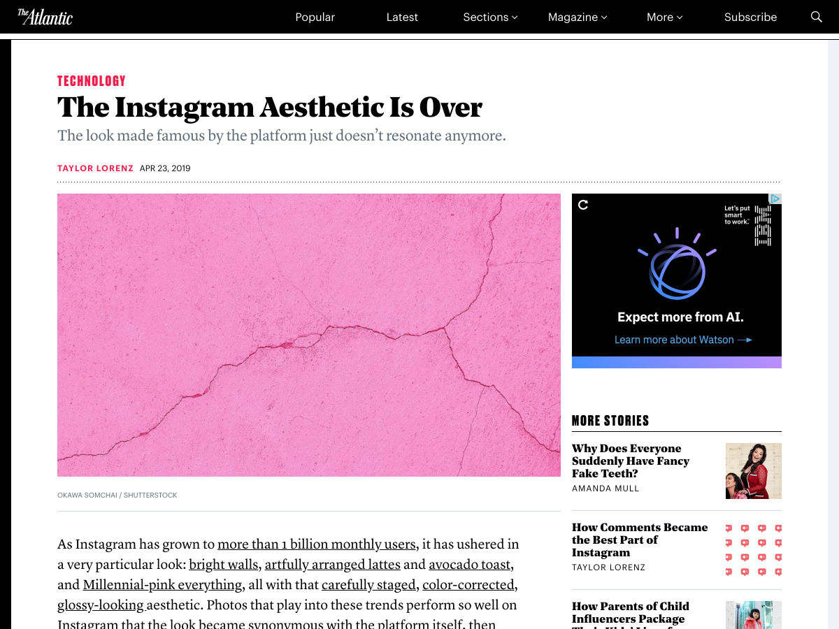
The Instagram Aesthetic is Over
25+ Animated Tab Bar Designs for Inspiration
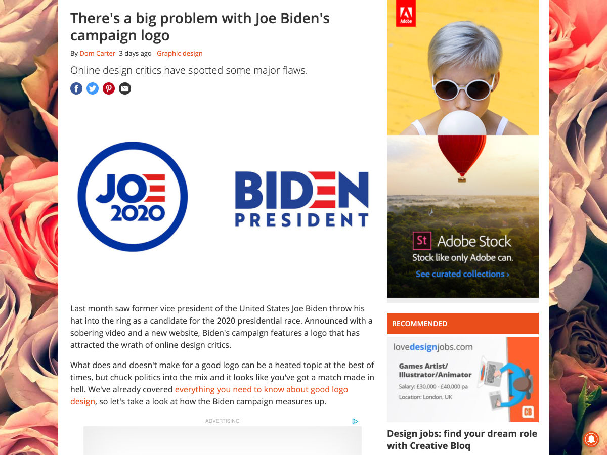
There’s a Big Problem with Joe Biden’s Campaign Logo
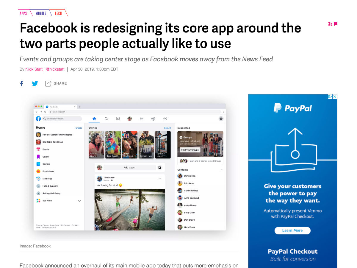
Facebook is Redesigning its Core App
5 Things to Consider When Creating your CSS Style Guide
New Logo for Red Hat
Two New Future-proof Features from Sketch 55 Beta
5 Best WordPress AMP Themes for 2019
The CSS Handbook: A Handy Guide to CSS for Developers
Designer First World Problems
Soft Skills in UX?-?what Makes a Mediocre Designer Great
Design Tips
Uber’s New Design System for Building Websites in React
What it Takes to Turn a Hobby into a Career at Age 40
UX Strategy Explained
U.S. Gov Web Design Language
Five Ways to Design the Perfect Onboarding Experience
It is Perfectly OK to Only Code at Work, You Can Have a Life Too
Lookalike Logos that You’ll Probably Recognize
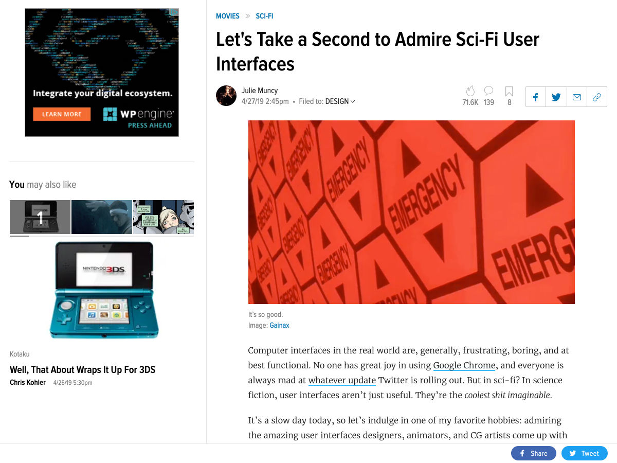
Inspiration: Sci-Fi User Interfaces
How this One Font Took Over the World
Using Typography to Establish Brand Identity
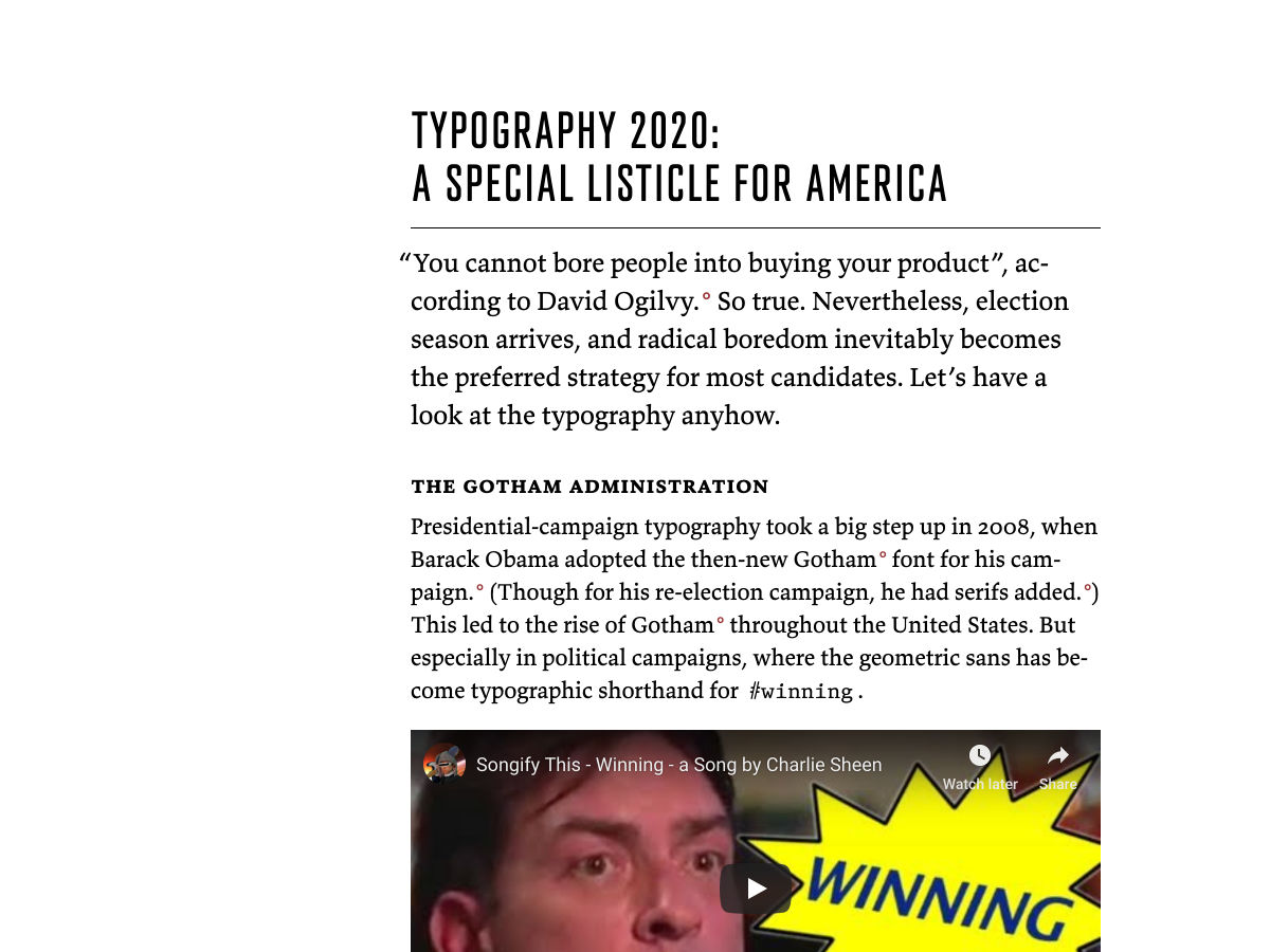
Typography 2020
How the “Ikea Effect” Explains Today’s Startups
Site Design: Montreux Jazz Festival
Want more? No problem! Keep track of top design news from around the web with Webdesigner News.
As someone who has used jQuery for many. years and has recently become a Vue convert, I thought it would be an interesting topic to discuss the migration process of working with one to the other.
Before I begin though, I want to ensure one thing is crystal clear. I am not, in any way whatsoever, telling anyone to stop using jQuery. That’s been pretty fashionable lately, and heck, I wrote up something similar myself a few year ago (“How I’m (Not) Using jQuery”). If you get things done with jQuery and your end users are successfully using your site, then more power to you. Keep using what works for you.
This guide is more for people who may be coming from years of jQuery experience and want to see how things can be done with Vue. With that in mind, I’m going to focus on what I consider “core” jQuery use cases. I won’t cover every single possible feature but instead take a “I often did [X] with jQuery” approach that may be more relatable to people considering learning Vue. (As an aside, also note that how I write my examples are simply one way of performing a task. Both jQuery and Vue give provide multiple ways to accomplish the same goal and that’s a great thing!)
With that in mind, let’s consider some high level things we might turn to jQuery for:
Finding something in the DOM (with the idea of doing something with it later)
Changing something in the DOM (e.g. the text of a paragraph or the class of a button)
Reading and setting form values
Form validation (which is really just a combination of the items above)
Ajax calls and handling the results
Event handling (e.g. on button click, do something)
Measuring or changing the styles of an element
There’s more to jQuery, of course, but these uses (at least in my opinion), cover the most common use cases. Also note there’s a lot of cross pollination in the list above. So, should we start with a simple one-to-one comparison of each? Nope, not so fast. Let’s begin by covering the major difference in Vue applications.
Defining where Vue “works”
When we drop jQuery onto a page, we are basically adding a Swiss Army knife to JavaScript code to handle common web development tasks. We can do any of the uses case we’re going to cover in whatever order we see fit. For example, a client may ask for form validation today, then in a month or so, ask to do an Ajax-based search form in the header of the site.
Vue has one significant difference in that respect. When starting a with Vue project, we start by defining an “area” in the DOM we want it to focus on. So, let’s consider a simple prototype web page:
<body>

  <header>
    Fancy header stuff here
  </header>

  <div id="sidebar">
    Some sidebar doohicky here
  </div>

  <main>
    <p>
      Main site content here, super important stuff...
    </p>
    <div id="loginForm">
      A login form of course
    </div>
  </main>

</body>
In a typical jQuery application, we may write code to work with the header, sidebar, and login form or something. No big whoop:
In a Vue application, we first specify what are we’re working with. Imagine our client first asked to add validation to the loginForm element. Our Vue code would specify that:
new Vue({
  el: '#loginForm',
  // Code here...
});
This means that we’d typically end up adding a second Vue application if the client later decides to have us add something to the sidebar:
new Vue({
  el:'#loginForm',
  // Code here...
});

new Vue({
  el:'#sideBar',
  // Code here...
});
Is that a bad thing? Absolutely not. Right away, we get the benefit of encapsulation. If we accidentally use a variable with a generic name (we’ve all done that), we don’t have to worry about conflicts with other parts of your code. Later on when the client adds yet another request, having our unique, logical sets of Vue code separated out like this gives us some great peace of mind that things won’t step on each other.
So, yes, a good thing. But it absolutely caused me to stop a bit when I first began using Vue. Now, onto our use cases.
Finding Stuff in the DOM
Another aspect you’ll find interesting, or scary, is how to “find stuff in the DOM.” That’s a bit vague, but let’s consider a firm example. We have a button, and when it’s clicked, we something to happen. Here’s an abbreviated example of how this could look:
The Vue application is a bit more verbose, but note how the markup has a direct connection between the action (“click”) and the function that will be called. Vue’s code doesn’t have a tie back to the DOM (outside of the el portion where we define where it needs to work). This was easily one of the things that sold me on Vue the most — it feels easier to tell what is going on. Also, I didn’t need to worry so much about the ID value and selectors. If I change the class or ID of the button, I don’t need to go back into my code and worry about updating selectors.
Let’s consider another example: finding and changing text in the DOM. Imagine that button, on click, now changes the text of another part of the DOM.
I’ve added a new span and now, when the button is clicked, we use another selector to find it and use a jQuery utility method to change the text inside it. Now consider the Vue version:
<div id="app">
  <button v-on:click="doSomething">Click Me!</button>
  <!-- On click, change text in this span -->
  <span>{{resultText}}</span>
</div>

<script>
const app = new Vue({
  el: '#app',
  data: {
    resultText: ''
  },
  methods: {
    doSomething: function() {
      this.resultText = 'You clicked me, thanks!';
    }
  }
});
</script>
In this example, we’re using Vue’s template language (the highlighted line) to specify that we want to render a variable inside the span, which is resultText in this case. Now, when the button is clicked, we change that value and the span’s inner text will change automatically.
As an aside, Vue supports a shorthand for the v-on attribute, so the button in the example could have been written with @click="doSomething" instead.
Reading and writing form variables
Working with forms is probably one of the most common — and useful — things that we can do with JavaScript. Even before JavaScript, most of my early “web development” was writing Perl script to handle form submissions. As the primary way of accepting user input, forms have always been critical to the web and that’s probably going to stay the same for quite some time. Let’s consider a simple jQuery example of reading a few form fields and setting another:
<form>
  <input type="number" id="first"> +
  <input type="number" id="second"> =
  <input type="number" id="sum">
  <button id="sumButton">Sum</button>
</form>

<script>
$(document).ready(function() {
  let $first = $('#first');
  let $second = $('#second');
  let $sum = $('#sum');
  let $button = $('#sumButton');

  $button.on('click', function(e) {
    e.preventDefault();
    let total = parseInt($first.val(),10) + parseInt($second.val(),10);
    $sum.val(total);
  });
});
</script>
This code demonstrates how jQuery can both read and write via the val() method. We end up getting four items from the DOM (all three form fields and the button) and use simple math to generate a result. Now consider the Vue version:
This introduces some interesting Vue shortcuts. First, v-model is how Vue creates two way data binding between values in the DOM and in JavaScript. The data block variables will automatically sync up with the form fields. Change the data, and the form updates. Change the form, and the data updates. The .number is a flag to Vue to treat the inherit string values of form fields as numbers. If we leave this off and do addition as we are, we’ll see string additions and not arithmetic. I’ve been working with JavaScript for nearly a century and still screw this up.
Another neat “trick” is @click.prevent. First, @click defines a click handler for the button, then the .prevent portion blocks the browser’s default behavior of submitting the form (the equivalent of event.preventDefault()).
The final bit is the addition of the doSum method that’s bound to that button. Note that it simply works with the data variables (which Vue makes available in the this scope).
While this is mostly my personal feeling here, I really love the lack of query selectors in the script when writing in Vue and how the HTML is much more clear about what it’s doing.
Finally, we could even get rid of the button completely:
One of the cooler features of Vue is computed properties. They are virtual values that recognize when their derived values are updated. In the code above, as soon as any of the two form fields change, the sum will update. This works outside of form fields too. We could render the sum like so:
The total is {{sum}}.
Working with Ajax
It’s commendable how easy jQuery has made it to use Ajax. In fact, I can say I’ve done Ajax “the vanilla” way probably a grand total of one time. (If you’re curious, you can take a look at the spec for XMLHttpRequest and probably be happy you avoided it yourself.) jQuery’s simple $.get(...) method worked in a large number of cases and when it’s needed for something more complex, $.ajax() made it easy as well. Another thing jQuery did well is the way it handles JSONP requests. While mostly unnecessary now with CORS, JSONP was a way to handle making requests to APIs on different domains.
So, what does Vue do for you to make Ajax easier? Nothing!
OK, that sounds scary but it really isn’t. There are many options out there for working with HTTP requests, and Vue.js took a more agnostic route of letting us, the developers, decide how we want to handle it. So yes, that does mean a bit more work, but we’ve got some great options.
The first one to consider is Axios, this is a Promise-based library that is very popular among the Vue community. Here’s a simple example of it in action (taken from their README file):
Axios supports POST requests, of course, and lets us specify headers among many other options.
While Axios is very popular among Vue developers, it isn’t something that really clicked with me. (At least not yet.) Instead, I’ve been much more a fan of Fetch. Fetch is not an external library but is a web standard way of performing HTTP requests. Fetch has very good support at roughly 90% of browsers, though that means it isn’t completely safe to use, but we can always use a polyfill we need to.
Both Axios and Fetch cover all types of HTTP requests, so either will fit an any number of needs. Let’s look at a simple comparison. Here’s a simple jQuery demo that makes use of the Star Wars API.
<h1>Star Wars Films</h1>
<ul id="films">
</ul>

<script>
$(document).ready(function() {
  $.get('https://swapi.co/api/films', function(res) {
    let list = '';
    res.results.forEach(function(r) {
      list += `<li>${r.title}</li>`;
    });
    $('#films').html(list);
  });
});
</script>
In the sample above, I use $.get to hit the API and return a list of films. Then I generate a list of titles as li tag elements with that data and insert it all into a ul block.
Probably the best part of this is the use of the v-for template. Notice how Vue isn’t concerned with the layout (well, at least the JavaScript). The data is fetched from the API. It’s assigned a variable. The layout handles displaying it. I’ve always hated having HTML in my JavaScript and, while solutions exist for that with jQuery, having it baked into Vue makes it a natural fit.
A full (if somewhat trivial) example
To bring it home a bit, let’s consider a more real world example. Our client has asked us to build a fancy Ajax-enabled front-end search interface to a product API. The feature list includes:
Support filtering by name and product category
Form validation such that we must supply a search term or a category
While the API is being hit, show a message to the user and disable the submit button
When done, handle reporting that no products were shown or list the matches
Let’s begin with the jQuery version. First, the HTML:
There’s a form with our two filters and two divs. One’s used as a temporary status when searching or reporting errors and one is used to render results. Now, check out the code.
const productAPI = 'https://wt-c2bde7d7dfc8623f121b0eb5a7102930-0.sandbox.auth0-extend.com/productSearch';

$(document).ready(() => {
  let $search = $('#search');
  let $category = $('#category');
  let $searchBtn = $('#searchBtn');
  let $status = $('#status');
  let $results = $('#results');

  $searchBtn.on('click', e => {
    e.preventDefault();

    // First clear previous stuff
    $status.html('');
    $results.html('');

    // OK, now validate form
    let term = $search.val();
    let category = $category.val();
    if(term === '' && category === '') {
      $status.html('You must enter a term or select a category.');
      return false;
    }

    $searchBtn.attr('disabled','disabled');
    $status.html('Searching - please stand by...');

    $.post(productAPI, { name:term, category:category }, body => {
      $searchBtn.removeAttr('disabled');
      $status.html('');

      if(body.results.length === 0) {
        $results.html('<p>Sorry, no results!</p>');
        return;
      }

      let result = '<ul>';
      body.results.forEach(r => {
        result += `<li>${r.name}</li>`
      });
      result += '</ul>';
      $results.html(result);
    });

  });
});
The code begins by creating a set of variables for each of the DOM items we want to work with — the form fields, button, and divs. The core of the logic is within the click handler for the button. We do validation, and if everything is OK, do a POST request against the API. When it returns, we either render the results or show a message if nothing was matched.
You can work with a complete version of this demo using the CodePen below.
Wrapping the layout in a div that can be used to let Vue know where to work.
Using v-model for the form fields to make it easy to work with the data.
Using @click.prevent to handle doing the main search operation.
Using :disabled to bind whether or not the button is disabled to a value in the Vue application (we’ll see that in action in a moment).
The status value is a bit different than earlier examples. While jQuery has a specific method to set text in a DOM item and another for HTML, Vue requires using v-html when assigning HTML to a value that’s going to be rendered. If we tried to do {{status}} with HTML, the tags would be escaped.
Finally, using v-if to conditionally render a list of results along with v-for to handle the iteration.
The first block worth calling out is the set of data fields. Some map to form fields and others to results, status messages, and the like. The searchProducts method handles much of the same stuff as the jQuery version but, in general, there’s much less code directly tied to the DOM. For example, even though we know the results are listed in an unordered list, the code itself doesn’t worry about that. It simply assigns the value and the markup handles rendering it. Overall, the JavaScript code is much more concerned about logic in comparison to the jQuery code which “feels” like a much nicer separation of concerns.
As before, I’ve got a CodePen for you to try this out yourself:
OK, that’s a bit over the top. As I said in the beginning, I absolutely think that you shouldn’t change a thing if like working with jQuery and it’s working for you.
I can say, however, that Vue feels like a great “next step” for people who are used to working with jQuery. Vue supports complex applications and has a great command line tool for scaffolding and building projects. But for simpler tasks, Vue works as a great “modern jQuery” replacement that has become my tool of choice for development!
I’ve been reading Jason Grigsby’s new book on progressive web apps this past week and it’s exciting. Jason explains what PWAs are and how they work while while doing a bang-up job covering the business case for using them them, too. But perhaps you might be thinking that a PWA isn’t necessary for the project you’re working on right now. Well, Jason argues that progressive web apps are for everybody:
Should your website be a progressive web app? The answer is almost certainly yes. Even if you don’t think of your website as an “app,” the core features of progressive web apps can benefit any website. Who wouldn’t profit from a fast, secure, and reliable website?
One of the challenges I’ve experienced when thinking about how to apply a progressive web app to a project I’m working on is figuring out what content to cache. Should the homepage be cached? Do we make a custom offline page? What is useful information to provide a user in that context?
Jason goes there, too, and even describes how he tackles that for his own projects:
For cloudfour.com, we chose to only cache recently viewed pages because the main reason people come to our site is to read the articles. If we tried to anticipate which articles someone would want offline access to, we’d likely guess incorrectly. If we precached top-level pages, we might force people on a metered network connection to download content they would never look at…
That makes a ton of sense to me and I realize that the offline cache should probably be different depending on the situation and the website. For example, maybe a design agency website could replace the big flashy homepage with an offline page that only shows the phone number of the agency instead. Or perhaps a restaurant website could cache the food menu and make that experience offline, but remove all the images to make sure it’s not too impactful for folks on those metered networks.
Anyway, I think that Jason’s book is wonderful as it reveals to us all this complexity and a whole new set of opportunities to improve the design and experience of our websites, which, by the way, is something we should strive for in this new and exciting age of web app development.
Lorem ipsum dolor sit amet, consectetur adipiscing elit. Pellentesque imperdiet pulvinar risus vel vehicula. Fusce ultrices malesuada eros, vitae dictum enim tristique a. Nulla et ex mauris. Pellentesque suscipit elit ut sapien suscipit, et cursus orci malesuada. Ut posuere nunc volutpat nisi varius, vitae aliquam neque tempor. Vestibulum tincidunt cursus leo et ultrices. Aliquam malesuada mauris eros.
In lobortis metus quis leo elementum, finibus facilisis lectus volutpat. Vivamus ut velit ligula. Suspendisse nunc dui, pellentesque id varius eu, blandit eget dolor. Cras ante neque, facilisis vel est mollis, iaculis fringilla neque. Donec gravida ac leo vitae fringilla. Fusce vehicula arcu in accumsan sollicitudin. Mauris rutrum ex diam, eget ullamcorper libero dapibus ac. Cras eu aliquet ligula, sit amet finibus quam. Lorem ipsum dolor sit amet, consectetur adipiscing elit. Curabitur non mauris leo. Morbi nec nulla interdum, bibendum augue non, faucibus velit. Nullam interdum, neque a sollicitudin accumsan, libero dolor finibus ex, eu vehicula quam nisi sed ante. Donec dignissim non magna sed semper. Nulla commodo, nisl et blandit dapibus, est nisi fermentum felis, non pharetra nisi risus non ex.
Vivamus luctus risus at vulputate interdum. Aenean quis mi consequat, bibendum felis non, sollicitudin dolor. Fusce neque nulla, tempor quis congue vel, facilisis sit amet justo. Maecenas fermentum nunc ac ligula vehicula fermentum. Ut egestas ultricies placerat. Vivamus luctus sodales odio nec faucibus. Phasellus pulvinar lacus vel vestibulum lacinia. Morbi eu ligula enim. Etiam tristique mi vel sagittis commodo. Integer vitae purus leo. Cras ac fermentum leo. Curabitur in ligula id magna interdum efficitur. Curabitur ac euismod libero. Nullam varius justo eu lorem iaculis sodales quis quis leo. Nulla rutrum semper nulla vel dictum.
Integer venenatis odio ac orci posuere, ac vulputate neque rhoncus. Suspendisse eu finibus enim. Aenean erat lorem, eleifend et dictum in, ullamcorper at metus. Sed leo lacus, egestas vitae venenatis at, tincidunt at nisi. Nunc ac dignissim velit, nec semper felis. Aliquam dapibus mi facilisis, ullamcorper ipsum eu, tincidunt turpis. Ut dictum gravida augue, nec auctor sapien posuere quis. Morbi volutpat lacus sit amet elit bibendum sagittis. Fusce ut quam sed massa hendrerit pellentesque sed non nunc. Duis vel venenatis justo, hendrerit mollis urna. Donec dignissim, ex nec ornare elementum, erat erat cursus dolor, non egestas velit metus non massa.
Nunc rhoncus eu mauris ut eleifend. Curabitur non sollicitudin est, a rhoncus justo. Phasellus ligula orci, congue eget vestibulum eleifend, efficitur et elit. Aenean eget justo volutpat, feugiat nibh at, gravida sapien. Etiam eget libero sodales, hendrerit ante ac, ullamcorper augue. Maecenas vulputate metus lectus, a congue orci ultrices at. Sed laoreet nulla commodo velit cursus, in pulvinar odio maximus. Interdum et malesuada fames ac ante ipsum primis in faucibus. Donec efficitur hendrerit velit nec ornare. Duis consequat vel libero non efficitur. Fusce ac ornare diam, nec pretium magna.
With the onset of Artificial Intelligence which is a big part of machine learning solutions, the human race seems to take a backseat and people feel that their intelligence is getting challenged by their competitor- Artificial Intelligence.
But, is this really true? In this article, we will be discussing about the pros and cons of Artificial Intelligence and how this technology has benefited the world. Also, after moving ahead, we will be discussing how artificial intelligence will be impacting the future of humans & will it completely move one step ahead of the humans? You will find answers to all these questions ahead.
Sci-fi has the ability to give the human personality a chance to envision the impossible. This has been displayed in the science fiction films of past days, which portrayed robots doing work for people, and people controlling robots according to their impulses and likes. Ever have you wondered what innovation this brilliant creative ability depends on? Man-made brainpower or AI? Today AI has made some amazing progress and is an integral part of our lives, regardless of whether it is climate forecasts, or email to the executives or voice-empowered gadgets. The base for these unpredictable errands are AI calculations that make the machine knowledge spring up. Yet, this was not generally the situation. We should think back in time and perceive how AI achieved the functional platform it remains on today.
What is Artificial Intelligence?
Before we dive in the detailed explanation, let’s first understand what exactly is AI. From chatbots to smartphones, AI has already made its place in our day-to-day lives. And with its emergence and popularity, this technology seems to take a step ahead in our lives. The benefits of using AI and positive user feedback is enticing more & more software development companies to adapt & use this technology.
Self-driving cars or SIRI, the most common and top examples that can be used to properly describe the AI technology. If you break up the terms: ‘’Artificial” ‘’Intelligence”- an artificial technology that makes use of the intelligence provided to solve various problems in the different situations. With the advances in this particular technology, it can feature just anything from Google’s search algorithm to the autonomous weapons.
But, the question that arises here is, has Artificial Intelligence moved ahead of the human brains? Will it take over the future of humans? Will humans lose jobs? These are some of the questions that you will find the answers to in this article.
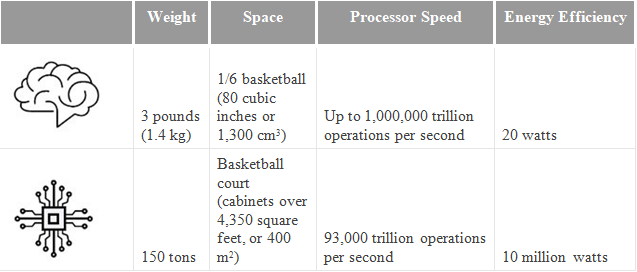
The experts have anticipated that the organized artificial intelligence will intensify human adequacy, yet in addition undermine human self-sufficiency and capacities. They talked about the wide-running potential outcomes; that PCs may coordinate or even surpass human knowledge and capacities on errands. For example, complex basic leadership, thinking and learning, advanced investigation and example acknowledgment, visual sharpness, discourse acknowledgment, and language interpretation. As per the experts, the smart systems in the networks, in vehicles, in structures and utilities, on farms and in business procedures will spare more time, cash & lives and offer open doors for people to appreciate a more-tweaked future.
The following diagram shows the comparison between the human brain and a supercomputer:
Will Artificial Intelligence take up human jobs?
With the developing publicity around AI, comes significant worry among laborers dreading for their occupations, and which is all well and good. For each feature referencing the development of the AI business, there’s another that offers a viewpoint on how and why AI is a danger to human occupation. One study found that about 37% of positions in the U.S. could be “powerless” to AI by the mid-2030s. This study, alongside endless sources referencing AI’s danger to human occupations, might miss a basic component – the requirement for human enthusiastic knowledge and information investigation. In the event that we investigate the particular ways, AI is improving the working environment for HR experts, obviously the human factor won’t become out of date, despite the fact that jobs of representatives may change.
Human intercession is basic to the eventual fate of AI—and AI is basic to guaranteeing HR pioneers can keep on moving from playing out a carefully authoritative capacity in an organization to turning into a vital accomplice and benefactor. We’ve exposed that AI is representing a noteworthy risk to employments—so by what means can, HR pioneers make the most out of this developing innovation fragment? As we keep on applying AI and mechanization to HR forms, we should investigate the representative lifecycle, from enrolling and onboarding to off-boarding and outplacement, and everything in the middle.
Summary:
Human insight revolves around adjusting to the environment making use of the mix of a few of the psychological procedures. The field of Artificial intelligence centers around structuring the machines that can imitate human conduct. In any case, AI experts can go similarly as actualizing Weak AI, yet not the Strong AI. Indeed, some trust that Strong AI is not just possible because of the different contrasts between a computer and human brain. In this way, right now, the insignificant capacity to impersonate human conduct is considered as Artificial Intelligence.
Likewise, the usage of human consciousness will clearly make life considerably increasingly advantageous for mankind in the years to come and even power people to develop their ranges of abilities, it will maybe never be feasible for such machines to totally supplant the human asset.
Web design gets broader everyday, with new technologies entering the field on a seemingly weekly basis. As a web designer, you need to stay on top of these technologies, and upgrade your skills, or you’ll become obsolete. But it’s tough to keep up when you’re reading countless Medium posts, and scouring the latest ebook for tips.
That’s where podcasts come in. The (usually) short episodes are like talk radio for the web, and are a great way to keep up to date on new technology and ideas.
Today we’ve collected 15 podcasts that are worth trying, if you’re not already addicted. Download a few, and listen to them on your commute, you’ll arrive at work inspired, more knowledgeable, and ready to go.
1. Responsive Web Design Podcast
The Responsive Web Design Podcast is brought to life by Ethan Marcotte and Karen McGrane. There are currently over 150 episodes, and still counting. Ethan and Karen conduct discussions and interviews centered around responsive design, and well-known sites that have implemented it.
2. ShopTalk Show
The ShopTalk Show is a huge deal, achieving a massive amount of publicity and attention, thanks to the efforts of Dave Rupert and Chris Coyier. Experts from across web design and development are invited on, on a weekly basis, and they’ve amassed over 350 episodes to date.
If you’re into web design, and love staying in touch with the latest web technologies then this is one podcast you’ll definitely want to check out.
3. The Web Ahead
Jen Simmons is the anchorwoman for The Web Ahead, through her resilience and love of tech, she invites renowned experts to speak their views and ideas on various web topics ranging from responsive web design, programming languages, and many other topics.
You’re able to access fresh episodes on weekly basis, which are usually above an hour in duration.
4. The Boagworld UX Show
Paul Boag’s a very successful writer on web design, and he’s been in the industry for years with a number of successful publications under his belt. His accomplice on The Boagworld UX Show is Marcus Lillington, who has an incredible history of successes as well.
This podcast channel runs to almost 500 episodes, all of which can be subscribed to, through your favorite podcast player, or RSS.
5. Alexa Stop
If I was ranking these podcasts starting with my favorites, Alexa Stop would have been right at the top.
Jim Bowes and Robert Belgrave study the impact of technology on our lives, and their podcast episodes explore cutting edge technologies like new developments on the web, and computational innovations.
6. JavaScript Jabber
The podcast here, as the name suggests, is mostly about JavaScript. JavaScript Jabber connects you with a wealth of experience in front-end web development. Plus it’s accessible enough for those who are just entering the field.
7. Drafts
Giovanni DiFeterici and Gene Crawford cover everything web design and development on Drafts, bringing this channel to life.
Each podcast encompasses a time frame of 15 minutes, which is shorter than most, but each one is packed with ideas to keep you inspired and engaged.
8. TheBuildUp
Bobby Solomon and Jon Setzen are the big hit on TheBuildUp, they are the experts themselves, so they engage in short conversations within fields that best suits the tech industry, with emphasis to the web technology among other fields. A single episode is released on a biweekly basis.
9. The Big Web Show
Jeffrey Zeldman really has it big for web techies. The episodes cover topics relating to web publishing, design, and typography among many other topics. The Big Web Show is a web show that you really can’t afford to miss out on.
10. CTRL+CLICK CAST
Ctrl+Click‘s former name was ExpressionEngine which was brought alive by its hosts Lea Alcantara and Emily Lewis. As their slogan was “your human web inspectors” their approach to podcasting was to guide, teach, and motivate web designers.
11. The Gently Mad
Adam Clark with his guest on The Gently Mad podcast comes to their audience’s rescue by highlighting stories, facts, databases, deep insights and real-time experiences of individuals doing great in their respective fields.
12. 99% invisible
99% Invisible episodes are consistently brilliant, despite the fact that each of the episodes usually run to a duration of between 15 to 20 mins. An amazingly addictive series of podcasts.
13. Data Stories
Data visualisations are the primary topic on Data Stories, a podcast hosted by outstanding personalities Enrico Bertini and Mortiz Stefaner). Their topics are mainly academic but oftentimes, they follow their audiences responses into more divergent and less well-trodden paths.
If you are passionate about web and related topics like software development, infographics and data analysis, then Data Stories will help you stay up to date.
14. Design Matters
Debbie Millman has been rowing her boat in the podcast industry since 2005. She loves touching on anything design, right from architectural designs, web design, product design, etc.
This is why the experts she meets for discussion on Design Matters are always designers with high sense of technical craftsmanship.
15. The Digital Life
Jon Follett and Dirk Knemeyer are the podcast hosts here, they speak about everything digital but primarily digital technology. Their episodes were among the most trending. If you really want to go beyond web design, the Digital Life is your bet.
Chances are that the answer is yes. According to recent research, 84% of people fill out at least one web form per week.
But you may not have realized, because filling out web forms has become an almost integral part of the fabric of our lives.
In fact, almost every online interaction that takes a user from A to B is an online web form: getting in touch with a company, booking a train, buying a product, organizing a hotel stay…
Web forms first started to be used for online sales in 1994, with the first ever drag-and-dropforms popping onto our screens in 2006. Since then, forms have become the lynchpin of online interactions.
They are the gateway between a company and their customer. From small town blogs to global government portals, it’s almost impossible to imagine a website without one.
So why do online forms have such a bad rep?
Sure, very few people actually love forms. But most won’t mind filling one out as long as it’s clear, concise and well-designed.
And that’s where the rub lies. Too many online forms are overly long, confusing or invasive (and sometimes all three at the same time).
When a form baffles, frustrates or asks for more than is necessary, the risk of a respondent giving up is sky-high. Some people will abandon the form altogether. Others will unsubscribe. Either way, you’re not likely to get a second chance.
When designing a form, how can we make sure respondents will hang in till the final click?
“It’s very easy to create a form. The hard part is getting people to actually fill it out.”
After helping our 4.2 million users create online forms, the main thing we have learned at JotForm is that seemingly subtle changes make a world of difference. Often, they are what distinguishes a form that converts from one that is abandoned.
For example:
HubSpot found that readers were 17% more likely to fill out a lead generation form of 14+ pages when it was placed on a separate landing page.
Marketo found that a few non-essential fields were inflating their cost per lead by 25%.
Designing a form? Make it an intuitive, easy and friendly experience. This guide tells you how.
Main components of a form
1. Greet your respondents: Title and introduction
Would you greet your friends without saying hello? We know how important good manners are, but in the online sphere, they often get lost in translation.
A title and welcome page are your chance to introduce your form (and yourself) in a clear and friendly way – and make a good first impression.
Just ask BettingExpert: they received 31.54% more signups by changing their form title to emphasize why people should sign up.
Your title is the shortest and most accurate description of what’s to come. Users tend to skim a form’s content, and hardly any will read a detailed description carefully. That’s why it’s so crucial to capture a form’s purpose in as few words as possible.
The title can be followed by a brief description of what the respondent can expect from the form. Keep this as neutral as possible: you want to make sure that your respondents answer honestly, rather than trying to meet your expectations. Even something as simple as outlining a goal may unwittingly coax your respondent into trying to achieve that goal.
Now’s also the time to list any external paperwork the respondent should gather beforehand – no one wants to be running around the house looking for their P45 or passport halfway through.
If your form is guaranteed to take a substantial amount of time to finish, alert users to this in advance. But if it’s ‘quick and easy’? Let users be pleasantly surprised (i.e., don’t risk insulting anyone’s intelligence, just in case.) They will be able to infer this themselves by looking at the progress bar or number of fields anyway.
2. Place related headers and subheaders
Fun fact: humans form first impressions in 50 milliseconds. Spoiler: that’s just not long enough for them to read your copy carefully.
Form respondents will probably skim-read the bare minimum and ignore the rest. Chances are they’re in a hurry, distracted, or generally impatient to get the experience over and done with.
Fair enough. We can’t stop them, so we may as well guide them: with crystal-clear, succinct sign-posting. Headers are your new best friend: they clarify the text, break it down, give it structure and keep users engaged.
Users should be able to glance at a header and immediately know what’s expected of them, without having to read the rest of the text.
The best way to test this is by reading your headers in isolation – do they still make sense?
3. Break questions with dividers
Dividers matter. In the case of traditional forms, using dividers is the best way to reduce overwhelm by visually breaking questions up. There doesn’t need to be a huge amount of visual difference, and too much contrast can distract.
4. Decide whether you’ll use multi-page or single page form
It depends on the number of sections.
If there are only one or two topics, a single page form is your best bet. But if a form has multiple sections, multiple pages are required to break up the conversation. Think about first impressions: a user is likely to feel intimidated if faced with a one-page form containing (what looks like) hundreds of fields.
5. Emphasize Calls-to-Actions (CTAs)
Successful CTAs emphasize the ACTION part: by clicking this button, what will the user DO? Generic labels like “send,”“submit” or “process” won’t cut it. The more descriptive, the better.
To eliminate uncertainty, try answering the question “I want to…” from the user’s perspective. For example, if it’s an inquiry form for a service, it could be ‘Request My Free Consultation.’
Need more convincing? In this study, Unbounce found that even just changing ‘start your free trial’ to ‘start my free trial’ increased clicks of the call to action by 90%.
6. Identify your form fields
Now’s not the time to get fancy….
Radio fields, picker fields, and checkboxes work because they are plain and familiar. Standard formatting of form elements equals better usability.
Radio buttons can be used when there are several options, and only one can be chosen. Checkboxes work best when more than one option can be selected.
Where possible, use checkboxes and radio buttons rather than dropdowns, as they require less cognitive load to process. As Luke Wroblewski once remarked: “dropdowns should be the UI of last resort.”
7. Never forget “Thanks” page
Remember your respondents are humans that have given you some of their time. So don’t finish abruptly – always say thank you.
When it comes to forms, we all prefer plain language – even the academics amongst us, the geniuses, and the experts. So why do so many online conversations sound like they’ve been put through a Thesaurus backward?
“Kindly accept our sincerest apology. Nevertheless, we would care to know your opinion. Furthermore… “
Writing like your old college professor will alienate readers and make their eyes glaze over.
Simple doesn’t equal dumb – it equals readable. That means Plain English, with maximum clarity. Each word should be the shortest, most straightforward version available – that means ‘but’ instead of ‘however.’ No jargon, no complex sentences.
To check for coherence, read your text out loud. Your ears might hear what your eyes can’t see – particularly in corners where your writing stumbles into wordy territory.
9. Make it personal
A form should feel like a friendly conversation between you and the respondent. Make it personal by using pronouns like “I,” “you” and “your.”
10. Eliminate passive sentences
Writing packs more of a punch when it’s active (John wrote a letter of complaint), not passive (A letter of complaint was written by John).
Passive writing tends to be lengthier and less focused.
How can you tell if a sentence is passive? Here are two dead giveaways:
The subject doing the action is unclear (A letter was written) or
The sentence uses the verb ‘to be’ (has been, was…) followed by a participle (e.g. ‘written’).
Many writers fall into the trap of thinking that the more words they use, the smarter they sound. Not so. When it comes to form-writing – or indeed, any kind of writing – cutting words is almost always more effective than adding them.
‘For every word you cut, you gain a reader.’
A text will emerge leaner, more coherent, more engaging and more precise after being checked carefully for unnecessary words.
Helpful areas for cutting:
Adverbs (words ending in -ly).
Meaningless qualifiers (a lot, a great deal).
Empty intensifiers (very, quite, rather, really).
The word ‘that.’
Nonessential information.
Vague words (thing, few, many).
12. Use contracted versions of words
Using contracted versions of words (e.g. can’t, isn’t) instead of their serious, full-formed alternatives (cannot, is not)) keeps writing light, friendly and conversational.
Plus, you save space. And good forms are always spacious.
What’s > what is. Simple.
13. Cleave long sentences
Lengthy, meandering sentences induce overwhelm. So do dense blocks of text.
For most readers, up to 20 words per-sentence – and up to three sentences per-paragraph – is just right. Splice anything longer in two. Short sentences aren’t inferior.
Blank space, bullet points, tables – anything else that breaks through the fog of heavy instructions – will make your reader breathe a sigh of relief.
When you’ve perfected your questions, reduced words and tightened everything, put the form away. Let it stew for a few days. When you return to it, you’ll spot loose ends to tie that you couldn’t have spotted the first time round.
The psychology of forms
Most UX psychology principles are so built into our psyche that we don’t notice them – unless they’re not there.
But every color, font, line and button serves a purpose.
Small-scale, everyday design might not be as dramatic as billion-dollar marketing campaigns. But that doesn’t mean it should be any less thoughtful. And understanding the psychology behind what makes people tick is fascinating – and free.
Every decision we make – from taking out the bins to getting engaged – goes through an automatic cost-benefit analysis in our minds. Are the costs of a task worth the benefits of its completion?
It’s a designer’s job to ensure that perceived benefits always outweigh costs.
Of course, cost vs. benefit is subjective, and form-filling usually stems from obligation, rather than an activity respondents hope to gain something from. We can’t ensure benefit, unless we offer our respondents a reward. But we can minimize costs.
Some key strategies for minimizing costs for your respondents:
16. Chunk text
+1-919-555-2743 vs 19195552743.
Which telephone number sticks in your brain? The first one, of course. That’s because it’s been chunked.
Chunking is a handy memory technique: we use it for our bank PINS, social security numbers and locker codes. It refers to the process of arranging information into ‘chunks,’ making the content easier to retain, process and recall.
Research claims that three is a magic number to help people absorb and recall information. So use it when you can: for paragraphs, lists, key steps…
17. Define formatting requirements
If at all possible, avoid arbitrary formatting rules. But if they are a necessary evil, spell them out in red marker pen. When filling out a form, no one likes guessing games. Password requirements, syntax rules, numbered spacing: if a field requires a certain input, make it visible.
Hicks Law
If I’m throwing a dinner party, I’ll always opt for buying my ingredients from a small local grocer rather than a sprawling supermarket. That’s because having too many options often feels paralyzing. That’s Hicks Law: it states that, as our number of choices increases, so does our time spent trying to make a decision.
Applied to UX, Hicks Law is an ode to deliberate elimination: limiting navigation choices and giving users clear but restricted options. Because as design flexibility increases, its usability decreases.
Less really is more.
Some ways of putting Hicks Law into practice:
18. Cut ruthlessly (again)
What purpose does that link serve? Or that button on the top right? If it’s not adding, it’s taking away. Every word of copy, every picture, bell or whistle that isn’t 100% necessary will decrease your form’s conversion rate.
Neil Patel was able to increase his contact form submission rate by 26% simply by removing a single field.
As Truman Capote once said, ‘I believe more in the scissors than I do in the pencil.’
19. Reduce the need for typing
Typing is the most time-consuming and intensive aspect of online forms, and it often leads to errors – especially on mobiles. Replacing text boxes with buttons and sliders and using autocomplete will reduce effort and increase conversions.
20. Shorten your form with conditional logic
According to Marketing Insider Group, 78% of internet users say personally relevant content from brands increases their purchase intent. And marketing campaigns are 83% less effective when the experience is irrelevant to the user.
So, thank goodness for conditional logic!
Conditional logic (or ‘branch logic’) simplifies complex processes by allowing additional instructions based on a particular response – or, “if this, then that.” In the context of a form, a respondent would only see questions that apply to them on the basis of their previous answers.
Using conditional logic will reduce the time it takes to complete your form by not displaying questions that are irrelevant to a user, making them less likely to abandon the task ahead (stat about abandonment).
Yes, this sounds like common sense – but most forms parrot the same questions to every user, no matter who they are. And using conditional logic is a win-win, because by clearly defining user segments, you capture cleaner, more useful data.
Dual-Coding Theory
I say: tree.
You see: trunk, green leaves, branches.
Our brain is clever like that: it associates visuals with words.
That’s the key principle behind Dual-Coding Theory, which states that memory has two disparate but connected systems, one for verbal information (‘tree’) and one for visual information (trunk, green leaves, branches).
When something is ‘coded’ in two ways (visual and verbal) there is a higher chance of it being understood and remembered than if it is coded in only one way (visual or verbal).
In other words, pairing words with images make them easier to remember. Children’s books make the most of this. Here are two ways of putting Dual-Coding Theory into practice when designing a form.
21. Visualize the information
Our brains process visuals much faster than text. Using cues like icons, imagery, shapes – whatever helps to illustrate your point – will make the user experience more intuitive.
Form design should be consistent, but that doesn’t mean it can’t integrate little moments of surprise. By using non-standard visual UI elements – like clickable images and toggled sliders – you can make form-filling more enjoyable and intuitive.
22. Consider the colors
Did you know: 90% of our initial judgement of a product is based on color alone?
In fact, according to marketing guru Neil Patel, color is “85% of the reason you purchased a specific product.” The right combination can improve readership by 40%, comprehension by 73%, and learning by 78%.
You don’t need to be a designer to figure out which color schemes and contrasts work best. Handy programs like Adobe Color CC and Paletton exist to help you choose a palette that reflects your company’s image.
23. Make your form beautiful
Shallow creatures that we are, we’re conditioned to believe that attractive design is better in other ways, too: faster, smarter, easier to use. That’s called the ‘aesthetic-usability effect.’ A beautiful interface increases our patience and loyalty and even makes us more sympathetic to design problems.
38% of people will stop engaging with a page if the content or layout is unattractive. In other words, if your web forms aren’t beautiful to look at (and easy to fill out), they’re a waste of time.
Sure, beauty is in the eye of the beholder. But a simple interface, clean font, and sleek styling will win you (form) beauty pageants.
The Endowed Progress Effect
We are more motivated to finish a task if we can visualize the progress we’ve already made towards it. When we think we have a headstart, it reduces that amount of perceived work, making us more likely to go the extra mile.
That’s known as the ‘Endowed Progress Effect,’ summed up by American professors Joseph C. Nunes and Xavier Dreze as “a phenomenon whereby people provided with artificial advancement toward a goal exhibit greater persistence toward reaching the goal.”
Some examples of applying the Endowed Progress Effect to forms:
24. Stagger questions from easy to hard
If you can release questions from easy at the beginning of the form to hard at the end (without sacrificing logical order), users will speed through the initial stages of the form. This, in turn, will trigger the streak effect: the satisfaction generated by quick progress and a sense of momentum, that makes users reluctant to break the streak. Meaning they will continue and are more likely to hang in when the form becomes more demanding.
25. Illustrate the progress
Reflect user’s advancement at all times. The closer respondents feel to their goal, the more likely they are to push themselves towards it. If your form is multi-page, indicate how many pages they have left to complete.
A study from Clutch confirms that 90% of people prefer web forms that use progress bars to manage their expectations about completion time.
Questions, answers and grouping
26. Brainstorm the questions
All forms rely on questions. When it comes to brainstorming questions, it’s best to start with the end goal and work backward.
So your first question is: What’s the purpose of your form? Is it onboarding? Feedback? Research?
Jot down the knowledge you hope to gain from the form, as precisely as possible. Articulate this as questions (with a question mark at the end) instead of snippets from your train of thought. Give yourself enough time to erase and start again.
Then, write down some possible answers which would give you what you are looking.
And finally, brainstorm the questions that would lead you to these answers in the first place.
As a post-survey precaution, write down the %age of responses per-question you’d expect to receive. Comparing these guesstimates to your actual results will reveal blind spots to pay attention to next time round.
This pre-survey process will also guide your design and save you time.
The science of fields
According to the Form Conversion Report, the type of form directly impacts the number of fields you should include. Think very carefully about how much detail you need for the context you are in.
Now, ask yourself: do you really, really, REALLY need to ask that question?
Chances are the answer is no. Even if we know the power of less, when faced with the opportunity to get a peek into our users’ brains, it’s tempting to ask for lots.
Yes, the answer to this question may be important. But is so important that it’s worth losing the form respondent over it?
You need your users’ cooperation. And every additional field makes them less likely to complete your form. So, once you’ve listed all the possible questions and answers, try and cut as many as you can. Think about other ways to collect data, and consider whether the question can be inferred, postponed or excluded altogether.
Eliminate optional questions altogether. If you must include them, list them after the form has been completed.
Once you’ve brainstormed, trimmed and refined a final list of questions, it’s time to organize them. Arrange them into groups and subgroups with a ‘theme’ header that holds them together, e.g. contact details, work experience, etc.
Once again, the user should be able to scan each section and know what they need without reading the questions.
28. Define a logical question sequence
Next on the list is question order. The rule of thumb is that the closer in topic questions are, the closer they should physically be placed together.
Each question, and section, should nudge the respondent on to the next. Big gaps or leaps forward are confusing, so think of the way a form develops step-by-step in a recognizable sequence.
Through conditioning, we can recognize some types of flow more easily than others. For instance, ‘What’s your name?’ will come before ‘Where do you live?’ which will, in turn, come before ‘What’s your work experience?’
29. Decide on “compulsory vs. optional vs. ‘nice-to-have’”
It’s best practice to limit your form to compulsory questions only. Optional questions needlessly lengthen a form and irritate the user: “Where did you hear about us?” “Would you like to receive marketing emails?”
But what about questions that aren’t compulsory, but would be very ‘nice to have’? Place them at the end of the form as an optional follow-up. This way, they will feel less invasive, and won’t affect your conversion rate.
30. Ask one thing at a time
Double-barrelled questions lead to ambiguity. And – you guessed it – ambiguous answers can’t be quantified.
Avoid the pitfall of meandering questions by scanning them for the words ‘and/’or.’ Seen one? Cleave the question in half.
The clearer the question, the clearer the answer. The clearer the answer, the clearer the data.
31. Give shortcuts
A good form carves a clear route to completion, then carefully guides users along with clues, cues and direction. The shorter that route, the higher the chance of completion. So offer shortcuts if you can.
Some examples of helpful shortcuts:
Zip code lookup
When asking users to fill out their address, it’s best practice to just ask for a house number and postcode/zip code, and then use a lookup service to suggest the full address.
Placeholder text
Placeholder text is light text that appears in a form field to describe its expected value. It should only be used if there is potential ambiguity.
Field label
A field label is the question text that sits above the field. These should always be present and shouldn’t be replaced with placeholders. It’s tempting to free up space by making placeholder text double up as a label, but this causes many usability issues (summarizedhere.)
In other words, you can have labels without placeholder text, but not placeholder text without a label.
Predefined answers
Everyone loves predefined answers. They save your reader time, AND they are easy-peasy to evaluate.
You can predefine answers by making questions Yes/No, single choice (radio) or multiple choice (checkbox). In case there’s an answer you can’t predict, add an ‘Other’ textbox to let readers enter a custom response.
Predictive search
When asking users to choose their country, occupation, or something else with a large number of predefined options, it helps to provide a predictive search function to reduce the amount of typing (and cognitive load) required.
Audience, purpose and context of a form
Your form is only half of the equation. It’s active, not passive. And its action relies on your respondents. They need to be embedded in the framework from the very beginning.
So when designing a form, you also need to think from your user’s perspective… And that starts with their purpose and context.
Why should someone fill your form? What’s their purpose? Write it down.
Purpose is embedded in context, so make context specific in your mind’s eye. Where and how are they filling out the form? At home? On a laptop? On a mobile? On the subway?
Context isn’t just the environment. It’s about your participants understanding what your form can achieve, with their help.
32. Know who are you talking to
The form needs to engage the attention of the right audience – so, who is that audience comprised of?
Thinking in a broad, foggy mass of people won’t help. To focus your mind, hone on on one person – or, a ‘buyer persona.’ This will tell you more than any general group can.
Imagine a fictitious ideal customer with a job, personality, family, hopes, and dreams. Bring this person into sharp focus. Where do they live and work? What are their opinions and values? How do they relate to your business?
If you find out what is meaningful to this imagined person, you will be better-placed to gather questions that lead to meaningful data.
This is the person you need to keep referring back to. This is the person whose answers you need.
Form visuals and structure
Surprises are great on birthdays, but not when filling out forms. Users should be lulled into a sense of rhythm and repetition as they work through the questions, safe in the knowledge that the buttons, input fields and everything else will be the same from page to page.
Consistency will support a smooth form-filling experience. That means colors should be the same, visuals should be the same, TOV should be the same.
What is your company persona? What phrases and words get this across? What are your values?
At JotForm, we focus on being inclusive, friendly and down to earth – and the language we use reflects this.
When you’ve defined your brand tone of voice, maintain it throughout all of your forms – your customer should feel as if they’re interacting with the same friendly person every step of the way.
Visual consistency is equally important. Adopt a visual identity and style that you maintain throughout your form (and the rest of the forms you create in the future).
33. Align labels top-left
Google’s UX researchers found that aligning labels above fields on the left-hand side increased form completion time, because it requires less ‘visual fixations.’
34. Avoid placing questions side-by-side.
Eye-tracking studies have shown that simple one-column layouts are better than multi-column layouts with questions positioned side-by-side.
The only exception to this rule is when asking for dates (day, month, year) or time (hours and minutes), where multiple fields are expected to be on one line.
35. Try one-thing-per-page
One-thing-per-page is a psychological technique defined as:
…” splitting up a complex process into multiple smaller pieces, and placing those smaller pieces on screens of their own.”
Essentially, users only have one important thing to focus on.
One piece of information to understand.
One decision to make.
One question to answer.
A chaos-free page encourages users to stay on task.
36. Use field length as an affordance
Always adjust the width of the field so it’s just long enough to contain all the characters of the input (users should be able to see their full entry) and no longer.
The size of a field should reflect how much text the user is expected to enter. Fields like zip code or house number should be shorter than the address line.
A Baymard Institute usability study found that if a field is too long or too short, users start to wonder if they have understood the label correctly. This applies especially to fields with unusual data or a technical label like CVV (Card Verification Code).
When displaying validation errors or success messages, don’t rely on using green or red text, (as red-green color blindness is relatively common). Use texts, icons or something else. JotForm Cards warns the user with a micro-animation that shakes ‘no’ when an error has been made.
38. Specify errors inline
Show the user where the error occurred and provide a reason.
If you must use validation, ensure that it’s inline (to the right of the field) and reports errors early on.
Don’t wait until a user hits submit to report validation errors. But equally, inline validation should not be real-time, as this is likely to report errors before a user has completed the field.
39. Use field validation
You ask for an email address, and you receive a response with no @ sign. You request a phone number, and half your answers don’t contain enough digits.
Typos shouldn’t be a barrier to your form’s usability.
Use “field validation” to make sure you get the answers you need, such as, “Answer must contain a ___.”
JotForm Cards recovers the email address of a user who has entered the domain name wrong; john@gnail.comshould be john@gmail.com.
40. … but don’t be too strict
If there’s a lot of variation in how users answer a field (for example, responding to ‘phone number’ with +12345678912, +44 12345678912, 012345678912), convert these to a consistent format.
All about payment forms
What is a payment form?
A payment form is a digital version cash desk. It authorizes online payment, validates the user’s details, checks funds are available and ensure you get paid.
Payment integrations have a lot of advantages. They help you to
sell products or services;
apply complex calculations to these sales, such as adding taxes and shipping costs or subtracting coupons;
give your products descriptions like images, quantity, color and sizing options;
collect donations and payments of a fixed amount, or make these payments recurrent with a subscription service.
When it comes to designing a payment form, it’s essential to follow best practice. Here are some key rules.
41. Limit the steps in payment
The Baymard Institute analyzed checkout forms and found that a checkout process that is too long or too complicated is one of the top reasons for abandonment during checkout. So cut fields, cut, and then cut again.
42. Use visual indicators of security
When entering sensitive details such as credit card details, users will be on high-alert to anything that seems dodgy. A recent study revealed that 17% of shoppers left a page without paying due to security concerns.
Professional payment forms put users at ease, whereas anything that looks ‘off’ will put them on edge. That’s why you should be cautious about building a payment form from scratch – even the tiniest errors or inconsistencies can scare users off.
It also helps to enable SSL on your forms to help protect data. Visitors get peace of mind knowing all interactions are encrypted. JotForm is the most secure ways to transfer data: we’re Payment Card Industry Data Security Standard (PCI DSS) Level 1 compliant and SSL enabled.
43. Clearly explain why you’re asking for sensitive information
People are increasingly concerned about privacy and information security. If you must ask for sensitive information, make sure you explain why it is needed, using support text below the field.
44. Save the data
Giving users the option to save their address and payment information makes the process quicker and more streamlined – especially on fiddly devices like mobile. It also gives repeat customers a sense of reward and loyalty.
45. How to add a payment integration with JotForm
Step 1: Add your brand logo and custom styles.
Step 2: Enter integration credentials using a connect button, or enter them directly.
You can use purchase order integration to check for the details and options for a generic payment field creation (this doesn’t require any credentials because it doesn’t create a real transaction). You can check Sofort integration guide as an example to walk through an entire payment process.
Step 5: Write a personal thank you message-autoresponder emails.
All set. Now you can easily sell your products on websites, blogs or social media.
When you’ve finished the form…
Hurray, done! Almost. Your form might be finished, but it’s not time to send it off just yet…
There are a few final steps to keep in mind.
46. Test your form before sharing
We all have blind-spots. And when a form’s success hangs on the quality of the data, it’s good to be cautious. So, make sure you’ve provided robust answer choices, and haven’t missed anything, by pre-testing your survey.
Send it to family/friends and ask them to keep track of how long it takes for them to respond to the survey, and how they experience the flow of questions. This will help you evaluate the design of the form next time round, too.

 , kids. If you find an idea you like and want to adapt to your own site, remember to implement it responsibly.
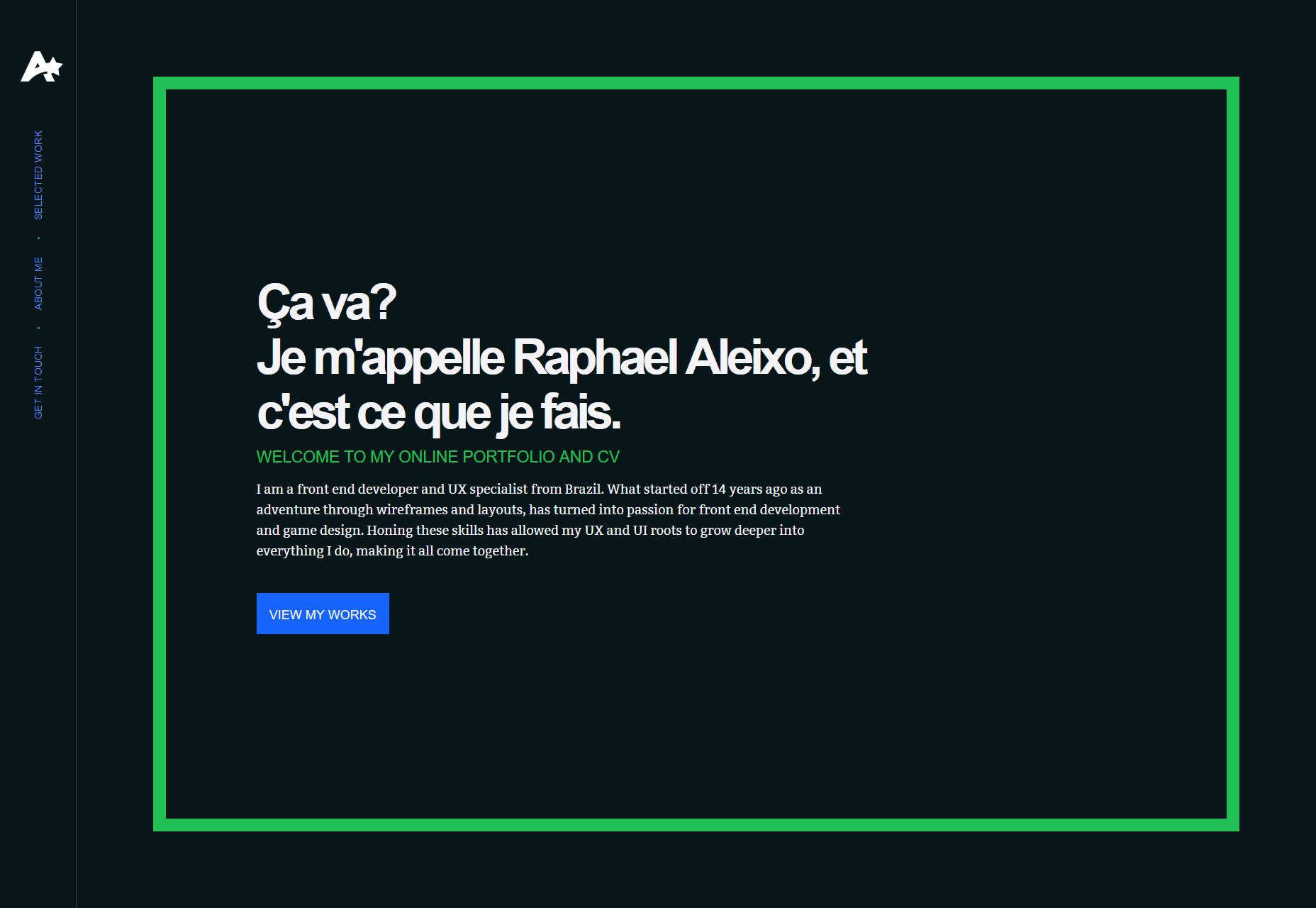


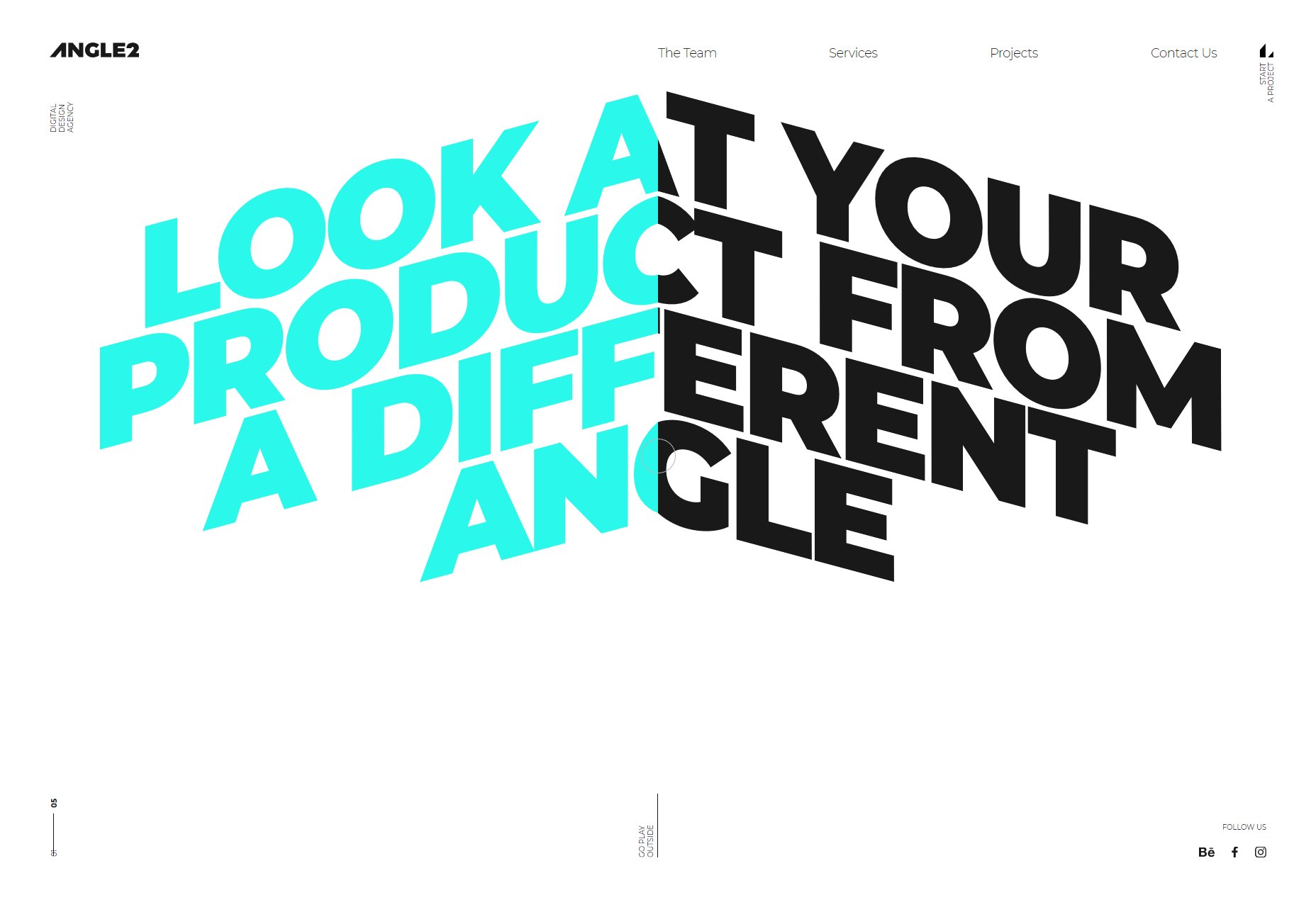
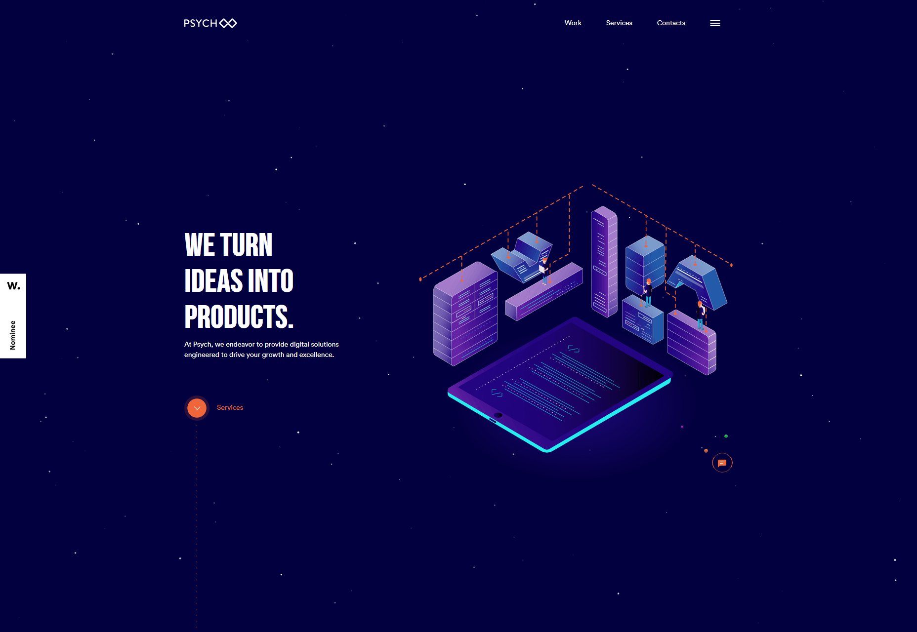


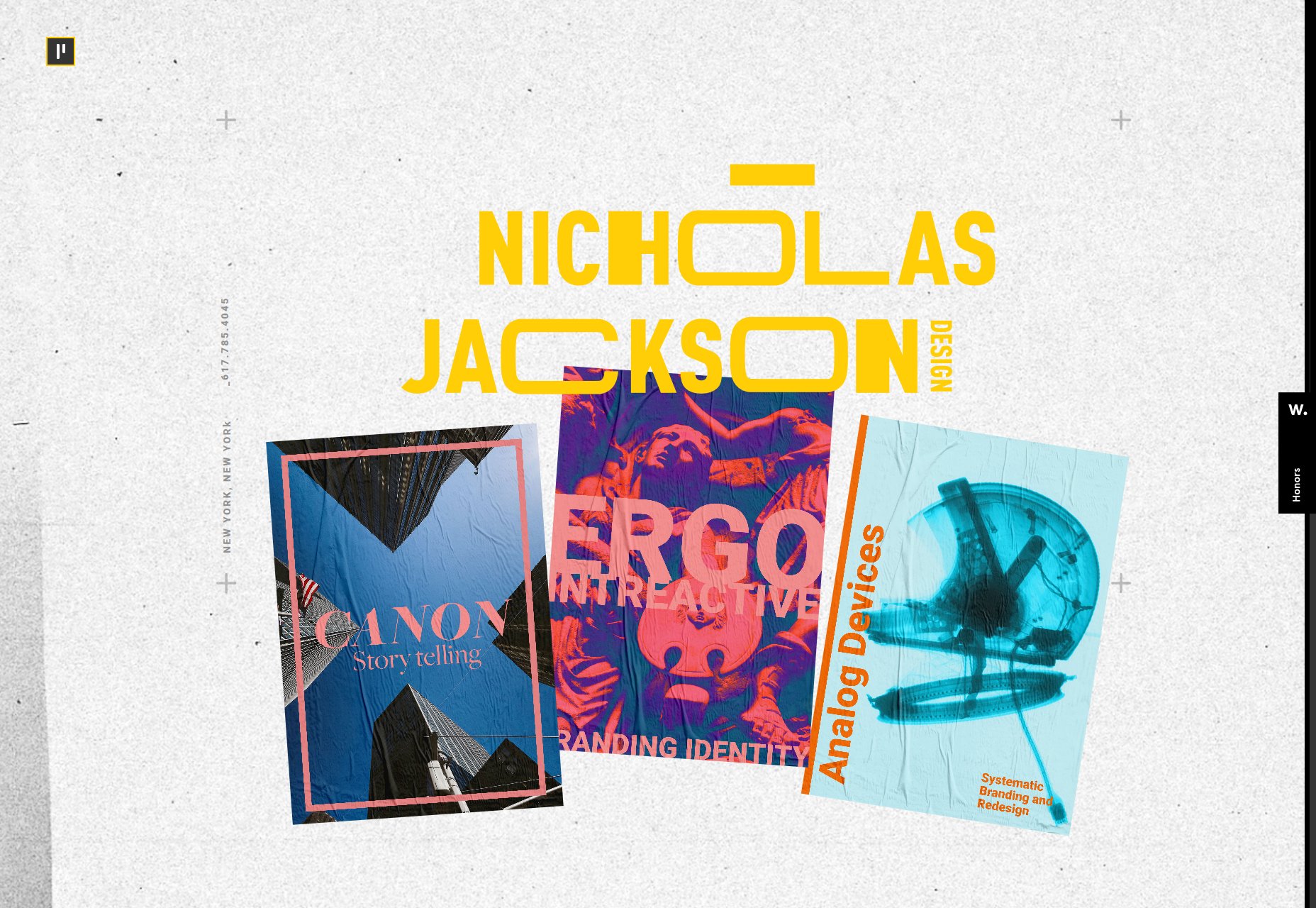


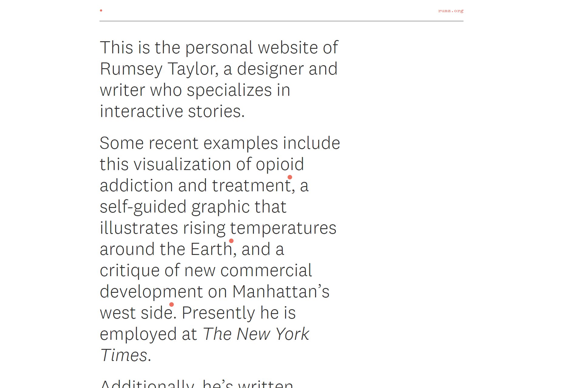


