Jeremy on the divide between the core languages of the web, and all the tooling that exists to produce code in those languages:
On the one hand, you’ve got the raw materials of the web: HTML, CSS, and JavaScript. This is what users will ultimately interact with.
On the other hand, you’ve got all the tools and technologies that help you produce the HTML, CSS, and JavaScript: pre-processors, post-processors, transpilers, bundlers, and other build tools.
Jeremy likes the raw materials side the best, but acknowledges a healthy balance of both worlds is a healthy mix.
I think a great front-end developer is hyper-aware of this split. Every choice we make is a trade-off between developer productivity and complexity management and the user’s experience. The trick is to punish the user as little as possible while giving yourself as much as you can.
This article isn’t about how to build web components. Caleb Williams already wrote a comprehensive guide about that recently. Let’s talk about how to work with them, what to consider when making them, and how to embrace them in your projects.
If you are new to web components, Caleb’s guide is a great read, but here are more resources that will get you up to speed:
Since web components are now widely supported (thanks to the hard work of many people behind the scenes) — and considering the imminent switch that Edge will make to the chromium platform — people are now thinking about web components as “native” and a platform-compliant way to build reusable UI components to keep consistency across design systems and web projects, while using the power of the Shadow DOM to encapsulate style and logics inside the component itself.
Well, this can be true and false at the same time. But first, let’s get acquainted with the Abstraction Layers Triangle.
The Abstraction Layers Triangle
Technically, we should consider web components as an extension of our favorite markup language, HTML (yep!). The Web Components API allows us to create custom HTML elements (e.g. ) that don’t exist in HTML.
We are told web components are basically new HTML elements, so we should consider them as part of the HTML specifications and, consequently, we should follow its paradigms, core concepts, and utilization. If we assume all of these points, we will figure out that our components will live among the lowest levels of the web platform stack, alongside HTML, CSS, and JavaScript.
Frameworks and libraries like React, Vue, Angular, SvelteJS work on their abstraction level, right above other tools that live in a sort of “middle earth,” like StencilJs, Hybrids and Lit. Under these layers of abstraction, we can find our basic web technologies… and vanilla web components. We can represent this concept with an ALT (A>bstraction LTriangle) diagram:
The higher we go, the more abstraction things get.
Why is this important? Well, it helps us visualize the various layers that exist on top of native components and understand the context they are used so that they can be built for an intended context. What’s context? That’s where we’re headed.
Same technology, different contexts
The Shadow DOM is a key factor in the Web Components API. It allows us to bundle JavaScript and CSS inside a custom element to both prevent external interferences and style manipulations, unless we expressly allow it. There are indeed some approaches that developers can follow to allow external CSS to leak into the shadow root and into a component, including custom properties and the ::part and ::theme pseudo-elements, which is something Monica Dinculescu) has covered so well.
There is also another thing to consider: the context we are working with. After three years of building web components personally, I can identify two contexts: the privatecontext (like a design system) and the standardcontext (like plain HTML, CSS, and JavaScript without custom styles).
Before designing components, we need to know how they will be used, so determining the type of context is a key to all of this. The most easy way is targeting only one context, but with a small CSS trick. we can build our components for both of them.
Let’s look at the differences between the two contexts before we get into that.
Private context
A private context is a closed ecosystem that provides components with their own style that must be used as-is. So, if we are building a component library that comes from specific styling guidelines or a design system, each component will reflect custom styles so there’s no need to code them up each time they’re needed.
That can be true also with JavaScript logic. For example, we can attach a closed shadow root that prevent others to accidentally pierce the shadow boundary with a querySelector. As a a result, we can simply pick and use all any component, avoiding issues like style inconsistencies and CSS collisions. As the author, you can also get to define a set of CSS custom properties (or ::parts) that can be used to style a component for a specific use case, but this is not the focus point of a design system.
Here’s an example of a web component component in a private context. It has all of the styles and logic contained inside its shadow-root and and can simply be dropped into any page.
This example and the one to follow are for demonstration purposes and not intended for production use because they do not make considerations for key situations, like accessibility and other optimizations.
Components in a private context can be rarely used outside of that context. For example, if we try to take an element from a design system (which has its own enforced styles), we’re unable to simply add it to a project and expect to customize it. You know how Bootstrap can be themed and customized to your liking? This is pretty much the opposite of that. These components are made to live inside their context and their context only.
Standard context
A standardcontext may be the most complex type of component, not only because the environment can range anywhere from a full-fledged framework (like Vue and React) to plain vanilla HTML, but also because everyone should be able to use that component like any other element.
For example, when adding a component publicly, say to npm, those who use it will expect to be able to customize it, at least to some degree.
Do you know of any HTML element that comes with its own presentational style? The answer should be no because, well, elements must be explicitly styled with CSS. This is also true for web components made in a standard context. A single web component should be customizable by adding classes an attributes, or other methods.
Here’s the same element that we saw in the closed context example, but designed for a standard context. It works as-is, without any presentational styles inside its shadow root. In fact, it only contains the required logic and baseline CSS to make sure it functions. Otherwise, it’s completely customizable like any standard HTML element, like a div.
Both of the examples we’ve looked at for each context are made with the same component. The difference is that the component in a standard context an be customized and selected with external CSS.
Web components and composition
OK, so working with web components is really the same as working with plain HTML, though as we’ve seen, it’s important to follow the paradigms and principles of the given content. Well, thing we need to be mindful of is the web component composition.
Composition is one of the least understood features of shadow DOM, but it’s arguably the most important.
In our world of web development, composition is how we construct apps, declaratively out of HTML. Different building blocks (
s, s, s, s) come together to form apps. Some of these tags even work with each other. Composition is why native elements like , , , and are so flexible. Each of those tags accepts certain HTML as children and does something special with them. For example, knows how to render option> and into dropdown and multi-select widgets. The element renders as an expandable arrow. Even knows how to deal with certain children: elements don’t get rendered, but they do affect the video’s behavior. What magic!
Composition is what we normally do when we work with HTML. Since web components are merely HTML elements with a DOM reference — and not logical containers — we should rely on composition to build our components and any sub-components. If you think about the ul and and select you will notice that you declaratively compose these elements to get the final output and you have specific attributes to be used with the main component (e.g. [readonly]) or the sub-component (e.g. [selected]). This is true also for web components, and if you are building a custom list, consider to build the main component () and the child one (). Using the [slot] element, you can define where children elements will be placed and also placeholder content that will be shown when no children are passed through.
Web components and accessibility
Another thing to consider is that “small” topic we call accessibility. Since we are creating completely new HTML elements, we need to consider the accessibility of our elements in order to provide a basic semantic role, any keyboard navigation as well as the user’s operating system preferences, like the reduce motion and high contrast settings.
I strongly suggest the following resources as reference for building accessible and inclusive components, how to define semantic markup, and how to implement a basic keyboard navigation.
Web components are an emerging technology in web development and, as such, there really aren’t any clearly defined best practices to guide us as far as building them for their intended or maximized use. When you find yourself working with them, perhaps the single thing you can take away from this post is to consider whether they are intended for a closed context or a standard context, then ask yourself WHI:
Who will use this component?
How much flexibility should that person have to customize it?
Is this component for everyone or for a specific audience?
Photo Vectorizer is a simple-to-use Photoshop action that can convert any photo into a vector. With just a few clicks of your mouse, you can save tons of time and frustration by turning your photos into vectors. With super sharp results, these vectors are great for any project either online or in print.
Highlights:
Turn your photos into professional looking vectors.
Easy to use — just a few clicks.
Save tons of time.
Sharp, clean results.
Great for backgrounds, spot illustrations and presentations as well as printed projects like T- shirts, mugs, totes and more.
(This article is kindly sponsored by Adobe.) Voice-enabled interfaces are challenging the long dominance of graphical user interfaces and are quickly becoming a common part of our daily lives. According to a survey run by Adobe, 76 percent of smart speaker owners increased their usage of voice assistants over the last year.
In this article, I’ll share a flow that you can use to create voice-based experiences. But before we dive into the specific recommendations on how to design for voice, it’s important to understand the user expectations about it.
Why Do People Expect More From Voice?
Voice User Interfaces (VUIs) not only introduce a change in a way people interact with machines, but they also raise the bar for the quality of interaction. When people interact with GUI’s and have troubles with them, they often blame themselves, but when people interact with VUIs and are unable to complete a task, they blame the system.
Why is that? Well, talking is the most naturally convenient medium for communication between people, and people are confident in their talking skills. This can have a direct influence on the retention rate: A 2017 report by Voicelabs states there’s only a 6 percent chance a user will be active in the second week after downloading a voice application.
Design Process
Many designers think that designing voice-based experiences is completely different from graphical user interfaces. That’s not true.
Designing voice-based experiences is not a new direction in UX design; it’s a next natural step. It’s possible to adapt the design process that we use for visual interfaces for voice-based products.
There are five steps should take place before starting development a voice product:
The great thing about this process is that it can be applied to all types of voice interfaces, whether it is a voice-enabled, voice-only or voice-first.
1. Research
Similar to any other digital product we design, we need to apply user-first design in the context of voice user interfaces. The goal of user research is to understand the needs and behaviors of the target user. The information you gather during this step will be a foundation for product requirements.
Identify The Target Audience
Defining and researching the target audience of a product should be one of the first steps in the design process.
Here’s what to focus on during this step:
Look at the current experience and how the users are solving their problem now. By identifying pain points, you’ll find the cases where voice can benefit your users.
User language. The exact phrases that a target user uses when they speak with other people. This information will help us to design a system for different utterances.
2. Define
During this step, we need to shape our future product and define its capabilities.
Define Key Scenarios Of Interaction
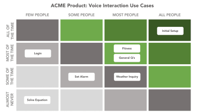
Scenarios come before specific ideas for app — they’re a way to think about the reasons someone might have to use a VUI. You need design scenarios that have high value for your target users. If you have many scenarios and do not know which ones are important and which are not, create use case matrix to evaluate each individual scenario. The matrix will tell you what scenarios are primary, what are secondary what are nice-to-haves.
There should be a compelling reason to use voice. Users should be able to solve the problem faster or more efficiently using voice than any of the alternative experiences.
A few common cases when voice interaction might be preferable for users:
When user’s hands are busy (while driving or cooking);
When using voice is an easier and more natural way to interact (for example, it’s much easier to tell your smart speaker to “Play Jazz” rather than jump to a media center and select the right option using a GUI).
Your goal for this step is to identify both common and specific cases that your users will benefit from. It’s also important to consider the limitations of voice interactions. For example, selecting from a long list of menu items is problematic with voice interactions. A good rule of thumb is to keep choices short and to the point — 3 selections maximum. If you find you have more than 3, it’s best to reframe the scenario.
3. Create
With voice prototypes, it’s important to start at the drawing board. The first step is to tackle the voice user flows of your experience, which is the basis from which all user interaction will map back to.
Use Storyboards
Storyboards visualize interactions and flows in context and make them feel more realistic.
A storyboard that illustrate the flow. Image: BBC. (Large preview)
Write Dialogues
Dialogues are the building blocks of voice user flows. For each key scenario that the voice app will support, start creating conversational dialogues between the user and the app.
Strive to make interacting with the app as familiar as having a regular conversation with a real person. Human conversation is complex; it often has many twists and turns. It will be important to take this into account when working through your scenarios and writing dialogues.
A few general recommendations for creating great dialogues:
Reduce the number of steps it takes to complete a task.
Try to eliminate unnecessary information and questions wherever possible. Design should solve the user’s problem with the minimum number of steps. Remember that the longer it takes to complete the task, the less enjoyable the experience becomes. No one likes products that drain on their valuable time, and this is especially true for repetitive tasks. Your app should provide a delightful user experience whether it’s the first time a user completes the task, or it’s the 100th time this month.
Don’t teach “commands”.
Given how hard discovery can be in voice, some designers try to teach users commands so they know what to say. Don’t do that. Phrasing should be natural and intuitive, so users will know what to say in particular situations.
Be brief with your questions and responses.
It’s relatively easy to overload users with too much information when you use long sentences. Try to simplify messages to their essence wherever possible. Users enjoy concise and well-defined information from VUI.
Think about what information is primary, and what information is secondary. Follow the principle of Maximum of Quantity which says that a speaker provides the listener as much information as is necessary to advance the perceived purpose of the interaction but not too much.
Here is a dialogue that doesn’t follow the principle of Maximum of Quantity:
User: “Where’s a good place to go for pizza?”
System: “I have five places for you. The first one is “Pizza & Pasta” is located on 1300-1398 Diamond St San Francisco, 15 minutes away from you, open from 8:00 AM till 8:00 PM, the second is “Italy” which is located on 4100-4148 20th St San Francisco, 1 hour away from you, open from 9:00 AM till 6:00 PM,…”
The dialogue tries to present all options in a single turn. It’s better to try to narrow down the list by asking a clarifying question:
User: “Where’s a good place to go for pizza?”
System: “There are several pizza restaurants in the area — would you like to walk, or drive?”
Handle Errors
No matter how good your VUI will be, one thing is for sure: things will go wrong. And you need to design for those situations. Graceful handling of errors is one of the biggest challenges you’ll face when designing for voice and it’s vital to start thinking about it right at the time when you write your dialogues.
Here are a few common cases that can cause error states:
Misspellings
Some users can mispronounce words and the natural language processing system won’t understand the request.
Ambiguity
Even between humans, speech is sometimes ambiguous. For example, someone might say “Good” and that could be defined as ‘Yes, I agree’ or just be an indication that they’re listening.
Cases when the system is unable to provide valuable information for users. For example, the user wants to book a flight, but the system doesn’t have relevant options.
In all cases, the dialogue shouldn’t end up in a dead end; the system should provide valuable options. Always try to get the dialog back on track.
Let’s check out the first example:
User: “Book me a flight from San Diego to Dallas on Monday.”
System: “I couldn’t find any flights from San Diego to Dallas on Monday.”
It’s evident that users face a dead end. However, it’s relatively easy to modify the dialog to provide some options for users:
User: “Book me a flight from San Diego to Dallas on Monday.”
System: “I couldn’t find any flights from San Diego to Dallas on Monday. Would you like to search for another date?”
Another example for food ordering app:
User: “What’s the ZIP code for delivery?”
System: “Hmm, 811415”
User: “This ZIP is invalid. Try again.”
Not only the word “Invalid” is too technical, but it also doesn’t help get the user back on track. It’s better to offer a user a hint so they can understand what they should do next:
System: “What’s the ZIP code for delivery?”
User: “Hmm, 811415”
System: “This ZIP is longer than expected. It should be five digits, not six.“
User: “81415”
Reflect Your Unique Identity
All voices project a persona whether you plan for one or not. Don’t leave your VUI persona to chance, reflect your unique brand and identity in dialogues you write. Imagine how your ideal employee should interact with customers and try to reflect it in the wording of your dialogues.
Tone of voice has measurable impacts on users’ perceptions of a product. That’s why it’s important to consider the emotional needs of your users when choosing a tone.
A product’s tone of voice can be expressed as a function of the 4 tone dimensions. Image: NNGroup. (Large preview)
Bake Empathy In Interactions
Voice interfaces should take user emotions into account. People like not only friendly people but also friendly computers. For example, when someone wants to book a ticket for a flight and provides information about a trip, the system might respond ‘Sounds like a fun trip!’ The response should be slightly different each time to prevent a feeling of interaction with a machine.
Confirm When A Task Has Been Completed
It’s vital to think about where in the conversation flow the users need confirmations. Usually, people expect a final confirmation at the end of a dialogue. For example, when a user schedules an event, they might want to hear the “The event is on your calendar now.”
Another typical scenario is a checkout flow — let the user know that the transaction has been successfully recorded.
Use explicit confirmation for important actions and implicit for routine tasks. For example, if you ask your Alexa to send money to your friend, a user probably wants to hear “The [amount of money] was sent to [name of the person]” rather than just “OK.” At the same time, when you ask Alexa to turn off the lights in a garage, hearing “The lights in the garage are off” all the time might be too much, so be sure to test confirmations carefully to find out what confirmations your users feel is critical in order to feel successful with the VUI.
Leverage Context
A good conversational system keeps track of the dialog, memorizing all previous turns and of previous interactions. A solid system will use this information to create a better experience for users by offering a more personalized experience.
For example, when a user orders pizza, the system might remind them about their previous order:
User: “I want to order a pizza.”
System: “Last time you ordered Quattro Formaggio from Pizza & Pasta. Do you want to order it again?”
User: “Yay, I do!”
Cover Alternate Phrases
People can use different words to describe the same thing, and it’s vital to take this moment into account when designing your VUI. For each voice user flow that you designed in the previous step, think about the different ways users could phrase those requests. Consider word variations and synonyms that they might use.
Depending on the capabilities of your voice product, the number of utterances that users can vocalize when interacting with VUI can easily run into the hundreds, making the task of mapping them out really complex. Fortunately, there are special tools available to help you with that. For example, if you design apps for Alexa, you can use Amazon Echo Utterance Expander for that purpose.
Test Your Dialogues
Now when you have all your dialogues written, it’s time to start testing them. Why? Because the way we speak is far less formal than the way we write. To make sure you design dialogues that sound natural, it’s vital to test them before moving to prototyping.
Two simple techniques will help you do it:
Record and play audio with your dialogs. You’ll hear nuances of words and sentences that just aren’t natural.
Role play conversations to make sure they’re natural and intuitive. A technique called ‘Wizard of Oz‘ will help you quickly identify the problems in your dialogues. If you’re Mac user, you can use a tool called Say Wizard to make things easier.
Prototype Your App
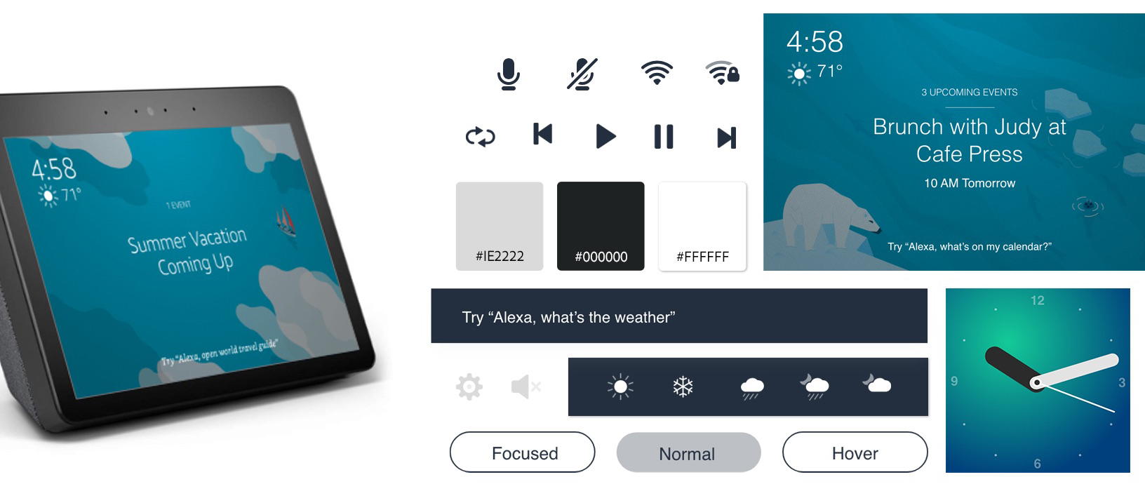
Now that we’ve written, mapped and tested our dialogues we can finally move on to designing and prototyping the experience. Adobe XD makes it easy for designers to create a working prototype for voice-enabled Amazon or Google apps and test it with real users. The tool allows you to prototype the actual voice inputs and outputs for the app.
A typical interaction consists of user input and system responses:
To design user requests, we need to create voice triggers. To add a new voice trigger, drag a connector from an element in one artboard to another. When the attributes menu opens, select Voice from Trigger menu and add your utterance in the Command field.
Speech Playback will simulate the response of the voice app. To add Speech Playback, you need to select Time as the Trigger and set the action to Speech Playback.
Prototyping with Voice in Adobe XD
Adobe XD allows you to prototype for voice-first products like the Amazon Echo Show, and voice-only products such as Google Home.
A few folx have asked about voice-only prototypes in #adobexd – below I made a quick prototype of a Google Home timer in XD using:
?Vector file from Illustrator to XD ?Auto Animate for the lights ?Voice Command as trigger ?Speech Response
Last but not least, if you design Amazon Alexa Skill for Amazon Echo Show or Amazon Echo Spot, XD provides a VUI kit for those devices. You can download it here. This VUI kit provides all the building blocks you need to get started building an Alexa skill.
VUI kit for Amazon Echo Show and Spot. (Large preview)
4. Test
Testing is a mandatory part of the design process. Without testing, you can’t say whether your app will work for your users or not.
Test Your Prototypes With Target Users
Conduct usability testing sessions with representatives from your target audience, and observe how users interact with your app. Track the tasks completion rate and CSAT (Customer Satisfaction Score). If possible, try to record a video for each session.
Use Test Simulators
Both Amazon and Google provide testing tools that let you test your Skill or Action in simulation of the hardware devices and their settings. This testing will give you a good feel for the voice experience in the real world.
5. Refine
Refine the voice application after sending it to the market.
Collect Analytics
Once you’ve rolled out your app, you should track how the app is being used with analytics. Here are some of the key metrics to keep an eye out for are:
Intents and utterances,
User engagement metrics,
Behavior flows.
Most of the metrics you need you will find within your Skill developer account without any additional coding.
Conclusion
Human-computer interaction has never been about graphical user interfaces. First and foremost, it has always been about communication. It’s evident that voice will be a natural way for the new generation of users to interact with technology, and as a designer, you should be ready for these new challenges and the opportunities they unlock for new ways of looking at interaction design.
This article is part of the UX design series sponsored by Adobe. Adobe XD tool is made for a fast and fluid UX design process, as it lets you go from idea to prototype faster. Design, prototype and share — all in one app. You can check out more inspiring projects created with Adobe XD on Behance, and also sign up for the Adobe experience design newsletter to stay updated and informed on the latest trends and insights for UX/UI design.
I like the this wrap-up statement from Hidde de Vries:
In modern browsers, our markup becomes an accessibility tree that ultimately informs what our interface looks like to assistive technologies. It doesn’t matter as much whether you’ve written this markup:
in a .html file
in Twig, Handlebars or Nunjucks
as the in a Vue Single File Component
exported in the JSX of your React component
outputted by a weird legacy CMS
It is which markup that determines if your site is pleasurable to experience for AT users. In short: it’s the markup that matters
As a front-end developer, you’ll find yourself writing markup in lots of different places with lots of different technologies. I think it behooves you think of how best to write it regardless of where and how.
Data is available everywhere nowadays, whether it’s in a plain text file, a REST API, an online Google sheet… you name it! It’s that variety of context that makes building graphs more than simply having a database in your local project — where there is data, there is a way.
That’s pretty much what we’re going to look at in this post: making JavaScript data visualizations using data from a variety of sources.
If you want to follow along and make any of the visualizations we’re covering here, we’ll be using Chart.js so grab that and include it in your own environment:
Lots and lots of websites have data tables, and why not? They are a great way to show data and that’s what they were made to do. But, if you could have a visualization powered by the data in it — and for not much more effort — wouldn’t that be even better?
With a little JavaScript, the data in a HTML table can be isolated from the HTML and prepped for a chart. Look at the following data table:
Year
Items Sold
Turnover ($)
Profit ($)
2016
10
200
89
2017
25
550
225
2018
55
1200
600
2019
120
2450
1100
It contains sales data for a business. Now, if we could graph this out, it would be both visually compelling and help users glean insights. So let’s do it!
First of all, let’s define a function for our chart. This comes straight out of the Chart.js library, so it’s worth cross-referencing this with the documentation is something seems unclear. I’ve added some comments to call out key parts.
Now that we have a function to create a chart for the table data, let’s write out the HTML for the table and add a canvas element that Chart.js can use to inject its charting magic. This is exactly the same data from the table example above.
Then, we need to parse the table into JSON with vanilla JavaScript. This is what Chart.js will use to populate the charts and graphs.
var table = document.getElementById('dataTable');
var json = []]; // First row needs to be headers
var headers =[];
for (var i = 0; i < table.rows[0].cells.length; i++) {
headers[i] = table.rows[0].cells[i].innerHTML.toLowerCase().replace(/ /gi, '');
}
// Go through cells
for (var i = 1; i < table.rows.length; i++) {
var tableRow = table.rows[i];
var rowData = {};
for (var j = 0; j < tableRow.cells.length; j++) {
rowData[headers[j]] = tableRow.cells[j].innerHTML;
}
json.push(rowData);
}
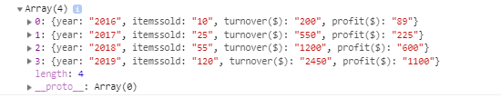
console.log(json);
We threw in that last line so we can check the output in the DevTools console. Here’s what is logged into the console:
Perfect! Our table headers become variables and are mapped to the content in the table cells.
All that’s left to do is map the year labels and items sold values to array (which Chart.js requires for its data object) and then to pass the data into the chart function.
This script maps the JSON values to an array of years. We can add it directly after the previous function.
// Map JSON values back to label array
var labels = json.map(function (e) {
  return e.year;
});
console.log(labels); // ["2016", "2017", "2018", "2019"]

// Map JSON values back to values array
var values = json.map(function (e) {
  return e.itemssold;
});
console.log(values); // ["10", "25", "55", "120"]
Call the BuildChart function from our first snippet (including a name for the chart) and we get a beautiful visualization of the data from the HTML table.
var chart = BuildChart(labels, values, "Items Sold Over Time");
And that is it! The charts data has now been isolated and passed into the JavaScript visualization and rendered.
There are many, many public APIs available in the world, many of which are rich with neat and useful data. Let’s use one of them to demonstrate how real-time data can be used to populate a chart. I’m going to use the Forbes 400 Rich List API to graph out the top 10 richest people in the world. I know, cool, eh?! I always find wealth rankings interesting, and there is so much more data this API provides. But for now, we will request data to display a chart with names and real time net worth using pure JavaScript!
First off, we want to define a chart function again, this time with a few more options.
function BuildChart(labels, values, chartTitle) {
  var data = {
    labels: labels,
    datasets: [{
      label: chartTitle, // Name the series
      data: values,
      backgroundColor: ['rgb(54, 162, 235)',
        'rgb(54, 162, 235)',
        'rgb(54, 162, 235)',
        'rgb(54, 162, 235)',
        'rgb(54, 162, 235)',
        'rgb(54, 162, 235)',
        'rgb(54, 162, 235)',
        'rgb(54, 162, 235)',
        'rgb(54, 162, 235)',
        'rgb(54, 162, 235)',
      ],
    }],
  };
  var ctx = document.getElementById("myChart").getContext('2d');
  var myChart = new Chart(ctx, {
    type: 'horizontalBar',
    data: data,
    options: {
      responsive: true, // Instruct chart JS to respond nicely.
      maintainAspectRatio: false, // Add to prevent default behavior of full-width/height
      scales: {
        xAxes: [{
          scaleLabel: {
            display: true,
            labelString: '$ Billion'
          }
        }],
        yAxes: [{
          scaleLabel: {
            display: true,
            labelString: 'Name'
          }
        }]
      },
    }
  });
  return myChart;
}
Next, we’ll need that same HTML canvas element for where the chart will be rendered:
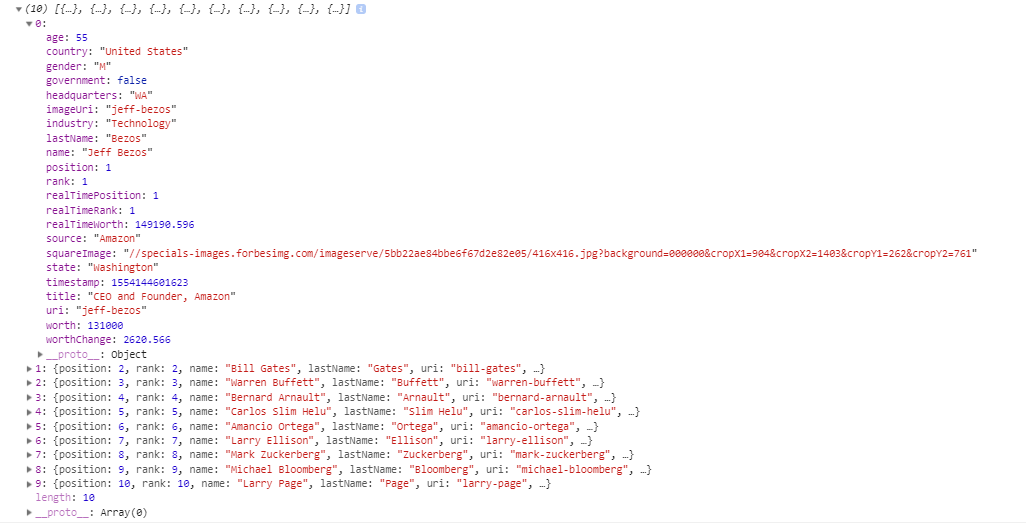
Now to grab some real time data. Let’s see what is returned in the console from the Forbes API call:
As you can see by the JSON returned, there is a lot of rich information that can injected into a chart. So, let’s make our rankings!
With some light JavaScript, we can request the data from the API, pick out and map the values we went to array variables, and finally pass our data in and rendering the chart.
var xhttp = new XMLHttpRequest();
xhttp.onreadystatechange = function () {
  if (this.readyState == 4 && this.status == 200) {
    var json = JSON.parse(this.response);
    // Map JSON labels  back to values array
    var labels = json.map(function (e) {
      return e.name;
    });
    // Map JSON values back to values array
    var values = json.map(function (e) {
      return (e.realTimeWorth / 1000); // Divide to billions in units of ten
    });
    BuildChart(labels, values, "Real Time Net Worth"); // Pass in data and call the chart
  }
};
xhttp.open("GET", "https://forbes400.herokuapp.com/api/forbes400?limit=10", false);
xhttp.send();
So far, we’ve looked at data in standard HTML tables and APIs to populate charts. But what if we already have an existing Google Sheet that has a bunch of data in it? Well, we can also use that to make a chart!
First, there are some rules for accessing a Google Sheet:
The Google Sheet must be published
The Google Sheet must be public (i.e. not set to private viewing)
As long as these two points are true, we can access a Google Sheet in the form of JSON, which means, of course, we can graph it out!
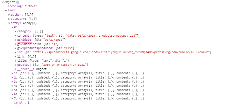
Here’s a Google Sheet with some made up data that I’ve published publicly. It consists of three fields of data: MachineId, Date, and ProductsProduced.
Now, if we that the sheet’s URL, we’ll want to note everything after the last slash:
This is the sheet identity and what we need for the GET request we send to Google. To make a GET request for JSON, we insert that string in the URL in another URL:
The important piece is the feed.entry object array. This holds vital sheet data, which looks like this when we drill into it:
Notice the items underlined in red. The Google Sheets API has preceded each of the column names with gsx$ (e.g. gsx$date). These are exactly how we will dissect the data from the object, using these uniquely generated names. So, knowing this, it’s time to insert the data into some isolated arrays and pass them into our chart function.
function BuildChart(labels, values, chartTitle) {
  var data = {
    labels: labels,
    datasets: [{
      label: chartTitle, // Name the series
      data: values,
      backgroundColor: ['rgb(54, 162, 235)',
        'rgb(54, 162, 235)',
        'rgb(54, 162, 235)',
        'rgb(54, 162, 235)',
        'rgb(54, 162, 235)',
        'rgb(54, 162, 235)',
        'rgb(54, 162, 235)',
        'rgb(54, 162, 235)',
        'rgb(54, 162, 235)',
        'rgb(54, 162, 235)',
      ],
    }],
  };

  var ctx = document.getElementById("myChart").getContext('2d');
  var myChart = new Chart(ctx, {
    type: 'bar',
    data: data,
    options: {
      responsive: true, // Instruct chart js to respond nicely.
      maintainAspectRatio: false, // Add to prevent default behavior of full-width/height
      scales: {
        xAxes: [{
          scaleLabel: {
            display: true,
            labelString: 'Date'
          }
        }],
        yAxes: [{
          scaleLabel: {
            display: true,
            labelString: 'Produced Count'
          }
        }]
      },
    }
  });

  return myChart;
}
You probably get the point that there is a variety of ways we can get data to populate beautiful looking charts and graphs. As long as we have some formatted numbers and a data visualization library, then we have a lot of powers at our fingertips.
Hopefully now you’re thinking of where you might have data and how to plug into a chart! We didn’t even cover all of the possibilities here. Here are a few more resources you can use now that you’ve got chart-making chops.
Cassie Evans showcases some really nifty web design ideas and explores using the API provided by the company her team over at Clearleft recently hired to cover their building’s roof with solar panels. Cassie outlines her journey designing a webpage that uses the API to populate some light data visualizations about the energy the building uses now that the solar panels are installed.
Here at Clearleft we’ve been taking small steps to reduce our environmental impact. In December 2018 we covered the roof of our home with solar panels.
With the first of the glorious summer sun starting to shine down on us, we started to ponder about what environmental impact they’d had over the last 5 months.
Luckily for us, our solar panels have an API, so we can not only find out that information, we can request it from SolarEdge and display it in our very own interface.
The post is a great practical look into using the Fetch API which is also something Zell Liew wrote up in thorough detail, covering the history of using APIs with JavaScript, handling errors and other weird things that might happen when working with it.
But, equally interesting and useful is reading through Cassie’s thought process as she sketches a wireframe for the page, researches how to use the Fetch API, and integrates animation into a lovely SVG illustration. It’s an exercise in both design and development that many of us can relate to but also learn from.
Oh and while we’re on the topic of data visualizations, Dan Englishby posted something just today on the many ways if getting data into charts. Working with real-time APIs is covered there as well, and is a nice segue from Cassie’s post.
This is the second in a short series of articles about the display property in CSS. You can read the initial article in the series at “The Two Values Of Display”. The display specification is a very useful spec to understand as it underpins all of the different layout methods we have.
While many of the values of display have their own specification, many terms and ideas are detailed in display. This means that understanding this specification helps you to understand the specifications which essentially detail the values of display. In this article, I am going to have a look at the box generation values of display — none and contents.
Everything Is A Box
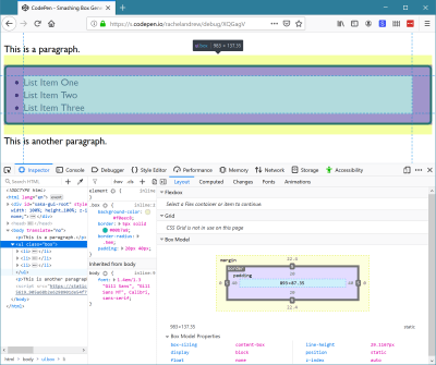
In CSS everything generates boxes. A webpage is essentially a set of block and inline boxes, something you get to understand very well if you open up DevTools in your favorite browser and start selecting elements on the page. You can see the boxes that make up the layout, and how their margins, padding and borders are applied.
I have highlighted the ul element using Firefox DevTools so I can inspect the different parts of the box. (Large preview)
Controlling Box Generation
The none and contents values of display deal with whether boxes should appear at all. If you have elements in your markup and don’t want them to generate a box in CSS then you need to somehow suppress generation of the box. There are two possible things you might want to do. Which are:
Prevent generation of a box and all of its children.
Prevent generation of a box but still display the children.
We can take a look at each of these scenarios in turn.
display: none
The none value of display is how we prevent the generation of a box and all the children of that box. It acts as if the element was not there at all. Therefore, it is useful in situations where you intend to completely hide that content, perhaps because it will be revealed later after activating a link.
If I have an example with a paragraph, an unordered list, and another paragraph you can see that the items are displaying in normal flow. The ul has a background and border applied, plus some padding.
If you use display: none it hides the content from all users of the website. This includes screen reader users. Therefore, you should only use this if your intention is that the box and everything inside it is completely hidden to everyone.
There are situations where you might want to add additional information for users of assistive technology like screen readers but hide it for other users; in such cases, you need to use a different technique. Some excellent suggestions are made by Scott O ‘Hara in his article “Inclusively Hidden”.
Using display: none is therefore pretty straightforward. Use it in a situation where you want a box and contents to vanish from the display, from the box tree, and from the accessibility tree (as if it were never there in the first place).
display: contents
For the second scenario, we need to look at a much newer value of display. The value display: contents will remove the box it is applied to from the box tree in the same way that display: none does, but leave the children in place. This causes some useful behavior in terms of things we can then do in our layouts. Let’s look at a simple example and then explore further.
I am using the same example as before, but this time I have used display: contents on the ul. The list items are now visible, however, they have no background and borders and are acting as if you have added li elements to the page without any enclosing ul.
The reason that removing a box and keeping the children is useful is due to the way that other values of display behave. When we change the value of display we do so on a box and the direct children of that box, as I described in the last article. If I add display: flex to the CSS rules for an element, that element becomes a block-level box, and the direct children become flex items. The children of those flex items return to normal flow (they are not part of the flex layout).
You can see this behavior in the next example. Here I have a containing element set to display flex, it has four direct children, three div elements and a ul. The ul has two list items. The direct children all participate in the flex layout and lay out as flex items. The list items are not direct children and so display as list items inside the box of the ul.
If we take this example and add display: contents to the ul, the box is removed from the visual display and now the children participate in the flex layout. You can see that they do not become direct children. They are not selected by the direct child universal selector (.wrapper > *) in the way that the div and ul elements are, and they maintain the background given to them. All that has happened is that the box of the containing ul has been removed, everything else carries on as normal.
This has potentially very useful implications if we consider elements in HTML which are important for accessibility and semantic data, but which generate an additional box that may prevent us from laying the content out with flex or grid layout.
This Is Not A CSS “Reset”
You may have noticed how one side effect of using display: contents is that the margin and padding on the element are removed. This is because they are related to the box, part of the CSS Box Model. This might lead to you think that display: contents is a good way to quickly rid yourself of the padding and margin on an element.
This is a use that Adrian Roselli has spotted in the wild; he was concerned enough to write a detailed post explaining the problems of doing so — “display: contents is not a CSS reset.” Some of the issues he raises are due to an unfortunate accessibility issue in browsers currently with display: contents which we will discuss below. However, even once those issues are resolved, removing an element from the box tree simply to rid yourself of the margin and padding is somewhat extreme.
If nothing else, it would be problematic for the future maintenance of the site, a future developer might wonder why they didn’t seem to be able to apply anything to this mysterious box — missing the fact it had been removed! If you need margin and padding to be 0, do your future self a favor and set them to 0 in a time-honored way. Reserve use of display: contents for those special cases where you really do want to remove the box.
It is also worth noting the difference between display: contents and CSS Grid Layout subgrid. Where display: contents completely removes the box, background, and border from the display, making a grid item a subgrid would maintain any box styling on that item, and just pass through the track sizing so that nested items could use the same grid. Find out more in my article, “CSS Grid Level 2: Here Comes Subgrid.”
Accessibility Issues And display: contents
A serious issue currently makes display: contents not useful for the very thing it would be most useful for. The obvious cases for display: contents are those cases where additional boxes are required to add markup that makes your content more easily understood by those using screen readers or other assistive devices.
The ul element of our list in the first display: contents CodePen is a perfect example. You could get the same visual result by flattening out the markup and not using a list at all. However, if the content was semantically a list, would be best understood and read out by a screen reader as a list, it should be marked up as one.
If you then want the child elements to be part of a flex or grid layout, just as if the box of the ul was not there, you should be able to use display: contents to magic away the box and make it so — yet leave the semantics in place. The specification says that this should be the case,
“The display property has no effect on an element’s semantics: these are defined by the document language and are not affected by CSS. Aside from the none value, which also affects the aural/speech output and interactivity of an element and its descendants, the display property only affects visual layout: its purpose is to allow designers freedom to change the layout behavior of an element without affecting the underlying document semantics.”
As we have already discussed, the none value does hide the element from screen readers, however, other values of display are purely there to allow us to change how things display visually. They should not touch the semantics of the document.
For this reason, it took many of us by surprise to realize that display: contents was, in fact, removing the element from the accessibility tree in the two browsers (Chrome and Firefox) that had implemented it. Therefore changing the document semantics, making it so that a screen reader did not know that a list was a list once the ul had been removed using display: contents. This is a browser bug — and a serious one at that.
Last year, Hidde de Vries wrote up this issue in his post “More Accessible Markup with display:contents” and helpfully raised issues against the various browsers in order to raise awareness and get them to work on a fix. Firefox have partially fixed the problem, although issues still exist with certain elements such as button. The issue is being actively worked on in Chrome. There is also an issue for WebKit. I’d encourage you to star these bugs if you have use cases for display: contents that would be impacted by the issues.
Until these issues are fixed, and the browser versions which exhibited the issue fall out of use, you need to be very careful when using display: contents on anything which conveys semantic information and needs to be exposed to assistive technology. As Adrian Roselli states,
“For now, please only use display: contents if you are going to test with assistive technology and can confirm the results work for users.”
There are places where you can safely use display: contents without this concern. One would be if you need to add additional markup to create fallbacks for your grid of flex layouts in older browsers. Browsers which support display: contents also support grid and flexbox, therefore you could display: contents away the redundant div elements added. In the example below, I have created a float based grid, complete with row wrappers.
I then use display: contents to remove the row wrappers to allow all of the items to become grid items and therefore be able to be part of the grid layout. This could give you an additional tool when creating fallbacks for advanced layouts in that if you do need to add extra markup, you can remove it with display: contents when doing your grid or flex layout. I don’t believe this usage should cause any issues — although if anyone has better accessibility information than me and can point out a problem, please do that in the comments.
This article has taken a look into the box generation values of the display property. I hope you now understand the different behavior of display: none — which removes a box and all children completely, and display: contents which removes just the box itself. You also should understand the potential issues of using these methods where accessibility is concerned.
Design work is very time consuming. But it’s not just the labor you put into building websites that takes time and concentration.
Because the projects you work on typically have a short shelf life, you’re constantly having to find new gigs, woo potential clients, and sign them onto your service — which is like another job in and of itself. So, when do you find time to look for more work when you’re so busy actually doing it?
You could set aside time on the weekends to work on drumming up new projects, but that’s the last thing you want to do. Imagine spending that time booking new business and then being too burned out to get started with any of them? That’s no good.
You could, of course, do it during the workweek. It would just require you to dedicate otherwise billable hours to non-billable work and cut into your business’s profitability.
Without hiring someone to handle sales for you, what’s the solution?
It’s your website.
Here are some things you can do to design a website that relieves you of at least some of the burden of finding and selling to new clients.
1. Design for Your Niche
One of the best things you can do as a web designer (or any creative freelancer, really) is to carve out a highly specific niche. For instance, you could design websites for:
Real estate agents
Female-owned businesses
Restaurants in your city
The more targeted your audience, the easier it will be to sell to them (and to build their websites).
I’m going to take this one step further as I don’t just think it’s enough to choose a niche to design for.
I think your own website should be reflective of your niche. More specifically, it should be designed to look like a website your client would want as their own. What better way to sell a prospect on a website than to show them that you know exactly how to build the solution they need?
The company name sounds like it should be working for law firms.
The design is super buttoned-up — traditionally-structured, muted color palette, and minimalism at its best.
Copy is professional, honest, and straight to the point.
In other words, this website looks and sounds like one that its target clientele would want for themselves.
2. Answer Their Questions
Think about how much time you spend dealing with objections as you talk to prospective clients. That’s either because their expectations haven’t been set properly before meeting with you or they’re a bad fit.
If you use your website to answer those questions, though, you can significantly decrease the amount of time you spend on sales calls with prospects.
One way to do this is to explain in the simplest terms what your clients get. Here’s how I handle this for prospective copywriting clients:
I was frustrated that I had to explain over and over again to prospects what it meant to create optimized content. The question continued to come up on calls, so I decided to just provide the answer on my website.
I now no longer get questions about my services. Prospects hop on the phone with me and ask how much they have to pay to get started. It’s been a huge time-saver.
As a web designer, it might not be as simple as to say, “You’ll get a 10-page website, built using X theme, optimized for speed with caching, etc.” When it comes to websites, you’re just delivering too technical of a product.
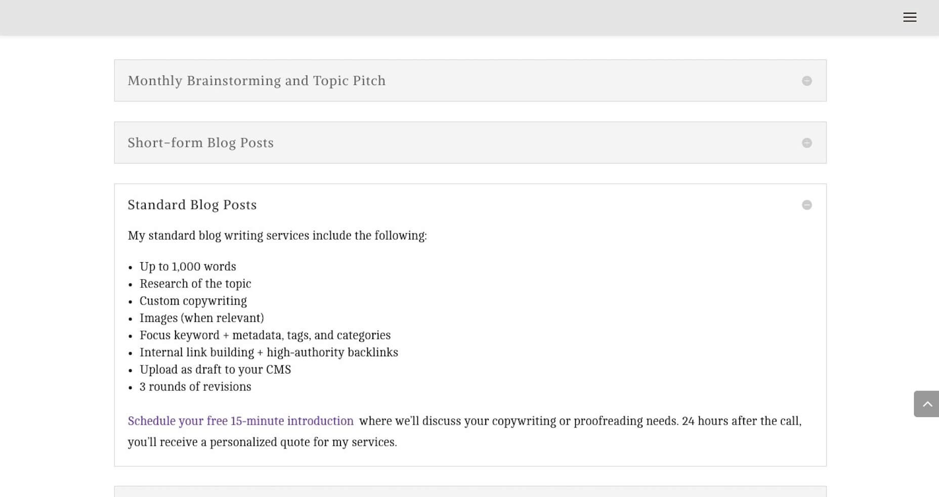
So, for you, I’d suggest taking the same basic principle of “answer their questions”, but tackle them with an FAQs like Eternity does:
They’ve done such a great job of providing simple and straightforward answers to the kinds of questions I’m sure all of you get. Not only will this decrease the amount of time people have to spend with them on sales calls, but it’ll help weed out bad-fit clients.
3. Create a More Impressive Portfolio
There’s absolutely no question that your website needs to include an awesome portfolio of websites. Just make sure that any samples you include in your portfolio:
Are 100% something you’re proud to show off;
Are relevant to your target audience;
Are consistently designed.
Here’s what I mean:
Bluetext is in the business of creating digital campaigns (including web design) for clients. Although they build solutions for a couple dozen industries, they keep their portfolio well-organized, grouping sample work based on category.
For example, this is what their “Cybersecurity” portfolio looks like:
Notice how well put together this portfolio is — everything is clearly labeled, designed in a similar style, and is impressive to look at. It also helps clients in quickly see the potential for their specific business without the distraction of other types of websites getting in the way.
4. Establish Trust
As a web designer, you have to build trust with clients if you want them to pay top-dollar for your services. While you can certainly do that throughout the web design process, why wait? Use your website as a vehicle for establishing trust now.
One way to do this is with your portfolio.
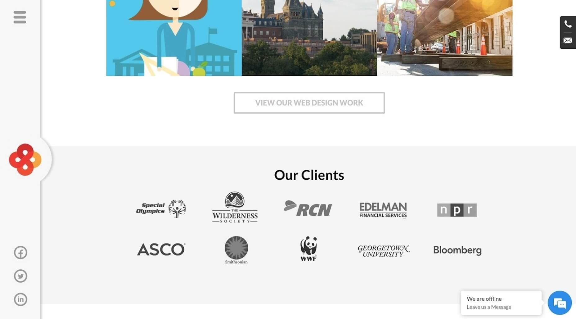
Another way to do this is by including testimonials or, at the very least, logos from clients who are happy to connect their brand to yours. Interactive Strategies uses a dedicated banner on its home page to show off brands who’ve trusted them:
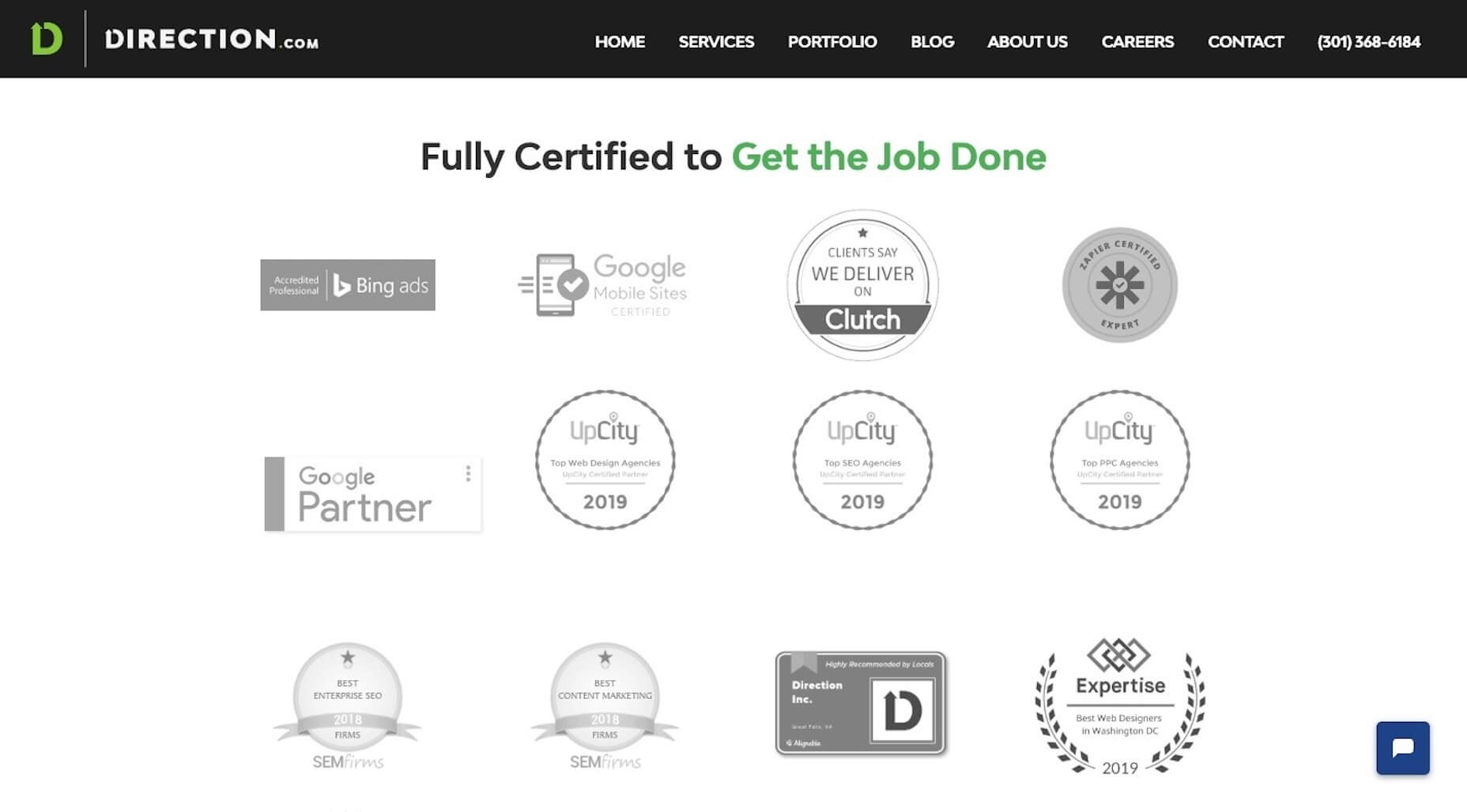
If you don’t have a client base with recognizable names, or you’re still working to amass an impressive list of clients, don’t worry. You can use other trust marks to establish trust now as Direction.com does:
Prospective clients can see all of their awards and certifications in one place — and it’s definitely something to marvel at.
5. Simplify Next Steps
If you’ve been doing this for long enough, I bet you can anticipate what prospective clients’ next steps are after they’ve visited your website.
For my business, I know that they’ll see my site and then reach out for pricing. However, I know that I can’t actually answer that question during a first phone call. I have to review their needs, business, industry, and a whole host of other details before I can provide a quote.
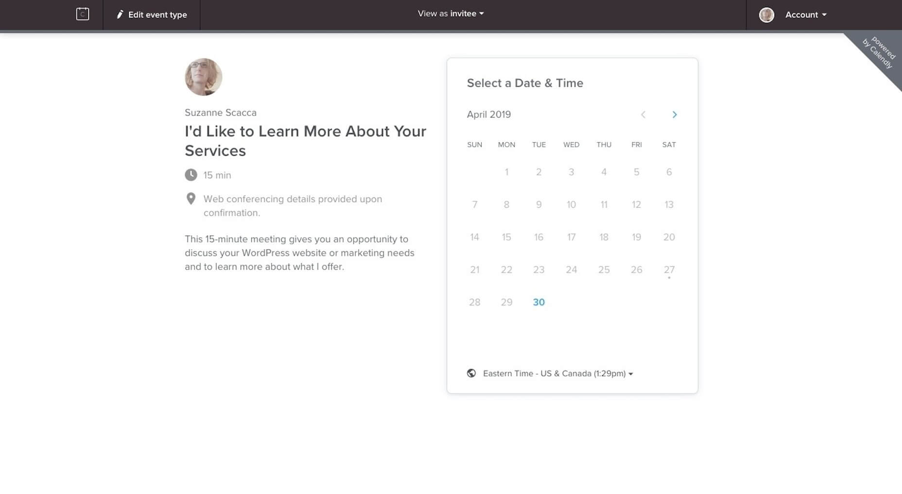
Schedule a 15-minute call with me through Calendly.
There’s just one caveat to the phone call though. I don’t get on the phone with anyone until they fill out my questionnaire (which their “Thank You” email sends to them). It asks them everything I need to know to provide them with a quote.
That way, when I do get on the phone, I’m fully prepared to talk about my process, explain final questions, and give them a number.
I would suggest building out a similar set of contact options (e.g. contact form and scheduler, chatbot and scheduler, chatbot and email, etc.), so you can spend less time going back-and-forth on the phone or over email and instead get them a quote and contract right away.
Design Your Website to Sell While You Work
Would you like to stop spending so much time on job boards, social media, and in search trying to find new clients? You already know how to build websites to help your clients sell their businesses, so why aren’t you doing the same for your own?


