Archive

Archive for May, 2019

Best Plugins To Use For A Woocommerce Store

May 29th, 2019 No comments

Talking about the current trends, one of the most profitable and trending business opportunities have emerged with eCommerce.

This is the reason why more than 3 million eCommerce stores are created using Woocommerce making it the most used and preferred eCommerce plugin. Moreover, talking about the total proportion it has in percentage, it covers around 42 percent of the eCommerce stores on the web.

Though it is quite handy to use for development of an eCommerce store, if you are planning something with solid eCommerce goals in mind, it is essential to reach for some advanced plugins and extensions.

Moreover, some of these additional extensions and plugins may need you to pay extra money but if you work a little wisely, you can pick the best picks for free creating maximum functionality of your store.

Here we have a small list of Woocommerce plugins that can help you generate revenues and conversions through your eCommerce store without spending on big purchases.

Product Import Export

When you move your business to the virtual world taking benefit of eCommerce store development, you actually hit into an industry which is very demanding. Therefore, it gets natural to have a shift towards those tasks and tools that can help you in boosting your eCommerce services.

Product import export is actually that kind of plugin which can save you a lot of effort. It lets you work on product export and import quickly using a CSV file upload. Moreover, it allows you to avoid uploading the data for each product manually because it just needs a simple spreadsheet of detail and the rest is done automatically.

For instance, if you have an inventory management needs or your supplier gets you a spreadsheet for products, all you need to do is export the CSV file matching all the mandatory fields to those of Woocommerce and upload the file into the system.

WooCommerce Multilingual

This is actually the most essential plugin to be added into your Woocommerce store, especially when you need to target a big audience considering diversity factors like language and demographics. Woocommerce multilingual can help you get a better hit because it supports the most frequently used 11 languages in the world targeting more than 90 million users.

Ultimately, it is a goldmine for the sales targeting a massive community of buyers who feel more connected with their own language. Woocommerce multilingual enables you to target users who speak multiple languages with complete support over unique URLs as well as page translations. So, if you are planning to deliver services across multiple nations or you are targeting an area which is diverse in languages, Woocommerce multilingual is a must use plugin.

YITH WooCommerce Zoom Magnifier

If you are looking for some of the biggest factors that can affect your sales, it is the product images which you share on your website apart from the prices which you feature. Every customer who reaches your eCommerce store needs to be very clear about the product quality and features. These goals could only be achieved with the right presentation through images.

Even if you are selling a product similar to that of your competitor, chances are high that the store which features an easy zoom option with a high-quality image would get more conversions. Wondering why? Think of yourself looking for a pair of shoes and you are not able to see the product clearly zooming in on its details? On the other hand, you have a store that helps you with quick zoom option where you can check for every detail precisely.

Now which eCommerce store you would prefer to make that purchase? Obviously, the one where you find more convenient to explore the product. Though the cost of the product on both websites may create a difference of opinion bad quality image and no zoom options could bring doubts in a user’s mind.

So, YITH WooCommerce Zoom Magnifier enables a user to zoom on any image just by hovering the mouse on the product image. However, the zoom view and size of the image on zooming are all customizable for the optimum experience. So, if you are in need of some big jumps with conversions, make sure you don’t forget to use the YITH WooCommerce Zoom Magnifier.

Booster for WooCommerce

If you want to make your store supercharge with entire information related to cost of sales, currency, stock management, payment gateways, checkout customization, invoicing, shipping options, and much more. This plugin is perfect for those who need to keep a check on their sales and profits.

The booster plugin is designed to help you exclude the entire extra costs related to taxes, shipping, and fees paid at the customer end to calculate the overall profit for your business. Some of the additional features you can explore with booster for Woocommerce include:

  • Crowdfunding
  • Display product availability status
  • Display country based products
  • Customized shopping cart options

YITH WooCommerce Wishlist

This is one of the most amazing plugins which every eCommerce store needs to have integrated with it. YITH WooCommerce Wishlist enables a user visiting your eCommerce store to have a product wishlist for the favorites and share them with their loved ones for ensuring perfect picks.

This tool is perfect for delivering a great holiday shopping experience to all the users who need to have a great shopping time with friends and family.

YITH WooCommerce Ajax Search

Now, this is again essential for every eCommerce store to create a completely personalized search experience for the users. It is a perfect plugin for the growing eCommerce enthusiasts because it gives the benefit at the user end to make the search easier. Ajax search enables a user to locate the product which they want by hitting the right category.

When it comes to the user experience on an eCommerce store, you should necessarily present the content in a sorted way. This means a user no longer needs to go through multiple pages and categories before they reach for their need.

For instance, if a user is looking for an iPad, the search can automatically modify to “iPad in tablets” for an easier user reach. This is a great plugin that helps the user to reach the required product by understanding the criteria of search used by the customer.

Stripe Payment Gateway

Earlier, the Woocommerce store only enable support for single payment gateway i.e. PayPal. However, it was not desirable for most of the users as well as store owners to get along with a single payment gateway which needs the user to reach an external PayPal website.

Then comes the introduction of a better payment gateway named, Stripe Payment Gateway. This gateway helps the user to go for onsite payments like PayPal pro or stripe.

The best part of using the Stripe Payment Gateway is that it is free of cost. Moreover, if you would need to install the stripe payment gateway on your eCommerce store a few years back, it needs you to go for downloads and extensions. But watching on its popularity, the installation process has become very streamlined. So, if you need to install this plugin on your website, stripe gateway is just a click away to install on your Woocommerce store.

WooCommerce Currency Switcher

Working on eCommerce store is all about leveraging the potential to the global grounds but before making any move to reach the international consumers, it is very necessary that you should understand every single technicality of the successful project.

But when we talk about the technicalities of the eCommerce store which needs to serve global customers, the first thing that takes the priority is currency converter. In case, you are not able to present your product prices in the local currency of the user, it may cause reduce the chances of the user to buy your product.

Though it offers certain restrictions to the user, it is the best free plugin available till date, for currency conversion goals. First of all, it only allows two currencies at a time and secondly, you need to upload the flag of your country manually into the media library for better conversions. However, you can always pick the premium version which allows multiple currency support, the free version has its own benefits to redeem.

The best part of using this tool is the ease to reach real-time exchange rates which are accurately retrieved from yahoo finance. Moreover, it has three different dedicated widgets for currency, conversion rate calculator, and latest exchange rates enabled with geolocation features based on IP. all in all, it is a perfect plugin for creating a great user experience when a user is having difficulty dealing with the currency or prices.

WooCommerce MailChimp

If you are concerned about your customers, one thing which is necessary to keep in mind is retaining an existing customer is much more important than acquiring new. So rather than keeping your focus on the new users, you have to work on the existing database of customers which can be done quite effectively through a mailing list.

WooCommerce MailChimp is the best plugin for email marketing which is vital for any business that runs on eCommerce. This plugin automatically works on a subscription where a user can either be added to the mailing list the moment they enroll into business or you can get a checkbox for the users to subscribe for your emails.

This means, if you are a person who is concerned about the customers, all you need to do is treat your customers with pleasing information that reaches them through right email marketing done with WooCommerce MailChimp.

Conclusion

If you are planning to turn your eCommerce store into a conversion machine, we got you a perfect list of Woocommerce plugins that can help you solve your purpose, no doubt there are plenty of plugins available all around that may suit your needs, the above collection of plugins is a perfect kit of essentials that every eCommerce store should aim at.
Though it is always a good move to have back from an expert eCommerce Development Company in India, all these plugins are actually the potential keys that can help you interact with your audience in a better way without causing any hindrance to your revenue goals. So, if you are planning to make your eCommerce store more convenient or you need to go for a fresh start, now you have a list of plugins to include with Woocommerce to make the most of your eCommerce business. All the best!

Categories: Others Tags:

Four Most Useful WordPress Plugins Are Best for Making a Subscription Website

May 29th, 2019 No comments

For transforming your WordPress website into a fully operational subscription website, you will require to have a WordPress membership plugin.

With the help of the membership website plugin, you can develop a high-class content collection and let only registered members access it. The stats depicted by statista offers the position of the most famous online subscription websites in the United States of America as of April 2018 depending upon the proportion of visitors. In April 2018, meal kit service provider based on website visitors was successful in capturing 935,599 visitors.

Selecting an ideal WordPress registration plugin is essential for your business house as it is challenging to step back if your decision doesn’t prove to be right.

Be it for producing recurring revenues, developing a list of registered members or for selling online courses, the following list will support you select the best membership plugin WordPress for your needs.

1- MemberPress

MemberPress is the most convincing WordPress membership plugin and holds all essential properties which you will require to develop a robust membership website. MemberPress also permits you to convert your current website into a fully operational membership website without any chaos.

For this, you are required to download MemberPress Plugin on your current website, select your payment gateway data, arrange your products, and initiate inviting your clients to connect with your membership website.

MemberPress will help you limit access to particular web pages, posts, personalized post kinds and any of four clients document. The plugin collaborated ideally with leading e-mail marketing platforms such as AWeber, MailChimp, GetResponse, etc.

MemberPress is a WordPress paid membership plugin, whose cost initiated from $129/ year for the license of an individual website.

2- LearnDash

LearnDash is the best membership plugin WordPress 2019. It was developed for building and selling online courses on WordPress platforms. It permits you to deliver a powerful learning experience to your members and helps the newly released gamification, micro-content, and social learning trends.

Offering courses have become comfortable with the help of LearnDash. Some methods to offer your online courses are:

  • Membership

Offer traditional access for all the or prevailing online courses.

  • One-time price

Execute a shopping cart where your clients can purchase single courses.

  • Subscription

Subscription-based selling can offer you a chance to even recurring payments.

It permits learners to explore fresh courses depending on the links they acquire as they finish their current course. This allows them to hike up retention rate and ensure that more users are indulged in your online course. As a reward, customized certificates and badges can be given to the learner based on its performance. You can even provide front end users profile where members can ascertain their tasks.

The cost of LearnDash license initiates from $199 for one year for an individual website.

Additional Helpful Resources Related WordPress Plugins:

11 Best Analytics Solutions for WordPress

15 Best Live Chat Plugins for WordPress: Features and Benefits

9 Plugins Helps to Enhance Your WordPress Site in Search Engine Results

3- Teachable

Teachable is the best free WordPress membership plugin 2018. It is a kind of all rounds solution for developing and publishing an excellent online course. It is a free-stand solution so that the user can collaborate their online courses into their current website or host them using Teachable subdomain.

This comes with a robust editor which permits the user to develop and release top-notch sales pages to hike up the conversion rate.

4- Paid Member Subscriptions

Paid Member Subscription is a flexible WordPress association membership plugin which will aid the users to arrange a fully functional membership website. The basic plan of this plugin is available free of cost while if the user desires to use more advanced properties such as content dripping, they will have to access paid plans.

After downloading the Paid Membership Subscription, the user enjoys the facility to limit access to their website contents with posts, tags, pages, or divisions. The properties can be accessed on a trial basis on the demonstration website to ascertain how the plugin functions.

The properties of the Paid Member Subscription consist of:

  • Handling unlimited members
  • Through Navigation menu filter, the members can only view what they are permitted to.
  • Facilities in accepting payments through PayPal express checkout, PayPal Pro, and stripe.
  • Worldwide limited access to content depending upon taxonomy Post types and terms.
  • Content dripping with the timed launch of reach
  • Discount coupons for functioning promotion of rewards for members while they upgrade to a higher membership level.

In terms of pricing policy, there are 3 plans present:

  • Free
  • Hobbyist
  • Pro

The paid plans need to be updated every year, so for regularly accessing their featured, the user requires to lay yearly continually.

If the user desired to have a membership plugin which offers them a higher level of versatility and the potential to drop content, the Paid member subscription is an ideal choice.

To wrap up,

With the help of ideal Membership Plugin for WordPress which comprises of premium quality of free WordPress membership plugin as well as paid alternatives, any user can initiate delivering limited access content on their websites to their members who opt for it or their subscribers.

If the user desires to develop a private community or a paid online course, these best free WordPress membership plugin 2019 hold the potential to organize and arrange their website in a short span of time with the help any one of these Plugins.

The plugins mentioned above only depict a small proportion of tools present across, for WordPress. There exists not a single size which caters to all ideal WordPress membership plugins as although the above-stated ones are famous and well-known ones they come with their own merits and demerits and the pricing policy as well.

Before taking up a decision, it is best to be well aware of your strategy to handle the member zone and that properties are required to be compiled such as course delivery, content dripping, ease of usage, recurring payments, personalized landing pages or pay on every view access.

Once all these things are, and the specifications see jotted down, taking up a decision will be a much simpler task.

Categories: Others Tags:

Color contrast accessibility tools

May 28th, 2019 No comments

Accessibility is all the rage these days, specifically when it comes to color contrast. I’ve stumbled upon a couple of tools this week that I think are pretty nifty for helping make sure that all of the text on our websites is legible regardless of what background color they might have.

First up is the Accessible Color Generator which happens to be a wonderful tool for picking alternative colors. Let’s say you’re working on a brand with color X. You can generate a host of other complimentary colors like this:

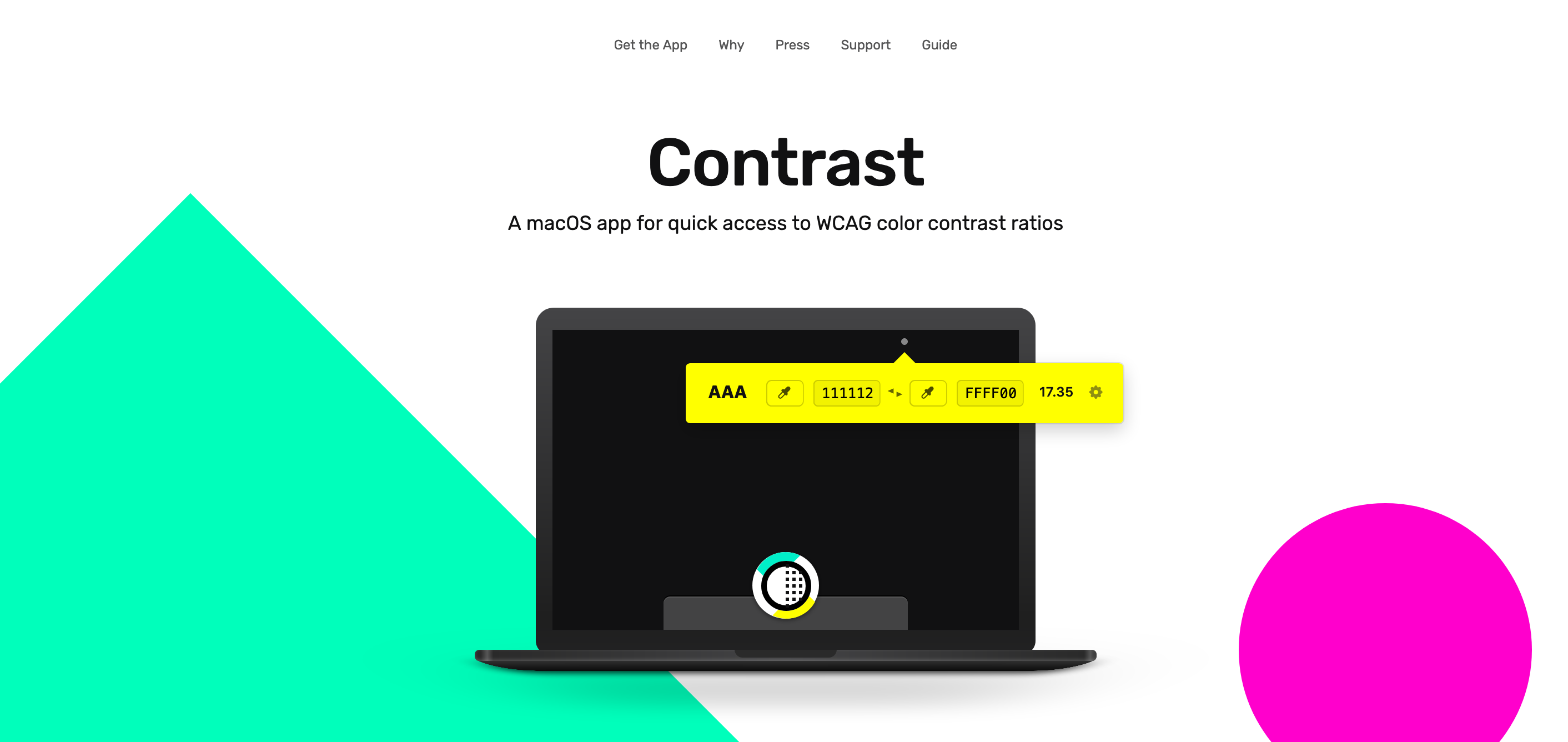
Next up is Contrast, a rather great MacOS app that sits in the menu bar at all times and helps identify accessible color pairings based on WCAG Guidelines. This one is particularly useful if you happen to be a designer:

This reminds me of a wonderful post about how the Lyft design team re-approached the way they use color in their app. Kevyn Arnott explains:

Color, at least on the surface, appears almost naively simple, yet as it scales across larger products it becomes unbelievably complex. You have thousands of people building products all at once, and those products are all heavily reliant on color. This puts a lot of pressure on the color system to ensure that all the products are being created consistently, but very hard to implement since it’s all too easy to apply colors on a one-off basis.

The team then went ahead and built ColorBox.io which lets you systematically build out a ton of colors for your design systems work. It’s pretty nifty!

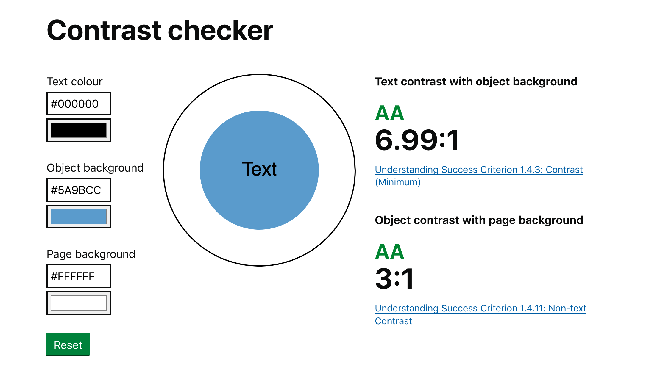
Plus the folks over at GOV.UK made their own color accessibility tool called Contrast Checker which (as you have guessed by the name) helps check the contrast between the background of an element and the page itself:

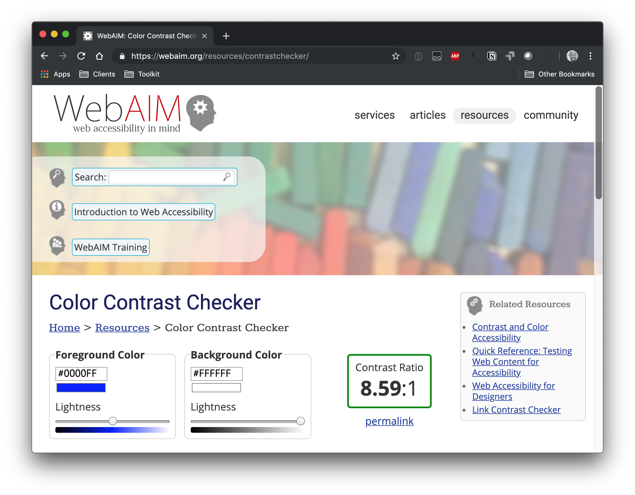
And, of course, there’s the trusty WebAIM contrast checker, which is a go-to for many developers out there.

So far, we’ve looked at tools that check contrast. But there is a class of tooling that can automate accessible contrasts during development. Josh Bader wrote up an approach that enforces high contrast by pairing CSS custom properties with the calc() function. Facundo Corradini did something similar that switches font color based on the background color behind it.

Oh! And we may have something to look forward to with the color-adjust property. It is proposed in the CSS Color Module Level 4 specification and could give browsers more control to adjust color values that are declared in the stylesheet. It’s not really geared towards color contrast, but there’s something interesting about handing off the responsibility of rendering color values to the browser based on certain conditions.

The post Color contrast accessibility tools appeared first on CSS-Tricks.

Categories: Designing, Others Tags:

Using the Grid Shepherd Technique to Order Data with CSS

May 28th, 2019 No comments

Shepherds are good at tending to their sheep, bringing order and structure to their herds. Even if there are hundreds of those wooly animals, a shepherd still herds them back to the farm at the end of the day.

When dealing with data, programmers often don’t know if it is correctly filtered or sorted. This is especially painful when iterating over an array then displaying the data on a site without knowing the locations of each element receiving it. The Grid Shepherd is a technique that helps position and sort items where you want them to be, using CSS Grid instead of JavaScript.

That’s what we’re going to look at in this post. The Grid Shepherd technique can bring order and structure to the data we work with while giving us greater visibility to where and how it’s being used than we would be able to otherwise.

Let’s dig in.

Sorting with JavaScript

We’re going to start by iterating over an unordered array of farm animals. Imagine that cows and sheep are happily grazing the fields. They can be grouped together programmatically with the Array.prototype.sort method and listed on a page:

let animals = [
  { name: 'Edna', animal: 'cow'   },
  { name: 'Liam', animal: 'sheep' },
  { name: 'Fink', animal: 'sheep' },
  { name: 'Olga', animal: 'cow'   },
]
let sortedAnimals = animals.sort((a, b) => {
  if (a.animal < b.animal) return -1
  if (a.animal > b.animal) return 1
  return 0
})
console.log(sortedAnimals)
/* Returns:
  [ { name: 'Elga', animal: 'cow'   },
    { name: 'Olga', animal: 'cow'   },
    { name: 'Liam', animal: 'sheep' },
    { name: 'Fink', animal: 'sheep' } ]
*/

Meet the Grid Shepherd

The Grid Shepherd method makes sorting data possible without the use of JavaScript. Instead, we rely on CSS Grid to do the lifting for us.

The structure is exactly the same as the JavaScript array of objects above, only represented in DOM nodes instead.

<main>
  <div class="cow">Edna</div>
  <div class="sheep">Liam</div>
  <div class="sheep">Jenn</div>
  <div class="cow">Fink</div>
</main>

See the Pen
1. Start
by David Bernegger (@Achilles_2)
on CodePen.

To herd the animals, we have to fence them into a common area, which is what we’re using the element to do. By setting that fence with display: grid, we’re creating a grid formatting context where we can define the column (or row) each animal should occupy.

.sheep { grid-column: 1; }
.cow { grid-column: 2; }

And with grid-auto-flow: dense, each animal orders itself into the first available spot of each defined area. This can also be used with as many different sort options as you want — simply define another column and the data will be shepherded magically into it.

main
  display: grid;
  grid-auto-flow: dense;
}

.sheep { grid-column: 1; }
.cow { grid-column: 2; }

See the Pen
2. Final
by David Bernegger (@Achilles_2)
on CodePen.

Pro Shepherding

We can take our herding example further with CSS Counters. That way, we can count how many animals we have in each column and — applying Heydon Pickering’s quantity queries from Lea Verou’s Talk in 2011 — conditionally style the them depending on how many there are.

Quantity queries rely on some sort of selector for counting the classes — which would be great with the :nth-child(An+B [of S]?) pseudo-class notation, but it’s currently only available in Safari). That means we have to use the :nth-of-type() selector as a workaround.

We need some new element types for this to work. This could be realized through Web Components or renaming any HTML element to a custom name. This works even if these elements are not in the HTML spec, as browsers use HTMLUnknownElement for undefined tags which results in them behaving much like a div. The document looks now like this:

<fence>
  <sheep>Lisa</sheep>
  <sheep>Bonnie</sheep>
  <cow>Olaf</cow>
  <sheep>Jenn</sheep>
</fence>

Now we can access our custom element types. Let’s apply a red background when the number of sheep or the cows is equal to or less than 10.

sheep:nth-last-of-type(n+10),
sheep:nth-last-of-type(n+10) ~ sheep,
cow:nth-last-of-type(n+10),
cow:nth-last-of-type(n+10) ~ cow, {
  background-color: red;
}

Additionally the the counters can be simply realized by using counter-reset: countsheep countcow; on the parent element and using the before selector to target each element and count up.

sheep::before {
  counter-increment: countsheep;  
  content: counter(countsheep); 
}

Here, we’re going to reach for Vue to dynamically add and remove animals using Vue transitions with two different sort options. Watch as the animals naturally occupy the correct columns, even as more are added and some are removed:

See the Pen
3. Final with Vue Transitions
by David Bernegger (@Achilles_2)
on CodePen.

Grid Shepherd can also be used with any non-ordered data to:

  • separate and count voters in a poll (maybe as two sections with their corresponding profile picture) with live insertion;
  • group people / co-workers according to their position, age, height; and
  • create any hierarchical structure

Shepherding and accessibility

grid-auto-flow: dense does not change the DOM structure of the grid — it merely reorders the contained elements visually. A side effect can be seen in the last example when ordering alphabetically as the counter numbers get mixed up. Changing the DOM structure not only affects people who use screen readers, but also effects tab traversal.

Also note that a flat document structure might not be good for screen readers. Instead, I would treat these presentational grids as graphs and provide the information with a longer textual alternative.

Round ‘em up!

It’s pretty neat to see how a powerful CSS layout tool like grid can be leveraged for use cases that fall outside of traditional layouts needs and into things where we may have reached for other languages in the past. In this case, we can see how the layout benefits of CSS Grid and the dynamic data-handling capabilities of JavaScript overlap and how that gives us more choices — and power — to bend rendered data to our will.

The post Using the Grid Shepherd Technique to Order Data with CSS appeared first on CSS-Tricks.

Categories: Designing, Others Tags:

Tips For Managing Design Systems

May 28th, 2019 No comments

Tips For Managing Design Systems

Tips For Managing Design Systems

Nick Babich

2019-05-28T14:30:59+02:002019-05-30T07:11:22+00:00

(This is a sponsored article.) A design system enables a product team to create a product faster by making the design reusable. But quite often, despite everyone’s best intentions, all the effort that a product team puts into making a thoughtful design system can go straight down the drain.

Nowadays, there’s no shortage of articles explaining what a design system is and how to create one. However, there’s still a lack of practical recommendations on how to manage a design system.

Let’s fill this gap. In this article, I’ll talk about things you can do to set up your organization for long-term success with your design system.

1. Encourage Adoption Of Your Design System

More important than building a design system is encouraging everyone to use it. A design system sets a new direction for an organization, and whether the organization accepts this direction will largely depend on how people react to the changes. Depending on the size of the company, encouraging people to adopt a single design system can be a tall order. People will be happy to adopt the system only when they find it to be valuable.

Here is what you need to do to get your organization to follow the direction you’ve established with the design system.

Create A Vision Statement

Where are we going? What do we want to achieve? Why do we want to achieve that? Those are fundamental questions that you need to answer in order to build a shared vision.

A vision statement defines what your team, product or company is attempting to achieve and, more importantly, why. The vision statement will become your North Star — it will unite the team and guide it towards a common destination.

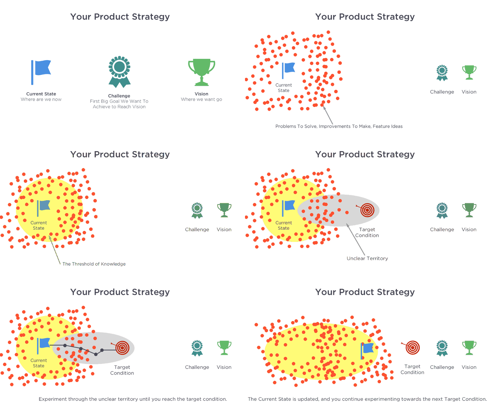
A simple technique you can use to create your vision statement is to describe what your product or organization should look like in five years. By doing that, you’ll define a target condition.

The vision statement is the answer to the question, “Where do we want to go?” (Image: UIE) (Large preview)

Establish Guiding Design Principles

How do you define good design? How do you know when something is ready to ship? When it comes to evaluating the quality of a design, designers often rely on their own set of standards. But as a team grows, following such an approach can introduce a lot of chaos in the product design process, because every designer will have their own subjective ideals. That’s where design principles can save the day.

Design principles act as standards for the product team and help them to measure their work. They replace subjective ideals with clear standards that help team members make user-centered design decisions. However, in many cases, it’s not hard to make people follow guidelines, but rather it’s hard to make people agree on guidelines. That’s why it’s essential not only to establish grounding principles of design, but also to get a commitment to those principles from the people involved in the creation of the product.

Here are a few things to remember when working on design principles:

  • Design principles should reflect the nature of the product.
    For example, when it comes to human-machine interface design for automobiles, the most important design principle should be “Safety first”. Every design decision should be measured for safety — the goal is to keep the driver and passengers safe.
  • Practice open discussion.
    If an organization has many design teams, then involving them in a discussion is vital. By getting their feedback on the design principles, you can adapt the principles to the needs of users.
  • Design principles should not sound like rules.
    Product creators should not feel limited or restrained. It’s important to make everyone comfortable when they do their work.

Magera Moon has written an excellent article, “Creating Etsy’s Design Principles”, that describes the process of creation.

Get Buy-In From Stakeholders

A design system won’t take off if the people who decide on funding don’t buy into it. You need to get buy-in from executives to fund the system.

Write a strategy with a clear proposal, and pitch it to key decision-makers. Your goal is to show that the system solves real problems. Identify key pain points — areas where people spend much time (especially routine operations), and pitch a presentation (or series of presentations) to show how the design system can save the day.

Quick tip: Wrap your presentation in the form of a story. By telling success stories, you will have a better chance of engaging stakeholders.

Promote Your Design System

You can create the best design system in the world, but if you don’t actively promote it in your organization, the entire effort will suffer greatly. That’s why, from the first release of your system, you need to work hard to foster its adoption and create a community of supporters.

Evangelize the design system. Create a group of volunteers, led by senior designers, who will pitch and sell ideas about your design system. The evangelists should participate in various activities such as workshops and webinars. The goal of all of those activities should be to raise awareness that the system exists and to educate people on how to use it.

Show Value Through A Sandbox Environment

It’s well known that the best way for people to see value is to experience it. So, create a sandbox environment that will allow product team members to quickly prototype apps using your design system. Using Adobe XD, it’s easy to create an environment that empowers people to experiment with their own ideas. Actually, it’s a two-step process.

First, you need to teach people how to build things using XD. The XD team has prepared a series of tutorials to familiarize people with the basics of Adobe XD.

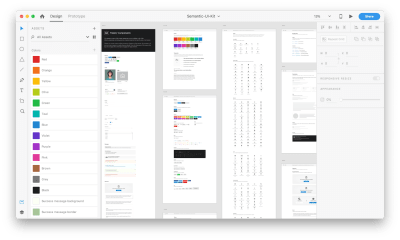
Secondly, you need to set a solid foundation for your design system. Again, you don’t need to start from scratch. Ole Fredrik Lie has made a UI kit especially for design systems: Semantic UI Kit (download the ZIP file). The kit includes all of the basic components you need to start designing at scale, such as buttons, inputs, search, tabs and more.

Semantic UI Kit for Adobe XD. (Large preview)

2. Establish A Culture Of Communication

Every team member should use the design system on a regular basis. In doing so, team members will learn to solve problems systematically, not individually. Communication plays a key role in this process. Invest in creating a culture of communication early in the process, because it will increase the likelihood of adoption of the design system.

Shared Language

Language is fundamental to collaboration. The design language needs to be shared among the people involved in the creation of the product. A shared language allows team members to follow the same approach when giving names to new components and interface elements and when referring to existing components in conversation.

Communicate Changes

Once the design system is being used in product design, it’s vital to communicate changes and updates to the entire organization. Ship updates regularly and with a changelog. The log should tell users what changes were introduced in the new version and how upgrades will impact their work.

Release notes in the Salesforce’s Lightning Design System. (Large preview)

Open Channels For Getting Updates

Bake communication channels into the team’s daily workflow. This will help to keep both the design system’s users and makers engaged.

Start simple. Create a trigger for the update — whenever someone pushes updates to the design system, send a notification to your Slack channel, announcing to the team that a change has been proposed. Also, make an effort to be available via Slack to answer questions.

Establish A Practice Of Regular Checkups

In addition to a day-to-day conversation between the design system’s makers and users, it’s worth scheduling regular meetings to review the design system with makers, users and stakeholders. Discuss what works and what does not, what needs to be improved and when. The meetings will help you set priorities and create a roadmap to improve the system so that it better serves the needs of the business.

3. Improve Design Efficiency

Reduce Duplication Of Design Elements

Duplication of design elements leads to fragmentation, and fragmentation leads to inconsistency. Identifying duplication of design elements helps a team to avoid the scenario in which team members build an element from scratch and after a while find out that a version of it already exists.

Conducting an interface inventory, as described by Brad Frost, is a popular way to understand what’s in use. It’s worth investing time in an interface inventory even before building the actual design system, because going through this process will enable you to identify problem areas that need attention and help you to understand how much design debt your team has.

Interface inventory in action. Image: Brad Frost. (Large preview)

Analyze How People Use Your Design System

Similar to any other product you design, you need to find the answer to the following question: Who will use your design system, and how will they use it? Conduct research to find the answer to this question.

If you’ve just started incorporating a design system into your organization’s design process, conduct a series of interviews to understand how people use it. By doing that, you can pinpoint problems ahead of time. Try to make time for in-person feedback sessions, because such sessions will give you more insight than you would get with remote interviews or online surveys.

It’s also recommended to conduct user journey mapping. User journey mapping helps you better understand the user’s experience.

Strive To Create Reusable Components

Many design systems suffer from the same problem: Team members create components that are too focused on a single use case. As a result, the system becomes too inflexible, and its users (designers and developers) have to create their own components each time they need to cover a particular scenario.

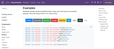
A successful design system is highly reusable. Take Bootstrap. Because it was architected with reusability in mind, thousands of websites use it as their foundation.

Bootstrap framework. (Large preview)

Try to develop components that are not tied to a single use case, but can be reused in multiple contexts. To be reusable and scalable, components need to be the following:

  • Modular
    Modular components are self-contained — they don’t have any dependencies.
  • Composable
    It’s possible to combine components to create new components.
  • Customizable
    It’s possible to adjust and extend components to make them work in a variety of contexts.

Every time you want to introduce a new component, consider how it will work on the various platforms you are designing for. Ideally, every component you design should work on all platforms.

Introduce Versioning

Versioning makes it much easier to track changes. With versioned releases, users can reference a specific version as a dependency. They also have control over when and how upgrades to new versions are handled.

Versioning also helps you deal with breaking changes — situations where changes to a component’s code break existing usages of that component.

There are two types of versioning:

  • Versioning the entire system
    Here, everything within the system belongs to just one version number. As users, we deal with versioning for the whole system every time we update our mobile OS — when we update iOS, we’re updating the entire piece of software. Following the same approach for a design system will mean that users will have to update everything within the design system during the update. For example, if you changed a primary font, add a new secondary color or deprecate a particular UI element, when a user of the design system chooses to upgrade, they will get all of those changes together.
  • Versioning by modules
    This type of versioning involves having a version number for every component or style within the design system. Compared with versioning the entire system, versioning by module allows for more flexibility — users can choose to upgrade just the elements they need.

Establish A Clear Governance Strategy

Change is the only constant, as they say. Creating a clear governance strategy is essential to making sure your design system can adapt to changes. A robust governance strategy starts by answering some critical questions about how changes are handled, such as:

  • Who approves changes to the design system?
  • How are requests for new components handled?
  • What happens when bugs are found in the design system?

The organization of a design system is really important to its scalability. In his article, “Team Models for Scaling a Design System”, Nathan Curtis describes the three models:

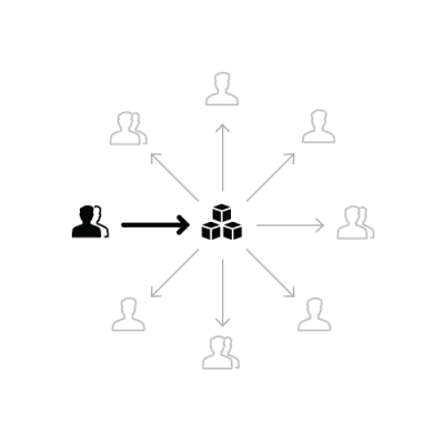
  • Solitary model
    In this model, an “overlord” rules the design system.

    In the solitary model, the one team make a system available. Image: Nathan Curtis. (Large preview)
  • Centralized model
    In this model, one team is in charge of the system and guides its evolution.

    A single, central design team produces and supports a system used by others. Image: Nathan Curtis. (Large preview)
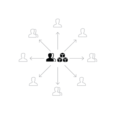
  • Federated model
    In this model, several people from several teams are in charge of the system.

    Designers from multiple product teams work on the system together. Image: Nathan Curtis. (Large preview)

Each of the models above has strengths and weaknesses, but the first is the most fragile because it has a built-in risk — when one person is in charge of so much, that person can quickly become a bottleneck to the completion of many tasks. As Nathan Curtis mentions in his article, overlords don’t scale. That’s why many teams are moving away from the solitary model to the centralized or federated model — those models are usually much better for scaling the design system.

In many cases, it’s possible to try a combination of models. For instance, the Salesforce team’s model is a combination of the centralized and federated models. Though Salesforce’s Lightning Design System has a core team, there are also contributors who act as a federation of practitioners.

Salesforce uses a hybrid of two models. Image: Jina Anne. (Large preview)

Find The Right Balance Between Strictness And Flexibility

One of the main goals of a design system is to extend creative direction. The system should give designers and developers the freedom to explore various approaches before they select one to follow.

It’s vital that the system does not prevent designers from exploring different styles. In her book, Alla Kholmatova defines two types of design systems:

  • Strict
    Designers and developers have to follow a rigorous process when introducing a new pattern in a system.
  • Loose
    The system acts as a framework, allowing designers and developers to experiment and try various approaches.

You have to find the right balance between the two extremes.

Cross-Functional Collaboration

Design is a team sport, and creating a design system is no exception. You need more than just designers to create an efficient design system. The expertise and creative energy of cross-functional collaboration will help you create a system that works best for your organization’s needs.

Product managers, project managers, executives and other stakeholders have unique perspectives that can undoubtedly inform and shape the work.

Here is a quick list of disciplines you’ll need to involve in the process of creating and managing the system:

  • Front-end development
    Front-end developers review the code and rework it to make it modular.
  • Back-end development
    Back-end engineers help to identify architectural decisions that could affect the front-end UI.
  • Content management
    Content strategists set the voice and tone of the design system.
  • UX research
    Researchers understand the needs of your users and help to bake those needs into the system.
  • Performance testing
    Performance engineers help you to avoid performance degradation.
    Leadership
    Leaders align the vision throughout the company.

At the same time, it doesn’t mean that every discipline should be constantly involved in developing the system. Cross-discipline exploration is better. Conduct cross-team sprints: Create teams of people from different teams, and have them work together and explore different areas of design and development. Such activities will help them to find common problems that many teams think are important and to propose solutions — in other words, users of the design system will tailor the system to their own needs.

Ship Early And Often

As with regular products, the waiting time for updates plays a key role in adoption of the design system. Practice regular incremental releases, rather than big reveals, and work hard to integrate the components into the products as soon as possible.

To make that happen, define clear timelines for new components, code reviews and other procedures.

Test Your Design Decisions

Some product teams believe that once a design system is built, the work is complete. Not true. A design system is a product, and it’s vital to manage it as a product instead of a project — a designs system requires ongoing maintenance and improvements as needs arise.

It’s essential to test the design system and the products that use it. When you test the design system, you will become confident that you have a solid foundation for your design.

If you’re just starting to introduce the design system into your design process, start small and test the foundation of the system before extending to larger parts. Find a pilot project — rebuild a real part of a product using this new approach — and see whether it works for your team.

Here are three types of testing that will help you:

  • Functional testing
  • Visual regression testing
    Visual regression testing help you to catch unintended visual changes to component styles.
  • Manual and automated accessibility testing
    This ensures that your components are accessible.

Measure Progress

Assess how effective your design system is at achieving your goals. Define key metrics, and track them with each release.

4. Invest In Documentation

A well-crafted design system is an excellent tool. But even more important than having a great tool is knowing how to use it properly. Documentation is key to adoption.

Write Documentation To Make It Crystal Clear

Minimize jargon and specific terms. Write the documentation in simple, human-readable sentences so that everyone on the team can understand it. This decision will also save a lot of time when onboarding new team members.

Keep Documentation Up To Date

If some part of the system is not documented, it doesn’t exist. When some elements of the design system go undocumented, you run the risk of duplicating elements. Thus, try to keep documentation up to date with your system’s code by automating documentation — the documentation should be automatically updated when a component changes. This should include both visual references and code samples.

Good Findability Of Information

Prioritize sections with information in the documentation, and make sure search works fine. The structure you choose should follow the pattern that users follow when browsing the documentation.

Users should be able to find what they’re looking for themselves and not have to ping other people to find it.

Bake Best Practices Into The Documentation

When best practices — such as accessibility, performance, ergonomics and so on — are baked into the system, it becomes much easier for users to apply them.

Shopify’s Polaris design system has sections with best practices. (Large preview)

Conclusion

Incorporating a system into a design culture takes a lot of time; it’s a gradual process. And the way you manage the design system plays a vital role in its adoption. A successful design system needs to become part of the organization’s DNA, helping your team produce more consistent user experiences, building bridges between design and development, and improving your design process without exposing your orgchart.

This article is part of the UX design series sponsored by Adobe. Adobe XD tool is made for a fast and fluid UX design process, as it lets you go from idea to prototype faster. Design, prototype and share — all in one app. You can check out more inspiring projects created with Adobe XD on Behance, and also sign up for the Adobe experience design newsletter to stay updated and informed on the latest trends and insights for UX/UI design.

(ms, yk, il, al)
Categories: Others Tags:

4 Times When it’s OK to Trick Users

May 28th, 2019 No comments

Tricking people can be… well… tricky. The problem, at its most fundamental level, is that people only like to be tricked when they expect to be tricked. Obviously, if you trick them and take money they never intended to give away, well that’s theft. They rightfully get angry. If you say, “Hey, wanna see a trick? Give me a dollar.”; well then they expect some David Copperfield-level magic, don’t they?

In fact, they demand it.

And that’s the thing about designing interfaces and websites, isn’t it? People want a certain amount of information provided to them, and then they want everything else to happen where they can’t see it. The amount of information they want to see will vary based on the skills of the user, but ultimately, they want to be “tricked”, at least a little bit.

These are the best, and maybe the only reasons you should ever be allowed to “trick” your users:

1. To Make Waiting Less Tedious

Waiting can be frustrating, and waiting for computers to do, “whatever they’re doing now, Gaaawwd!”, can be extra infuriating at times. That’s why God invented the loading icon.

distract the eyes with a spinny-thing, while reassuring the brain that something is happening behind the scenes

Loading and waiting icons, particularly the ones that don’t function as actual progress bars, are perhaps the oldest example of distraction-to-improve-the-UX. They distract the eyes with a spinny-thing, while reassuring the brain that something is happening behind the scenes… probably.

Of course, with time, we’ve developed all sorts of ways to make waiting seem like less of a chore. Simple transitional animations can give the browser a few extra milliseconds to load content from the next page or screen. Some more graphically heavy sites are (and I hate that this is still a thing), using animated splash screens as pre-loaders. Chrome gives you a game to play while you wait for your Internet to come back.

Pretty much all solutions involve some sort of animation, if I’m honest. Moving things around on the screen is probably the most effective distraction there is, outside of auto-playing audio. And well… don’t do that.

2. To Give New Context to Old Actions

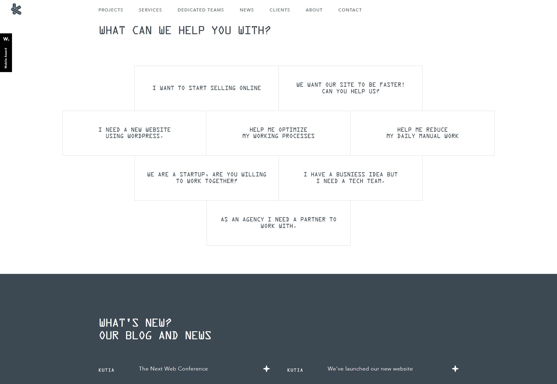
I featured Kutia, a web development agency, in the May 2019 edition of our monthly portfolio showcase for a number of reasons, but mostly because of the way they “trick” the users into going to the contact page. Basically they just ask, “What can we help you with?”, and provide a number of potential answers for people to click on.

Answers include things like “I need a new WordPress website”, “I want to sell things online”, and others. All of these answers take them straight to the contact page, but they also give people an idea of what the agency can do for them. It also helps the user to focus on communicating their end goal to the agency.

Even when you figure out the trick, it’s helpful enough that I don’t see how anyone could get mad.

3. To Smooth Over Rough Edges in the Experience

The human eye is a strange and wonderful thing, but it’s not half as crazy as the bits of brain that have to interpret everything your eyes see. The brain filters out a lot of what we actually see to keep us from going nuts, or at least getting very dizzy. Even when you’re only moving your eyeballs, your brain “records” everything you see before your eyes twitch, and everything after. Everything seen while your eyeballs are moving fast is filtered out for your own sake.

We can do that with websites, too. Take lazy loading images, for example: It’s a great way to save bandwidth, but then you have to deal with the fact that users will probably see partially or completely empty stretches of website while they scroll.

Give them something quick-loading, big, bright, and shiny to look at for a second

Or what about when the content is there, but not all the styles have loaded yet, and your custom typeface is taking a second? A flash of un-styled text is, in my opinion, a lot better than missing text, but it’s still not ideal.

There are many ways to make these issues less jarring (with placeholders, and so on), but what about distracting the user? Give them something quick-loading, big, bright, and shiny to look at for a second. Throw in a paragraph for them to read while the first set of images right below the viewport load in advance.

If people just don’t see or really notice the rough bits, they may as well not exist.

4. To Entertain and Surprise People

This is, of course, the essence of stage magic right here. You distract them so you can surprise them, entertain them, delight them. The problem with this approach is that users generally don’t want to be too surprised by the websites they visit. They just want them to work.

An entertaining surprise can be very hard to pull off on the web for the simple reason that most users aren’t there to be wowed. They’re there to get something they need, and get out. “Surprises” are so often the result of bugs or bait-and-switch tactics, that most users would probably prefer that your site behave mostly predictably.

However, if you can give them a surprise they actually like, they’ll gladly forgive any tricks you pulled. The problem is that this is rare enough that I actually can’t think of any examples.

And That’s Pretty Much It

Look, there really aren’t a lot of good reasons for deceiving people outright, even if it’s only for a moment. By and large, transparency will get you a lot farther than tricks. The only times when it’s even remotely acceptable are those occasions when tricking the user’s brain actually makes their experience smoother, and their day a little better.

Anything else is fishy at best.

Featured image via Unsplash.

Add Realistic Chalk and Sketch Lettering Effects with Sketch’it – only $5!

Source

Categories: Designing, Others Tags:

40 Of the Best Free Retro Fonts Picked by Professional Designers

May 27th, 2019 No comments
retro fonts

The variety of fonts available online at the moment includes Retro Fonts. From vintage to modern, from fancy to minimalist, we try to include all styles in our blog posts here at Web Design Ledger. But for today’s article, we have the pleasure of mentioning some of the coolest retro fonts you can find online, both free and paid. Why did we choose the retro font as the star of our article today? Because they have the ability to take us back in time, in an era we have never lived, but now we are able to, through design.

Of course, some of the fonts we are about to mention below have been designed in the past two decades. Inspired by the depth that this trend can give to a graphics project, font artists haven’t stopped giving retro fonts the attention they deserve. Retro fonts are characterized by colorful details, bold letters, unique shapes, and other cool details we are about to discover throughout this article.

What does retro mean?

The word “RETRO” comes from Latin and it means backward. We need to look back in history into the font’s evolution to find these amazing creations. We will start off with the best retro fonts of the ’50s, ’60s, ’70s, ending with the ’80s.

So fasten your seatbelts, we are about to dive into this amazing trend that keeps being fashionable even 50, 60, 70 years later.

retro fonts ’50s

The retro fonts of 1950 have a cinematic look. When I take a look at any of the fonts below, images of old movies come to my mind. Many of the movies created in this period used this style of fonts for their posters. The fonts of the ’50s tend to be more dramatic due to their bold characteristics. Today, we can use the ’50s fonts in packaging that requires a vintage look, restaurant branding, business cards for different companies, and in any project you think it would do the magic.

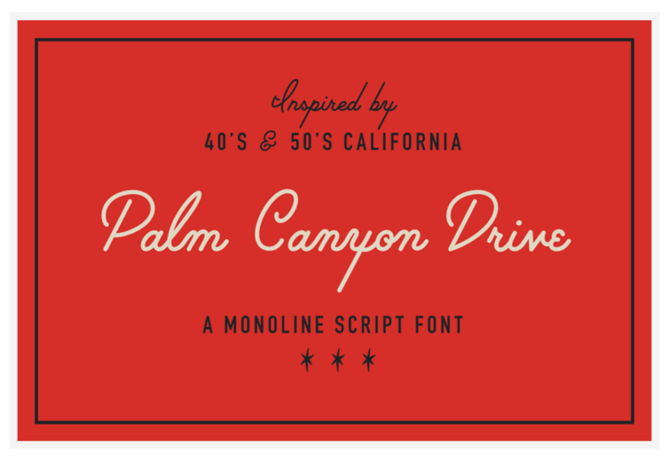
1. Palm Canyon Drive

2. Stiff Staff Font

retro fonts

3. Windpeak Script Font

retro fonts

4. The Lunch Box Font Set

retro fonts

5. Lucy Script

retro fonts

6. Hamburger Heaven

retro fonts

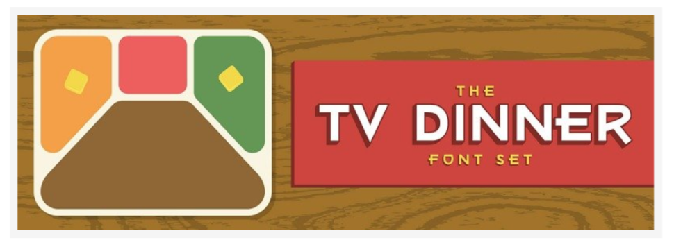
7. TV Dinner Font Set

retro fonts

8. American Captain Font

retro fonts

9. Hardman Font

retro fonts

10. Cinqcent Font

retro fonts

retro fonts ’60s

The ’60s fonts will get your attention from the first sight. They might not be love at first sight, but it will be interest at first sight for sure. These retro fonts are often used on billboards even today. The retro fonts of the ’60s feature colorful details, another characteristic that makes it steal the show. These can be used in retro games, movie posters set in the ’60s, obviously, catchy packaging, book covers, and many others.

11. Haike

retro fonts

12. Swung Note

retro fonts

13. Sundowners

retro fonts

14. Ziclets

retro fonts

15. Bright Script

retro fonts

15. LHF Retro Ricky Doohickies

retro fonts

16. Roadside | Vintage Slab Serif

retro fonts

17. DRIVER • Retro action typeface

retro fonts

18. Hitchcut Display font

retro fonts

19. Superb

retro fonts

20. Sunbeat Family

retro fonts

retro fonts ’70s

The fonts of the ’70s are fresh, yet nostalgic, many created for throwback posters or with the sole purpose of helping achieve the look and feel of the era. Many of the ’70s fonts feature retro hand-lettering from the ’70s, added with a touch of pop style, giving them a unique and elegant look. The fonts listed below are best suited for apparel graphics, logos, posters, and fun times, as well as invitations, flyers, greeting cards, product packaging, book cover, printed quotes, cover album, movie, etc

21. Summer 0f 76 – Multi-Line Font

retro fonts

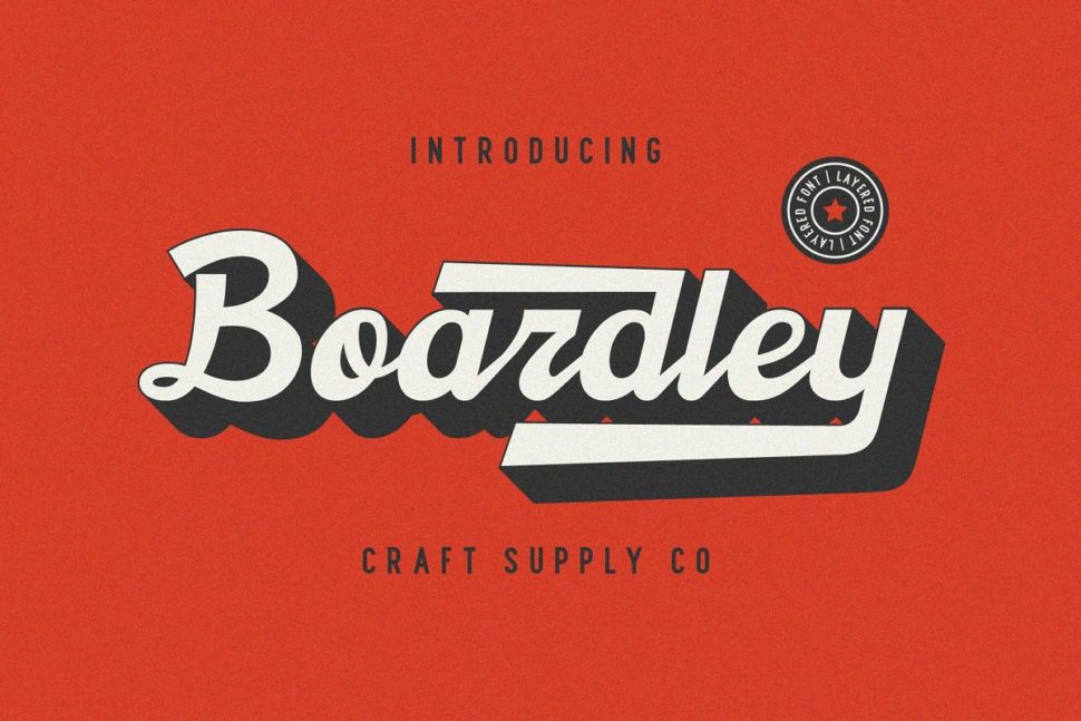
22. Boardley Script – Layered Font

retro fonts

23. Hornet – Retro Style Font

retro fonts

24. “No Worries”

retro fonts

25. Saturday Night Font Family

retro fonts

26. Donatello II new retro script

retro fonts

27. Retro Fonts – Bon Voyage!

retro fonts

29. Ride Slow – Motorcycle Font Bundle

retro fonts

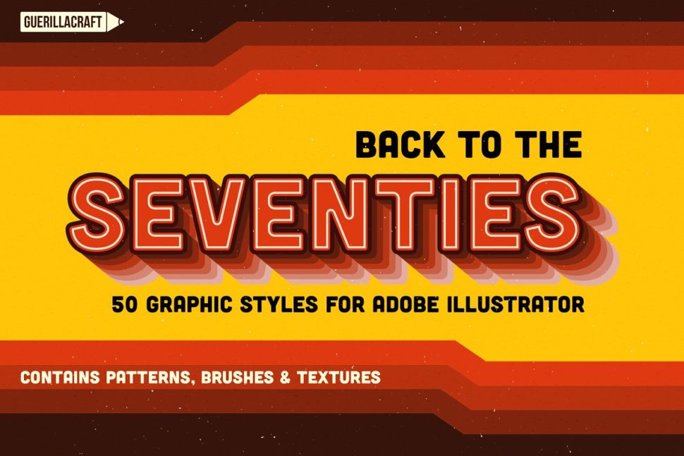
30. Back to the 70s

retro fonts

retro fonts ’80s

The retro fonts of the ’80s begin to evolve into more detailed fonts. We can now observe shadows, neon shades, and tracing elements. The letters are bold, with a strong personality and new features. They are super dynamic, many featuring 3D effects. These amazing fonts are great for any summer projects, due to their bright and joyful looks.

31. Vintage Party – Bold Retro Script

retro fonts

32. Bondie Extrude Font Family

retro fonts

33. Berg layered font (7 Font)

retro fonts

34. NWB UltraViolent – Designer’s Cut

retro fonts

35. Boardson Type

retro fonts

36. Bayshore + New! Neon Glow Styles

retro fonts

37. Thunderstorm + Extras

retro fonts

38. 1980

retro fonts

39. Hermes

retro fonts

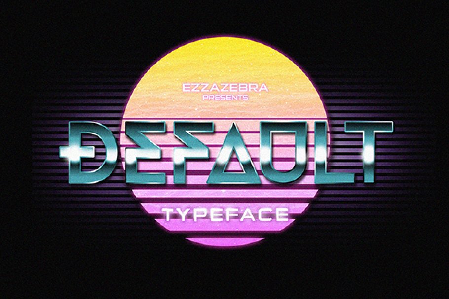
40. Default Typeface + 80s Style

retro fonts
We hope you enjoyed these fonts and that you will start adding them to your projects. They will give them a unique look that every designer looks for. We would appreciate if you let us know in the comment section below which is your favorite retro font, be it part of this list or not. Also, make sure you check out our articles about the best modern fonts and the best classic fonts. Until later,
WLD

Read More at 40 Of the Best Free Retro Fonts Picked by Professional Designers

Categories: Designing, Others Tags:

Prioritizing

May 27th, 2019 No comments
photo of computer and notepad

You’re faced with a lot of decisions in everyday work. There are multiple tasks calling for your focus, and you can burn daylight or even burn out trying to decide what comes first. There’s a phenomenon called decision fatigue. There have been many studies that you can make poor choices when you’re not able to decide what is most important that can lead to things like impaired judgement and even purchase decisions.

So how can you figure out what’s most important to work on first, or even what tasks to work on at all? In this post, we’ll explore how to sift through the inevitable weight of our to-do lists so that we can be efficient and clear with our direction.

If you feel like your to-do list is ruling you instead of you ruling it, read on.

How to invest your time

If you’re going to think smarter (and not harder) about how you prioritize tasks, you have to invest a little time away from your to-do list. Here’s the thing: what you work on informs your values. You may think it’s no big thing to work overtime for a little while, but something will be sacrificed with this decision. If you’re a parent, you might spend less time with your kids. Maybe it’s less time hanging out with friends. Maybe you give up sleep or eating well.

Similarly, if you choose not to work much or effectively, you’re deciding that your values lie outside your career, which is ok too. No judgement here. But where you invest your time is not just about what you value, but also what you don’t value.

Photo by Jessica Lewis, Unsplash

Every quarter or so, I break down all the tasks I’ve committed doing. I write them all down, and I create four quadrants containing all of things I care about. This could be: helps the community, helps one-to-one relationships (which can include coworkers, friends, and family), makes money, and things I find personally fulfilling. This is just an example and your quadrants may be different, of course.

I then take all the things I have going and place them in the quadrants. I see how many of the boxes each one takes up. Some endeavors are counted in a quadrant twice to add weight to it.

Here are a couple allotments for me:

  • Writing things on CSS-Tricks (like this very article) is one of the rarest instances where all boxes are checked
  • Mentoring people checks: building one-to-one relationships, and something that I find personally fulfilling

Anything that fills just one box has to be reconsidered. Anything that fills nothing is usually on the chopping block. This activity allows me to see where I really want to invest my energy. It’s actually illuminating because sometimes I don’t really know what I value and how to prioritize tasks around those things until I do the exercise.

From here, the rest of the prioritization gets a little easier. I now have a better idea where my efforts are really paying off. I also know when I’m wasting my own time. This distinction helps me prevent decision fatigue quite a bit because I have a guiding light to help make choices.

What do you have to do?

In order to figure out a plan for yourself, the first thing you should be doing is gathering all of your tasks, large and small. Letting those things fester in our minds can make us feel burdened by what we have to do, so get it all out on proverbial paper. You can use notebooks, a homemade to-do list, applications like Notion, Evernote, or Clear. It’s up to you.

I use several lists for a few reasons: I tend to retain information better if I write it down multiple in multiple places. For example, I need some things on mobile. I use Clear for those things, Notion on desktop, and a paper teacher planner (which I’ve shared before). I find that the repetition helps me solidify what’s important. That might not be right for you. That’s cool, do what works.

Coding priorities

You may work at a company that creates tickets for tasks. Some tickets are simple and you can knock them out quickly; some can be arduous. Whenever I have a larger coding task, I first break it down into a to-do list as comments in my code. It looks vaguely like this:

// get the request from the server
// give us an error if it failed
// do x thing with that request
// format the data like so

That way, I can fill in the blanks with each task. I usually try to split each one into different pull requests so I can keep myself organized and make it easier on my reviewers. When it’s all done, I’ll go back and prune the comments or replace them with comments that explain the why (not how).

Overall prioritization

There are some tasks that are pretty straightforward. You need to do the thing. It’s indisputable. Other people are counting on you or your future self will depend on it somehow. These are actually easier to prioritize.

First I break down large tasks into smaller pieces. That helps me put things in order:

  1. Things that are actively on fire or are time-sensitive
  2. Things that can be done quickly
  3. Things that need a scheduled block of time
  4. Things that I may get to further along

Part of the reason we do the small things first is that morale is important. I feel more incensed to get my other work done because being productive feels good — there’s a small dopamine rush associated with every check. This is also why I put things I’ve already accomplished on my list. It may sound silly, but acknowledging accomplishments makes me more likely to keep going and pushes me through the more complicated tasks.

Some people, like Alice Goldfuss, have this down to a science:

I have a kanban board for my personal life todo list and a cron job that empties my Done column and texts it to me every week, so I feel accomplished

— bletchley punk (@alicegoldfuss) May 25, 2019

Keep yourself motivated

Keeping yourself motivated is key. Sometimes this means keeping your own morale in mind. The good news is you know yourself pretty well. Here are some tricks that have served me well:

  • Put things on your to do list that you enjoy. You will start to associate your to do list with happiness. For instance, recently I put “read a dumb thriller fiction” on my to do list. It’s ridiculous, but it works. It also helps me remember to do things outside of code all day.
  • Put things on your to do list that you’ve already done. When you mark them off you can get a sense of satisfaction that may entice you to gather more things you can check off. I think a lot of people do this. I definitely didn’t come up with it.
  • Customize it a bit. Whether I use paper or digital means, I spend a minute or two customizing it and making it my own. It makes it more important to me, because I’ve invested in it, and I’m more likely to keep up with the contents.

Prioritizing based on energy levels

Chris Coyier mentioned a great blog post by Alex Sexton when I was pondering how I feel better suited for things like meetings on some days and heads-down coding on others.

I think this is brilliant! I’ve definitely had times in my career where I’ve suffered because of sporadic meetings with ill-defined amounts of time in between that were too small to be heads-down coding, and I would make up for it at night. That’s not a recipe for success; it’s a recipe for fatigue.

man's hand writing in a planner
Photo by Ilya Ilford, Unsplash

Lately, I’ve been working on grouping similar tasks. For example, meetings should all happen in succession because it’s easier for me to jump from one to another than it is having an hour in between. I’m also more keen to communicate with others on Monday, when I’m getting the lay of the land. Towards the end of the week, my energy is higher if I’m dedicated to coding, especially if I’ve allotted uninterrupted time.

Notice when your energy levels are high and when they wane. Notice when you’re more productive for social activities and when you’re better off working in isolation. The more you study yourself, the easier planning becomes.

Scheduling

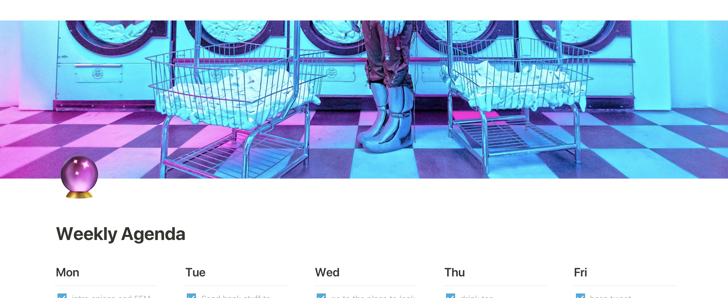
Now that you have your priorities in order, go ahead and schedule your time. I like to use the weekly planner in Notion. I’ll take all the things I think I can get done in a week and break them down day-by-day, based on when it makes the most sense to do each task. When I finish a task, it’s dragged to the top. Anything that’s unchecked at the bottom by the end of the day moves over to the next. I also have general to-do lists, and task-based lists, but the weekly planner is my holy grail. Again, you don’t have to do it exactly like I do, find what works for you.

weekly status notion
I find some art to use as the cover for my weekly schedule so that I enjoy going to it. It’s the little things.

Know yourself

Most of these systems work for me because I know my strengths and weaknesses and I play to them: I work more efficiently when things are broken down into steps. I work best when my work has the most meaning, and I remove the cruft. I work best when I work along with, not against, my energy levels, where possible.

There’s one more thing I haven’t addressed yet: forgiveness. You’ll be more productive on some days (or hell, even years!) than you will be on others, and that’s OK. Life is full of ebbs and flows.

It’s good to check in to see if your waning productivity is the result of simply moving a little slower, signals signs of depression, represents misalignment with personal goals (or the company where you work), or if you’re reacting to a toxic environment.

In all cases, forgiveness is in order. In some cases, you may need more than a prioritization plan. But truly, you’ll never be able to do everything, because no one is capable of that. People you see on social media might also only be showing their successes, and conveniently leaving out their failures and struggles. The fact is that we all get distraught, and sometimes mental illness isn’t something we want to announce over the megaphone of social media. Try not to compare yourself to others. Forgive yourself a bit. Work an amount that’s reasonable for you.


Hopefully, if you’re prioritizing well, the amount of time that you do have to work is structured in a way that actually relieves stress and allows you to accomplish the most you can, when you can. The goal of prioritizing is to bring into focus the work that you find fulfilling, and removes tasks that don’t. That’s the sweet spot.

The post Prioritizing appeared first on CSS-Tricks.

Categories: Designing, Others Tags:

Night Mode with Mix Blend Mode: Difference

May 27th, 2019 No comments

Dark mode designs are all the rage right now but here’s an interesting take: Wei Gao has built a night mode on her own site that uses mix-blend-mode: difference to create an effect that looks like this:

Wei explains how she implemented this technique and the edge cases she encountered along the way. I especially love what she had to say about mix-blend-mode functions here:

I remember first playing around with them in Photoshop years ago. Now that browsers are becoming more powerful and we are seeing complex graphical features native to browser rendering. This doesn’t mean we should implement a full photoshop in browsers and nor should we limit our imaginations to just that. Browsers and web pages have their own contexts and goals, as well as a different set of limits. Maybe we should welcome them like new habitants and discover use cases native to this territory.

Indeed! Although Wei’s technique is pretty unique and awesome on its own, this all ties back into the thing that kicked off the whole trend: the prefers-color-scheme media feature that was released in Safari as part of the MacOS 10.4 release that gave us a dark mode preference setting. This is a developing space, so we’re certain to see more innovations and approaches ahead.

Direct Link to ArticlePermalink

The post Night Mode with Mix Blend Mode: Difference appeared first on CSS-Tricks.

Categories: Designing, Others Tags:

Demystifying JAMstack: An Interview With Phil Hawskworth

May 27th, 2019 No comments
Smashing Editorial

Demystifying JAMstack: An Interview With Phil Hawskworth

Demystifying JAMstack: An Interview With Phil Hawskworth

Vitaly Friedman

2019-05-27T13:00:59+02:002019-05-27T12:35:59+00:00

Some of you might have heard of JAMstack, and perhaps even about how to switch from WordPress to Hugo, but is JAMstack a viable option for any kind of project?

I spoke with Phil Hawksworth, a front-end engineer who (after 9 years of working at agencies has returned to working on a standalone product) is now focusing on developing strategies for JAMstack technologies to make building for the web simpler, faster, and more secure. Phil will also be co-hosting JAM_stack ldn, a conference dedicated to static site generators, serverless and JAMstack in London, on July 9–10.

Vitaly: So hello and welcome to one of our conversations with our speakers at Smashing Conf and generally nice people. You might remember those times when FTP was a big thing and maybe actually you’re still deploying why FTP is a perfectly safe space so you don’t have to worry about that. But changes are high that you’re not using FTP anymore and instead move to Git based workflows, and probably continuous deployment. All this fancy whistles and bells. And so today I’m very happy to welcome Phil Hawksworth who is actually working at Netlify, Developer relationships [inaudible 00:10:00]. Hello Phil. How are you doing today?

Phil: I’m great, how are you doing Vitaly? It’s nice to see you.

Vitaly: Aw, I’m doing great. It’s always pleasure to see you. You’re like a sunshine streaming Netlify and Jump Stack and everything.

Phil: I try. I’m not even branded up, what a missed opportunity.

Vitaly: That’s okay, that’s okay. But you have to tell me, so that gem or jen or jeet, like, jem? Is it jem?

Phil: Jam. It’s jam. It’s all about the jam.

Vitaly: It’s all jam. So the JAMstack. For developers or designers, actually never heard the term before. If you wanted to maybe sum up what it is and why it’s good and what are the benefits of it in the first place. Why would you ever want to move from your traditional, good old stack to JAMstack. Maybe you could sum it up briefly.

Phil: Let me see if I can try because it’s tempting just to say, JAMstack, the JAM stands for Javascript, APIs and mockup. But that in itself doesn’t really explain very much, just knowing what it stands for. So really, JAMstack is all about a way of deploying and serving websites that don’t rely on an origin server, they don’t rely on requests hitting an active server all the time.

Phil: So you might be more familiar with stacks like the LAMP stack which was Linux, Apache, MySQL, and PHP, that was the kind of stack that was serving your site there. With JAMstack, it gets a bit different because we’ve kind of moved up a level, away from the server and closer to the browser so it’s thinking a lot about getting in a browser as fast as possible and then using technologies in the browser to enhance and augment it later on. So JAMstack is all about pre-rendering sites, getting it into the browser, and then maybe enhancing it, augmenting it, the experience with Javascript running in your browser, maybe making requests to APIs and that kind of thing.

Phil: So that’s the model, trying to get away from having a server that you need to maintain because I know maintaining a server is difficult. I don’t know about you but I’ve got lots of sites that kind of went away when I just turned my back on them for a few years. I needed to upgrade PHP which meant I needed to upgrade the version of Linux which I’ve done once in a blue moon. So maintaining servers is difficult so the idea of the JAMstack is to try and make it as simple as possible to serve sites as static assets and then make the most out of all the APIs and inabilities in the browser to do augmentation and do more things with them there.

Vitaly: Right, makes sense. Well, in fact, we moved to JAMstack 2 years ago or so now.

Phil: Two years?

Vitaly: Yeah, it was quite a journey for us. And of course, we learned a few lessons along the way. But I’m wondering, would you say that essentially every project could benefit somehow from moving or moving some parts of it to JAMstack or like, where do you see its limitations? Is it something that potentially every developer could use in a project or is it something that’s kind of dedicated to a particular group of websites or a group of projects?

Phil: Yeah, I mean, it’s tempting to say, oh yeah, you can use it for everything but I think you should be careful saying that about any technology. You know, you really need to kind of pick the use cases and make sure it’s tailored well. I would say the first instinct when you think about a JAMstack site and maybe think about something which is served as static assets, maybe directly from a CDN. You might think, well that’s only good for sites that don’t change very often, they’re quote on quote, static, they don’t change. But in actual fact, that’s not really the case because so many tools exists now that can reduce the friction in deploying things.

Phil: You can deploy many many times a day, or many times an hour if you want and actually make things feel a lot more dynamic than they might have done before. So some of those use cases where you think they wouldn’t be appropriate; those actually come into the fold as well. The time that it gets challenging, perhaps though, is when we’re creating sites that have many many pages, many hundreds of thousands or many millions of pages because the JAMstack model really makes a lot of sense when you can pre-generate your site so you might be using a static site generator. Those have really in vogue at the moment; those are really really popular.

Phil: But of course, they have to do a piece of work every time they deploy an update so if you have a site, maybe like a newspaper site, that has many millions of pages, the work that is required to re-generate that can be quite, you know, that can take a long time so that’s when you start bumping into some of the limitations of where JAMstack can be, kind of, simply used. You can start to get a bit crafty and start to work around that if, you know, you’re very very crafty but it definitely introduces some challenges.

Phil: One of the things I’m starting to see from a variety of different static site generators like Gatsby for instance or React Static, and also Hugo. The teams behind those static site generators are starting to explore ways that you can do progressive generation of the pages so in other words, you don’t re-deploy the entire site or regenerate the entire site every time something changes but try and find ways to do incremental builds. It’s kind of a challenging problem to overcome but there’s work being done on that at the moment so that will help to try and break down that barrier as well. But, certainly at the moment, finding ways to use a JAMstack site for a website that has many millions of pages or many hundreds of thousands of pages, that’s where it can be a little bit challenging right now.

Vitaly: Oh, that’s interesting. So actually the idea of being then to serve a div of the state that you have and essentially that whatever you have to build, like a new portal has to be kind of paged into it so it’s interesting to see this happening. Because you also, just recently, I think two weeks ago, there was an article by Jason Pamental coming up where the idea was actually very similar where you would actually load the fonts, and then you load the first page that you need and then you load the second and then you actually merge them in a way to create a new font, like also incremental font loading.

Phil: Interesting.

Vitaly: That would be really interesting to explore that.

Phil: Yeah, and it’s not just so much of the loading, it’s the generation-

Vitaly: The generation, the build out.

Phil: Yeah, exactly.

Vitaly: I understand. But what do you think are kind of the common challenges that most developers have? Well, I mean, let me move back first. If you have never worked on JAMstack before and you are very much comfortable and happy with your LAMP stack and you wanted to maybe explore the possibility and advantages like security and performance of JAMstack. How would you actually start? What would you move, what does it mean to workflow change?

Phil: So, the changes to the workflow can actually be quite profound because you are taking away a lot of the infrastructure that you’d normally depend on and say actually we can do away with that and start deploying things directly to a CDN. But in terms of how someone might get started experimenting with this, chances are they might be using some of the aspects of this already. You know, even on kind of traditional ways of building things for the web.

Phil: If you think about how you might build something on the LAMP stack, chances are in your PHP there, you’re doing things like writing a template that grabs data from a data source, in this case, the MySQL database or some kind of database, rendering those things into view and then getting them served. And that’s kind of similar to how static site generators work. They have templates, they grab data from somewhere that might be kind of structured data in files or it might be hitting some kind of database or a content API. Either way, it’s grabbing data, combining that data with templates, generating views and the only difference is that it’s not doing that on demand, it’s doing that ahead of time. So, some of the logical steps in that kind of cognitive steps for a developer might not actually be that huge.

Phil: The biggest change is in thinking about how you deploy things. Because really what you’re deploying is your built, rendered assets entirety every time you want to do a deployment. That starts to bring things like the management of the content and the management of the code all into the same place so that things like the vision control across all of those things together. So it starts to be a slightly different way of thinking about how you might develop and manage sites and the content within it. So there are a few changes there. But the nice thing is, a lot of static site generators can be quite straight forward to start experimenting with and the nice thing is you don’t need a ton of infrastructure to do this. So the nice thing is that you can really start to build things out right on your local machine. You’re running a static site generator right on your machine and you can get a really good sense of what the outcome is going to be without needing to lean on lots of other infrastructure.

Phil: So that kind of first step, the on ramp, can be quite shallow for you to start to say, “well, I’ll try this particular set of tools. I can run them locally.” And you’ll have good confidence that when you deploy the output of that somewhere, that will be exactly the same where you deploy it as it would be locally. That’s one of the things that I love about rendering things that are static because you’re not depending on lots of infrastructure and moving parts to serve them. You can look at them on the static server on your own machine and think, “yeah, this is how it will work when it goes off to a CDN.”

Vitaly: Mm-hmm (affirmative);And also the infrastructure when we look, for example, into the way we build single [inaudible 00:10:07], and there is a huge number of options of what you could do. For the server, for the client, and everything in between.

Phil: Yeah.

Vitaly: And so, I think, in our case because we are kind of building out a skeleton and it’s serving straight through CDI with content and all and enhance with Javascript. It was actually quite reasonable and quite, I wouldn’t say easy but it made sense to move to that kind of set up. Because in the end, it’s just content that leaves on the page. It’s just HTML with a few comment areas and search box and a few other things. But if you’re moving towards really standalone application, maybe even financial application, online banking, this kind of thing. Do you think still that JAMstack would be a good option to consider there if you’re having something that requests a lot of logic? Does it need a server or not?

Phil: Well, I hate to trot out the old phrase, “it depends.” But it kind of does depend a little bit. With that said, there are lots of applications which work just as well being a Javascript application as actually having a service side component to them. I say that with a certain amount of caution because I’m a little bit old school when it comes web development and I really like getting things into the browser as HTML as much as possible and then having a really high watermark from where you progressively enhance from. So I don’t personally like doing everything in Javascript and just shipping an empty body tag and then running everything through Javascript.

Phil: With that said, there are sometimes where that’s perfectly acceptable. If you’re thinking about a certain kind of application which, of course, would heavily depend on Javascript and you know your audience. That can be completely reasonably. There are things that have been shipped recently. I’m thinking actually of something that shipped to Google IO for, as an example, the chrome team put together a game which was very heavily Javascript and that worked beautifully served statically. There are plenty of use cases where that can work.

Phil: Going back to your financial example, I used to work, my very first job actually, was putting numbers on screens for traders to trade off using web technologies and this was before web sockets, it was before Ajax, it was before anything really that was useful to help you do that and it’s kind of challenging but more recently, you would do a lot of that kind of thing in Javascript and that makes perfect sense. You can start to make secure requests to APIs right from the browser. There’s plenty of models now for doing authentication and authorization directly from your browser. So in many ways, this can simplify the stack for financial institutions that want to build some of these things out because the way that they can decouple some of these things can make them much more manageable. So I’d certainly think that the JAMstack model could perfectly work in that scenario as well.

Vitaly: Okay, so maybe coming back now to explore that world of JAMstack and front end. What are you most excited about these days, Phil? If you look at JAMstack and front end in general, is it something that’s really keeps you awake at night where you wake up in the morning hoping that yes, I’m going to work on that someday. One day I will get it done. Do you have [crosstalk 00:13:33]

Phil: Yeah, and this is the kind of thing where your answer can be different day by day because it feels like this world moves so quickly. And that in itself is one of the things that excites me so much. Now that we’re starting to see the browser APIs start to really progress and the kinds of things we can do directly in the browser without having to implement them ourselves. That’s kind of exciting to me. I’m still very much a duffer when it comes to SVGs. I should explain the word duffer, if anyone who’s not English and watching this, it means a fool. It means I’m way behind the curve.

Phil: But I find myself really wanting to do more with SVGs and animations are kinds of things I’m just way behind on and I want to play with that. But things like the browser APIs whether that’s things for offline or for improving performance and particularly at the moment the way the font loading seems to be getting more and more accessible so that we can start to really create things that visually are very rich and closer to what we might want to make with typography. I’m a bit of a nerd for that stuff, I like that kind of stuff so I want to play more and more with that.

Vitaly: So Phil, talking about JAMstack conf in London. Can you also explain in a few words like what is it going to be about, what’s the focus and who is it for and what is your role there? Just behind the scenes, taking care of the content and all. What is your role there?

Phil: So I’ve had the fun part of the job. So I’ve had the opportunity to go out and find speakers and find interesting content so I’m really excited about how the programs come together. We’ve got people like Chris Coia who’s going to talk about empowering front end developers and how much we can do with front end technologies now based on this JAMstack model. We’ve got people like Jake Archibald and Surma from the Google Chrome team who are going to talk about things like performance in the front end and ways that we can really drive very performance experiences either with static hosting or infrastructure or code that runs right in the browser.

Phil: We’re also going to have Yuna Kravitz talking about things to do with CSS and Houdini and all of those kinds of things. And much much more besides. We’ll also be talking about things to do with the cultural change that a JAMstack model can have on your organization and on your projects so it really reaches all over the place. So I’m kind of excited about that. I’ll get the chance also to introduce all of these people because they’ve let me go wild and be the MC as well so that means I get to talk to these people and ask a few questions and those kinds of things. So I think it should be very interesting for anyone who is interested in front end development and also new models of delivering projects on the web in a really efficient way.

Vitaly: Oh, so you do like the spotlight on stage, huh?

Phil: I’m an attention seeker. You should know that by now, Vitaly.

Vitaly: Oh, actually I always thought you were very humble and nice and kind person, apparently I was-

Phil: It’s an act, it’s an act.

Vitaly: Okay, that’s fine. Phil, we’ll meet in a few, oh actually, tomorrow.

Phil: I’ll see you soon for another event but otherwise I’ll see you in July, July the ninth and tenth.

Vitaly: [inaudible 00:16:52] So with this in mind, thank you Phil and signing off. Bye bye everyone.

Phil: See you soon.

That’s A Wrap!

We’re looking forward to welcoming Phil at SmashingConf Toronto 2019, with a live session on JAMstack. We’d love to see you there as well!

Please let us know if you find this series of interviews useful, and whom you’d love us to interview, or what topics you’d like us to cover and we’ll get right to it!

(ra, il)
Categories: Others Tags: