Archive

Archive for May, 2019

How Frontend Developers Can Help To Bridge The Gap Between Designers And Developers

May 14th, 2019 No comments
“Can't Unsee” is a game where you need to choose the most correct design out of two choices.

How Frontend Developers Can Help To Bridge The Gap Between Designers And Developers

How Frontend Developers Can Help To Bridge The Gap Between Designers And Developers

Stefan Kaltenegger

2019-05-14T12:30:59+02:002019-05-14T10:47:01+00:00

Within the last nine years, almost every designer I used to work with expressed their frustration to me about them frequently having to spend days giving feedback to developers to correct spacings, font sizes, visual as well as layout aspects that had simply not been implemented correctly. This often lead to weakening the trust between designers and developers, and caused unmotivated designers along with a bad atmosphere among the two disciplines.

A lot of times developers still seem to have the bad reputation of being overly technical and ignorant when it comes to being considerate about details the design team came up with. According to an article by Andy Budd, “[…] a lot of developers are in the same position about design — they just don’t realize it.” In reality though (as Paul Boag points out), “developers [need to] make design decisions all the time.”

In this article, I’ll provide practical points of advice for frontend developers to avoid frustration and increase productivity when working with their creative counterpart.

Looking Through The Eyes Of A Designer

Let’s for one moment imagine you were a designer and spent the last weeks — if not months — to work out a design for a website. You and your teammates went through multiple internal revisions as well as client presentations, and put a solid effort into fine-tuning visual details such as white space, font styles, and sizes. (In a responsive era — for multiple screen sizes, of course.) The designs have been approved by the client and were handed off to the developers. You feel relieved and happy.

A few weeks later, you receive an email from your developer that says:

“Staging site is set up. Here’s the link. Can you please QA?”

In a thrill of anticipation, you open that staging link and after scrolling through some of the pages, you notice that the site looks a little off. Spacings are not even close to what your design suggested and you notice some kinks in the layout: wrong font faces and colors as well as incorrect interactions and hover states. Your excitement starts to slowly fade and turn into a feeling of frustration. You can’t help but ask yourself, “How could that have happened?”

The Search For Reasons

Maybe there were just a lot of unfortunate misunderstandings in the communication between the designers and developers. Nevertheless, you continue asking yourself:

  • What did the the handover of designs look like? Were there just some PDFs, Photoshop or Sketch files shared via e-mail with some comments, or was there an actual handover meeting in which various aspects such as a possible design system, typography, responsive behavior, interactions and animations were discussed?
  • Did interactive or motion prototypes that help to visualize certain interactions exist?
  • Was a list of important aspects with defined levels of priority created?
  • How many conversations took place — with both designers and developers in the same room together?

Since communication and handover are two very important key points, let’s take a closer look at each.

Communication Is Key

Designers and developers, please talk to each other. Talk a lot. The earlier on in the project and the more often, the better. If possible, review design work in progress together early in the project (and regularly) in order to constantly evaluate feasibility and get cross-disciplinary input. Designers and developers naturally both focus on different aspects of the same part and therefore see things from different angles and perspectives.

Checking in early on lets developers become familiarized with the project so they can start researching and planning ahead on technical terms and bring in their ideas on how to possibly optimize features. Having frequent check-ins also brings the team together on a personal and social level, and you learn how to approach each other to communicate effectively.

The Handover From Design To Development

Unless an organization follows a truly agile workflow, an initial handover of design comps and assets (from the design team to the developers) will likely happen at some point in a project. This handover — if done thoroughly — can be a solid foundation of knowledge and agreements between both sides. Therefore, it is essential not to rush through it and plan some extra time.

Ask a lot of questions and talk through every requirement, page, component, feature, interaction, animation, anything — and take notes. If things are unclear, ask for clarification. For example, when working with external or contract-based teams, both designers and developers can sign off the notes taken as a document of mutual agreement for future reference.

Flat and static design comps are good for showing graphical and layout aspects of a website but obviously lack the proper representation of interactions and animations. Asking for prototypes or working demos of complex animations will create a clearer vision of what needs to be built for everyone involved.

Nowadays, there’s is a wide range of prototyping tools available that designers can utilize to mockup flows and interactions in different levels of fidelity. Javier Cuello explains how to choose the right prototyping tool for your project in one of his comprehensive articles.

Every project is unique, and so are its requirements. Due to these requirements, not all conceptualized features can always be built. Often the available time and resources to build something can be a limiting factor. Furthermore, constraints can come from technical requirements such as feasibility, accessibility, performance, usability and cross-browser support, economic requirements like budget and license fees or personal constraints like the skill level and availability of developers.

So, what if these constraints cause conflicts between designers and developers?

Finding Compromises And Building Shared Knowledge

In order to successfully ship a project on time and meet all defined requirements, finding compromises between the two disciplines is mostly inevitable. Developers need to learn to speak to designers in non-technical terms when they explain reasons why things need changes or can’t be built in a specific situation.

Instead of just saying, “Sorry, we can’t build this,” developers should try to give an explanation that is understandable for designers and — in the best case — prepare suggestions for an alternative solution that works within the known constraints. Backing your point with statistics, research, or articles, can help to emphasize your argument. Also, if timing is an issue, maybe the implementation of some time-consuming parts can be moved to a later phase of the project?

Even though it is not always possible, having designers and developers sit next to each other can shorten feedback loops and make it easier to work out a compromised solution. Adapting and prototyping can be done directly through coding and optimizing with DevTools open.

Show your fellow designers how to use DevTools in a browser so that they can alter basic information and preview small changes in their browser (e.g. paddings, margins, font sizes, class names) on the fly.

If the project and team structure allow it, building and prototyping in the browser as soon as possible can give everyone involved a better understanding of the responsive behavior and can help eliminate bugs and errors in the early stage of the project.

The longer designers and developers work together, the better designers will understand what is easier and what is more difficult for the developers to build. Over time, they can eventually refer to solutions that have worked for both sides in the past:

“We’ve used that solution to find a compromise in Project A. Can we use it for this project as well?”

This also helps developers get a better sense of what details the designers are very specific about and what visual aspects are important to them.

Designers Expect The Frontend To Look (And Function) Like Their Design

The Design File Vs. Browser Comparison

A helpful technique to prevent designers from frustration is to make a simple left-right comparison between the design file you got handed over and what your current state of development looks like. This might sound trivial, but as a developer, you have to take care of so many things that need to function under the hood that you might have missed some visual details. If you see some noticeable discrepancies, simply correct them.

Think of it this way: Every detail in your implementation that looks exactly as it was designed saves both you and the designer valuable time and headaches, and encourages trust. Not everyone might have the same level of attention to detail, but in order to train your eye to notice visual differences, a quick round of Can’t Unsee might be a good help.
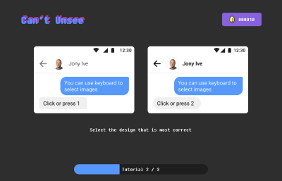
“Can't Unsee” is a game where you need to choose the most correct design out of two choices.

(Image credits: Can’t Unsee) (Large preview)

This nostalgically reminds me of a game we used to play a long time ago called “Find it”. You had to find discrepancies by comparing two seemingly similar images in order to score points.
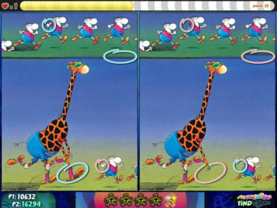
In “Find it”, players have to find errors comparing two images

(Image credits: Mordillo find them) (Large preview)

Still, you may be thinking:

“What if there simply is no noticeable system of font sizes and spacings in the design?”

Well, good point! Experience has shown me that it can help to start a conversation with the designer(s) by asking for clarification rather than radically starting to change things on your own and creating unwanted surprises for the designer(s) later.

Learn Basic Typographic And Design Rules

As Oliver Reichenstein states in one of his articles, 95% of the information on the web is written language. Therefore, typography plays a vital role not only in web design but also in development. Understanding basic terms and concepts of typography can help you communicate more effectively with designers, and will also make you more versatile as a developer. I recommend reading Oliver’s article as he elaborates the importance of typography on the web and explains terms such as micro- and macro-typography.

In the “Reference Guide For Typography In Mobile Web Design”, Suzanne Scacca thoroughly covers typography terminology such as typeface, font, size, weight, kerning, leading and tracking as well as the role of typography in modern web design.

If you would like to further expand your typographical horizon, Matthew Butterick’s book “Butterick’s Practical Typography” might be worth reading. It also provides a summary of key rules of typography.

One thing I found particularly useful in responsive web design is that one should aim for an average line length (characters per line) of 45 to 90 characters since shorter lines are more comfortable to read than longer lines.
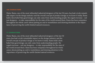
Comparing two text paragraphs with different line lengths

Comparing different line lengths (Large preview)

Should Developers Design?

There has been a lot of discussion whether designers should learn to code, and you may be asking yourself the same question the other way around. I believe that one can hardly excel in both disciplines, and that’s totally fine.

Rachel Andrew nicely outlines in her article “Working Together: How Designers And Developers Can Communicate To Create Better Projects” that in order to collaborate more effectively, we all need to learn something of the language, skills, and priorities of our teammates so that we can create a shared language and overlapping areas of expertise.

One way to become more knowledgable in the field of design is an online course known as “Design for Developers” that is offered by Sarah Drasner in which she talks about basic layout principles and color theory — two fundamental areas in web design.

“The more you learn outside of your own discipline, is actually better for you […] as a developer.”

— Sarah Drasner

The Visual Center

By collaborating with designers, I learned the difference between the mathematical and visual center. When we want to draw the reader’s attention to a certain element, our eye’s natural focal point lies just slightly above the mathematical center of the page.

We can apply this concept, for example, to position modals or any kinds of overlays. This technique helps us to naturally get the user’s attention and makes the design appear more balanced:
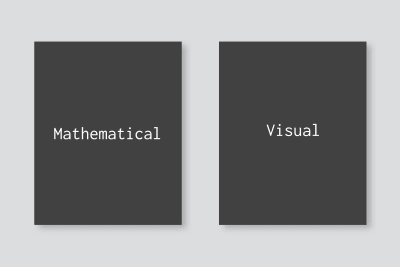
Comparing two page layouts where one shows a text aligned to the mathematical and the other a text aligned to the visual center

(Large preview)

We’re All In This Together

In fast-paced and not-so-agile agency environments with tight deadlines, developers are often asked to implement fully functional responsive frontends based on a mobile and desktop mockup. This inevitably forces the developer to take design decisions throughout the process. Questions such as, “At what width will we decrease the font size of headlines?” or “When should we switch our three-column layout to a single column?” may arise.

Also, in the heat of the moment, it may happen that details like error states, notifications, loading states, modals or styles of 404 pages simply fall through the cracks. In such situations, it’s easy to start finger-pointing and blaming the people who should have thought about this earlier on. Ideally, developers shouldn’t ever be put in such a situation, but what if that’s the case?

When I listened to Ueno’s founder and CEO, Haraldur Thorleifsson, speak at a conference in San Francisco in 2018, he presented two of their core values:

“Nothing here is someone else’s problem.”

“We pick up the trash we didn’t put down.”

What if more developers proactively start mocking-up the above-mentioned missing parts as good as they can in the first place, and then refine together with the designer sitting next to them? Websites live in the browser, so why not utilize it to build and refine?

While winging missing or forgotten parts might not always be ideal, I’ve learned in my past experiences that it has always helped us to move forward faster and eliminate errors on the fly — as a team.

Of course, this does not mean that designers should be overruled in the process. It means that developers should try to respectfully meet designers halfway by showing initiative in problem-solving. Besides that, I as a developer was valued way more by the team simply for caring and taking on responsibility.

Building Trust Between Designers And Developers

Having a trustful and positive relationship between the creative and tech team can strongly increase productivity and outcome of work. So what can we, as developers, do to increase trust between the two disciplines? Here are a few suggestions:

  1. Show an eye for details.
    Building things exactly as they were designed will show the designers that you care and put a big smile on their faces.
  2. Communicate with respect.
    We’re all human beings in a professional environment striving for the best possible outcome. Showing respect for each other’s discipline should be the basis for all communication.
  3. Check in early on and regularly.
    Involving developers from the start can help to eliminate errors early on. Through frequent communication, team members can develop a shared language and better understanding of each other’s positions.
  4. Make yourself available.
    Having at least an optional 30-minute window a day when designers can discuss ideas with developers can give designers a feeling of being supported. This also gives developers the opportunity to explain complex technical things in words that not-so-technical people can understand better.

The Result: A Win-Win Situation

Having to spend less time in QA through effective communication and a proper handover of designs gives both the creative and dev team more time to focus on building actual things and less headaches. It ultimately creates a better atmosphere and builds trust between designers and developers. The voice of frontend developers that show interest and knowledge in some design-related fields will be heard more in design meetings.

Proactively contributing to finding a compromise between designers and developers and problem-solving as a developer can give you a broader sense of ownership and involvement with the whole project. Even in today’s booming creative industry, it’s not easy to find developers who — besides their technical skillset — care about and have an eye for visual details. This can be your opportunity to help bridge the gap in your team.
Related Resources

(dm, yk, il)
Categories: Others Tags:

Rediscover creativity: 3 ways to do it right

May 13th, 2019 No comments
Rediscover creativity

How do you find creativity in moments when it seems impossible to create something? How do you find inspiration to do something? This is a question that a designer asks over and over again. Especially in difficult periods of working or personal life. The first thing to do, when ideas are not coming, when creativity is not found, is to try to understand the reasons for the problem. Its causes. There can be multiple. But often the cause of lack of creativity is due to two or three key elements: stress, performance/result anxiety, lack of motivation.

So let’s try to understand why sometimes, ideas just don’t come up.

Why is creativity lost? Why don’t we get ideas anymore?

The human brain is a bit like a computer. As long as all the elements work, the whole system works. But, much like a computer, or any other complex machine, once one tiny thing is out of place, the whole system starts to fall apart. For those of us who use our creative abilities for a living, this most often manifests in the lack of ideas. It is not that the brain goes out. It’s simply that good ideas just don’t seem to surface.

Rediscover creativity

Why does this happen? I’m neither a psychologist nor a guru of personal growth, motivation or anything like that. In this article, I write substantially what I and many others have experienced throughout our careers. Having said that, why do we lose creativity? Mainly due to “brakes” inside or outside our brains. By internal brakes I mean mental situations that we create ourselves, by external brakes I mean situations that involve us (unforeseen events, results not achieved, etc.). We, therefore, see the three causes that usually cause a decline in creativity. In total, there are 3 major reasons for all of our creative struggles. Let’s start off with the first reason:

First cause: stress

Too many things to do, too many emails to reply to, too many projects to prepare for. Spending, family, social life, work, the client, the meeting.

Stress.

From the dictionary: “every cause (physical, chemical, psychic, etc.) capable of exerting a harmful stimulus on the organism, with its prolonged action, causing its reaction”. And in your case, the reaction is the lack of ideas or creativity.

Second cause: performance or result anxiety

We’ve all been there. Hours and hours of studying put into one project that you have to present in front of your entire high school class. This is a concept applicable to any social and mental dynamic. This is, for example, a problem that I myself continually face in my working life and that has destroyed my creativity and motivation numerous times. I fight with it all the time.

Rediscover creativity

I always want to create a phenomenal article, a logo design project that the customer is super satisfied with, or a web page design that gets people drooling over my creation. I always try to do my best and sometimes the anxiety of achieving the best possible result pulls me down. When this aspect is added to the other two, it becomes tragic for creativity.

Third cause: lack of motivation

Sometimes at this stage, people start to consider whether or not they’re in the right business. It starts to make them question whether they’re actually cut out for what they do, or if they just got lucky a few times. I’m here to tell you that a lack of motivation is not a result of any of those things. Many famous designers are incredibly talented. So talented, that they basically have projects spewing out of their ears.

Rediscover creativity

Despite this, they sometimes lose their daily motivation. Do you know what helps me in these moments? Thinking back to my first ever big project, and considering how far I’ve come since. I can assure you will start to remember why you started designing in the first place. And sometimes, that’s all the motivation I need.

So now, these are the 3 main causes that hinder creativity and make ideas disappear. But how can creativity be reborn? Here are 3 practical actions that can be implemented today.

FIRST ACTION: Stop.

When we are so focused with our daily routine we often don’t realize what is holding us back. You don’t really collect your thoughts enough to stop and take a breather. That’s why, when you feel creativity and motivation drop, you have to stop. The duration depends on you and your situation. An hour, a day, two days (the so-called 72-hour break). Stop and let your brain breathe for a moment. In those moments, usually, I go for a run or I sometimes even watch a movie or read a good book. This time, which doesn’t have to be too much, will help you free your brain from anxiety and stress. This phase will also serve to recharge your creativity, which until then was harnessed by anxiety and stress.

SECOND ACTION: Get organized.

Once you have freed your brain from the burdens of daily routine, take some time to organize your next moves. Take a sheet and write down the things you have to do in the coming weeks. Write them all. Try to create a plan, a sort of roadmap to tackle all the most important things you have to do. The useful aspect of this phase is that this makes it possible to actually understand the order of priority in your tasks and projects. But that’s not all. It also creates a plan to deal with them and destroy the anxiety and stress that comes when you feel like you have to do a billion things at one time. It can be head-splitting.

Rediscover creativity

If you are a person who hates making lists, organizing things, just trust me on this one. It is one of the most effective ways to clear your mind and free yourself from the burdens of everyday responsibilities.

The lack of creativity is often a simple lack of organization of one’s time. Poor organization of time becomes anxiety, stress, and demotivation. And these start to slowly limit your creativity.

Lack of creativity is often a lack of organization. Plan your work! Managing your time better is one of the most important aspects for a designer.

THIRD ACTION: Start doing it.

You have freed your mind, you have organized your tasks, now is the time to start doing. But… how? Simply start doing! If you don’t want to tackle that university project and don’t get any immediate ideas, just take a sheet and start brainstorming. If you can’t find the creativity for that logo design project, simply start working on it! If you don’t find the desire and creativity to write that article, simply open the text editor and start writing! Everything has a beginning, so you might as well and get that out of the way.

The conclusion

Despite your lack of creativity, you are more than likely a great designer. Just because you can’t think of the next big idea now, doesn’t mean it won’t come later. Great ideas take time, and great design takes even longer.

So, next time you find yourself in a rut, sad and on the verge of crying, maybe even questioning your life choices, just remember one thing: it happens to literally everyone. You are a designer not by chance, but by the reality of your skills. Use them, even if it takes a while to rediscover creativity.

Read More at Rediscover creativity: 3 ways to do it right

Categories: Designing, Others Tags:

Change Color of SVG on Hover

May 13th, 2019 No comments

There are a lot of different ways to use SVG. Depending on which way, the tactic for recoloring that SVG in different states or conditions — :hover, :active, :focus, class name change, etc. — is different.

Let’s look at the ways.

Inline SVG

Inline SVG is my favorite way to use SVG anyway, in part because of how easy it is to access and style the SVG.

See the Pen
bJXNyy
by Chris Coyier (@chriscoyier)
on CodePen.

If you’re used to working with icon fonts, one thing you might enjoy about them is how easy it is to change the color. You’re largely limited to a single color with icon fonts in a way that SVG isn’t, but still, it is appealingly easy to change that single color with color. Using inline SVG allows you to set the fill, which cascades to all the elements within the SVG, or you can fill each element separately if needed.

SVG Symbol / Use

There is such thing as an SVG sprite, which is a group of SVGs turned into elements such that any given icon can be referenced easily with a element.

See the Pen
Use SVG Hovers
by Chris Coyier (@chriscoyier)
on CodePen.

You can still set the fill color from outside CSS rather easily this way, but there are caveats.

  • The internal SVG elements (like the ) can have no fill themselves. This allows the fill set from the parent SVG to cascade into the Shadow DOM created by . As soon as you have something like in the , you’ve lost outside CSS control.
  • Likewise, the fill of individual elements cannot be controlled within the SVG like you could with inline SVG. This means you’re pretty firmly in single-color territory. That covers most use cases anyway, but still, a limitation nonetheless.

SVG background images

SVG can be set as a background image just like PNG, JPG, or whatever other graphics format. At this point, you’ve sort of given up on being able to change the fill. One possibility, which I’d argue isn’t a particularly good one, is to have two versions of every icon, in the respective colors, and swap between them:

See the Pen
Background SVG Hovers
by Chris Coyier (@chriscoyier)
on CodePen.

I don’t blame you if you’d rather not swap sources, so another possibility is to get gnarly with filters.

See the Pen
Background SVG Hovers with Filters
by Chris Coyier (@chriscoyier)
on CodePen.

Trying to finagle the right filters to get the color right is tricky stuff. Fortunately, Barrett Sonntag made a tool to calculate the filters for you! Turning black to red ends up a whacky combination like this: invert(27%) sepia(51%) saturate(2878%) hue-rotate(346deg) brightness(104%) contrast(97%);.

SVG also has object, which is kinda neat in that it had a built-in fallback back in the day — although browser support is so good these days, I honestly have never used it. But if you’re using it, you would probably have to use this filter technique to swap color on hover.

See the Pen
Background SVG Object Hovers
by Chris Coyier (@chriscoyier)
on CodePen.

Use a mask instead of a background image

This way, the SVG is still in charge of essentially drawing the shape, but the color comes from the background-color (or image! or gradient!) behind it rather than the SVG itself.

See the Pen
Background SVG Hovers with Mask
by Chris Coyier (@chriscoyier)
on CodePen.

SVG background images as data URLs

This doesn’t change that much from above, but it does open up one interesting possibility: Using a variable for the internal fills. Here that is with Sass keeping the URLs as variables:

See the Pen
Background SVG Hovers with Data URL variables
by Chris Coyier (@chriscoyier)
on CodePen.

You can also do this with native CSS custom properties!

The post Change Color of SVG on Hover appeared first on CSS-Tricks.

Categories: Designing, Others Tags:

SVG Properties and CSS

May 13th, 2019 No comments

There are many Scalable Vector Graphics (SVG), but only certain attributes can be applied as CSS to SVG. Presentation attributes are used to style SVG elements and can be used as CSS properties. Some of these attributes are SVG-only while others are already shared in CSS, such as font-size or opacity.

For example, to change the color of a element to red, use the fill property in CSS. The fill attribute is a presentation attribute, therefore it can be used as a CSS property:

circle {
  fill: red;
}

See the Pen
vMqaay
by Geoff Graham (@geoffgraham)
on CodePen.

So, with that, let’s take a deep and thorough dive into all of the SVG elements that are available to us as well as the CSS properties for them. We’ll also look at various styling approaches, including general presentational styles and animations.

SVG Elements by Category

The presentation attributes that can be used as CSS properties can be found below. For reference, supported elements will be classified by category. This does not include deprecated elements.

Element Type Elements
Container elements


Filter primitive elements


Gradient elements

Graphics elements


Shape elements


Text content elements

Properties shared between CSS and SVG

Font properties

Presentation attribute Supported elements
font Text content elements
font-family Text content elements
font-size Text content elements
font-size-adjust Text content elements
font-stretch Text content elements
font-style Text content elements
font-variant Text content elements
font-weight Text content elements

Text properties

Presentation attribute Supported elements
direction
letter-spacing Text content elements
text-decoration Text content elements
unicode-bidi Text content elements
word-spacing Text content elements
writing-mode

Masking properties

Presentation attribute Supported elements
overflow


Interactivity properties

Presentation attribute Supported elements
cursor Container elements
Graphics elements

Color properties

Presentation attribute Supported elements
color Applies to elements using:
fill
stroke
stop-color
flood-color
lighting-color

Visibility properties

Presentation attribute Supported elements
display Graphics elements
Text content elements


visibility Graphics elements
Text content elements
SVG CSS Properties

Text properties

Presentation attribute Supported elements
alignment-baseline
baseline-shift
dominant-baseline Text content elements
glyph-orientation-horizontal Text content elements
glyph-orientation-vertical Text content elements
kerning Text content elements
text-anchor Text content elements

Clip properties

Presentation attribute Supported elements
clip


clip-path Container elements
Graphics elements
clip-rule

Masking properties

Presentation attribute Supported elements
mask Container elements
Graphics elements
opacity Graphics elements


Filter effects

Presentation attribute Supported elements
enable-background Container elements
filter Container elements
Graphics elements
flood-color
flood-opacity
lighting-color

Gradient properties

Presentation attribute Supported elements
stop-color
stop-opacity

Interactivity properties

Presentation attribute Supported elements
pointer-events Graphics elements

Color properties

Presentation attribute Supported elements
color-profile referring to raster image

Painting properties

Presentation attribute Supported elements
color-interpolation Container elements
Graphics elements
color-interpolation-filters Filter primitive elements
color-rendering Container elements
Graphics elements
fill Shape elements
Text content elements
fill-rule Shape elements
Text content elements
fill-opacity Shape elements
Text content elements
image-rendering
marker


marker-start


marker-mid


marker-end


shape-rendering Shape elements
stroke Shape elements
Text content elements
stroke-dasharray Shape elements
Text content elements
stroke-dashoffset Shape elements
Text content elements
stroke-linecap Shape elements
Text content elements
stroke-linejoin Shape elements
Text content elements
stroke-miterlimit Shape elements
Text content elements
stroke-opacity Shape elements
Text content elements
stroke-width Shape elements
Text content elements
text-rendering
SVG 2

While presentation attributes can be used as CSS properties to style SVG, what about controlling the coordinates and dimensions of SVG elements using CSS? SVG 2, which is in Candidate Recommendation at the time of this writing, makes it is possible to style and animate these properties.

The SVG 2 specification states:

Some styling properties can be specified not only in style sheets and ‘style‘ attributes, but also in presentation attributes. These are attributes whose name matches (or is similar to) a given CSS property and whose value is parsed as a value of that property.”

Not only does it mean that SVG properties can be styled using CSS as presentation attributes or in style sheets, but this also can be applied to CSS pseudo-classes such as :hover or :active.

SVG 2 also introduces more presentation attributes that can be used as styling properties. These attributes can be found in SVG 2 specification.

Element-specific properties

It is important to note that not every SVG element will support the same CSS properties. Much like how there are CSS properties that can be applied to certain SVG elements, there are specific properties that are supported by certain SVG elements.

For example, the or elements support the cxand cyproperties as coordinates of the center of the shape. The element also supports the rx and ry properties as the radius, but the element cannot use these properties.

Geometry properties

In SVG 2, properties such as rx and ry are defined as geometry properties. Geometry properties can be used as CSS properties, just like presentation attributes such as fill or stroke properties. These CSS properties and the corresponding SVG elements include:

SVG Element Geometry Property
cx
cy
r
cx
cy
rx
ry
rx
ry
height
width
x
y
path
height
width
x
y
height
width
x
y
code>height
width
x
y
Positioning SVG elements

SVG 2 also makes it is possible to position SVG elements using CSS. Let’s begin with drawing a rectangle shape having the following SVG:

<svg width="170" height="170">
  <rect x="10" y="10" width="150" height="150" />
</svg>

And the following CSS:

rect {
  fill: #6e40aa;
}

See the Pen
QPeNGj
by Geoff Graham (@geoffgraham)
on CodePen.

This will produce a rectangle shape with its coordinates set to 10, 10. With SVG 2, x and y can be applied as CSS properties:

/* This will work with SVG 2 */
rect {
  x: 10;
  y: 10;
  ...
}

The SVG code would be reduced to this:

<svg width="170" height="170">
  <rect width="150" height="150" />
</svg>

You can even set the width and height for the element using CSS like so:

rect {
  ...
  width: 150px;
  height: 150px;
  ...
}

That leaves us with just the following for SVG markup:

<svg width="170" height="170">
  <rect />
</svg>

See the Pen
Positioning SVG elements
by Katherine Kato (@kathykato)
on CodePen.

At the time of writing, the following demos will work in Blink (e.g. Chrome and Opera) and WebKit (e.g. Safari) browsers as these browsers support SVG 2 features. Until then, let’s dive into how to override SVG properties using CSS.

SVG shape morphing

The element can be overridden with CSS to create shape morphing.

The SVG paths that morph one into the other must have the same number of points or else the morphing will not work.

Let’s start with drawing a element in the shape of a triangle. Using the d property will specify the shape of the element:

<svg height="220" width="300">
  <path d="M150 10 L40 200 L260 200Z" />
</svg>

To get the triangle to morph into a different shape, let’s override the SVG element with the d property with CSS:

path {
  d: path("M150, 10 L40, 200 L260, 200Z");
  fill: #4c6edb;
}

Let’s also add a :active pseudo-class to the property so when the element is clicked, the shape will morph into a square and change its fill color. Let’s also add a transition property to make the shape morphing action appear smooth. Here is the CSS:

path:active {
  d: path("M150, 10 L40, 200 L260, 200 L260, 200Z");
  fill: #4c6edb;
  transition: all 0.35s ease;
}

And the SVG would be:

<svg height="220" width="300">
  <path />
</svg>

See the Pen
SVG shape morphing
by Katherine Kato (@kathykato)
on CodePen.

Want another demo? Here is a cool demo from Chris Coyier demonstrating SVG shape morphing on hover!

See the Pen
Simple Path Examples
by Chris Coyier (@chriscoyier)
on CodePen.

Animating SVG properties

SVG properties can be animated using CSS through CSS animations and transitions.

In this demo, we will draw various SVG elements and create a wave animation. Start by drawing five elements:

<svg width="350" height="250">
  <circle class="shape" />
  <circle class="shape" />
  <circle class="shape" />
  <circle class="shape" />
  <circle class="shape" />
</svg>

We’ll be using CSS variables and :nth-child() CSS pseudo-class to define each .shape class. The .shape class will have a cy of 50 and a r of 20. Each of the .shape classes will have their own cx and fill CSS properties set:

:root {
  --color-1: #6e40aa;
  --color-2: #4c6edb;
  --color-3: #24aad8;
  --color-4: #1ac7c2;
  --color-5: #1ddea3;
}

.shape {
  cy: 50;
  r: 20;
}

.shape:nth-child(1) {
  cx: 60;
  fill: var(--color-1);
}

.shape:nth-child(2) {
  cx: 120;
  fill: var(--color-2);
}

.shape:nth-child(3) {
  cx: 180;
  fill: var(--color-3);
}

.shape:nth-child(4) {
  cx: 240;
  fill: var(--color-4);
}

.shape:nth-child(5) {
  cx: 300;
  fill: var(--color-5);
}

Here is how it should look so far.

See the Pen
Animating SVG properties: Pre-animation
by Geoff Graham (@geoffgraham)
on CodePen.

Now it’s time to animate! Start by using @keyframes rule to define the moveCircle animation:

@keyframes moveCircle {
  50% {
    cy: 150;
    r: 13;
  }
}

This will get each element to change their cy coordinates from 50 to 150 and r from 20 to 13. Add the following to the CSS to the .shape class get the animation running infinitely:

.shape {
  ...
  animation: moveCircle 1250ms ease-in-out both infinite;
}

Finally, add an animation-delay to each of the .shape classes to the CSS with the exception of .shape:nth-child(1) like this:

.shape:nth-child(2) {
  ...
  animation-delay: 100ms;
}

.shape:nth-child(3) {
  ...
  animation-delay: 200ms;
}

.shape:nth-child(4) {
  ...
  animation-delay: 300ms;
}

.shape:nth-child(5) {
  ...
  animation-delay: 400ms;
}

See the Pen
Animating SVG properties
by Katherine Kato (@kathykato)
on CodePen.

Shapes in SVG elements can also be animated using CSS. Here is a cool demo by Dudley Storey showcasing that!

See the Pen
Screen
by Dudley Storey (@dudleystorey)
on CodePen.

Wrapping up

As SVG 1.1 is the current standard, few browsers currently support SVG 2 features. It is not recommended to put these techniques into production yet. SVG 2 implementation is currently at Candidate Recommendation stage, thus support for styling SVG geometry properties with CSS should improve in the future.

The post SVG Properties and CSS appeared first on CSS-Tricks.

Categories: Designing, Others Tags:

Setting Up A Digital Policy: An Interview With Kristina Podnar

May 13th, 2019 No comments
Smashing Editorial

Setting Up A Digital Policy: An Interview With Kristina Podnar

Setting Up A Digital Policy: An Interview With Kristina Podnar

Vitaly Friedman

2019-05-13T13:00:59+02:002019-05-13T14:26:46+00:00

The web is wonderfully diverse and unpredictable because of wonderfully diverse people shaping it. In this new series of short interviews, we talk to interesting people doing interesting work in our industry, and sharing what they’ve learned.

For over two decades, Kristina Podnar has worked with some of the most high-profile companies in the world and has helped them see digital policies as opportunities to free the organization from uncertainty, risk, and internal chaos.

Kristina is an energetic and passionate problem-solver, and we’re honored to welcome her at SmashingConf Toronto 2019 for a live session for creating and documenting a sound policy and standards, and a few tools and tactics which will help nurse your website back to health.

Vitaly: So, hello everyone. Thank you so much for joining in again. This is one of those mysterious sessions where we interview interesting people behind the scenes. I think it’s actually very important to highlight the important people doing important work just silently in the back, hiding a little bit, trying to make the world a bit better, one step at a time and, that’s important, sharing what they learned with the community, with all of us, so we can benefit from it.

Vitaly: And so, I’m very happy and privileged today to have with us Kristina Podnar who is a digital policy innovator. And, for over two decades she has worked with some of the most high profile companies in the world, and has helped them see policies as opportunities to free the organization from uncertainty, risk, and internal chaos. This is the official description. What I can tell from my side though is that Kristina is just such an incredibly positive and energetic and nice person. I’m so privileged to have you speaking in Toronto with us, Kristina. So Kristina, how are you today?

Kristina Podnar: Thanks for having me, Vitaly. I am doing really well and really excited to be here with you. You have no idea. This is sort of a pinnacle of my career and a path I’ve been on for a while. As you know, I contributed to Smashing Magazine back in 2016, but having the opportunity to be with you in Toronto is, I think, an ultimate high for me amongst everything else that I’ve done so far. I’m really excited.

Vitaly: This is so nice. I can’t wait. I can’t wait.

Kristina Podnar: Same here.

Vitaly: So, Kristina, tell me, the truth, the story, how did you end up in this mess? Every time we talk about digital policies and governance, and I heard rumors that you are going to speak about that, everybody thinks about boring stuff. Bureaucracy, slow processes, and communication issues, and maintenance problems. Messy, messy things.

Kristina Podnar: That’s right.

Vitaly: How do you feel there?

Kristina Podnar: Well, you know what, I don’t blame anybody for thinking that because that’s all that we’ve all been taught, right? I mean, we always think about policies as these 20 page PDF documents that have been signed off by legal or HR, or there somewhere on SharePoint. We have to go searching for them when we need to know something, and all we need is a yes or no answer and somebody’s saying, “No, no. Go read this document. Really, it’ll help you.” And, if you are a digital, that usually means reading 30 or 40 such documents.

Kristina Podnar: I don’t blame anybody for feeling like it’s a lot of bureaucracy. It’s really, really annoying. And, it’s where I actually came from in my career. Well, that’s not true. It was a little bit of a derailment in my career, but I came from the world where we used to live in the wild, wild west. We did things like migrate new websites in HTML with having a backup, which is how I personally made sure that one of my clients didn’t have a website for nine hours. Or, we would pass credit card numbers through FTP without encryption. Right. It was the crazy days.

Kristina Podnar: And then, it seems like the world just went to this extreme of trying to tie down anybody who was doing anything creative. And, if you wanted to do a really cool marketing campaign online, it was like compliance had to sign off, and legal had to sign off, and you had to say certain things. And, by the time you got to this point where your really cool idea came out the other end, you didn’t even recognize it. It was boring and it was dull.

Kristina Podnar: And so, I lived in this world for many years, and what I discovered is it doesn’t have to be like that. We can actually have a really good balance between understanding what needs to be done to protect the business, doing things the right way in terms of laws and regulations, and yet freeing everybody to do really creative and innovative work. And so, I’m on this mission to help businesses understand that because I think far too many people come into their work job every day and they’re not happy. And, I think that’s really sad.

Kristina Podnar: So, I’m all about let’s create policies that free the organization to do what it needs to get done in digital, and let’s free the workers to be creative and innovative and not have to do the humdrum of reading these long PDF’s or putting up with red tape because digital policies are fun and exciting and enabling. They are anything but red tape.

Vitaly: But, Kristina it sounds like a magic dream. It sounds like it’s something that it’s really hard to achieve. So, when it comes to something like that, and I guess this is also something you’re going to speak about in Toronto,-

Kristina Podnar: Yeah.

Vitaly: … where do you even start? Imagine you have this mass organization just in front of you and it desperately needs some better structure, maybe better communication. Every single company I was working within my career had communication issues, including ours to be honest for quite a bit of time.

Kristina Podnar: No.

Vitaly: So, where do you even start? What’s the starting point for you?

Kristina Podnar: So, personally what I like to do is really kind of just come into the organization fresh-eyed, and trying to understand really what are the biggest challenges. And, I’ve worked with really, really large multinationals all the way down to really small companies. And, it varies. The problem varies. But, in most organizations that I work with, what I find is people feel like they have to really control digital because it’s something new and they feel like it’s something that’s really, really dangerous and can kind of pose a threat to the organization as much as it can kind of create that opportunity.

Kristina Podnar: And so, it’s all about trying to find the pain point. So, for example, I recently worked with a pharma company, and they had this really crazy review process where it took 21 days to get content published. I’m thinking to myself that could work if it’s a really big product launch and you’ve been creating the product for years. 21 days isn’t a big deal. But, if you had like the measles outbreak in the United States, you want to act really quickly and get the information out there. 21 days is forever.

Kristina Podnar: And so, what it was is people had to go through the same pain staking points for content review over and over again and their medical signatories had to feel comfortable. They had to do these crazy screenshots of the content on an iPad versus an iPhone versus this screen, that screen. Legal had to review things. And, what we found is that we can actually boil the steps down and creates certain rules that can’t be broken and do this in a way that facilitates the content being created with awareness across the whole sign-off team.

Kristina Podnar: And so, really ahead of time, what we would do is, as content was being created, we would do screenshots with the different devices. We would make sure that, up front, whoever was in charge of the marketing campaign was following certain sort of rules and regulations and actually showing where they were getting creative or where they wanted to kind of relax some of the rules.

Kristina Podnar: And, what that meant is that there was a summary and a summative package at the end of the process that we could serve up, almost in a restaurant where you have your menu item and you check things off and go, “I don’t want the fish today, but gosh, the chicken sounds delicious.” We’ll go with that really quickly and get that order in. And, it was the same thing. And so, all of a sudden we found ourselves in this crazy pharma world, which is probably the most regulated of anybody out there, 21 review day process down to three.

Kristina Podnar: But, it has to do with understanding what the expectations are of sort of this regulatory policy driven world and really making sure that as creatives we address that up front, and that we actually give everybody the ability to exhale, take a deep breath, and understand we’re doing things and working towards the same common goal, and we’re going to make sure we don’t get the company sued. But, at the end of the day, we want to have a lot of freedom. We want to make sure that it’s innovative, that it catches the user’s imagination, that we have these great digital experiences, and that that can still be done within that framework. Because it’s really freedom within a framework, if you will. And, it doesn’t have to be boring and it doesn’t have to be onerous and it certainly doesn’t have to take 21 days.

Vitaly: Wow. Now, I actually getting excited about all that stuff. That’s surprising.

Kristina Podnar: Yay.

Vitaly: I did not see that coming at all. But, I’m wondering at this point, so would you say that every single company of every size could benefit from a very clear digital governance and kind of policy? Does every company has to invest time in it, or do you see it’s more a deal for enterprise or larger level, larger size companies?

Kristina Podnar: So yes, everybody needs to have digital policies, even me. I’m an independent consultant, but even I have to comply with things like GDPR. And so, last year I actually wrote up how I did that and how GDPR applies to the gig economy. So, policies are really good for anybody, whether you’re a single consultant all the way up to multinational. The thing that’s different I think, and we have to be very, very cognizant of this because I don’t want everybody to run out there and create 300 policies. Don’t do that. That’s also wrong.

Kristina Podnar: What we have to be really cognizant of is if you’re a small startup, for example, you’re not going to have the same policies nor the same number of policies, that they’re not going to be as robust, perhaps, in terms of how you implement them, as a large multinational. And, I really wrote my book, The Power of Digital Policy, and that’s really what I focused on. I focused on how can you get this done, whether you’re a startup, or if you’re a small company, if you’re a large enterprise, and it really is about where you are in your maturity growth in terms of policy.

Kristina Podnar: So, if you’re just starting out, don’t worry about 300 things. Worry about the four things that I’m going to tell you about at the conference, right? Let’s kind of just get you started. Pay attention to the most important things and get you to the point where, for you, in terms of what you’re trying to get done, you’ve properly balanced out that risk and that opportunity that digital brings with it. Because that’s really what I want people to understand. There is no magic checklist for policies. Just because somebody else is doing the crazy dance over there with 300 policies and that’s what they need to do, the crazy dance in a happy way. That’s okay.

Kristina Podnar: But, the same thing doesn’t apply to you. You’re unique in terms of your culture, you’re unique in terms of your beliefs. You’re unique in terms of what you’re trying to get done. And so, don’t just take somebody else’s suit and put it on. It’s going to be constructive if it’s too small and too tight. It’s not going to feel good. Same thing with policies. Don’t go off and take somebody’s policies and put them on. They’re not going to feel good. We want your organization to be safe, to be productive, to do the right things for the business. But, by the same token, we want you to actually be able to get some cool things done. And, that’s really what digital policies are and that’s what I’m trying to actually get done and help everybody else do.

Kristina Podnar: And so yes, one person all the way up to multinational, everybody needs policies. What type? It depends on what you’re doing. It could be accessibility, which I know we’re going to also be covering it at Smashing and I’m excited about that. But, it could be anything from accessibility to user-generated content. It could be policy and privacy, lots of conversation around that these days. It could be about just literally who gets to select the content management system we’re going to use inside of an organization so we don’t have to have that conversation over and over again every time we have a new digital martech stack or something else we want to introduce into the organization and get something done. So, to me, yes, policies always sound boring, but the reality is they can be anything but that. And, it’s just about how we get that done and get it done in a reasonable way that helps everybody out and is in the interest of everybody in the organization. And, that’s where I see the most success.

Vitaly: I have to switch cameras now.

Kristina Podnar: Okay.

Vitaly: Interesting. And, it’s also, for me personally, when it comes to policies, I think it’s all about streamlining. So, we improved a lot of things just to streamline processes to make sure that everything is kind of clear, what is following what, kind of how do we move from a to b in a very predictable set of steps rather than chaotic, just throwing everything in the air and hoping that something will stick. And so, this was actually very helpful and it was very informal in many ways. Would you say that a policy has to be kind of stated on a piece of paper or in a document? How do you document it? How does it manifest itself?

Kristina Podnar: So, it’s interesting, I actually spent a year thinking about all of my experiences in terms of what works best in an organization and size, industry, et cetera. And, what I found is policies do need to be written down somewhere, right? Just because most organizations, no matter how small you are, there’s always somebody new jumping onto the team, or somebody’s leaving for maternity leave and so somebody has to step in, et cetera. So, it’s important to document things.

Kristina Podnar: Now, I think, especially if you’re in a small organization, you’re part of a smaller team, you don’t need to have a really formal template. You can even write on the back of a napkin if everybody can see that napkin in the lunchroom and knows where to find it. So, I don’t think we need to get stuck on this is the template, this is the format, although in a larger organization that does help.

Kristina Podnar: What I think we need to really focus on, and this is where policies get the bad rap, policies are not just about how we document things and that’s sort of old-world thinking, right? That’s how we did things 25 years ago. We wrote it on a piece of paper and it’s in a file folder over there. But, here we are in the digital world, right? We’re trying to make these really great user experiences online, but what we forget to do is the same thing for our internal friends and colleagues. And, that’s really what I think we need to be doing around policies.

Kristina Podnar: We need to be making policies and documenting them in a way that’s easily accessible by everybody and it fits into what you’re already doing. And, that’s what I see work the best. If you want people to do certain things, for example, around content creation and they’re in Drupal, honestly just create a little checklist that they can actually link to from Drupal, and understand quickly these are the things I should be paying attention to. Don’t make them quit their day job and go looking for guidance because nobody wants that. Right?

Kristina Podnar: Or, if in a really large multinational, like we just deployed a chat bot that is really great. It actually tells marketers real time what they need to be thinking about and what they need to be doing in terms of that campaign. But, what’s really cool is it remembers and builds on top of itself over and over again. So, if a marketer is focused, for example, on Asia Pacific, we already know you’re focused on Asia Pacific and so all guidance we’ll ever give you is in the context of Asia Pacific and you can get that real time. We remember last time you did a campaign, what you were trying to achieve, and what your performance objectives were. And so, if they’re the same ones, we can just track that going forward and narrow the amount of guidance that you have to think about or even do.

Kristina Podnar: And, what’s really great is if you do this in the right way, it doesn’t just empower the designer, the marketer, or the developer, the content strategist. It really also helps your vendors and agencies that you bring on board. Or, if you’re a part of an agency and you’re coming to the table, imagine how cool when somebody brings you on board and says, “Hey, I want you to do this for me. Stand up this new website.” And then it’s like, ta-da. These are the things we expect you to do and this is how we’re going to measure you when you’re done. I mean, that’s great. You already know how high you have to jump and what you have to achieve, and that allows you to focus on the things that really matter, in where you have that freedom and creativity without having to worry, oh no, are they going to tell me at the last hour my website has to be accessible and I haven’t built it that way. It’s like, man, nobody wants to go back to step one.

Kristina Podnar: And so yes, it’s about documentation, but more than just write it down on a piece of paper, although that can certainly work. It’s about doing it in the context of your culture and how people want to be delivered that information, and treating people who are going to consume this information like they’re actual users because they are.

Vitaly: Oh, this sounds like… I’m so happy now. I’m so happy.

Kristina Podnar: Oh good.

Vitaly: So, if you had to sum up what you’re going to cover in 40 or 45 minutes at this madness show called SmashingConf Toronto, how would you sum it up? What is it all about in maybe 40 seconds or less?

Kristina Podnar: Sure. So, you know what, all of us collectively, even if you’ve only been in this field for a few years, have contributed to a big mess. The mess has been underway in 25 years. It’s not going to get cleaned up right away, but we can make a huge difference in terms of what we do, cleaning up the messes, and making our life easier and more fun. So, we’re going to play doctor and patient in this session. We’re going to have some fun and hopefully make it funny as well. And, we’re going to literally go through how can we diagnose some of the illnesses that our organizations have, some of our projects have, and make sure that we give the right medicine, the right Rx, the right policies so that we can enable ourselves to have fun, be creative, and balance out that risk and that opportunity that I keep talking about.

Vitaly: Wow. I have a question for you.

Kristina Podnar: Sure.

Vitaly: Kristina, are you planning to run for President? Because if you do, I think you have very good chances of winning.

Kristina Podnar: Oh, thank you. I don’t know about that. But, you know what, and I shouldn’t say this publicly, it’ll be an interesting scene in the United States in terms of who’s going to run and where the bar is. And, I’ll let everybody decide on where they fall on that one.

Vitaly: Yes. So, maybe the last one, can you maybe share some insights with us about what you’re working on now, and also what excites you the most in this vast worldwide web of ours? Is there something you’re particularly interested in? Or, if you look into GDPR and all of this stuff, and I know that there is a law coming in California next year.

Kristina Podnar: Yes. CCPA.

Vitaly: Yes, exactly.

Kristina Podnar: January 1st, yeah.

Vitaly: Oh, January 1st. Here we go.

Kristina Podnar: January 1st, yes. Here we go.

Vitaly: What are you kind of looking forward to? What is something that really brings you to life or keeps you awake at night?

Kristina Podnar: Okay. So, two things. I’m working on something really fun right now, which I love. I’m actually becoming a spokesperson for this really small company in the United States. They are active in every country in the world with the exception, I think of Cuba and maybe Iraq. And, very tiny company, really small staff, not a lot of money. They’ve decided to become GDPR compliant, but get this, they’re applying GDPR principles to everybody, that’s their customer or consumer or prospect around the world, and they’re applying the same principles to everybody who works for them. Which is a huge order.

Kristina Podnar: And so, for me, it’s really fun. It’s really energizing. It’s a little bit of a proof of concept because GDPR inherently conflicts with other regulations around the world and other things that we try to do in terms of best practice. And so, I’m kind of taking this as an extreme case and an opportunity to do a proof of concept and see how do you do this in a practical way, and what does an organization do when there’s actually a conflict? Right? Where do you decide to kind of go in terms of your practices? So, that’s really something that gets me up in the morning and I don’t even need coffee to get started. I just go.

Kristina Podnar: And, in terms of what keeps me up at night, I think it’s this entire notion, what I call, the perfect storm of where we are right now. We have a situation where there’s sort of the crazy dance going on in social media, right? We have the opportunity for violence to be streamlined in social media. We have politicians using social media as a platform, claiming that they have First Amendment rights in the United States, of freedom of speech on a private platform, which is just crazy. We have users getting really upset around privacy and all of the privacy laws you just mentioned.

Kristina Podnar: So, I see this as the perfect storm, and what keeps me up at night is are we going to take this as an opportunity and make the best of it, or are we going to just passively sit by and not contribute, in which case the perfect storm will pass. And so, I hope that all of us step up and play a role because we have an important one to play and it’s a little bit more important than we probably realize. So, I hope we all engage in that.

Vitaly: Yeah. Well, so that sounds very exciting. So, with this in mind, thank you so much Kristina, for being with us today. I can’t wait for Toronto.

Kristina Podnar: Me either.

Vitaly: It’s coming up in just a few weeks from now, like six weeks or so from now.

Kristina Podnar: Yep. Countdown’s on.

Vitaly: This’ll be the first time where we actually finally meet. We have many friends in common-

Kristina Podnar: That’s right.

Vitaly: … and so I can’t wait. So, thank you so much, Kristina.

Kristina Podnar: Same here.

Vitaly: Everyone, thank you so much for joining us today. I’m looking forward to the next little sessions about people behind the scenes and all of that. And, with this in mind, signing off. Kristina, any last words you want to share with the audience to kind of send a message out there?

Kristina Podnar: I’m bringing cookies and I’ll leave it at that.

Vitaly: Oh, wow. If that doesn’t work, I don’t know what will.

Kristina Podnar: Sounds good.

Vitaly: All right, thanks everyone. Thanks Kristina, and see you next time.

Kristina Podnar: Thanks Vitaly. Take good care.

That’s a Wrap!

We’re looking forward to welcoming Kristina to SmashingConf Toronto 2019, with a live session on digital policy, how to set up one, and how to solve some of the issues most companies are struggling with these days. We’d love to see you there as well!

Please let us know if you find this series of interviews useful, and whom you’d love us to interview, or what topics you’d like us to cover and we’ll get right to it!

(ra, il)
Categories: Others Tags:

What’s New For Designers, May 2019

May 13th, 2019 No comments

There are plenty of cool new tools and resources available for designers this month, and you’ll be especially happy if you are looking to find photos with ease, increase productivity or even create better documentation.

If we’ve missed something that you think should have been on the list, let us know in the comments. And if you know of a new app or resource that should be featured next month, tweet it to @carriecousins to be considered!

Creative Commons Search Engine

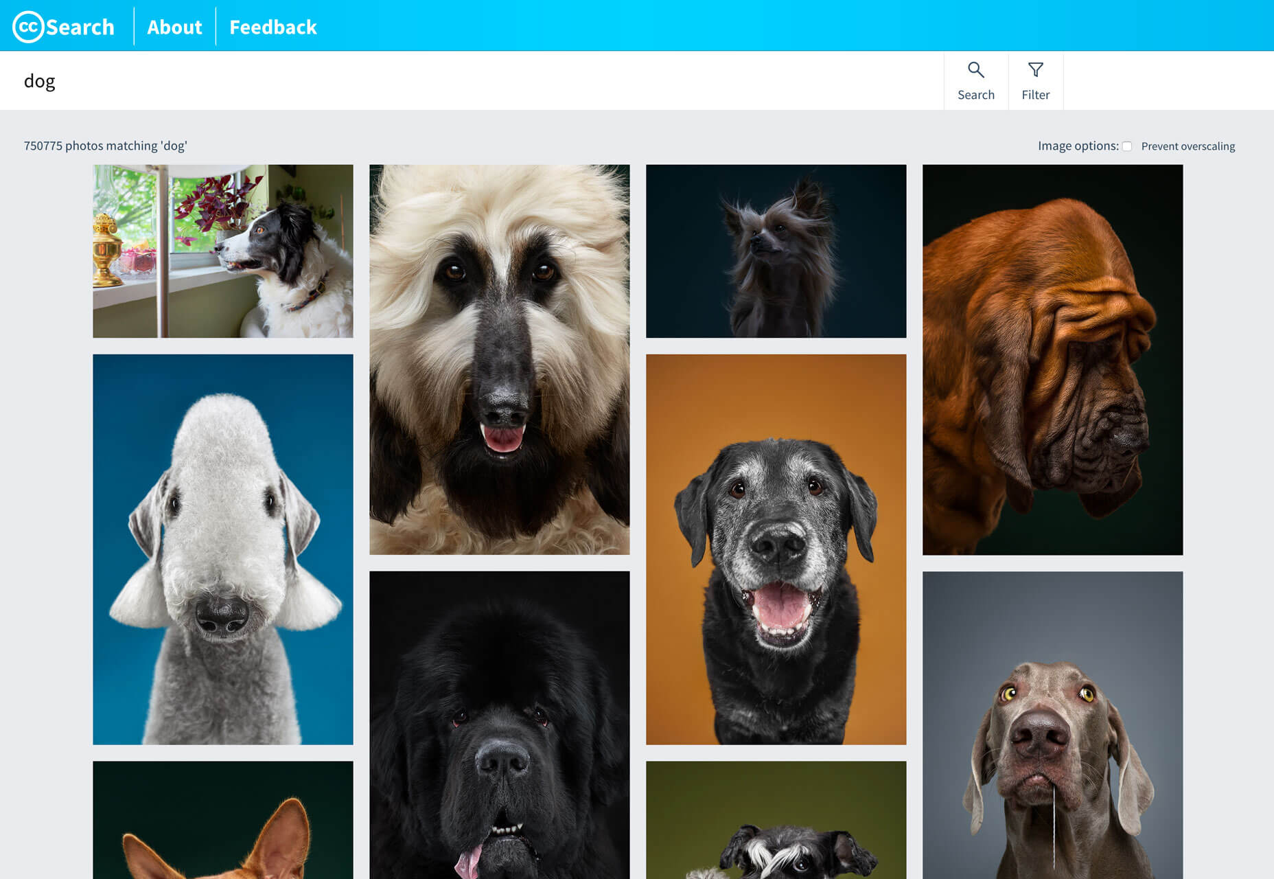
Looking for photos that you can use anywhere just got easier. Creative Commons fully launched its search engine, which can help you find photos from a database of more than 300 million images from 19 collections with easy to understand attribution rules. Creative Commons is the standard for open-source and with attribution sharing of assets. The nonprofit organization enables sharing and reuse of assets through tools and standardized licensing for creative works.

Milanote

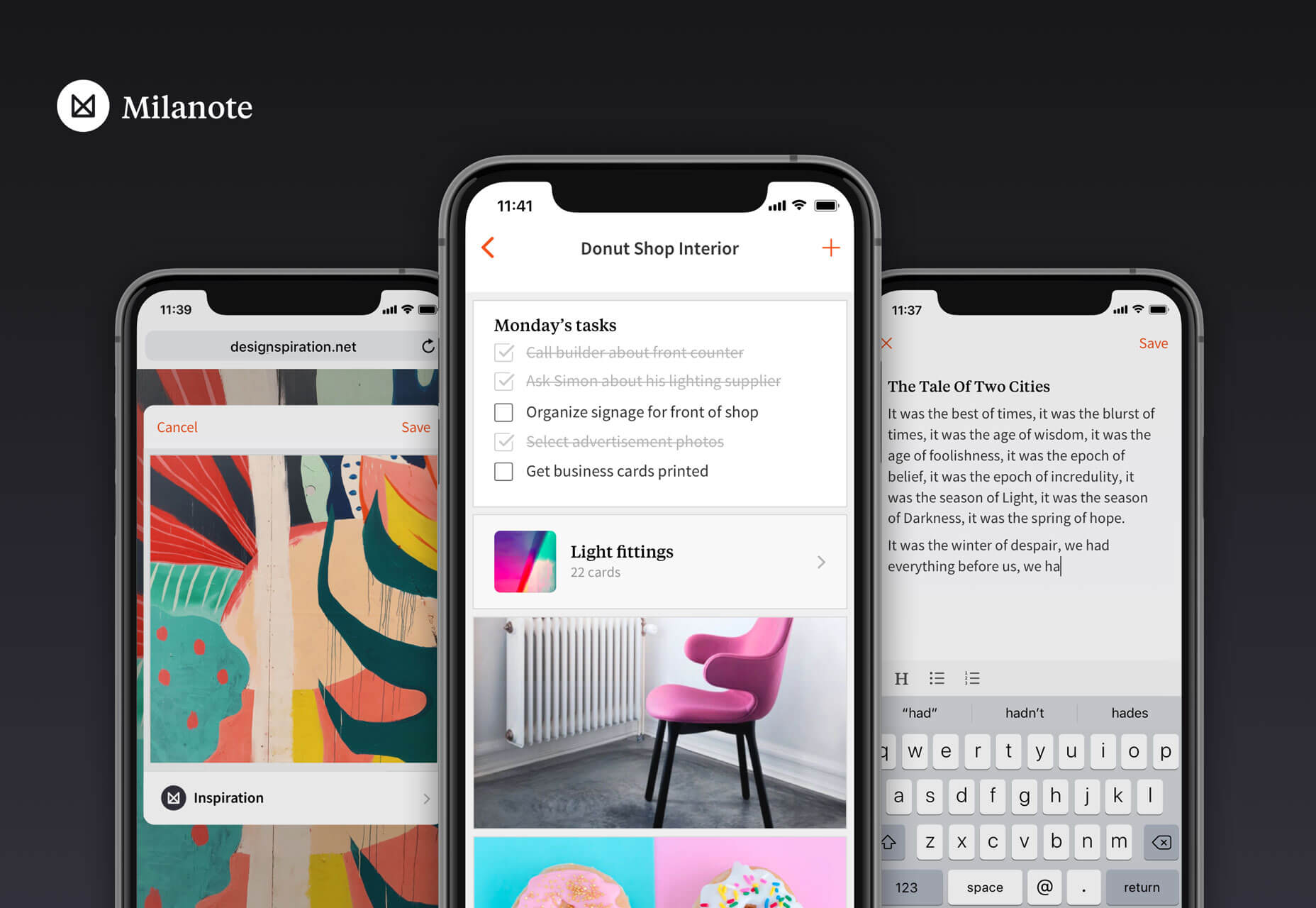
Milanote, a note taking app now has an app that integrates with the desktop tool. The app is important, and different, from other tools because of what happens when you log in on your desktop computer. Organize content into visual boards designed to feel like a wall in a creative studio. All of your notes, images, links, tasks and files can be laid out in a shareable visual workspace. It’s fast, flexible and fun to use—think Trello meets Pinterest.

FlowCV

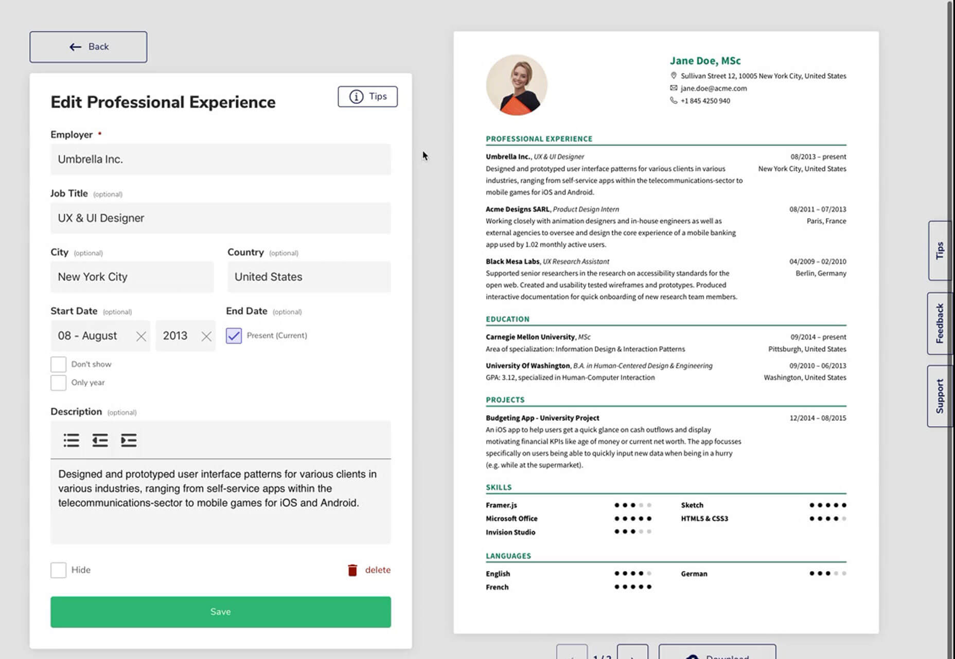
FlowCV is an online resume builder that can help you create, format and design a resume with ease. You can design it online and download a PDF for free. The biggest bonus might be prompts and resume advice packed right in to the tool.

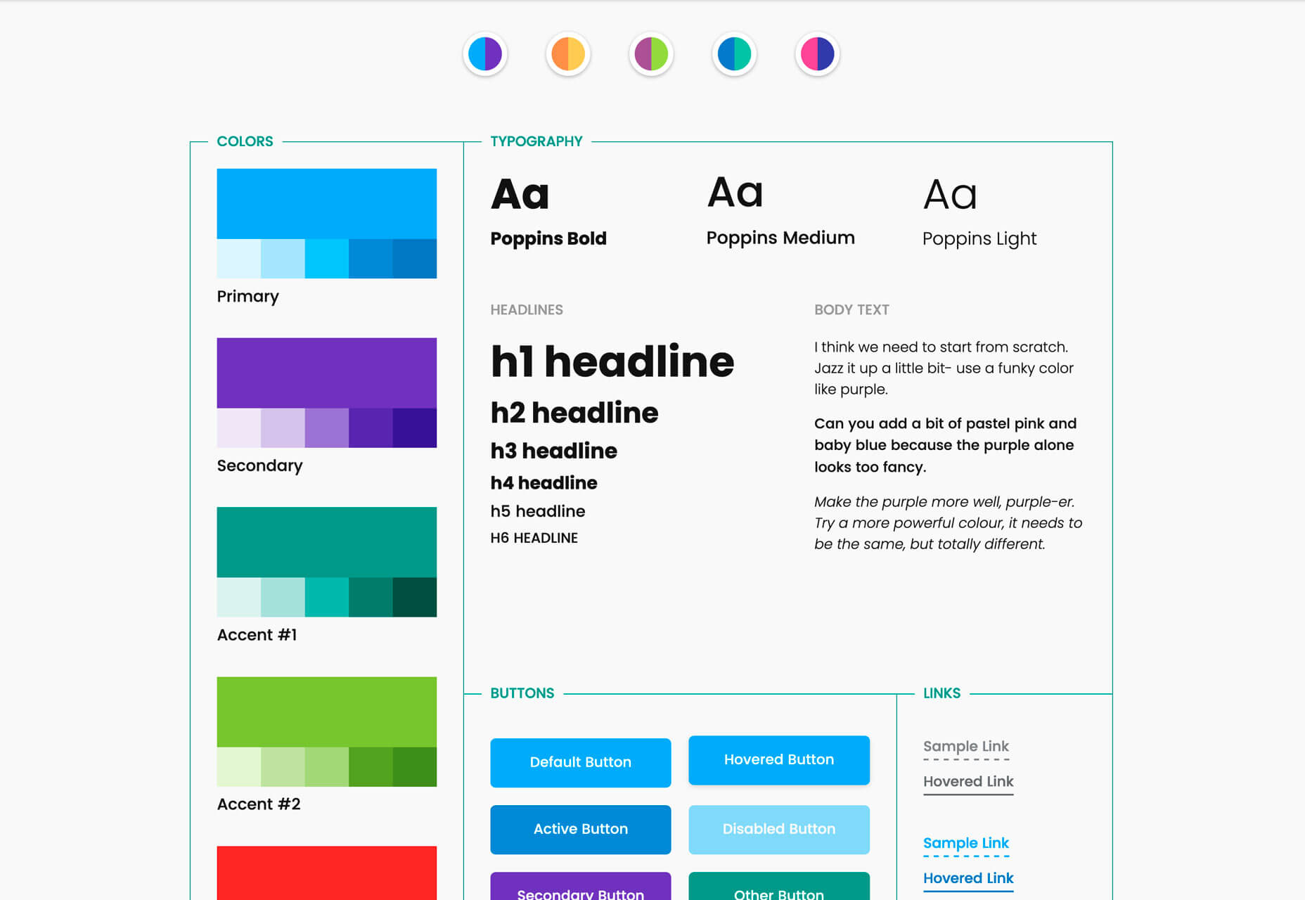
CSS Grid: Style Guide

CSS Grid: Style Guide is a beautiful example of how to create documentation. You’ll want to fork Olivia Ng’s pen.

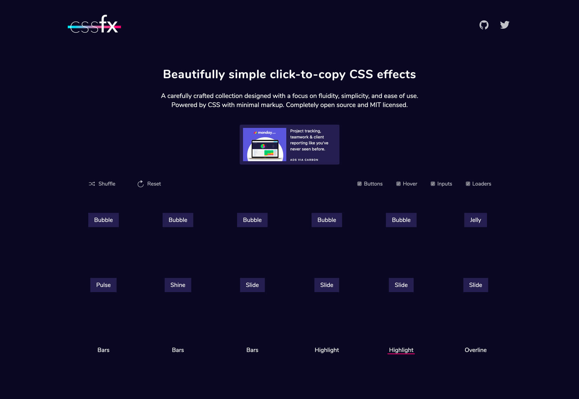
CSSfx

This collection of effects allows you to click-to-copy CSS. The collection is designed with a focus on fluidity, simplicity and ease of use with minimal markup. Every effect is open source and ready to use.

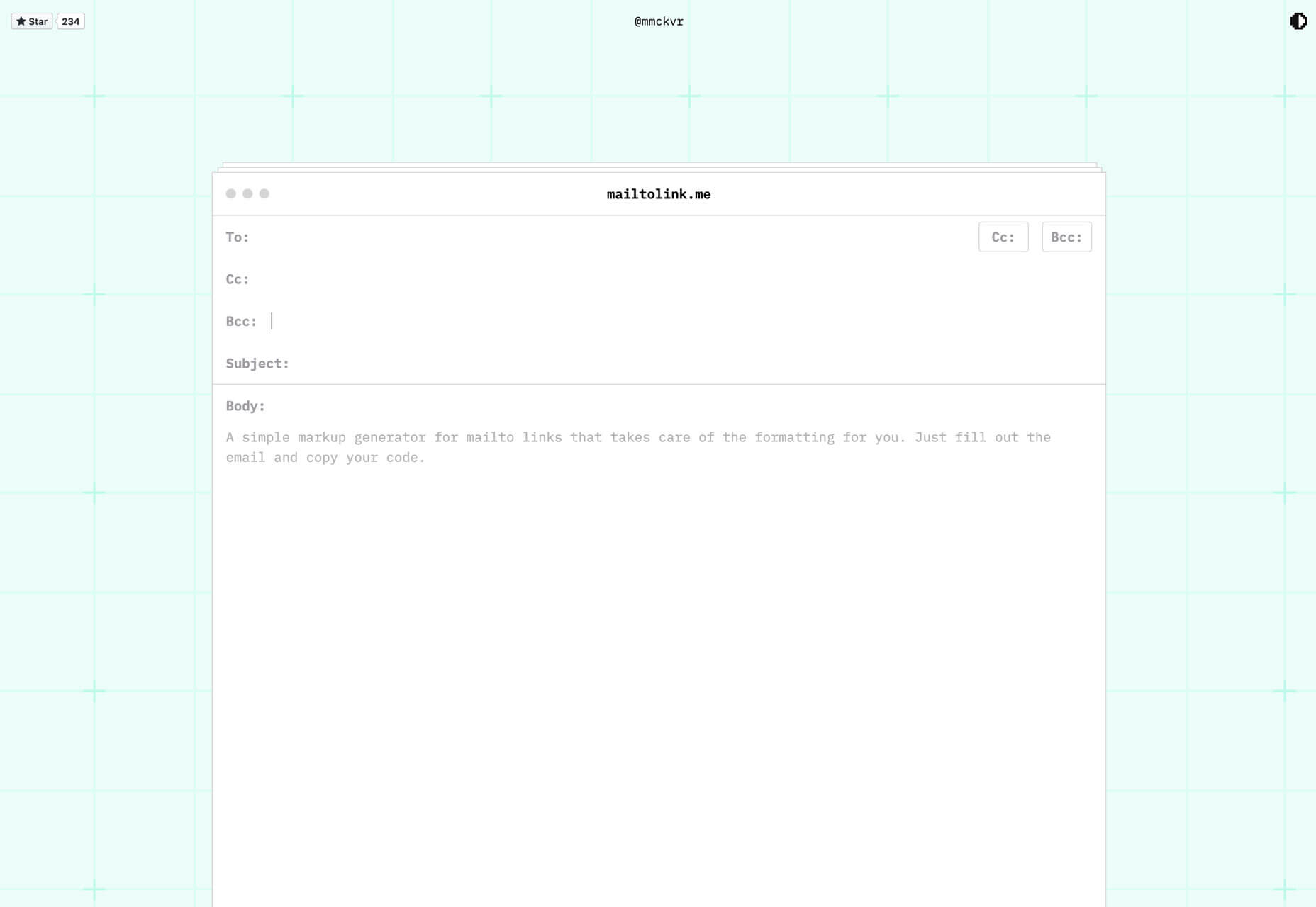
Mailtolink.me

Mailtolink.me takes all the hassle out of mailto links. Just fill in the fields and copy the code. All the markup is automatically generated.

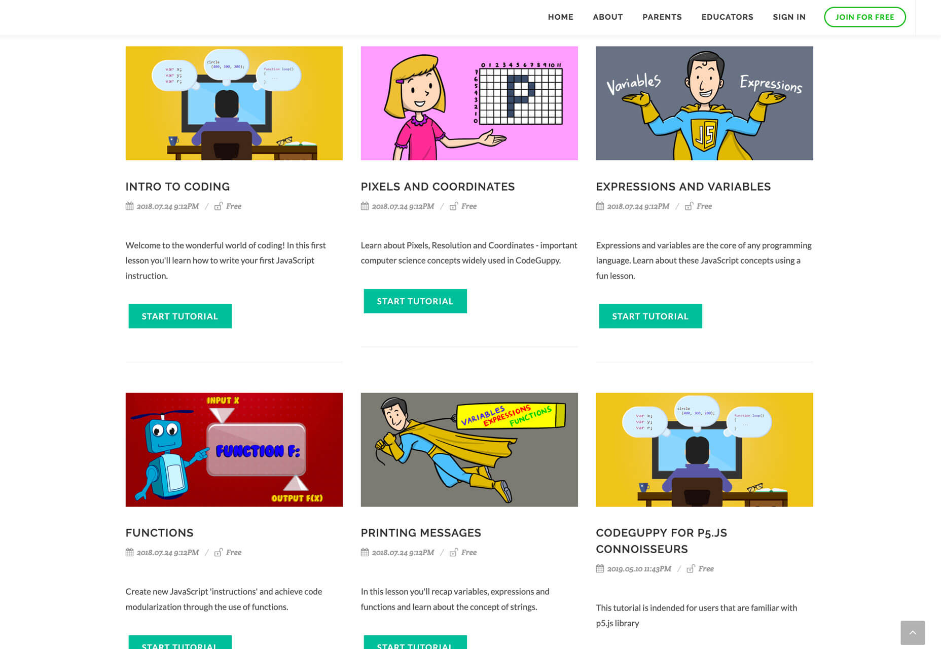
Code Guppy

Code Guppy is a collection of resources and tutorials for kids, teens and adults to learn JavaScript. You don’t have to have an account to work through tutorials in a number of categories including drawing, math, games and more.

Nicedoc.io

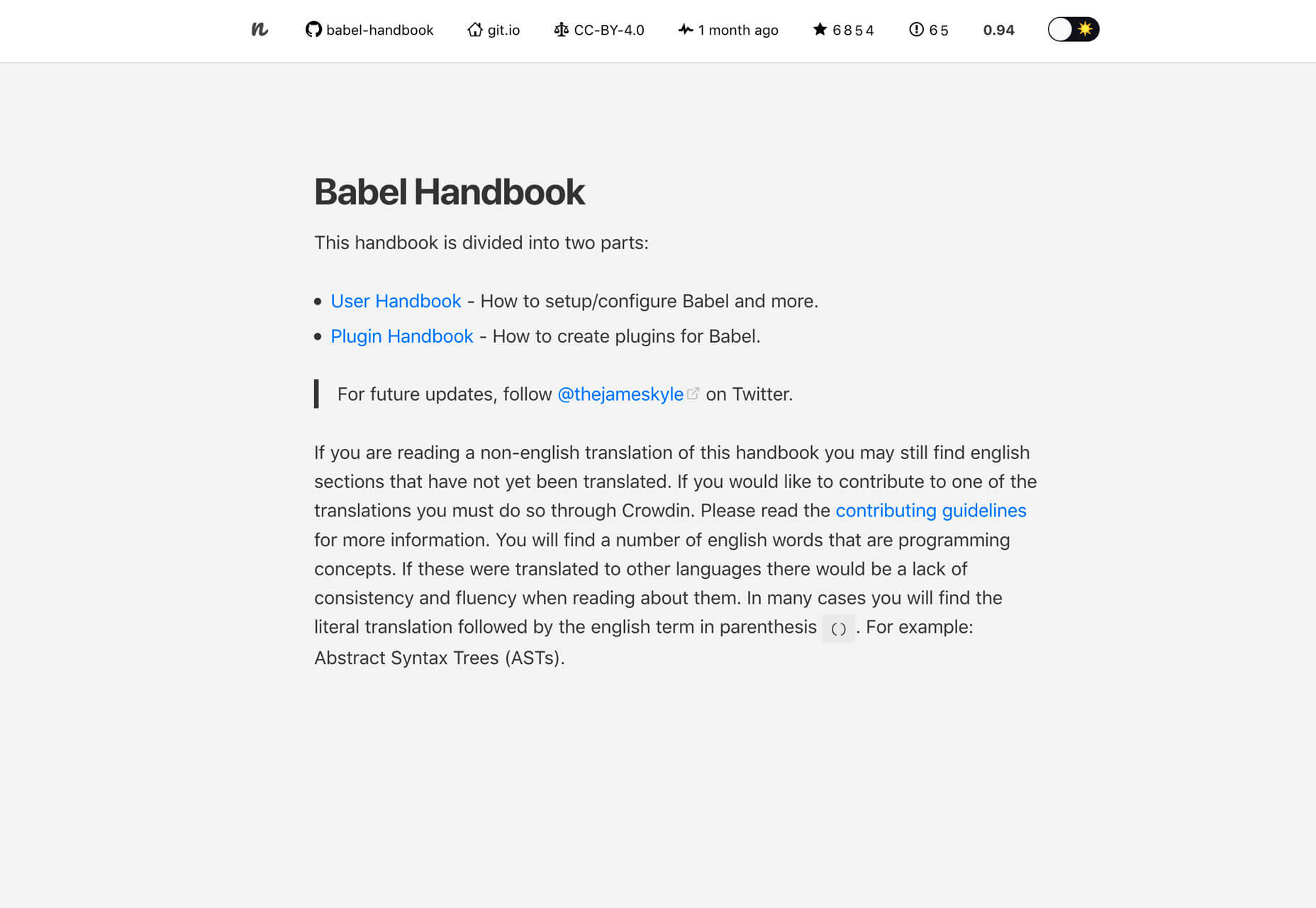
Tired of ugly readme files? Nicedoc.io is the solution. It is made to create instant and beautiful documentation for any github repository. It’s compatible with any markup format and has light and dark themes.

WebThings Gateway

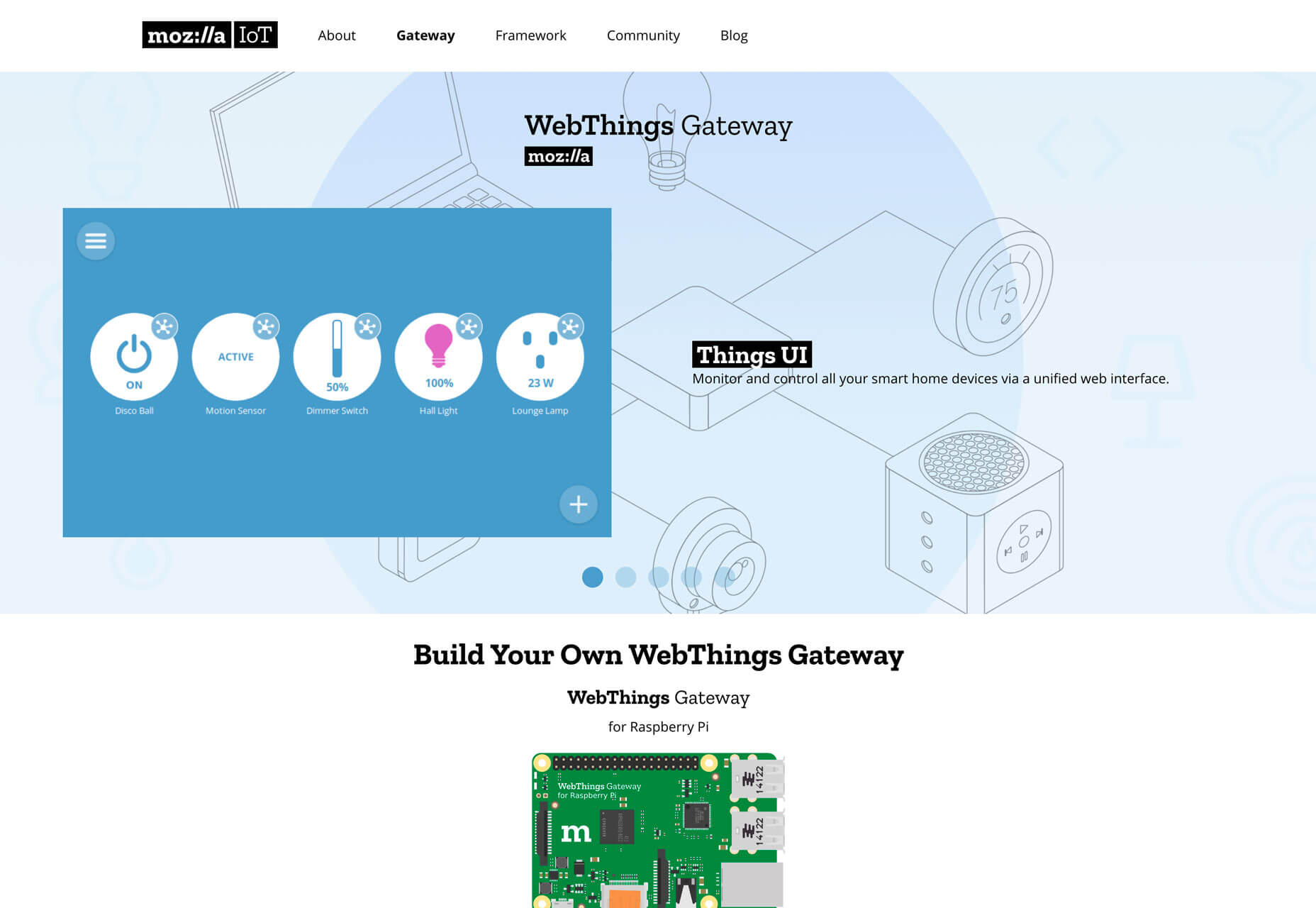
Mozilla WebThings is an open platform for monitoring and controlling devices over the web, including smart home gateways focused on privacy, security and interoperability. The associated framework is a collection of reusable software components to help you build your own “web things.”

Tutorial: Animating Links

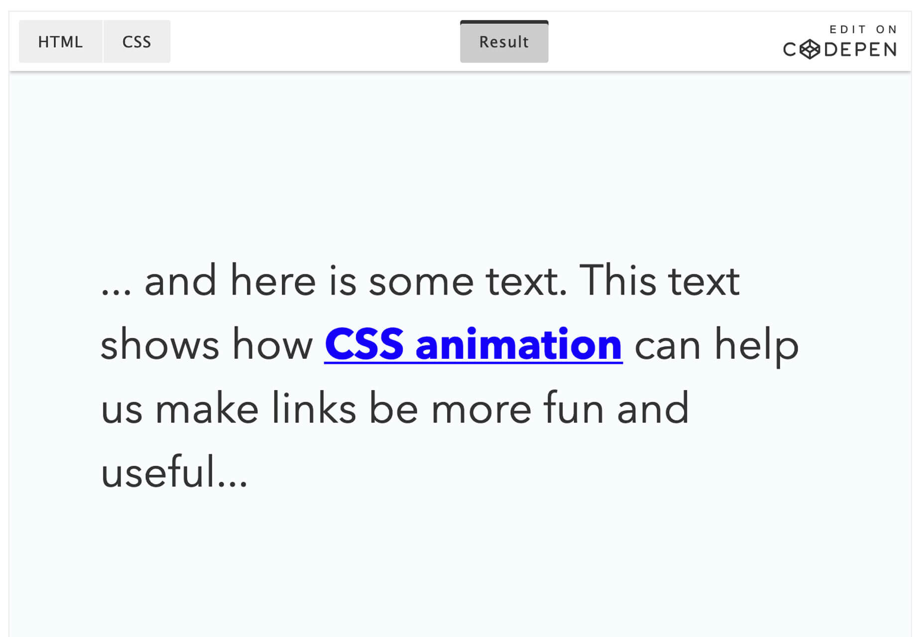
Have you ever wanted to animate a link? This tutorial from Learn CSS Animation has the solution. It will walk you through how to animate the underlines on links, combine multiple transitions, group animation keyframes and look at the pros and cons of using animations in this space.

Editor.js

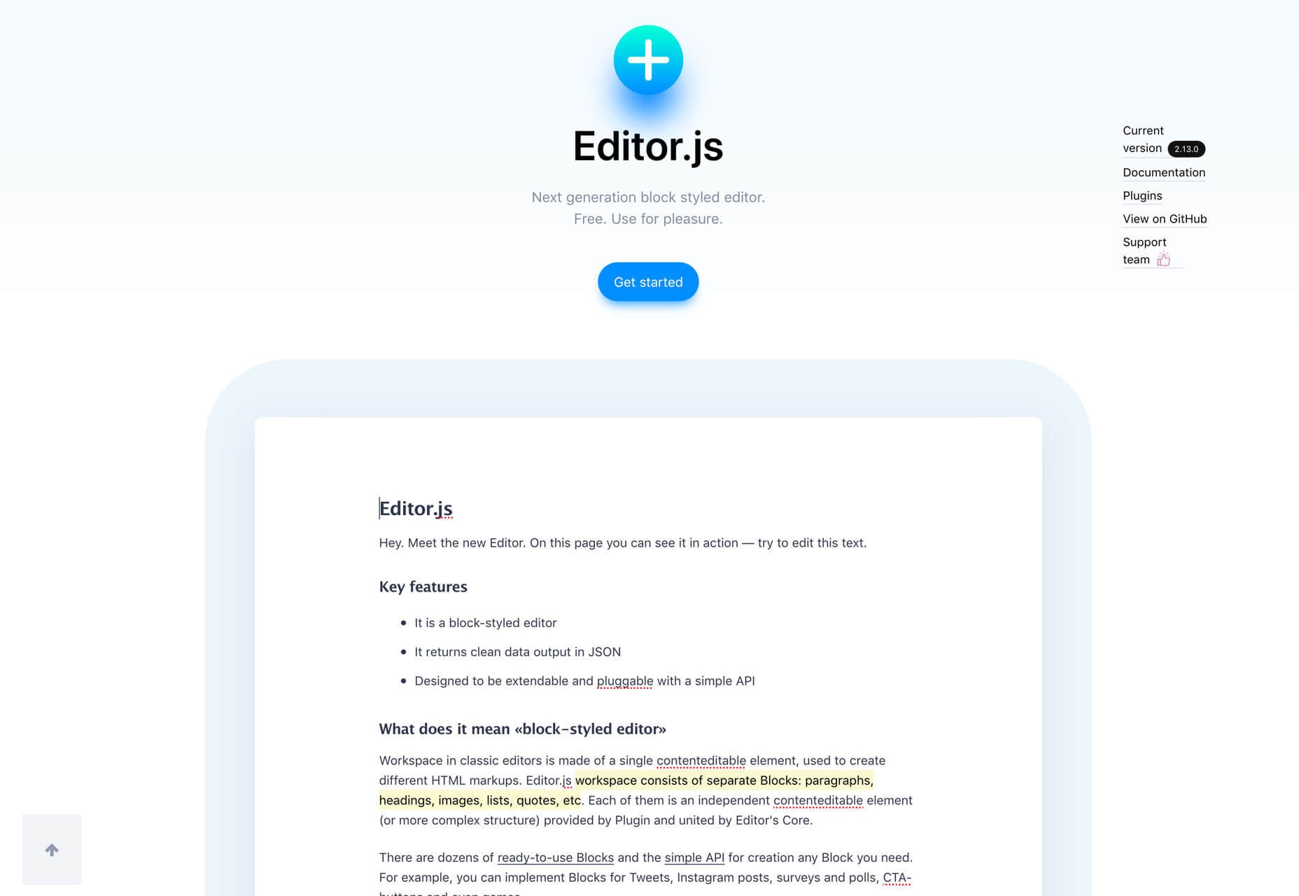
Editor.js is a free block-style editor. From the developr:

Workspace in classic editors is made of a single contenteditable element, used to create different HTML markups. Editor.js workspace consists of separate Blocks: paragraphs, headings, images, lists, quotes, etc. Each of them is an independent contenteditable element (or more complex structure) provided by Plugin and united by Editor’s Core.

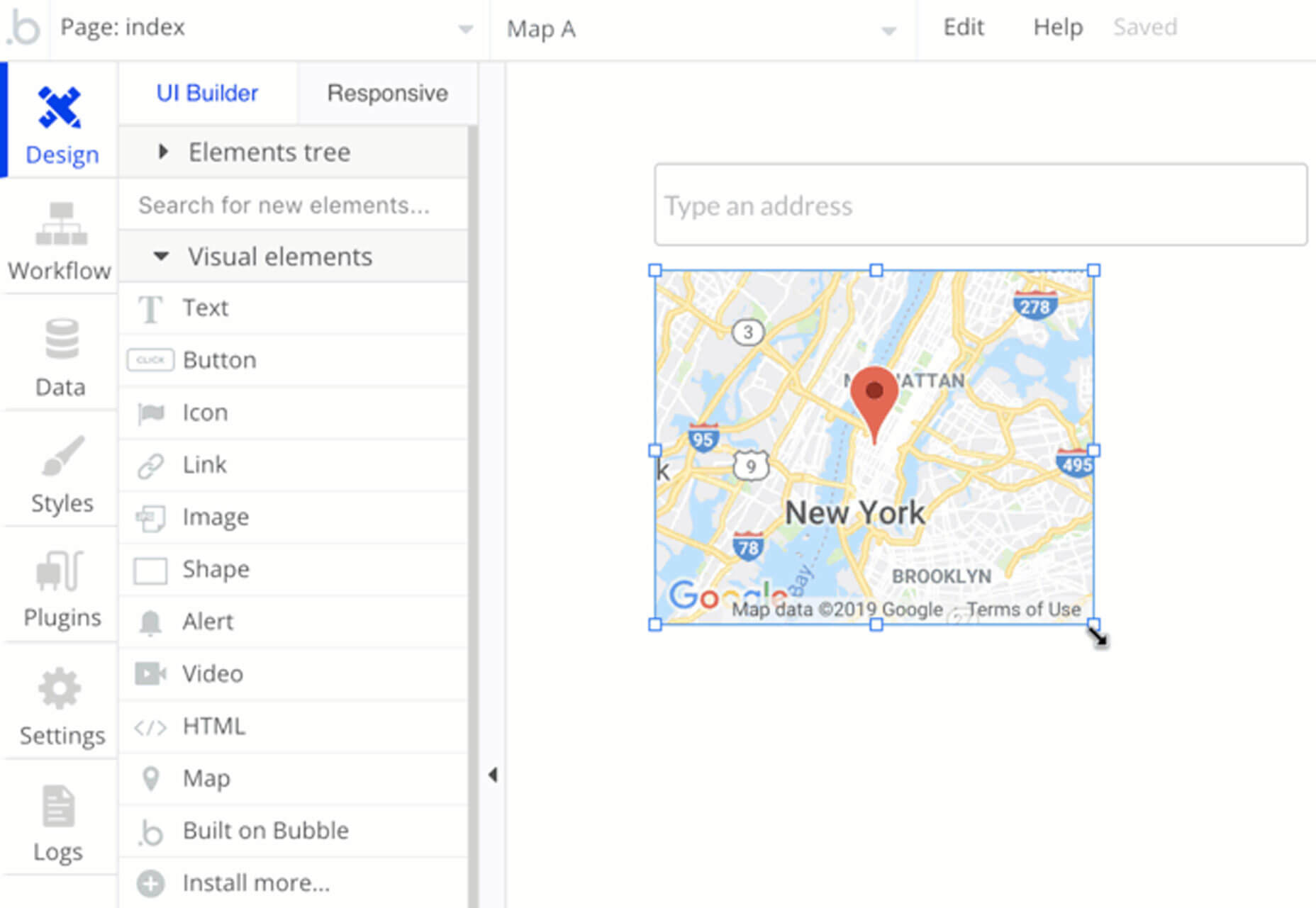
Bubble

Bubble allows non-coders to build software. It’s a code-free programming language that lets you create web applications. The tool includes free and premium plans and include everything you need to create and host a responsive web app with drag and drop tools.

Google Duplex

Google Duplex is an AI assistant that can talk to humans to get what you need. Powered by Google’s AI and tucked into Google Assistant, you’ll be able to book reservations or schedule haircuts in seconds. The system makes the conversational experience as natural as possible, allowing people to speak normally, like they would to another person, without having to adapt to a machine.

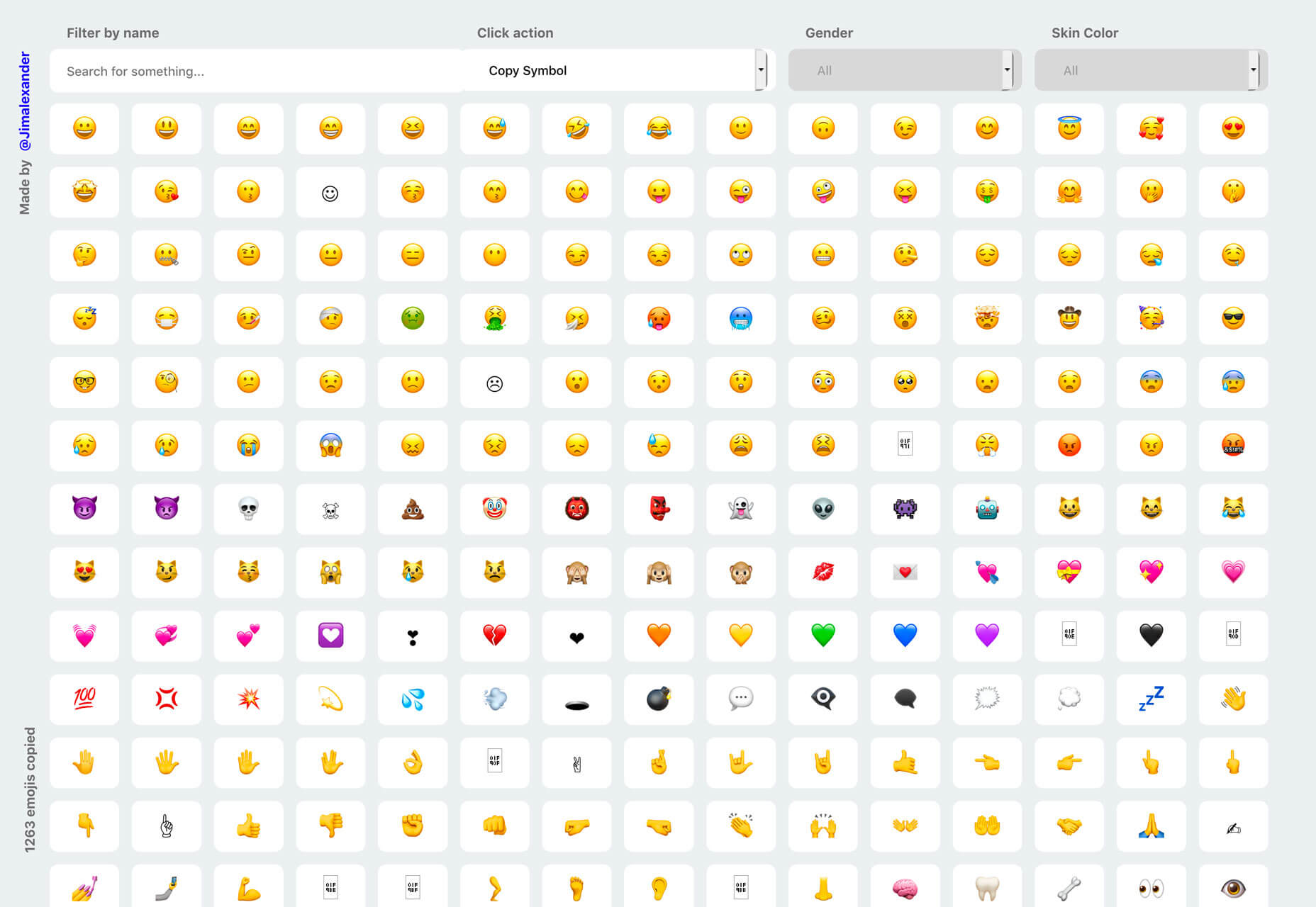
Emojim

Search emojis and click to copy to your keyboard for easy pasting in documents, mockups, blogs or social media websites. Emojim‘s essentially an emoji keyboard for your desktop and it’s amazingly easy to use.

City Life Icons

City Life icons is a fun set of vector shapes in SVG and PNG format. The icon pack includes 50 designs in full color and line styles. Use them in digital or print applications.

Developer Survey Results

Stack Overflow surveyed over 90,000 developers to find out how they learn and “level up,” what tools they use and what they think about the industry. Top takeaways include Python is growing as a most-loved programming language, half of respondents were writing code before age 16 and devops specialists are among the highest paid positions.

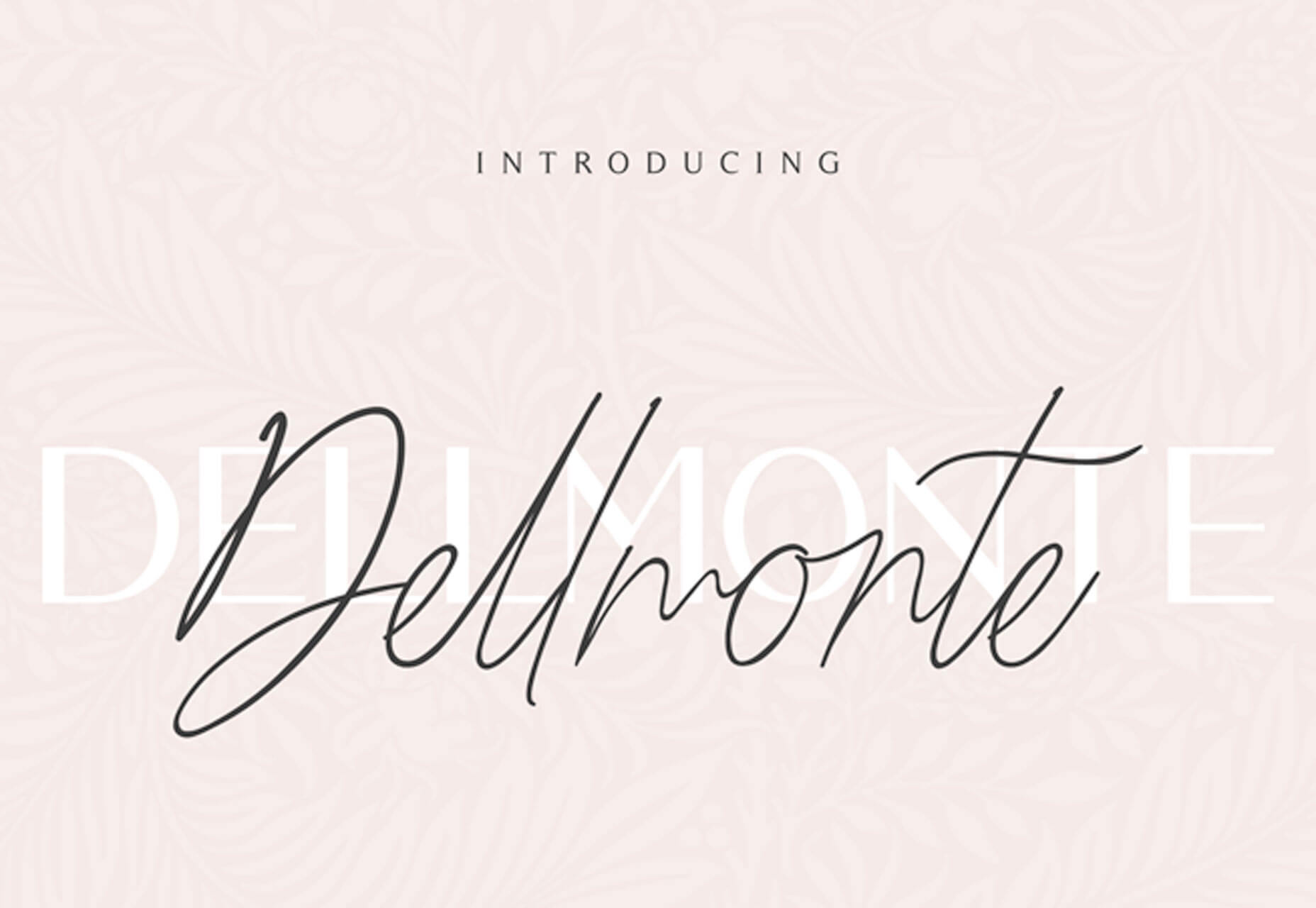
Dellmonte Sans

Dellmonte Sans is an elegant uppercase display font. It includes letters, numerals and some punctuation.

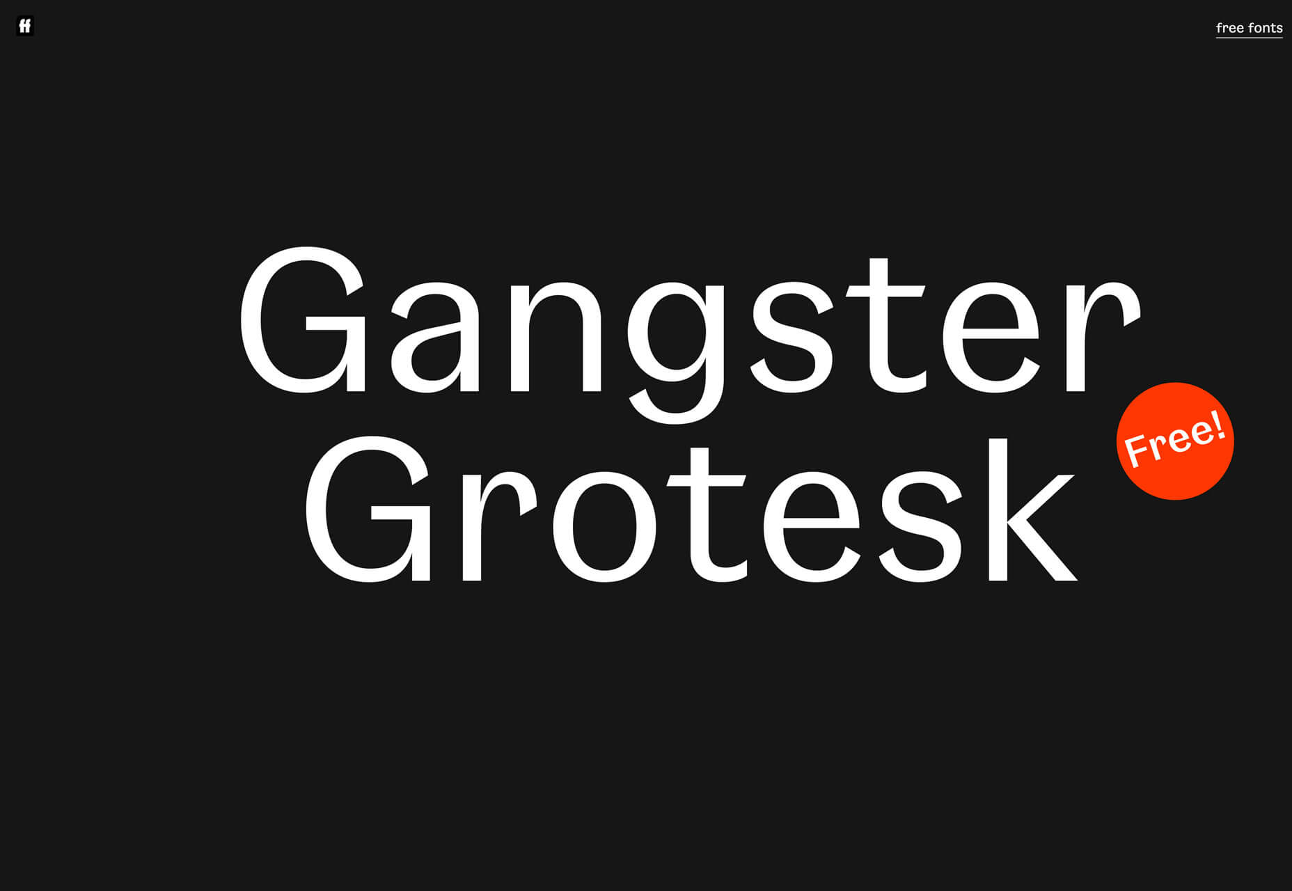
Gangster Grotesk

According to the designer: “Nodding to its historical roots in the 1920s, Gangster Grotesk is a contemporary typeface that combines a sharp contrast with angled terminal strokes that curve inward ever so slightly. These elements are simple but effective, lending the typeface character while being practically invisible at small sizes.” It includes a full character set with light, regular, bold and alternate options. The font is free with newsletter signup.

Ohio Script

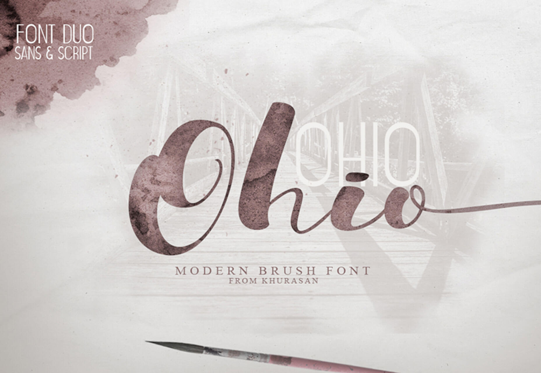
Ohio Script is a modern brush typeface with a full set of upper- and lowercase letters. The script is free for personal use and you can buy the paired sans serif.

Pondspell

Pondspell is a brush typeface, with a handwriting style that is made with a natural brush or marker. The free version includes only letters. The design is flowy with connected characters and interesting strokes.

Public Sans

Public Sans is the font integrated with the design system of the United States government. The simple sans serif is strong and neutral and includes multiple weights with a full character set for pretty much all text uses online.

Add Realistic Chalk and Sketch Lettering Effects with Sketch’it – only $5!

Source

Categories: Designing, Others Tags:

Popular Design News of the Week: May 6, 2019 – May 12, 2019

May 12th, 2019 No comments

Every week users submit a lot of interesting stuff on our sister site Webdesigner News, highlighting great content from around the web that can be of interest to web designers.

The best way to keep track of all the great stories and news being posted is simply to check out the Webdesigner News site, however, in case you missed some here’s a quick and useful compilation of the most popular designer news that we curated from the past week.

Note that this is only a very small selection of the links that were posted, so don’t miss out and subscribe to our newsletter and follow the site daily for all the news.

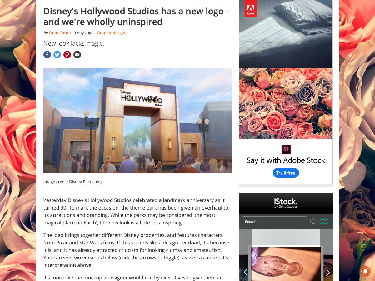
Disney’s Hollywood Studio has a New Logo – And We’re Wholly Uninspired

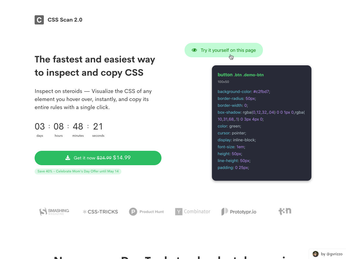
CSS Scan 2.0 — Instantly Check or Copy Computed CSS of any Element on the Internet

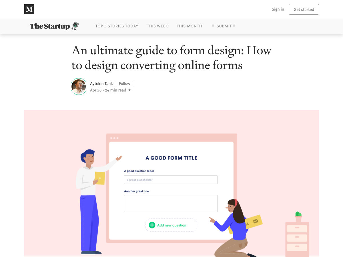
An Ultimate Guide to Form Design

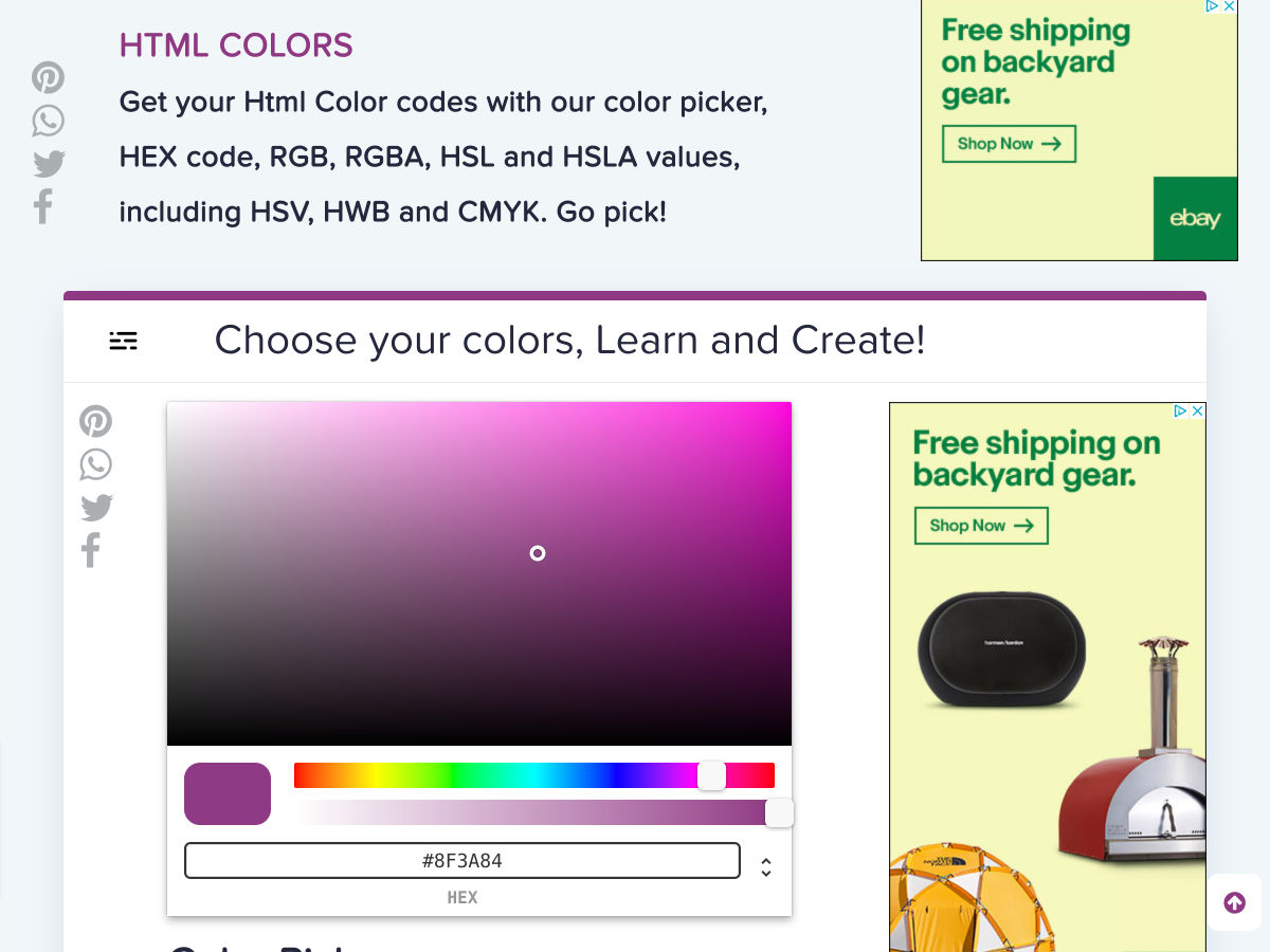
Html Colors

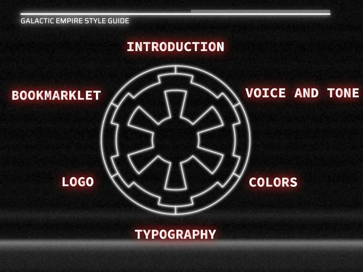
A Styleguide for the Galactic Empire

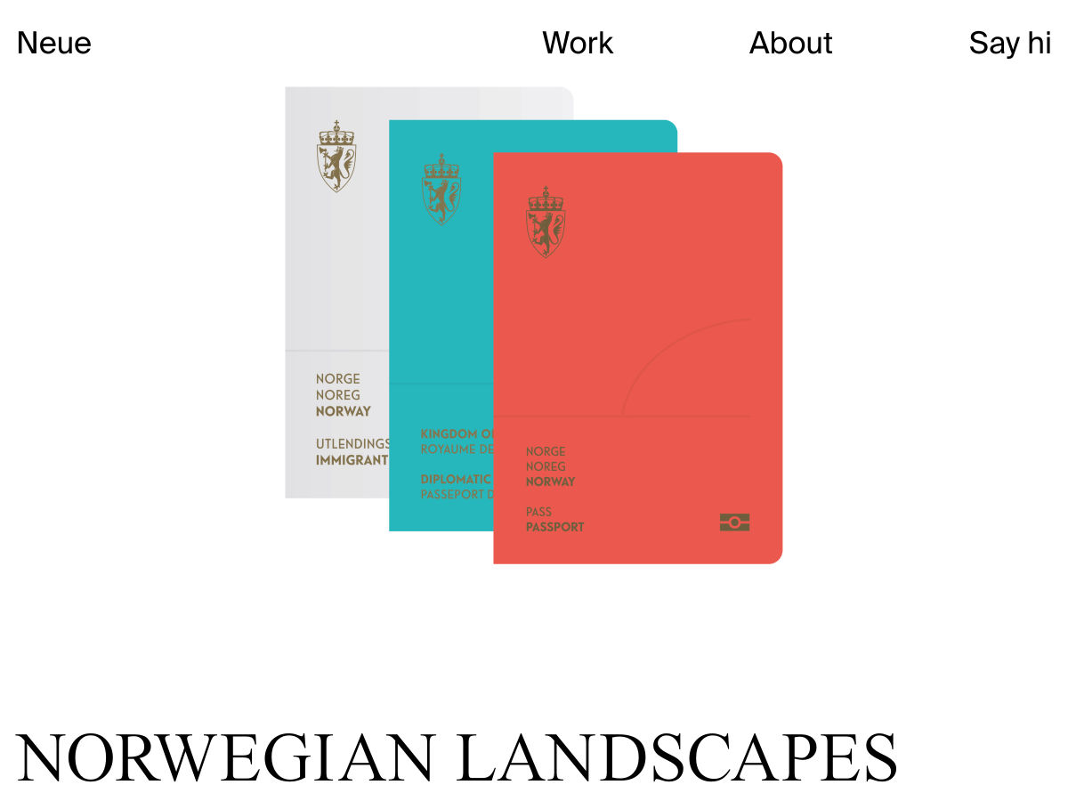
Norwegian Passports Design

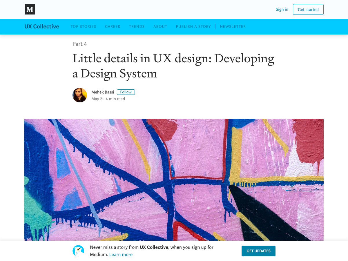
Little Details in UX Design: Developing a Design System

Thanos: Super-Villain and Terrible Designer

Ecommerce Cart Design Best Practices

Debugging CSS Grid

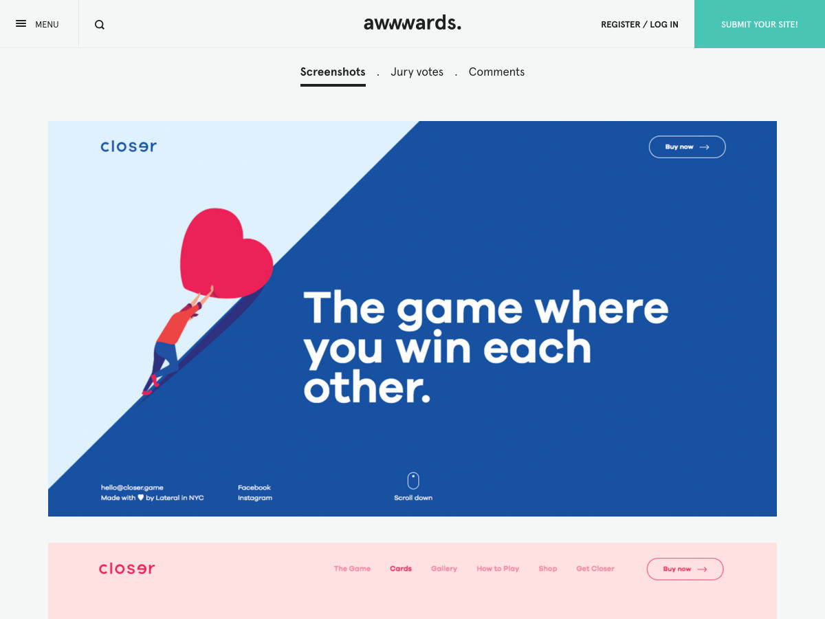
Site Design: Closer Cards

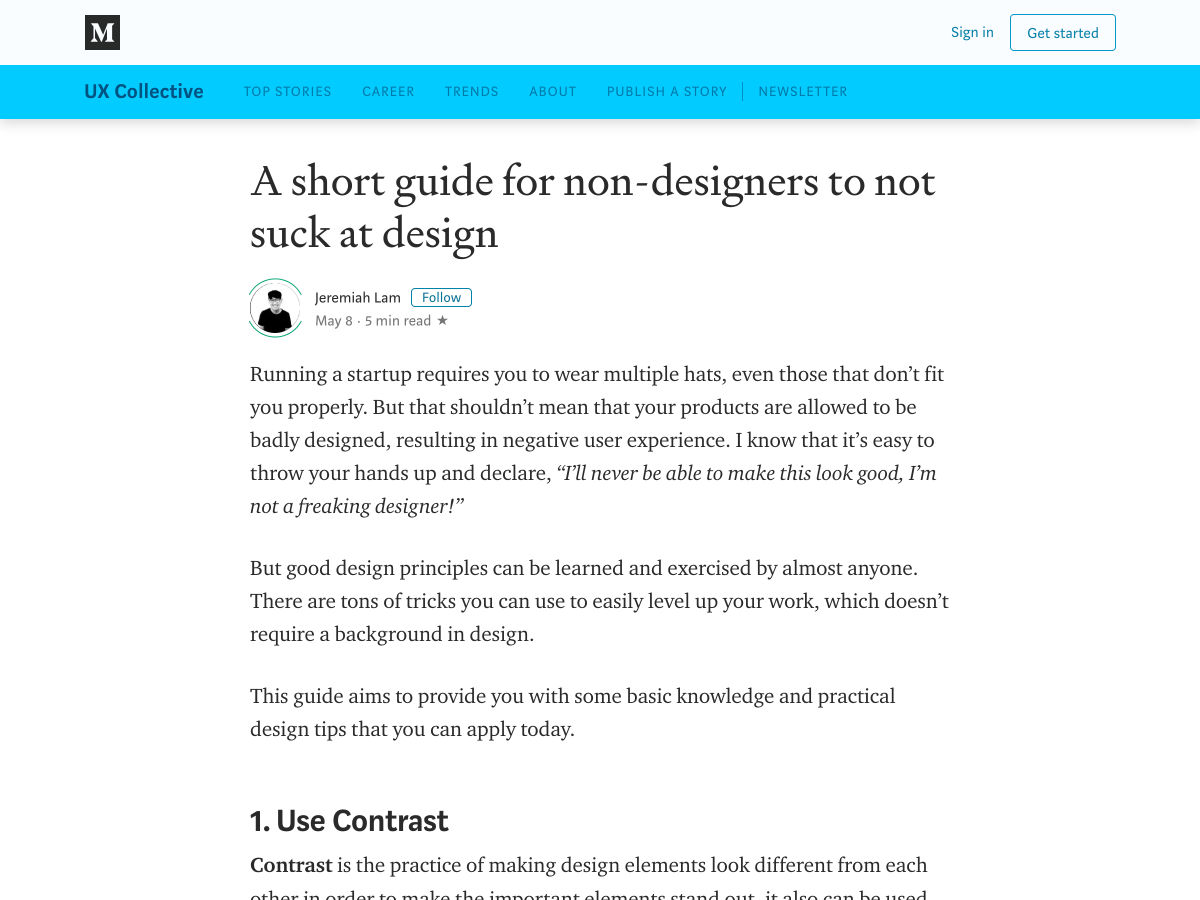
A Short Guide for Non-designers to not Suck at Design

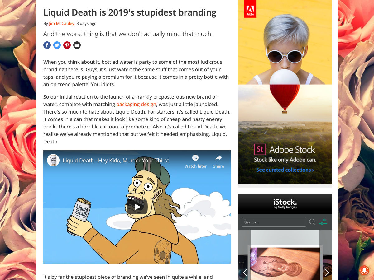
Liquid Death is 2019’s Stupidest Branding

The Vandalisation of UX

Consider Margin

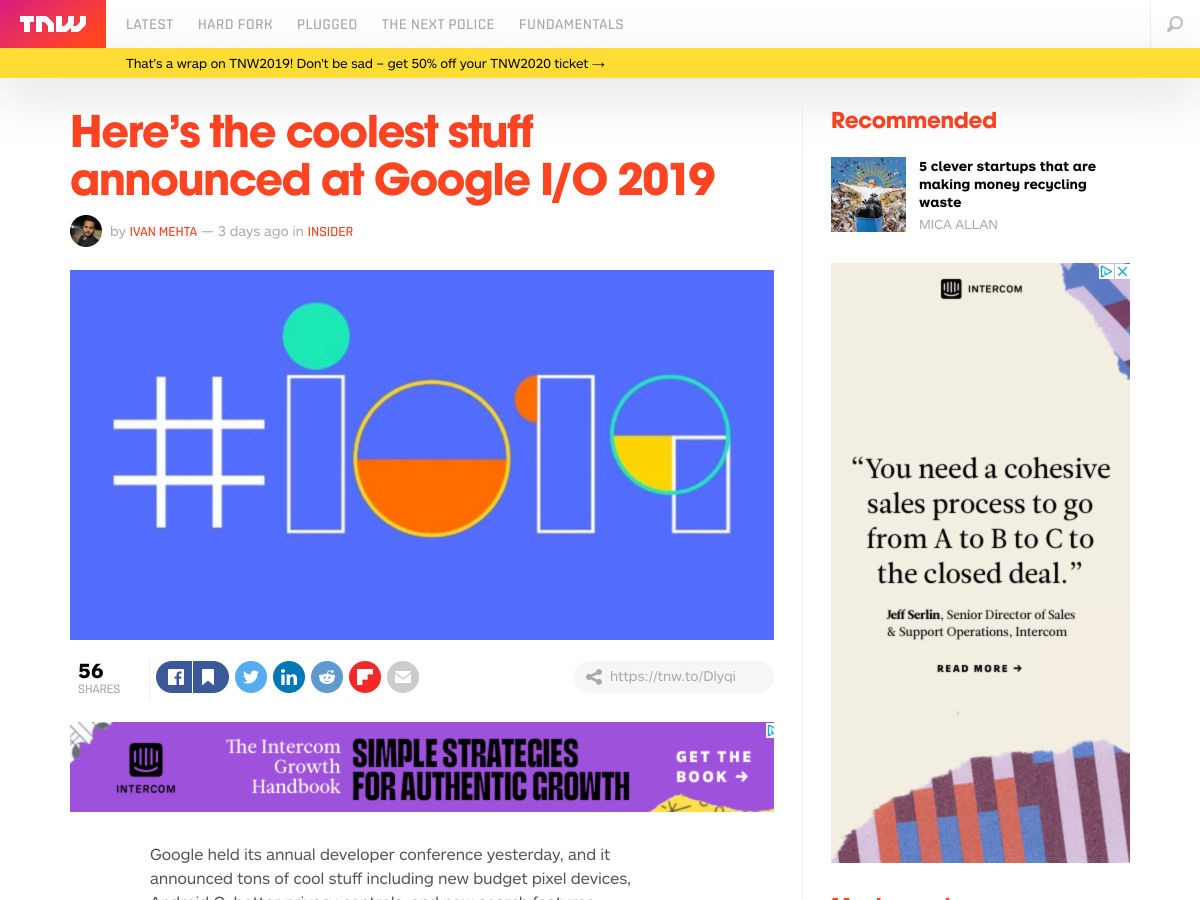
Here’s the Coolest Stuff Announced at Google I/O 2019

Figma Plus

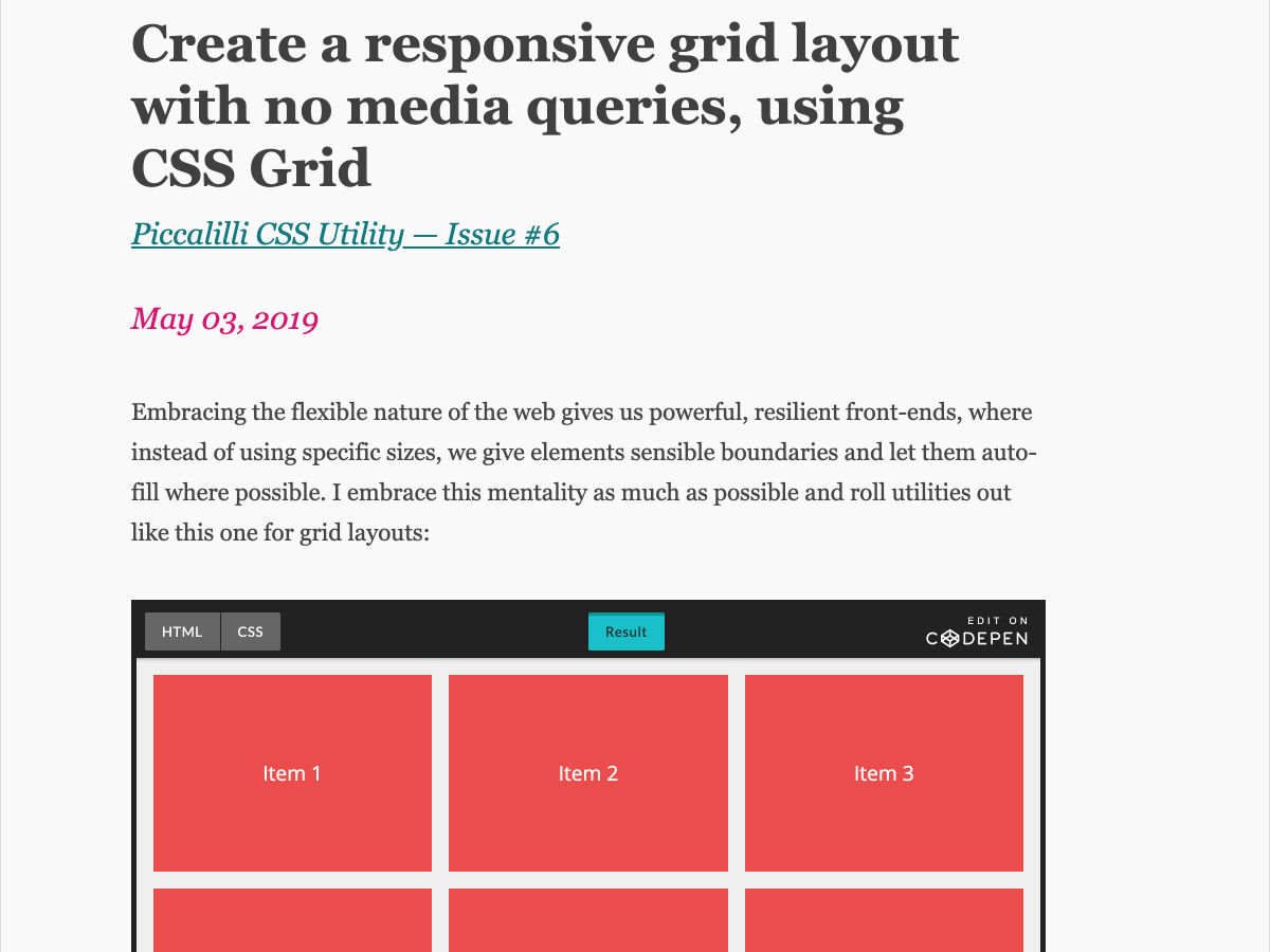
Create a Responsive Grid Layout with no Media Queries, Using CSS Grid

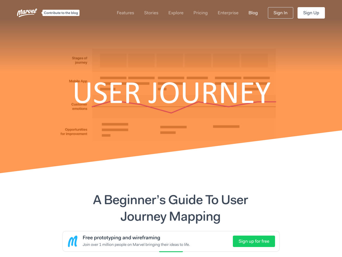
A Beginner’s Guide to User Journey Mapping

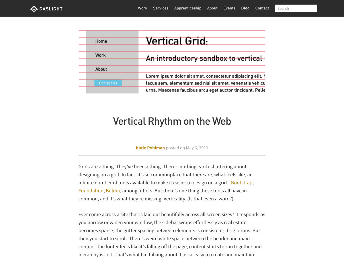
Vertical Rhythm on the Web

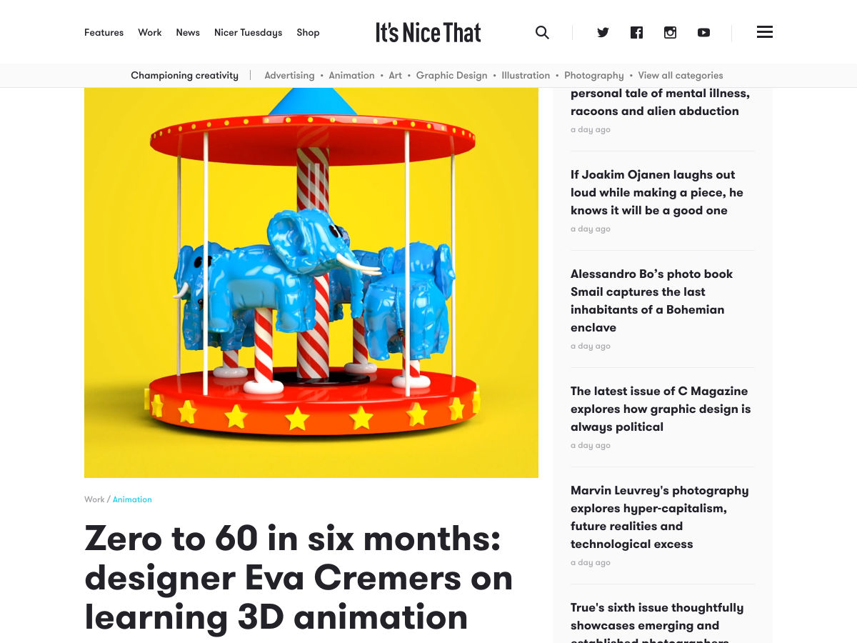
Zero to 60 in Six Months: Designer Eva Cremers on Learning 3D Animation

Color Palettes

Why Agile Doesn’t Work

Typography in Design Systems

FOUND COLOR · Schemes for Web and UI

Want more? No problem! Keep track of top design news from around the web with Webdesigner News.

Add Realistic Chalk and Sketch Lettering Effects with Sketch’it – only $5!

Source

Categories: Designing, Others Tags:

Deploying a Client-Side Rendered create-react-app to Microsoft Azure

May 10th, 2019 No comments

Deploying a React app to Microsoft Azure is simple. Except that… it isn’t. The devil is in the details. If you’re looking to deploy a create-react-app — or a similar style front-end JavaScript framework that requires pushState-based routing — to Microsoft Azure, I believe this article will serve you well. We’re going to try to avoid the headaches of client and server side routing reconciliation.
First, a quick story.

Back in 2016, when Donovan Brown, a Senior DevOps Program Manager at Microsoft, had given a “but it works on my machine speech” at Microsoft Connect that year, I was still in my preliminary stages as a web developer. His talk was about micro-services and containers.

[…] Gone are the days when your manager comes running into your office and she is frantic and she has found a bug. And no matter how hard I try, I can’t reproduce it and it works perfectly on my machine. She says: fine Donovan, then we are going to ship your machine because that is the only place where it works. But I like my machine, so I’m not going to let her ship it…

I had a similar sort of challenge, but it had to do with routing. I was working on a website with a React front end and ASP.NET Core back end, hosted as two separate projects that were deployed to Microsoft Azure. This meant we could deploy both apps separately and enjoy the benefits that comes with separation of concern. We also know who to git blame if and when something goes wrong. But it had downsides as well, as front-end vs. back-end routing reconciliation was one of those downsides.

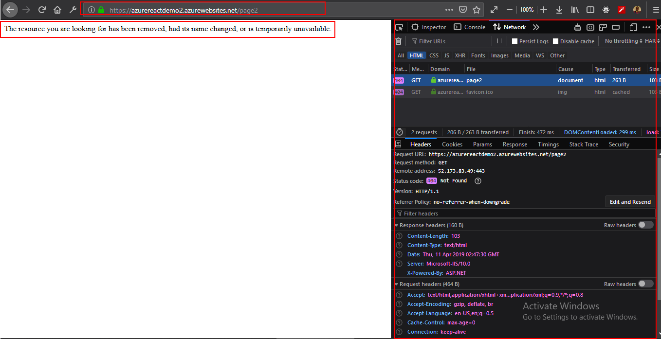
One day I pushed some new code to our staging servers. I received a message shortly after telling me the website was failing on page refresh. It was throwing a 404 error. At first, I didn’t think it was my responsibility to fix the error. It had to be some server configuration issue. Turns out I was both right and wrong.

I was right to know it was a server configuration issue (though at the time, I didn’t know it had to do with routing). I was wrong to deny it my responsibility. It was only after I went on a web searching rampage that I found a use case for deploying a create-react-app to Azure under the Deployment tab on the official documentation page.

Building React for production

When building a React app for production (assuming we’re are using create-react-app), it’s worth noting the folders that get generated. Running npm run build will generate a build folder where an optimized static version of the application lives. To get the application on a live server, all we need do is feed the server the content of the build folder. If we were working on localhost, there is no live server involved, so it is not always equivalent to having the application on a live server.

Generally, the build folder will have this structure:

→ build
  → static
    → css
      → css files
    → js
      → js files
    → media
      → media files
  → index.html
  → other files...

Client-side routing with React Router

React Router uses the HTML5 pushState history API internally. What pushState does is quite interesting. For example, navigating (or using Link in react router) from the page https://css-tricks.com to the page https://css-tricks.com/archives/ will cause the URL bar to display https://css-tricks.com/archives/ but won’t cause the browser to load the page /archives or even check that it exists. Couple this with the component-based model of React, it becomes a thing to change routes while displaying different pages based on those routes — without the all-seeing eye of the server trying to serve a page in its own directory. What happens, then, when we introduce servers by pushing the code to a live server? The docs tell it better:

If you use routers that use the HTML5 pushState history API under the hood (for example, React Router with browserHistory), many static file servers will fail. For example, if you used React Router with a route for /todos/42, the development server will respond to localhost:3000/todos/42 properly, but an Express serving a production build as above will not. This is because when there is a fresh page load for a /todos/42, the server looks for the file build/todos/42 and does not find it. The server needs to be configured to respond to a request to /todos/42 by serving index.html.

Different servers require different configuration. Express, for example, requires this:

app.get('*', (req, res) => {
  res.sendFile(path.resolve(__dirname, 'client', 'build', 'index.html'));
});

as documented in the create-react-app docs. Keep in mind though, this assumes that we’re hosting create-react-app at the server root, which is making use of a wildcard route (*) that catches all route and respond to all route request by serving the index.html file in the build folder which sits at the root of the server application. Also, this is tightly coupled with the back-end. If that’s the case, we would most likely have this kind of folder structure (assuming the back-end is in NodeJS):

→ Server
  → Client (this is where your react code goes)
    → build (this is the build folder, after you npm run build)
    → src
    → node_modules
    → package.json
    → other front-end files and folders
  → Other back-end files and folders

Since my front-end (create-react-app) and back-end (ASP.NET) were two different projects, serving static files by navigating the directory was sort of an impossibility.

In fact, since we are deploying a static app, we do not need the back-end. As Burke Holland put it: “Static” means that we aren’t deploying any server code; just the front-end files.

I keep mentioning ASP.NET here because during the course of my research, I figured configuring Azure required a configuration file in a wwwroot folder and ASP.NET’s folder structure typically has a wwwroot folder. Remember the application’s back-end was in ASP.NET? But that’s just about it. The wwwroot folder seemed to be hidden somewhere on Azure. And I can’t show you without deploying a create-react-app. So let’s go do that.

Getting started with App Services on Microsoft Azure

To get started, if you do not already have a Azure account, get a free trial then head over to the Azure portal.

  1. Navigate to All services ? Web ? App Services
    Navigating on the Azure portal from All services, to Web, to App services

  2. We want to add a new app, give it a name, subscription (should be free if you’re on a free trial, or if you already have one), resource group (create one or use existing), then click on the Create button down at the bottom of the panel.
    Creating a new App service on the Azure portal.
  3. We should get a notification that the resource has been created. But it won’t immediately show up, so hit “Refresh” — I have other resources, but the AzureReactDemo2 is what I’m using here. You’ll click on the name of your newly created app, which is AzureReactDemo2 in my case.
    Displaying all App Services on the Azure portal.
  4. The blade shows you information about your app, the navigation to the left has everything you need to manage your application (overview, activity log, deployment center…).

For example, the Deployment Center is where the app deployment is managed, Slots is where things like staging, production, test are managed. Configuration is where things like environmental variables, node versions and — an important one — Kudu are managed.

The overview screen shows a general view of the application Status, URL… Click on the URL to see the live site.

Showing the various parts of an App Service on the Azure CLI.

The app is up and running!

Showing the default live page of an App Service.

What we’ve done is create a new App Service, but we have none of our code on Azure yet. As said earlier, all we need to do is to feed Azure the content of the build folder generated by building React for production, but we don’t have one yet. So let’s go local and get some React app.

Going local

We need to create a new React app, and install react-router as a dependency.

npx create-react-app azure-react-demo
cd azure-react-demo

We also want to install react-router (react-router-dom, actually)

npm i react-router-dom

All things being equal, starting the app with npm start, we should get the default page.

Showing the default page generated by React.

Because this will be about testing routes, I needed to make some pages. I’ve modified my local version and uploaded it to GitHub. I’m banking on the fact that you can find your way around react and react-router. Download a demo.

My folder looks like this:

Showing the folders and files in the modified create-react-app app.

The changed files have the following code:

// App.js
import React, { Component } from "react";
import "./App.css";
import Home from "./pages/Home";
import Page1 from "./pages/Page1";
import Page2 from "./pages/Page2";
import { BrowserRouter as Router, Switch, Route } from "react-router-dom";

class App extends Component {
  render() {
    return (
      <Router>
        <Switch>
          <Route exact path="/" component={Home} />
          <Route path="/page1" component={Page1} />
          <Route path="/page2" component={Page2} />
        </Switch>
      </Router>
    );
  }
}

export default App;
// Page1.js
import React from "react";
import { Link } from "react-router-dom";

const Page1 = () => {
  return (
    <div className="page page1">
      <div className="flagTop" />
      <div className="flagCenter">
        <h1 className="country">Argentina (PAGE 1)</h1>
        <div className="otherLinks">
          <Link to="/page2">Nigeria</Link>
          <Link to="/">Home</Link>
        </div>
      </div>
      <div className="flagBottom" />
    </div>
  );
};

export default Page1;
// Page2.js
import React from "react";
import { Link } from "react-router-dom";

const Page2 = () => {
  return (
    <div className="page page2">
      <div className="flagTop" />
      <div className="flagCenter">
        <h1 className="country">Nigeria (PAGE 2)</h1>
        <div className="otherLinks">
          <Link to="/page1">Argentina</Link>
          <Link to="/">Home</Link>
        </div>
      </div>
      <div className="flagBottom" />
    </div>
  );
};

export default Page2;
/* App.css */
html {
  box-sizing: border-box;
}

body {
  margin: 0;
}

.page {
  display: grid;
  grid-template-rows: repeat(3, 1fr);
  height: 100vh;
}

.page1 .flagTop,
.page1 .flagBottom {
  background-color: blue;
}

.page2 .flagTop,
.page2 .flagBottom {
  background-color: green;
}

.flagCenter {
  display: flex;
  align-items: center;
  flex-direction: column;
  justify-content: center;
  text-align: center;
}

.page a {
  border: 2px solid currentColor;
  font-weight: bold;
  margin: 0 30px;
  padding: 5px;
  text-decoration: none;
  text-transform: uppercase;
}

.flags {
  display: flex;
  width: 100%;
}

.flags > .page {
  flex: 1;
}

Running the app works locally, so the routes deliver when links are clicked and even when the page is refreshed.

Deploy the app to Azure

Now, let’s get it up on Azure! There are a few steps to make this happen.

Step 1: Head to the Deployment Center

On Azure, we need to go to the Deployment Center. There are quite a few options each with its pros and cons. We’ll be using Local Git (which means your local git app straight directly to Azure) for source control, Kudu for Build Provider.

Remember to click continue or finish when you select an option, or else, the portal will just keep staring at you.

Showing Deployment Center on the Azure portal and choosing a source control as the first step in deploying a new App Service.
Showing the Build Provider section in the Deployment Center on Azure portal.

After the third step, Azure generates a local git repo for you. And it gives you a remote link to point your react app to.

One thing to note at this point. When you push, Azure will ask for your GitHub credentials. It is under the deployment tab. There are two: App and User. App credential will be specific to an app. User will be general to all the apps you as a user has Read/Write access to. You can do without User Credentials and use App credentials, but I find that after a while, Azure stops asking for credentials and just tells me authentication failed automatically. I set a custom User Credentials. Either way, you should get past that.

Showing the Deployment Credentials for the App Service on Azure portal.

In the React app, after modification, we need to build for production. This is important because what we want to upload is the content of the build folder.

We need to tell Kudu what node engine we’ll be using, or else, the build will most likely fail,
due to the reported fact that react-scripts requires a node version higher than the default set on Azure. There are other ways to do that, but the simplest is to add a nodes engine in package.json. I’m using version 10.0 here. Unfortunately, we can’t just add what we like, since Azure has Node versions it supports and the rest are unsupported. Check that with the CLI with the command: az webapp list-runtimes

Add the preferred node version to the package.json file, as in:

"engines": {
  "node": "10.0"
}
Displaying a list of Azure runtimes in the Azure CLI.

Step 2: Build the App

To build the React app, let’s run npm build in the Terminal.

Step 3: Initialize the Git repo

Navigate into the build folder and initialize a Git repo in there. The URL to clone the repo is in the overview page. Depending on what credentials you’re using (App or User), it will be slightly different.

Showing the overview of the App Service on Azure and the Git clone URL.
git init
git add .
git commit -m "Initial Commit"
git remote add azure <git clone url>
git push azure master

Now, visit the live app by using the URL on the overview page. As you can see, the app fails on /page2 refresh. Looking at the network tab, a 404 is thrown because the page tried to be fetched from the server — with client-side routing, as we have already set up, the page shouldn’t even be server fetched at all.

Showing the failed page request and the network tab to verify.

Configuring Azure to reconcile client and server side routing

In the public folder, let’s add a web.config XML file with the following content:

<?xml version="1.0"?>
<configuration>
<system.webServer>
<rewrite>
<rules>
<rule name="React Routes" stopProcessing="true">
<match url=".*" />
<conditions logicalGrouping="MatchAll">
<add input="{REQUEST_FILENAME}" matchType="IsFile" negate="true" />
<add input="{REQUEST_FILENAME}" matchType="IsDirectory" negate="true" />
<add input="{REQUEST_URI}" pattern="^/(api)" negate="true" />
</conditions>
<action type="Rewrite" url="/" />
</rule>
</rules>
</rewrite>
</system.webServer>
</configuration>

I’ve intentionally decided to not format the code snippet because XML is strict about that. If you miss the formatting, the file has no effect. You can download an XML formatter for your text editor. For VSCode, that would be the XML Tools plugin.

Showing an XML formatter and an XML formatted file in VSCode.

The app can be built again at this point, although we’ll lose the Git info in the build folder since the new build overrides the old build. That means it would have to be added again, then pushed.

Now the app works as shown below! Whew.

We don’t want to have to npm run build every time — that’s where continuous deployment comes in. Check out the link below for appropriate references.

Conclusion

There is a lot to Azure, as it can do a lot for you. That’s nice because there are times when you need it to do something that seems super specific — as we’ve seen here with client and server side routing reconciliation — and it already has your back.

That said, I’ll leave you with a couple of related resources you can turn to as you look to deploying a React app to Azure.

The post Deploying a Client-Side Rendered create-react-app to Microsoft Azure appeared first on CSS-Tricks.

Categories: Designing, Others Tags:

Mid-Century Modern Illustration: Creating A Cover Book With Illustrator And InDesign

May 10th, 2019 No comments
Illustrations used for inspiration

Mid-Century Modern Illustration: Creating A Cover Book With Illustrator And InDesign

Mid-Century Modern Illustration: Creating A Cover Book With Illustrator And InDesign

Manuela Langella

2019-05-10T19:00:59+02:002019-05-13T14:26:46+00:00

In this tutorial, I’m going to show you how to create a beautiful cover design inspired by the 1950s. Specifically, the cover will be for a children’s book, so we’re going to create a well-known character: Little Red Riding Hood.

The interesting aspect of this design is that we are going to create its purely retro character that was typical for cartoons back then. As an illustrator, I have always been fascinated by the graphics of the last half-century. I grew up watching many cartoons, books, and comics characterized by that style, although I wasn’t exactly born in the 50s.

This is the reason why I want you to soak in a little inspiration from 1950. In this article, I’ll explain why I chose this precise historical period to inspire me and where my love for this type of artwork comes from. I’ll also share some ideas which you can find online if you are looking for a little inspiration to give this a try yourself.

In order to follow along, you can download the files and practice on my self-made drawing or, if you like, you can create one of your own. The important thing is that you follow all of the steps and tips if you want to create an absolutely fascinating retro design!

You will then discover the world of retro colors and all those effects that will allow us to have retro effects: I’m talking about brushes, textures, and patterns. Once the design is finished, the cover design is ready. Finally, we will prepare our cover in InDesign to export for print.

Are you ready? Let’s have fun!

  1. Why Mid-Century Art?
  2. Looking For Inspiration
  3. Drawing Concepts

    1. How To Import A Hand-Drawn Design
    2. How To Create A Basic Design
    3. How To Create A Retro Brush
    4. How To Outline Drawings
    5. Further Details
  4. Colors, Textures And Patterns

    1. Coloring Characters
    2. Brushes Effects
    3. The Background
    4. Texture Effects
  5. How To Organize A Cover Into InDesign
  6. The Final Result

1. Why Mid-Century Art?

Growing up, I read so many comics and watched so many cartoons. But not any kind — just the ones that had been drawn in a mid-century style. I’m not sure why that particular design atttracted me that much; maybe it was because of the simple lines used in the drawings or the pastel colors that were used to create the comics and cartoons.

As an illustrator and graphic designer, I always search for inspiration and like to browser through Pinterest. (It’s a great place to discover some very special ideas!)

While searching for some retro inspiration for this tutorial, I found a couple of illustrations that captured my attention:

Illustrations used for inspiration

Illustrations by Satoshi Hashimoto (left) and Derek Yaniger (middle and right) inspired by the 1950s (Large preview)

I absolutely love the hilarious way these artists have represented people and things in their artwork — the exaggeration, the details in simplicity, and the vibrant colors. Aren’t they something!

I’ve always wanted to know everything about drawings and designs created during the mid-century age, and the more I research, the more I keep rediscovering a world created with beautiful patterns, Scandinavian colors, and simple but very communicative designs.

2. Looking For Inspiration

There is so much to discover about mid-century designs. Here some examples of very inspiring advertisements and illustrations.

Image credits (from left to right): Luca Vecchi, Vintage Ad Browser, Classic Film, Ward Jenkins. (Large preview)

Characteristics: few colors, simple lines, brush effects.

Inspiration from mid-century advertisements

Image credits: Vintage Ad Browser (top left), CrumbByCrumb (top right), Vintage Everday (bottom left), Kathryn Howard (bottom right). (Large preview)

3. Drawing Concepts

For this tutorial, I wanted to find something to draw that is well known to everyone, so that it’s not too difficult to understand how the details can be applied to an illustration of your choice later on when you want to try out the steps on your own.

3.1. How To Import A Hand-Drawn Design

So, Little Red Riding Hood came to mind. I’m going to guess that everybody is familiar with this fairy tale, and we all have an idea of how Little Red Riding Hood looks like. As children, we have seen her at least once, i.e. in a book or a cartoon.

As with all of my designs, I begin drawing my idea by hand. Below, you’ll see the two original drawings (including the erasures and the yellow color of recycled paper):

sketch drawings of the characters

(Large preview)

I tidied up my sketches with the help of Photoshop and so now we can easily outline the characters and use them in the illustration:

sketches cleaned up in Photoshop

(Large preview)

Note: You can download the start images over here.

To achieve the retro look, let’s take a look now at which elements I used for the principal characters:

making Little Red Riding Hood look retro

For Little Red Riding Hood, I used many edges on the hood, the eyes, eyebrows, elbows, and feet. The face is pretty simple, too, and has a triangular shape. (Large preview)

Edges are one of the most useful details used for mid-century graphics and designs. I think edges give a very funny nature to the design, making it very playful and childish.

The little coat I used is also typical of 50s clothing:

vintage 1950's coat inspiration for Little Red Riding Hood to wear in the illustration

(Image source: 1stdibs on Pinterest) (Large preview)

For the wolf, I also used some typical elements from the 50s, such as the cartoon-like as eyes and feet:

(Large preview)

Funny note: In his book, “Modern Cartooning: Essential Techniques for Drawing Today’s Popular Cartoons”, Christopher Hart shows two ways to draw the same shoe:

“It’s funnier to draw the boots in a quirky manner. The disadvantage is that they only come in a size 7.”

(Large preview)

I decided to give the wolf typical facial expressions that were widely used in retro cartoons. Take a look at the image below (taken once again from Christopher Hart book):

(Large preview)

“The circle shape is the most common eye shape. It can be used for almost any character.”

For the rest of my design, everything follows the same rules. The trees, the house, and even the clouds have that particular edgy effect.

(Large preview)

Now that you know how to get started, we can finally begin to bring our illustration to life!

Let’s fire up Adobe Illustrator.

3.2. How To Create A Basic Design

Once you open Illustrator, start with creating a new document first. I will create a square artboard for a square book cover. (Many children’s books have a square shape.)

(Image credits: Pam Keller) (Large preview)

Let’s go to File ? New. In the open Window, I chose Print because I’d like to have my design printed. Then, I set 3000px × 3000px for the artboard size. Finally, I name it Little Red Riding Hood. See my setting below:

(Large preview)

(Large preview)

Now you have to import the drawings. (I’ve provided the files for you here.)

Go to File ? Place, choose the folder where you saved the drawings, and put them onto the artboard. Since the files are bigger than our artboard, just resize them to fit in.

(Large preview)

Put the drawings on two different layers, so we can have control on both of them.

(Large preview)

Once we have done, let’s go to the further step: create a brush to draw in Illustrator.

3.3. How To Create A Retro Brush

I have drawn some brushes myself, inventing something always based on the 50s style. As you can see in some examples below, used lines are not perfect. They always give the impression of something handmade.

So I grabbed my iPad and drawn some lines I liked in Procreate. I wanted to give the brushes a hand-drawn look, typical from 50s design, so this is my result:

(Large preview)

Note: For our mid-century-inspired illustration, I’ve provided the brushes for you here— feel free to download and use them.

So, let’s go back to Illustrator and see how the brushes can be installed.

Open the file you just downloaded and open it in Illustrator. Be sure your Brush Panel is open by clicking on Window ? Brushes. Select the first brush from the file you just opened and drag it into the Brush Panel as shown below:

Large preview

As you can see, after I dragged the brush in the Brush Panel, I selected “Art brush” from the open window and renamed the brush. I checked the “Stretch to fit stroke length” option and then selected “Tint” as Colorization Method. This way, we will be able to change our brush color as well.

Let’s go on and drag all the brushes in the Brush Panel, following the same instructions as above. At the end, you should have five brushes:

(Large preview)

Nice! Your very own custom mid-century-inspired brushes!

Note: If you want your brushes be permanent in Illustrator, select them all and click on the first left icon at the bottom of the panel (“Brush Library Menu”). Then click on “Save Brushes”.

(Large preview)

Illustrator will save them in a “Brushes” folder as the default. Then you will see your custom brushes by clicking Brush Library Menu ? User Defined.

3.4. How To Outline Drawings

With our new brushes, let’s begin to outline our design. You just need to select the brush you like most and begin to draw on the design lines.

If you don’t see the brushes in your panel, go on to Brush Library Menu ? User Defined and choose mid-century01 (or whatever other name you used).

Select the layers with imported files and set their opacity to 50% through the Appearance panel:

(Large preview)

(Large preview)

Once you’ve done that, lock them and create another layer on the top. Then, begin to trace:

(Large preview)

You can choose to work with just one or all of the brushes — it’s up to you. I suggest to use the first one for thinner lines, and the other ones for thicker lines. Of course, you can set the size of the brushes in any way you like.

(Large preview)

Have fun by tracing all of the lines. The thing I like the most are the trembling lines — that’s exactly the effect I desire.

Your finally design should look something like this:

(Large preview)

3.5. Further Details

Now, let’s add some details to our characters. I drew some stains with the help of the Blob Brush tool (Shift + B):

Large preview

This is the result:

(Large preview)

Another cute detail are the dotted lines on LRRH’s coat. They are very simple: open the Properties panel and click on Stroke. Check the Dashed Line and give 0 pt dash and 20 pt gap:

(Large preview)

Grab the Pencil tool (N) and draw dotted lines on the edges of the coat.

This is the result:

(Large preview)

Now that we’ve completed this step, we can now continue to the next one: adding colors, textures, and effects.

4. Colors, Textures And Patterns

4.1. Coloring Characters

The first thing we need is a palette to color our characters. I researched some colors on Pinterest and saved many interesting palettes on my Pinterest wall:

(Large preview)

I then created this palette for myself:

(Large preview)

Let’s insert our palette in the Swatches. Create some circles with these colors in Illustrator, then select them and open the Swatches panel through Windows ? Swatches. With color circles selected, click on New Color Group:

(Large preview)

In the pop-up window, click on “Selected Artwork”, including “Convert Process to Global (the palette will be permanent in the Swatches panel) and “Include Swatches for Tints”.

(Large preview)

And now we have our palette in the swatches:

(Large preview)

Let’s color Little Red Riding Hood and the wolf. Go into the Layers panel and create a new layer below the other two:

(Large preview)

Grab the Blob Brush tool and begin to color on this layer. The lines of the characters will stay on top and colors on the bottom.

I set the Blob Brush as shown below:

(Large preview)

Take the time you need to color everything. This is a relaxing and fun step, so enjoy it!

(Large preview)

Here are my final colors:

(Large preview)

4.2. Brushes Effects

I used some other brushes to create shadow effects on the characters. The brushes are default in Illustrator; you can find them by clicking Brush Library Menu ? Artistic ? ChalkCharcoalPencil.

(Large preview)

Select one of them, go to Appearance and set the opacity to 15% Multiply.

(Large preview)

Now, draw some lines on the characters to create some shadow effects:

(Large preview)

(Large preview)

(Large preview)

And we’re done with the characters! Let’s move on to the background.

4.3. The Background

As first thought, we probably need to start with the sky. So let’s create another layer (under the characters) and rename it as “Sky”.

Draw a rectangle with the color #9BD2D2, then grab and drag a circle inwards to make the rectangle rounded.

Large preview

Again, let’s work with the Chalk brushes see 4.2. above. With the same color applied as the background. Brush some lines at the bottom of the rectangle to give some art effects:

(Large preview)

We will add some others brush effects to the sky. Create a new layer above the sky one and rename it as “Brushes effect”. With another charcoal brush (I used charcoal feather), draw some lines in the sky. The color is #FFFFFF with opacity set to 50%. See the image below.

(Large preview)

Now that wasn’t that hard, was it? Let’s draw some clouds now. You can use the Pencil tool (N) with #FFFFFF as the color and draw some simple shapes like the ones shown below:

(Large preview)

Next, draw a country lane with the Pencil tool (N) (again, with #FFFFFF as the fill color):

(Large preview)

Let’s add some tufts of grass. Select a brush as we did in 4.3 and draw them as shown below. Set the brush color to #1BA58E:

(Large preview)

By using the Rectangle tool (M), you can create simple shapes so let’s try to create a little house in the background as well. In order to make it a bit deformed, we need to use the Direct Selection tool (A), then grab and drag the angles.

Large preview

Let’s move on to the trees now. With the Polygon Tool, click just once on your artboard, so that a window appeary. Set “3 sides” and 100 px for Radius:

(Large preview)

For the triangle you just created, set the background color on #1BA58E. To make it look a bit deformed, use the the Direct Selection tool (A), then grab and drag the angles like we did when we created the house earlier.

(Large preview)

With the Pen tool (P), make a simple line in the center of the tree. Open Window ? Stroke and set the stroke profile as shown below:

(Large preview)

The result should be something like this:

(Large preview)

Keep the same settings and draw some little lines with the Pen tool (P) to create a couple of branches:

(Large preview)

Let’s now group all tree elements, duplicate it or create some other trees to fill the scene. Put every tree on a different layer and play with layers to give depth to the scene.

Be brave. Try different shades of green for the trees:

(Large preview)

With the Ellipse tool (L), create some circles under the trees to simulate a shadow. Set the background to #000 and the opacity to 50%.

(Large preview)

4.4. Texture Effects

Let’s now add some effect to the trees, to make them more “retro”. I applied this effects just to the trees, but you are free to apply it to the entire design.

First of all, we need a texture. Since we work in vectors, we should apply a vector texture. You can download one for free (just googling “vector textures”. Anyway, I provided a vector texture for you here.

Download the texture and open it in Illustrator. Create a new layer and rename it as “Texture”.

(Large preview)

Put the texture on the new layer. Your illustration should look like this:

(Large preview)

Don’t be scared, we won’t ruin our design. We just need to make some changes.

Go to Windows > Appearance and set the Opacity on 15% and Blending Mode on Overlay. Then go to Object > Expand.

(Large preview)

In order to apply the texture just on trees, I deleted the superfluous parts of the texture with the Eraser tool (Shift + E). See my example below:

Large preview

Here my final result:

(Large preview)

All that remains is to make visible the layer with our characters and put them in the centre of the scene:

(Large preview)

As the very last thing, let’s create the title. Draw two simple black and white rectangles using the Rectangle tool (M) and write the title ad I show you in the image below. The fonts I used are Fontdiner Swanky and Fontdiner Sparkly (both free to download).

(Large preview)

Congratulations! You just finished your first Mid-Century Cover!

Next step is to complete our cover in InDesign. Ready?

5. How To Organize A Cover Into InDesign

Now I need to work in InDesign to prepare my cover for the print. Consider that we will need the front and back cover and must calculate a space for the spine.

I want my front cover size be 18 x 18 cm (7.00 × 7.00 in). Since I need to create everything in a single artboard, I need to put the pages side by side, plus a space more for the spine.

So, let’s set 37 cm width (18 cm front + 18 cm back + 1 cm spine) and 18 cm height. Other settings are 0,3 cm Margins and 0,3 cm Bleed.

(Large preview)

Create two guides, respectively on 18 and 19 cm.

(Large preview)

A quick back to Illustrator to save our cover design. If you have Adobe CC, you can use the Library to save your design. Open Window > Libraries, select everything on your artboard and drag to the library:

Large preview

By opening the Library in Indesign, you will find your cover. Drag it and drop into the page. Put it on the right side of it.

(Large preview)

For the back side i’d like to use just the Little Red Riding Hood Character. Go back to illustrator and drag it in the Library.

Large preview

Again, come back to InDesign and import the character into the page from Library the way I show you:

Large preview

Then write the title again, this time directly into InDesign. Feel free to play with the size and position of the words! Here my result:

(Large preview)

Let’s write the title on the spine too:

(Large preview)

And we’re done! Let’s export our file for the print.

Click on File > Export and choose Adobe PDF (Print).

In the General panel choose Adobe PDF Preset: High Quality Print. Leave the rest as it is.

In the Mark and Bleeds select All Printer’s Marks. Clic OK.

Here your result:

(Large preview)

Nice job! Bravo! You have finished this (quite long) tutorial!

6. The Final Result

Here some mockups to simulate the real book:

(Large preview)

(Large preview)

(Large preview)

(Large preview)

I hope you enjoyed this tutorial, and — most of all — I hope I was able to convey to you my passion for mid-century design!

Try it out, and please share your own illustrations and thoughts in the comments below.

Smashing Editorial(yk, il)
Categories: Others Tags:

Weekly Platform News: Feature Policy, Signed Exchanges, iOS browsers

May 10th, 2019 No comments

? Hey folks! This is the first edition of a new weekly update we’ll be posting that covers timely news at the intersection of development standards and the tools that make them available on the web. We often talk about the pace of change in our industry. It’s fast and touches everything from the HTML, CSS and JavaScript we write to the landscape of browsers that renders them. Please help us welcome Šime Vidas, who will be keeping us all on the up and up with curated updates from his own blog of regular development updates, webplatform.news.

Feature Policy in Chrome

Andrew Betts: Websites can use the HTTP Feature-Policy response header to prevent third parties from secretly using powerful features such as geolocation, and to disable certain bad practices (e.g. document.write, parser-blocking JavaScript, un-optimized images).

This allows good practices to be more easily rewarded. … Search results could be badged with some approving “fast” logomark or (more controversially perhaps) get a higher result ranking if they disallow themselves certain policy-controlled behaviors.

Feature Policy is an emerging technology. See featurepolicy.info for more information about individual policies and their level of support in browsers.

Signed exchanges on Google Search

The mobile version of Google Search includes AMP results on search results pages. When the user taps on an AMP result, the AMP page loads from Google’s domain (google.com) and is displayed in the AMP Viewer.

Google Search now supports an alternative: If a website signs its AMP pages, and the visitor uses Chrome for Android, then tapping on an AMP result instead loads the signed version of the AMP page from Google’s servers, but to the user it appears as if they have navigated to the website normally.

The technology that enables this is called Signed HTTP Exchanges (SXG). See the announcement on Google Webmaster Central Blog for more details. The specification describes the following use case:
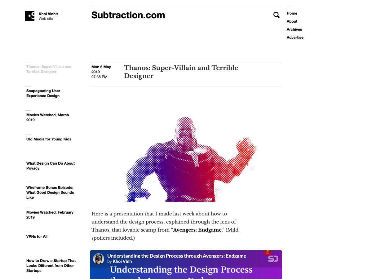
In order to speed up loading but still maintain control over its content, an HTML page in a particular origin “O.com” could tell clients to load its sub-resources from an intermediate content distributor that’s not authoritative, but require that those resources be signed by “O.com” so that the distributor couldn’t modify the resources.
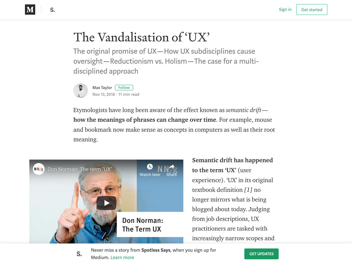
Websites can add support for signed exchanges by running AMP Packager on the server side. Cloudflare has launched a free feature called “AMP Real URL” that fully automates the signing process for AMP pages served from its CDN.
Alternative iOS browsers

Henrik Joreteg: On iOS, several important APIs are limited to Safari and are not available in any of the alternative iOS browsers. These include service workers, web payments, and camera access.
Chrome on iOS is such a pain. A surprising number of people seem to use it and no one realizes it’s not actually Chrome but just a crippled webkit webview missing major features:

1. No Service Worker
2. Can’t print or save as PDF
3. No support for GetUserMedia

Why is this OK?!

— Henrik Joreteg (@HenrikJoreteg) March 30, 2019

Chrome for iOS supports web payments via a custom implementation. I’ve created a browser support table on HTML5test that highlights the differences between some of the popular iOS browsers.

The post Weekly Platform News: Feature Policy, Signed Exchanges, iOS browsers appeared first on CSS-Tricks.

Categories: Designing, Others Tags: