Restricting a (pseudo) element to its parent’s border-box
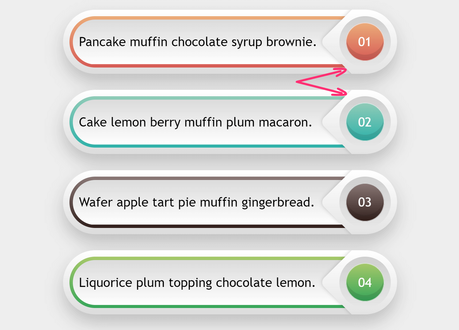
Have you ever wanted to ensure that nothing of a (pseudo) element gets displayed outside its parent’s border-box? In case you’re having trouble picturing what that looks like, let’s say we wanted to get the following result with minimal markup and avoiding brittle CSS.
This means we cannot add any elements just for visual purposes and we cannot create shapes out of multiple pieces, whether that’s directly or via masks. We also want to avoid long, long lists of anything (think something like tens of background layers or box shadows or points inside a polygon() function) in our generated code because, while the results can be fun, it’s not really practical to do something like that!
How do you think we can achieve this, given the parts the arrows point towards? Fancy giving it a try before checking my solution below? It’s one of those things that seems simple at first, but once you actually try it, you discover it’s much trickier.
Markup
Each item is a paragraph (
) element. I was lazy and generated them with Pug out of an array of objects which hold the item’s gradient stop list and its paragraph text:
- var data = [
-   {
-     slist: ['#ebac79', '#d65b56'],
-     ptext: 'Pancake muffin chocolate syrup brownie.'
-   },
-   {
-     slist: ['#90cbb7', '#2fb1a9'],
-     ptext: 'Cake lemon berry muffin plum macaron.'
-   },
-   {
-     slist: ['#8a7876', '#32201c'],
-     ptext: 'Wafer apple tart pie muffin gingerbread.'
-   },
-   {
-     slist: ['#a6c869', '#37a65a'],
-     ptext: 'Liquorice plum topping chocolate lemon.'
-   }
- ].reverse();
- var n = data.length;

while n--
  p(style=`--slist: ${data[n].slist}`) #{data[n].ptext}
This generates the following unspectacular HTML:
<p style='--slist: #ebac79, #d65b56'>Pancake muffin chocolate syrup brownie.</p>
<p style='--slist: #90cbb7, #2fb1a9'>Cake lemon berry muffin plum macaron.</p>
<p style='--slist: #8a7876, #32201c'>Wafer apple tart pie muffin gingerbread.</p>
<p style='--slist: #a6c869, #37a65a'>Liquorice plum topping chocolate lemon.</p>
Basic styles
For the paragraph elements, we set a font, dimensions and a border-radius that’s half the height value:
$w: 26em;
$h: 5em;

p {
  width: $w; height: $h;
  border-radius: .5*$h;
  background: silver;
  font: 1.5em/ 1.375 trebuchet ms, verdana, sans-serif;
}
We’ve also set a dummy background so we can see their limits:
See the Pen by thebabydino (@thebabydino) on CodePen.
Paragraph background
We have three top-to-bottom gradients, which means we can place each of them within the limits of a different layout box: the top gradient layer is limited to the content-box, the middle one to the padding-box and the bottom one to the border-box. If you need an in-depth refresher on this technique, check out this article, but the basic idea is you picture these layout boxes as nested rectangles.
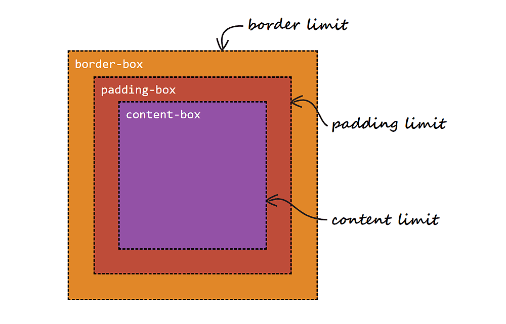
This is pretty much how browser DevTools presents them.

You may be wondering why we wouldn’t layer gradients with different sizes given by their background-size and that have background-repeat: no-repeat. Well, this is because we only get rectangles without rounded corners this way.
Using the background-clip method, if we have a border-radius, our background layers will follow that. Meanwhile, the actual border-radius we set is being used to round the corners of the border-box; that same radius minus the border-width rounding the corners of the padding-box. Then we’re subtracting the padding as well to round the corners of the content-box.
See the Pen by thebabydino (@thebabydino) on CodePen.
So let’s code this!
We set a transparent border and a padding. We make sure they get subtracted from the dimensions we’ve set by switching to box-sizing: border-box. Finally, we layer three gradients: the top one restricted to the content-box, the middle one to the padding-box and the bottom one to the border-box.
p {
  /* same styles as before */
  display: flex;
  align-items: center;
  justify-content: space-between;
  box-sizing: border-box;
  border: solid $b transparent;
  padding: $p;
  background:
    linear-gradient(#dbdbdb, #fff) content-box,
    linear-gradient(var(--slist)) padding-box,
    linear-gradient(#fff, #dcdcdc) border-box;
  text-indent: 1em;
}
We’ve also set a flex layout and a text-indent to move the text content away from the banner edges:
See the Pen by thebabydino (@thebabydino) on CodePen.
Numbering
Before we move on to the tricky part, let’s get the paragraph numbers out of the way!
We add them using a counter we set as the content value on the :after pseudo-element. We first make this :after a square whose edge length equals the paragraph height (which is $h) minus the top and bottom border-width (both equal to $b). Then we turn this square into a circle by setting border-radius: 50% on it. We make it inherit its parent’s box-sizing and border and we then set its background in a similar manner as we did for its parent.
$d: $h - 2*$b;

p {
  /* same styles as before */
  counter-increment: $d;

  &:after {
    box-sizing: inherit;
    border: inherit;
    width: $d; height: $d;
    border-radius: 50%;
    box-shadow:
      inset 0 0 1px 1px #efefef,
      inset 0 #{-$b} rgba(#000, .1);
    background:
      linear-gradient(var(--slist)) padding-box,
      linear-gradient(#d0d0d0, #e7e7e7) border-box;
    color: #fff;
    content: counter(c, decimal-leading-zero);
  }
}
Alright, this is starting to look like something!
See the Pen by thebabydino (@thebabydino) on CodePen.
We still need to make a few tweaks to the CSS of this :after pseudo-element — a margin-right that’s minus its parent’s padding and adjustments to its inner layout so we have the number dead in the middle. That’s pretty much it for the numbering part!
p {
  /* same styles as before */

  &:after {
    /* same styles as before */
    display: grid;
    place-content: center;
    margin-right: -$p;
    text-indent: 0;
  }
}
We’re getting closer!
See the Pen by thebabydino (@thebabydino) on CodePen.
The tricky part
And we’re finally here!
We start off by using the :before pseudo-element, absolutely positioning it on the right side and making it a square whose edge length equals its parent’s height:
p {
  /* same styles as before */
  position: relative;
  outline: solid 2px orange;

  &:before {
    position: absolute;
    right: -$b;
    width: $h;
    height: $h;
    outline: solid 2px purple;
    content: '';
  }
}
We’ve also given both this pseudo-element and its parent some dummy outlines so that we can check the alignment:
See the Pen by thebabydino (@thebabydino) on CodePen.
Alright, we now give this :before a dummy background, rotate it, and then give it a border-radius and a nice box-shadow:
p {
  /* same styles as before */

  &:before {
    /* same styles as before */
    border-radius: $b;
    transform: rotate(45deg);
    box-shadow: 0 0 7px rgba(#000, .2);
    background: linear-gradient(-45deg, orange, purple);
  }
}
And we get the following result!
See the Pen by thebabydino (@thebabydino) on CodePen.
We now have a small problem: the :before pseudo-element is absolutely positioned and is now on top of the :after pseudo-elements that holds the numbering! We can fix this by setting position: relative on the :after pseudo-element.
See the Pen by thebabydino (@thebabydino) on CodePen.
Here’s where things start getting interesting!
Restricting the background gradient
First, we need to set the stop positions on the gradient of our :before pseudo-element such that they match the bottom and top edges of the parent. This is because we want to have a certain hex value along the top edge of the parent and a certain hex value along the bottom edge of the parent.

Since we’ve rotated our square :before by 45°, its top-left corner now points upward (and, conversely, its bottom-right corner points downward).
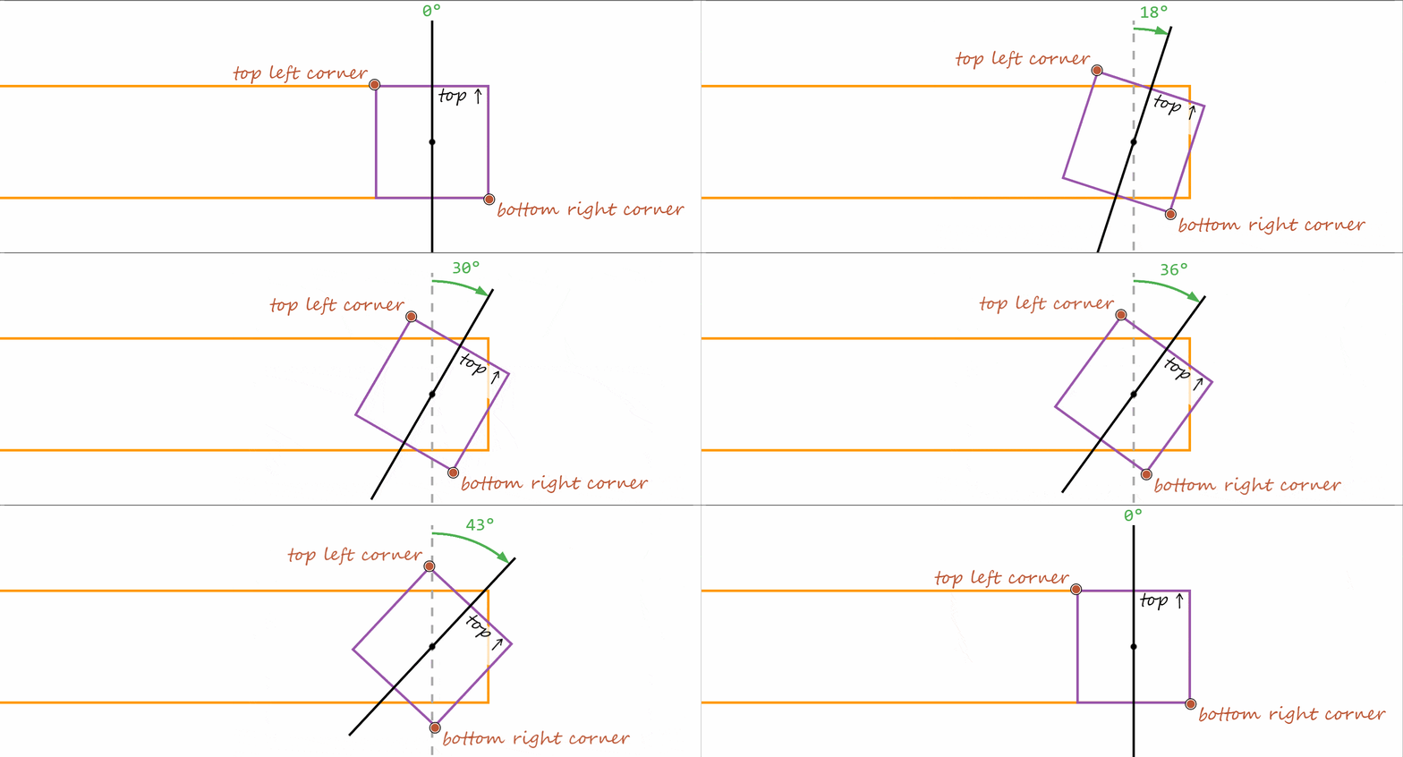
A gradient to the top-left corner of a square is a gradient in the -45° direction (because the 0° angle is at 12 o’clock and the positive direction is, just as for transforms, the clockwise one). A gradient to a corner means the 100% point is located in that corner)
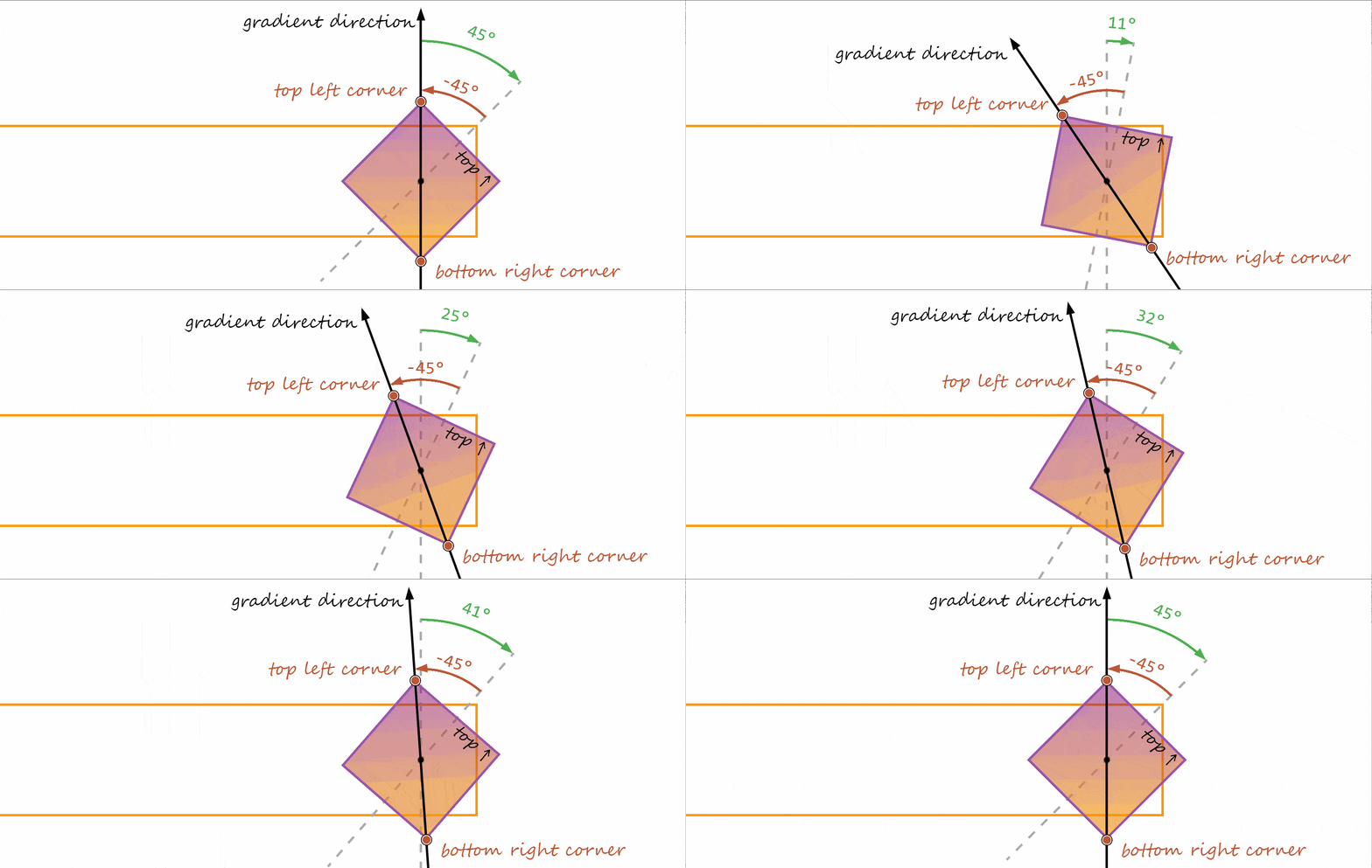
The 50% line of a gradient always passes through the midpoint (the point at the intersection of the diagonals) of the gradient box.
The gradient box is the box within which we paint the gradient and whose size is given by the background-size. Since we haven’t set a background-size, the default for gradients is to use the entire box defined by background-origin, which is the padding-box by default. Since we don’t have a border or a padding on our :before pseudo-element, it results that all three boxes (content-box, padding-box and border-box) are equal in space between them and equal in proportion to the gradient box.
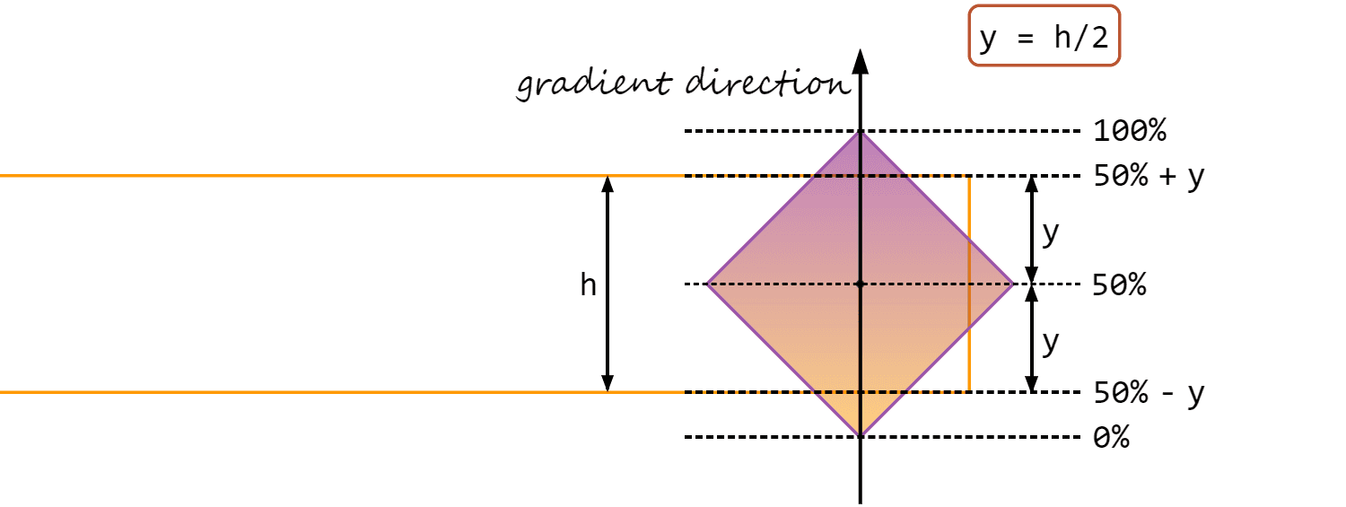
In our case, we have the following lines perpendicular to the direction of the -45°-pointing gradient line:
- the
0%line, passing through the bottom right corner of the:before - the
bottomedge of the pseudo-element’s paragraph parent - the
50%line which splits our square diagonally into two mirrored right isosceles triangles; given the way we’ve aligned our paragraph and its pseudo-elements, this line is also a midline for the paragraph itself, splitting it into two halves, each with aheightequal to half the paragraph’sheight($h). - the
topedge of the pseudo-element’s paragraph parent - the
100%line, passing through the top left corner of the:before
This means we need to restrict the -45°-pointing gradient on our :before pseudo-element between calc(50% - #{.5*$h}) (corresponding to the paragraph’s bottom edge) and calc(50% + #{.5*$h}) (corresponding to the paragraph’s top edge).
Sure enough, this does it!
linear-gradient(-45deg, orange calc(50% - #{.5*$h}), purple calc(50% + #{.5*$h}))See the Pen by thebabydino (@thebabydino) on CodePen.
Adding a sharp transition from and to transparent at these stop positions makes it a lot more obvious they’re the correct ones:
linear-gradient(-45deg,
      transparent calc(50% - #{.5*$h}), orange 0,
      purple calc(50% + #{.5*$h}), transparent 0)
See the Pen by thebabydino (@thebabydino) on CodePen.
Restricting the pseudo-element itself
The next step is to prevent the :before pseudo-element from spilling outside the boundaries of its parent.
That’s easy, right? Just set overflow: hidden on the paragraph!
Well, let’s do that!
This is the result we get:
See the Pen by thebabydino (@thebabydino) on CodePen.
Oops, this is not what we were going for!
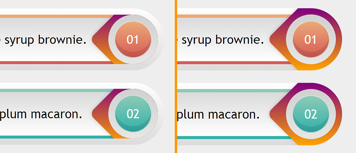
overflow: hidden (left) vs. what we want (right).The problem is overflow: hidden cuts out everything outside an element’s padding-box, but what we want here is to cut the parts of the :before pseudo-element that are outside the border-box, which is larger than the padding-box in our case because we have a non-zero border we cannot ditch (and solve the issue by making the border-box equal to the padding-box) because we need three background layers on our paragraph: the top one covering the content-box, the middle one covering the padding-box and the bottom one covering the border-box.
The solution? Well, if you’ve taken a peek at the tags, you’ve probably guessed by now: use clip-path instead!
Pretty much every article and demo using clip-path out there makes use of either an SVG reference or the polygon() shape function, but these are not the only options we have!
Another possible shape function (and the one we’ll be using here) is inset(). This function specifies a clipping rectangle defined by the distances from the top, right, bottom and left edges. Edges of what? Well, by default1, that’s the edges of the border-box, which is exactly what we need here!
inset() function works. (Demo)So let’s ditch overflow: hidden and use clip-path: inset(0) instead. This is the result we get:
See the Pen by thebabydino (@thebabydino) on CodePen.
This is better, but not quite what we want because it doesn’t take into account the paragraph’s border-radius. Fortunately, inset() also lets us specify a rounding that can take any border-radius value we want. No joke, any valid border-radius value works — for example, this:
clip-path: inset(0 round 15% 75px 35vh 13vw/ 3em 5rem 29vmin 12.5vmax)We only need something much simpler though:
$r: .5*$h;

p {
  /* same styles as before */
  border-radius: $r;
  clip-path: inset(0 round $r)
}
And now we finally get the result we wanted:
See the Pen by thebabydino (@thebabydino) on CodePen.
Final touches
Since we don’t want a purple-orange gradient on the :before, we replace those with the actual values we need. We then place the paragraphs in the middle because that looks better. Finally, we give our paragraphs a shadow by setting a drop-shadow() on the body (we cannot use box-shadow on the paragraphs themselves because we’ve used clip-path, which clips out the box-shadow so we wouldn’t see it anyway). And that’s it!
See the Pen by thebabydino (@thebabydino) on CodePen.
The post Restricting a (pseudo) element to its parent’s border-box appeared first on CSS-Tricks.
