How I Created a Code Beautifier in Two Days
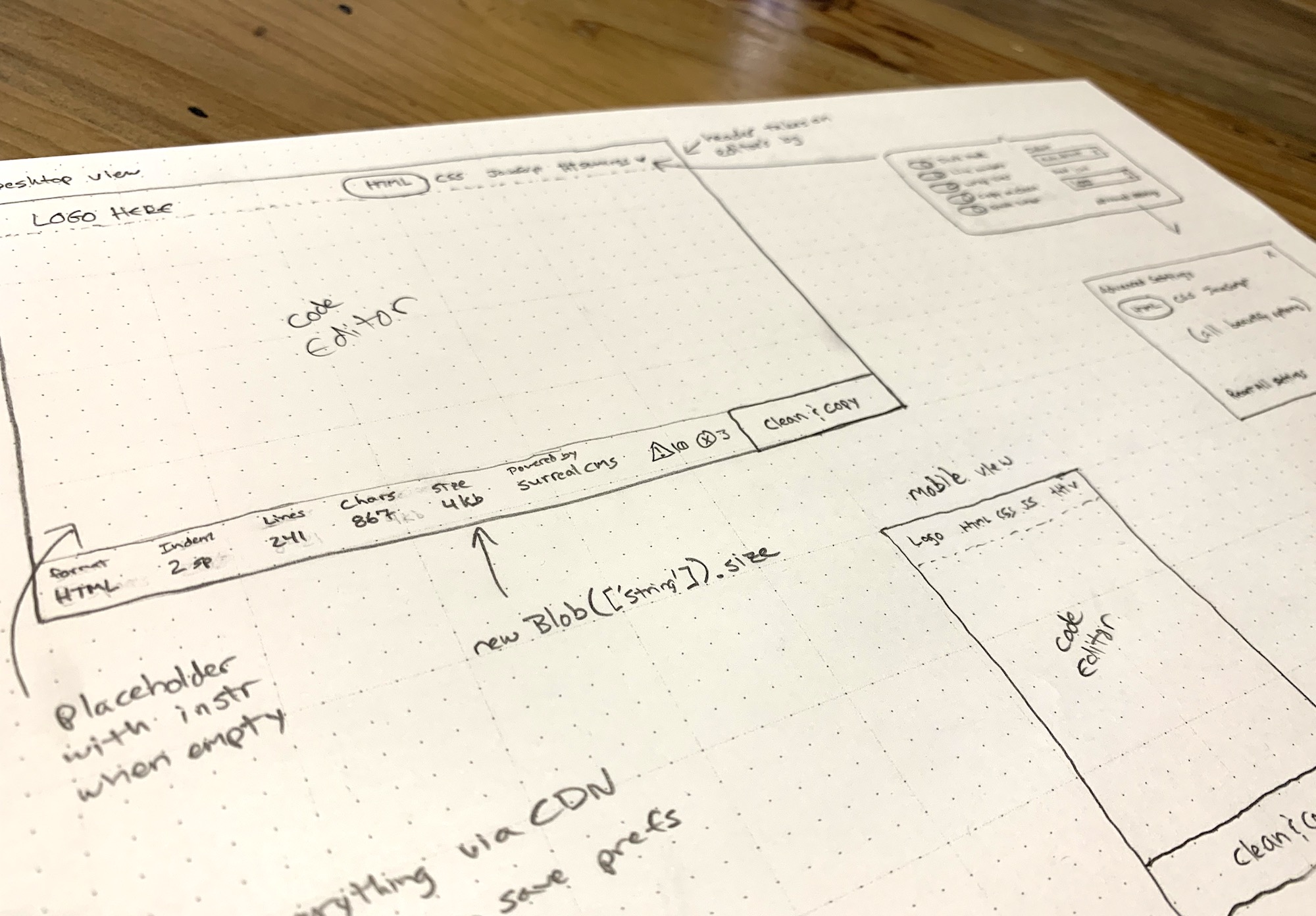
I recently drew up a wireframe for a code beautifier. The next day, I decided to turn it into a real tool. The whole project took less than two days to complete.
I’d been thinking about building a new code beautifier for a while. The idea isn’t unique, but every time I use someone else’s tool, I find myself reapplying the same settings and dodging advertisements every single time. ???
I wanted a simple tool that worked well without the hassle, so last week I grabbed some paper and started sketching one out. I’m a huge fan of wireframing by hand. There’s just something about pencil and paper that makes the design part of my brain work better than staring at a screen.
I was immediately inspired after drawing the wireframe. The next day, I took a break from my usual routine to turn it into a something real. ????
The design
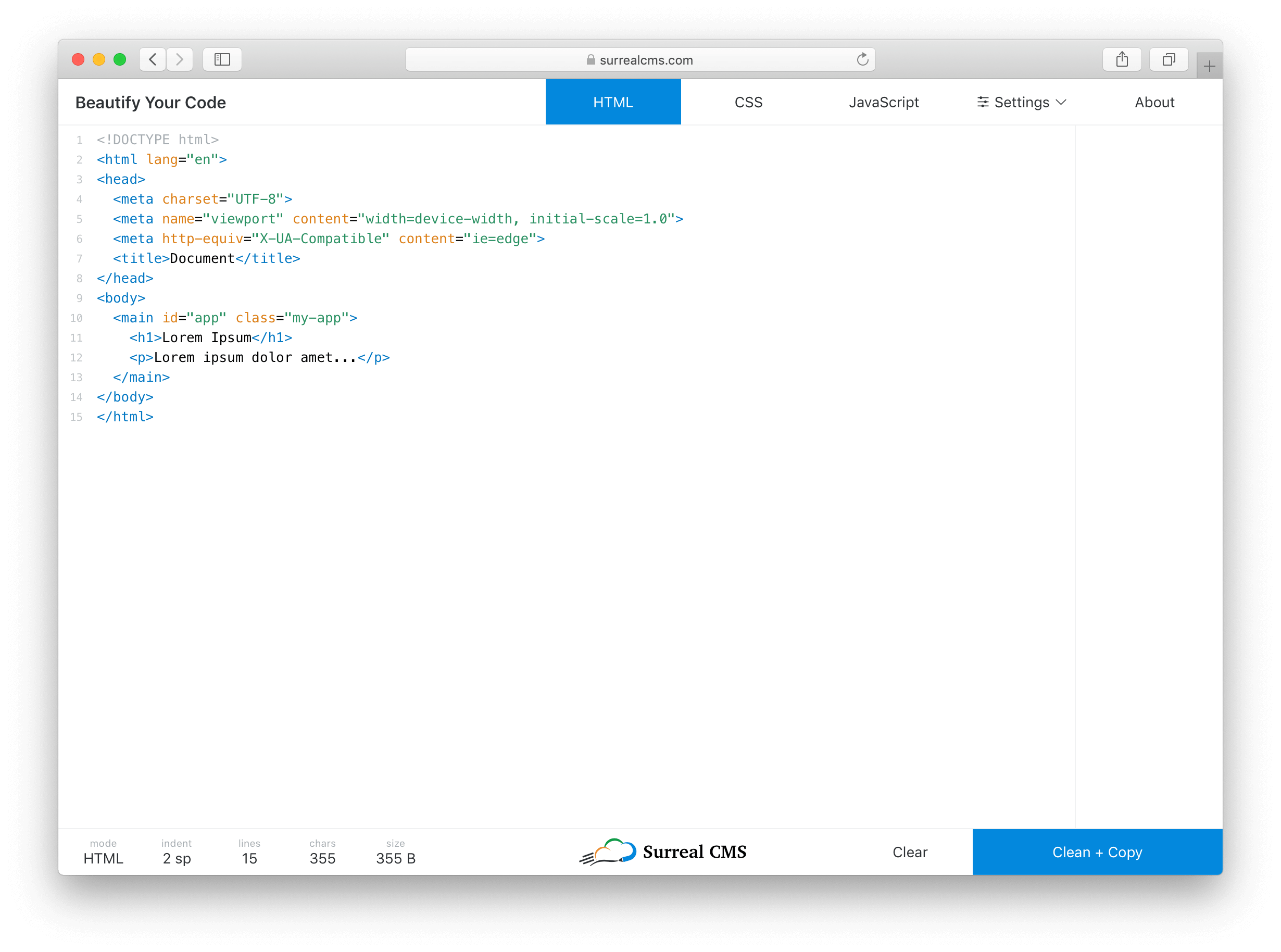
I knew I wanted the code editor to be the main focus of the tool, so I created a thin menu bar at the top that controls the mode (i.e. HTML, CSS, JavaScript) and settings. I eventually added an About button too.
The editor itself takes up most of the screen, but it blends in so you don’t really notice it. Instead of wasting space with instructions, I used a placeholder that disappears when you start typing.
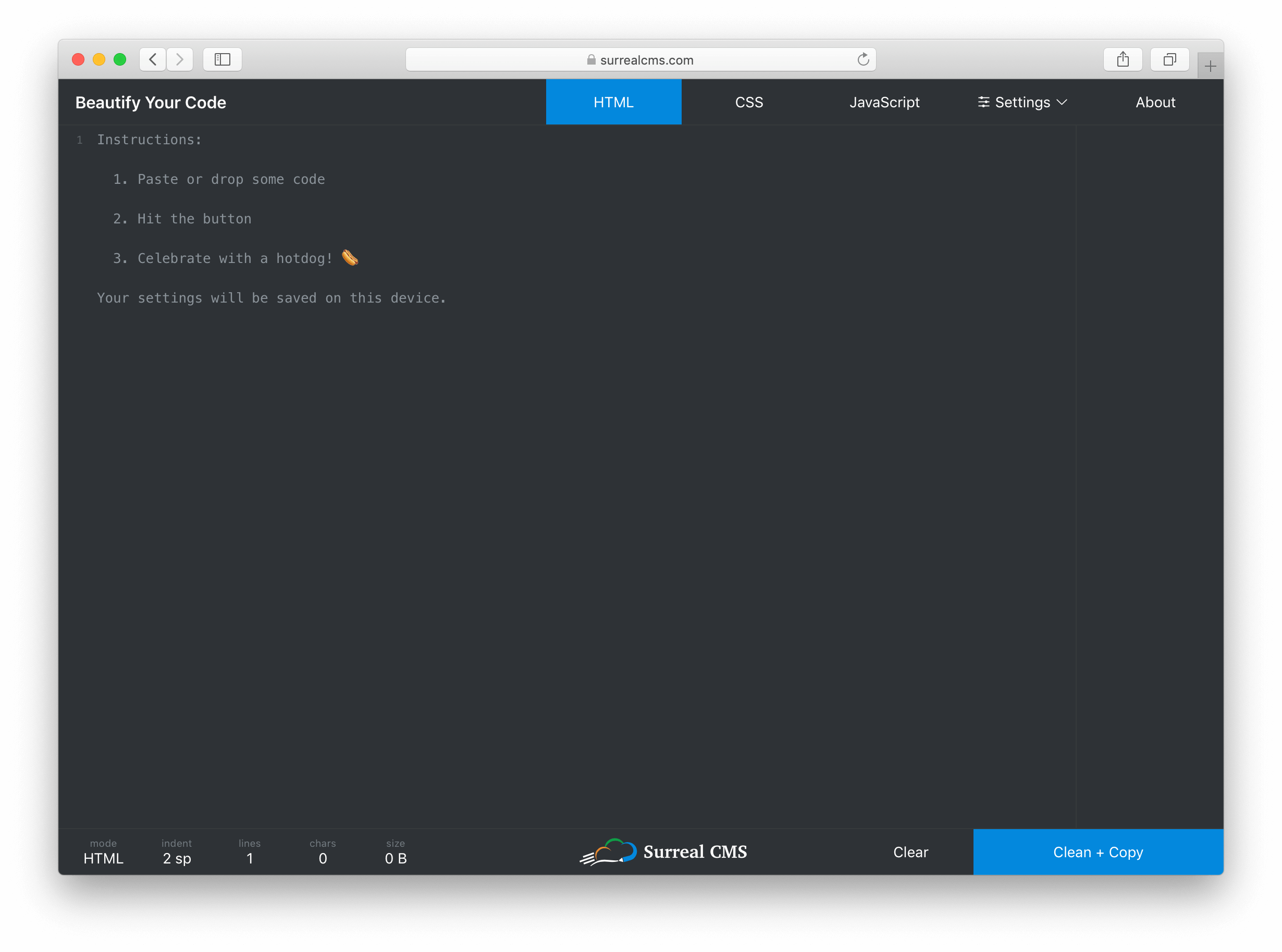
At the bottom, I created a status bar that shows live stats about the code including the current mode, indentation settings, number of lines, number of characters, and document size in bytes. The right side of the status bar has a “Clear” and “Clean + Copy” button. The center has a logo shamelessly plugging my own service.
I don’t think many developers really code on phones, but I wanted this to work on mobile devices anyway. Aside from the usual responsive techniques, I had to watch the window size and adjust the tab position when the screen becomes too narrow.
I’m using flexbox and viewport units for vertical sizing. This was actually pretty easy to do with the exception of a little iOS quirk. Here’s a pen showing the basic wireframe. Notice how the textarea stretches to fill the unused space between the header and footer.
See the Pen
Full-page text editor with header + footer by Cory LaViska (@claviska)
on CodePen.
If you look at the JavaScript tab, you’ll see the iOS quirk and the workaround. I’m not sure how to feature detect something like this, so for now it’s just a simple device check.
Handling settings
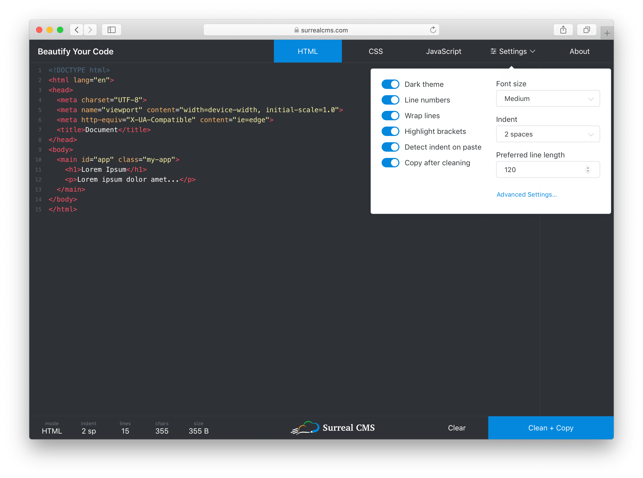
I wanted to keep the most commonly used settings easy to access, but also expose advanced settings for each mode. To do this, I made the settings button a popover with a link to more advanced settings inside. When a setting is changed, the UI updates immediately and the settings are persisted to localStorage.
I took advantage of Vue.js here. Each setting gets mapped to a data property, and when one of them changes, the UI updates (if required) and I call saveSettings(). It works something like this.
function saveSettings() {
  const settings = {};

  // settingsToStore is an array of property names that will be persisted
  // and "this" is referencing the current Vue model
  settingsToStore.map(key => settings[key] = this[key]);
  localStorage.setItem('settings', JSON.stringify(settings);
}
Every setting is a data property that gets synced to localStorage. This is a rather primitive way to store state, so I might update the app to use a state management library such as Vuex later on.
To restore settings, I have a restoreSettings() function that runs when the app starts up.
function restoreSettings() {
  const json = localStorage.getItem('settings');

  if (json) {
    try {
      const settings = JSON.parse(json);

      Object.keys(settings).forEach(key => {
        if (settingsToStore.includes(key)) {
          this[key] = settings[key];
        }
      });
    } catch (err) {
      window.alert('There was an error loading your previous settings');
    }
  }
}
The function fetches settings from localStorage, then applies them one by one ensuring only valid settings in settingsToStore get imported.
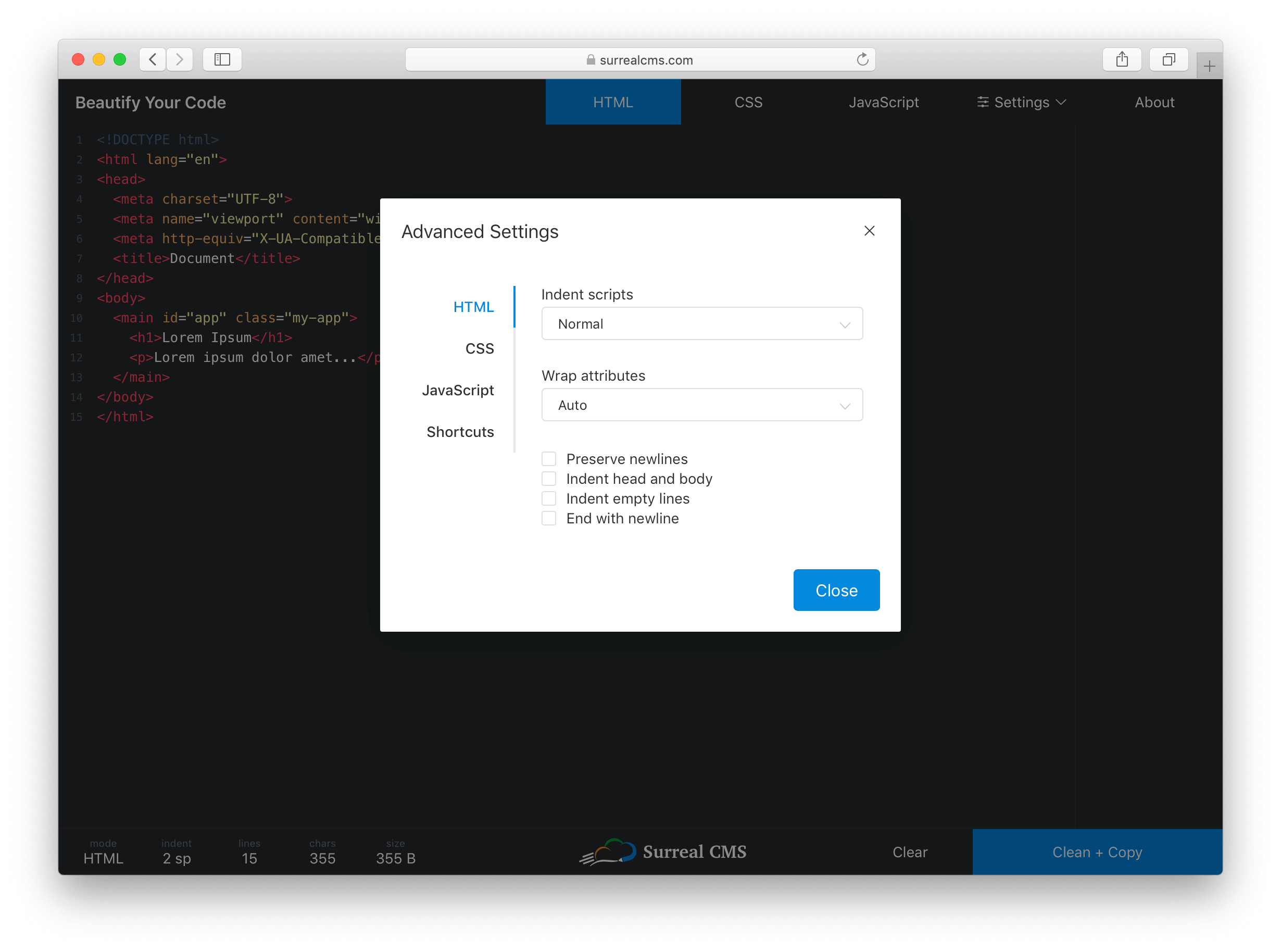
The Advanced Settings link opens a dialog with tabs for each mode. Despite having over 30 settings total, everything is organized and easy to access so users won’t feel overwhelmed.
Applying themes
Dark mode is all the rage these days, so it’s enabled by default. There’s also a light theme for those who prefer it. The entire UI changes, except for popovers and dialogs.
I considered using prefers-color-scheme, which coincidentally landed in Firefox 67 recently, but I decided a toggle would probably be better. Browser support for the color theme preference query isn’t that great yet, plus developers are weird. (For example, I use macOS with the light theme, but my text editor is dark.)
Defining features
Coming up with feature ideas is fairly easy. It’s limiting features for an initial release that’s hard. Here are the most relevant features I shipped right away:
- Beautifies HTML, CSS, and JavaScript code
- Syntax highlighting with tag/bracket matching
- Paste or drop files to load code
- Auto-detects indentation preference based on pasted code or dropped file
- Light and dark themes
- Clean and copy in one click
- Keyboard shortcuts
- Most JS Beautify options are configurable
- Settings get stored indefinitely in
localStorage - Minimal UI without ads (just an unobtrusive plug to my own service) ?
I also threw in a few easter eggs for fun. Try refreshing the page, exploring shortcuts, and sharing it on Facebook or Twitter to find them. ?
The tools and libraries I used
I’m a big fan of Vue.js. It’s probably overkill for this project, but the Vue CLI let me start building with all the latest tooling via one simple command.
vue create beautify-codeI didn’t have to waste any time scaffolding, which helped me build this out quickly. Plus, Vue came in handy for things like live stats, changing themes, toggling settings, etc. I used various Element UI components for things like buttons, form elements, popovers, and dialogs.
The editor is powered by CodeMirror using custom styles. It’s a well-supported and fantastic project that I can’t recommend enough for in-browser code editing.
The library that does all the beautifying is called JS Beautify, which handles JavaScript, HTML, and CSS. JS Beautify runs on the client-side, so there’s really no backend to this app — your browser does all the work!
JS Beautify is incredibly easy to use. Install it with npm install js-beautify and run your code through the appropriate function.
import beautify from 'js-beautify';

const code = 'Your code here';
const settings = {
  // Your settings here
};

// HTML
const html = beautify.html(code, settings)

// CSS
const css = beautify.css(code, settings)

// JavaScript
const js = beautify.js(code, settings)
Each function returns a string containing the beautified code. You can change how each language is output by passing in your own settings.
I’ve been asked a few times about Prettier, which is a comparable tool, so it’s worth mentioning that I chose JS Beautify because it’s less opinionated and more configurable. If there’s enough demand, I’ll consider adding an option to toggle between JS Beautify and Prettier.
I’ve used all of these libraries before, so integration was actually pretty easy. ?
This project was made possible by my app, Surreal CMS. If you’re looking for a great CMS for static websites, check it out — it’s free for personal, educational, and non-profit websites!
Oh, and if you’re wondering what editor I used… it’s Visual Studio Code. ????
The post How I Created a Code Beautifier in Two Days appeared first on CSS-Tricks.
