Archive

Archive for July, 2019

The Ultimate Guide To Building Scalable Web Scrapers With Scrapy

July 16th, 2019 No comments
Using Chrome DevTools to inspect HTML and CSS

The Ultimate Guide To Building Scalable Web Scrapers With Scrapy

The Ultimate Guide To Building Scalable Web Scrapers With Scrapy

Daniel Ni

2019-07-16T14:30:59+02:002019-07-16T16:48:20+00:00

Web scraping is a way to grab data from websites without needing access to APIs or the website’s database. You only need access to the site’s data — as long as your browser can access the data, you will be able to scrape it.

Realistically, most of the time you could just go through a website manually and grab the data ‘by hand’ using copy and paste, but in a lot of cases that would take you many hours of manual work, which could end up costing you a lot more than the data is worth, especially if you’ve hired someone to do the task for you. Why hire someone to work at 1–2 minutes per query when you can get a program to perform a query automatically every few seconds?

For example, let’s say that you wish to compile a list of the Oscar winners for best picture, along with their director, starring actors, release date, and run time. Using Google, you can see there are several sites that will list these movies by name, and maybe some additional information, but generally you’ll have to follow through with links to capture all the information you want.

Obviously, it would be impractical and time-consuming to go through every link from 1927 through to today and manually try to find the information through each page. With web scraping, we just need to find a website with pages that have all this information, and then point our program in the right direction with the right instructions.

In this tutorial, we will use Wikipedia as our website as it contains all the information we need and then use Scrapy on Python as a tool to scrape our information.

A few caveats before we begin:

Data scraping involves increasing the server load for the site that you’re scraping, which means a higher cost for the companies hosting the site and a lower quality experience for other users of that site. The quality of the server that is running the website, the amount of data you’re trying to obtain, and the rate at which you’re sending requests to the server will moderate the effect you have on the server. Keeping this in mind, we need to make sure that we stick to a few rules.

Most sites also have a file called robots.txt in their main directory. This file sets out rules for what directories sites do not want scrapers to access. A website’s Terms & Conditions page will usually let you know what their policy on data scraping is. For example, IMDB’s conditions page has the following clause:

Robots and Screen Scraping: You may not use data mining, robots, screen scraping, or similar data gathering and extraction tools on this site, except with our express-written consent as noted below.

Before we try to obtain a website’s data we should always check out the website’s terms and robots.txt to make sure we are obtaining legal data. When building our scrapers, we also need to make sure that we do not overwhelm a server with requests that it can’t handle.

Luckily, many websites recognize the need for users to obtain data, and they make the data available through APIs. If these are available, it’s usually a much easier experience to obtain data through the API than through scraping.

Wikipedia allows data scraping, as long as the bots aren’t going ‘way too fast’, as specified in their robots.txt. They also provide downloadable datasets so people can process the data on their own machines. If we go too fast, the servers will automatically block our IP, so we’ll implement timers in order to keep within their rules.

Getting Started, Installing Relevant Libraries Using Pip

First of all, to start off, let’s install Scrapy.

Windows

Install the latest version of Python from https://www.python.org/downloads/windows/

Note: Windows users will also need Microsoft Visual C++ 14.0, which you can grab from “Microsoft Visual C++ Build Tools” over here.

You’ll also want to make sure you have the latest version of pip.

In cmd.exe, type in:

python -m pip install --upgrade pip

pip install pypiwin32

pip install scrapy

This will install Scrapy and all the dependencies automatically.

Linux

First you’ll want to install all the dependencies:

In Terminal, enter:

sudo apt-get install python3 python3-dev python-pip libxml2-dev libxslt1-dev zlib1g-dev libffi-dev libssl-dev

Once that’s all installed, just type in:

pip install --upgrade pip

To make sure pip is updated, and then:

pip install scrapy

And it’s all done.

Mac

First you’ll need to make sure you have a c-compiler on your system. In Terminal, enter:

xcode-select --install

After that, install homebrew from https://brew.sh/.

Update your PATH variable so that homebrew packages are used before system packages:

echo "export PATH=/usr/local/bin:/usr/local/sbin:$PATH" >> ~/.bashrc

source ~/.bashrc

Install Python:

brew install python

And then make sure everything is updated:

brew update; brew upgrade python

After that’s done, just install Scrapy using pip:

pip install Scrapy

>

Overview Of Scrapy, How The Pieces Fit Together, Parsers, Spiders, Etc

You will be writing a script called a ‘Spider’ for Scrapy to run, but don’t worry, Scrapy spiders aren’t scary at all despite their name. The only similarity Scrapy spiders and real spiders have are that they like to crawl on the web.

Inside the spider is a class that you define that tells Scrapy what to do. For example, where to start crawling, the types of requests it makes, how to follow links on pages, and how it parses data. You can even add custom functions to process data as well, before outputting back into a file.

Writing Your First Spider, Write A Simple Spider To Allow For Hands-on Learning

To start our first spider, we need to first create a Scrapy project. To do this, enter this into your command line:

scrapy startproject oscars

This will create a folder with your project.

We’ll start with a basic spider. The following code is to be entered into a python script. Open a new python script in /oscars/spiders and name it oscars_spider.py

We’ll import Scrapy.

import scrapy

We then start defining our Spider class. First, we set the name and then the domains that the spider is allowed to scrape. Finally, we tell the spider where to start scraping from.

class OscarsSpider(scrapy.Spider):
   name = "oscars"
   allowed_domains = ["en.wikipedia.org"]
   start_urls = ['https://en.wikipedia.org/wiki/Academy_Award_for_Best_Picture']

Next, we need a function which will capture the information that we want. For now, we’ll just grab the page title. We use CSS to find the tag which carries the title text, and then we extract it. Finally, we return the information back to Scrapy to be logged or written to a file.

def parse(self, response):
   data = {}
   data['title'] = response.css('title::text').extract()
   yield data

Now save the code in /oscars/spiders/oscars_spider.py

To run this spider, simply go to your command line and type:

scrapy crawl oscars

You should see an output like this:

2019-05-02 14:39:31 [scrapy.utils.log] INFO: Scrapy 1.6.0 started (bot: oscars)
...
2019-05-02 14:39:32 [scrapy.core.engine] DEBUG: Crawled (200)  (referer: None)
2019-05-02 14:39:34 [scrapy.core.engine] DEBUG: Crawled (200)  (referer: None)
2019-05-02 14:39:34 [scrapy.core.scraper] DEBUG: Scraped from 
{'title': ['Academy Award for Best Picture - Wikipedia']}
2019-05-02 14:39:34 [scrapy.core.engine] INFO: Closing spider (finished)
2019-05-02 14:39:34 [scrapy.statscollectors] INFO: Dumping Scrapy stats:
{'downloader/request_bytes': 589,
 'downloader/request_count': 2,
 'downloader/request_method_count/GET': 2,
 'downloader/response_bytes': 74517,
 'downloader/response_count': 2,
 'downloader/response_status_count/200': 2,
 'finish_reason': 'finished',
 'finish_time': datetime.datetime(2019, 5, 2, 7, 39, 34, 264319),
 'item_scraped_count': 1,
 'log_count/DEBUG': 3,
 'log_count/INFO': 9,
 'response_received_count': 2,
 'robotstxt/request_count': 1,
 'robotstxt/response_count': 1,
 'robotstxt/response_status_count/200': 1,
 'scheduler/dequeued': 1,
 'scheduler/dequeued/memory': 1,
 'scheduler/enqueued': 1,
 'scheduler/enqueued/memory': 1,
 'start_time': datetime.datetime(2019, 5, 2, 7, 39, 31, 431535)}
2019-05-02 14:39:34 [scrapy.core.engine] INFO: Spider closed (finished)

Congratulations, you’ve built your first basic Scrapy scraper!

Full code:

import scrapy

class OscarsSpider(scrapy.Spider):
   name = "oscars"
   allowed_domains = ["en.wikipedia.org"]
   start_urls = ["https://en.wikipedia.org/wiki/Academy_Award_for_Best_Picture"]

   def parse(self, response):
       data = {}
       data['title'] = response.css('title::text').extract()
       yield data

Obviously, we want it to do a little bit more, so let’s look into how to use Scrapy to parse data.

First, let’s get familiar with the Scrapy shell. The Scrapy shell can help you test your code to make sure that Scrapy is grabbing the data you want.

To access the shell, enter this into your command line:

scrapy shell “https://en.wikipedia.org/wiki/Academy_Award_for_Best_Picture”

This will basically open the page that you’ve directed it to and it will let you run single lines of code. For example, you can view the raw HTML of the page by typing in:

print(response.text)

Or open the page in your default browser by typing in:

view(response)

Our goal here is to find the code that contains the information that we want. For now, let’s try to grab the movie title names only.

The easiest way to find the code we need is by opening the page in our browser and inspecting the code. In this example, I am using Chrome DevTools. Just right-click on any movie title and select ‘inspect’:

Using Chrome DevTools to inspect HTML and CSS

Chrome DevTools window. (Large preview)

As you can see, the Oscar winners have a yellow background while the nominees have a plain background. There’s also a link to the article about the movie title, and the links for movies end in film). Now that we know this, we can use a CSS selector to grab the data. In the Scrapy shell, type in:

response.css(r"tr[style='background:#FAEB86'] a[href*='film)']").extract()

As you can see, you now have a list of all the Oscar Best Picture Winners!

> response.css(r"tr[style='background:#FAEB86'] a[href*='film']").extract()
['<a href="/wiki/Wings_(1927_film)" title="Wings (1927 film)">Wings</a>', 
...
 '<a href="/wiki/Green_Book_(film)" title="Green Book (film)">Green Book</a>', '<a href="/wiki/Jim_Burke_(film_producer)" title="Jim Burke (film producer)">Jim Burke</a>']

Going back to our main goal, we want a list of the Oscar winners for best picture, along with their director, starring actors, release date, and run time. To do this, we need Scrapy to grab data from each of those movie pages.

We’ll have to rewrite a few things and add a new function, but don’t worry, it’s pretty straightforward.

We’ll start by initiating the scraper the same way as before.

import scrapy, time

class OscarsSpider(scrapy.Spider):
   name = "oscars"
   allowed_domains = ["en.wikipedia.org"]
   start_urls = ["https://en.wikipedia.org/wiki/Academy_Award_for_Best_Picture"]

But this time, two things will change. First, we’ll import time along with scrapy because we want to create a timer to restrict how fast the bot scrapes. Also, when we parse the pages the first time, we want to only get a list of the links to each title, so we can grab information off those pages instead.

def parse(self, response):
   for href in response.css(r"tr[style='background:#FAEB86'] a[href*='film)']::attr(href)").extract():
       url = response.urljoin(href)
       print(url)
       req = scrapy.Request(url, callback=self.parse_titles)
       time.sleep(5)
       yield req

Here we make a loop to look for every link on the page that ends in film) with the yellow background in it and then we join those links together into a list of URLs, which we will send to the function parse_titles to pass further. We also slip in a timer for it to only request pages every 5 seconds. Remember, we can use the Scrapy shell to test our response.css fields to make sure we’re getting the correct data!

def parse_titles(self, response):
   for sel in response.css('html').extract():
       data = {}
       data['title'] = response.css(r"h1[id='firstHeading'] i::text").extract()
       data['director'] = response.css(r"tr:contains('Directed by') a[href*='/wiki/']::text").extract()
       data['starring'] = response.css(r"tr:contains('Starring') a[href*='/wiki/']::text").extract()
       data['releasedate'] = response.css(r"tr:contains('Release date') li::text").extract()
       data['runtime'] = response.css(r"tr:contains('Running time') td::text").extract()
   yield data

The real work gets done in our parse_data function, where we create a dictionary called data and then fill each key with the information we want. Again, all these selectors were found using Chrome DevTools as demonstrated before and then tested with the Scrapy shell.

The final line returns the data dictionary back to Scrapy to store.

Complete code:

import scrapy, time

class OscarsSpider(scrapy.Spider):
   name = "oscars"
   allowed_domains = ["en.wikipedia.org"]
   start_urls = ["https://en.wikipedia.org/wiki/Academy_Award_for_Best_Picture"]

   def parse(self, response):
       for href in response.css(r"tr[style='background:#FAEB86'] a[href*='film)']::attr(href)").extract():
           url = response.urljoin(href)
           print(url)
           req = scrapy.Request(url, callback=self.parse_titles)
           time.sleep(5)
           yield req

   def parse_titles(self, response):
       for sel in response.css('html').extract():
           data = {}
           data['title'] = response.css(r"h1[id='firstHeading'] i::text").extract()
           data['director'] = response.css(r"tr:contains('Directed by') a[href*='/wiki/']::text").extract()
           data['starring'] = response.css(r"tr:contains('Starring') a[href*='/wiki/']::text").extract()
           data['releasedate'] = response.css(r"tr:contains('Release date') li::text").extract()
           data['runtime'] = response.css(r"tr:contains('Running time') td::text").extract()
       yield data

Sometimes we will want to use proxies as websites will try to block our attempts at scraping.

To do this, we only need to change a few things. Using our example, in our def parse(), we need to change it to the following:

def parse(self, response):
   for href in (r"tr[style='background:#FAEB86'] a[href*='film)']::attr(href)").extract()
:
       url = response.urljoin(href)
       print(url)
       req = scrapy.Request(url, callback=self.parse_titles)
       req.meta['proxy'] = "http://yourproxy.com:80"
       yield req

This will route the requests through your proxy server.

Deployment And Logging, Show How To Actually Manage A Spider In Production

Now it is time to run our spider. To make Scrapy start scraping and then output to a CSV file, enter the following into your command prompt:

scrapy crawl oscars -o oscars.csv

You will see a large output, and after a couple of minutes, it will complete and you will have a CSV file sitting in your project folder.

Compiling Results, Show How To Use The Results Compiled In The Previous Steps

When you open the CSV file, you will see all the information we wanted (sorted out by columns with headings). It’s really that simple.
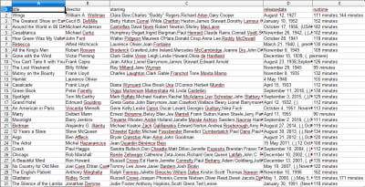
A CSV of Oscar winning movies and associated information

Oscar winning movies list and information. (Large preview)

With data scraping, we can obtain almost any custom dataset that we want, as long as the information is publicly available. What you want to do with this data is up to you. This skill is extremely useful for doing market research, keeping information on a website updated, and many other things.

It’s fairly easy to set up your own web scraper to obtain custom datasets on your own, however, always remember that there might be other ways to obtain the data that you need. Businesses invest a lot into providing the data that you want, so it’s only fair that we respect their terms and conditions.

Additional Resources For Learning More About Scrapy And Web Scraping In General

(dm, yk, il)
Categories: Others Tags:

10 Ways Web Design Can Help You Reinvent Customer Experience

July 16th, 2019 No comments

The e-commerce world is growing.

These days, it is impossible for a business to survive without an online presence. Therefore, as part of your brand’s digital marketing strategy, every design element should serve its purpose.

Every element ? from usability to visuals ? is essential to the overall customer experience. Each has a significant impact on your brand to attract new customers and retain old ones.

In this post, we are going to talk about the seven ways web design can help you reinvent the customer experience. Also, why this impact can boost your site design, helping you reach its full potential.

It captures the audience’s attention

Do you know that you only have approximately 8 seconds to capture your audience’s attention once they land on your site? That means you only have 8 seconds to show them how great your brand is, and compel them to buy something from you.

If all users see is how poor your design is the moment they land on your page, there’s no way that they will notice what you have to offer them.

So, how do you make the first few seconds count and compel visitors to continue exploring your site? Well, take note of the following elements:

  • Go for a clean, minimalist, and uncluttered layout that places your brand’s value in the spotlight.
  • Place visuals with bold photography and compelling photographs that show well on both mobile and desktop devices.
  • Pay attention to the colors you pick, as it can have a psychological impact on your audience.
  • Utilize cohesive design elements such as textures, shapes, icons, patterns, and colors. Ensure that they are unified and well thought-out.

While what we have discussed are not the only things that you can do with your homepage, they are a great starting point to build an excellent first impression.

It renders a professional presentation

According to Sytian Productions, a Philippines web designer, “An excellent design gives a professional presentation with your audience, as well as your prospects. That’s why it is crucial that you establish yourself as an authoritative presence in your industry.”

Think about all the websites that you have visited recently. Chances are, you would immediately know those companies who hired a professional web design agency from the ones who do not.

Having a site that is professionally designed helps build trust with your audience in the long run. They already know that you will not waste their time by giving them the best service that you can give.

It creates a sense of trust

If you want to win over a potential customer’s trust, start with excellent web design. It is one of the most influential factors that help users form an opinion about your business.

Having a high-quality web design boosts your conversion rates. When you regularly update your site such as your headings and images to make it more modern, it has a positive effect on your prospects. As a result, prospects are 2-3 times more likely to turn into paying customers.

It increases functionality

Aside from having an excellent presentation, a good web design should also have great functionality.

When you are aiming for a responsive site, you are taking into consideration how your site will look across different devices. You have to ensure that your site will look the same across different devices, and still deliver excellent user experience no matter what device they view your site on.

It has an impact on your credibility as a company

For a lot of users, their introduction to your business is through your website. That’s why one of your main goals is to instill a sense of trust as soon as they land on your website.

But how do you inspire trust with your audience instead of skepticism?

There are two main factors to consider when it comes to building the credibility of your site: Expertise and trustworthiness.

Your website has to convince the prospect that your knowledge and experience is enough and that the data that they find on your site is trustworthy and reliable.

That way, there is a greater chance that you will be influencing their behaviors and attitudes towards your brand. It is easier for them to give you their personal information, revisit your site, and hold positive opinions about your brand.

On the other hand, if your site lacks credibility, then you will receive the opposite effect.

The reality is, a lot of users will only bank on your site if they trust it and the people behind it. So, let’s say you are an e-commerce site that deals with users’ personal data. Then you have to put the extra effort on your web design to gain your users’ trust.

It helps users to navigate your website efficiently

Navigation is key when it comes to designing your site. Ideally, it acts as a map that features the core places that users can visit. It is how your customers explore and move on your site.

Therefore, at its core, it needs to be intuitive and easy to use.

There is nothing worse than seeing a site that is highly disorganized or has confusing navigation. It is crucial that users can easily find whatever they are looking for.

Your site’s navigation comes in various styles:

  • Breadcrumbs: Boosts the searchability of your pages by showing a visual age that features the user’s location within the site’s hierarchy. Breadcrumbs significantly decrease the actions a visitor needs to take to move on to a higher level web page.
  • Drop-down menus: This includes a list of drop-down items that shows up once you click a particular text selection or menu title. For some sites, you can find the drop-down menus on top.

Both types of navigation can effectively work together to create an optimal user experience. For instance, you can include a drop-down menu on your homepage. When somebody clicks on the homepage drop-down menu, you can utilize the breadcrumb navigation so that you can easily guide your users on their way back.

If web users cannot easily find whatever they are looking for, then there is no reason to stay on your site anymore. Chances are, they will simply bounce and will move on to your competitors that offer an excellent user experience.

It establishes a visual hierarchy

When a user visits your site, and you present them with a lot of information that is not organized, they will leave immediately.

An excellent design not only helps break up the content, but it also creates a visual hierarchy. Ideally, the content should be digested easily, and all the important data should be highlighted on the page.

Here are some excellent elements in the design:

  • For your body text, pick something that is appropriately sized and has a readable typeface.
  • Use whitespace effectively, as it allows your content to breathe.
  • Utilize sidebars to feature or highlight all the crucial information in your copy.
  • Give your headings a visual hierarchy through font-weight, size, and color.
  • Break up content using compelling quotes, icons, and descriptive imagery.

It is all about the looks

Having a visually appealing site is an excellent way to capture the attention of a prospective customer. After all, it will be the first thing that they notice.

There are several budget-friendly tweaks that you can do to make your web design compelling:

Go for a clean and modern design

Your goal should be to build a site that is modern and clean. If it looks outdated, has terrible formatting, and too busy for users, it will look unappealing.

Instead, you want a site that is laid out strategically and has plenty of white space. Utilize trending design elements such as parallax scrolling, where two elements scroll at various speeds.

Utilize Multimedia

Remember the quote, “a picture is worth a thousand words”?

Use multimedia for your design. Tell potential customers about your product, and how to use it to boost customer experience.

Utilize full-width “hero” images to feature products, or even integrate interactive media, and videos. Using multimedia “above the fold” of your website has a greater chance of catching users’ attention.

Pick Colors Carefully

Whenever you are choosing a color scheme in your web design, you have to choose colors carefully.

Why? Well, for several reasons.

One of those is the psychological effect of colors. For example, blue is linked to dependability and trust, while green is closely linked to health.

Another reason you need to choose a color scheme with contrasting colors is that it can help you easily direct users. For example, using contrasting colors on your call to action buttons or CTAs (such as “buy now,” “learn more,” or “sign me up”) easily catches a user’s attention. Thus, it is easy for you to prompt them to follow through.

Make it Easy

When making your design, you need to figure out what the user needs from your site.

If prospects are looking forward to making a purchase or making a booking on your site, then you have to ensure that functionality is there.

Aside from functionality, you also have to ensure that your site is easy to use.

The three areas that you can use to enhance your customer experience is through your navigation, organization, and search. The search functionality should be developed so that users can search directly via your site.

Your site’s organization should be logical and predictable. Aside from that, you should also utilize headers, product categories, bold fonts, and so on.

Build an Emotional Connection

Never underestimate the power of your website. Besides the fact that it lets people purchase your products and services, it also gives you credibility.

Again, users tend to trust a web page that looks professionally designed over a crappy one.

Here are ways how you can establish an emotional connection with your audience:

Tell a Story

A great way to cultivate positive emotions for your brand is through the power of visual storytelling.

If users experience positive feelings from your website, such as joy, excitement, happiness, and so on, they are more likely to convert. Having a well-developed story about your brand gives people a reason to explore and understand your brand a lot better.

Your website gives you an excellent platform to create a story about your brand and products. Over time, a lot of new and returning customers will be drawn to your brand’s values.

Use Human Faces

Scientific evidence has shown that the human eyes are instinctively drawn to human faces, no matter what type of content it is.

When strategically placed, photographs with human faces helps build a connection with your audience. As a result, it is a lot easier to build your brand story.

So, it is time to start using human faces on your About Us page, to show the people behind your brand.

If you are selling something, use faces of humans that interact with your products. That way, prospective customers can relate to your brand and products better.

Remember that although making these changes may sound simple, they can have a significant impact on how users view your website and experience your brand.

Over to You

If your website is not getting the kind of traction that you are expecting, then maybe it is time to take a step back. Then, do a critical evaluation of your web design.

These tips are pretty straightforward to implement. Also, if done correctly, not only will it provide great customer experience, but it will also improve customer engagement on your site. These can be translated into online and offline sales.

So, take note of these tips on how to revamp your web design. That way, you will be giving both your customers (and your business) the best experience possible.

Hopefully, you will have a better picture of how web design can have a positive impact on your customer experience. Note that web design is more on the visual side of things. So it’s up to you on how you can make your customer’s journey more positive.

Categories: Others Tags:

Managing Multiple Backgrounds with Custom Properties

July 15th, 2019 No comments

One cool thing about CSS custom properties is that they can be a part of a value. Let’s say you’re using multiple backgrounds to pull off a a design. Each background will have its own color, image, repeat, position, etc. It can be verbose!

You have four images:

body {
  
  background-position:
    top 10px left 10px,
    top 10px right 10px,
    bottom 10px right 10px,
    bottom 10px left 10px;
  
  background-repeat: no-repeat;
  
  background-image:
    url(https://s3-us-west-2.amazonaws.com/s.cdpn.io/3/angles-top-left.svg),
    url(https://s3-us-west-2.amazonaws.com/s.cdpn.io/3/angles-top-right.svg),
    url(https://s3-us-west-2.amazonaws.com/s.cdpn.io/3/angles-bottom-right.svg),
    url(https://s3-us-west-2.amazonaws.com/s.cdpn.io/3/angles-bottom-left.svg);
  
}

You want to add a fifth in a media query:

@media (min-width: 1500px) {
  body {
    /* REPEAT all existing backgrounds, then add a fifth. */
  }
}

That’s going to be super verbose! You’ll have to repeat each of those four images again, then add the fifth. Lots of duplication there.

One possibility is to create a variable for the base set, then add the fifth much more cleanly:

body {
  --baseBackgrounds: 
    url(https://s3-us-west-2.amazonaws.com/s.cdpn.io/3/angles-top-left.svg),
    url(https://s3-us-west-2.amazonaws.com/s.cdpn.io/3/angles-top-right.svg),
    url(https://s3-us-west-2.amazonaws.com/s.cdpn.io/3/angles-bottom-right.svg),
    url(https://s3-us-west-2.amazonaws.com/s.cdpn.io/3/angles-bottom-left.svg);

  background-position:
    top 10px left 10px,
    top 10px right 10px,
    bottom 10px right 10px,
    bottom 10px left 10px;
  
  background-repeat: no-repeat;
  
  background-image: var(--baseBackgrounds);
}
@media (min-width: 1500px) {
  body {
    background-image: 
      var(--baseBackgrounds),
      url(added-fifth-background.svg);
  }
}

But, it’s really up to you. It might make more sense and be easier manage if you made each background image into a variable, and then pieced them together as needed.

body {
  --bg1: url(https://s3-us-west-2.amazonaws.com/s.cdpn.io/3/angles-top-left.svg);
  --bg2: url(https://s3-us-west-2.amazonaws.com/s.cdpn.io/3/angles-top-right.svg);
  --bg3: url(https://s3-us-west-2.amazonaws.com/s.cdpn.io/3/angles-bottom-right.svg);
  --bg4: url(https://s3-us-west-2.amazonaws.com/s.cdpn.io/3/angles-bottom-left.svg);
  --bg5: url(https://s3-us-west-2.amazonaws.com/s.cdpn.io/3/angles-bottom-left.svg);
  
  background-image: var(--bg1), var(--bg2), var(--bg3), var(--bg4);
}
@media (min-width: 1500px) {
  body {
    background-image: var(--bg1), var(--bg2), var(--bg3), var(--bg4), var(--bg5);
  }
}

Here’s a basic version of that, including a supports query:

See the Pen
Multiple BGs with Custom Properties
by Chris Coyier (@chriscoyier)
on CodePen.

Dynamically changing just the part of a value is a huge strength of CSS custom properties!

Note, too, that with backgrounds, it might be best to include the entire shorthand as the variable. That way, it’s much easier to piece everything together at once, rather than needing something like…

--bg_1_url: url();
--bg_1_size: 100px;
--bg_1_repeat: no-repeat;
/* etc. */

It’s easier to put all of the properties into shorthand and use as needed:

body {  
  --bg_1: url(https://s3-us-west-2.amazonaws.com/s.cdpn.io/3/angles-top-left.svg) top 10px left 10px / 86px no-repeat;
  --bg_2: url(https://s3-us-west-2.amazonaws.com/s.cdpn.io/3/angles-top-right.svg) top 10px right 10px / 86px no-repeat;
  --bg_3: url(https://s3-us-west-2.amazonaws.com/s.cdpn.io/3/angles-bottom-right.svg) bottom 10px right 10px / 86px no-repeat;
  --bg_4: url(https://s3-us-west-2.amazonaws.com/s.cdpn.io/3/angles-bottom-left.svg) bottom 10px left 10px  / 86px no-repeat;
    
  background:
    var(--bg_1), var(--bg_2),var(--bg_3),var(--bg_4);
}

Like this.

The post Managing Multiple Backgrounds with Custom Properties appeared first on CSS-Tricks.

Categories: Designing, Others Tags:

Build a Chat App Using React Hooks in 100 Lines of Code

July 15th, 2019 No comments

We’ve looked at React Hooks before, around here at CSS-Tricks. I have an article that introduces them as well that illustrates how to use them to create components through functions. Both articles are good high-level overviews about the way they work, but they open up a lot of possibilities, too.

So, that’s what we’re going to do in this article. We’re going to see how hooks make our development process easier and faster by building a chat application.

Specifically, we are building a chat application using Create React App. While doing so, we will be using a selection of React Hooks to simplify the development process and to remove a lot of boilerplate code that’s unnecessary for the work.

There are several open source Reacts hooks available and we’ll be putting those to use as well. These hooks can be directly consumed to build features that otherwise would have taken more of code to create. They also generally follow well-recognized standards for any functionality. In effect, this increases the efficiency of writing code and provides secure functionalities.

Let’s look at the requirements

The chat application we are going to build will have the following features:

  • Get a list of past messages sent from the server
  • Connect to a room for group chatting
  • Get updates when people disconnect from or connect to a room
  • Send and receive messages

We’re working with a few assumptions as we dive in:

  • We’ll consider the server we are going to use as a blackbox. Don’t worry about it working perfectly as we’re going to communicate with it using simple sockets.
  • All the styles are contained in a single CSS file, can be copied to the src directory. All the styles used within the app are linked in the repository.

Getting set up for work

OK, we’re going to want to get our development environment ready to start writing code. First off, React requires both Node and npm. You can set them up here.

Let’s spin up a new project from the Terminal:

npx create-react-app socket-client
cd socket-client
npm start

Now we should be able to navigate to http://localhost:3000 in the browser and get the default welcome page for the project.

From here, we’re going to break the work down by the hooks we’re using. This should help us understand the hooks as we put them into practical use.

Using the setState hook

The first hook we’re going to use is useState. It allows us to maintain state within our component as opposed to, say, having to write and initialize a class using this.state. Data that remains constant, such as username, is stored in useState variables. This ensures the data remains easily available while requiring a lot less code to write.

The main advantage of useState is that it’s automatically reflected in the rendered component whenever we update the state of the app. If we were to use regular variables, they wouldn’t be considered as the state of the component and would have to be passed as props to re-render the component. So, again, we’re cutting out a lot of work and streamlining things in the process.

The hook is built right into React, so we can import it with a single line:

import React, { useState } from 'react';

We are going to create a simple component that returns “Hello” if the user is already logged in or a login form if the user is logged out. We check the id variable for that.

Our form submissions will be handled by a function we’re creating called handleSubmit. It will check if the Name form field is completed. If it is, we will set the id and room values for that user. Otherwise, we’ll throw in a message reminding the user that the Name field is required in order to proceed.

// App.js

import React, { useState } from 'react';
import './index.css';

export default () => {
  const [room, setRoom] = useState('');
  const [id, setId] = useState('');

  const handleSubmit = e => {
    e.preventDefault();
    const name = document.querySelector('#name').value.trim();
    const room_value = document.querySelector('#room').value.trim();
    if (!name) {
      return alert("Name can't be empty");
    }
    setId(name);
    setRoom(document.querySelector('#room').value.trim());
  };

  return id !== '' ? (
    <div>Hello</div>
  ) : (
    <div style={{ textAlign: 'center', margin: '30vh auto', width: '70%' }}>
      <form onSubmit={event => handleSubmit(event)}>
        <input id="name" required placeholder="What is your name .." /><br />
        <input id="room" placeholder="What is your room .." /><br />
        <button type="submit">Submit</button>
      </form>
    </div>
  );
};

That’s how we’re using the useState hook in our chat application. Again, we’re importing the hook from React, constructing values for the user’s ID and chat room location, setting those values if the user’s state is logged in, and returning a login form if the user is logged out.

Using the useSocket hook

We’re going to use an open source hook called useSocket to maintain a connection to our server. Unlike useState, this hook is not baked into React, so we’re going to have to add it to our project before importing it into the app.

npm add use-socket.io-client

The server connection is maintained by using the React Hooks version of the socket.io library, which is an easier way of maintaining websocket connections with a server. We are using it for sending and receiving real-time messages as well as maintaining events, like connecting to a room.

The default socket.io client library has global declarations, i.e., the socket variable we define can be used by any component. However, our data can be manipulated from anywhere and we won’t know where those changes are happening. Socket hooks counter this by constraining hook definitions at the component level, meaning each component is responsible for its own data transfer.

The basic usage for useSocket looks like this:

const [socket] = useSocket('socket-url')

We’re going to be using a few socket APIs as we move ahead. For the sake of reference, all of them are outlined in the socket.io documentation. But for now, let’s import the hook since we’ve already installed it.

import useSocket from 'use-socket.io-client';

Next, we’ve got to initialize the hook by connecting to our server. Then we’ll log the socket in the console to check if it is properly connected.

const [id, setId] = useState('');
const [socket] = useSocket('<https://open-chat-naostsaecf.now.sh>');

socket.connect();
console.log(socket);

Open the browser console and the URL in that snippet should be logged.

Using the useImmer hook

Our chat app will make use of the useImmer hook to manage state of arrays and objects without mutating the original state. It combines useState and Immer to give immutable state management. This will be handy for managing lists of people who are online and messages that need to be displayed.

Using Immer with useState allows us to change an array or object by creating a new state from the current state while preventing mutations directly on the current state. This offers us more safety as far as leaving the current state intact while being able to manipulate state based on different conditions.

Again, we’re working with a hook that’s not built into React, so let’s import it into the project:

npm add use-immer

The basic usage is pretty straightforward. The first value in the constructor is the current state and the second value is the function that updates that state. The useImmer hook then takes the starting values for the current state.

const [data, setData] = useImmer(default_value)

Using the setData hook

Notice the setData hook in that last example? We’re using that to make a draft copy of the current data we can use to manipulate the data safely and use it as the next state when changes become immutable. Thus, our original data is preserved until we’re done running our functions and we’re absolutely clear to update the current data.

setData(draftState => { 
  draftState.operation(); 
});

// ...or

setData(draft => newState);

// Here, draftState is a copy of the current data

Using the useEffect hook

Alright, we’re back to a hook that’s built right into React. We’re going to use the useEffect hook to run a piece of code only when the application loads. This ensures that our code only runs once rather than every time the component re-renders with new data, which is good for performance.

All we need to do to start using the hook is to import it — no installation needed!

import React, { useState, useEffect } from 'react';

We will need a component that renders a message or an update based on the presence or absence of a sende ID in the array. Being the creative people we are, let’s call that component Messages.

const Messages = props => props.data.map(m => m[0] !== '' ? 
(<li key={m[0]}><strong>{m[0]}</strong> : <div className="innermsg">{m[1]}</div></li>) 
: (<li key={m[1]} className="update">{m[1]}</li>) );

Let’s put our socket logic inside useEffect so that we don’t duplicate the same set of messages repeatedly when a component re-renders. We will define our message hook in the component, connect to the socket, then set up listeners for new messages and updates in the useEffect hook itself. We will also set up update functions inside the listeners.

const [socket] = useSocket('<https://open-chat-naostsaecf.now.sh>');      
socket.connect();

const [messages, setMessages] = useImmer([]);
useEffect(()=>{
  socket.on('update', message => setMessages(draft => {
    draft.push(['', message]);
  }));

  socket.on('message que',(nick, message) => {
    setMessages(draft => {
      draft.push([nick, message])
    })
  });
},0);

Another touch we’ll throw in for good measure is a “join” message if the username and room name are correct. This triggers the rest of the event listeners and we can receive past messages sent in that room along with any updates required.

// ...
  setRoom(document.querySelector('#room').value.trim());
  socket.emit('join', name, room);
};

return id ? (
  <section style={{display:'flex',flexDirection:'row'}} >
    <ul id="messages"><Messages data={messages}></Messages></ul>
    <ul id="online"> 🌐 :</ul>
    <div id="sendform">
      <form id="messageform" style={{display: 'flex'}}>
        <input id="m" /><button type="submit">Send Message</button>
      </form>
    </div>
  </section>
) : (
// ...

The finishing touches

We only have a few more tweaks to wrap up our chat app. Specifically, we still need:

  • A component to display people who are online
  • A useImmer hook for it with a socket listener
  • A message submission handler with appropriate sockets

All of this builds off of what we’ve already covered so far. I’m going to drop in the full code for the App.js file to show how everything fits together.

// App.js

import React, { useState, useEffect } from 'react'; 
import useSocket from 'use-socket.io-client'; 
import { useImmer } from 'use-immer';

import './index.css';

const Messages = props => props.data.map(m => m[0] !== '' ? (<li><strong>{m[0]}</strong> : <div className="innermsg">{m[1]}</div></li>) : (<li className="update">{m[1]}</li>) );

const Online = props => props.data.map(m => <li id={m[0]}>{m[1]}</li>);

export default () => { 
  const [room, setRoom] = useState(''); 
  const [id, setId] = useState('');
  
  const [socket] = useSocket('<https://open-chat-naostsaecf.now.sh>');
  socket.connect();

  const [messages, setMessages] = useImmer([]);
  
  const [online, setOnline] = useImmer([]);
  
  useEffect(()=>{
    socket.on('message que',(nick,message) => {
      setMessages(draft => {
        draft.push([nick,message])
      })
    });
  
    socket.on('update',message => setMessages(draft => {
      draft.push(['',message]);
    }))
  
    socket.on('people-list',people => {
      let newState = [];
      for(let person in people){
        newState.push([people[person].id,people[person].nick]);
      }
      setOnline(draft=>{draft.push(...newState)});
      console.log(online)
    });
  
    socket.on('add-person',(nick,id)=>{
      setOnline(draft => {
        draft.push([id,nick])
      })
    })
  
    socket.on('remove-person',id=>{
      setOnline(draft => draft.filter(m => m[0] !== id))
    })
  
    socket.on('chat message',(nick,message)=>{
      setMessages(draft => {draft.push([nick,message])})
    })
  },0);
  
  const handleSubmit = e => {
    e.preventDefault();
    const name = document.querySelector('#name').value.trim();
      const room_value = document.querySelector('#room').value.trim();
    if (!name) {
      return alert("Name can't be empty");
    }
    setId(name);
    setRoom(document.querySelector('#room').value.trim());
    console.log(room)
    socket.emit("join", name,room_value);
  };
  
  const handleSend = e => {
    e.preventDefault();
    const input = document.querySelector('#m');
    if(input.value.trim() !== ''){
      socket.emit('chat message',input.value,room);
      input.value = '';
    }
  }
  
  return id ? (
    <section style={{display:'flex',flexDirection:'row'}} >
      <ul id="messages"><Messages data={messages} /></ul>
      <ul id="online"> 🌐 : <Online data={online} /> </ul>
      <div id="sendform">
        <form onSubmit={e => handleSend(e)} style={{display: 'flex'}}>
            <input id="m" /><button style={{width:'75px'}} type="submit">Send</button>
        </form>
      </div>
    </section>
  ) : (
    <div style={{ textAlign: 'center', margin: '30vh auto', width: '70%' }}>
      <form onSubmit={event => handleSubmit(event)}>
        <input id="name" required placeholder="What is your name .." /><br />
        <input id="room" placeholder="What is your room .." /><br />
        <button type="submit">Submit</button>
      </form>
    </div>
  );
};

Wrapping up

That’s it! We built a fully functional group chat application together! How cool is that? The complete code for the project can be found here on GitHub.

What we’ve covered in this article is merely a glimpse of how React Hooks can boost your productivity and help you build powerful applications with powerful front-end tooling. I have built a more robust chat application in this comprehensive tutorial. Follow along if you want to level up further with React Hooks.

Now that you have hands-on experience with React Hooks, use your newly gained knowledge to get even more practice! Here are a few ideas of what you can build from here:

  • A blogging platform
  • Your own version of Instagram
  • A clone of Reddit

Have questions along the way? Leave a comment and let’s make awesome things together.

The post Build a Chat App Using React Hooks in 100 Lines of Code appeared first on CSS-Tricks.

Categories: Designing, Others Tags:

What’s New for Designers, July 2019

July 15th, 2019 No comments

It’s hard to stay focused this time of year. With vacations coming up (or having recently passed) it’s easy to get distracted from work-related tasks. For that reason, this month’s roundup is full of design tools plus a few design diversions that you can have fun with.

404 Illustrations

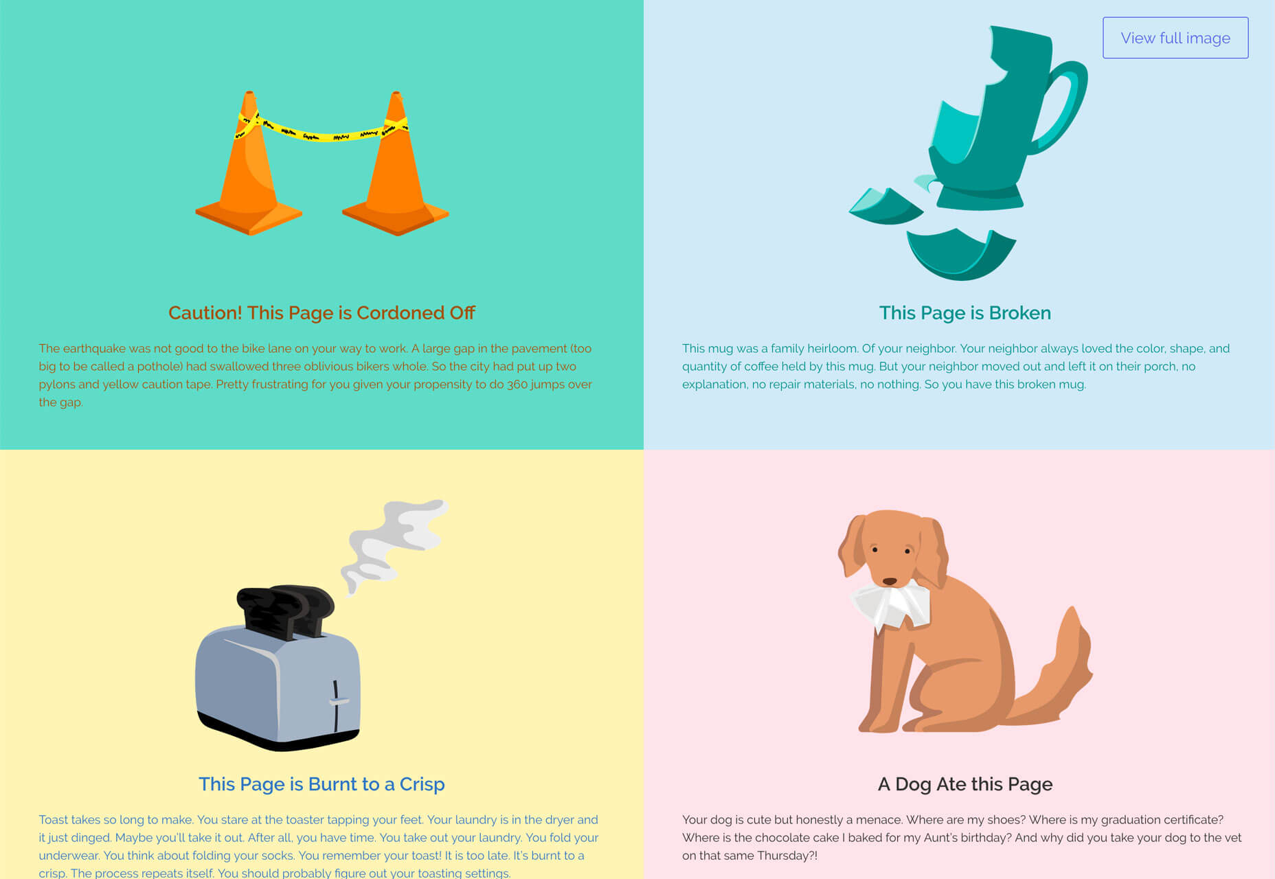
Have you ever wanted to create a cool 404 page but didn’t have the time or inspiration? 404 Illustrations takes all the work out of it for you with funky and trendy illustrations for lost website users. Each illustration comes with a cute description as well and they are free to use. The designers promise more illustrations in the future.

Spotlight

Spotlight is a lightbox gallery library that’s lightweight, easy to run, and has no dependencies. It literally runs from the download without additional JavaScript, HTML snippets, additional CSS resources, images or assets, and no additional handling of dynamic content.

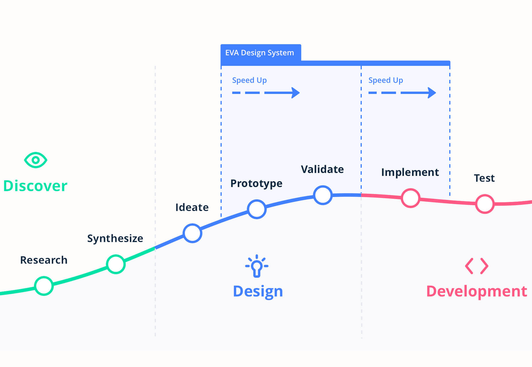
Eva Design System

Eva is a free and open-source design system that’s adaptable to your needs and team. It works with Sketch and provides symbols and style configurations. The system allows you to design and code using a quick process that can eliminate repetitive work.

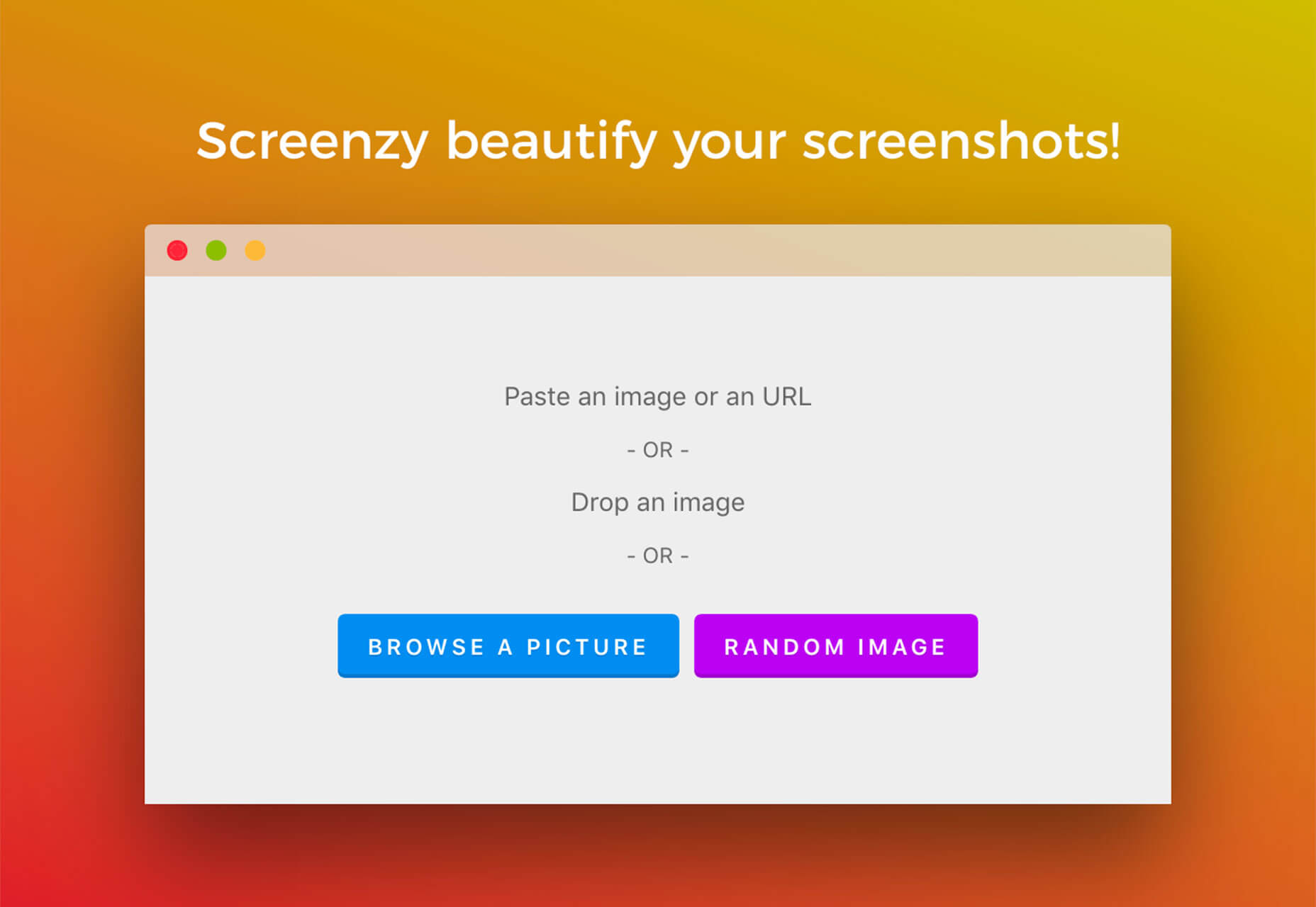
Screenzy

Screenzy is a tool for creating and editing screenshots quickly. Just paste an image or URL and use on-screen settings to adjust the image, add text or choose from one of 5 pre-set options.

Drag and Drop Sticky

Scott Kellum created a cool drag and drop sticky note element with no JavaScript. It works as a textarea element and as you move it around, technically you are just resizing a the textarea and the “note” follows.

Freezeframe.js

Freezeframe.js lets you pause animated gifs and then reanimate on a hover, mouse click, touch event, or another manual trigger. The new version of this tool no longer uses jQuery and functions thanks to modern JavaScript.

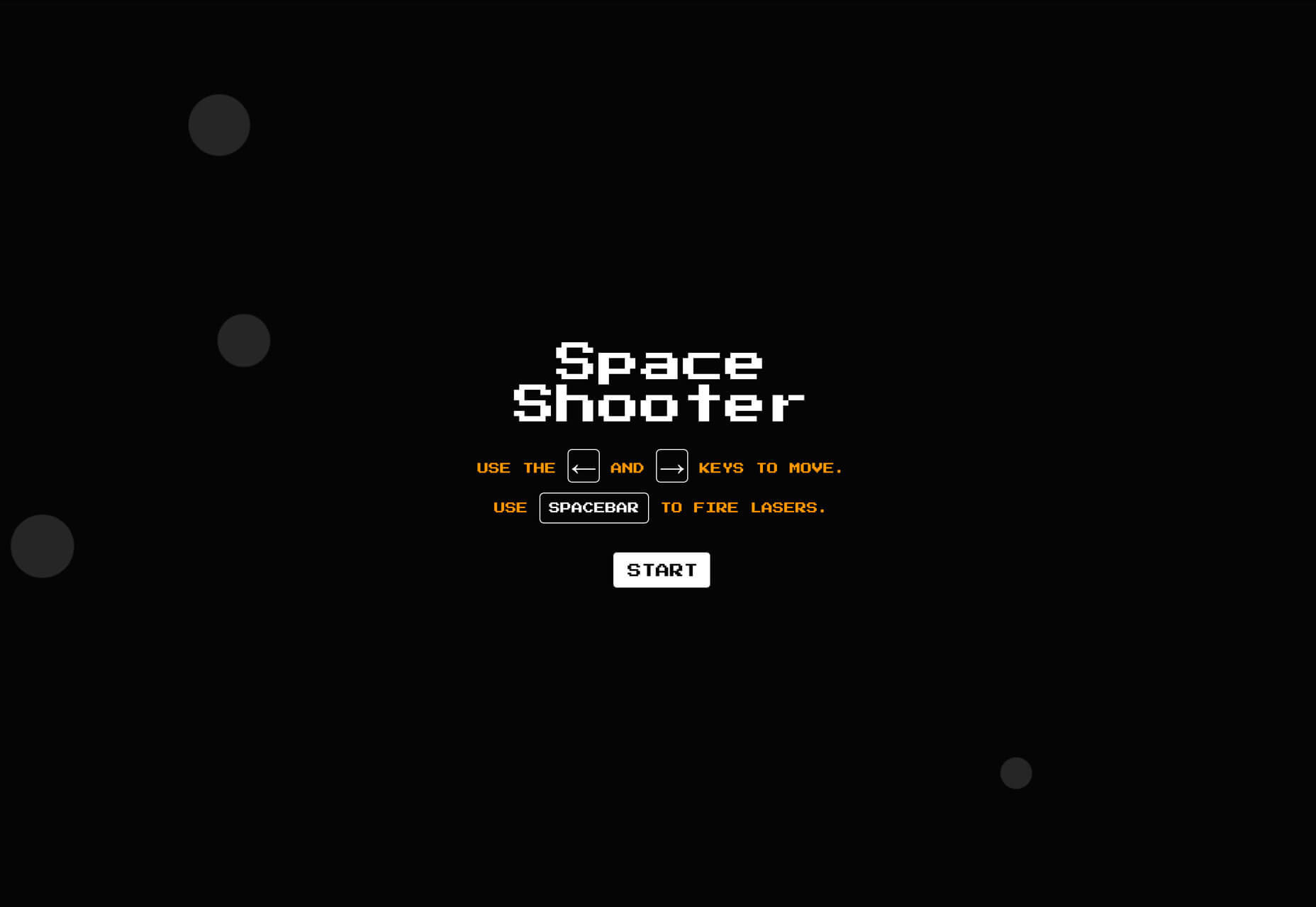
Space Shooter

Space Shooter is a fun pen by Andrew Rubin that’s a good distraction when you are trying to work through a design problem and a fun bit of inspiration. You can build something like this. Why not make a game? Fork it and play around.

Pika CDN

Pika CDN is made for packages written in ES Module syntax, that runs natively in browser. Use it to distribute more modern, unminified packages that uses a proprietary package builder, putting everything into a ready-to-import JavaScript file. The tool is free and a pro version is on the way. (Sign up to get notified when it is ready.)

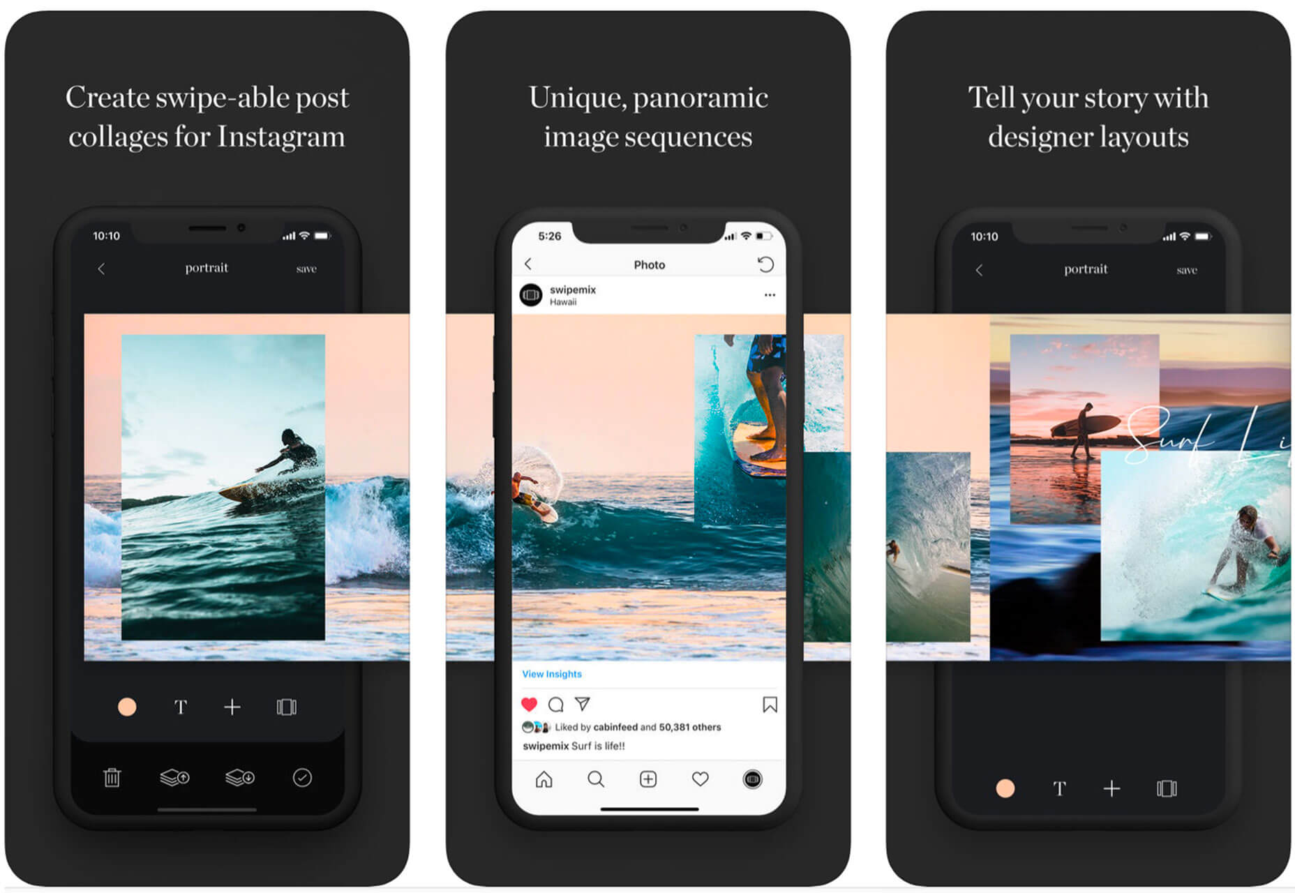
Swipemix

Swipemix will help you design better layouts and collages on Instagram. It allows you to sequence images with easy templates in just a few minutes from an app on your iPhone.

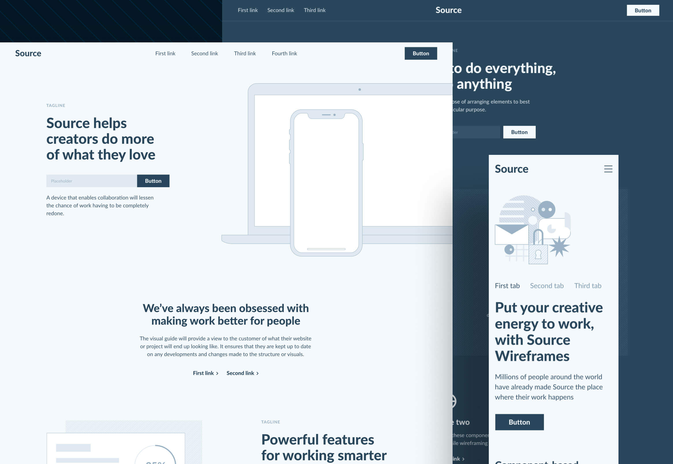
Source Wireframe Kit

Source Wireframe Kit helps you prototype faster with more than 500 blocks that can be moved, combined, and adjusted into a complete design system. Everything is grouped into categories to help you work faster and you can use it with Sketch, Figma, Marvel, or Invision to bring prototypes to life.

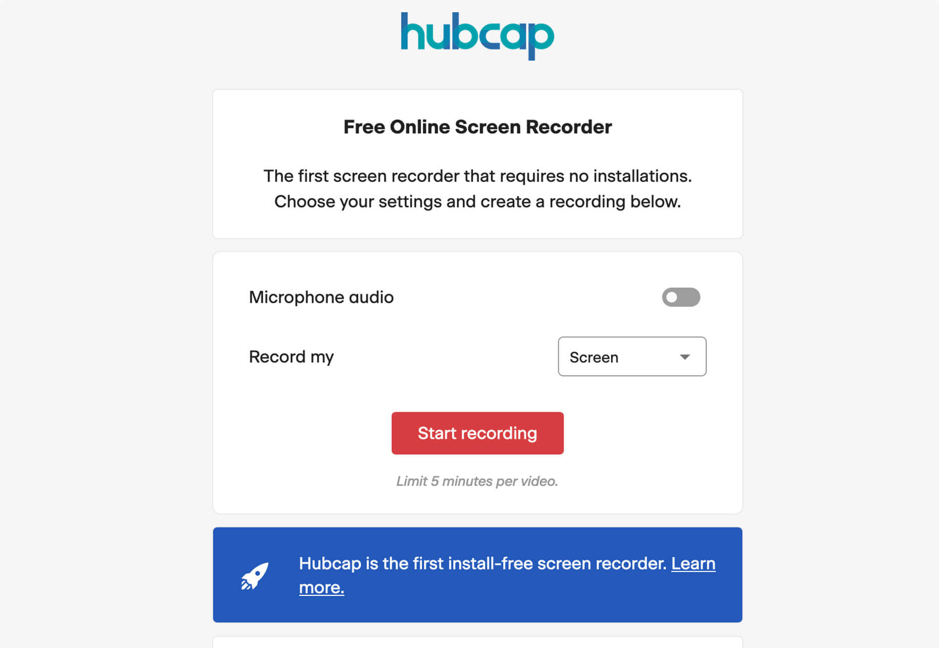
Hubcap

Hubcap is a free screen recorder that works without installing any software. It works with Chrome or Firefox and allows you to record a screengrab and share it instantly. You can record up to five minutes and Hubcap will store if for up to 2 weeks at no cost.

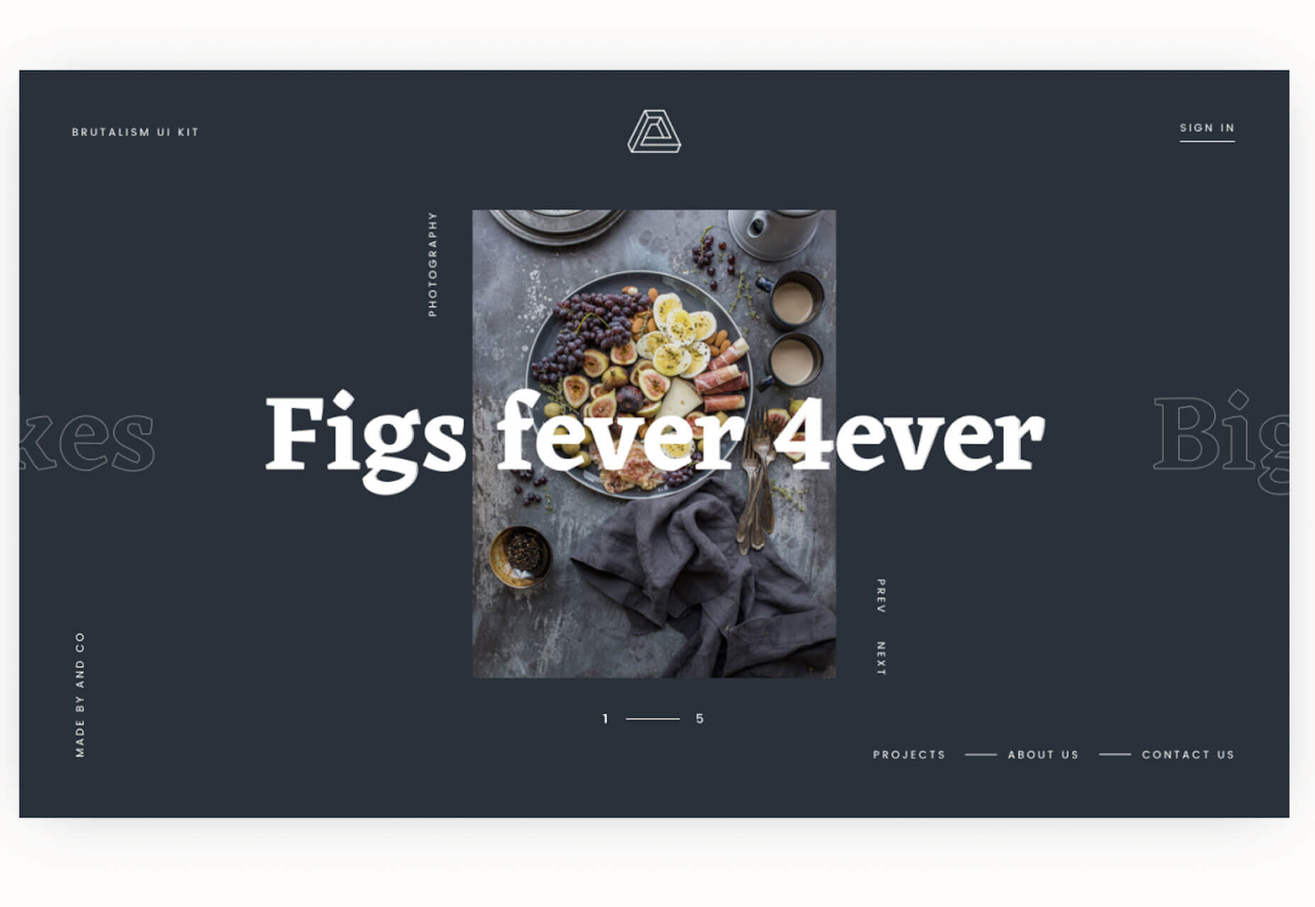
Brutalism Web Kit

Brutalism Web Kit is a collection of artboards to jumpstart website projects using this design trend. It includes 70 styles and works with free tools including Google Fonts.

Ant Design UI Kit

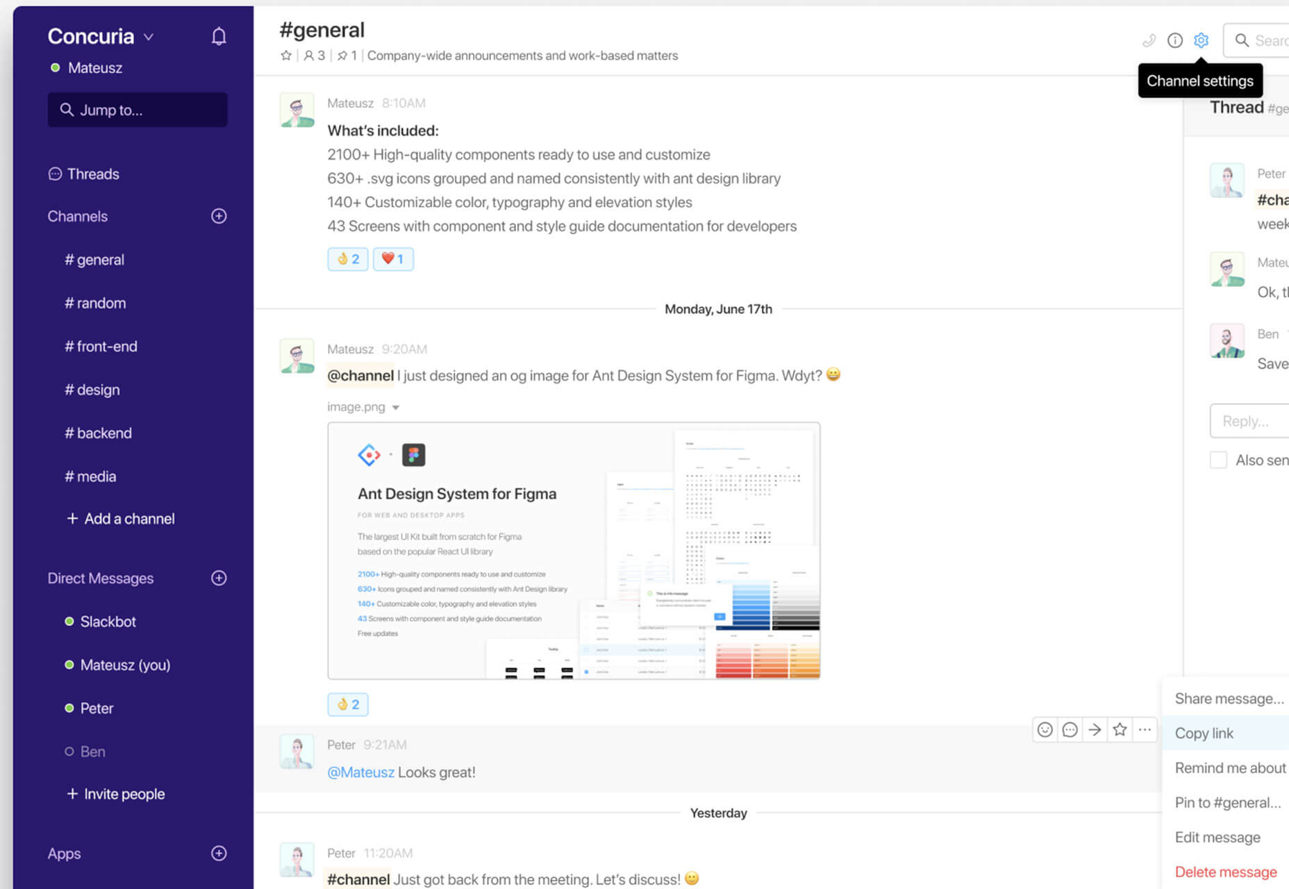
Any Design UI Kit is a collection of components for Figma based on the React UI library. It includes 2,100 components, 630 icons, 140 customizable styles, and 43 screens, making it one of the biggest component inventories for Figma.

Anggada

Anggada looks like it could be inspired by the title characters in recent Aladdin movie release. It includes a full character set that’s most appropriate for display use. The demo version is free and the full font is available from the typeface designer.

Basier Mono

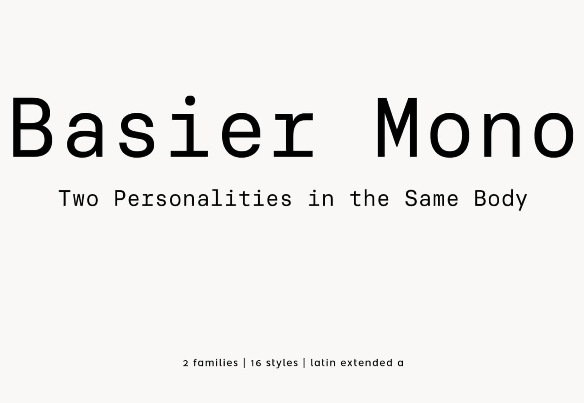
Basier Mono is a modern style monospaced typeface with a free and family (premium) download option with square and circular shapes. The typeface is also packed with cool alternates, fractions, and supports multiple languages.

Bright Salkiy

Bright Salkiy is a scrawling script with thin lines that has the look of an elegant signature. The free version is for personal use only and includes a full character and number set.

Cataclysmo

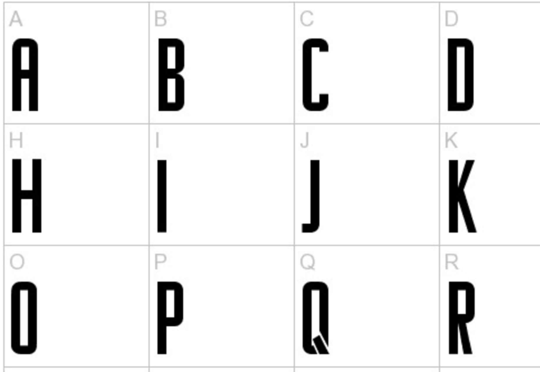
Cataclysmo is a bold, tall slab serif for display use. It includes an uppercase-only character set and numbers.

Nairi Amber

Nairi Amber includes a regular sans serif, italic sans serif, and script character set for personal use with the free version. Each character set in the family works well together with a wide stance and rounded letterforms. The script is somewhat more compact.

Rise of Kingdom

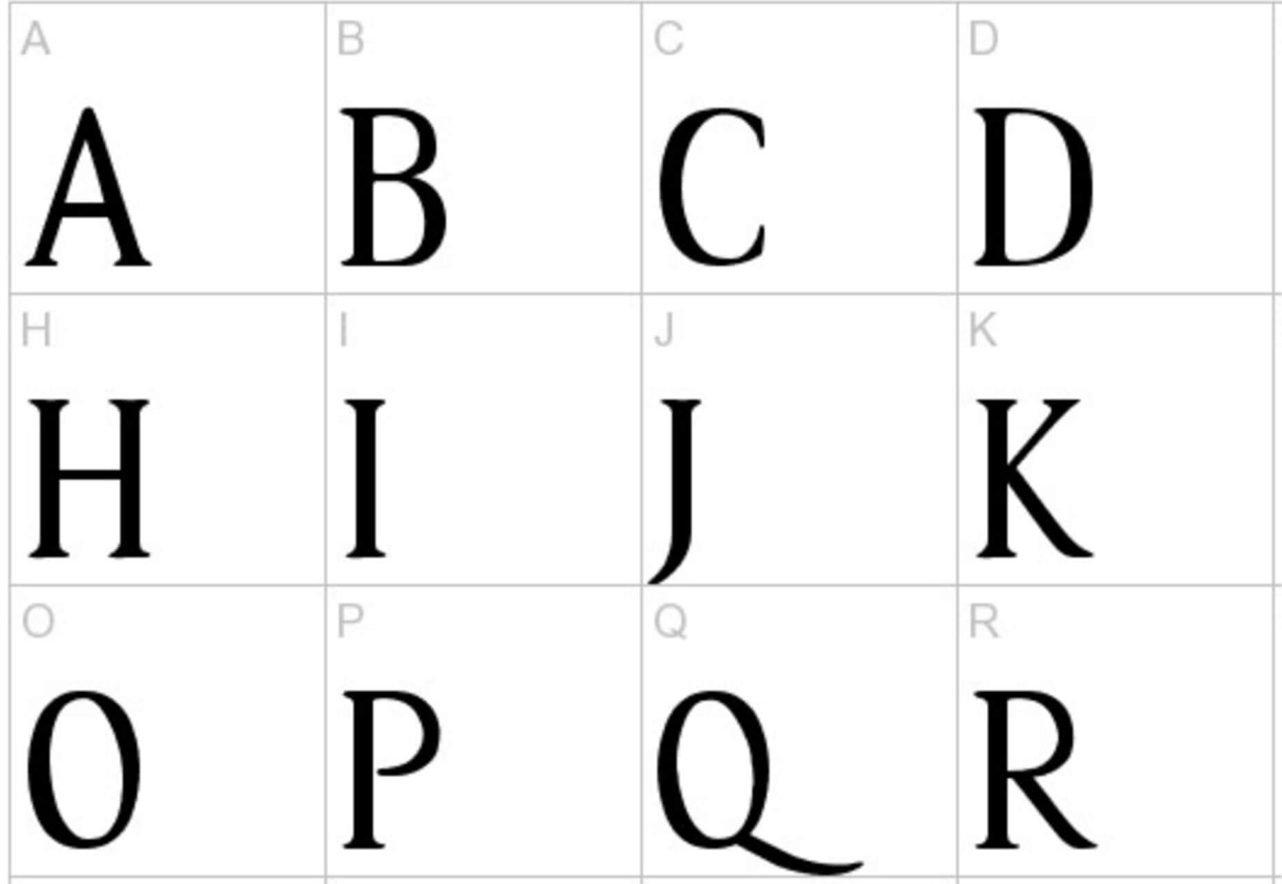
Rise of Kingdom is an uppercase serif typeface that would be a great display option. It has a somewhat whimsical feel with tall letterforms on the thin side.

Source

Categories: Designing, Others Tags:

Everything You Need To Know About CSS Margins

July 15th, 2019 No comments
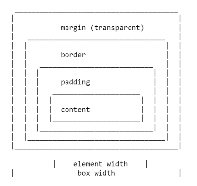
ascii art drawing of the box model

Everything You Need To Know About CSS Margins

Everything You Need To Know About CSS Margins

Rachel Andrew

2019-07-15T12:30:59+02:002019-07-16T16:48:20+00:00

One of the first things most of us learned when we learned CSS, was details of the various parts of a box in CSS, described as The CSS Box Model. One of the elements in the Box Model is the margin, a transparent area around a box, which will push other elements away from the box contents. The margin-top, margin-right, margin-bottom and margin-left properties were described right back in CSS1, along with the shorthand margin for setting all four properties at once.

A margin seems to be a fairly uncomplicated thing, however, in this article, we will take a look at some of the things which trip people up with regard to using margins. In particular, we will be looking at how margins interact with each other, and how margin collapsing actually works.

The CSS Box Model

As with all articles about parts of the CSS Box Model, we should define what we mean by that, and how the model has been clarified through versions of CSS. The Box Model refers to how the various parts of a box — the content, padding, border, and margin — are laid out and interact with each other. In CSS1, the Box Model was detailed with the ASCII art diagram shown in the image below.

ascii art drawing of the box model

Depiction of the CSS Box Model in CSS1

The four margin properties for each side of the box and the margin shorthand were all defined in CSS1.

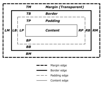
The CSS2.1 specification has an illustration to demonstrate the Box Model and also defines terms we still use to describe the various boxes. The specification describes the content box, padding box, border box, and margin box, each being defined by the edges of the content, padding, border, and margin respectively.

diagram of the CSS Box Model

Depection of the CSS Box Model in CSS2

There is now a Level 3 Box Model specification as a Working Draft. This specification refers back to CSS2 for the definitions of the Box Model and margins, therefore it is the CSS2 definition we will be using for the majority of this article.

Margin Collapsing

The CSS1 specification, as it defined margins, also defined that vertical margins collapse. This collapsing behavior has been the source of margin-related frustration ever since. Margin collapsing makes sense if you consider that in those early days, CSS was being used as a documenting formatting language. Margin collapsing means that when a heading with a bottom margin, is followed by a paragraph with a top margin, you do not get a huge gap between those items.

When margins collapse, they will combine so that the space between the two elements becomes the larger of the two margins. The smaller margin essentially ending up inside the larger one.

Margins collapse in the following situations:

Let’s take a look at each of these scenarios in turn, before looking at the things which prevent margins from collapsing in these scenarios.

Adjacent Siblings

My initial description of margin collapsing is a demonstration of how the margins between adjacent siblings collapse. Other than in the situations mentioned below, if you have two elements displaying one after the other in normal flow, the bottom margin of the first element will collapse with the top margin of the following element.

In the CodePen example below, there are three div elements. The first has a top and bottom margin of 50 pixels. The second has a top and bottom margin of 20px. The third has a top and bottom margin of 3em. The margin between the first two elements is 50 pixels, as the smaller top margin is combined with the larger bottom margin. The margin between the second two elements in 3em, as 3em is larger than the 20 pixels on the bottom of the second element.

See the Pen [Margins: adjacent siblings](https://codepen.io/rachelandrew/pen/OevMPo) by Rachel Andrew.

See the Pen Margins: adjacent siblings by Rachel Andrew.

Completely Empty Boxes

If a box is empty, then it’s top and bottom margin may collapse with each other. In the following CodePen example, the element with a class of empty has a top and bottom margin of 50 pixels, however, the space between the first and third items is not 100 pixels, but 50. This is due to the two margins collapsing. Adding anything to that box (even padding) will cause the top and bottom margins to be used and not collapse.

See the Pen [Margins: empty boxes](https://codepen.io/rachelandrew/pen/JQLGMr) by Rachel Andrew.

See the Pen Margins: empty boxes by Rachel Andrew.

Parent And First Or Last Child Element

This is the margin collapsing scenario which catches people out most often, as it does not seem particularly intuitive. In the following CodePen, I have a div with a class of wrapper, and I have given that div an outline in red so that you can see where it is. The three child elements all have a margin of 50 pixels. However, the first and last items are flush with the edges of the wrapper; there is not a 50-pixel margin between the element and the wrapper.

See the Pen [Margins: margin on first and last child](https://codepen.io/rachelandrew/pen/BgrKGp) by Rachel Andrew.

See the Pen Margins: margin on first and last child by Rachel Andrew.

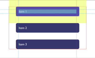
This is because the margin on the child collapses with any margin on the parent thus ending up on the outside of the parent. You can see this if you inspect the first child using DevTools. The highlighted yellow area is the margin.

The item with a yellow highlighted margin showing outside the parent

DepvTools can help you see where your margin ends up

Only Block Margins Collapse

The last example also highlights something about margin collapsing. In CSS2, only vertical margins are specified to collapse — that is the top and bottom margins on an element if you are in a horizontal writing mode. So the left and right margins above are not collapsing and ending up outside the wrapper.

Note: It is worth remembering that margins only collapse in the block direction, such as between paragraphs.

Things Which Prevent Margin Collapsing

Margins never collapse if an item has absolute positioning, or is floated. However, assuming you have run into one of the places where margins collapse outlined above, how can you stop those margins collapsing?

The first thing that stops collapsing is situations where there is something between the elements in question.

For example, a box completely empty of content will not collapse it’s top and bottom margin if it has a border, or padding applied. In the example below I have added 1px of padding to the box. There is now a 50-pixel margin above and below the box.

See the Pen [Margins: empty boxes with padding do not collapse](https://codepen.io/rachelandrew/pen/gNeMpg) by Rachel Andrew.

See the Pen Margins: empty boxes with padding do not collapse by Rachel Andrew.

This has logic behind it, if the box is completely empty with no border or padding, it is essentially invisible. It might be an empty paragraph element thrown into the markup by your CMS. If your CMS was adding redundant paragraph elements, you probably wouldn’t want them to cause large gaps between the other paragraphs due to their margins being honored. Add anything to the box, and you will get those gaps.

Similar behavior can be seen with margins on first or last children which collapse through the parent. If we add a border to the parent, the margins on the children stay inside.

See the Pen [Margins: margin on first and last child doesn’t collapse if the parent has a border](https://codepen.io/rachelandrew/pen/vqRKKX) by Rachel Andrew.

See the Pen Margins: margin on first and last child doesn’t collapse if the parent has a border by Rachel Andrew.

Once again, there is some logic to the behavior. If you have wrapping elements for semantic purposes that do not display visually, you probably don’t want them to introduce big gaps in the display. This made a lot of sense when the web was mostly text. It is less useful as behavior when we are using elements to lay out a design.

Creating a Block Formatting Context

A new Block Formatting Context (BFC) will also prevent margin collapsing through the containing element. If we look again at the example of the first and last child, ending up with their margins outside of the wrapper, and give the wrapper display: flow-root, thus creating a new BFC, the margins stay inside.

See the Pen [Margins: a new Block Formatting Context contains margins](https://codepen.io/rachelandrew/pen/VJXjEp) by Rachel Andrew.

See the Pen Margins: a new Block Formatting Context contains margins by Rachel Andrew.

To find out more about display: flow-root, read my article “Understanding CSS Layout And The Block Formatting Context”. Changing the value of the overflow property to auto will have the same effect, as this also creates a new BFC, although it may also create scrollbars that you didn’t want in some scenarios.

Flex And Grid Containers

Flex and Grid containers establish Flex and Grid formatting contexts for their children, so they have different behavior to block layout. One of those differences is that margins do not collapse:

“A flex container establishes a new flex formatting context for its contents. This is the same as establishing a block formatting context, except that flex layout is used instead of block layout. For example, floats do not intrude into the flex container, and the flex container’s margins do not collapse with the margins of its contents.”

Flexbox Level 1

If we take the example above and make the wrapper into a flex container, displaying the items with flex-direction: column, you can see that the margins are now contained by the wrapper. Additionally, margins between adjacent flex items do not collapse with each other, so we end up with 100 pixels between flex items, the total of the 50 pixels on the top and bottom of the items.

See the Pen [Margins: margins on flex items do not collapse](https://codepen.io/rachelandrew/pen/mZxreL) by Rachel Andrew.

See the Pen Margins: margins on flex items do not collapse by Rachel Andrew.

Margin Strategies For Your Site

Due to margin collapsing, it is a good idea to come up with a consistent way of dealing with margins in your site. The simplest thing to do is to only define margins on the top or bottom of elements. In that way, you should not run into margin collapsing issues too often as the side with a margin will always be adjacent to a side without a margin.

Note: Harry Roberts has an excellent post detailing the reasons why setting margins only in one direction is a good idea, and not just due to solving collapsing margin issues.

This solution doesn’t solve the issues you might run into with margins on children collapsing through their parent. That particular issue tends to be less common, and knowing why it is happening can help you come up with a solution. An ideal solution to that is to give components which require it display: flow-root, as a fallback for older browsers you could use overflow to create a BFC, turn the parent into a flex container, or even introduce a single pixel of padding. Don’t forget that you can use feature queries to detect support for display: flow-root so only old browsers get a less optimal fix.

Most of the time, I find that knowing why margins collapse (or didn’t) is the key thing. You can then figure out on a case-by-case basis how to deal with it. Whatever you choose, make sure to share that information with your team. Quite often margin collapsing is a bit mysterious, so the reason for doing things to counter it may be non-obvious! A comment in your code goes a long way to help — you could even link to this article and help to share the margin collapsing knowledge.

I thought that I would round up this article with a few other margin-related pieces of information.

Percentage Margins

When you use a percentage in CSS, it has to be a percentage of something. Margins (and padding) set using percentages will always be a percentage of the inline size (width in a horizontal writing mode) of the parent. This means that you will have equal-sized padding all the way around the element when using percentages.

In the CodePen example below, I have a wrapper which is 200 pixels wide, inside is a box which has a 10% margin, the margin is 20 pixels on all sides, that being 10% of 200.

See the Pen [Margins: percentage margins](https://codepen.io/rachelandrew/pen/orqzrP) by Rachel Andrew.

See the Pen Margins: percentage margins by Rachel Andrew.

Margins In A Flow-Relative World

We have been talking about vertical margins throughout this article, however, modern CSS tends to think about things in a flow relative rather than a physical way. Therefore, when we talk about vertical margins, we really are talking about margins in the block dimension. Those margins will be top and bottom if we are in a horizontal writing mode, but would be right and left in a vertical writing mode written left to right.

Once working with logical, flow relative directions it becomes easier to talk about block start and block end, rather than top and bottom. To make this easier, CSS has introduced the Logical Properties and Values specification. This maps flow relative properties onto the physical ones.

For margins, this gives us the following mappings (if we are working in English or any other horizontal writing mode with a left-to-right text direction).

  • margin-top = margin-block-start
  • margin-right = margin-inline-end
  • margin-bottom = margin-block-end
  • margin-left = margin-inline-start

We also have two new shorthands which allow for the setting of both blocks at once or both inline.

  • margin-block
  • margin-inline

In the next CodePen example, I have used these flow relative keywords and then changed the writing mode of the box, you can see how the margins follow the text direction rather than being tied to physical top, right, bottom, and left.

See the Pen [Margins: flow relative margins](https://codepen.io/rachelandrew/pen/BgrQRj) by Rachel Andrew.

See the Pen Margins: flow relative margins by Rachel Andrew.

You can read more about logical properties and values on MDN or in my article “Understanding Logical Properties And Values” here on Smashing Magazine.

To Wrap-Up

You now know most of what there is to know about margins! In short:

  • Margin collapsing is a thing. Understanding why it happens and when it doesn’t will help you solve any problems it may cause.
  • Setting margins in one direction only solves many margin related headaches.
  • As with anything in CSS, share with your team the decisions you make, and comment your code.
  • Thinking about block and inline dimensions rather than the physical top, right, bottom and left will help you as the web moves towards being writing mode agnostic.
(il)
Categories: Others Tags:

Popular Design News of the Week: July 8, 2019 – July 14, 2019

July 14th, 2019 No comments

Every week users submit a lot of interesting stuff on our sister site Webdesigner News, highlighting great content from around the web that can be of interest to web designers.

The best way to keep track of all the great stories and news being posted is simply to check out the Webdesigner News site, however, in case you missed some here’s a quick and useful compilation of the most popular designer news that we curated from the past week.

Note that this is only a very small selection of the links that were posted, so don’t miss out and subscribe to our newsletter and follow the site daily for all the news.

Web Designers Create the Most Annoying UI Ever

Ad-Free Internet by Firefox

Creating the Perfect Color Palette for a Website

Menu (or not)

Web Design Color Trends for 2019

Site Design: The Atlas of Moons

The Twelfth Fourth

Bringing New CSS Techniques to Production

Design Principles are Dead

My Approach to On-Page SEO in 2019

How to Run a Small Social Network Site for your Friends

Google’s Taking Another Crack at Building a Social Network

It’s Never Going to Be Perfect, so Just Get it Done

No, not “everyone is a Designer”

Niice Insights

How We Used UI/UX to Confront the Climate Crisis

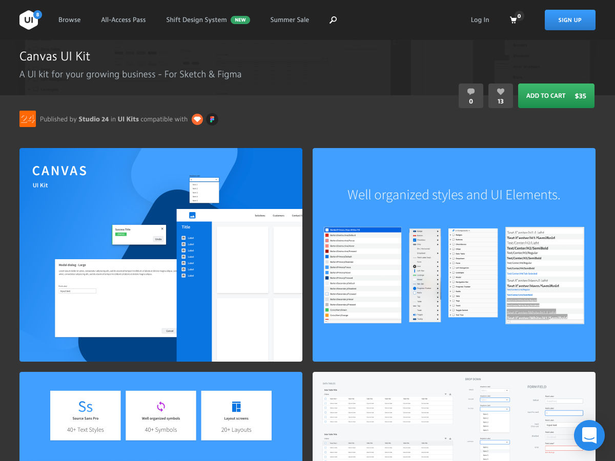
Canvas UI Kit: A UI Kit for your Growing Business – For Sketch & Figma

JavaScript Classes – A Friendly Introduction

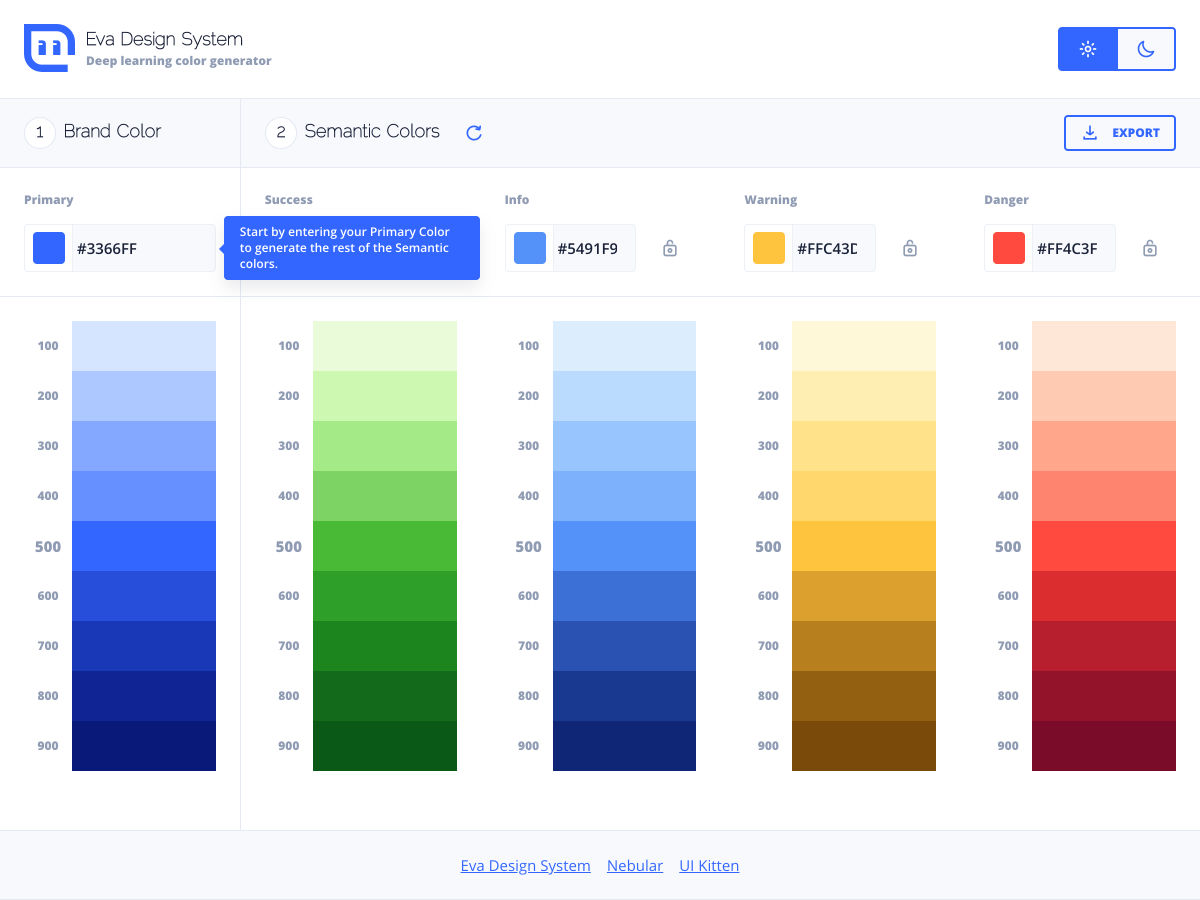
Eva Design System: Deep Learning Color Generator

Awesome Stranger Things Fan Art

Why Information Architecture in UX Process is a Necessity

How to Build a Bulletproof Product Design Strategy

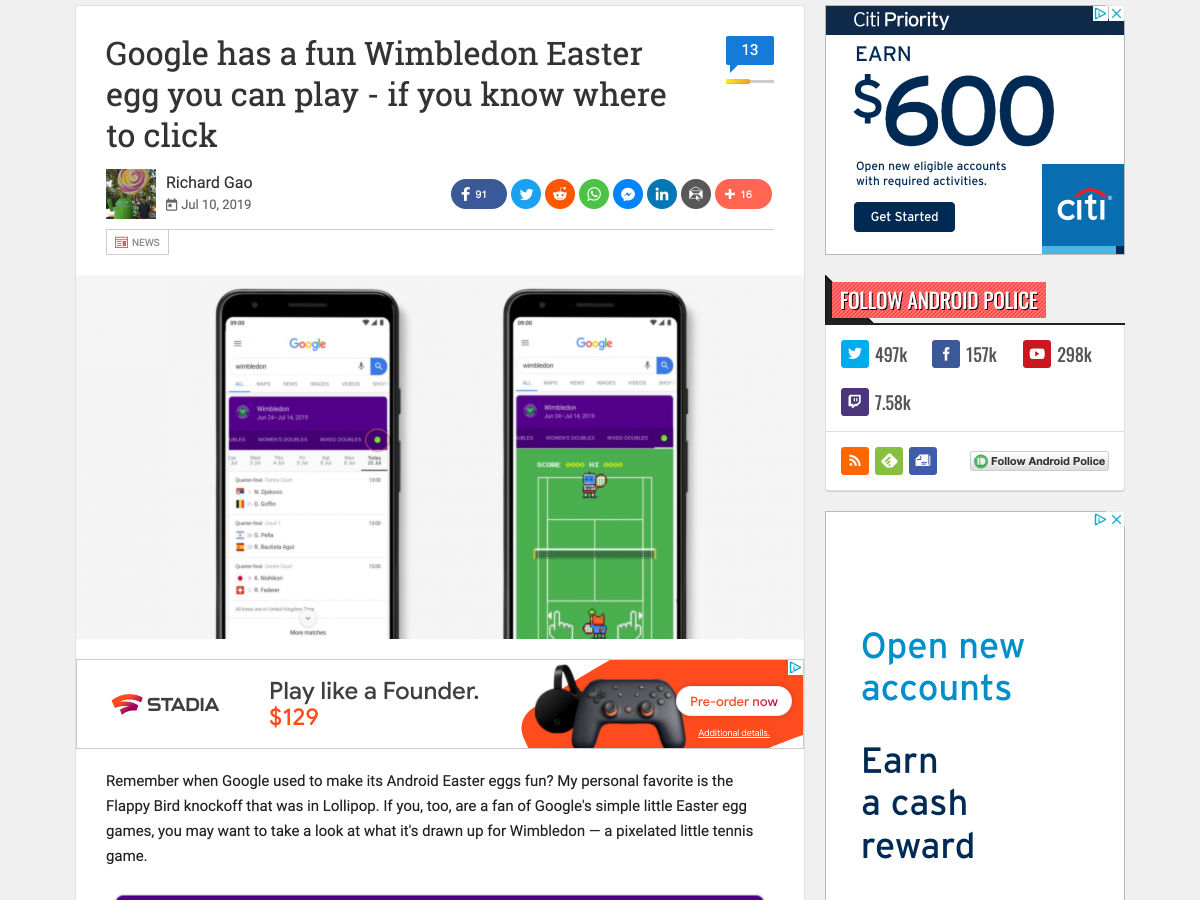
Google has a Fun Wimbledon Easter Egg You Can Play

You’re Getting Screwed on Amazon Prime Day

It’s Never Too Late to Be Successful and Happy

Want more? No problem! Keep track of top design news from around the web with Webdesigner News.

Source

Categories: Designing, Others Tags:

Position Sticky and Table Headers

July 12th, 2019 No comments

You can’t position: sticky; a

. Nor a

. But you can sticky a

, which means you can make sticky headers inside a regular ol’

. This is tricky stuff, because if you didn’t know this weird quirk, it would be hard to blame you. It makes way more sense to sticky a parent element like the table header rather than each individiaul element in a row.

The issue boils down to the fact that stickiness requires position: relative to work and that doesn’t apply to

and

in the CSS 2.1 spec.

There are two very extreme reactions to this, should you need to implement sticky table headers and not be aware of the

workaround.

  • Don’t use table markup at all. Instead, use different elements (
    s and whatnot) and other CSS layout methods to replicate the style of a table, but not locked out of using position: relative and creating position: sticky parent elements.
  • Use table elements, but totally remove all their styling defaults with new display values.

The first is dangerous because you aren’t using semantic and accessible elements for the content to be read and navigated. The second is almost the same. You can go that route, but need to be really careful to re-apply semantic roles.

Anyway, none of that matters if you just stick (get it?!) to using a sticky value on those

elements.

See the Pen
Sticky Table Headers with CSS
by Chris Coyier (@chriscoyier)
on CodePen.

It’s probably a bit weird to have table headers as a row in the middle of a table, but it’s just illustrating the idea. I was imagining colored header bars separating players on different sports teams or something.

Anytime I think about data tables, I also think about how tricky it can be to make them responsive. Fortunately, there are a variety of ways, all depending on the best way to group and explore the data in them.

The post Position Sticky and Table Headers appeared first on CSS-Tricks.

Categories: Designing, Others Tags:

Color Inputs: A Deep Dive into Cross-Browser Differences

July 12th, 2019 No comments

In this article, we’ll be taking a look at the structure inside elements, browser inconsistencies, why they look a certain way in a certain browser, and how to dig into it. Having a good understanding of this input allows us to evaluate whether a certain cross-browser look can be achieved and how to do so with a minimum amount of effort and code.

Here’s exactly what we’re talking about:

But before we dive into this, we need to get into…

Accessibility issues!

We’ve got a huge problem here: for those who completely rely on a keyboard, this input doesn’t work as it should in Safari and in Firefox on Windows, but it does work in Firefox on Mac and Linux (which I only tested on Fedora, so feel free to yell at me in the comments if it doesn’t work for you using another distribution).

In Firefox on Windows, we can Tab to the input to focus it, press Enter to bring up a dialog… which we then cannot navigate with the keyboard!

I’ve tried tabbing, arrow keys, and every other key available on the keyboard… nothing! I could at least close the dialog with good old Alt + F4. Later, in the bug ticket I found for this on Bugzilla, I also discovered a workaround: Alt + Tab to another window, then Alt + Tab back and the picker dialog can be navigated with the keyboard.

Things are even worse in Safari. The input isn’t even focusable (bug ticket) if VoiceOver isn’t on. And even when using VoiceOver, tabbing through the dialog the inputs opens is impossible.

If you’d like to use on an actual website, please let browsers know this is something that needs to be solved!

How to look inside

In Chrome, we need to bring up DevTools, go to Settings and, in the Preferences section under Elements, check the Show user agent shadow DOM option.

How to view the structure inside an input in Chrome.

Then, when we return to inspect our element, we can see inside its shadow DOM.

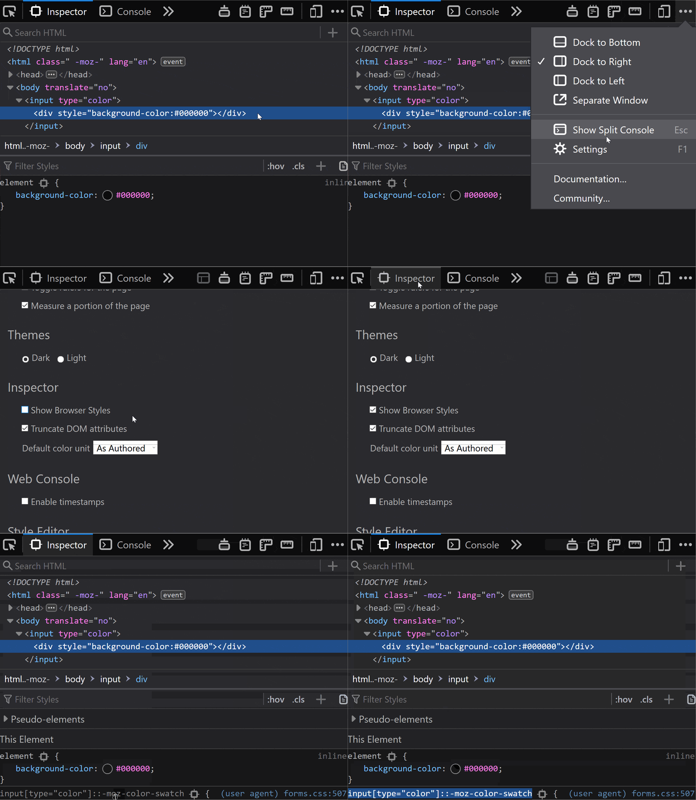
In Firefox, we need to go to about:config and ensure the devtools.inspector.showAllAnonymousContent flag is set to true.

How to view the structure inside an input in Firefox.

Then, we close the DevTools and, when we inspect our input again, we can see inside our input.

Sadly, we don’t seem to have an option for this in pre-Chromium Edge.

The structure inside

The structure revealed in DevTools differs from browser to browser, just like it does for range inputs.

In Chrome, at the top of the shadow DOM, we have a

wrapper that we can access using ::-webkit-color-swatch-wrapper.

Inside it, we have another

we can access with ::-webkit-color-swatch.

. Right at the top, we have a div which is the swatch wrapper and can be accessed using ::-webkit-color-swatch-wrapper. Inside it, there’s another div which is the swatch and can be accessed using ::-webkit-color-swatch. This div has the background-color set to the value of the parent color input.”>
Inner structure in Chrome.

In Firefox, we only see one

, but it’s not labeled in any way, so how do we access it?

On a hunch, given this

has the background-color set to the input’s value attribute, just like the ::-webkit-color-swatch component, I tried ::-moz-color-swatch. And it turns out it works!

<img src="https://css-tricks.com/wp-content/uploads/2019/05/in_struct_firefox.png" alt="Screenshot of Firefox DevTools showing what's inside an . Unlike in Chrome, here we only have a div which is the swatch and can be accessed using ::-moz-color-swatch. This div has the background-color set to the value of the parent color input.”>
Inner structure in Firefox.

However, I later learned we have a better way of figuring this out for Firefox!

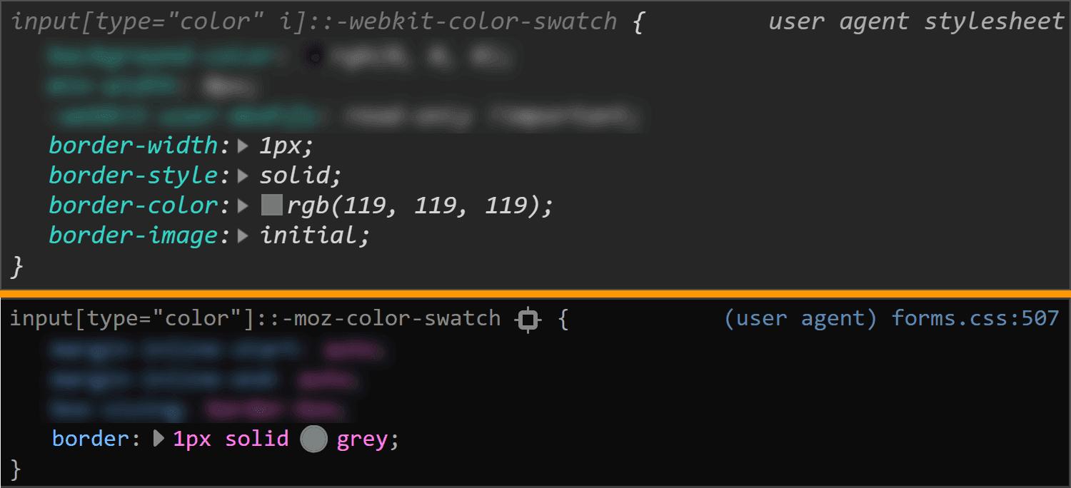
We can go into the Firefox DevTools Settings and, in the Inspector section, make sure the “Show Browser Styles” option is checked. Then, we go back to the Inspector and select this

inside our . Among the user agent styles, we see a rule set for input[type='color']::-moz-color-swatch!

Inspector > check the Show Browser styles checkbox.”>
Enable viewing browser styles in Firefox DevTools.

In pre-Chromium Edge, we cannot even see what kind of structure we have inside. I gave ::-ms-color-swatch a try, but it didn’t work and neither did ::-ms-swatch (which I considered because, for an input type='range', we have ::-webkit-slider-thumb and ::-moz-range thumb, but just ::-ms-thumb).

After a lot of searching, all I found was this issue from 2016. Pre-Chromium Edge apparently doesn’t allow us to style whatever is inside this input. Well, that’s a bummer.

How to look at the browser styles

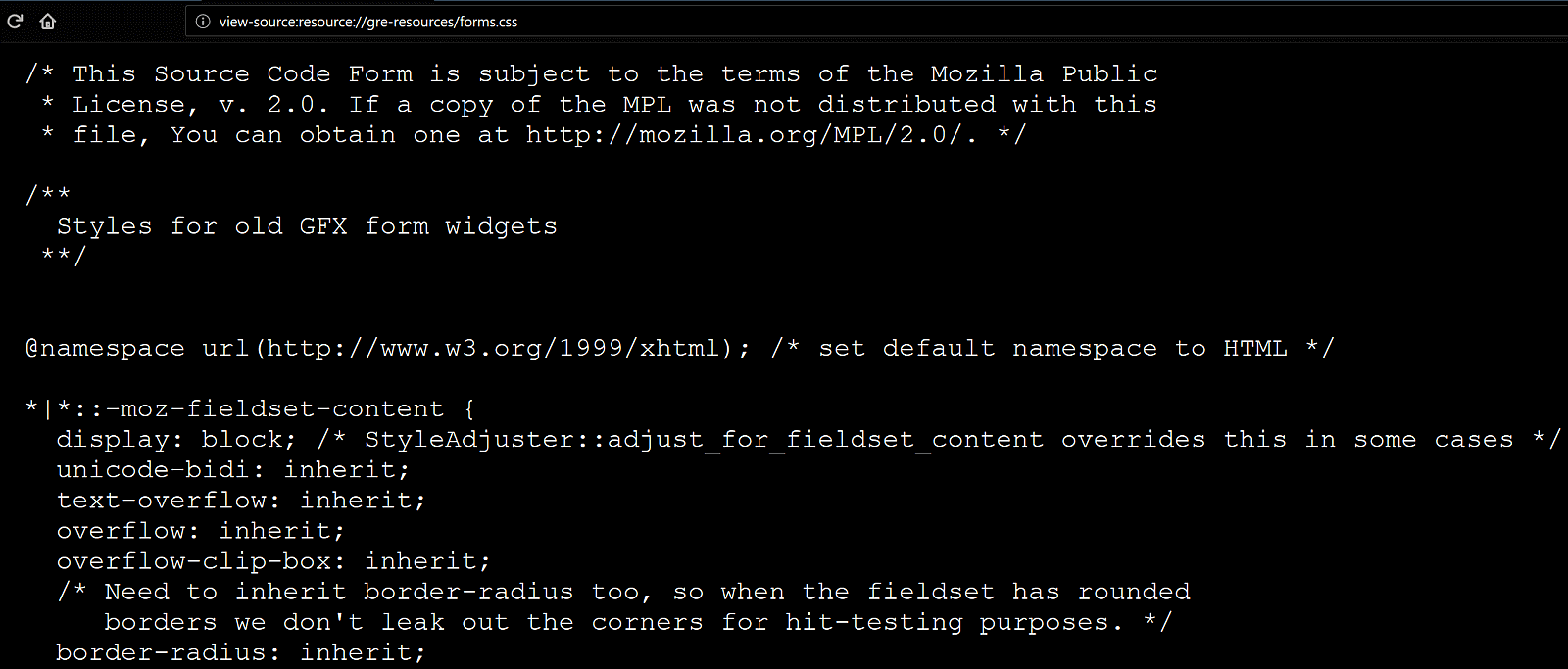
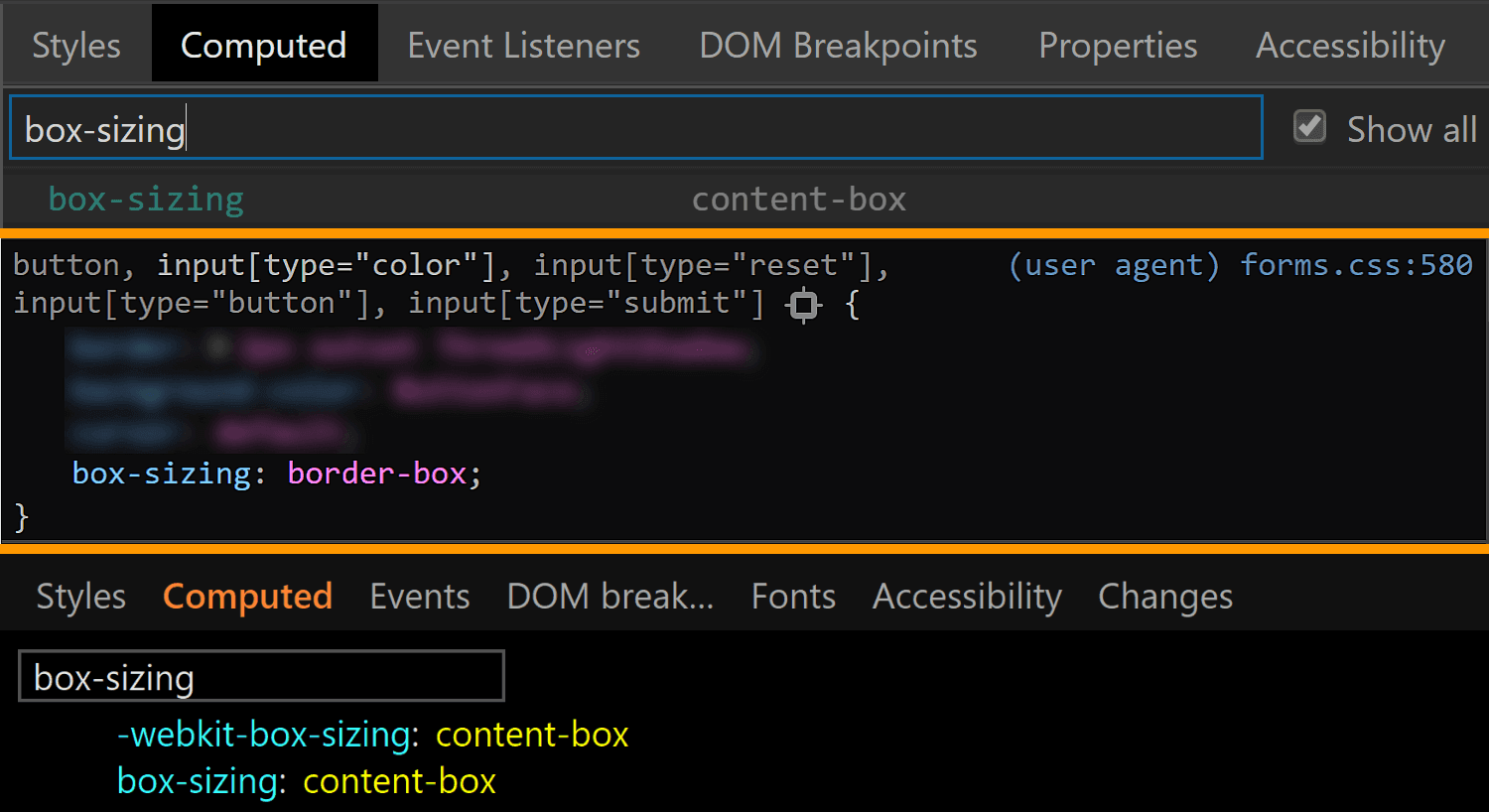
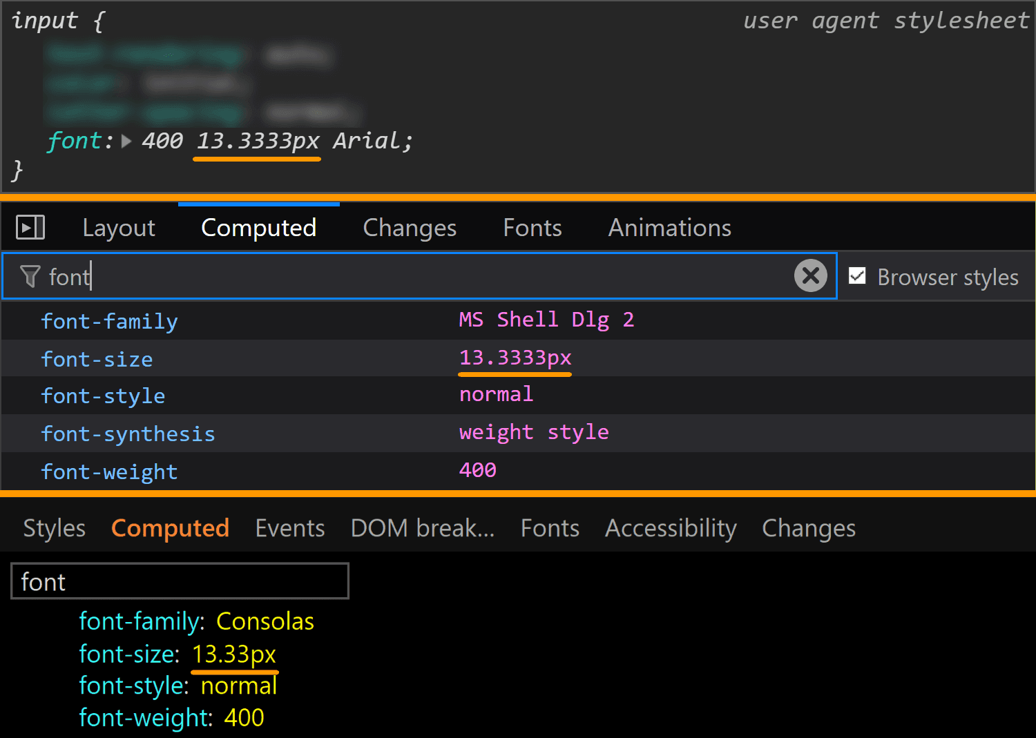
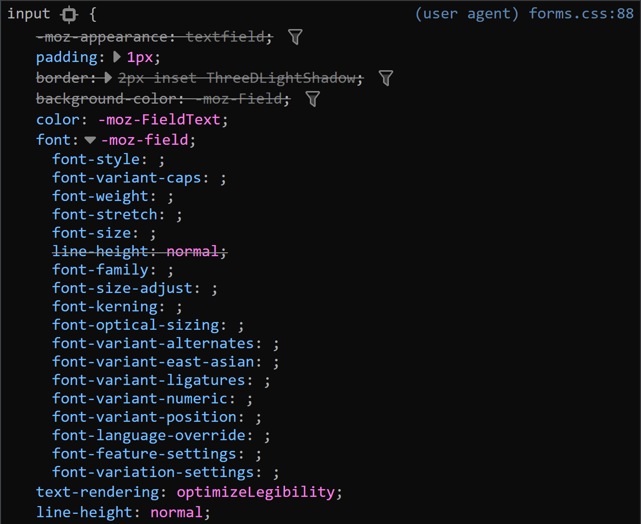
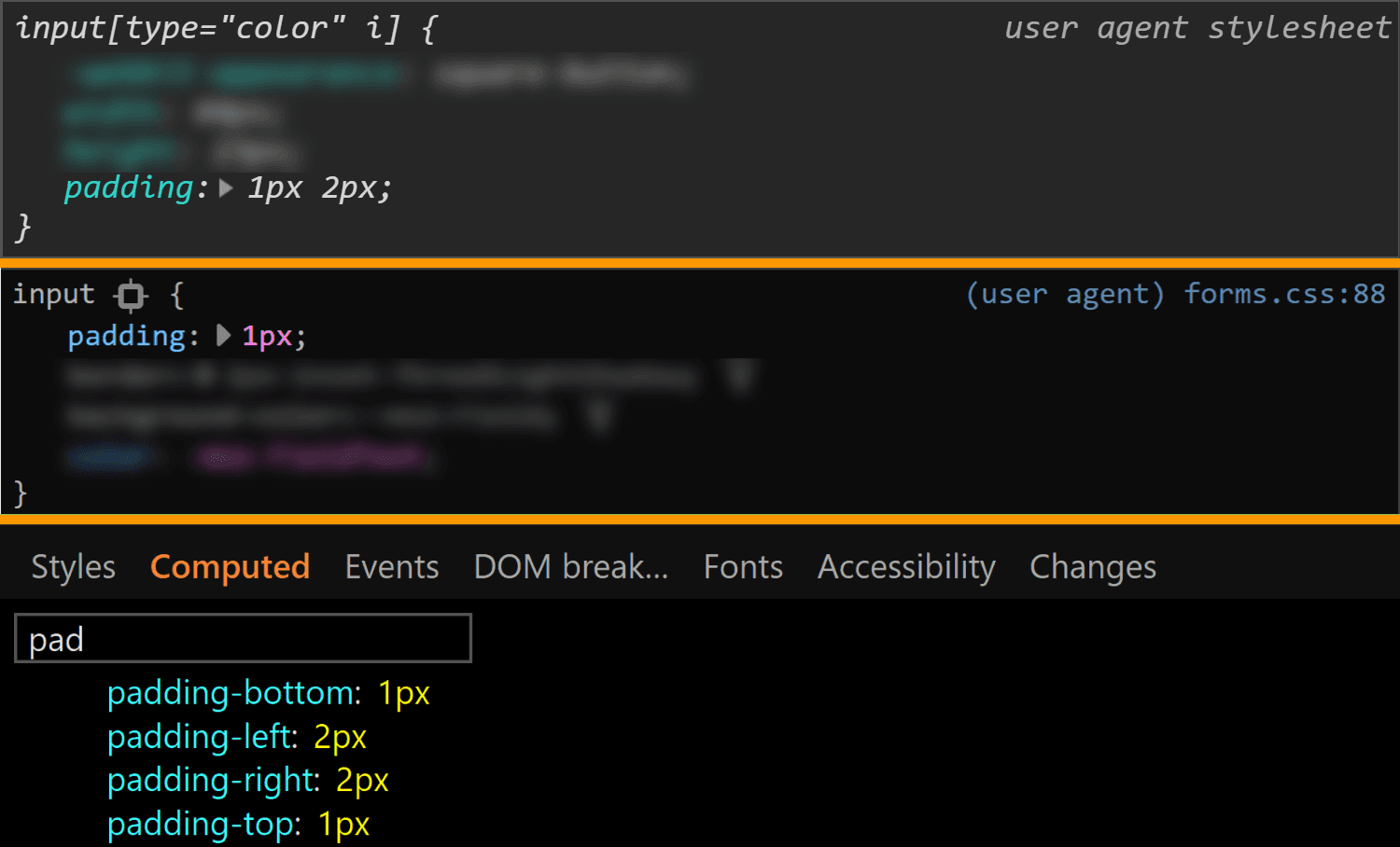
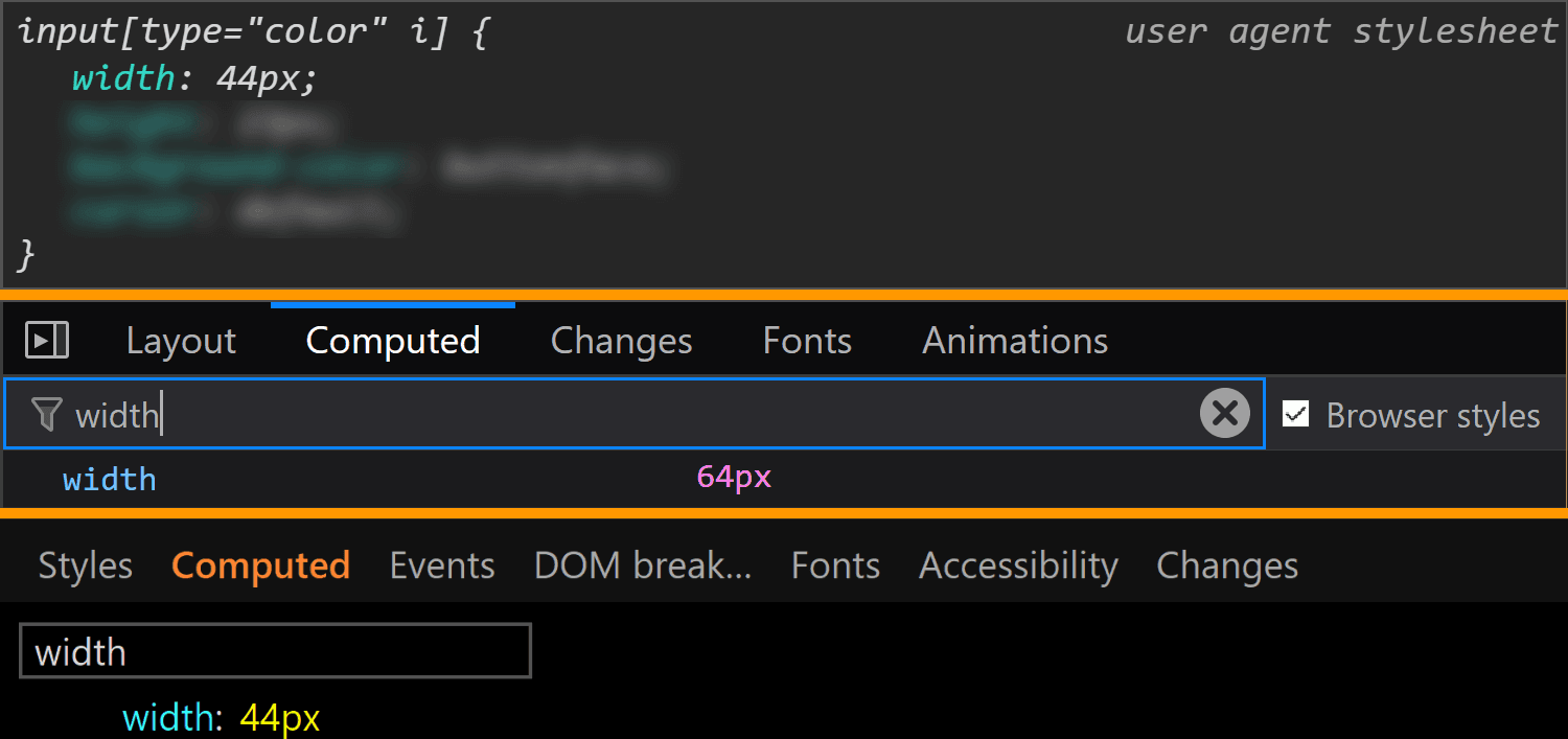
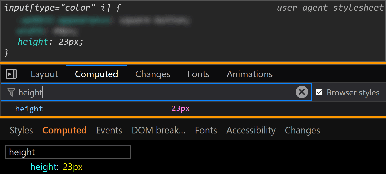
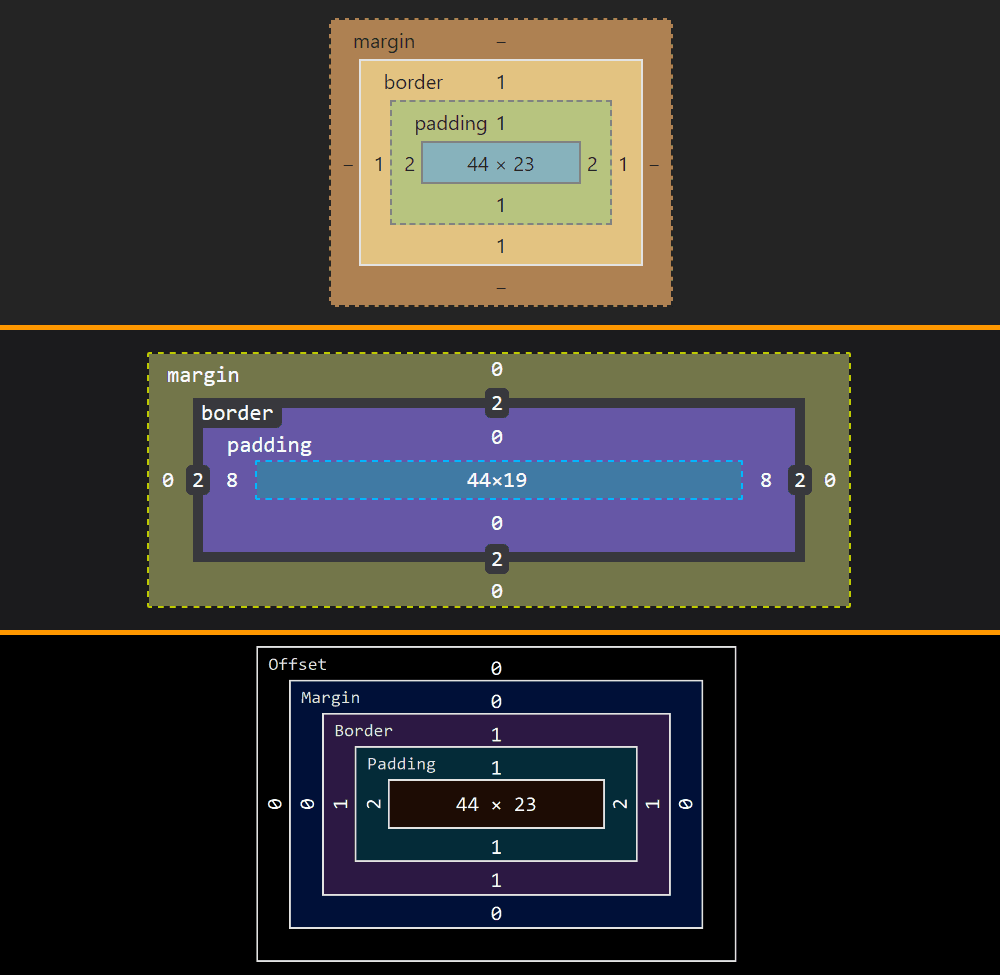
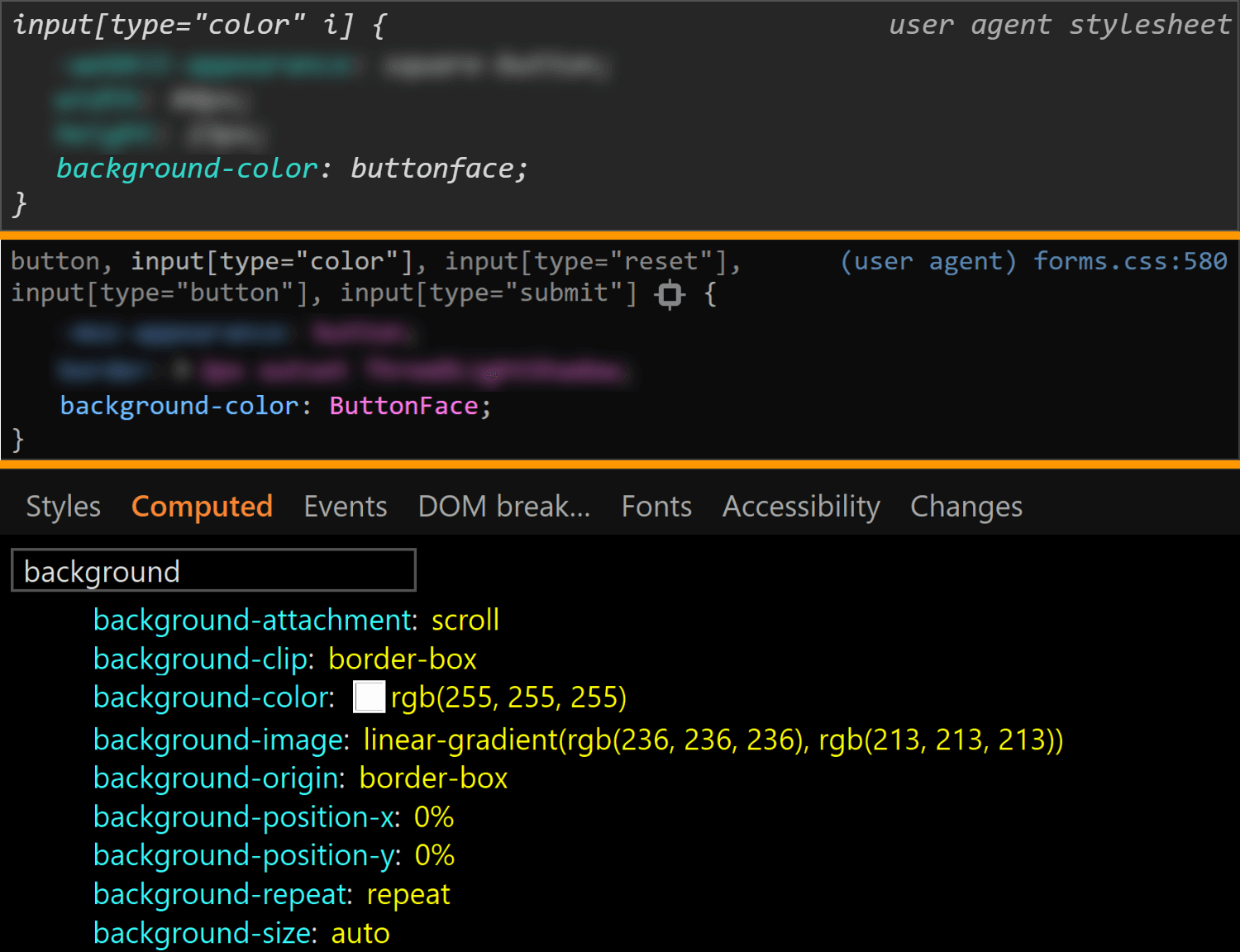
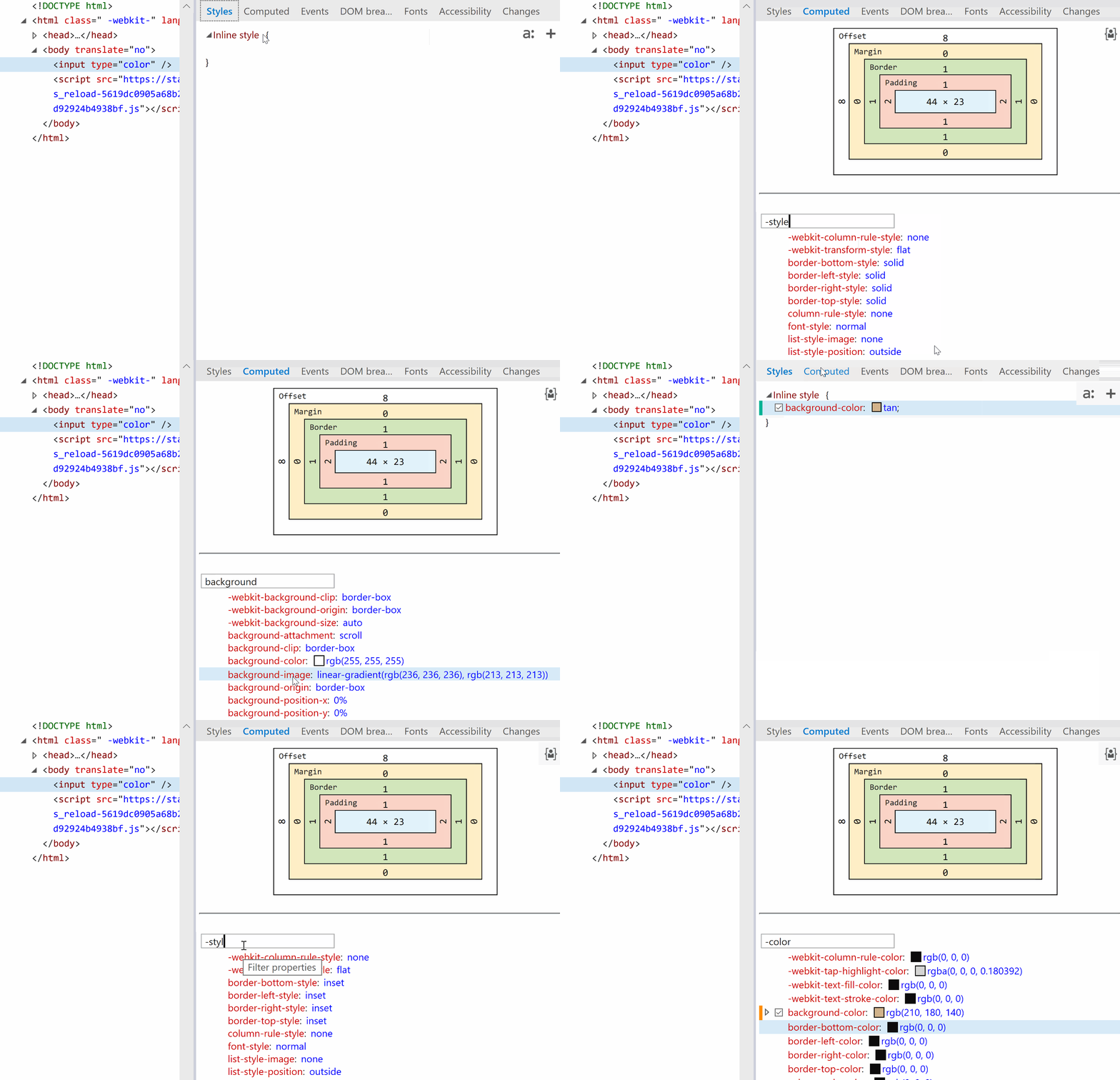
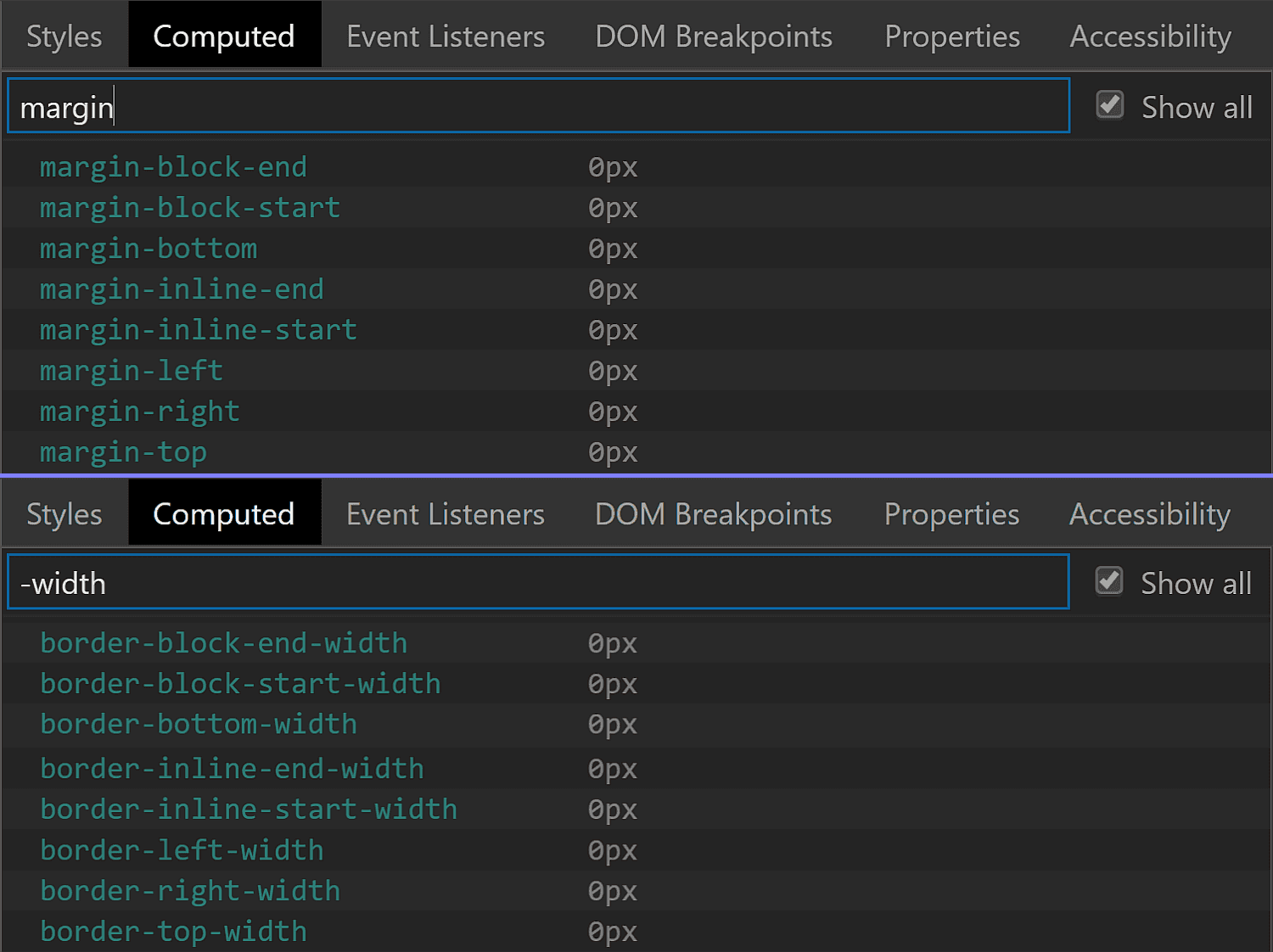
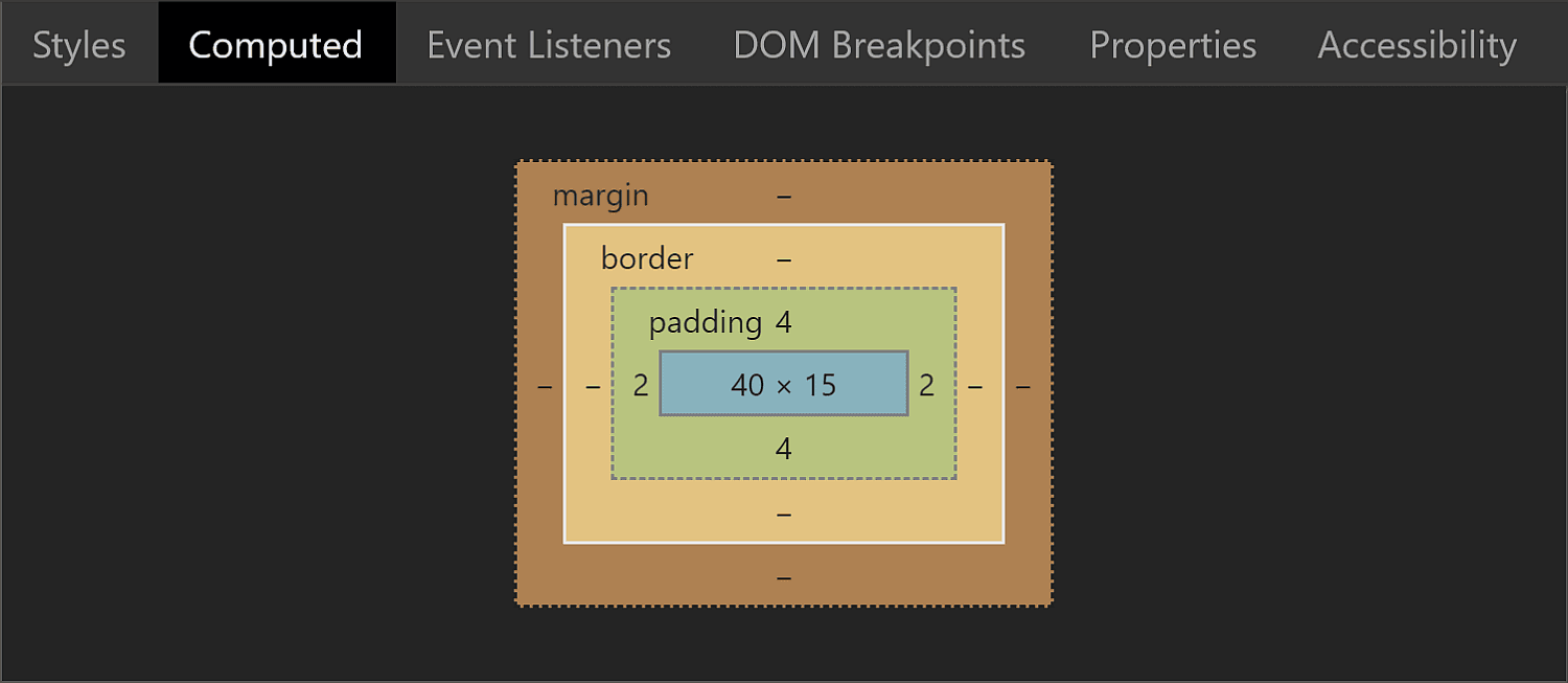
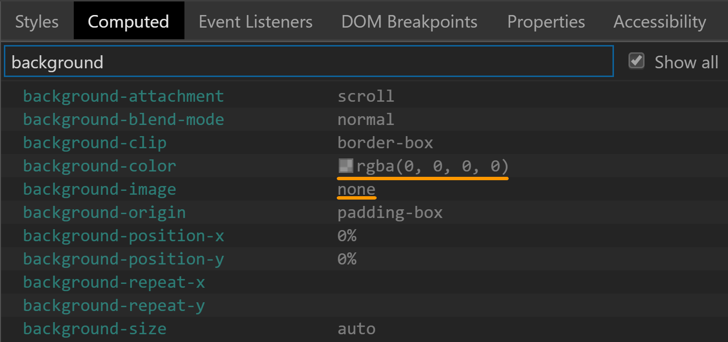
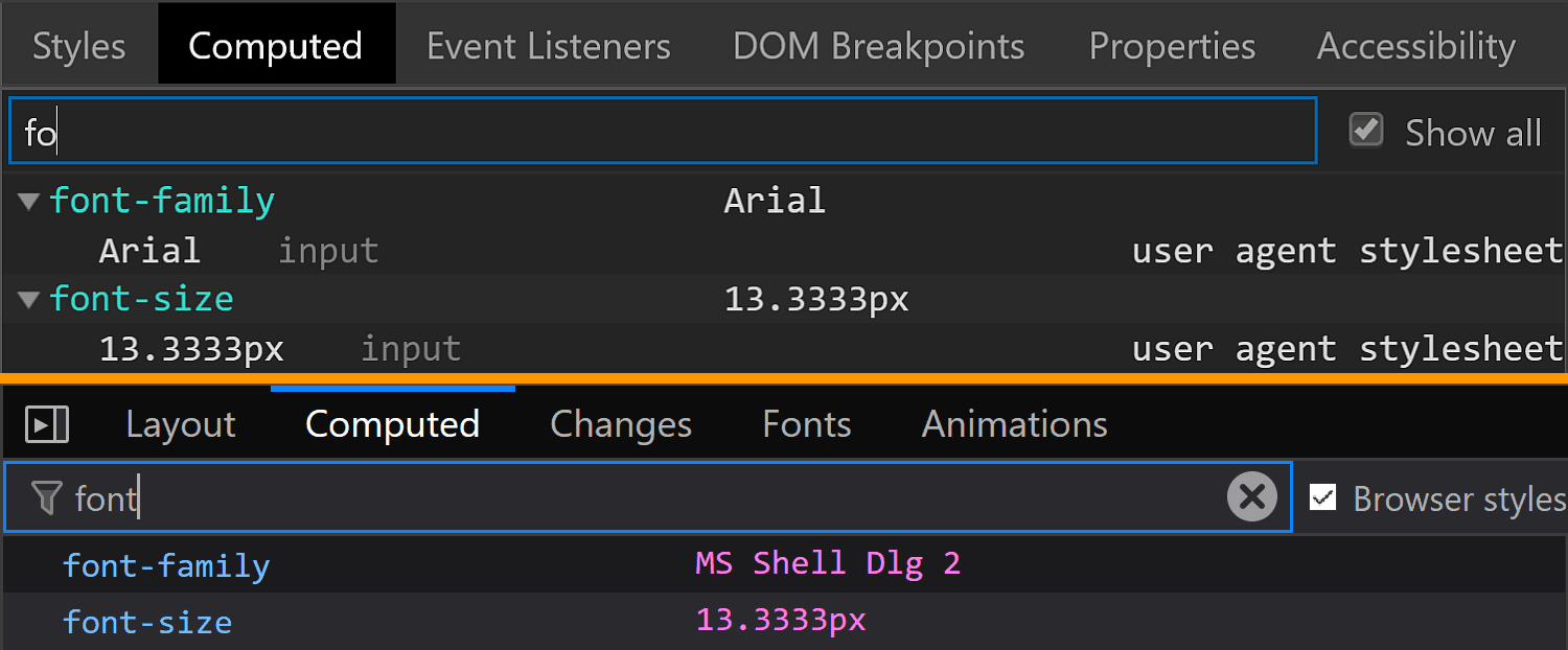
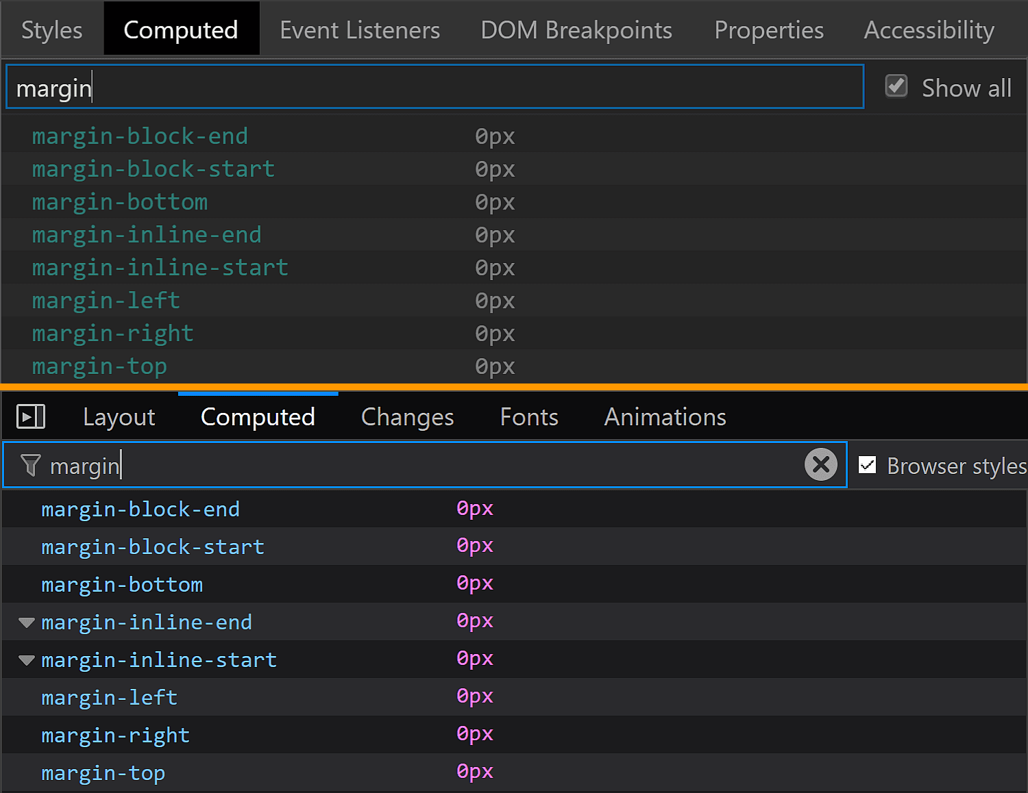
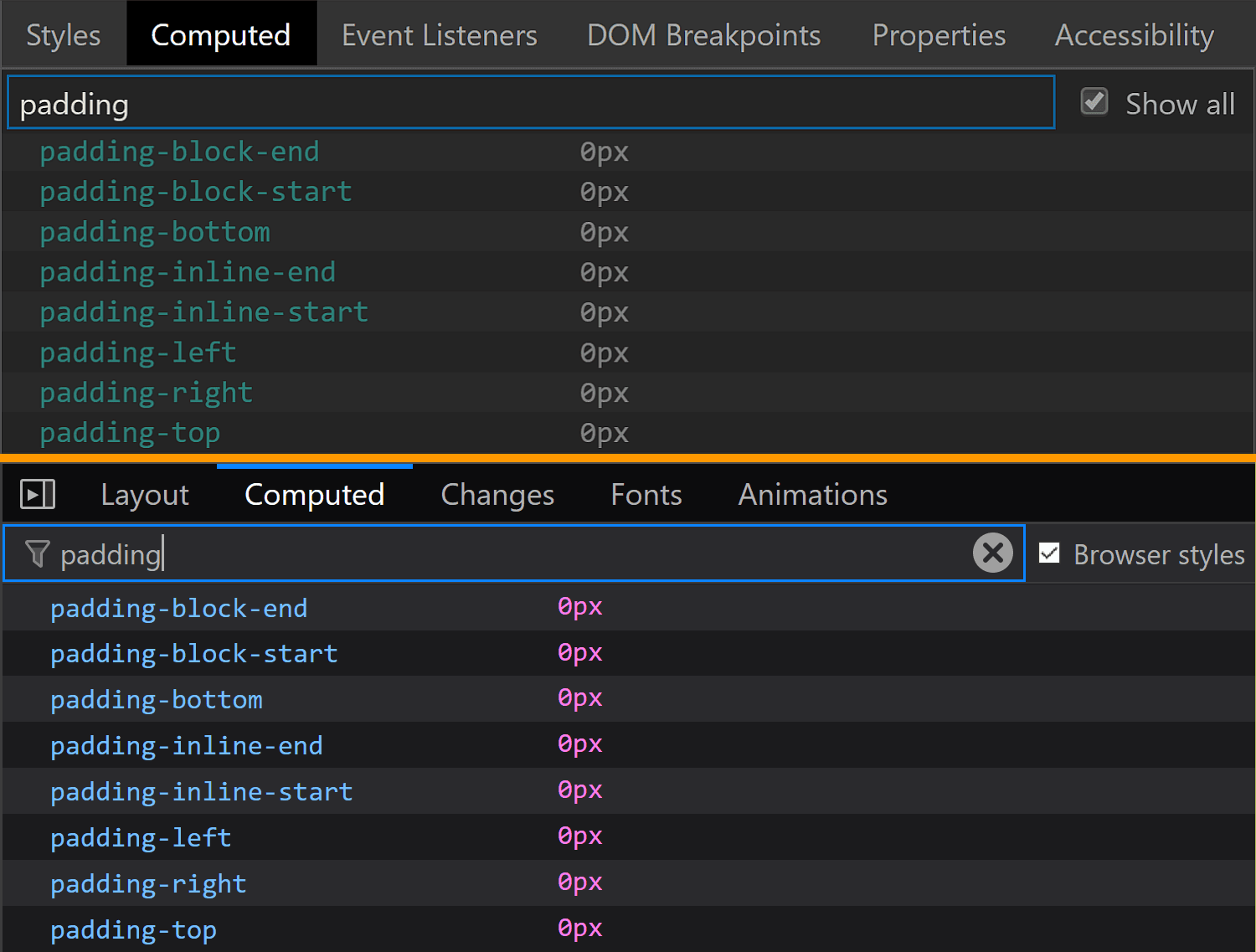
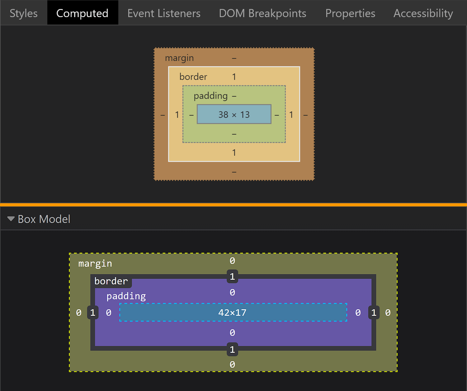
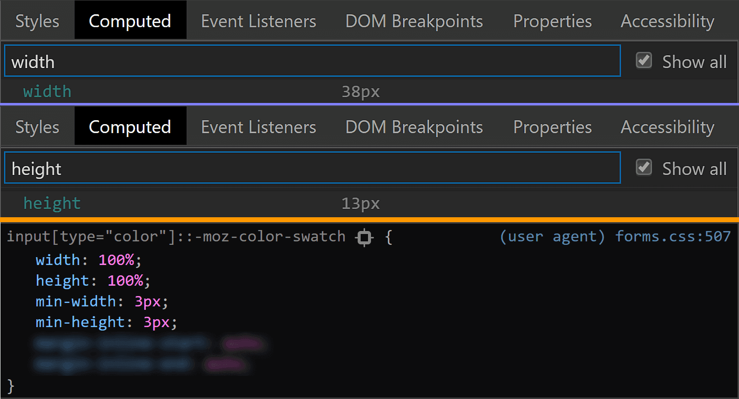
In all browsers, we have the option of not applying any styles of our own and then looking at the computed styles.

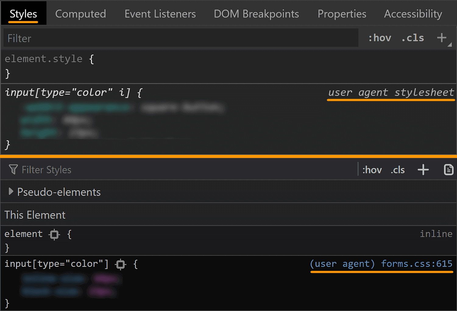
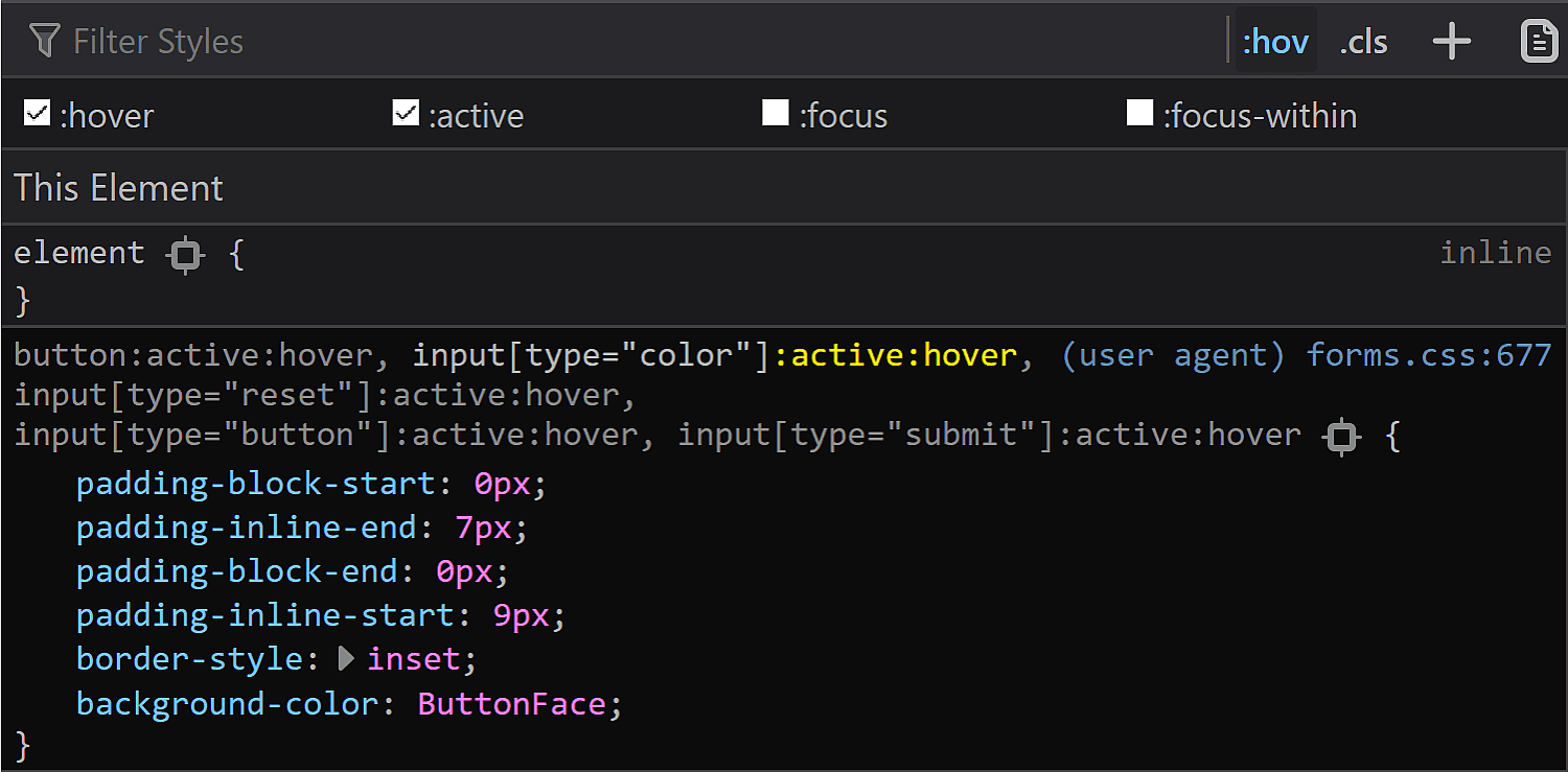
In Chrome and Firefox, we can also see the user agent stylesheet rule sets that are affecting the currently selected element (though we need to explicitly enable this in Firefox, as seen in the previous section).

Styles in Chrome and Inspector > Styles in Firefox.”>
Checking browser styles in Chrome and Firefox.

This is oftentimes more helpful than the computed styles, but there are exceptions and we should still always check the computed values as well.

In Firefox, we can also see the CSS file for the form elements at view-source:resource://gre-resources/forms.css.

Screenshot showing view-source:resource://gre-resources/forms.css open in Firefox to allow us seeing user agent styles for form elements.
Checking browser styles in Firefox.

The input element itself

We’ll now be taking a look at the default values of a few properties in various browsers in order to get a clear picture of what we’d really need to set explicitly in order to get a custom cross-browser result.

The first property I always think about checking when it comes to elements is box-sizing. The initial value of this property is border-box in Firefox, but content-box in Chrome and Edge.

Comparative screenshots of DevTools in the three browsers showing the computed values of box-sizing for the actual input.
The box-sizing values for compared in Chrome, Firefox and Edge (from top-to-bottom).

We can see that Firefox is setting it to border-box on , but it looks like Chrome isn’t setting it at all, so it’s left with the initial value of content-box (and I suspect the same is true for Edge).

In any event, what it all means is that, if we are to have a border or a padding on this element, we also need to explicitly set box-sizing so that we get a consistent result across all these browsers.

The font property value is different for every browser, but since we don’t have text inside this input, all we really care about is the font-size, which is consistent across all browsers I’ve checked: 13.33(33)px. This is a value that really looks like it came from dividing 40px by 3, at least in Chrome.

Comparative screenshots of DevTools in the three browsers showing the font values for the actual input.
The font values for compared in Chrome, Firefox and Edge (from top-to-bottom).

This is a situation where the computed styles are more useful for Firefox, because if we look at the browser styles, we don’t get much in terms of useful information:

Screenshot of what we get if we look at the browser styles where the font was set for Firefox. The value for the font is -moz-field, which is an alias for the look of a native text field. Expanding this to check the longhands shows us empty instead of actual values.
Sometimes the browser styles are pretty much useless (Firefox screenshot).

The margin is also consistent across all these browsers, computing to 0.

Comparative screenshots of DevTools in the three browsers showing the margin values for the actual input.
The margin values for compared in Chrome, Firefox and Edge (from top-to-bottom).

The border is different for every single browser. In both Chrome and Edge, we have a solid 1px one, but the border-color is different (rgb(169, 169, 169) for Chrome and rgb(112, 112, 112) for Edge). In Firefox, the border is an outset 2px one, with a border-color of… ThreeDLightShadow?!

Comparative screenshots of DevTools in the three browsers showing the border values for the actual input.
The border values for compared in Chrome, Firefox and Edge (from top-to-bottom).

What’s the deal with ThreeDLightShadow? If it doesn’t sound familiar, don’t worry! It’s a (now deprecated) CSS2 system value, which Firefox on Windows shows me to be rgb(227, 227, 227) in the Computed styles tab.

Screenshot of Computed panel search in Firefox on Windows, showing that the ThreeDLightShadow keyword computes to rgb(227, 227, 227).
Computed border-color for in Firefox on Windows.

Note that in Firefox (at least on Windows), the operating system zoom level (Settings ? System ? Display ? Scale and Layout ? Change the size of text, apps and other items) is going to influence the computed value of the border-width, even though this doesn’t seem to happen for any other property I’ve checked and it seems to be partially related to the border-style.

Screenshot showing the Windows display settings window with the zoom level options dropdown opened.
Zoom level options on Windows.

The strangest thing is the computed border-width values for various zoom levels don’t seem to make any sense. If we keep the initial border-style: outset, we have:

  • 1.6px for 125%
  • 2px for 150%
  • 1.7px for 175%
  • 1.5px for 200%
  • 1.8px for 225%
  • 1.6px for 250%
  • 1.66667px for 300%

If we set border-style: solid, we have a computed border-width of 2px, exactly as it was set, for zoom values that are multiples of 50% and the exact same computed values as for border-style: outset for all the other zoom levels.

The padding is the same for Chrome and Edge (1px 2px), while Firefox is the odd one out again.

Comparative screenshots of DevTools in the three browsers showing the padding values for the actual input.
The padding values for compared in Chrome, Firefox and Edge (from top-to-bottom).

It may look like the Firefox padding is 1px. That’s what it is set to and there’s no indication of anything overriding it — if a property is overridden, then it’s shown as grey and with a strike-through.

Screenshot of Firefox DevTools highlighting how the border set on input[type='color'] overrides the one set on input and the look (grey + strike-through) of overridden properties.
Spotting overrides in Firefox.

But the computed value is actually 0 8px! Moreover, this is a value that doesn’t depend on the operating system zoom level. So, what the hairy heck is going on?!

<img src="https://css-tricks.com/wp-content/uploads/2019/05/default_l0_padding_comp_firefox.png" alt="Screenshot of Firefox DevTools showing how the computed padding value on isn’t the one that was set on input, even if no override seems to be happening.”>
Computed value for padding in Firefox doesn’t match the value that was set on input.

Now, if you’ve actually tried inspecting a color input, took a close look at the styles set on it, and your brain works differently than mine (meaning you do read what’s in front of you and don’t just scan for the one thing that interests you, completely ignoring everything else…) then you’ve probably noticed there is something overriding the 1px padding (and should be marked as such) — the flow-relative padding!

Screenshot of Firefox DevTools showing the flow-relative padding overriding the old padding due to higher specificity of selector (input[type='color'] vs. input).
Flow-relative padding overrides in Firefox.

Dang, who knew those properties with lots of letters were actually relevant? Thanks to Zoltan for noticing and letting me know. Otherwise, it probably would have taken me two more days to figure this one out.

This raises the question of whether the same kind of override couldn’t happen in other browsers and/or for other properties.

Edge doesn’t support CSS logical properties, so the answer is a “no” in that corner.

In Chrome, none of the logical properties for margin, border or padding are set explicitly for , so we have no override.

Concerning other properties in Firefox, we could have found ourselves in the same situation for margin or for border, but with these two, it just so happens the flow-relative properties haven’t been explicitly set for our input, so again, there’s no override.

Even so, it’s definitely something to watch out for in the future!

Moving on to dimensions, our input’s width is 44px in Chrome and Edge and 64px in Firefox.

Comparative screenshots of DevTools in the three browsers showing the width values for the actual input.
The width values for compared in Chrome, Firefox and Edge (from top-to-bottom).

Its height is 23px in all three browsers.

Comparative screenshots of DevTools in the three browsers showing the height values for the actual input.
The height values for compared in Chrome, Firefox and Edge (from top-to-bottom).

Note that, since Chrome and Edge have a box-sizing of content-box, their width and height values do not include the padding or border. However, since Firefox has box-sizing set to border-box, its dimensions include the padding and border.

Comparative screenshots of DevTools in the three browsers showing the layout boxes.
The layout boxes for compared in Chrome, Firefox and Edge (from top-to-bottom).

This means the content-box is 44pxx23px in Chrome and Edge and 44xpxx19px in Firefox, the padding-box is 48pxx25 in Chrome and Edge and 60pxx19px in Firefox and the border-box is 50pxx27px in Chrome and Edge and 64pxx23 in Firefox.

We can clearly see how the dimensions were set in Chrome and I’d assume they were set in the same direct way in Edge as well, even if Edge doesn’t allow us to trace this stuff. Firefox doesn’t show these dimensions as having been explicitly set and doesn’t even allow us to trace where they came from in the Computed tab (as it does for other properties like border, for example). But if we look at all the styles that have been set on input[type='color'], we discover the dimensions have been set as flow-relative ones (inline-size and block-size).

Screenshot of the Firefox user agent styles showing flow relative dimensions being set on input[type='color'].
How dimensions have been set in Firefox.

The final property we check for the normal state of the actual input is background. Here, Edge is the only browser to have a background-image (set to a top to bottom gradient), while Chrome and Firefox both have a background-color set to ButtonFace (another deprecated CSS2 system value). The strange thing is this should be rgb(240, 240, 240) (according to this resource), but its computed value in Chrome is rgb(221, 221, 221).

Comparative screenshots of DevTools in the three browsers showing the background values for the actual input.
The background values for compared in Chrome, Firefox and Edge (from top-to-bottom).

What’s even stranger is that, if we actually look at our input in Chrome, it sure does look like it has a gradient background! If we screenshot it and then use a picker, we get that it has a top to bottom gradient from #f8f8f8 to #ddd.

Screenshot of the input in Chrome. A very light, almost white, grey to another light, but still darker grey gradient from top to bottom can be seen as the background, not the solid background-color indicated by DevTools.
What the actual input looks like in Chrome. It appears to have a gradient, in spite of the info we get from DevTools telling us it doesn’t.

Also, note that changing just the background-color (or another property not related to dimensions like border-radius) in Edge also changes the background-image, background-origin, border-color or border-style.

Animated gif. Shows the background-image, background-origin, border-color, border-style before and after changing the seemingly unrelated background-color - their values don't get preserved following this change.
Edge: side-effects of changing background-color.

Other states

We can take a look at the styles applied for a bunch of other states of an element by clicking the :hov button in the Styles panel for Chrome and Firefox and the a: button in the same Styles panel for Edge. This reveals a section where we can check the desired state(s).

Screenshot collage highlighting the buttons that bring up the states panel in Chrome, Firefox and Edge.
Taking a look at other states in Chrome, Firefox, Edge (from top to bottom).

Note that, in Firefox, checking a class only visually applies the user styles on the selected element, not the browser styles. So, if we check :hover for example, we won’t see the :hover styles applied on our element. We can however see the user agent styles matching the selected state for our selected element shown in DevTools.

Also, we cannot test for all states like this and let’s start with such a state.

:disabled

In order to see how styles change in this state, we need to manually add the disabled attribute to our element.

Hmm… not much changes in any browser!

In Chrome, we see the background-color is slightly different (rgb(235, 235, 228) in the :disabled state versus rgb(221, 221, 221) in the normal state).

Chrome DevTools screenshot showing the background being set to rgb(235, 235, 228) for a :disabled input.
Chrome :disabled styling.

But the difference is only clear looking at the info in DevTools. Visually, I can tell tell there’s a slight difference between an input that’s :disabled and one that’s not if they’re side-by-side, but if I didn’t know beforehand, I couldn’t tell which is which just by looking at them, and if I just saw one, I couldn’t tell whether it’s enabled or not without clicking it.

Disabled and enabled input side by side in Chrome. There is a slight difference in background-color, but it's pretty much impossible to tell which is which just by looking at them.
Disabled (left) versus enabled (right) in Chrome.

In Firefox, we have the exact same values set for the :disabled state as for the normal state (well, except for the cursor, which realistically, isn’t going to produce different results save for exceptional cases anyway). What gives, Firefox?!

<img src="https://css-tricks.com/wp-content/uploads/2019/05/default_state_disabled_firefox.png" alt="Comparison of styles set in Firefox for in its normal state and its :disabled state. The padding and border set in the :disabled case are exactly the same as those set in the normal case.”>
Firefox :disabled (top) versus normal (bottom) styling.

In Edge, both the border-color and the background gradient are different.

Chrome DevTools screenshot showing border-color and the background-image being set to slightly different values for a :disabled input.
Edge :disabled styling (by checking computed styles).

We have the following styles for the normal state:

border-color: rgb(112, 112, 112);
background-image: linear-gradient(rgb(236, 236, 236), rgb(213, 213, 213));

And for the :disabled state:

border-color: rgb(186, 186, 186);
background-image: linear-gradient(rgb(237, 237, 237), rgb(229, 229, 229));

Clearly different if we look at the code and visually better than Chrome, though it still may not be quite enough:

Disabled and enabled input side by side in Edge. There is a slight difference in background-image and a bigger difference in border-color, but it still may be difficult to tell whether an input is enabled or not at first sight without having a reference to compare.
Disabled (left) versus enabled (right) in Edge.
:focus

This is one state we can test by toggling the DevTools pseudo-classes. Well, in theory. In practice, it doesn’t really help us in all browsers.

Starting with Chrome, we can see that we have an outline in this state and the outline-color computes to rgb(77, 144, 254), which is some kind of blue.

<img src="https://css-tricks.com/wp-content/uploads/2019/06/default_state_focus_chrome.png" alt="Chrome DevTools screenshot showing an outline for an input having :focus.”>
Chrome :focus styling.

Pretty straightforward and easy to spot.

Moving on to Firefox, things start to get hairy! Unlike Chrome, toggling the :focus pseudo-class from DevTools does nothing on the input element, though by focusing it (by tab click), the border becomes blue and we get a dotted rectangle within — but there’s no indication in DevTools regarding what is happening.

Animated gif. Shows how, on :focus, our input gets a blue border and a dark inner dotted rectangle.
What happens in Firefox when tabbing to our input to :focus it.

If we check Firefox’s forms.css, it provides an explanation for the dotted rectangle. This is the dotted border of a pseudo-element, ::-moz-focus-inner (a pseudo-element which, for some reason, isn’t shown in DevTools inside our input as ::-moz-color-swatch is). This border is initially transparent and then becomes visible when the input is focused — the pseudo-class used here (:-moz-focusring) is pretty much an old Firefox version of the new standard (:focus-visible), which is currently only supported by Chrome behind the Experimental Web Platform features flag.

Firefox DevTools screenshot where the inner dotted rectangle on :focus comes from: it is set as a transparent border on the ::-moz-focus-inner pseudo-element and it becomes visible when the input should have a noticeable :focus indicator.
Firefox: where the inner dotted rectangle on :focus comes from.

What about the blue border? Well, it appears this one isn’t set by a stylesheet, but at an OS level instead. The good news is we can override all these styles should we choose to do so.

In Edge, we’re faced with a similar situation. Nothing happens when toggling the :focus pseudo-class from DevTools, but if we actually tab to our input to focus it, we can see an inner dotted rectangle.

Animated gif. Shows how, on :focus, our input gets an inner dotted rectangle.
What happens in Edge when tabbing to our input to :focus it.

Even though I have no way of knowing for sure, I suspect that, just like in Firefox, this inner rectangle is due to a pseudo-element that becomes visible on :focus.

:hover

In Chrome, toggling this pseudo-class doesn’t reveal any :hover-specific styles in DevTools. Furthermore, actually hovering the input doesn’t appear to change anything visually. So it looks like Chrome really doesn’t have any :hover-specific styles?

In Firefox, toggling the :hover pseudo-class from DevTools reveals a new rule in the styles panel:

Screenshot of Firefox DevTools showing the rule set that shows up for the :hover state.
Firefox :hover styling as seen in DevTools.

When actually hovering the input, we see the background turns light blue and the border blue, so the first thought would be that light blue is the -moz-buttonhoverface value and that the blue border is again set at an OS level, just like in the :focus case.

<img src="https://css-tricks.com/wp-content/uploads/2019/06/default_state_hover_firefox_vis.gif" alt="Animated gif. Shows that, on actually hovering our , it gets a light blue background and a blue border.”>
What actually happens in Firefox on :hover.

However, if we look at the computed styles, we see the same background we have in the normal state, so that blue background is probably really set at an OS level as well, in spite of having that rule in the forms.css stylesheet.

Screenshot of Firefox DevTools showing the computed value for background-color in the :hover state.
Firefox: computed background-color of an on :hover.

In Edge, toggling the :hover pseudo-class from DevTools gives our input a light blue (rgb(166, 244, 255)) background and a blue (rgb(38, 160, 218)) border, whose exact values we can find in the Computed tab:

Screenshot of Edge DevTools showing the computed value for background-color and border-color in the :hover state.
Edge: computed background-color and border-color of an on :hover.
:active

Checking the :active state in the Chrome DevTools does nothing visually and shows no specific rules in the Styles panel. However, if we actually click our input, we see that the background gradient that doesn’t even show up in DevTools in the normal state gets reversed.

Screenshot of the input in :active state in Chrome. A very light, almost white, grey to another light, but still darker grey gradient from bottom to top can be seen as the background, not the solid background-color indicated by DevTools.
What the actual input looks like in Chrome in the :active state. It appears to have a gradient (reversed from the normal state), in spite of the info we get from DevTools telling us it doesn’t.

In Firefox DevTools, toggling the :active state on does nothing, but if we also toggle the :hover state on, then we get a rule set that changes the inline padding (the block padding is set to the same value of 0 it has in all other states), the border-style and sets the background-color back to our old friend ButtonFace.

Screenshot of Firefox DevTools showing the rule set that shows up for the :active state.
Firefox :active styling as seen in DevTools.

In practice, however, the only thing that matches the info we get from DevTools is the inline shift given by the change in logical padding. The background becomes a lighter blue than the :hover state and the border is blue. Both of these changes are probably happening at an OS level as well.

<img src="https://css-tricks.com/wp-content/uploads/2019/06/default_state_active_firefox_vis.gif" alt="Animated gif. Shows that, on actually clicking our , it gets a light blue background and a blue border in addition to sliding 1 pixel in the inline direction as a result of changing the inline padding.”>
What actually happens in Firefox in an :active state.

In Edge, activating the :active class from DevTools gives us the exact same styles we have for the :hover state. However, if we have both the :hover and the :active states on, things change a bit. We still have a light blue background and a blue border, but both are darker now (rgb(52, 180, 227) for the background-color and rgb(0, 137, 180) for the border-color):

Screenshot of Edge DevTools showing the computed value for background-color and border-color in the :active state.
The computed background-color and border-color of an on :active viewed in Edge.

This is the takeaway: if we want a consistent cross-browser results for , we should define our own clearly distinguishable styles for all these states ourselves because, fortunately, almost all the browser defaults — except for the inner rectangle we get in Edge on :focus — can be overridden.

The swatch wrapper

This is a component we only see in Chrome, so if we want a cross-browser result, we should probably ensure it doesn’t affect the swatch inside — this means ensuring it has no margin, border, padding or background and that its dimensions equal those of the actual input’s content-box.

In order to know whether we need to mess with these properties (and maybe others as a result) or not, let’s see what the browser defaults are for them.

Fortunately, we have no margin or border, so we don’t need to worry about these.

Chrome DevTools screenshot showing the margin and border values for the swatch wrapper.
The margin and border values for the swatch wrapper in Chrome.

We do however have a non-zero padding (of 4px 2px), so this is something we’ll need to zero out if we want to achieve a consistent cross-browser result.

Chrome DevTools screenshot showing the padding values for the swatch wrapper.
The padding values for the swatch wrapper in Chrome.

The dimensions are both conveniently set to 100%, which means we won’t need to mess with them.

Chrome DevTools screenshot showing the size values for the swatch wrapper.
The size values for the swatch wrapper in Chrome.

Something we need to note here is that we have box-sizing set to border-box, so the padding gets subtracted from the dimensions set on this wrapper.

<img src="https://css-tricks.com/wp-content/uploads/2019/06/default_l1_box_chrome.png" alt="Chrome DevTools screenshot showing the box-sizing value for the swatch wrapper.”>
The box-sizing value for the swatch wrapper in Chrome.

This means that while the padding-box, border-box and margin-box of our wrapper (all equal because we have no margin or border) are identical to the content-box of the actual (which is 44pxx23px in Chrome), getting the wrapper’s content-box involves subtracting the padding from these dimensions. It results that this box is 40pxx15px.

Chrome DevTools screenshot showing the box model for the swatch wrapper.
The box model for the swatch wrapper in Chrome.

The background is set to transparent, so that’s another property we don’t need to worry about resetting.

Chrome DevTools screenshot showing the background values for the swatch wrapper.
The background values for the swatch wrapper in Chrome.

There’s one more property set on this element that caught my attention: display. It has a value of flex, which means its children are flex items.

Chrome DevTools screenshot showing the display value for the swatch wrapper.
The display value for the swatch wrapper in Chrome.

The swatch

This is a component we can style in Chrome and Firefox. Sadly, Edge doesn’t expose it to allow us to style it, so we cannot change properties we might want to, such as border, border-radius or box-shadow.

The box-sizing property is one we need to set explicitly if we plan on giving the swatch a border or a padding because its value is content-box in Chrome, but border-box in Firefox.

Comparative screenshots of DevTools in the two browsers showing the computed values of box-sizing for the swatch component.
The box-sizing values for the swatch viewed in Chrome (top) and Firefox (bottom).

Fortunately, the font-size is inherited from the input itself so it’s the same.

Comparative screenshots of DevTools in the two browsers showing the computed values of font-size for the swatch component.
The font-size values for the swatch viewed in Chrome (top) and Firefox (bottom).

The margin computes to 0 in both Chrome and Firefox.

Comparative screenshots of DevTools in the two browsers showing the computed values of margin for the swatch component.
The margin values for the swatch viewed in Chrome (top) and Firefox (bottom).

This is because most margins haven’t been set, so they end up being 0 which is the default for

elements. However, Firefox is setting the inline margins to auto and we’ll be getting to why that computes to 0 in just a little moment.

Screenshot of Firefox DevTools.
The inline margin for the swatch being set to auto in Firefox.

The border is solid 1px in both browsers. The only thing that differs is the border-color, which is rgb(119, 119, 119) in Chrome and grey (or rgb(128, 128, 128), so slightly lighter) in Firefox.

Comparative screenshots of DevTools in the two browsers showing the computed values of border for the swatch component.
The border values for the swatch viewed in Chrome (top) and Firefox (bottom).

Note that the computed border-width in Firefox (at least on Windows) depends on the OS zoom level, just as it is in the case of the actual input.

The padding is luckily 0 in both Chrome and Firefox.

Comparative screenshots of DevTools in the two browsers showing the computed values of padding for the swatch component.
The padding values for the swatch viewed in Chrome (top) and Firefox (bottom).

The dimensions end up being exactly what we’d expect to find, assuming the swatch covers its parent’s entire content-box.

Comparative screenshots of DevTools in the two browsers showing the box model for the swatch component.
The box model for the swatch viewed in Chrome (top) and Firefox (bottom).

In Chrome, the swatch parent is the

wrapper we saw earlier, whose content-box is 4pxx15px. This is equal to the margin-box and the border-box of the swatch (which coincide as we have no margin). Since the padding is 0, the content-box and the padding-box for the swatch are identical and, subtracting the 1px border, we get dimensions that are 38pxx13px.

In Firefox, the swatch parent is the actual input, whose content-box is 44pxx19px one. This is equal to the margin-box and the border-box of the swatch (which coincide as we have no margin). Since the padding is 0, the content-box and the padding-box for the swatch are identical and, subtracting the 1px border, we get that their dimensions are 42pxx17px.

In Firefox, we see that the swatch is made to cover its parent’s content-box by having both its dimensions set to 100%.

Comparative screenshots of DevTools in the two browsers showing the size values for the swatch component.
The size values for the swatch viewed in Chrome (top) and Firefox (bottom).

This is the reason why the auto value for the inline margin computes to 0.

But what about Chrome? We cannot see any actual dimensions being set. Well, this result is due to the flex layout and the fact that the swatch is a flex item that’s made to stretch such that it covers its parent’s content-box.

Chrome DevTools screenshot showing the flex value for the swatch wrapper.
The flex value for the swatch wrapper in Chrome.

Final thoughts

Phew, we covered a lot of ground here! While it may seem exhaustive to dig this deep into one specific element, this is the sort of exercise that illustrates how difficult cross-browser support can be. We have our own styles, user agent styles and operating system styles to traverse and some of those are always going to be what they are. But, as we discussed at the very top, this winds up being an accessibility issue at the end of the day, and something to really consider when it comes to implementing a practical, functional application of a color input.

Remember, a lot of this is ripe territory to reach out to browser vendors and let them know how they can update their implementations based on your reported use cases. Here are the three tickets I mentioned earlier where you can either chime in or reference to create a new ticket:

The post Color Inputs: A Deep Dive into Cross-Browser Differences appeared first on CSS-Tricks.

Categories: Designing, Others Tags:

Is Dribbble Worth Your Time?

July 12th, 2019 No comments

The online community has been around since 2010 and is one of the top platforms where designers can share work, or shots, and get feedback.

The invite-only community is a showcase of portfolio projects and personal artwork for digital graphics and user interface design, illustrations, animations, and pretty much any other design work you can think of.

Dribbble Pros

If you want to be inspired, Dribbble is the place for you. There’s so much good work to browse through, comment on, and engage with. It’s a good mental distraction if you are working through a design problem of your own.

The community is huge and the company reports that the number of users nearly doubled last year. In 2018, designers uploaded 1.2 million shots, that got 35 million likes, and 1 million comments. Best estimates put the number of users at 4.5 million worldwide.

Everything about Dribbble has a community feel, for the time being, it’s very un-Facebook

Dribbble is more than just an online community. Dribbblers in different locations get together for meetups and design networking. They literally happen all over the world, or you can host one in your location. It makes the design-based peer network social IRL.

Everything about Dribbble has a community feel, for the time being, it’s very un-Facebook, even as it expands. It’s simple and authentic.

There’s something great about a design platform that is designed well. Every page is simple and stunning. Projects are easy to see, thanks to consistent previews. Usability is obvious. From the first login, everything about Dribbble is easy to understand, find, and explore.

You can get feedback from other designers. Feedback from your boss or clients or design team is great, but what if you want to know what a wider community thinks. This is the place to test out a design.

Dribbble has expanded to include job listings – real gigs from some reputable companies – and even mark your profile as available for hire. That allows others to seek you out. One the same note, you can sell designs and digital goods, which can be a nice supplemental income.

The theme of the site hasn’t changed since Day 1 and it’s cute and endearing. Basketball fans can appreciate it for sure.

Dribbble Cons

Dribbble can be a major distraction. There’s just so much to look at, and then there are the rebounds, which will have you asking if you really just spent 3 hours enhancing someone else’s original animation concept.

Uploads are somewhat limited. While Dribbble eliminated the 400-pixel by 300-pixel rule late last year (thank you!), the maximum size for uploads is 10 MB. You don’t have to use a specific aspect ratio, but will be asked to crop for the preview to maintain design consistency across the network. Plus, you can still upload downloadable versions if you like.

The invites. It seems like a cool idea and maybe it was in the beginning, but are invites really necessary 10 years later? If someone doesn’t play by the rules kick them out.

It can feel a little like a high-school popularity contest

It can feel a little like a high-school popularity contest. There are bloggers out there with tips for what time to share your shots to get the most likes. Seriously? No thanks.

Some days Dribbble seems bigger than the rookie designer just starting out. It’s totally cool that designers from Apple and Airbnb are posting, but it can also be intimidating. If you are new to the platform, or design in general, try not to compare. Do your thing, find your niche, and be you in the community.

Dribbble is not the best place to keep a portfolio, although it is getting better. You can, but it can be a little tough to explain and share. (Do you really want a potential employer to see all those comments or a project you were just experimenting with?) So, you’ll probably need Dribbble, plus another platform to host a portfolio.

There are little ads everywhere. Dribbble needs a revenue source to survive and thrive, but some people are turned off by it. (If you are one of those people, you can upgrade to a paid plan.)

If you really want all the features of the network, you have to pay. It can be worth it if you are using it to sell good or get work (or ads drive you crazy). Dribbble Pro is $12 per month or $60 annually.

I’m on Dribbble … Kind Of

My name is Carrie, and I am a Dribbble lurker.

I have been on Dribble almost since the beginning. And I haven’t posted anything. That doesn’t mean I don’t value it, I’ve been looking at other designer projects for years love to see what’s out there, but just don’t have time to do more.

For me, Dribbble is all about inspiration and anticipation. So many of the shots are glimpses into experiments in design and can even be a predictor of trends.

I have go-to designers that I like to peek in on, but mostly I like to browse

I have go-to designers that I like to peek in on, but mostly I like to browse. What’s been uploaded recently, what’s getting a lot of attention, is there a technique or aesthetic that’s starting to emerge frequently?

I’ll also admit to getting called out for my Dribbble lurker status. Can you be a “real designer” if you aren’t using the platform regularly? Am I washing an invitation by not creating new, and regular shots?

Whether you are on (and are a frequent contributor to) Dribbble or not has nothing to do with your status as a designer. It’s all about time, project needs, and whether that feedback is something you crave. It’s like almost any other social network. You get from it what you contribute.

So, if you have the time and want to be a Dribbbler, go for it. And if not, that’s OK, too. (Let’s not judge each other because of a peer network.)

Conclusion

There’s nothing wrong with trying to get that coveted Dribbble invite, although with so many designers on the platform, invites aren’t as hard to get as they once were.

If you have time and enjoy the interaction, Dribbble can be a good use of resources and effort. But it’s OK to lurk too.

Just play with it in moderation and don’t let comments or shots overwhelm you. When Dribbble stops being fun, you should probably move on to something else. If you haven’t joined yet, now might be the time to ask your favorite co-worker for an invite.

Source

Categories: Designing, Others Tags: