20 Best New Portfolios, August 2019
It’s August, which means the rain is finally slowing down, and I have a chance to get my roof fixed. While I wait here under a literal tarp-fort that I hung up in my office, I thought I might as well compile some of the best recent portfolios for you all to look at.
We have a mix of sites this month, both colorful and, shall we say, color-minimalist. We’ve got more than a few specimens of one-column layouts, and some superb CSS Grid-based affairs. Enjoy.
Note: I’m judging these sites by how good they look to me. If they’re creative and original, or classic but really well-done, it’s all good to me. Sometimes, UX and accessibility suffer. For example, many of these sites depend on JavaScript to display their content at all; this is a Bad Idea , kids. If you find an idea you like and want to adapt to your own site, remember to implement it responsibly.
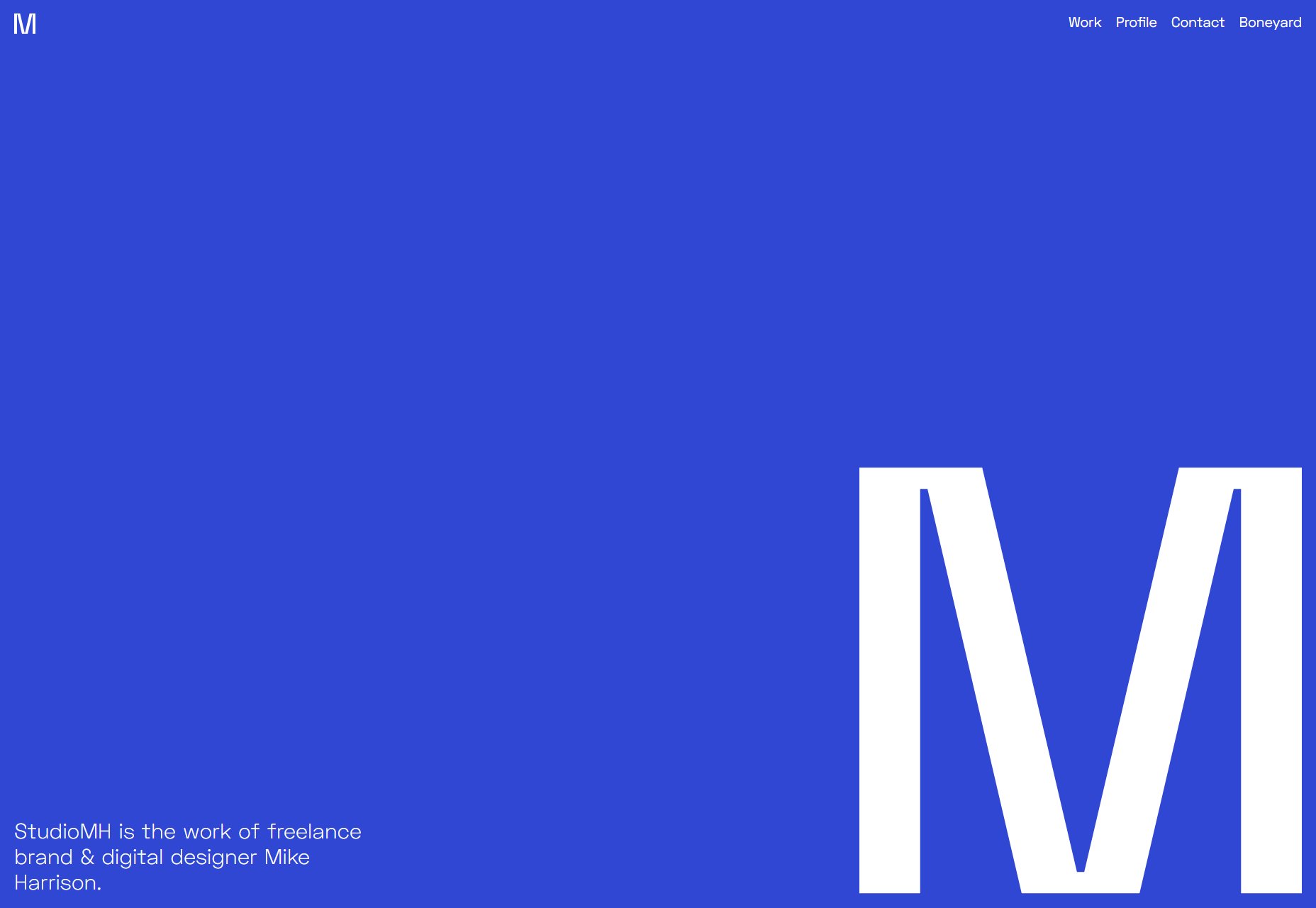
Mike Harrison
Mike Harrison’s portfolio is all about “big”: big text, big pictures, and a great big “M” that all fill up big screens (and yes, the small ones too). It’s dead simple, eye-catching, and might have a little bit of a blue thing going on. (It’s subtle, but it’s there [/sarcasm])
I sure would like it if the logo mark in the header took you back to the home page, like most sites do, but otherwise we have a solid (blue) first site for this list.
Platform: WordPress
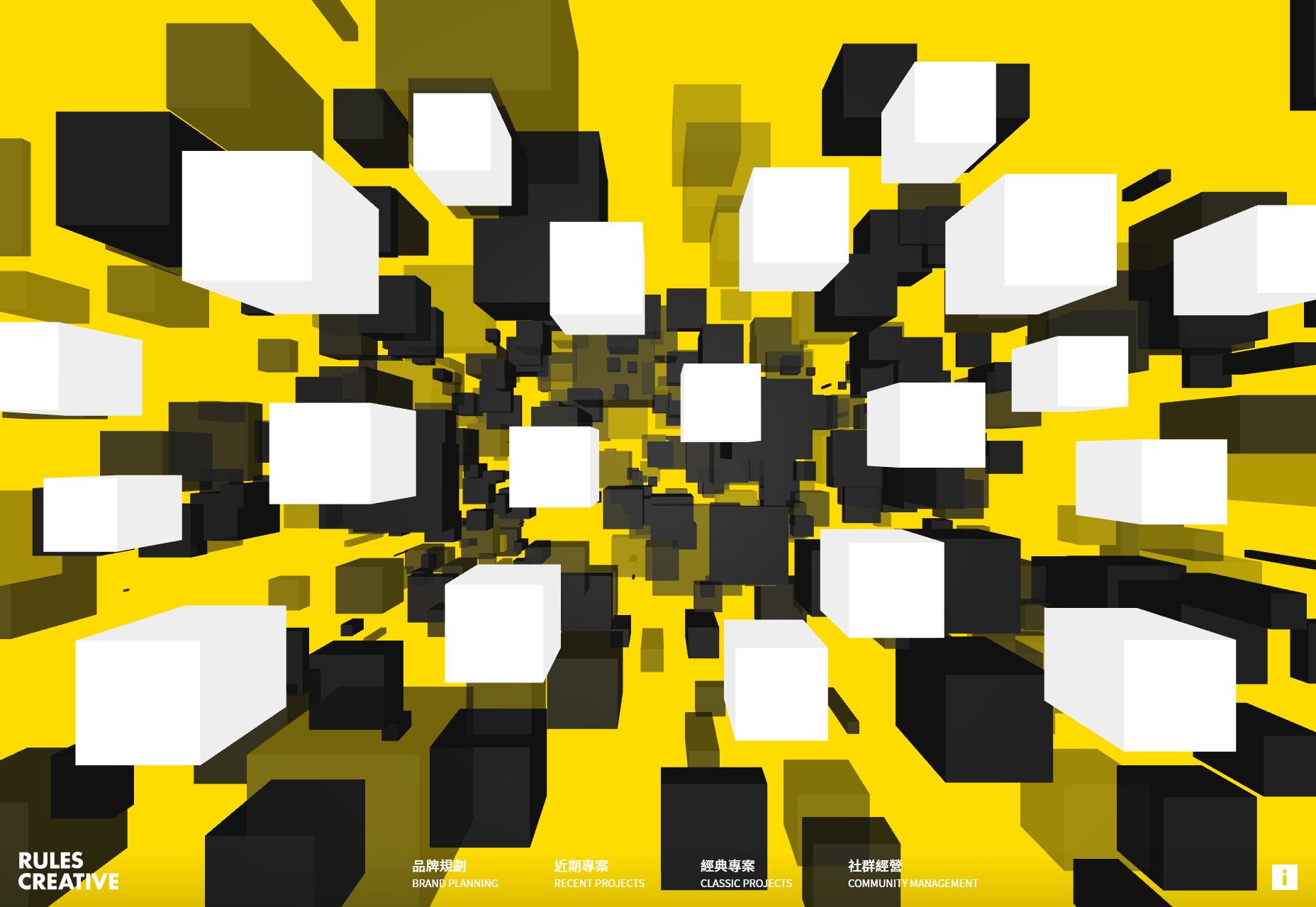
Rules Creative
Who needs a power-point-style site when there’s actual 3D graphics to be had? Rules Creative uses both 3D and pseudo-3D effects combined with some light brutalism(?) to create a brash, but lovely-looking site. And it’s the first site this month to use yellow effectively, so it gets bonus points from me.
They could use a bit more contrast for the navigation menu at the bottom, perhaps, but it’s otherwise great.
Platform: Contentful
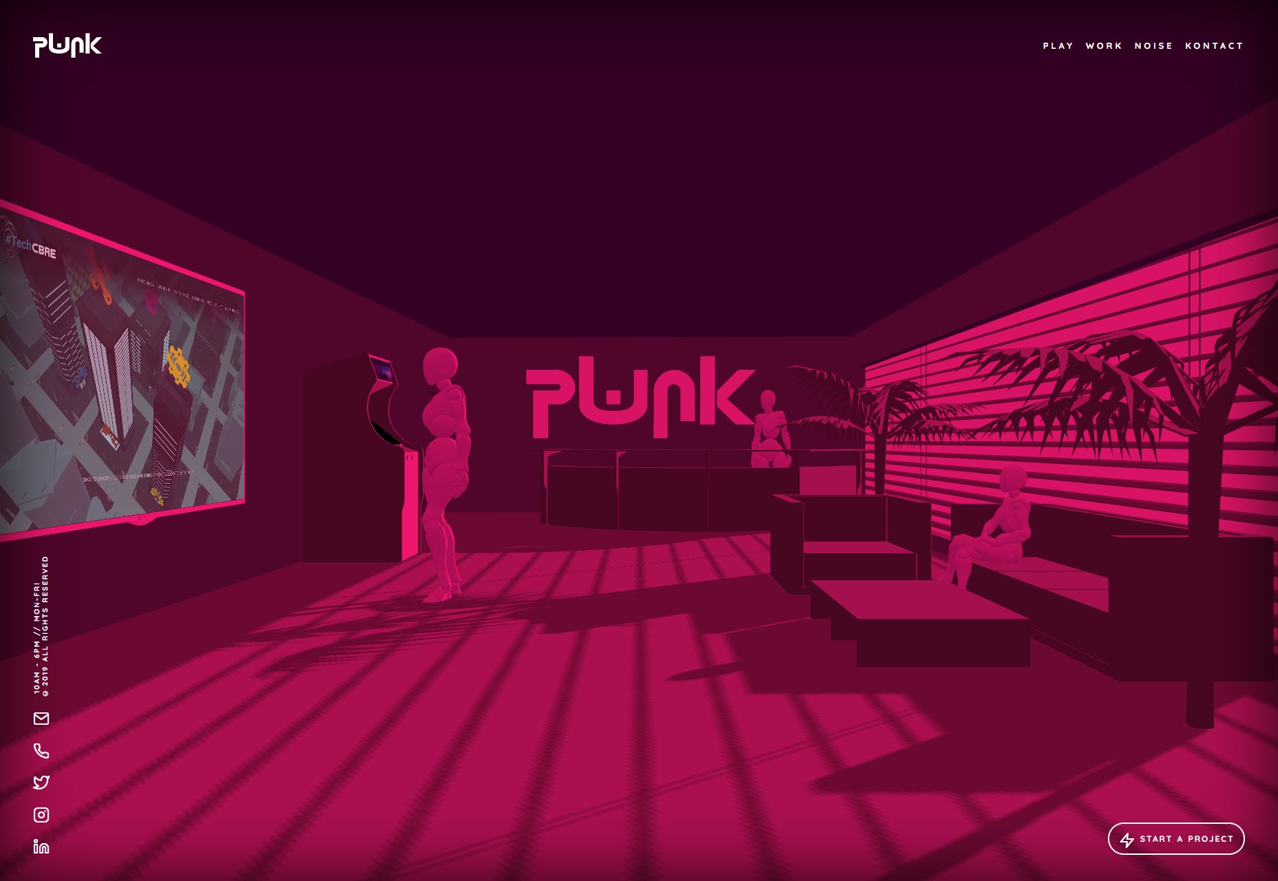
PWNK Digital
PWNK Digital brings more 3D WebGL graphics, a whole lot of pink, and a cyberpunk aesthetic, which makes their logotype alone very clever. The rest of the site is brilliantly atmospheric, whether you’re browsing through their work or their social feeds. It’s a great showcase of what can be achieved with WebGL and 3D graphics on the web in general.
Platform: Static Site (I think)
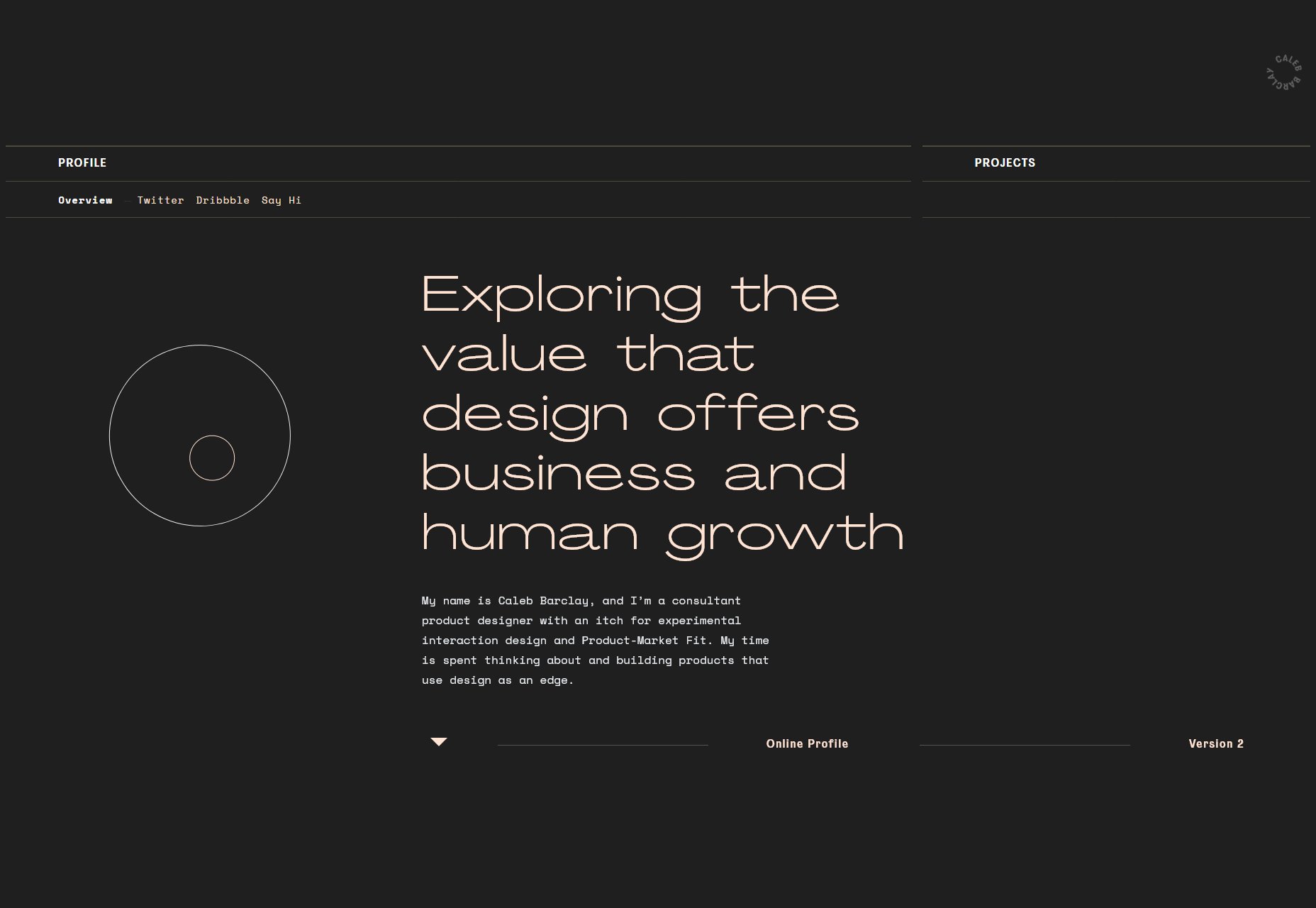
Caleb Barclay
Caleb Barclay’s site has that monospaced-type and thin borders look that was everywhere for a while. Combined with the pastels and grays, along with some light animation, the whole things is pleasant to browse through while listening to piano covers of ‘90s pop hits. I know that’s a bit specific, but it’s true.
It’s also another great example of what the Webflow platform can do. I do still prefer custom coding my sites, but man, the drag and drop builders are getting better.
Platform: Webflow
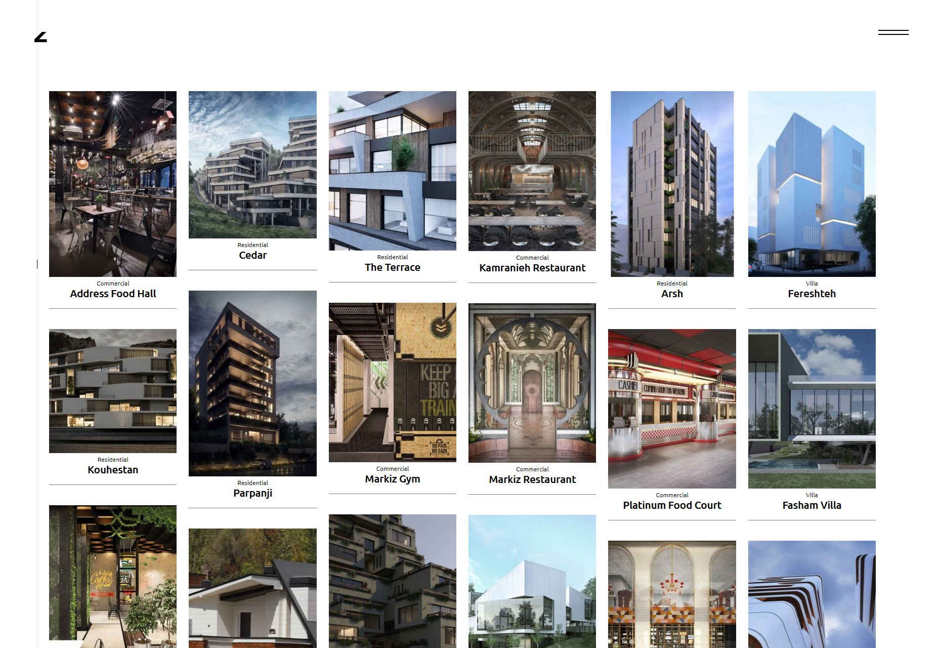
Zomorrodi Associates
The site for Zomorrodi Associates is a sleek, monochromatic design that makes excellent use of mild animation, for the most part, but hits you with a couple of big ones in just the right places. I kind of love the “broken” effect that they’re applied to a couple of elements, including their logo.
Platform: WordPress
Brightscout
Brightscout’s portfolio uses clean type, tons of futuristic vector illustrations, and a general aesthetic that I sort of remember seeing from the better designers on DeviantArt right as Web 2.0 was slowing down. Don’t get me wrong, I love it, and I love the way their using the green tones. If just using green made a company eco-friendly, these guys could have fixed the rainforest already.
Platform: WordPress
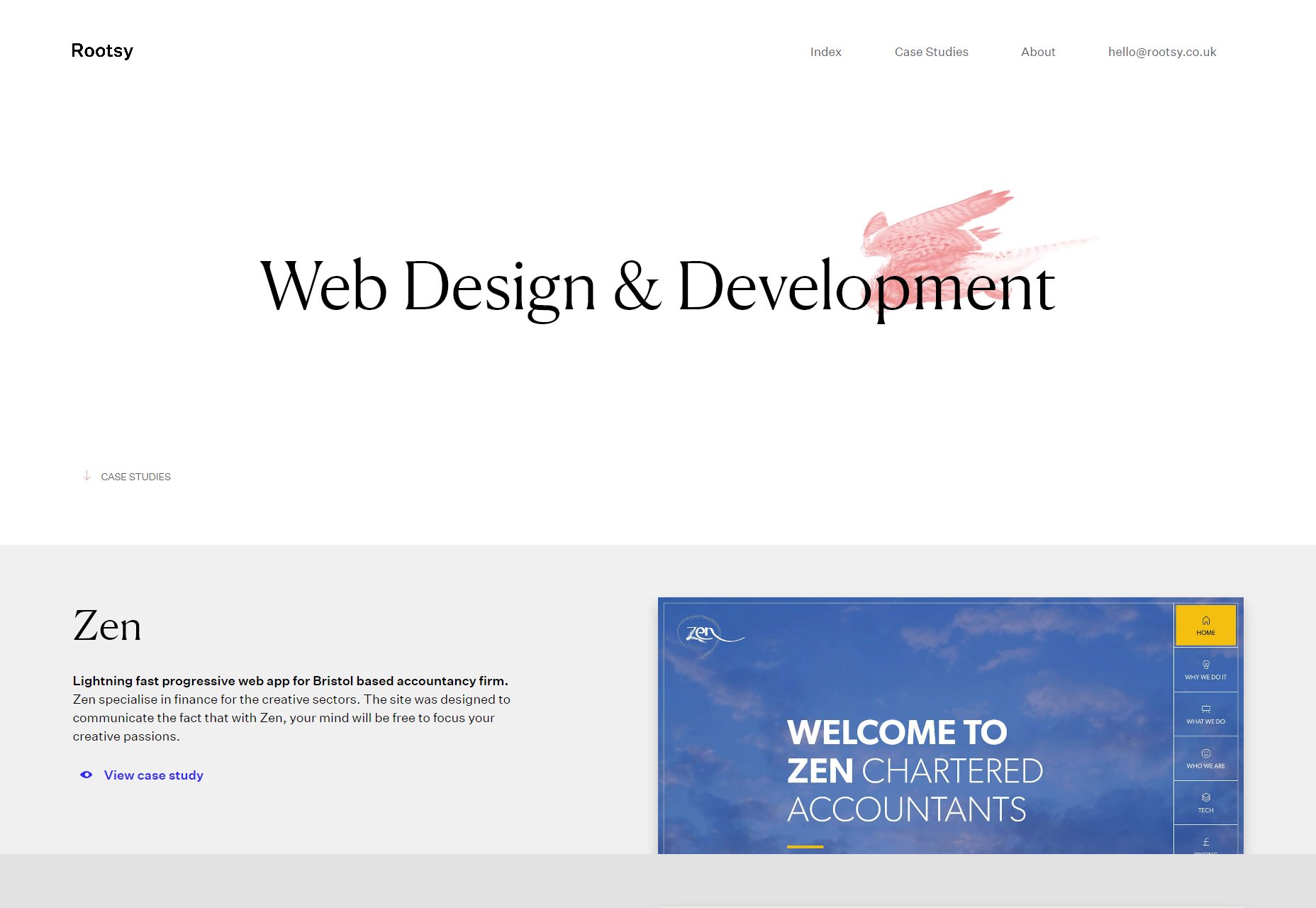
Rootsy
Rootsy has more pastels and grays to look at, but it’s mostly a brighter design. It’s also got a layout that works fantastically on larger screens, which I always like to see. As one-page portfolios go, this one feels downright elegant and sophisticated, while still managing to feel a bit techy.
Platform: Static Site
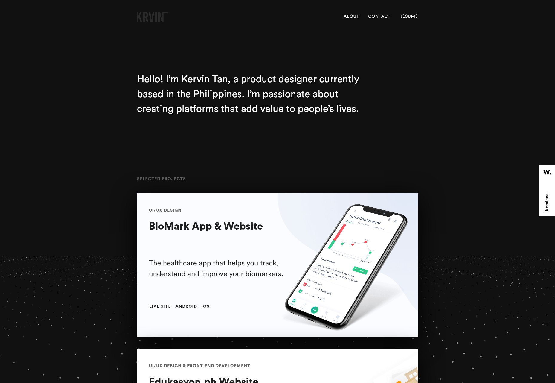
Kervin Tan
Kervin Tan’s portfolio has a lovely background animation, a good dark layout, and generally just looks pretty. Go look at the pretty thing.
Platform: Static Site
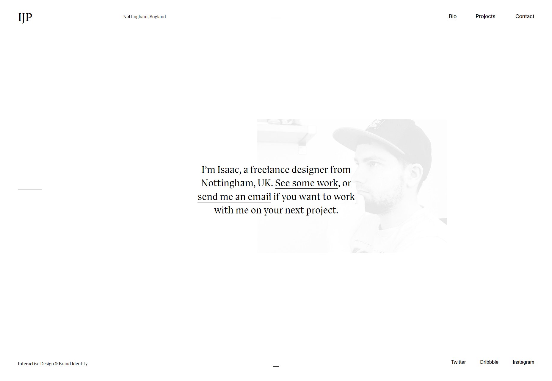
Isaac Powell
By contrast, Isaac Powell’s website is a lot brighter, though also very pretty. Go look at the other pretty thing. Well, I’ll admit that their approach to case studies is also pretty solid. They still let the images do most of the talking, but there’s a enough text to give you a feel for how they approach problems.
Platform: Statis Site
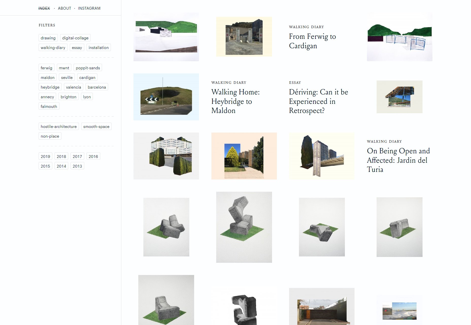
Ashley Sheekey
Ashley Sheekey’s portfolio looks less like a classic website, and more like a very elegant database. Nerd that I am, this does it for me. There’s something about that typography, grid-based organization, and the use of filters that just makes me happy.
Besides, when you have as much work to show off as Ashley does, filters just make sense. Someone please hold me down and tell me my own site doesn’t need filters. Oh, and do click on the “About” page, because I wasn’t kidding about that typography.
Platform: Static Site (I think)
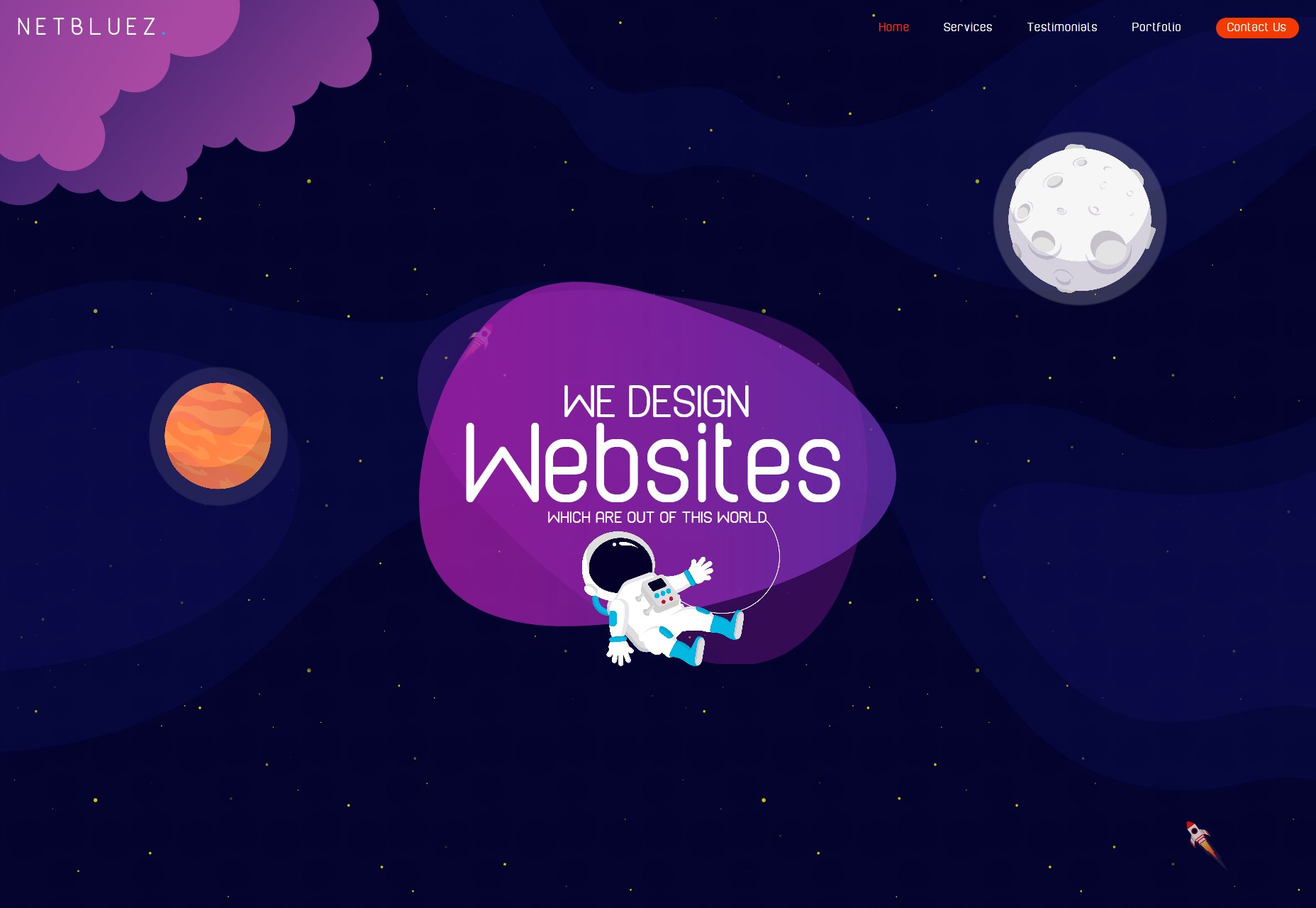
Netbluez
Netbluez’ portfolio is modern, colorful, and it has lovely illustrations to boot. This one-pager keeps things mostly pretty simple, but then, I’m never going to get over how much my inner five-year-old likes space stuff. I love my minimalism, but I also like seeing designers go nuts with the illustration and graphics.
Platform: Static Site
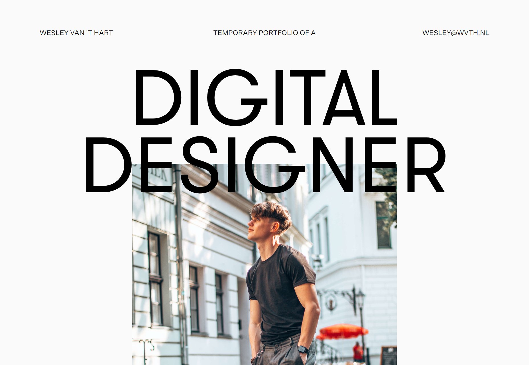
Wesley van ‘t Hart
This portfolio, well… I’ve seen a lot of minimalism in my admittedly limited time, but not many go for this much white space unless they have no content to speak of. Here, the white space is embraced, loved, and very well-used to frame a simple—but by no means empty—portfolio.
Platform: Static Site
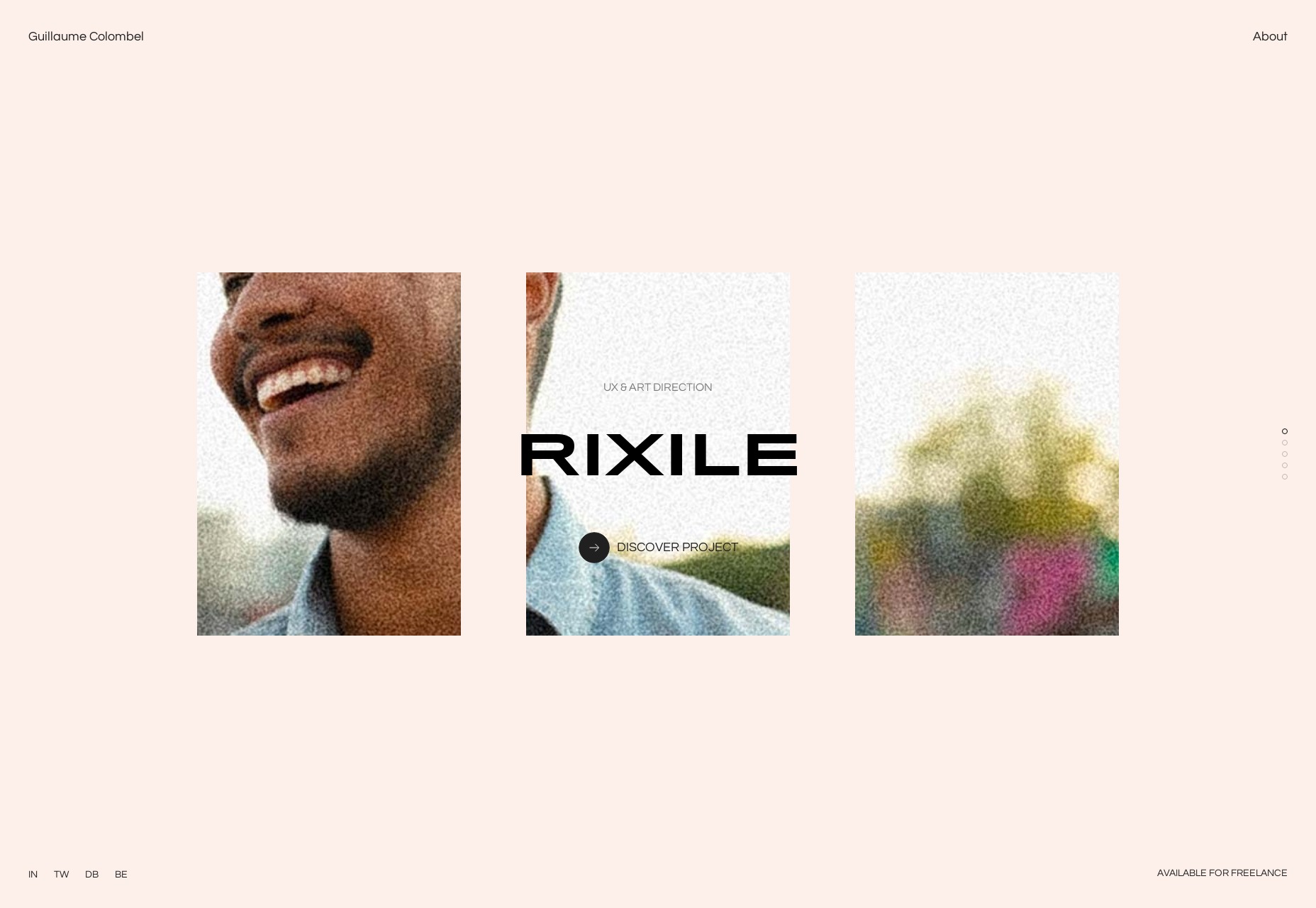
Guillame Colombel
Guillame Colombel’s portfolio goes for the slideshow on the home page as their primary method of showing off their work. In general, animation is used to show off the images, and keep things looking fancy. And well, it does look fancy.
Platform: Static Site
EVERGIB
Want to see what CSS Grid can do for you? Look no further than the layout over at EVERGIB, with its print-like feel, and generally great use of white space. It’s a simple site, but simplicity is hard, and I get excited for the future of the web every time I see something this well-built.
Platform: WordPress
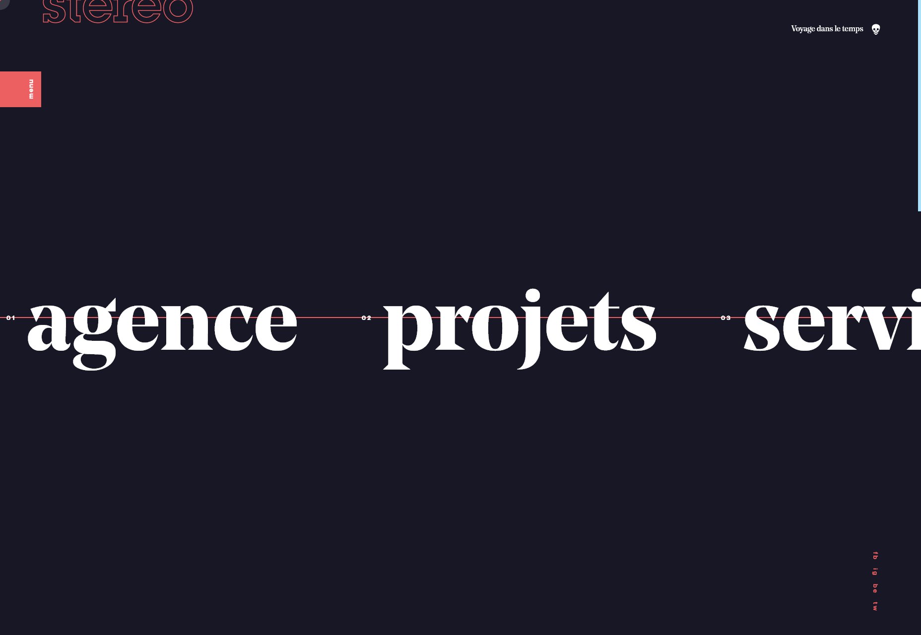
Stereo
Stereo is a site with smooth animation, a beautiful palette, and gorgeous type. It is a bit odd though, to have the navigation menu on the home page scrolling across the screen marquee-style (you can drag it manually, too, to get the link you want). It’s not an approach I’d recommend to everyone, but it’s certainly striking… and usable enough for short menus.
Plus, they managed to work memes into their actual website design in a way that made sense and amused me. I’m genuinely impressed with that.
Platform: WordPress
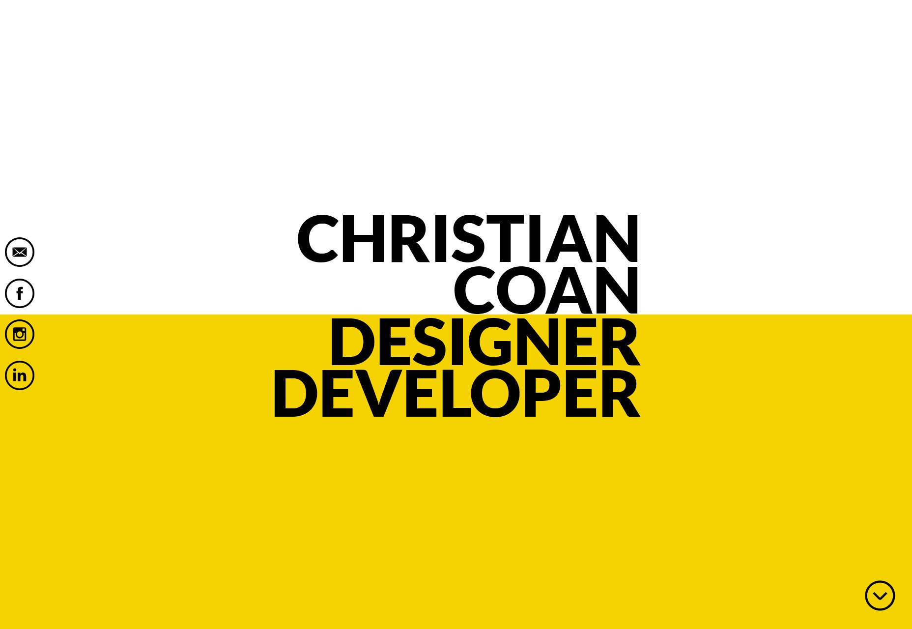
Christian Coan
Christian Coan’s portfolio is another one that leans hard into the use of yellow, but the real star of the show is that typography. I’m not sure I would have put the actual work all the way at the bottom, myself, but this one-pager is just that pretty.
Platform: Static Site
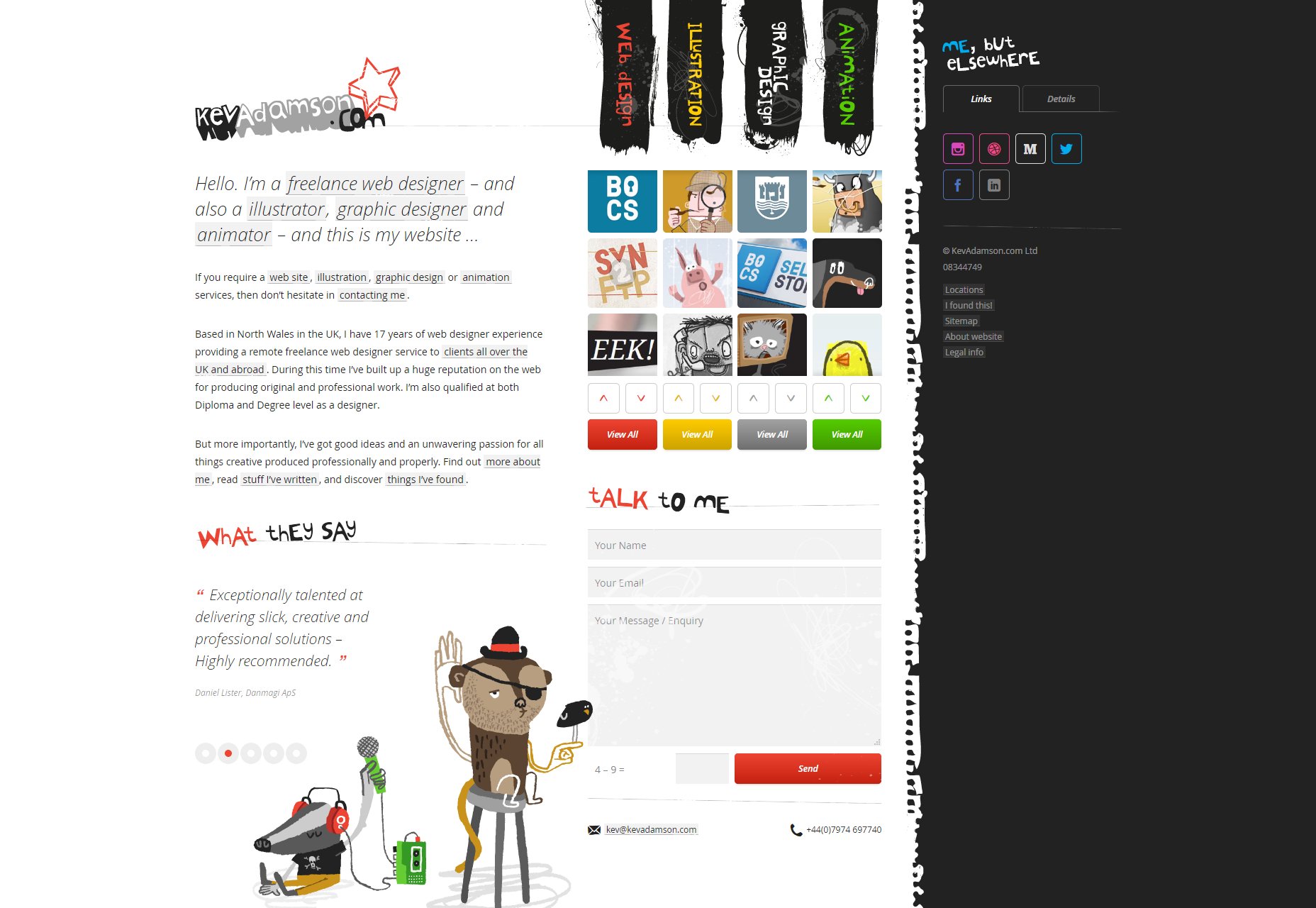
Kev Adamson
Not gonna lie, I am in love with Kev Adamson’s site for nostalgia reasons. It’s a bit ’90s, a bit early 2000s, and all built with more modern development techniques. I’m never going to say that we should all go back to skeuomorphism, but maybe some of us could, sometimes. This Kev person certainly can, I think.
Plus, they’re an illustrator. The aesthetic totally works.
Platform: Custom CMS
Cam Dales
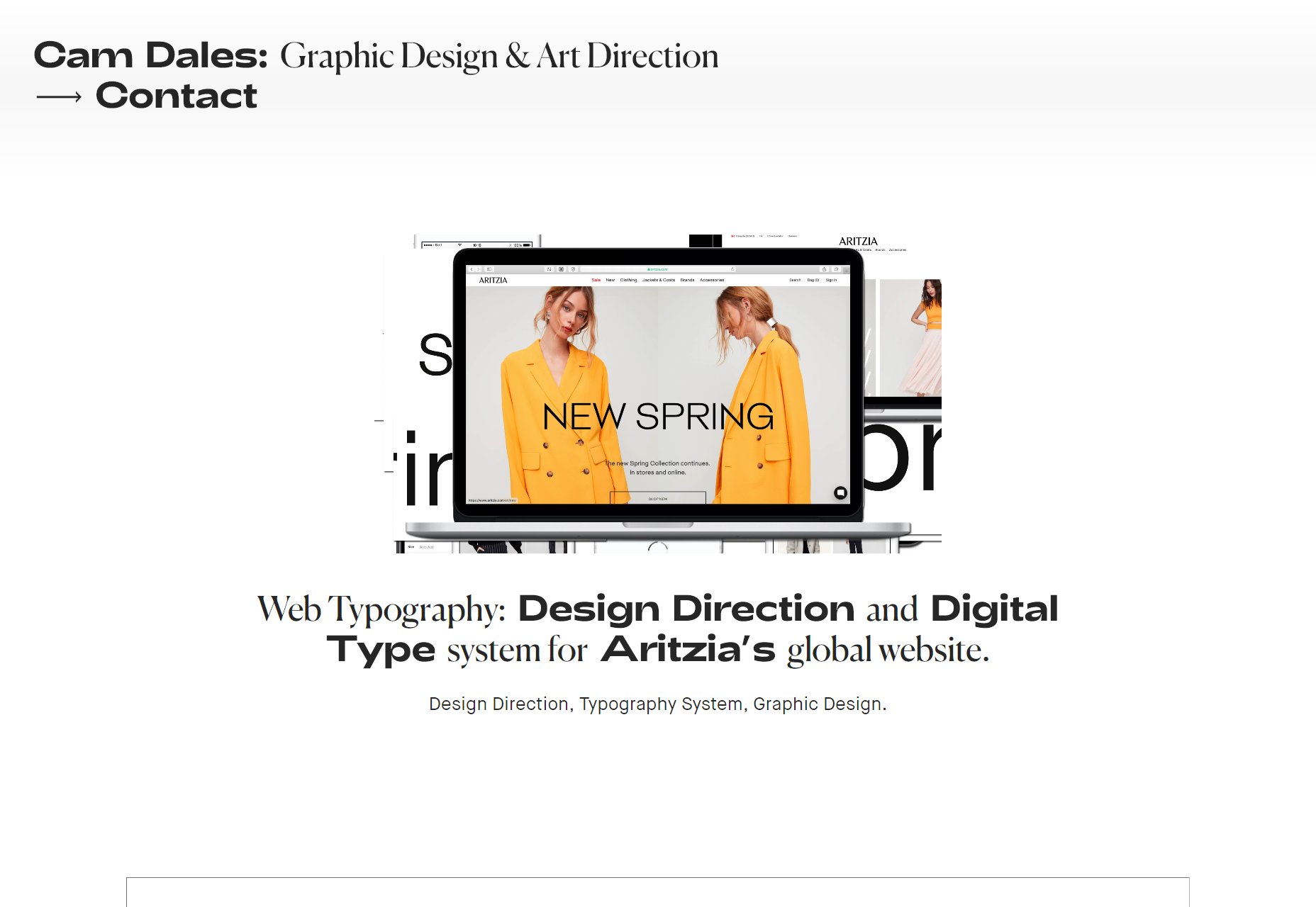
Cam Dales’ portfolio is a fine example of both highly modern minimalism, and one-column layouts. It stands as a reminder that sometimes, when you’ve got very simple content, there’s no need to over complicate your design.
Platform: Cargo Collective, Backdrop
Studio 313
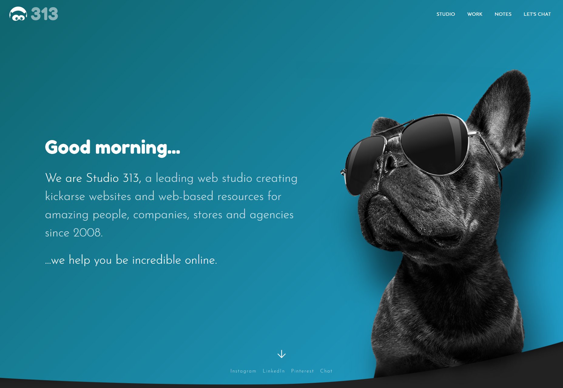
Studio 313 is coming in hot with a modern aesthetic, fantastic type, gradients, and A PUG WITH SUNGLASSES IT’S SO CUTE I WANT HIM BUT THEY HAVE SO MANY HEALTH PROBLEMS… and I have cats anyway. They’d go full Garfield on that poor thing.
It could use a bit more text contrast in places, but overall this site has quirky personal touches all over it, while still maintaining a professional image. That’s an approach I can respect.
Platform: WordPress
Kévin Chassagne
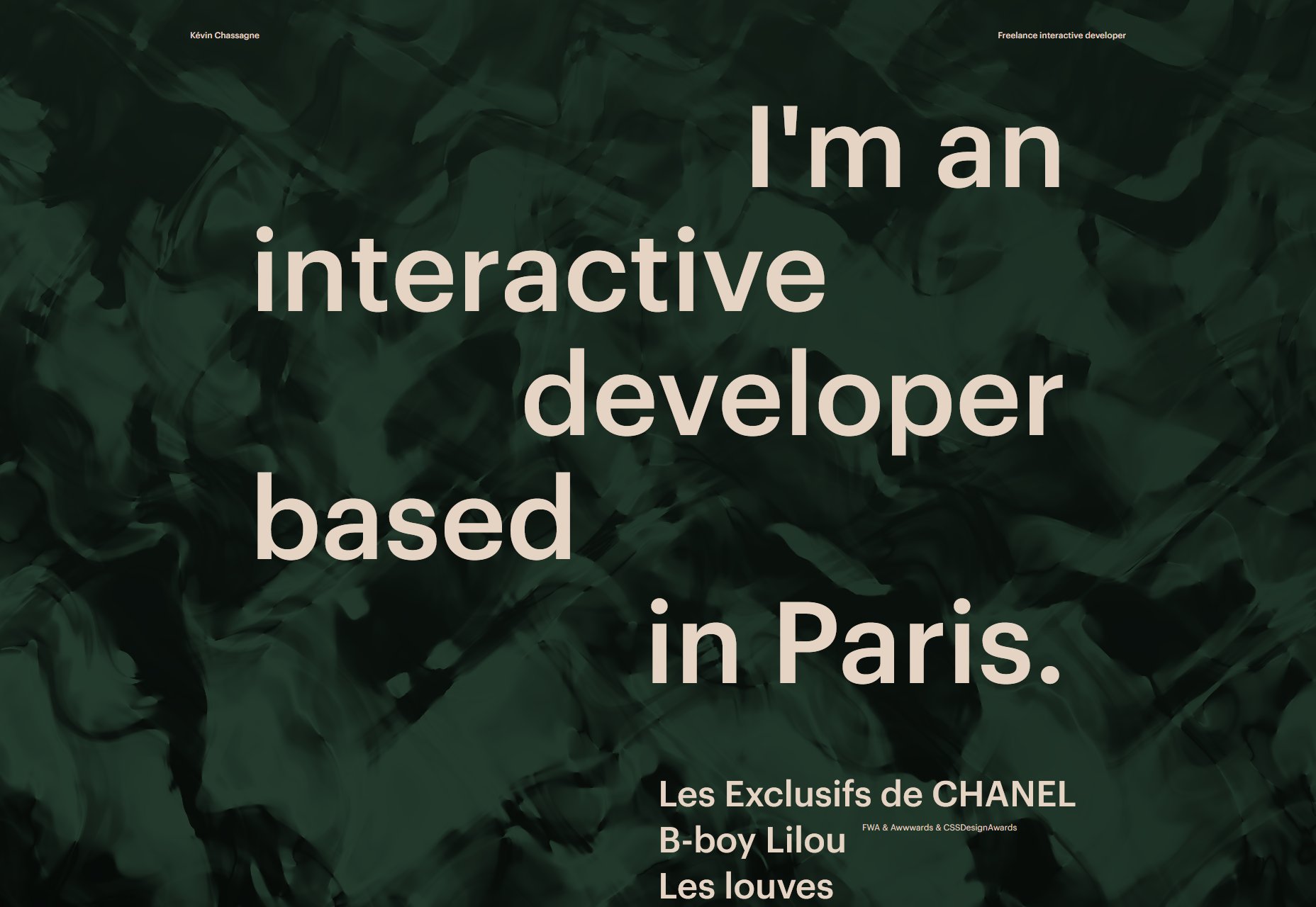
Kévin Chassagne’s portfolio is living (or at least functioning) proof that you can have and elegant, fancy website with great-looking animation, that also works without JavaScript. Sure, you don’t see the fancy ripples in the background, but everything important and functional still functions.
Sure, it’s a one-page portfolio with links to external sites, but my point stands. Content can load without JS. Oh, and I should probably mention that the site has fairly sold typography, and that I adore the color scheme. In this age of digital screens, it’s literally easy on the eyes.
Platform: Static Site
And you know what? If I’m honest, a part of me will really miss this tarp fort when it’s gone. It’s a fort. In my grown up office. Everyone should have one.
